Thanks for the Zoom sections when I was stranded in India for the first four months of the thesis due to the baby's visa issues. This thesis argues that interior spaces in elderly homes can become more interesting and stimulating through the use of color, and that a simple color redesign of the common areas can provide great benefits for the users.
INTRODUCTION
- RESEARCH QUESTION
- RESEARCH AIM
- OBJECTIVES
- DESIGN METHODOLOGY
This thesis brings these concepts together by examining how to use color most effectively in the design of nursing homes in New Zealand. This helped to choose colors according to the function of the room and the characteristics of the users: older people in social rooms in retirement homes.
LITERATURE REVIEW
- COLOUR BASICS
- THE PHYSICS OF COLOUR
- COLOUR WHEEL
- PSYCHOLOGICAL AND PHYSIOLOGICAL IMPACTS OF COLOUR
- IMPACTS OF INDIVIDUAL COLOURS ON PEOPLE
- COLOUR AND ELDERLY
- COLOUR AND AGING EYE
- COLOUR INTERVENTIONS FOR ELDERLY
- HEALING AND COMFORTING ENVIRONMENT
- THE IMPACT OF NATURAL LIGHT AND NATURAL ELEMENTS ON
- COLOUR AND HEALING ENVIRONMENT
- SUMMARY AND REFLECTION
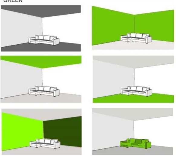
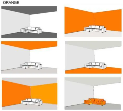
Hue is the attribute of the color that distinguishes it from another color. It is known from section 2.3 that certain colors can promote interaction, especially red and orange.
KEY DESIGN STRATEGIES
Natural light is known to have healing powers, the presence of natural light has been proven to reduce the length of hospital stay of patients (Park, Chai, Lee, Moon, & Noh, 2018). From Section 2.3 and Section 2.5 it is known that colors have a potential to promote interaction; Red and orange are colors known to encourage interaction between people.
PROJECT REVIEW
- VIEW OF NATURE AND NATURAL LIGHT
- SOOTHING COLOURS
- COLOURS PROMOTING INTERACTION
- CONCLUSION
This chapter presents and analyzes design examples that have used some of the key design strategies for promoting healing identified in the literature review. Strengths: Skylights help bring lots of natural light into the space, which can have a positive psychological effect on improving sleep, mood and behavior. Above the living room of Shinjuen Nursing Home, there are 225 spheres in 15 colors that create gentle circular motions in the air.
Residents can feel the essence of nature, such as the greenery, the sky and the moving wind, be absorbed in the gently dancing bubbles and forget all about time. Sometimes too much of calming colors like blur or green can lead to depression, in this case they have tried to include shades of warm colors to balance this. Weakness: Too much warm color may not be suitable for residents when they want a calm and quiet atmosphere.
These case studies follow on from the literature review in Chapter Two to provide a further understanding of how various key design strategies identified in the literature review can be used in retirement to promote a calming atmosphere, resident interaction and liveliness.

SITE SELECTION
COLOUR AND RETIREMENT HOMES IN NEW ZEALAND
To understand how color is used in the interior of retirement homes in New Zealand, a photographic survey of shared community living rooms of ten retirement homes was conducted. Out of ten retirement homes selected, one was chosen as the site for conducting experiments. Floral patterns on curtains and wallpaper -Large windows to bring in natural lights and colors.
From the above tables it is clear that many of the nursing homes in New Zealand have not experimented with colors to make the built environment interesting. Color is brought into the interior mainly through furniture or as a painting on the wall. Color is an ideal design element and an influential design facet that can be easily applied and manipulated in a variety of design materials.
However, there is a lack of systematic research into the use and effect of color on the living environment of the elderly.
SITE
- SITE BACKGROUND
- INTERIOR
Selwyn Sprott Village, ideally located in the residential heart of Wellington's Karori sits on just over 3/4 of an acre, surrounded by established trees and mature gardens (Selwyn Foundation, 2018). The Selwyn Foundation took ownership of Sprott House in October 2018 and now comprises a 73-room care facility (rest home and hospital), a purpose-built secure dementia care unit for 24 people and 13 self-catering cottages. livelihoods (Selwyn Foundation, 2018). The chosen multi-purpose hall is one of the main halls located in the south wing of the house.
This living room is used as a TV lounge, dining area and also as an optional activity room. Sitting room is located on the southern corner of the building, has windows on the southwest wall and southeast wall.

EXPERIMENTS
- COLOUR AND LOCATIONS
- COLOUR AND AMBIENCE
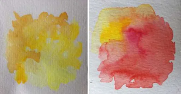
- WATERCOLOUR EXPERIMENT
- COLOUR BOXES
- AGING EYE
- SUMMARY AND REFLECTION
The main goal of this experiment was to practically test and observe how different colors change the mood and ambience of a room. This experiment could serve as an example of how the ambience and appearance of an interior space changes with different colors. From this experiment, it could be observed that different colors convey different moods to a room.
It is also noted that observations in this experiment contrasted some of the observations made in experiment 1, which was done digitally. In this experiment, combinations made in the watercolor experiment are kept inside different colored boxes. With this experiment it was possible to observe how different colors complemented each other.
This experiment allowed us to observe how colors differ in an aging eye.
DESIGN EXPLORATIONS
SITE ANALYSIS FOR THE INTERVENTION
To begin design, proposed communal lounge and dining area was graded using these key elements of healing derived in Chapter 2 (Figure 24). Even though Figures A, B and C are views of the same living room space, they look very different from each other due to the furniture arrangements and use of space. This living room is used as a T.V room, dining room as well as from the figure B it is known that they use this living room indoor play area.
60 | P a g e The main source of natural light is from the windows on the south-east and south-west sides of the lounge. The view from the south-east window is towards a parking area and a garden behind the car park. The view from the south-west windows is towards the landscaped area, the car park and the main road (Messines road).
There is an absence of both soothing colors and colors that promote interaction in the room.
DESIGN EXPLORATIONS
- HOW TO INCREASE IDENTIFIED DESIGN OBJECTIVES?
- SUMMARY AND REFLECTION
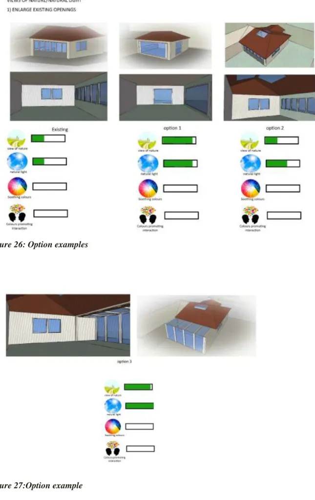
64 | Page In Figure 28, some samples are obtained from natural elements such as leaves, wood and water. In option 30, a green wall and an internal garden and observations are introduced into the extended part. The introduction of nature increased the presence of nature and also calm colors in the room.
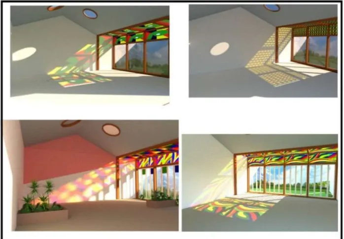
In option 2 (Figure 31) an additional glass window is inserted; this again increased the natural light in the room. In Figure 35 Intermediate colors such as blue-green and blue-violet are mainly used on walls. A picture of the application of colors that promote interaction with some examples are shown in the figure below.
In Figure 36, colors that promote interaction are applied to the various surfaces of the interior.
HOW TO BRING IN COLOURS NATURALLY?
- FIRST SET
- SECOND SET
- FIFTH SET
- SUMMARY AND REFLECTION
The selected design in Image 38 provides both soothing colors and colors that promote interaction in the room without blocking the view of nature and natural light. Again, variations on the selected design in the first set were explored, taking into account the nature patterns abstracted in section A.2.1. 74 | P a g e A selected design from the second set (Figure 40) uses colorful nature patterns abstracted from A.2.1.
In the third set of explorations (Figure 41), the living space is divided into two zones using color as the main driver. The selected design from the third set was re-investigated to produce further design variations. A selected design from a set of four together with splashes of patterned colors, the entire glass wall acts as a pattern.
All the stages of design explorations helped to refine and develop the final selected design.
FINAL DESIGN
COMBINING DESIGN EXPLORATIONS
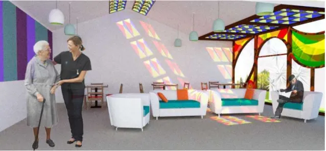
The northwest wall is in the T.V zone, so it requires soothing and relaxing colors. The northwest wall is chosen to be designed as a green wall with a TV unit similar to the one in section A2.2 (option 3). The northeast wall is designed as a wall with a colorful board, as in Figure 32.
The floor has been decided to be white in the color in section 8.1.1, therefore furniture must be in a contrasting color to avoid confusion for the elderly. Seating in the T.V zone is chosen to be blue-green color and complimentary color Orange-red is given to the cushions to make it colorful and comfortable. To make the mornings more energetic, active and cheerful colors like red, yellow-orange and green are designed to be broken through the glass roof in the morning.
In the afternoon, all the colors are visible, as the sun is exactly at the top.
SUMMARY AND REFLECTION
TESTING ON ANOTHER SITE
SITE
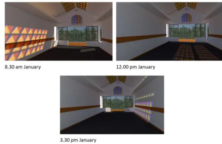
Elements of healing derived from the literature review are tested on the site and observed that there is a lack of colors that promote interaction on the site. First, the ultimately selected 3D glass design was applied to the existing opening in the roof and observations were noted. It is noted that the desired results are not obtained when the chosen design is applied to the existing roof opening.
94 | P a g e Again the roof opening similar to final design was tested on the new site and observations are recorded. It is noted that colors similar to the selected design in chapter 8 are obtained in this case. Energetic and interactive colors are broken in the morning, all colors are visible during the afternoon and soothing colors are visible in the evening.
CONCLUSION
CONCLUSION
FINDINGS
- COLOUR AND AGING EYE NEEDS
Location of openings and orientation of the room must also be considered when designing new openings. Literature review identified that blue and green colors are considered more calming than any other color. Soothing colors can be brought into the interior by using natural elements such as water or plants and creating a better connection with nature.
Soothing colors can also be introduced by painting surfaces or using soothing colors in upholstery. It should also be noted that colors such as yellow-green can feel strangely clinical when used poorly, especially when used with white. The literature study shows that red and orange are the colors that can promote interaction.
Overuse of these colors can be disturbing and can feel overbearing to the residents.
FURTHER STUDY
Retrieved from Filli Boy The Effect of Color (Renk Etkisi): http://renketkisi.com/en/color-preferences-in-the-elderly.html. The effect of natural sunlight on sleep problems and sleep quality of the elderly in a nursing home. Retrieved from Color Studio: http://blog.colourstudio.com/2011/11/effects-of-aging-on-color-vision.html Elements of Design Part 2: Color.
The application of color and color contrast in the home environment of elderly and visually impaired individuals. Evidence-based research: The application of color and color contrast in the home environment of the elderly. Retrieved from https://www.ballarddesigns.com/howtodecorate/2015/09/how-to-use-the-color-wheel- for-decorating/.
Retrieved from la Healthcare Design: https://lahealthcaredesign.com/psychology-of-the-color-green-and-its-effect-in-interior-design/.