The Development of Practical Guidelines for Designing Online
Questionnaires
Zurina Saaya Nuridawati Mustafa Anusuriya Devaraju
Fakulti Teknologi Maklumat dan Komunikasi, Universiti Teknikal Malaysia Melaka Karung Berkunci 1200, 75450 Ayer Keroh, Melaka
Abstract — Questionnaires are an inexpensive way to gather data from a potentially large number of respondents. However, it is a long and effort consuming process to conduct the survey manually. As the popularity of the Internet increases, online survey creation software allows an access to individuals in distant locations, the ability to reach difficult to contact participants, and the convenience of having automated data collection, which reduces researcher time and effort. The aim of this study is to develop an Online Questionnaire Builder (OQB), which is an online survey software package to streamline and simplify the entire survey process from design of the questionnaire to the presentation of the results. OQB consists of an intuitive wizard interface for creating surveys, tools for distributing the surveys and analyzing the results. This paper presents the results of our preliminary study. By studying wide numbers of existing surveys, we came up with practical guidelines that should be met before a questionnaire can be considered a sound research tool. The guidelines presented in terms of structure, layout, navigation, formatting, response format and question types. It is expected, with the specified guidelines, OQB will be a useful and automated online application for creating and distributing surveys for the use of researchers or any scholars.
KEYWORDS
Survey, Online, Design Guidelines, Automated
INTRODUCTION
Questionnaires are a feasible way to collect factual from a potentially large number of respondents. Creating and distributing paper-based can be a time-consuming process and have less visual appeal. Items on the paper-based questionnaires may be confusing without the aid of interpretation; omission and errors of various types can go without detection until it is too late to fix them. Another disadvantage of paper self-completion questionnaires is that the respondents can look ahead. Forms may be hard to follow from question to question and from page to page [1]. According to [2], there is no other method of collecting survey data that offers so
much potential for so little cost as Web surveys. Our study is on the development of an Online Questionnaire Builder (OQB) which is a web-based survey system that allow user to streamline and simplify the entire process survey process from questionnaire design to the presentation of the results. OQB is equipped with tools for creating, distributing survey by copying a survey template from the survey library or by custom building their own survey from scratch, analyzing and viewing the survey results by using reports, graphs and charts.
An appropriate questionnaire design is essential to ensure that we obtain valid responses to our questions. Currently, most of the existing questionnaire design guidelines are lacking key information need to be effective. For example, many guidelines sets are based on personal opinions of few experts, do not provide references to support them and not well-documented. By addressing these issues, in this paper, we present practical guidelines in questionnaire design to support our online survey system design decisions. The guidelines also can stimulate research into areas that will have greatest influence on the creation of usable online survey system. As there is no single guideline would be ‘one-size-fits-all’ situation, our guidelines are drawn upon the research on existing guidelines. The guidelines reported here focuses on the survey content, response format, navigation, and layout design.
WEB-BASED SURVEY
Questionnaire can be described as a medium of remote conversation between researcher and respondent. It can be written in various ways and used in many different situations or media for data collection. It is presented in a series of questions and designed to elicit the information that is required to enable the researcher fulfil the objectives of the survey.
the other hand, these methods remove the potential of bias responses and increase the honest answer for the sensitive subject. Web based self completion questionnaire is a survey that is published in the Internet and the respondent is invited to participate using email or any other invitation method. As stated in [3] the method that can be used are the following; a Web site which is open to anyone who visits it, the respondents are invited to visit a Web site to complete a questionnaire, the questionnaire appears to a visitor only when triggered by some mechanism (e.g. date, visitor number, interest in a specific page), a respondent is invited by e-mail to the survey site, the e-mail contains a URL or Web address on which respondents click, an e-mail with questions contained in it and the questionnaire is sent as an attachment to an e-mail.
A web based survey is designed using web technology including the HTML, client-side scripting, server-side scripting and database support for data storage. As there are various types of technology used, some kind of guidelines needs to be followed so that the generation of the survey can be use easily by the respondent. Web based questionnaire design guidelines is a recommended techniques or approach to design a web survey in term of its content, response format, question sequence and layout design. Guidelines should be a collective opinion from expert regarding the specific area or field. It is not a rigid standard that can bring to the breach of contract or lawsuit. The content of guidelines is a useful set of recommendations with justifications and examples [4].
RELATED WORKS
There are several existing guidelines to design online questionnaires, which are introduced by [1] and [5]. Besides that, [3] also published a book called Questionnaire Design which consist of the steps to design questionnaires for interviews survey and self-completion surveys. The following section summarizes the selected existing questionnaire design guidelines.
According to [5], one of the considerations in designing an online questionnaire is the layout of the whole survey. The survey should start with introduction or welcome message in the first page of the survey in order to motivate respondent to participate [1], [4], [5]. To allow respondent to easily exit in any webpage, the first page must be designed in usable manner so that it can help respondent to finish the survey easily and quickly. If applicable, the researcher could use login or registration page before respondent can access to the questions. Then, they should go to brief description regarding the survey and if applicable the screening test should be after this page. If relevant, each of the questions should have link to the additional information. It can be implemented using pop-up help windows consist of additional insight into specific question being asked. Furthermore, the windows will help to make
information more intuitive and readable [6]. The survey will end with appreciation message.
On the other hand, [3] has summarized that the sequence section in a survey is exclusion or security question, screening questions and main questionnaire. In term of the layout, [5] suggested the questionnaire document may be divided into pages that fit within a monitor screen. The page is divided according to one long scrolling form, section partitioning, page partition or a set of question/answer in a page. The issue regarding layout of the survey also discussed by [5] and [6]. [5] has mentioned that one long page of survey can be frustrating to the respondent to finish it, so she suggest that the questions should be divided into several question per page but then if the questions is too much the it might be end up with excessive numbers of pages. While [6] has highlighted that the questionnaire should be in linearly down a single page in order to minimize non-response error where the respondent failed to answer one or more questions in a survey. As solution, the decision to put all in one page or to divide into section must depend to the content and the number of question in a particular survey. For a simple and short survey, the questions may be presented in one long page. While, for a long questionnaire, it is better to put in separate page which is divided according to section of topic of questions.
As the questionnaire consist of many pages, it must be incorporate with additional navigation function to get around the questionnaires. [5] has summarized that several elements in navigation that can be used; namely, button, hyperlinks, sitemaps and scrolling. Beside that, the designer should consider the format of the elements in the questionnaire such as text, colour, graphics, tables and frames as it is important issue in usability guidelines.
After all, the other element in questionnaire is the response. As stated in [1] and [5], the choice of responses format are the form control in HTML, such as radio button, check box, drop-down boxes and text input. The compatibility of these controls is depend on the types of questions whether open or closed ended.
PROPOSED GUIDELINES
It is important that the development of interface for web-based survey system guided by reasoned design principles. Fig. 1 represents the overall questionnaire guideline organization that will be covered in our online questionnaire tool development.
Layout
Fig. 1. Overall questionnaire guideline organization
Avoid cluttered displays: The question and answering process should be uncluttered and easy to complete. Align contents horizontally or vertically to make them easier to read. Limit the number of items to 10 or fewer, whereas twice that number may be given on one page of a paper questionnaire.
Placement of question and its response set. A question and its elements of response must be included on the same page. A question should never be divorced from its response set.
Clear separation between different questionnaire sections: Questions relating to a given topic must be presented together and clearly separated or sectioned from questions related to other topics. Section headings and sub-headings must be displayed clearly to differentiate sections. Too many sections in one questionnaire are not recommended.
Set appropriate page length: Implement ‘single scrolling page’ mechanism for a very short questionnaire covering a limited number of topics, while a long questionnaire can be distributed within several, linked, non-scrolling pages.
Frames: Avoid using frames when designing an online questionnaire, as frames can make pages difficult to read, print and increase load time, also cause problems for disabled users who rely on assistive technology.
Forms and Fields: Locate field labels close to their associated fields so that respondents can easily make the association. A ‘submit’ button should always be placed adjacent to the last field on any given page so that it can be easily identified by users when they complete the question responses. Any instructions pertaining to a given field should appear ‘before’ the field as fields are most easily read if stacked in vertical column.
Numbering: Questions should be numbered sequentially through out the instrument without omissions or repetitions. Even if the questionnaire is divided in sections or parts, it is preferable to use progressive numbers through out the form.
Instructions: Eliminate confusion between instruction and questions, for example via different formats, or put them in a box. Instruction should be placed directly above the question concerned or the section of the questionnaire to which they apply.
Use Fluid Layouts: Use fluid layout that automatically adjusts the page size to monitor resolution settings that are 1024x768 pixels or higher
Organization Structure
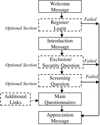
The next issue to be considered before designing a survey is its structure. The sections for the stucture is disscussed in the following paragraph and Fig. 2.
Welcome message: Welcome message is the place to insert motivational message to encourage respondent to finish the survey. If compared with paper based survey, this part most likely a cover letter to persuade the respondent to complete the survey.
Register/login: This section is important if the questionnaire need to be restricted to the specific respondent
Introduction message: This section is where the researcher explains the objectives of the survey, security and privacy term.
Exclusion/security questions: This section consists of the questions that can determine whether the respondents need to be excluded from the survey. Exclusion question is used if the researcher need to protect the confidentiality of the content of the survey.
Screening question: This section use to screen the respondents for eligibility of the survey in order to ensure that they belong to the research population.
Organization Structure
Welcome Message, Register/Login, Introduction Message, Exclusion/Security Question, Screening Question, Main Questionnaires, Additional Links, Appreciation Message
Layout
Display, Question and Response Set, Section Seperator, Page Length, Frames, Forms, Field, Numbering and Instructions
Navigation
Button, Link, Site Maps and Scrolling
Formatting
Text, Colour, Graphics and Symbols
Response Format
Drop-Down Boxes, Radio Button, Check Box and Text Input.
Question Types
Main questionnaires: This section is where the users present the questions and define answer format. There is also option to the user to add additional instruction to the question to help respondent answer the questions.
Appreciation message: Every survey should finish appreciation message to the respondent for their time and effort in completing the survey. This section also should enable respondent to email or give comment regarding the survey to the administrator.
Fig. 2. Questionnaire Organization Structure
Navigation
Navigation refers to the method used to find information within a web site and it is a visible segment to the end user. The navigation element should allow user to find and access information effectively and efficiently [4]. There are several elements of navigation which are discussed here and can be implemented in an online questionnaire.
Button: Button should consistently available on each page of the website to ease user especially researcher to develop their own questionnaire. According to [5] buttons allowing a respondent to exit questionnaire or return to the previous section of a questionnaire should be consistently available on each page of the website. Button also important for user to skip any questions which are not appropriate. It is because as written in [6], filters, jumps, skips, conditioning are means to adapt the questionnaire to the response behaviour of each participant. They allow skipping non-appropriate questions depending on the previous answers given and
thus reduce the length of a survey to the individual minimum.
Link: Link is the hypertext which can cause a new page is loaded when a user clicks on it. As [5] has suggested that the use of links in questionnaires should follow the general rules which is not exceed 20 links per web page.
Site Maps: Site maps provide an overview of the Web site and it may display the hierarchy of the Web site[4]. The online questionnaire requires a site maps in order to help user to navigate through a web site especially when the questionnaire exceed more than 20 pages [5].
Scrolling: Scrolling is one of the browser controller which enable user to scroll left or down to the page. The need for scrolling on web-pages comprising an online questionnaire should be avoided as it can become burden to the respondent. The lengthy of a page gives the impression that the survey is too long to complete [1], [5].
Formatting
Design issues are an extremely important consideration for online questionnaires because of the highly visual nature of the web environment, and the variety of technical skills of survey respondents [8]. There are several elements in formatting that need to consider which are related to questionnaires appearance such as text, color and graphics.
Text: According to [8], text appearance is based on font, size and decoration. The choice can affect transmission times, screen configurations and perceived length of questionnaire. Text appearance also discussed in [4] as usability issue where the type of font used should be a familiar type with black or plain colour. This recommendation also agreed by [5].
Colour: Colour can sometimes attract people but it is important to use them wisely. The colours for text and backgrounds should always be high contrast e.g. black and white. This makes the text more legible, reduces eye strain and makes it easier for people with colour blindness and other visual impairments to use the site.
Graphics: Ease to process questionnaire is one of important factor to be considered. If lots of graphics included in questionnaire, it consume times to download and make the process slower. As being mentioned by [5], graphic should be kept to a minimum wherever possible to enhance download time and increase the accessibility of online-questionnaire across target audiences.
Symbols : Symbols such as circles, arrows, boxes, triangles, and asterisks are excellent visual tools and Main
Questionnaires Welcome
Message
Register/ Login
Introduction Message
Exclusion/ Security Question
Screening Question Optional Section
Optional Section
Optional Section
Additional Links
Appreciation Message
Failed
Failed
should be used not only to guide the respondents through out the form.
Response Format
Drop-down Boxes: Drop-down boxes is useful when the answer in a long list such as state, country, etc. The usage of drop-down boxes requires three times mouse action. However there is a tendency to select the top entries. Worse, drop-down-menus are easily overlooked. If it is needed to be implemented, the usage of default selections of answer categories should be avoided. Make the first entry something like “-select here-“ [7]. As stated in [5], it is important that the first option in the drop-down box is not visible by default since this can lead respondents and that visual clues to indicate how the drop-box is used are clear and visible. Thus, use the drop-down boxes where appropriate.
Radio Buttons: Radio buttons are small circles that are placed next to the response option of a closed-ended question. It is very useful when there is a need to select
from among mutually exclusive items [4].
Check Box: Check boxes are the small squares that show a tick when checked. It is differed from radio button where the respondent is allowed to select more than one answers.
Text input: Text input as response format need to consider the size of the box. The usage of scrolling around the text box if possible, should be avoided. This type of input control is very useful in open-ended questions.
Question Types
In general there are two types of questions in a questionnaire namely, closed-ended and open-ended. Open-ended question is an open question where the response is collected verbatim. It is very useful if the survey aim to get the qualitative aspects of a particular topic where the respondent has a chance to respond the question in details. However the responses for open-ended question are difficult to analyze and thus require more experience and skill on part of the researcher to use effectively [5]. The following paragraph briefly describes the type of question categorized as closed ended question.
Dichotomous Question: The dichotomous question is generally a two-answer question. For an example is for yes/no answer. This type of question is easy to write and easy to ask question. It is usually used as screening question to ensure that the respondents are eligible for the survey depends on whether they belong to the sampled population or not. Is also advisable to include “Don’t know” option in case the respondent refuse to answer [3].
Multiple-choice: Multiple-choice also known as multi-chotomous. It is consist of three or more choices of answer. There are two type of response, whether single response or multiple responses. The list of possible answer provided should be exclusive and as exhaustive as possible [3].
Rank order scaling: This type of question allow respondent to specify the rank (e.g. 1 to 5) of the item based of specific attribute or characteristic. The list of responses should be given a sufficient distinct visual appearance that they can be differentiated from ordinal question [5].
Rating Scale: A rating scale question requires respondent to rate a product or brand along a well-defined scale (i.e. very pleasant to very unpleasant). Rating scales are used to measure the direction and intensity of attitudes.
Constant Sum Question: Constant sum question allow respondent to express the relative value or importance of the option in a collection of ratio data.
Skip Question: This type of question is used to determine, based on a respondent’s answer where the question should jump to when the question path is response directed. According to [5] this type of question is not recommended in paper-based questionnaire, however with the web programming technology, this type of question can be implemented.
CONCLUSION
Questionnaire design is a process that demands careful attention. There are several important guidelines that need be met before a questionnaire can be considered as a research tool. In this paper, we have delivered practical guidelines within web-based survey system in order to support our online questionnaire development, which is based on relevant design principles. The design principles are in terms of survey content, response format, question sequence, and layout design. Our next stage of development is incorporating the proposed guidelines into the design of automated online system for creating and distributing questionnaires.
REFERENCES
[1]K. L Norman, S. Lee, P. Moore, G. C. Murry, W. Rivadeneira, B. K. Smith and P. Verdines (2007, April 13), Online Survey Design Guide, University of Maryland, [Online] Available: http://lap.umd.edu/ survey_design/tools.html
[2]D. A. Dillman, Mail and Internet Surveys: The Tailored Design Methods. (2nd ed.) New York: Wiley, 2000
[4]National Cancer Institute (2006), National Cancer Institute’s Research Based Web Design & Usability Guidelines [Online]. Available: http://www.usability. gov/guidelines/index.html
[5]J. Lumsden, “Guidelines for the Design of Online-Questionnaires,” NRC/ERB-1127, National Reseach Council Canada,. June 9, 2005
[6]J. Burkey and W.L Kuechler, "Web-Based Survey for Corporate Information Gathering: A Bias-Reducing Design Framework," IEEE Transactional on Professional Communication, vol. 46 no. 2, pp. 81-93, June 2003.
[7]L. Kaczmirek. (2005) Web Surveys. A Brief Guide on Usability and Implementation Issues. [Online]. Available: http://www.websm.org/uploadi/editor/113 3803522kaczmirek2005-survey-design.pdf