Effective UI
Jonathan Anderson, John McRee, Robb Wilson,
and the EffectiveUI Team
Effective UI
by Jonathan Anderson, John McRee, Robb Wilson, and the EffectiveUI Team Copyright © 2010 EffectiveUI. All rights reserved.
Printed in Canada.
Published by O’Reilly Media, Inc., 1005 Gravenstein Highway North, Sebastopol, CA 95472.
O’Reilly books may be purchased for educational, business, or sales promotional use. Online editions are also available for most titles (http://my.safaribooksonline.com). For more information, contact our corpo-rate/institutional sales department: (800) 998-9938 or [email protected].
Editor: Steve Weiss
Development Editor: Jeff Riley
Production Editor: Rachel Monaghan
Copyeditor: Genevieve d’Entremont
Proofreader: Nancy Kotary
Indexer: Julie Hawks
Cover Designer: Karen Montgomery
Illustration and Interior Design:
The EffectiveUI Team
Printing History:
February 2010: First Edition.
The O’Reilly logo is a registered trademark of O’Reilly Media, Inc. Effective UI, the image of a rainbow lorikeet, and related trade dress are trademarks of O’Reilly Media, Inc.
Many of the designations used by manufacturers and sellers to distinguish their products are claimed as trademarks. Where those designations appear in this book, and O’Reilly Media, Inc. was aware of a trade-mark claim, the designations have been printed in caps or initial caps.
While every precaution has been taken in the preparation of this book, the publisher and authors assume no responsibility for errors or omissions, or for damages resulting from the use of the information con-tained herein.
3 Effective Planning and Requirements
. .
75
Uncertainty and the Unknown 77 The Humility of Unknowing 78 The Weakness of Foresight and Planning 79 Friction in a Complex andPeculiar System 81
Subjectivity and Change 87
Lessons from Uncertainty and the
Unknown 89
The Further You Are in the Project,
the Wiser You Are 89
Start Development As Soon As Possible 90 Written Functional Requirements and Specifications Are Inherently Flawed 90 Commitments to Scope Are Untenable 92 Relish and Respect the Unexpected 92 Intolerance of Uncertainty Is Intolerable 93
Effective Requirements 94
How Framework Requirements
Are Built 97
Reexamining the Three-Legged Stool 99 Commitments You Can Live Up To 101
Effective Process 102
Development Methodology 103
Preface
. . . .
ix
1 Building an Effective UI
. . . .
1
Understanding UX 4
What Good UX Accomplishes 6
Why Engagement and Good UX Matter 10 The Elements of Engaging UX 11 Redefining Two Fundamental Terms 32
Design 32
Development 34
2 Building the Case for Better UX
. . . .
37
Why Now Is the Moment for UX 40Motive 40
Means 48
Opportunity 50
Winning Support for Better UX 53
Stakeholders 53
Education 57
Quantifying the Business Value 67 Materializing and Proving the Concept 67 Other Strategies for Building Support 73
vi Contents
The Project Leader 116
Relationship to the Product 116 Relationship to the Stakeholders 117 Relationship to the Project Team 119 Who Should Be the Project Leader 119
The Stakeholders 121
Securing Authority 121
Collaboration and Decision Making 124 The Characteristics of a Successful
Project Team 125
Getting Professional Help 127 Insourcing Versus Outsourcing 130
5 Getting the Business Perspective
. . . . .
139
Defining Success 141
Creating a Project Mission Statement 142 Determining Project Success Criteria 144
Exercising Restraint 145
Applying the Pareto Principle 148
What Not to Restrain 148
Refocusing Product Objectives 149 Omissions Aren’t Permanent 150 Describing the Product’s Users 151
User Attributes 152
Exercises to Identify Key User
Attributes 153
Creating Business Requirements 160
Defining “Requirement” 161
Exercises to Develop Business
Requirements 163
Maintaining Stakeholder Buy-in 169
6 Getting to Know the User
. . . .
171
Valuing User Research 173
Combating Pressure to Skip
User Research 175
Key Concepts in User Research 177
Empathy 177
User Goals Versus Product Features and
Tasks 178
Qualitative Versus Quantitative
Research Methods 180
Research 182
Finding Research Participants 184 Determining the Research Sample Size 185
Making Recordings 188
Research Through Speaking with Users 190
User Interviews 190
Structured Interview Techniques 191 Research Through Direct Observation 193 Analyzing the Research Observations 196
Discovering Personas 196
Weaving User Stories 198
Discovering User Priorities 199
Guerilla User Research 200
Stakeholder Buy-in Through
User Research 202
7 Initial Product Architecture
. . . .
205
The Initial Product Architecture Team 208Contextual Scenarios 210
Mapping High-Level Workflows 213 Sketching Low-Fi Visual
Representations of Requirements 215 Examining Key Features and
Interactions 216
Setting a Style Vision 217
Developing Nomenclature 221
Technical Architecture 222
Getting a Lay of the Land 223 Making Platform and Framework
Choices 223
Understanding Data Requirements 224 Mapping Interactions with
Other Systems 225
Finding Shortcuts Through Third-Party and Open Source Components 228 Discovering Business Logic 229 Software Architecture in Big Design
Up Front (BDUF) 230
Project Infrastructure Needs 232
Code Source Control 232
Graphic Asset Management 233 Testing Infrastructure and
Contents vii
Regarding “Process” 239
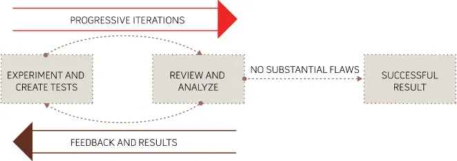
Iterations and Feedback 239
The Scope of Iterations 243
Prioritizing the Subjects of Iterations 245 Finishing Iterations with Something
Complete 246
Estimating Iterations 247
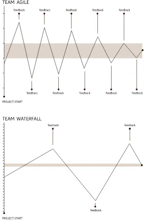
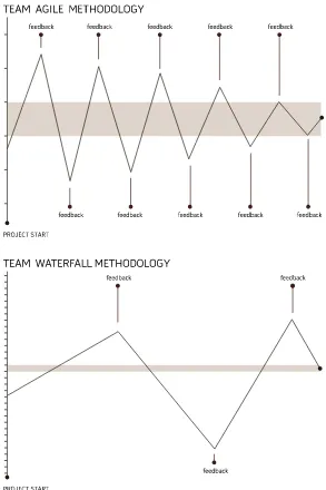
Basic Iterative Process 248
Mapping Progress and Feedback Across
Multiple Cycles 252
Increasing the Amount of Feedback 254 Iteration in Sub-Ideal Project Approaches 256 Strict Waterfall Process 257 Iteration in a Big Design Up Front
(BDUF) Process 261
Managing Expectations 265
The Alpha and Beta Releases 266 Receiving Orderly Feedback 268
Last-Minute Housekeeping 269
User Documentation 270
And Champagne Corks Fly… 271
Adoption 272
Post-Release 273
Review 274
Measurement and Tracking 277
Afterword
. . . .
281
When the Internet first came online
in 1969, it linked computer systems the size of two-car garages that had only a tiny fraction of the power of a modern smartphone. They were programmed and maintained by researchers and scientists, and performed functions that would be ludi-crously rudimentary by today’s standards. The complexity and size of these systems ensured that computers and software were pretty remote from the everyday lives and experiences of people. But as the power and sophistica-tion of computing systems and software have grown, their proximity to our lives has increased to the point where software is integral to the daily home and work life experiences of most people.The sophistication of software has grown tremendously while at the same time software is reaching a much less technical audience. This creates a nexus of tension around the user interface (UI); for sophisticated products to be fully useful, they must be easy to operate. At its heart, software is like any other tool; its purpose is to make people’s lives and work easier, and to give people access to capabilities previously beyond their reach. This demands, of course, that the software itself not be beyond their reach.
It’s taken a while for the standards of UI design and user experience (UX) quality to catch up with the advances in software capabilities and ubiquity. But the time for better UX has, at long last, inally come. When we began writing this book in early 2009, there was a noticeable increase in the atten-tion to and awareness of the importance of UX in software. At the same time, though, there was a generally poor understanding of how to build UX-focused software products. Many large companies were struggling to build a UX competency from within and inding that UX requires far more than just graphic design and IT. Prestigious digital, interactive, and ad agen-cies were trying to get a foothold in the ield but were failing with remark-able regularity. The promise of better UX and the beneits it confers was, and still is, harder to achieve than many companies expect.
This is why our publisher, O’Reilly Media, asked us to write this book. They noted the disparity between the growing expectations and demands for better UX and the poor success rate of companies trying to meet that demand. And so it’s for the companies and people who recognize the importance of gaining competency in building better UX in software that we have written this book.
This is for product managers who need a risk-reducing roadmap, for tech-nologists and designers who need guidance and advocacy, and for business-people who need to understand and manage UX-focused initiatives.
O’Reilly is perhaps the best known and most respected provider of knowl-edge resources created by and made for technology innovators. We’ve been presenting at their Web 2.0 conferences for years, and our employees’ book-shelves are illed with O’Reilly books. We’re thrilled to add a book to their prestigious animal series. If you’re wondering what the rainbow lorikeet on the cover has to do with effective UIs, it’s simple:
What does the dog say? Woof, woof! What does the cow say? Moo, moo! What does the rainbow lorikeet say? Ui, ui!
It’s a privilege to be participating in the present fast-growing trend of build-ing better UX in software. EffectiveUI has been ridbuild-ing the UX trend as it has grown from a small surge into a tidal wave. At a time when other companies were focusing either on design or on engineering, we built our company around the marriage of the two.
This is the most basic ingredient for good UX—the cooperation of design and engineering that results in design-minded engineers and technically savvy UX designers. We’ve also regarded UX as a new, highly advanced specialty, very seriously and have endeavored to hire the best, most creative people available in the industry. It’s thanks to these people and an early focus on UX that we’ve been able to help a long list of clients succeed in their product initiatives. They’ve also helped us stay ahead of the curve with the exciting new things that are happening in the mobile, multitouch, and other emerg-ing domains of software.
Everything we know about building software and delivering great UX has come from the contributions of the people working here and the lessons they’ve learned in approaching a lot of hard challenges over the past ive years. The subjects covered in this book span the dozens of professional domains within EffectiveUI. The ideas we share in these pages are an aggre-gation of the thoughts, experiences, and contributions of over a hundred members of our staff. The process of writing this book was very much like a very long journalistic assignment. We conducted countless hours
of interviews, had numerous group and one-on-one discussions, and per-formed a lot of research—all for the purpose of discovering what we as a company, and as a group of individuals, collectively knew.
This book gives a snapshot of the best advice we found in investigating our own approach over the period of about a year in 2009. But we work in a fast-changing, cutting-edge ield, so even as we were putting the inal touches on this book, many new ideas and concepts were being conceived and applied in our work. Because this book covers a very broad subject, we provide only a high-level overview of some very complex domains. You may want to learn more about these domains, and to ind resources on how to develop your own expertise in those ields. So, to provide updates and link you to useful resources, we’ve created a page on our website to complement this book:
http://effectiveui.com/book-resources/
We’ll also be posting updates on Twitter. Please follow us: @uitweet.
Two of us, Jonathan and Robb, also work as managing editors for UX
Magazine (http://uxmag.com). The magazine is a good source of current ideas and information about the UX strategy, technology, and design.
Thanks and Acknowledgments
As we’ve said, this book represents the thoughts and contributions of over a hundred people. We’re very grateful to have these people as our friends, coworkers, teachers, and supporters. We’re also deeply grateful to O’Reilly Media for giving us this opportunity and for toiling long and hard to help us pull this off.
Thank You to Our Virtual Coauthor
The role of a project manager is a tough one—you’re responsible for the results of a project, and at the same time you’re entirely dependent on other people doing the majority of the work. Eileen Wilcox may not have written any of the words that went into this book, but without Eileen none of the words in this book would have been written. Eileen also conducted much of the early research and interviews that went into this book, and her thoughtful questions and follow ups ensured that the information captured was useful.
Just like software engineers and UX designers, writers need a balanced mea-sure of stern presmea-sure and reassuring supportiveness. And since this book arose from the ideas of so many people inside our company, the amount of coordination the writing effort required was enormous. Eileen provided that pressure, support, and coordination masterfully.
Eileen’s ideas and contributions are everywhere in this book, so we consider her a virtual coauthor.
Thank You to Our Friends at O’Reilly Media
Thanks irst to Steve Weiss for coming up with the idea for this book, and for his conidence in us. Steve’s enthusiasm and patient stewardship are the reasons this book exist. Thanks also to Marlowe Shaeffer for her vote of con-idence, patience, and support.
Thank you to our development editor, Jeff Riley. Thank you, Jeff, for suffering to read some atrocious irst drafts so our poor readers didn’t have to. Thank you for making us much better writers, especially since we thought we were pretty good to begin with. Thank you also to Genevieve d’Entremont, Rachel Monaghan, and all of the other people who were just beginning to work with us even as this thank-you section was written.
Thank You to Everyone at EfectiveUI
Everyone at EffectiveUI contributed to this book in some way. Some gave us a lot of information that’s found all throughout these pages, and others gave us just one or two ideas that proved foundational. It’s impossible to rank the degree to which people contributed, so we thank everyone in equal measures.
There were a number of people who spent a lot of their time—much of it after-hours and on weekends—helping with the content, graphics, and pro-duction of the book:
Chris Aron Jeremy Balzer Eddie Breidenbach Jason Bowers Greg Casey Lance Christmann Anthony Franco Jeremy Graston Catherine Horning Bobby Jamison Beth Koloski Joy Sykes Tony Walt
Since our people are our company, the best way to know the face of
EffectiveUI is to know the faces of our staff. For this reason, we’ve included a portrait section at the back of this book to pay homage to our people. It’s done in the style of a yearbook class page as a further tribute to Herff Jones, the yearbook company that let us use their product as an example in this book.
Additional Thank-Yous
The following people outside of EffectiveUI helped us a great deal:
Catherine Anderson Truman Anderson Constantinos Demetriadis Tony Hillerson
Gregg Peterson Alexandre Schleifer
Thanks to Our Partners
Thank you to our friends at Herff Jones and National Geographic for gener-ously allowing us to use their projects as examples in this book.
Safari Books Online®
Safari Books Online is an on-demand digital library that lets you easily search over 7,500 technology and creative refer-ence books and videos to ind the answers you need quickly.
With a subscription, you can read any page and watch any video from our library online. Read books on your cell phone and mobile devices. Access new titles before they are available for print, and get exclusive access to manuscripts in development and post feedback for the authors. Copy and paste code samples, organize your favorites, download chapters, bookmark key sections, create notes, print out pages, and beneit from tons of other time-saving features.
O’Reilly Media has uploaded this book to the Safari Books Online service. To have full digital access to this book and others on similar topics from O’Reilly and other publishers, sign up for free at http://my.safaribooksonline.com.
Chapter 1
Building an Efective UI
Just as a finished software product
never looks anything like the original plans and expectations for it, writing this book carried us in a sur-prising but interestingly different direction than we’d originally assumed. When you imagine what it might take to succeed at building an effective user interface (UI) built with a modern standard of user experience (UX) quality, you might think of high-end design, innovation and inspiration, and technical best practices. These are certainly all important components, but our experience helping other businesses build great products has shown us that a team’s ability to deliver on the promise of good UX is only partially dependent on its creativity and technical competency. The rest depends on creating the right climate for the team and within the company that allows the team to be effective and helps success come more reliably and easily.Too many people have endured the pain of participating in the building of a software product in a bad climate—so many, in fact, that most are resigned to the belief that building software is an inherently diicult and disappointing undertaking. Whether you’re a business leader who’s frustrated at the fre-quency with which software projects disappoint or fail, or you’re a software professional who feels like execs just don’t “get it,” or that your stakeholders are their own worst enemies, then you already know what we’re talking about. Everyone is feeling a frustration that has the same root cause, but each is expe-riencing it from a different perspective and consequently reaching a different conclusion. The way companies have historically handled software develop-ment projects is extremely lawed, and everyone knows it without having any idea of what to do differently. And the ways IT and software engineering teams have coped with business constraints and responded to the need for better UX have also been weak and are undermined by entrenched problems and lawed approaches. These issues combine to cripple the ability of project teams—no matter how talented they may be—to produce great results. Succeeding in building a product with a superior UX quality is a particularly signiicant
challenge that requires an intensity of design and engineering productivity, and anything that interferes with that diminishes the quality of the result.
And so as we asked ourselves how could we best assist people in succeeding at building products with great UX, we arrived at an unexpected answer: focus less on training people in how great design is done; focus more on how to create a setting where great product design can occur and succeed. If you are opening a restaurant, just having a great chef isn’t enough; the chef’s tal-ent will be meaningless if the restaurant is in a bad location, the wait staff is poorly trained, the kitchen doesn’t have a supply of fresh food and isn’t well equipped, and the restaurant isn’t marketed effectively. The artistry of exceptional cooking can’t easily be taught in book form, but the business of being a restaurateur can. Likewise, the skills of great UX architects, visual designers, and software engineers are gained through individual profes-sional experience rather than through books, so the most valuable informa-tion we can offer in helping people succeed in building UX-driven products is information on how to enable the success of those professionals.
If you’re one of those professionals and want to help your organization or clients become better at building software, or if you’re a businessperson try-ing to make a UX-driven initiative successful, we’ve written this book to be of help and reassurance to you. The best of intentions, the most cogent of busi-ness strategies, and the most talented professionals are routinely thwarted by having to operate in settings that are inherently disabled in ways that no one can quite identify or solve. So a principal goal of this book is to give you an understanding of what the most fertile and hospitable environment for UX-driven software development looks like, and to provide some tips on how to move an organization in that direction. We consistently ind that success in building high-quality software products requires major changes in think-ing and process across an organization. It takes much more than just one person to create the right climate for building better software, and so much of the work of creating that climate requires understanding, teaching, and advocating for the principles we’ll discuss in this book.
Building a product with a focus on UX also involves people and practices that might be new and unfamiliar to you and your company, so another principal goal in this book is to give you a general orientation and clear roadmap of what it will take to get from a concept to a successful completion. Unless you’re
specialized in one of these domains, you won’t ind yourself writing code, designing interfaces, or conducting user research, but understanding what to expect, what to avoid, and how all of the professional domains contribute to the forward momentum of a project will help you ensure its success.
Understanding UX
Good and bad UX is typically easy to identify but diicult to deine in gener-alities since the medium of UX is individual, subjective human experience. But in order to understand whether your company’s products or internal systems have successful UX design and to convince skeptical executives of the value of UX, it helps to have a clear explanation of UX design and what makes its contribution valuable.
User experience is, as the name suggests, the experience a user has when interacting with software. Just as is the case with music, a software product’s UX falls somewhere along a range between subjectively good and subjec-tively bad. This is obvious enough, but in that simple analogy are a number of truths that are often misunderstood or overlooked in software develop-ment. The process of creating good music involves a combination of the underlying mathematical principles of music that govern how we interpret sound, the technical skill required to write and play the music, and the
artis-tic sense required to know how to make it all come together pleasingly in the subjective consciousness of the intended audience. Take
away any of those elements, and you make it impossible to bring new music into being. Also, the quality of music
is not an objective one, but is speciic to the subjective experience of the individual listener. A group of people might love techno and hate country, but that doesn’t mean that techno is objectively good and country is objectively bad; it just means that if you’re making music for that group, you need to bear their subjective needs in mind.
All of that is also the case in software UX. There’s no such thing as objectively bad or good UX, only subjectively bad or good experi-ences speciic to the user. The process of creating great UX involves some combination of quasi-scientiic disciplines such as human factors
SCIENCE
ART
CRAFTSMANSHIP
UX
engineering, usability, and information architecture; the technical skills to produce not only great UX and user interface design but also the working software itself; and the artistic sense required to intuit and design for how the different subjective perspectives of different users will experience any given aspect of the software. Briely, building great UX requires the combina-tion of science, skilled craftsmanship, and art to address a subjective need.
In the way your company has approached the development or improve-ment of its software products, has it demonstrated an understanding of these concepts? Evidence of failure is easy to perceive in hindsight. If you’ve neglected the scientiic aspects of building software, you’ve built products that are confusing, hard to use, cumbersome, poorly organized, and frustrat-ing. Undervaluing the technical need on the engineering side usually means you’ve produced gorgeous UI designs but a disappointing, hacked, utterly compromised inal product that performs poorly. The technical need on the UX design side—and yes, design for software is highly technical and not just subjective artistry—is also often overlooked or misunderstood. This leads to product UIs designed in ways that are graphically interesting but that cause undue diiculty in how the software will actually work and be developed. And inally, if you haven’t recognized the subjective nature of UX, it’s likely that, despite all the best of intentions and efforts, you’ve built products that users hate or reject. It also means you’ve worked with team members who narrowly focused on their own disciplines and deliverables without being constructively mindful of how their work assembles into a larger whole.
This entire book is dedicated to ways you can avoid those bad outcomes, but it’s important at the outset to point out explicitly that delivering on the promise of great UX requires that you and your company’s view of and approach to software development is sensible and correct. Just having some talented team members won’t lead to success if your general approach to the endeavor is wrongheaded. And it’s not enough to have just one person on the team who understands how things need to be done; this is knowledge that needs to be shared and needs to become part of a broader organiza-tional competency. And so you’ll ind that most of the insight you’ll gain in this book isn’t speciic to innovation, design, technique, or artistry; it’s about how you can clear the way for innovation, design, technique, and artistry to come together successfully.
What Good UX Accomplishes
Having a strong UX in your software product is a good goal to have, but high-quality UX isn’t in and of itself the real goal. It’s the means to another, more important end that, though it’s easy to appreciate irsthand, is incredibly hard to describe. Good UX enhances user engagement, and UX design is the art of creating and maintaining user engagement in software. Whereas UX is an abstract concept and UX design is a professional discipline, user engage-ment is the all-important subjective experience.
This naturally begs the question, what is engagement? This is best explained through analogies.
Engagement as immersion
The easiest, most intuitively obvious example of engagement in software is the experience of playing a great video game. Video games—particularly those of the irst-person variety—aim to create a high degree of immersion for players.
Deep immersion occurs when the player becomes less and less aware of his surroundings, and his percep-tion of the space separating him and the screen starts to fade. His experi-ence of the game becomes one of being the character rather than just being a guy in a chair manipulating the controller. If you’ve ever seen someone leaning his body to one side to try to steer a car in a game or dodge an incoming missile, you’ve seen someone who’s heavily immersed in the game. Robbie Cooper produced a wonderful video for the New York Times Magazine showing just how immersed kids get in the game play expe-rience: http://video.nytimes.com/video/2008/11/21/magazine/1194833565213/ immersion.html.
Creating that deep immersion is an art form, and many things must be con-trolled lest they diminish or entirely break the immersive experience. A player
can be snapped out of immersion and the game play experience can be destroyed by simple problems like controllers that are diicult to operate, jarring inconsistencies in the game’s physics or rules, badly delivered lines by voiceover actors, or any jumping and skipping in the video or audio.
The example of immersion in gaming may seem quite remote from what you’re trying to accomplish. If you’re building a new Customer Relationship Management (CRM) tool for internal use at your company, for example, your goal in focusing on the UX of the product isn’t to make your sales team so enthralled by the experience of managing their customer interactions that they forget where they are, mentally merge with the application, and stay up until 4 a.m. trying to reach the next level of enterprise marketing automa-tion eiciency. Well, maybe that wouldn’t be so bad. But certainly most soft-ware products are meant to be useful—not entertaining.
Deep immersion is, however, just an extreme example of user engagement. In the case of games, the goal is to bring the player’s focus away from manipulating the controls or comprehending the game dynamics, and even away from being aware of playing a game, and to put it squarely and deeply on goals internal to the game: winning the race, killing the aliens, solving the puzzle, and so on.
Engagement as the fourth wall
The fourth wall is a term from theater that is often used in ilmmaking. The action on the stage is bounded by three walls, one in the back and two at the sides, but there is no fourth wall between the action and the audience. The audience members watching an engaging play infer and build that fourth wall in their minds, ignoring its absence. Just as the gamer loses awareness of the space between the screen and himself, and of the screen itself, the audience members become so engrossed in the action that the theater around them fades away. If an actor lubs a line, or a baby starts crying in
the back of the theater, that fourth wall is “broken,” detract-ing from the experiential quality of the play. Rather than being engrossed in the plot and action, the audience members are suddenly reminded that they’re in a theater and have been sitting in their chairs for an uncomfortably long time.
Most ilmmakers pay a tremendous amount of attention to the fourth wall. They attempt to keep the audience in a constant state of high engagement through the art of good ilmmaking. The art of ilmmaking helps them build and maintain engagement, and ensures that they avoid the simple little prob-lems that break the fourth wall and remind the audience they’re in a theater watching a ilm—like when the boom mic briely appears at the top of the frame, or when actors or extras look straight at the camera, or when the spe-cial effects are noticeably fake or overdone. The ilmmaker wants to keep the audience immersed in what’s going on in the movie, and not on anything else outside it.
Engagement as frictionless accomplishment of goals
We’re beginning to arrive at the heart of what engagement is: an undistracted, unencumbered focus on the ultimate goal of the activity a person’s engaged in. In movies, as in video games, that goal is to be engrossed and entertained, to be carried away by a story and an experience. The point of software isn’t necessarily to engross your users in the experience of using the software, it is to keep them focused on the ultimate goals they’re trying to accomplish in using the software, rather than on the actual use of the software itself. Software is, after all, just a tool people use to accomplish certain goals. To be truly and unobtrusively useful, software must clear the straightest, most fric-tionless path to the accomplishment of the user’s goals.
One of the most common instances of frictionless user experience that people encounter comes while driving a familiar route, such as from work to home at the end of each weekday. Almost everyone has had the experience of arriving in their garage or driveway with no memory whatsoever of the drive. In this case, rather than the product being software, it’s the car, and instead of a keyboard and a mouse, the user is operating pedals and a steer-ing wheel. The high degree of familiarity people have with the operation of the car allows for such a frictionless experience that their awareness of all the little tasks involved in driving slips away. On leaving work, the driver decides on the goal of returning home; the more familiar the route and the more skilled the driver, the less attention is required to accomplish the goal.
It’s easy to imagine ways in which friction could be increased and attention drawn to the tasks involved in driving. Swapping the positions of the accel-erator and brake pedals, for example, would shatter the driver’s acquired easy familiarity with driving and would force her to pay very careful atten-tion to working the pedals for the entire drive home. By changing the goal from going home to going to a restaurant in an unfamiliar part of town, the driver must focus her attention on navigation. And if something important in the car is malfunctioning—say, one of the tires is running lat—the driver will need to focus on controlling the steering wheel. Each of these will make for a more memorable experience of driving because the driver’s attention will be on managing the little tasks involved in driving.
Engagement in software
The goal of UX design in building engagement in software is to help people be more focused on and effective at the accomplishment of their goals. This involves expert combination of the science, technique, craft, and art of UX design to create user experiences that effectively engage their target users. It also involves avoiding or smoothing over things that tend to create friction and diminish or break engagement. Breaking engagement, like breaking the fourth wall, is crossing the line where the user must focus on operating the software instead of achieving her goals. Broken engagement both causes and indicates diiculty for the user, which in turn causes displeasure. Strong engagement, on the other hand, both causes and indicates ease for the user, which in turn brings about pleasure.
The aim of UX design, with its principal goal of creating and maintaining engagement, is therefore to bring software past the point of frustration, dif-iculty, and displeasure, to irst create engagement and then to deepen it according to the needs of the user and the aims of the product. UX design tries to reduce the friction that diminishes from engagement and that inter-feres with a user’s ability to focus on accomplishing his goals. UX design works to apply a certain artistry that helps elevate simple engagement to higher levels of ease and pleasure, which are what make exceptional software.
Why Engagement and Good UX Matter
If you understand that positive engagement leads to greater pleasure and effectiveness for the user, and negative engagement leads to diiculty, dis-pleasure, and wasted time, it’s easy to imagine why engagement and good UX are important in customer-facing products and internal information systems. To ask whether good UX should be a priority for an organization is essentially to ask whether assisting and pleasing customers and helping employees to be happy and effective are important goals in business. If a software product has been well conceived such that helping users accom-plish their goals is directly connected to an important business goal, then reducing the friction experienced in achieving the users’ goals should be the same as reducing resistance against the accomplishment of business goals.
With the growth of the customer experience (CX) trend, there’s been an increased recognition in business that every aspect of a company’s interac-tion with its customers (“touch points”) is an effective, rewarding experience. There’s also an increased understanding of the importance of experience
Engagement
Displeasure Pleasur
e
Anger
Ease
Pleasure
Fun
Joy
Frustration
Displeasure
Awful Software
Bad Software
Most Software
Good Software
Good Theater and Movies
Good Games
Difficulty
UX Design
quality over just service delivery. Simply having a well-stocked, conveniently located grocery store is not enough; the store must be visually appealing and clean, the checkout process must be quick and easy, and the store must have ample and accessible parking. The corollary to this in software is that it isn’t suicient to simply provide the user with a complete range of features; a good experience in using those features to accomplish one’s goals is also required. The grocer doesn’t want to waste his customers’ time by not hav-ing enough checkout stands, or to trouble and confuse them by not organizhav-ing and labeling the shelves properly, or to deter potential customers by being hard to access or appearing unprofessional and untrustworthy. Likewise, com-panies with customer-facing products should avoid wasting their customers’ time, confusing them or insulting their intelligence, or pushing them away. The linkage between acquiring and satisfying customers and business success is uncontroversial, but the direct relationship between UX quality and those goals is underappreciated.
The value of good UX and engagement extends to internal information systems and isn’t limited to customer-facing applications. The goals change, but the means of accomplishing them remain the same. In the case of internal appli-cations, exceptional UX has the ability to increase productivity, improve the timeliness and relevance of business data lowing to decision makers, increases adoption of the product and therefore the reach of its beneits, improves employee satisfaction, and generally reduces cost and increases opportunity.
The Elements of Engaging UX
EffectiveUI has spent a long time trying to deine, in concrete and mea-surable terms, the substance of engaging UX. Since good UX is something that’s measured subjectively and is dependent on the individual needs of the speciic users of a given product, there’s no 100-point checklist of good UX design; nevertheless, it’s important to have a structure and lexicon for expressing problems and opportunities related to UX that otherwise can be recognized only at a gut level. There are a number of concepts that are focal points of good UX design, or can be fault points for bad UX. This list of elements of engaging UX can serve as an evaluation tool for assessing the UX quality of your company’s current applications, understanding where past efforts have missed the mark, and identifying where investments are needed.
Familiarity
All else being equal, it’s easier to operate a tool you’re entirely familiar with than one you’ve never used before or one that is unfamiliar in some aspects. In the example of engagement in driving from work to home, swap-ping the positions of the brake and accelerator pedal destroys engagement and plunges the user into diiculty, even though the change is very minor in the context of the complexity of the rest of the car. The need for familiar-ity appeared in an interesting way when EffectiveUI was building a desktop version of the eBay application. Because the application wasn’t delivered through a web browser but rather was deployed as desktop software that had no discrete page states like websites do, we initially didn’t think to include a “Back” button such as those found in web browsers. Though the new application broke free of the page-based constraints of the browser and offered improved, more luid means of browsing content, users who were accustomed to the original eBay experience frequently had the experience of feeling trapped in some corner of the application without knowing how to go back. And so even though a “Back” button made little logical sense in the context of the eBay Desktop application (as it wouldn’t in a product such as Microsoft Excel), we were compelled by deference to the user’s needs to add a “Back” button to ensure that a comfortable degree of familiarity was preserved.
There are plenty of other examples of things that aren’t the most elegant, ei-cient, or sensible solution but are never-theless the right solution for the moment because of their strong familiarity. The QWERTY keyboard layout, for example, came about because the layout helped reduce the frequency of typebar clashes in old typewriters, and not because it’s the most eicient from an ergonomic perspective. But at this point the layout has become so familiar and people have become so expert in using it that making any changes would cause nothing but frustration. One exception to this is stenotype machines, used by stenogra-phers, which employ a radically different approach to typing because the
need to type quickly (225+ words per minute) necessarily overrides taking a familiar approach.
Responsiveness and feedback
Responsiveness in software is also often referred to as providing feedback to users. This responsiveness, or feedback, is what conirms and reassures the user that the action he has taken has been effective.
Elevators provide a simple, real-world example of the importance of feed-back in user interfaces. Imagine that you’d like to take an elevator from the 18th loor of a skyscraper to reach a meeting on the 32nd loor, but with this elevator all of the button lights and up/down arrow lights are burned out. When you press the “up” button on the 18th loor, though the order is suc-cessfully sent to the elevator’s controller, you receive no conirmation that an elevator has in fact been summoned
to go up. The absence of this feedback suddenly diverts your attention from the goal of reaching the meeting on the 32nd loor and puts it onto the task of summoning the elevator. You mash the button a dozen times, and still receiving no response, you decide to hold the button down until the elevator arrives. Your anxiety begins to build, as your uncertainty about whether you’ll be able to accomplish your goal has increased.
When the elevator inally arrives, no “up” arrow illuminates to let you know that this elevator is in fact
going up. If it’s going down, you could be in for a long ride, so your anxiety ratchets up another level. Upon boarding the elevator and pressing the “32” button, you receive no conirmation that the selection has been accepted, so you do some more button mashing and hold your breath as the doors close, waiting to see whether you go up.
At this point, you’re in such a state of uncertainty that as the elevator begins moving upward, you briely think it’s actually going downward, and feel another small surge of panic. Still holding down the “32” button, you don’t know that everything is OK until the elevator inally arrives at the 32nd loor and you quickly jump out, irrationally worrying the doors will snap closed and whisk you away from your goal before you reach solid ground.
In this scenario, the elevator itself was, from a functional perspective, oper-ating perfectly. It provided the necessary input mechanisms and responded correctly to its variable directives, and conveyed its user from one loor to another without incident. For you as the user, however, the experience of using the elevator has been bizarrely nerve-racking. The simple failure to pro-vide valuable feedback pulled your focus away from your goal and forced you to focus intently on the microtasks required to accomplish the goals that, in a properly maintained elevator, you would have performed without thinking.
When we released an early version of the eBay Desktop application, several users said they had trouble determining whether the information on their screens about the status of an auction item was up-to-date. This was surpris-ing feedback because we’d built the application to always display the most current information. With the original eBay web-based application, users needed to click the browser’s “Refresh” button to see the most current mation; with the eBay Desktop application, however, the most current infor-mation was automatically displayed. But it turned out that the ability to click “Refresh” and see the page reload in the original eBay application gave users conidence that they were seeing the latest information. What was missing in the eBay Desktop application wasn’t a “Refresh” button, though; it was a feedback mechanism that gave users conidence that the information was fresh. So we added a timer to the auction pages that counted down the sec-onds until the auction closed. When users looked at the auction page, they saw a clear, visual, second-by-second indication that the information was current. We didn’t have to change anything else to address the data fresh-ness concern; we needed only to provide the right kind of feedback.
Engagement in e-commerce is very important, because it correlates strongly with the user’s willingness to buy, her ability to complete transactions, and her experience of the brand. Any friction along the way leads to uncertainty,
distrust, and confusion, which decrease the likelihood of the user complet-ing the transaction or developcomplet-ing an ainity for the brand that would lead to repeat business. There’s another straightforward example of poor feedback that occurs frequently in e-commerce sites even to this day, though simple solutions have been found and really ought to be universally implemented. After having added the desired items to her shopping cart, and after having illed out all of the billing and shipping information, including her credit card information, the user is inally asked to press a button that submits the purchase. A lot of implied assurances should be associated with the press-ing of that button: she should be able to know that her purchase has been accepted, her credit card has been charged, and that it’s no longer neces-sary to worry about preserving the shopping cart or to take additional steps to complete the purchase. She’s essentially made a commitment of money, time, and trust, and requires the reassurance that it has led to success.
But an inexplicably large number of e-commerce sites betray that need by failing to provide the necessary feedback. Certainly you’ve encountered sites where under the “Purchase” button there’s a note saying, “Please push this button only once; otherwise, your card may be charged twice.” This is a band-aid solution for a failure to be responsive. It takes at least a couple of seconds after you press the button to validate the order and authorize the charge with your credit card, and if during that time nothing has hap-pened to acknowledge that you successfully submitted the purchase, your uncertainty and worry increase. If you’re not particularly tech-savvy and don’t notice that the browser has submitted something and is waiting for a response, you’ll spend a few nervous seconds wondering whether you actu-ally pressed the button, you missed clicking on it, or your Internet connec-tion is down, and you might decide to click it again for good measure. If the “Purchase” button had simply changed its visual state to acknowledge the click and then deactivated, you’d have some of the reassurance you need and your focus would remain on the goal of acquiring products rather than on the microtasks of submitting the purchase request. And if this experience of uncertainty leads the user to wonder whether her card has been charged twice, she’ll pick up the phone and call customer support, destroying the ei-ciency and cost savings sought by having an e-commerce site.
Responsiveness is important at all levels of an application, and for all features big and small. Good feedback is the UX equivalent of the polite nod or “uh-huh”
that a listener provides to a speaker to reassure her that he’s still listening and understanding. Consistent, valuable responsiveness builds a sense of conidence in the user and thereby improves engagement, allowing him to focus on achieving his goals rather than fretting over whether each of his actions taken toward that end have been effective.
Performance
An application’s performance—that is, how well it handles the strains of processing, display, data traic, and other technical considerations—can
strongly affect the experience of using it. Performance issues can cause the application to stall and lag, and for certain
opera-tions to take a disruptively long time to complete. Some performance issues are inevitable as the application performs complex operations or interacts with data over the Internet, and many can be mitigated at the UX design level by extending the simple courtesy of providing good feedback through progress bars or handling heavy processes in a way where the load-ing and processload-ing are more evenly distributed and less apparent to the user.
Whereas minor performance issues are irritating and diminish the UX quality and the productivity of using the product, major ones can go beyond breaking down engagement and cause the user to get upset with and distrust the product. Being forced to endure long or frequent waits, especially in settings where eiciency is important or the application is supporting repetitive tasks, can ratchet up the user’s irritation level to the point of anger. This is some-what akin to the experience of trying to watch a scratched DVD, when your immersion in the ilm is constantly being broken by lagging or pixelation that pulls your attention out of the story and puts it back into your living room and onto the DVD player. Most people have also had the unfortunate experience of working in an oice with a very expensive copy machine that jams every 50th copy, making it a source of disproportionate frustration and anger instead of the oice eiciency miracle it was sold as.
And if the product performs poorly—if the interface lags or hangs during heavy processing, certain things happen inexplicably slowly, the user is sub-jected to frequent progress bars that move slowly and at inconsistent rates— besides the irritation that results from having to pay attention to the delays instead of staying goal-focused, the user’s trust of the product also begins to break down. Performance issues indicate a poorly engineered product or some sort of technical malfunction occurring behind the scenes, which leave the user to wonder about the reliability of the product and the safety of the data he’s entrusting to it. This, once again, injures the user’s ability to beneit from the product as a tool for accomplishing goals, when those goals seem to be in jeopardy because of uncertainty about the product’s reliability.
It’s also worth noting that performance quality is based on a constantly changing, subjective impression. Things that used to be considered fast in the computing world in 1999 would be agonizingly slow by modern stan-dards—96 baud modems compared to high-speed cable Internet, 2-page-per-minute dot-matrix printing compared to 100-page-per-2-page-per-minute laser printers, and so on. We were also far more willing to accept a bit of technical crude-ness in the products we used regularly 10 years ago because the state of the art was far from advanced. But as computer capabilities and the sophistica-tion and quality of software have increased rapidly, our patience for poor performance has decreased enormously. Thus a product that delighted customers or employees three years ago may very easily be irritating them today.
Consistency in performance is also important. If you’re a regular patron of a fast food restaurant and every time you go in, it takes ive minutes to get your meal, then ive minutes becomes an acceptable waiting period. If occasionally it takes 10 minutes, those occasions cause frustration. If one day you get your meal in two minutes, then ive minutes is no longer accept-able. With software, a user should be able to count on the same task taking roughly the same amount of time for each use, so the delays are familiar and are therefore less likely to break engagement.
Intuitiveness and eiciency
Intuitiveness is the degree to which the process of accomplishing a goal or performing a task within a product is obvious to the user, without explana-tion or confusion. It relates strongly to familiarity, because a great deal of a UI’s intuitive ease comes from functions being handled in familiar ways, buttons being in familiar places, and things having familiar names. With the goal of allowing the user to remain focused on the goal instead of having to pay attention to the microtasks of operating the product, intuitiveness allows the user to more easily slip into engagement and retain undistracted focus and productivity. Intuitiveness and the eiciency the product makes possible for the user are also strongly related, as intuitiveness allows a user to remain focused on accomplishing her goals without having to expend time iguring out or focusing on the microtasks needed to accomplish those goals.
If they’re misunderstood and misapplied, though, intuitiveness and eiciency can wind up being competing ideals. Many people view intuitiveness as the ease with which a person can igure out how to operate a product in his irst few uses of it. But what may be the easiest approach to igure out on irst use is likely not the most eicient long-term approach, and the most eicient applica-tion UX may be less intuitive to new users. These two ideals are both coupled and also in some degree of tension with each other, and the right balance must be struck according to the requirements of the product. Consumer products generally tend to favor intuitiveness over eiciency wherever there’s ten-sion, because it’s important not to drive new users away by confusing them at the outset or providing them with overly complicated “Getting Started” guides. But products that are made for daily intensive use—an internal call center support application or a customer-facing CRM tool—should generally err on the side of eiciency, since the irst couple of weeks using the tool are less important than the subsequent two years, and users of such applications are willing to undergo a bit of training. Some products address the tension between ease of learning and ease of long-term use by letting users switch between basic and advanced interface modes.
But despite the occasional conlict between intuitiveness and eiciency, in much of UX design, a focus on intuitiveness also yields an improved quality of eiciency, as well as lower long-term costs to training and support.
Herf Jones eDesign: Intuitiveness Versus Eiciency
Intuitiveness
Presenting the yearbook in a way that closely resembles a physical yearbook has clear intuitive appeal. Users apply their knowledge of how to use physical books to how to use this screen. As a result, no training or instruction is necessary to help people use this yearbook preview screen, and it also provides students with the most accurate view of what their yearbook will be like. But this view is also very limited, and is not ideal when a student is doing complex work on the yearbook or trying to manage the whole book.
Eiciency
This screen doesn’t have the clear intuitiveness of the yearbook preview screen, but is nevertheless much more useful. It allows many aspects of the yearbook creation process—the management of colors, templates, sections, student assignments, progress, and so on—to be viewed and managed for hundreds of pages. Having all of this capability on one screen is an eicient approach, but isn’t immediately intuitive. That is more than made up for in how the eicient approach of the screen makes the student’s work easier and more effective.
Helpfulness in accomplishing real goals
Since software is a utility meant to help people and businesses accomplish their goals, the requirement that a product actually help accomplish those goals should be so obvious that we shouldn’t have to point it out. But a sur-prising number of products fail to help the business and the user accomplish their real goals. If a product is to succeed, both the user’s and business’ real goals need to be accounted for. If the user’s goals aren’t addressed, the prod-uct will cause frustration or won’t be used and thus won’t help the business; if the business’s goals aren’t met, the product’s development will have been a waste of money.
Companies will sometimes build a product with the hope of helping the company itself accomplish some of its goals, but don’t bother inding out whether or how those goals were aligned with actual user goals. This comes about as a result of companies undervaluing the role of user research in soft-ware design. They assume that they understand the user well enough or that their interests are the same as their users’ interests, or they underestimate the signiicance of the role the product plays in their customers’ relationship with the company. If this causes them to produce a product that fails to help users accomplish their real goals and causes them frustration, whatever busi-ness goal the product was intended to satisfy will also not be accomplished. Helping users accomplish their real goals is thus a stepping stone to the accomplishment of business goals.
A solid business goal that may be the basis for funding a new software initia-tive might be, for example, to reduce the cost to call center support opera-tions by reducing the support volume and diverting requests to lower-cost channels. This is a perfectly legitimate starting place and basis for a new product initiative. It is, however, certainly not the explicit goal of the compa-ny’s customers to help the company save money on call centers and provid-ing support. To be successful in meetprovid-ing the business goal, a means of align-ing it with a real customer goal must be found and pursued.
There are plenty of instances of big companies taking on just this sort of ini-tiative and getting it terribly wrong. Solely focused on reducing call center costs, the companies simply make it very diicult to reach an actual phone agent. In order to obtain support, they make the user go through a long
series of self-help, web-based procedures or browse through incomplete and poorly organized “knowledge bases.” If the user tries all of those things and still fails to ind a solution, he’s inally provided with a “Contact Us” support form where he’s required to type a detailed request for support. Sometime within the next week, he gets a two-sentence email response from an over-seas support operator who, as it turns out, is reading from the same support information the user already went through online and through the knowl-edge base. For users of a software product, this kind of experience is like being given the middle inger by the company. It’s clear the company’s pri-mary interest was in reducing the cost of supporting its customers. But the company took no steps to actually address the user’s goals.
The reality is, no user wants to contact customer support. Users would much rather have an application that operates as they expect it to. When the appli-cation doesn’t operate in this way, users expect to easily ind answers to their questions through sources that are instantaneous and readily intelligible. The business’s goal of reducing support costs can be achieved through helping the users accomplish their real goals, which are to have a product that is effective in helping them accomplish their goals (without the need of support) and of having answers readily at hand for common problems and questions. Rather than investing in the infrastructure necessary to divert customers and force them through tedious self-support systems—which, in effect, simply makes the customers work harder to get the support they wish they didn’t need— the business should invest in improving the overall UX quality of the product to reduce the need for support altogether. This winds up being more broadly positive, because it not only reduces the cost to support operations, but also improves the user’s experience of using the application, which in turn trans-lates into beneits such as improved brand ainity for consumer applications or increased productivity and job satisfaction for internal applications.
That’s a pretty egregious example of how companies can myopically focus on business goals without attending to user goals, but most failures to attend to real user goals are more subtle than this and descend from the best of inten-tions. Businesses tend to make a lot of false assumptions about what’s impor-tant to their users and set out priorities that, while they deliver some value to the user and business, fall short as a result of failing to keep a strong focus on the user’s actual goals. Supporting a user in achieving his actual goals is always the irst step to achieving related business goals.
On a recent project, EffectiveUI interviewed a large number of call center support staff and found that over half of their calls are for password resets. Evidently our client, concerned about security—or their customers’ percep-tion of security—required users to change their passwords every 45 days. We reviewed the online password change process and found that ambiguous labels and poorly written copy were contributing to customer confusion. By interviewing users, we discovered most were irritated by the 45-day pass-word change rule, and that most already operated under company policies that required periodic password changes on schedules that didn’t align with the product’s 45-day rule. Allowing users to set the date and frequency of their password changes solved most of the problems and reduced call center volume dramatically.
Delivery of relevant, valuable content
There are some products—Wikipedia and Craigslist, for example—where the entire purpose of the product is to deliver useful content. The quality of the experience of using those products is therefore most strongly determined by the quality, accessibility, and relevance of the content they provide. Other types of products are much more focused on capabilities rather than content and information—Adobe Photoshop and Microsoft Excel, for example. In the middle are content and capability applications, such as online investment trading tools like E*TRADE or sales force management and CRM tools.
Wherever it may fall along the spectrum of content-focus, the UX quality of a product is strongly dependent on its effectiveness in delivering appropri-ate, relevant content at the right times and places. This is fairly obvious in the case of the content-intensive products such as Wikipedia and Craigslist, where the role of the application is to assist the user in getting from a ques-tion to a useful answer as rapidly and easily as possible while ensuring that content is available and valuable. But even in far less content-intensive prod-ucts such as Microsoft Excel, the product’s ability to deliver useful content to the user at appropriate times is very important in enhancing the experience of using the application. The necessary consequence of Excel’s breadth and
depth of capabilities is that it is a rather complicated product, and taking full advantage of its capabilities requires the ability to perform some complex tasks, such as writing intricate formulas for ranges of cells in a spreadsheet. Rather than simply providing the user with a thick manual to use in trying to igure out how to write formulas, Excel provides that information directly within the application as part of the worklow. So instead of requiring the user to become an expert prior to using the product, or forcing users to con-stantly refer to help content, Excel delivers the information the user needs at the moment he needs it (while performing a complex task). This type of intel-ligent assistance can also take the form of context-speciic help. Rather than requiring users to access a separate help application to ind their answers, buttons and tool tips can be placed where users are likely to need assistance, giving them the exact information they’ll require at the exact spot they’ll require it.
In online trading tools, there’s a pretty balanced emphasis on both the capa-bilities of trading and managing investments, and the content. The content— stock prices, news, market analyses, and so on—helps users understand the market, learn about speciic industries and companies, and make educated decisions about their portfolios. An investment tool in which streams of accurate, timely information are presented alongside the ability to act on that information, and key content is automatically made available at junc-tures where it’s important to the user’s activity, is of far greater value than a product that keeps that content separate from its capabilities. Products that successfully anticipate what information and content a user will need at any given point and make it readily available will build a far greater sense of conidence and engagement in their users, helping them to remain focused on their goals rather than managing all the small details that must be assembled in the accomplishment of those goals. A simple and very use-ful example of this is when an application pops up a calendar when the user clicks into a date selection ield, saving the user from having to break engagement and look to another resource to igure out the correct date or to have to format the date entry according to the needs of the system.
There are even opportunities within this domain to delight users and radically enhance the UX quality of the product by providing them with infor-mation that’s important to meeting their goals but that they didn’t realize was avail-able or relevant, without their having to actively seek it out.
Internal consistency
Internal consistency requires that the application handle similar tasks in similar ways. In a CRM tool, for example, the process for adding a new customer record should be as similar as pos-sible to the process of adding a new job record. Although the information being input is different, the essential task is still the same: inputting informa-tion to create a new record. Internal consistency can be a simple as ensuring that buttons are in the same places and have the same labels (“OK” versus “Save” versus “Submit”), and that screens are generally organized and pre-sented in similar ways so the user knows where to look and what to expect. But it can also extend to much more complex interactions and tasks; in fact, the more complex the interaction or task is, the more important it is that it be as internally consistent with other similar interactions or tasks as possible. This will make it so the user needs to learn how to operate that type of capabil-ity of the product only once, and that knowledge can be intuitively generalized to allow him to use other, similar capabilities with ever-increasing ease.
A product should be internally consistent from a visual design perspective, too, to ensure that the user has the impression of it being a uniied, well-organized, professional product. Internal consistency is often lost in large product initia-tives where multiple teams are working on different aspects of the product and aren’t well coordinated, resulting in badly integrated Frankenstein products that look like the forced combination of several different products, and that require the user to master multiple approaches to accomplishing similar tasks.
A travel site that provides calendar-related content when the user needs it
A Frankenstein look-and-feel can also come about as part of the design concept process. Every professional designer has had the experience of presenting several different concepts to a stakeholder and being asked to take the best from each concept and mash them all together. Occasionally this can be lead to positive progress, but most times it leads to incoherence in the resulting design. Most people understand the problem of mixed metaphors (“I’ll bite the bullet and step up to the plate to nip it in the bud!”), and UX and visual designs for software are akin to metaphors in how they simplify complexity through appealing abstraction, and different approaches don’t mix together very well.
The internal consistency of a product should disguise a lack of consistency in the functions it’s handling. If the product is interacting with a dozen dif-ferent “backend” systems, the user shouldn’t have any clue that’s the case— everything should all feel like the same experience. The same is true of products that span multiple departments or divisions of a single company. Users should be left to think about their goals without having to under-stand the nuances of how a company is divided and structured. For exam-ple, with a travel site, buying a plane ticket should be the same experience as reserving a hotel room. And an employee using a workplace information system to sign up for beneits shouldn’t have to perform separate, redun-dant tasks just because beneits enrollment involves three different depart-ments within the company.
External consistency
External consistency in functionality is very similar to the ideal of familiarity; the more similarly the product operates compared to other products the user is already familiar with, the less of a learning curve there will be in its use, and the less jarring it will be for the user to switch between the different products he uses in any given day. Obviously, external consistenty with other products that have bad UX design shouldn’t be overemphasized beyond the limits of respecting familiarity. External consistency is actually much more of a concern when it comes to the visual design of a product, which conveys to the user on both a conscious and subconscious level a message about who and what the product is for. Software, like literature or architecture, has a recognizable set of genres. In architecture, if you see a building made out of white stone with Greek- and Roman-style columns and ornamental sculptures on the facade, you’re likely to assume that it’s a government building of some sort.
Many disparate applications in the legacy software…
…become a single uniied experience after the redesign.
Herf Jones eDesign: Integrated Experience
If you’re browsing the shelves of a bookstore and see a book with a cover that has a painting of a muscular, shirtless man with long, lowing hair riding a horse with a lushed, swooning lady in his arms, you’d be safe in assuming you’re standing in the iction section looking at a torrid pulp romance novel.
Likewise, the visual appearance of a software product should indicate its purpose and audience. The beneits this confers to the UX are very dif-fuse and hard to explain, but they have something to do with giving users the impression and conidence that the product is the right tool for their needs. When you walk into a lawyer’s oice, for example, you expect to be