BREJCHA, Jan et al. Chinese UI Design Guidelines 2.0. In: MARCUS, A., ed. "Design, User Experience, and Usability: Design Discourse", Part I, HCII 2015, LNCS 9186, pp. 122-–129. Springer, Switzerland, 2015. DOI: http://dx.doi.org/10.1007/978-3-319-20886-2_12. The origi-nal publication is available at www.springerlink.com.
Chinese UI Design Guidelines 2.0
Jan Brejcha1, Hui Li2, Qing Xu2, Huitian Miao2, Menghan Xu2, Li Wang2, Zhengjie Liu2
1
Frame Institute, Prague, Czech Republic
2
Sino-European Usability Center (SEUC), Dalian Maritime University, Dalian, 116026 P. R. China
[email protected], [email protected], [email protected], [email protected],
[email protected], [email protected]
Abstract. This paper presents the preferences of selected UI components of Chinese users. The areas of study were chosen using from a semiotic perspec-tive, which lead us to focus on the cultural context, as well as the linguistic structure of user interaction. This quantitative study based on 50 respondents was targeted at validating the data gathered in a qualitative pilot study. The re-sults are presented as UI design guidelines to simplify their adoption by both HCI researchers, and UX practitioners.
Keywords: Cross-cultural research, Cultural markers, Methodology, Design, Guidelines, User-interface, HCI, Semiotics.
1
Introduction
When designing for global users, we are faced with a need to design UIs that are usable and well accepted in a targeted culture. In order to match the user’s cultural expectations as closely as possible, designers need to combine usability knowledge with cultural insights. In the field of cross-cultural comparison, we can build upon a body of previous research [6, 7, 8]. For an initial analysis of the Chinese user experi-ence we can refer to Marcus and Baradit [5]. In our view, however, only limited work has been done in creating usable guidelines for Chinese UI design.
Semiotics works with a basic unit of analysis, which is a sign. The sign can be an-ything in the UI/UX that has a meaning for somebody. The meaning is supported by context and relationships between signs. Semiotic analysis can find implicit assump-tions and hidden relaassump-tions in culture, therefore is very suitable for cross-cultural anal-ysis. The semiotic perspective in this study lead us to focus on specific areas, such as the meaning of composition (UI layout), of color, of icons, and the overall look and feel. The linguistic perspective focused in more detail on the composition (grammar) of icons, wording and structure of menu items (e.g., object+command).
Consequently, in our research we focused on different components of the UI lan-guage such as: discrete elements, interaction sentences, narration, rhetorical tropes, and patterns. [2] Discrete elements are the smallest elements to have a meaning. The interaction sentence is a meaningful unit describing a task in the user's interaction. The narrative in UI is made both by the designer’s meta-communication and the tem-poral and/or sequential aspects of perceiving UI elements. Rhetorical tropes are de-vices of persuasion and emphasis, such as metaphors. Patterns are typical configura-tions of UI language components in different settings. Focusing on these UI language components allowed us to focus the scope of our research.
2
Research Methods
This paper revisits the results gathered during a pilot study in Mainland China in September 2011. The pilot study targeted the UI components’ preferences of Chinese users. To continue on the previous study we defined research questions, updated and improved the questions to include more contexts for the given task. We also updated the hypotheses about the Chinese users forming the background of the questions. Then we built a questionnaire of ~40 questions for user interviews using an online reporting tool [9], and recruited participants according to a screener (using the snow-ball method: friends of friends). One session took about 15 min. After the interviews all the data was checked and translated, when appropriate.
In order to find the prevalent and preferred UI components or cultural markers [1], we focused our study on the five following areas: personal information (de-mographics, exposure to other cultures and technologies), layout (discrete elements, patterns, interaction sentences and narration), color (discrete elements, rhetorical tropes), symbol (rhetorical tropes) and look and feel (interaction sentences, narration, patterns, and rhetorical tropes).
The previous qualitative pilot study was based on one-to-one interviews supported by note taking and filling in questionnaires. The same method was adopted also for this quantitative study.
For evaluating the data we are using a margin of error [3] of 13,9% (7 respond-ents) for the whole group of 50 respondents, and 19,6% for in-group comparison (5 people in a sample of 25 respondents, e.g. male/female, urban/rural).
3
Results
Our findings show there is a strong influence of globalization on the cultural markers, mainly through the use of common software platforms. In spite of that, we found still many important culture-specific differences in both groups which are related to: spa-tial organization of information [4], shapes, direction of reading, motion, color, color combinations, semantic organization of content, use of icons and metaphors, user's preferences for different types of media, preference for culture-specific content and for cartoon imagery, trustworthiness of the content, navigation tools, visible and in-teraction grammar of menus and commands. In the following sub-sections, we pro-vide a summary of the hypotheses that were supported by the data, those that were not, as well as other interesting insights and comments. The summary is divided by the main themes of our research:
3.1 Layout
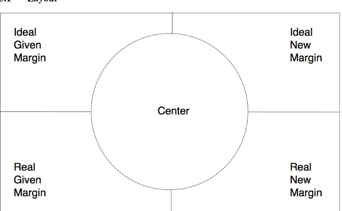
Fig. 1. Semiotics of space used to elicit hypotheses, and to evaluate study results (ac-cording to Kress and van Leeuwen).
• The center would hold important information, the margin the least important in-formation.
• The given information would be on the left of the screen, the new on the right. • The ideal information would be on the upper part of the screen, the real in the
bot-tom.
• The sequence of comic panels follows the reading direction of text.
3.2 Color
Fig. 2. Color palette used in the study.
For testing colors we used a 5-color palette. The supported hypotheses regarding col-ors and color combinations were:
• Users would prefer lighter shades, combination of pastel colors.
3.3 Symbol
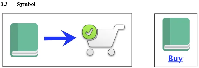
Fig. 3. Variants of icon sets used in the study. Book icon author: Paomedia, License: Creative Commons (Attribution 3.0 Unported); Shopping cart icon author: www.inmotionhosting.com, License: Creative Commons Attribution 3.0 Unported (CC BY 3.0).
For testing symbols we used various examples of existing computer icons, or we cre-ated the examples by ourselves. The supported hypotheses regarding user's prefer-ences for the UI grammar were:
• During Chinese language acquisition in children, verbs are learned first, followed by nouns later.
• There is a close similarity between sequential information structure in language and in visual composition. Verb (downloading) and adverb (speed of download) would mimic their position in sentence. The file is in this case the noun.
• There is a close similarity between sequential information structure in language and in visual composition. Noun (folder) and adjective (star attribute) would mimic their position in sentence (adjective+noun).
• The sequence of input in faceted search would follow the sequence of natural language.
3.4 Look & Feel
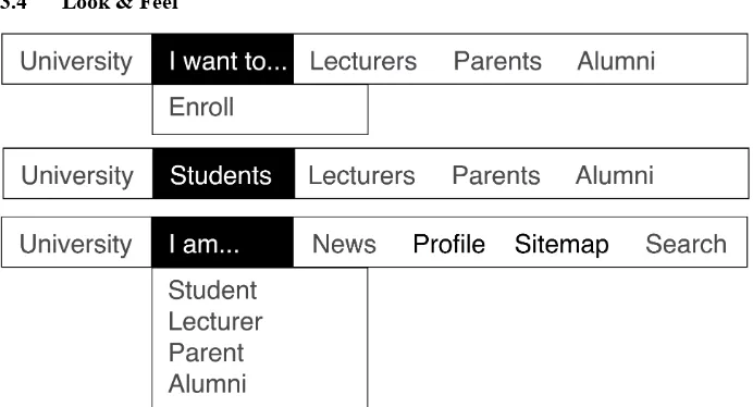
Fig. 4. Three different compositions of menus used in the study. On top a verb-driven menu, in the middle a noun-only menu, on the bottom a role-driven (narrative) menu.
For testing the look and feel we used various examples found in different applica-tions, or we created the examples by ourselves. The supported hypotheses in this sec-tion regarding user’s preference for cartoon imagery, navigasec-tion tools, visible and interaction grammar of menus and commands were:
• Menus starting with a verb are considered more natural than those starting with nouns.
• Menus progressively disclosing a narrative are considered more natural. • Cartoon imagery (little animals) plays an important role in communication.
4
Revisited Guidelines for Chinese UI Design
Layout: Center vs. margin. The most important message to the user should be in the upper-left and middle part of the screen. The least important should be placed in the bottom-right corner. These results confirm the outcome from the pilot study.
Layout: Given vs. new information. Given information should be placed in the up-per-left and left part of the screen, the new information to the right or below from it.
Layout: Ideal vs. real information. The ideal information should be place in the upper part of the screen, the real information in the center of the screen. These results also support the pilot study outcome.
Layout: Focus of attention. Carefully choose the images: they start the visual narra-tion on the screen, followed by titles.
Layout: Expected sequence direction. In a progressively disclosing UI, follow the prevalent reading direction. Expand the options to the right or underneath.
Layout: Originality. For a personal website use a somewhat novel style of design, for a commercial website use rather a somewhat well known style.
Color: Emotions and preference. Adjust the UI color scheme not only for the target culture, but also to the target group of users. The results underlined the importance of the red color in Chinese culture no matter what segmentation we used.
Color: Combinations preference. Background/content (white/blue or black), color pairs for a personal website (blue and yellow), color pairs for a commercial website (black and white, black and blue, blue and white).
Color: Image brightness preference. Use well-adjusted, or somewhat lighter images in the UI. This is one of the question we presented using a different methodology. In contrast with the previous study we let the respondents choose from visible options.
Symbol: Implicit interaction. Build UIs on implicit relationships between com-mands and objects. In the Chinese context users tend to group items according to relations (verbs), rather than categories (nouns).
Symbol: Icon style preference. The icons should be as clear as possible, and when representing an action (command), they should present also the object of the action. The situations depicted in the icons favored mostly female respondents, while males preferred only a textual description of the action.
Symbol: Nouns and adjectives. The icons presenting object attributes should be on the left of the object; as such a placement seems most natural for the users.
Symbol: Length of web pages. When appropriate, use shorter, rather than longer pages on screen. While bandwidth limitations favored longer pages (because of a lower number of requests to a server) during our pilot study in 2011, the quickly im-proving infrastructure allows the designers to focus more on users’ requirements.
Symbol: Trust. Design for the senses when building trust. The UX design should account for the preferences of the target group of users, in order to build trust, and to persuade. Although the senses might have a different importance in terms of trustworthiness in different environment, the leading is sight, followed by touch, and taste. In the media, television still plays a major role in trust. We see trust as a first step towards persuasion.
Symbol: Learning online. When designing an online course, focus on video-recorded lectures, but add also a choice to download the slides, and a possibility to directly engage with the lecturer through videoconference. Differences were found between the sexes; we can assume, that females prefer more direct social interaction (video conference), while males prefer quickly skim and scan the texts.
Symbol: Word order in faceted search. The sequence of input in a faceted search follows the sequence of natural language. The Subject comes first (relating to the user’s gender, or size), followed by an implied Verb and adverb (purpose), and finally the Object (price, color, rating etc.). The results were the same in the pilot study for the first 3 items.
Look and feel: Unfolding a narrative. Construct menus with noun only, as these are clear to the users, and allow for a verb (command) submenu.
Look and feel: User roles. Construct menus that are based on the roles of users. In the case of a university website the students find it much more natural to find the information for them, and to start their interaction with the site from there.
Look and feel: Cartoons in the UI. Present cartoons in the UI while waiting for system processes to finish, which might take some time.
5
Discussion
study, there was a generation change: We worked with students having a different life experience, who were exposed to different social and technological conditions.
As a result, we obtained some new results (also because we introduced explorato-ry questions), and some trends that we would like to investigate further in a future study. As was the case with the pilot study, we plan to run a comparison study with a Western (Czech) population.
We hope our results and proposed design guidelines will help the international HCI design community and they will contribute to a discussion on how to improve cross-cultural research.
6
Acknowledgements
The authors wish to thank for the assistance of the Sino-European Usability Center.
7
References
1. Barber and Badre. Culturability: The merging of culture and usability. Proceedings of the 4th Conference on Human Factors and the Web (1998)
2. Brejcha. Cross-Cultural Human-Computer Interaction and User Experience Design. CRC Press (2015).
3. Creative Research Systems. Sample size calculator. (2012). [last accessed 2015-01-06]. Available from: http://www.surveysystem.com/sscalc.htm.
4. Kress and Van Leeuwen. Reading Images: The Grammar Of Visual Design. Routledge (2006)
5. Marcus and Baradit. Chinese User-Experience Design: An Initial Analysis. HCII 2015 in Los Angeles, Springer (2015)
6. Marcus and Gould. Crosscurrents: cultural dimensions and global Web user-interface de-sign. Interactions (2000)
7. Sheridan. Cross-cultural website design. MultiLingual Computing & Technology (2001) vol. 12 (7) pp. 1-5
8. Smith et al. A process model for developing usable cross-cultural websites. Interacting with Computers (2004) vol. 16 (1) pp. 63-91


