Root Cause
Analysis
Matthew A. Barsalou
CRC Press is an imprint of the
Taylor & Francis Group, an informa business
Boca Raton London New York
A P R O D U C T I V I T Y P R E S S B O O K
Root Cause
Analysis
Matthew A. Barsalou
Boca Raton, FL 33487-2742
© 2015 by Taylor & Francis Group, LLC
CRC Press is an imprint of Taylor & Francis Group, an Informa business
No claim to original U.S. Government works Version Date: 20140624
International Standard Book Number-13: 978-1-4822-5880-6 (eBook - PDF)
This book contains information obtained from authentic and highly regarded sources. Reasonable efforts have been made to publish reliable data and information, but the author and publisher cannot assume responsibility for the validity of all materials or the consequences of their use. The authors and publishers have attempted to trace the copyright holders of all material reproduced in this publication and apologize to copyright holders if permission to publish in this form has not been obtained. If any copyright material has not been acknowledged please write and let us know so we may rectify in any future reprint.
Except as permitted under U.S. Copyright Law, no part of this book may be reprinted, reproduced, transmit-ted, or utilized in any form by any electronic, mechanical, or other means, now known or hereafter inventransmit-ted, including photocopying, microfilming, and recording, or in any information storage or retrieval system, without written permission from the publishers.
For permission to photocopy or use material electronically from this work, please access www.copyright. com (http://www.copyright.com/) or contact the Copyright Clearance Center, Inc. (CCC), 222 Rosewood Drive, Danvers, MA 01923, 978-750-8400. CCC is a not-for-profit organization that provides licenses and registration for a variety of users. For organizations that have been granted a photocopy license by the CCC, a separate system of payment has been arranged.
Trademark Notice: Product or corporate names may be trademarks or registered trademarks, and are used only for identification and explanation without intent to infringe.
To my wife Elsa for her patience while I wrote this book
vii
Contents
Preface ...xi Introduction ... xiii About the Author ...xvii
Section i introduction to Root cause Analysis
chapter 1 The Scientific Method and Root Cause Analysis ... 3
chapter 2 The Classic Seven Quality Tools for Root Cause
Analysis ... 17
chapter 3 The Seven Management Tools ... 27
chapter 4 Other Tools for Root Cause Analysis ... 33
chapter 5 Exploratory Data Analysis and Root Cause Analysis .... 39
chapter 6 Customer Complaint- Related Root Cause Analysis ... 45
chapter 7 Example of a Root Cause Analysis ... 51
Section ii Root cause Analysis Quick Reference
chapter 9 The Science of Root Cause Analysis ... 59
Hypothesis as a Basis for New Knowledge ...59
Key Points ... 60
Scientific Method and Root Cause Analysis ...61
Key Points ...62
Experimentation for Root Cause Analysis ... 64
Key Points ...65
chapter 10 The Classic Seven Quality Tools ... 69
Introduction ...69
Ishikawa Diagram ...69
Key Points ...70
Check Sheet ...71
Check Sheet with Tally Marks ...71
Key Points ...73
Check Sheet with Graphical Representations ...73
Key Points ...74
Run Charts ...75
Key Points ...75
Histogram ...76
Key Points ...76
Pareto Chart ...77
Key Points ...78
Scatter Plot ...79
Key Points ...79
Flowchart ... 80
Key Points ... 80
chapter 11 The Seven Management Tools ... 83
Introduction ...83
Matrix Diagram ...83
Key Points ...83
Activity Network Diagram ... 84
Key Points ...85
Prioritization Matrix ... 86
Contents • ix
Interrelationship Diagram ...87
Key Points ... 88
Tree Diagram ...89
Key Points ...89
Process Decision Tree Chart ... 90
Key Points ... 90
Affinity Diagram ...91
Key Points ...91
chapter 12 Other Quality Tools for Root Cause Analysis ... 93
5 Why ...93
Key Points ...93
Cross Assembling ...94
Key Points ...95
Is- Is Not Analysis ...95
Key Points ... 96
Following Lines of Evidence ...97
Key Points ...97
Parameter Diagram ... 99
Key Points ... 99
Boundary Diagram ... 100
Key Points ...101
chapter 13 Exploratory Data Analysis ... 103
Introduction ...103
Key Points ...103
Procedure ...103
Stem- and- Leaf Plot ...103
Key Points ...104
Box- and- Whisker Plots ...104
Key Points ...105
Multi- Vari Chart ...107
Key Points ...107
chapter 14 Customer Quality Issues ...111
Plan- Do- Check- Act for Immediate Actions ...111
8D Report ...112
Key Points ...113
Corrective Actions ...114
Key Points ...115
References ... 117
Appendix 1: Using the Tool Kit ... 121
xi
Preface
There are many books and articles on Root Cause Analysis (RCA); how-ever, most concentrate on team actions such as brainstorming and using quality tools to discuss the failure under investigation. These may be nec-essary steps during an RCA, but authors often fail to mention the most important member of an RCA team, the failed part. Actually looking at the failed part is a critical part of an RCA, but is seldom mentioned in RCA related literature. The purpose of this book is to provide a guide to empiri-cally investigating quality failures using the scientific method in the form of cycles of Plan-Do-Check-Act (PDCA) supported by the use of quality tools.
This book on RCA contains two sections. The first describes the the-oretical background behind using the scientific management and qual-ity tools for RCA. The first chapter introduces the scientific method and explains its relevance to RCA when combined with PDCA. The next chap-ter describes the classic seven quality tools and this is followed by a chapchap-ter on the seven management tools. Chapter 4 describes other useful quality tools and Chapter 5 explains how Exploratory Data Analysis (EDA) can be used during an RCA. There is also a chapter describing how to handle RCAs resulting from customer quality complaints using an 8D report and a chapter presenting an example of an RCA.
The second section contains step-by-step instructions for applying the principles described in the first section. The tools presented are briefly described, key points are summarized and an example is given to illustrate the concept. This is followed by the procedure for applying the concept. The intent is to make the step-by-step procedure available for less expe-rienced investigators, with the examples being sufficiently clear for more experienced investigators to use as a quick reference.
xiii
Introduction
This guide to root cause analysis (RCA) is intended to provide root cause investigators with a tool kit for the quick and accurate selection of the appropriate tool during a root cause investigation. The handbook consists of two parts. Part 1 provides more detailed information regarding the tools and methods presented here. Part 2 contains less background infor-mation but has step- by- step instructions and is intended for use as a quick reference when a tool is needed.
Root cause analysis is the search for the underlying cause of a quality problem. There is no single RCA method for all situations; however, the RCA should involve empirical methods and the selection of the appropri-ate tools for the problem under investigation. For example, a run chart may be appropriate for investigating a length deviation that sporadically occurs over a longer period of time. A run chart would not be useful if the length deviation is on a unique part. An RCA is performed by a root cause investigator; in manufacturing, this could be a quality engineer, quality manager, or even a well- trained production operator.
For every problem, there is a cause, and RCA tools are used to identify the cause (Doggett, 2005). Most quality problems can be solved using the classic seven quality tools (Borrer, 2009). Typical quality problems include a machined part out of specification or a bracket with insufficient ten-sile strength. The use of quality tools alone to solve a problem may not be sufficient; Bisgaard (1997) recommends the addition of the scientific method when performing RCA. The use of the seven quality tools and the scientific method may not be sufficient for investigating a complex qual-ity problem. ReVelle (2012) warns that “qualqual-ity professionals with only a limited number of tools at their disposal perform the task in a suboptimal way, giving themselves—and the tools they’ve used—a bad name” (p. 49). The scientific method together with the classic seven quality tools and other tools and methods form a complete quality toolbox.
systematic and not random, as in without purpose. That is, the results of each change to the process should be recorded, and the variables affected should be written down so comparisons can be made and conclusions can be drawn. Variables should be controlled to ensure that the changes to the system are not the result of an unknown factor and misattributed to the factor under consideration.
An example of an improper experiment is a hypothetical manufacturing company with a rust problem on the steel tubes the company produces. A quality engineer decides to study the effects of rust on tube diameter by placing samples of various tube sizes in a humidity chamber for a week to simulate aging. The experiment is set to run for six months. Every week the diameter of five randomly selected tubes of the same diameter is recorded, the tubes are wiped down to remove metal chips and are then sprayed with rust inhibitor and placed in the humidity chamber. The samples are checked daily for rust, and the first day a part is observed to have rust is recorded so that at the end of the study the quality engineer can determine if a correlation exists between rust and diameter. At the end of the week, a new set of five tubes of a different diameter is randomly selected, and the process is repeated. It is unknown if there is a correlation between rust and tube diameter, and if there is a correlation, it is expected to be a weak correlation; the negative correlation between rust and rust inhibitor is a known strong correlation. Unfortunately, the rust inhibitor bottle was refilled from a large container in production that was refilled once a week and the ratio of rust inhibitor to water changed daily as the water evapo-rated from the container. The effect of tube diameter on rust was lost in the data because of the stranger, yet uncontrolled, effect of the variations in the strength of the rust inhibitor.
Introduction • xv
There are many tools of varying degrees of usefulness in addition to the classic seven quality tools. Additional quality tools such as 5 Why, cross assembling, is- is not analysis, and matrix diagrams are presented in this book. In addition, an explanation is given regarding how a root cause investigator can successfully follow multiple lines of evidence to arrive at a root cause.
xvii
About the Author
Matthew Barsalou is employed by BorgWarner Turbo Systems Engineering GmbH, where he provides engineering teams with support and training in quality- related tools and methods, including root cause analysis. He has a master of liberal studies from Fort Hays State University and a master of science in business administration and engineering from Wilhelm Büchner Hochschule. His past positions include quality/ laboratory technician, quality engineer, and quality manager.
Matthew Barsalou’s certifications include TÜV quality management representative, quality manager, quality auditor, and ISO/ TS (International Organization for Standardization/ Technical Specification) 16949 quality auditor as well as American Society for Quality certifications as quality tech-nician, quality engineer, and Six Sigma Black Belt.
Section I
3
1
The Scientific Method
and Root Cause Analysis
The textbook explanation of the scientific method is “Collect the facts or data. … Formulate a hypothesis. … Plan and do additional experiments to test the hypothesis. … Modify the hypothesis.” And, an experimenter should consider a hypothesis to be a “tentative explanation of certain facts” and must remember that a “well- established hypothesis is called a theory or a model” (Hein and Arena, 2000). This textbook example of the scientific method is correct, but too oversimplified for use in root cause analysis (RCA).
Before going into detail regarding the scientific method, there are terms used in the scientific method that may require clarification so that their exact meanings are easily understood. One important term is hypothesis. A hypothesis “is a postulated principle or state of affairs which is assumed in order to account for a collection of facts” (Tramel, 2006, p. 21). The word theory is often used colloquially to mean hypothesis; however, hypothesis should not be used interchangeably with the word theory; a hypothesis is preliminary and more tentative than a theory.
The five virtues of a hypothesis are no guarantee that a hypothesis will be correct; however, conformity to the virtues increases the chance that a hypothesis will be correct and can help in choosing between two hypoth-eses. There is a greater chance of a hypothesis being incorrect if it requires complicated lines of reasoning and makes many complex assumptions. The first virtues are along the same lines as Occam’s razor, which is a prin-ciple that “urges us when faced with two hypotheses that explain that the data equally well to choose the simpler” (Sagan, 1996, p. 211) hypothesis.
The final virtue is much like Popper’s falsification: A hypothesis must be falsifiable or it is not scientific; it is not possible to truly prove something because contrary evidence could always be discovered at a later time. An experimenter should not consider the results of an experiment as conclusive evidence but rather as tentative. However, the more robust the testing is, the higher the degree of corroboration will be (Popper, 2007). An experimenter who only performs one simple experiment has a lower degree of corrobo-ration than an experimenter who rigorously tests his or her hypothesis. For example, a hypothetical experimenter suspects that tube diameter cor-relates with rust on a steel tube. The experimenter places a 20-mm diam-eter tube and an 80-mm diamdiam-eter tube in an environmental chamber and checks for rust every day until the fourth day of the experiment, when the smaller tube is found to be rusty. Such an experiment would result in a low degree of corroboration. A more robust experiment would involve control-ling the variables, random sampcontrol-ling for sample collection, more samples during each experimental run, and repeated test runs. This would result in a higher degree of collaboration, and the experimenter can be more confi-dent of the accuracy of the results.
Two other important terms are dependent and independent vari-able. The dependent variable is the result or outcome of the experiment, and the independent variable is an “aspect of an experimental situation manipulated or varied by the researcher” (Wade and Travis, 1996, p. 60). The dependent variable is also known as the response variable. The inde-pendent variable in the rust study experiment is the tube diameter; the experimenter varied the tube diameter to see what affect it had on the final outcome, which was the dependent variable. The independent variables “are also called the treatment, manipulated antecedent, or predictor vari-ables” (Creswell, 2003, p. 94).
The Scientific Method and Root Cause Analysis • 5
the rust study is rust on the tubes, and the experimental run is the experi-ment in which a sample tube is wiped down, coated in rust inhibitor, and placed into a humidity chamber.
A factor is “a process condition that significantly affects or controls the process output, such as temperature, pressure, type of raw material, concentration of active ingredient” (Del Vecchio, 1997, pp. 158–159). The treatment variable is one factor; another type of factor is the confounding variable. The confounding variable “is not actually measured or observed in a study,” and “its influence cannot be directly detected in a study” (Creswell, 2003) Uncontrollable factors such as the confounding variable are referred to as noise (Montgomery, 1997) The effects of the noise being mixed into the results is referred to as confounding (Gryna, 2001). The effects of confounding can be lessened by the use of blocking, which is “a technique used to increase the precision of any experiment” (Montgomery, 1997, p. 13) by mixing the confounding factors across all experimental sets to ensure that although the effects cannot be eliminated, they will have less impact by being more evenly spread across the experimental results.
An example of noise in the rust study was the rust inhibitor; the rust inhibitor had a great deal of influence on the formation of rust but was not applied in consistent quantities because the rust inhibitor used was col-lected at different times and had varying degrees of rust inhibitor con-centration in the mixture. Blocking is an option that could be used if the concentration in the rust inhibitor mixture could not be controlled. The experimenter could have used sample tubes with different diameters instead of using sample tubes of the same diameter each week. This way, the effect of the variation in the rust inhibitor would have been spread across the samples and stronger or weaker concentrations of rust inhibitor would equally affect all tube diameter sizes.
Such random factors could be canceled out by randomization. Replication of the experiment would have shown the variation in the results; to be accurate and precise, the results should be consistent with each other.
The precision of measurement results is the closeness of each result to each other. Also related to precision is accuracy, which is the closeness of the measurement results to the true value of what is being measured (Griffith, 2003). Juran and Gryna (1980) illustrate the difference between accuracy and precision using targets. The hits clustered closely together but away from the center are precise but not accurate. The hits that are scattered around the center of the target are accurate but not precise. Only the hits clustered close together and at the center of the target are both accurate and precise. Figure 1.1 graphically depicts the difference between precision and accuracy.
Ideally, the measurements taken after an experiment will be both pre-cise and accurate. The experimenters in the rust study did not properly control their variables. This problem could have been avoided by ensur-ing that a consistent amount of rust inhibitor was in the mixture used or blocking was used to lessen the effects of the variation on the precision and accuracy of the results.
To fully use the scientific method, an understanding of deduction and induction is necessary. Deduction is a “process of reasoning in which a conclusion is drawn from a set of premises … usually … in cases in which the conclusion is supposed to follow from the premise,” and induction is “any process of reasoning that takes us from empirical premises to empir-ical conclusions supported by the premises” (Blackburn, 2005, p. 90). Deduction “goes from the general to … the particular” and induction goes “from the particular to the general” (Russell, 1999, p. 55). Deduction uses logical connections, such as, “A red warning light on a machine indicates a problem; therefore, a machine with a red warning light has a problem.”
Accuracy Precision Precision and accuracy
FIGURE 1.1
The Scientific Method and Root Cause Analysis • 7
Deduction moves from generalities to specifics and uses what is known to reach conclusions or form hypotheses. Induction goes from specif-ics to generalities and uses observations to form a tentative hypothesis. Induction uses observations such as, “Every machine with a red light has a problem; therefore, the machine I observed with a red light must have a problem.”
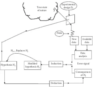
Box, Hunter, and Hunter (2005) explain that deduction is used to move from the first hypothesis to results that can be compared against data; if the data and expected results do not agree, induction is used to modify the hypothesis. This “iterative inductive- deductive process” (Box, Hunter, and Hunter, 2005) is iterative; that is, it is repeated in cycles as shown in Figure 1.2.
The iterative inductive- deductive process is used together with experi-mentation during RCA. Each iteration or repetition of the inductive- deductive process should provide new data that can be used to refine the hypothesis or to create a new hypothesis that fits the new data. Each itera-tion should bring the root cause investigator closer to the root cause, even if a hypothesis must be completely discarded. The investigator can use the negative information to tentatively exclude possible root causes. Using the iterative inductive- deductive process with experimentation can pro-vide a glimpse of the “true state of nature” (Box, 1976) (Figure 1.3).
There are many elements that are essential for the proper use of the sci-entific method. For example, controls are needed to ensure that the result-ing response variable is the result of the influence of the treatment variable (Valiela, 2009). Controlling the variables helps to separate the influences of noise from the influence of the treatment variable on the response
D I
variable. In the rust study example, the treatment variable rust inhibitor was not properly controlled; various concentrations of rust inhibitor were unknowingly used, and the results of the study were masked by the varia-tion in the rust inhibitor.
Feynman (1988) points out the need for objectivity in using the scientific method. He warns experimenters to be careful of preferring one result more than another and uses the example of dirt falling into an experi-ment to illustrate this hazard; the experiexperi-menter should not just accept the results that he or she likes and ignore the others. The favorite results may just be the result of the dirt falling into the experiment and not the true results of the experiment. In such a situation, the results without the con-taminating dirt were discarded because they were not what the experi-menter wanted to see. Objectivity is essential for achieving experimental results that truly reflect reality and not the wishes of the experimenter.
Deduction
The Scientific Method and Root Cause Analysis • 9
To help achieve objectivity, an experimenter can use blinding so that the experimenter does not know which results correspond to which variables (Wade and Travis, 1996). An experimenter may not consciously be biased but may still show an unconscious tendency to favor results that confirm what was already suspected. A simple method of blinding is to evaluate the results of an experiment without knowing if the results are for the control or the factor under consideration. An experimenter can also use blinding when checking measurement data by having the checks performed by a second person who does not know what to expect.
Also needed in using the scientific method are operational definitions. Operational definitions are clear descriptions of the terms that are used (Valiela, 2009). Doctor W. Edwards Deming, who has been referred to as the “Man Who Discovered Quality” (Gabor, 1990), explains that opera-tional definitions are needed because vague words such as bad or square fail to express sufficient meaning; operational definitions should be such that all people who use them can understand clearly what is intended. Deming uses the example of a requirement for a blanket to be made of 50% wool. Without an operational definition, one- half may be 100% cot-ton and the other half 100% wool; an operational definition would include a method of establishing the exact meaning of 50% wool. Deming’s (1989) operational definition for 50% wool is to specify the number of uniform test samples to be cut from a blanket and the exact method of testing to determine the amount of wool in the samples of the blanket. An opera-tional definition for the rust inhibitor used in the rust study would be, “The rust inhibitor solution must contain between 66% and 68% rust inhibitor, with the remainder of the solution being water.” Operational definitions bring clarity to what is being described and help to eliminate confusion.
The scientific method is empirical; that is, it is based on observation and evidence. However, Tramel (2006) sees the scientific method as containing both empirical and conceptual elements. A hypothesis is formed by the empirical element, observing data. The next steps are conceptual: Analyze the data and then form a hypothesis. The following steps are conceptual elements of testing the hypothesis; assume the hypothesis is true so it can be tested and then deduce the expected results based on the hypothesis. The final element is an empirical observation in which the results of the test are compared against the expected results based on the hypothesis.
can be collected, although de Groot acknowledges that an investigator may have a preconceived notion of what the hypothesis will be. Induction is then used to form a hypothesis based on the data at hand. Deduction is used when the hypothesis makes a prediction that would then be tested empirically and the results evaluated and the hypothesis modified or replaced with a new one if necessary.
In using the scientific method, Platt (1964) recommends forming multi-ple hypotheses, performing preliminary experiments to determine which hypothesis should be excluded, performing another experiment to evalu-ate the remaining hypothesis, and then modifying hypotheses and repeat-ing the process if necessary. If there are insufficient data to form a plausible hypothesis, a root cause investigator could perform exploratory investiga-tions to gather data. An exploratory investigation is less structured than the formal scientific method; however, it should not be confused with searching for data in a true haphazard way (de Groot, 1969). During an exploratory investigation, the root cause investigator forms many hypoth-eses and tries to reject them or hold them for more structured testing at a later time. An exploratory investigation is part of data gathering and is not the search for the final root cause.
Once sufficient data are gathered, a hypothesis should be generated and tested; the hypothesis must be capable of predicting the results of the test, or it should be rejected because, “If one knows something to be true, he is in a position to predict; where prediction is impossible, there is no knowl-edge” (de Groot, 1969, p. 20). The power to predict is the true test of a hypothesis. Medawar (1990) tells us a scientist “must be resolutely critical, seeking reasons to disbelieve hypotheses, perhaps especially those which he has thought of himself and thinks rather brilliant” (p. 85); the same can be said for a root cause investigator. It is acceptable to begin an RCA with a preconceived notion regarding what the root cause is; however, pre-conceived notions should be based on some form of data because “it is a capital mistake to theorize before one has data. Insensibly one begins to twist facts to suit theories, instead of theories to suit facts” (Doyle, 1994, p. 7). The investigator must be absolutely sure to follow the evidence and not an opinion. Blinding could be useful here to guard against the hazards of a pet hypothesis.
The Scientific Method and Root Cause Analysis • 11
Shewhart cycle because it was originally based on a concept developed by Walter A. Shewhart in the 1930s. Deming taught it to the Japanese in the 1950s, and the concept became known as the Deming cycle (Deming, 1989; Figure 1.4). The PDCA cycle was improved in Japan and began to be used for contributions to quality improvements; it is unclear who made the changes, although it may have been Karou Ishikawa (Kolesar, 1994). By the 1990s, Deming had renamed PDCA as Plan- Do- Study- Act (PDSA) (Deming, 1994) although the name PDCA still remains in use. The Deming cycle can be viewed in Figure 1.4.
The PDCA concept is known in industry; therefore, it can be used in industry without introducing a completely new concept. It can also be com-bined with the scientific method and the iterative inductive- deductive pro-cess to offer an RCA methodology for opening the window into the true state of nature, also known as finding the root cause. The PDCA cycle has the additional advantage that it can be used for the implementation of corrective actions and quality improvements after a root cause has been identified. Kaizen, also known as continuous improvement, frequently uses the PDCA cycle (Imai, 1986).
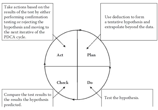
The first iterative of the PDCA cycle should consist of making observa-tions (Figure 1.5). This could mean collecting new data or using what is already known if sufficient information is available. The observations are to be used with deduction to go from a tentative hypothesis that extrap-olates beyond the data. The hypothesis is then tested. This could be as complicated as an experiment in a laboratory or as simple as observing a defective component. The complexity level should be determined by the problem under investigation. The test results are compared against the hypothesis and actions are taken based on the results. A more elaborate confirmation test may be required if the test failed to refute the
tenta-Act
Check
Plan
Do
FIGURE 1.4
tive hypothesis. The next iterative of the PDCA process is required if the hypothesis is rejected.
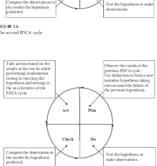
The next PDCA iterative uses induction to form a new or modified hypothesis based on the test results of the previous iterative. The hypoth-esis is then tested, and the test results are compared against the predicted results; this PDCA cycle is shown in Figure 1.6. Confirmation testing is performed if the hypothesis is not refuted, and the next PDCA cycle starts if the hypothesis is refuted.
Deduction is used to form a new or modified hypothesis, taking into consideration the failure of the previous hypothesis. The new or modified hypothesis is then tested and the results are compared against the predic-tions made by the hypothesis as displayed in Figure 1.7. Confirmation test-ing or a new PDCA cycle is then required.
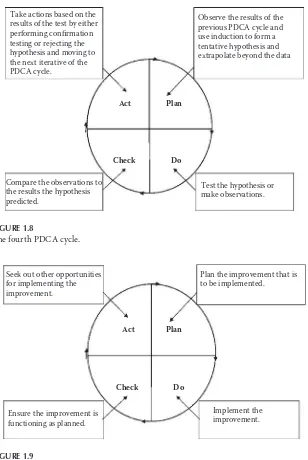
The next PDCA cycle, as depicted in Figure 1.8, uses inductive reasoning and the results of the previous cycle to form a new or modified tentative hypothesis. The cycle then continues and is followed by new iterations of the PDCA cycle until a root cause is identified and confirmed. Confirmation is essential to ensure that resources are not wasted on implementing a cor-rective action that will not eliminate the problem. Identification of the wrong root cause also leads to the potential for a false sense of security because of the incorrect belief that the problem has been solved.
Act Take actions based on the results of the test by either performing confirmation testing or rejecting the hypothesis and moving to the next iterative of the PDCA cycle.
Make observations.
Test the hypothesis. Compare the test results to
The Scientific Method and Root Cause Analysis • 13
Act Take actions based on the
results of the test by either performing confirmation testing or rejecting the hypothesis and moving to the next iterative of the PDCA cycle.
Observe the results of the previous PDCA cycle.
Test the hypothesis or make observations.
Compare the observations to the results the hypothesis predicted.
Use induction to form a tentative hypothesis and Take actions based on the
results of the test by either performing confirmation testing or rejecting the hypothesis and moving to the next iterative of the PDCA cycle.
Corrective and improvement actions can and should be based on PDCA, as shown in Figure 1.9. The improvement needs to be planned and then implemented. After implementation, the effectiveness of the improve-ment needs to be verified. An improveimprove-ment that was successful during a small trial could have unintended consequences during mass production.
Act Take actions based on the
results of the test by either performing confirmation testing or rejecting the hypothesis and moving to the next iterative of the PDCA cycle.
Observe the results of the previous PDCA cycle and use induction to form a tentative hypothesis and
Plan the improvement that is to be implemented.
FIGURE 1.9
The Scientific Method and Root Cause Analysis • 15
Opportunities should be sought for implementing a successful improve-ment in other locations or on other products, particularly if the same prob-lem has the potential to occur somewhere else. The absence of a probprob-lem in other locations where it could occur may not be a sign that the problem is not there; rather, it could mean that the problem was undetected or has not occurred yet.
The iterations of the PDCA cycle should be used in such a way that the process fits the problem under investigation. For example, a sporadic prob-lem with a continuous process would not be treated exactly the same as the RCA of an individual failed part that has been returned from a customer. For the former, a larger interdepartmental team and a formal structure would be advantageous. For the latter, a single root cause investigator may go though many quick iterations of the process while observing, measur-ing, and otherwise evaluating the failed part, ideally with the support of those who have the required technical or process knowledge.
17
2
The Classic Seven Quality Tools
for Root Cause Analysis
The classic seven quality tools were originally published as articles in the late 1960s in the Japanese quality circle magazine Quality Control for the Foreman. Around that time, most Japanese books on quality were too complicated for factory foremen and production workers, so Kaoru Ishikawa used the articles from Quality Control for the Foreman as a basis for the original 1968 version of Guide to Quality Control. The book was frequently used as a textbook for tools in quality (Ishikawa, 1991).
The seven tools as defined by the American Society for Quality are the flowchart for graphically depicting a process, Pareto charts for identifying the largest frequency in a set of data, Ishikawa diagrams for graphically depicting causes related to an effect, run charts for displaying occurrences over time, check sheets for totaling count data that can later be analyzed, scatter diagrams for visualizing the relationship between variables, and histograms for depicting the frequency of occurrences (Borror, 2009). These tools should be a staple in the tool kit of any root cause investigator. Although often used by quality engineers, the tools are simple enough to be effectively used by production personnel, such as machine operators.
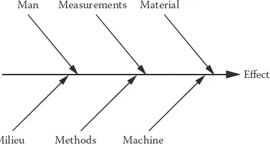
The Ishikawa diagram was originally created by Kaoru Ishikawa, who used it to depict the causes that lead to an effect. Ishikawa originally called it a cause- and- effect diagram. Joseph Juran used the name Ishikawa dia-gram in his 1962 book Quality Control Handbook, and now the Ishikawa diagram is also known as fish- bone diagram because of its resemblance to a fish bone (Ishikawa, 1985). It is sometimes also called a cause- and- effect diagram.
to the left side of the diagram. These lines are typically labeled with the potential factors. Many, but not all, authors attempt to list the factors as the six Ms: man, material, milieu, methods, machine, and measure-ment. Griffith (2003, p. 28) recommends using the six factors: “1. People. 2. Methods. 3. Materials. 4. Machines. 5. Measurements. 6. Environment.” People can be an influence factor because of their level of training, failure to adhere to work instructions, or fatigue. Methods such as the way in which a part is assembled may be inappropriate or a work instruction may not be clear enough. Materials can be an influence for many reasons, such as being the wrong dimension or having some other defect. Machines may be worn or not properly maintained. Measurement errors could result from either a problem with the measuring device or improper use by an operator. The environment may be an influence because of the distrac-tions of extreme temperature or loud noise (Griffith, 2003). Each of the angled lines has a horizontal line labeled with the influences on each fac-tor. For example, measurement could be affected by the calibration of the measuring device and the accuracy of the device.
Borror (2009) demonstrates an Ishikawa diagram using safety discrep-ancies on a bus as the effect; the causes are materials, methods, people, environment, and equipment. Borror lists road surfaces and driving con-ditions as two causes under environment. Road surfaces have two subcate-gories: dirt and pavement. An Ishikawa diagram is provided in Figure 2.1. An Ishikawa diagram can be subjective and limited by the knowledge and experience of the quality engineer who is creating it. This weakness can be compensated for by the use of a team when creating an Ishikawa diagram. The Ishikawa diagram may not lead directly to a root cause; however, it could be effective in identifying potential factors for fur-ther investigation.
Milieu Methods Machine
Man Measurements Material
Effect
FIGURE 2.1
The Classic Seven Quality Tools for Root Cause Analysis • 19
Another of Ishikawa’s tools is the check sheet. A check sheet can be used for multiple reasons, for example, to collect data on types of defects, defect locations, causes of defects, or other uses as deemed appropriate (Ishikawa, 1991). Griffith (2003) uses failure types for an example of a check sheet. The example uses defect, count, and total as the column headings, and the types of defects are listed under the defect heading. In the count cat-egory, tally marks are used to indicate the number of occurrences of each defect. The total number of each defect type is then entered in the total column. Check sheets can be used for data collection.
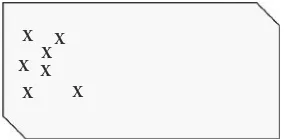
For example, the data collected by a check sheet could be used for the prioritization of a root cause investigation; it may be better to seek the root cause of an occurrence that happened 25 times before investigating the root cause of an event with only 1 occurrence. Naturally, common sense must be applied so that a high occurrence minor failure is not investigated instead of a one- time occurrence that could put people in danger, such as a faulty brake system in an automobile or a faulty shutoff switch on an indus-trial press. A check sheet used for types of failures is shown in Figure 2.2.
Check sheets can also be used for collecting data on the location of a failure. Ishikawa (1991) demonstrates the use of a check sheet for a defect location using a problem with bubbles in the laminated glass that is to be used for automotive windshields. The problem location was narrowed down by identifying the location of the defects on a schematic representa-tion of a windshield. Using this informarepresenta-tion, the root cause investigator was able to localize the problem and found the root cause to be a lack of pressure during lamination in the affected area. Such a graphic check sheet used for scratches on a side panel is shown in Figure 2.3. In this example, it is obvious the problem is only occurring in one area of the side panel.
Failure Number of Occurrences Total
Part missing //// //// // 12
Scratches //// //// //// //// / 21
Dimensional problem //// //// 10
Wrong part //// //// / 11
Improper assembly //// /// 8
Assembly problems //// / 6
Total 68
FIGURE 2.2
More than one of the seven classic quality tools can be used to assess the same data. For example, data from check sheets can be analyzed using run charts. To do this, however, the time of data collection must be recorded in the check sheet. Run charts are much like statistical process control (SPC) but without the calculated control limits used in SPC.
Run charts are used for monitoring process performance “over time to detect trends, shifts, or cycles” as well as allowing “a team to compare a performance measure before and after implementation of a solution” (Sheehy et al., 2002). To construct a run chart, an x axis and y axis must be drawn. The x axis is used to indicate time, which increases from left to right. The units can be defined as needed; for example, the units could be hours, days, or production shifts. The y axis is where the measure-ment results are placed; these can be actual measuremeasure-ments arranged from lowest to highest or the number of occurrences. A run chart is shown in Figure 2.4.
A quality manager may use a check sheet to collect data on defective parts being produced by several production machines. After two weeks of pro-duction, a run chart could be used to view the results. The run chart would be drawn and the data plotted. The quality manager should then observe
X X
X X X
X X
FIGURE 2.3
Check sheet for location.
Time or run order
Measurement
FIGURE 2.4
The Classic Seven Quality Tools for Root Cause Analysis • 21
the data and look for patterns or trends. It may also be advantageous to use “stratification” (Stockhoff, 1988, p. 565). Stratification involves separating the data; for example, instead of plotting the total number of defective parts per shift for all three production machines, a quality manager plots the individual results of the machines separately. By using stratification, the quality manager may notice that the majority of the defective parts were produced by only one machine.
Another method for displaying and analyzing data is the histogram. A histogram is used to graphically depict frequency distributions; a fre-quency distribution is the ordered rate of occurrence of a value in a data set. Histograms depict the shape of a data set’s distribution and as such can be used to compare the results of two different processes (Tague, 2005). To construct a histogram, an x axis and y axis are used. The x axis is the unit under consideration, such as defects, days between failures, or individual measurements or occurrences, such as production stops. The y axis is the number of occurrences, as shown in Figure 2.5.
The shape of the histogram should be observed. A statistically normal distribution should present a bell- shaped curve that rises and then peaks in the middle before descending; the results should be evenly spread about the average. A skewed histogram has a peak that is on one side or the other; a histogram would be skewed if it depicted the number of days for a repair job and most repair jobs only took a few days with a minority of repair jobs taking up to nine days.
25
20
15
10
Occurrences
5
0
40 41 42 43 44 46 47
Measurements in mm
48 49 50 51 52 53
FIGURE 2.5
Stratification should also be considered when using histograms. Ishikawa (1991) recounts a situation in which a histogram created to show the hardness of sheet metal had a normal distribution. Sheet metal supplied to the company by a parent company was often wrinkled and cracked. The company created two histograms on discovering that the sheet metal originally came from two different subsuppliers. One sub supplier sup-plied parts that where skewed to the left, and the other supplier supsup-plied parts that where skewed to the right; the true distribution was masked by the mixing of the parts.
The same data that was used in a run chart or histogram can be used in a Pareto chart. A Pareto chart is used to prioritize by separating “contributing effects into the ‘vital few’ and the ‘useful many’” (Stockhoff, 1988, p. 565). The Pareto chart is based on the Pareto principle: 80% of effects are the results of 20% of causes. This is not a rule that holds true 100% of the time; however, it holds true often enough to be useful and should be considered.
The Pareto principle was created and misnamed by Joseph Juran, who first observed during the 1920s that only a few defects accounted for most defects in a list. Vilfredo Pareto had originally noticed that there was an uneven distribution of wealth, with 80% of all wealth in Italy owned by only 20% of the people. Juran named his concept the Pareto principle, but later believed it had been misnamed because Vilfredo Pareto was only referring to the distribution of wealth. Juran also came up with the con-cept of the vital few and trivial many to label the 20% of causes and 80% of causes, respectively (Juran, 2005). Juran later realized that the trivial many may also be important; therefore, he renamed the trivial many the “useful many” (Sandholm, 2005, p. 72).
A Pareto chart can be used for many things, for example, defect by types, failures by machine, customer complaints by customer, or failures by costs. The factors under consideration are listed on a horizontal line, starting from the most to the least. The vertical line on the left side is used to indicate the number of occurrences or units of each factor. The hori-zontal line on the right side is used to indicate cumulative percentage. The percentage for each factor is calculated and then added in a cumulative line running across the chart from left to right.
The Classic Seven Quality Tools for Root Cause Analysis • 23
only account for 25% of sales. The Pareto chart could also have been made for defect types or products experiencing failures.
A Pareto chart is an effective tool for determining which quality prob-lem should be addressed first. Generally, either the most common failure or the most costly failure should be addressed first. It may be advanta-geous to use more than one Pareto chart: one for failure types and one for failure costs. It may be better to address a lower number of failures in an expensive system before a higher number of failures in a simple, low- cost part. Regardless of what the Pareto analysis indicates, safety issues should be addressed first. Sound engineering and economic judgment should be applied when using the Pareto chart.
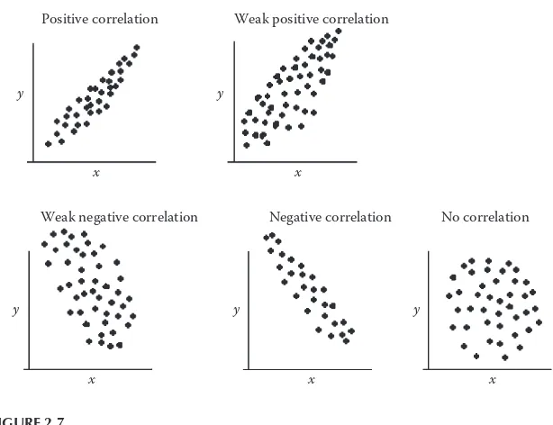
Another method for visualizing factors is the scatter plot. Scatter plots use paired data comparisons; a treatment variable is plotted on an x axis, and a response variable is plotted on the y axis. Scatter plots are used to look for a potential correlation between the variables; that is, a change in one variable results in a change in the other variable. For example, a rela-tionship may be suspected between oil pressure and a response variable, so an investigator performs 15 trials and plots the results in a scatter plot. The investigator observes an increase in the oil pressure that corresponds to an increase in response variable, which indicates a correlation may be present. A correlation in a scatter plot is not conclusive evidence of a cor-relation; the two variables may be moving together in response to a third, unknown, variable (Palady and Snabb, 2000).
Occurrences
Subject being Evaluated 0% 20% 40% 60%
Cumulative %
80% 100%
FIGURE 2.6
An investigator using scatter plots should look for patterns in the points that are plotted in the scatter plot. Points moving upward and to the right may indicate a positive correlation. The indication for a correlation is stronger if an imaginary line is drawn though the center of the cluster of points and the points are close to the line. A high degree of disper-sion indicates less chance of a correlation. A negative correlation is like a positive correlation, but going from the upper left side of the scatter plot and moving down toward the lower right side. The data points scattered randomly about the graph are an indication that no correlation is present (Ishikawa, 1991).
A scatter plot can be used for exploring preliminary data or testing a hypothesis that there is a relationship between the variables. A scatter dia-gram is shown in Figure 2.7. It should be noted that a strong correlation does not necessarily mean that one factor is causing the other. Box and colleagues tell of a strong correlation between the population of the city of Oldenburg and the local stork population over a period of seven years (Box, Hunter, and Hunter, 2005). It may be erroneous to conclude there is a relationship between people and storks.
y y
x x
Weak positive correlation
Weak negative correlation Positive correlation
Negative correlation No correlation
x x
y y
x y
FIGURE 2.7
The Classic Seven Quality Tools for Root Cause Analysis • 25
A flowchart is used to understand a process (Figure 2.8), unlike the scat-ter plot and Pareto chart, which are used for data analysis. Also unlike the other classic seven quality tools, the flowchart was not a part of Ishikawa’s Guide to Quality Control. Regardless of its origins, a flowchart is a useful tool for root cause analysis. A root cause investigator can use a flowchart to map a process and thereby gain a better understanding of the factors relating to the process. For instance, a root cause investigator searching for the root cause of sporadic defective parts from a production machine may create a flowchart of the manufacturing process from the input of the raw material to the completion of the finished parts. The factors listed in the flowchart could then be used for an Ishikawa diagram and then analyzed in detail. A flowchart is particularly useful for process- related failures, such as when a quality manager must determine the root cause for orders being improperly entered into an enterprise resource planning (ERP) system.
A flowchart uses symbols to represent the flow of a process, including activities and decision points in a process. Typically, an oval is used for the start or end of a process, and a diamond is used to symbolize a yes or no decision point. Boxes or rectangles are used to represent the individ-ual activities in a process. Lines with arrows depict the flow of a process. Occasionally, a flowchart may be too long for the paper it is drawn on, so a letter within a circle is used to indicate a break in the flowchart (Brassard and Ritter, 2010). A flowchart can be used for understanding the steps in a manufacturing process.
There is no one correct order for using the classic seven quality tools, and a simple root cause analysis may not require the use of any of the classic seven quality tools. On the other hand, a complex problem may require the use of multiple quality tools to find the root cause. A quality
Receive
Ship? Yes customerSend to
FIGURE 2.8
27
3
The Seven Management Tools
The seven management and planning tools were the result of operations research in Japan; in the 1970s, the tools were collected and published in one book that was translated into English in the 1980s (Brassard, 1996). The tools can be used to encourage innovation, facilitate communication, and help in planning (Duffy et al., 2012). These are not tools that should be used by one person alone; the great advantage in using these tools comes from using a team approach.
Although these tools are intended for management and planning, they can still be applied during a root cause analysis or when contemplating corrective actions after the root cause has been identified. The tools can be used to graphically illustrate a concept, which makes the concept easier for a team to discuss because all team members can see the ideas being presented. The seven management tools can also be used for the evalu-ation of potential improvement actions. These tools are no substitute for empirical methods; however, they can be useful in supporting an empiri-cal investigation.
One of the seven management tools is the matrix diagram. There are many types of matrices used for studying the linkage between causes and effects, such as the roof- shaped, L- shaped, Y- shaped, T- shaped, and X- shaped (Wilson, Dell, and Anderson, 1993). The matrix shown in Figure 3.1 is L shaped; it is a simple matrix consisting of one variable listed in the first vertical column on the left and a second variable listed in the top horizontal row. Generally, more than just two variables are used.
by listing the characteristic measured in the vertical column and the item measured in the horizontal row. The measurement results would be recorded in the corresponding cells where the measurement characteristic and the measured item meet.
An activity network diagram is much like a PERT (program evaluation review technique) chart, which is used to identify the time required to complete a project (Benbow and Kubiak, 2009) or process (Figure 3.2). This tool can establish the critical path and the tasks that must be per-formed in a specific order and determine how long a process or project will take. Starting actions on the critical path later than necessary could delay a project; early identification of the critical path can ensure that the tasks on the critical path are known and can be started before tasks that are less critical to the time required to complete the project.
Process G Process H
Process E Process F Finished
Process D Start
1.5 hours 4 hours 1 hours
2 hours
2 hours 3 hours
3 hours 2.5 hours
Process B Process C Process A
FIGURE 3.2
Activity network diagram.
Factor 2
F
ac
tor 1
FIGURE 3.1
The Seven Management Tools • 29
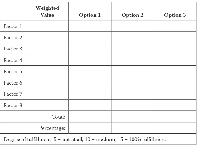
A prioritization matrix is used to quantify and determine priorities for items (Breyfogle, 2003), such as possible solutions to a problem (Figure 3.3). The options are compared in a table, and factors are given weighted values; this is especially useful if the potential solutions fulfill requirements to different degrees. Using a prioritization matrix helps avoid the selection of a solution that meets all requirements but not well.
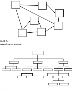
Interrelationship diagrams (Figure 3.4) use arrows to show relation-ships, such as the inputs, outputs, and interconnections among processes (Dias and Saraiva, 2004). This tool can be used to show the relationship between causes and effects and may be particularly useful when evaluat-ing service- related failures involvevaluat-ing multiple difficult- to- quantify factors. Arrows are used to show the direction of influences, and one item may influence many other items or be influenced by many other items.
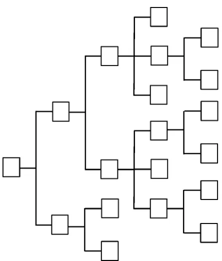
Tree diagrams (Figure 3.5) use a structure with broader categories on top and break them down into details at the lower levels (Liu, 2013). For root cause analysis, the failure under investigation should be listed on top of the tree diagram. The potential causes of the failure are then listed beneath the first failure. A tree diagram can be used to visualize the many
Weighted
Value Option 1 Option 2 Option 3
Factor 1
Factor 2
Factor 3
Factor 4
Factor 5
Factor 6
Factor 7
Factor 8
Total:
Percentage:
Degree of fulfillment: 5 = not at all, 10 = medium, 15 = 100% fulfillment.
FIGURE 3.3
potential failures that led to a final failure; however, the failures identified should still be empirically investigated.
A process decision tree (Figure 3.6) is used when there are many possible solutions to a problem and the best possible solution needs to be selected (Levesque and Walker, 2007). The subject under consideration is listed on the left side of a tree structure, and potential solutions are listed to the right. These solutions may entail potential problems; if so, the problems are listed further to the right. This tool can also be useful when consider-ing multiple improvements, such as when tryconsider-ing to improve a process.
FIGURE 3.5
Tree diagram.
FIGURE 3.4
The Seven Management Tools • 31
Affinity diagrams (Figure 3.7) group many items in categories, which makes them easier to comprehend (Liu, 2013). Tague (2005) recommends using affinity diagrams when there are many unordered facts, the issue is complex, and a group must reach an agreement, such as when brainstorm-ing. Ideas, such as potential causes or a problem, are written on cards, and then the cards are organized into categories.
FIGURE 3.6
Idea
Category label Category label
Category label Category label
Category label Category label
Idea
Idea Idea
Idea Idea
Idea Idea
Idea Idea Idea
Idea Idea
Idea Idea
Idea Idea
Idea Idea
Idea Idea Idea
Idea Idea Idea
Idea
Idea
Idea Idea Idea
FIGURE 3.7
33
4
Other Tools for Root Cause Analysis
The classic seven quality tools and the seven management tools are not the only quality tools available to a root cause investigator. Other quality tools may be of great use in assisting a root cause investigator. One simple con-cept that should be used during any root cause analysis is asking “why” five times. Without asking why more than once, there is a danger that the root cause that has been identified is a contributor to the failure under investigation, but not the true underlying root cause. This could lead to misdirected corrective actions and a recurrence of the failure.
Each failure may have more than one root cause that contributed to the failure. The root cause closest to the occurrence can be labeled the proximate cause (Dekker, 2011). The root cause that resulted in the prox-imate cause or the chain of events that led to a proxprox-imate cause is the ultimate root cause. Using the 5 Why method can lead from the obvious proximate cause to the ultimate cause.
Taiichi Ohno considers repeatedly asking why to be the scientific approach on which the Toyota production system is based. Repeatedly asking why prevents focusing on obvious symptoms while ignoring the true root cause. Ohno presents the following example of the use of 5 Why (1988, p. 17):
1. Why did the machine stop?
There was an overload, and the fuse blew. 2. Why was there an overload?
The bearing was not sufficiently lubricated. 3. Why was it not lubricated sufficiently?
The lubrication pump was not pumping sufficiently. 4. Why was it not pumping sufficiently?
The shaft of the pump was worn and rattling. 5. Why was the shaft worn out?
A root cause investigator who is analyzing the machine stoppage pre-sented in Ohno’s example would be mistaken if he or she simply replaced the blown fuse; the failure would occur again. Even lubricating the bear-ing would only delay the time it takes until the failure reoccurs. The ques-tion “Why?” should be asked until it is no longer possible or logical to dig deeper into a root cause.
Imai (1997) thinks that 90% of all quality improvements on the pro-duction floor could be implemented quickly if managers used 5 Why. Unfortunately, people often go straight to the obvious answer and do not take the time to use 5 Why. Five Why is a quality tool that should be used during every root cause analysis.
A method that uses comparisons is the is- is not matrix. An is- is not matrix can be used to compile the results of other quality tools. For exam-ple, a run chart with stratification may indicate that a problem only occurs on one production line, although the same problem could occur on a sec-ond production line. “By comparing what the problem is with what the problem is not, we can see what is distinctive about this problem, which leads to possible causes” (Tague, 2005, p. 330).
Although there are variations in how different authors explain how to create an is- is not matrix, it is generally created by listing statements with questions pertaining to the problem. The questions are then answered in a column for “is” and a column for “is not” as shown in Figure 4.1. The objective is to find a critical difference between where or when the prob-lem occurs and when or where it does not occur but could be expected to occur. This difference may not lead to the root cause, but it does warrant
Problem is Problem is not Differences
FIGURE 4.1
Other Tools for Root Cause Analysis • 35
further investigation because it may lead to the root cause. Like other quality tools and methods, this tool should be used with other tools to achieve synergy. As previously mentioned, the data from a run chart could be used in preparing an is- is not matrix. The data collected in a check sheet may also be useful here.
A root cause may not be easy to clearly identify. A root cause investiga-tor may need to see where multiple lines of evidence converge for situa-tions in which the proverbial smoking gun is missing. Using multiple lines of evidence is a technique used by researchers (Beekman and Christensen, 2003) to draw conclusions from multiple pieces of evidence or hypoth-eses. This convergence of multiple lines of evidence is consilience: a “link-ing of facts and fact- based theory … to create a common groundwork” (Wilson, 1999, p. 8). The scientist E. O. Wilson explains that this concept was originally presented in William Whewell’s 1840 book The Philosophy of the Inductive Sciences. Whewell believed the consilience of induction was what happened when the individual inductions resulting from sepa-rate facts converge at one conclusion.
A root cause investigator should follow the lines of evidence to the con-silience of induction. Naturally, a concon-silience of induction is not conclu-sive proof that can be taken as a sign that the root cause has been identified because the rules of hypothesis testing should be followed. Rather, a new hypothesis can be formed as a meta- level hypothesis that should be tested.
A root cause investigator can use other tools, such as run charts, scatter plots, or cross assembling to find evidence that can lead to a consilience of induction. Following lines of evidence is not so much a quality tool for root cause analysis as a concept that can be used to support an investigator during a root cause analysis. In addition to working well with the quality tools, the concept of following lines of evidence can also use statistical data as evidence for hypothesis generation.
A parameter diagram (P- diagram) (Figure 4.2) is often used for creating and deciding between design concepts when using Design for Six Sigma (Soderborg, 2004). Although generally used in product development, a P- diagram can be used during root cause analysis when investigating fail-ures pertaining to a design concept. If there is limited empirical data avail-able, a P- diagram can be used to consider the system as a whole.
factors that influence the system; generally, noise factors to consider are the operating environment, customer usage, interactions with other sys-tems, and variation such as between parts.
A boundary diagram (Figure 4.3), also known as a block diagram, is used to depict the relationship between components in a system as well as their interactions. According to the Chrysler, Ford, General Motors Supplier Quality Requirements Task Force, interactions include “flow of information, energy, force, or fluid” (2008, p. 18). The blocks in a bound-ary diagram represent components, and arrows depict the interactions in
Instructions Machine
Controller housing
Converter Cables
Gauges Switches
Mounting
hardware PCB
Information from machine
Power
Power supply
FIGURE 4.3
Boundary diagram.
Noise Factors
The System
Control Factors
Error States Ideal Function Input Factors
FIGURE 4.2
Other Tools for Root Cause Analysis • 37
the system or with other systems. A dotted line surrounding the blocks defines the limits of the system.
39
5
Exploratory Data Analysis
and Root Cause Analysis
As useful as it may be to use the scientific method coupled with the clas-sic seven and other quality tools, a root cause investigator’s toolbox would be incomplete without a method for forming the first tentative hypoth-eses. Exploratory data analysis (EDA) provides such a methodology. The concept of EDA was created by John Tukey for using statistical methods for hypothesis generation and searching through data for clues. Trip and de Mast (2007) believe “the purpose of EDA is the identification of depen-dent (Y-) and independepen-dent (X-) variables that may prove to be of inter-est for understanding or solving the problem under study” and EDA can “display the data such that their distribution is revealed” (p. 301).
Tukey calls EDA “detective work” and compares the analysis of data to detective work. During both data analysis and detective work, data and tools are required as well as an understanding of where to look for evi-dence. Detectives find clues that are later presented to a judge, and an analysis of data seeks evidence that can be confirmed through more rigor-ous testing at a later time (Tukey, 1977, p. 1). Many tools that could be used during EDA may not be specific EDA tools; for example, the classic quality tools could be used as a part of EDA to graphically view data. The data are then searched for “salient features” (de Maast and Trip, 2007, p. 369), that is, features or characteristics that do not conform to what would be expected or that stand out as different from expectations.
of eccentricity of pins in cell phone production. A histogram was con-structed using final inspection data, and the histogram depicted bimodal data, that is, two bell- shaped distributions. This led the investigator to suspect that there were two distinct populations present in the data. The operators confirmed that parts came from two different molds; however, it was not possible to determine which parts came from an individual mold. New data then confirmed the hypothesis that the variation was a result of the molds.
Tukey’s EDA is not any one specific method but rather a collection of tools used for the analysis of data. One of these tools is the stem- and- leaf plot. A stem- and- leaf plot is used to visually display a data set containing numbers with two or more digits. The first column is the stem; the leaves are the rows to the right of the numbers on the stem. The numbers are organized from lowest at the top to highest at the bottom (Montgomery, Runger, and Hubble, 2001). The first digit or digits in a number is placed in the stem, and the remaining digit is placed in the leaf. Using a data set containing three- digit numbers would require placing the first two digits of each data set in the stem and the remaining digit in the leaf. Using the numbers 112 and 115, a stem would contain 11 and the leaf would contain 25. A legend should be used to clearly identify the units in the stem and leaf as shown in Figure 5.1.
Stem- and- leaf plots can show the frequency distribution of the data; they are much like a histogram. The advantage in using a stem- and- leaf plot is that it is a quick- and- easy tool to use by hand, unlike the histogram, which can be hand drawn but is much easier to create using a graphics or spreadsheet program.
A more informative method for displaying data is a box plot. A box plot is constructed with a box using the limits of two quartiles as the ends of
56 269
Exploratory Data Analysis and Root Cause Analysis • 41
the box and a horizontal line in the box to identify the median. Whiskers originating at the box ends are used to display the spread of the data away from the median (Gryna, 2001). The upper whisker’s length is determined by drawing a line from the upper box end to the largest data point that is less than or equal to the third quartile value plus one and a half times the interquartile range. The interquartile range is the distance between the second and third quartiles. Outliers in the data set are identified by an x (George et al., 2005), such as the one seen in Figure 5.2.
Box plots are a quick- and- effective method for comparing data sets. This could be handy in root cause analysis for comparing the difference in the spread of data between machines or parts. A box plot displaying multiple data sets can be seen in Figure 5.3, and the same concept can be used for process- related data.
Multi- vari charts are another graphical tool used to study variation. Multi- vari charts are used to show how the variation in an input variable affects an output variable. Data for a multi- vari chart can either be pre-existing or generated though experimentation. Sources of variation can be the variation between parts, variation over a predetermined length of time, or cyclical variation. A sampling plan should be created to graphically display the data sets that will be used (Sheehy et al., 2002). Observations from a multi- vari chart can serve as a catalyst for hypothesis generation, which is the objective of EDA. An example of a multi- vari chart is shown in Figure 5.4.
22.86
22.84
Machine 1 Machine 2 Machine 3
IQR
Outlier
Q3: 3rd quartile x
Q1: 1st quartile