An Introduction to Statistical Analysis in
Research
With Applications in the Biological and Life Sciences
Kathleen F. Weaver Vanessa C. Morales Sarah L. Dunn
This edition first published 2018 © 2018 John Wiley & Sons, Inc
All rights reserved. No part of this publication may be reproduced, stored in a retrieval system, or transmitted, in any form or by any means, electronic, mechanical, photocopying, recording or otherwise, except as permitted by law. Advice on how to obtain permission to reuse material from this title is available at http://www.wiley.com/go/permissions. The right of Kathleen F. Weaver, Vanessa C. Morales, Sarah L. Dunn, Kanya Godde, and Pablo F. Weaver to be identified as the authors of this work has been asserted in accordance with law.
Registered Offices
John Wiley & Sons, Inc., 111 River Street, Hoboken, NJ 07030, USA
Editorial Office
111 River Street, Hoboken, NJ 07030, USA
For details of our global editorial offices, customer services, and more information about Wiley products visit us at
www.wiley.com.
Wiley also publishes its books in a variety of electronic formats and by print-on-demand. Some content that appears in standard print versions of this book may not be available in other formats.
Limit of Liability/Disclaimer of Warranty
The publisher and the authors make no representations or warranties with respect to the accuracy or completeness of the contents of this work and specifically disclaim all warranties, including without limitation any implied warranties of fitness for a particular purpose. This work is sold with the understanding that the publisher is not engaged in rendering professional services. The advice and strategies contained herein may not be suitable for every situation. In view of ongoing research, equipment modifications, changes in governmental regulations, and the constant flow of information relating to the use of experimental reagents, equipment, and devices, the reader is urged to review and evaluate the information provided in the package insert or instructions for each chemical, piece of equipment, reagent, or device for, among other things, any changes in the instructions or indication of usage and for added warnings and precautions. The fact that an organization or website is referred to in this work as a citation and/or potential source of further information does not mean that the author or the publisher endorses the information the organization or website may provide or recommendations it may make. Further, readers should be aware that websites listed in this work may have changed or disappeared between when this works was written and when it is read. No warranty may be created or extended by any promotional statements for this work. Neither the publisher nor the author shall be liable for any damages arising herefrom.
Library of Congress Cataloging-in-Publication Data
Names: Weaver, Kathleen F.
Title: An introduction to statistical analysis in research: with
applications in the biological and life sciences / Kathleen F. Weaver [and four others]. Description: Hoboken, NJ: John Wiley & Sons, Inc., 2017. | Includes index.
Identifiers: LCCN 2016042830 | ISBN 9781119299684 (cloth) | ISBN 9781119301103 (epub) Subjects: LCSH: Mathematical statistics–Data processing. | Multivariate
analysis–Data processing. | Life sciences–Statistical methods.
Classification: LCC QA276.4 .I65 2017 | DDC 519.5–dc23 LC record available
at https://lccn.loc.gov/2016042830
CONTENTS
2.1 Central Tendency and Other Descriptive Statistics 2.2 Distribution
3.1 Background on Tables and Graphs 3.2 Tables
3.3 Bar Graphs, Histograms, and Box Plots 3.4 Line Graphs and Scatter Plots
3.5 Pie Charts
4: Parametric versus Nonparametric Tests 4.1 Overview
4.2 Two-Sample and Three-Sample Tests 5: t-Test
5.1 Student's t-Test Background 5.2 Example t-Tests
5.3 Case Study 5.4 Excel Tutorial
5.5 Paired t-Test SPSS Tutorial
5.8 R Independent/Paired-Samples t-Test Tutorial
6.5 One-Way Repeated Measures ANOVA SPSS TUTORIAL 6.6 Two-Way Repeated Measures ANOVA SPSS Tutorial 6.7 One-Way ANOVA Numbers Tutorial
6.8 One-Way R Tutorial
6.9 Two-Way ANOVA R Tutorial
7: Mann–Whitney U and Wilcoxon Signed-Rank
7.1 Mann–Whitney U and Wilcoxon Signed-Rank Background 7.2 Assumptions
7.3 Case Study – Mann—Whitney U Test 7.4 Case Study – Wilcoxon Signed-Rank 7.5 Mann–Whitney U Excel Tutorial 7.6 Wilcoxon Signed-Rank Excel Tutorial 7.7 Mann–Whitney U SPSS Tutorial 7.8 Wilcoxon Signed-Rank SPSS Tutorial 7.9 Mann–Whitney U Numbers Tutorial
7.10 Wilcoxon Signed-Rank Numbers Tutorial
9.4 Chi-Square Excel Tutorial
10.3 Case Study – Pearson's Correlation 10.4 Case Study – Spearman's Correlation
10.5 Pearson's Correlation Excel and Numbers Tutorial 10.6 Spearman's Correlation Excel Tutorial
12.2 Installing the Data Analysis ToolPak 12.3 Cells and Referencing
12.4 Common Commands and Formulas 12.5 Applying Commands to Entire Columns 12.6 Inserting a Function
13.4 Determining the Measure of a Variable 13.5 Saving SPSS Data Files
14: Basics in Numbers
Table 5.3
Figure 1.4 Bar graph comparing the body mass index (BMI) of men who eat less than 38 g of fiber per day to men who eat more than 38 g of fiber per day.
Figure 1.5 Bar graph comparing the daily dietary fiber (g) intake of men and women.
Chapter 2
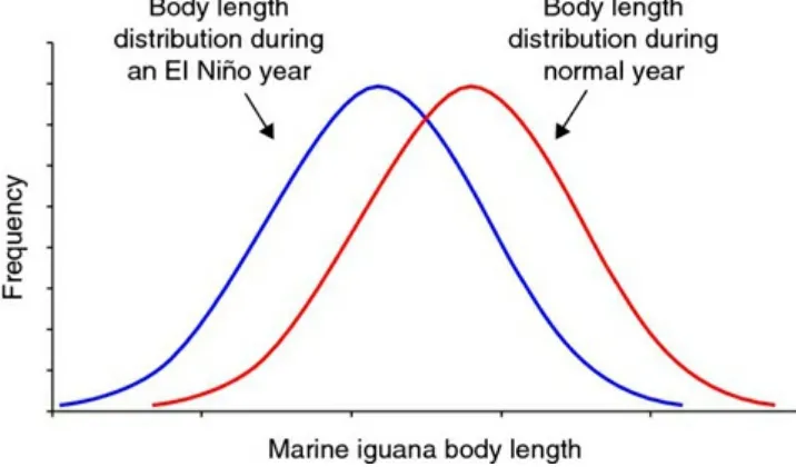
Figure 2.1 Frequency distribution of the body length of the marine iguana during a normal year and an El Niño year.
Figure 2.2 Display of normal distribution.
Figure 2.3 Histogram illustrating a normal distribution.
Figure 2.3 Histogram illustrating a right skewed distribution. Figure 2.5 Histogram illustrating a left skewed distribution.
Figure 2.6 Histogram illustrating a platykurtic curve where tails are lighter. Figure 2.7 Histogram illustrating a leptokurtic curve where tails are heavier. Figure 2.8 Histogram illustrating a bimodal, or double-peaked, distribution. Figure 2.9 Histogram illustrating a plateau distribution.
Figure 2.10 Estimated lung volume of the human skeleton (590 mL), compared with the distribution of lung volumes in the nearby sea level population.
Figure 2.11 Distributions of lung volumes for the sea level population (mean = 420 mL), compared with the lung volumes of the Aymara population (mean = 590 mL).
Chapter 3
Figure 3.1 Clustered bar chart comparing the mean snowfall of alpine forests between 2013 and 2015 in Mammoth, CA; Mount Baker, WA; and Alyeska, AK. Figure 3.2 Clustered bar chart comparing the mean snowfall of alpine forests between 2013 and 2015 in Mount Baker, WA and Alyeska, AK. An improperly scaled axis exaggerates the differences between groups.
Figure 3.3 Clumped bar chart comparing the mean snowfall of alpine forests by year (2013, 2014, and 2015) in Mammoth, CA; Mount Baker, WA; and Alyeska, AK. Figure 3.4 Stacked bar chart comparing the mean snowfall of alpine forests by month (January, February, and March) for 2015 in Mammoth, CA; Mount Baker, WA; and Alyeska, AK.
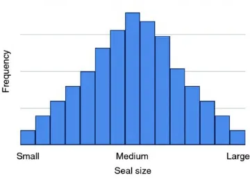
Figure 3.5 Histogram of seal size.
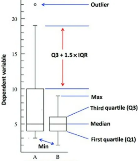
Figure 3.6 Example box plot showing the median, first and third quartiles, as well as the whiskers.
population.
Figure 3.8 Sample box plot with an outlier.
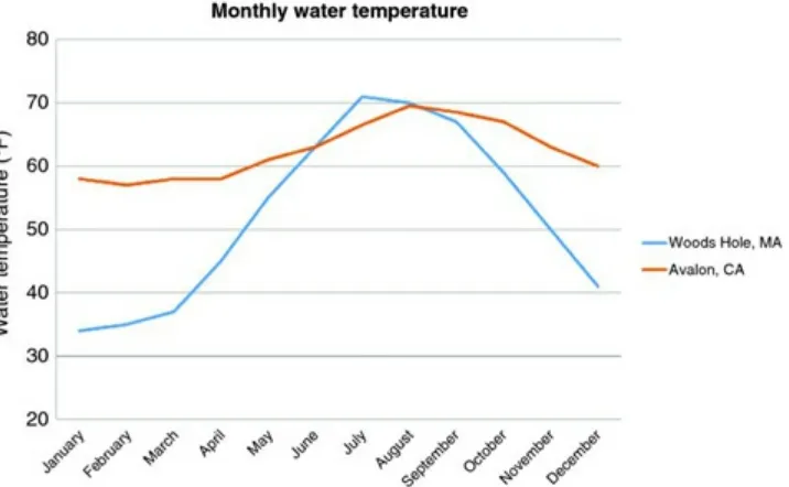
Figure 3.9 Line graph comparing the monthly water temperatures (°F) for Woods Hole, MA and Avalon, CA.
Figure 3.10 Scatter plot with a line of best fit showing the relationship between temperature (°C) and the relative abundance of Mytilus trossulus to Mytilus edulis
(from 0 to 100%).
Figure 3.11 Pie chart comparing the fatty acid content (saturated fat, linoleic acid, alpha-linolenic acid, and oleic acid) in standard canola oil.
Figure 3.12 Pie chart comparing the fatty acid content (saturated fat, linoleic acid, alpha-linolenic acid, and oleic acid) in standard olive oil.
Chapter 4
Figure 4.1 Example of a survey question asking the effectiveness of a new antihistamine in which the response is based on a Likert scale.
Figure 4.2 Visual representation of the SPSS menu showing how to test for homogeneity of variance.
Chapter 5
Figure 5.1 Visual representation of the error distribution in a one- versus two-tailed t-test. In a one-tailed t-test (a), all of the error (5%) is in one direction. In a two-tailed t-test (b), the error (5%) is split into the two directions.
Figure 5.2 SPSS output showing the results from an independent t-test.
Figure 5.3 Bar graph with standard deviations illustrating the comparison of mean pH levels for Upper and Lower Klamath Lake, OR.
Chapter 6
Figure 6.1 One-way ANOVA example protocol using three groups (A, B, and C). Figure 6.2 Two-way ANOVA example protocol using three groups (A, B, and C) with subgroups (1 and 2).
Figure 6.3 One-way repeated measures ANOVA study protocol for the measurement of muscle power output at pre-, mid-, and post-season. Figure 6.4 Two-way repeated measures ANOVA study protocol for the
measurement of muscle power output at pre-, mid-, and post-season for three resistance training groups (morning, mid-day, and evening).
Figure 6.6 Diagram illustrating the relationship between distribution curves where groups B and C are similar but A is significantly different.
Figure 6.7 One-way ANOVA case study experimental design diagram. Figure 6.8 One-way ANOVA SPSS output.
Figure 6.9 Bar graph illustrating the average blood lactate levels (A significantly different than B) for the control and experimental groups (SSE and HIIE).
Figure 6.10 SPSS post hoc options when analyzing data for multiple comparisons. Figure 6.11 Post hoc multiple comparison SPSS output.
Chapter 7
Figure 7.1 Mann–Whitney U SPSS output.
Figure 7.2 Bar graph illustrating the mean ranks of land cleared for the unprotected surrounding areas and park areas.
Figure 7.3 Wilcoxon signed-rank SPSS output.
Figure 7.4 Bar graph illustrating the median changes in metabolic rate (CO2/mL/g) pre and post meal of Gromphadorhina portentosa.
Chapter 8
Figure 8.1 Kruskal–Wallis SPSS output.
Figure 8.2 Bar graph illustrating the median number of parasites observed among the three snail species, Bulinus forskalii, Bulinus beccarii, and Bulinus cernicus.
Figure 8.3 Kruskal–Wallis SPSS output.
Figure 8.4 Bar graph illustrating the mean ranks of sleep satisfaction score for the four treatment groups.
Chapter 9
Figure 9.1 Illustration depicts the experimental setup (treatment, no response, and control) utilized in both case studies assessing leech attraction.
Chapter 10
Figure 10.1 Scatter plot of data points depicting (a) no relationship, (b) a positive relationship, and (c) a negative relationship.
Figure 10.2 Different relationships between parent and offspring beak size.
(a) shows a positive relationship, (b) shows a negative relationship, and (c) shows no relationship between the two variables.
Figure 10.3 Representation of the strength of correlation based on the spread of data on a scatterplot, with higher r values indicating stronger correlation.
dataset: (a) homoscedastic data that display both a linear and elliptical shape satisfies the normality assumption, (b) homoscedastic data that display an
elliptical shape satisfies the normality assumption, (c) heteroscedastic data that is funnel shaped, rather than elliptical or circular violates the normality assumption, (d) the presence of outliers violates the normality assumption, and (e) data that are non-linear also violate the normality assumption.
Figure 10.5 Pearson's correlation SPSS output.
Figure 10.6 Scatter plot illustrating number of hours studied and student exam scores for 28 students.
Figure 10.7 Spearman's correlation SPSS output.
Figure 10.8 Scatter plot illustrating number of hours studied and feeling of preparedness based on a Likert scale (1–5) for 28 students.
Chapter 11
Figure 11.1 Scatter plot with regression line representing a typical regression analysis.
Figure 11.2 Graphs depicting the spread around the trend line. Orientation of the slope determines the type of relationship between x and y and R2 describes the
strength of the relationship.
Figure 11.3 Linear regression SPSS output.
Preface
This book is designed to be a practical guide to the basics of statistical analysis. The structure of the book was born from a desire to meet the needs of our own science
students, who often felt disconnected from the mathematical basis of statistics and who struggled with the practical application of statistical analysis software in their research. Thus, the specific emphasis of this text is on the conceptual framework of statistics and the practical application of statistics in the biological and life sciences, with examples and case studies from biology, kinesiology, and physical anthropology.
In the first few chapters, the book focuses on experimental design, showing data, and the basics of sampling and populations. Understanding biases and knowing how to categorize data, process data, and show data in a systematic way are important skills for any
researcher. By solidifying the conceptual framework of hypothesis testing and research methods, as well as the practical instructions for showing data through graphs and figures, the student will be better equipped for the statistical tests to come.
Subsequent chapters delve into detail to describe many of the parametric and
nonparametric statistical tests commonly used in research. Each section includes a description of the test, as well as when and how to use the test appropriately in the context of examples from biology and the life sciences. The chapters include in-depth tutorials for statistical analyses using Microsoft Excel, SPSS, Apple Numbers, and R, which are the programs used most often on college campuses, or in the case of R, is free to access on the web. Each tutorial includes sample datasets that allow for practicing and applying the statistical tests, as well as instructions on how to interpret the statistical outputs in the context of hypothesis testing. By building confidence through practice and application, the student should gain the proficiency needed to apply the concepts and statistical tests to their own situations.
The material presented within is appropriate for anyone looking to apply statistical tests to data, whether it is for the novice student, for the student looking to refresh their
knowledge of statistics, or for those looking for a practical step-by-step guide for
analyzing data across multiple platforms. This book is designed for undergraduate-level research methods and biostatistics courses and would also be useful as an accompanying text to any statistics course or course that requires statistical testing in its curriculum.
Examples from the Book
Acknowledgments
This book was made possible by the help and support of many close colleagues, students, friends, and family; because of you, the ideas for this book became a reality. Thank you to Jerome Garcia and Anil Kapoor for incorporating early drafts of this book into your
About the Companion Website
This book is accompanied by a companion website:
www.wiley.com/go/weaver/statistical_analysis_in_research
The website features:
R, SPSS, Excel, and Numbers data sets from throughout the book Sample PowerPoint lecture slides
End of the chapter review questions
Software video tutorials that highlight basic statistical concepts
1
Experimental Design
Learning Outcomes
By the end of this chapter, you should be able to:
1. Define key terms related to sampling and variables.
2. Describe the relationship between a population and a sample in making a statistical estimate.
3. Determine the independent and dependent variables within a given scenario. 4. Formulate a study with an appropriate sampling design that limits bias and error.
1.1 Experimental Design Background
As scientists, our knowledge of the natural world comes from direct observations and experiments. A good experimental design is essential for making inferences and drawing appropriate conclusions from our observations. Experimental design starts by
formulating an appropriate question and then knowing how data can be collected and analyzed to help answer your question. Let us take the following example.
Case Study
Observation: A healthy body weight is correlated with good diet and regular physical activity. One component of a good diet is consuming enough fiber; therefore, one question we might ask is: do Americans who eat more fiber on a daily basis have a healthier body weight or body mass index (BMI) score?
How would we go about answering this question?
In order to get the most accurate data possible, we would need to design an experiment that would allow us to survey the entire population (all possible test subjects – all people living in the United States) regarding their eating habits and then match those to their BMI scores. However, it would take a lot of time and money to survey every person in the country. In addition, if too much time elapses from the beginning to the end of collection, then the accuracy of the data would be compromised.
1.2 Sampling Design
Below are some examples of sampling strategies that a researcher could use in setting up a research study. The strategy you choose will be dependent on your research question. Also keep in mind that the sample size (N) needed for a given study varies by discipline. Check with your mentor and look at the literature to verify appropriate sampling in your field.
Some of the sampling strategies introduce bias. Bias occurs when certain individuals are more likely to be selected than others in a sample. A biased sample can change the
predictive accuracy of your sample; however, sometimes bias is acceptable and expected as long as it is identified and justifiable. Make sure that your question matches and acknowledges the inherent bias of your design.
Random Sample
In a random sample all individuals within a population have an equal chance of being selected, and the choice of one individual does not influence the choice of any other individual (as illustrated in Figure 1.1). A random sample is assumed to be the best technique for obtaining an accurate representation of a population. This technique is often associated with a random number generator, where each individual is assigned a number and then selected randomly until a preselected sample size is reached. A random sample is preferred in most situations, unless there are limitations to data collection or there is a preference by the researcher to look specifically at subpopulations within the larger population.
Systematic Sample
A systematic sample is similar to a random sample. In this case, potential participants are ordered (e.g., alphabetically), a random first individual is selected, and every kth
individual afterward is picked for inclusion in the sample. It is best practice to randomly choose the first participant and not to simply choose the first person on the list. A random number generator is an effective tool for this. To determine k, divide the number of
individuals within a population by the desired sample size.
This technique is often used within institutions or companies where there are a larger number of potential participants and a subset is desired. In Figure 1.2, the third person (going down the first column) is the first individual selected and every sixth person afterward is selected for a total of 7 out of 40 possible.
Figure 1.2 A systematic sample of individuals within a population, starting at the third individual and then selecting every sixth subsequent individual in the group.
Stratified Sample
A stratified sample is necessary if your population includes a number of different
Figure 1.3 A stratified sample of individuals within a population. A minimum of 20% of the individuals within each subpopulation were selected.
In our BMI example, we might want to make sure all regions of the country are
represented in the sample. For example, you might want to randomly choose at least one person from each city represented in your population (e.g., Seattle, Chicago, New York, etc.).
Volunteer Sample
A volunteer sample is used when participants volunteer for a particular study. Bias would be assumed for a volunteer sample because people who are likely to volunteer typically have certain characteristics in common. Like all other sample types, collecting
demographic data would be important for a volunteer study, so that you can determine most of the potential biases in your data.
Sample of Convenience
A sample of convenience is not representative of a target population because it gives preference to individuals within close proximity. The reality is that samples are often chosen based on the availability of a sample to the researcher.
Here are some examples:
A university researcher interested in studying BMI versus fiber intake might choose to sample from the students or faculty she has direct access to on her campus.
A skeletal biologist might observe skeletons buried in a particular cemetery, although there are other cemeteries in the same ancient city.
A malacologist with a limited time frame may only choose to collect snails from populations in close proximity to roads and highways.
representative of the population as a whole.
Replication is important in all experiments. Replication involves repeating the same experiment in order to improve the chances of obtaining an accurate result. Living systems are highly variable. In any scientific investigation, there is a chance of having a sample that does not represent the norm. An experiment performed on a small sample may not be representative of the whole population. The experiment should be replicated many times, with the experimental results averaged and/or the median values calculated (see Chapter 2).
For all studies involving living human participants, you need to ensure that you have submitted your research proposal to your campus’ Institutional Review Board (IRB) or Ethics Committee prior to initiating the research protocol. For studies involving animals, submit your research proposal to the Institutional Animal Care and Use Committee
(IACUC).
Counterbalancing
When designing an experiment with paired data (e.g., testing multiple treatments on the same individuals), you may need to consider counterbalancing to control for bias. Bias in these cases may take the form of the subjects learning and changing their behavior
between trials, slight differences in the environment during different trials, or some other variable whose effects are difficult to control between trials. By counterbalancing we try to offset the slight differences that may be present in our data due to these circumstances. For example, if you were investigating the effects of caffeine consumption on strength, compared to a placebo, you would want to counterbalance the strength session with
placebo and caffeine. By dividing the entire test population into two groups (A and B), and testing them on two separate days, under alternating conditions, you would
counterbalance the laboratory sessions. One group (A) would present to the laboratory and undergo testing following caffeine consumption and then the other group (B) would present to the laboratory and consume the placebo on the same day. To ensure washout of the caffeine, each group would come back one week later on the same day at the same time and undergo the strength tests under the opposite conditions from day 1. Thus, group B would consume the caffeine and group A would consume the placebo on testing day 2. By counterbalancing the sessions you reduce the risk of one group having an
advantage or a different experience over the other, which can ultimately impact your data.
1.3 Sample Analysis
Once we take a sample of the population, we can use descriptive statistics to
dietary fiber per day (as indicated in Figure 1.4). We cannot sample all men; therefore, we might randomly sample 100 men from the larger population for each category (<38 g and >38 g). In this study, our sample group, or subset, of 200 men (N = 200) is assumed to be representative of the whole.
Figure 1.4 Bar graph comparing the body mass index (BMI) of men who eat less than 38 g of fiber per day to men who eat more than 38 g of fiber per day.
Although this estimate would not yield the exact same results as a larger study with more participants, we are likely to get a good estimate that approximates the population mean. We can then use inferential statistics to determine the quality of our estimate in
describing the sample and determine our ability to make predictions about the larger population.
If we wanted to compare dietary fiber intake between men and women, we could go beyond descriptive statistics to evaluate whether the two groups (populations) are
Figure 1.5 Bar graph comparing the daily dietary fiber (g) intake of men and women.
1.4 Hypotheses
In essence, statistics is hypothesis testing. A hypothesis is a testable statement that provides a possible explanation to an observable event or phenomenon. A good, testable hypothesis implies that the independent variable (established by the researcher) and dependent variable (also called a response variable) can be measured. Often, hypotheses in science laboratories (general biology, cell biology, chemistry, etc.) are written as “If… then…” statements; however, in scientific publications, hypotheses are rarely spelled out in this way. Instead, you will see them formulated in terms of possible explanations to a problem. In this book, we will introduce formalized hypotheses used specifically for
statistical analysis. Hypotheses are formulated as either the null hypothesis or alternative hypotheses. Within certain chapters of this book, we indicate the opportunity to
formulate hypotheses using this symbol .
In the simplest scenario, the null hypothesis (H0) assumes that there is no difference between groups. Therefore, the null hypothesis assumes that any observed difference between groups is based merely on variation in the population. In the dietary fiber example, our null hypothesis would be that there is no difference in fiber consumption between the sexes.
The alternative hypotheses (H1, H2, etc.) are possible explanations for the significant differences observed between study populations. In the example above, we could have several alternative hypotheses. An example for the first alternative hypothesis, H1, is that there will be a difference in the dietary fiber intake between men and women.
variables that were not accounted for in our experimental design. For example, if when you were surveying men and women over the telephone, you did not ask about other dietary choices (e.g., Atkins, South Beach, vegan diets), you may have introduced bias unexpectedly. If by chance, all the men were on a high protein diet and the women were vegan, this could bring bias into your sample. It is important to plan out your experiments and consider all variables that may influence the outcome.
1.5 Variables
An important component of experimental design is to define and identify the variables inherent in your sample. To explain these variables, let us look at another example.
Case Study
In 1995, wolves were reintroduced to Yellowstone National Park after an almost 70-year absence. Without the wolf, many predator–prey dynamics had changed, with one
prominent consequence being an explosion of the elk population. As a result, much of the vegetation in the park was consumed, resulting in obvious changes, such as to nesting bird habitat, but also more obscure effects like stream health. With the reintroduction of the wolf, park rangers and scientists began noticing dramatic and far reaching changes to food webs and ecosystems within the park. One question we could ask is how trout
populations were impacted by the reintroduction of the wolf. To design this experiment, we will need to define our variables.
The independent variable, also known as the treatment, is the part of the experiment established by or directly manipulated by the research that causes a potential change in another variable (the dependent variable). In the wolf example, the independent variable is the presence/absence of wolves in the park.
The dependent variable, also known as the response variable, changes because it “depends” on the influence of the independent variable. There is often only one
independent variable (depending on the level of research); however, there can potentially be several dependent variables. In the question above, there is only one dependent
variable – trout abundance. However, in a separate question, we could examine how wolf introduction impacted populations of beavers, coyotes, bears, or a variety of plant species. Controlled variables are other variables or factors that cause direct changes to the
dependent variable(s) unrelated to the changes caused by the independent variable.
Controlled variables must be carefully monitored to avoid error or bias in an experiment. Examples of controlled variables in our example would be abiotic factors (such as
sunlight) and biotic factors (such as bear abundance). In the Yellowstone wolf/trout example, researchers would need to survey the same streams at the same time of year over multiple seasons to minimize error.
the class is given three plants; the plants are of the same species and size. For the experiment, each plant is given a different fertilizer (A, B, and C). What are the other variables that might influence a plant's growth?
Let us say that the three plants are not receiving equal sunlight, the one on the right (C) is receiving the most sunlight and the one on the left (A) is receiving the least sunlight. In this experiment, the results would likely show that the plant on the right became more mature with larger and fuller flowers. This might lead the experimenter to determine that company C produces the best fertilizer for flowering plants. However, the results are
biased because the variables were not controlled. We cannot determine if the larger flowers were the result of a better fertilizer or just more sunlight.
Types of Variables
Categorical variables are those that fall into two or more categories. Examples of categorical variables are nominal variables and ordinal variables.
Nominal variables are counted not measured, and they have no numerical value or rank. Instead, nominal variables classify information into two or more categories. Here are some examples:
Sex (male, female)
College major (Biology, Kinesiology, English, History, etc.) Mode of transportation (walk, cycle, drive alone, carpool) Blood type (A, B, AB, O)
Ordinal variables, like nominal variables, have two or more categories; however, the order of the categories is significant. Here are some examples:
Satisfaction survey (1 = “poor,” 2 = “acceptable,” 3 = “good,” 4 = “excellent”) Levels of pain (mild, moderate, severe)
Stage of cancer (I, II, III, IV)
Level of education (high school, undergraduate, graduate)
Ordinal variables are ranked; however, no arithmetic-like operations are possible (i.e., rankings of poor (1) and acceptable (2) cannot be added together to get a good (3) rating). Quantitative variables are variables that are counted or measured on a numerical
scale. Examples of quantitative variables include height, body weight, time, and
temperature. Quantitative variables fall into two categories: discrete and continuous. Discrete variables are variables that are counted:
Number of wing veins
Number of colonies counted
Continuous variables are numerical variables that are measured on a continuous scale and can be either ratio or interval.
Ratio variables have a true zero point and comparisons of magnitude can be made. For instance, a snake that measures 4 feet in length can be said to be twice the length of a 2 foot snake. Examples of ratio variables include: height, body weight, and income.
Interval variables have an arbitrarily assigned zero point. Unlike ratio data,
2
Central Tendency and Distribution
Learning Outcomes
By the end of this chapter, you should be able to:
1. Define and calculate measures of central tendency. 2. Describe the variance within a normal population.
3. Interpret frequency distribution curves and compare normal and non-normal populations.
2.1 Central Tendency and Other Descriptive Statistics
Sampling Data and Distribution
Before beginning a project, we need an understanding of how populations and data are distributed. How do we describe a population? What is a bell curve, and why do biological data typically fall into a normal, bell-shaped distribution? When do data not follow a normal distribution? How are each of these populations treated statistically?
Measures of Central Tendencies: Describing a Population
The central tendency of a population characterizes a typical value of a population. Let us take the following example to help illustrate this concept. The company Gallup has a partnership with Healthways to collect information about Americans’ perception of their health and happiness, including work environment, emotional and physical health, and basic access to health care services. This information is compiled to calculate an overall well-being index that can be used to gain insight into people at the community, state, and national level. Gallup pollers call 1000 Americans per day, and their researchers
summarize the results using measures of central tendency to illustrate the typical response for the population. Table 2.1 is an example of data collected by Gallup.
Table 2.1 Americans’ perceptions of health and happiness collected from the company Gallup.
US Well-Being Index Score Change versus Last Measure
Well-being index 67.0 +0.2
Emotional health 79.7 +0.3
Physical health 76.9 +0.6
Work environment 48.5 +0.6
The central tendency of a population can be measured using the arithmetic mean, median, or mode. These three components are utilized to calculate or specify a
numerical value that is reflective of the distribution of the population. The measures of central tendency are described in detail below.
Mean
The mean, also known as average, is the most common measure of central tendency. All values are used to calculate the mean; therefore, it is the measure that is most sensitive to any change in value. (This is not the case with median and mode.) As you will see in a later section, normally distributed data have an equal mean, median, and mode.
The mean is calculated by adding all the reported numerical values together and dividing that total by the number of observations. Let us examine the following scenario: suppose a professor is implementing a new teaching style in the hope of improving students’ retention of class material. Because there are two courses being offered, she decides to incorporate the new style in one course and use the other course without changes as a control. The new teaching style involves a “flip-the-class” application where students present a course topic to their peers, and the instructor behaves more as a mentor than a lecturer. At the end of the semester, the professor compared exam scores and determined which class had the higher mean score.
Table 2.2 summarizes the exam scores for both classes (control and treatment). Calculating the mean requires that all data points are taken into account and used to determine the average value. Any change in a single value directly changes the calculated average.
Table 2.2 Exam scores for the control and the “flip-the-class” students.
Exam Scores (Control) Exam Scores (Treatment)
8081 8890
79 83
75 90
Sum 1144 1315
Observations 15
Calculate the mean for the control group: (1144)/15 = 76.3. Calculate the mean for the treatment group: (1315)/15 = 87.7.
Although the mean is the most commonly used measure of central tendency, outliers can easily influence the value. As a result, the mean is not always the most appropriate
measure of central tendency. Instead, the median may be used.
Let us look at Table 2.3 and calculate the average ribonucleic acid (RNA) concentrations for all eight samples. Although 121.1 ng/μL is an observed mean RNA concentration, it is considered to be on the lower end of the range and does not clearly identify the most representative value. In this case, the mean is thrown off by an outlier (the fifth sample = 12 ng/μL). In cases with extreme values and/or skewed data, the median may be a more appropriate measure of central tendency.
Table 2.3 Reported ribonucleic acid (RNA) concentrations for eight samples. Sample RNA Concentration (ng/ L)
for an earlier example looking at student exam scores. There were 15 observations: 76, 72, 70, 71, 70, 82, 70, 78, 78, 79, 83, 80, 81, 79, and 75
To calculate the median, first arrange the exam scores in order. In this case, we placed them in ascending order:
70, 70, 70, 71, 72, 75, 76, 78, 78, 79, 79, 80, 81, 82, and 83
The middle number of the distribution is 78; this is the median value for the exam score example. It is easy to find the median value for an odd number of data points; however, if there is an even number of data points, then the average of the two middle values must be calculated after scores are arranged in order. In the previous RNA example, there were eight readings in ng/μL.
125, 146, 133, 152, 12, 129, 117, and 155
To calculate the median, arrange the RNA values (ng/μL) in order. Here, we put them in ascending order:
12, 117, 125, 129, 133, 146, 152, 155
The fourth (129 ng/μL) and the fifth (133 ng/μL) fall in the middle. Therefore, in order to determine the median, calculate the mean of these two readings:
(129 + 133)/2 = 131 ng/μL
Where the mean (121.1 ng/μL) may be considered misleading, the properties of the median (131 ng/μL) allow for datasets that have more values in a particular direction (high or low) to be compared and analyzed. Nonparametric statistics such as the Mann– Whitney U test and the Kruskal–Wallis test, which are introduced in later chapters, utilize the medians to make comparisons between groups.
Mode
Another measure of central tendency is the mode. The mode is the most frequently observed value in the dataset. The mode is not as commonly used as the mean and median, but it is still useful in some situations. For example, we would use the mode to determine the most common zip code for all students at a university, as depicted in Table 2.4. In this case, zip code is a categorical variable, and we cannot take a mean. Likewise, the central tendency of nominal variables, such as male or female, can also be estimated using the mode.
Table 2.4 Most common zip code reported by 10 university students. Student Zip Code
2 90815
A frequency distribution curve represents the frequency of each measured variable in a population. For example, the average height of a woman in the United States is 5′5′′. In a normally distributed population, there would be a large number of women at or close to 5′5′′ and relatively fewer with a height around 4′ or 7′ tall. Frequency distributions are typically graphed as a histogram (similar to a bar graph). Histograms display the
frequencies of each measured variable, allowing us to visualize the central tendency and spread of the data.
In living things, most characteristics vary as a result of genetic and/or environmental factors and can be graphed as histograms. Let us review the following example:
Figure 2.1 Frequency distribution of the body length of the marine iguana during a normal year and an El Niño year.
Summary
In a normal year, we would expect to see a distribution with the highest frequency of
medium-sized iguanas and lower frequencies as we approached the extremes in body size. However, as the food resources deplete in an El Niño year, we would expect the
distribution of iguana body size to shift toward smaller body sizes (Figure 2.1). Notice in the figure the bell shape of the curve is the same; therefore, a concept known as the
variance (which will be described below) has not changed. The only difference between El Niño years is the shifted distribution in body size.
Nuts and Bolts
The distribution curve focuses on two parameters of a dataset: the mean (average) and the variance. The mean (μ) describes the location of the distribution heap or average of the samples. In a normally distributed dataset (see Figure 2.2), the values of central
tendencies (e.g., mean, median, and mode) are equal. The variance (σ2) takes into account
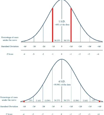
the spread of the distribution curve; a smaller variance will reflect a narrower distribution curve, while a larger variance coincides with a wider distribution curve. Variance can most easily be described as the spread around the mean. Standard deviation (σ) is defined as the square root of the variance. When satisfying a normal distribution, both the mean and standard deviation can be utilized to make specific conclusions about the spread of the data:
68% of the data fall within one standard deviation of the mean 95% of the data fall within two standard deviations of the mean 99.7% of the data fall within three standard deviations of the mean
Histograms can take on many different physical characteristics or shapes. The shape of the histogram, a direct representation of the sampling population, can be an indication of a normal distribution or a non-normal distribution. The shapes are described in detail below.
Normal distributions are bell-shaped curves with a symmetric, convex shape and no lingering tail region on either side. The data clearly are derived from a homogenous group with the local maximum in the middle, representing the average or mean (see Figure 2.3). An example of a normal distribution would be the head size of newborn babies or finger length in the human population.
Figure 2.3 Histogram illustrating a normal distribution.
Skewed distributions are asymmetrical distribution curves, with the distribution heap either toward the left or right with a lingering tail region. These asymmetrical shapes are generally referred to as having “skewness” and are not normally distributed. Outside factors influencing the distribution curve cause the shift in either direction, indicating that values from the dataset weigh more heavily on one side than they do on the other. Distribution curves skewed to the right are considered “positively skewed” and imply that the values of the mean and median are greater than the mode (see Figure 2.4). An
example of a positively skewed distribution is household income from 2010 to 2011. The American Community Survey reported the US median household income at
Figure 2.3 Histogram illustrating a right skewed distribution.
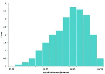
Distribution curves skewed to the left are considered “negatively skewed” and imply that the values of the mean and median are less than the mode (see Figure 2.5). An example of this would be the median age of retirement, which the Gallup poll reported was 61 years of age in the year 2013. Here, we would expect a left skew because people typically retire later in life, but many also retire at younger ages, with some even retiring before 40 years of age.
Figure 2.5 Histogram illustrating a left skewed distribution.
other value as defined by the selected algorithm), or that there is no skew. In other words, a significant p-value indicates the data are skewed. The sign of the skew value will denote the direction of the skew (see Table 2.5).
Table 2.5 Interpretation of skewness based on a positive or negative skew value. Direction of Skew Sign of Skew Value
Right Positive
Left Negative
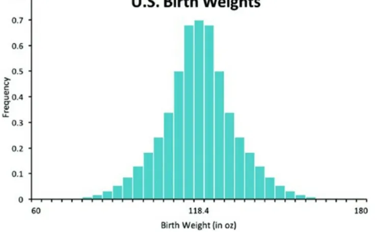
Kurtosis refers to symmetrical curves that are not shaped like the normal bell-shaped curve (when normal, the data are mesokurtic), and the tails are either heavier or lighter than expected. If the curve has kurtosis, the data do not follow a normal distribution. Generally, there are two forms of data that deviate from a normal distribution with
kurtosis: platykurtic, where tails are lighter (as illustrated in Figure 2.6), or leptokurtic, where the tails are heavier (as illustrated in Figure 2.7). Table 2.6 provides an
interpretation of the kurtosis value.
Figure 2.7 Histogram illustrating a leptokurtic curve where tails are heavier. Table 2.6 Interpretation of the shape of the curve based on a positive or negative kurtosis value.
Shape of Curve Sign of Kurtosis Value Leptokurtic Positive
Platykurtic Negative
With lighter tails, there are fewer outliers from the mean. An example would be a survey of age for traditional undergraduate students (Figure 2.6). Typically, the age range is between 18 and 21 years with very few students far outside this range. Heavier tails indicate more outliers than a normal distribution. An example is birth weight in U.S. infants (Figure 2.7). While most babies are of average birth weight, many are born below or above the average.
Bimodal (double-Peaked) distributions are split between two or more distributions (see Figure 2.8). Having more than one distribution, or nonhomogeneous groups within one dataset, can cause the split. Bimodal distributions can be asymmetrical or
symmetrical depending on the dataset and can have two or more local maxima, or peaks. Distribution curves depicted with more than two local maxima are considered to be
Figure 2.8 Histogram illustrating a bimodal, or double-peaked, distribution.
Plateau distributions are extreme versions of multimodal distributions because each bar is essentially its own node (or peak); therefore, there is no single clear pattern (as illustrated in Figure 2.9). The curve lacks a convex shape, which makes the distribution heap, or local maximum, difficult to identify. This type of distribution implies a wide variation around the mean and lacks any useful insight about the sampling data.
Figure 2.9 Histogram illustrating a plateau distribution.
Outliers
skewed?” “If so, are they skewed to the left or to the right?” These are questions that must be addressed a priori in order to determine which statistical test is appropriate for the dataset. In addition, by graphing the distribution curve, a researcher has the
opportunity to identify any possible outliers that were not obvious when looking at the numerical dataset.
Outliers can be defined as the numerical values extremely distant from the norm or rest of the data. In other words, outliers are the extreme cases that do not “fit” with the rest of the data. By now, we understand that there will be variation of numerical values around the mean, and this variation can either be an indication of a large or small variance
(spread around the mean). However, extreme values, such as outliers, fall well beyond the levels of variance observed for a particular dataset and are then classified as special
observations.
Outliers can be handled in several ways, including deeming the observation as an error and subsequent removal of the outlying data point. However, before you remove a data point, assuming it is an error, talk with your mentor or an expert in the field to consider what might be the best option with the given data. If possible, re-collect that data point to verify accuracy. If not possible, consider using the median and running a nonparametric analysis.
Quantifying the
p-
Value and Addressing Error in Hypothesis Testing
One of the most vital, yet often confusing aspects of statistics is the concept of the p-value and how it relates to hypothesis testing. The following explanation uses simplified
language and examples to illustrate the key concepts of inferential statistics, hypothesis testing, and statistical significance.
In previous sections, we have discussed descriptive statistics, such as the mean, median, and mode, which describe key features of our sample population. What if, however, we wanted to use these statistics to make some inferences about how well our sample represents the overall population, or whether two samples were different from each other, at an acceptable level of statistical probability? In these cases, we would be using inferential statistics, which allow us to extend our interpretations from the sample and tell us whether there is some sort of interesting phenomenon occurring in the larger population.
Figure 2.10 Estimated lung volume of the human skeleton (590 mL), compared with the distribution of lung volumes in the nearby sea level population.
According to the distribution, we can see that the probability of a person from the area having a lung volume of 590 mL is very low (less than 1%). In other words, over 99% of the population in the area has a smaller lung volume than the sample. Because the chances of this sample coming from the population are low, we could then make an inference that the skeleton may be from another population that has a different lung volume capacity.
In her research, the anthropologist learns of the indigenous Aymara people, from the mountains of Peru and Chile. The Aymara people have adapted to low oxygen in many ways, including enlarged lung capacity (the mean lung volume for the Aymara is
Figure 2.11 Distributions of lung volumes for the sea level population (mean = 420 mL), compared with the lung volumes of the Aymara population (mean = 590 mL).
The first step is to develop the null hypothesis (H0). In this case, the null hypothesis would be that there is no statistical difference between our two groups (the lung volume of the sea level and Aymara populations are not different). Our alternative hypothesis (H1), would be that there is a real, statistically significant difference between the groups. We must choose whether to reject or not reject our null hypothesis (H0), based on some objective criterion, which we define ahead of time as alpha (α). In most cases, this α value will be set to 0.05. It may be helpful to think of your α value as a degree of confidence that we are making the right call, with regard to rejecting our null hypothesis. An α of 0.05 represents a 95% confidence that you will not mistakenly reject the null hypothesis. Also, think of using the p-value as evidence against the null hypothesis. Table 2.7
demonstrates the relationship between confidence (%) and error or chance of occurrence (%).
Table 2.7 Demonstration of the relationship between the percent confidence and error in determining the alpha (α).
Confidence (%) Error or Chance of Occurrence (%) Alpha (α)
99 1 0.01
95 5 0.05
90 10 0.10
In science, we can almost never be 100% certain of an outcome being correct, and some error is acceptable and expected. An alpha of 0.05 is most common in life science
research; however, you may occasionally see an alpha of 0.10 (e.g., cancer research when you are willing to accept more error or a decrease in confidence in exchange for an
outcome or cure).
Note: Depending on the field or level of research, the significance level may vary. For example, in areas of cancer research where people are willing to take more risk on a potential treatment, a much larger p-value (0.09 or 0.10) is supported.
To test our hypotheses, we would run a statistical test that compares the lung volumes of the two populations (sea level and Aymara). In this case, the test gives us a probability value (p-value) of 0.01. The p-value reflects the probability (0.01 or 1%) of obtaining the test result if the null hypothesis was true, based on our data. Stated differently, we are 99% confident that we can reject the null hypothesis. Because we established our α value to be 0.05, any calculated p-value ≤0.05 means that we can reject the null hypothesis. However, if the p-value is large (p > 0.05), we would fail to reject the null hypothesis, meaning that there would be no statistically significant difference between the
95% confidence in the ability to reject the null hypothesis.
Summary
Based on the example, we would conclude that there is a statistically significant difference between the lung volumes of the sea level population and the Aymara population (p = 0.01).
With any conventional hypothesis testing, the possibility of error must be kept in mind. In hypothesis testing, error falls into two main categories, Type I and Type II, which refer to the probability of yielding a false positive or a false negative conclusion, respectively:
Type I error occurs when the null hypothesis is rejected incorrectly (false positive). Type II error occurs when the null hypothesis fails to be rejected when it should have been (false negative).
The level of significance (α = 0.05) implies that if the null hypothesis is true, then we would have a 5% or 1 in 20 chance of mistakenly rejecting it, and thus committing a Type I error.
The probability of committing a Type II error is represented by the symbol β and is
related to statistical power. Statistical power is the probability of correctly rejecting a false null hypothesis. Increasing the statistical power essentially lowers the probability of
committing a Type II error and increases the possibility of detecting changes or
relationships within a study. There are three factors that influence the statistical power of a study and can be strategically addressed in order to help increase the power:
1. Sample size (N) – a large total sample size (represented with a capital N) increases the statistical power because you are increasing your finite representation of a
potentially infinite population. If you have a smaller subset of the total number of participants, you would represent the subset with a lower case (n). If 50 people were surveyed for fitness center usage the group would be represented as N = 50. If you were to divide that group into males (n = 22) and females (n = 28) the groups would be represented with a lower case (n).
2. Significance criterion (α) – increasing α (e.g., from 0.01 to 0.05 or from 0.05 to 0.1) decreases the chance of making a Type II error. However, it also increases the chance of a Type I error.
3. Low variability – low variation from sample to sample within the dataset (samples are tightly distributed around the dataset mean).
Error and power are also important to consider when deciding between a parametric and nonparametric statistical method. If the assumptions have been satisfied, then the
There are two possible alternatives for addressing violated assumptions. First, in the case where the dataset does not follow a normal distribution (this happens often in human research), one could carry out data transformations on the collected measurements. In doing so, the original data can be transformed to satisfy the test assumptions, and a parametric statistical method can be applied on the transformed data. Data
transformations do not always prove to be successful, and in such cases, you may need to use a nonparametric method to analyze the data.
Nonparametric methods make fewer assumptions about the data and are commonly known for ranking the measured variables rather than using the actual measurements themselves to carry out the statistical analysis. In doing so, the scale of the data is
partially lost causing the nonparametric method to be less powerful; however, ranking the data makes nonparametric methods useful for dealing with outliers.
Data Transformation
Data transformation can be applied on a dataset that strongly violates statistical
assumptions. As a result, this helps to “normalize” the data. This is a familiar situation for human biology researchers dealing with the assessment of hormones as hormones do not always follow a normal distribution. The logarithm of the data may better suit the
situation, allowing for a more normal distribution and satisfying the original
assumptions. If the transformations do in fact fit a normally distributed population, then proceed with applying the parametric statistical method on the transformed data. Keep in mind that whichever mathematical formula was applied to one data point must be applied in the same form to all the remaining data points within a variable. In other words, what is done to one must be done to all. The three commonly used data transformations are the log transformation, the square-root transformation, and the arcsine transformation.
Log Transformation
Log transformations take the log of each observation, whether in the form of the natural log or base-10 log. It is the most commonly used data transformation in the sciences, specifically in biology, physical anthropology, and health fields and tends to work exceptionally well when dealing with ratios or products of variables. In addition, log transformations work well with datasets that have a frequency distribution heavily skewed to the right. The following formula serves as a mathematical representative for taking the natural log (ln):
Square-Root Transformation
cells after a 24-hour incubation period. The following formula applies a square-root transformation:
Arcsine Transformation
Arcsine transformations take the arcsine of the square root of each observation and are commonly used on datasets involving proportions. Use the following formula to calculate the arcsine of certain proportional observations:
Building Blocks
Understanding the fundamentals of distribution and error are not only important when analyzing the raw data, but also when deciding which test best fits the dataset. The following chapters will review the concepts learned in this chapter, such as outliers and variance, and will use these fundamentals to guide you through different statistical approaches.
Tutorials
2.3 Descriptive Statistics in Excel
*This example was taken from the research conducted by Dr. Sarah Dunn.
Mean
1. To calculate the mean, use the average function by typing in =average into an empty cell. Double click on the average function from the drop down menu.
2. Highlight the cells that will be used to calculate the mean. Press enter/return.
Median
1. To calculate the median, use the median function by typing in =median into an empty cell. Double click on the median function from the drop down menu.
3. The output is the median.
Mode
2. Highlight the cells that will be used to calculate the mode. Press enter/return.
Variance
1. To calculate the variance, use the variance function by typing in =Lvar into an empty cell. Double click on the variance function from the drop down menu.
3. The output is the variance.
Standard Deviation
2. Highlight the cells that will be used to calculate the standard deviation. Press enter/return.
Skewness
1. To calculate skewness, use the skewness function by typing in =skew into an empty cell. Double click on the skewness function from the drop down menu.
3. The output is the skewness value.
Because the skewness value is close to zero, the data are not significantly skewed.
Kurtosis
2. Highlight the cells that will be used to calculate the kurtosis. Press enter/return.
Because the kurtosis value is not close to zero, the data are kurtic. The negative sign indicates they are platykurtic (light tails).
Descriptive Statistics Command
1. If you need additional information about the data (e.g., standard error, minimum, maximum) or you would like Excel to automatically compute the descriptive statistics for you, use the Data Analysis ToolPak. Click on an empty cell, then select Data Analysis, which should be located along the toolbar under the Data tab.
Note: If it does not appear, then you must manually install it (see Chapter 12).
2. The following window will appear. Select the Descriptive Statistics function, then click OK.
4. Input the range by highlighting the cells that will be used to calculate the descriptive statistics. Select the small icon to the right when finished.
6. Now that the Output options has been set, select Summary statistics. Click OK.
8. As you will notice, the Descriptive Statistics function provides additional information about the data.
2.4 Descriptive Statistics in SPSS
To calculate the descriptive information (mean, standard deviation, range, variance, skewness, and kurtosis) of a dataset in SPSS, follow the example provided using the
dietary intake information pertaining to the ingestion of omega-3 fatty acids in grams per day from a group of 25 young males and females. Refer to Chapter 13 for getting started and understanding SPSS.
*This example was taken from the research conducted by Dr. Sarah Dunn.
2. Click on the Analyze tab on the toolbar located along the top of the page. Scroll down to Descriptive Statistics and select Descriptives.
4. Make sure to move the variable over to the Variable(s) box. To do so, click on the
variable (Omega3gperday). Then click on the arrow to the right corresponding to the Variable(s) box.
5. Select Options on the right side of the window.
6. Use the checkboxes to choose the options you want to view in the output. At
7. Click OK.
8. A separate output will appear.
The skewness and kurtosis values are not close to zero, indicating the data are skewed to the right and leptokurtic (heavy tails).
2.5 Descriptive Statistics in Numbers
prior to starting this tutorial.
*This example was taken from the research conducted by Dr. Sarah Dunn.
Mean
1. Use the average function =average. Highlight the cells that will be used to calculate the mean.
2. Click on the check button or press enter/return.
Median
2. Click on the check button or press enter/return.
Mode
1. Use the mode function =mode. Highlight the cells that will be used to calculate the mode.
Variance
1. Use the variance function =var. Highlight the cells that will be used to calculate the variance.
2. Click on the check button or press enter/return.
Standard Deviation
2. Click on the check button or press enter/return. 3. Summary of the outputs.
4. Finally, you should change the significant figures or number of digits behind the decimal point for consistency. Click Cell in the pane on the right hand side of your screen. Then, click the drop down menu under Data Format and select Number. Use the arrows to the right of the box next to Decimals to select the appropriate number of decimal points. The default is auto; click the up arrow to change the number.
*Note: To run skewness or kurtosis, you will need to use another program. See the tutorials within Excel, SPSS, or R.
2.6 Descriptive Statistics in R
For each of the calculations below, we will use the following protein data (grams per day) from 25 females. Refer to Chapter 15 for R specific terminology and instructions on how to invoke and construct code.
Mean
1. Load the data into R by storing the numbers below to a vector name, for example “protein.”
2. Apply the mean() function to the vector protein. Press enter/ return.
The output for the mean value is placed below the R code you typed in.
Median
1. If you have not already loaded the data as in step 1 of the instructions for calculating the mean, do so now. Then, apply the median() function to the protein vector. Press
The output for the median value is placed below the R code you typed in.
Mode
Not all statistical programs have automated features for statistical calculations. In the case of mode, R does not have an automated feature. Instead, code can be developed to measure the mode. The development of the code is beyond the scope of this chapter.
Variance
1. Load the data as in step 1 of the instructions for calculating the mean. Then, apply the
var() function to the protein vector. Press enter/return.
The output for the variance value is placed below the R code you typed in.
Standard Deviation
1. Load the data as in step 1 of the instructions for calculating the mean. Then, apply the
sd() function to the protein vector. Press enter/return.
The output for the standard deviation value is placed below the R code you typed in.
Skewness
1. Load the moments package in R using the library() function. If you do not have the package installed, you will get a message that reads “Error in library (moments): there is no package called ‘moments’.” Refer to Chapter 15 for instructions on how to install packages. Apply the library() function to load the moments package. Press
enter/return.
2. Load the data as in step 1 of the instructions for calculating the mean. Then, apply the
agostino.test() function to the protein vector to run the D'Agostino skewness test.
Note: The coding for a two sided test is a string, so we need to use the c() function and quotation marks to select the numbers of tails.
The output for the skewness value is placed below the R code you typed in. The p-value is less than a p-valuecutoff of 0.05. Because the p-value is significant, we can conclude the skewness is greater than zero and the data are skewed. The skew value is positive, indicating the data are skewed to the right.
3. This result can be verified by plotting a histogram using the hist() argument applied
to the protein vector following the tutorial in Chapter 3.
Kurtosis
1. Follow the instructions in step 1 of calculating skewness to load the moments package. Press enter/return.
2. Load the data as in step 1 of the instructions for calculating the mean. Then, apply the
anscombe.test() function to the protein vector to run the Anscombe–Glynn kurtosis
test. We will add the alternative = argument to specify using a two-sided test for generating a p-value, which will allow us to measure kurtosis in either direction. Press enter/return.
Note: The coding for a two sided test is a string, so we need to use the c() function and
quotation marks to select the numbers of tails.
The output for the kurtosis value is placed below the R code you typed in. The p-value is less than a p-valuecutoff of 0.05. Because the p-value is significant, we can conclude the kurtosis is greater than three and the data are kurtotic. The kurtosis value is positive, indicating the data are leptokurtic (heavy tails).
3. This result can be verified by plotting a histogram using the hist() argument applied