Early praise for HTML5 and CSS3, Second Edition
In an industry where staying employable means staying current, this book is an essential read and an efficient reference for web designers and developers. This book does not belong on your bookshelf. It belongs on your desk.
➤ Matt Margolis
Manager, application development, Getty Images
The whole book feels like a well-stocked toolbox. It’s accessible, well-presented, and packed with information. Brian is a confident expert and a masterful educator.
➤ Tibor Simic
Developer, Inge-mark
I’ve been making websites for more than ten years, and I still learned a few tricks from reading this book. If you haven’t yet taken advantage of the new features available in HTML5, now is the time. Brian’s book will explain what you can and should use, and when.
➤ Stephen Orr
Level Up with Today
’
s Web Technologies
Brian P. Hogan
Many of the designations used by manufacturers and sellers to distinguish their products are claimed as trademarks. Where those designations appear in this book, and The Pragmatic Programmers, LLC was aware of a trademark claim, the designations have been printed in initial capital letters or in all capitals. The Pragmatic Starter Kit, The Pragmatic Programmer, Pragmatic Programming, Pragmatic Bookshelf, PragProg and the linking g device are trade-marks of The Pragmatic Programmers, LLC.
Every precaution was taken in the preparation of this book. However, the publisher assumes no responsibility for errors or omissions, or for damages that may result from the use of information (including program listings) contained herein.
Our Pragmatic courses, workshops, and other products can help you and your team create better software and have more fun. For more information, as well as the latest Pragmatic titles, please visit us at http://pragprog.com.
The team that produced this book includes:
Susannah Davidson Pfalzer (editor) Potomac Indexing, LLC (indexer) Candace Cunningham (copyeditor) David J Kelly (typesetter)
Janet Furlow (producer) Juliet Benda (rights) Ellie Callahan (support)
Copyright © 2013 The Pragmatic Programmers, LLC. All rights reserved.
No part of this publication may be reproduced, stored in a retrieval system, or transmitted, in any form, or by any means, electronic, mechanical, photocopying, recording, or otherwise, without the prior consent of the publisher.
Printed in the United States of America. ISBN-13: 978-1-937785-59-8
Contents
Acknowledgments . . . ix
Preface . . . xi
1. An Overview of HTML5 and CSS3 . . . 1
1.1 A Stronger Platform for Web Development 1
1.2 The Road to the Future Is Bumpy 5
Part I
—
Improving User Interfaces
2. New Structural Tags and Attributes . . . 13
Tip 1. Redefining a Blog Using Semantic Markup 15
Tip 2. Showing Progress toward a Goal with the <meter>
Element 26
Tip 3. Creating Pop-Up Windows with Custom Data
Attributes 30
Tip 4. Defining an FAQ with a Description List 34
3. Creating User-Friendly Web Forms . . . 37
Tip 5. Describing Data with New Input Fields 39
Tip 6. Jumping to the First Field with Autofocus 49
Tip 7. Providing Hints with Placeholder Text 50
Tip 8. Validating User Input without JavaScript 54
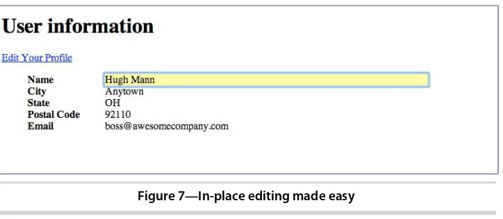
Tip 9. In-Place Editing with contenteditable 59
4. Styling Content and Interfaces . . . 67
Tip 10. Styling Tables with Pseudoclasses 69
Tip 11. Making Links Printable with :after and content 78
Tip 12. Building Mobile Interfaces with Media Queries 81
5. Making Accessible Interfaces . . . 91 Tip 14. Providing Navigation Hints with ARIA Roles 93
Tip 15. Creating an Accessible Updatable Region 98
Tip 16. Improving Table Accessibility 104
Part II
—
New Sights and Sounds
6. Drawing in the Browser. . . 111
Tip 17. Drawing a Logo on the Canvas 112
Tip 18. Graphing Statistics with RGraph 120
Tip 19. Creating Vector Graphics with SVG 126
7. Embedding Audio and Video . . . 131
Tip 20. Working with Audio 137
Tip 21. Embedding Video 141
Tip 22. Making Videos Accessible 146
8. Eye Candy . . . 151
Tip 23. Rounding Rough Edges 153
Tip 24. Working with Shadows, Gradients, and
Transformations 157
Tip 25. Working with Fonts 164
Tip 26. Making Things Move with Transitions and
Animations 169
Part III
—
Beyond Markup
9. Saving Data on the Client . . . 183
Tip 27. Saving Preferences with Web Storage 185
Tip 28. Storing Data in a Client-Side Database Using
IndexedDB 190
Tip 29. Working Offline 203
10. Creating Interactive Web Applications . . . 207
Tip 30. Preserving History 209
Tip 31. Talking across Domains 213
Tip 32. Chatting with Web Sockets 219
Tip 33. Finding Yourself: Geolocation 227
Tip 34. Getting It All Sorted Out with Drag and Drop 231
11. Where to Go Next . . . 239 Defining Layouts with the Flexible Box Model 240 11.1
11.2 Cross-Origin Resource Sharing 242
11.3 Web Workers 243
11.4 Server-Sent Events 247
11.5 Filter Effects 250
11.6 WebGL 252
11.7 Onward! 252
A1. Features Quick Reference . . . 253
New Elements 253
A1.1
A1.2 Attributes 254
A1.3 Forms 254
A1.4 Form-Field Attributes 255
A1.5 Accessibility 255
A1.6 Multimedia 256
A1.7 CSS3 257
A1.8 Client-Side Storage 259
A1.9 Additional APIs 260
A2. jQuery Primer . . . 263
Loading jQuery 263
A2.1
A2.2 jQuery Basics 264
A2.3 Methods to Modify Content 264
A2.4 Creating and Removing Elements 267
A2.5 Events 267
A2.6 Document Ready 269
A2.7 Use jQuery Wisely 270
A3. Encoding Audio and Video for the Web . . . 273
A3.1 Encoding Audio 273
A3.2 Encoding Video 274
A4. Resources . . . 275
Bibliography . . . 277
Acknowledgments
Second editions are supposed to be quick—just a chance to correct mistakes
or make improvements and updates to the first edition. This, though, was almost like writing a new book, and there are so many people I need to thank who made my work much easier.
First, I want to thank you for reading this book. I hope it helps you tackle some cool and interesting projects of your own when you’re done.
Next, the wonderful gang at The Pragmatic Bookshelf deserves not only my gratitude, but also a lot of the credit for this book. Susannah Pfalzer once again ensured that one of my books makes sense. She’s an awesome
develop-ment editor and I’m thankful for her time and attention to detail, especially
on a book like this, where thousands of little details need attention. Dave Thomas and Andy Hunt had great feedback, and I’m grateful for their
contin-ued support. Thank you, all.
I was fortunate to have an absolutely amazing group of technical reviewers on this book. The comments and feedback were excellent, exhaustive, and full of great suggestions for improvement. Thank you to Cheyenne Clark, Joel Clermont, Jon Cooley, Chad Dumler-Montplaisir, Jeff Holland, Michael Hunter, Karoline Klever, Stephen Orr, Dan Reedy, Loren Sands-Ramshaw, Brian Schau, Matthew John Sias, Tibor Simic, Charley Stran, and Colin Yates, for all of your help. Not only were your reviews thorough, but they also offered great advice and insight, and impacted the final version of this book considerably.
Thanks to Jessica Janiuk for providing the screenshots for Android devices.
Finally, my wife Carissa works really hard to make sure that I can work really hard. She’s a silent partner in this and I’m eternally grateful for her
Preface
To a web developer, three months on the Web is like a year in real time. And that means it’s been twelve web years since the last edition of this book.
We web developers are always hearing about something new. A few years ago HTML5 and CSS3 seemed so far off, but companies are using these technolo-gies in their work today because browsers like Chrome, Safari, Firefox, Opera, and Internet Explorer are implementing pieces of the specifications.
HTML5 and CSS3 help lay the groundwork for solid, interactive web applica-tions. They let us build sites that are simpler to develop, easier to maintain, and more user-friendly. HTML5 has elements for defining site structure and embedding content, which means we don’t have to resort to extra attributes,
markup, or plug-ins. CSS3 provides advanced selectors, graphical enhancements, and better font support that makes our sites more visually appealing without using font image-replacement techniques, complex Java-Script, or graphics tools. Better accessibility support will improve dynamic JavaScript client-side applications for people with disabilities, and offline support lets us start building working applications that don’t need an Internet
connection.
In this book, we’ll get hands-on with HTML5 and CSS3 so you can see how
to use them in your projects, even if your users don’t have browsers that can
support all of these features yet. Before we get started, let’s take a second to
talk about HTML5 and buzzwords.
HTML5: The Platform vs. The Specification
HTML5 is a specification that describes some new tags and markup, as well as some wonderful JavaScript application programming interfaces (APIs), but it’s getting caught up in a whirlwind of hype and promises. Unfortunately,
are being called HTML. Browser-makers are trying to one-up each other with how much “HTML5” they support. People are starting to make strange requests
like “Create the site in HTML5.”
For the majority of the book, we’ll focus on the HTML5 and CSS3 specifications
themselves and how you can use the techniques they describe on all the common web browsers. In the last part of the book, we’ll look into a suite of
closely related specifications associated with HTML5 that are in use right now on multiple platforms, such as Geolocation and Web Sockets. Although these technologies aren’t technically HTML5, they can help you build incredible
things when combined with HTML5 and CSS3.
What
’
s in This Book
Each chapter in this book focuses on a specific group of problems that we can solve with HTML5 and CSS3. Each chapter has an overview and a list summarizing the tags, features, or concepts covered in the chapter. The main content of each chapter is broken into tips, which introduce you to a specific concept and walk you through building a simple example using the concept. The chapters in this book are grouped topically. Rather than group things into an HTML5 part and a CSS3 part, it made more sense to group them based on the problems they solve. You’ll find some chapters that specifically
focus on CSS3, and you’ll find CSS3 goodness sprinkled throughout other
chapters.
Many tips contain a section called “Falling Back,” which shows you methods
for addressing users whose browsers don’t directly support the feature we’re
implementing. We’ll be using a variety of techniques to make these fallbacks
work, from third-party libraries to our own JavaScript and jQuery solutions.
Each chapter wraps up with a section called “The Future,” where we discuss
how the concept can be applied as it becomes more widely adopted.
We’ll start off with a brief overview of HTML5 and CSS3 and take a look at
some of the new structural tags you can use to describe your page content. Then we’ll work with forms, and you’ll get a chance to use some form fields
and features, such as autofocus and placeholders. From there, you’ll get to
play with CSS3’s new selectors so you can learn how to apply styles to
ele-ments without adding extra markup to your content.
Then we’ll explore HTML5’s audio and video support, and you’ll learn how to
use the canvas to draw shapes. You’ll also see how to use CSS3’s shadows,
Next we’ll use HTML5’s client-side features, such as web storage, IndexedDB,
and offline support to build client-side applications. We’ll use web sockets to
talk to a simple chat service, and discuss how HTML5 makes it possible to send messages and data across domains. You’ll also get a chance to play with
the Geolocation API and learn how to manipulate the browser’s history.
This book focuses on what you can use today in modern browsers. Additional HTML5 and CSS3 features might not be ready for widespread use yet but are valuable nonetheless. You’ll learn more about them in the final chapter,
Chapter 11, Where to Go Next, on page 239.
In Appendix 1, Features Quick Reference, on page 253, you’ll find a listing of
all the features covered in this book, with a quick reference to the chapters that reference each feature. We’ll be using a lot of jQuery in this book, so
Appendix 2, jQuery Primer, on page 263, gives you a short primer. Appendix
3, Encoding Audio and Video for the Web, on page 273, is a small appendix
explaining how to encode audio and video files for use with HTML5.
Browser Compatibility Lists
At the start of each chapter, you’ll find a list of the HTML5 features we’ll
dis-cuss. In these lists, browser support is shown in square brackets using a shorthand code and the minimum supported version number. The codes used are C: Chrome, F: Firefox, S: Safari, IE: Internet Explorer, O: Opera, iOS: iOS devices with Safari, and A: Android browser.
What
’
s Not in This book
We won’t talk about Internet Explorer versions before Internet Explorer 8.
Microsoft has actively pushed people off of those old browsers.
We also won’t cover every aspect of HTML5 and CSS3. Some things don’t
make sense to talk about because the implementations have changed or they’re not practical yet. For example, the CSS grid layout is really exciting,1
but it’s not worth spending time on until browsers all get “on the same page.”
In this book I focus on showing how you can use HTML5 and CSS3 techniques right now to improve things for the widest possible audience.
Since this book doesn’t have any basic HTML or CSS content, it’s not a book
for absolute beginners. It is aimed primarily at web developers who have a good understanding of HTML and CSS. If you’re just getting started, go get a
copy of HTML and CSS: Design and Build Websites [Duc11], by Jon Duckett.
1. http://www.w3.org/TR/css3-grid-layout/
It covers the basics nicely. You should also look at Designing with Web
Standards [Zel09], by Jeffrey Zeldman.
I assume that you have a basic understanding of JavaScript and jQuery,2 which we’ll be using to implement many of our fallback solutions. Appendix
2, jQuery Primer, on page 263, is a brief introduction to jQuery that covers the
basic methods we’ll be using, but you should consider picking up the book
Pragmatic Guide to JavaScript [Por10], by Christophe Porteneuve, as a more
in-depth reference for JavaScript. The last part of the book gets pretty Java-Script-heavy, but I’m confident you’ll do just fine.
Changes in the Second Edition
The second edition of this book brings everything up-to-date and removes material that specifically targets Internet Explorer 7 and lower. You’ll find
more detail on HTML5 accessibility, more stable and proven fallback approaches, and nine new tips:
• Tip 2, Showing Progress toward a Goal with the meter Element, on page 26
• Tip 4, Defining an FAQ with a Description List, on page 34
• Tip 8, Validating User Input without JavaScript, on page 54
• Tip 19, Creating Vector Graphics with SVG, on page 126
• Tip 22, Making Videos Accessible, on page 146
• Tip 16, Improving Table Accessibility, on page 104
• Tip 26, Making Things Move with Transitions and Animations, on page 169
• Tip 28, Storing Data in a Client-Side Database Using IndexedDB, on page 190
• Tip 34, Getting It All Sorted Out with Drag and Drop, on page 231
Plus, you’ll explore CSS’s Flexible Box model, cross-origin resource sharing,
web workers, server-sent events, and CSS filter effects in Chapter 11, Where
to Go Next, on page 239.
In addition to the new content, the other tips have been updated with new fallback solutions as necessary, and you’ll find a handy Node.js-based web
server in this book’s example-code download, which will make it easy for you
to test all the projects across multiple browsers.
How to Read This Book
Don’t feel that you have to read this book from cover to cover. It’s broken up
into easily digestible tips that focus on one or two core concepts. In each chapter, you’ll find several projects. If you download the example code from
this book’s website,3 you’ll find a template/ folder, which is a great place to
start.
When you see code examples like this
html5_new_tags/index.html
<link rel="stylesheet" href="stylesheets/style.css">
the label above the code shows where you’ll find the file in the example code. If you’re reading this in electronic format, you can click that label to bring up the entire file so you can see the code in context. The label shows the location of the file in the example code; it may not always match the file you’re working with.
Finally, follow along with the code in the book and don’t be afraid to examine
and tweak the finished examples. Let’s get more specific about what you need
to work with the examples in this book.
What You Need
You’ll need Firefox 20 or later, Chrome 20 or higher, Opera 10.6, or Safari 6
to test the code in this book. You’ll probably want all of these browsers to test
everything we’ll be building, since each browser does things a little differently.
Having an Android or iOS device around is helpful, too, but it’s not required.
Testing on Internet Explorer
You’ll also need a way to test your sites with Internet Explorer 8 and later so
you can ensure that the fallback solutions we create actually work. The easiest way to do this is to install Microsoft Windows on VirtualBox for testing.4
Microsoft provides free virtual machines for testing web applications at Modern.IE, where you can download ready-to-go images for VirtualBox, Par-allels, or VMware.5 These machines work for thirty days and then need to be redownloaded.
Node.js and the Example Server
Testing some of the features in this book requires that you serve the HTML and CSS files from a web server, and testing others requires a more complex
3. http://pragprog.com/titles/bhh52e/
4. http://virtualbox.org
5. http://modern.ie
back end. In the downloadable example code for the book, you’ll find a server
you can use to make the examples easier to work with. To run this server you’ll need to install Node.js by following the instructions on the Node.js
website.6 You’ll want at least version 0.10.0 to avoid intermittent server
crashes.
You’ll also need npm, a command-line utility to install Node Packaged Modules,
so you can install dependencies. This utility is included as part of a Node.js installation.
Once you’ve installed Node.js, visit the book’s website and download the
example code. Extract the archive, navigate to the location of the extracted files in the Terminal (or the Command Prompt if you’re on Windows), and run
this command, without the $, to download all of the dependencies:
$ npm install
Then type the following, again leaving off the $:
$ node server
to launch the server on port 8000. Load up http://localhost:8000 in your browser and browse the demos. If you’re testing on virtual machines, your
machines should be able to connect using the actual IP address of the com-puter that’s running the example server. Best of all, any files or folders you
place in the same folder as the server file will get served, so you could follow along with this book by working out of the example-code folders.
A Note about JavaScript and jQuery Usage
In this book we’ll use a lot of JavaScript. In the past, it’s been common
practice to load JavaScript files in the <head> section of the page and then use techniques like jQuery’s document.ready() to wait until the Document Object
Model (DOM) is ready for modification. However, it’s recommended practice
to load all scripts at the bottom of the page, as this can result in better perfor-mance. So that’s what we’ll do. All scripts, including jQuery, will go at the
bottom of the page, except for a few cases where we must alter the DOM before any elements load.
In addition, we’ll use jQuery where it makes sense. If we’re simply looking for
an element by its ID, we’ll use document.getElementById(). But if we’re doing event
handling or more complex DOM manipulation that needs to work in Internet Explorer 8, we’ll use jQuery.
To put it another way, we’re going to “use the right tool for the job.” It might
lead to a little inconsistency at times, but that’s the tradeoff when we start
introducing fallback solutions to make old browsers fall in line. I’ll be sure to
explain why we’re doing things as we go forward.
Online Resources
The book’s website has links to an interactive discussion forum as well as
errata for the book. The source code for all the examples in this book is linked on that page, as well.7
If you find a mistake, please create an entry on the Errata page so we can get it addressed. In the electronic version of this book, there are links in the footer of each page that you can use to easily submit errata.
Finally, be sure to visit this book’s blog, Beyond HTML5 and CSS3.8 I’ll be
posting related material, updates, and working examples from this book.
Ready to go? Great! Let’s get started with HTML5 and CSS3.
7. http://www.pragprog.com/titles/bhh52e/
8. http://www.beyondhtml5andcss3.com/
An Overview of HTML5 and CSS3
HTML5 and CSS3 are more than just two new standards proposed by the World Wide Web Consortium (W3C) and its working groups. They are the next iteration of technologies you use every day, and they’re here to help you build
better modern web applications. Before we dive deep into the details of HTML5 and CSS3, let’s talk about some benefits of those standards, as well as some
of the challenges we’ll face.
1.1
A Stronger Platform for Web Development
A lot of the new features of HTML center on creating a better platform for web-based applications. From more descriptive tags and better cross-site and cross-window communication to animations and improved multimedia sup-port, developers using HTML5 have a lot of new tools to build better user experiences.
Backward Compatibility
One of the best reasons for you to embrace HTML5 today is that it works in most existing browsers. Right now, even in Internet Explorer 6, you can start using HTML5 and slowly transition your markup. It’ll even validate with the
W3C’s validation service (conditionally, of course, because the standards are
still evolving).
If you’ve worked with HTML or XML, you’ve come across the doctype
declara-tion before. It’s used to tell validators and editors what tags and attributes
you can use and how the document should be formed. Additionally, a lot of web browsers use it to determine how they will render the page. A valid doctype often causes browsers to render pages in “standards mode.”
<!DOCTYPE html PUBLIC "-//W3C//DTD XHTML 1.0 Transitional//EN" "http://www.w3.org/TR/xhtml1/DTD/xhtml1-transitional.dtd">
Compared to this, the HTML5 doctype is ridiculously simple:
html5_why/index.html
<!DOCTYPE html>
Place that at the top of the document, and you’re using HTML5. Of course,
you can’t use any of the new HTML5 elements that your target browsers don’t
yet support, but your document will validate as HTML5.
More-Descriptive Markup
Each version of HTML introduces some new markup, but never before have there been so many additions that directly relate to describing content. You’ll
learn about elements for defining headings, footers, navigation sections, sidebars, and articles in Chapter 2, New Structural Tags and Attributes, on page 13. You’ll also learn about meters, progress bars, and how custom data
attributes can help you mark up data.
Less Cruft
A lot of the elements in HTML5 have been streamlined and have more sensible defaults. You’ve already seen how much simpler the doctype is, but other
things have gotten easier to type, as well. For example, for years we’ve been
told we have to specify JavaScript <script> tags like this:
<script language="javascript" type="text/javascript">
But in HTML5, it’s expected that you’ll use JavaScript for all <script> tags, so
you can safely leave those extra attributes off.
If we want to specify that our document contains UTF-8 characters, we only have to use a <meta> tag like
<meta charset="utf-8">
instead of the unwieldy and often copied-and-pasted
<meta http-equiv="Content-Type" content="text/html; charset=utf-8">
Improved User Interfaces
The user interface is such an important part of web applications, and we jump through hoops every day to make browsers do what we want. To style a table or round corners, we either use JavaScript libraries or add tons of additional markup so we can apply styles. HTML5 and CSS3 make that practice a thing of the past.
Joe asks:
But I Like My XHTML Self-Closing Tags.
Can I Still Use Them?
You sure can! Look at Polyglot Markup.a Many developers fell in love with XHTML because of the stricter requirements on markup, compared to HTML. XHTML docu-ments forced quoted attributes, made you self-close content tags, required that you use lowercase attribute names, and brought well-formed markup to the World Wide Web. Moving to HTML5 doesn’t mean you have to change your ways. HTML5 docu-ments will be valid if you use the HTML5-style syntax or the XHTML syntax. But before you dive in you need to understand the implications of using self-closing tags.
Most web servers serve HTML pages with the text/html MIME type because of Internet Explorer’s inability to properly handle the application/xml+xhtml MIME type associated with XHTML pages. Because of this, browsers tend to strip off self-closing tags because they don’t consider closing tags to be valid HTML. For example, if you had a self-closing script tag above a div, like this,
<script language="javascript" src="application.js" /> <h2>Help</h2>
the browser would remove the self-closing forward slash, and then the renderer would think that the h2 was within the script tag, which never closes! This is why you see script tags coded with an explicit closing tag, even though a self-closing tag is valid XHTML markup.
Be aware of possible issues like this if you do use self-closing tags in your HTML5 documents. Be sure to serve your files with the correct MIME type. You can learn more about these issues at http://www.webdevout.net/articles/beware-of-xhtml#myths.
a. http://www.w3.org/TR/html-polyglot/
Better Forms
HTML5 promises better user-interface controls. For ages, we’ve been forced
to use JavaScript and CSS to construct sliders, calendar date pickers, and color pickers. These are all defined as real elements in HTML5, just like drop-downs, checkboxes, and radio buttons. You’ll learn how to use them in
Chapter 3, Creating User-Friendly Web Forms, on page 37. Although this isn’t
quite ready for every browser, it’s something you need to keep your eye on,
especially if you develop web-based applications.
In addition to improved usability without reliance on JavaScript libraries, there’s another benefit—improved accessibility. Screen readers and other
Improved Accessibility
Using the new HTML5 elements to clearly describe our content makes it easier for programs like screen readers to consume the content. A site’s
nav-igation, for example, is much easier to find if you can look for the <nav> tag instead of a specific <div> or unordered list. Footers, sidebars, and other content can be easily reordered or skipped altogether. Parsing pages in gen-eral becomes much less painful, which can lead to better experiences for people relying on assistive technologies. In addition, new attributes on elements can specify the roles of elements so that screen readers can work with them more easily. In Chapter 5, Making Accessible Interfaces, on page 91, you’ll learn how to use those new attributes so that today’s screen readers
can use them.
Advanced Selectors
CSS3 has selectors that let you identify odd and even rows of tables, all selected checkboxes, or even the last paragraph in a group. You can accom-plish more with less code and less markup. This also makes it much easier to style HTML you can’t edit. In Chapter 4, Styling Content and Interfaces, on
page 67, you’ll see how to use these selectors effectively.
Visual Effects
Drop shadows on text and images help bring depth to a web page, and gradi-ents can also add dimension. CSS3 lets you add shadows and gradigradi-ents to elements without resorting to background images or extra markup. In addition, you can use transformations to round corners or skew and rotate elements. You’ll see how all of those things work in Chapter 8, Eye Candy, on page 151.
Multimedia with Less Reliance on Plug-ins
You don’t need Flash or Silverlight for video, audio, and vector graphics
any-more. Although Flash-based video players are relatively simple to use, they don’t work on Apple’s mobile devices. That’s a significant market, so you’ll
need to learn how to use non-Flash video alternatives. In Chapter 7,
Embed-ding Audio and Video, on page 131, you’ll see how to use HTML5 audio and
video with effective fallbacks.
Better Applications
Developers have tried all kinds of things to make richer, more interactive applications on the Web, from ActiveX controls to Flash. HTML5 offers amazing features that, in some cases, completely eliminate the need for third-party technologies.
Cross-Document Messaging
Web browsers prevent us from using scripts on one domain to affect or interact with scripts on another domain. This restriction keeps end users safe from cross-site scripting, which has been used to do all sorts of nasty things to unsuspecting site visitors.
However, this prevents all scripts from working, even when we write them ourselves and know we can trust the content. HTML5 includes a workaround that is both safe and simple to implement. You’ll see how to make this work
in Tip 31, Talking across Domains, on page 213.
Web Sockets
HTML5 offers support for web sockets, which give you a persistent connection to a server. Instead of constantly polling a back end for progress updates, your web page can subscribe to a socket, and the back end can push notifi-cations to your users. We’ll play with that in Tip 32, Chatting with Web
Sockets, on page 219.
Client-Side Storage
We tend to think of HTML5 as a web technology, but with the addition of the Web Storage and Web SQL Database application programming interfaces (APIs), we can build applications in the browser that can persist data entirely on the client’s machine. You’ll see how to use those APIs in Chapter 9, Saving
Data on the Client, on page 183.
1.2
The Road to the Future Is Bumpy
A few roadblocks continue to impede the widespread adoption of HTML5 and CSS3.
Handling Old Versions of Internet Explorer
Internet Explorer still has a large user base, and versions prior to IE9 have very weak HTML5 and CSS3 support. Internet Explorer 10 improves this sit-uation vastly, but it’s not widely used yet and won’t be made available to
people using Windows Vista or earlier operating systems. That doesn’t mean
we can’t use HTML5 and CSS3 in our sites anyway. We can make our sites
work in Internet Explorer, but they don’t have to work the same as the versions
we develop for Chrome and Firefox. We’ll just provide fallback solutions so
we don’t anger users and lose customers. You’ll learn plenty of tactics
Accessibility
Our users must be able to interact with our websites, whether they are visu-ally impaired, hearing impaired, on older browsers, on slow connections, or on mobile devices. HTML5 introduces some new elements, such as <audio>,
<video>, and <canvas>. Audio and video have always had accessibility issues,
but the <canvas> element presents new challenges. It lets us create images within the HTML document using JavaScript. This creates issues for the visually impaired but also causes problems for the 5 percent of web users who have disabled JavaScript.1
Cake and Frosting
I like cake. I like pie better, but cake is pretty good stuff. I prefer cake with frosting on it.
When you’re developing web applications, you have to keep in mind that all the pretty user interfaces and fancy JavaScript stuff is the frosting on the cake. Your website can be really good without that stuff, and just like a cake, you need a foun-dation on which to put your frosting.
I’ve met some people who don’t like frosting. They scrape it off the cake. I’ve also met people who use web applications without JavaScript for various reasons.
Bake these people a really awesome cake. Then add frosting for those who want it.
We need to be mindful of accessibility when we push ahead with new tech-nologies, and provide suitable fallbacks for these HTML5 features, just like we would for people using Internet Explorer.
Deprecated Tags
HTML5 has introduced a lot of new elements, but the specification also dep-recates quite a few common elements that you might find in your web pages.2
You’ll want to remove those moving forward.
First, several presentational elements are gone. If you find these in your code, get rid of them! Replace them with semantically correct elements and use CSS to make them look nice.
• basefont
• big
• center
1. http://visualrevenue.com/blog/2007/08/eu-and-us-javascript-disabled-index.html
2. http://www.w3.org/TR/html5-diff/
• font • s
• strike
• tt • u
Some of those tags are pretty obscure, but lots of pages maintained with visual editors such as Dreamweaver still contain occurrences of <font> and
<center> tags.
In addition, support for frames has been removed. Frames have always been popular in enterprise web applications such as PeopleSoft, Microsoft Outlook Web Access, and even custom-built portals. Despite their widespread use, frames caused so many usability and accessibility issues that they just had to go. That means these elements are gone:
• frame
• frameset
• noframes
Look at ways to lay out your interfaces using CSS instead of frames. If you’re
using frames to ensure the same header, footer, and navigation appears on each page of your application, you should be able to accomplish the same thing with the tools provided by your web-development framework. For example, you could look into the position: fixed CSS property.
A few other elements are gone because there are better options available:
• acronym gets replaced by abbr.
• applet gets replaced by object.
• dir gets replaced by ul.
In addition, many attributes are no longer valid. These include presentational attributes such as the following:
• align
• link, vlink, alink, and text attributes on the body tag
• bgcolor
• height and width
• scrolling on the iframe element
• valign
• hspace and vspace
The profile attribute on the <head> tag is no longer supported either, and this is something you see in a lot of WordPress templates.
Finally, the longdesc attribute for <img> and <iframe> elements is gone, which is a bit of a disappointment to accessibility advocates, because longdesc was an accepted way of providing additional descriptive information to users of screen readers.
If you plan on using HTML5 with your existing sites, you’ll want to look for
these elements and remove them or replace them with more semantic ones. Be sure to validate your pages with the W3C Validator service;3 this will help you locate deprecated tags and attributes.
Competing Corporate Interests
Internet Explorer is not the only browser slowing adoption of HTML5 and CSS3. Google, Apple, and the Mozilla Foundation have their own agendas, as well, and they’re battling it out for supremacy. They’re arguing over video
and audio codec support, and they’re including their opinions in their
browser releases. For example, Safari will play MP3 audio with the <audio> tag, but ogg files won’t work. Firefox, however, supports ogg files instead of
mp3 files.
Eventually these differences will be resolved. In the meantime, we can make smart choices about what we support, either by limiting what we implement to the browsers our target audiences use or by implementing things multiple times, once for each browser, until the standards are finalized. It’s not as
painful as it sounds. You’ll learn more about this in Chapter 7, Embedding
Audio and Video, on page 131.
HTML5 and CSS3 Are Still Works in Progress
They’re not final specifications, and that means anything in those
specifica-tions could change. Although Firefox, Chrome, and Safari have strong HTML5 support, if the specification changes, the browsers will change with it, and this could lead to some deprecated, broken websites. For example, over the last few years CSS3 box shadows have been removed from and readded to the specification, and the Web Sockets protocol has been modified, breaking client-server communications entirely.
If you follow the progress of HTML5 and CSS3 and stay up-to-date with what’s
happening, you’ll be fine. The HTML5 specification is at http://www.w3.org/TR/html5/.
3. http://validator.w3.org/
CSS3 is split across multiple modules, and you can follow its progress at
http://www.w3.org/Style/CSS/current-work.
When you come across something that doesn’t work in one of your target
browsers, you just fill in the gaps as you go, using JavaScript and Flash as your putty. You’ll build solid solutions that work for all your users, and as
time goes on, you’ll be able to remove the JavaScript and other fallback
solutions without changing your implementations.
But before we think much about the future, let’s start working with HTML5.
Part I
Improving User Interfaces
New Structural Tags and Attributes
I’d like to talk to you about a serious problem affecting many web developers
today. Divitis is rampant—this chronic syndrome causes web developers to
wrap elements with extra <div> tags with IDs such as banner, sidebar, article, and
footer. It’s also highly contagious. Developers pass Divitis among each other
extremely quickly, and since <div>s are invisible to the naked eye, even mild cases of Divitis may go unnoticed for years.
Here’s a common symptom of Divitis:
<div id="page">
<div id="navbar_wrapper"> <div id="navbar">
<ul>
<li><a href="/">Home</a></li>
<li><a href="/products">Products</a></li>
...
</ul> </div> </div> </div>
Here we have an unordered list, which is already a block element, wrapped with two <div> tags that are also block elements. Remember, block elements fall on their own line, whereas inline elements do not force a line break, and so this <div> tag doesn’t serve any purpose. The id attributes on these wrapper
elements tell us what they do, but you can remove at least one of these wrappers to get the same result. Overuse of markup leads to bloat and pages that are difficult to style and maintain.
HTML5 specification introduces new tags specifically designed to divide a page into logical regions.
In addition to these new structural tags, we’ll talk about a few other tags, like
<meter> and <progress>, and discuss how we can use the new custom-attributes
feature in HTML5 so we can embed data into our elements instead of hijacking classes or existing attributes. In a nutshell, we’re going to cover how to use
the right tag for the right job. Together with HTML5, we can help wipe out Divitis in our lifetime.
In this chapter, we’ll explore these new elements and features:
<header>
Defines a header region of a page or section. [C5, F3.6, S4, IE8, O10]
<footer>
Defines a footer region of a page or section. [C5, F3.6, S4, IE8, O10]
<nav>
Defines a navigation region of a page or section. [C5, F3.6, S4, IE8, O10]
<section>
Defines a logical region of a page or a grouping of content. [C5, F3.6, S4, IE8, O10]
<article>
Defines an article or complete piece of content. [C5, F3.6, S4, IE8, O10]
<aside>
Defines secondary or related content. [C5, F3.6, S4, IE8, O10] Description lists
Defines a list of names and associated values, like definitions and descriptions. [All browsers]
<meter>
Describes a quantity within a range. [C8, F16, S6, O11]
<progress>
Control that shows real-time progress toward a goal. [C8, F6, S6, IE10, O11]
Custom data attributes
Allow the addition of custom attributes to any elements that use the
data- pattern.[All browsers support reading these via JavaScript’s getAttribute()
method.]
Tip 1
Redefining a Blog Using Semantic Markup
Semantic markup is all about describing content. If you’ve been developing
web pages for a few years, you’ve probably divided your pages into various
regions such as header, footer, and sidebar so that you can more easily identify the regions of the page when applying style sheets and other formatting.
Semantic markup makes it easy for machines and people to understand the meaning and context of the content. The new HTML5 markup tags, such as
<section>, <header>, and <nav>, help you do that, as well.
One place you’re sure to find lots of content in need of structured markup is
a blog. You’re going to have headers, footers, multiple types of navigation
(archives, blogrolls, and internal links), and, of course, articles or posts. Let’s
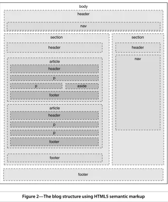
use HTML5 markup to mock up the front page of the blog for AwesomeCo, a company on the cutting edge of awesomeness.
When we’re all done, we’ll have something that looks like the following figure.
To get an idea of what we’re going to build, take a look at the following figure.
We’ll create a fairly typical blog structure, with a main header and horizontal
navigation below the header. In the main section, each article has a header and a footer. An article may also have a pull quote, or an aside. There’s a
sidebar that contains additional navigation elements. Finally, the page has a footer for contact and copyright information. There’s nothing new about
this structure except that this time, instead of coding it up with lots of <div>
tags, we’re going to use specific tags to describe these regions.
body
header
section section
footer header
footer article header
footer p
aside
article header
footer p
p
header
nav
p
nav
Figure 2—The blog structure using HTML5 semantic markup
It All Starts with the Right Doctype
We want to use HTML5’s new elements, and that means we need to let
browsers and validators know about the tags we’ll be using. Create a new
page called index.html, and place this basic HTML5 template into that file.
html5_new_tags/index.html
Take a look at the doctype on line 1 of that example. This is all we need for an HTML5 doctype. If you’re used to doing web pages, you’re probably familiar
with the long, hard-to-remember doctypes for XHTML, like this:
<!DOCTYPE html PUBLIC "-//W3C//DTD XHTML 1.0 Transitional//EN" "http://www.w3.org/TR/xhtml1/DTD/xhtml1-transitional.dtd">
Now take another look at the HTML5 doctype:
<!DOCTYPE html>
That’s much simpler and much easier to remember.
The point of a doctype is twofold. First, it’s to help validators determine what
validation rules an HTML validator needs to use when validating the code. Second, a doctype forces Internet Explorer versions 6, 7, and 8 to go into
“standards mode,” which is vitally important if you’re trying to build pages
that work across all browsers. The HTML5 doctype satisfies both of these needs.
Notice the <meta> tag on line 4. This specifies the character encoding of our page. If we want to use Unicode characters, we need to include this at the top, above any lines that contain any text.
With our basic HTML5 template in place, let’s start building out our blog.
Headers
html5_new_tags/index.html <header id="page_header">
Line 1 2
</header><h1>AwesomeCo Blog!</h1>
3
You’re not restricted to having just one header on a page. Each section or
article can also have a header, so it can be helpful to use the ID attribute like I did on line 1 to uniquely identify your elements. A unique ID makes it easy to style elements with CSS or locate elements with JavaScript.
Footers
The <footer> tag defines footer information for a document or an adjacent
section. You’ve seen footers before on websites. They usually contain
informa-tion like the copyright date and who owns the site, although it’s common for
footers to contain complex navigation structures. The specification says we can have multiple footers in a document too, so that means we could use the footers within our blog articles.
For now, let’s define a simple footer for our page. Since we can have more
than one footer, we’ll give this one an ID just like we did with the header. It’ll
help us uniquely identify this particular footer when we want to add styles to this element and its children.
html5_new_tags/index.html <footer id="page_footer">
<p>Copyright © 2013 AwesomeCo.</p> </footer>
This footer simply contains a copyright date. However, like headers, footers on pages often contain other elements, including navigational elements.
Navigation
Navigation is vital to the success of a website. People simply aren’t going to
stick around if you make it too hard for them to find what they’re looking for,
so it makes sense for navigation to get its own HTML tag.
Let’s add a navigation section to our document’s header. We’ll add links to
the blog’s home page, the archives, a page that lists the contributors to the
blog, and a link to a contact page.
Your page can have multiple navigation elements. You often have navigation in the header and the footer, so now you can identify those explicitly. Our blog’s footer needs links to the AwesomeCo home page, the company’s “about
us” page, and the company’s terms of service and privacy policies. We’ll add
these as another unordered list within the page’s <footer> element.
html5_new_tags/index.html <footer id="page_footer">
<p>Copyright © 2013 AwesomeCo.</p> <nav>
<ul>
<li><a href="#">Home</a></li> <li><a href="#">About</a></li>
<li><a href="#">Terms of Service</a></li> <li><a href="#">Privacy</a></li>
</ul> </nav> </footer>
We’ll use CSS to change how both of these navigation bars look, so don’t
worry about the appearance yet. The point of these new elements is to describe the content, not to describe how the content looks. That’s what CSS is for.
Let’s keep working on the markup.
Sections and Articles
Sections are the logical regions of a page, and the <section> tag is here to replace the abused <div> tag when it comes to describing logical sections of a page.
html5_new_tags/index.html <section id="posts"> </section>
Don’t get carried away with sections, though. Use them to logically group
your content! Here we’ve created a section that will hold all the blog posts.
However, each post shouldn’t be in its own section. We have a more
appropri-ate tag for that.
Articles
The <article> tag is the perfect element to describe the actual content of a web
page. With so many elements on a page, including headers, footers, naviga-tional elements, advertisements, widgets, and social-media sharing buttons, it might be easy to forget that people come to a site because they’re interested
in the content you’re providing. The <article> tag helps you describe that
content.
So what’s the difference between an <article> and a <section>? Think of a <section>
To put it another way, a <section> is like the sports section of a newspaper. The sports section has many articles, each one able to stand on its own. Each of those articles may again be divided into its own bunch of sections.
Some sections of a web page, like headers and footers, have proper tags. A section is a rather generic element you can use to logically group content.
Each of our articles will have a header, some content, and a footer. We define an entire article like this:
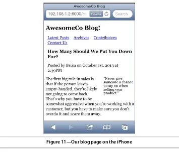
html5_new_tags/index.html <article class="post">
<header>
<h2>How Many Should We Put You Down For?</h2> <p>Posted by Brian on
<time datetime="2013-10-01T14:39">October 1st, 2013 at 2:39PM</time> </p>
</header> <p>
The first big rule in sales is that if the person leaves empty-handed, they're likely not going to come back. That's why you have to be somewhat aggressive when you're working with a customer, but you have to make sure you don't overdo it and scare them away.
</p> <p>
One way you can keep a conversation going is to avoid asking questions that have yes or no answers. For example, if you're selling a service plan, don't ever ask “Are you interested in our 3 or 5 year service plan?” Instead, ask “Are you interested in the 3 year service plan or the 5 year plan, which is a better value?” At first glance, they appear to be asking the same thing, and while a customer can still opt out, it's harder for them to opt out of the second question because they have to say more than just “no.”
</p> <footer>
<p><a href="comments"><i>25 Comments</i></a> ...</p> </footer>
</article>
We can use <header> and <footer> elements inside of our articles, which makes it much easier to describe those specific sections. We can also divide our article into multiple sections using the <section> element.
Asides and Sidebars
Sometimes you have content that adds something extra to your main content, such as pull quotes, diagrams, additional thoughts, or related links. You can use the new <aside> tag to identify these elements.
html5_new_tags/index.html <aside>
<p>
“Never give someone a chance to say no when selling your product.”
</p> </aside>
We’ll place the callout quote in an <aside> element. We’ll nest this <aside>
within the article, keeping it close to its related content.
Our completed section, with the aside, looks like this:
html5_new_tags/index.html <section id="posts">
<article class="post"> <header>
<h2>How Many Should We Put You Down For?</h2> <p>Posted by Brian on
<time datetime="2013-10-01T14:39">October 1st, 2013 at 2:39PM</time> </p>
</header> <aside>
<p>
“Never give someone a chance to say no when selling your product.”
</p> </aside> <p>
The first big rule in sales is that if the person leaves empty-handed, they're likely not going to come back. That's why you have to be somewhat aggressive when you're working with a customer, but you have to make sure you don't overdo it and scare them away.
</p> <p>
One way you can keep a conversation going is to avoid asking questions that have yes or no answers. For example, if you're selling a service plan, don't ever ask “Are you interested in our 3 or 5 year service plan?” Instead, ask “Are you interested in the 3 year service plan or the 5 year plan, which is a better value?” At first glance, they appear to be asking the same thing, and while a customer can still opt out, it's harder for them to opt out of the second question because they have to say more than just “no.”
</p> <footer>
<p><a href="comments"><i>25 Comments</i></a> ...</p> </footer>
Now we just have to add the sidebar section.
Our blog has a sidebar on the right side that contains links to the archives for the blog. If you’re thinking that we could use the aside tag to define the
sidebar of our blog, think again. You could do it that way, but it goes against the spirit of the specification. The <aside> is designed to show content related to an article. It’s a good place to show related links, a glossary, or a pull quote.
To mark up our sidebar that contains our archive list, we’ll use another
<section> tag and a <nav> tag.
html5_new_tags/index.html <section id="sidebar">
<nav>
<h3>Archives</h3>
<ul>
<li><a href="2013/10">October 2013</a></li> <li><a href="2013/09">September 2013</a></li> <li><a href="2013/08">August 2013</a></li> <li><a href="2013/07">July 2013</a></li> <li><a href="2013/06">June 2013</a></li> <li><a href="2013/05">May 2013</a></li> <li><a href="2013/04">April 2013</a></li> <li><a href="2013/03">March 2013</a></li> <li><a href="2013/02">February 2013</a></li> <li><a href="2013/01">January 2013</a></li> <li><a href="all">More</a></li>
</ul>
</nav>
</section>
In our case, the links in our page’s sidebar are a secondary navigation. Not
every group of links needs to be wrapped with the <nav> element; we reserve that element specifically for navigation regions.
That’s it for our blog’s structure. Now let’s turn our attention to the layout.
Styling the Blog
We apply styles to these new elements just like we’d style <div> elements.
First we create a new stylesheet file called stylesheets/style.css and attach it to our HTML document by placing a stylesheet link in the header, like this:
html5_new_tags/index.html
<link rel="stylesheet" href="stylesheets/style.css">
Let’s center the page’s content and set some basic font styles.
html5_new_tags/stylesheets/style.css body{
margin: 15px auto;
font-family: Arial, "MS Trebuchet", sans-serif;
width: 960px; }
p{ margin: 0 0 20px 0;}
p, li{ line-height: 20px; }
Next we define the header’s width.
html5_new_tags/stylesheets/style.css
#page_header{ width: 100%; }
We style the main navigation links by transforming the bulleted lists into a horizontal navigation bar by floating all of the list items so they fall on the same line:
html5_new_tags/stylesheets/style.css
#page_header > nav > ul, #page_footer > nav > ul{
list-style: none; margin: 0; padding: 0; }
#page_header > nav > ul > li, #page_footer nav > ul > li{ margin: 0 20px 0 0;
padding: 0; display: inline; }
We add a little margin to the right side of each <li> so we get space between each menu entry. We’re using the shorthand version of the margin rule, which
reads top, right, bottom, left. Think of it like an analog clock; 12 is at the top, 3 is on the right, 6 is at the bottom, and 9 is on the left.
Next we style the main content to create a large content column and a smaller sidebar. The posts section needs to be floated left and given a width, and we need to float the callout inside the article. While we’re doing that, let’s
bump up the font size for the callout.
html5_new_tags/stylesheets/style.css
#posts aside{ float: right; font-size: 20px; line-height: 40px; margin-left: 5%; width: 35%; }
Then we float the sidebar and define its width:
html5_new_tags/stylesheets/style.css
#sidebar{ float: left; width: 25%; }
Last, we need to clear the floats on the footer so that it sits at the bottom of the page. Remember that whenever we float something, the element gets removed from the normal document flow. Clearing an element tells the browser not to float that element.1
html5_new_tags/stylesheets/style.css
#page_footer{ clear: both; display: block; text-align: center; width: 100%; }
These are just basic styles. From here, I’m confident you can make this look
much, much better.
Falling Back
Although this all works great in Internet Explorer 9, Firefox, Chrome, Opera, and Safari, the people in management aren’t going to be too happy when they
see the mess that Internet Explorer 8 makes out of our page. The content displays fine, but since Internet Explorer 8 doesn’t understand these elements,
it can’t apply styles to them, and the whole page resembles something from
the mid 1990s.
The only way to make Internet Explorer 8 and older style these elements is to use JavaScript to define the elements as part of the document. That turns out to be really easy. We add this code to the <head> section of the page so it executes before
the browser renders any elements. We place it inside a conditional comment, a
special type of comment that only Internet Explorer will read.
1. https://developer.mozilla.org/en-US/docs/Web/CSS/clear
html5_new_tags/index.html
<!--[if lte IE 8]>
<script>
document.createElement("nav"); document.createElement("header"); document.createElement("footer"); document.createElement("section"); document.createElement("aside"); document.createElement("article");
</script>
<![endif]-->
This particular comment targets any version of Internet Explorer older than version 9.0. If we reload our page, it looks correct now.
This approach creates a dependency on JavaScript, though, so you need to take that into consideration. The improved organization and readability of the document make it worth it, and since there are no accessibility concerns, because the contents still display and are read by a screen reader, you’re only
making the presentation seem grossly out-of-date to your users who have disabled JavaScript intentionally.
This approach is fine for adding support for a handful of elements or for understanding how you can add support. Remy Sharp’s brilliant html5shiv
takes this approach much further and might be more appropriate for incor-porating fallback support if you’re looking to support many more elements.2
Tip 2
Showing Progress toward a Goal with the <meter> Element
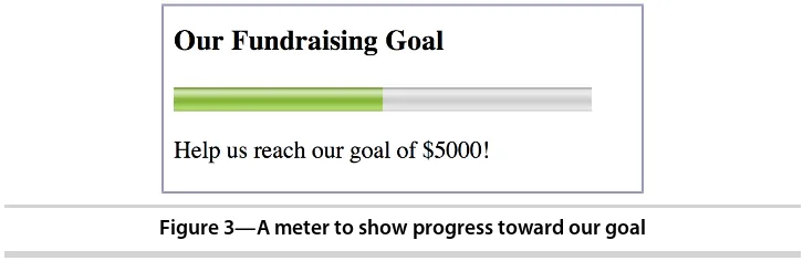
AwesomeCo is holding a charity fundraiser in a few months and looking to get $5000 donated by the general public. Because AwesomeCo is such an awesome company, it’s planning to kick in an additional $5000 if people
pledge enough support to hit the original $5000 goal. AwesomeCo wants to display a progress meter on one of its pages. When we’re done, we’ll have
something that looks like the following figure.
While we can certainly achieve that with some <div> tags styled with CSS, we can also use the new <meter> tag, which is designed specifically for this task.
The <meter> tag helps you semantically describe an actual meter. In order for
your meter to be in harmony with the specification, you shouldn’t use your
meter for things with arbitrary minimum or maximum values, like height and weight. However, you could use <meter> for temperature if you treated it like a thermometer, where you would set low and high values.
In our case, we want to show how close we are to our goal of $5000. We have a minimum and a maximum value, so it’s a perfect fit for us.
Figure 3—A meter to show progress toward our goal
Let’s build a quick prototype by creating a new HTML5 document. We’ll
rep-resent our meter with this code, hard-coding 2500.00 as our current value to demonstrate how it works right now.
html5_meter/index.html
<h3>Our Fundraising Goal</h3> <meter title="USD" id="pledge_goal"
value="2500.00" min="0" max="5000.00"> </meter>
<p>Help us reach our goal of $5000!</p>