Exploring Spatial Data with
GeoDa
TM: A Workbook
Luc Anselin
Spatial Analysis Laboratory
Department of Geography
University of Illinois, Urbana-Champaign
Urbana, IL 61801
http://sal.uiuc.edu/
Center for Spatially Integrated Social Science
http://www.csiss.org/
Revised Version, March 6, 2005
Contents
Preface xvi
1 Getting Started with GeoDa 1
1.1 Objectives . . . 1
1.2 Starting a Project . . . 1
1.3 User Interface . . . 3
1.4 Practice . . . 5
2 Creating a Choropleth Map 6 2.1 Objectives . . . 6
4 Creating a Point Shape File 22 4.1 Objectives . . . 22
4.2 Point Input File Format . . . 22
4.3 Converting Text Input to a Point Shape File . . . 24
5 Creating a Polygon Shape File 26
6.2 Creating a Point Shape File Containing Centroid Coordinates 37 6.2.1 Adding Centroid Coordinates to the Data Table . . . 39
6.3 Creating a Thiessen Polygon Shape File . . . 40
17 Spatially Lagged Variables 124
22 Regression Basics 165
23.5 Multicollinearity, Normality and Heteroskedasticity . . . 193
23.6 Diagnostics for Spatial Autocorrelation . . . 196
23.6.1 Morans’ I . . . 196
23.6.2 Lagrange Multiplier Test Statistics . . . 197
23.6.3 Spatial Regression Model Selection Decision Rule . . . 198
25 Spatial Error Model 213
25.1 Objectives . . . 213
25.2 Preliminaries . . . 214
25.2.1 OLS with Diagnostics . . . 215
25.3 ML Estimation with Diagnostics . . . 216
25.3.1 Model Specification . . . 218
25.3.2 Estimation Results . . . 218
25.3.3 Diagnostics . . . 219
25.4 Predicted Value and Residuals . . . 221
25.5 Practice . . . 223
List of Figures
1.1 The initial menu and toolbar. . . 2
1.2 Select input shape file. . . 2
1.3 Opening window after loading the SIDS2 sample data set. . 3
1.4 Options in the map (right click). . . 4
1.5 Close all windows. . . 4
1.6 The complete menu and toolbar buttons. . . 4
1.7 Explore toolbar. . . 5
2.1 Variable selection. . . 7
2.2 Quartile map for count of non-white births (NWBIR74). . . . 8
4.1 Los Angeles ozone data set text input file with location
co-ordinates. . . 23
4.2 Creating a point shape file from ascii text input. . . 24
4.3 Selecting the x and y coordinates for a point shape file. . . . 24
4.4 OZ9799 point shape file base map and data table. . . 25
5.1 Input file with Scottish districts boundary coordinates. . . . 27
5.2 Creating a polygon shape file from ascii text input. . . 28
5.3 Specifying the Scottish districts input and output files. . . . 28
5.4 Scottish districts base map. . . 29
5.5 Scottish districts base map data table. . . 29
5.6 Specify join data table and key variable. . . 30
5.7 Join table variable selection. . . 30
5.8 Scottish lip cancer data base joined to base map. . . 30
5.9 Saving the joined Scottish lip cancer data to a new shape file. 31 5.10 Creating a polygon shape file for a regular grid. . . 32
6.1 Creating a point shape file containing polygon centroids. . . 37
6.2 Specify the polygon input file. . . 37
6.3 Specify the point output file. . . 37
6.4 Centroid shape file created. . . 38
6.5 Centroid point shape file overlaid on original Ohio counties. 38 6.6 Add centroids from current polygon shape to data table. . . 39
6.7 Specify variable names for centroid coordinates. . . 40
6.8 Ohio centroid coordinates added to data table. . . 40
6.9 Creating a Thiessen polygon shape file from points. . . 40
6.10 Specify the point input file. . . 41
6.11 Specify the Thiessen polygon output file. . . 41
6.12 Thiessen polygons for Los Angeles basin monitors. . . 42
7.1 Quintile maps for spatial AR variables on 10 by 10 grid. . . 44
7.2 Histogram function. . . 44
7.3 Variable selection for histogram. . . 45
7.4 Histogram for spatial autoregressive random variate. . . 45
7.6 Linked histograms and maps (from histogram to map). . . . 47
7.7 Linked histograms and maps (from map to histogram). . . . 48
7.8 Changing the number of histogram categories. . . 48
8.3 Scatter plot of homicide rates against resource deprivation. . 55
8.4 Option to use standardized values. . . 55
8.5 Correlation plot of homicide rates against resource deprivation. 56 8.6 Option to use exclude selected observations. . . 57
8.7 Scatter plot with two observations excluded. . . 58
8.8 Brushing the scatter plot. . . 58
8.9 Brushing and linking a scatter plot and map. . . 59
8.10 Brushing a map. . . 60
10.5 Conditional scatter plot. . . 72
10.6 Moving the category breaks in a conditional scatter plot. . . 73
10.7 Three dimensional scatter plot function. . . 74
10.8 3D scatter plot variable selection. . . 74
10.9 Variables selected in 3D scatter plot. . . 74
10.10 Three dimensional scatter plot (police, crime, unemp). . . . 74
10.11 3D scatter plot rotated with 2D projection on the zy panel. 75 10.12 Setting the selection shape in 3D plot. . . 75
11.4 Percentile map for APR party election results, 1999. . . 80
11.5 Box map function. . . 81
13.5 Box map for Ohio white female lung cancer mortality in 1968. 94 13.6 Save rates to data table. . . 95
13.8 Raw rates added to data table. . . 95
13.9 Excess risk map function. . . 96
13.10 Excess risk map for Ohio white female lung cancer mortality in 1968. . . 96
13.11 Save standardized mortality rate. . . 97
13.12 SMR added to data table. . . 98
13.13 Box map for excess risk rates. . . 98
14.1 Empirical Bayes rate smoothing function. . . 100
14.2 Empirical Bayes event and base variable selection. . . 100
14.3 EB smoothed box map for Ohio county lung cancer rates. . 101
14.4 Spatial weights creation function. . . 102
14.5 Spatial weights creation dialog. . . 103
14.6 Open spatial weights function. . . 103
14.7 Select spatial weight dialog. . . 103
14.8 Spatial rate smoothing function. . . 104
14.9 Spatially smoothed box map for Ohio county lung cancer rates. . . 104
15.7 Rook contiguity structure for Sacramento census tracts. . . . 110
15.8 Weights properties function. . . 111
15.9 Weights properties dialog. . . 111
15.10 Rook contiguity histogram for Sacramento census tracts. . . 112
15.11 Islands in a connectivity histogram. . . 112
15.12 Queen contiguity. . . 113
15.13 Comparison of connectedness structure for rook and queen contiguity. . . 114
15.14 Second order rook contiguity. . . 114
15.15 Pure second order rook connectivity histogram. . . 115
15.16 Cumulative second order rook connectivity histogram. . . . 115
16.1 Base map for Boston census tract centroid data. . . 118
16.2 Distance weights dialog. . . 119
16.4 GWT shape file created. . . 120
17.5 Spatial lag dialog for Sacramento tract household income. . 126
17.6 Spatial lag variable added to data table. . . 127
17.7 Variable selection of spatial lag of income and income. . . . 128
17.8 Moran scatter plot constructed as a regular scatter plot. . . 128
18.1 Base map for Scottish lip cancer data. . . 130
18.2 Raw rate calculation for Scottish lip cancer by district. . . . 131
18.3 Box map with raw rates for Scottish lip cancer by district. . 131
18.4 Univariate Moran scatter plot function. . . 132
18.5 Variable selection dialog for univariate Moran. . . 132
18.6 Spatial weight selection dialog for univariate Moran. . . 133
18.7 Moran scatter plot for Scottish lip cancer rates. . . 133
18.8 Save results option for Moran scatter plot. . . 134
18.9 Variable dialog to save results in Moran scatter plot. . . 134
18.10 Randomization option dialog in Moran scatter plot. . . 135
18.11 Permutation empirical distribution for Moran’s I. . . 135
18.12 Envelope slopes option for Moran scatter plot. . . 136
18.13 Envelope slopes added to Moran scatter plot. . . 136
19.1 St Louis region county homicide base map. . . 139
19.2 Local spatial autocorrelation function. . . 139
19.3 Variable selection dialog for local spatial autocorrelation. . . 140
19.4 Spatial weights selection for local spatial autocorrelation. . . 140
19.5 LISA results option window. . . 141
19.6 LISA significance map for St Louis region homicide rates. . . 141
19.7 LISA cluster map for St Louis region homicide rates. . . 142
19.8 LISA box plot. . . 143
19.9 LISA Moran scatter plot. . . 144
19.10 Save results option for LISA. . . 144
19.12 LISA randomization option. . . 145
19.13 Set number of permutations. . . 145
19.14 LISA significance filter option. . . 146
19.15 LISA cluster map with p <0.01. . . 146
19.16 Spatial clusters. . . 147
20.1 Empirical Bayes adjusted Moran scatter plot function. . . . 149
20.2 Variable selection dialog for EB Moran scatter plot. . . 150
20.3 Select current spatial weights. . . 150
20.4 Empirical Bayes adjusted Moran scatter plot for Scottish lip cancer rates. . . 151
20.5 EB adjusted permutation empirical distribution. . . 151
20.6 EB adjusted LISA function. . . 152
20.7 Variable selection dialog for EB LISA. . . 152
20.8 Spatial weights selection for EB LISA. . . 153
20.9 LISA results window cluster map option. . . 153
20.10 LISA cluster map for raw and EB adjusted rates. . . 154
20.11 Sensitivity analysis of LISA rate map: neighbors. . . 154
20.12 Sensitivity analysis of LISA rate map: rates. . . 154
21.1 Base map with Thiessen polygons for Los Angeles monitor-ing stations. . . 156
21.2 Bivariate Moran scatter plot function. . . 156
21.3 Variable selection for bivariate Moran scatter plot. . . 157
21.4 Spatial weights selection for bivariate Moran scatter plot. . . 157
21.5 Bivariate Moran scatter plot: ozone in 988 on neighbors in 987. . . 158
21.6 Bivariate Moran scatter plot: ozone in 987 on neighbors in 988. . . 159
21.7 Spatial autocorrelation for ozone in 987 and 988. . . 159
21.8 Correlation between ozone in 987 and 988. . . 160
21.9 Space-time regression of ozone in 988 on neighbors in 987. . 161
21.10 Moran scatter plot matrix for ozone in 987 and 988. . . 162
21.11 Bivariate LISA function. . . 163
21.12 Bivariate LISA results window options. . . 163
21.13 Bivariate LISA cluster map for ozone in 988 on neighbors in 987. . . 164
22.1 Columbus neighborhood crime base map. . . 166
22.3 Regression inside a project. . . 166
22.12 Predicted values and residuals variable name dialog. . . 173
22.13 Predicted values and residuals added to table. . . 173
22.19 Quantile map (6 categories) with predicted values from CRIME regression. . . 178
22.20 Standard deviational map with residuals from CRIME re-gression. . . 179
23.1 Baltimore house sales point base map. . . 181
23.2 Baltimore house sales Thiessen polygon base map. . . 181
23.3 Rook contiguity weights for Baltimore Thiessen polygons. . 182
23.4 Calculation of trend surface variables. . . 182
23.5 Trend surface variables added to data table. . . 183
23.6 Linear trend surface title and output settings. . . 183
23.7 Linear trend surface model specification. . . 184
23.8 Spatial weights specification for regression diagnostics. . . . 185
23.9 Linear trend surface residuals and predicted values. . . 185
23.10 Linear trend surface model output. . . 186
23.11 Quadratic trend surface title and output settings. . . 186
23.12 Quadratic trend surface model specification. . . 187
23.13 Quadratic trend surface residuals and predicted values. . . . 188
23.14 Quadratic trend surface model output. . . 188
23.15 Quadratic trend surface predicted value map. . . 189
23.16 Residual map, quadratice trend surface. . . 190
23.17 Quadratic trend surface residual plot. . . 191
23.18 Quadratic trend surface residual/fitted value plot. . . 192
23.20 Regression diagnostics – linear trend surface model. . . 194
23.21 Regression diagnostics – quadratic trend surface model. . . . 194
23.22 Spatial autocorrelation diagnostics – linear trend surface model. . . 196
23.23 Spatial autocorrelation diagnostics – quadratic trend surface model. . . 196
23.24 Spatial regression decision process. . . 199
24.1 South county homicide base map. . . 202
24.2 Homicide classic regression for 1960. . . 203
24.3 OLS estimation results, homicide regression for 1960. . . 204
24.4 OLS diagnostics, homicide regression for 1960. . . 205
24.5 Title and file dialog for spatial lag regression. . . 205
24.6 Homicide spatial lag regression specification for 1960. . . 206
24.7 Save residuals and predicted values dialog. . . 207
24.8 Spatial lag predicted values and residuals variable name dialog.207 24.9 ML estimation results, spatial lag model, HR60. . . 208
24.10 Diagnostics, spatial lag model, HR60. . . 209
24.11 Observed value, HR60. . . 210
24.12 Spatial lag predicted values and residuals HR60. . . 210
24.13 Moran scatter plot for spatial lag residuals, HR60. . . 210
24.14 Moran scatter plot for spatial lag prediction errors, HR60. . 211
25.1 Homicide classic regression for 1990. . . 214
25.2 OLS estimation results, homicide regression for 1990. . . 215
25.3 OLS diagnostics, homicide regression for 1990. . . 216
25.4 Spatial error model specification dialog. . . 217
25.5 Spatial error model residuals and predicted values dialog. . . 217
25.6 Spatial error model ML estimation results, HR90. . . 219
25.7 Spatial error model ML diagnostics, HR90. . . 219
25.8 Spatial lag model ML estimation results, HR90. . . 220
25.9 Observed value, HR90. . . 221
25.10 Spatial error predicted values and residuals HR90. . . 221
Preface
This workbook contains a set of laboratory exercises initally developed for the ICPSR Summer Program courses on spatial analysis: Introduction to Spatial Data Analysis andSpatial Regression Analysis. It consists of a series of brief tutorials and worked examples that accompany theGeoDaTM
User’s Guide and GeoDaTM
0.95i Release Notes (Anselin 2003a, 2004).1
They pertain to release 0.9.5-i of GeoDa, which can be downloaded for free from http://geoda.uiuc.edu/downloadin.php. The “official” reference to GeoDa
is Anselin et al. (2004c).
GeoDaTM is a trade mark of Luc Anselin.
Some of these materials were included in earlier tutorials (such as Anselin 2003b) available on the SAL web site. In addition, the workbook incor-porates laboratory materials prepared for the courses ACE 492SA, Spatial Analysisand ACE 492SE,Spatial Econometrics, offered during the Fall 2003 semester in the Department of Agricultural and Consumer Economics at the University of Illinois, Urbana Champaign. There may be slight discrepan-cies due to changes in the version of GeoDa. In case of doubt, the most recent document should always be referred to as it supersedes all previous tutorial materials.
The examples and practice exercises use the sample data sets that are available from the SAL “stuff” web site. They are listed on and can be downloaded from http://sal.uiuc.edu/data main.php. The main purpose of these sample data is to illustrate the features of the software. Readers are strongly encouraged to use their own data sets for the practice exercises.
Acknowledgments
The development of this workbook has been facilitated by the continued research support through the U.S. National Science Foundation grant
BCS-1
In the remainder of this workbook these documents will be referred to asUser’s Guide
9978058 to the Center for Spatially Integrated Social Science (CSISS). More recently, support has also been provided through a Cooperative Agreement between the Center for Disease Control and Prevention (CDC) and the As-sociation of Teachers of Preventive Medicine (ATPM), award # TS-1125. The contents of this workbook are the sole responsibility of the author and do not necessarily reflect the official views of the CDC or ATPM.
Exercise 1
Getting Started with GeoDa
1.1
Objectives
This exercise illustrates how to get started withGeoDa, and the basic struc-ture of its user interface. At the end of the exercise, you should know how to:
• open and close a project
• load a shape file with the proper indicator (Key)
• select functions from the menu or toolbar
More detailed information on these operations can be found in the User’s Guide, pp. 3–18, and in the Release Notes, pp. 7–8.
1.2
Starting a Project
StartGeoDa by double-clicking on its icon on the desktop, or run theGeoDa
executable in Windows Explorer (in the proper directory). A welcome screen will appear. In the File Menu, select Open Project, or click on the Open Project toolbar button, as shown in Figure 1.1 on p. 2. Only two items on the toolbar are active, the first of which is used to launch a project, as illustrated in the figure. The other item is to close a project (see Figure 1.5 on p. 4).
Figure 1.1: The initial menu and toolbar.
In GeoDa, only shape files can be read into a project at this point. However, even if you don’t have your data in the form of a shape file, you may be able to use the included spatial data manipulation tools to create one (see also Exercises 4 and 5).
To get started, select the SIDS2 sample data set as theInput Mapin the file dialog that appears, and leave the Key variable to its default FIPSNO. You can either type in the full path name for the shape file, or navigate in the familiar Windows file structure, until the file name appears (only shape files are listed in the dialog).1
Finally, click on OK to launch the map, as in Figure 1.2.
Figure 1.2: Select input shape file.
Next, a map window is opened, showing the base map for the analyses,
1
When using your own data, you may get an error at this point (such as “out of memory”). This is likely due to the fact that the chosenKeyvariable is either not unique or is a character value. Note that many county data shape files available on the web have the FIPS code as a character, andnot as a numeric variable. To fix this, you need to convert the character variable to numeric. This is easy to do in most GIS, database or spreadsheet software packages. For example, in ArcView this can be done using the
Tableedit functionality: create a newField and calculate it by applying theAsNumeric
depicting the 100 counties of North Carolina, as in Figure 1.3. The window shows (part of) the legend pane on the left hand size. This can be resized by dragging the separator between the two panes (the legend pane and the map pane) to the right or left.
Figure 1.3: Opening window after loading the SIDS2 sample data set.
You can change basic map settings by right clicking in the map window and selecting characteristics such as color (background, shading, etc.) and the shape of the selection tool. Right clicking opens up a menu, as shown in Figure 1.4 (p. 4). For example, to change the color for the base map from the default green to another color, clickColor>Mapand select a new color from the standard Windows color palette.
To clear all open windows, click on theClose all windowstoolbar but-ton (Figure 1.5 on p. 4), or selectClose All in theFile menu.
1.3
User Interface
Figure 1.4: Options in the map (right click).
Figure 1.5: Close all windows.
The menu bar contains eleven items. Four are standard Windows menus:
File (open and close files), View (select which toolbars to show), Windows
(select or rearrange windows) andHelp (not yet implemented). Specific to
GeoDa areEdit(manipulate map windows and layers),Tools(spatial data manipulation),Table (data table manipulation), Map (choropleth mapping and map smoothing),Explore(statistical graphics),Space(spatial autocor-relation analysis), Regress (spatial regression) and Options (application-specific options). You can explore the functionality ofGeoDa by clicking on various menu items.
Figure 1.6: The complete menu and toolbar buttons.
Clicking on one of the toolbar buttons is equivalent to selecting the matching item in the menu. The toolbars are dockable, which means that you can move them to a different position. Experiment with this and select a toolbar by clicking on the elevated separator bar on the left and dragging it to a different position.
Figure 1.7: Explore toolbar.
1.4
Practice
Make sure you first close all windows with the North Carolina data. Start a new project using the St. Louis homicide sample data set for 78 counties surrounding the St. Louis metropolitan area (stl hom.shp), with FIPSNO
as the key variable. Experiment with some of the map options, such as the base map color (Color > Map) or the window background color (Color >
Exercise 2
Creating a Choropleth Map
2.1
Objectives
This exercise illustrates some basic operations needed to make maps and select observations in the map.
At the end of the exercise, you should know how to:
• make a simple choropleth map
• select items in the map
• change the selection tool
More detailed information on these operations can be found in the User’s Guide, pp. 35–38, 42.
2.2
Quantile Map
The SIDS data set in the sample collection is taken from Noel Cressie’s (1993) Statistics for Spatial Data (Cressie 1993, pp. 386–389). It contains variables for the count of SIDS deaths for 100 North Carolina counties in two time periods, here labeledSID74 andSID79. In addition, there are the count of births in each county (BIR74,BIR79) and a subset of this, the count of non-white births (NWBIR74,NWBIR79).
Consider constructing two quantile maps to compare the spatial distri-bution of non-white births and SIDS deaths in 74 (NWBIR74 and SID74). Click on the base map to make it active (inGeoDa, the last clicked window is active). In theMapMenu, selectQuantile. A dialog will appear, allowing the selection of the variable to be mapped. In addition, a data table will appear as well. This can be ignored for now.1
You should minimize the table to get it out of the way, but you will return to it later, so don’t remove it.2
In theVariables Settingsdialog, selectNWBIR74, as in Figure 2.1, and clickOK. Note the check box in the dialog to set the selected variable as the default. If you should do this, you will not be asked for a variable name the next time around. This may be handy when you want to do several different types of analyses for the same variable. However, in our case, we want to do the same analysis for different variables, so setting a default isnot a good idea. If you inadvertently check the default box, you can always undo it by invokingEdit >Select Variable from the menu.
Figure 2.1: Variable selection.
After you choose the variable, a second dialog will ask for the number of categories in the quantile map: for now, keep the default value of 4 (quartile map) and click OK. A quartile map (four categories) will appear, as in Figure 2.2 on p. 8.
1
The first time a specific variable is needed in a function, this table will appear.
2
Note how to the right of the legend the number of observations in each category is listed in parentheses. Since there are 100 counties in North Carolina, this should be 25 in each of the four categories of the quartile map. The legend also lists the variable name.
You can obtain identical result by right-clicking on the map, which brings up the same menu as shown in Figure 1.4 on p. 4. SelectChoropleth Map
> Quantile, and the same two dialogs will appear to choose the variable and number of categories.
Figure 2.2: Quartile map for count of non-white births (NWBIR74). Create a second choropleth map using the same geography. First, open a second window with the base map by clicking on theDuplicate maptoolbar button, shown in Figure 2.3. Alternatively, you can selectEdit>Duplicate Mapfrom the menu.
Figure 2.3: Duplicate map toolbar button.
Figure 2.4: Quartile map for count of SIDS deaths (SID74). observations in each quartile?
There are two problems with this map. One, it is a choropleth map for a “count,” or a so-calledextensive variable. This tends to be correlated with size (such as area or total population) and is often inappropriate. Instead, a rate or density is more suitable for a choropleth map, and is referred to as aintensive variable.
The second problem pertains to the computation of the break points. For a distribution such as the SIDS deaths, which more or less follows a Poisson distribution, there are many ties among the low values (0, 1, 2). The computation of breaks is not reliable in this case and quartile and quintile maps, in particular, are misleading. Note how the lowest category shows 0 observations, and the next 38.
You can save the map to the clipboard by selecting Edit > Copy to Clipboardfrom the menu. This only copies the map part. If you also want to get a copy of the legend, right click on the legend pane and selectCopy Legend to Clipboard. Alternatively, you can save a bitmap of the map (but not the legend) to a .bmp formatted file by selectingFile>Export>
2.3
Selecting and Linking Observations in the Map
So far, the maps have been “static.” The concept of dynamic maps im-plies that there are ways to select specific locations and to link the selection between maps. GeoDa includes several selection shapes, such as point, rect-angle, polygon, circle and line. Point and rectangle shapes are the default for polygon shape files, whereas the circle is the default for point shape files. You select an observation by clicking on its location (click on a county to select it), or select multiple observations by dragging (click on a point, drag the pointer to a different location to create a rectangle, and release). You can add or remove locations from the selection by shift-click. To clear the selection, click anywhere outside the map. Other selection shapes can be used by right clicking on the map and choosing one of the options in the
Selection Shapedrop down list, as in Figure 2.5. Note that each individ-ual map has its own selection tool and they don’t have to be the same across maps.
Figure 2.5: Selection shape drop down list.
As an example, choose circle selection (as in Figure 2.5), then click in the map for NWBIR74 and select some counties by moving the edge of the circle out (see Figure 2.6 on p. 11).
Figure 2.6: Circle selection.
2.4
Practice
Exercise 3
Basic Table Operations
3.1
Objectives
This exercise illustrates some basic operations needed to use the functional-ity in the Table, including creating and transforming variables.
At the end of the exercise, you should know how to:
• open and navigate the data table
• select and sort items in the table
• create new variables in the table
More detailed information on these operations can be found in the User’s Guide, pp. 54–64.
3.2
Navigating the Data Table
Begin again by clearing all windows and loading thesids.shpsample data (with FIPSNOas the Key). Construct a choropleth map for one of the vari-ables (e.g.,NWBIR74) and use the select tools to select some counties. Bring the Table back to the foreground if it had been minimized earlier. Scroll down the table and note how the selected counties are highlighted in blue, as in Figure 3.1 on p. 14.
Figure 3.1: Selected counties in linked table.
Figure 3.2: Table drop down menu.
selected items are shown at the top of the table, as in Figure 3.3 on p. 15. You clear the selection by clicking anywhere outside the map area in the map window (i.e., in the white part of the window), or by selecting Clear Selectionfrom the menu in Figure 3.2.
3.3
Table Sorting and Selecting
Figure 3.3: Table with selected rows promoted.
a given variable, double click on the column header corresponding to that variable. This is a toggle switch: the sorting order alternates between as-cending order and desas-cending order. A small triangle appears next to the variable name, pointing up for ascending order and down for descending order. The sorting can be cleared by “sorting” on the observation numbers contained in the first column. For example, double clicking on the column header for NWBIR74results in the (ascending) order shown in Figure 3.4.
Figure 3.4: Table sorted onNWBIR74.
the left-most column to select multiple records. The selection is immediately reflected in all the linked maps (and other graphs). You clear the selection by right clicking to invoke the drop down menu and selectingClear Selection
(or, in the menu, chooseTable >Clear Selection).
3.3.1 Queries
GeoDaimplements a limited number of queries, primarily geared to selecting observations that have a specific value or fall into a range of values. A logical statement can be constructed to select observations, depending on the range for a specific variable (but for one variable only at this point).
To build a query, right click in the table and select Range Selection
from the drop down menu (or, useTable>Range Selectionin the menu). A dialog appears that allows you to construct a range (Figure 3.5). Note that the range is inclusive on the left hand side and exclusive on the right hand side (<= and<). To find those counties with 500 or fewer live births in 1974, enter 0in the left text box, selectBIR74 as the variable and enter
500.1in the right hand side text box. Next, activate the selection by clicking the top right Applybutton.1
The first Apply will activate the Recoding dialog, which allows you to create a new variable with value set to 1 for the selected observations and zero elsewhere. The default variable name isREGIME, but that can be changed by overwriting the text box. If you do not want to create this vari-able, click OK. On the other hand, if you do want the extra variable, first clickApply(as in Figure 3.5) and thenOK.
Figure 3.5: Range selection dialog.
1
The selected rows will show up in the table highlighted in blue. To collect them together, choose Promotion from the drop down menu. The result should be as in Figure 3.6. Note the extra column in the table for the variable REGIME. However, the new variable is not permanent and can become so only after the table is saved (see Section 3.4).
Figure 3.6: Counties with fewer than 500 births in 74, table view.
3.4
Table Calculations
The table in GeoDa includes some limited “calculator” functionality, so that new variables can be added, current variables deleted, transformations carried out on current variables, etc. You invoke the calculator from the drop down menu (right click on the table) by selectingField Calculation
(see Figure 3.2 on p. 14). Alternatively, selectField Calculationfrom the
Tableitem on the main menu.
The calculator dialog has tabs on the top to select the type of operation you want to carry out. For example, in Figure 3.7 on p. 18, the right-most tab is selected to carry out rate operations.
Before proceeding with the calculations, you typically want to create a new variable. This is invoked from the Table menu with the Add Column
command (or, alternatively, by right clicking on the table). Note that this is not a requirement, and you may type in a new variable name directly in the left most text box of the Field Calculation dialog (see Figure 3.7). The new field will be added to the table.
You may have noticed that thesids.shpfile contains only the counts of births and deaths, but no rates.2
To create a new variable for the SIDS death rate in 74, selectAdd Columnfrom the drop down menu, and enter SIDR74
2
Figure 3.7: Rate calculation tab.
Figure 3.8: Adding a new variable to a table.
for the new variable name, followed by a click on Add, as in Figure 3.8. A new empty column appears on the extreme right hand side of the table (Figure 3.9, p. 19).
To calculate the rate, chooseField Calculationin the drop down menu (right click on the table) and click on the right hand tab (Rate Operations) in the Field Calculation dialog, as shown in Figure 3.7. This invokes a dialog specific to the computation of rates (including rate smoothing). For now, select the Raw Rate method and make sure to have SIDR74 as the result, SID74 as the Event and BIR74 as the base, as illustrated in Figure 3.7. Click OKto have the new value added to the table, as shown in Figure 3.10 on p. 19.
Figure 3.9: Table with new empty column.
Figure 3.10: Computed SIDS death rate added to table.
the SIDS death rate by its rescaled value, as in Figure 3.12 on p. 20. The newly computed values can immediately be used in all the maps and statistical procedures. However, it is important to remember that they are “temporary” and can still be removed (in case you made a mistake). This is accomplished by selectingRefresh Datafrom the Tablemenu or from the drop down menu in the table.
The new variables become permanent only after you save them to a shape file with a different name. This is carried out by means of theSave to Shape File As option.3
The saved shape file will use the same map as
3
Figure 3.11: Rescaling the SIDS death rate.
Figure 3.12: Rescaled SIDS death rate added to table.
the currently active shape file, but with the newly constructed table as its
dbf file. If you dont care about the shape files, you can remove the new .shp and .shx files later and use the dbf file by itself (e.g., in a spreadsheet or statistics program).
Experiment with this procedure by creating a rate variable for SIDR74
and SIDR79and saving the resulting table to a new file. Clear all windows and open the new shape file to check its contents.
3.5
Practice
located (e.g., click on St. Louis county in the table and check where it is in the map). Sort the table to find out which counties has no homicides in the 84–88 period (HC8488= 0). Also use the range selection feature to find the counties with fewer than 5 homicides in this period (HC8488<5).
Create a dummy variable for each selection (use a different name in-stead of the default REGIME). Using these new variables and the Field Calculation functions (not the Range Selection), create an additional selection for those counties with a nonzero homicide count less than 5. Ex-periment with different homicide count (or rate) variables (for different pe-riods) and/or different selection ranges.
Finally, construct a homicide rate variable for a time period of your choice for the St. Louis data (HCxxxxandPOxxxxare respectively theEvent
Exercise 4
Creating a Point Shape File
4.1
Objectives
This exercise illustrates how you can create a point shape file from a text or dbf input file in situations where you do not have a proper ESRI formatted shape file to start out with. SinceGeoDa requires a shape file as an input, there may be situations where this extra step is required. For example, many sample data sets from recent texts in spatial statistics are also available on the web, but few are in a shape file format. This functionality can be accessed without opening a project (which would be a logical contradiction since you don’t have a shape file to load). It is available from the Tools
menu.
At the end of the exercise, you should know how to:
• format a text file for input intoGeoDa
• create a point shape file from a text input file or dbf data file
More detailed information on these operations can be found inUsers’s Guide
pp. 28–31.
4.2
Point Input File Format
The format for the input file to create a point shape file is very straightfor-ward. The minimum contents of the input file are three variables: a unique identifier (integer value), the x-coordinate and the y-coordinate.1
In a dbf
1
Note that when latitude and longitude are included, the x-coordinate is thelongitude
Figure 4.1: Los Angeles ozone data set text input file with location coordi-nates.
format file, there are no further requirements.
When the input is a text file, the three required variables must be entered in a separate row for each observation, and separated by a comma. The input file must also contain two header lines. The first includes the number of observations and the number of variables, the second a list of the variable names. Again, all items are separated by a comma.
In addition to the identifier and coordinates, the input file can also con-tain other variables.2
The text input file format is illustrated in Figure 4.1, which shows the partial contents of the OZ9799 sample data set in the text file oz9799.txt. This file includes monthly measures on ozone pollution taken at 30 monitoring stations in the Los Angeles basin. The first line gives the number of observations (30) and the number of variables (2 identi-fiers, 4 coordinates and 72 monthly measures over a three year period). The
2
Figure 4.2: Creating a point shape file from ascii text input.
Figure 4.3: Selecting the x and y coordinates for a point shape file.
second line includes all the variable names, separated by a comma. Note that both the unprojected latitude and longitude are included as well as the projectedx, y coordinates (UTM zone 11).
4.3
Converting Text Input to a Point Shape File
The creation of point shape files from text input is invoked from theTools
menu, by selecting Shape > Points from ASCII, as in Figure 4.2. When the input is in the form of a dbf file, the matching command is Shape > Points from DBF. This generates a dialog in which the path for the input text file must be specified as well as a file name for the new shape file. Enter
oz9799.txtfor the former andoz9799for the latter (theshpfile extension will be added by the program). Next, the X-coord and Y-coord must be set, as illustrated in Figure 4.3 for the UTM projected coordinates in the
oz9799.txttext file. Use either these same values, or, alternatively, select
Check the contents of the newly created shape file by opening a new project (File > Open Project) and selecting the oz7999.shp file. The point map and associated data table will be as shown in Figure 4.4. Note that, in contrast to the ESRI point shape file standard, the coordinates for the points are included explicitly in the data table.
Figure 4.4: OZ9799 point shape file base map and data table.
4.4
Practice
Exercise 5
Creating a Polygon Shape File
5.1
Objectives
This exercise illustrates how you can create a polygon shape file from text input for irregular lattices, or directly for regular grid shapes in situations where you do not have a proper ESRI formatted shape file. As in Exercise 4, this functionality can be accessed without opening a project. It is available from the Toolsmenu.
At the end of the exercise, you should know how to:
• create a polygon shape file from a text input file with the boundary coordinates
• create a polygon shape file for a regular grid layout
• join a data table to a shape file base map
More detailed information on these operations can be found in the Release Notes, pp. 13–17, and theUser’s Guide, pp. 63–64.
5.2
Boundary File Input Format
and y coordinate pairs for each point (comma separated). This format is referred to as1a in the User’s Guide. Note that it currently does not sup-port multiple polygons associated with the same observation. Also, the first coordinate pair isnot repeated as the last. The count of point coordinates for each polygon reflects this (there are 16 x, y pairs for the first polygon in Figure 5.1).
The boundary file in Figure 5.1 pertains to the classic Scottish lip cancer data used as an example in many texts (see, e.g., Cressie 1993, p. 537). The coordinates for the 56 districts were taken from the scotland.map
boundaries included with the WinBugs software package, and exported to the S-Plus map format. The resulting file was then edited to conform to the
GeoDainput format. In addition, duplicate coordinates were eliminated and sliver polygons taken out. The result is contained in thescotdistricts.txt
file. Note that to avoid problems with multiple polygons, the island districts were simplified to a single polygon.
Figure 5.1: Input file with Scottish districts boundary coordinates.
5.3
Creating a Polygon Shape File for the Base Map
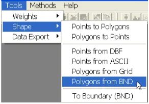
The creation of the base map is invoked from theTools menu, by selecting
Shape > Polygons from BND, as illustrated in Figure 5.2. This generates the dialog shown in Figure 5.3, where the path of the input file and the name for the new shape file must be specified. Selectscotdistricts.txtfor the former and enter scotdistrictsas the name for the base map shape file. Next, clickCreateto start the procedure. When the blue progress bar (see Figure 5.3) shows completion of the conversion, click onOK to return to the main menu.
Figure 5.2: Creating a polygon shape file from ascii text input.
Figure 5.3: Specifying the Scottish districts input and output files.
Figure 5.4: Scottish districts base map.
Figure 5.5: Scottish districts base map data table.
5.4
Joining a Data Table to the Base Map
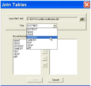
In order to create a shape file for the Scottish districts that also contains the lip cancer data, a data table (dbf format) must be joined to the table for the base map. This is invoked using theTablemenu with theJoin Tables
the drop down menu, as in Figure 3.2 on p. 14).
This brings up a Join Tables dialog, as in Figure 5.6. Enter the file name for the input file as scotlipdata.dbf, and select CODENOfor theKey
variable, as shown in the Figure. Next, move all variables from the left hand side column over to the right hand side, by clicking on the >> button, as shown in Figure 5.7. Finally, click on theJoinbutton to finish the operation. The resulting data table is as shown in Figure 5.8.
Figure 5.6: Specify join data table and key variable.
Figure 5.7: Join table variable selection.
Figure 5.8: Scottish lip cancer data base joined to base map.
however, the table (and shape file) must be saved to a file with a new name, as outlined in Section 3.4 on p. 19. This is carried out by using the Save to Shape File As ... function from theTablemenu, or by right clicking in the table, as in Figure 5.9. Select this command and enter a new file name (e.g., scotdistricts) for the output shape file, followed by OK. Clear the project and load the new shape file to check that its contents are as expected.
Figure 5.9: Saving the joined Scottish lip cancer data to a new shape file.
5.5
Creating a Regular Grid Polygon Shape File
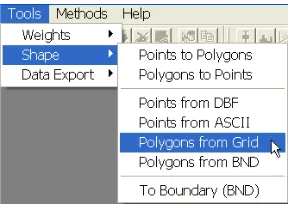
GeoDa contains functionality to create a polygon shape file for a regular grid (or lattice) layout without having to specify the actual coordinates of the boundaries. This is invoked from the Tools menu, using the Shape > Polygons from Gridfunction, as shown in Figure 5.10 on p. 32.
This starts up a dialog that offers many different options to specify the layout for the grid, illustrated in Figure 5.11 on p. 32. We will only focus on the simplest here (see theRelease Notes for more details).
Figure 5.10: Creating a polygon shape file for a regular grid.
Figure 5.11: Specifying the dimensions for a regular grid.
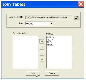
Check the resulting grid file with the usualOpen projecttoolbar button and usePolyIDas theKey. The shape will appear as in Figure 5.12 on p. 33. Use theTable toolbar button to open the associated data table. Note how it only contains the POLYIDidentifier and two geometric characteristics, as shown in Figure 5.13 on p. 33.
Figure 5.12: Regular square 7 by 7 grid base map.
Figure 5.13: Joining the NDVI data table to the grid base map.
a global change database. It was used as an illustration in Anselin (1993). The 49 observations match the layout for the regular grid just created.
After clearing the screen, bring up the new shape file and check its contents.
Figure 5.14: Specifying the NDVI variables to be joined.
Figure 5.15: NDVI data base joined to regular grid base map.
5.6
Practice
text file ohioutmbnd.txt with the boundary point coordinates for the 88 Ohio counties projected using UTM zone 17. Use this file to create a polygon shape file. Next, join this file with the “classic” Ohio lung cancer mortality data (Xia and Carlin 1998), contained in theohdat.dbffile. UseFIPSNOas theKey, and create a shape file that includes all the variables.1
Alternatively, you can apply theTools > Shape > To Boundary (BND)
function to any polygon shape file to create a text version of the boundary coordinates in 1a format. This can then be used to recreate the original polygon shape file in conjunction with the dbf file for that file.
The GRID100 sample data set includes the file grid10x10.dbf which contains simulated spatially correlated random variables on a regular square 10 by 10 lattice. Create such a lattice and join it to the data file (the Key
is POLYID). Save the result as a new shape file that you can use to map different patterns of variables that follow a spatial autoregressive or spatial moving average process.2
Alternatively, experiment by creating grid data sets that match the bounding box for one of the sample data sets. For example, use the COLUM-BUS map to create a 7 by 7 grid with the Columbus data, or use the SIDS map to create a 5 by 20 grid with the North Carolina Sids data. Try out the different options offered in the dialog shown in Figure 5.11 on p. 32.
1
Theohlung.shp/shx/dbffiles contain the result.
2
Exercise 6
Spatial Data Manipulation
6.1
Objectives
This exercise illustrates how you can change the representation of spatial observations between points and polygons by computing polygon centroids, and by applying a Thiessen polygon tessellation to points.1
As in Exer-cises 4 and 5, this functionality can be accessed without opening a project. It is available from the Tools menu. Note that the computations behind these operations are only valid for properlyprojectedcoordinates, since they operate in a Euclidean plane. While they will work on lat-lon coordinates (GeoDa has no way of telling whether or not the coordinates are projected), the results will only be approximate and should not be relied upon for precise analysis.
At the end of the exercise, you should know how to:
• create a point shape file containing the polygon centroids
• add the polygon centroids to the current data table
• create a polygon shape file containing Thiessen polygons
More detailed information on these operations can be found in the User’s Guide, pp. 19–28, and theRelease Notes, pp. 20–21.
1
Figure 6.1: Creating a point shape file containing polygon centroids.
Figure 6.2: Specify the poly-gon input file.
Figure 6.3: Specify the point output file.
6.2
Creating a Point Shape File Containing Centroid
Coordinates
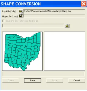
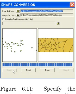
Centroid coordinates can be converted to a point shape file without having aGeoDa project open. From theToolsmenu, selectShape > Polygons to Points (Figure 6.1) to open the Shape Conversion dialog. First, specify the filename for the polygon input file, e.g.,ohlung.shpin Figure 6.2 (open the familiar file dialog by clicking on the file open icon). Once the file name is entered, a thumbnail outline of the 88 Ohio counties appears in the left hand pane of the dialog (Figure 6.2). Next, enter the name for the new shape file, e.g.,ohcentin Figure 6.3 and click on theCreatebutton.
Figure 6.4: Centroid shape file created.
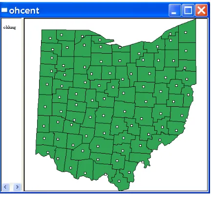
Figure 6.5: Centroid point shape file overlaid on original Ohio counties.
return to the main interface.
polygons with the centroids superimposed will appear as in Figure 6.5 on p. 38. The white map background of the polygons has been transferred to the “points.” As thetop layer, it receives all the properties specified for the map.
Check the contents of the data table. It is identical to the original shape file, except that the centroid coordinates have been added as variables.
6.2.1 Adding Centroid Coordinates to the Data Table
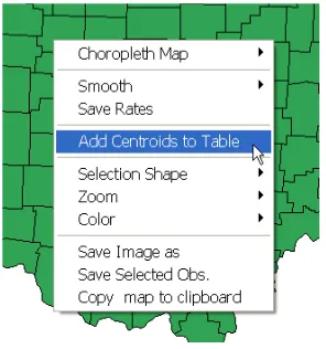
The coordinates of polygon centroids can be added to the data table of a polygon shape file without explicitly creating a new file. This is useful when you want to use these coordinates in a statistical analysis (e.g., in a trend surface regression, see Section 23.3 on p. 183).
This feature is implemented as one of the map options, invoked either from the Options menu (with a map as the active window), or by right clicking on the map and selectingAdd Centroids to Table, as illustrated in Figure 6.6. Alternatively, there is a toolbar button that accomplishes the same function.
Figure 6.6: Add centroids from current polygon shape to data table.
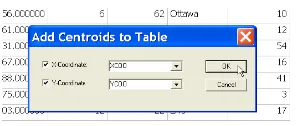
Load (or reload) the Ohio Lung cancer data set (ohlung.shpwithFIPSNO
Figure 6.7: Specify variable names for centroid coordinates.
Figure 6.8: Ohio centroid coordinates added to data table.
Figure 6.8. As before, make sure to save this to a new shape file in order to make the variables a permanent addition.
6.3
Creating a Thiessen Polygon Shape File
Point shape files can be converted to polygons by means of a Thiessen poly-gon tessellation. The polypoly-gon representation is often useful for visualization of the spatial distribution of a variable, and allows the construction of spa-tial weights based on contiguity. This process is invoked from the Tools
menu by selectingShape > Points to Polygons, as in Figure 6.9.
Figure 6.10: Specify the point input file.
Figure 6.11: Specify the
Thiessen polygon output file.
This opens up a dialog, as shown in Figure 6.10. Specify the name of the input (point) shape file as oz9799.shp, the sample data set with the locations of 30 Los Angeles basin air quality monitors. As for the polygon to point conversion, specifying the input file name yields a thumbnail outline of the point map in the left hand panel of the dialog. Next, enter the name for the new (polygon) shape file, say ozthies.shp.
Click on Createand see an outline of the Thiessen polygons appear in the right hand panel (Figure 6.11). Finally, select Done to return to the standard interface.
Compare the layout of the Thiessen polygons to the original point pat-tern in the same way as for the centroids in Section 6.2. First, open the Thiessen polygon file (ozthies with Stationas the Key). Change its map color to white. Next, add a layer with the original points (oz9799 with
Stationas theKey). The result should be as in Figure 6.12 on p. 42. Check the contents of the data table. It is identical to that of the point coverage, with the addition of Areaand Perimeter.
Figure 6.12: Thiessen polygons for Los Angeles basin monitors.
6.4
Practice
Use the SCOTLIP data set to create a point shape file with the centroids of the 56 Scottish districts. Use the points to generate a Thiessen polygon shape file and compare to the original layout. You can experiment with other sample data sets as well (but remember, the results for the centroids and Thiessen polygons are unreliable for unprojected lat-lon coordinates).
Exercise 7
EDA Basics, Linking
7.1
Objectives
This exercise illustrates some basic techniques for exploratory data analysis, or EDA. It covers the visualization of the non-spatial distribution of data by means of a histogram and box plot, and highlights the notion oflinking, which is fundamental in GeoDa.
At the end of the exercise, you should know how to:
• create a histogram for a variable
• change the number of categories depicted in the histogram
• create a regional histogram
• create a box plot for a variable
• change the criterion to determine outliers in a box plot
• link observations in a histogram, box plot and map
More detailed information on these operations can be found in the User’s Guide, pp. 65–67, and theRelease Notes, pp. 43–44.
7.2
Linking Histograms
Figure 7.1: Quintile maps for spatial AR variables on 10 by 10 grid.
Figure 7.2: Histogram function.
variable and is useful to detect asymmetry, multiple modes and other pecu-liarities in the distribution.
Clear all windows and start a new project using the GRID100S sample data set (entergrid100sfor the data set andPolyIDas theKey). Start by constructing two quintile maps (Map > Quantile with 5 as the number of categories; for details, see Exercise 2), one forzar09and one forranzar09.1 The result should be as in Figure 7.1. Note the characteristic clustering associated with high positive spatial autocorrelation in the left-hand side panel, contrasted with the seeming random pattern on the right.
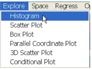
Invoke the histogram as Explore > Histogram from the menu (as in Figure 7.2) or by clicking the Histogram toolbar icon. In the Variable
1
Figure 7.3: Variable selection for histogram.
Figure 7.4: Histogram for spatial autoregressive random variate.
Settings dialog, select zar09 as in Figure 7.3. The result is a histogram with the variables classified into 7 categories, as in Figure 7.4. This shows the familiar bell-like shape characteristic of a normally distributed random variable, with the values following a continuous color ramp. The figures on top of the histogram bars indicate the number of observations falling in each interval. The intervals themselves are shown on the right hand side.
Figure 7.5: Histogram for SAR variate and its permuted version.
the histograms for the two variables are identical. You can verify this by comparing the number of observations in each category and the value ranges for the categories. In other words, the only aspect differentiating the two variables iswhere the values are located, not the non-spatial characteristics of the distribution.
This is further illustrated bylinking the histograms and maps. Proceed by selecting (clicking on) the highest bar in the histogram of zar09and note how the distribution differs in the other histogram, as shown in Figure 7.6 on p. 47. The corrresponding observations are highlighted in the maps as well. This illustrates how the locations with the highest values for zar09
arenot the locations with the highest values for ranzar09.
Linking can be initiated in any window. For example, select a 5 by 5 square grid in the upper left map, as in Figure 7.7 on p. 48. The match-ing distribution in the two histograms is highlighted in yellow, showmatch-ing a
Figure 7.6: Linked histograms and maps (from histogram to map).
overall pattern. This would possibly suggest the presence of a spatial regime forzar09, but not forranzar09.
Figure 7.7: Linked histograms and maps (from map to histogram).
Figure 7.8: Changing the
number of histogram cate-gories.
Figure 7.9: Setting the inter-vals to 12.
7.3
Linking Box Plots
Figure 7.10: Histogram with 12 intervals.
Figure 7.11: Base map for St. Louis homicide data set.
shows the median, first and third quartile of a distribution (the 50%, 25% and 75% points in the cumulative distribution) as well as a notion ofoutlier. An observation is classified as an outlier when it lies more than a given multiple of the interquartile range (the difference in value between the 75% and 25% observation) above or below respectively the value for the 75th percentile and 25th percentile. The standard multiples used are 1.5 and 3 times the interquartile range. GeoDa supports both values.
Figure 7.12: Box plot function.
Figure 7.13: Variable selection in box plot.
show the base map with 78 counties as in Figure 7.11 on p. 49.
Invoke the box plot by selecting Explore > Box Plot from the menu (Figure 7.12), or by clicking on theBox Plottoolbar icon. Next, choose the variableHR8893(homicide rate over the period 1988–93) in the dialog, as in Figure 7.13. Click onOKto create the box plot, shown in the left hand panel of Figure 7.14 on p. 51. The rectangle represents the cumulative distribution of the variable, sorted by value. The value in parentheses on the upper right corner is the number of observations.
The red bar in the middle corresponds to the median, the dark part shows the interquartile range (going from the 25th percentile to the 75th percentile). The individual observations in the first and fourth quartile are shown as blue dots. The thin line is the hinge, here corresponding to the default criterion of 1.5. This shows six counties classified as outliers for this variable.
Figure 7.14: Box plot using 1.5 as hinge.
Figure 7.15: Box plot using 3.0 as hinge.
Figure 7.16: Changing the hinge criterion for a box plot.
> Hingefrom the menu, or by right clicking in the box plot itself, as shown in Figure 7.16. Select 3.0 as the new criterion and observe how the number of outliers gets reduced to 2, as in the right hand panel of Figure 7.15.
Specific observations in the box plot can be selected in the usual fashion, by clicking on them, or by click-dragging a selection rectangle. The selec-tion is immediately reflected in all other open windows through the linking mechanism. For example, make sure you have the table and base map open for the St. Louis data. Select the outlier observations in the box plot by dragging a selection rectangle around them, as illustrated in the upper left panel of Figure 7.17 on p. 52. Note how the selected counties are highlighted in the map and in the table (you may need to use thePromotionfeature to get the selected counties to show up at the top of the table). Similarly, you can select rows in the table and see where they stack up in the box plot (or any other graph, for that matter).
Figure 7.17: Linked box plot, table and map.
key and let go. The selection rectangle will blink. This indicates that you have started brushing, which is a way to change the selection dynamically. Move the brush slowly up or down over the box plot and note how the selected observations change in all the linked maps and graphs. We return to brushing in more detail in Exercise 8.
7.4
Practice
Use the St. Louis data set and histograms linked to the map to investi-gate the regional distribution (e.g., East vs West, core vs periphery) of the homicide rates (HR****) in the three periods. Use the box plot to assess the extent to which outlier counties are consistent over time. Use the ta-ble to identify the names of the counties as well as their actual number of homicides (HC****).
Exercise 8
Brushing Scatter Plots and
Maps
8.1
Objectives
This exercise deals with the visualization of the bivariate association between variables by means of a scatter plot. A main feature ofGeoDais thebrushing
of these scatter plots as well as maps.
At the end of the exercise, you should know how to:
• create a scatter plot for two variables
• turn the scatter plot into a correlation plot
• recalculate the scatter plot slope with selected observations excluded
• brush a scatter plot
• brush a map
More detailed information on these operations can be found in the User’s Guide, pp. 68–76.
8.2
Scatter Plot
Figure 8.1: Scatter plot function.
Figure 8.2: Variable selection for scatter plot.
by clicking on theScatter Plottoolbar icon. This brings up the variables selection dialog, shown in Figure 8.2.
Figure 8.3: Scatter plot of homicide rates against resource deprivation.
Figure 8.4: Option to use standardized values.
The scatter plot in GeoDa has two useful options. They are invoked by selection from the Options menu or by right clicking in the graph. Bring up the menu as shown in Figure 8.4 and choose Scatter plot > Standardized data. This converts the scatter plot to a correlation plot, in which the regression slope corresponds to the correlation between the two variables (as opposed to a bivariate regression slope in the default case).
Figure 8.5: Correlation plot of homicide rates against resource deprivation.
clicking on them or by click-dragging a selection rectangle and note where the matching observations are on the St. Louis base map (we return to brushing and linking in more detail in section 8.2.2).
The correlation between the two variables is shown at the top of the graph (0.5250). Before proceeding with the next section, turn back to the default scatter plot view by right clicking in the graph and choosingScatter plot > Raw data.
8.2.1 Exclude Selected
A second important option available in the scatter plot is the dynamic recal-culation of the regression slope after excluding selected observations. This is particularly useful when brushing the scatter plot. Note that this option does not work correctly in the correlation plot and may yield seemingly in-correct results, such as correlations larger than 1. With selected observations excluded, the slope of the correlation scatter plot is no longer a correlation.1 In the usual fashion, you invoke this option from the Options menu or by right clicking in the graph. This brings up the options dialog shown in
1
Figure 8.6: Option to use exclude selected observations.
Figure 8.6. Click on Exclude selected to activate the option.
In the scatter plot, select the two points in the upper right corner (the two observations with the highest homicide rate), as shown in Figure 8.7 on p. 58. Note how a new regression line appears (in brown), reflecting the as-sociation between the two variableswithout taking the selected observations into account. The new slope is also listed on top of the graph, to the right of the original slope. In Figure 8.7, the result is quite dramatic, with the slope dropping from4.7957to0.9568. This illustrates the strongleverage these two observations (St. Louis county, MO, and St. Clair county, IL) effect on the slope.2
8.2.2 Brushing Scatter Plots
The Exclude selected option becomes a really powerful exploratory tool when combined with a dynamic change in the selected observations. This is referred to asbrushing, and is implemented in all windows inGeoDa.
To get started with brushing in the scatter plot, first make sure the
Exclude selectedoption is on. Next, create a small selection rectangle and hold down the Control key. Once the rectangle starts to blink, the brush
is activated, as shown in Figure 8.8 on p. 58. From now on, as you move the brush (rectangle), the selection changes: some points return to their original color and some new ones turn yellow. As this process continues, the regression line is recalculated on the fly, reflecting the slope for the data set
without the current selection.
2
Figure 8.7: Scatter plot with two observations excluded.
Figure 8.9: Brushing and linking a scatter plot and map.
The full power of brushing becomes apparent when combined with the
linking functionality. For example, in Figure 8.9 on p. 59, the scatter plot is considered together with a quintile map of the homicide rate in the next period (HR8488). Create this choropleth map by clicking on the “green” base map and using theMap > Quantile function (or right clicking on the map with the same effect). As soon as the map appears, the selection from the scatter plot will be reflected in the form of cross-hatched counties.
Thebrushing and linking means that as you move the brush in the scat-ter plot, the selected counties change, as well as the slope in the scatscat-ter plot. This can easily be extended to other graphs, for example, by adding a histogram or box plot. In this manner, it becomes possible to start explor-ing the associations among variables in a multivariate sense. For example, histograms could be added with homicide rates and resource deprivation measures for the different time periods, to investigate the extent to which high values and their location in one year remain consistent over time.
8.3
Brushing Maps
In Figure 8.9, the brushing is initiated in the scatter plot, and the selection in the map changes as a result of its link to the scatter plot. Instead, the logic can be reversed.
Click anywhere in the scatter plot to close the brush. Now, make the map active and construct a brush in the same fashion as above (create a selection rectangle and hold down theControlkey). The result is illustrated in Figure 8.10.
Figure 8.10: Brushing a map.
brush is ready. As you now move the brush over the map, the selection changes. This happens not only on the map, but in the scatter plot as well. In addition, the scatter plot slope is recalculated on the fly, as the brush moves across the map.
Similarly, the brushing can be initiated in any statistical graph to prop-agate its selection throughout all the graphs, maps and table in the project.
8.4
Practice
Continue exploring the associations between the homicide and resource de-privation variables using brushing and linking between maps, scatter plots, histograms and box plots. Compare this association to that between homi-cide and police expenditures (PE**). Alternatively, consider the Atlanta (atl hom.shp with FIPSNO as the Key) and Houston (hou hom.shp with
Exercise 9
Multivariate EDA basics
9.1
Objectives
This exercise deals with the visualization of the association between multiple variables by means of a scatter plot matrix and a parallel coordinate plot.
At the end of the exercise, you should know how to:
• arrange scatter plots and other graphs into a scatter plot matrix
• brush the scatter plot matrix
• create a parallel coordinate plot
• rearrange the axes in a parallel coordinate plot
• brush a parallel coordinate plot
More detailed information on these operations can be found in the Release Notes, pp. 29–32.
9.2
Scatter Plot Matrix
We will explore the association between police expenditures, crime and un-employment for the 82 Mississippi counties in the POLICE sample data set (enterpolice.shpfor the file name andFIPSNOfor theKey). The beginning base map should be as in Figure 9.1 on p. 62.
The first technique considered is a scatter plot matrix. Even though
Figure 9.1: Base map for the Mississippi county police expenditure data.
Figure 9.2: Quintile map for police expenditures (no legend).
consists of a set of pairwise scatter plots, arranged such that all the plots in a row have the same variable on the y-axis. The diagonal blocks can be left empty, or used for any univariate statistical graph.
sep-Figure 9.3: Two by two scatter plot matrix (police, crime).
arator between the legend and the map to the left, such that the legend disappears, as in Figure 9.2 on p. 62. Repeat this process for the variables
crimeand unemp. Next, create two bivariate scatter plots for the variables
policeand crime (see Section 8.2 on p. 53 for specific instructions), with each variable in turn on the y-axis. Arrange the scatter plots and the two matching quintile maps in a two by two matrix, as shown in Figure 9.3.
Figure 9.4: Brushing the scatter plot matrix.
After rearranging the various graphs, the scatter plot matrix should look as in Figure 9.4.
Figure 9.5: Parallel coordinate plot (PCP) function.
Figure 9.6: PCP variable se-lection.
Figure 9.7: Variables selected in PCP.
plot, resulting in a much lower slope when excluded. Since all the graphs are linked, the location of the selected observations is also highlighted in the three maps on the diagonal of the matrix.
9.3
Parallel Coordinate Plot (PCP)
An alternative to the scatter plot matrix is the parallel coordinate plot (PCP). Each variable considered in a multivariate comparison becomes a