For your convenience Apress has placed some of the front
matter material after the index. Please use the Bookmarks
Contents at a Glance
About the Author ...
xv
About the Technical Reviewer ...
xvii
Acknowledgments ...
xix
Introduction ...
xxi
Chapter 1: Introduction to Responsive Design
■
...
1
Chapter 2: Testing a Responsive Site
■
...
35
Chapter 3: The Power of Media Queries
■
...
59
Chapter 4: Using Fluid Layouts
■
...
77
Chapter 5: Frameworks in Responsive Design
■
...
111
Chapter 6: Adapt an Existing Site
■
...
135
Chapter 7: Tools and Workflow
■
...
171
Chapter 8: Making the User Journey Responsive
■
...
211
Chapter 9: JavaScript Across Responsive States
■
...
235
Chapter 10: Optimizing Your Responsive Site
■
...
263
Introduction
Responsive web design (RWD) is the technique used when designing and building a web site to optimize a web site to work well across a wide variety of different devices. Through this optimization, developers are able to provide a much better experience for the users of their web sites.
The aim of this book is to take you from knowing how to build a web site with HTML to CSS right through to building great responsive experiences that work across a variety of devices. In particular I will focus on these areas:
An introduction to responsive design
•
Testing responsive sites
•
The power of media queries
•
Using fluid layouts
•
Frameworks in responsive design
•
Adapt an existing site
•
Tools and workflow
•
Making the user’s journey responsive
•
JavaScript across responsive states
•
Optimizing your responsive site
•
CHAPTER 1
Introduction to Responsive Design
The way in which web sites are built has evolved over the past 20 years. The 1990s were dominated by web sites being built in tables, and although the cascading style sheet (CSS) specification was released in 1996, CSS didn’t really take center stage until mid-2003. This brought the launch of CSS Zen Garden, which demonstrated the power of CSS and how it could be used to completely restyle a site without even touching the HTML. With the subsequent rise in popularity of CSS, the development community standardized on targeting screens with a resolution of 1024 by 800, with larger screens being left with white space around the edges and smaller screens requiring scrolling. This was rolled out so that sites could be designed and built in a way that worked for the largest possible audience, as the majority of users were accessing them from the 1024 by 800 resolution.
With the launch of the iPhone in 2007, the full experience of the Internet was available anywhere. Gone were the simplistic, difficult to use mobile browsers of before, and suddenly we had a full, desktop-grade browser in our pockets. The first reaction from companies was to make a separate, mobile-optimized site, following the theory that offering a targeted user experience would increase sales. More often than not, these sites were scaled-back versions of the full web site and would often fail to offer the visitor the content they were after, meaning ultimately they would either leave the site or switch to the full web site anyway.
In 2010, CSS3 (cascading style sheets 3) media queries were implemented in mobile browsers, starting with Android 2.1 and followed by iOS 3.2. The arrival of media queries brought with it the ability to target specific styles at different screen resolutions.
Aside from the size of the screens changing, there has also been a huge drive to improve the quality of the screens that are in use, with high pixel density screens becoming more commonplace. The term retina display was conceived by Apple in June 2010 to describe their own high dpi (dots per CSS inch) screens found on their phones, and they are credited with bringing the high-dpi screens to the mainstream. As they are not the only company deploying the technology, it is becoming increasingly important to consider high-dpi displays during your build to ensure your web site looks fantastic on these devices. The optimum way of ensuring and achieving this is through use of responsive design methodologies.
Responsive design has rapidly become the current trend in web development, and this book aims to take you through the different approaches you can take to achieve responsive design.
This chapter will introduce you to responsive design. The sections contained in this chapter are:
1. What is responsive design?
2. Why is mobile so important?
3. Responsive design vs. device-specific experiences
4. Responsive web design is not limited just to mobile
5. When would you not use responsive web design?
6. Examples of responsive web design
What Is Responsive Design?
The term responsive design is derived from the way in which the browser responds to its environment. Responsive design is an approach to how a web site is developed that aims to provide users of a web site with a good experience regardless of the browser, device, or screen size used. Web sites designed with a responsive design approach adapt their layout by using fluid grids, fluid content (e.g., images, videos, and text), and CSS3 media queries.
Responsive design moves away from using fixed units like pixels and more toward relative units like percentages. This means that the widths of the different sections of a site are designed to be a percentage of the viewport.
It was Ethan Marcotte who first coined the term responsive web design in his article for A List Apart, in which he compares the web to architecture. He made a key point about how we should treat the increasing number of web devices as facets of the same experience.
Rather than tailoring disconnected designs to each of an ever-increasing number of web devices,
we can treat them as facets of the same experience. We can design for an optimal viewing
experience, but embed standards-based technologies into our designs to make them not only more
flexible, but more adaptive to the media that renders them. In short, we need to practice responsive
web design.
1—Ethan Marcotte, A List Apart
What Ethan is suggesting here is that all displays should receive the same content. However, it needs to be built to be flexible in order to fit correctly to the display. The site should adapt in a way that optimizes the experience for the device.
Why Is Mobile So Important?
With the advance of the smartphone, people have access to the Internet at any given moment with a simple pluck from their pocket or bag. From checking out the reviews for the television you are interested in at your local electrical goods outlet to finding the closest place to get a pizza, the Internet no longer requires you to be tied down to a computer with a plethora of cables, but it can be with you everywhere. With this in mind, the very idea of developing a web site that is not optimized to work well on a mobile device is absurd.
The smartphone market is no longer a niche part of the mobile phone industry but instead is booming with popularity, with smartphones accounting for 57.6% of mobile phone sales in 2013 globally.2 Although you would
expect a portion of these sales to simply be the result of a smartphone being the device given as part of a mobile phone plan, this is still a phenomenal figure.
One of the most interesting things about the growth of the smartphone market is that the percentage of web traffic deriving from mobile devices is rapidly increasing, with WalkerSands Digital estimating a 67 percent increase of mobile traffic in 2013 alone (see Figure 1-1). When we look at these statistics in more detail, we can clearly see that the growth of mobile cannot be ignored.
1EthanMarcotte,AListApart.http://alistapart.com/article/responsive-web-design
CHAPTER 1 ■ INTRODUCTION TO RESPONSIVE DESIGN
One thing to bear in mind is that these data do not separate out business and consumer traffic. If data were specific to consumer traffic, we may find that the percentage of traffic coming from mobile is much higher. The reason that we might expect this is because during business hours it would be expected that most users were using desktop computers to access the Internet.
Joe McCann discussed the expected online impact of mobile on large retailers during his talk at Full Frontal in Brighton in November 2013. As part of his talk on the importance of mobile he mentioned a discussion he had had with someone from Target.com about the impact mobile is having on their business, and his claim supports our expectation that consumer traffic for mobile would be higher than the combined business and consumer traffic. He said:
“This year, more than half of all traffic to Target.com is expected to come from mobile devices on cyber Monday for the first time ever.”3
—Joe McCann, Director of Creative Technology at Mother NY, 08/11/2013
This would be an incredible figure, which is only expected to continue to rise as use of mobile devices becomes more widespread. Mobile has the potential to achieve true ubiquitousness, which may never have been possible with desktop computers and notebooks. The reason for this is twofold: first, the cost to entry is much lower, a tablet can now be purchased for less than $50 and a smartphone for less than $30. Second, touch interfaces are more intuitive than their desktop counterparts, meaning people who may have previously had problems using computers are more likely to be able to engage a mobile platform. While there are now touch interface desktops and notebooks, these have been cited to cause arm strain, particularly in the shoulder region, making the mobile platform much more appealing.4
Another indicator of an upturn in the mobile market are the sales data for mobile phones. They reveal that the market for smartphones has not yet been saturated, with only 1.5 billion of the 5 billion mobile phone user base being smartphones. Additionally, in Q4 2012 tablet sales surpassed the combined total sales of desktop PCs and notebooks.5
Q3 2012 Q4 2012 Q1 2013 Q2 2013 Q3 2013
Percentage of traffic from mobile devices
Figure 1-1. Percentage of web traffic coming from mobile devices in 2012-2013
3JoeMcCann,DirectorofCreativeTechnologyatMother,NewYork,August11,2013.
Responsive Design vs. Device-Specific Experiences
As just discussed, mobile is a huge growth area and you might be wondering why we don’t just build device-specific experiences tailored to the platform we are targeting.
Well, when comparing responsive vs. separate sites, it is very easy to assert that a separate site would allow you to offer a better experience. This is the view that Jakob Nielsen has taken and a summary of a post he has written reads:
“It’s cheap but degrading to reuse content and design across diverging media forms like print vs. online or desktop vs. mobile. Superior UX requires tight platform integration.”6
—Jakob Nielsen
In reality I believe this is a misguided view. Responsive development allows you to define the user experience that mobile devices receive, and as such, content can be adapted through hiding and showing content that is not specific to the platform.
One of the key benefits of responsive web design is simplicity. There is no need for a separate mobile presence, as responsive allows use of the same URL and the same code base. With one code base, testing becomes simpler, especially useful if you work in a workplace that uses test-driven development, as two code bases could potentially lead to many more unit tests being needed.
Part of this simplicity is that with responsive design you only have to manage one lot of content instead of essentially managing the same content on multiple sites. This is especially important in organizations where content of the site needs to be approved by several people or a legal team. This will, of course, speed things up, resulting in both saved time and money.
For the majority of web sites it is important to rank well on search engines, and Google offers guidance on how they would prefer you to build your sites. As part of their guidance, Google recommends responsive development with the following notes:
1. A single URL for content makes it easier for your users to interact with and share the content.
2. A single URL for content helps Google’s algorithms index your site.
3. No redirection or server side device detection is needed for users to get to the device-optimized view, which reduces loading time.
4. Googlebot user agents have to crawl your pages once, as opposed to crawling multiple times with different user agents, to retrieve your content.
With these recommendations, it makes even more sense to go the responsive route, especially if your business relies on being found through Google.
When weighing up the pros and cons of using responsive web design or separate sites, it is also important to consider how you will continue to support the sites with updates, modifications, and additional new features. Two code bases are twice as much work, time, and effort to update and support.
If you already have a web site you are happy with, you could potentially look at converting your current site rather than embarking on a full rebuild. Although this approach is not mobile first (so by definition you would be taking a graceful degradation approach instead of a progressive enhancement approach), it could potentially allow you to make your site responsive and quicker. Converting an existing site consists partly of refactoring existing code and of adding media queries to the CSS.
This comparison may seem to lean heavily on the side of responsive development; however, there are some benefits of a separate site build. First, it is a lot easier to optimize the performance of a mobile site, because you don’t have the overhead of the media queries, JavaScript, and JavaScript libraries required for the desktop site to worry about. Additionally, having a separate site build means you do not need to touch your existing desktop site, which in turn means no rebuilding and retesting required.
CHAPTER 1 ■ INTRODUCTION TO RESPONSIVE DESIGN
Responsive Web Design Is Not Limited Just to Mobile
So far a lot of the discussion about responsive web design has been focused on how responsive development allows you to build sites that work well on mobile devices. However, it is not only mobile devices that can benefit from responsive web design techniques.
Despite the huge growth of web-based television services like BBC’s iPlayer, Netflix, and Amazon’s Lovefilm, which are all available on mobile devices, television is still the center of family entertainment. The most common use for the television is to consume media: watching television shows, playing on a video games console, or simply using it for background music or listening to the radio.
In April 2013, Deloitte’s Media & Entertainment Practice ran a survey that found that video games consoles can now be found in 50 percent of homes; they also found that 26 percent of televisions are connected to the Internet either directly or through a set top box (examples of set top boxes include games consoles, media PCs). When looking at future growth in this area, we also need to bear in mind that since October 2012, all major games consoles include a web browser, meaning there is the potential for further growth as additional users connect these to the Internet.
Aside from televisions, desktop or notebook computers with higher resolution and bigger displays are becoming more commonplace. As previously mentioned, historically web site widths have been built with the aim toward screens with a 1024 by 800 resolution, however, as of March 2012 1366 by 768 screens have become the most common resolution. With responsive techniques, you can take advantage of this extra space rather than simply have large margins on either side of your web site. Images can be bigger, content can be more spaced out, and more content can be visible to the user before they have even started scrolling.
If we look at just a small cross-section of devices, it is very easy to see that there are a wide variety of screen resolutions. Figure 1-2 shows the different screen resolutions of the mobile devices from just one manufacturer (in this case, Apple) along with the most common screen resolution and a common television resolution.
As this simple example demonstrates, from only one device manufacturer there are a variety of resolutions that will need to be supported, and when you then take into consideration the vast amount of other manufacturers’ devices, the sheer level of different resolutions that are now commonplace is staggering. We also have to remember that new devices, with new screen resolutions, are regularly being developed and released, so you need to ensure your site is flexible enough to work with these new devices, no matter what they may be.
There is more to responsive design than simply mobile vs. desktop; therefore, when you think about responsive design, it is important to not simply think in these terms but instead think about how you can make your designs work on as many devices as possible, regardless of screen sizes and their capabilities. A good example of this is rather than make the assumption that all mobile browsers support the geolocation API (application programming interface), you can use feature detection to allow you to identify the features supported by the users’ browsers and progressively enhance the site.
When Would You Not Use Responsive Web Design?
Sometimes it is not always appropriate to use responsive design techniques, but instead it would be better for the user experience to build device-specific experiences.
A prime example of when responsive design is not appropriate would be for web applications offering a desktop-like experience in the browser. Google Docs is one such web application where on the desktop browser you get a full-featured word processor, but because this experience cannot be achieved in a mobile browser, you instead have a heavily simplified mobile version. The reason for this is that for a feature-rich web application like Google Docs, the small screen size offers a major challenge. On a larger viewport, it is easy to put all the features into a toolbar, however, on a mobile device, this is just not possible. Therefore, to provide a better user experience it makes sense to strip the interface back to only what typical users will actually use. This striped back interface would be very different from the desktop interface to allow the code base to be lean, and it then makes sense for the mobile and desktop experiences to be built separately.
Aside from large web applications, if you are looking to convert an existing site rather than rebuild it, it is important to look at your existing code base to ensure it is not bloated. Converting an existing code base to a responsive build should only be done if the existing code base is reasonably lean. If you find that your existing site is bloated, you could choose to spend time slimming it down prior to converting the site; however, if this is not possible or the budget won’t allow a rebuild, you could choose to build the mobile site separately.
Understanding the Viewport
One of the important concepts in responsive design is the viewport. The viewport, as the name suggests, is the view through which you see your web site.
Prior to HTML5 and CSS3, we typically thought about a web site in relation to the size of the browser window. Typically our users would be using a minimum display size of 1024 by 800 with the window full screen, we therefore would build our web sites to a fixed width, typically around 960px to 980px wide. When developing the early smaller devices, however, manufacturers faced a problem. The majority of sites at the time were built to be this fixed width, which was much wider than the width of the screens their new devices had. If they loaded the site at the native resolution of the device, the user would then need to scroll both horizontally and vertically to view the site.
CHAPTER 1 ■ INTRODUCTION TO RESPONSIVE DESIGN
To give the developers control over the viewport width, a meta tag was introduced, which allows the viewport width and initial scale to be set; I cover how to use this meta tag later in this chapter. What this means is that you can tell the mobile browser to render the site at a different viewport width. Where responsive design techniques are being used, you can choose to tell the browser to set the viewport width to be equal to the width of the browser window (or in the case of a single window device to be the width of that device).
Figure 1-3 shows where the viewport width and viewport height are measured in relation to the browser window.
Figure 1-3. A diagram illustrating the viewport width and viewport height
The wide variety of devices means that you need to ensure you are testing at a wide variety of different viewport sizes. To easily look up the viewport size of a large variety of popular devices you can check out
http://viewportsizes.com, which allows you to search through a list of devices, with information on the device viewport size.
Understanding Breakpoints
Along with understanding the viewport, you need to have a good understanding of what a breakpoint is. A breakpoint
in responsive design is the width at which the web site changes layout based on the media query declaration. Typically a responsive site will be built to work with at least two but normally three distinct breakpoints aimed at specific types of devices. The most commonly used breakpoints are:
1. Extra small devices, for example, Phones (<768px)
2. Small devices, for example, tablets (³768px and <992px)
3. Medium devices, for example, desktop computers (³992px and <1200px)
4. Large devices, for example, desktops computers (³1200px)
Aside from breakpoints, another piece of important terminology you need to understand is the state, which is the version of the site in between each breakpoint. So mobile, tablet, and desktop are your states and in between you have two breakpoints.
Examples of Responsive Web Design
Prior to writing responsive web pages, let’s look at some of the best examples of responsive web sites. It’s best to visit these online to see the features being described. They are described here as of the time of writing.
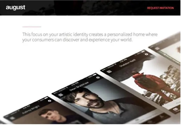
August
Our first example is August (http://www.agst.co/), which is a place to discover the world’s most talented artists. The web page is a single-page site with a form to register your interest at the end of the page.
When you resize the site, you’ll notice that the changes appear to be very subtle. When you look at the changes that happen between each breakpoint, you notice the differences discussed in the following sections.
Large and Medium Devices
For both large device and medium device states, August use an HTML5 video playing on a loop. The background’s stretched full width, while the content is centered in a container. As you scroll down the page, you’ll see that the site is very image heavy, with images wrapping carefully around the text (see Figures 1-4 and 1-5).
CHAPTER 1 ■ INTRODUCTION TO RESPONSIVE DESIGN
Small Devices
With the smaller devices (e.g., tablets), August disables the video playing in the background, opting instead to replace it with an image (see Figure 1-6).
The way in which the text wraps the images is adapted so the text sits farther up the images so as to not cover the main imagery (see Figure 1-7).
Figure 1-7. The wrapping of the copy is adapted to better fit the screen of smaller devices and not cover the image
Extra Small Devices
CHAPTER 1 ■ INTRODUCTION TO RESPONSIVE DESIGN
When you look at how the imagery has changed, you can see that it is now cropped by the width of the viewport and the text is again moved farther up the image to prevent it from overlapping the imagery (see Figure 1-9).
Nyetimber
The Nyetimber (http://nyetimber.com/our-story/) web site is very different from the August site in that it is a multipage responsive site. The site features a section titled “Our Story,” which uses a parallax scroll effect to tell you the story about the business; this page will be the focus for the examples that follows.
Large and Medium Devices
The story of the company is told using a parallax effect on desktop, as you scroll the site the different elements are brought into view at different time intervals (see Figure 1-10).
Figure 1-10. The Nyetimber site starts wth an introduction to the story
CHAPTER 1 ■ INTRODUCTION TO RESPONSIVE DESIGN
Figure 1-11. When opened, the videos fill the viewport
Figure 1-12. Tiled panels allow the user to hover over them
Small Devices
CHAPTER 1 ■ INTRODUCTION TO RESPONSIVE DESIGN
Rather than opening full screen, the videos are now inline (see Figure 1-14).
As the user cannot hover on a touch device, the panels no longer feature a hover action but instead are shown as a list of information about Nyetimber (see Figure 1-15).
Figure 1-15. The information panels are visible by default on small devices
Extra Small Devices
CHAPTER 1 ■ INTRODUCTION TO RESPONSIVE DESIGN
Upon tapping the Navigation button on the header, the navigation now opens up (see Figure 1-17).
Figure 1-16. The menu be default is collapsed on extra small devices, with a menu icon now available to toggle it
Figure 1-17. Taping the menu icon expands the menu
Other Examples
There are a lot more examples available at the AWWWards site, where they have a whole section dedicated to responsive design.7
Getting Started with HTML5
Responsive design is built on top of the new technologies brought along with HTML5 and CSS3. Let’s look at the changes brought about by HTML5 so we can better understand the code we are writing.
HTML5 is the draft specification for the newest version of the HTML language specification, which is agreed upon by the World Wide Web Consortium (W3C). The HTML5 specification is part of a larger set of technologies that the W3C terms the “open web platform,” which in a nutshell means it allows us to build web sites and web applications that work anywhere. When people refer to the term HTML5, they are normally talking about the “open web platform.”
There are lots of benefits of using HTML5 with your projects, which I’ll discuss now.
Figure 1-18. The content is narrower, blocks are all stacked and the text size optimized for the device
CHAPTER 1 ■ INTRODUCTION TO RESPONSIVE DESIGN
Accessibility
HTML5 makes it a lot simpler to make your site accessible. The new HTML5 semantic tags allow screen readers to more easily identify types of content, and this allows them to provide a better experience for the user. Additionally, HTML5 has support for ARIA (accessible rich Internet application) data roles, which allow you to assign roles to sections of content. This can be especially useful where you are updating the content of the page using JavaScript, as you can define ARIA roles that watch parts of the page for changes and notifies the user.
Video and Audio Support
HTML5 has native support for both video and audio codes. One of the key benefits of HTML5 video and HTML5 audio is that they deliver strong mobile device support as they work in the browser without any plug-ins like Adobe Flash. One area that is currently being discussed is whether HTML5 should support digital rights management (DRM) for content, and it is likely that DRM in some form will be added to the specification with the purpose of preventing piracy of digital media like movies and music.
Smarter Storage
Prior to HTML5, the main way to store data on the client side was to use cookies; the disadvantage of this is that they are sent to the server along with the HTTP request, even if they are not used by the server. HTML5 introduced DOM (document object model) Storage, which includes localStorage (which is persistent) and sessionStorage (which is only available for the duration of the session). The benefits of DOM Storage are the data remain client-side only, so they do not affect the size of the HTTP request and it allows you to store a lot more data; currently DOM Storage allows you to store 5MB of data per domain.
New Interactions
HTML5’s new JavaScript APIs enable you to add new and improved interactions. An example of this is new APIs such as drag and drop, geolocation, and history. The aim of these new interactions is to enable you to build richer and easier to use interfaces.
Canvas
HTML5 introduces the canvas element, which is the new HTML5 tag that can be used for drawing. It allows you to build rich Internet applications similarly to how Adobe Flash had been used in the past.
Mobile
HTML5 introduces a lot of improvements for mobile, new APIs such as geolocation allow the site to determine the location of the user and offer location-specific data. HTML5 features a viewport tag, which allows you to define viewport widths and zoom settings. There are also device-specific tags that enable developers to interact with browser-specific features, an example of which is, when using a meta tag, the developer can tell iOS that if bookmarked on the home page, it should be opened as a full screen web application.
The doctype
The doctype tells the browser how it should parse your document; as such, it is an important part of the document and it should be included in the first line of your HTML document. The previous doctype not only defined the document as HTML4, it also provided a URL to the specification document, as shown in this example:
<!DOCTYPE HTML PUBLIC "-//W3C//DTD HTML 4.01 Transitional//EN" "http://www.w3.org/TR/html4/loose.dtd">
The new HTML5 doctype is a lot simpler, and you no longer specify the version of HTML or the URL of the specification document, as shown in this example:
<!DOCTYPE html>
The reason for the change is that HTML is a living specification where browsers will continue new parts of the specifications as they pass through the standardization process. The idea is that in the future new features can be added without further changes to the doctype.
New Semantic HTML Tags
When you first open an HTML5 document, the first thing you will notice is that there are many more semantic tags used throughout the document. The most notable ones are:
1. <article>: Defines an article.
2. <aside>: Defines content alongside the main content.
3. <figure>: Defines related content, an example of use is photos or code listings.
4. <figcaption>: Defines the caption for your <figure> element.
5. <header>: Defines a header for the document or section.
6. <footer>: Defines a footer for the document or section.
7. <nav>: Defines a series of links used for navigation around the site.
8. <section>: Defines a section of content.
A simple example of how an HTML5 document may be laid out follows:
CHAPTER 1 ■ INTRODUCTION TO RESPONSIVE DESIGN
New Meta Tags
In addition to the new semantic tags that were introduced with HTML5, there has also been the introduction of some new meta tags.
Viewport Meta Tag
The most important of the new meta tags is the viewport meta tag. This meta tag was initially introduced by Mobile Safari and is used as a way to allow developers to define the width and the scaling of the viewport. When used incorrectly, the viewport meta tag can cause a terrible experience for users.
The viewport meta tag content consists of a comma-separated list of key value pairs, the values that can be used are:
1. width:– The width of the viewport.
2. initial-scale: The scale of the site when it initially loads.
3. user-scalable: By default, the user can zoom the site, setting “user-scalable” to “no” disables this. This is bad for the accessability of the site so it is discouraged.
4. maximum-scale: Allows you to define a maximum level that the user can zoom the site. Although not as bad as user-scalable, this can still be harmful to accessability.
If you were to add this meta tag to a nonresponsive site, you would set the viewport meta tag to have a sensible width to display the site comfortably. If you take an example of a 980px site, which is centrally aligned, you would want to include a bit of spacing around the edges, so you might set the viewport width to 1024px, as shown in this example:
<meta name="viewport" content="width=1024, initial-scale=1">
For responsive design, you want the width of the viewport to be equal to the width of the device you are using. This is for two key reasons: first, you will be building your CSS to target the width of the viewport so you want the viewport width to match the device width. Second, it tells the device that the site is mobile optimized and that it therefore does not need to load the page with a large default viewport zoomed out.
To make the viewport equal to the width of the device you are using, you set the value for the viewport width to
device-width instead of specifying a specific size. You also want your site to start with a default zoom level, so you have initial-scale set to 1, as shown in the following example:
<meta name="viewport" content="width=device-width, initial-scale=1">
Apple Touch Icons
Another new meta tag that has been introduced is the Apple touch icon meta tag, which allows you to define icons that will be used on iOS when the user saves a web page to the home screen, as shown in the following example:
<link rel="apple-apple-icon" href="apple-icon-iphone.png">
<link rel="apple-apple-icon" sizes="76x76" href="apple-icon-ipad.png">
<link rel="apple-apple-icon" sizes="120x120" href="apple-icon-iphone-retina.png"> <link rel="apple-apple-icon" sizes="152x152" href="apple-icon-ipad-retina.png">
Web Forms
Input form fields have been upgraded with the HTML5 specification. Previously, we have been limited to radio, check box, and text fields, however, we now have a much larger range of input types:
1. search
2. email
3. url
4. tel
5. number
6. range
7. date
8. month
9. week
10. time
11. datetime
12. datetime-local
13. color
One of the benefits of using the new input types is that it allows the browser to render relevant controls. For example, on mobile devices if the input type is set to email, a keyboard specific for inserting e-mail addresses is shown. Alternatively if the input type is set to date, a native date selector is shown instead of the keyboard. This provides a really good user experience as it makes form entry much quicker. A simple example is provided of the custom controls that are shown for the date field:
<input type="date" id="field" name="field" />
CHAPTER 1 ■ INTRODUCTION TO RESPONSIVE DESIGN
When you load the same control in a desktop browser, you then get native controls for the desktop (see Figure 1-20).
Figure 1-19. <input type="date" id="field" name="field" />as shown on an iPhone running iOS7
HTML5 allows you to add placeholders to input fields; what this means is that you can provide the user with an example of what sort of data they should be inputting to an input field. An example of adding a placeholder attribute to an input field is:
<input type="input" placeholder="Sample placeholder" id="field" name="field" />
When loaded into the browser, you see a grayed out text box for the placeholder (see Figure 1-21).
Figure 1-21. Input element with a placeholder
In HTML5, you can also easily add validation to the form. To demonstrate how this works, let’s look at a couple of simple examples.
The simplest form of validation is to make the field required, you would do this by adding the attribute required
to the input field, as shown in this example:
<input type="text" placeholder="e.g [email protected]" required />
CHAPTER 1 ■ INTRODUCTION TO RESPONSIVE DESIGN
Figure 1-22. The browsers error message shown when user tries to submit the form without filling in a required value
If you want to validate an e-mail address, you would simply need to set the input type to email, as shown in this example:
<input type="email" placeholder="e.g [email protected]" required id="email" name="email" />
When you click the Submit button in the browser, the user is then shown an error to tell them the e-mail address they entered was invalid (see Figure 1-23).
Figure 1-23. The browsers error message shown when user tries to submit the form with an invalid email address
Polyfilling
With all these fantastic new features in HTML5, it can be disappointing to find not all of them play nice with the legacy browsers we are required to support. Thankfully, this is where polyfills come in. The term polyfill was first coined by Remy Sharp in 2009 when he was writing “Introducing HTML.”
Remy stated “Shim, to me, meant a piece of code that you could add that would fix some functionality, but it would most often have its own API. I wanted something you could drop in and it would silently work.”
http://remysharp.com/2010/10/08/what-is-a-polyfill/.
There are already a significant number of polyfills available for HTML5 technologies, some of the popular ones are:
1. Respond.js: https://github.com/scottjehl/Respond Respond.js adds support for min/max-width CSS3 Media Queries to older versions of Internet Explorer (IE6-8). If you are planning on making mobile first responsive sites and need to support older IE, this is required.
2. HTML5 Shiv: https://github.com/aFarkas/html5shiv HTML5 Shiv enables support for styling HTML5 semantic elements in older versions of Internet Explorer.
3. CupCake.js: http://www.rivindu.com/p/cupcakejs.html CupCake.js adds support to both localStorage and sessionStorage with a generic API.
4. FlashCanvas: http://flashcanvas.net/ HTML5 Canvas Polyfill based on using Adobe Flash.
Validating the HTML5 Page
You may have previously used the W3C validator to validate your HTML; however, you may not be aware that it has been updated to have experimental support for the draft specification of HTML5.
To validate your HTML, visit the W3C validator (validator.w3.org) and either validate by entering the direct URL of your site or paste the HTML of your site into the text area provided.
Validation of HTML can be used:
1. As a debugging tool: The simplest bug to fix in HTML are those caused by writing invalid code. A simple validation should highlight problems with your HTML, which you can promptly fix.
2. To maintain quality of code: By ensuring code always passes the W3C validation, it maintains a level of quality in the code.
3. Ensuring ease of maintenance: Although invalid code may not break your site in the short term, unexpected bugs can crop up when you later amend that code, and validating helps minimize this.
What’s New in CSS3
Along with the changes that have been brought about by HTML5, we also have the new CSS3 specification. CSS3 is the third incarnation of CSS, which expands CSS to allow us to build deeper and richer user interfaces. Before you can jump into using responsive design, it is very important that you have an understanding of what you can achieve using CSS3 as it will form the foundation of a lot of the work you will do inside media queries.
Browser Vendor Prefixes
Before you start looking at examples of CSS3, you need to understand a bit about CSS browser prefixes.
As the CSS3 spec is still a working draft, browser vendors often implement the new features behind vendor-specific prefixes. This means that they are able to implement features where the specification has not been completely agreed upon by all browsers. Each of the vendors has its own prefix, and the prefixes for the most popular vendors are:
1. -moz- Firefox and browsers using Mozilla’s Gecko engine
2. -webkit- Safari, Chrome, and WebKit
3. -o- Opera
CHAPTER 1 ■ INTRODUCTION TO RESPONSIVE DESIGN
As you will see in some of the examples, not all browsers require a prefixed version of CSS3 properties as the property has already been developed for long enough to not need browser prefixes and some browser vendors never implemented a prefixed version.
Where a prefixed version of a CSS property has been implemented, often the implementations are very similar. However, there are some properties where prefixed CSS properties differ from one another. An example of this is the linear-gradient property, which has different implementations for each of the browser prefixes.
It is important to note that with Google migrating to the new Blink engine they have forked from WebKit, they are moving away from adding new features under browser prefixes. To quote them for the reason behind this:
“Historically, browsers have relied on vendor prefixes (e.g., -webkit-feature) to ship experimental features to web developers. This approach can be harmful to compatibility because web content comes to rely upon these vendor-prefixed names.”8 – Blink Information page.
What this means to developers is that we won’t be able to immediately use some of the new experimental CSS3 features when they make it into the browser as they won’t be enabled to our sites’ users. This does not prevent us from enabling the experimental features in our own browsers and trying them out as they can be enabled in Chrome’s about: flags.
A comprehensive list of vendor prefixed CSS properties can be found at:
http://peter.sh/experiments/vendor-prefixed-css-property-overview/.
CSS3 Examples
To really explore what you can do with CSS3, let’s look at some common elements and discuss how we would have previously styled them and how CSS3 enables us to make styling easier.
Buttons
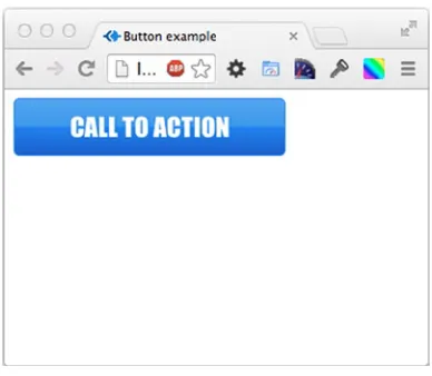
Web sites use buttons for a variety of purposes, with common examples being call to actions, form submit buttons, and action buttons. Historically, styling buttons could be quite tricky as you would need to use images for things like gradients, none web safe fonts, and shadows. When we had different sized buttons, we would then need a different set of images. With CSS3, you are able to achieve all this simply by writing code. Not only is this simpler, it also means you can scale your buttons to different sizes without redefining the general button styles. Listing 1-1 defines a single button size with a gradient.
Listing 1-1. A Single Button with a Gradient
<!DOCTYPE html> <html>
<head>
background: #6db3f2; /* Old browsers */
<a href="#" class="button">Call to action</a> </body>
</html>
CHAPTER 1 ■ INTRODUCTION TO RESPONSIVE DESIGN
Figure 1-24. The finished CSS button
RGBA
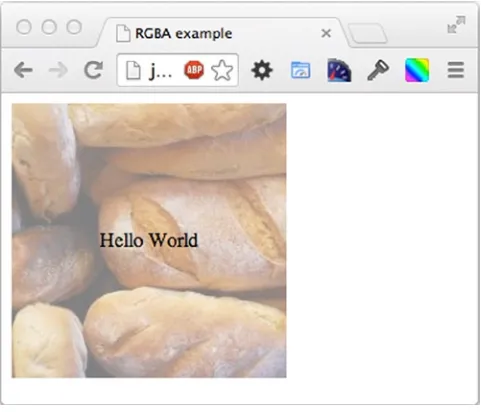
In CSS, colors have generally been defined as hexadecimal or RGB (red, green blue). If we had wanted a translucent background, it would have required using a 1×1px 24-bit .png; however, with CSS3, we can now do this with RGBA colors. A RGBA color is an RGB color with alpha transparency applied to it. The benefit of this is that you no longer need to include an image. To demonstrate RGBA, let’s place some text over a random image with a translucent background (see Listing 1-2).
Listing 1-2. Demonstrating RGBA
<!DOCTYPE html> <html>
<head>
<title>RGBA example</title> <style>
.rgba-container, .rgba{ width: 220px;
height: 220px; position: relative; }
.rgba{
background: rgba(255,255,255,0.5); position: absolute;
top: 0px; left: 0px; margin: 0px; line-height: 220px; text-align: center; }
<body>
<div class="rgba-container">
<img src="http://lorempixel.com/220/220/" alt="random image" /> <p class="rgba">Hello World</p>
</div> </body> </html>
As you can see in this listing, you have set the background to rgba(255,255,255,0.5), which is white at 50 percent opacity. As per RGB values, the first three values you define are red, green, and blue, the fourth value is the opacity of the color as a decimal number. This is visualized in the screenshot shown in Figure 1-25.
Figure 1-25. The finished text over a translucent image
Multiple Columns
In the past, if you wanted to achieve multiple columns of text, it was very difficult. You either had the option of calculating in the backend how many words should appear in each column or using JavaScript to set up the columns. CSS3 allows the addition of multiple columns, meaning you are able to define the columns in your style sheet rather than programmatically. In Listing 1-3 you’ll separate the content in the paragraph tag into two columns with a 10px column gap.
Listing 1-3. Creating Two Columns
<!DOCTYPE html> <html>
<head>
<title>Multiple col example</title> <style>
CHAPTER 1 ■ INTRODUCTION TO RESPONSIVE DESIGN
Figure 1-26. The finished two columns
-moz-column-count: 2; -moz-column-gap: 10px; -webkit-column-count: 2; -webkit-column-gap: 10px; column-count: 2;
column-gap: 10px; }
</style> </head> <body>
<p>Sed posuere consectetur est at lobortis. Fusce dapibus, tellus ac cursus commodo, tortor mauris condimentum nibh, ut fermentum massa justo sit amet risus. Donec id elit non mi porta gravida at eget metus. Integer posuere erat a ante venenatis dapibus posuere velit aliquet.</p>
</body> </html>
In this listing you have set column-count to 2 so that the content will show up as two columns. You then defined the column-gap as 10px to space out the columns. As you will notice, you also included prefixed versions of these CSS3 properties for browsers that require the prefixed versions. You can see the outcome in Figure 1-26.
Gradient Panels
Listing 1-4. Creating a Radial Gradient
<!DOCTYPE html> <html>
<head>
<title>Gradient panel example</title> <style> filter: progid:DXImageTransform.Microsoft.gradient( startColorstr='#77b7ef', endColo
rstr='#000000',GradientType=1 ); /* IE6-9 fallback on horizontal gradient */ background-size: 160% 160%;
CHAPTER 1 ■ INTRODUCTION TO RESPONSIVE DESIGN
Figure 1-27. Our finished gradient
Summary
This chapter explained how responsive design techniques can enable you to build web sites that work well across a wide variety of different devices. It is important to remember that responsive design is not simply about making a web site work across mobile and desktop devices, but also about building a site that is flexible enough to function well across a wide variety of devices. You can’t predict how future devices that will access your site will display, therefore, for your programming it is better to think of devices in terms of large, medium, small, and extra small rather desktop, tablet, and mobile.
In addition to getting an understanding of where to use responsive design, you should now be able to recognize times where using responsive techniques would not be suitable. A good example of this is a desktop replacement application like Google Docs, which has a lot of functionality that a smaller device does not have or the space to show the user.
Having gotten a sense of responsive design and what it can offer your site, it is a good idea to look at some existing responsive sites to get an idea of what you are able to achieve when using these techniques. This chapter also looked at a couple of examples of responsive design being used. However, with the explosion in popularity of responsive design, there are many more good examples out there. The AWWWARDS site has a really good listing of different responsive sites, which can be found at: http://www.awwwards.com/websites/responsive-design/.
What makes responsive design even possible is of course the improvements that have been made in the browsers with both HTML5 and CSS3. The new semantic tags that come as part of HTML5 enable us to bring more meaning to our HTML, which not only helps us as developers but it also enables screen readers to understand the structure of the page. CSS3 has also brought many improvements that allow us to have greater control of how we style our pages.
Testing a Responsive Site
Having been introduced to responsive design and some of the new features found in both CSS3 and HTML5 in Chapter 1, this chapter will look at how to test responsive sites as you work on them.
It is likely you have already done some browser testing of your sites to ensure that you support the browsers your users are using. However, when it comes to testing a responsive site, it can be trickier as there is a much larger range of devices that need to be supported.
You need to know how to test your responsive sites in an effective way, and with this in mind this chapter will explain:
1. How to test responsive site in the web browser
2. How to test on a device
Testing Responsive Design in the Browser
During the development life cycle of a web site, it is likely that the first place you turn to test your site is the same browser you would use to surf the web. With responsive design, as long as your browser supports media queries (IE9+, Chrome, Firefox, Opera, Safari), you can continue to do this, turning to the other browsers when you reach the point where you need to cross-browser test.
CHAPTER 2 ■ TESTING A RESPONSIVE SITE
Because this site is responsive, the browser can be resized to test the mobile view (see Figure 2-2).
There it is, my web site in the desktop and mobile views. This simple resizing of the window process is the same in all browsers that support media queries.
Browser Specific Testing Features
I mentioned previously that you don’t need to change your browser to test a responsive site. Some browsers provide additional developer tools that aid us in testing a responsive site. Although you don’t need to switch browsers for your core development, it is useful to be aware of the different tools that browsers offer so where you feel there is a benefit to your workflow, you can switch browsers to take advantage of the particular tool.
Google Chrome
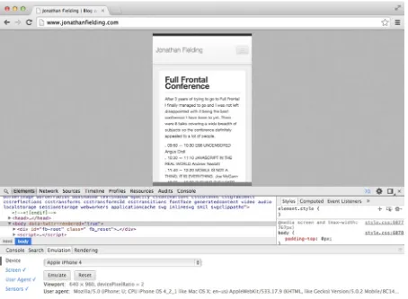
In Chrome you are able to emulate some of the most popular devices by following these steps:
1. Open the Developer tools, there are two ways in which you can do this, the first is to right-click your page and click Inspect element. The second method is to click on the menu button found to the right of the url field and select Tools ➤ Developer Tools.
2. Click the Show console icon to the right of the Developer Tools or press the Esc key on your keyboard. This will open the Console drawer, as shown in Figure 2-3.
CHAPTER 2 ■ TESTING A RESPONSIVE SITE
3. With the Console drawer open, you can now select the Emulation tab. As you can see in Figure 2-4, the Device line indicates it will default to Google Nexus 4.
Figure 2-4. The Emulation tab, preselected with a default device
Figure 2-3. The Console drawer open in Chrome’s Inspector
5. Having selected the device to emulate, you will see the viewport has now automatically narrowed, and when you move your mouse cursor over the viewport, it will turn into a circle to signify your finger (see Figure 2-6).
Figure 2-6. With a device selected and emulation enabled, the browsers viewport changes
Note
CHAPTER 2 ■ TESTING A RESPONSIVE SITE
Firefox
Firefox takes a slightly different approach to this. Rather than emulating specific devices, you can enter responsive design mode, which allows you to test common viewport widths.
1. Open the developer tools. The easiest way to do this is to right-click the web page and click Inspect element.
2. Enter responsive design view; this is achieved using the icon tab on the far right.
3. Now that you are in responsive design view, you can see the site in a smaller viewport. You have the option to switch to landscape view, enable touch events, or change the viewport size to other commonly used viewport sizes. You can also resize the viewport and then save the new viewport size as a preset. You can see the Firefox interface in Figure 2-7.
Testing on a Device Simulator
So far you have been testing sites by resizing the browser window or using the tools built in to browsers for testing responsive sites. Although this is effective for viewing how media queries are working, it doesn’t provide the full picture of how they will affect a site on mobile devices. We will now look at how we can test our project on device simulators and actual devices.
Before you get started with testing on real mobile browsers, you need to determine which browsers you are going to support. This may be different for each web site you build based on your site’s target audience, so if you already have some analytics on the browsers your users are using, this is a good start. Additionally, if your web site is targeting a specific country, it is easy to find statistics on what percentage of users use each platform by looking at the StatCounter GlobalStats site (http://gs.statcounter.com/).
There are currently five main smartphone operating systems:
1. iOS
2. Android
3. Windows Mobile
4. BlackBerry OS
5. Firefox OS
Having decided on which browsers you want to test on, let’s look at how to test on real mobile browsers. There are two options: the first is to use simulators and the second is to get some actual devices to start testing on.
Simulators
Simulators provide a fantastic start to testing your responsive site. They are able to run on your local machine, often with the capability to access all your local files and files on the network you are on.
iOS Simulator
If you are using a Mac you can download the Mac developer toolkit, Xcode, from the Apple App Store. Included with this is the iOS Simulator, which can be used to test responsive sites. To get started with the iOS Simulator, you need to follow the following steps:
1. Download Xcode from the Apple App Store.
2. Open Xcode.
3. Use the menu bar to navigate to Xcode ➤ Open Developer Tool ➤ iOS Simulator.
4. Open Safari by clicking the Safari icon in the dock.
You can now access any web site, including local sites stored in your Hosts file. If you simply want to test an HTML file, you can even just drag and drop it into the iOS Simulator window.
CHAPTER 2 ■ TESTING A RESPONSIVE SITE
Android
The Android emulator is available as part of the Android SDK (software development kit) on both Windows and Mac.
Mac
1. Download the Android SDK from http://developer.android.com/sdk.
2. Extract the zip file to ~/bin/Android (~is the Unix shorthand for your user directory, so if your username is Jonathan, the full folder path would be /Users/jonathan/bin/Android).
3. Open your terminal.
4. Navigate to the SDK, which is located at ~/bin/Android/sdk/tools. You can navigate to this path using the change directory Unix command cd, so the full command you enter into your terminal would be ~/bin/Android/sdk/tools.
5. Run the SDK Manager by running the ./android command in your terminal. This will load another application (be aware this application may take a while to load and unfortunately does not give any indication of the status of it loading).
Windows
1. Download Android SDK from http://developer.android.com/sdk.
2. Extract the zip file to C:\Program Files\Android.
3. Launch the SDK Manager.exe.
Shared Steps
1. You will now be able to select the SDK version you want to test. In this case I have selected Android 4.3. Then simply click Install, reading and accepting any licenses as required.
2. You then need to select Tools ➤ Manage AVDs on the menu bar. Then click the New button to create a new Android Virtual Device.
4. You can now select your simulator and click Start (see Figure 2-9).
Figure 2-8. The create a Simulator prompt allows you to configure your simulator
CHAPTER 2 ■ TESTING A RESPONSIVE SITE
5. With the Android emulator installed, you can now simply use the emulator as you would with a normal Android device (see Figure 2-10).
Figure 2-10. The Android Simulator, with the hardware buttons included in the window
Firefox OS Simulator
The Firefox OS Simulator runs as an add on for Firefox, and as of Firefox 26.0 it is really simple to install.
2. You can now click Start Simulator. Because there is no simulator installed, you will be given the option to install the simulator, so click Install Simulator to continue, as shown in Figure 2-12.
Figure 2-11. The Firefox App Manager tool can be used to launch a Firefox OS Simulator
Figure 2-12. The App Manager allows you to install the simulator if it is not already installed
3. You will now be taken to a web page to install a simulator, simply follow the instructions to install the latest version.
4. Once installed, go back to about:app-manager and refresh the page. Click Start Simulator and then select the version of the simulator you wish to start. If it still says Install
Simulator, you should try to install a different version (see Figure 2-13).
CHAPTER 2 ■ TESTING A RESPONSIVE SITE
5. After a short loading time, you will find yourself at the Firefox OS home screen, where you can select the web browser. The OS Simulator is shown in Figure 2-14.
Figure 2-14. Firefox OS Simulator home screen, with the browser found in the bottom right-hand corner
BlackBerry OS Simulator
BlackBerry Limited provides emulators for BlackBerry OS that run on both Windows and Mac, and they are really simple to install. However, you will need to also install VMware Player on Windows or VMware Fusion on Mac if you do not already have these applications, which can be found at www.vmware.com.
1. Download the emulator at http://uk.blackberry.com/sites/developers/resources/ simulators.html.
2. Run the Installer.
3. Run the Virtual Machine in VMware, as shown in Figure 2-16.
CHAPTER 2 ■ TESTING A RESPONSIVE SITE
Windows Phone Simulator
The Windows Phone Simulator is part of the Windows Phone SDK, which is currently only available for Windows 8+. Unfortunately, running the Windows Phone Simulator also has specific hardware requirements, which can be found at msdn.microsoft.com/en-us/library/windowsphone/develop/ff626524(v=vs.105).aspx.
1. Download the Windows Phone SDK from
http://dev.windowsphone.com/en-us/downloadsdk.
2. Run the SDK installer (this requires 6.5GB of hard drive space).
3. Upon completion of the installation, you will be told you need a license for Visual Studio, so you can either cancel and use the trial or register for a free license at
http://www.visualstudio.com/en-US/products/visual-studio-express-vs.
4. Check for available updates to the SDK.
5. Open the command line (cmd) by right-clicking and clicking Run as administrator.
6. Run the command:
"C:\Program Files (x86)\Microsoft XDE\8.0\XDE.exe" /vhd "C:\Program Files (x86)\Microsoft SDKs\Windows Phone\v8.0\Emulation\Images\Flash.vhd" /name WP8SDK
7. With the emulator now open, you should now be able to run Internet Explorer in the Simulator, as shown in Figure 2-17.
Figure 2-17. Internet Explorer running on Windows Phone Simulator
8. To make opening the simulator easier in the future, create a .bat file with the command.
Physical Devices
CHAPTER 2 ■ TESTING A RESPONSIVE SITE
One of the reasons for this is that on development machines you are only simulating the different input methods the device uses using a keyboard and mouse. By testing on real devices, you are able to test using the input methods users would be using. Without testing a site on a physical device, you might not notice issues with the usability. Common issues you might not notice would be buttons being too small to tap or text that is unreadable on the small display.
With this in mind, it is really important to test responsive sites on as many devices to which you have access. However, if you are just starting your device collection, it can be really difficult to choose which devices to purchase, especially if you have a limited budget. In this situation, it makes sense to take a look at the devices your users are using and, when selecting the devices you need, ensure you cover your bases. Devices should cover the most popular operating systems as a minimum, with a mixture of high end and low end if possible.
Debugging Web Sites on Devices
When testing web sites across a variety of different devices, you need to be able to debug any issues that users might face. The way to do this debugging is dependent on the operating system of the device.
Debugging Sites on iOS
You also need to ensure that the Develop menu item is enabled on your Mac Safari. To do this, simply open Safari and check if the Develop item appears on the top menu. If this is not visible, you will need to open the Safari preferences under the Advanced tab. To enable the Develop menu, simply check the check box Show Develop menu in menu bar, as shown in Figure 2-19.
Figure 2-19. Safari preferences with Develop menu enabled
CHAPTER 2 ■ TESTING A RESPONSIVE SITE
Upon selecting the site you want to debug, the Safari Inspector panel will open, giving you full access to the site code. From here debugging is the same as if you were debugging on desktop Safari, highlighting an element in the source code will highlight the corresponding element on the iOS device. The Safari Inspector panel is illustrated in Figure 2-21.
Figure 2-21. Safari Inspector panel
Debugging Sites on Android
Similar to iOS, you can debug web sites running in Chrome on Android from your development machines.
The first step is to configure your Android device so it allows remote debugging. The way you do this is dependent on the version of Android your device is running.
CHAPTER 2 ■ TESTING A RESPONSIVE SITE
For Android 4.0 or 4.1, go to Settings ➤ Developer Options. Under Debugging, you can now enable USB debugging. The setting is highlighted in Figure 2-22.
If you are using Windows, at this stage you will need to install the USB device drivers for connecting the Android device. These are available to download at http://developer.android.com/tools/extras/oem-usb.html.
It is at this point you need to change a setting in Chrome to enable remote debugging support. To do this, enter the URL about:inspect into your web browser. This will show you the settings page for the Chrome DevTools. You can then enable device discovery by checking the check box Discover USB devices, as shown in Figure 2-23.
With a page loaded on your device, you can now click the Inspect link below the name of the site, which will open the Inspector. This is the normal Chrome Inspector you used to inspect web sites on your desktop (as shown in Figure 2-25). In addition all the developer tool plug-ins you have installed on your browser can also be used to debug your site.
Figure 2-24. Choose a tab on your device you want to inspect
You are now at the stage where you can connect your device by USB. When connecting, you may see an alert on the device requesting permission for USB debugging. To avoid this in future, you can check the Always allow from this computer check box before clicking OK.
You can now open your site in Chrome on your device. This will then appear on the chrome://inspect page underneath the device you have plugged in to your computer. This is illustrated in Figure 2-24.
CHAPTER 2 ■ TESTING A RESPONSIVE SITE
Open Device Labs
If you don’t have the budget to buy any devices of your own, you can look if there are any Open Device Labs (http://opendevicelab.com/) near where you work or live. Open Device Labs is a community movement that establishes pools of devices that anyone can go and test on. They typically have a range of different devices, which will enable you to get a good picture of how your site works across them.
Online Solutions
You might be in the situation where you are not able to get your hands on devices and do not live close to an Open Device Lab. In this case there are also online solutions that will allow you to test across various devices.
The first of these online solutions is Perfecto Mobile (www.perfectomobile.com/). Perfecto Mobile is not a simulator but instead you are remotely controlling real devices. What this means is that you get a truer likeness of what the users of your site will experience when using your site.
A second solution is BrowserStack (www.browserstack.com), which allows you to test your web site across a wide number of different browsers. In addition to allowing you to test and debug your responsive site, BrowserStack also allows you to quickly generate screenshots of your phone across different browsers and devices. It is also worth mentioning that you do not need to make your site publically available to use BrowserStack, because it installs a browser plug-in that will proxy your local sites through to their servers securely.
Summary
Testing web sites is critical to building sites that work across a wide variety of different devices. Therefore, ensuring that you have a strategy in place as to how you will test your site is very important.
When planning the strategy you will use when testing your site you should ensure you take into account both the browsers your users are using and the devices they are using them upon.
This chapter explored how to test across these different platforms, including how you can initially test within your browsers and then move on to testing on real devices or simulators. Your strategy should take both into account, because you can’t simply expect web sites to work on real devices if you have only tested on desktop browsers. Third-party tools like Perfecto Mobile and BrowserStack can be valuable parts of this strategy because they give you greater access to extra browsers you can test on.
In the bigger picture of web development, you need to ensure that you give adequate time to testing your site. Testing is not something you can simply do at the end of the process but instead should be an integral part of how you work, and you should be able to test a particular feature as it is implemented.
Thorough testing enables you to ensure that things don’t get missed and that you have seen the different experiences the user gets from device to device.