Beijing
·
Cambridge·
Farnham·
Köln·
Sebastopol·
TokyoMobile Design
Pattern Gallery
Second Edition
UI Patterns for Smartphone Apps
Theresa Neil
Mobile Design Pattern Gallery, Second Edition by Theresa Neil
Copyright © 2014 Theresa Neil. All rights reserved.
Printed in Canada.
Published by O’Reilly Media, Inc.,
1005 Gravenstein Highway North, Sebastopol, CA 95472.
O’Reilly books may be purchased for educational, business, or sales promotional use. Online editions are also available for most titles (safari. oreilly.com). For more information, contact our corporate/institutional sales department: (800) 998-9938 or [email protected].
Editor: Mary Treseler
Production Editor: Kara Ebrahim Copyeditor: Rachel Monaghan Proofreader: Rachel Head Indexer: Ron Strauss
Cover Designer: Randy Comer Interior Designers: Ron Bilodeau and Monica Kamsvaag
Illustrator: Rebecca Demarest Compositor: Kara Ebrahim
May 2014: First Edition.
Revision History for the First Edition:
2014-04-15 First release
See http://www.oreilly.com/catalog/errata.csp?isbn=0636920029311 for release details.
Nutshell Handbook, the Nutshell Handbook logo, and the O’Reilly logo are registered trademarks of O’Reilly Media, Inc. Mobile Design Pattern Gallery, Second Edition and related trade dress are trademarks of O’Reilly Media, Inc. Many of the designations used by manufacturers and sellers to distin-guish their products are claimed as trademarks. Where those designations appear in this book, and O’Reilly Media, Inc., was aware of a trademark claim, the designations have been printed in caps or initial caps.
Although the publisher and author have used reasonable care in preparing this book, the information it contains is distributed “as is” and without warran-ties of any kind. This book is not intended as legal or financial advice, and not all of the recommendations may be suitable for your situation. Professional legal and financial advisors should be consulted, as needed. Neither the publisher nor the author shall be liable for any costs, expenses, or damages resulting from use of or reliance on the information contained in this book.
ISBN: 978-1-4493-6363-5
[
Contents
]
Foreword . . . .ix
Preface . . . .xiii
Chapter 1 Navigation . . . .1
Primary Navigation Patterns, Persistent . . . .2
Springboard . . . 7
Cards . . . 12
List Menu . . . 14
Dashboard . . . 17
Gallery . . . 17
Tab Menu . . . 19
Skeuomorphic . . . 26
Primary Navigation Patterns, Transient . . . .30
Side Drawer . . . 30
Toggle Menu . . . 41
Pie Menu . . . 44
Secondary Navigation Patterns . . . .46
Page Swiping . . . 48
Scrolling Tabs . . . 51
Chapter 2 Forms . . . .55
Sign In . . . .57
Multi-Step . . . .75
Checkout . . . .82
Tip #1: Include Sign In, Register, and Guest Options . . . 83
Tip #2: Streamline the Flow . . . 84
Chapter Extra: Let Them Pee—Avoiding the
Sign-Up/Sign-In Mobile Anti-Pattern . . . .361
Appendix A: Additional Resources . . . .365
ix
To name something is to begin to understand it.
My five-year-old son, like many children, enjoys looking at clouds. Recently, he clued into the fact that different kinds of clouds have dif-ferent names. And so, being of good geek stock, he proceeded to mem-orize them—cirrus, cumulus, stratus, cirrostratus, cumulonimbus, altostratus, lenticular—all of the ones I knew, and then some. I’d cer-tainly never heard of “cumulus congestus” before.
Now, when he looks at the sky, he can tell me which clouds are which. More than that, he notices more than he did before, and with greater nuance. He has learned to visually discriminate among cloud types based on texture, color, height, movement, and who knows what else. (They’re not always easy to tell apart, of course, but that doesn’t bother him.) He can predict, with some accuracy, which ones might drop rain on us and which won’t.
And in his limited preschooler fashion, he uses his cloud knowledge to analyze the big picture. “Cirrostratus clouds might mean a warm front,” he points out. Or, “Cumulus congestus might turn into cumu-lonimbus! Then we could get a storm.”
Above all, he enjoys knowing these names. Little kids seem to get a kick out of naming the things they love, whether they’re clouds, dino-saurs, bugs, cars, dolls, or movie characters. Certainly their imagina-tions aren’t limited by that left-brain knowledge, despite our grown-up romantic biases—my son still sees palaces and ducks and cauliflowers in the clouds, even as he names them “cumulus.”
So it is with us grown-ups. That brings us to the topic at hand: by rec-ognizing and naming patterns in interfaces, we “see” those interfaces better. We notice more details, because our brains are more attuned to what we should look for. We can start to predict the workings of
[
Foreword
]
the software we use, because we know how certain interface pat-terns should behave. Then we can tell other people what we see via an expressive new vocabulary.
And how do we learn these patterns?
When my son learned about clouds, the best tool he had was pictures. Lots of pictures. After looking at some of these “catalogs” in books and on websites, he learned to see rather subtle differences between cloud types, some of which are hard to describe verbally.
Likewise, the best way to learn interface patterns is to see visual exam-ples. Now, I’m a writer, so I love words. When not restrained by cour-tesy, I would happily go on endlessly about what patterns are, how to choose them, and the differences between them! But it’s clear to me that anyone who simply wants to design interfaces—that is, anyone who needs to know patterns as one component of their craft knowl-edge—won’t really need all those words. For a given pattern, they need just enough explanation to “get it,” and then they need to see a range of well-chosen real-life examples to solidify and internalize that knowledge.
In this book, Theresa Neil has pulled together a spectacular collection of pictures of patterns. I can’t imagine the work that went into this, having tried it myself; it’s no small feat to review this many mobile apps, see what works best in them, and gather up all these carefully cataloged screenshots.
For mobile interface designers, this book is a treasure. Read it straight through if you’d like, but more than that, use its examples to improve your own designs:
• Use your own judgment about what works well in these
exam-ples, and figure out what may work best in the context of whatever you’re designing.
• Use it as a sourcebook for design inspiration. I found myself
admiring these screenshots for design aspects that had nothing to do with the patterns themselves, such as icon design and color usage.
• Use it to expand your knowledge of how existing apps work,
FOREWORD
|
xiYou might even go out and find your own pattern examples in the mobile apps you use daily. In fact, I’d bet that once you learn these pat-tern names, you won’t be able to avoid doing so. Having had my son point out “cumulus congestus” in the wild a few times, I know it well, and, gosh—I don’t know how I ever lived without that knowledge.
Enjoy!
—Jenifer Tidwell
xiii
Sometimes it’s good to stop and reflect on the many factors that affect usable design. But more often, there’s no time for that—you’ve just got to roll up your sleeves and get to work. This book is for those times.
From one perspective, the mobile world has changed a lot since this
book first came out in 2011. Three of the six mobile operating systems
I included in 2011—WebOS, Symbian, and BlackBerry—are no longer
contenders in the mobile space.
From another perspective, not that much has changed: out of over 70
patterns from the first edition, most are still with us, with only a hand-ful of new ones added. Those latest patterns, though, exhibit more “mobile-centric” thinking. Designers are finally looking beyond desk-top and web metaphors to craft solutions that are organic to mobile interfaces. I expect this to continue, and to accelerate.
Another change: in 2011, I was also optimistic about OS-neutral
designs, meaning that perhaps we could as designers and develop-ers create a single interface that would work well on multiple OSs. In fact, the opposite has occurred; distinct design conventions for iOS, Android, and Windows Phone have become more formalized, particu-larly with regard to navigation.
It’s now more important than ever to understand those OS guide-lines, and even more crucial that you are truly familiar with the actual
devices your users rely on 24/7/365. I strongly advise that you spend a
minimum of six weeks using devices for each OS you are designing for. That way, when you do roll up your sleeves to get to work, your own experience—along with the patterns in this book—will give you the confidence you need to design beautifully usable apps.
[
Preface
]
Intended Audience for This Book
Mobile Design Pattern Gallery is for product managers, designers, and developers who are creating mobile applications. As companies are defining and refining their mobile strategies, it can be a challenge to find examples of design best practices, especially for multiple operat-ing systems. Whether you have been tasked with designoperat-ing a simple iPhone application or designing for every popular operating system on the market, these patterns will provide solutions to common design challenges.
Safari® Books Online
Safari Books Online (http://my.safaribooksonline.com) is an
on-de-mand digital library that delivers expert content (
http://www.safa-ribooksonline.com/content) in both book and video form from the world’s leading authors in technology and business. Technology pro-fessionals, software developers, web designers, and business and cre-ative professionals use Safari Books Online as their primary resource for research, problem solving, learning, and certification training.
Safari Books Online offers a range of product mixes (http://www.
safaribooksonline.com/subscriptions) and pricing programs for
orga-nizations (http://www.safaribooksonline.com/organizations-teams),
government agencies (
http://www.safaribooksonline.com/govern-ment), and individuals (
http://www.safaribooksonline.com/individu-als). Subscribers have access to thousands of books, training videos,
and prepublication manuscripts in one fully searchable database from publishers like O’Reilly Media, Prentice Hall Professional, Addison-Wesley Professional, Microsoft Press, Sams, Que, Peachpit Press, Focal Press, Cisco Press, John Wiley & Sons, Syngress, Morgan Kaufmann, IBM Redbooks, Packt, Adobe Press, FT Press, Apress, Manning, New Riders, McGraw-Hill, Jones & Bartlett, Course Technology, and
doz-ens more (http://www.safaribooksonline.com/publishers). For more
information about Safari Books Online, please visit us online (http://
PREFACE
|
xvHow to Contact Us
Please address comments and questions concerning this book to the publisher:
O’Reilly Media, Inc.
1005 Gravenstein Highway North
Sebastopol, CA 95472
800-998-9938 (in the United States or Canada)
707-829-0515 (international or local)
707-829-0104 (fax)
We have a web page for this book, where we list errata, examples, and any additional information. You can access this page at:
http://oreil.ly/mobile-design-2e
To comment or ask technical questions about this book, send email to:
For more information about our books, courses, conferences, and
news, see our website at http://www.oreilly.com.
Find us on Facebook: http://facebook.com/oreilly
Follow us on Twitter: http://twitter.com/oreillymedia
Watch us on YouTube: http://www.youtube.com/oreillymedia
Acknowledgments
I am in debt to Rich Malley for helping me write this book; I hope this is just the first of many. Many thanks to Cathlin McCullough for pull-ing together the chapter on social patterns, and Suze Kemper for help-ing me meet the deadline. And a huge thanks to Ivan Bachev for once
again prepping all 1,000 images!
Thank you to Alissa Briggs, Greg Nudelman, and Eli Holder for shar-ing their stories, and Aaron Jansinski for the pattern illustrations.
I’d also like to acknowledge all the creative and dedicated teams out there designing and developing mobile applications. I feel privileged to use many of the great apps showcased in this book and appreciate all the hard work that went into them.
This is my third book for O’Reilly Media, and it has been a pleasure to work with Mary Treseler and her team again.
Finally, a very warm thank you to the newest member of my family, Marlena Elizabeth Ann, for providing me with the motivation to finish
1
[
1
]
Navigation
Primary Navigation Patterns, Persistent
Springboard, List Menu, Dashboard, Gallery, Tab Menu, Skeuomorphic
Primary Navigation Patterns, Transient
Side Drawer, Toggle Menu, Pie Menu
Secondary Navigation Patterns
Page Swiping, Scrolling Tabs, Expand/Collapse Panel
I like to read reviews in mobile marketplaces to better understand how people are using apps. The marketplace rating system offers incredi-bly valuable feedback of a kind that doesn’t exist for web and desktop applications. It provides a rich source of information about customer preferences and expectations.
In general, most 4- and 5-star reviews aren’t very specific. They often don’t go beyond “What a great app; it looks good and works well.” But
the 1- and 2-star reviews are much more telling; they tend to offer a
truer picture of problems users are having with applications. The most common complaints seem to revolve around:
• Crashing
• Lack of key features (e.g., syncing, filtering, account linking)
• Confusing interface design
• Poor navigation (e.g., can’t go back, can’t find things)
The first two issues can’t be fixed with design patterns—they’ll both require user and device testing—but the third and fourth complaints certainly can. Following the common design patterns for navigation will ensure that people can find and use the valuable features in your application.
Good navigation, like good design, is invisible. Applications with good navigation just feel simple and make it easy to accomplish any task, from browsing through pictures to applying for a car loan.
Primary Navigation Patterns, Persistent
The first set of patterns we’ll look at are used for primary naviga-tion, like navigating from one primary category to another, as with the top-level menus of a desktop application. Since the first edition of this book, primary navigation has evolved into two distinct types: per-sistent and transient.
ChAPTER 1: NAvIGATION
|
3Transient navigation, however, must be explicitly revealed with a tap or gesture. These patterns arise from the constraints of smartphone screen sizes, which have pushed mobile designers to think “outside of the box,” literally.
To me, this classic 9-dot puzzle perfectly illustrates the change in
thinking around mobile navigation patterns. Give it a try: your chal-lenge is to connect all of the dots using four straight lines or fewer, without taking your pencil off the paper or retracing any of the lines.
How’d you do? You probably figured out that the only way to solve this puzzle is to break free of the artificial boundaries. In the mobile world, it’s called thinking “off-canvas.”
This off-canvas thinking inspired the Side Drawer, which is cur-rently one of the most popular primary navigation patterns in iOS and Android apps.
FIGURE 1-1. 9-dot puzzle
FIGURE 1-2. Two of the possible solutions to the 9-dot puzzle
Windows Phone 8 and Ubuntu Touch, a new open source mobile OS, are both highly influenced by this move to break artificial boundaries as well.
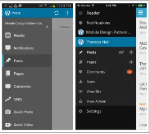
FIGURE 1-3. WordPress for Android
and iOS: Side Drawer represents “off-canvas” thinking
ChAPTER 1: NAvIGATION
|
5Designers have also made a significant shift in design thinking, lay-ering content instead of relegating the UI to a single plane. Twitter’s
early iPad design was a fantastic example of how 3D layers and
ges-tures can create a uniquely mobile experience: the left panel is the menu bar, the middle panel is the listing of contents, and the right panel displays those contents. Tapping an item in the middle section collapses the left menu bar and shows a preview of the contents within the right panel. When tapped, the right panel expands to cover about
70% of the screen.
FIGURE 1-5. In Ubuntu, you can swipe the screen edges to reveal settings and menus, leaving the screen entirely free for the application’s content
ChAPTER 1: NAvIGATION
|
7When deciding between persistent and transient navigation, ask your-self a few questions:
• Is your application “flat”? Are the menu categories equivalent in
hierarchy, and are there just a few primary categories (i.e., three to
five) in the app?
• Do your users need the menu to be always visible for quick access?
• Do the menu categories have status indicators, like the number of
unread emails, for instance?
If you answered “yes” to one or more of these questions, it’s probably best to stick with persistent navigation. Now let’s take a look at those patterns.
Springboard
The Springboard pattern, also called a Launchpad, was the most
pop-ular navigation pattern in 2011. This design is a landing screen with
options that act as launch points into the application.
One of the reasons for its popularity was that it worked equally well across platforms. At the time, many of us were still thinking in terms of OS-neutral designs that allowed for consistency and reuse. It was
also popular because up to nine options (in a 3×3 grid) could be
dis-played, compared to the limits of three to five tabs imposed by iOS and Android tab bars. And by adding a paging indicator (those little dots at the bottom), designers could provide even more menu options.
The main drawback of the Springboard pattern is that it flattens all options to the same level of importance. Enter the Side Drawer
pat-tern, first designed by Aza Raskin for Firefox Mobile (http://www.
azarask.in/blog/post/firefox-mobile-concept-video/), and adopted by
FIGURE 1-7. Trulia for iOS and Gowalla for Android
FIGURE 1-8. Facebook for iOS and
ChAPTER 1: NAvIGATION
|
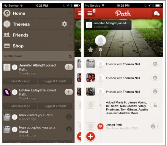
9Path in 2011. This pattern accommodates more options than a tab bar,
and those options can be logically grouped to communicate impor-tance and/or hierarchy. We’ll discuss it more later in this chapter.
However, the Springboard pattern is not dead. Android, iOS, and Windows Phone all still use this navigation pattern at the OS level.
And there are still apps with traditional implementations of the Springboard pattern around. LearnVest, BBC Radio, and Vimeo use
basic 4-, 6-, and 9-grid layouts, respectively.
FIGURE 1-9.
Path for iOS (November 2011): enter the Side Drawer
FIGURE 1-10. iOS 7, Android KitKat, and Windows Phone 8 all use the Springboard pattern at the OS level
Orbitz and EasyJet vary the icon treatment and grid layout to introduce visual hierarchy to the menu.
Windows Phone has pushed the Springboard pattern the farthest with
tiles. Tiles can be live or static, and come in three different sizes. Live tiles convey dynamic information like number of calls missed, details of your next appointment, or the avatar of your last caller. Read the
FIGURE 1-11. Learnvest for iOS, BBC
Radio for Windows Phone, and vimeo for Android: traditional Springboard alive and well within apps
ChAPTER 1: NAvIGATION
|
11Windows Phone tiles can be used for primary navigation or paired with the Panorama control as a secondary navigation pattern. Examples from three apps show their versatility. CalendarPro uses live tiles for primary navigation and NBC News for subnavigation, while Evernote uses static tiles for subnavigation.
Evernote Hello for Android and iOS uses a tile-inspired design for the Springboard. Users can customize the UI, first by adding people, then by adding meetings.
FIGURE 1-13. CalendarPro, NBC News, and Evernote for Windows Phone: versatile tile implementations
FIGURE 1-14. Evernote hello for Android: tile-inspired customizable Springboard
Cards
Cards may seem familiar to those of us who had a Palm in 2010–2011.
Card navigation is based on a card deck metaphor, including common card deck manipulations such as stacking, shuffling, discarding, and flipping.
This pattern has become popular again with the release of Google Now, which stacks information-rich cards vertically to display a long list of launch points into the app, or quick actions in context.
FIGURE 1-15. Palm webOS circa 2010–2011: apps fanned out like cards in a deck
ChAPTER 1: NAvIGATION
|
13In a similar vein, Jelly and Potluck use Cards as the primary means to navigate and interact with content. With Jelly, when you swipe the card down to remove it from the screen—indicating that you can’t help answer the posted question—a new card replaces it. With Potluck, swiping left on the top card in the stack will skip the story; swiping right will move it to a new pile, the “keep” pile.
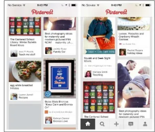
Facebook and Pinterest use the visual style of Cards but are missing the gesture-based interactions of the aforementioned examples. This makes them more like stylized list elements than true Cards.
For an example of the Card pattern gone wrong, see the discussion of
Alaska Airlines in the section “Novel Notions” in Chapter 11.
FIGURE 1-17.
Cards provide an elegant way to display content for browsing. A true Card pattern will offer interactions like stacking, swiping, or flipping.
List Menu
The List Menu pattern is similar to the Springboard in that each list item is a launch point into the application, and switching modules
requires navigating back to the list. Apple (http://bit.ly/1dZDU8J) calls
this hierarchal navigation:
In a hierarchical app, users navigate by making one choice per screen until they reach their destination. To navigate to another destination, users must retrace some of their steps—or start over from the beginning—and make different choices. Settings and Mail are good examples of apps that use a hierarchical structure.
The Kayak, Day One, and AroundMe apps illustrate various imple-mentations of the List Menu.
ChAPTER 1: NAvIGATION
|
15FIGURE 1-19. Day One for iOS: List Menu as primary navigation
FIGURE 1-20. AroundMe for iOS: “home” or “Menu” might’ve been a better choice for the Back button label
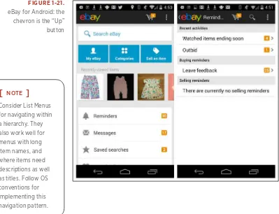
The List Menu navigation pattern is similar in Android, but the Back button is called the Up button, conveying the pattern’s hierarchical structure, as described in the Android documentation:
The Up button is used to navigate within an app based on the hierarchical relationships between screens. For instance, if screen A displays a list of items, and selecting an item leads to screen B (which presents that item in more detail), then screen B should offer an Up button that returns to screen A. If a screen is the top-most one in an app (that is, the app’s home), it should not present an Up button.
An example of this is shown in the eBay app; the Up button is the app icon preceded by a left chevron. Note that most users expect the
chev-ron plus the logo or icon to be tappable.
[
NOTE]
Consider List Menus for navigating within a hierarchy. They also work well for menus with long item names, and where items need descriptions as well as titles. Follow OS conventions for implementing this navigation pattern.
FIGURE 1-21. eBay for Android: the
ChAPTER 1: NAvIGATION
|
17 DashboardThe Dashboard pattern is similar to the Springboard and List Menu patterns.
With a quick glance, a good Dashboard gives the user a snapshot of the most relevant information she needs to know, without making her navigate into another screen.
When you design the drill-down screens, the rules for providing navi-gation back to the Dashboard are the same as with the List Menu and
Springboard. See Chapter 6 for more on the Dashboard design pattern.
Gallery
The Gallery pattern displays live content—like news stories, recipes, or photos—arranged in a grid (as with Recipeas and Square Wallet), a carousel (as with LinkedIn Pulse and BBC News), or a slideshow.
[
NOTE]
Use a Dashboard when it makes sense to use key metrics or data as launch points into the app. But don’t overload the Dashboard; conduct research to determine which key metrics or data to include.
FIGURE 1-22.
Mint for iOS: Dashboard makes data the launch points
FIGURE 1-23. Recipeas and Square Wallet for iOS: galleries present individual, nonhierarchical items
ChAPTER 1: NAvIGATION
|
19Notice the BBC News example is easier to scan than the LinkedIn Pulse example, because the titles are below the photo instead of over-laid on them.
Tab Menu
Android, iOS, and Windows Phone each have their own specific nomenclature and design guidelines for Tab Menus. I’m going to go over them here, because it is important that you understand them, even if you choose to deviate from them in your design iterations.
IOS
Since the first release of iOS, Apple has recommended (http://bit.
ly/1dZF9Vt) the Tab Bar for navigating flat apps:
In an app with a flat information structure, users can navigate directly from one primary category to another because all primary categories are accessible from the main screen. Music and App Store are good examples of apps that use a flat structure.
Interestingly, Facebook recently has returned to the Tab Bar after two years of using Side Drawer navigation. Read more about its user
test-ing process and results at http://tcrn.ch/1dZFlUF.
[
NOTE]
The Gallery pattern works best for showing frequently updated, highly visual content where no hierarchy is implied.
FIGURE 1-25. Facebook for iOS, old and new: Tab Bar (right) beat out the Side Drawer (left) and other navigation patterns in 10-million-user test batches
The iOS Tab Bar is restricted to five menu items. If the application has more than five primary categories, a More option can be provided as the fifth tab on the right.
It is important to understand the difference between the Tab Bar and Toolbar in iOS. The Tab Bar is for navigating the main categories of the application; the Toolbar presents the tools, or possible actions, for a specific screen.
Some applications, like Instagram and RunKeeper, rely so heavily on the user taking a single action (like taking a picture or starting a run)
that they place calls to action (a single action more prominent than the
rest) in their Tab Bars.
If you design for this variation, make sure the selected tab is con-spicuous. It’s hard to tell where you are in Everlapse and Tumblr, for instance, because the selected tabs are overshadowed by the visual emphasis on the action buttons.
FIGURE 1-26. Amazon and Walmart for iOS: Tab Bar treatments
FIGURE 1-27. Tab Bar (left) has menu
ChAPTER 1: NAvIGATION
|
21FIGURE 1-28. Instagram and RunKeeper for iOS: calls to action in the Tab Bar
FIGURE 1-29. Everlapse and Tumblr for iOS: the prominence of action buttons overshadows menu location
ANDROID
Android offers three different Tab Menu patterns for top-level, or pri-mary, navigation: Fixed Tabs, Spinners, and Navigation Drawers. Here
are the Android guidelines (
http://developer.android.com/design/pat-terns/app-structure.html) for Fixed Tabs:
Fixed tabs display top-level views concurrently and make it easy to explore and switch between them. They are always visible on the screen, and can’t be moved out of the way like scrollable tabs.
Fixed tabs should always allow the user to navigate between the views by swiping left or right on the content area.
Use tabs if:
• You expect your app’s users to switch views frequently.
• You have a limited number of up to three top-level views.
• You want the user to be highly aware of the alternate views.
Path makes Fixed Tabs work by using icon-based tabs, while Quora pushes the limit, squeezing in four text-based tabs. More often than not, designers incorrectly use the Scrolling Tab control for primary navigation when they should be using a Spinner or Navigation Drawer instead.
ChAPTER 1: NAvIGATION
|
23WINDOWS PHONE
In Windows Phone, the Tab Menu is called App Tabs, and tabs that extend offscreen are accessible via panning, through the Pivot control.
The Windows Phone design guide (http://bit.ly/1iJWnpE) suggests:
You can use the Pivot control (http://bit.ly/1iJWy4v) to implement the App Tab UI style. This control allows the user to navigate right and left through each page (called a pivot page).
FIGURE 1-31.
Bump and Newegg for Android: incorrect use of Scrolling Tabs for primary navigation
FIGURE 1-32. Netflix for Windows Phone: Pivot control implementation of App Tabs
EMERGING PATTERNS
There is a new trend in both desktop and mobile web design to hide or collapse the website header when the user is scrolling or swiping down through content.
This Retracting Tab design is showing up in native apps too. Pinterest retracts the Toolbar when the user swipes down to browse content. The Toolbar reappears when the user swipes up. Luvocracy and Polar for iOS are other apps that use this effect.
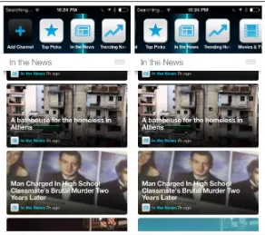
Configurable Tabs are another variation of the standard Tab Menu. The design of Frequency mimics the way tabs are implemented in all the major desktop web browsers. Adding a channel adds a new tab. If there are too many tabs to fit on the screen, the header scrolls. To reor-ganize the tab order, the user can simply press and hold a tab, then drag it to the desired location.
FIGURE 1-33. Pinterest for iOS: scrolling down hides the Toolbar; scrolling up reveals it (http://
ChAPTER 1: NAvIGATION
|
25Sidebars are gaining popularity in web applications as well as native tablet apps. Twitter offers clearly labeled side tabs for navigating the main views of its iPad application. Yammer has almost twice as many tabs, but no labels, making navigation more of a challenge.
FIGURE 1-34. Frequency for iOS: Configurable Tabs, an emerging pattern, work like web browser tabs
FIGURE 1-35. Twitter for iPad has tabs clearly labeled; Yammer for iPad does not
It is unlikely that Sidebars will ever be widely adopted as a persistent navigation pattern on smartphones, for two reasons:
• Most people hold their smartphones in portrait mode, and the
sidebar takes up a fair amount of horizontal real estate.
• Since the space is so limited, labels will get dropped, which
reduces the usability of the app.
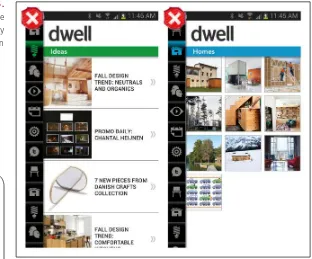
Dwell is a cautionary example. It looks nice, but you have to tap every single icon to see what the primary categories are—a classic example
of mystery meat navigation (
http://www.webpagesthatsuck.com/mys-terymeatnavigation.html).
Skeuomorphic
The Skeuomorphic pattern is characterized by an interface designed
to match its real-world counterpart. Even though the trend in visual
design is now toward a flatter design aesthetic, some apps can still aid usability by emulating objects and tools from the real world.
FIGURE 1-36. Dwell for Android: the
Sidebar as mystery meat navigation
[
NOTE]
ChAPTER 1: NAvIGATION
|
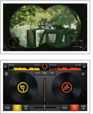
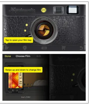
27Skeuomorphism is the dominant navigation pattern in game design,
as in Sniper Ghost Warrior 2, but it can also have its uses in nongame
apps, like the music-mixing app Cross DJ, the photo app Hipstamatic, and the travel app FlightBoard.
FIGURE 1-37. Sniper Ghost Warrior 2 for iOS and Android: skeuomorphism is common in game navigation
FIGURE 1-38. Cross DJ for iOS: skeuomorphic design is also valid for some nongame apps
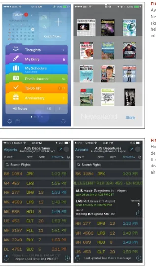
Other examples include the iOS 7 redesign of Awesome Note and Apple’s Newsstand. Both designs are immediately recognizable and feel intuitive because we recognize the folder and bookshelf metaphors.
ChAPTER 1: NAvIGATION
|
29FIGURE 1-40. Awesome Note and Newsstand for iOS: skeuomorphism can help make navigation intuitive
FIGURE 1-41. FlightBoard for iOS: designed to match the flight information display systems in airports
There are, of course, limits to any metaphor being extended to the dig-ital realm. For example, there was confusion around the early versions of iBook: some users thought that the digital bookshelf size implied a limit to the number of ebooks it could hold, which it didn’t.
Primary Navigation Patterns, Transient
The term transient means staying a short time, which is exactly how
the following navigation menus work. They are hidden until we reveal them; then we make a selection and they disappear again. The three pat-terns we’ll look at here are Side Drawers, Toggle Menus, and Pie Menus.
Side Drawer
There are two styles of Side Drawers. The first is an overlay, meaning
a swipe or tap gesture will reveal a drawer that partially covers or over-laps the original screen content, as in RetailMeNot. The second style is an inlay, in which a swipe, pan, or tap will open a drawer that pushes the original screen content partially off-canvas, as in Path.
[
NOTE]
Exercise restraint in choosing the metaphor to model the navigation on—a poor implementation can result in the Novel Notion anti-pattern discussed in Chapter 11.
ChAPTER 1: NAvIGATION
|
31What is the best way to let users know that there is a Side Drawer?
The Android design guidelines (http://bit.ly/1iKuQV5) recommend
having the drawer open on first use so the user can see the menu and learn how to close the drawer:
Upon first launch of your app, introduce the user to the navigation drawer by automatically opening it. This ensures that users know about the navigation drawer and prompts them to learn about the structure of your app by exploring its content. Continue show-ing the drawer upon subsequent launches until the user actively expands the navigation drawer manually. Once you know that the user understands how to open the drawer, launch the app with the navigation drawer closed.
Sounds good, right? However, this suggestion has not performed well in the user testing I’ve conducted for clients. Instead, I recommend a design like Allthecooks, where the drawer “bumps” open just the first time the app is opened.
The most popular orientation for the Side Drawer is on the left, but it can be on the right instead, as with If ThisThenThat, or there can be drawers on the right and the left, as with the Facebook Beta for Windows Phone.
FIGURE 1-43. Path for iOS: tap navicon or pan to reveal the Side Drawer as an inlay, pushing main screen to the side
FIGURE 1-44. Allthecooks for Android: Side Drawer bumps open when app is launched to alert users it’s there (http:// youtu.be/iLlCs-gyNaE)
ChAPTER 1: NAvIGATION
|
33But don’t position the drawer on the bottom, as in the om finder and Frost apps. This positioning conflicts with the swipe-up gesture that
reveals the Control Center in iOS 7.
FIGURE 1-46. Facebook beta for Windows Phone: two Side Drawers—left for the main menu, right for quick links
FIGURE 1-47. om finder for iOS: drawer at the bottom of the screen conflicts with the iOS 7 Control Center
Side Drawer content need not be limited to only navigation options. Zillow’s Mortgage Marketplace drawer has a real-time chart of mort-gage rates, and social apps like LinkedIn frequently include profile information.
FIGURE 1-48. Frost for iOS: almost every time I try to open the menu, the iOS Control Center opens instead
ChAPTER 1: NAvIGATION
|
35The Side Drawer can be more than one level deep. In Fancy, for instance, you can tap-tap-tap down the path until you reach the lowest-level category. As you drill down through the categories, the content on the right updates. In Wish, the Side Drawer path for Categories is only two levels deep; categories are selected Springboard-style.
FIGURE 1-50. LinkedIn for iOS: Side Drawer has profile info (oops, I have mail!)
The Side Drawer can also let users switch high-level context. With the Side Drawer in Gmail for iOS, tapping the arrow by my name opens a panel that slides down over the menu options. There I can switch between email accounts, or add a new one.
FIGURE 1-51. Fancy for iOS: a multilevel Side Drawer
[
NOTE]
ChAPTER 1: NAvIGATION
|
37FIGURE 1-52. Wish for iOS: Side Drawer path to Categories is only two levels deep, then switches to a Springboard
FIGURE 1-53. Gmail for iOS: slide-down panel within a Side Drawer lets me switch or add accounts
EMERGING PATTERN
In response to iOS 7 guidelines, the designers of Luvocracy have been
experimenting with a variation of the inlay Side Drawer (http://uxmag.
com/articles/adapting-ui-to-ios-7-the-side-menu).
Tapping the navicon (or the “hamburger”) reveals the Side Drawer, but instead of the drawer inlay simply pushing the parent screen to the
right, it also uses a 3D effect to push it back.
Luvocracy is simple to navigate and the transitions are smooth. However, a similar-style menu in Airbnb for iOS constitutes an anti-pattern. The new design creates three high-level menu categories: Travel, Host, and Log In. The Travel title is positioned across the top (with the actual travel menu options disconnected down below), while Host and Log In are next to each other on the bottom edge. Tapping on Host or swiping vertically switches Host to the top and Travel to the bottom (Log In stays static). Swiping again switches them back. This
ChAPTER 1: NAvIGATION
|
39design is impractical and inefficient for users. I don’t always agree
with everything in the iOS Design Guide (http://bit.ly/1iK1juP), but
substitute the word swipe for scroll in the following and it’s on point in
this case:
Don’t make users scroll to see all their choices. This causes a disconcerting experience for users, because they must spend extra time to distinguish the choices. Also, it can be very difficult for users to scroll without inadvertently tapping an option.
The Navigation Drawer in the Android version of Airbnb, by compari-son, is crystal-clear—no guesswork required.
A better implementation for iOS is American Airlines, where the Side Drawer reveals a well-designed grouped menu. I wish the parent screen weren’t translucent, though, since it is still a touch target.
FIGURE 1-55. Airbnb for iOS 7: con-fusing implementation of the emerging Side Drawer style (http:// www.youtube.com/ watch?v=Rl1ZwXINhIc)
[
NOTE]
Before you choose Side Drawer navigation, map out the information architecture for the app and validate it with users. Then, if a Side Drawer seems to make sense, you should prototype and test a couple of variations to see which one works best.
FIGURE 1-56. Airbnb for Android: ah, crystal-clear Side Drawer navigation
ChAPTER 1: NAvIGATION
|
41 Toggle MenuIn this book’s first edition, I labeled this pattern the Mega Menu, after its web equivalent. Since then, mobile web and responsive web design have pushed this design further, and it is now more commonly known as the Toggle Menu.
Like the Side Drawer, the Toggle Menu can be an inlay that pushes the content down below the menu, as with Pocket or Qwiki, or an overlay that appears as a layer above the content, as with Walmart and Home Depot. The overlay design is the more common option in native mobile apps. In Ultravisual, the overlay Toggle Menu comes up from the bottom.
FIGURE 1-58. Starbucks.com: responsive web design with a Toggle Menu
FIGURE 1-59. Pocket and Qwiki for
iOS: overlay Toggle Menus
FIGURE 1-60. Walmart for Android
ChAPTER 1: NAvIGATION
|
43A key convention of the Toggle Menu is that whatever gesture reveals the menu—tapping an icon, swiping, or panning, for example— should also hide it.
The menu shouldn’t cover the whole screen, but instead let the back-ground peek through. Tapping anywhere in the backback-ground should also hide the menu.
Android provides a specific control, the Spinner, for this type of pri-mary navigation. But keep in mind the Spinner should be reserved for navigating between views in a category, as opposed to jumping between completely different categories.
For example, both the NPR and the NYTimes apps serve up news, and the Spinner offers different ways to slice and dice the massive amount of news content they offer. But if, say, NPR needed to offer other options in this menu, like Music or Weather, Android guidelines would dictate using a Tab Bar or Navigation Drawer instead.
For Android, use the Spinner control where the Toggle Menu is intended to show the views within a category. For iOS and Windows, bear in mind that the Toggle Menu is a custom control, which could take more time to implement, test, and maintain.
FIGURE 1-61. Ultravisual for iOS: overlay Toggle Menu comes up from the bottom
Pie Menu
Pie Menus—also known as wheels, circular menus, or radial menus—
have been around since the ’90s in desktop software, and more recently
in web applications. They are also very popular in game design. So I was excited to play with PIE, a Pie Menu interface in the open source Paranoid Android OS, and was surprised at how well it works.
FIGURE 1-62. NPR and NYTimes for
Android: the Spinner Toggle Menu is for views within a category
FIGURE 1-63. Examples of PIE menus
ChAPTER 1: NAvIGATION
|
45If the Pie Menu option ever becomes a standard part of the stock Android OS, though, I think that will disqualify it for use as primary navigation within apps—it would create too many conflicts between the OS and the apps.
Looking at the other operating systems, I discovered only a handful of apps experimenting with this pattern for primary navigation. The examples I did find were discouraging. PortalWebBrowser, for instance, has a multitier wheel that requires psychic powers and surgeon-like precision to navigate.
The primary design differences between Paranoid Android’s PIE and the Pie Menu in PortalWebBrowser are the latter’s multiple tiers and tiny touch targets. Having to tap, hold, and then slide across tiers to variably sized wedges is not a simple or natural gesture. There are some good examples of Pie Menus for selecting actions, though; see
Chapter 5.
FIGURE 1-64. PortalWebBrowser for iOS: multitiered Pie Menu requires a surgeon’s touch to use
[
NOTE]
This is probably the weakest pattern for primary navigation and should be avoided for any menu with multiple tiers. If you have an application with flat information architecture, consider the Tab Menu—familiar to all users—instead.
Secondary Navigation Patterns
This chapter didn’t feel complete with only primary navigation
pat-terns, so I broadened it to include secondary navigation. By
second-ary navigation, I mean moving about within a selected module. For
example, Starbucks uses the Tab Menu for primary navigation and a Springboard for secondary navigation on the Home screen. Similarly, Brit & Co. uses a Tab Menu for primary navigation (a Windows Pivot control) and a Springboard for secondary navigation in the Browse module.
All of the primary navigation patterns can also serve as secondary nav-igation patterns. It is common to see Tabs with Tabs, Tabs with Lists, Tabs with a Dashboard, a Springboard with a Gallery, and so on.
ChAPTER 1: NAvIGATION
|
47Additional patterns that work well for secondary navigation include Page Swiping, Scrolling Tabs, and the Expand/Collapse Panel.
FIGURE 1-66. National Parks by National Geographic for iOS: Side Drawer for primary navigation, Gallery for secondary
FIGURE 1-67. BillGuard for iOS: Side Drawer for primary navigation, Springboard for secondary
Page Swiping
This pattern can be used to navigate quickly through content using the swipe gesture. The most common way to communicate this navigation
pattern is via page indicators (the iOS term for the horizontal line of
little dots). The card metaphor also works for paging, as in Ness and Foodspotting. In these examples, partially visible background cards or pages cue the user to swipe.
FIGURE 1-68. Audible for iOS: Tabs for primary navigation, Page Swiping for secondary; note page indicators
ChAPTER 1: NAvIGATION
|
49Many Android apps offer a similar paging experience. In Google Maps, you can swipe through the list of search results. A tip is shown on first use to communicate this Page Swiping option.
Ark Mail, like Gmail, offers Page Swiping for quick navigation through email messages. A thin footer shows the total number of messages, current message number, and Newer and Older labels in the corners, giving some indication that swiping horizontally will reveal another email.
News360 is an anti-pattern implementation of Page Swiping, because
of its lack of affordance. Adding the paging indicator dots across the top, as in HuffPost, would have made it immediately obvious that a horizontal swipe gesture is required to see the next story, versus a ver-tical scroll.
FIGURE 1-70. Google Maps and Ark Mail for Android
[
NOTE]
Use Page Swiping to take advantage of mobile’s gestural controls, instead of relying on desktop holdovers like Next buttons or Tabs. But provide visual affordance that swiping is available.
FIGURE 1-71. News360 for iOS: no affordance that horizontal swiping shows the next article
FIGURE 1-72. huffPost for iOS: subtle
ChAPTER 1: NAvIGATION
|
51 Scrolling TabsThe Android design guidelines (http://bit.ly/1hsr9VF) refer to these
secondary navigation controls as Scrolling Tabs, so I stuck with that term. This pattern is useful for displaying multiple categories or views within a specific module. Scrolling Tabs are usually thinner than stan-dard Tab Bars since they are not necessarily touch targets. More typi-cally, they are an affordance to swipe horizontally.
In Google Play, Scrolling Tabs offer a way to filter the results after selecting an item (such as “Movies & TV”) in the Navigation Drawer. Examples from Songza and TuneIn show other ways to integrate the pattern.
If you incorporate this pattern, make sure your design clearly indicates the selected tab.
ACCORDION
An Accordion lets the user see more information while staying on the same screen. This pattern can be more efficient than navigating to a new screen, and then having to navigate back up. Note that examples from Elevatr, Flava, and the Android Play Store all use familiar icons to indicate a panel’s expanded or collapsed state.
FIGURE 1-73. Google Play, Songza, and TuneIn for Android: Scrolling Tabs for secondary navigation
FIGURE 1-74. Elevatr for iOS: “+”
turns to “–” and heading colors reverse when panel expands
FIGURE 1-75. Flava for iOS: down
ChAPTER 1: NAvIGATION
|
53FIGURE 1-76.
Play Store for Android: expand/collapse in the What’s New panel
[
NOTE]
Use a familiar icon for communicating the Accordion’s open or closed state.
55
[
2
]
Forms
Patterns
Sign In, Registration, Registration with Personalization, Checkout, Calculator, Search Form, Multi-Step, Long Form
Most web applications rely extensively on forms for data entry and configuration. And although we have compelling research and design strategies for effective form design, there are still horrible forms all over the Web. We do our best to muddle through them to set up online accounts, buy merchandise, submit applications, answer surveys, and the like.
Sometimes we succeed, but often we don’t. Form abandonment (users who fail to complete and submit forms before giving up) is an enor-mous and costly problem. But compared to mobile, the Web is pretty forgiving, because mobile forms—rendered on devices that have small screen sizes and restricted user input—give you, the designer, virtu-ally no leeway for bad design.
So before you design any mobile forms, I highly recommend brushing up on form basics with these resources:
• Web Form Design: Filling in the Blanks (http://amzn.to/1g364lv) by
Luke Wroblewski (Rosenfeld Media, 2011)
• Forms on Mobile Devices: Modern Solutions (http://bit.ly/1g369pc) by Luke Wroblewski
• Better Mobile Form Design (http://bit.ly/1g36zvV) by Luke Wroblewski
• Mobile Form Design Strategies (http://bit.ly/1g36jwU) by Chui Chui Tan
• Mobile Inline Form Validation (http://bit.ly/1g36pVe) by Steven Hoober
• Removing Stumbling Blocks in Mobile Forms (http://bit.ly/1g36uZb)
FIGURE 2-1. American Airlines flight
ChAPTER 2: FORMS
|
57As a complement to these resources, the form design patterns that fol-low will help you build apps with forms that work for your users. They include:
• Sign In
• Registration
• Registration with Personalization
• Checkout
• Calculator
• Search Form
• Multi-Step Form
• Long Form
Sign In
Sign In forms should require a minimal number of inputs: username, password, command button, password help, and an option to register. Some applications do this in a single screen, like Remember the Milk and Groupon.
FIGURE 2-2.
Remember the Milk for Android and Groupon for iOS: minimal Sign In fields
Other apps, like Instagram, present the Sign In and Register options up front, then take the user to the appropriate form. You should auto-focus on the first form field, saving the user an extra tap to open the keyboard.
ChAPTER 2: FORMS
|
59The Sign In form itself should use a new technique that has substan-tial support from usability testing and live usage: the unmasked pass-word field. As in LinkedIn, show the passpass-word unmasked and/or offer the option to mask it. The open and close icon is common, or just the words Hide/Show (see the Polar example in the section “Registration” later in this chapter).
Other apps, like Wunderlist and Box, place the Sign Up and Log In options in context within the promotional tour. By keeping these options present on each screen in the tour, the apps make it easy for prospective users to take action once they have been persuaded to use the app, and equally easy for returning users to simply log in.
FIGURE 2-4. LinkedIn for Android- Unmask password option
Tabs are another viable option for presenting these two options while keeping navigation to a minimum, as shown with Foodspotting and SigFig.
ChAPTER 2: FORMS
|
61FIGURE 2-6.
Box for Android makes it easy for users to sign up once sold by the tour
FIGURE 2-7. Foodspotting for Android and SigFig for Windows Phone: Sign In and Sign Up on tabs
Any of these patterns can also include a Social Sign In path, not to be confused with Social Sign Up, which we’ll cover in the Registration pattern. Social Sign In will take the user through the social network of his choice to gain access to the application.
Another Sign In option gaining popularity with the finance indus-try is to forgo the username field and just require a password. The user’s identity can be authenticated when the application is installed. Users are then only prompted for a password to access sensitive data. Requiring a mobile PIN as a password serves the same purpose, as shown in the examples from Frost Bank and Personal Capital.
ChAPTER 2: FORMS
|
63In most of the examples we’ve seen so far, the Sign In form is pre-sented when the app is launched. But there are many cases where it’s preferable to allow the user to start using the application without hav-ing to sign in or register.
You can happily explore Groupon and Etsy unauthenticated, until it is time to buy an item or save a favorite (authentication could also be required to share, add an item to your wish list, add a comment, etc.). Why should you let folks shop without signing in or registering? Jared
Spool explains it in his article “The $300 Million Button” (http://www.
uie.com/articles/three_hund_million_button). And if you need fur-ther convincing, take a look at the “Chapter Extra” by Greg Nudelman
in Chapter 11.
FIGURE 2-9. Personal Capital and Frost for iOS require just a password or PIN for Sign In
[
NOTE]
Sign In may not be a necessary first step. Consider where it makes sense to authenticate the user. And don’t get creative with the Sign In screen; use standard designs to make it easy for users to sign in.
FIGURE 2-10. Groupon for iOS: browse freely—you’ll be prompted to sign in to purchase
ChAPTER 2: FORMS
|
65Registration
Businesses love customer data, so they often try to get as much of it as possible at user registration. But Registration forms should have a minimal number of inputs. Since every additional form field demon-strably lowers Registration form conversion, UX consultant and author Chui Chui Tan recommends ruthlessly editing “elements which do not carry important functions.” One easy target has been validated by a lot of user testing: eliminating the redundant Confirm Email and Confirm Password fields found in apps such as NOOK and LearnVest.
FIGURE 2-12. NOOK for Android and Learnvest for iOS: redundant email and password fields
Can’t live without email confirmation? Path’s Registration form is a bit longer, but it clearly marks the optional fields, and instead of asking for the email twice, it prompts users to double-check it.
Since this may be the first form you design for your application, estab-lish a labeling convention that is easy to read. Polar, the fun polling app from form guru Luke Wroblewski provides a good example. Note that each field also has inline feedback and the password field has a Hide/Show option, which further makes redundant password entry unnecessary.
ChAPTER 2: FORMS
|
67Horizontally aligned form labels might not be the best choice, since they can end up truncated or simply cut into the space needed to enter the value. Consider vertically aligned labels, like in Fancy and Remember The Milk.
FIGURE 2-14. Path for iOS clearly marks optional fields and uses a prompt to confirm email address
FIGURE 2-15.
Polar for iOS is a good example of form layout and interaction design
Another option is to use hint text (i.e., faint text prepopulated in the field that prompts users for the required info). But this can create a
FIGURE 2-16. horizontal labels can
end up truncated or overlapped
ChAPTER 2: FORMS
|
69distracted user can easily forget what she’s supposed to enter in that field. The Float Label is an emerging pattern that may address some of the usability problems around watermark labels. See more on this
from Matt Smith, the pattern’s creator, at http://mattdsmith.com/
float-label-pattern/.
Another good practice is to offer inline feedback wherever possible and
appropriate, like Instagram does for Account Name. See Chapter 8 for
more tips.
Will you have certain requirements for password security, like
upper- and lowercase letters and so forth? Tell users that before they
tap the Submit or Done button, not in an error message afterward. HelloWallet’s instructions are bit much; Level is more succinct (although it could improve its registration experience overall, in my opinion).
FIGURE 2-18. With the Float Label pattern, watermarks become labels “floating” above the field once text is entered
FIGURE 2-19.
Instagram for iOS: real-time inline feedback
And once the user does submit a Registration form, offer feedback on progress, like in the Etsy and Pageonce apps for Android.
FIGURE 2-20. helloWallet and Level for iOS: show password requirements up front
ChAPTER 2: FORMS
|
71During the registration process, keep the user within the application if at all possible. If you must link out to a form on a web page, at least test the form in mobile browsers to make sure it is usable. The designers of Fitbit for Windows Phone apparently didn’t do this.
Think of registration as a flow, and account for all possible user inputs. In another example from Level, I “accidentally” filled out the Registration form again, even though I already had an account. Even though there was a checkmark next to my email address—which would apparently indicate that it was acceptable—I received an error message because the email address was already in use. My only option was to tap “Bummer.”
Why not tell me the email address is already in use when I enter it in the form field? Or how about at least redirecting me to the Sign In screen with my email address prepopulated instead of serving me a lame error message that gives me no clue as to what step to take next?
FIGURE 2-22. Fitbit for Windows Phone: miserable bly one screen, with the command button in plain sight. Clearly state field entry requirements and use inline feedback to speed up the process and let the user know what’s going on. And account for all user scenarios.
Dropbox offers an elegant solution for this same scenario. Once it rec-ognizes my email address it assumes that I would like to sign in, not reregister. Since I most likely need recovery instructions for my pass-word, it prepopulates my email address on the recovery screen, so I only have to tap Send and I’m on my way.
FIGURE 2-23. Level for iOS: my email address has a checkmark by it, even though it’s already in use
ChAPTER 2: FORMS
|
73Registration with Personalization
This is a relatively new pattern designed to either offer more
personal-ized content to the user (as shown with Ness and News360), enhance
the experience through social connections (Path and Instagram), or capture data required for setup (Personal Capital).
The Multi-Step pattern we’ll look at next offers examples of more elab-orate Registration flows.
Facebook’s recent Paper app veers toward the Needless Complexity
anti-pattern (see Chapter 11), with its drag-and-drop UI for
select-ing topics of interest. Swipselect-ing and tappselect-ing like shown in Ness and
News360 is more efficient and very easy to do with just a thumb. For
more on that concept, see Luke Wroblewski’s article “Designing for
Thumb Flow” (http://www.lukew.com/ff/entry.asp?1734=).
FIGURE 2-25. Ness for iOS and News360 for Android: prompt for preferences in the Registration flow
FIGURE 2-26. Facebook’s Paper for
iOS: drag-and-drop UI requires extra user effort (http://youtu.be/
UpZFw2wQr58)
FIGURE 2-27. Path and Instagram for
ChAPTER 2: FORMS
|
75Multi-Step
On the Web, Multi-Step registration processes often use process bars to show users where they are and what’s next. But with their smaller screens, mobile devices just don’t have the real estate to display bulky process bars. You might be able to cram one in the title bar, but there are better ways to guide mobile users through a series of steps.
For an early version of the PayPal iOS app, stakeholders insisted on a process bar. Sending money was a process, after all. But compare the
2010–2011 version with the current, much cleaner evolution.
FIGURE 2-28. Personal Capital for iOS: prompts for phone number and asset range and provides an opportunity to link accounts
If steps have to be broken across multiple screens, skip the heavy pro-cess bar and consider displaying the current step among the total num-ber of steps, like SnipSnap (displayed in the title bar) and Priceline (displayed in the footer).
FIGURE 2-29. PayPal for iOS, circa 2010–2011: Send Money process bar
ChAPTER 2: FORMS
|
77In the first edition of the book, Home Depot’s checkout process was included as an anti-pattern. The process bar was crowded with tiny text, and the checkout experience felt tedious. But it now offers a much-improved single-screen design.
FIGURE 2-31.
SnipSnap and Priceline for Android: indicate the current step among the total number
The secure checkout process first captures the delivery address. Upon tapping Next, you then select the delivery date. The delivery address is still shown, but in a read-only mode, with an Edit button.
Once the delivery date is selected, tapping Next reveals the payment form. Upon completing the payment form, you can review the total, and all of the information entered previously—while never leaving this screen—and proceed to the next step.
ChAPTER 2: FORMS
|
79TurboTax SnapTax uses a similar approach. However, the details for each step are collected in a drill-down screen instead of inline on the same screen. This single-page approach provides valuable navigation information (there are three steps in the process, two of which are remaining), and it also doubles as a high-level summary.
FIGURE 2-33. home Depot for iOS (2013): much-improved checkout flow
Product configurators are a unique type of Multi-Step form that may need to allow for back-and-forth navigation, not just the typical linear flow. To enable this in its Drink Builder tool, Starbucks just uses Next- and Back-style buttons.
This works fine, but it is hard to see what’s been specified in the cus-tomization screens without opening every one of the options and scrolling through the list.
A simple fix could be a persistent Summary or Details button in the footer, near the Nutrition tab and Info icon. The Audi Configurator does exactly that, with a Details button that opens to reveal all of the selected preferences so far.
FIGURE 2-34. Intuit’s TurboTax SnapTax for Android and iOS: drill down to the details
[
NOTE]
ChAPTER 2: FORMS
|
81FIGURE 2-35. Starbucks Drink Builder for iOS: Next- and Back-style buttons (http://www. youtube.com/wat ch?v=Bvke0dXD2SM)
Checkout
As of January 2013, about 15% of ecommerce was being conducted via
mobile devices, with the expectation that this will exceed 25% in a
cou-ple of years. However, even when the shopping experience starts on the phone, most people choose to finish the transaction, or checkout, via desktop or tablet or at the retailer.
In many cases, this is likely due to the incredibly bad checkout expe-riences many retailers include in their native apps. In others, it’s because many retailers only let users shop in their apps and redirect them to a mobile-optimized site for checkout.
Help your users buy right where they are, right when their interest is highest. Don’t let a poor UX deter your customers from checking out on their phones, preferably right within the app they are shopping from. Here are some design tips for creating a high-conversion check-out flow.
FIGURE 2-36. Audi Configurator for iOS: Persistent Details button reveals selected options
FIGURE 2-37. The North Face for iOS