matplotlib Plotting
Cookbook
Learn how to create professional scientific plots
using matplotlib, with more than 60 recipes that
cover common use cases
Alexandre Devert
BIRMINGHAM - MUMBAI
matplotlib Plotting Cookbook
Copyright © 2014 Packt Publishing
All rights reserved. No part of this book may be reproduced, stored in a retrieval system, or transmitted in any form or by any means, without the prior written permission of the publisher, except in the case of brief quotations embedded in critical articles or reviews.
Every effort has been made in the preparation of this book to ensure the accuracy of the information presented. However, the information contained in this book is sold without warranty, either express or implied. Neither the author, nor Packt Publishing, and its dealers and distributors will be held liable for any damages caused or alleged to be caused directly or indirectly by this book.
Packt Publishing has endeavored to provide trademark information about all of the companies and products mentioned in this book by the appropriate use of capitals. However, Packt Publishing cannot guarantee the accuracy of this information.
First published: March 2014
Production Reference: 1200314
Published by Packt Publishing Ltd. Livery Place
35 Livery Street
Birmingham B3 2PB, UK.
ISBN 978-1-84951-326-5
www.packtpub.com
About the Author
Alexandre Devert
is a scientist, currently busy solving problems and making tools for molecular biologists. Before this, he used to teach data mining, software engineering, and research in numerical optimization. He is an enthusiastic Python coder as well and never gets enough of it!About the Reviewers
Francesco Benincasa
, Master of Science in Software Engineering, is a designer and developer. He is a GNU/Linux and Python expert and has vast experience in many languages and applications. He has been using Python as the primary language for more than 10 years, together with JavaScript and framewoks such as Plone or Django.He is interested in advanced web and network developing as well as scientific data
manipulation and visualization. Over the last few years, he has been using graphical Python
libraries such as Matplotlib/Basemap and scientific libraries such as NumPy/SciPy, as well as scientific applications such as GrADS, NCO, and CDO.
Currently, he is working at the Earth Science Department of the Barcelona Supercomputing Center (www.bsc.es) as a Research Support Engineer for the World Meteorological Organization Sand and Dust Storms Warning Advisory and Assessment System (sds-was.aemet.es).
Valerio Maggio
has a PhD in Computational Science from the University of Naples "Federico II" and is currently a Postdoc researcher at the University of Salerno.His research interests are mainly focused on unsupervised machine learning and software engineering, recently combined with semantic web technologies for linked data and Big Data analysis.
Valerio started developing open source software in 2004, when he was studying for his
Bachelor's degree. In 2006, he started working on Python, and has since contributed to several open source projects in this language. Currently, he applies Python as the mainstream language for his machine learning code, making intensive use of matplotlib to analyze experimental data.
Valerio is also a member of the Italian Python community and enjoys playing chess and drinking tea.
I wish to sincerely thank Valeria for her true love and constant support and for being the sweetest girl I've ever met.
Jonathan Street
is a well-known researcher in the fields of physiology and biomarkerdiscovery. He began using Python in 2006 and extensively used matplotlib for many
figures in his PhD thesis. He shares his interest in Python data tools by giving lectures
Dr. Allen Chi-Shing Yu
is a postdoctoral researcher working in the field of cancer genetics.He obtained his BSc degree in Molecular Biotechnology from the Chinese University of Hong Kong in 2009, and obtained a PhD in Biochemistry from the same university in 2013. Allen's PhD research primarily involved genomic and transcriptomic characterization of novel bacterial
strains that can use toxic fluoro-tryptophans but not canonical tryptophan for propagation, under the supervision of Prof. Jeffrey Tze-Fei Wong and Prof. Ting-fung Chan. The findings
demonstrated that the genetic code is not an immutable construct, and a small number of analogue-sensitive proteins are stabilizing the assignment of canonical amino acids to the genetic code.
Soon after his microbial studies, Allen was involved in the identification and characterization
of a novel mutation marker causing Spinocerebellar Ataxia—a group of genetically diverse neurodegenerative disorders. Through the development of a tool for detecting viral integration
events in human cancer samples (ViralFusionSeq), he has entered the field of cancer
genetics. As the postdoctoral researcher in Prof. Nathalie Wong's lab, he is now responsible for the high-throughput sequencing analysis of hepatocellular carcinoma, as well as the maintenance of several Linux-based computing clusters.
Allen is proficient in both wet-lab techniques and computer programming. He is also
committed to developing and promoting open source technologies, through a collection of tutorials and documentations on his blog at http://www.allenyu.info. Readers wishing to contact Dr. Yu can do so via the contact details on his website.
www.PacktPub.com
Support files, eBooks, discount offers and more
You might want to visit www.PacktPub.com for support files and downloads related to your book.
Did you know that Packt offers eBook versions of every book published, with PDF and ePub
files available? You can upgrade to the eBook version at www.PacktPub.com and as a print book customer, you are entitled to a discount on the eBook copy. Get in touch with us at [email protected] for more details.
At www.PacktPub.com, you can also read a collection of free technical articles, sign up for a range of free newsletters and receive exclusive discounts and offers on Packt books and eBooks.
TM
http://PacktLib.PacktPub.com
Do you need instant solutions to your IT questions? PacktLib is Packt's online digital book
library. Here, you can access, read and search across Packt's entire library of books.
Why Subscribe?
f Fully searchable across every book published by Packt
f Copy and paste, print and bookmark content
f On demand and accessible via web browser
Free Access for Packt account holders
Table of Contents
Preface 1
Chapter 1: First Steps
5
Introduction 5
Installing matplotlib 6
Plotting one curve 7
Using NumPy 10
Plotting multiple curves 13
Plotting curves from file data 16
Plotting points 20
Plotting bar charts 22
Plotting multiple bar charts 25
Plotting stacked bar charts 27
Plotting back-to-back bar charts 29
Plotting pie charts 31
Plotting histograms 32
Plotting boxplots 33
Plotting triangulations 36
Chapter 2: Customizing the Color and Styles
39
Introduction 40
Defining your own colors 40
Using custom colors for scatter plots 42
Using custom colors for bar charts 46
Using custom colors for pie charts 49
Using custom colors for boxplots 50
Using colormaps for scatter plots 52
Using colormaps for bar charts 54
Controlling a line pattern and thickness 56
Controlling a fill pattern 60
Table of Contents
Controlling a marker's style 62
Controlling a marker's size 66
Creating your own markers 69
Getting more control over markers 71
Creating your own color scheme 72
Chapter 3: Working with Annotations
77
Introduction 77
Adding a title 78
Using LaTeX-style notations 79
Adding a label to each axis 81
Adding text 82
Adding arrows 86
Adding a legend 88
Adding a grid 90
Adding lines 91
Adding shapes 93
Controlling tick spacing 97
Controlling tick labeling 99
Chapter 4: Working with Figures
107
Introduction 107
Compositing multiple figures 108
Scaling both the axes equally 112
Setting an axis range 114
Setting the aspect ratio 116
Inserting subfigures 117
Using a logarithmic scale 118
Using polar coordinates 121
Chapter 5: Working with a File Output
125
Introduction 125
Generating a PNG picture file 126
Handling transparency 127
Controlling the output resolution 131
Generating PDF or SVG documents 133
Handling multiple-page PDF documents 134
Chapter 6: Working with Maps
139
Introduction 139 Visualizing the content of a 2D array 140
Adding a colormap legend to a figure 145
iii
Table of Contents
Visualizing a 2D scalar field 149
Visualizing contour lines 151
Visualizing a 2D vector field 154
Visualizing the streamlines of a 2D vector field 157
Chapter 7: Working with 3D Figures
161
Introduction 161
Creating 3D scatter plots 161
Creating 3D curve plots 165
Plotting a scalar field in 3D 167
Plotting a parametric 3D surface 170
Embedding 2D figures in a 3D figure 173
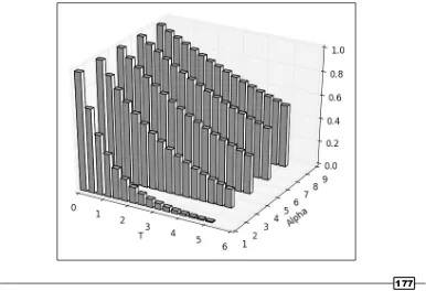
Creating a 3D bar plot 176
Chapter 8: User Interface
179
Introduction 179
Making a user-controllable plot 179
Integrating a plot to a Tkinter user interface 183 Integrating a plot to a wxWidgets user interface 188 Integrating a plot to a GTK user interface 194 Integrating a plot in a Pyglet application 198
Index 201
Preface
matplotlib is a Python module for plotting, and it is a component of the ScientificPython modules suite. matplotlib allows you to easily prepare professional-grade figures with a comprehensive API to customize every aspect of the figures. In this book, we will cover the different types of figures and how to adjust a figure to suit your needs. The recipes are orthogonal and you will
be able to compose your own solutions very quickly.
What this book covers
Chapter 1, First Steps, introduces the basics of working with matplotlib. The basic figure
types are introduced with minimal examples.
Chapter 2, Customizing the Color and Styles, covers how to control the color and style
of a figure—this includes markers, line thickness, line patterns, and using color maps to color a figure several items.
Chapter 3, Working with Annotations, covers how to annotate a figure—this includes
adding an axis legend, arrows, text boxes, and shapes.
Chapter 4, Working with Figures, covers how to prepare a complex figure—this includes
compositing several figures, controlling the aspect ratio, axis range, and the coordinate
system.
Chapter 5, Working with a File Output, covers output to files, either in bitmap or vector
formats. Issues like transparency, resolution, and multiple pages are studied in detail.
Chapter 6, Working with Maps, covers plotting matrix-like data—this includes maps,
quiver plots, and stream plots.
Chapter 7, Working with 3D Figures, covers 3D plots—this includes scatter plots, line plots,
surface plots, and bar charts.
Chapter 8, User Interface, covers a set of user interface integration solutions, ranging
from simple and minimalist to sophisticated.
What you need for this book
The examples in this book are written for Matplotlib 1.2 and Python 2.7 or 3.
Most examples rely on NumPy and SciPy. Some examples require SymPy, while some other examples require LaTeX.
Who this book is for
The book is intended for readers who have some notions of Python and a science background.
Conventions
In this book, you will find a number of styles of text that distinguish between different kinds of
information. Here are some examples of these styles, and an explanation of their meaning.
Code words in text, database table names, folder names, filenames, file extensions, pathnames,
dummy URLs, user input, and Twitter handles are shown as follows: "We can include other contexts through the use of the include directive."
A block of code is set as follows:
[default]
exten => s,1,Dial(Zap/1|30) exten => s,2,Voicemail(u100) exten => s,102,Voicemail(b100) exten => i,1,Voicemail(s0)
When we wish to draw your attention to a particular part of a code block, the relevant lines or items are set in bold:
[default]
exten => s,1,Dial(Zap/1|30) exten => s,2,Voicemail(u100)
exten => s,102,Voicemail(b100)
exten => i,1,Voicemail(s0)
Any command-line input or output is written as follows:
# cp /usr/src/asterisk-addons/configs/cdr_mysql.conf.sample
/etc/asterisk/cdr_mysql.conf
3
Warnings or important notes appear in a box like this.
Tips and tricks appear like this.
Reader feedback
Feedback from our readers is always welcome. Let us know what you think about this book—what you liked or may have disliked. Reader feedback is important for us to develop titles that you really get the most out of.
To send us general feedback, simply send an e-mail to [email protected], and mention the book title via the subject of your message.
If there is a topic that you have expertise in and you are interested in either writing or contributing to a book, see our author guide on www.packtpub.com/authors.
Customer support
Now that you are the proud owner of a Packt book, we have a number of things to help you to get the most from your purchase.
Downloading the example code
You can download the example code files for all Packt books you have purchased from your
account at http://www.packtpub.com. If you purchased this book elsewhere, you can visit http://www.packtpub.com/support and register to have the files e-mailed directly to you.
Downloading the color images of this book
We also provide you a PDF file that has color images of the screenshots/diagrams used
in Chapter 1, First Steps, of this book. The color images will help you better understand the
changes in the output. You can download this file from https://www.packtpub.com/ sites/default/files/downloads/3265OS_Graphics.pdf.
Errata
Although we have taken every care to ensure the accuracy of our content, mistakes do happen.
If you find a mistake in one of our books—maybe a mistake in the text or the code—we would be
grateful if you would report this to us. By doing so, you can save other readers from frustration
and help us improve subsequent versions of this book. If you find any errata, please report them
by visiting http://www.packtpub.com/submit-errata, selecting your book, clicking on the errata submission form link, and entering the details of your errata. Once your errata are
verified, your submission will be accepted and the errata will be uploaded on our website, or
added to any list of existing errata, under the Errata section of that title. Any existing errata can be viewed by selecting your title from http://www.packtpub.com/support.
Piracy
Piracy of copyright material on the Internet is an ongoing problem across all media. At Packt, we take the protection of our copyright and licenses very seriously. If you come across any illegal copies of our works, in any form, on the Internet, please provide us with the location address or website name immediately so that we can pursue a remedy.
Please contact us at [email protected] with a link to the suspected pirated material.
We appreciate your help in protecting our authors, and our ability to bring you valuable content.
Questions
1
First Steps
In this chapter, we will cover:
f Installing matplotlib
f Plotting one curve
f Using NumPy
f Plotting multiple curves
f Plotting curves from file data f Plotting points
f Plotting bar charts
f Plotting multiple bar charts
f Plotting stacked bar charts
f Plotting back-to-back bar charts
f Plotting pie charts
f Plotting histograms
f Plotting boxplots
f Plotting triangulations
Introduction
matplotlib makes scientific plotting very straightforward. matplotlib is not the first attempt
at making the plotting of graphs easy. What matplotlib brings is a modern solution to the balance between ease of use and power. matplotlib is a module for Python, a programming language. In this chapter, we will provide a quick overview of what using matplotlib feels like. Minimalistic recipes are used to introduce the principles matplotlib is built upon.
Installing matplotlib
Before experimenting with matplotlib, you need to install it. Here we introduce some tips to get matplotlib up and running without too much trouble.
How to do it...
We have three likely scenarios: you might be using Linux, OS X, or Windows.
Linux
Most Linux distributions have Python installed by default, and provide matplotlib in their standard package list. So all you have to do is use the package manager of your distribution to install matplotlib automatically. In addition to matplotlib, we highly recommend that you install NumPy, SciPy, and SymPy, as they are supposed to work together. The following list consists of commands to enable the default packages available in different versions of Linux:
f Ubuntu: The default Python packages are compiled for Python 2.7. In a command terminal, enter the following command:
sudo apt-get install python-matplotlib python-numpy python-scipy python-sympy
f ArchLinux: The default Python packages are compiled for Python 3. In a command terminal, enter the following command:
sudo pacman -S matplotlib numpy scipy python-sympy
If you prefer using Python 2.7, replace python by python2 in the package names
f Fedora: The default Python packages are compiled for Python 2.7. In a command terminal, enter the following command:
sudo yum install python-matplotlib numpy scipy sympy
There are other ways to install these packages; in this chapter, we propose the most simple and seamless ways to do it.
Windows and OS X
7
You have several choices for ready-made packages: Anaconda, Enthought Canopy, Algorete Loopy, and more! All these packages provide Python, SciPy, NumPy, matplotlib, and more (a text editor and fancy interactive shells) in one go. Indeed, all these systems install their own package manager and from there you install/uninstall additional packages as you would do on a typical Linux distribution. For the sake of brevity, we will provide instructions only for Enthought Canopy. All the other systems have extensive documentation online, so installing them should not be too much of a problem.
So, let's install Enthought Canopy by performing the following steps:
1. Download the Enthought Canopy installer from https://www.enthought.com/ products/canopy. You can choose the free Express edition. The website can guess your operating system and propose the right installer for you.
2. Run the Enthought Canopy installer. You do not need to be an administrator to install the package if you do not want to share the installed software with other users.
3. When installing, just click on Next to keep the defaults. You can find additional
information about the installation process at http://docs.enthought.com/ canopy/quick-start.html.
That's it! You will have Python 2.7, NumPy, SciPy, and matplotlib installed and ready to run.
Plotting one curve
The initial example of Hello World! for a plotting software is often about showing a simple curve. We will keep up with that tradition. It will also give you a rough idea about how matplotlib works.
Getting ready
You need to have Python (either v2.7 or v3) and matplotlib installed. You also need to have a text editor (any text editor will do) and a command terminal to type and run commands.
How to do it...
Let's get started with one of the most common and basic graph that any plotting software offers—curves. In a text file saved as plot.py, we have the following code:
Downloading the example code
You can download the sample code files for all Packt books that you have purchased from your account at http://www.packtpub.com. If you purchased this book elsewhere, you can visit http://www.packtpub. com/support and register to have the files e-mailed directly to you.
Assuming that you installed Python and matplotlib, you can now use Python to interpret this script. If you are not familiar with Python, this is indeed a Python script we have there! In a command terminal, run the script in the directory where you saved plot.py with the following command:
python plot.py
Doing so will open a window as shown in the following screenshot:
The window shows the curve Y = X ** 2 with X in the [0, 99] range. As you might have noticed, the window has several icons, some of which are as follows:
f : This icon opens a dialog, allowing you to save the graph as a picture file. You can
9
f : This icon allows you to translate and scale the graphics. Click on it and then move the mouse over the graph. Clicking on the left button of the mouse will translate the graph according to the mouse movements. Clicking on the right button of the mouse will modify the scale of the graphics.
f : This icon will restore the graph to its initial state, canceling any translation or scaling you might have applied before.
How it works...
Assuming that you are not very familiar with Python yet, let's analyze the script demonstrated in the previous section.
The first line tells Python that we are using the matplotlib.pyplot module. To save on a bit of typing, we make the name plt equivalent to matplotlib.pyplot. This is a very common practice that you will see in matplotlib code.
The second line creates a list named X, with all the integer values from 0 to 99. The range function is used to generate consecutive numbers. You can run the interactive Python interpreter and type the command range(100) if you use Python 2, or the command list(range(100)) if you use Python 3. This will display the list of all the integer values from 0 to 99. In both versions, sum(range(100)) will compute the sum of the integers from 0 to 99.
The third line creates a list named Y, with all the values from the list X squared. Building a new list by applying a function to each member of another list is a Python idiom, named list comprehension. The list Y will contain the squared values of the list X in the same order. So Y will contain 0, 1, 4, 9, 16, 25, and so on.
The fourth line plots a curve, where the x coordinates of the curve's points are given in the list X, and the y coordinates of the curve's points are given in the list Y. Note that the names of the lists can be anything you like.
The last line shows a result, which you will see on the window while running the script.
There's more...
So what we have learned so far? Unlike plotting packages like gnuplot, matplotlib is not
a command interpreter specialized for the purpose of plotting. Unlike Matlab, matplotlib is not an integrated environment for plotting either. matplotlib is a Python module for plotting. Figures are described with Python scripts, relying on a (fairly large) set of functions provided by matplotlib.
Thus, the philosophy behind matplotlib is to take advantage of an existing language, Python. The rationale is that Python is a complete, well-designed, general purpose programming language. Combining matplotlib with other packages does not involve tricks and hacks, just Python code. This is because there are numerous packages for Python for pretty much any task. For instance, to plot data stored in a database, you would use a database package to read the data and feed it to matplotlib. To generate a large batch of statistical graphics, you
would use a scientific computing package such as SciPy and Python's I/O modules.
Thus, unlike many plotting packages, matplotlib is very orthogonal—it does plotting and only
plotting. If you want to read inputs from a file or do some simple intermediary calculations,
you will have to use Python modules and some glue code to make it happen. Fortunately, Python is a very popular language, easy to master and with a large user base. Little by little, we will demonstrate the power of this approach.
Using NumPy
NumPy is not required to use matplotlib. However, many matplotlib tricks, code samples, and examples use NumPy. A short introduction to NumPy usage will show you the reason.
Getting ready
Along with having Python and matplotlib installed, you also have NumPy installed. You have a text editor and a command terminal.
How to do it...
Let's plot another curve, sin(x), with x in the [0, 2 * pi] interval. The only difference with the preceding script is the part where we generate the point coordinates. Type and save the following script as sin-1.py:
import math
import matplotlib.pyplot as plt
T = range(100)
X = [(2 * math.pi * t) / len(T) for t in T] Y = [math.sin(value) for value in X]
plt.plot(X, Y) plt.show()
Then, type and save the following script as sin-2.py:
import numpy as np
11
X = np.linspace(0, 2 * np.pi, 100) Y = np.sin(X)
plt.plot(X, Y) plt.show()
Running either sin-1.py or sin-2.py will show the following graph exactly:
How it works...
The first script, sin-1.py, generates the coordinates for a sinusoid using only Python's standard library. The following points describe the steps we performed in the script in the previous section:
1. We created a list T with numbers from 0 to 99—our curve will be drawn with 100 points.
2. We computed the x coordinates by simply rescaling the values stored in T so that x goes from 0 to 2 pi (the range() built-in function can only generate integer values).
3. As in the first example, we generated the y coordinates.
The second script sin-2.py, does exactly the same job as sin-1.py—the results are identical. However, sin-2.py is slightly shorter and easier to read since it uses the NumPy package.
NumPy is a Python package for scientific computing. matplotlib can work without NumPy, but using NumPy will save you lots of time and effort. The NumPy package provides a powerful multidimensional array object and a host of functions to manipulate it.
The NumPy package
In sin-2.py, the X list is now a one-dimensional NumPy array with 100 evenly spaced values between 0 and 2 pi. This is the purpose of the function numpy.linspace. This is arguably more convenient than computing as we did in sin-1.py. The Y list is also a one-dimensional NumPy array whose values are computed from the coordinates of X. NumPy functions work on whole arrays as they would work on a single value. Again, there is no need to compute those values explicitly one-by-one, as we did in sin-1.py. We have a shorter yet readable code compared to the pure Python version.
There's more...
NumPy can perform operations on whole arrays at once, saving us much work when generating curve coordinates. Moreover, using NumPy will most likely lead to much faster
code than the pure Python equivalent. Easier to read and faster code, what's not to like?
The following is an example where we plot the binomial x^2 -2x +1 in the [-3,2] interval using 200 points:
import numpy as np
import matplotlib.pyplot as plt
X = np.linspace(-3, 2, 200) Y = X ** 2 - 2 * X + 1.
13
Running the preceding script will give us the result shown in the following graph:
Again, we could have done the plotting in pure Python, but it would arguably not be as easy to read. Although matplotlib can be used without NumPy, the two make for a powerful combination.
Plotting multiple curves
One of the reasons we plot curves is to compare those curves. Are they matching? Where do
they match? Where do they not match? Are they correlated? A graph can help to form a quick
judgment for more thorough investigations.
How to do it...
Let's show both sin(x) and cos(x) in the [0, 2pi] interval as follows:
import numpy as np
import matplotlib.pyplot as plt
X = np.linspace(0, 2 * np.pi, 100)
Ya = np.sin(X) Yb = np.cos(X)
plt.plot(X, Ya) plt.plot(X, Yb) plt.show()
The preceding script will give us the result shown in the following graph:
How it works...
The two curves show up with a different color automatically picked up by matplotlib. We use one function call plt.plot() for one curve; thus, we have to call plt.plot() here twice. However, we still have to call plt.show() only once. The functions calls plt. plot(X, Ya) and plt.plot(X, Yb) can be seen as declarations of intentions. We want to link those two sets of points with a distinct curve for each.
15
There's more...
This deferred rendering mechanism is central to matplotlib. You can declare what you render as and when it suits you. The graph will be rendered only when you call plt.show(). To illustrate this, let's look at the following script, which renders a bell-shaped curve, and the slope of that curve for each of its points:
import numpy as np
import matplotlib.pyplot as plt
def plot_slope(X, Y): Xs = X[1:] - X[:-1] Ys = Y[1:] - Y[:-1] plt.plot(X[1:], Ys / Xs)
X = np.linspace(-3, 3, 100) Y = np.exp(-X ** 2)
plt.plot(X, Y) plot_slope(X, Y)
plt.show()
The preceding script will produce the following graph:
One of the function call, plt.plot(), is done inside the plot_slope function, which does
not have any influence on the rendering of the graph as plt.plot() simply declares what we want to render, but does not execute the rendering yet. This is very useful when writing scripts for complex graphics with a lot of curves. You can use all the features of a proper programming language—loop, function calls, and so on— to compose a graph.
Plotting curves from file data
As explained earlier, matplotlib only handles plotting. If you want to plot data stored in a file,
you will have to use Python code to read the file and extract the data you need.
How to do it...
Let's assume that we have time series stored in a plain text file named my_data.txt as follows:
A minimalistic pure Python approach to read and plot that data would go as follows:
import matplotlib.pyplot as plt
X, Y = [], []
for line in open('my_data.txt', 'r'): values = [float(s) for s in line.split()] X.append(values[0])
Y.append(values[1])
17
This script, together with the data stored in my_data.txt, will produce the following graph:
How it works...
The following are some explanations on how the preceding script works:
f The line X, Y = [], [] initializes the list of coordinates X and Y as empty lists.
f The line for line in open('my_data.txt', 'r') defines a loop that will
iterate each line of the text file my_data.txt. On each iteration, the current line
extracted from the text file is stored as a string in the variable line.
f The line values = [float(s) for s in line.split()] splits the current line around empty characters to form a string of tokens. Those tokens are then
interpreted as floating point values. Those values are stored in the list values.
f Then, in the two next lines, X.append(values[0]) and Y.append(values[1]), the values stored in values are appended to the lists X and Y.
The following equivalent one-liner to read a text file may bring a smile to those more familiar with Python:
import matplotlib.pyplot as plt
with open('my_data.txt', 'r') as f:
X, Y = zip(*[[float(s) for s in line.split()] for line in f])
plt.plot(X, Y) plt.show()
There's more...
In our data loading code, note that there is no serious checking or error handling going on. In any case, one might remember that a good programmer is a lazy programmer. Indeed,
since NumPy is so often used with matplotlib, why not use it here? Run the following script
to enable NumPy:
This is as short as the one-liner shown in the preceding section, yet easier to read, and it will handle many error cases that our pure Python code does not handle. The following point describes the preceding script:
f The numpy.loadtxt() function reads a text file and returns a 2D array. With NumPy, 2D arrays are not a list of lists, they are true, full-blown matrices.
f The variable data is a NumPy 2D array, which give us the benefit of being able to manipulate rows and columns of a matrix as a 1D array. Indeed, in the line plt. plot(data[:,0], data[:,1]), we give the first column of data as x coordinates
and the second column of data as y coordinates. This notation is specific to NumPy.
Along with making the code shorter and simpler, using NumPy brings additional advantages.
For large files, using NumPy will be noticeably faster (the NumPy module is mostly written in
C), and storing the whole dataset as a NumPy array can save memory as well. Finally, using
NumPy allows you to support other common file formats (CVS and Matlab) for numerical data
19
As a way to demonstrate all that we have seen so far, let's consider the following task.
A file contains N columns of values, describing N–1 curves. The first column contains the x coordinates, the second column contains the y coordinates of the first curve, the third
column contains the y coordinates of the second curve, and so on. We want to display
those N–1 curves. We will do so by using the following code:
import numpy as np
import matplotlib.pyplot as plt
data = np.loadtxt('my_data.txt') for column in data.T:
plt.plot(data[:,0], column)
plt.show()
The file my_data.txt should contain the following content:
0 0 6 1 1 5 2 4 4 4 16 3 5 25 2 6 36 1
Then we get the following graph:
We did the job with little effort by exploiting two tricks. In NumPy notation, data.T is a transposed view of the 2D array data—rows are seen as columns and columns are seen as rows. Also, we can iterate over the rows of a multidimensional array by doing for row in data. Thus, doing for column indata.T will iterate over the columns of an array. With a few lines of code, we have a fairly general plotting generic script.
Plotting points
When displaying a curve, we implicitly assume that one point follows another—our data is the time series. Of course, this does not always have to be the case. One point of the data can be independent from the other. A simple way to represent such kind of data is to simply show the points without linking them.
How to do it...
The following script displays 1024 points whose coordinates are drawn randomly from the [0,1] interval:
import numpy as np
import matplotlib.pyplot as plt
data = np.random.rand(1024, 2)
plt.scatter(data[:,0], data[:,1]) plt.show()
21
How it works...
The function plt.scatter() works exactly like plt.plot(), taking the x and y coordinates of points as input parameters. However, each point is simply shown with one marker. Don't be fooled by this simplicity—plt.scatter() is a rich command. By playing with its many optional parameters, we can achieve many different effects. We will cover this in Chapter 2, Customizing
the Color and Styles, and Chapter 3, Working with Annotations.
Plotting bar charts
Bar charts are a common staple of plotting package, and even matplotlib has them.
How to do it...
The dedicated function for bar charts is pyplot.bar(). We will enable this function by executing the following script:
import matplotlib.pyplot as plt
data = [5., 25., 50., 20.]
plt.bar(range(len(data)), data) plt.show()
The preceding script will produce the following graph:
How it works...
23
There's more...
Through an optional parameter, pyplot.bar() provides a way to control the bar's thickness. Moreover, we can also obtain horizontal bars using the twin brother of pyplot.bar(), that is, pyplot.barh().
The thickness of a bar
By default, a bar will have a thickness of 0.8 units. Because we put a bar at each unit length,
we have a gap of 0.2 between them. You can, of course, fiddle with this thickness parameter.
For instance, by setting it to 1:
import matplotlib.pyplot as plt
data = [5., 25., 50., 20.]
plt.bar(range(len(data)), data, width = 1.) plt.show()
The preceding minimalistic script will produce the following graph:
Now, the bars have no gap between them. The matplotlib bar chart function pyplot.bar() will not handle the positioning and thickness of the bars. The programmer is in charge. This
flexibility allows you to create many variations on bar charts.
Horizontal bars
If you are more into horizontal bars, use the barh() function, which is the strict equivalent of bar(), apart from giving horizontal rather than vertical bars:
import matplotlib.pyplot as plt
data = [5., 25., 50., 20.]
plt.barh(range(len(data)), data) plt.show()
25
Plotting multiple bar charts
When comparing several quantities and when changing one variable, we might want a bar chart where we have bars of one color for one quantity value.
How to do it...
We can plot multiple bar charts by playing with the thickness and the positions of the bars as follows:
import numpy as np
import matplotlib.pyplot as plt
data = [[5., 25., 50., 20.], [4., 23., 51., 17.], [6., 22., 52., 19.]]
X = np.arange(4)
plt.bar(X + 0.00, data[0], color = 'b', width = 0.25) plt.bar(X + 0.25, data[1], color = 'g', width = 0.25) plt.bar(X + 0.50, data[2], color = 'r', width = 0.25)
plt.show()
The preceding script will produce the following graph:
How it works...
The data variable contains three series of four values. The preceding script will show three bar charts of four bars. The bars will have a thickness of 0.25 units. Each bar chart will be shifted 0.25 units from the previous one. Color has been added for clarity. This topic will be detailed in Chapter 2, Customizing the Color and Styles.
There's more...
The code shown in the preceding section is quite tedious as we repeat ourselves by shifting the three bar charts manually. We can do this better by using the following code:
import numpy as np
for i, row in enumerate(data): X = np.arange(len(row)) plt.bar(X + i * gap, row, width = gap,
color = color_list[i % len(color_list)])
plt.show()
27
Plotting stacked bar charts
Stacked bar charts are of course possible by using a special parameter from the pyplot. bar() function.
How to do it...
The following script stacks two bar charts on each other:
import matplotlib.pyplot as plt
A = [5., 30., 45., 22.] B = [5., 25., 50., 20.]
X = range(4)
plt.bar(X, A, color = 'b')
plt.bar(X, B, color = 'r', bottom = A) plt.show()
The preceding script will produce the following graph:
How it works...
The optional bottom parameter of the pyplot.bar() function allows you to specify a starting value for a bar. Instead of running from zero to a value, it will go from the bottom to
value. The first call to pyplot.bar() plots the blue bars. The second call to pyplot.bar() plots the red bars, with the bottom of the red bars being at the top of the blue bars.
There's more...
When stacking more than two set of values, the code gets less pretty as follows:
import numpy as np
For the third bar chart, we have to compute the bottom values as A + B, the coefficient-wise sum of A and B. Using NumPy helps to keep the code compact but readable. This code is, however, fairly repetitive and works for only three stacked bar charts. We can do better using the following code:
import numpy as np
import matplotlib.pyplot as plt
data = np.array([[5., 30., 45., 22.], [5., 25., 50., 20.], color = color_list[i % len(color_list)])
29
Here, we store the data in a NumPy array, one row for one bar chart. We iterate over each row of data. For the ith row, the bottom parameter receives the sum of all the rows before
the ith row. Writing the script this way, we can stack as many bar charts as we wish with minimal effort when changing the input data.
Plotting back-to-back bar charts
A simple but useful trick is to display two bar charts back-to-back at the same time. Think of an age pyramid of a population, showing the number of people within different age ranges. On the left side, we show the male population, while on the right we show the female population.
How to do it...
The idea is to have two bar charts, using a simple trick, that is, the length/height of one bar can be negative!
import numpy as np
import matplotlib.pyplot as plt
women_pop = np.array([5., 30., 45., 22.]) men_pop = np.array( [5., 25., 50., 20.])
X = np.arange(4)
plt.barh(X, women_pop, color = 'r') plt.barh(X, -men_pop, color = 'b') plt.show()
The preceding script will produce the following graph:
How it works...
31
Plotting pie charts
To compare the relative importance of quantities, nothing like a good old pie—pie chart, that is.
How to do it...
The dedicated pie-plotting function pyplot.pie() will do the job. We will use this function in the following code:
import matplotlib.pyplot as plt
data = [5, 25, 50, 20]
plt.pie(data) plt.show()
The preceding simple script will display the following pie diagram:
How it works...
The pyplot.pie() function simply takes a list of values as the input. Note that the input data is a list; it could be a NumPy array. You do not have to adjust the data so that it adds up to 1 or 100. You just have to give values to matplolib and it will automatically compute the relative areas of the pie chart.
Plotting histograms
Histograms are graphical representations of a probability distribution. In fact, a histogram
is just a specific kind of a bar chart. We could easily use matplotlib's bar chart function
and do some statistics to generate histograms. However, histograms are so useful that matplotlib provides a function just for them. In this recipe, we are going to see how to use this histogram function.
How to do it...
The following script draws 1000 values from a normal distribution and then generates histograms with 20 bins:
import numpy as np
import matplotlib.pyplot as plt
X = np.random.randn(1000)
plt.hist(X, bins = 20) plt.show()
33
How it works...
The pyplot.hist() function takes a list of values as the input. The range of the values will be divided into equal-sized bins (10 bins by default). The pyplot.hist() function will generate a bar chart, one bar for one bin. The height of one bar is the number of values following in the corresponding bin. The number of bins is determined by the optional parameter bins. By setting the optional parameter normed to True, the bar height is normalized and the sum of all bar heights is equal to 1.
Plotting boxplots
Boxplot allows you to compare distributions of values by conveniently showing the median, quartiles, maximum, and minimum of a set of values.
How to do it...
The following script shows a boxplot for 100 random values drawn from a normal distribution:
import numpy as np
import matplotlib.pyplot as plt
data = np.random.randn(100)
plt.boxplot(data) plt.show()
A boxplot will appear that represents the samples we drew from the random distribution.
Since the code uses a randomly generated dataset, the resulting figure will change slightly
every time the script is run.
The preceding script will display the following graph:
How it works...
The data = [random.gauss(0., 1.) for i in range(100)] variable generates 100 values drawn from a normal distribution. For demonstration purposes, such values are
typically read from a file or computed from other data. The plot.boxplot() function takes a set of values and computes the mean, median, and other statistical quantities on its own. The following points describe the preceding boxplot:
f The red bar is the median of the distribution.
f The blue box includes 50 percent of the data from the lower quartile to the upper quartile. Thus, the box is centered on the median of the data.
f The lower whisker extends to the lowest value within 1.5 IQR from the lower quartile.
f The upper whisker extends to the highest value within 1.5 IQR from the upper quartile.
35
There's more...
To show more than one boxplot in a single graph, calling pyplot.boxplot() once for each boxplot is not going to work. It will simply draw the boxplots over each other, making a messy, unreadable graph. However, we can draw several boxplots with just one single call to pyplot.boxplot() as follows:
import numpy as np
import matplotlib.pyplot as plt
data = np.random.randn(100, 5)
plt.boxplot(data) plt.show()
The preceding script displays the following graph:
The pyplot.boxplot() function accepts a list of lists as the input, rendering a boxplot for each sublist.
Plotting triangulations
Triangulations arise when dealing with spatial locations. Apart from showing distances between points and neighborhood relationships, triangulation plots can be a convenient way to represent maps. matplotlib provides a fair amount of support for triangulations.
How to do it...
As in the preceding examples, the following few lines of code are enough:
import numpy as np
import matplotlib.pyplot as plt import matplotlib.tri as tri
data = np.random.rand(100, 2)
triangles = tri.Triangulation(data[:,0], data[:,1])
plt.triplot(triangles) plt.show()
Every time the script is run, you will see a different triangulation as the cloud of points that is triangulated is generated randomly.
37
How it works...
We import the matplotlib.tri module, which provides helper functions to compute triangulations from points. In this example, for demonstration purpose, we generate a random cloud of points using the following code:
data = np.random.rand(100, 2)
We compute a triangulation and store it in the triangles' variable with the help of the following code:
triangles = tri.Triangulation(data[:,0], data[:,1])
The pyplot.triplot() function simply takes triangles as inputs and displays the triangulation result.
2
Customizing the Color
and Styles
In this chapter, we will cover:
f Defining your own colors
f Using custom colors for scatter plots
f Using custom colors for bar charts
f Using custom colors for pie charts
f Using custom colors for boxplots
f Using colormaps for scatter plots
f Using colormaps for bar charts
f Controlling a line pattern and thickness
f Controlling a fill pattern f Controlling a marker's style
f Controlling a marker's size
f Creating your own markers
f Getting more control over markers
f Creating your own color scheme
Introduction
All the plots available with matplotlib come with their default styles. While this is convenient
for prototyping, our finalized graph will require some departure from the default styles. You
might need to use gray levels only, or follow an existing color scheme, or more generally, an
existing visual chart. matplotlib has been designed with flexibility in mind. It is easy to adapt the style of a matplotlib figure, as the recipes of this chapter will illustrate.
Defining your own colors
The default colors used by matplotlib are rather bland. We might have our own preferences
of what convenient colors are. We might want to have figures that follow a predefined color scheme so that they fit well within a document or a web page. More pragmatically, we might simply have to make figures for a document that will be printed on a black-and-white printer. In this recipe, we are going to see how to define our own colors.
Getting ready
There are multiple ways to define colors in matplotlib. Some of them are as follows:
f Triplets: These colors can be described as a real value triplet—the red, blue, and green components of a color. The components have to be in the [0, 1] interval. Thus, the Python syntax (1.0, 0.0, 0.0) will code a pure, bright red, while (1.0, 0.0, 1.0) appears as a strong pink.
f Quadruplets: These work as triplets, and the fourth component defines a transparency
value. This value should also be in the [0, 1] interval. When rendering a figure to a picture file, using transparent colors allows for making figures that blend with a background. This is especially useful when making figures that will slide or end up
on a web page.
41
Alias Colors
y Yellow k Black w White
f HTML color strings: matplotlib can interpret HTML color strings as actual colors.
Such strings are defined as #RRGGBB where RR, GG, and BB are the 8-bit values for the red, green, and blue components in hexadecimal.
f Gray-level strings: matplotlib will interpret a string representation of a floating point value as a shade of gray, such as 0.75 for a medium light gray.
How to do it...
Setting the color of a curve plot is done by setting the parameter color (or the equivalent shortcut c) of the pyplot.plot() function as follows:
import numpy as np
X = np.linspace(-6, 6, 1000)
for i in range(5):
samples = np.random.standard_normal(50) mu, sigma = np.mean(samples), np.std(samples) plt.plot(X, pdf(X, mu, sigma), color = '.75')
plt.plot(X, pdf(X, 0., 1.), color = 'k') plt.show()
The preceding script will produce a graph similar to the following one, which displays five light
gray, bell-shaped curves and a black one:
How it works...
In this example, we generate five sets of 50 samples from a normal distribution. For each of
the five sets, we plot the estimated probability density in light gray. The normal distribution
probability density is shown in black. There, the color is coded using the shortcut for black, that is, k.
Using custom colors for scatter plots
We can control the colors used for a scatter plot just as we do for a curve plot. In this recipe, we are going to see how to use the two ways to control the colors of a scatter plot.
Getting ready
The scatter plot function pyplot.scatter() offers the following two options to control the colors of dots through its color parameter, or its shortcut c:
f Common color for all the dots: If the color parameter is a valid matplotlib color
43
f Individual color for each dot: If the color parameter is a sequence of a valid
matplotlib color definition, the ith dot will appear in the ith color. Of course,
we have to give the required colors for each dot.
How to do it...
In the following script, we display two sets of points, A and B, drawn from two bivariate Gaussian distributions. Each set has its own color. We call pyplot.scatter() twice, once for each point set, as shown in the following script:
import numpy as np
import matplotlib.pyplot as plt
A = np.random.standard_normal((100, 2))
A += np.array((-1, -1)) # Center the distrib. at <-1, -1>
B = np.random.standard_normal((100, 2))
B += np.array((1, 1)) # Center the distrib. at <1, 1>
plt.scatter(A[:,0], A[:,1], color = '.25') plt.scatter(B[:,0], B[:,1], color = '.75') plt.show()
The preceding script will produce the following graph:
Thus, in this example, custom colors are used exactly like in pyplot.plot(). In the
following script, things will be different. We load an array from a text file, the Fisher's
iris dataset, available at http://archive.ics.uci.edu/ml/datasets/Iris. Its content looks like the following:
4.6,3.2,1.4,0.2,Iris-setosa 5.3,3.7,1.5,0.2,Iris-setosa 5.0,3.3,1.4,0.2,Iris-setosa 7.0,3.2,4.7,1.4,Iris-versicolor 6.4,3.2,4.5,1.5,Iris-versicolor
Each point of the dataset is stored in a comma-separated list of values. The last column that gives the label of each point is a string that can take three possible values—Iris-virginica, Iris-versicolor, and Iris-Vertosa. We read this file using NumPy's numpy.loadtxt function. The color of points will depend on their label, and we will display them with just one call to pyplot.scatter() as follows:
import numpy as np
color_set = ('.00', '.50', '.75')
color_list = [color_set[int(label)] for label in data[:,4]]
45
The preceding script will produce the following graph:
How it works...
For each of the three possible labels, we assign one unique color. The colors are defined in color_set and the labels are defined in label_set. The ith label in label_set is associated with the ith color in color_set.
We convert the list of labels, label_list, to a list of colors, color_list, with a list comprehension. We then need just one call to pyplot.scatter() to display all the points with their colors. We could have done this with three separate calls, but it would require more code for no tangible gain.
It's possible for two points to have the same coordinate and yet have a different label. In such a case, the color shown will be the color of the latest point drawn. Using transparent colors, the colors of overlapping points will be blended together.
There's more...
Just as the color parameter controls the color of the dots, the edgecolor parameter controls the color of the edge of the dots. It works strictly for the color parameter—you can set the same color for each dot edge or control the edge color individually as follows:
import numpy as np
import matplotlib.pyplot as plt
data = np.random.standard_normal((100, 2))
plt.scatter(data[:,0], data[:,1], color = '1.0', edgecolor='0.0') plt.show()
The preceding script will produce the following graph:
Using custom colors for bar charts
47
How to do it...
In Chapter 1, First Steps, we have already seen how to make bar charts. Controlling which
colors are used works the same as it does for curves plots and scatter plots, that is, through an optional parameter. In this example, we load the age pyramid of a country's population
from a file as follows:
import numpy as np
import matplotlib.pyplot as plt
women_pop = np.array([5., 30., 45., 22.]) men_pop = np.array([5., 25., 50., 20.])
X = np.arange(4)
plt.barh(X, women_pop, color = '.25') plt.barh(X, -men_pop, color = '.75')
plt.show()
The preceding script shows one bar chart with the age repartition for men and another bar chart for women. Women appear in dark gray, while men appear in light gray, as shown in the following graph:
How it works...
The pyplot.bar() and pyplot.barh() functions work strictly like pyplot.scatter(). We simply have to set the optional parameter color. The parameter edgecolor is also available.
There's more...
In this example, we display a bar chart and color the bars depending on the values they represent. A value in the [0, 24], [25, 49], [50, 74], [75, 100] range will appear in a different shade of gray for each bar. The list of colors is built using a list comprehension as follows:
import numpy as np
import matplotlib.pyplot as plt
values = np.random.random_integers(99, size = 50)
color_set = ('.00', '.25', '.50', '.75')
color_list = [color_set[(len(color_set) * val) // 100] for val in values]
plt.bar(np.arange(len(values)), values, color = color_list) plt.show()
49
If we sort the values, the bars will form four distinct bands, as shown in the following graph:
Using custom colors for pie charts
Like bar charts, pie charts are also used in contexts where the color scheme might matter a lot. Pie chart coloring works mostly like in bar charts. In this recipe, we are going to see how to color pie charts with our own colors.
How to do it...
The function pyplot.pie() accepts a list of colors as an optional parameter, as shown in the following script:
import numpy as np
import matplotlib.pyplot as plt
values = np.random.rand(8)
color_set = ('.00', '.25', '.50', '.75')
plt.pie(values, colors = color_set) plt.show()
The preceding script will produce the following pie chart:
How it works...
Pie charts accept a list of colors using the colors parameter (beware, it is colors, not color). However, the color list does not have as many elements as the input list of values. If there are less colors than values, then pyplot.pie() will simply cycle through the color list. In the preceding example, we gave a list of four colors to color a pie chart that consisted of eight values. Thus, each color will be used twice.
Using custom colors for boxplots
Boxplots are common staple features of scientific publications. Colored boxplots are no trouble;
however, you may need to use black and white only. In this recipe, we are going to see how to use custom colors with boxplots.
How to do it...
Every function that creates a specific figure returns some values—they are the low-level drawing
primitives that constitute the figure. Most of the time, we don't bother to get those return values. However, manipulating those low-level drawing primitives allows some fine-tuning, such as
51
Making a boxplot appear totally black is a little bit trickier than it should be, as shown in the following script:
import numpy as np
import matplotlib.pyplot as plt values = np.random.randn(100)
b = plt.boxplot(values)
for name, line_list in b.iteritems(): for line in line_list:
line.set_color('k')
plt.show()
The preceding script produces the following graph:
How it works...
Plotting functions returns a dictionary. The key of the dictionary is the name of the graphical
elements. In the case of a boxplot, such elements will be medians, fliers, whiskers, boxes, and
caps. The value associated with each of those keys is a list of low-level graphic primitives— lines, shapes, and so on. In the script, we iterate every graphic primitive that is a part of the boxplot and set its color to black. The same method allows you to render boxplots with your own color schemes.
Using colormaps for scatter plots
When using a lot of colors, defining each color one by one is tedious. Moreover, building
a good set of colors is a problem in itself. In some cases, colormaps can address those
issues. Colormaps define colors with a continuous function of one variable to one value,
corresponding to one color. matplotlib provides several common colormaps; most of them are continuous color ramps. In this recipe, we are going to see how to color scatter plots with a colormap.
How to do it...
Colormaps are defined in the matplotib.cm module. This module provides functions to
create and use colormaps. It also provides an exhaustive choice of predefined color maps.
The function pyplot.scatter() accepts a list of values for the color parameter. When providing a colormap (with the cmap parameter), those values will be interpreted as a colormap index as follows:
import numpy as np
import matplotlib.cm as cm import matplotlib.pyplot as plt
N = 256
angle = np.linspace(0, 8 * 2 * np.pi, N) radius = np.linspace(.5, 1., N)
X = radius * np.cos(angle) Y = radius * np.sin(angle)
53
The preceding script will generate a colorful spiral of dots as shown in the following graph:
How it works...
In this script, we plot a spiral of dots. The dots are colored as a function of the angle variable, taking the color from a colormap. A large set of colormaps are available in the matplotlib. cm module. The hsv map contains the full spectrum of colors, which makes for a fancy rainbow
theme. For scientific visualization, other colormaps are more appropriate, taking into account
the perceived color intensity, such as the PuOr map. The same script with the PuOr map will give us the following result:
Using colormaps for bar charts
The pyplot.scatter() function has a built-in support for colormaps; some other plotting functions that we will discover later also have such support. However, some functions, such as pyplot.bar(), do not take colormaps as inputs to plot bar charts. In this recipe, we are going to see how to color a bar chart with a colormap.
55
How to do it...
We will use the matplotlib.cm module in this recipe just as we did in the previous recipe. This time, we will directly use a colormap object rather than letting a rendering function use it automatically. We will also need the matplotlib.colors module, which contains the utility functions related to colors as shown in the following script:
import numpy as np
import matplotlib.cm as cm import matplotlib.colors as col import matplotlib.pyplot as plt
values = np.random.random_integers(99, size = 50)
cmap = cm.ScalarMappable(col.Normalize(0, 99), cm.binary)
plt.bar(np.arange(len(values)), values, color = cmap.to_rgba(values)) plt.show()
The preceding script will produce a bar chart where the color of a bar depends on its height, as shown in the following graph:
How it works...
We first create the colormap cmap so that it maps values from the [0, 99] range to the colors of the matplotlib.cm.binary colormap. Then, the function cmap.to_rgba converts the list of values to a list of colors. Thus, although pyplot.bar does not support colormaps, using colormaps does not involve complex code; there are functions to make this easy.
Note that if the list of values is sorted, the continuous aspect of the colormap used here becomes obvious, as shown in the follow graph:
Controlling a line pattern and thickness
57
How to do it...
As in the case of colors, the line style is controlled by an optional parameter of pyplot.plot() as shown in the following script:
import numpy as np
import matplotlib.pyplot as plt
def pdf(X, mu, sigma):
a = 1. / (sigma * np.sqrt(2. * np.pi)) b = -1. / (2. * sigma ** 2)
return a * np.exp(b * (X - mu) ** 2)
X = np.linspace(-6, 6, 1024)
plt.plot(X, pdf(X, 0., 1.), color = 'k', linestyle = 'solid') plt.plot(X, pdf(X, 0., .5), color = 'k', linestyle = 'dashed') plt.plot(X, pdf(X, 0., .25), color = 'k', linestyle = 'dashdot')
plt.show()
The preceding script will produce the following graph:
How it works...
In this example, we use the linestyle parameter of pyplot.plot() to control the line pattern of three different curves. The following line styles are available:
f Solid
f Dashed
f Dotted
f Dashdot
There's more...
Line style settings are not limited to pyplot.plot(); in fact, any graphics made of lines allows such settings. Moreover, you can also control line thickness.
The line style with other plot types
The linestyle parameter is available for all the commands that involve line rendering. For instance, we can modify the line pattern used for a bar chart as follows:
import numpy as np
import matplotlib.pyplot as plt
N = 8
A = np.random.random(N) B = np.random.random(N) X = np.arange(N)
plt.bar(X, A, color = '.75')
plt.bar(X, A + B, bottom = A, color = 'w', linestyle = 'dashed')
59
The preceding script will produce the following graph:
The line width
Likewise, the linewidth parameter will change the thickness of lines. By default, the thickness is set to 1 unit. Playing with the thickness of lines can help to put emphasis on one particular curve. The following is the script to set the thickness of lines using the linewidth parameter:
import numpy as np
import matplotlib.pyplot as plt
def pdf(X, mu, sigma):
a = 1. / (sigma * np.sqrt(2. * np.pi)) b = -1. / (2. * sigma ** 2)
return a * np.exp(b * (X - mu) ** 2)
X = np.linspace(-6, 6, 1024) for i in range(64):
samples = np.random.standard_normal(50) mu, sigma = np.mean(samples), np.std(samples)
plt.plot(X, pdf(X, mu, sigma), color = '.75', linewidth = .5)
plt.plot(X, pdf(X, 0., 1.), color = 'y', linewidth = 3.) plt.show()
In the following graph, which is a result of the preceding script, 64 estimated Gaussians PDF
(Probability Density Functions) are estimated from 50 samples and are shown as thin gray curves. The Gaussian distribution used to draw the samples is shown as a thick black curve.
Controlling a fill pattern
matplotlib offers fairly limited support to fill surfaces with a pattern. For line patterns, it can be
helpful when preparing figures for black-and-white prints. In this recipe, we are going to look at how we can fill surfaces with a pattern.
How to do it...
Let's demonstrate the use of fill patterns with a bar chart as follows:
import numpy as np
import matplotlib.pyplot as plt
N = 8
61
B = np.random.random(N) X = np.arange(N)
plt.bar(X, A, color = 'w', hatch = 'x')
plt.bar(X, A + B, bottom = A, color = 'w', hatch = '/')
plt.show()
The preceding script produces the following graph:
How it works...
Rendering function filling volumes, such as pyplot.bar(), accept an optional parameter, hatch. This parameter can take the following values:
f /
f \
f |
f
f +
Each value corresponds to a different hatching pattern. The color parameter will control the background color of the pattern, while the edgecolor parameter will control the color of the hatching.
Controlling a marker's style
In Chapter 1, First Steps, we have seen how we can display the points of a curve as dots.
Also, scatter plots represent each point of a dataset. As it turns out, matplotlib offers a variety of shapes to replace dots with other kinds of markers. In this recipe, we are going to see how to set a marker's style.
Getting ready
Markers can be specified in various ways as follows:
f Predefined markers: They can be predefined shapes, represented as a number in the [0, 8] range, or some strings
f Vertices list: This is a list of value pairs, used as coordinates for the path of a shape
f Regular polygon: It represents a triplet (N, 0, angle) for an N sided regular polygon, with a rotation of angle degrees
f Start polygon: It represents a triplet (N, 1, angle) for an N sided regular star, with a rotation of angle degrees
How to do it...
Let's take a script that shows two sets of points with two different colors. Now we will display all the points in black, but with different markers as follows:
import numpy as np
import matplotlib.pyplot as plt