Praise for
Microinteractions
“Microinteractions is a book I’ve wanted for a very long time. I’ve needed a thoughtful, insightful, and concise understanding of how to look at interaction design at the atomic level. Dan’s delivered that in spades.” —Jared Spool, User Interface Engineering
“Microinteractions is an essential guide to designing in today’s world where a typical person touches a hundred different user experiences each day, and only the clearest interactions will turn a new user experience into a cherished product. “In this book, Dan Saffer turns the Cognitive Walkthrough on its head and takes it to the next level, creating a new model for defining interactions and illustrating the strength of designing for moments rather than systems. “An easy, jargon-free read and an invaluable reference, Microinteractions is packed with vital principles backed up by a wide spectrum of useful real-world examples of what to do and what not to do. You’ll get something out of reading any two pages and even more out of reading them again. The book is an example of its own teachings. Approachable, but with deeper insights as needed.” —Kevin Fox, designer, Gmail
“Dariel Fitzkee, the famous magician’s magician, once stated, ‘Magic is both in the details and in the performance.’ Interaction design is just like that. It is in reality creating a user illusion out of many tiny, nuanced, interesting moments. Dan’s book, Microinteractions, shines a magnifying glass on these moments and teases out how to go from a good to a great ‘user illusion.’ I highly recommend this book to every designer and implementer of user experiences in any medium.” —Bill Scott, Senior Director UIE, Paypal
Microinteractions
by Dan Saffer
Copyright © 2013 Dan Saffer. All rights reserved.
Printed in the United States of America.
Published by O’Reilly Media, Inc., 1005 Gravenstein Highway North, Sebastopol, CA 95472.
O’Reilly books may be purchased for educational, business, or sales promotional use. Online editions are also available for most titles (http://my.safaribooksonline.com). For more information, contact our corporate/ institutional sales department: 800-998-9938 or [email protected].
Editor: Mary Treseler
See http://oreilly.com/catalog/errata.csp?isbn=9781449342685 for release details.
Nutshell Handbook, the Nutshell Handbook logo, and the O’Reilly logo are registered trademarks of O’Reilly Media, Inc. Microinteractions, the image of an English sparrow and a tree sparrow, and related trade dress are trademarks of O’Reilly Media, Inc.
Many of the designations used by manufacturers and sellers to distinguish their products are claimed as trademarks. Where those designations appear in this book, and O’Reilly Media, Inc., was aware of a trade‐ mark claim, the designations have been printed in caps or initial caps.
While every precaution has been taken in the preparation of this book, the publisher and author assume no responsibility for errors or omissions, or for damages resulting from the use of the information contained herein.
ISBN: 978-1-449-34268-5
Table of Contents
Foreword. . . v
Preface. . . ix
1. Designing Microinteractions. . . 1
Microinteractions Are Not Features ... But Still Matter 4
Microinteractions Can Be Big 5
The Secret History of Microinteractions 9
The Structure of Microinteractions 14
Microinteractions as a Philosophy 19
Summary 22
2. Triggers. . . 23
Manual Triggers 26
Bring the Data Forward 27
The Components of a Trigger 28
System Triggers 43
System Trigger Rules 46
Summary 48
3. Rules. . . 49
Designing Rules 52
Generating Rules 56
Verbs and Nouns 59
Screens and States 61
Constraints 62
Don’t Start from Zero 64
Absorb Complexity 67
Limited Options and Smart Defaults 69
Controls and User Input 72
Foreword
I first encountered Dan Saffer’s interest in microinteractions at a conference in Brazil. I was immediately captivated. Dan started his talk with the story of the ringing cellphone at a symphony concert that forms the opening pages of Chapter 1. It was very clear that by focusing upon the small, Dan had discovered something very big.
I next encountered the importance of getting the details right through my own frustra‐ tions with Apple’s photo cataloging and editing application, Aperture. I was putting together the illustrations for a book when suddenly my computer froze and I had to force a reboot. But when I tried to open Aperture, it announced that the database was corrupted and promptly shut down. Huh? What is the use of an error message that provides no remedy? What was I supposed to do?
I searched the Aperture help files. No luck. I searched Apple’s support website. No luck. I was annoyed and concerned: How could I get the photos back? The program wouldn’t even launch. I keep a backup on another computer, but my synchronization program was far too efficient: the corrupted file had been transferred to the other computer. Finally, after much travail, an Internet search yielded the solution, described in a very nicely formatted set of instructions from Apple. I followed the instructions and 15 mi‐ nutes later, all my photos were restored. (Note that I couldn’t find this from the Apple site: I found a discussion group where someone had posted the link to the proper lo‐ cation at Apple.)
Why am I telling you this? Because if only Apple’s programmers had read this book, I wouldn’t have had to go through any agony. Microinteraction. Get the details right. Why didn’t that error message contain the solution as well as identifying the problem? After all, Apple had a very nice message explaining the problem and saying just what to do about it. Suppose the error message had said, “The database is corrupted: to correct this, follow these steps” (with active buttons on the message dialog box that would initiate the process). Why didn’t Apple do this? Was it because the programmers for this part of the program didn’t consider it part of their responsibility? Was it because these
programmers came from a different group that maintained the database, so they only knew there was a problem but not how to fix it? Or was it because it is not in the culture of error-message writers to also provide the solution? (My best guess is that all three factors played a role.) Whatever the reason, the result is an inferior user experience, one that now has me extremely unhappy with Aperture, searching for a better alternative. This can’t be the response Apple wants to produce in its customers. If only they had been able to read this book.
Are microinteractions details? Damn right: the magic is all in the details.
The “micro” in “microinteractions” implies it is about the small things. Small? Yes. Un‐ important? Absolutely not! Microinteractions is about those critical details that make the difference between a friendly experience and traumatic anxiety. As Dan Saffer points out in his Preface, designers love to get the big picture right. It’s a wonderful feeling. No problem is too large. But even if the big picture is done right, unless the details are also handled properly, the solution fails: the details are what control the moment-to-moment experience. It is timely details that lead to seamless interaction with our products. Al‐ ternatively, it is the lack of attention to those details that lead to frustration, irritation, and eventually an intense dislike of the product. Yes, the big picture matters, but so too does the detailed picture. It is attention to detail that creates a smooth feeling of ac‐ complishment.
There are several steps to great microinteractions. The first, and for many developers, the hardest, is to identify the situation properly. This requires great observational skills: watching people interact, watching yourself interact, identifying the pain points, iden‐ tifying logical sequences, and then determining which things make sense to bring to‐ gether. Obvious candidates can be found in error messages and dialog boxes. Each presents some information, thus implying the next step to be performed. Why not make that next step part of the present step?
Great microinteraction design requires understanding the people who use the product, what they are trying to accomplish, and the steps they need to take. It requires under‐ standing the context of those interactions. It is essential to develop empathy with the user, to develop the users’ observational skills, and to instill the knowledge of how to combine different aspects of your product—perhaps the result of different program‐ ming teams or even different divisions—into a single, smooth microinteraction.
The second step to great microinteraction is the implementation. There are lots of design issues here: triggers, rules, feedback, loops, and modes—all nicely described within the chapters of this book.
Are microinteractions important? Well, let me tell you of my last major purchase: a new automobile. When I walk up to it and put my hand around the door handle, the handles light up and an interior light turns on. The door unlocks, and as I enter the car, the seat, mirrors, and even the programming of the radio resets itself to my preferences. When I open the door, the ceiling light for the seat comes on. If my passenger opens his door, that light comes on. As my wife and I take turns driving, the car resets itself each time to the settings each of us prefers. How did the car designers decide upon this sequence? How did they decide which things to control or not control? By clever, intelligent mi‐ crodesign. Are these small things? Yes. Could we have manually done all of this? Yes. But when the car does it for us, it provides a sense of delight in the car, a feeling of pride of ownership. Isn’t that what all product manufacturers should want for their customers? Hurrah for the small, which is where we spend most of our lives. Hurrah for those many seconds and minutes spent seeking how to do the next step, the frustrations of inelegant transitions. Hurrah for Dan Saffer and this book, where the friendly writing style is enhanced through copious examples. I considered myself skilled at observing people interacting with technology, but after reading this book, my skills have improved. Now I look more closely at the details, at the missed opportunities. I also see where products do things right. Learning to see is the first step toward making thing better.
Now it is your turn: go out and conquer. Make our lives simpler, more enjoyable. Put microinteraction awareness into practice.
—Don Norman ([email protected]) Norman group, Silicon Valley, California Author of Design of Everyday Things, Revised and Expanded
Preface
What Is This Book About?
Microinteractions are all around us, from the turning on of an appliance to logging in to an online service to getting the weather in a mobile app. They are the single use-case features that do one thing only. They can be stand-alone apps or parts of larger features. The best of them perform with efficiency, humor, style, and an understanding of user needs and goals. The difference between a product we love and a product we just tolerate are often the microinteractions we have with it.
This book dissects microinteractions in order to help readers design their own. Starting with a model of microinteractions, each chapter closely examines each part of the model, and provides guiding principles to get the most out of every microinteraction. By doing so, your products will improve and your users will enjoy using them more, building customer (and brand) loyalty.
Who Should Read This Book
This book is for anyone who cares about making better products, particularly digital products. Designers of all stripes, developers, researchers, product managers, critics, and entrepreneurs will hopefully find much to think about, use, and emulate here. This book is especially for anyone who has struggled to convince their client, developers, the product or project managers that this small thing is really worth doing, that it’ll make the product so much better. Now that small thing has a name—microinteractions—and can be argued for more effectively.
How This Book Is Organized
This is a small book about a small but important topic.
Chapter 1, Designing Microinteractions
Introduces microinteractions and discusses why something seemingly so insignif‐ icant is so important. The structure of microinteractions is discussed, laying out the overall pattern that all microinteractions follow. Lastly, this chapter looks at how microinteractions can be incorporated into projects.
Chapter 2, Triggers
Introduces triggers, the moment that microinteractions begin. Both manual (user-initiated) and system triggers are reviewed. The principle of Bring the Data Forward is discussed.
Chapter 3, Rules
Presents a discussion of rules, the hidden parameters and characteristics that define a microinteraction: how rules are created and what they should encompass, in‐ cluding the principle of Don’t Start from Zero.
Chapter 4, Feedback
Discusses feedback, or how the rules are understood by the user. When to use feedback, as well as the three major types of feedback: visual, audio, and haptic. The principles of Thinking Human and Using What Is Often Overlooked are introduced.
Chapter 5, Loops and Modes
Discusses loops and modes, the “meta” parts of microinteractions. The types of modes and loops are discussed, as well as how to use long loops.
Chapter 6, Putting It All Together
Puts together all the pieces of the microinteractions model to design three sample microinteractions: one for a mobile app, another for an online app, and the third for an appliance. This is also where we’ll discuss linking microinteractions together to form features.
Appendix A
Touches on the process of testing microinteractions.
Why Write a Book About Microinteractions?
Over the last decade, designers have been encouraged to think big, to solve “wicked problems,” to use “design thinking” to tackle massive, systemic issues in business and in government. No problem is too large to not apply the tools of design to, and design engagements can involve everything from organizational restructuring to urban planning.
that we love show an attention to detail: the beautiful curve, the satisfying click, the understandable mental model.
This is another way to work: not through grand, top-down design projects, but from the bottom up, by crafting—lovingly, with care—small things. This is something de‐ signers can do quite well, with immediate, tangible results. This is another way to change the world: by making seemingly inconsequential moments into instances of pleasure. There is a joy in tiny things that are beautiful and work well. This joy is both on the part of the user and in the creator, even though it certainly takes skill, time, and thought to make it so. It’s hard work, and as admirable in its own way as tackling the Big Problems. After all, who doesn’t need more joy in their life?
Conventions Used in This Book
The following typographical convention is used in this book: Italic
Indicates new terms, URLs, email addresses, filenames, and file extensions.
This icon signifies a tip, suggestion, or general note.
This icon indicates a warning or caution.
Using Code Examples
This book is here to help you get your job done. In general, if this book includes code examples, you may use the code in your programs and documentation. You do not need to contact us for permission unless you’re reproducing a significant portion of the code. For example, writing a program that uses several chunks of code from this book does not require permission. Selling or distributing a CD-ROM of examples from O’Reilly books does require permission. Answering a question by citing this book and quoting example code does not require permission. Incorporating a significant amount of ex‐ ample code from this book into your product’s documentation does require permission.
We appreciate, but do not require, attribution. An attribution usually includes the title, author, publisher, and ISBN. For example: “Microinteractions by Dan Saffer (O’Reilly). Copyright 2013 Dan Saffer, 978-1-449-34268-5.”
If you feel your use of code examples falls outside fair use or the permission given above, feel free to contact us at [email protected].
Safari® Books Online
Safari Books Online (www.safaribooksonline.com) is an on-demand digital library that delivers expert content in both book and video form from the world’s leading authors in technology and business. Technology professionals, software developers, web designers, and business and crea‐ tive professionals use Safari Books Online as their primary resource for research, prob‐ lem solving, learning, and certification training.
Safari Books Online offers a range of product mixes and pricing programs for organi‐ zations, government agencies, and individuals. Subscribers have access to thousands of books, training videos, and prepublication manuscripts in one fully searchable database from publishers like O’Reilly Media, Prentice Hall Professional, Addison-Wesley Pro‐ fessional, Microsoft Press, Sams, Que, Peachpit Press, Focal Press, Cisco Press, John Wiley & Sons, Syngress, Morgan Kaufmann, IBM Redbooks, Packt, Adobe Press, FT Press, Apress, Manning, New Riders, McGraw-Hill, Jones & Bartlett, Course Technol‐ ogy, and dozens more. For more information about Safari Books Online, please visit us
online.
How to Contact Us
Please address comments and questions concerning this book to the publisher:
O’Reilly Media, Inc.
1005 Gravenstein Highway North Sebastopol, CA 95472
800-998-9938 (in the United States or Canada) 707-829-0515 (international or local)
707-829-0104 (fax)
We have a web page for this book, where we list errata, examples, and any additional information. You can access this page at http://oreil.ly/Microinteractions.
For more information about our books, courses, conferences, and news, see our website
I am extremely grateful for Floris Dekker and Andrew McCarthy, the editors and col‐ lectors of the tremendous blog Little Big Details, where most of the images in this book are drawn. Without question, I don’t think this book would have been written without the examples so readily available to me there. My thanks to them, and particularly to the many contributors to their site. I have tried to credit them whenever I could track down their names.
Jack Moffett, writer of the “Design A Day” blog, should also get a nod of appreciation. Not only did I draw many examples from his “In the Details” section, but how he dis‐ sected those details has long been inspirational to me and led indirectly to this book. My technical reviewers have greatly improved this book with their encouragement, wisdom, and keen eyes: Robert Reimann, Christopher Fahey, Dani Malik, Nick Remis, Dave Hoffer, Bill Scott, and Scott Jenson.
Despite the less-than-stellar performance of my last (before its time) O’Reilly book, I’m grateful for my editor Mary Tresler and everyone at O’Reilly for giving me another shot with this book, and being unfailingly supportive about a small book on a strange topic. As always, the fortitude of the women (human and canine) I live with cannot be un‐ derestimated. This book in particular tested the patience of our house, as I could only write it in the club chair that sits in the middle of our TV room. This book is dedicated to them.
Lastly, a hat tip to the teachers and designers I have worked with and learned from, past and present, who have taught me—sometimes forcibly—the value of focusing on the details. Always, always, it has been some clever little bit they’ve imagined or have en‐ couraged me to invent that brings the product we’re working on to life. It’s that spark I hoped to capture here.
—Dan Saffer San Francisco, February 2013
1. Daniel J. Wakin, “Ringing Finally Ended, but There’s No Button to Stop Shame.” The New York Times, January 12, 2012.
CHAPTER 1
Designing Microinteractions
“Nothing big works.”
—Victor Papanek
The furious shouting started after the conductor stopped the performance. The New York Philharmonic had reached the very end of the slow, quiet Adagio movement that finishes Mahler’s Symphony no. 9. The audience, many of whom had paid hundreds of dollars for this privilege, sat attentive and rapt, listening to the still, sublime moments that resolve over an hour of music.
And then it happened: from the front row, the unmistakable sound of an iPhone’s “Marimba” sound—that high-pitched xylophone tinkle—going off over and over again. An alarm. It kept going. And going. The conductor, Alan Gilbert, halted the orchestra. But the alarm kept going off. By now, audience members were yelling at the phone’s owner, an older executive the Philharmonic later dubbed “Patron X,” a long-time sym‐ phony patron. Avery Fisher Hall, which just moments before had been unearthly calm and quiet, had erupted in chaos and anger.
As the New York Times reported in January 2012,1 Patron X had just gotten the iPhone
the day before; his company had replaced his Blackberry for it. Before the performance began, he had flipped the mute switch, turning silent mode on. But what he didn’t know was that one of the iPhone’s rules was that alarms still go off even when the phone is silenced. So when the alarm went off, he didn’t even realize it was his phone for an excruciatingly long time. By the time he knew it was his phone and had turned the alarm off, it was too late: the performance was ruined.
The next day, as news spread, the Internet exploded with vitriol and wisecracks. Com‐ poser Daniel Dorff tweeted, “Changed my ringtone to play #Mahler 9 just in case.”
Arguments and discussions spanned across blogs, with some advocating that turning the ringer off should turn every sound off. In his January 2012 Article “Daring Fireball: On the Behavior of the iPhone Mute Switch” tech columnist Andy Ihnatko wrote, “My philosophy is ‘It’s much better to be upset with yourself for having done something stupid than to be upset with a device that made the wrong decision on its own initiative.’ ”
While others made the (in my opinion, correct) case that alarms still need to sound even when the ringer is turned off. As Apple pundit John Gruber pointed out, “If the mute switch silenced everything, there’d be thousands of people oversleeping every single day because they went to bed the night before unaware that the phone was still in silent mode.”
Apple’s own iOS Human Interface Guidelines gives its rationale for why muting the phone works the way it does:
For example, in a theater users switch their devices to silent to avoid bothering other people in the theater. In this situation, users still want to be able to use apps on their devices, but they don’t want to be surprised by sounds they don’t expect or explicitly request, such as ringtones or new message sounds.
The Ring/Silent (or Silent) switch does not silence sounds that result from user actions that are solely and explicitly intended to produce sound.
2. See 100 Quotes by Charles Eames, Charles Eames (Eames Office, 2007).
Figure 1-1. An example of a common microinteraction: signup. The Disqus sign-up form cleverly guesses your name based on your email address. (Courtesy Jakob Skjern‐ ing and Little Big Details.)
Microinteractions are the functional, interactive details of a product, and details, as Charles Eames famously said,2 aren’t just the details; they are the design. Details can
make engaging with the product easier, more pleasurable—even if we don’t consciously remember them. Some microinteractions are practically or literally invisible, and few are the reason that you buy a product; instead, they are usually pieces of features, or the supporting or so-called “hygiene” functionality. For example, no one buys a mobile phone for the ability to turn the ringer off, but it’s expected, and, as we’ve seen, that microinteraction can create all sorts of experiences—for good and bad. Some micro‐ interactions can be frustrating, some dull and forgotten, while the best are engaging and clever. It’s this last that this book will provide the tools to design.
The case of Patron X is one of the few examples of a microinteraction making news. Even though we’re surrounded by microinteractions every day, we don’t usually notice them until something goes horribly wrong, as it did for Patron X. But microinteractions are, despite their small size and near-invisibility, incredibly important. The difference between a product you love and a product you tolerate is often the microinteractions you have with it. They can make our lives easier, more fun, and just more interesting if done well. That’s what this book is all about: how to design microinteractions well.
This chapter will teach you how to distinguish microinteractions from features, and gives a brief history of microinteractions. Then, we’ll dive into the structure of microinteractions, which also forms the structure of the rest of the book. The micro‐ interactions model will provide a means of discussing and dissecting every piece of a microinteraction so that you can design or improve your own microinteractions. Finally, we’ll talk about how to incorporate microinteractions into your process.
Microinteractions Are Not Features ... But Still Matter
The combination of well-designed micro- and macro- (feature) interactions is a pow‐ erful one. This is what experience design truly is: paying attention to the details as well as the big picture so that users have a great experience using the product (see Figure 1-2).
Microinteractions differ from features in both their size and scope. Features tend to be complex (multiuse case), time consuming, and cognitively engaging. Microinteractions on the other hand are simple, brief, and should be nearly effortless (see Figure 1-3). A music player is a feature; adjusting the volume is a microinteraction inside that feature. Microinteractions are good for:
• Accomplishing a single task • Connecting devices together
• Interacting with a single piece of data, such as a stock price or the temperature • Controlling an ongoing process, such as changing the TV channel
• Adjusting a setting
• Viewing or creating a small piece of content, like a status message • Turning a feature or function on or off
Figure 1-3. When someone posts on your Facebook page in a language that isn’t your default, Facebook offers to translate. (Courtesy Marina Janeiko and Little Big Details.)
Microinteractions Can Be Big
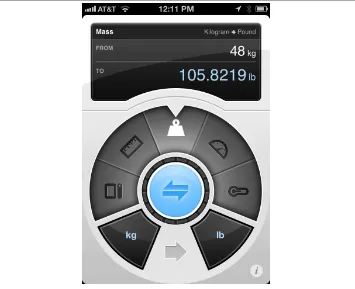
Microinteractions can be part of a product—or even the entire product itself. Take a toaster, for example. A toaster does one thing: toasts. It only has one use case: a user puts item to toast into the toaster and presses start. Toaster toasts. Toast pops up when done. That’s it. Now, of course, there are variations to this (toasting a bagel instead of bread), but in general the whole device is powered by a single microinteraction. Similarly, small apps can be made up of one microinteraction. Thousands of small apps —desktop and mobile—do one small thing well, whether it’s converting measurements like Convertbot (see Figure 1-4), being a calculator, or showing weather data.
Figure 1-4. Tapbot’s Convertbot is an app built around a single microinteraction: con‐ verting one value to another.
Microinteractions are frequently the last parts of a product to be designed and devel‐ oped, and as such they are often overlooked. But ignoring them is a mistake. The reason the original (G1) version of Android felt so unpolished was because the microinterac‐ tions were clunky, especially in comparison to the iPhone; for example, deleting items was inconsistently triggered, and in some applications pressing the search key did noth‐ ing at all. If the microinteractions are poor, the main features, no matter how nicely done, are surrounded by pain and frustration. The design of your product is only as good as its smallest part.
Figure 1-5. The author’s menu bar in OS X is crammed full of icons, each of which launches a microinteraction.
Of course, some features are so useful and/or powerful (or so highly protected by in‐ tellectual property laws) that the microinteractions don’t matter as much. Many medical devices are examples of this, as is most early stage technology, when people are more amazed something can be done rather than how it’s done. For instance, the first gener‐ ation of the Roomba (introduced in 2002) couldn’t calculate room size or detect obstacles and dirt, but it was a novel technology nonetheless, and subsequent models (especially now that there are competitors on the market) have focused more on the human–robot microinteractions.
Figure 1-6. When trying to find a word on a page, Chrome indicates in the scrollbar where instances of that word appear. (Courtesy Saul Cozens and Little Big Details.)
In competitive markets, microinteractions are even more important. When there is feature parity, it is the experience using the product that increases adoption and brand loyalty. The overall experience of a product relies heavily on its microinteractions. They are the “feel” in look-and-feel. One reason Google+ fell so flat against Facebook was that its microinteractions, such as sorting users into circles, while initially intriguing, quickly became tiresome and gimmicky.
Another reason to pay attention to microinteractions is because they fit so well into our multiplatform existence. Microinteractions are the glue that can tie together features across mobile devices, TV, desktop and laptop computers, appliances, and the Web. While the microinteractions could vary by platform, their small size allows for a con‐ sistency that you might not have with large features. In particular, appliances and mobile
devices with their small (or no) screens seem custom-made for microinteractions. Small interactions work well on small devices.
Take Twitter for example. Twitter is built entirely around a single microinteraction: sending a <140-character message. Users can do this from practically any device, any‐ where. Some objects even tweet independently, or for us. Twitter can be used to send gossip or messages to coordinate a revolution. Well-designed microinteractions can scale well across platforms and to millions of users (see Figure 1-7).
Figure 1-7. A nice piece of microcopy. When you go to ask for support at Harvest, it shows the time at their office alongside their office hours. (Courtesy Nicolas Bouliane.)
Microinteractions also fit well into our already crowded, overcomplicated, and frag‐ mented lives. We need and even enjoy the fast glance at data, the rapid check-in at a restaurant, the casual review of messages on the subway. (The “Casual Games” category is really a set of stand-alone microinteractions for amusement.)
Microinteractions force designers to work simply, to focus on details. They challenge designers to see how lightweight they can design, to reduce complexity and streamline features that could otherwise be burdensome (Figure 1-8).
3. Detailed in Bravo Course Outline by Suzan Jerome, published by Xerox, 1976.
The Secret History of Microinteractions
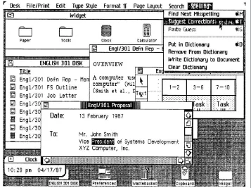
In 1974, a young engineer named Larry Tesler began working on an application called Gypsy for the Xerox Alto computer. Gypsy was one of the first word-processing appli‐ cations ever, and the successor to the groundbreaking Bravo, the first true WYSIWYG word-processing program and the first program that could have the ability to change fonts. Even though it was still a word-processing program, Gypsy was a different kind of application altogether: it made use of a mouse and a graphical user interface (GUI). Larry’s mission—and what would become his rallying cry for decades to come—was to reduce the modality of the interface, so that users wouldn’t have to switch to a separate mode to perform actions. (His website is http://www.nomodes.com, his Twitter handle is @nomodes, and even his license plate reads NOMODES.) Larry wanted users, when they typed a character key, to always have that character appear onscreen as text—not an unreasonable expectation for a word-processing application. This wasn’t the case in Bravo: typing only worked in a particular mode; other times it triggered a function. One of those functions was moving text from one part of the document to another. In Bravo (see Figure 1-9), users had to first select the destination, then press the “I” or “R” keys to enter Insert or Replace modes, then find and select the text to move, then finally press the Escape key to execute the copy.3 Larry knew there was a better way to perform
this action, so he designed one that not only made use of the mouse, but radically simplified this microinteraction. In Gypsy, the user could select a piece of text, press the “Copy” function key, then select the destination, and finally press the “Paste” function key. No mode required. And thus, cut and paste was born.
The intertwined history of interaction design and human–computer interaction is really the history of microinteractions. The tiny things we unthinkingly interact with every day on desktops, laptops, and mobile devices were once novel microinteractions: ev‐ erything from saving a document to organizing files into folders to connecting to a WiFi network were all microinteractions that needed to be designed. Even “basics” like scroll‐ ing and opening multiple windows needed to be designed and engineered. The forward march of technology has provided a continuous need for new microinteractions. We use them unquestioningly now, and only really pay attention to them when someone designs a better way, or the technology changes and allows for or forces a new way of performing the microinteraction.
Figure 1-9. A “screenshot” (Polaroid[!]) of Bravo. The bottom window is being used to make a form in the top window. (Courtesy DigiBarn Computer Museum.)
4. As recounted in Dealers of Lightning: Xerox PARC and the Dawn of the Computer Age by Michael A. Hiltzik (HarperBusiness, 2005).
his engineers, which they then built into Apple’s Lisa (Figure 1-10)—and subsequently the Macintosh.)4
As documents got longer, scrollbars added arrows to jump to the end without scrolling. Tooltip-style indicators would appear to indicate where you were in the document. But the real change came with touchscreen technology on trackpads and mobile devices. Do you slide up or down to scroll down? Apple famously changed directions (from down to up) in OS X Lion after the introduction of its iPhones in order to align its laptops and mobile devices to “natural scrolling.” [See, for example, “Apple’s Mousetrap: Why did Apple reverse the way we scroll up and down?” by Michael Agger in Slate.] Apple has also (to the ire of many) hidden scrollbars except when scrolling is in process or the cursor nears the right edge of a scrollable window. The microinteraction keeps evolving.
Figure 1-10. Apple’s Lisa (1982) featured dozens of “new” (for the market) microinter‐ actions. (Source: Lisa Graphical User Interface Gallery Guidebook.)
But it’s not just digital products that have microinteractions; a case can be made that microinteractions originated with the first electric devices, such as the radio (1893), the flashlight (1986), and the washing machine (1900). As designer Bill DeRouchey points out in his talk “The History of The Button,” in the (pre-electric) mechanical era, users could follow their actions directly from the control to the output. You could pull a lever, watch the gears move and finally see the wheels turn. It was easy to connect the input to the output. Electricity changed all that. You could press a button on the wall and nearly instantly a light on the other side of the room turned on. Sure, the feedback was instant, but the method of execution was not. As DeRouchey says in “The History of the Button”, “The button meant for the first time the result of the human motion could be completely different from the motion [it creates] itself.” Action became abstracted. In the digital age, particularly before the GUI, action became even more abstract. In‐ serting a stack of punchcards or flipping a series of switches produced output that was equally obtuse. For a time, the GUI cleared up and simplified microinteractions. But then Moore’s Law (processor speed doubles every 18 months), Koomey’s Law (power consumption for hardware decreases 50% every 18 months), Kryder’s Law (exponential increase in storage space), and increasing bandwidth and network connectivity (LANs first, then wireless networks, both local and mobile) created the need for more micro‐ interactions, and those microinteractions needed to control actions far more abstract than turning on a light. Just as one example, syncing data across devices is a conceptually abstract idea, for which there’s no readily available physical analog.
Input methods are also drastically changing microinteractions. Not only do we have physical controls like buttons, switches, keyboards, and mice, we also have touchscreens, sensors, voice, and gestural means of triggering microinteractions. In the not-too-distant past, the only way to interact with the physical environment was to adjust it manually via a physical control. This changed in 1956 when Robert Adler invented the Zenith Space Commander, the first TV remote control (Figure 1-11). For the first time, users could control an object from a distance, invisibly.
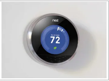
Today, to trigger a microinteraction, you don’t even need to be in the same room. With the right equipment, you can adjust the temperature in your house from the other side of the world (see Figure 1-12). Or you only need to be in the right location; just by being in a certain block, your mobile phone can remind you of a to-do item, or your GPS device can tell you where to turn left. In public restrooms, you can turn on sinks just by putting your hands into them. You can tell your phone to find you a nearby restaurant, or flick your finger down a touchscreen list to reveal a search bar, or tap your phone on a counter to pay for your coffee. The list goes on.
Figure 1-11. Although there had been remote-control planes and boats previously (mostly for military use), the Space Commander television remote removed proximity from control for consumers. (Courtesy Peter Ha.)
Figure 1-12. The Nest Learning Thermostat uses proximity sensors to know when some‐ one walks into the room, then lights up and shows the temperature in a way that’s visi‐ ble at a glance from across the room. No touching required. (Courtesy of Nest.)
The Structure of Microinteractions
What makes effective microinteractions is not only their contained size, but also their form. A beautifully crafted microinteraction gracefully handles four different parts, which will be described next (see Figure 1-13).
Figure 1-13. The structure of microinteractions.
These four parts—the trigger that initiates the microinteraction, the rules that determine how the microinteraction works, the feedback that illuminates the rules, and loops and modes, the meta rules that affect the microinteraction—are a way to design and dissect microinteractions.
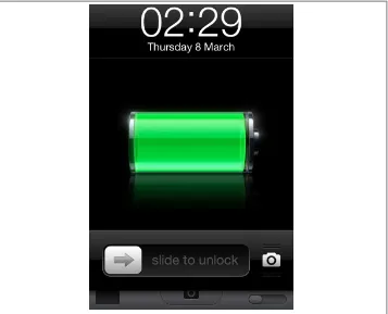
Figure 1-14. An example of a trigger. In iOS (as in Windows Mobile), you can use the camera even on a locked phone. Pressing the camera icon bounces the bottom bar up a little, indicating that you swipe up to get the camera functionality. Of course, slide to unlock is its own trigger as well.
But triggers need not be user-initiated. Increasingly, triggers are system-initiated— when the device or application itself detects that certain conditions have been met and begins a microinteraction. The triggering condition could be anything from detecting that a new email arrived, to the time of day, to the price of a particular stock, to the location of the user in the world. For silencing the phone, one could easily imagine that function integrating with your calendar, so that it automatically silences the phone whenever you’re in a meeting. Or by knowing your location, it automatically goes silent whenever you’re in a movie theater or symphony hall. As our applications and devices become more sensor-full and context-aware, the more ability they could have to make decisions on their own about how they operate.
Triggers are covered in Chapter 2.
Understandably, users may want, if not the ability to adjust these system-initiated trig‐ gers, then at least the understanding of how they operate, just as Patron X probably would have liked to know how silencing his phone worked. In other words, they want to know the rules of the microinteraction.
Once a microinteraction has been initiated, it engages a sequence of behavior. In other words: something happens (see Figure 1-15). This usually means turning some piece of functionality or interactivity on, but it might just show the current state of the applica‐ tion or device. It might use data to guess what the user wants to do. In whatever case, it turns on at least one rule, and rules can usually be defined by a designer.
Figure 1-15. An example of a rule. When you’re using the music-streaming service Spo‐ tify and then turn it on on another platform, the first instance of Spotify pauses. If you resume playing on the first instance, the second platform will pause. This creates a very frictionless, cross-platform service. (Courtesy Sebastian Hall.)
that rule, however, by adding a dimmer or a motion detector that turns the light off when no motion is detected. But the basic turn on switch/turn on light rule is very simple, and one that becomes apparent to anyone who uses a light, even a child. With applications or electro-digital devices, the rules can be much, much more nuanced and hard to understand, even for small microinteractions. In the case of Patron X, it was the interaction with silencing the phone that caused the symphony incident, because unless there is a specific piece of feedback (and we’ll get to that next), rules are themselves invisible. Unlike the mechanical devices of the 19th century, users generally cannot see
the activity the trigger has initiated. (This “feature” has been used to tremendous effect by hackers, whose victims launch a program that unbeknownst to them installs a virus onto their computers.)
Rules are covered in Chapter 3.
Everything we see or hear while using digital devices is an abstraction. Very few of us really know what’s happening when we use any kind of software or device. Just as ex‐ amples, you’re not really putting a “file” into a “folder” and “email” isn’t really arriving into your “inbox.” Those are all metaphors that allow us to understand the interactions that are going on. Anything you see, hear, or feel that helps you to understand the rules of the system is feedback, the third part of microinteractions.
Feedback can take many forms: visual, aural, haptic (vibrations). Sometimes it can be prominent and unmistakable, like the light bulb glowing when you flip the switch. Sometimes it can be subtle and ambient, like the unread badges that appear on email applications and mobile apps. It can be as descriptive as a voice telling you exactly where to turn while doing turn-by-turn directions, or it can be as ambiguous as an LED light blinking in a complicated pattern. It can be as disruptive as the fart-like buzz of your phone in your pocket announcing a message, or a whisper as a digital panel opens. What is important is to match feedback to the action, to convey information in the most appropriate channel possible.
In our turning off the ringer on the iPhone example, silencing the phone has two pieces of feedback: a screen overlay when the switch is turned on or off, and a tiny, visible strip of orange on the actual switch when the phone is silent. What doesn’t appear—and what was the downfall of Patron X—is any indication that even though the ringer is off, set alarms will still sound. There is also no onscreen indicator (other than the temporary overlay, which vanishes after a few seconds) that the ringer is off. These are design choices.
Even more than with triggers, feedback is the place to express the personality of the product. Indeed, feedback could be said, along with the overall form, to completely define the product’s personality.
Feedback is not only graphics, sounds, and vibrations; it’s also animation (see
Figure 1-16). How does a microinteraction appear and disappear? What happens when an item moves: how fast does it go? Does the direction it moves in matter?
Figure 1-16. An example of feedback. In Coda2, the Process My Order button becomes a progress bar when pressed. The text should change to Processing Order and Order Processed!, however. (Courtesy Christophe Hermann and Little Big Details.)
Feedback can have its own rules as well, such as when to appear, how to change colors, how to rotate the screen when the user turns a tablet on its side. These rules may them‐ selves become their own microinteractions, as users might want to adjust them manually as a setting.
Feedback is discussed in Chapter 4.
The last part of microinteractions are the loops and modes that make up its meta rules. What happens over time with the microinteraction: do the interactions remain until manually turned off (as is the case with the Ringer/Silence switch) or do they expire after a while? What happens during an interruption or when conditions change? See
Although it’s often undesirable, some microinteractions have different modes. For in‐ stance, take the example of a weather app. Its main (default) mode is all about displaying the weather. But perhaps users have to enter another mode to enter the locations they’d like weather data from.
Figure 1-17. An example of a loop. On eBay, if you’ve bought the same item in the past, the button changes from “Buy it now” to “Buy another.” (Courtesy Jason Seney and Lit‐ tle Big Details.)
Loops and modes are discussed in Chapter 5.
Microinteractions as a Philosophy
There are three ways of incorporating microinteractions into products. The first is to think about them on a case-by-case basis. During the course of a design project or when simply refining your product, try to identify any possible microinteractions. Make a list of them, then treat each as such. For each one, deliberately consider the structure as outlined in this book, and see if you can polish each individual component. You’ll wind up with elegant microinteractions—and possibly Signature Moments.
Signature Moments are those microinteractions that are product differentiators. A cus‐ tom trigger control (such as the original iPod’s scroll wheel) or an elegant “loading” animation or a catchy sound (“You’ve Got Mail!”) can be marketed as though they are features and used cross-platform or in other products by the same organization. A Signature Moment will help create customer loyalty and recognition. The Like button on Facebook is now so well known that it’s part of the brand.
The challenge in working this way is keeping the scope of the microinteraction limited. The tendency is to turn them into features, because that is the way most designers are used to working. We want to tackle big problems and solve everything. Microinterac‐ tions are an exercise in restraint, in doing as much as possible with as little as possible.
5. Dieter Rams in conversation with Rido Busse (1980), reprinted in Design: Dieter Rams & (1981).
Embrace the constraints and focus your attention on doing one thing well. Mies van der Rohe’s mantra of “less is more” should be the microinteraction designer’s mantra as well.
A second way to think about microinteractions is to reduce more complex applications to individual products that are each built around one microinteraction. This is micro‐ interactions as product strategy: your product does one thing and one thing well. Reduce the product to its essence, its Buddha nature. If you find you want to add another feature to your product, that other feature should be its own product. Many appliances, apps, and devices, including the original iPod, follow this model. This is how many startups work (or at least began), from Instagram to Nest: they did one thing well. The “minimum viable product” can be one microinteraction. Working this way justifies and provokes a radical simplicity to your product, which allows you to say no to feature requests as they arise. Of course, this is also a difficult stance to take, particularly in corporations where the inclination is to sell one product that does everything their customers might need. Imagine breaking up Microsoft Word into individual products! And yet this is what some competitors have done. For example, apps like WriteApp are optimized just for writing, with most of the functionality of a word-processing program stripped away, so that the focus is only on writing, for writers. Evernote began with a simple microin‐ teraction: write notes that are available across platforms.
But there is a third way to think about microinteractions, and that is that most complex digital products, broken down, are made up of dozens, if not hundreds, of microinter‐ actions. You can view a product as the result of all these microinteractions working in harmony. This is what Charles Eames meant when he said the details are the design. Everything’s a detail, everything’s a microinteraction: a chance to delight, a chance to exceed users’ expectations. As Dieter Rams said:
I have always had a soft spot in my heart for the details. I consider details more important than a great draft. Nothing works without details. Details are the essentials. The standard to measure quality by.5
Figure 1-18. Whether viewing the Standard (“Plain”) or Satellite view of Google Maps, the widget for changing the view shows the map and a preview of the other view behind it. (Courtesy Hugo Bouquard and Little Big Details.)
This is also a difficult way for agencies—with their notoriously fast project schedules— to work. It’s honestly a challenging way for any designer to work, as often the attention of clients and stakeholders is focused on the big features, not the small details that would enhance those features or improve the overall experience. Indeed, it can be difficult to get enough time to focus on microinteractions at all. Convincing business and devel‐ opment team members that microinteractions are worth spending time on can be a challenge. It will likely mean extra time for design and development, after all. But it’s worth it.
The disastrous story of Patron X reminds us that microinteractions matter, that the designer’s job is to take the tasks that could otherwise be frustrating and difficult and make them otherwise. Larry Tesler knew this when he decided there had to be a better way to move text inside a document, and thus cut and paste were born. Microinterac‐ tions can improve the world, one tiny piece at a time. And they all start with a trigger.
Summary
Microinteractions are the small pieces of functionality that are all around us. Focusing on them is the way to create a superior user experience.
The history of microinteractions stretches back to the first electric devices. Most of the digital standards we’re used to now were once novel microinteractions.
A microinteraction is made up of four parts: triggers that initiates it, rules that determine how it functions, feedback that the rules generate, and the loops and modes that make up its meta-rules.
1. “Ethnic Press Booms In New York City.” Editor & Publisher. July 10, 2002.
CHAPTER 2
Triggers
In the 1990s, New York City Transit began converting its seven million daily bus-and-subway passengers from paying fares with tokens—which had been in use since 1904— to paying with a MetroCard, a thin, paper-like plastic card. One of the key pieces of the city’s conversion plan was the installation of hundreds of vending machines all over the five boroughs for riders to purchase and fund these new MetroCards. This was no easy task. New York City is home to over eight million people, and tens of millions more live in the surrounding tristate area. According to a report by the Department of City Planning, in 2000, 36% of New York City residents were foreign born; there were enough people speaking a language other than English in 2002 to support 40 magazines and newspapers in another language.1 Tens of thousands of residents are visually impaired,
physically disabled, have little or no schooling, or are illiterate—or some combination
2. The full story is told in her 2008 talk “Intervention-Interaction” at Interaction08.
thereof. The official guide to New York City reports that over 35 million tourists visit every year (in some years as many as 50 million), many of whom will ride the subway, but few of whom are familiar with it or know how to buy a MetroCard. In fact, the Metropolitan Transit Authority (MTA) had done studies of early MetroCard vending machine prototypes and had found that users were intimidated by the physical form and found the user interface to be incomprehensible.
Stepping into this challenge were designers Masamichi Udagawa, Sigi Moeslinger, and their team at Antenna Design, who were tasked with designing the MetroCard Vending Machine.
As Moeslinger recounts,2 one assumption they had to dispel for themselves was that
their users had experience using touchscreen-style kiosks. In the mid-1990s, few people outside of the service industry (where touchscreens were behind bars and fast-food restaurant counters) had much interaction with touchscreens, with one exception: au‐ tomatic teller machines (ATMs). The designers assumed that even for the lowest com‐ mon denominator, they would have at least some experience using an ATM. This turned out not to be the case—at the time, anecdotally up to 50% of the MTA riders didn’t have a bank account, and thus didn’t own an ATM card. They’d likely never used a machine like the MetroCard dispenser. “The concept of a touchscreen was really alien to them,” said Moeslinger. Just getting these users—millions of them—to approach and start using the new, unfamiliar machines was a real issue.
“touch” twice. The hand animates, pointing towards the Start button. But here’s the thing: the whole screen is the trigger. You can touch anywhere to begin using the ma‐ chine. The Start button is just a visual cue—a faux affordance—so that people know to “push” (when they will actually just tap) it to start. Although it seems like the button is the trigger, really it’s the whole screen. It’s a great solution to a very hard challenge— and one that is still in use over a decade later.
Figure 2-1. The idle screen from the MetroCard Vending Machine. Antenna Design de‐ liberately overemphasized the trigger, which was not, as one might suspect, the button in the top right. It’s actually the whole screen. (Courtesy Antenna Design.)
The MetroCard Vending Machine introduces the first principle of triggers: make the trigger something the target users will recognize as a trigger in context. This might mean a physical (or seemingly physical, as with the fake Start button on the MetroCard Vending Machine) control like a button or a switch, or it could be an icon in the task or menu bar. Make it look like you can do something, and make it engaging. And while having a large, animated glowing finger pointing up to a Start button isn’t the right affordance for most microinteractions, it was appropriate—and wildly successful—for this context.
3. “A Tablet Straining to Do It All”, The New York Times, August 15, 2012.
Manual Triggers
Where do microinteractions begin? Often they are the very first thing a user encounters as they turn a device on or launch an app. The on/off switch (or its digital equivalent) is the first trigger they encounter. On/off switches are, like the Start screen on the Met‐ roCard, examples of manual triggers. (Automatic, system-initiated triggers are covered later.)
Manual triggers usually spring from a user want or need: “I want to turn the TV on.” “I want to turn the ringer off on this phone.” “I need to move this text from one place to another.” “I want to buy a MetroCard.” From a strategic point of view, it is critically important to understand what a user wants (or needs) to do, when they want to do it, and in what context(s) they want to do it. This determines when and where your manual trigger should instantiate. It might need to be globally available, like an on/off switch, or it might be very contextual, only appearing when certain conditions are met, such as being in a particular mode or when the user is in a particular functional area of the app. For example, Microsoft Office’s “minibar” formatting menu only appears when text has been highlighted. You can find out these user needs the usual ways: either through design research (observations, interviews, exercises) or through intuition and understanding of the subject area. Or you find out the hard way: in product testing or when the product is launched or out in the field. The point is to match the user need (when and where) with the location of the trigger. (See “Making manual triggers discoverable” on page 29.) The second principle of triggers, although it seems incredible to even have to say this, is have the trigger initiate the same action every time. This is so users can create an accurate mental model of how the microinteraction works. This is violated more fre‐ quently than one might imagine. Tech reviewer David Pogue on the Samsung S Note:
Some of the icons in S Note actually display a different menu every other time you tap them. I’m not making this up.3
Another example is the Home button on iPhone and iPad, which either takes you to the home screen or, if you’re on the home screen, to Search. (Not to mention all the other functions that it does when you press it twice or press and hold. See “Spring-Loaded and One-off Modes” on page 113 in Chapter 5.) While bundling functionality under the home button is a great way to reuse limited hardware, the single press that takes you to Search instead of doing nothing (or giving some kind of “Hey! You’re already there!” feedback) if you’re on the home screen is probably a step too far.
find it. Of course, the alternative is to have a visible trigger onscreen for a microinter‐ action that is infrequently used, which might not be the best solution either. Settings, such as those for the desktop in Figure 2-2, are a perfect example of this; users only use them infrequently, yet they can be essential for certain apps, so it can be a design chal‐ lenge to figure out how visible the trigger for them needs to be.
Figure 2-2. On the Gnome desktop, rather than a static text file icon, the icon shows the first three rows of text. (Courtesy Drazen Peric and Little Big Details.)
Bring the Data Forward
The third principle of manual triggers is to bring the data forward. The trigger itself can reflect the data contained inside the microinteraction. Ask yourself, what can I show about the internal state of the microinteraction before it is even engaged or while a process is ongoing? What are the most valuable pieces of information I can show? This requires knowing what most people will use the microinteraction for, but you should know that key piece of information before you even begin. A simple example is a stock market app. Perhaps it indicates (via color or an arrow) the current state of the market or a stock portfolio, which could prompt the user to launch the microinteraction—or not. The trigger becomes a piece of ambient information available at a glance that might lead to using the trigger.
The trigger can also indicate where in a process a product is (see Figure 2-3 for an example). The button you use to start a process (making toast, for example) could in‐ dicate how long it is until the toast is ready.
Figure 2-3. Google’s Chrome browser icon (the trigger to launch it) also indicates active downloads and the download’s progress.
The Components of a Trigger
Manual triggers can have three components: the control itself, the states of the control, and any text or iconographic label.
Controls
For manual triggers, the least you can have is a control (see Figure 2-4). The kind of control you choose can be determined by how much control you want to give:
• For a single action (e.g., fast-forward), a button or a simple gesture is a good choice. The “button” in some cases could be an icon or menu item, while the gesture could be a movement like a tap, swipe, or wave. A button could also be (or be paired with) a key command or a gesture.
• For an action with two states (e.g., on or off), a toggle switch makes sense. Alter‐ natively, a toggle button could be used, although it is often hard to tell at a glance what state the button is in—or even that it might have another state. A third (and perhaps worst) choice is that of a regular button where a single press changes the state. If you choose this method, the state the button controls should be absolutely clear. A lamp is clearly on or off, so a regular (nontoggle) button could be used to turn it on and off.
• For an action along a continuum (e.g., adjusting volume) with a defined range, a slide or dial (particularly a jog dial, which can spin quickly) are the best choices. Alternatively, and particularly if there is no defined range, a pair of buttons could be used to change the value up/down or high/low.
• Some manual triggers are made up of multiple controls or elements such as form fields (radio buttons, checkboxes, text-entry fields, etc.). For example, a microin‐ teraction such as logging in might have text-entry fields to put in a username and password. These should be used sparingly and, whenever possible, prepopulated with either previously entered values or smart defaults.
Figure 2-4. The parts of a control.
There are also custom controls that fall outside the traditional buttons, switches, and dials—an example being the scroll wheel from the original (nontouch) iPods. Custom controls will bring a distinct emphasis to your microinteraction, perhaps even making it a Signature Moment. Custom controls can also be gestures or touches (see “Invisible triggers” on page 32).
The goal for microinteractions is to minimize choice and instead provide a smart default and a very limited number of choices. The control you select for the trigger should reflect this philosophy.
Controls are tightly coupled with visual affordances—what users expect can be done, based on sight. The fourth principle of triggers is don’t break the visual affordance: if your trigger looks like a button, it should work like a button and be able to be pushed.
Making manual triggers discoverable.
An important first question to ask is: how noticeable should this trigger be? The fifth principle of triggers is that the more frequently the microinteraction is used, the more visible it should be. Author Scott Berkun has a golden rule for discoverability that I’ve adapted for microinteractions. It’s this:4. Adapted from Scott Berkun, “The Myth of Discoverability”.
5. Marshall, W. H., S. A. Talbot, and H. W. Ades. “Cortical response of the anaesthesized cat to gross photic and electrical afferent stimulation.” Journal of Neurophysiology 6: 1–15. (1943).
6. Welford, A. T. “Choice reaction time: Basic concepts.” In A. T. Welford (Ed.), Reaction Times. Academic Press, New York, pp. 73–128. (1980).
Microinteractions that most people do, most often, should be highly discoverable. Microinteractions that some people do, somewhat often, should be easily discoverable. Microinteractions that few people do, infrequently, should take some searching to find.4
This golden rule will serve you well when determining how discoverable your trigger should be.
But how do we discover anything?
There are two ways we as humans become aware of anything in our environment. The first is that the item, either through movement or sound, causes our attention to invol‐ untarily attune to it. This stimulus-driven attention is what kept our ancestors alive, drawing their attention to charging rhinos and other dangers in the environment. De‐ signers can use this same device to draw attention to a trigger by having it move or make noise. Doing this, particularly on a desktop or web environment, can be incredibly obnoxious. Because we involuntarily focus our attention on movement and sound, having a trigger move or make a sound should be reserved for high-priority microin‐ teractions—and to have it repetitively do so should be reserved for the highest priority microinteractions, such as errors and alerts.
The second way we pay attention to anything is when we’re actively seeking to find something—when we’re goal-based. We actively turn our attention on items/areas to see if we can find something that meets our current needs. This attention, unless we are impaired or blind, is mostly visual. We turn our bodies, heads, or just eyes to visually search for what we’re looking for.
However, it should be noted that our reaction time to sound is faster than visual; auditory stimulus takes 8–10 milliseconds to reach the brain but visual stimulus takes 20–40 milliseconds.5 Reaction time to
sound is also faster: 140–160 milliseconds for sound versus 180–200 milliseconds for visual.6 Again, this makes evolutionary sense. The
7. Eriksen, C; Hoffman, J. “Temporal and spatial characteristics of selective encoding from visual displays”. Perception & Psychophysics 12 (2B): 201–204. (1972).
8. Ibid.
9. Eriksen, C; St James, J. “Visual attention within and around the field of focal attention: A zoom lens model.” Perception & Psychophysics 40 (4): 225–240. (1986).
10. Geons were first espoused in “Recognition-by-components: A theory of human image understanding” by Irving Biederman in Psychological Review 94 (2): 115–47. (1987).
11. Treisman, A. “Features and objects in visual processing.” Scientific American, 255, 114B–125. (1986). When we’re searching for something, our field of vision can narrow to as little as 1 degree7 or less than 1% of what we typically see. This narrowing of our field of vision
has been compared to a spotlight8 or zoom-in lens.9 We engage in a process of object
recognition, wherein we identify and categorize items in the environment.
When we’re engaged in object recognition, our eyes are looking for familiar shapes, known as geons. Geons are simple shapes such as squares, triangles, cubes, and cylinders that our brains combine together to figure out what an object is.10
Because of geons, it’s especially good practice to make triggers, particularly iconic ones, geometric. In general, it’s easier to find a target when we’re looking for a single charac‐ teristic rather than a combination of characteristics,11 so it’s best to keep your triggers
visually simple—especially if they are going to live in a crowded environment such as among other icons.
Once we identify an item (“That’s a button”), we can associate an affordance to it (“I can push a button”), unless there is another visual cue such as it being grayed out or having a big red X over it that negates the affordance. The sixth principle of manual triggers is don’t make a false affordance. If an item looks like a button, it should act like a button. With microinteractions, the least amount of cognitive effort is the goal. Don’t make users guess how a trigger works. Use standard controls as much as possible. As Charles Eames said, “Innovate as a last resort.”
The most discoverable triggers are (from most discoverable to least):
• An object that is moving, like a pulsing icon
• An object with an affordance and a label, such as a labeled button • An object with a label, such as a labeled icon
• An object alone, such as an icon • A label only, such as a menu item • Nothing: an invisible trigger
Invisible triggers.
Manual triggers can also be invisible—there might be no label or af‐ fordance to let the user know there’s a microinteraction to be triggered. Invisible triggers are often sensor-based, made possible via touchscreens, cameras, microphones, and other sensors such as accelerometers (as in Figure 2-5). However, you could also have an invisible trigger that is only a command key (Figure 2-6) or a mouse movement (to the corner of the screen, for example).Figure 2-6. In Alfred’s settings, if you disable the visible triggers, the invisible one be‐ comes highlighted. (Courtesy Hans Petter Eikemo and Little Big Details.)
Touchscreen UIs currently contain the most common invisible controls. Many multi‐ touch gestures have no visual affordance to indicate their presence, and custom gestures beyond the usual taps and swipes are often found through a process of trial and error (see Figure 2-7).
Voice input is another example of an invisible control. There are three kinds of voice controls:
Always listening
The product’s microphone is always on and users only need to address it (usually by name) to issue a command. Microsoft’s Kinect for Xbox works in this manner. “Xbox, play!” is an example of this kind of control.
Dialogue
The product’s microphone turns on at specific times to listen for a response to a prompt. (“Say ‘yes’ to continue in English.”) Most automated customer call inter‐ faces work thus.
Combined with a control
In order to initiate a voice command, a physical control has to be engaged first. Apple’s Siri works like this: users press and hold the Home button in order to issue voice commands.
Gestural controls such as hand waves to turn something on, or a shake to shuffle are also often invisible. Like voice controls, sometimes there is an initial action (like a wave)
Figure 2-7. In Google Maps for iOS, shaking is an invisible trigger for sending feedback. (Courtesy Little Big Details.)
or a physical control to get the device ready for other gestural commands. With Google Glass, tilting your head upwards or touching the side of the frame turns on the screen. Touching or being close to a device can be an invisible trigger, such as turning on a bathroom sink when hands are put under the faucet. Similarly, moving away from an object can be a trigger as well, such as automatically flushing a toilet when the person has moved away.

![Figure 1-9. A “screenshot” (Polaroid[!]) of Bravo. The bottom window is being used tomake a form in the top window](https://thumb-ap.123doks.com/thumbv2/123dok/4028523.1971943/28.504.75.433.61.454/figure-screenshot-polaroid-bravo-window-used-tomake-window.webp)