Effective use of
tables and figures
Reza Pulungan
1
Klinik Penulisan Karya Ilmiah Internasional
Outline
•
Scientific papers•
General guidelines•
Tables•
Figures•
Mistakes and tips!
Scientific papers
•
To get ideas across as clearly, accurately and succinctlyas possible to the reader.
•
Not only simply present a chronological account of theresearch work.
•
Must convince their audience that the research presentedis important, valid, and relevant.
•
Must emphasise both the motivation for the work andthe outcome of it, and they must include just enough
evidence to establish the validity of this outcome.
!
General guidelines
The main text should:
a. tell the reader when to look at a table or figure;
b. introduce the contents of the table or figure;
c. point out any key features or trends;
d. draw a conclusion from the table or figure.
!
General guidelines
!
5
Incorporating Tables and Figures
Effectively Into Your Writing
nclusion from the table or figure which answers the “So what?” question. (Schematics
of experimental apparatus are one exception to this guideline.)
Example 1
One measure of social disadvantage is relative access to primary health care. As Table 1/Fig. 1 shows, in
comparison to capital city residents, Woop Woop’s
residents have significantly lower per capita access to both GPs and pharmacists. This suggests that
governments should look at ways of encouraging more doctors and pharmacists to move to rural areas.
main text
Topic sentence to introduce the topic of the paragraph.
“As Table 1 shows, …” would
rarely be a useful topic sentence.
(a)
x Note that when referencing the source, “adapted
from” would only be used if you have changed the
x include “Bar
chart of ...” as that would be redundant. It can take ns which don’t include redundant “Graph of / Bar chart of” etc.
x x
on the writer’s objectives and the reader’s perceived needs.
(b) and (c). Note that the important
General guidelines
!
6
Table vs Figure
Incorporating Tables and Figures
Effectively Into Your Writing
nclusion from the table or figure which answers the “So what?” question. (Schematics
Table 1. Access to primary health care providers in rural Woop Woop is significantly lower than in capital cities.*
Woop Woop Capital City Average
GPs per 100,000 75.6 103.4
Pharmacists per 100,000 52.0 62.5
* Source: AIHW (1996).
comparison to capital city residents, Woop Woop’s
“As Table 1 shows, …” would
x Note that when referencing the source, “adapted from” would only be used if you have changed the
x include “Bar
chart of ...” as that would be redundant. It can take ns which don’t include redundant “Graph of / Bar chart of” etc.
x x
on the writer’s objectives and the reader’s perceived needs.
Incorporating Tables and Figures
Effectively Into Your Writing
nclusion from the table or figure which answers the “So what?” question. (Schematics
comparison to capital city residents, Woop Woop’s
“As Table 1 shows, …” would
x
x
x
Figure 1. Access to primary health care providers in rural Woop Woop is significantly lower than in capital cities (AIHW, 1996).
x
x
x
x Note that when referencing the source, “adapted
from” would only be used if you have changed the
x include “Bar
chart of ...” as that would be redundant. It can take ns which don’t include redundant “Graph of / Bar chart of” etc. x
x
on the writer’s objectives and the reader’s perceived needs. • Tables are more precise but can take more
work from the reader to interpret. Graphs and charts are less precise but are generally much easier to interpret qualitatively.
• Tables present numbers for comparison with other numbers or summarise or define
General guidelines
!
7
Caption
Incorporating Tables and Figures
Effectively Into Your Writing
nclusion from the table or figure which answers the “So what?” question. (Schematics
Table 1. Access to primary health care providers in rural Woop Woop is significantly lower than in capital cities.*
Woop Woop Capital City Average
GPs per 100,000 75.6 103.4
Pharmacists per 100,000 52.0 62.5
* Source: AIHW (1996).
comparison to capital city residents, Woop Woop’s
“As Table 1 shows, …” would
x Note that when referencing the source, “adapted from” would only be used if you have changed the
x include “Bar
chart of ...” as that would be redundant. It can take ns which don’t include redundant “Graph of / Bar chart of” etc.
x x
on the writer’s objectives and the reader’s perceived needs.
Incorporating Tables and Figures
Effectively Into Your Writing
nclusion from the table or figure which answers the “So what?” question. (Schematics
comparison to capital city residents, Woop Woop’s
“As Table 1 shows, …” would
x
x
x
Figure 1. Access to primary health care providers in rural Woop Woop is significantly lower than in capital cities (AIHW, 1996).
x
x
x
x Note that when referencing the source, “adapted
from” would only be used if you have changed the
x include “Bar
chart of ...” as that would be redundant. It can take ns which don’t include redundant “Graph of / Bar chart of” etc. x
x
on the writer’s objectives and the reader’s perceived needs. M. Cargill & P. O’Connor (2009), Writing Scientific Research Articles: Strategy and Steps, pp.
25-26, argue that “story telling” captions and titles are more communicative than simply descriptive titles. Compare the caption in with: “Rural-city comparison of access to primary health care providers.”
If the table or figure is not your creation, don’t forget to cite it.
General guidelines
!
8
Independent from the text
• Make your tables and figures as independent of the main text as much as you can without making them excessively wordy.
• Spell out abbreviations at first mention in tables or figures, even if they have already been defined in the text.
they are taking a “short cut” or
Table 2. The number of 1st year engineering students (N = 108) providing the indicated
answer to the question of the units of each term in the differential equation
2 differential equation need to be homogeneous.
mg/hr* mg mg2 no units other no answer
dD/dt 84 6 - 2 3 13
100 10 74 - 6 6 12
-0.01D2 14 35 26 - 13 20
Adapted from D.R. Rowland (2006), “Student difficulties with units in differential equations in modelling contexts,”
– “Student
= 108).” –
M. Cargill & P. O’Connor (2009),
argue that “story telling” captions and titles are more communicative than titles. Compare the title / caption in Example 1 with: “Rural
health care providers.”
Figure 1. Overview of the retinal structure in retinal fundus im-age of the right eye and of the sector partition. RNFL, retinal nerve fiber layer; ONH, optic nerve head.
RNFL
General guidelines
!
9
Referencing
•
As shown in Table 3, … As can be seen in Fig. 2, … As indicated in Tables 3-5, …•
The result of X was Y, as shown in Fig. 3.•
Regarding the question of …, data in Table 5 shows that …•
The result of the experiments is given in Table 9. The blockdiagram of the proposed method is depicted in Fig. 4.
•
As hypothesised, it was found that Group A performedTables
•
Are used for reporting extensive numerical data in anorganised manner.
•
Present numbers for comparison with other numbers orsummarise or define concepts, terms, or other details of a
study.
•
Numbered in the ordered they are referenced to in thetext.
•
Caption is usually above the table.!
Tables
!
11
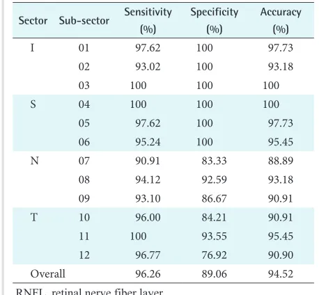
Table 1. Performance of the proposed RNFL detection method
Sector Sub-sector Sensitivity (%)
Specificity (%)
Accuracy (%)
I 01 97.62 100 97.73
02 93.02 100 93.18
03 100 100 100
S 04 100 100 100
05 97.62 100 97.73
06 95.24 100 95.45
N 07 90.91 83.33 88.89
08 94.12 92.59 93.18
09 93.10 86.67 90.91
T 10 96.00 84.21 90.91
11 100 93.55 95.45
12 96.77 76.92 90.90
Overall 96.26 89.06 94.52
RNFL, retinal nerve fiber layer.
•
Use boldface type, italictype, or underlining to
highlight.
•
Pay attention to alignment ineach column.
•
Avoid using too manyvertical lines.
Figures
!
12
•
Often the best means of presenting scientific data.•
Graphs, maps, diagrams, photos, illustration.•
Reveal trends or delineate selected features.•
Numbered in the ordered they are referenced to in thetext.
•
Use vector-based or high-resolution figures.Figures
!
13
GT: 1-1-1-1-1-1- -0-0-1-1-1 PM: 1-1-1-1-1-1- -0-0-1-1-1
1 0
GT: 1-1-1-1-1-1-1-0-0-1- -1 PM: 1-1-1-1-1-1-1-0-0-1- -1
0
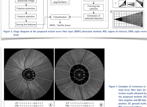
Figure 7. Examples of erroneous re-tinal nerve fiber layer de-tection results obtained by the proposed method: (A) false negative and (B) false positive. GT, ground truth; PM, proposed method.
Converting to grayscale image Feature extraction
Feature selection Forming the features Sample images with labels
+ Class
Saving the features
Testing Retinal fundus image
ONH RNFL: Yes/No (loss)
Feature extraction
Figure 2. Stage diagram of the proposed retinal nerve fiber layer (RNFL) detection method. ROI, region of interest; ONH, optic nerve head.
•
Avoid using “Bar chart of …”, “Diagram of …” as that would be redundant. It can take a conscious effort to writecaptions which don’t include them.
•
The style of the graphs and charts and the size andappearance of letters and numbers should be
consistent within a paper.
•
Every line in a figure should have meaning and purpose.Mistakes and tips
•
M: Not integrating the table or figure into the text.•
M: Including irrelevant or unnecessary figures or tables.•
M: Repeating in the text, statistics that can be found in a table.•
T: Consolidate similar information into one table to let the reader compare easily so that the reader does not have to search for related information.•
T: If a table has only a few rows and columns, try stating the findings in a few sentences. Information in small tables can often be presented better in the text.•
T: Data presented in tables should not be duplicated in graphs, and vice versa.!
Mistakes and tips
!
15
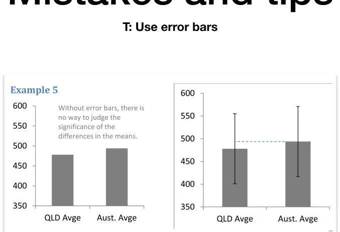
“ ” “ rror bars”
Example 5
x
350 400 450 500 550 600
QLD Avge Aust. Avge
Figure 2. NAPLAN Grade 5 reading results for 2009 (error bars are standard deviations).
Without error bars, there is no way to judge the
significance of the
differences in the means.
Mistakes and tips
!
16
T: Showing discrete points
Mistakes and tips
!
17
References
•
Doumont, J., ed. English Communication for Scientists.Cambridge, MA: NPG Education, 2010. (available at:
https://www.nature.com/scitable/ebooks/english-communication-for-scientists-14053993/contents)
•
ASA-CSSA-SSSA, Publications Handbook & StyleManual, 2018.
•
The Learning Hub, Student Services, The University ofQueensland.
!
Thank you.
!