HOSPITAL’S WALL COLO
UR IMPACT ON STROKE
PATIENTS
’
WARD USERS IN SURABAYA
Tanuwidjaja, Gunawan 1, Kristanto, Luciana2, Elsiana, Feny3, Yusani, Juniar4, Haryogo, Maria Marsha5, Budihardja, Sastra6
1,2,3,4,5 Architecture Program Study, Petra Christian University, Jl. Swialankerto 121-131, Surabaya 6 Career Development Center, Petra Christian University
ABSTRACT
The Cardiovascular diseases have become the top killer since 1970 worldwide. And in 2005, it was recorded the present of 5.7 million stroke survivors. And healing stroke and its related complications required much more
considerable time. So the patients’ wards quality especially related to wall colour become very important for the patients' recovery. The study was conducted with exploratory methods combining visual methods of research
and Luscher colour test. Series of interviews were conducted to gather the users’ perception. And it was found on that blue wall colour calmed the medical personals, patients, and their family. The most soothing Blue colour
variant according to respondents was the Artic Blue (hue 9.8B, value 7.4 and chroma 5.6). Keywords: Wall Colour, Perception, Stroke Patient’s Ward
INTRODUCTION
Cardiovascular disease is the first killer in the world since 1970. In 2005, the number of cardiovascular disease (CVD) mortality (especially coronary heart disease, stroke, and rheumatic heart disease) rose globally to 17.5 million from 14.4 million 1990 of these, 7.6 million associated with coronary heart disease and 5.7 million for stroke, especially in the countries with low and middle income (Valentin & Bridget (ed), 2010). Because of the considerable time needed for healing stroke and its complications the quality of space especially the wall colour would impact the patient's psychological and the total healing (Edge, 2003, Valentin & Bridget, 2010).
Anderson (2008) recommended the need for inpatient wards design improvements in the aspects of the rooms’ size, noise, light, storage, temperature, colour, small rooms and social spaces provisions. And because of the colour as one of the aspect to improve, the research further pursued the impact of the wall colour on the patients and its families. The research questions asked in were:
• Did the inpatient wards’ wall colour impact the patients and other users?
• Did the blue colour calm the patients (according to the patients, patients’ family and healthcare team)? • From four blue colour variants, which colour calmed patients the most?
PREVIOUS RESEARCH ON HUMAN PERCEPTION ON THE WALL COLOUR
Perception was a brain activity that organize, identify and interpret sensations to create a mental representation (Schacter, et al, 2009). Factors influencing the perception were other expectations, past experience and psychological circumstances, involving people, objects or events occurring in certain place, time, and atmosphere. On the other hand, Dilani (2009) revealed that the negative impact of the physical environment that abandoned patient's psychological, in forms of anxiety, depression, high blood pressure, sleeplessness, and an increase in the need for analgesics. Novak & Richardson (2012) also found that stress affected the emotional state of the patient and health outcomes. On the other hand, the blue colour was interpreted as a cool colour, and providing peace of mind, supporting relaxation and positive impact (Novak & Richardson, 2012, Birren, 2010). Blue was found also to cause the human body releasing soothing hormones, especially strong blue sky. And one particular blue (Cardiac Blue) was often to calm patients in the cardiac unit (Kopacz, 2004).
METHODOLOGY
Research method was prescribed incorporating earlier tests, such as: Luscher Color Test (1969) and Franz, et.al. (2005). Luscher Color Test (1969)was a person's preference test for some colour using coloured cards. The coloured cards were selected from most preferred to least preferred. Franz, et.al. (2005) created several 3-dimensional model of the room with a certain colour variants. The pictures were given to respondents. The respondents selected the most preferable and described the colour with semantic descriptions scale. Combining both methods, the research was conducted at the Pavilion for Stroke Patients, in Hospital Y, Surabaya, Indonesia
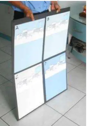
The respondents was asked with a set of blue colour panel. The blue colour was chosen for calming the patient, based Novak & Richardson (2012). Four variants of blue colour were selected, such as: Arctic Blue, Everest Blue, Cool Blue, and Teardrop (Figure 1). Hue, value and chrome of each variants were described such as: 9.8 Blue 7.4 / 5.6 (Arctic Blue), 3.3 Purple Blue 6.2 / 7.3 (Everest Blue), 7.3 Blue 7.6 / 3.4 (Cool Blue) and 0.6 Purple Blue 8.2 / 1.7 (Teardrop). All the colours variants chosen from Nippon Paint products. To improve the
respondents’ visualization on the wall colour, three-dimensional of the inpatient wards was created. The pictures were fixed to the four colour A3-sized colour panel (293 cm x 420 cm) (Figure 2).
Figure 1. Blue colour variants asked as the most calming colour to doctors, nurses, patients and their family Legend: A = Arctic Blue, B = Cool Blue, C = Tear Drop, D = Everest Blue
(Source: author).
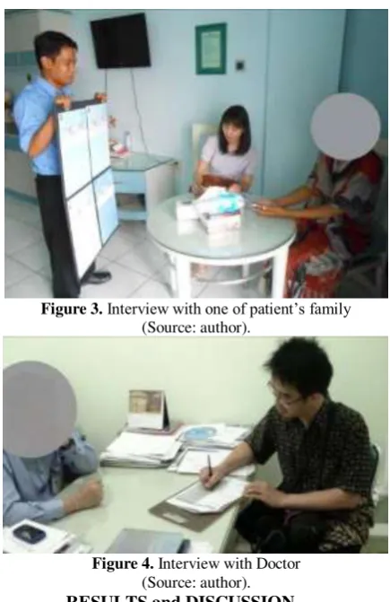
Figure 3.Interview with one of patient’s family
(Source: author).
Figure 4. Interview with Doctor (Source: author).
RESULTS and DISCUSSION
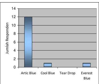
Results of the study stated the blue colour calmed patients to rest, as expressed by Luscher, (1969) and Kopacz (2004). Respondents perceived the blue colour as calming, cooling, refreshing, and reminiscent of sky colour. The majority of respondents (86%) chose Artic Blue as the most calming colour. Other respondents chose Cool Blue (7%) and Everest Blue (7%) colours (Figure 5). The order of blue colour variants from most calming to the least one to be presented in Table 1. Supporting reasons why Artic Blue colour was most calming were: it was quite soft, it did not blister, it did not collect dirt, and it did not cause agitation to patients.
The Artic Blue and Cool Blue was analysed as the most calming colour because of:
• The two blue colour variants showed that the Purple Blue (PB) hue on the Munsell atlas created more calming impacts than Blue (B) hue.
• The value of the Artic Blue and Cool Blue were in the range of 7.4-7.6 on a scale of 10. They were more related to clear sky that calmed the respondents.
• The chrome of two colours were 3.4-5.6 on a scale of 6. It mean that the colour consisted more blue saturation rather than grey.
Figure 5. Users preference of most calming blue colour (in the scale of number of respondents) (Source: author)
Table 1 Users preference of the blue colour variants from the most calming to the least calming Colour’s Choices
Of the four blue colour variants investigated, Arctic Blue was the most calming colour, for stroke units users in Y Hospital in Surabaya. The Arctic blue colour had a value of 7.4-7.6 on a scale of 10, and chroma 3.4-5.6 on a scale of 6. However, further research on the user's perception of the colour could be expanded for the whole interior, such as: ceiling, furniture, etc. On the other hand, other blue colours could be researched for other purposes such as educational buildings, etc.
ACKNOWLEDGMENT
This research was funded by Hibah Internal scheme of Lembaga Penelitian dan Pengabdian Masyarakat (LPPM) Petra Christian University in 2014. Special thanks to Professor Djwantoro Hardjito as the Vice Rector of Petra Christian University and Professor Lilianny Arifin Sigit the former of Chairman of LPPM.
REFERENCES
Anderson, D., (2008), Palliative Care Unit Design: Patient and Family Preferences, Design & Health Scientific Review, World H ealth Design, Source: http://www.designandhealth.com/uploaded/documents/Publications/Papers/diana-andersson-whd-april08.
Birren, F., (2010). Color Psychology and Color Theraphy: A Factual Study of the Influence of Color on Human Life .Whitefish. Kessinger Publishing L.L.C.
Dilani, A., (2009), Psychosocially Supportive Design – Scandinavian Healthcare Design in Del Nord, R., (ed), (2009), The Culture for the Future of Healthcare Architecture. Proceedings of the 28th, International Public Health Seminar, Alinea Editrice
Edge, K. J. (2003). Wall Color of Patient’s Room Effect on Recovery, Thesis at University of Florida, Florida
Franz, G., von der Heyde, M., & Bülthoff, H. H. (2005). An empirical approach to the experience of architectural space in vir tual reality: Exploring relations between features and affective appraisals of rectangular indoor spaces. Automation in Construction, 14(2), 165–172. Kopacz, Jeanne (2004). Color in Three Dimensional Design. McGraw-Hill Companies, USA
Luscher, M. (1969), The Luscher color test. Random House, New York
Novak, C.A., Richardson, B., (2012), Functional Color and Design in Healthcare Environments, Architectural Record, Continuing Education, McGraw Hill, diunduh dari: http://continuingeducation.construction.com/crs.php?L=222&C=928#
Schacter, D., Gilbert, T., Wegner, D. M., (2009). Psychology. Worth Publishers