JMP
Start Statistics
A Guide to Statistics and Data
Analysis Using JMP
®Fourth Edition
John Sall
Lee Creighton
JMP® Start Statistics: A Guide to Statistics and Data Analysis Using JMP®, Fourth Edition
Copyright © 2007, SAS Institute Inc., Cary, NC, USA
ISBN 978-1-59994-572-9
All rights reserved. Produced in the United States of America.
For a hard-copy book: No part of this publication may be reproduced, stored in a retrieval system, or transmitted, in any form or by any means, electronic, mechanical, photocopying, or otherwise, without the prior written permis-sion of the publisher, SAS Institute Inc.
For a Web download or e-book: Your use of this publication shall be governed by the terms established by the vendor at the time you acquire this publication.
U.S. Government Restricted Rights Notice: Use, duplication, or disclosure of this software and related documen-tation by the U.S. government is subject to the Agreement with SAS Institute and the restrictions set forth in FAR 52.227-19, Commercial Computer Software-Restricted Rights (June 1987).
SAS Institute Inc., SAS Campus Drive, Cary, North Carolina 27513.
1st printing, September 2007
SAS® Publishing provides a complete selection of books and electronic products to help customers use SAS
software to its fullest potential. For more information about our e-books, e-learning products, CDs, and hard-copy books, visit the SAS Publishing Web site at support.sas.com/pubs or call 1-800-727-3228.
SAS® and all other SAS Institute Inc. product or service names are registered trademarks or trademarks of SAS
Institute Inc. in the USA and other countries. ® indicates USA registration.
Preface
xiii
The Software xiiiJMP Start Statistics, Fourth Edition xiv
SAS xv
This Book xv
1
Preliminaries
1
What You Need to Know 1
…about your computer 1 …about statistics 1 Learning About JMP 1
…on your own with JMP Help 1 …hands-on examples 2
Open a JMP Data Table 9 Launch an Analysis Platform 12 Interact with the Surface of the Report 13 Special Tools 16
Modeling Type 17
Analyze and Graph 18 The Analyze Menu 18 The Graph Menu 20
Navigating Platforms and Building Context 22 Contexts for a Histogram 22
Contexts for the t-Test 22 Contexts for a Scatterplot 23
3
Data Tables, Reports, and Scripts 27
Overview 27
The Ins and Outs of a JMP Data Table 28
Selecting and Deselecting Rows and Columns 28 Mousing Around a Spreadsheet: Cursor Forms 29 Creating a New JMP Table 31
Define Rows and Columns 31 Copy, Paste, and Drag Data 44 Moving Data Out of JMP 45
Working with Graphs and Reports 48
Copy and Paste 48 Drag Report Elements 49 Context Menu Commands 49 Juggling Data Tables 50
Data Management 50
Give New Shape to a Table: Stack Columns 52
The Summary Command 54
Create a Table of Summary Statistics 54 Working with Scripts 57
4
Formula Editor Adventures 61
Overview 61
The Formula Editor Window 62
A Quick Example 63
Formula Editor: Pieces and Parts 66
Terminology 66
The Formula Editor Control Panel 67 The Keypad Functions 69
The Formula Display Area 70
Function Browser Definitions 71
Row Function Examples 72
Tips on Building Formulas 89
Examining Expression Values 89
Cutting, Dragging, and Pasting Formulas 89 Selecting Expressions 90
Tips on Editing a Formula 90 Exercises 91
5
What Are Statistics?
95
Overview 95
Ponderings 96
The Business of Statistics 96 The Yin and Yang of Statistics 96 The Faces of Statistics 97
Flipping Coins, Sampling Candy, or Drawing Marbles 111 Probability of Making a Triangle 112
Confidence Intervals 117
7
Univariate Distributions: One Variable, One
Sample
119
Overview 119
Looking at Distributions 120
Probability Distributions 122
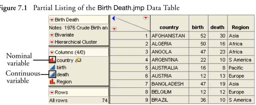
True Distribution Function or Real-World Sample Distribution 123 The Normal Distribution 124
Describing Distributions of Values 126
Generating Random Data 126 Histograms 127
Stem-and-Leaf Plots 128
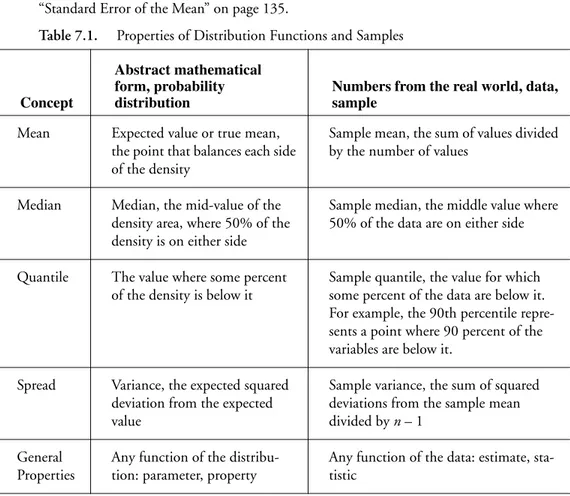
Median and Other Quantiles 133 Mean versus Median 133
Higher Moments: Skewness and Kurtosis 134 Extremes, Tail Detail 134
Statistical Inference on the Mean 135
Standard Error of the Mean 135 Confidence Intervals for the Mean 135 Testing Hypotheses: Terminology 138 The Normal z-Test for the Mean 139 Case Study: The Earth’s Ecliptic 140 Student’s t-Test 142
Comparing the Normal and Student’s t Distributions 143 Testing the Mean 144
The p-Value Animation 145 Power of the t-Test 148
Practical Significance vs. Statistical Significance 149
Examining for Normality 152
Normal Quantile Plots 152 Statistical Tests for Normality 155 Special Topic: Practical Difference 158
Special Topic: Simulating the Central Limit Theorem 160
Seeing Kernel Density Estimates 161
Exercises 162
8
The Difference between Two Means 167
Overview 167
Two Independent Groups 168
When the Difference Isn’t Significant 168 Check the Data 168
Launch the Fit Y by X Platform 170 Examine the Plot 171
Display and Compare the Means 171 Inside the Student’s t-Test 173 Equal or Unequal Variances? 174 One-Sided Version of the Test 176
Analysis of Variance and the All-Purpose F-Test 177 How Sensitive Is the Test?
How Many More Observations Are Needed? 180 When the Difference Is Significant 182 Normality and Normal Quantile Plots 184
Testing Means for Matched Pairs 186
Look at the Distribution of the Difference 188 Student’s t-Test 189
The Matched Pairs Platform for a Paired t-Test 190 Optional Topic:
An Equivalent Test for Stacked Data 193 The Normality Assumption 195
Two Extremes of Neglecting the Pairing Situation: A Dramatization 197
A Nonparametric Approach 202
Introduction to Nonparametric Methods 202 Paired Means: The Wilcoxon Signed-Rank Test 202 Independent Means: The Wilcoxon Rank Sum Test 205 Exercises 205
9
Comparing Many Means: One-Way Analysis of
Variance
209
Overview 209
What Is a One-Way Layout? 210
Comparing and Testing Means 211
Means Diamonds: A Graphical Description of Group Means 213
Statistical Tests to Compare Means 214
Means Comparisons for Balanced Data 217
Means Comparisons for Unbalanced Data 217
Adjusting for Multiple Comparisons 222
Are the Variances Equal Across the Groups? 224
Testing Means with Unequal Variances 228 Nonparametric Methods 228
Review of Rank-Based Nonparametric Methods 228 The Three Rank Tests in JMP 229
Exercises 231
10 Fitting Curves through Points: Regression
235
Overview 235
Regression 236
Least Squares 236 Seeing Least Squares 237
Fitting a Line and Testing the Slope 238 Testing the Slope by Comparing Models 240 The Distribution of the Parameter Estimates 242 Confidence Intervals on the Estimates 243 Examine Residuals 246
Time to Clean Up 247
What Happens When X and Y Are Switched? 256
Curiosities 259
Sometimes It’s the Picture That Fools You 259 High-Order Polynomial Pitfall 260
The Pappus Mystery on the Obliquity of the Ecliptic 261 Exercises 262
11 Categorical Distributions 265
Overview 265
Categorical Situations 266
Categorical Responses and Count Data: Two Outlooks 266
A Simulated Categorical Response 269
Simulating Some Categorical Response Data 269 Variability in the Estimates 271
Larger Sample Sizes 272
Monte Carlo Simulations for the Estimators 273 Distribution of the Estimates 274
The X2 Pearson Chi-Square Test Statistic 275
The G2 Likelihood-Ratio Chi-Square Test Statistic 276
Likelihood Ratio Tests 277
The G2 Likelihood Ratio Chi-Square Test 277 Univariate Categorical Chi-Square Tests 278
Fitting Categorical Responses to Categorical Factors: Contingency Tables 284
Car Brand by Marital Status 288 Car Brand by Size of Vehicle 289
Two-Way Tables: Entering Count Data 289
Expected Values Under Independence 290 Entering Two-Way Data into JMP 291 Testing for Independence 291
If You Have a Perfect Fit 293
Special Topic: Correspondence Analysis— Looking at Data with Many Levels 295
Continuous Factors with Categorical Responses: Logistic Regression 297
Fitting a Logistic Model 298 Degrees of Fit 301
A Discriminant Alternative 302 Inverse Prediction 303
Polytomous Responses: More Than Two Levels 305
Ordinal Responses: Cumulative Ordinal Logistic Regression 306
Surprise: Simpson's Paradox: Aggregate Data versus Grouped Data 310
Generalized Linear Models 313
Exercises 317
13 Multiple Regression
319
Overview 319
Parts of a Regression Model 320
A Multiple Regression Example 321
Residuals and Predicted Values 323 The Analysis of Variance Table 325 The Whole Model F-Test 325 Whole-Model Leverage Plot 326 Details on Effect Tests 326 Effect Leverage Plots 327 Collinearity 328
Exact Collinearity, Singularity, Linear Dependency 332 The Longley Data: An Example of Collinearity 334
The Case of the Hidden Leverage Point 335
Mining Data with Stepwise Regression 337
Exercises 341
14 Fitting Linear Models 345
Overview 345
The General Linear Model 346
Kinds of Effects in Linear Models 347
Regressor Construction 352 Interpretation of Parameters 353 Predictions Are the Means 353 Parameters and Means 353
Analysis of Covariance: Putting Continuous and Classification Terms into the Same Model 354 The Prediction Equation 357
The Whole-Model Test and Leverage Plot 357 Effect Tests and Leverage Plots 358
Least Squares Means 360 Lack of Fit 362
Separate Slopes: When the Covariate Interacts with the Classification Effect 363 Two-Way Analysis of Variance and Interactions 367
Optional Topic: Random Effects and Nested Effects 373
Nesting 374
Repeated Measures 376
Method 1: Random Effects-Mixed Model 377 Method 2: Reduction to the Experimental Unit 380 Method 3: Correlated Measurements-Multivariate Model 382 Varieties of Analysis 384
Summary 385 Exercises 385
15 Bivariate and Multivariate Relationships
387
Overview 387
Bivariate Distributions 388
Density Estimation 388
Bivariate Density Estimation 389 Mixtures, Modes, and Clusters 391
The Elliptical Contours of the Normal Distribution 392 Correlations and the Bivariate Normal 393
Simulation Exercise 393
Correlations Across Many Variables 396 Bivariate Outliers 398
Three and More Dimensions 399
Principal Components 400
Principal Components for Six Variables 402 Correlation Patterns in Biplots 404 Outliers in Six Dimensions 404
Summary 407
16 Design of Experiments
411
Overview 411
Introduction 412
Experimentation Is Learning 412
Controlling Experimental Conditions Is Essential 412
Experiments Manage Random Variation within A Statistical Framework 412
JMP DOE 413
Enter and Name the Factors 414 Define the Model 416
Is the Design Balanced? 419
Perform Experiment and Enter Data 420 Analyze the Model 421
Details of the Design 425 Using the Custom Designer 426 Using the Screening Platform 427
Screening for Interactions: The Reactor Data 429
Response Surface Designs 436
The Experiment 436
Exercises 475
18 Discriminant and Cluster Analysis
477
Overview 477
Control Charts and Shewhart Charts 490
Variables Charts 491 Attributes Charts 491
The Control Chart Launch Dialog 491
Process Information 492 Chart Type Information 493 Limits Specification Panel 493 Using Known Statistics 494
Types of Control Charts for Variables 494 Types of Control Charts for Attributes 499 Moving Average Charts 500
Correlation Plots of AR Series 522
Estimating the Parameters of an Autoregressive Process 522
Moving Average Processes 524
Example of Diagnosing a Time Series 526
ARMA Models and the Model Comparison Table 528 Stationarity and Differencing 530
Effect of Sample Size Significance 544 Effect of Error Variance on Significance 545 Experimental Design’s Effect on Significance 546 Simple Regression 547
Leverage 548
Multiple Regression 549
Summary: Significance and Power 549 Machine of Fit for Categorical Responses 549
How Do Pressure Cylinders Behave? 549 Estimating Probabilities 551
One-Way Layout for Categorical Data 552 Logistic Regression 554
References and Data Sources
557
Answers to Selected Exercises
561
Chapter 4, "Formula Editor Adventures" 561
Chapter 7, "Univariate Distributions: One Variable, One Sample" 565 Chapter 8, "The Difference between Two Means" 572
Chapter 9, "Comparing Many Means: One-Way Analysis of Variance" 577 Chapter 10, "Fitting Curves through Points: Regression" 584
Chapter 11, "Categorical Distributions" 586 Chapter 12, "Categorical Models" 587 Chapter 13, "Multiple Regression" 590 Chapter 14, "Fitting Linear Models" 591
Chapter 15, "Bivariate and Multivariate Relationships" 593 Chapter 17, "Exploratory Modeling" 594
Chapter 20, "Time Series" 595
Technology License Notices 597
xiii
JMP® is statistical discovery software. JMP helps you explore data, fit models, discover patterns, and discover points that don’t fit patterns. This book is a guide to statistics using JMP.
The Software
The emphasis of JMP as statistical discovery software is to interactively work with data and graphics in a progressive structure to make discoveries.
•
With graphics, you are more likely to make discoveries. You are also more likely tounderstand the results.
•
With interactivity, you are encouraged to dig deeper and try out more things that mightimprove your chances of discovering something important. With interactivity, one analysis leads to a refinement, and one discovery leads to another discovery.
•
With a progressive structure, you build a context that maintains a live analysis. You don’thave to redo analyses and plots to make changes in them, so details come to attention at the right time.
Software’s job is to create a virtual workplace. The software has facilities and platforms where the tools are located and the work is performed. JMP provides the workplace that we think is best for the job of analyzing data. With the right software workplace, researchers embrace computers and statistics, rather than avoid them.
JMP is controlled largely through point-and-click mouse manipulation. If you hover the mouse over a point, JMP identifies it. If you click on a point in a plot, JMP highlights the point in the plot, and highlights the point in the data table. In fact, JMP highlights the point everywhere it is represented.
JMP has a progressive organization. You begin with a simple report (sometimes called a report surface or simply surface) at the top, and as you analyze, more and more depth is revealed. The analysis is alive, and as you dig deeper into the data, more and more options are offered according to the context of the analysis.
In JMP, completeness is not measured by the “feature count,” but by the range of possible applications, and the orthogonality of the tools. In JMP, you get a feeling of being in more control despite less awareness of the control surface. You also get a feeling that statistics is an orderly discipline that makes sense, rather than an unorganized collection of methods.
A statistical software package is often the point of entry into the practice of statistics. JMP strives to offer fulfillment rather than frustration, empowerment rather than intimidation.
If you give someone a large truck, they will find someone to drive it for them. But if you give them a sports car, they will learn to drive it themselves. Believe that statistics can be interesting and reachable so that people will want to drive that vehicle.
JMP Start Statistics
, Fourth Edition
Many changes have been made since the third edition of JMP Start Statistics. Based on comments and suggestions by teachers, students, and other users, we have expanded and enhanced the book, hopefully to make it more informative and useful.
JMP Start Statistics has been updated and revised to feature JMP 7. Major enhancements have been made to the product, including new platforms for design (Split Plots, Computer Designs), analysis (Generalized Linear Models, Time Series, Gaussian Processes), and graphics (Tree Maps, Bubble Plots) as well as more report options (such as the Tabulate platform, Data Filter, Phase and T2 control charts) unavailable in previous versions. The chapter on Design of Experiments (DOE) has been completely rewritten to reflect the popularity and utility of optimal designs. In addition, JMP has a new interface to SAS that makes using the products together much easier.
Building on the comments from teachers on the third edition, chapters have been rearranged to streamline their pedagogy, and new sections and chapters have been added where needed.
SAS
JMP is a product from SAS, a large private research institution specializing in data analysis software. The company’s principal commercial product is the SAS System, a large software system that performs much of the world’s large-scale statistical data processing. JMP is positioned as the small personal analysis tool, involving a much smaller investment than the SAS System.
This Book
Software Manual and Statistics Text
This book is a mix of software manual and statistics text. It is designed to be a complete and orderly introduction to analyzing data. It is a teaching text, but is especially useful when used in conjunction with a standard statistical textbook.
Not Just the Basics
A few of the techniques in this book are not found in most introductory statistics courses, but are accessible in basic form using JMP. These techniques include logistic regression,
correspondence analysis, principal components with biplots, leverage plots, and density estimation. All these techniques are used in the service of understanding other, more basic methods. Where appropriate, supplemental material is labeled as “Special Topics” so that it is recognized as optional material that is not on the main track.
JMP also includes several advanced methods not covered in this book, such as nonlinear regression, multivariate analysis of variance, and some advanced design of experiments capabilities. If you are planning to use these features extensively, it is recommended that you refer to the help system or the documentation for the professional version of JMP (included on the JMP CD or at http://www.jmp.com).
Examples Both Real and Simulated
step-by-step instructions in the text. The same data are also available on the internet at www.jmp.com. JMP can also import data from files distributed with other textbooks. See Chapter 3, "Data Tables, Reports, and Scripts" for details on importing various kinds of data.
Acknowledgments
1
What You Need to Know
…about your computer
Before you begin using JMP, you should be familiar with standard operations and terminology such as click, double-click, a-click, and option-click on the Macintosh (Control-click and Alt-click under Windows or Linux), shift-Alt-click, drag, select, copy, and paste. You should also know how to use menu bars and scroll bars, move and resize windows, and open and save files. If you are using your computer for the first time, consult the reference guides that came with it for more information.
…about statistics
This book is designed to help you learn about statistics. Even though JMP has many advanced features, you do not need a background of formal statistical training to use it. All analysis platforms include graphical displays with options that help you review and interpret the results. Each platform also includes access to help that offers general help and appropriate statistical details.
Learning About JMP
…on your own with JMP Help
If you are familiar with Macintosh, Microsoft Windows, or Linux software, you may want to proceed on your own. After you install JMP, you can open any of the JMP sample data files and experiment with analysis tools. Help is available for most menus, options, and reports.
•
If you are using Microsoft Windows, help in typical Windows format is available underthe Help menu on the main menu bar.
•
On the Macintosh, select JMPHelp from the help menu.•
On Linux, select an item from the Help menu.•
You can click the Help button from launch dialogs whenever you launch an analysis orgraph platform.
•
After you generate a report, select the help tool ( ) from the Tools menu or toolbarand click the report surface. Context-sensitive help tells about the items that you click on.
…hands-on examples
This book, JMP Start Statistics, describes JMP features, and is reinforced with hands-on examples. By following along with these step-by-step examples, you can quickly become familiar with JMP menus, options, and report windows.
Mouse-along steps for example analyses begin with the mouse symbol in the margin, like this paragraph.
…using Tutorials
Tutorials interactively guide you through some common tasks in JMP, and are accessible from
the Help > Tutorials menu. We recommend that you complete the Beginner’s tutorial as a
quick introduction to the report features found in JMP.
…reading about JMP
The professional version of JMP is accompanied by five books—the JMP Introductory Guide, the JMP User Guide, JMP Design of Experiments, the JMP Statistics and Graphics Guide, and the JMP Scripting Guide. These references cover all the commands and options in JMP and have extensive examples of the Analyze and Graph menus. These books may be available in printed form from your department, computer lab, or library. They were installed as PDF files when you first installed JMP.
Chapter Organization
This book contains chapters of documentation supported by guided actions you can take to become familiar with the JMP product. It is divided into two parts:
The first five chapters get you quickly started with information about JMP tables, how to use the JMP formula editor, and give an overview of how to obtain results from the Analyze and
Graph menus.
•
Chapter 1, “Preliminaries,” is this introductory material.•
Chapter 2, “JMP Right In,” tells you how to start and stop JMP, how to open data tables,and takes you on a short guided tour. You are introduced to the general personality of JMP. You will see how data is handled by JMP. There is an overview of all analysis and graph commands, information about how to navigate a platform of results, and a description of the tools and options available for all analyses. The Help system is covered in detail.
•
Chapter 3, “Data Tables, Reports, and Scripts,” focuses on using the JMP data table. Itshows how to create tables, subset, sort, and manipulate them with built-in menu commands, and how to get data and results out of JMP and into a report.
•
Chapter 4, “Formula Editor Adventures,” covers the formula editor. There is adescription of the formula editor components and overview of the extensive functions available for calculating column values.
•
Chapter 5, “What Are Statistics?” gives you some things to ponder about the nature anduse of statistics. It also attempts to dispel statistical fears and phobias that are prevalent among students and professionals alike.
Chapters 6–21 cover the array of analysis techniques offered by JMP. Chapters begin with simple-to-use techniques and gradually work toward more complex methods. Emphasis is on learning to think about these techniques and on how to visualize data analysis at work. JMP offers a graph for almost every statistic and supporting tables for every graph. Using highly interactive methods, you can learn more quickly and discover what your data has to say.
•
Chapter 6, “Simulations,” introduces you to some probability topics by using the JMPscripting language. You learn how to open and execute these scripts.
•
Chapter 7, “Univariate Distributions: One Variable, One Sample,” covers distributionsof continuous and categorical variables and statistics to test univariate distributions.
•
Chapter 8, “The Difference between Two Means,” covers t-tests of independent groupsand tells how to handle paired data. The nonparametric approach to testing related pairs is shown.
•
Chapter 9, “Comparing Many Means: One-Way Analysis of Variance,” covers one-wayanalysis of variance, with standard statistics and a variety of graphical techniques.
•
Chapter 10, “Fitting Curves through Points: Regression,” shows how to fit a regression•
Chapter 11, “Categorical Distributions,” discusses how to think about the variability insingle batches of categorical data. It covers estimating and testing probabilities in categorical distributions, shows Monte Carlo methods, and introduces the Pearson and Likelihood ratio chi-square statistics.
•
Chapter 12, “Categorical Models,” covers fitting categorical responses to a model,starting with the usual tests of independence in a two-way table, and continuing with graphical techniques and logistic regression.
•
Chapter 13, “Multiple Regression,” describes the parts of a linear model with continuousfactors, talks about fitting models with multiple numeric effects, and shows a variety of examples, including the use of stepwise regression to find active effects.
•
Chapter 14, “Fitting Linear Models,” is an advanced chapter that continues thediscussion of Chapter 12, moving on to categorical effects and complex effects, such as interactions and nesting.
•
Chapter 15, “Bivariate and Multivariate Relationships,” looks at ways to examine two ormore response variables using correlations, scatterplot matrices, three-dimensional plots, principal components, and other techniques. Outliers are discussed.
•
Chapter 16, “Design of Experiments,” looks at the built-in commands in JMP used togenerate specified experimental designs. Also, examples of how to analyze common screening and response level designs are covered.
•
Chapter 17, “Exploratory Modeling,” illustrates two common data mining techniques—Neural Nets and Recursive Partitioning.
•
Chapter 18, “Discriminant and Cluster Analysis,” discusses methods that group datainto clumps.
•
Chapter 19, “Statistical Quality Control,” discusses common types of control charts forboth continuous and attribute data.
•
Chapter 20, “Time Series,” discusses some elementary methods for looking at data withcorrelations over time.
•
Chapter 21, “Machines of Fit,” is an essay about statistical fitting that may proveenlightening to those who have a mind for mechanics.
Typographical Conventions
•
Reference to menu names (File menu) or menu items (Save command), and buttons ondialogs (OK), appear in the Helvetica bold font.
•
When you are asked to choose a command from a submenu, such as File > Save As, goto the File menu and choose the Save As command.
•
Likewise, items on popup menus in reports are shown in the Helvetica bold font, butyou are given a more detailed instruction about where to find the command or option. For example, you might be asked to select the Show Points option from the popup menu on the analysis title bar, or select the Save Predicted command from the Fitting popup menu on the scatterplot title bar. The popup menus will always be visible as a small red triangle on the platform or on its outline title bars, as circled in the picture below.
•
References to variable names, data table names, and some items in reports show inHelvetica but can appear in illustrations in either a plain or boldface font. These items show on your screen as you have specified in your JMP Preferences.
•
Words or phrases that are important, new, or have definitions specific to JMP are initalics the first time you see them.
•
When there is an action statement, you can follow along with the example by followingthe instruction. These statements are preceded with a mouse symbol () in the margin. An example of an action statement is:
Highlight the Month column by clicking the area above the column name, and then choose Cols > Column Info.
•
Occasionally, side comments or special paragraphs are included and shaded in gray, or7
Hello!
JMP (pronounced “jump”) software is so easy to use that after reading this chapter you’ll find yourself confident enough to learn everything on your own. Therefore, we cover the essentials fast—before you escape this book. This chapter offers you the opportunity to make a small investment in time for a large return later on.
First Session
This first section just gets you started learning JMP. In most of the chapters of this book, you can follow along in a hands-on fashion. Watch for the mouse symbol () and perform the action it describes. Try it now:
To start JMP, double-click the JMP application icon.
When the application is active, you see the JMP menu bar and the JMP Starter window. You may also see toolbars, depending on how your system is set up. (Macintosh toolbars are attached to each window, and are appropriate for their window, and therefore vary.)
Figure 2.1 The JMP Main Menu and the JMP Starter
Windows menu and toolbar
Macintosh menu and toolbar
As with other applications, the File menu(JMP menu on Macintosh) has all the strategic commands, like opening data tables or saving them. To quit JMP, choose the Exit (Windows and Linux) or Quit (Macintosh) command from this menu. (Note that the Quit command is located on the JMP menu on the Macintosh.)
Start by opening a JMP data table and doing a simple analysis.
Open a JMP Data Table
When you first start JMP, you are presented with the JMP Starter window, a window that allows quick access to the most frequently used features of JMP. Instead of starting with a blank file or importing data from text files, open a JMP data table from the collection of sample data tables that comes with JMP.
Choose the Open command in the File menu (choose File > Open).
When the Open File dialog appears, as shown in Figure 2.2, Figure 2.3, or Figure 2.4, select Big Class.jmp from the list of sample data files.
•
Windows sample data is usually installed at C:\Program Files\SAS\JMP7\EnglishSupport Files\Sample Data.
•
Macintosh Sample Data is usually installed at the root level at /Library/ApplicationSupport/JMP/Support Files English/Sample Data.
•
Linux Sample Data is usually installed at /JMP7/Support Files English/Sample Data inthe directory where you installed JMP (typically /opt).
Select Big Class and click Open (Windows and Macintosh) or Finish (Linux) on the dialog.
There is also a categorized list of the sample data, accessible from Help >
Sample Data Directory. The pre-defined list of files may help you when
Figure 2.2 Open File Dialog (Windows)
Figure 2.4 Open File Dialog (Linux)
You should now see a table with columns titled name, age, sex, height, and weight (shown in Figure 2.5).
Figure 2.5 Partial Listing of the Big Class Data Table
Launch an Analysis Platform
What is the distribution of the weight and age columns in the table?
Click on the Analyze menu and choose the Distribution command.
This is called launching the Distribution platform. The launch dialog (Figure 2.6) now appears, prompting you to choose the variables you want to analyze.
Click on weight to highlight it in the variable list on the left of the dialog.
Click Y, Columns to add it to the list of variables on the right of the dialog, which are the variables to be analyzed.
Similarly, select the age variable and add it to the analysis variable list.
The term variable is often used to designate a column in the data table. Picking variables to fill roles is sometimes called role assignment.
You should now see the completed launch dialog shown in Figure 2.6.
Figure 2.6 Distribution Launch Dialog
The resulting window shows the distribution of the two variables, weight and age, as in
Figure 2.7.
Figure 2.7 Histograms from the Distribution Platform
Interact with the Surface of the Report
All JMP reports start with a basic analysis, which is then worked with interactively. This allows you to dig into a more detailed analysis, or customize the presentation. The report is a live object, not a dead transcript of calculations.
Row Highlighting
Click on one of the histogram bars, for example, the age bar for 12-year-olds.
linking of rows in the data tables to plots. Later, you will see other ways of selecting and working with attributes of rows in a table.
Figure 2.8 Highlighted Bars and Data Table Rows
On the right of the weight histogram is a box plot with a single point near the top.
Move the mouse over that point to see the label, LAWRENCE, appear in a popup box.
Click on the point in the plot.
The point highlights and the corresponding row is highlighted in the data table.
Disclosure Icons
Each report title is part of the analysis presentation outline. Click on the diamond on the side of each report title to alternately open and close the contents of that outline level.
On the Windows and Linux operating systems, if you have all the windows maximized, then you need to un-maximize them to see both windows at the same time.
Figure 2.9 Disclosure Icons for Windows and Linux (left) and Macintosh (right)
Contextual Popup Menus
There is a small red triangle (a hot spot) on the title bar at the top of the analysis window that accesses popup menu commands for the analysis. This popup menu has commands specific to the platform. Hot spots on the title bars of each histogram contain commands that only influence that histogram. For example, you can change the orientation of the graphs in the Distribution platform by checking or unchecking Display Options > Horizontal Layout (Figure 2.10).
Click on one of the menus next to weight or age and select Display Options >
Horizontal Layout.
Figure 2.10 Display Options Menu
In this same popup menu, you find options for performing further analyses or saving parts of the analysis in several forms. Whenever you see a red triangle hot spot, there are more options available. The options are specific to the context of the outline level where they are located. Many options are explained in later sections of this book.
Disclosure icons open and close sections of the report.
Click here for options relating to all histograms.
Resizing Graphs
If you want to resize the graph windows in an analysis, move your mouse over the side or corner of the graph. The cursor changes to a double arrow, which lets you to drag the borders of the graph to the position you want.
Special Tools
When you need to do something special, pick a tool in the tools menu or tool palette and click or drag inside the analysis.
The grabber ( ) is for grabbing objects.
Select the grabber, then click and drag in a continuous histogram.
The brush ( ) is for highlighting all the data in an rectangular area.
Try getting the brush and dragging in the histogram. To change the size of the rectangle, option-drag (Macintosh), Alt-drag (Windows) or Shift-Alt-drag on Linux.
The lasso ( ) is for selecting points by roping them in. We use this later in scatterplots.
The crosshairs ( ) are for sighting along lines in a graph.
The magnifier ( ) is for zooming in to certain areas in a plot. Hold down the a (Macintosh) Alt (Windows) or Shift+Alt (Linux) key and click to restore the original scaling.
The drawing tools ( ) let you draw circles, squares, lines and shapes to annotate your report. The annotate tool ( ) is for adding text annotations anywhere on the report.
The question mark ( ) is for getting help on the analysis platform surface.
Get the question mark tool and click on different areas in the Distribution platform.
The selection tool ( )is for picking out an area to copy so that you can paste its contents into another application. Hold down the Shift key to select multiple report sections. Refer to the chapter “Data Tables, Reports, and Scripts” on page 27 for details.
Modeling Type
Notice in the previous example that there are different kinds of graphs and reports for weight
and age. This is because the variables are assigned different modeling types. The weight
column has a continuous modeling type, so JMP treats the numbers as values from a continuous scale. The age column has an ordinal modeling type, so JMP treats its values as labels of discrete categories.
Here is a brief description of the three modeling types:
•
Continuous ( )are numeric values used directly in an analysis.•
Ordinal ( )values are category labels, but their order is meaningful.•
Nominal ( )values are treated as unordered, categorical names of levels.The ordinal and nominal modeling types are treated the same in most analyses, and are often referred to collectively as categorical.
You can change the modeling type using the Columns panel at the left of the data grid
(Figure 2.11). Notice the beside the column heading for age. This icon is a popup menu.
Click on the to see the menu for choosing the modeling type for a column.
Figure 2.11 Modeling Type Popup Menu on the Columns Panel
Why does JMP distinguish among modeling types? For one thing, it’s a convenience feature. You are telling JMP ahead of time how you want the column treated so that you don’t have to say it again every time you do an analysis. It also helps reduce the number of commands you need to learn. Instead of two distribution platforms, one for continuous variables and a different one for categorical variables, a single command performs the anticipated analysis based on the modeling type you assigned.
The following sections demonstrate how the modeling type affects the kind of analysis from several platforms.
Analyze and Graph
The Analyze and Graph menus, shown here, launch interactive platforms to analyze data.
Figure 2.12 Analyze and Graph Menus
The Analyze menu is for statistics and data analysis. The Graph menu is for specialized plots.
That distinction, however, doesn’t prevent analysis platforms from being full of graphs, nor the graph platforms from computing statistics. Each platform provides a context for sets of related statistical methods and graphs. It won’t take long to learn this short list of platforms. The next sections briefly describe the Analyze and Graph commands.
The Analyze Menu
Distribution is for univariate statistics, and describes the distribution of values for each
variable, one at a time, using histograms, box plots, and other statistics.
Fit Y by X is for bivariate analysis. A bivariate analysis describes the distribution of a y-variable
the y- and x- variables leads to one of the four following analyses: scatterplot with regression curve fitting, one-way analysis of variance, contingency table analysis, or logistic regression.
Matched Pairs compares means between two response columns using a paired t-test. Often
the two columns represent measurements on the same subject before and after some treatment.
Fit Model launches a general fitting platform for linear models. Analyses found in this
platform include multiple regression, analysis of variance models, generalized linear models, and logistic regression.
Modeling
Screening helps select a model to fit to a two-level screening design by showing which effects
are large.
Nonlinear fits models that are nonlinear in their parameters, using iterative methods.
Neural Net implements a standard type of neural network.
Gaussian Process models the relationship between a continuous response and one or more
continuous predictors. These models are common in areas like computer simulation experiments, such as the output of finite element codes, and they often perfectly interpolate the data. Gaussian processes can deal with these no-error-term models.
Time Series lets you explore, analyze, and forecast univariate time series taken over equally
spaced time periods. The analysis begins with a plot of the points in the time series with autocorrelations and partial autocorrelations, and can fit ARIMA, seasonal ARIMA, transfer function models, and smoothing models.
Partition recursively partitions values, similar to CART and CHAID.
Categorical tabulates and summarizes categorical response data, including multiple response
data, and calculates test statistics. It is designed to handle survey and other categorical response data, including multiple response data like defect records, side effects, and so on.
Multivariate Methods
Multivariate describes relationships among variables, focusing on the correlation structure:
correlations and other measures of association, scatterplot matrices, multivariate outliers, and principal components.
Cluster allows for k-means and hierarchical clustering. Normal mixtures and Self-Organizing
Principal Components derives a small number of independent linear combinations (principal components) of a set of variables that capture as much of the variability in the original variables as possible. JMP offers several types of orthogonal and oblique Factor-Analysis-Style rotations to help interpret the extracted components.
Discriminant fits discriminant analysis models, categorizing data into groups.
PLS implements partial least-squares analyses.
Item Analysis analyzes questionnaire or test data using Item Response Theory.
Survival and Reliability
Survival /Reliability models the time until an event, allowing censored data. This kind of
analysis is used in both reliability engineering and survival analysis.
Fit Parametric Survival opens the Fit Model dialog to model parametric (regression)
survival curves.
Fit Proportional Hazards opens the Fit Model dialog to fit the Cox proportional hazards
model.
Recurrence Analysis analyzes repairable systems.
The Graph Menu
Chart gives many forms of charts such as bar, pie, line, and needle charts.
Overlay Plot overlays several numeric y-variables, with options to connect points, or show a
step plot, needle plot, or others. It is possible to have two y-axes in these plots.
Scatterplot 3D produces a three-dimensional spinnable display of values from any three
numeric columns in the active data table. It also produces an approximation to higher dimensions through principal components, standardized principal components, rotated components, and biplots.
Contour Plot constructs a contour plot for one or more response variables for the values of
two x-variables. Contour Plot assumes the x values lie in a rectangular coordinate system, but the observed points do not have to form a grid.
Bubble Plot draws a scatter plot which represents its points as circles (bubbles). Optionally
Parallel Plot shows connected-line plots of several variables at once.
Cell Plot produces a “heat map” of a column, assigning colors based on a gradient (for
continuous variables) or according to a discrete list of colors (for categorical variables).
Tree Map presents a two-dimensional, tiled view of the data.
Scatterplot Matrix produces scatterplot matrices.
Ternary Plot constructs a plot using triangular coordinates. The ternary platform uses the
same options as the contour platform for building and filling contours. In addition, it uses a specialized crosshair tool that lets you read the triangular axis values.
Diagram is used to construct Ishikawa charts, also called fishbone charts, or cause-and-effect
diagrams. These charts are useful when organizing the sources (causes) of a problem (effect), perhaps for brainstorming, or as a preliminary analysis to identify variables in preparation for further experimentation.
Control Chart presents a submenu of various control charts available in JMP.
Variability/Gage Chart is used for analyzing measurement systems. Data can be continuous
measurements or attributes.
Pareto Plot creates a bar chart (Pareto chart) that displays the severity (frequency) of
problems in a quality-related process or operation. Pareto plots compare quality-related measures or counts in a process or operation. The defining characteristic of Pareto plots is that the bars are in descending order of values, which visually emphasizes the most important measures or frequencies.
Capability measures the conformance of a process to given specification limits. Using these
limits, you can compare a current process to specific tolerances and maintain consistency in production. Graphical tools such as the goalpost plot and box plot give you quick visual ways of observing within-spec behaviors.
Profiler is available for tables with columns whose values are computed from model
prediction formulas. Usually, profiler plots appear in standard least squares reports, where they are a menu option. However, if you save the prediction equation from the analysis, you can access the prediction profile independent of a report from the Graph menu and look at the model using the response column with the saved prediction formula.
Contour Profiler works the same as the Profiler command. It is usually accessed from the Fit
formulas for the responses, you can access the Contour Profiler at a later time from the Graph menu and specify the columns with the prediction equations as the response columns.
Surface Plot draws up to four three-dimensional, rotatable surfaces. It can also produce
density shells and isosurfaces.
Custom Profiler is an advanced feature for optimization and simulation.
Navigating Platforms and Building Context
The first few times JMP is used, most people have navigational questions: How do I get a particular graph? How do I produce a histogram? How do I get a t-test?
The strategy for approaching JMP analyses is to build an analysis context. Once you build that context, the graphs and statistics become easily available—often they happen automatically, without having to ask for them specifically.
There are three keys for establishing the context:
•
Designating the Modeling Type of the variables in the analysis as either continuous,ordinal, or nominal.
•
Assigning X or Y Roles to identify whether the variable is a response (Y) or a factor (X).•
Selecting an analysis platform for the general approach and character of the analysis.Once you settle on a context, commands appear in logical places.
Contexts for a Histogram
Suppose you want to display a histogram. In other software, you might find a histogram command in a graph menu, but in JMP you need to think of the context. You want a histogram so that you can see a distribution of values. So, launch the Distribution platform in
the Analyze menu. Once launched, there are many graphs and reports available for focusing
on the distribution of values.
Occasionally, you may want the histogram as a presentation graph. Then, instead of using the Distribution platform, use the Chart platform in the Graph menu.
Contexts for the
t
-Test
If you want the t-test to test a single variable’s mean against a hypothesized value, you are focusing on a univariate distribution, and therefore launch the Distribution platform
(Analyze > Distribution). On the title bar of the distribution report is a popup menu with
the command Test Mean. This command gives you a t-test, as well as the option to conduct a nonparametric test.
If you want the t-test to compare the means of two independent groups, then you have two variables in the context—perhaps a continuous Y response and a categorical X factor. Since the analysis deals with two variables, use the Fit Y By X platform. If you launch the Fit Y by X platform, you’ll see the side-by-side comparison of the two distributions, and you can use the
t test or Means/Anova/Pooled t command from the popup menu on the analysis title bar.
If you want to compare the means of two continuous responses that form matched pairs, there are several ways to build the appropriate context. You can make a third data column to form the difference of the responses, and use the Distribution platform to do a t-test that the mean of the differences is zero. Alternatively, you can use the Matched Pairs command to launch the Matched Pairs platform for the two variables. In Chapter 8, “The Difference between Two Means,” you will learn more ways to do a t-test.
Contexts for a Scatterplot
Suppose you want a scatterplot of two variables. The general context is a bivariate analysis, which suggests using the Fit Y by X platform. With two continuous variables, the Fit Y By X platform produces a scatterplot. You can then fit regression lines or other appropriate items with this scatterplot from the same report.
You might also consider the Overlay Plot command in the Graph menu when you want a presentation graph. As a Graph menu platform, it does not compute regressions, but can overlay multiple Y’s in the same graph and support two y-axes.
If you have a whole series of scatterplots for many variables in mind, your context is many bivariate associations, which is part of either the Multivariate or Scatterplot 3D platforms. A matrix of scatterplots appears automatically for Multivariate platform analyses.
Contexts for Nonparametric Statistics
Mann-Whitney U-test). If you want a nonparametric measure of association, like Kendall’s W
or Spearman’s correlation, look in the Multivariate platform.
The Personality of JMP
Here are some reasons why JMP is different from other statistical software:
Graphs are in the service of statistics (and vice versa). The goal of JMP is to provide a graph for every statistic, presented with the statistic. The graphs shouldn’t appear in separate windows, but rather should work together. In the analysis platforms, the graphs tend to follow the statistical context. In the graph platforms, the statistics tend to follow the graphical context.
JMP encourages good data analysis. In the example presented in this chapter, you didn’t have to ask for a histogram because it appeared when you launched the Distribution platform. The Distribution platform was designed that way, because in good data analysis you always examine a graph of a distribution before you start doing statistical tests on it. This encourages responsible data analysis.
JMP allows you to make discoveries. JMP was developed with the charter to be “Statistical Discovery Software.” After all, you want to find out what you didn’t know, as well as try to prove what you already know. Graphs attract your attention to an outlier or other unusual feature of the data that might prove valuable to discovery. Imagine Marie Curie using a computer for her pitchblende experiment. If software had given her only the end results, rather than showing her the data and the graphs, she might not have noticed the discrepancy that led to the discovery of radium.
JMP bristles with interactivity. In some products, you have to specify exactly what you want ahead of time because often that is your only chance while doing the analysis. JMP is interactive, so everything is open to change and customization at any point in the analysis. It is easier to remove a histogram when you don’t want it than decide ahead of time that you want one.
27
and Scripts
Overview
JMP data are organized as rows and columns of a grid referred to as the data table. The columns have names and the rows are numbered. An open data table is kept in memory and displays a data grid with panels of information about the data table. You can open as many data tables in a JMP session as memory allows.
Commands in the File, Edit, Tables, Rows, and Cols menus give you a broad range of data handling operations and file management tasks, such as data entry, data validation, text editing, and extensive table manipulation. The Edit menu contains the Run Script command, used for executing scripts.
In particular, the Tables menu has commands that perform a wide variety of data management tasks on JMP data tables.You can also create summary tables for group processing and summary statistics.
The purpose of this chapter is to tell you about JMP data tables and give a variety of hands-on examples to help you get comfortable handling table operations and scripts.
The Ins and Outs of a JMP Data Table
JMP displays data as a data grid, often called a data table. From the data table, you can do a variety of table management tasks such as editing cells; creating, rearranging or deleting rows and columns; subsetting the data; sorting; or combining tables. Figure 3.1 identifies active areas of a JMP data table.
There are a few basic things to keep in mind:
•
Column names can use any keyboard character, including spaces. The size and font fornames and values is a setting you control through JMP Preferences.
•
If the name of the column is long, you can drag column boundaries to widen thecolumn.
•
There is no set limit to the number of rows or columns in a data table; however, the tablemust fit in memory.
Figure 3.1 Active Areas of a JMP Spreadsheet
Selecting and Deselecting Rows and Columns
Many actions from the Rows and Cols menus operate only on selected rows and columns. To select rows and columns, highlight them.
•
To highlight a row, click the space that contains the row number.•
To highlight a column, click the background area above the column name.These areas are shown in Figure 3.1.
To extend a selection of rows or columns, drag (in the selection area) across the range of rows or columns or Shift-click the first and last row or column of the range. Ctrl-click (a-click on the Macintosh) to make a discontiguous selection. To select both rows and columns at the same time, drag across table cells in the spreadsheet.
To deselect a row or column, Ctrl-click (a-click on the Macintosh) on the row or column. To deselect all rows or columns at once, click the triangular rows or columns area in the upper-left corner of the spreadsheet.
Mousing Around a Spreadsheet: Cursor Forms
To navigate in the spreadsheet, you need to understand how the cursor works in each part of the spreadsheet.
To experiment with the different cursor forms, open the Typing.jmp sample table, move the mouse around on the surface (as illustrated in Figure 3.1), and see how the cursor changes to the forms listed next.
Arrow cursor ( )
When a data table is the active window, the cursor is a standard arrow when it is anywhere in the table panels to the left of the data grid, except when it is on a red triangle popup menu icon or a diamond-shaped disclosure icon. It is also a standard arrow when it is in the upper-left corner of the data grid. It is used for the selection of items.
I-beam cursor ( )
The cursor is an I-beam when it is over text in the data grid, highlighted column names in the data grid, or column panels. It signals that the text underneath it is editable. To edit text in the data grid, position the I-beam next to characters and click to highlight the cell. Once the cell is highlighted, simply begin typing to edit the cell’s contents. Alternatively, double-click and start typing to replace the existing text.
Click to select columns.
Selection cursor ( )
Move the blinking cursor around. The cursor becomes a large thick plus sign when you move it into a column or row selection area. It is used to select items in JMP data tables and reports. Use the selection cursor to select a single row or column. Shift-click a beginning and ending row (or a
beginning and ending column) to select an entire range. Ctrl-click (a-click on the Macintosh) to select multiple rows or columns that are not contiguous.
The selection cursor appears when you select it from the tools menu. It is used to select areas of reports to copy and paste to other locations. See “Copy, Paste, and Drag Data” on page 44 for details on using it for cut and paste operations.
Double Arrow cursor ( )
The cursor changes to a double arrow when placed on a column boundary. To change the width of a spreadsheet column, drag this cursor left or right.
List Check and Range Check cursors ( )
The cursor changes when it moves over values in columns that have data validation in effect (automatic checking for specific values). It becomes a small, downward-pointing arrow on a column with list checking and a large double I–beam on a column with range checking. When you click, the value highlights and the cursor becomes the standard I–beam; you enter or edit data as usual. However, you can only enter data values from a list or range of values you pre-specify. In addition, you can right-click in columns with list checks to see a menu listing the possible entries for the column.
Popup Pointer cursor ( )
The cursor changes to a finger pointer over any menu icon or diamond-shaped disclosure icon. It signifies that you are over a clickable item. Click a disclosure icon to open or close a window panel or report outline; click red triangle buttons to open menus.
After you finish exploring, choose File!Close to close the Typing.jmp table.
Click and drag to select.
Creating a New JMP Table
Hopefully, most of the data you analyze is already in electronic form. However, if you have to key in data, a JMP data table is like a spreadsheet with familiar data entry features. A short example shows you how to start from scratch.
Suppose data values are blood pressure readings collected over six months and recorded in a notebook page as shown in Figure 3.2.
Figure 3.2 Notebook of Raw Study Data Used to Define Rows and Columns
Define Rows and Columns
JMP data tables have rows and columns, which represent observations and variables in statistical terms. This differs from the way other software that also presents data as a data grid works. In JMP, the rows always represent observations, and the columns always represent variables. The raw data in Figure 3.2 are arranged as five columns (month and four treatment groups) and six rows (months March through August). The first line in the notebook describes each column of values, and these descriptions can be used as column names in a JMP data table. To enter this data into JMP, you first need a blank data table.
Choose File!New!(New)1 Data Table to create a new empty data table. This new, untitled table has one column and no rows.
1. On the Macintosh, the menu item is New Data Table, while on other platforms, it is simply Data Table. We use this notation to represent all platforms.
Add Columns
We now want to add five columns to the data table to hold the data from the study.
Choose Cols!Add Multiple Columns and respond to the How many columns to add question by requesting five new columns.
The default column names are Column 1, Column 2, and so on, but you can change them by typing in the editable column fields.
To edit a column name, first click the column selection area to highlight the column. Then, begin typing the name of the column. (The column name area highlights, but doesn’t obtain “edit focus” until you begin typing). The column name starts changing, with the insertion point showing as a blinking vertical bar. Use the Tab key to move from one column to the next.
Type the names from the data journal (Month, Control, Placebo, 300 mg, and 450 mg) into the columns headers of the new table.
Set Column Characteristics
Columns can have different characteristics, such as modeling type or numeric format. By default, their modeling type is continuous, so they expect numeric data. However, in this example, the Month column holds a non-numeric character variable.
Right-click the column name area for Month and select Column Info to activate the column info dialog.
In the Column Info dialog, use the Data Type popup menu to change Month to a character variable (Figure 3.3), then click OK.
Figure 3.3 Column Info Dialog
Add Rows
Adding new rows is easy.
Choose Rows > Add Rows and ask for six new rows.
Alternatively, if you double-click anywhere in the body of the data table, the data table automatically fills with new rows through the position of the cursor.
The last step is to give the data table a name and save it.
Choose File > Save As to name the data table BP Study.jmp. You may also navigate to another folder if you want to save this data table somewhere else.
Figure 3.4 JMP Data Table with New Rows, Columns, and Names
Enter Data
Entering data into the data table requires typing values into the appropriate table cells. To enter data into the data table, do the following:
Move the cursor into a data cell and double-click to begin editing the cell.
A blinking vertical bar appears in the indicating that you can begin typing.
Type the appropriate data from the notebook (Figure 3.2).
If you make a mistake, drag the I–beam across the incorrect entry to highlight it and type the correction over it. The Tab and Return keys are useful keyboard tools for data entry:
Add columns.