CSS
R E F E R E N C E
To m m y O l s s o n & P a u l O ’ B r i e n
THE ULTIMATE
CSS REFERENCE
BY
TOMMY OLSSON
The Ultimate CSS Reference
by Tommy Olsson and Paul O’BrienCopyright © 2008 SitePoint Pty Ltd
Managing Editor: Simon Mackie Technical Director: Kevin Yank
Technical Editor: Andrew Tetlaw Editor: Georgina Laidlaw
Expert Reviewer: Natalie Downe Cover Design: Simon Celen
Expert Reviewer: Roger Johansson Interior Design: Xavier Mathieu Printing History:
First Edition: February 2008
Notice of Rights
All rights reserved. No part of this book may be reproduced, stored in a retrieval system, or transmitted in any form or by any means, without the prior written permission of the publisher, except in the case of brief quotations included in critical articles or reviews.
Notice of Liability
The author and publisher have made every effort to ensure the accuracy of the information herein. However, the information contained in this book is sold without warranty, either express or implied. Neither the authors and SitePoint Pty Ltd, nor its dealers or distributors will be held liable for any damages to be caused either directly or indirectly by the instructions contained in this book, or by the software or hardware products described herein.
Trademark Notice
Rather than indicating every occurrence of a trademarked name as such, this book uses the names only in an editorial fashion and to the benefit of the trademark owner with no intention of infringement of the trademark.
Published by SitePoint Pty Ltd
48 Cambridge Street Collingwood VIC Australia 3066 Web: www.sitepoint.com Email: [email protected]
ISBN 978–0–9802858–5–7
About the Authors
Hailing from Hampshire in the UK, Paul O’Brien is a freelance web designer specializing in CSS layouts. After selling a successful packaging business back in 1998 he was all set for a quiet existence, dabbling with his hobby of web design. However, what started out as a hobby soon became a full-time occupation as the demand for well-coded CSS layouts started growing. Even when he’s not working, he can be found giving out helpful advice in the SitePoint Forums where he has racked up nearly 20,000 posts, all of which are CSS-related.
Paul’s other passion is karate, which he has studied continuously for 35 years. He currently holds the rank of Third Dan (Sandan) in Shotokan karate, so I wouldn’t argue with him if I were you!
Tommy Olsson is a pragmatic evangelist for web standards and accessibility, who lives in the outback of central Sweden. Visit his blog at
http://www.autisticcuckoo.net/.
About the Expert Reviewers
The always excitable Natalie Downe works for Clearleft, in Brighton, as a client-side web developer. An experienced usability consultant and project manager, her first loves remain front-end development and usability engineering. She enjoys Doing Things Right and occasionally dabbling in the dark art of Python and poking the odd API.
Roger Johansson is a web professional with a passion for web standards, accessibility, and usability. He spends his days developing web sites at Swedish web consultancy NetRelations, and his evenings and weekends writing articles for his personal sites, http://www.456bereastreet.com/ and
http://www.kaffesnobben.com/.
About the Technical Editor
editing of SitePoint books and kits. He is also a busy father of five, enjoys coffee, and often neglects his blog at http://tetlaw.id.au/.
About the Technical Director
As Technical Director for SitePoint, Kevin Yank oversees all of its technical publications—books, articles, newsletters, and blogs. He has written over 50 articles for SitePoint, but is best known for his book, Build Your Own Database Driven Website Using PHP & MySQL. Kevin lives in Melbourne, Australia, and enjoys performing improvised comedy theater and flying light aircraft.
About SitePoint
SitePoint specializes in publishing fun, practical, and easy-to-understand content for web professionals. Visit http://www.sitepoint.com/ to access our books, newsletters, articles, and community forums.
The Online Reference
The online version of this reference is located at http://reference.sitepoint.com/css. The online version contains everything in this book, fully hyperlinked and searchable. The site also allows you to add your own notes to the content and to view those added by others. You can use these user-contributed notes to help us to keep the reference up to date, to clarify ambiguities, or to correct any errors.
Your Feedback
If you wish to contact us, for whatever reason, please feel free to email us at [email protected]. We have a well-manned email support system set up to track your inquiries. Suggestions for improvement are especially welcome.
Reprint Permissions
Table of Contents
Chapter 1
What Is CSS?
. . . 1
CSS Versions . . . 4
Linking CSS to a Web Document . . . 5
Media Queries . . . 14
Standards Mode, Quirks Mode, and Doctype Sniffing . . . 17
Summary . . . 20
Chapter 2
General Syntax and
Nomenclature
. . . 23
Statements . . . 25
At-rules . . . 25
Rule Sets . . . 26
Selectors . . . 26
Declaration Blocks . . . 28
Declarations, Properties, and Values . . . 28
Keywords . . . 29
Lengths and Units . . . 29
Percentages . . . 32
Colors . . . 33
Numbers . . . 37
Strings . . . 37
URIs . . . 38
Initial Values . . . 39
Shorthand Properties . . . 39
CSS Comments . . . 42
CSS Identifiers . . . 43
CSS Syntax Errors . . . 44
Summary . . . 45
Chapter 3
At-rules Reference
. . . 47
@charset . . . 48
@import . . . 49
@media . . . 51
@page . . . 52
@font-face . . . 54
@namespace . . . 55
Chapter 4
Selector Reference
. . . 59
Universal Selector . . . 60
Element Type Selector . . . 62
Class Selector . . . 63
ID Selector . . . 65
Attribute Selector . . . 67
CSS3 Attribute Selectors . . . 71
Selector Grouping . . . 72
Combinators . . . 73
Descendant Selector . . . 74
Child Selector . . . 76
Adjacent Sibling Selector . . . 77
General Sibling Selector . . . 79
Pseudo-classes . . . 80
:link . . . 83
:visited . . . 84
:active . . . 85
:focus . . . 87
:first-child . . . 88
:lang(C) . . . 89
CSS3 Pseudo-classes . . . 90
Pseudo-elements . . . 106
:first-letter . . . 107
:first-line . . . 110
:before . . . 113
:after . . . 114
::selection . . . 115
Chapter 5
The Cascade, Specificity, and
Inheritance
. . . 117
The Cascade . . . 118
!important Declarations . . . 124
Specificity . . . 126
Inheritance . . . 133
The CSS Property Value inherit . . . 135
Summary . . . 137
Chapter 6
CSS Layout and Formatting
. . . 139
The Viewport, the Page Box, and the Canvas . . . 141
The CSS Box Model . . . 142
Containing Block . . . 147
Collapsing Margins . . . 148
The Internet Explorer 5 Box Model . . . 156
The Internet Explorer hasLayout Property . . . 158
Formatting Concepts . . . 163
Inline Formatting . . . 166
List Formatting . . . 168
Table Formatting . . . 168
Replaced Elements . . . 175
Positioning . . . 176
Relative Positioning . . . 176
Absolute Positioning . . . 178
Fixed Positioning . . . 178
Stacking Contexts . . . 179
Floating and Clearing . . . 180
The Relationship Between display, position, and float . . . 184
Summary . . . 185
Chapter 7
Box Properties
. . . 187
Dimensions . . . 187
height . . . 188
min-height . . . 190
max-height . . . 192
width . . . 194
min-width . . . 196
max-width . . . 198
Margins . . . 200
margin-top . . . 200
margin-right . . . 202
margin-bottom . . . 205
margin-left . . . 207
margin . . . 209
Padding . . . 211
padding-top . . . 212
padding-bottom . . . 215
padding-left . . . 216
padding . . . 218
Borders and Outlines . . . 220
border-top-color . . . 220
border-top-style . . . 222
border-top-width . . . 224
border-top . . . 226
border-right-color . . . 228
border-right-style . . . 229
border-right-width . . . 232
border-right . . . 233
border-bottom-color . . . 235
border-bottom-style . . . 236
border-bottom-width . . . 239
border-bottom . . . 240
border-left-color . . . 242
border-left-style . . . 243
border-left-width . . . 246
border-left . . . 247
border-color . . . 249
border-style . . . 251
border-width . . . 254
border . . . 255
outline-color . . . 258
outline-style . . . 259
outline-width . . . 260
Chapter 8
Layout Properties
. . . 263
display . . . 264
position . . . 267
float . . . 269
clear . . . 271
visibility . . . 273
top . . . 275
right . . . 276
bottom . . . 277
left . . . 278
z-index . . . 279
overflow . . . 280
clip . . . 283
Chapter 9
List Properties
. . . 285
list-style-type . . . 286
list-style-position . . . 288
list-style-image . . . 289
list-style . . . 290
Chapter 10
Table Properties
. . . 291
table-layout . . . 292
border-collapse . . . 293
border-spacing . . . 294
empty-cells . . . 295
Chapter 11
Color and Backgrounds
. . . 299
background-color . . . 299
background-image . . . 301
background-repeat . . . 303
background-position . . . 305
background-attachment . . . 309
background . . . 312
color . . . 315
Chapter 12
Typographical Properties
. . . 317
font-family . . . 318
font-size . . . 320
font-weight . . . 321
font-style . . . 323
font-variant . . . 324
font . . . 325
letter-spacing . . . 326
word-spacing . . . 327
line-height . . . 328
text-align . . . 330
text-decoration . . . 332
text-indent . . . 334
text-transform . . . 335
text-shadow . . . 337
vertical-align . . . 338
white-space . . . 341
direction . . . 343
Chapter 13
Generated Content
. . . 347
content . . . 348
counter-increment . . . 352
counter-reset . . . 354
quotes . . . 355
Chapter 14
User Interface Properties
. . . 357
cursor . . . 358
Chapter 15
Paged Media Properties
. . . 361
page-break-before . . . 362
page-break-inside . . . 363
page-break-after . . . 364
orphans . . . 365
widows . . . 366
Chapter 16
Vendor-specific Properties
. . . 367
Mozilla Extensions . . . 371
-moz-border-radius . . . 372
-moz-box-sizing . . . 375
The display Property Value: -moz-inline-box . . . 377
Internet Explorer Extensions . . . 379
zoom . . . 380
filter . . . 381
behavior . . . 387
The expression Property Value . . . 388
Chapter 17
Workarounds, Filters, and
Hacks
. . . 391
Internet Explorer Conditional Comments . . . 394
Workarounds and Filters . . . 400
CSS Hacks . . . 404
Summary . . . 408
Chapter 18
Differences Between HTML and
XHTML
. . . 409
MIME Types . . . 411
Case Sensitivity . . . 412
Optional Tags . . . 413
Root Element Properties . . . 415
1
What Is CSS?
Have you ever thought about what a web page is? I mean, what it really is? Some people think of a web page as a visual medium—an aesthetically pleasing experience which may or may not contain information that’s of interest to the viewer. Other people think of a web page as a document that may be presented to readers in an aesthetically pleasing way. From a technical point of view, the document
interpretation is more appropriate.
When we examine the elements of its construction, a web document can consist of up to three layers—content, presentation, and behavior—as illustrated in Figure 1.1.
The presentation layer defines how the content will appear to a human being who accesses the document in one way or another. The conventional way to view a web page is with a regular web browser, of course, but that’s only one of many possible access methods. For example, content can also be converted to synthetic speech for users who have impaired vision or reading difficulties.
Figure 1.1: The three layers of a web document
The behavior layer involves real-time user interaction with the document. This task is normally handled by JavaScript. The interaction can be anything from a trivial validation that ensures a required field is filled in before an order form can be submitted, to sophisticated web applications that work much like ordinary desktop programs.
It’s possible to embed all three layers within the same document, but keeping them separate gives us one valuable advantage: we can modify or replace any of the layers without having to change the others.
Certain versions of HTML and XHTML also contain presentational element types—that is, elements that specify the appearance of the content, rather than structure or semantics. For example, <b> and <i> can be used to control the presentation of text, and <hr> will insert a visible rule element. However, as these types of elements embed presentation-layer information within the content layer, they negate any advantage we may have gained by keeping the layers separate.
site in a single CSS file. CSS also provides far better control over presentation than do presentational element types in HTML.
By externalizing the presentation layer, CSS offers a number of significant benefits:
■ All styling is kept in a limited number of style sheets. The positive impact this has on site maintenance can’t be overestimated—editing one style sheet is obviously more efficient than editing 10,000 HTML files!
■ The overall saving in bandwidth is measurable. Since the style sheet is cached after the first request and can be reused for every page on the site, it doesn’t have to be downloaded with each web page. Removing all presentational markup from your web pages in favor of using CSS also reduces their size and bandwidth usage—by more than 50% in many documented cases. This benefits the site owner, through lower bandwidth and storage costs, as well as the site’s visitors, for whom the web pages load faster.
■ The separation of content from presentation makes it easier for site owners to reuse the content for other purposes, such as RSS feeds or text-to-speech conversion.
■ Separate styling rules can be used for different output media. We no longer need to create a special version of each page for printing—we can simply create a single style sheet that controls how every page on the site will be printed.
Although CSS is designed to be independent of the markup language of the documents to which it is applied, in reality, it’s used mainly with HTML and XML (including XHTML).
What Is CSS?
HTML and XHTML
CSS Versions
The first CSS specification, CSS1,1 became a World Wide Web Consortium (W3C)2
recommendation in December 1996. It included properties for controlling
typography, such as fonts, text alignment, spacing, margins, and list formatting. It allowed the designer to specify the dimensions of block-level boxes and to surround boxes with borders. Yet, when it came to layout and design, CSS1 didn’t have much to offer: you could specify foreground and background colors and background images, and you could float a box to the left or to the right and make text flow around it.
CSS2 came out in 1998, and contained a lot of the features that designers had been longing for. Boxes could be made to behave like HTML table cells, or they could be positioned in different ways; more powerful selectors (p. 59) were available; style sheets could be imported into other style sheets; style rules could be specific to certain output media; and so on. Vast improvements had also been made in the areas of paged media (printing), and the generation of content from the style sheet.
As it turned out, some parts of CSS2 were very difficult to implement, so the W3C decided to revise the specification and adapt it to real-world situations. Most of the special features for paged media were removed. The creation of generated content
(p. 347) was restricted to the :beforeand :afterpseudo-elements, and restrictions were placed on how generated content could be styled.
The name of the revised version was “Cascading Style Sheets, Level 2 Revision 1”—CSS2.1 for short.3
References to CSS2 Mean CSS2.1
Today, references to CSS2 usually mean CSS2.1, since the original CSS2 was never really implemented by any browser.
In this reference, we’ll use the term CSS2 when we refer to Level 2 of the CSS specification (as opposed to CSS1 or CSS3). Unless we explicitly state otherwise,
1
http://www.w3.org/TR/CSS1
2 http://www.w3.org/
this term refers to CSS2.1, which is the latest—and current—revision of the CSS2 specification.
The work on CSS34 has been going on for years, but seems to advance very slowly. CSS3 is divided into modules, and the idea is that each module can become a recommendation independently from the others. No module has reached that stage, but some parts of the CSS3 specification have already been implemented by browsers.
Some features in the CSS3 working drafts that have already been implemented include multi-column output of text,5 rounded corners on borders,6 opacity control,7 HSL/HSLA/RGBA colors,8 and text shadows9 (a part of CSS2 that was removed in CSS2.1).
What Is CSS?
The CSS3 selectors module10 will be released separately from the rest of CSS3. Some of those selectors are already implemented in modern browsers.
Linking CSS to a Web Document
We can use any of three methods to specify CSS styling rules for elements in an HTML document, but only one method to specify CSS rules for XML documents. We can use all four methods with XHTML documents that are served as XML. XHTML served as HTML is HTML as far as browsers are concerned, so only the three HTML methods can be used in that case. See Differences Between HTML and XHTML (p. 409) for details about the different ways in which you can serve XHTML.
The methods are:
■ Place the rules in a separate, external style sheet that’s referenced by a link element or an @import rule in a style element (HTML, XHTML).
4 http://www.w3.org/Style/CSS/current-work 5 http://www.w3.org/TR/css3-multicol/ 6
http://www.w3.org/TR/css3-background/#the-border-radius
7 http://www.w3.org/TR/css3-color/#transparency 8
http://www.w3.org/TR/css3-color/
■ Place the rules within an separate, internal style sheet within a style element (HTML, XHTML).
■ Place the rules in inline CSS specified in a styleattribute of a markup tag (HTML, XHTML).
■ Place the rules in a separate, external style sheet referenced by a processing instruction (or PI) (XML).
Separate style sheets—both external and internal—can be targeted to one or more output media. External style sheets can be specified as alternative, which means that they’re not applied by default, but can be enabled by users in browsers that support alternative style sheets.
We specify the output media using the predefined media types shown in Table 1.1.
Table 1.1: Media Types
Description Media Type
applies to all media "all"
Braille/tactile feedback devices "Braille"
paged Braille printers "embossed"
handheld devices "handheld"
paged media and print preview mode on the screen "print"
projected presentation (used by Opera in full-screen mode) "projection"
color computer screens "screen"
speech synthesizers (see the note below) "speech"
media with a fixed-pitch character grid "tty"
Using one or more external style sheets is generally considered to be the best practice, as it enforces the desirable separation between content and presentation.
Should each style sheet be specific to one output medium, or should you have a single style sheet and use @media at-rules (p. 51) to specify styles for different output media? The answer to that question depends, primarily, on how differently the content will be presented in different media. Style sheets for "screen" and
"projection" media can often be combined, while style sheets for "print" or
"handheld" usually benefit from being kept separate.
An internal style sheet can sometimes be justified on a page which has presentational needs that are very different from the rest of the site. It could also be used, along with one or more external style sheets, for styling special elements that only occur on one page.
What Is CSS?
Using an Internal Style Sheet During Development
It can be useful to keep your CSS in an internal style sheet during the initial development phase, to avoid problems that can arise when style sheets are cached by the browser. Once the design is completed, you can move the CSS to an external style sheet.
Inline styles should normally be avoided, since they tie presentation to content in the same unfortunate way as do presentational HTML elements such as the deprecated <font> and <center> elements.
About Aural Style Sheets
Aural style sheets (media="speech") are not formally specified in CSS2.1. The specification reserves the speech media type, but says nothing about which properties apply to it and which don’t. Therefore, aural style sheets will not be covered in this reference.
Referencing an External Style Sheet Using a
linkElement or
@importAt-rule
<link rel="stylesheet" type="text/css" href="/style.css" media="screen">
The link element, which must reside within the head element of an HTML document, links an external style sheet to the document. Multiple, comma-separated media types can be specified in the media attribute, for example,
media="screen,projection". If it’s omitted, this attribute defaults to
media="screen", according to the HTML4 specification, but in reality, browsers seem to apply media="all" if the attribute is omitted.
Here’s an example of a style sheet reference that uses an @import at-rule (p. 49):
<style type="text/css"> @import url(/style.css); </style>
The style element, like the link element, must reside within the head element.
Relative URIs in the href attribute or @import rule are relative to the HTML document that contains the link. (When @import is used inside an external style sheet, relative URIs are relative to the importing style sheet.)
The link element can also be used to link to an alternative style sheet:
<link rel="alternate stylesheet" type="text/css"
href="/contrast.css" media="screen" title="High contrast">
This alternative style sheet, which is disabled by default, can be enabled by the user if the browser supports alternative style sheets. All style sheets with the same title attribute will be enabled or disabled as a group. Alternative style sheets are mutually exclusive, so enabling one group will automatically disable all other groups.
Watch Out for Alternative Spelling
A style sheet that’s linked with rel="stylesheet" but lacks a title attribute, like the first example in this section, is known as a persistent style sheet. It will always be applied—even if an alternative style sheet is enabled by the user.
A style sheet that’s linked with rel="stylesheet", and for which a titleattribute has been specified, is known as a preferred style sheet. It will be applied unless the user has enabled an alternative style sheet.
Let’s take a look at a more complex example:
<link rel="stylesheet" type="text/css" href="/base.css" media="all"> <link rel="stylesheet" type="text/css"
href="/def_layout.css" media="screen" title="Default"> <link rel="stylesheet" type="text/css"
href="/def_colour.css" media="screen" title="Default"> <link rel="alternate stylesheet" type="text/css"
href="/alt_layout.css" media="screen" title="Custom"> <link rel="alternate stylesheet" type="text/css"
href="/alt_colour.css" media="screen" title="Custom"> <link rel="stylesheet" type="text/css"
href="/print.css" media="print">
Here, base.css is a persistent style sheet, as it doesn’t have a title attribute; it will always be applied for all media types, since it has the attribute media="all".
By default, def_layout.css and def_colour.css will also be applied for screen media, since they’re preferred style sheets.
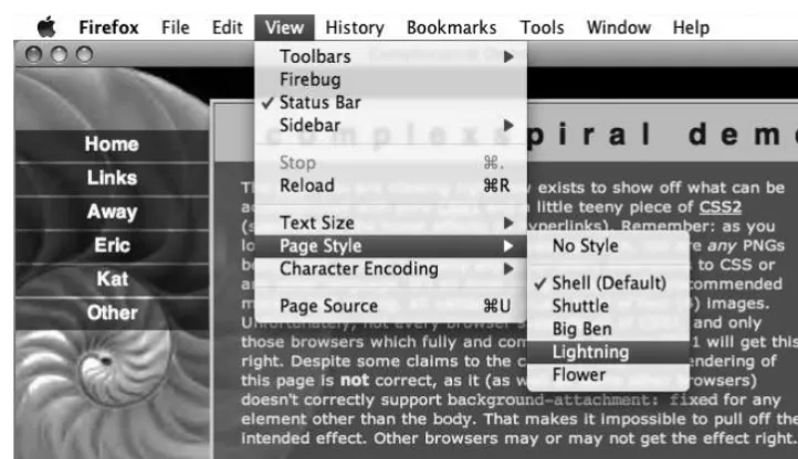
If the user selects Custom style sheets in the browser, as depicted in Figure 1.2, def_layout.css and def_colour.css will be disabled, and alt_layout.css and alt_colour.css will be enabled.
Figure 1.2: Selecting alternative style sheets in Firefox
When printing, or in print preview, print.css will be applied since it has the attribute media="print". Note that base.css will also be applied since it specifies
media="all". The other four style sheets will not be applied here, however, since they specify only screen media.
We can use the alternative style sheet feature to offer multiple viewing options from which the user can make a selection. In Eric Meyer’s Complex Spiral Demo,11 the user is able to select from one of many available alternative style sheets, as depicted in Figure 1.3.
What Is CSS?
Figure 1.3: Alternative style sheets in the Complex Spiral Demo
Using an Internal Style Sheet
The style element, which must reside within the head element of an HTML document, specifies an internal style sheet which will only apply to elements in the enclosing document:
<style type="text/css" media="screen,projection">
⋮ CSS rules…
</style>
The typeattribute is required, and should have the value "text/css"which denotes CSS styles. As in the case of external style sheets, the media attribute defaults to
"screen" if you omit it, according to the HTML4 specification, but in reality, browsers seem to apply media="all" if the attribute is omitted.
The practice of commenting out the content of <style> elements is archaic and unnecessary, since very few pre-HTML4 browsers are in regular use these days. It’s harmless in HTML, but must be avoided in XHTML—even if served as text/html—to ensure that such a document will still work when served as XML.
Here’s an example of an internal style sheet in HTML, which is hidden from ancient browsers:
<style type="text/css" media="screen,projection">
<!--⋮ CSS rules…
--> </style>
Using Inline Styles
The following inline CSS will make the font size of an unordered list 120% of what it would normally be. It will also make the text and the list bullet points dark green:
<ul style="font-size:120%; color:#060">
⋮ list items…
</ul>
Using style attributes creates a strong coupling between the content and the presentation, which is usually undesirable.
Inline CSS is more limited than internal or external style sheets. It’s not possible to specify a media type, so style attributes will apply for all media types. Also, you can’t specify inline CSS rules for pseudo-classes (p. 80) or pseudo-elements (p. 106).
If you use inline CSS, the HTML specification12 states that you must declare the style language. You can do so using a HTTP header or an equivalent <meta>element:
<meta http-equiv="Content-Style-Type" content="text/css">
In reality, browsers don’t care because the HTML specification also states that the style content type defaults to "text/css" if it’s not specified in a <meta> element or a Content-Style-Type HTTP header.
Yes, it may seem that the statements “you must declare the style language” and “the style content type defaults to "text/css" if not specified” are mutually exclusive, but the intent was only to provide a safety net. The specification recommends that authoring tools automatically generate the style sheet language information in order to avoid forcing user agents to rely on the default value. The effectiveness of this recommendation remains to be seen.
Referencing an External Style Sheet Using an XML PI
What Is CSS?
In XML documents, including XHTML served as XML, an external style sheet can be referenced using a processing instruction (PI). Such processing instructions are normally part of the XML prologue, coming after the XML declaration, but before the doctype declaration (if there is one) and the root element’s start tag.
This example shows an XML prologue with a persistent style sheet (base.css), a preferred style sheet (default.css), and an alternative style sheet (custom.css):
<?xml version="1.0" encoding="utf-8"?>
<?xml-stylesheet type="text/css" href="/base.css"?> <?xml-stylesheet type="text/css" href="/default.css"
title="Default"?>
<?xml-stylesheet type="text/css" href="/custom.css" title="Custom" alternate="yes"?>
Watch Out for Alternative Spelling
The CSS specifications use the term “alternate” instead of “alternative.” The attribute name in a PI must be alternate.
Differences Between the Methods
■ An external style sheet can’t contain SGML comments (<!-- … -->) or HTML tags (including <style>and <style>). Nor can it use SGML character references (such as ©) or character entity references (such as ©). If you need to use special characters in an external style sheet, and they can’t be represented through the style sheet’s character encoding, specify them with CSS escape notation (p. 43).
■ The content type of the style element type in HTML is CDATA, which means that character references (numeric character references or character entity references) in an internal style sheet aren’t parsed. If you need to use special characters in an internal style sheet, and they can’t be represented with the document’s character encoding, specify them with CSS escape notation (p. 43). In XHTML, the content type is #PCDATA, which means that character references are parsed, but only if the document’s served as XML.
■ Unlike in style elements, character references are parsed in style attributes, even in HTML.
Media Queries
Media queries is a CSS3 extension to media types that allows us far greater control over rendering across different devices than do media types alone. Used in
conjunction with a media type, a media query is a logical expression, evaluating to
trueor false, that tests one or more features of the output device to which the CSS is to be applied. Media queries can be used in <link> tags, XML processing instructions, the @import at-rule, and the @media at-rule. The CSS associated with the media query expression is only applied if the expression evaluates to true. A logical expression can consist of either a media feature, or a media feature followed by a colon (:) and a value—similar to a normal property/value pair. A logical expression in a media query must be enclosed in parentheses (…). Let’s look at a some examples:
<link rel="stylesheet" type="text/css" href="/style.css" media="all and (color)">
@import url(/style.css) all and (color); @media all and (color) {
⋮ one or more rule sets…
}
In the above examples, we can see media queries used in the media attribute of a <link> tag and an XML processing instruction, and with the optional media type list in @importand @mediaat-rules. In all three examples, the media query uses the expression all and (color)to indicate that the CSS should be applied to all output media that are capable of representing color.
Here’s another example that applies to hand-held devices, but only if the viewport width is at least 20em:
What Is CSS?
@media handheld and (min-width:20em) {
⋮ one or more rule sets…
}
You can use multiple expressions in a media query if you join them with the and
keyword. The following example applies the CSS if the output device is a screen-based device with a width between 800 and 1280 pixels:
@import url(/style.css) screen and (min-width:800px) and (max-width:1280px);
You can also use multiple, comma-separated media queries in a single at-rule:
@import url(/style.css) screen and (color), projection and (color);
The comma acts like an “or” keyword, so the above example will apply the CSS to color-screen or projection devices.
As you’ve seen in these examples, many of the media features can be prefixed with
Media features generally apply only for certain media types. It’s meaningless to query color capabilities for "speech"media, or to specify a width in pixels for "tty"
media—these kinds of logical expressions will always evaluate to false. The media features in Table 1.2 are listed in the latest W3C recommendation for
media queries, dated 6 June 2007.13
Table 1.2: Media Features
Description Min/Max
Value Feature
number of bits per color component yes
integer color
number of entries in the color lookup table
height of the output device yes
length device-height
width of the output device yes
length device-width
true for a grid-based device no
integer grid
height of the rendering surface yes
length height
number of bits per pixel in a monochrome frame buffer yes
scanning process of "tv"media types no
"progressive" or
"interlaced" scan
width of the rendering surface yes
length width
The device-widthand device-heightfeatures refer to the dimensions of the output device (that is, the screen size).
The width and height features, on the other hand, refer to the dimensions of the rendering surface, which is the viewport (for example, the browser window) for screen media, or the page box for print media.
Resolutions are specified using a number immediately followed by one of the units
dpi (dots per inch) or dpcm (dots per centimeter).
Aspect ratios are specified as the quotient of two integers representing width/height: for example, 16/9 or 1280/1024.
Currently, support for media queries is limited. Opera 9 has partial support,14 as
What Is CSS?
does Safari 3. Support for media queries is also appearing in browsers for other devices, such as Opera Mini 4, Opera for the Nintendo Wii,15 iPhone, and the Nokia S60 browser. Apple suggests using media queries as a way of targeting the iPhone browser,16 since, confusingly, that browser does not support the "handheld"media type.
Standards Mode, Quirks Mode,
and Doctype Sniffing
Some of the early browser implementations of CSS were fraught with problems—they only supported parts of the specification, and in some cases, the implementation of certain CSS features didn’t comply with the specification.
Today’s browsers generally provide excellent support for the latest CSS specification, even incorporating features that aren’t yet in the official specification, but will likely appear in the next version.
Due to the implementation deficiencies in early browsers, many old style sheets were written to work with the then-contemporary browsers rather than to comply
14
http://www.opera.com/docs/specs/css/
with the CSS specification. This presented a dilemma for browser vendors releasing new versions of their products that had better support for the CSS standard. While they wanted to do the right thing with properly written CSS, and display web pages according to CSS standards, this had the potential to make a mess of millions of existing web pages whose CSS didn’t comply with the CSS specification.
The solution was to have the browser make an educated guess as to whether the current document seemed to be modern or old-school, and then choose the appropriate rendering mode. The basis for this guesswork was the presence, or absence, of an SGML document type declaration (or doctype declaration) in the markup. A doctype declaration contains the name of the document’s root element, and usually, a reference to the document type definition (DTD), which contains the syntactic rules for the markup language used in the document. Web browsers had so far ignored the doctype declaration, which was mainly intended for markup validators.
The process by which a browser chooses a rendering mode based on the doctype declaration is known as doctype sniffing (or doctype switching), and was first implemented in Microsoft Internet Explorer 5 for Mac OS. Today, doctype sniffing is also used in Opera (7 and later), Firefox and other Gecko-based browsers, Safari, Internet Explorer 6 and 7, and Konqueror (3.2 and later).
If the browser decides that the document is modern, it’ll render it in standards mode. This means that, as a rule, CSS is applied in accordance with the CSS2 specification.
If the browser decides that the document is old-school, it’ll render it in quirks mode. This mode applies CSS in the quirky way that suited predecessors of that browser, or even of other browsers. The exact implementations of quirks mode differ between browsers.
Opera (7.5 and later), Firefox, and Safari also have a third mode, called almost standards mode,17 in which the layout of images in table cells is implemented as in quirks mode, rather than in accordance with the CSS2 specification. In every
other respect, this mode is equivalent to standards mode. Almost standards mode was added so that the old-school method of aligning images split across table cells is more likely to render as the authors intended, and not to fall apart. This mode corresponds to standards mode in Internet Explorer 6 and 7, Internet Explorer 5 for Mac OS and OS X, Konqueror, and Opera versions prior to 7.5. These browsers do not implement vertical alignment in table cells in compliance with the CSS2 specification, so their standards mode is really an almost standards mode.
Doctype sniffing is only undertaken for documents served with a MIME type of text/html. The specification of any XML MIME type, including
application/xhtml+xml, automatically triggers standards mode (see MIME Types
(p. 411) for more details).
How Does it Work?
So how does doctype sniffing work? Which declarations trigger standards mode, quirks mode, and almost standards mode? The document type definition reference, for HTML and XHTML, consists of the string PUBLIC followed by a formal public identifier (FPI), optionally followed by a formal system identifier (FSI), which is the URL for the DTD.
Here’s an example of a doctype declaration that contains both an FPI and an FSI:
<!DOCTYPE html PUBLIC "-//W3C//DTD HTML 4.01//EN" "http://www.w3.org/TR/html4/strict.dtd">
This example contains only the FPI:
<!DOCTYPE html PUBLIC "-//W3C//DTD HTML 4.01 Transitional//EN">
Doctype sniffing works by detecting which of these parts are present in the doctype declaration. If an FPI is present, but an FSI isn’t, browsers generally choose quirks mode, since this was the common way of writing doctype declarations in the old days. Browsers also choose quirks mode if the doctype declaration is missing altogether—which used to be very common—or is malformed.
If both an FPI and a correct FSI are present, browsers with two layout modes choose their standards mode. Browsers with three layout modes will examine the DTD reference before committing to a choice. Generally, the DTDs for HTML 4.0 Strict, HTML 4.01 Strict, and XHTML 1.0 Strict trigger standards mode. The corresponding Transitional DTDs trigger almost standards mode for a text/html MIME type.
Internet Explorer 6 uses a very primitive form of doctype sniffing, which presumes that the doctype declaration is the very first line in the document. An SGML comment before the doctype declaration will trigger quirks mode, as will an XML declaration before an XHTML doctype—even XHTML 1.0 Strict. The following declaration will trigger quirks mode in IE6 (but not IE7) if served as text/html:
<?xml version="1.0" encoding="utf-8"?>
<!DOCTYPE html PUBLIC "-//W3C//DTD XHTML 1.0 Strict//EN" "http://www.w3.org/TR/xhtml1/DTD/xhtml1-strict.dtd">
For more detailed information about doctype sniffing, including a table of which doctypes trigger specific rendering modes in different browsers, see
http://hsivonen.iki.fi/doctype/.
Summary
Using cascading style sheets is the recommended way to control the presentation of web pages. It allows the presentation layer to remain separate from the content and behavior layers, which makes site maintenance much easier and reduces bandwidth usage.
One or more external style sheets can be attached to an HTML page via linkelements or @importrules. A page can also include internal style sheets within styleelements. XML pages can be linked to external style sheets via processing instructions. Finally, styling can be specified for an HTML element via its style attribute, but this approach isn’t recommended.
A style sheet or group of style sheets can be persistent, preferred, or alternative, and chosen as such by the user through a browser that supports alternative style sheets.
Some browsers apply CSS rules in two or three different modes: standards mode, almost standards mode, and quirks mode. The choice of rendering mode is made through the process of doctype sniffing.
For all intents and purposes, the current CSS specification is CSS2.1. Some modern browsers implement a few features from the CSS3 working drafts, but currently those features cannot be relied upon for anything other than experimental use.
2
General Syntax and Nomenclature
In this section, we’ll describe the building blocks of a CSS style sheet and the correct syntax for each part. We’ll also define the unavoidable jargon we’ll use throughout this reference. When everyone uses the same term for the same thing, communication is usually easier and less error prone.
CSS syntax is not rigid: whitespace can usually be added freely between tokens, and line breaks have no semantic value.
CSS is case insensitive in all matters under its control. However, some things lie outside the control of CSS and these may or may not be case sensitive, depending on external factors such as markup language and operating system.
Element type names, for instance, are case insensitive for HTML but case sensitive for XML (including XHTML served as XML). Font names, with the exception of the generic font family CSS keywords, may be case sensitive on some operating systems.
Gener
al Syntax and
Nomenclatur
Disambiguating the Nomenclature
In order to name the various items that make up CSS syntax, let’s consider the example in Figure 2.1.
Figure 2.1: Sample CSS syntax
The example begins with a comment (p. 42):
/* A sample style sheet */
The comment is followed by two statements (p. 25). The first statement is an at-rule
(p. 25):
@import url(base.css);
The second statement is a rule set (p. 26):
h2 {
color: #666;
font-weight: bold; }
The rule set consists of a selector (p. 26) (the text before the left curly brace, {) and a declaration block (p. 28) (delimited with the curly braces, {}). The block contains two declarations (p. 28) separated by semicolons:
color: #666;
Each declaration includes a property name and a value, separated by a colon.
Statements
A CSS style sheet is composed from a list of statements. A statement is either an
at-rule (p. 25) or a rule set (p. 26). The following example has two statements; the first is an at-rule that is delimited by the semicolon at the end of the first line, and the second is a rule set that is delimited by the closing curly brace, }:
@import url(base.css); h2 {
color: #666;
font-weight: bold; }
At-rules
An at-rule is an instruction or directive to the CSS parser. It starts with an
at-keyword: an @ character followed by an identifier (p. 43). An at-rule can comprise a block delimited by curly braces, {}, or text terminated by a semicolon, ;. An at-rule’s syntax will dictate whether it needs a block or text—see At-rules Reference
(p. 47) for more information.
Parentheses, brackets, and braces must appear as matching pairs and can be nested within the at-rule. Single and double quotes must also appear in matching pairs.
Here’s an example of an at-rule that requires a block—the @media (p. 51) at-rule:
@media print { body {
font-size: 12pt; }
}
Here’s an example of an at-rule terminated by a semicolon—the @import (p. 49) at-rule:
Gener
al Syntax and
Nomenclatur
@import url(base.css);
Rule Sets
A rule set (also called a rule) comprises a selector (p. 26) followed by a declaration block (p. 28); the rule set applies the declarations listed in the declaration block to all elements matched by the selector.
Here’s an example of a rule set:
h2 {
color: #666;
font-weight: bold; }
Selectors
A selector comprises every part of a rule set (p. 26) up to—but not including—the left curly brace {. A selector is a pattern, and the declarations (p. 28) within the block that follows the selector are applied to all the elements that match this pattern. In the following example rule set, the selector is h2:
h2 {
color: #666;
font-weight: bold; }
This selector—which is comprised of a single simple selector—will match all elements of type h2 in an HTML document. A simple selector can either be an
element type selector (p. 62) or the universal selector (p. 60), (*), optionally followed by attribute selectors (p. 67), ID selectors (p. 65), or pseudo-classes (p. 80).1 A selector can comprise a number of simple selectors separated by combinators (p. 73),
1 Note that in CSS3, simple selectors are defined slightly differently than they are in CSS2.1. See
but it can contain only one pseudo-element (p. 106), which must be appended to the last simple selector in the chain.
Here’s a more complex selector:
h2+p.warning:first-line { color: #666;
font-weight: bold; }
This selector consists of two simple selectors separated by an adjacent sibling combinator (p. 77) (the +character), and a pseudo-element (:first-line). The first simple selector (h2) is a type selector. The second simple selector contains a type selector (p) and an attribute selector (p. 67)—in this case, a special form of attribute selector called a class selector (p. 63), which will match HTML class attributes containing the word “warning.”
As such, the selector above would match the first line of text within any p element that has a class attribute value of "warning" and is an adjacent sibling to an h2 element.
Finally, two or more selectors can be grouped, separated by commas (,); the declaration block that follows applies to both selectors. Consider these two rules:
#main ol {
margin-left: 2em; }
#main ul {
margin-left: 2em; }
They can be grouped like this:
#main ol, #main ul { margin-left: 2em; }
You can read about selectors in detail in the selector reference section (p. 59).
Gener
al Syntax and
Nomenclatur
Declaration Blocks
Declaration blocks begin with a left curly brace, {, and end with a right curly brace,
}. They contain zero or more declarations (p. 28) separated by semicolons:
h2 {
color: #666; }
A declaration block is always preceded by a selector (p. 26). We can combine multiple rules that have the same selector into a single rule. Consider these rules:
h2 {
color: #666; }
h2 {
font-weight: bold; }
They’re equivalent to the rule below:
h2 {
color: #666;
font-weight: bold; }
Although the last semicolon within a declaration block is optional, it’s good practice to include it, as it’ll help you avoid syntax errors in the future. As you start to add declarations to a block, it’s all too easy to forget the semicolon.
Declarations, Properties, and Values
A declaration is made up of a property name and a value, separated by a colon; whitespace characters can appear around any of these elements. A declaration must appear within a declaration block (p. 28), like so:
h2 {
There’s a large collection of property names that we can use in our style rules. Syntactically, they are in fact CSS identifiers (p. 43), and must be specified correctly, otherwise the declaration will be ignored. Property values can be specified in various forms, depending on the property in question—each property has its own syntactic and semantic requirements and restrictions. Values can be expressed as keywords
(p. 29), strings (p. 37), colors (p. 33), numbers (p. 37), lengths (p. 29), percentages
(p. 32), and URIs (p. 38).
Keywords
Many CSS property values can be specified as keywords. A keyword is an identifier
(p. 43), and it mustn’t be surrounded by quotation marks. So the correct syntax is
background-color: yellow;, whereas background-color: "yellow"; is an error. See the definition of each property for information about which keywords, if any, it allows.
Lengths and Units
The value type for many CSS properties is specified as <length>.2 A length is a measurement comprising a numeric value and a unit only—whitespace can’t appear between the number and the unit.
The numeric value can be either an integer or a real number. If the numeric value is 0, the unit can be omitted (after all, zero pixels is the same measurement as zero millimeters).3 But if the value isn’t zero, the unit must be specified.4
The units in which length is measured can be either relative or absolute, but an absolute unit is useful only if the physical properties of the output medium are known.
2 http://www.w3.org/TR/CSS21/syndata.html#length-units
3
It could even be argued that the unit should be omitted if the number is 0.
4 The line-height property can take a non-zero, unit-less value, but it’s not a value of the type
<length>.
Gener
al Syntax and
Nomenclatur
Relative Units Explained
The three possible relative units are listed in Table 2.1.
Table 2.1: Relative Units
Description Unit
the current font size em
the x-height of the current font ex
pixels px
The em and ex units depend on the font size that’s applied to the element.
A measurement of 1em is defined as being equal to the font size, however that may be defined. When we specify a font size in em, 1em is equal to the inherited font size—that is, the size the text would have had if we hadn’t changed it. As such,
font-size:1.2em; makes the text 1.2 times larger than the parent element’s text. This unit’s name is a centuries-old legacy from the typographic world, where an M-square or “mutton square” was a blank, square type whose sides’ length was equal to the width of an uppercase M—usually the widest character—in that font.
The exunit is equal to the x-height of the current font, which is normally the height of a lowercase x, as depicted in Figure 2.2. Interestingly, an x-height is defined even for fonts that don’t include a lowercase x.
Figure 2.2: Font size and x-height
of pixel measurements,5 but the bottom line is that a pixel is relative to the viewing distance. A standard pixel is 0.26mm (1/96 inch) square.
On an LCD computer monitor, or similar device, a pixel is usually the smallest area that can be rendered. On high-resolution output devices, such as laser printers or photosetters, pixels must be rescaled by the user agent so that, for example, a one-pixel border is approximately as wide on paper as it is on a computer screen. As such, pixel measurements are relative to the device on which the document is reproduced.
Note that pxunits must not be used for a tty media type (for instance, character-grid devices).
Pixels and Accessibility
The classification of pixels as relative units has nothing to do with the concept of relative units as it’s defined in the Web Content Accessibility Guidelines (WCAG) 1.0,6 where “relative” means that web page elements can scale easily to meet the needs of the user—for example, changing the text size in the browser, or changing the size of the browser window. In WCAG terms, pixels are absolute, as you can’t change the size of a pixel from within your browser.
Absolute Units Explained
Table 2.2 identifies the five absolute units that are available to us.
Table 2.2: Absolute Units
Gener
al Syntax and
Nomenclatur
e
Description Unit
millimeters mm
centimeters cm
inches in
Description Unit
points pt
picas pc
Millimeters and centimeters are defined in the SI standard.7 Inch measurements are now used mainly in the United States. One inch measures 25.4mm.
A point is an old typographic measurement, but multiple standards were used for points in print, and the Didot point used in continental Europe was slightly larger than the point used in Britain and America. In CSS, one point is defined as 1/72 inch (0.353mm), just as it is in PostScript.
A pica is equal to 12 points, just as it is in typography, which translates into 1/6 inch or 4.23mm in CSS.
Physical (absolute) units shouldn’t normally be used for on-screen display. A font size specified as 7pt may be readable (albeit barely) at nine pixels on a 96dpi Windows system, but it will display at an illegible seven pixels on an older 72dpi Mac system.
In a similar vein, pixels shouldn’t usually be used when you’re specifying styles for print media. Although user agents are expected to rescale pixels if necessary, pixels don’t make sense on high-resolution devices.
Percentages
A percentage is an integer, or a decimal number, followed by a percentage character (%). Whitespace characters mustn’t appear between the number and the %. For example, here’s a width declaration that uses a percentage value:
#example { width: 50%; }
A percentage value is, by its nature, relative to something else. The interpretation of percentages differs between CSS properties, so you’ll have to use the reference to find the specific property you’re dealing with, and to identify what its stated percentage value means. In some cases, the interpretation of percentage values can be quite unexpected; for example, vertical padding refers to a percentage of the width—not height—of the containing block.
Colors
Color values can be represented in several different ways in CSS.
Hexadecimal Notation
Hexadecimal RGB (red, green, blue) notation is perhaps the most common format. It consists of a # character followed by three or six hexadecimal digits. When six digits are provided, the first pair represents the red value, the second pair represents the green value, and the last pair represents the blue value: #rrggbb. A value with three digits represents the corresponding six-digit value where each digit occurs twice; thus #09f is the same as #0099ff (red=00, green=99, blue=ff).
Decimal Notation
We can also write a color value with decimal functional notation—rgb(0, 160, 255) or rgb(0%, 63%, 100%)—where the order of the arguments is red, green, and blue. Using the first form, 255 corresponds to 100%. Values outside the valid range (0–255 or 0%–100%) are automatically changed to the corresponding limit.
CSS3 makes a few extra functional notations available:
■ rgba(0, 160, 255, 0.2) for RGBA colors; the fourth argument is the alpha opacity and accepts a value from 0 to 1
■ hsl(240, 100%, 50%) for HSL colors (hue, saturation, luminosity)
■ hsla(240, 100%, 50%, 0.2) for HSLA colors (hue, saturation, luminosity, alpha)
Gener
al Syntax and
Nomenclatur
At the time of writing, these three notations were supported only by the Gecko8 and WebKit9 rendering engines.
Keywords
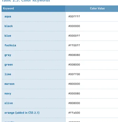
Colors can also be represented by the keywords listed in Table 2.3.
Table 2.3: Color Keywords
Color Value Keyword
#00ffff aqua
#000000 black
#0000ff blue
#ff00ff fuchsia
#808080 gray
#008000 green
#00ff00 lime
#800000 maroon
#000080 navy
#808000 olive
#ffa500 orange (added in CSS 2.1)
#800080 purple
#ff0000 red
Color Value Keyword
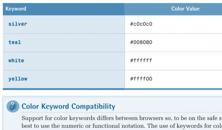
#c0c0c0 silver
#008080 teal
#ffffff white
#ffff00 yellow
Color Keyword Compatibility
Support for color keywords differs between browsers so, to be on the safe side, it’s best to use the numeric or functional notation. The use of keywords for colors is also disallowed by the Web Content Accessibility Guidelines (WCAG) 1.0.10
Finally, you can use the keywords listed in Table 2.4 to specify system
colors—various colors that are used by the operating system and/or window manager, and can be applied when you want to create a “native application” look and feel.
Table 2.4: System Colors
Description Keyword
the desktop background color Background
the face color for 3D elements ButtonFace
the highlight color for 3D elements ButtonHighlight
the shadow color for 3D elements ButtonShadow
the text color on buttons ButtonText
the color of captions, scrollbar arrows, etc. CaptionText
Gener
al Syntax and
Nomenclatur
e
Description Keyword
the color of disabled text GrayText
the color of selected items in a control Highlight
the text color in selected items HighlightText
the border color of an inactive window InactiveBorder
the caption color of an inactive window InactiveCaption
the color of text in an inactive caption InactiveCaptionText
the background color in tooltips InfoBackground
the text color in tooltips InfoText
the menu background color Menu
the menu text color MenuText
the color of the scrollbar “trough” Scrollbar
the dark shadow color for 3D display elements ThreeDDarkShadow
the face color for 3D display elements ThreeDFace
the highlight color for 3D display elements ThreeDHighlight
the light shadow color for 3D display elements ThreeDLightShadow
the dark shadow color for 3D display elements ThreeDShadow
the window background color Window
Description Keyword
the color of text in windows WindowText
Note that even though the keywords are case insensitive, they’re presented here as they are in the CSS2.1 specification, for maximum readability.
System Color Keyword Compatibility
The support for these keywords is even less reliable than that provided for the “regular” color keywords. You should test your document extensively—in different browsers and different operating systems—if you use them.
Numbers
A number can be specified either as an integer or a real number (one that contains a decimal point), and can have an initial -or + to indicate its sign. Numbers can only be specified in decimal notation. For example, here’s a line-heightdeclaration that uses a number value:
#example {
line-height: 1.5; }
Strings
Gener
al Syntax and
Nomenclatur
e
A string value must be enclosed in double or single quotes. So, to include a quote inside a string, you’ll need to escape it with a backslash character, like so:
ol#breadcrumbs:before {
content: "You are \"here\": "; }
html {
Of course, it’s often easier to use the opposite quotation character around the string—if you need a double quote inside the string, surround the whole string with single quotes, and vice versa:
ol#breadcrumbs:before {
content: 'You are "here": '; }
html {
font-family: "Grey's Bold",serif; }
If you want a string to contain characters that can’t easily be typed from the keyboard, characters that can’t be expressed in the style sheet’s character encoding, or non-printable characters, you can represent those characters using CSS escape notation (p. 43).
Note also that a string value in CSS can’t contain a literal new line. If you need to include a new-line character inside a string value, use a character escape (\a ).
URIs
URI values are expressed with a functional notation that, for historical reasons, is named url.11 A URI is expressed using the following syntax: url(URI). For example, here’s a background-image declaration that specifies the URI of an image file:
#example {
background-image: url(images/bg.gif); }
The argument for URI is a string that may be enclosed in quotes; if you choose to use quotes, they may be double or single quotes.12 Certain characters appearing in an unquoted URI value—whitespace characters, single and double quotes,
parentheses, and commas—must be escaped with a backslash. In some types of
11 In the beginning, web addresses were called Uniform Resource Locators (URL). Later, something
called Uniform Resource Name (URN) was added. A Uniform Resource Identifier (URI) is a URL or a URN.
12 Some browsers, like Internet Explorer 5 for Mac, don’t support single quotes in url(
URIs, you can also replace these characters with URI escape sequences; for example, you can use %20 to replace a space character.
Relative URIs
Relative URIs are relative to the style sheet, not to the HTML document that links to the style sheet.
Initial Values
The default value for a property, when it’s not specified explicitly or inherited, is called the initial value. The initial value of each property is defined in the CSS specification.
Browsers have user agent style sheets that define the default rendering of the various HTML element types. In some cases, the rules in those built-in style sheets define values other than the initial values from the CSS specification. For example, links are usually underlined, even though the initial value for the text-decoration property is none.
You can read more about these topics in The Cascade, Specificity, and Inheritance
(p. 117).
Shorthand Properties
Some properties can be combined into shorthand notation—a notation that allows us to specify values for related properties in a single declaration.
Shorthand for Box Properties
One form of shorthand notation allows us to specify values for two, three, or four sides of a box simultaneously, like this:
margin: 1em 2em 3em 4em;
That declaration is equivalent to these:
Gener
al Syntax and
Nomenclatur