Photoshop Masking & Compositing
Second Edition
Katrin EISMANN
Photoshop Masking & Compositing, Second Edition Katrin Eismann, Seán Duggan, and James Porto New Riders
1249 Eighth Street Berkeley, CA 94710 510/524-2178
510/524-2221 (fax)
Find us on the Web at: www.newriders.com
To report errors, please send a note to [email protected]
New Riders is an imprint of Peachpit, a division of Pearson Education. Copyright © 2013 by Katrin Eismann, Seán Duggan, and James Porto Acquisitions Editor: Nikki Echler McDonald
Interior Design: Charlene Charles-Will, Kim Scott/Bumpy Design Indexer: FireCrystal Communications
Notice of Rights
All rights reserved. No part of this book may be reproduced or transmitted in any form by any means, electronic, mechanical, photocopying, recording, or otherwise, without the prior written permission of the publisher. For information on getting permission for reprints and excerpts, contact
[email protected]. Notice of Liability
The information in this book is distributed on an “As Is” basis without warranty. While every precaution has been taken in the preparation of the book, neither the authors nor Peachpit shall have any liability to any person or entity with respect to any loss or damage caused or alleged to be caused directly or indirectly by the instructions contained in this book or by the computer software and hardware products described in it.
Trademarks
Adobe, Lightroom, and Photoshop are registered trademarks of Adobe Systems Incorporated in the United States and/or other countries. All other trademarks are the property of their respective owners.
Many of the designations used by manufacturers and sellers to distinguish their products are claimed as trademarks. Where those designations appear in this book, and Peachpit was aware of a trademark claim, the designations appear as requested by the owner of the trademark. All other product names and services identified throughout this book are used in editorial fashion only and for the benefit of such companies with no intention of infringement of the trademark. No such use, or the use of any trade name, is intended to convey endorsement or other affiliation with this book.
9 8 7 6 5 4 3 2 1
For Mark Beckelman—friend, artist, Photoshop fanatic, talented photographer, dedicated family man, and generous teacher. You are valued, remembered, and missed a great deal.
—Katrin Eismann
To all the teachers, students, and fellow artists who have taught me so much in my creative journey. The path we choose to follow may not always be clear, but it is rich with wonderful discoveries.
—Seán Duggan
For my wife, Beth, and sons, Cole and Dylan, for all their support. And for all the people and opportunities that have enabled me to create a life doing what I love—making images. I’m deeply grateful.
Acknowledgments
We’ve heard it over and over again: “Oh you can fix that in Photoshop” or “Just Photoshop it.” Anyone who has ever had that cavalier attitude of being able to quickly change this or move that in Photoshop quickly regrets it because what seems like a quick fix turns into hours of work. We’ve also heard, “I have a great idea for a book” or “You should write a book.” Although the bookstores and Amazon pages may be full of books, writing a book is never a quick, easy, or painless undertaking to take a germ of an idea and turn it into a 500-plus-page book. Most important, writing a book is not the romantic undertaking of a lone author toiling away to create a masterpiece. Conceptualizing, planning, writing, reviewing, editing, proofing, designing, formatting, printing, and delivering a final product requires a dedicated team of talented people who may never meet face to face but have one goal in mind—to create a valuable, useful, and in this case inspiring book that will help you understand and master the finest details of masking and compositing with Adobe Photoshop.
Our thanks and gratitude goes out to a variety of people, including:
• Our families who rolled their eyeballs and muttered, “no more books” as they brought us yet another cup of coffee or a piece of chocolate to keep us going. Thank you, John McIntosh, Katrin’s smarter half; Anna and Fiona, Seán’s inspiration and support; and Beth, Cole, and Dylan, Jim’s raison d’etre.
• The fabulous Peachpit development staff who had their hands full with us! Katrin’s teaching obligations often pushed writing into the weekends; Seán’s workshop and travel schedules kept him offline for days at a time; and Jim’s photography business often required complete dedication, meaning that our acquisitions editor Nikki McDonald and Development Editor Anne Marie Walker often had to resort to not-soveiled threats of wet noodle whippings to get us to make our deadlines. Both Nikki and Anne Marie were always professional, dedicated, and unrelenting in their support for this project. Thank you!
• The Peachpit design and production staff—thank you for making these pages so elegant and well designed. Specifically, über production editor Lisa Brazieal, cover designer Charlene Charles-Will, and compositor Kim Scott of Bumpy Design for all of their long hours put into these pages. We very much appreciate you taking into account our nondesigner opinions. • The artists, photographers, students, and image makers that allowed us to feature their images,
techniques, and insights. Your point of view and talent make this book richer and more inspiring.
• Our Technical Editor Wayne (Option-click [Alt-click]) Palmer. Knowing that you read the text and tried out all of the exercises helped us avoid many errors and inconsistencies.
• Thank you to Julieanne Kost for a wonderful Foreword and inspirational teaching; Candace Dobro for helping Katrin with photo compositing history research; and the dedicated staff, product managers, and senior engineers at Adobe Systems: Russell Brown, Jeff Chien, Chris Cox, Cari Gushiken, John Nack, Bryan O’Neill Hughes, Jeff Tranberry, and Gregg Wilensky. We don’t really understand how you do what you do, but we love what you allow us to do with Adobe Photoshop!
As Winston Churchill said, “Writing a book is an adventure. To begin with it is a toy and an
There is no way we could have completed this project without a large group of people who deserve a great deal of thanks, gratitude, and more thanks.
Contents at a Glance
Contents
Artist in the First Person: Jerry UelsmannAnalog to Digital History
Artist in the First Person: Fran Forman
Color Temperature
Artist in the First Person: Jim Huibregtse Matching Multiple Light Sources
5 Perspective, Point of View, and Scale Basic Principles of Lenses
Artist in the First Person: Giselle Behrens Exaggerated Scale
Skills: Selections & Masking
Artist in the First Person: Tommy Ingberg The Quick Selection Tool
Controlling Color Range Focus and Preview Size Fuzziness
Selections with Color and Tonal Presets Artist in the First Person: Bojune Kwon
Merging and Discarding Layers
Artist in the First Person: Brigitte Carnochan The Price of Layers
Turning a Layer Mask into a Selection
Moving and Copying a Layer Mask to Another Layer Disable/Enable a Layer Mask
Linking and Unlinking Layer Masks Applying a Layer Mask
The Properties Panel
Modifying Masks with Levels and Curves Modifying Masks with Filters
Artist in the First Person: David Julian Masking with Layer Groups
Artist in the First Person: Viktor Koen Dimensional Shading
Working with White, Black, and Gray Backdrops Masking on White with Multiply
Masking on Gray with Overlay or Hardlight Masking on Black with Screen
Working with Refine Edge
Greenscreen and Bluescreen Techniques Bluescreen and Greenscreen Photography
Working with Digital Anarchy Primatte Chromakeyer Greenscreen with Adobe Camera Raw
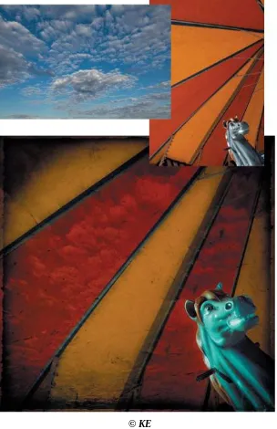
Artist in the First Person: Mark Beckelman Masking Smoke
Artist in the First Person: Julieanne Kost Concept and Story
Matching Image Characteristics
Foreword
There is a well-known saying that compares painting to photography: Painters include and
photographers exclude. Painters begin with a blank canvas and decide what elements to add to create their interpretation of the scene; every brush stroke and mark on the canvas are gestures of their hand and have a reason for being there. Photographers start with a scene from the world in front of the lens that is often chaotic and visually cluttered, and through conscious composition, they decide what to exclude until the scene is just how they want it.
Although the source material begins as photographs, creating a composite image has much in common with painting. Everything in the image has a purpose, which is to build the story of the scene and create the message you want to communicate. The conscious arrangement of these elements, combined with a unified color and a tonal and textural palette, all help to bring the different elements together into a single image.
Compositing allows me to create an image that doesn’t exist in reality. The collage process lets me explore ideas and concepts that would be difficult, if not impossible, for me to portray with a straight photograph. A good composite is like an intriguing doorway, partly open—an invitation to viewers to come inside and see what they can find. When you view a composite, you pick up a conceptual thread left by the artist and follow it to see where it leads.
Creating composites on the computer requires not only a creative vision, but also the technical knowhow needed to implement that vision. This book provides the reader with the necessary technical foundation of the essential techniques and considerations required for masking and compositing in Adobe Photoshop. Katrin Eismann, Seán Duggan, and James Porto are dedicated photographers, artists, and educators. They’ve been compositing images for many years and have learned how to master the digital tools so that the technical part of the process doesn’t get in the way of their creative vision. Whether you want to create composites yourself or are shooting the source images and having someone else do the
compositing, this book is an ideal guide for anyone who wants to learn the art of combining different images together.
Photoshop Masking & Compositing is certain to broaden your horizons as to what is possible when more than one photograph is combined into a new image. With the techniques covered in these chapters, you can learn to create your own composites that will become those intriguing invitations to explore—those
delicate conceptual threads to leave for others to discover and follow as they view your images. —Julieanne Kost
Introduction: Concept, Craft, Vision
We photograph to explore. Each time we raise a camera to our eyes, we see two worlds, our interior world and of course the exterior world that the camera lens is focused on. We photograph what catches our eye; what is important to us; the ideas and questions we are trying to express and resolve; and in many cases what a client is paying us to photograph. Each person has a unique point of view, and even if we were all in the same place at the same time with the identical camera and lens combination, what we each perceive, frame, and create would be uniquely different.
We work with Photoshop to refine and deepen our exploration of our imagination, to create, and to make the unreal very real. Being a visual artist requires you to see (not look), be honest (not cynical), be curious (not stubborn), and be open to exploration, learning, making mistakes, and starting over again. Being a visual artist involves showing the world what is important to you, and with each image you are portraying yourself.
Collaboration and Update
The first edition of this book was released in October 2004, and as you know, Photoshop has been updated and improved upon at a geometric rate since then. What took hours of work in 2004, such as pulling a fine-detailed mask can now be accomplished in a few minutes with the Refine Edge controls. But one thing remains the same—visual talent requires time and practice to develop confidence and skills. On that note, I asked and was greatly thankful that Seán Duggan and James Porto agreed to collaborate with me on updating this book. Seán, who is an outstanding educator and fine artist, concentrated on the “Creative Compositing” and many “Essential Skills” chapters. Jim, who brings decades of photographic and commercial experience, focused on the “Photography,” “Lighting,” and “Photorealistic” chapters. I had the pleasure to write the “Art of Compositing” chapter and then delve into the finer points of the “Channels” and “Fine-edged Masking” chapters. In all honesty, I would not have updated this book
without Seán and Jim, and I owe them more thanks than I can ever express. They both put many more long nights and countless weekends into this book than they had imagined they would. I’m sure that there is an effigy doll full of pins in it that bears an uncanny resemblance to me on their desks. Ouch and thank you!
Is this Book Right for You?
This book is right for you if you enjoy working with photographs, and have ideas to express and explore by combining multiple images. This book is right for you if you’re excited by the possibility of staying up late at night to finesse a perfect mask or to combine images in new and unusual ways. Masking and
compositing requires flexibility and dedication: There is no “make great art” button on your keyboard, and it often takes a few attempts and approaches to get an image right.
This book is not for you if you don’t have the time, curiosity, or patience to read through the examples, try them out, and then—just as we push our students—take the techniques further by applying them to your own images.
You have three ways to learn the techniques in this book: • By reading the examples and looking at the images.
• By downloading the images from www.peachpit.com/pmc2e, and with the book in hand, re-creating our steps.
at that moment, when you are working with your own images, that you’re really learning how to mask and composite.
This is not an introductory book. To get the most out of it, you should be comfortable with the fundamentals of Photoshop, know where the tools are and what they do, and know how to execute
common tasks, such as how to activate a layer or color balance an image. We all tried to write a book that we would want to buy or that would interest intermediate and advanced Photoshop users who are looking for indepth and challenging learning materials.
As you flip through the book, you’ll see that all of our screen captures were taken on an Apple computer. If you’re a Windows user, don’t let that deter you from this book. Photoshop functionality, for the greatest part, is identical on the Macintosh and Windows platforms. All the features discussed in the book are available on both platforms, and the interface is nearly identical. When offering keyboard shortcuts, we give you both Macintosh and Windows commands. The command for Macintosh appears first, followed by the command for Windows, which appears in parentheses, like this: Command+Option+X
(Ctrl+Alt+X).
The Structure of the Book
Creating art is part craft and part imagination—one without the other gives you lifeless and banal results. With this book, we address both—sometimes with words, but many times more quietly and effectively by featuring images created by professional photographers, creative artists, and a number of our students. We are fortunate that they trust us with their work and that we all can benefit from the insights and talent that the images reveal. New to this edition of the book is the “Artist in the First Person”—a double-page interview featuring one artist, photographer, or illustrator’s images and insights.
This book should really be called Photoshop Vision, Photography, Selections, Masking, and
Compositing, but that title would be too long to fit on the spine of the book! However, the four sections of the book reflect how important and interrelated creative vision, photography, selections, masking, and compositing really are:
Part 1—Inspire: Seeing & Creating
Part 2—Expose: Photography for Compositing Part 3—Skills: Selections & Masking
Part 4—Projects: Putting It All Together
The first part of the book addresses the history of compositing and the creative process. The second part of the book focuses on the photographic issues of planning, composing, lighting, and completing the
photography of source materials and environments. The better the initial photography, the more successful the final composite will be. The third section bursts with Photoshop information and techniques on
selections, layers, layer and channel masking, and maintaining fine details. The final part of the book is divided into two chapters—“Creative Compositing” and “Photorealistic Compositing,” and even if you prefer one type of composite over the other, we recommend that you don’t skip a single page, because the same skill or technique can be used to work on and create a wide variety of images.
Each chapter starts with a brief overview of what is covered in the chapter. We always start with a straightforward example that leads to more advanced examples. You may be tempted to jump to the more advanced sections right away, but we don’t recommend it. The introductory examples serve as the
foundation for the advanced examples, building on the same tools and techniques.
juxtaposing, and blending images to express new ideas and explore new worlds.
We used the latest version of Photoshop CS6 when writing this book. If you are working with earlier versions, you will still learn a lot, because the most important tools for masking and compositing—layers, alpha channels, and blending modes—are a part of previous versions. And this book will also be useful long after the next release of Photoshop.
Tutorial Files and Pen Tool Chapter
Please visit and bookmark www.peachpit.com/pmc2e to download the tutorial images. Many chapters have up to 12 JPEG images that you can download to work and learn along with as you read the book. Posted images are signified by an icon and a name in the book, such as
ch10_hulagirl.jpg
Note
The images on the book’s companion website are for your personal use and should not be distributed by any other means. If images are not posted on the website, it means that we do not have the copyright permission to post them and therefore cannot legally make them available.
Many of the images in the book originated from our own image and photography collections. The
copyright of all images used in the book and posted on the website remains with the originator, as noted throughout the book.
For those specific images that we didn’t have permission to post on the book’s website, we recommend that you use similar images from your own photo collections to follow along. Although you won’t be using the exact image we used, the issues being addressed are so universal that we’re sure you’ll be able to learn the techniques using your own images. After all, you’ll probably be branching out to your own images sooner rather than later.
Due to page count and print quality, we opted to update and post the “Pen Tool Power” chapter on the book’s website at www.peachpit.com/pmc2e. The PDF is laid out exactly like the book, and we hope it allows you to call the Pen tool a friend, not your foe!
Note to Educators
This book was built around the techniques that we have taught over the years to the numerous students in our digital- and creative-imaging classes. We hope that this book can help you teach Photoshop, and that the examples and images we have provided will help you learn and demonstrate the concepts and
techniques of masking and compositing. As teachers, we’re sure you know how much time and work is involved in creating exercises and preparing materials that fulfill all the needs of a classroom. We ask that you respect our work and the work of the many contributors and imaging professionals featured in this book by not copying pages of the book, distributing any images from the website, or otherwise
reproducing the information, even if paraphrased, without proper attribution and permission. Of course, if students own their own copies of the book, they can freely download and use images from the website in the classroom.
Closing Thoughts
and express your own images. We would love to hear from you. Please email your comments about the book and show us how you’ve taken the techniques in these pages and gone further with them.
Inspire:
Seeing
&
Creating
Chapter 1. The History of Compositing
Artists have been combining drawings, photos, paintings, remnants, and found objects for centuries. The digital tools and techniques that this book describes are an important addition to the practice of
envisioning, combining, and discovering images that uniquely express the subconscious and conscious. No one lives in a vacuum, least of all artists whose eyes and very beings thrive on viewing images and exploring ideas for substance and inspiration.
As artists and educators, you appreciate the importance of understanding the history, terminology, and contemporary practices of the art form in which you are a part. For example, you enjoy visiting
contemporary art galleries because they inspire and inform you as to what is relevant in the contemporary arts. We’re not suggesting that you look at someone else’s work and copy it, but instead that you see how the many past and presently practicing image makers have investigated similar ideas and issues, and learn from their examples and solutions. Or as Sir Isaac Newton (1643–1727) succinctly put it, “If I have seen a little further, it is by standing on the shoulders of giants.” Appreciate where you have come from in order to know where you are going.
To create successful composites and collaged images, it is essential to value the history of compositing and understand the basic vocabulary of your chosen art form. Before we get into the nuts and bolts of Adobe Photoshop, we’ll take a brief foray into the history of combining images, discuss composite categories, and present a variety of composite work that will inspire and inform you to explore and express your unique point of view. In this chapter, you’ll:
• Be introduced to the history of compositing • Meet influential artists
• Explore where compositing is used • Learn about the types of composites
A Multilayered History
Note
Due to image copyright and licensing requirements, we cannot feature all of the historical images addressed in this chapter. We hope that the references inspire you to look up, search, and visit galleries and museums to appreciate the work of the many artists mentioned in this chapter who inspire our creativity.
Nonphotographic Collages
People have been gluing, sticking, stitching, and attaching disparate objects to a variety of surfaces for many centuries, such as adding valuable jewels and gemstones to religious artifacts and coats of arms. On a less expensive note, quilting—the art of combining cloth remnants into complex and meaningful patterns —is enjoying a true renaissance. Quilts that were once discarded are now valuable collector’s items and shown in museums. The practice of scrapbooking is also enjoying immense popularity, as young families even in this digital age gather to glue, notate, and memorialize family events, such as children’s births, first day of school, and other similar rites of passage.
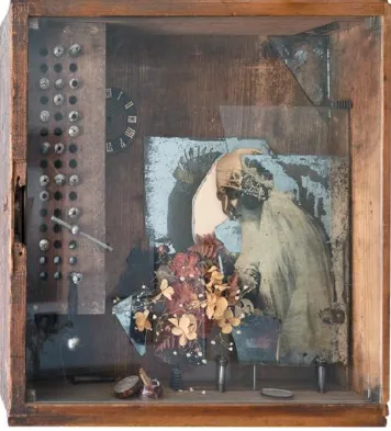
In the early twentieth century Pablo Picasso (1881–1973) and Marcel Duchamp (1887–1968) created artwork with discarded or found objects. Their works influenced Louise Nevelson, Joseph Cornell, and Robert Rauschenberg, who all worked with what most people at that time would consider trash to create unique artwork that has in turn influenced countless artists and achieved great critical acclaim. These artists encourage us to be inspired by source materials that are in our basements, in our garages, and even on the curb on trash day. For example, Louse Nevelson (1899–1988) created stunning sculptures out of discarded blocks of wood that she most often painted a monotone white or black. Joseph Cornell (1903-1972) created beautiful assemblage boxes that remain quirky, beautiful, and intriguing, and have
Figure 1.1. Carol Eismann’s exploration of feminine roles and identity.
Robert Rauschenberg (1925–2008) was an incredibly prolific artist who worked with paint, silk-screen printing, and sculpture. His multilayered approach of juxtaposing images of contemporary media across and on top of one another was a precursor to the Pop Art of the 1960s. Among his most important works are the “Combines” in which he gathered found objects and integrated them with one another to create something new. He enjoyed the use of the found object, as he perfectly expressed, “I wanted to use the generosity of finding surprises. And if it wasn’t a surprise at first, by the time I got through with it, it was. So the object itself was changed by its context and therefore it became a new thing.”
Try It
The next time you’re walking down the street, walk a bit slower and see what you can find to use as unique source materials. Let yourself be surprised and open to seeing and finding a wide variety of source materials for your compositing projects. Carry a camera to photograph the item on the spot, or if size and circumstance permit, you can bring the item back to the studio for more controlled photographing or scanning.
Traditional Photographic Composites
It is often said that photography liberated painting from being a medium dedicated to recording reality to being an expressive medium that allowed (although not limited to) Impressionism, Expressionism,
days of photography, artists were exploring multiple exposures and composite images to offset physical shortcomings of the materials of the day and to express their artistic sensibilities.
In the nineteenth century, photographic materials were overly blue sensitive and couldn’t differentiate between sky and clouds, causing the skies to be very white and uninteresting. Photographers used combination printing to add skies, as Camille Silvy (1834–1910) did with his highly regarded river scenes in the 1850s. The difference clouds make to a landscape was well described by a contemporary critic of Silvy, “A sky should convey the effect of space, not surface; the eye should gaze into, not upon it; and instead of coming forward and throwing back every other object, it should retire and bring the
landscape into prominence.” Landscapes without skies, with only a uniform white tone above the ground, were found wanting by critics. They lacked atmosphere. But the blue sensitive negatives of the time made landscapes with skies an almost impossible challenge.
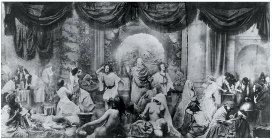
Oscar Gustave Rejlander (1813–1875) used multiple exposures and combination printing to choreograph and create complex images, which even today would be impossible to take with a single exposure. One of the most famous examples of an early photo composite of Rejlander’s is “Two Ways of Life” (1857), which was made from over 30 glass plate negatives (FIGURE 1.2). The image portrays a sage who is guiding two young men toward adulthood. On the left a lusty young man eagerly looks at a life of wine, woman, and gambling; on the right side the young man sees a life of family, hard work, and faith. It may be difficult to comprehend, but at this time in history the sight of naked people created quite a stir. When the image was displayed in Scotland, the left side of the image was covered with a cloth. In 1860, Rejlander created a scandalous composite image called “The Bachelor’s Dream,” which portrayed a young man lying on a daybed as he fantasizes about the scantily clad and tiny woman climbing on the ribbing of a woman’s corset. Viewers were incensed by the blatant sexuality. Although Rejlander is considered the father of fine art photography, he died in absolute poverty.
Figure 1.2. Oscar Gustave Rejlander “Two Ways of Life,” 1858.
Henry Peach Robinson (1830–1901) studied with Rejlander. His images started with sketches and
combined to create the final image. Interestingly, painters at the same time also portrayed this subject without creating an uproar. Because the image was photographic—that is, realistic—viewers imbued the image with truth and related to the situation much more keenly than when a similar subject was portrayed with oil on canvas.
Figure 1.3. Henry Peach Robinson “Fading Away,” 1858.
Well into the late nineteenth century and into the early twentieth century, photographers were compositing or double-exposing images to create trick photos of people with two heads; people standing in boats, including Bobby Leach, who was the second person to survive going over Niagara Falls in a barrel (FIGURE 1.4); and the very popular spirit photographs, which often portrayed a seer who could communicate with the deceased who were shown floating in the background (FIGURE 1.5). Perhaps most famous are the five images of the Cottingley Fairies that were “photographed” in 1916–17 by two young girls, Frances Griffiths and Elsie Wright, who lived in Cottingley, England. The photographs
attracted tremendous international attention, including a book by Sir Arthur Conan Doyle and being made into a movie in 1997, Fairy Tale: A True Story, with two of our favorite actors, Harvey Keitel and Peter O’Toole. As Paul Atterbury—a British antiques expert often featured on the popular television series
Antiques Roadshow—stated, “These extraordinary photographs took the world by storm in 1918.”
Figure 1.5. Spirit photo. Library of Congress Prints and Photographs Division Washington, DC 20540
As artists and photographers, we cannot rush to judgment and quickly discount these seemingly crude attempts at photorealism with our Photoshop-induced superiority and hindsight. It is important to
understand the roots of our art form and to appreciate that the times of our great-grandparents were more innocent, and in regard to photographic images, less sophisticated.
The Twentieth Century: Dada
The nineteenth century saw the dawn of photography. Much of the work was dedicated to working around technical limitations and simply showing what photography could do. It wasn’t until after World War I that artists began to use montage as a truly new art form—one that tore, questioned, and challenged existing perceptions. The Dadaists in Berlin, including Raoul Hausman, Hannah Höch, Kurt Schwitters, and John Heartfield (1891–1968), worked with photomontage to question the status quo. Of this group, Hannah Höch (1889–1978) continued working with photomontage until her death. In fact, she rejected the literal and what she deemed the tendentious political work of the group’s most well-known member, John Heartfield.
reliance on German industrial wealth and the horrors of war. Heartfield and his brother Wieland Herzfeld founded the publishing house Malik-Verlag in Prague, Czechoslovakia, which provided an ideal outlet for Heartfield’s critical images as featured in the groundbreaking magazine the AIZ (Arbeiter Illustrierte Zeitung) or Workers Illustrated Magazine. Heartfield’s work was banned during the Third Reich and then rediscovered in the late 1950s. Since then, his powerful use of image and type has greatly influenced many artists and graphic designers. Katrin had the good fortune to visit a retrospective of John
Heartfield’s work, which taught her two lessons: First, whenever possible, it is essential to see artwork in the first person, not on the web or in a book but in a gallery or museum. Second, she was fascinated by how he used mundane newspaper images and cut and pasted them into place. To create the final image, he photographed the montages and retouched the copy negatives to conceal the seams that were so obvious in the original pieces.
The Twentieth Century: Surrealism
World War 1 had soaked the European continent with blood, and the war to end all wars had forever changed the established social, political, and economic systems. The darkest, irrational aspects of war had been exposed to the world through the press and film. Taking impetus from Dada, surrealists, including the artists Man Ray (1890–1976) and Méret Oppenheim (1916–1985) as well as filmmakers Luis Buñuel (1890–1983) and Jean Cocteau (1889–1963), were part of a wide-reaching and influential art movement whose characteristics included exploring shocking juxtaposition and the surprising use of the absurd.
In the early twentieth century, Emmanuel (“Manny”) Radnitzky’s family changed its surname to Ray due to a deep fear of anti-semitism, and Manny took on the moniker of Man Ray. Man Ray had ties to both Dada and Surrealism, and although he considered himself a painter, he is most often remembered as an avant-garde photographer who created compelling photograms (images created in the darkroom on
photosensitive materials without a camera). In fact, he coined the term rayographs or rayograms. The images are ethereal renderings of familiar objects, such as bottles, glasses, and scissors layered on top of one another to create images of Man Ray’s imagination. Many credit his lover and muse Lee Miller
(1907–1977)—a fashion model and photographer who also explored Surrealism—with influencing Ray’s art. As the story goes, she accidentally exposed one of Man Ray’s images to light by opening the
darkroom door, which resulted in the first solarized image—a technique that Ray used quite often thereafter.
© KE
Figure 1.6. Man Ray’s final resting place.
Try It
Serendipity, experimentation, and making mistakes are the best ways to learn. So the next time you rush to Undo a step in Photoshop, take a moment to look at it with a fresh eye and learn from it.
The list of artists and photographers influenced by Man Ray is lengthy and continues to grow. Two of Katrin’s favorites include Maurice Tabard (1897–1984) and Lucas Blalock. Tabard, a French fashion photographer, printed through multiple negatives to create images that do not exist in a recognizable space or time; Blalock, a young, contemporary photographer, frenetically and wonderfully mixes and matches subject and materials.
The Twentieth Century: Darkroom Masters
In the late 1950s, two American photographers were beginning to emerge as montage artists. Jerry Uelsmann (FIGURES 1.7 and 1.8) and Duane Michals (1932–present) composed evocative, dreamlike images with traditional black-and-white materials. Michals is best known for his image sequences that often include handwritten text. According to Michals, “to illustrate grief by taking a picture of a woman crying does not aid the observer in understanding what it is truly like to experience deep sadness. Instead, the photographer must help the viewer feel what the woman feels by tracing the woman’s pain with
(www.fototv.com/duane_michals).
© Jerry Uelsmann
Figure 1.7. Created in the classic darkroom with multiple enlargers, Uelsmann’s images have inspired countless artists to explore combining images.
© Jerry Uelsmann
Figure 1.8. Jerry travels to Yosemite National Park on a regular basis to photograph source materials, as featured in this composite.
Artist in the First Person: Jerry Uelsmann
Although Jerry works in the darkroom to create his original images, he takes advantage of the quality of large-format inkjet prints. A few years ago at the AIPAD (Association of International Photography Art Dealers) art fair in Miami, my husband and I suddenly stopped in front of a stunning 30- by 40-inch large-format, black-and-white print. Both John and I instantly recognized the work of Jerry Uelsmann, the master of traditional darkroom compositing. But we simply
couldn’t imagine Jerry working in the darkroom to produce such a large print (FIGURE 1.9). The sheer size of the paper and required developer and fixer trays would make handling such a print unwieldy.
© Jerry Uelsmann
Figure 1.9. The final refined image.
© Jerry Uelsmann
Figure 1.10. The original image, which Jerry always felt needed more room on the sides.
© Jerry Uelsmann
Figure 1.11. Selectively refining details and sharpness added the final polish.
Maggie printed the image on an Epson Stylus Pro 9880 onto Epson Signature Worthy Exhibition Fiber Paper. As Jerry said, “I am amazed by the tonal range and exquisite quality of the prints that Maggie made for me on the Epson printer. The attention to detail that Photoshop allows, with very subtle dodging and retouching, enhances the overall effect of this image that was initially created in the darkroom. I am so excited to see some of my images in this larger scale. I could never do this in the darkroom!”
On most days, after breakfast, Jerry and wife get to work. Maggie Taylor, a fabulous digital
enters his darkroom where they each work for hours to examine and create fabulous images. As Jerry says, “Simply stated, my hidden agenda is to amaze myself.” We’ll address “working as an artist” in Chapter 2, “The Creative Process.” But one important fact we can tell you right now is that to be a successful artist, it is essential to maintain a regular schedule and a working
environment that is conducive to the creative process (FIGURE 1.12).
© KE
Figure 1.12. Jerry Uelsmann in his office reviewing medium format contact sheets.
© KE
Figure 1.13. Jerry Uelsmann with wife and artist Maggie Taylor (left), and Harn Museum of Art Director Rebecca Nagy (right).
Compositing in the color darkroom
Creating color composites required the use of pin-registration easels and hand-painted masks to print onto large-format film to create unique images. The darkroom process, as Jim explains and was a master of, often involved weeks of work to create one photo-illustration.
1. After planning the image, I would start by photographing all the elements using film formats that would integrate with each other, so that when the elements were scaled to the desired size, their grain size would match. This required a lot of planning and using a variety of cameras and film formats. For example, sometimes I would have to duplicate a 2 ¼ image up to 8×10-inch film to get the scale right.
2. I would then make a sketch by tracing the image elements onto a clear piece of 8×10-inch film and punch pin registration holes in it. Using this as a base, I would position each piece of film that was to be combined onto a separate sheet of registration-punched, black, opaque film, and then cut a small window for the image.
3. I would overlay a frisket (similar to a layer mask) of plastic adhesive film onto the image and precisely cut it to the edge of the image. Removing the waste film, I would paint around the image with black opaque, let it dry, and then remove the frisket to create a single element component. 4. For the cigarette stomp image (FIGURE 1.14), I made a mask for the cigarette, the figure, and the
© JP
Figure 1.14. “Cigarette Stomp.”
5. To make the composite dupe while working in complete darkness, I taped a piece of 8×10 duplicating film to the vacuum easel. I started with the cigarette element, placed it over the unexposed dupe film, and made the exposure. I then placed the cigarette mask on the dupe to
protect that area from being exposed again. I repeated this for each element, placing the mask onto the dupe film after each exposure. The final exposure was the sky with all the masks in place. 6. To create the edge glow, I placed several pieces of diffusion material between the mask and the
dupe film. The smoke exposure was a separate exposure with no mask.
Jim concludes, “You can see how laborious this process is. This particular image took over a month to create. Given that Photoshop wasn’t showing up for at least seven or eight years, it was a nice way to get striking, conceptual, multi-image composites when almost no one was willing (or crazy enough) to make these types of images (FIGURE 1.15). The amazing thing is that all the techniques learned in the
darkroom were immediately applicable to the computer; now that I’m working completely digitally, none of that experience has gone to waste as I continue to create conceptual and creative illustrations for clients such as Absolut, Adidas, Pepsi, Reebok, and Sony to name a few” (FIGURE 1.16).
© JP
© JP
Figure 1.16. Working on self-assigned projects, James Porto explored advertising and information overload, and collaborated with the Blacksnow fashion company to explore fashions via dance.
Analog to Digital History
The years ranging from the 1970s to the 1990s were a hotbed of innovation and development: Kodak and Sony were working on electronic cameras, Apple Computer was founded, and Xerox PARC was
encouraging researchers to be innovative. In addition, graphical software, such as MacPaint, SuperPaint, and PageMaker, was being developed. All showed the way for the creative use of computers.
In 1987, Thomas Knoll wrote code to display grayscale images on a black-and-white bitmap computer monitor codenamed Display. At the time, his brother John was working for ILM (Industrial Light & Magic), a division of Lucasfilms founded by George Lucas of Star Wars fame. Thomas’s code caught John’s attention and he asked Thomas to write code to process digital images for the special effects industry. Within a year, Display had color capabilities, could support a variety of file formats, and featured a unique soft-edged selection that allowed for localized color and brightness enhancements. In 1988, John shopped the application around and showed it to a variety of software companies. Russell Brown, one of Adobe’s original employees, saw the potential of what was then called PhotoShop. With some additional software engineering, as well as dropping the capital S, the first version of Photoshop was released in early 1990 by Adobe Systems.
Although the early 1990s were heady times, average desktop computers couldn’t support high-resolution files, and most photographers were hesitant to give up the proven quality of film to work on
© KE
Figure 1.17. The Center for Creative Imaging as interpreted by Katrin in 1992.
Artist in the First Person: Glen Wexler’s Digital Transition
Throughout his creative career, Glen Wexler has gone from working with traditional tools to leading the way with cutting-edge digital techniques. Glen took the time to look back and explain his personal digital history and what influenced him.
“The influences of my work include the photomontage album cover work from the 1970s by the British design group Hipgnosis who designed the album covers for rock greats, including Pink Floyd, Yes, Peter Gabriel, 10cc, Led Zeppelin, and Genesis. The group’s work is largely uncredited in its importance, both to pop culture and as a precursor to digital image making.
Hipgnosis’s blurring of the lines of the photographic medium was inspirational in terms of pointing to the unlimited narrative possibilities that could be expressed with altered or combined
photographic imagery.
“In 1978, I dropped out of art school to create conceptual album cover images, which led to film posters and other advertising projects. This provided a ‘playground’ that supported my
experimentation with creating altered but ‘photoreal’ realities via photocomposition. I originally used traditional methods—multiple exposures on film (in-camera and in the darkroom) and traditional print compositing on dye transfers and Cibachrome prints.
monitor and a huge mainframe computer that could create files with 8192 pixels on the long end that were output to 9mm tape and then written to an 8×10 transparency with an MDA film recorder. All of this equipment was simply out of reach for an individual photographer.
“In the early 1990s, we explored the cutting-edge desktop systems and worked with a Macintosh 2fx loaded with ColorStudio and later Painter because the program had ‘floaters,’ which predated layers in Photoshop. In 1992, the Apple Quadra 950 was released, so I sprang for a machine with 128 MB of RAM, 1 GB hard drive, a graphics card, two additional 1 GB hard drives, SyQuest drives, a DAT tape backup system, a Wacom tablet, a 21-inch monitor, and Photoshop 2.5 for $25,000 (FIGURE 1.18). In 1996 we added a Daystar enhanced Mac tower with 1 GB of RAM for an additional $32,000. It is simply amazing to think about the expense we went to to bring the image-compositing work into our studio. We haven’t looked back since.”
© Eastman Kodak
Wexler’s clients include numerous technology, entertainment, publishing, and finance companies, including Geffen Records (FIGURE 1.19).
Figure 1.19. Glen Wexler has produced some of the most iconic music and entertainment images.
The Twenty-first Century: Digital Masters
At the beginning of the twentieth century, artists worked with scissors, glue, and sandwiched negatives. By the end of the twentieth century, artists, editorial, and commercial photographers had embraced working with digital tools and techniques to combine, juxtapose, and collide images to better express themselves.
1.21), Simen Johan, David Julian, Viktor Koen, Julieanne Kost, Kelli Connell, Jim Kazanjian, Dorothy Simpson Krause, and Ben Gest. We are honored to share many of their techniques and approaches throughout this book. In commercial work, the images of Vincent Dixon, Aaron Goodman, Thomas Herbrich, Dave Hill, Sanjay Kothari, Mark Beckelman, Lee Varis, Nick Vedros (FIGURE 1.22), and Glen Wexler (FIGURE 1.23) shatter the boundaries of the imagination. We’ll be exploring their
photorealistic techniques throughout the book. We admire and enjoy the work of all these artists and share a great respect for how they portray the world with intelligence, humor, and compassion.
© Diane Fenster
© Maggie Taylor
Figure 1.21. Maggie Taylor uses a flatbed scanner to input image elements and then creates the collages in Photoshop.
© Nick Vedros
© Glen Wexler
Figure 1.23. Glen created a one third-scale cow, a variety of cow wardrobes, and miniature environments for the series The Secret Life of Cows.
The Next Generation
As teachers, we continue to learn and be inspired by students in our workshops and classes.
Unsurprisingly, we often tell our students, “You teach me as much as I teach you.” We are fortunate to be able to feature some of our students’ work in these pages. You too will learn from their work throughout the coming chapters as they expand and explore their art. Their work spans fashion, illustration, creative techniques, photorealism, and the completely fantastic, as shown in the work by Giselle Behrens
© Giselle Behrens
Figure 1.24. Image from “La Femenina” series.
© Daniel Bolliger
© Jaime Permuth
Figure 1.26. Image from “The Completely Visible World” series.
Learning from Hollywood
One of the most inspiring sources to learn from about creative image compositing is the rich history of the movie industry. For example, consider what was once a state-of-the-art film—King Kong produced in 1933—to what is now considered the state-of-the-art version of King Kong as directed by Sir Peter Jackson in 2005. Anyone reading these pages knows that a giant ape that falls in love with a beautiful blonde simply didn’t exist. But as viewers, we allow ourselves to “go along” with the story as long as the illusions are believable. We flock to movies that rely on fabulous visual effects, such as Star Wars,
Terminator, Apollo 13, Band of Brothers, Titanic, The Matrix, Forrest Gump, 300, Inception,
Independence Day, Perfect Storm, Avatar, The Curious Case of Benjamin Button, and even Black Swan,
in which Natalie Portman’s face was often mapped onto a professional ballerina’s body to create the illusion that the talented actress was also a highly trained prima ballerina.
Suspension of Disbelief
To appreciate visual effect movies and well-done image composites, you need to enter a willing
suspension of disbelief, which allows you to consider that what you are seeing is feasible. Suspension of disbelief allows audiences to go along with the storyline while ignoring the fact that the good guy couldn’t possibly withstand such unbelievable amounts of physical punishment or leap tall buildings in a single bound. Or, as any high school physics student will tell you, exploding battleships in space do not make any noise. However, defying mere physics has never stopped a Hollywood blockbuster movie from drawing you into a good storyline.
to as zippernecking.
© Mark Beckelman
Figure 1.27. This multilayered image composite plays with size relationships and the impossibility of what is being portrayed.
Appreciating that your viewer wants to believe what you are portraying in an image composite is both helpful and a responsibility to take seriously. The suspension of disbelief allows you to explore fantastic worlds while paying attention to the details. We address this creative process throughout the book as you plan the shoot and lighting, take the pictures, and then mask the elements to blend them into a new
environment. Effective composites, whether surrealistic or photorealistic, require you to focus on a myriad of details to create an image that viewers will believe and enjoy rather than being distracted by disconnects in lighting, edges, scale, or color to name a few of the giveaways that can transform an effective image into an unsuccessful one. Throughout this book, we’ll discuss the many fine points that separate a poorly made mishmash image from a believable composite.
Visual Effects
Everyone can learn valuable techniques and be inspired by the big business of movies. Most likely, many of you watch a movie more than once to be able to concentrate on various aspects of it. The first time you’re usually drawn into the story, but on the second or third viewing you might take the time to study the editing, sound, or visual effects. The visual effects in today’s Hollywood smash hits are simply mind-blowing. As photographers, it makes sense to appreciate the attention to detail that goes into the
visualization of a scene, motion capture, lighting, capturing actors on greenscreen, creating and matching the background plate environment, color correction, and the complexity of having the actors interact believably with computer-generated (CG), 3D characters.
Excellent examples of combining human and CG elements include the battle scenes in 300, which tells the story of the Battle of Thermopylae in 480 BC in which the King of Sparta led his army against the
wanting more.
Chroma Key
Chroma key, also referred to as greenscreen or blue-screen, was developed when movies were still shot on analog film. It requires the actor to be captured in a greenscreen studio and then matted together with CG or historical background plates, for example, to allow Forrest Gump played by Tom Hanks to be combined with actual news film of President Kennedy. Or on a less spectacular note, your local weather reporter is shot on a bluescreen while standing in front of a changing weather map. We’ll address working with greenscreen in Chapter 4, “Lighting and Backgrounds,” and explain how to mask images shot on greenscreen in Chapter 11, “Fine-edged Selections.”
Animation
Although this isn’t a book on masking and compositing for motion, we do feel it is important to recognize and learn from the masters of composite animation. In Monty Python’s Flying Circus, Terry Gilliam created fabulous and often absurd animated collages. On a more contemporary note, the first episodes of
South Park were created with paper cutouts, and the political cartoons by JibJab burst onto the scene in 2004 with a viral parody of the presidential elections. To come full circle in terms of beautiful Photoshop work and animation, the best reason to have watched the television show Ghost Whisperer starring
Jennifer Love Hewitt was the opening credits based on Maggie Taylor’s artwork, which was animated by Digital Kitchen (FIGURE 1.28).
© Maggie Taylor
Try It
Mute the sound the next time you’re watching a visual effects movie, television show, or
commercial to focus on the visual effects. Observe how camera positions are matched, study the relationship between foreground and background, and pay attention to color matching.
Uncanny Valley
Uncanny valley is a theory of robotics that evokes a response of revulsion in viewers when robots look and behave too much like humans. Or said less academically, it’s just creepy when the artificial crosses the line of believability. As an artist, you can use that line to great effect. Stay on the human side of the line or cross it, but do it consciously as Hye-Jung Lee did when she composited herself onto a doll figure to blur the line of real and unreal (FIGURE 1.29). Images that apply the principles of uncanny valley always require a second look to determine whether the figure is in fact a robot or a human.
© Hye-Jung Lee
Figure 1.29. Hye-Jung illustrated The Art of War with an adventurous doll-girl who was a wise warrior.
Compositing Terminology and Categories
An appreciation for the history and terminology of your chosen field is the foundation for clarity of
overlap one another. Consider the following terms and categories as a starting point for further exploration in the rich world of art history and art criticism.
Traditional Methods
The great majority of the art we feature in this book has been created with digital technology, but many artists build upon or are inspired by pre-digital art forms and movement as presented here:
• Alternative processes. Traditionally refers to photosensitive nonsilver processes, including cyanotypes, gum bichromate, and platinum prints. Digital alternative processes refer to gel transfers, lifts, and combination printing—all of which can add a unique layered or textural look to your final prints (FIGURE 1.30).
© Catherine Steinman
Figure 1.30. Experimenting with print media and after print treatments creates beautiful textures and layering results.
© Viktor Koen
Figure 1.31. Creating fantastic and surreal figures out of the detritus of modern life. • Collage. Based on the French word coller—meaning to glue—collage artists use preexisting
text, diagrams, drawings, photographs, and found objects to create quirky and intriguing images (FIGURE 1.32). The previously mentioned Dada artists Hannah Höch and John Heartfield are excellent examples of collage artists.
© Philip Eismann
Figure 1.32. Katrin’s brother, Philip, enjoys creating beautiful mixed media collages.
• Composite. Combining, blending, and creating a new image from two or more photographic source images. This entire book is filled with examples of image composites that we hope inspire you to explore and create your own image composites.
Picasso (1881–1972) explored decoupage as sculpture and also subjects for Cubist paintings. • Double exposure. Traditionally a film-based photographic technique in which the film was
exposed more than once to create ghostly and surprising images. Admittedly, when using film, we sometimes unintentionally double expose a roll of film, which sometimes results in a disappointment or in a pleasant surprise (FIGURE 1.33). The serendipity of the double exposure look is often mimicked when exploring layering images with Photoshop blend modes, as we’ll address in Chapter 8, “Layer Essentials” and Chapter 13, “Creative Compositing.” Tierney Gearon, a contemporary fashion photographer, uses film double exposures, which inspired Hye-Ryoung Min’s Photoshop created composites (FIGURE 1.34).
© SD
© Hye-Ryoung Min
Figure 1.34. Digital composite inspired by the look of film-based double exposures. • Encaustic. Applying hot beeswax and resin onto paintings or prints, including inkjet prints, to
create a moody textured surface that appeals to those who appreciate the more organic, less technical feel of their final output. See www.rfpaints.com for supplies and information. • Mixed media. Combining a variety of found materials with painting or drawing to create a
new image. Digital artist Dorothy Simpson Krause explores mixed media by creating the initial image in Photoshop and then printing on brushed aluminum, fresco, or nonwoven cloth (FIGURE 1.35).
Figure 1.35. From the series “Visions,” which explores the spiritual transitions and ultimately life and death.
• Montage. Using the juxtaposition of disparate elements to create seamless and (often) surreal images. Examples of the montage approach can be found in mediums other than photography, for example, in the paintings of surrealists Salvador Dali and René Magritte. Often used interchangeably with collage, digital montage artists experiment with layers and blend modes to create playful and surprising images.
• Scanography. Using a flatbed scanner as the surface to build up and create images on. For example, Maggie Taylor uses a flatbed scanner to capture source materials, including Victorian photos and paper textures.
• Superimpose. Projecting or layering images on top of one another. Recently, artists have been superimposing historical images onto contemporary scenes by holding a print or smartphone up to the original scene and taking a new photo or using Photoshop to combine the two. Michael Morrison, a New Yorkbased fashion photographer, created a beautiful project
© Michael Morrison
Figure 1.36. Michael Morrison explores contemporary fashion photography.
Try It
Study and research the wide variety of traditional and mixed media composites and re-create the look and feel with digital tools to create your own artistic images.
Working Subjectively or Conceptually
You may be drawn to a specific type of photo composite, or you may be hired to create a certain type of image. Being conversant in the related terminology allows you to work with greater intent and express yourself more clearly.
Subjective Creative
© KE
Figure 1.37. Playfully combining and experimenting with images is a great way to make artistic discoveries.
Conceptual illustrative
© Nick Vedros
Figure 1.38. The color treatment enhances the mood.
Illustrative composites start with an idea or a brief from a client. It is then up to the photographer or compositing artist to sketch possible solutions, gather or photograph the required pieces, and then combine the pieces to create the final illustration. Of course, fine artists also create conceptual illustrations, as Katrin did to illustrate the fact that almost one in seven people, represented by the
multicolored grains of rice, live on less than one dollar a day (FIGURE 1.39). The question as to where artists get their ideas is an endless topic of speculation, theory, anxiety, and sleepless nights. We’ll
© KE
Figure 1.39. Katrin often draws inspiration and ideas from social issues. Surrealism
Earlier in this chapter, surrealism was addressed in an historical context, but the term surreal and/or
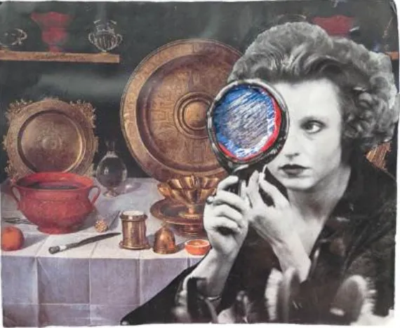
surrealism is still a vibrant part of contemporary art-making vocabulary and practice. A surrealistic image contains non sequitur elements, which are elements or meanings that have no logical relationship with one another (FIGURE 1.40). This non sequitur aspect is emblematic of images that are surprising and perhaps shocking with unexpected juxtapositions. Salvador Dali (1904–1989) was the classic surrealist as his most famous painting, “The Persistence of Memory,” of melting clocks shows. The works of photographer Ryzard Horowitz (1939–present) show a strong surreal influence that juxtaposes scale, source materials, and environments to create highly stylized commercial work (FIGURE 1.41).
Figure 1.40. A surreal image of a headless saint offering an apple to the viewer.
© Ryzard Horowitz
Figure 1.41. Experimenting with scale and environment to create surreal images.
Photorealism
Photorealistic composites are meant to convey an illusion of reality, and although some may be surreal in nature, they are so well done that the viewer partakes in the suspension of disbelief to “believe” that they are real. Photoreal work requires detailed preproduction, precise photography, and pixel-level
compositing to create engaging illusions that are so meticulously done that you just want to believe them. Such photorealistic achievements can be seen in the fabulous images of Rick Walstrom, Jim Porto, and Nick Vedros.
Of all the types of Photoshop composites, photoreal work requires the most planning, attention to detail during the photo shoot, and fastidious Photoshop skills to mask, combine, and balance the image
components to transform many into one. Essential issues to focus on to create the illusion of reality
include (but are not limited to) matching scale, perspective, color, light, shadows, reflections, edges, and texture. For more information on photorealism composites, see Chapter 13, “Photorealistic Compositing.” 3D and visual effects
Photography has always portrayed the 3D world on a 2D surface—be it on the sensor, film plane, or print. Once the 3D world is flattened to 2D, the camera’s point of view, lighting, and perspective are set. In the computer 3D world, nothing is ever set, and the artist can change the camera’s position, light quality and sources, surface characteristics, and reflectivity. The power is intoxicating and requires that
photographers learn new skills to work with dedicated 3D software, such as Maya, 3ds Max, and Alias ImageStudio. Photographers with the perseverance to learn new skills are rewarded by being able to create fantastic images that often combine the mechanical, such as cars, or fantasy environments with natural textures or human models, as Sanjay Kothari and Mike Campau do so effectively.
Chapter 2. The Creative Process
Some of the best conversations we’ve ever had about images and creativity have taken place when we were nowhere near a computer. Thinking and talking about photography, art, the creative process, and ideas for new images during a brisk walk with a fellow photographer or over dinner with friends and colleagues is a different experience than having a similar conversation when you’re seated in front of the brightly illuminated screen with all of its distractions. We enjoy the back and forth with our peers as we talk about how ideas and images come together to create new meanings and new visual possibilities. Often, these conversations include detailed discussions of Adobe Photoshop techniques as we share ideas on the best way to approach a particular imaging challenge or create a successful vision of a concept. What takes place during these gatherings is an important aspect of our creative process and one that we encourage you to seek out and make a part of your creative life: Enjoy all of the nuances of the image-making process wherever you are, even if you are not in front of a computer or don’t have a camera in your hands.
The most important creative tool you have is in your head. Photoshop can never come up with an idea or create a compelling image on its own. As Katrin likes to tell her students, “A keyboard shortcut for quality doesn’t exist.” But Photoshop can be a conduit for your imagination, a tool to help you realize the vision you have for an image. Activating and enhancing that conduit so you can work with more
confidence and greater skill is one of this book’s goals. Before we get into the nuts and bolts of Photoshop techniques for masking and compositing, we’ll take a brief look at the image-making journey and take a look at some considerations when developing an imaging strategy.
In this chapter, you’ll explore some of the key components of the creative process, including: • Inspiration; where to find it and how to encourage it
• Brainstorming and concept development • Personal projects and series
• Planning for photographs • Preparing the image files
The Image-making Journey
we’ve always regretted not having an image backed up when we needed it or when the client wanted a change made.
Inspiration
Where do you get your inspiration? What activities most often lead to the generation of new ideas? What conditions are the most conducive for engaging your creativity? Answering these relevant questions will help you identify the types of situations that are most likely to encourage and support your creativity. Understanding your own creative process is one of the first steps to being able to engage it more consciously instead of just waiting and hoping for ideas or inspiration.
Katrin often comes up with her best ideas while on a morning run. Others get their inspiration from
rummaging through a flea market to find objects and images to create. Still others turn to literature, poetry, their family history, or dreams. Pay attention to what triggers an idea or flips your creative switch: Is it a quiet afternoon spent gardening, or would you rather page through magazines, go for a walk, or visit museums?
At the School of Visual Arts in New York City, Katrin gave one of her classes an assignment called “free inspiration.” The students had to find three objects they did not pay for and create images that portrayed those subjects in a respectful manner. Many students found interesting objects on the streets of Manhattan, which they used to create very beautiful images (FIGURE 2.1). So if trash and fallen leaves inspire college freshmen, just think about what you can use for inspiration. Nurture the subjects or pastimes that inspire you; they are your personal wellspring of ideas and insights.
© Seung Hyung Lee
Removing Creative Roadblocks
If you are too busy making excuses to work creatively or if cleaning the bathroom just sounds better than working on images, don’t lose hope. It is not uncommon to put off creative work out of fear of failure, perceived lack of ideas, or personal inhibitions. To get over empty computer-screen
phobia, you should first try to “just work through it,” a valuable lesson that Katrin learned from an experienced photography teacher. When she felt empty or uninspired, he encouraged her “to get out there and take pictures,” to work through it. The actual act of working creatively provides
momentum and new inspiration to keep going, and propels you through the doldrums to a better creative space.
Another helpful solution is one we learned from Julieanne Kost at Adobe Systems. In a nutshell she advises, “Identify the primary distraction that keeps you from your creative work and deal with it. If you have an issue, be it weight, lack of exercise, or family worries, do your best to resolve that issue or reduce its power of distraction on your time and energy.”
It’s important to remember that creating images is a worthwhile endeavor in and of itself. Being creative, expressing yourself, and learning about the world you live in through image making is a positive way to spend your time. So turn off that nagging voice of distraction and doubt, and get to work.
Gather, Collect, and Snap
Figure 2.2. A student’s idea notebook with pictures, sketches, and notes.
Figure 2.3. Online pin boards such as Pinterest.com allow you to gather interesting things you find online and present them in a visual way, much like an actual bulletin board.
© KE
Figure 2.4. Maggie Taylor has several drawers in her studio that are filled with objects she collected to use in her collages. A large bulletin board displays images and other bits of ephemera that
provide creative inspiration.
We try not to leave home without a camera because we never know what texture, play of light, or
© SD
Figure 2.5. The original image of a display of old planes at the San Francisco Airport.
© SD
Figure 2.6. The U.S. Navy trainer plane from the airport display as an element in a collage about flight.
Observe