Visualizing Human Migration through Space and Time
G. Zambotti a , W. Guan a, *, J. Gest b a
Center for Geographic Analysis, Harvard University, 1737 Cambridge St., Suite 350, Cambridge, MA 02138 USA - (gzambotti, wguan)@cga.harvard.edu
b
School of Policy, Government and International Affairs, George Mason University, 3351 Fairfax Drive MS3B1 Arlington, VA 22201- [email protected]
KEY WORDS: spatiotemporal, visualization, migration, ArcGIS Server
ABSTRACT:
Human migration has been an important activity in human societies since antiquity. Since 1890, approximately three percent of the world’s population has lived outside of their country of origin. As globalization intensifies in the modern era, human migration persists even as governments seek to more stringently regulate flows. Understanding this phenomenon, its causes, processes and impacts often starts from measuring and visualizing its spatiotemporal patterns. This study builds a generic online platform for users to interactively visualize human migration through space and time. This entails quickly ingesting human migration data in plain text or tabular format; matching the records with pre-established geographic features such as administrative polygons; symbolizing the migration flow by circular arcs of varying color and weight based on the flow attributes; connecting the centroids of the origin and destination polygons; and allowing the user to select either an origin or a destination feature to display all flows in or out of that feature through time. The method was first developed using ArcGIS Server for world-wide cross-country migration, and later applied to visualizing domestic migration patterns within China between provinces, and between states in the United States, all through multiple years. The technical challenges of this study include simplifying the shapes of features to enhance user interaction, rendering performance and application scalability; enabling the temporal renderers to provide time-based rendering of features and the flow among them; and developing a responsive web design (RWD) application to provide an optimal viewing experience. The platform is available online for the public to use, and the methodology is easily adoptable to visualizing any flow, not only human migration but also the flow of goods, capital, disease, ideology, etc., between multiple origins and destinations across space and time.
* Corresponding author
1. INTRODUCTION
Mapping the movement of people worldwide resembles historic attempts to capture the movement of water in the world’s great oceans and seas. An infinite number of molecules flow from place to place in unstable currents that swirl landmasses, changing temperature, salinity, direction and intensity along the way. Human migration features currents as well between countries with shared languages, colonial affinities and social ties. But these flows change over time with economic and political conditions. Migrants are each demographically different and enter destinations on a variety of visa types, such that it is difficult to study and comprehensively understand this moving target.
Just as charting currents fostered a grasp of shifting waters and improved the navigation of ships as early as the 16th Century, mapping human migration can promote a more systematic understanding of human movement. This understanding is desperately needed to inform the management of an ever-globalizing world. An appreciation of these trends would reveal the repercussions of migration governance to national policymakers. Demographic composition suggests the human resources available to multinational businesses seeking the right work force. The visualization of trends vividly presents the scope and scale of diversification for classrooms of malleable students who may otherwise be unaware of the world’s dynamism.
At its most elementary, human migration can be reduced to an individual decision. This decision is often made in consultation with a household or even a village, but it is nonetheless a single decision to venture to unknown regions to radically alter the trajectory of one’s life. Even now, when collecting data on such decisions is vastly improved, representing them visually is a challenge. Prior attempts oversimplify total migrant stocks by considering regional origins and ignoring country-to-country nuances (Sander, Abel and Bauer 2014). Others that account for such bilateral movement do so without the use of maps, leaving users unable to place data into a schematic understanding (Walker 2013). Still others that employ maps do so without accounting for the volume of migrants (Behrens 2010), or do so but only use maps for country selection rather than schematic visualization (Römhild and Vertovec 2012).
The objective of this study is to build a map-centric visualization tool that is able to take in simple input data formats and quickly render the migration flow through space and time, with an easy-to-access and user-friendly interface. Such a platform not only contributes to the study of human migration at any geographic and temporal scale, but also lays the foundation for an even more generic platform to visualize the movement of any object in space and time, such as the flow of goods, capital, disease, ideology, etc., and provides a starting point for building a more comprehensive analytical platform to examine causes and consequences of such migrations.
2. DESIGNING A GENERIC PLATFORM
2.1 Core Principles in Designing This Platform
Accessibility – the platform should be easy to access through a browser, without installing any client-side software or plug-in.
Usability – the interactive system should balances user choices and interface complexity, allowing non-technical users to use it with minimum instructions.
Performance – the map display should refresh quickly when users select different datasets, and navigate through different extends in space and time.
Standard input – the input data needs to be in a standard and simple structure, so that non-technical researchers can compile it with minimum instruction and without any specialty software.
Scalability – the system should be able to handle variable size inputs, including very large datasets, and maintain adequate performance.
Generic – the visualization should be data driven. Replacing the input data file will result in a new corresponding visualization with minimum customization on the platform.
Economic – the development effort should be minimum, take advantage of available out-of-the-box products and avoid reinventing wheels.
2.2 Key Requirements for the User Interface
User may select a location by either picking from a pull-down list or clicking on a location in the map. The map will display human migration flows to that location from other parts of the map, as arcs radiating in. This assumes that Destination is the default flow direction.
User may switch between Origin and Destination as the default flow direction. When Origin is selected, the map will display human migration flows from the selected location to other parts of the map, as arcs radiating out.
The arcs are symbolized so that their colors represent the volume of the flow, with a legend which is customizable based on the range of the data values.
When the user mouse-over any arc, there is a report showing the corresponding migration origin and destination, migrants count, and percentages in the total migrants population and in the selected location’s total population (if total population data is available).
There is a time bar that the user may step through, or set on auto play. The map will update the migration flow arcs through each time step.
2.3 System Architecture
To minimize development effort, the authors selected ArcGIS as the main platform. ArcGIS is a family of GIS products developed by Esri, widely recognized as the dominating commercial product for geospatial data analysis and mapping on the market. Its desktop module provides comprehensive data processing capabilities; its server module can serve out the desktop prepared project package directly as GIS web services. With the two modules combined, ArcGIS allows users to turn geospatial data layers, and their analytical results, into web map services with complex cartographic design for visualization. This approach significantly reduced the need for developing new code, compared with using other available web mapping solutions such as Google Map API, CartoDB or MangoDB. The only application development task needed in this approach is to customize the web user interface so that users can perform their query against the web map service and interact with the web map as the project requires. This front-end application ISPRS Annals of the Photogrammetry, Remote Sensing and Spatial Information Sciences, Volume II-4/W2, 2015
development work is necessary regardless which back-end solution is selected for the platform.
Based on this selection, the authors designed a three-tier system. Its components and their functions are illustrated in Figure 1.
Figure 1 System components and their functions
2.4 Data Processing
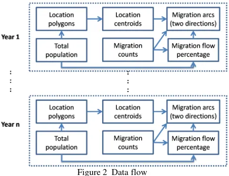
In tier one, ArcGIS for Desktop is used to join total population counts onto the location polygons (such as countries, states, provinces, or other geographic units for demographic data reporting). A centroid point is generated from each location polygon, which forms the beginning and ending nodes for the migration flow. The human migration flow between any given origin and destination is represented by a great circle arc connecting the two centroid points. These arcs, once generated in ArcGIS for Desktop, are duplicated into two identical sets, each pair of arcs share the same geometry but with opposite directions, representing migration flows between two geographic locations in both ways. For different year’s migration data, corresponding location polygons are used. Figure 2 summarized the data processing work flow on ArcGIS for Desktop.
Figure 2 Data flow
The human migration data is organized in a tabular format with only four columns: Origin (From), Destination (To), Time (Year) and Measurement (Count). This structure is designed to be simple, generic and suitable for recording any flow or connection in space and time, not limited to human migration alone. Table 1 is a small sample of actual data from the US migration dataset showing migration counts between US states and territories. It illustrates this input tabular data structure.
From To Year Count
Puerto Rico West Virginia 2012 8
Puerto Rico Wisconsin 2012 989
Puerto Rico Wyoming 2012 0
Alabama Alaska 2013 1026
Alabama Arizona 2013 1077
Alabama Arkansas 2013 1108
Alabama California 2013 4918
Table 1 Migration data input structure
In ArcGIS for Desktop, total population, total emigrants and total immigrants data, also in tabular format, were joined to the location polygons’ attribute table of the corresponding year by a unique location ID. Human migration counts and percentages are joined to the arcs attribute table of the corresponding year.
There are four percentages for each migration flow between an Origin-Destination pair of any given year:
• Number of migrants / Total population of the Origin • Number of migrants / Total emigrants from the Origin • Number of migrants / Total population of the Destination • Number of migrants / Total immigrants to the Destination
The arcs were symbolized by the number of migrants using a customized color ramp, representing an increase of migration flow from blue to red in our cases. The classification is based on the data range of each case, which can be changed easily within ArcGIS for Desktop.
The MXD project file produced in ArcGIS for Desktop contains one polygon layer and one arc layer. Each polygon feature represents a migration reporting unit of one year. For example, in the US inter-state migration data, there are 8 polygons for each state or territory, containing population, emigrant and immigrant values for each year from 2005 to 2013. The total number of polygon features in the layer is 468, derived from 50 states, plus the District of Columbia, plus the territory of Puerto Rico, times 9 years. In the arc layer, each arc represents a unique migration flow from one origin polygon to one destination polygon in one year. For example, in the US inter-state migration MXD file, the arc layer contains 23,868 arcs, derived from 52 states and territories as origins, times 51 states and territories as destinations, times 9 years.
2.5 Web Map Service and Application Development
Given the numerous number of features in such migration flow datasets, it is a challenge to visualize the data in a meaningful way. Displaying all of the arcs at once on a map is certainly not a viable way of communication. Thus it becomes critical to allow investigators to interactively select certain portions of the migration flows and visualize them effectively. Tier two and three of our system design achieved this purpose.
The authors decided to use the Amazon Web Services as our production infrastructure to serve out the web map services and web application user interfaces. Development and initial testing were done on existing local servers to minimize cost, but these local servers are low capacity and inadequate to handle the load and traffic of the production grade application. The advantage of using Amazon Web Services for production is mainly on its flexibility of server capacity and run time. For example, we can ISPRS Annals of the Photogrammetry, Remote Sensing and Spatial Information Sciences, Volume II-4/W2, 2015
start a larger server when the application is used in a course, and switch to a smaller server when the semester is over.
Our production server is a AWS Linux m3.large with 2 vCPU, 6.5 ECU, 7.5GB RAM and 100 GB storage. Running on it is ArcGIS for Server Enterprise for Linux version 10.2.2. We copied the geodatabase onto the AWS server and served it out from ArcGIS for Server. The polygon layer is enabled as a tile map service while the arc layers are enabled as web map services. This forms the second tier in our system design. The advantage of using a tile map service is to improve performance on the client side.
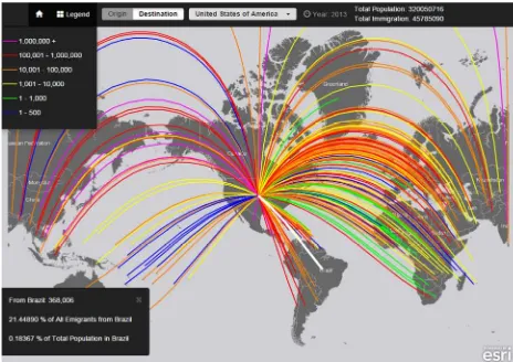
Tier three is the web application which we developed using ArcGIS Mapping API for JavaScript 3.13, specifically a light-weight JS/CSS extension for building nice looking responsive mapping apps with ArcGIS and Bootstrap 3. The main advantage of using this extension is to be able to automatically resize and re-center the map as the screen size changes. The extension is an open source project available in GitHub (2015). It contains the user interface and the visualization delivery platform based on ArcGIS for Server 10.2.2. It can be customized to query and display different data layers served out from the ArcGIS for Server. For example, in the global inter-country migration case, the user interface allows users to view a destination country's profile by a single-click anywhere inside the country's border, or by selecting the country name from the drop-down menu in the 'Destination' tab. Hover the mouse over any arc streaming into that destination country, users will see the destination-specific migration data. Streaming arcs turn white when touched and are otherwise colored according to the absolute number or proportion of migrant flow, as indicated in the 'Legend' tab. Users may toggle between Origin and Destination to view migration flows from or to the selected country. To view data in different years, users may click on the Play button once to let the map automatically refresh with data from the first year through the time series, or Pause at any year as needed. To zoom, double-click the map or use the zoom arrows in the top right corner. Figure 3 is a snapshot of the web user interface for the global inter-country migration case, highlighting in white the migration stream from Serbia to the USA in 2013.
Figure 3 Web user interface for the global inter-country migration case
3. IMPLEMENTATION CASES
The initial requirements for building this application came from the Crossroads of Migration research agenda (Boucher and Gest 2016), which required a map to visualize the movement of
migrants between countries across the globe from 1990 to 2013. Once built, the authors applied it for the visualization of two additional cases: one is the inter-state migration within the United States from 2005 to 2013; and the other is the inter-province migration within China in years 1995, 2000, 2005 and 2010.
3.1 Global Migration between Countries
This case is part of the forthcoming Crossroads of Migration research agenda. Migration data is based on standardized United Nations (2013) data, a compilation of demographic reports from 232 countries and territories. Country/territory boundaries data is based on the World Countries polygon layer in Esri licensed Data and Maps package of the corresponding years. Bilateral stock data allows the observer to not only chart the movement of people from abroad to a single destination country. It also allows the observer to examine countries as the origins of international migration, reorienting the nexus. The relationships, and their visualization, reveal the Earth’s primary migration corridors, but also unexpected phenomena such as the United States as a major sender of migrants abroad and a number of Global South countries as important regional destinations.
3.2 US Domestic Migration between States
This case uses data published by the US Census Bureau in downloadable MS Excel format, called the State-to-State Migration Flows. Description of the data is available on the Census Bureau’s website (U.S. Department of Commerce 2015). The state and territories boundary data is based on the US States polygon layer in Esri licensed Data and Maps package of the corresponding years.
3.3 Chinese Domestic Migration between Provinces
This case uses data summarized by Ms. Xin Lao of the School of Government, Beijing University, visiting fellow of the Harvard Center for Geographic Analysis in 2013-2014. Data sources are the fifth(2000) and sixth(2010) China national population census data and the 0.95% sample data of the fifth China national population census data (2000) (Lao, under review). The provincial boundary data is based on the provincial polygon layers of the corresponding years, published by the China Data Center at the University of Michigan (2015).
Among the three cases, the global migration between countries presents the count of people who were born in the origin and residing in the destination at the given year. It does not account for when the migration actually happened, or which other countries the person may have routed through between birth and the survey. While the US and China domestic migration cases
Much of our work time was spent on data gathering, verification, correction and reformatting. The most challenging part is to match migration data of a given year to the correct location polygons of the same year. Although census and migration data are usually available for multiple years from the same source, many GIS data sources provide boundary data updated to the most current version without preserving the historical versions. ISPRS Annals of the Photogrammetry, Remote Sensing and Spatial Information Sciences, Volume II-4/W2, 2015
Most of the demographic reporting units didn’t change from year to year, but in a handful of cases, some units changed. For example, in the world countries dataset, South Sudan was part toggle between origin and destination, or step through multiple years, and see the migration streams updated accordingly in a fraction of a second. In order to achieve this level of performance, spatial features must be generalized to weed out excessive vertices. This includes only the streaming arcs because the polygon boundaries were cached as tile images. The authors experimented through a series of generalization settings and selected one for each case that balances the speed and the visual quality of the features. The selection is based on the geographic extend and visualization scales of the particular application. The map application was developed using the ESRI Feature Layer component to respond quickly at a user map interaction, such as a mouse hover request, and to neatly render color visualization. Although Feature Layer addresses very well this kind of requests, it has a limitation on the number of streams. After numerous rounds of experimentation, the authors decided on great circle arcs instead of straight lines, and a color ramp instead of linear width to represent the migration streams. This is mostly due to the need to minimize congestion on the map.
For all three cases, the authors selected a grey background of polygon outlines as the base map. This can be replaced by other thematic maps of the choice if the user so desires, however the original base map is designed to highlight the human migration streams with a dramatic visual effect.
The trade-off between how much information to display on a map and how well the information is communicated is always a challenge to map designers. In this study the authors presented an initial design, and at the same time built the system so that it can accept modifications to the design easily. When the platform is adopted for visualizing other datasets, especially new types of flows or connections other than human migration, there will inevitably be a need for modifications on the cartographic design of the system to enhance visualization effects for the chosen theme.
5. CONCLUSIONS AND DISCUSSIONS
5.1 Significance of the Platform
This work is the authors’ attempt to leverage existing mapping technology, minimize programming development work, and maximize reusability of the resulting platform while serving the immediate need of a research project on visualizing human
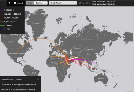
migration through space and time. The platform turned massive amount of tabular data into selectable, comparable and easily understandable visuals, allowing researchers and other users to investigate into the human migration patterns and trends interactively. From 1990 to 2013, between 232 countries and territories worldwide, there are nearly two million migration streams (232 origins times 231 destinations times 34 years 4b compare the immigrant and emigrant flow patterns of Saudi Arabia in 2013. Without seeing the detailed numbers, it is clear from the map that there are more people moving into Saudi Arabia than moving out of it, and the immigrants are mostly from Southern Asia and Northern Africa, while the emigrants are mostly going to North America, Australia and Western European countries.
Figure 4a Immigrants to Saudi Arabia in 2013
Figure 4b Emigrants from Saudi Arabia in 2013
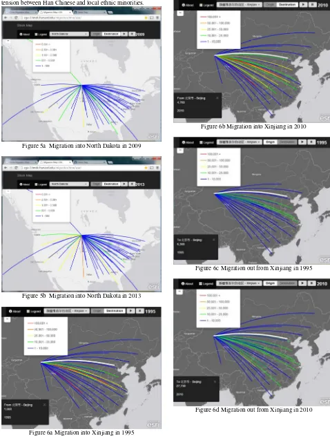
Temporal trends in human migration are revealed by the platform when the time bar is invoked. Figure 5a and 5b compares the immigrants into North Dakota between 2009 and 2013, and show a significant increase, especially from Texas, perhaps due to the fracking boom in the later year.
Another example is the Xinjiang Uyghur Autonomous Region of China. Similar to the State of North Dakota in the US, Xinjiang is in the northwest of the country, a large territory, sparsely populated, rich in oil and gas. The platform revealed that though human migration in both directions between ISPRS Annals of the Photogrammetry, Remote Sensing and Spatial Information Sciences, Volume II-4/W2, 2015
Xinjiang and other parts of China have been increasing from 1995 to 2010, immigration into Xinjiang is consistently several times more than emigration out of it. Henan and Sichuan, two most populated provinces in China, contributed the highest numbers of immigrations (Figure 6a and 6b). The net increase in Xinjiang’s population might have contributed to the social tension between Han Chinese and local ethnic minorities.
Figure 5a Migration into North Dakota in 2009
Figure 5b Migration into North Dakota in 2013
Figure 6a Migration into Xinjiang in 1995
In 1995, Sichuan was the only province receiving more than 10,000 emigrant from Xinjiang, while by 2010, Beijing received nearly as many emigrants as Sichuan, four times more than it received in 1995 (Figure 6c and 6d).
Figure 6b Migration into Xinjiang in 2010
Figure 6c Migration out from Xinjiang in 1995
Figure 6d Migration out from Xinjiang in 2010 ISPRS Annals of the Photogrammetry, Remote Sensing and Spatial Information Sciences, Volume II-4/W2, 2015
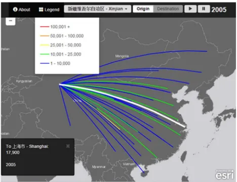
In 2000, Shanghai was the most favorable destination and received 27,510 emigrants from Xinjiang, but the number dropped to 17,900 in 2005 (Figure 7a and b), and rebounded to 21,400 in 2010, following Sichuan (27,780), Beijing (27,730), Guangdong (24,830) and Jiangsu (21,980).
Figure 7a Migration out from Xinjiang to Shanghai in 2000
Figure 7a Migration out from Xinjiang to Shanghai in 2005
The platform enabled researchers to quickly compare human migration data across geographic and temporal domains, discovering patterns, formulating hypotheses, contemplating scenarios, and verifying relationships. However the authors consider the significance of this work not limited for visualizing human migration of any region at any scale. It is suitable for visualizing any flow or connection through space and time. Potential applications include, but not limited to, import and export of goods, capital investments, technology transfers, partnerships, communications, and many more. The only input requirement is to have the geographic features of origins and destinations, and have the flow or connection data organized in a table with four columns: Origin, Destination, Time, and Measurement. The hosting server requires an ArcGIS for Server license, but the users only need a web browser.
5.2 Future Enhancements
This platform was developed with very limited staff time. Though it achieved the original objective, much enhancement could be done when resources become available. For example, some users may wish to be able to select from different base maps, change symbology for the flow streams, or shade the
polygons by their population or other properties. Users may also wish to be able to upload their own dataset and create new applications without contacting the system development staff. Much more enhancement ideas will come directly from the users when this platform is released for public use. The authors welcome comments and suggestions from all users.
REFERENCES
Boucher, Anna and Gest, Justin, 2016 (forthcoming). Crossroads: A Global Approach to Comparative Immigration Policy and Demographic Change. New York: Cambridge University Press.
China Data Center, 2015. Data & Services. Retrieved 5 24, 2015, from China Data Center, University of Michigan: http://chinadatacenter.org/DataCategory/DataCategory.aspx?typ e=2
Gest, Justin and Boucher, Anna, 2015. 'Crossroads of Migration Stock Map', Harvard University Center for Geographic Analysis, accessed via www.crossroadsofmigration.com.
GitHub, 2015. Bootstrap Map JS. Retrieved 5 25, 2015, from Esri: https://github.com/Esri/bootstrap-map-js
Lao, X., 2015 (under review). Spatial Pattern Changes of China’s Internal Migration at Scales of Prefecture-level Cities: Evidence from the Fifth and Sixth National Population Census Data (in Chinese). Population Research.
United Nations Department of Economic and Social Affairs, 2013. Trends in International Migrant Stock: Migrants by Destination and Origin (United Nations database, POP/DB/MIG/Stock/Rev.2013).
U.S. Department of Commerce, 2015. Migration/Geographic Mobility. Retrieved 5 24, 2015, from United States Census Bureau: https://www.census.gov/hhes/migration/data/acs/state-to-state.html