Jurusan Desain Komunikasi Visual, Fakultas Seni dan Desain –Universitas Kristen Petra http://www.petra.ac.id/~puslit/journals/dir.php?DepartmentID=DKV
PACKAGING DESIGN IN SOUTH KOREA AND IN INDONESIA
Listia Natadjaja
Visual Communication Design Department, Art and Design Faculty Petra Christian University Surabaya
E-mail: [email protected]
ABSTRACT
These days due to the global market development, there are many products that are marketed outside the local area. I found that there are differences between local and export design in Nongshim instant noodle packaging, marketed in South Korea and in Indonesia. This study, discusses the differences between packaging design elements of the famous instant noodle brand in South Korea. Hopefully, through this study, we can have a description of what kind of design elements should be kept and what kind of information should be added or changed for the export product.
Keywords: Nongshim instant noodle, South Korea, Indonesia, packaging design.
ABSTRAK
Saat ini dikarenakan perkembangan pasar global, banyak produk yang dipasarkan di luar area lokal. Penulis menemukan perbedaan yang menarik anmtara desain lokal dan desain yang diperuntukan untuk eksport pada kemasan mie instant merek Nohngshim yang dipasarkan di Korea Selatan dan di Indonesia. Pada studi ini, penulis ingin membahas perbedaan apa sajakah yang terdapat pada elemen-elemen desain kemasan sebuah merek mie instant yang terkenal di Korea Selatan. Diharapkan melalui studi ini, kita bisa mendapatkan sebuah gambaran elemen-elemen desain apa saja yang harus dipertahankan dan informasi apa saja yang harus ditambahkan atau dirubah untuk produk ekspor.
Kata kunci: mie instant Nongshim, Korea Selatan, Indonesia, desain kemasan.
INTRODUCTION
Many products compete on the shelves of stores, supermarkets, hypermarkets, etc. with many ways to sell the products; one of them is through packaging design. As a promotion tool, packaging design could function as the “silent sales person” (Wirya, 1999). Through the design elements, packaging design represents the product inside. This paper tries to compare the same product with different packaging designs, one is packaging for the local market in South Korea and the other is for an international market, one of which is in Indonesia.
GLOBAL MARKET
The concepts of exchange and relationships lead to the market. A market is the set of actual and potential buyers of a product. These buyers share a particular need or want that can be satisfied through exchange relationships. The size of a market depends on the number of people who exhibit the need, have resources to engage in exchange, and are willing to exchange the resources for what they want (Amstrong, 2005: 16).
The marketing environment is made up of micro and macroenvironment. The microenvironment
consists of the actors (people or organizations) close to the company that affects its ability to serve its customers the company, suppliers, marketing interme-diaries, customer markets, competitors and publics. The macroenvironment consists of the larger societal force hat affects the microenvironment demographic, economic, neural, technological, political and cultural forces. It is often said that microenvironmental forces have a direct impact on the firm’s marketing operations and sometimes will be controllable, to a certain degree, by the marketing firm. On the other hand, macroenvironmental forces are broader in nature, have an indirect or lagged effect on the marketing operation of the firm. Based on that fact, we should realize that markets today are becoming more open and susceptible to external forces.
Markets in Asia are not isolated from the rest of the world. Global trends will impact on the Asia region and individual Asian countries (Amstrong, 2005: 91-92).
INSTANT NOODLE DESIGN PACKAGING
throughout its distribution and sale. Packages perform the primary purpose of containment and protection, but vary enormously in appearance, texture, graphic, shape, cost and structure. When designing a package, no single package is necessarily right or wrong but one might be considerably more appropriate than another (Denison, 1999).
Instant noodle packaging material is named flexible packaging. Like plastic, flexible packaging is everywhere. In its most basic form, flexible containers have been utilized since ancient times. In its more complex state, flexible packaging is one of the latest innovations of the packaging industry. By definition, a flexible package is not rigid or hard, but is formed or wrapped around a product and is pliable, yielding to touch. Flexible packaging can be a total enclosure or a partial enclosure. As a total enclosure, the package will completely contain the product without aid of another medium. Partial enclosure, on the other hand, might include an internal element such as a liner made of foil, plastic or paper (Mosberg, 1989: 95). The food industry is a major user of flexible packaging. The variety of products to be packaged requires that a host of objectives be met. The objectives may or may not include: moisture barrier protection, oxygen barrier protection, fragrance and taste protection, puncture resistance, clarity, UV light repellency, seability, re-closeability. (Mosberg, 1989: 97). Almost all instant noodles use this kind of material, but sometimes use different composition of layers. Flexible packaging as a whole is growing. According to the 2002 Flexible Packaging Association’s State of the Industry Report, flexible packaging accounts for 17 percent of the total packaging market. The newest figures acquired by the FPA reveal that it is now a $20 billion industry, up from $17 billion in 1997. Flexible packaging is a broad category encompassing such items as pouches, bags and wraps. Arguably, items such as blister packs and shrink sleeves can also be included under the umbrella of flexible packaging. The FPA defines a flexible package as any package whose shape can be readily changed. Flexible packaging is utilized in a variety of fields—food and beverage, pet food, medical, cosmetics, health and beauty, and other consumer product.
Flexible packaging printed on the world wide web constitutes the more visible end of the flexible packaging industry as it is largely responsible for printing and constructing such items as large stand-up pouches and retortable packaging, used widely in the food industry due to its functionality and increased advertising space. Many companies also recognize the ability for flexible packaging to offer increased billboard space. Not reliant on a label, the package can
feature glossy graphics that stretch from one end to another. While this can be an asset, it is not always taken advantage (Zilenziger, 1996)
There are many elements of packaging design that can be modified through creative strategy, like: color, shape, brand, illustrator/character, typography, layout etc. (Nugroho, 2006).
INSTANT NOODLE NONG SHIM KOREA
The Korean brands come mainly in plastic wrappers like normal local brands except that they are larger in size and also come with sachets of dried vegetables that miraculously expand into bite size chunks in hot water! The texture of the noodles is tangier and quite distinctively Korean. These instant noodles cost around 4000-8000 Rupiahs (Food Avenue, 2002). From many instant noodle products in Korea, it can be said that the instant noodle Nong Shim brand is popular and many of Korean people buy this product (Hohl, 1997).
ANALYSIS OF PACKAGING DESIGN ELE-MENTS
Company : Nong Shim
Brand name : Shin Ramyon (Shin Instant Noodle)
Taste : A hot soup with thick noodles.
Result in gr. : 120 g
and the expiration date. There is also the label information attached at the side of the packaging which informs about the composition, the seasoning, serving suggestion, the name of importer and producer and the given number from BPOM RI (Food and Drug Research Institute). Both designs packaging have point of interest at the Chinese typography Shin
Basically, the information at the back side of the Shin Ramyun instant noodle is the same. The big difference is the use of typography. For Korean market, they totally use Hangul, the name for Korean Character
Picture 1. Frontside of Shin Ramyun Packaging in South Korean and Indonesian Markets
Picture 2. Backside of Shin Ramyun Packaging in South Korean and Indonesian Markets
common to consume daily in Korea, so the consumer must know how to serve the noodle soup. The position of the ingredients information is also changed, it is probably because the arrangement of the layout, or the position of directions for one serving is more important to read (considering the direction of reading). Meanwhile, for the export product, the ingredients information is more important than the information of product variant.
Company : Nong Shim
Brand : AnSungTangMyun (AnSung Noodle
Soup)
Taste : Oriental Style Noodle, hot, suited for
vegetarian. Result in gr. : 125 g.
Picture 3. Frontside of a New AnSungTangMyun Packaging in South Korean and Indonesian Markets
Like Shin Ramyun, these three packaging design basically look the same, but if we look at the design elements on detail, there are some differences. All packaging use orange color. Two of these packaging products are for local consumers and one for international market. The position of reading is horizontal. The color of these three packaging is exactly the same, also the photography. The size of
packaging is the same, and it contains the same weight 125 g. This product must be exported to other countries besides Indonesia, because of the written oz weight measure. The company brand Nong Shim has been translated into international alphabets so consumers could read the name of the producer who produces this instant noodle. Brand typography for the Chinese character doesn’t have any changes, but the international market could not read it, so it is translated again to AnSungTangMyun. The Chinese characters describes AnSungTangMyun. In order to make the international market understand that this is instant noodle, the producer needs to add the information noodle soup. The information hot and spicy has been added also the information at the side of the packaging also informs the Depkes RI, the name of the importer and the expiration date. There is also the label information attached at the side of the packaging. The point of interest of the design is the photograph of noodle soup. The change of packaging design for the local market shows that there is a dynamic design. First they use civet-cat character as a mascot, but then in the new product, instead of using the civet-cat mascot they change into the bowl mascot.
Picture 4. Frontside of Previous AnSungTang Myun Packaging in South Korean Market
directions of serving and the mascot, but they don’t use it for the new packaging. They write cooking instructions instead of directions of serving. The producers also put the product of Korea at the left site bottom of the packaging. This information could be just to fill the layout, or to make an awareness of the product.
Company : Nong Shim
Brand : Noguri Udon (Noguri Wheat Noodles)
Taste : Regular, usual large soup with slightly
hotter taste Result in gr. : 120 g.
Picture 5. Backside of a New AnSungTangMyun Packaging in South Korean and Indonesian Market
Picture 6. Backside of Previous AnSungTang- Myun Packaging in South Korean Market
Picture 7. Frontside of Noguri Udon Packaging in South Korean and Indonesian Markets
Like the others, the information at the backside of the Neoguri noodle soup is the same. The big difference is the use of typography, for Korean market they totally use Hangul, but for international market they use alphabets. They put the brand name, barcode and the address of the manufacturer at the same position between local and export product. Nong Shim put the directions of serving for the Korean and international packaging. They put the noodle soup photograph for the Korean packaging, to show the shape of the noodle, because usually the udon noodle is thick. This strategy could be to attract the Korean
cusumers to try the Neoguri instant noodle or just balancing the packaging lay out. Because Neoguri is a bit different with common instant noodles, the producer needs to add the serving information so the consumer understands how to serve the Neoguri instant noodle soup. The position of the ingredients information also changed, it is probably because the arrangement of the layout, or the position of directions of serving is more important to read (considering the direction of reading).
All packaging design put their brand bigger than
the company name. This is the right thing to do because brand itself should be a focus of attention of the consumers. The producer can put the company name as a second alternative (Ries, 2000: 103). All Nong Shim packaging design, especially typography, color and layout show that the products are from
Korea. Every brand, like every human, always comes from one place. It doesn’t matter where your brand is designed; the name and connotation determine the geographic perception (Ries, 2000: 139). One global message sometimes has to be made in order to accommodate another language besides English. (Ries, 2000: 141).
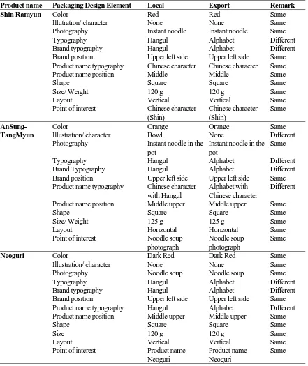
Tabel 1. The Packaging Design Elements Comparation
Product name Packaging Design Element Local Export Remark
Shin Ramyun Color Red Red Same
Illutration/ character None None Same
Photography Instant noodle Instant noodle Same
Typography Hangul Alphabet Different
Brand typography Hangul Alphabet Different
Brand position Upper left side Upper left side Same
Product name typography Chinese character Chinese character Same
Product name position Middle Middle Same
Shape Square Square Same
Size/ Weight 120 g 120 g Same
Layout Vertical Vertical Same
Point of interest Chinese character
(Shin)
Chinese character (Shin)
Same
Color Orange Orange Same
AnSung-TangMyun Illustration/ character Bowl None Different
Photography Instant noodle in the
pot
Instant noodle in the pot
Same
Typography Hangul Alphabet Different
Brand Typography Hangul Alphabet Different
Brand position Upper left side Upper left side Same
Product name typography Chinese character
with Hangul
Alphabet with Chinese character
Different
Product name position Middle upper Middle upper Same
Shape Square Square Same
Size/ Weight 125 g 125 g Same
Layout Horizontal Horizontal Same
Point of interest Noodle soup
photograph
Noodle soup photograph
Same
Neoguri Color Dark Red Dark Red Same
Illustration/ character None None Same
Photography Noodle soup Noodle soup Same
Typography Hangul Alphabet Different
Brand typography Hangul Alphabet Different
Brand position Upper left side Upper left side Same
Product name typography Hangul Alphabet Different
Product name position Middle upper Middle upper Same
Shape Square Square Same
Size 120 g 120 g Same
Layout Vertical Vertical Same
Point of interest Product name
Neoguri
Product name Neoguri
Three of the analyzed packaging designs show that Nong Shim likes to use bright colors like red and orange. Red color seems to move the eyes forward as soon as we look at it. It is so eye catching. Maybe because of this reason, red is the dominant color that forces the energy and inviting (Ries, 2000: 128).
CONCLUSION
Basically, the overall packaging designs are similar. This similar design between local and interna-tional market is important to keep the brand and product in the mind of the consumers. Whenever the consumer is Korean and they buy the product outside South Korea, they could notice the product faster and easier. For international consumers who travel to South Korea, they could easily find the product. It is important for both sides to know the packaging if they want to ask somebody else to buy the product.
The most important element that must be changed for international market is typography. The clear information about the product should get the attention. This could be successful if the information uses English or original language. In case of using Korean characters, Nong Shim usually keeps the Chinese character. This could be because the Chinese character is known internationally, or it is identical with the product name and brand awareness. There are many elements that Nong Shim does not want to change and keep the same, which are color, photography, the position of brand and product name, shape, size and layout. These elements are crucial for consumers to acknowledge the product immediately. Nong Shim uses the bright color and big typography to get consumer attention. Photography of noodle soup is very important, so it is made for the consumer to gain the taste of the product. Based on the three packaging, Nong Shim does not put any animal character in those packaging designs. It may be because character usually has different meaning in different countries.
The backside of packaging design is similar. Although it is not the point of sale, the producer realizes that it gives a lot of help to consumers to understand the product. Some of the information is changed in order to be successful in international markets.
REFERENCES
Amstrong, Garry, et al. (2005). Marketing An Intro-duction on Asia Perspective. Prentice Hall, USA.
Edward Denison, Richard Cawthray. (1999). Packaging
Prototype. RotoVision SA
Food Avenue Editor. (2002). Instant Noodle War? Food Avenue, Sdn Bhd. July 2003. http://www. foodvenue.com/content/features/f010005_nood lewars.asp
Hohl, Fritz. (1997). Asian Instant Noodle Soup
Wor-ship Page. September 2003
http://www.infor-matik.uni-stuttgart.de/menschen/hohldir/soups. html
Mosberg, Stewart, (1989), Design in Motion Packa-ging, PBC International, Inc, New York.
Natadjaja, Listia. (2003). Comparison Study of Instant Noodle Nongshim Korea and Indomie Indonesia as The Effect of packaging Design Point of Interest to The Consumer Brand Preference. Jurnal Nirmana, Vol 5, no.2, 123-136.
Nugroho, Banu Tri. Menambah Daya Tarik Melalui
Keindahan, 20 Nopember 2006, http://mipa.
uns.ac.id/~scienta/tutorial.doc.
Ries, Al & Ries, Laura, (2000) 22 Immutable Laws of Branding, PT. Gramedia Pustaka Utama, Jakar-ta.
Wirya, Iwan. (1999). Kemasan Yang Menjual, Jakarta: PT. Gramedia Pustaka Utama.
Zilenziger, J.Rodman. (1996). Label and Narrow
Web, Rodman Publication Online, 21 Oktober