3
Exploratory data analysis, display and summary of multivariate data
Display is an obligation! (Tukey, 1986)
Overview
Two tools of exploratory data analysis (EDA), the stem-and-leaf plot and boxplot, provide versatile and informative displays of process data and enable outliers to be defined and detected. The brushing facility in Minitab is introduced as it enables subsets of data sets displayed in graphs to be readily identified and explored.
There are many situations where two or more performance measurements are made in assessing process performance, so some familiarity with techniques for the display and summary of bivariate and multivariate data is important.
3.1 Exploratory data analysis
3.1.1 Stem-and-Leaf displays
In 1998 when the author worked in Dunfermline, Scotland, he was involved in a process that many of us undertake every day – the process of driving to work. The route from Loanhead, across the Forth Road Bridge, was 25 miles long. A run chart of journey duration (minutes) for 32 journeys undertaken during September and October 1998 is shown in Figure 3.1.
The lowP-value for clustering indicates the possible influence on journey duration of some special causes. In addition to journey duration, the weather was recorded as either dry (D) or wet (W). The author had a hunch that this (uncontrollable!) factor influenced journey duration.
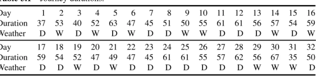
The data are given in Table 3.1 and are available in the supplied worksheet Travel.MTW. The
Six Sigma Quality Improvement with Minitab, Second Edition. G. Robin Henderson.
Ó2011 John Wiley & Sons, Ltd. Published 2011 by John Wiley & Sons, Ltd.
worksheet also contains a column giving the dates of the journeys and a column named Wcode which contains weather codes 1 for dry and 2 for wet.
In order to compare journey durations under the two categories of weather conditions, dry and wet, and in order to make further exploration of the data easier, stem-and-leaf displays will be constructed. Scrutiny of the data reveals durations ranging from the thirties to the sixties.
Stem values of 3, 4, 5 and 6 will be used corresponding to the thirties, forties, fifties and sixties.
Each stem will appear twice in the display corresponding to the low thirties, the high thirties, the low forties, the high forties etc. Consider first the durations for dry days: 37, 40,. . ., 50.
Thus the first dry day duration of 37 minutes is a value in the high thirties, i.e. in the range 35–39 inclusive, and will be considered as a leaf value of 7 attached to the stem value of 3 that corresponds to the upper thirties. The second dry day duration of 40 minutes is a value in the low forties, i.e. in the range 40–44 inclusive, and will be considered as a leaf value of 0 attached to the stem value of 4 that corresponds to the low forties.
In Minitab stem-and-leaf displays are created in the Session window and may be obtained using eitherStat>EDA>Stem-and-Leaf. . .orGraph>Stem-and-Leaf. . .. In either case By variable:Wcode has to be specified as only numeric variables may be used in this way with the Stem-and-Leaf procedure.
Figure 3.1 Run chart of journey duration.
Table 3.1 Journey durations.
Day 1 2 3 4 5 6 7 8 9 10 11 12 13 14 15 16
Duration 37 53 40 52 63 47 45 51 50 55 61 61 56 57 54 59
Weather D W D W D W D D W W D D D W D W
Day 17 18 19 20 21 22 23 24 25 26 27 28 29 30 31 32
Duration 59 54 52 47 49 47 45 61 61 55 57 62 56 67 35 50
Weather D D W D W D D D D D D D W W W D
The stems are shown in the second column and the leaves in the third column in Panel 3.1.
The first column contains what are known in the jargon of exploratory data analysis (EDA) as the values of depth. The first four depths listed, 1, 2, 6 and 10, correspond to the highest durations on each of the first four stems. Thus, for example, the highest duration of 47 on the third stem is 6 values deep into the ordered data set starting from the minimum. The final two depths listed of 10 and 6 correspond to the lowest durations on each of the final two stems. For example, the duration of 55 on the penultimate stem is 10 values deep into the ordered data set starting from the maximum. The display gives N¼20, indicating that the data set included durations for 20 journeys under dry conditions. The median duration corresponds to depth (Nþ1)/2, which in this case is 10.5, indicating that the median is the mean of the 10th and 11th ordered durations, i.e. (54þ55)/2¼54.5.
The stem-and-leaf display of the 12 journey durations on wet days is shown in Panel 3.2.
The bracketed 4 in the depth column indicates that the median duration lies in the correspond- ing interval and also that there are four durations in that interval. In Panel 3.1 where the median lies on the boundary between intervals there was no need for a bracketed frequency count. The reader is invited to check that the median in this case is 52.5.
Visual comparison suggests that location and spread are similar for both dry and wet conditions. Thus it would appear that the author’s hunch was incorrect! Figure 3.2 indicates how stem-and-leaf displays and histograms are, in essence, equivalent data displays. The stem-and-leaf displays in Panels 3.1 and 3.2 (without the depth values) have been rotated and positioned below the corresponding histograms. The first stem of 3 corresponds to durations in
Stem-and-leaf of Duration Wcode = 2 N = 12 Leaf Unit = 1.0
1 3 5
1 4 3 4 79 (4) 5 0223
5 5 5679 1 6
1 6 7
Panel 3.2 Stem-and-leaf display of duration (wet days).
Stem-and-Leaf Display: Duration
Stem-and-leaf of Duration Wcode = 1 N = 20 Leaf Unit = 1.0
1 3 7
2 4 0
6 4 5577 10 5 0144 10 5 5679 6 6 111123
Panel 3.1 Stem-and-leaf display of duration (dry days).
EXPLORATORY DATA ANALYSIS 65
the upper thirties, i.e. in the range 35–39 inclusive. Thus the midpoint value for the corresponding histogram bin is 37. The second stem of 4 corresponds to durations in the lower forties, i.e. in the range 40–44, the midpoint value for the corresponding histogram bin being 42, and so on. With this choice of binning for the histograms the profiles formed by the stacks of leaves of leaves match the bars of the histograms.
The reader might well ask, therefore, if one needs to know about the stem-and-leaf display in addition to the histogram. An answer is provided by one of the data sets in the Minitab Sample Data folder provided with the software. The worksheet Peru.MTW has data from an anthropological study of the effects of urbanization on people who had migrated from mountainous areas. Pulse rates were recorded for the subjects in the investigation and a stem-and-leaf display is shown in Panel 3.3.
Of the pulse rates for the 39 subjects the only value not divisible by 4 is 74. This suggests that the person recording the pulse rates generally counted heartbeats for a period of 15 seconds and then multiplied by 4 to obtain heart rate. Thus, if the standard procedure required heartbeats to be counted for a full minute, the data appear to provide evidence that the measurement system was not being implemented correctly.
Quartiles are included in the default list of descriptive statistics provided by Minitab – see Panel 3.4 for the results for journey duration by weather. Calculation of the median by
‘chopping’ the ordered data set in half has already been discussed in Section 2.1.1. The procedure may then be repeated, with the lower half of the data being chopped in half to give a
Figure 3.2 Stem-and-leaf displays viewed as histograms.
lower quartile Q1 of 47 for journeys on dry days and the upper half chopped in half to give an upper quartile Q3 of 61. The median may also be referred to as the middle quartile, Q2.
Essentially the three quartiles split the data set into ‘quarters’. The median is also referred to as the 50th percentile, the lower quartile the 25th percentile, and the upper quartile the 75th percentile. Interested readers my access the technical details of the calculation of quartiles in Minitab via the Help facility.
3.1.2 Outliers and outlier detection
One of the benefits of statistical methods is their ability to signal the presence of any unusual values in a data set. The detection of unusual values can lead to insights into how factors (the Xs) affect process responses (theYs). Unusual values may, of course, simply be due to incorrect data recording or to data input errors. Unusual values or outliers may be detected as follows.
The inter-quartile range (IQR) is the difference Q3 – Q1 and may be used as a measure of variability or spread. In EDA, outlier detection requires the use of lower and upper limits calculated using the formulae given in Box 3.1.
Stem-and-Leaf Display: Pulse
Stem-and-leaf of Pulse N = 39 Leaf Unit = 1.0
1 5 2
2 5 6
15 6 0000004444444 19 6 8888
(9) 7 222222224 11 7 6666 7 8 004 4 8 888
1 9 2
Panel 3.3 Stem-and-leaf display of pulse rates.
Lower limit¼Q1 1:5IQR Upper limit¼Q3þ1:5IQR
Box 3.1 Formulae for limits used in outlier detection.
Descriptive Statistics: Duration
Variable Weather N N* Mean SE Mean StDev Minimum Q1 Median Q3 Duration D 20 0 53.30 1.73 7.75 37.00 47.00 54.50 61.00
W 12 0 52.67 2.21 7.67 35.00 49.25 52.50 56.75
Variable Weather Maximum
Duration D 63.00
W 67.00
Panel 3.4 Descriptive statistics for dry and wet days.
EXPLORATORY DATA ANALYSIS 67
For the durations on dry days the formulae yield:
IQR¼61 47¼14;
Lower limit¼47 1:514¼26;
Upper limit ¼61þ1:514¼82:
Outliers are defined as values falling either below the lower limit or above the upper limit. For dry days the minimum and maximum durations were 37 and 63 so therefore there are no outliers.
For the durations on wet days we have
IQR¼56:75 49:25¼7:5;
Lower limit¼49:25 1:57:5¼38;
Upper limit ¼56:75þ1:57:5¼68:
Thus the duration of 35 minutes on one of the wet days is an outlier as it falls below the lower limit of 38, i.e. the duration of 35 minutes is being ‘flagged’ as the result of possible special cause variation. On checking his diary for that date, the author discovered that he had delivered a training course and had left home earlier than usual in order to set up the training room and had thereby driven in lighter traffic than normal.
Outliers may be obtained via Minitab by checking theTrim outliersoption in the Stem- and-Leaf dialog box. Note in Panel 3.5 how the value of 35 appears beside the text LO indicating that it is a low outlier: high outliers appear with the text HI. (For this facility to work the data for dry days has to be in a separate column from the data for wet days.)
3.1.3 Boxplots
The use of the median as a measure of location, the use of IQR as a measure of variability and the outlier detection procedure described above can be combined in a very powerful display called aboxplot. In order to display the journey duration data in this way for each weather condition use is made ofGraph>Boxplot. . ., with theOne Y,With Groupsoptions being selected and the dialog box completed as shown in Figure 3.3. Duration is specified under Graph variables:. Either Weather or Wcode may be used as Categorical variable for grouping:here. The Labels. . .button was used to create the title. Click on OK and the boxplots are created as displayed in Figure 3.4.
Panel 3.5 Outlier detection via Minitab stem-and-leaf.
Boxplots are sometimes known as box-and-whisker plots, for obvious reasons. The ends of a box correspond to the quartiles, the line across the box corresponds to the median. The medians indicate location for the samples and the box lengths (IQRs) indicate variability.
Outliers are denoted by asterisk symbols. The adjacent values are defined as the lowest and highest data values in a sample, which lie within the lower and upper limits. For dry days the adjacent values are 37 and 63. For wet days the adjacent values are 47 and 67. The whiskers extend from the ends of the boxes to the adjacent values.
Figure 3.3 Dialog for creating boxplots.
Figure 3.4 Boxplots for duration on dry and wet days.
EXPLORATORY DATA ANALYSIS 69
Scrutiny of data displayed as boxplots gives an immediate visual impression of location in terms of the position of the box(es) relative to the vertical measurement scale and of variability in terms of the length(s) of the box(es). The reader may have observed that the default for a histogram in Minitab is to have the measurement scale horizontal whilst the default for a boxplot is to have the measurement scale vertical. TheScale. . .button in the dialogs for both displays enables the alternatives to be selected by checkingTranspose Y and Xin the case of the histogram andTranspose value and category scalesin the case of the boxplot.
In Figure 3.4 the mouse pointer is shown located on the outline of the box part of the display for dry days. This triggers display of a summary of the data in the group, i.e. the sample size, the quartiles and the IQR, together with the group identity and the adjacent values.
On moving the cursor to an asterisk denoting an outlier the corresponding row number and value of duration are displayed, as shown in Figure 3.5. With a large data set this is clearly a very useful facility to have in the search for knowledge of special causes affecting processes, knowledge that may be used to achieve improvement. The brushing facility in Minitab may also be used to identify and view information on plotted points in graphs of interest to the user.
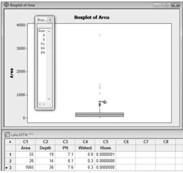
3.1.4 Brushing
Brushing provides a way of investigating data corresponding to a point or group of points of interest to the user in a Minitab graph e.g. outliers on a boxplot. As an example, open the Minitab worksheet Lake.MTW that is supplied with the software and which gives measure- ments of 71 lakes in northern Wisconsin. Create a boxplot of area and note that there are nine outliers in the plot. Suppose that we wish to create a worksheet that includes, for further analysis, data for those lakes that are flagged as outliers on the boxplot. With the graph active, use Editor>Brush to activate the brushing facility. (Alternatively click on the brush icon .) A window, referred to as the Brushing Palette, appears on the left of the screen with the heading Row. Move the mouse pointer over the plot and note how it changes to a pointing finger shape. With the tip of the finger located on the asterisk representing the lake with the greatest area, click. The colour of the asterisk changes and the number 55 appears in the Brushing Palette, indicating that the data for the corresponding lake are in row 55. Keep the shift key depressed, move to the next asterisk and click again. The number 5 will now appear in the window together with the number 55. Continue in this way, keeping the shift key depressed,
Figure 3.5 Identifying an outlier.
until all nine outliers have been identified. The Brushing Palette should now display the row numbers 3, 5, 37, 40, 51, 55, 60, 62 and 64. The row numbers are automatically sorted as each new point is brushed. Figure 3.6 displays the boxplot, the brushing palette and the worksheet after five outliers have been brushed.
Note that in the worksheet there are black dots to the left of the row number for each of the brushed rows. Thus variables other than area could readily be scrutinized for lakes classified as outliers on the basis of area. If the Brushing Palette is closed, by clicking the cross in its top right-hand corner, then the brushed points revert to their original colour and the black dots disappear from the worksheet. The reader is invited to do this, to activate the brushing facility and to brush the nine outliers again by clicking on the graph so that the pointing finger shape appears and, while keeping the mouse button depressed, dragging the mouse to create a dotted rectangle enclosing the nine points of interest. On releasing the mouse button the Brushing Palette should now include the row numbers 3, 5, 37, 40, 51, 55, 60, 62 and 64.
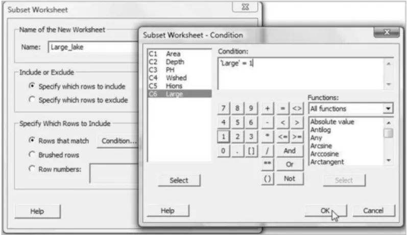
SelectEditor>Create Indicator Variable. . . and a menu will appear. EnterColumn:
Large, selectUpdate now, clickOKand close the Brushing Palette. Examination of the worksheet reveals that a column named Large has been created with value 1 in rows that have been brushed and value 0 in other rows. NextData>Subset Worksheet. . .enables the dialog in Figure 3.7.
The default name for the new worksheet may be changed to one that is appropriate, e.g.
Large_lake.MTW. The defaultSpecify which rows to includewas accepted underInclude or Exclude. Under Specify Which Rows to Include, clicking on Condition. . . provides a subdialog box in which ‘Large’¼‘1 is entered underCondition:. ClickingOKcompletes the creation of the new worksheet for the nine outlier lakes. Note the availability of the Boolean operatorsAnd,OrandNotso that more complex conditions may be created.
Figure 3.6 Brushing outliers in a boxplot.
EXPLORATORY DATA ANALYSIS 71
3.2 Display and summary of bivariate and multivariate data
3.2.1 Bivariate data – scatterplots and marginal plots
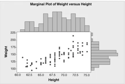
The Minitab data set Pulse.MTW was referred to in Chapter 2. Consider the random variables Height and Weight for the students, denoted byXandY, respectively. The first student listed in the worksheet had height 66 inches and weight 140 pounds, so the pointðx1;y1Þ ¼ ð66;140Þ in a two-dimensional coordinate system can be used to represent this student. Use of Graph>Scatterplot. . .>Simple, selection of Weight as Y variable (vertical axis) and Height as X variable (horizontal axis), and acceptance of defaults otherwise, yields the scatterplot or scatter diagram of the data displayed in Figure 3.8.
Figure 3.7 Dialog for creation of a subset of a worksheet.
Figure 3.8 Scatterplot of weight versus height.
The scatterplot has been modified so that the point representing the first student is represented by a triangle with lines drawn parallel to the axes to indicate the weight of 140 and the height of 66 for that student. The upward drift in the points as one scans from left to right across the diagram indicates a positive relationship between weight and height. It simply reflects what is common knowledge – taller people tend to be heavier than shorter people. (The vertical stacks of points are due to the rounding of height measurements to the nearest half of an inch.) Here we are investigating two random variables at the same time, i.e. we are exploring a bivariate data set.
Use ofGraph>Marginal Plot. . .enables one to explore the univariate aspects also either viaWith Histograms,With BoxplotsorWith Dotplotsconstructed on the margins of the scatterplot. Having selected the With Histograms option, the display in Figure 3.9 was obtained. The histogram of Height appears in the upper margin of the scatterplot, that of Weight appears in the right-hand margin.
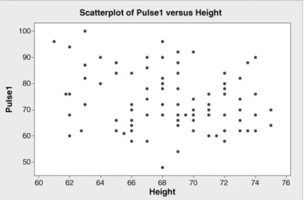
A scatterplot of the first pulse rate recorded (Pulse1) versus height is shown in Figure 3.10.
In this second plot there is no apparent relationship between these two random variables as might be expected.
Scatterplots are a useful tool for exploring relationships betweenYs andXs. The diagram in Figure 3.11 shows the diameter (mm) of a machined automotive component plotted against the temperature (C) of the coolant supplied to the machine at the time of production. The data for this example, available in Diameters.MTW, are copyright (2000) from ‘Finding assignable causes’ by Bisgaard and Kulachi and are reproduced by permission of Taylor & Francis, Inc., http://www.taylorandfrancis.com.
Given that the target diameter is 100 mm, this plot indicates the possibility of improving the process through controlling the coolant temperature (anX) to be more consistent, thus leading to less variability in the Diameter (aY) of the components. Use ofGraph>Scatterplot. . .and theWith Regressionoption (with all defaults accepted) yields the scatterplot in Figure 3.11 with the addition of a straight line modelling the linear relationship between diameter and
Figure 3.9 Marginal plot of weight versus height.
DISPLAY AND SUMMARY OF BIVARIATE AND MULTIVARIATE DATA 73
temperature. The modelling of linear relationships using linear regression will be covered in Chapter 10. The dotted reference lines added to the plot indicate that it appears desirable to maintain the coolant temperature at around 22C.
3.2.2 Covariance and correlation
In order to measure the ‘strength’ of the linear relationship between two random variables the concept ofcovarianceis required. Four small data sets will be used to introduce the concept.
Figure 3.11 Scatterplot of diameter versus temperature of coolant.
Figure 3.10 Scatterplot of pulse rate versus height.
The formula for calculating sample covariance is given in Box 3.2. It is similar in structure to the formula for variance given in Chapter 2. In fact the covariance betweenxandxis simply thevarianceofx.
Data set 1, for which the means ofxandyare 12 and 6 respectively, is displayed in Table 3.2 together with the results of calculations required to obtain the covariance. The covariance betweenxandyis
covðx;yÞ ¼
Pðxi xÞðy i yÞ
n 1 ¼288
8 ¼36:
Having entered the data into two columns namedxandy, the result can be verified in Minitab usingStat>Basic Statistics>Covariance. . .. The output in the Session window is displayed in Panel 3.6. The covariance of 36 calculated via Table 3.2 is confirmed by the
Table 3.2 Calculation of covariance.
Data set 1
xi yi xi x yi y ðxi xÞðy i yÞ
0 0 12 6 72
4 2 8 4 32
6 3 6 3 18
8 4 4 2 8
12 6 0 0 0
14 7 2 1 2
16 8 4 2 8
22 11 10 5 50
26 13 14 7 98
Total 0 0 288
The sample covariance betweenxandy, denoted by cov(x,y), is given by
covðx;yÞ ¼ Pn
i¼1ðxi xÞðy i yÞ
n 1 :
Box 3.2 Formula for covariance.
Covariances: x, y
x y
x 72.0000
y 36.0000 18.0000
Panel 3.6 Covariance from Minitab.
DISPLAY AND SUMMARY OF BIVARIATE AND MULTIVARIATE DATA 75
Session window output and, in addition, the variances of x and y are given: 72 and 18 respectively. In reading such a table the covariance betweenxandyis located vertically below thexwhich appears in the header row of variable names and horizontally across from they which appears in the left-hand column of variable names. The creators of Minitab could have chosen to present the output as shown in Panel 3.7. The additional value of 36 in the top right- hand corner of the table is the covariance betweenyandxaccording to the rule for reading the table given above. But since the covariance betweenxandyis identical to that betweenyandx the additional information is redundant. The full square array of values is referred to as the variance–covariance matrix for the variablesxandy.
For data sets 2, 3 and 4, displayed in Table 3.3, you are invited to verify, both by grass-roots calculation and using Minitab, that the covariances are 21.5, 0 and 32 respectively. (Thex values are the same in all four cases. The data are available in FourSets.MTW.) Annotated scatterplots for all four data sets are shown in Figure 3.12. The notation y1x1 is a shorthand used by the software to label the scatterplot of the firstyversus the firstx, i.e. for data set 1 etc.
For data set 1 a perfect linear relationship with a positive slope is evident; the covariance is positive. For data set 2 there is an upward drift in the points; the covariance is positive. For data set 3 the points appear to be scattered at random; the covariance is zero. For data set 4 there is a downward drift in the points; the covariance is negative. In the case of data sets considered earlier, for weight and height the covariance is 68.18, for pulse rate and height 8.53 and for diameter and temperature 0.035. Note how the signs of the covariances are in accord with the appearance of the corresponding scatterplots in the cases of weight and height (positive, see Figure 3.8) and diameter and temperature (negative, see Figure 3.11).
Table 3.3 Further bivariate data sets.
Data set 2 Data set 3 Data set 4
x y x y x y
0 2 0 4 0 11
4 8 4 3 4 13
6 0 6 8 6 8
8 6 8 6 8 4
12 3 12 7 12 7
14 4 14 13 14 6
16 13 16 2 16 3
22 7 22 11 22 2
26 11 26 0 26 0
Had the weights and heights of the students been given in kilograms and metres then the covariance would have been 0.786 (compared with 68.18 for inches and pounds). Thus a problem with covariance as a summary statistic for bivariate data is that its value depends on the units of measurement used. This problem can be overcome by reporting the covariance between the standardized values of the random variable. In this context, standardization means transforming each data value by subtracting the mean from the original value and then dividing by the standard deviation. The standardized values have mean 0 and standard deviation 1. The covariance between the standardized variables is referred to as thecorrelation coefficient.
Formally it is the Pearson product moment correlation coefficient between the original variables and is usually denoted by the symbolr. TheCalc menu in Minitab enables one to standardize variables and then the Covariance facility could be used to obtain the correlation coefficient. However, they are so important that theStat>Basic Statisticsmenu provides aCorrelation. . .submenu enabling them to be obtained directly. You should verify that the correlation between weight and height is 0.785 and that between diameter and temperature is – 0.712.
Alternatively the correlation coefficient (the Pearson product moment correlation to give it its full title) may be calculated from the covariance using the following formula:
r¼covðx;yÞ sxsy ;
wheresxandsyare the standard deviations ofxandy, respectively.
Some properties of the product moment correlation coefficient,r, are as follows:
. ris independent of the units of measurement
. ris not dependent on which of the two variables is labelledxand which is labelledy.
. 1r1, i.e. the value ofrmust lie between 1 and 1 inclusive.
Figure 3.12 Scatterplots of data sets 1, 2, 3 and 4.
DISPLAY AND SUMMARY OF BIVARIATE AND MULTIVARIATE DATA 77
or slope.
. r¼ 1 only if all the points in the scatterplot lie on a straight line with a negative gradient or slope.
. The value ofrmeasures the extent of thelinearrelationship betweenxandy.
. A strong correlation between two variables does not necessarily mean that there is a cause-and-effect relationship between them.
. A small value of the correlation coefficient does not necessarily mean that there is no relationship between the variables – the relationship might be nonlinear.
The square of the correlation coefficient,r2, is known as thecoefficient of determination. It can be interpreted as the proportion of the variation inyattributable to its linear dependence onx.
For the diameter and temperature datar2¼0.51, so just over half the variation in diameter can be attributed to its linear dependence on temperature. The Greek letterr(rho) is used for the population correlation coefficient.
Panel 3.8 shows the Session window output obtained for the correlation between Weight and Height obtained when Display p-values is checked in the Stat>Basic Statistics>
Correlation. . .dialog box. If theP-value is less than 0.05 then it is generally accepted that there is evidence that the population correlationris nonzero. Thus the student data provides evidence of a nonzero correlation between weight and height in the population from which the sample was drawn, provided that the sample can be regarded as a random one from that population.
So far the only data structure we have considered in Minitab is the column. The matrix is another data structure provided and this is a convenient point at which to introduce it. With the Session window active, enable commands viaEditor>Enable Commands. Note how the Session window now has the Minitab Command prompt MTB>displayed. UseStat>Basic Statistics>Correlation. . .and select Weight and Height but check theStore matrix (display nothing)option. On implementation the Session Window contains the output in Panel 3.9. The software has created a matrix m1, named it CORR1 and stored in it the correlations involving
Results for: Pulse.MTW
MTB > Name m1 "CORR1"
MTB > Correlation 'Weight' 'Height' 'CORR1'.
MTB >
Panel 3.9 Storage of correlation matrix.
the variables weight and height. Typing the command Print CORR1, or simply prin m1, after the prompt in the Session window and pressing the enter key yields the Session window output in Panel 3.10.
Alternatively one could useData>Display Data. . ., select the matrix CORR1 and click OKin order to display it. Note how all columns are available for selection to be displayed in the Session window if desired.
3.2.3 Multivariate data – matrix plots
A matrix is a rectangular array of numbers, symbols or objects. TheGraphmenu provides a matrix plot as shown in Figure 3.13 for weight and height. The sequenceGraph>Matrix Plot. . .>Matrix of plots – Simple, with the variable names entered in the order Weight Height was used to create the plot.
The four panels in the matrix plot match the four elements of the correlation matrix displayed in Panel 3.12 as indicated by the annotation that includes the correlation coefficients, rounded to three decimal places. The correlation between weight and height is the same as that between height and weight. Had the pulse rate Pulse1 been included in addition to weight and height then a correlation matrix with three rows and three columns would have been obtained –
Figure 3.13 Matrix plot of weight and height data.
MTB > Print CORR1
Data Display
Matrix CORR1 1.00000 0.78487 0.78487 1.00000
Panel 3.10 Printing a correlation matrix.
DISPLAY AND SUMMARY OF BIVARIATE AND MULTIVARIATE DATA 79
see Panel 3.11. For example, the entry in the top right-hand corner, 0.21179, is the correlation between pulse rate and height. The corresponding matrix plot is shown in Figure 3.14. It has been annotated with the correlations, rounded to three decimal places.
Note that the pattern of correlations in the correlation matrix matches that in the matrix plot – this is the case since the variables were listed in the same order in the corresponding Minitab dialog boxes.
Scrutiny of the matrix of scatterplots reveals that the strongest relationship is that between weight and height. In order to identify the variables for a particular plot, look to the left or right to find the variable plotted on the vertical axis and then look above or below to find the variable plotted on the horizontal axis.
Matrix plots can be very useful for exploring relationships between theYs and theXs for a process. Minitab provides a version of the matrix plot that enables one to specify which variables in the data set areYs and which areXs. Consider data collected in anad hocway by microelectronic fabrication engineers on a plasma etching process. The two response variables of interest were etch rate,Y1(A/m), and uniformity,Y2(A/m). The four factors of interest were gap,X1(cm), pressure,X2(m Torr), flow,X3(standard cubic centimetres per minute), and
Panel 3.11 Correlation matrix for pulse rate, weight and height.
Figure 3.14 Matrix plot of pulse rate, weight and height data.
power,X4(W). The data are stored in the supplied worksheet Etch.MTW. Use ofGraph>
Matrix Plot. . .>Each Y versus each X – Simplemay be used to create the display of the data in Figure 3.15. Both etch rate and uniformity are entered asY variablesand gap, pressure, flow and power asX variables.
Each horizontal strip displays scatterplots of one Y versus each of the Xs in turn.
Examination of the plots suggests that power has an effect on both etch rate and uniformity and that gap influences etch rate and possibly uniformity. There certainly does not appear to be any relationship between the two Ys and the two Xs pressure and flow. The engineers had the problem of maintaining the etch rate within acceptable limits while at the same time maintaining uniformity below a specified maximum value. The above display indicates that gap and power could be factors worth investigating in a designed experiment with the aim of determining appropriate settings for gap and power to be used in running the process.
Before concluding this section it has to be emphasized that the correlation coefficient measures the strength of thelinearrelationship between two random variables. Consider a sales manager who obtained the correlation between annual sales (£000) and years of experience for his sales team using Minitab as displayed in Panel 3.12. The data are available in Sales.MTW.
A P-value well in excess of 0.05 might lead the manager to think that there was no relationship between sales and experience. But a scatterplot of sales versus experience reveals
Figure 3.15 Matrix plot of plasma etching process data.
Correlations: Sales y, Experience x
Pearson correlation of Sales y and Experience x = 0.227 P-Value = 0.336
Panel 3.12 Correlation between sales and experience.
DISPLAY AND SUMMARY OF BIVARIATE AND MULTIVARIATE DATA 81
that there is an apparent relationship. The quadratic regression model curve added to the basic scatterplot was obtained using Graph>Scatterplot. . .>With Regression. Sales was specified as the Y variable and Experience as the X variable. TheData View. . .option was used for selection ofQuadraticvia theRegressiontab. The output is displayed in Figure 3.16.
The display suggests that sales increase with experience initially and then decline. This example underlines the importance of displaying bivariate data in the form of scatterplots, and not merely scrutinizing correlation coefficients and correspondingP-values.
3.2.4 Multi-vari charts
The multi-vari chart is a graphical tool that may be used to display multivariate data. The author and his wife used a micrometer to make two measurements of the height (mm) of each one of a sample of 10 parts. Experiments of this type are frequently used in the evaluation of measurement processes and will be referred to fully in Chapter 9. For the moment the data, available in ARGageR&R.MTW, will be displayed in a multi-vari chart in order to see what insights, if any, may be gained.
A segment of the data set is shown together with the dialog required to create the chart in Figure 3.17. The data in the first row indicate that Anne obtained a measurement of 1.445 for the height of the first part on the first occasion that she measured it. The data in the eleventh row indicate that Anne obtained a measurement of 1.255 for the height of the first part on the second occasion that she measured it. The chart may be created usingStat>Quality Tools>Multi- Vari Chart. . ..Factor 1: was specified as Trial,Factor 2: was specified as Operator and Factor 3: as Part. Under Options. . ., Display Options, Display individual points was checked,Connect means for. . .was checked for all three factors and a title was added. The chart is displayed in Figure 3.18.
The main insight to be gained here was that Anne’s measurements were more variable than Robin’s. For example, in the third panel of the display the four circular symbols represent the
Figure 3.16 A nonlinear relationship.
four measurements obtained on the third part, indicated by the 3 in the legend above the panel.
The circular symbols with the crosses represent the second measurement made and this is indicated in the legend to the right of the plot. The names of the two operators of the micrometer are indicated in the legend beneath the panel. The two circles for Anne’s pair of measurements on the left have a much greater vertical separation then the two circles for Robin’s measurements on the right. The fact that this pattern appears for the majority of the parts provides the insight. The square symbols on the line segments joining the pairs of circular symbols represent the means of the pairs of measurements. In the majority of cases Anne’s mean for a part was less than Robin’s. As the components were made of wood this raises the possibility that Anne was compressing the parts to some extent when taking measurements.
The insights indicated a need for further investigation of the measurement process.
Figure 3.17 Dialog for multi-vari chart.
Figure 3.18 Multi-vari chart of measurement data.
DISPLAY AND SUMMARY OF BIVARIATE AND MULTIVARIATE DATA 83
3.3 Other displays
3.3.1 Pareto charts
Having collected information on, and established the nature and the level of nonconformities for a process in the measure phase of a Six Sigma project, it is clearly of interest to be able to identify the major contributors in terms of category of nonconformity for the improve phase of the project. Resources can then be focused on reduction of the impact of these contributors.
Pareto analysis is a graphical tool for the display of the relative contributions of the categories of nonconformity that can occur.
As an example, consider the data in the worksheet Lenses1.MTW for a lens coating process. Each row of the table corresponds to a nonconforming lens identified at final inspection of the lenses produced during a production run of 2400 lenses of a particular type. Column C1 indicates category of nonconformity, and column C2 gives a reference number for the run. A Pareto chart of the data may be created usingStat>Quality Tools>
Pareto Chart. . .with Nonconformity entered in theDefects or attribute data in:window and Combine remaining defects into one category after this percent:specified as 99.9. The resulting output is shown in Figure 3.19.
Figure 3.19 Pareto chart of nonconforming lenses.
Summation of the six counts below the bar chart indicates that there were 110 non- conforming lenses for the run. Of these 45 were nonconforming due to a coating problem, representing 40.9% of the total number of nonconforming lenses. The first bar in the chart corresponds to coating nonconformities. The left-hand scale gives the count and the right-hand scale gives the corresponding percentage of the total count. The second highest number of nonconforming lenses arose from scarring, of which there were 30, representing 27.3% of the total. Coating and scarring together account for 68.2% of the nonconforming lenses. This cumulative percentage is plotted vertically above the middle of the bar in the chart corre- sponding to scarring. The points that correspond to the cumulative percentages are connected using line segments. (By clicking onOptions. . .this cumulative plot can be omitted from the display.) The reader is invited to verify that settingCombine remaining defects into one category after this percent:specified as95leads to the cracked and bubbles categories being combined into a single category labelled Other by the software.) It is frequently the case that relatively few categories of nonconformity account for a relatively large proportion of the nonconforming product items. In this case it would appear potentially fruitful to seek ways to reduce the impact of coating and scarring problems with the lens coating process.
Use ofStat>Tables>Tally Individual Variables. . .leads to the display in the Session window shown in Panel 3.13.
The reader is invited to verify that by setting up Nonconformity and Count in two separate columns in a worksheet the Pareto chart in Figure 3.19 can be created usingStat>Quality Tools>Pareto Chart. . .with Nonconformity entered in theDefects or attribute data in:
window, Count entered in theFrequencies in:window andCombine remaining defects into one category after this percent:specified as 99.9.
The supplier of the coating fluid used during the process was identified as a likely factor leading to nonconforming lenses in the coating category. A switch was made to a new supplier and the data in worksheet Lenses2.MTW was collected for a production run of 2400 lenses manufactured using the coating fluid from the new supplier. The corresponding Pareto chart is shown in Figure 3.20.
For this run there were 80 nonconforming lenses as opposed to 110 for the earlier run. As will be demonstrated formally in Chapter 7, this represents a significant process improvement.
Secondly, coating is no longer the most important category so the change of supplier has been of real benefit. Visual comparison of the two charts can be facilitated by having the first two columns in the two worksheets stacked into a single column with a second column indicating the number of the production run. The display shown in Figure 3.21 may be created using Stat>Quality Tools>Pareto Chart. . . with Nonconformity entered in the Defects or attribute data in:window plusBY variable in:specified as Run withDefault (all on one
Tally for Discrete Variables: Nonconformity
Nonconformity Count
Bubbles 4
Coating 45
Cracked 6
Scarring 30 Thickness 10 Unfinished 15 N= 110
Panel 3.13 Frequency of nonconformity by category.
OTHER DISPLAYS 85
graph, same ordering of bars)checked andCombine remaining defects into one category after thispercent:specified as 99.9.
The display in Figure 3.21 has much more impact in colour! In the example considered above the display was of the counts for the different categories of nonconforming lenses. In some situations it may be desirable to display costs rather than counts. An exercise will be provided on this aspect of Pareto analysis.
Figure 3.21 Pareto charts in a single display.
Figure 3.20 Pareto chart of nonconforming lenses after process change.
3.3.2 Cause-and-effect diagrams
Cause-and-effect, Ishikawa or fish-bone diagrams may be created using Minitab. Imagine that the Six Sigma project team involved in the lens coating improvement project followed up scrutiny of the Pareto chart in Figure 3.19 with a structured brainstorming session aimed at determining potential causes leading to lenses with coating that does not conform to requirements. The facilitator of the session could start by displaying the diagram in Figure 3.22 on a flipchart and inviting team members to ‘flesh out’ the bones of the ‘fish’ through suggesting additions that could be made.
The diagram may be created in Minitab using Stat>Quality Tools>Cause-and- Effect. . .withNonconf. lensesspecified in theEffect:box in the dialog. Once the discussion has been completed the possible causes identified in each of the six major cause categories can be listed in a worksheet as shown in Figure 3.23.
Use ofStat>Quality Tools>Cause-and-Effect. . .with Nonconf. lenses specified in the Effect:window in the dialog and the lists of potential causes specified as shown in Figure 3.24 yields the diagram in Figure 3.25. Note that in this case the names given to the columns used for the lists of potential causes matched the default category labels offered by Minitab
It may be desirable to subdivide potential causes into subcauses, e.g. under settings for the machines the factors temperature, coat time and agitation speed might all have been
Figure 3.23 Lists of potential causes in the six major categories.
Figure 3.22 Skeleton of Cause-and-Effect diagram.
OTHER DISPLAYS 87
raised during the project team’s discussion. These three subcauses can be listed in an additional column, named Settings, and the dialog shown in Figure 3.26 leads to the second version of the diagram in Figure 3.27. It is necessary to click onSub. . . to the right of Machines in the main dialog box and to enter the column name Settings under the heading Causesin the row that contains theLabelSettings in the subdialog box. Note that the name for the column containing the subcauses was chosen to match the name used for the cause, but this is not necessary.
Montgomery states that cause-and-effect analysis is an extremely powerful tool and that ‘a highly detailed cause-and-effect diagram can serve as an effective trouble-shooting aid’
(Montgomery, 2009, p. 204).
Figure 3.25 Revised cause-and-effect diagram – first version.
Figure 3.24 Dialog for creation of cause-and-effect diagram with title.
Figure 3.27 Cause-and-effect diagram with subcauses.
Figure 3.26 Dialog for creation version of cause-and-effect diagram with subcauses.
OTHER DISPLAYS 89
times was collected. The data are stored in Loans2.MTW. Create boxplots in order to assess the effectiveness of the project.
2. Open the worksheet Pulse.MTW in the Minitab Sample Data folder and create a boxplot of Pulse1 (resting heart rate, beats per minute) rate versus sex (1¼Male, 2¼Female).
What insight does the display provide? Re-edit the dialog and add Smokes (1¼Smokes regularly, 2¼does not smoke regularly) to the list in theCategorical variables for grouping:window. What further insight does this second display provide? Note that one may have up to four categorical grouping variables.
3. The worksheet Goujons.MTW contains weights (g) of samples of chicken goujons produced on a forming machine. The first column gives weights for a goujon selected every 15 minutes during a production run by Shift Team A and the second a similar set of weights for the next run on the same machine by Shift Team B. Given that the target weight is 17 g, use run charts, stem-and-leaf displays and boxplots to explore the data and comment on the performance of the two teams.
4. The supplied worksheet Wine.MTW gives annual wine consumption (litres of alcohol from wine, per capita) and annual deaths from heart disease (per 100 000 people), reported by Criqui and Ringel (1994) and discussed by Moore (1996, p. 314), for a set of countries. The data are reproduced with permission from Elsevier (Lancet1994, 344, pp. 1719–1723).
(i) Display the data in a scatterplot.
(ii) Obtain the correlation coefficient and comment on the relationship between the two variables.
(iii) Could you argue from the data that drinking more wine reduces the risk of dying from heart disease?
(iv) Values in a sample may be standardized by subtracting the mean and dividing by the standard deviation. UseCalc>Standardize. . .to standardizexinto a column namedz1andyinto a column namedz2. Verify that the correlation betweenxandy is the covariance betweenz1andz2.
5. Use a scatterplot to investigate the relationship between energy consumption and machine setting for the data stored in the Minitab Sample Data folder in worksheet Exh_regr.MTW.
6. Engineers responsible for rectifying faults on automatic telling machines recorded repair duration, number of months since last service of machine and classified the faults as either hardware or software. The data are supplied in worksheet Faults.MTW.
(i) Create a scatterplot of duration versus months and comment.
(ii) Use the categorical variable fault type to stratify the scatterplot. This requires use ofScatterplot. . .>With Groupsand selection of Fault Type in theCategorical variables for grouping:box. Try also the optionWith Regression and Groups.
What insight do you gain from the displays?
7. As part of a project on solar thermal energy, total heat flux was measured for a sample of houses. You wish to examine whether total heat flux can be predicted from insolation, by the position of the focal points in the east, south, and north directions, and by the time of day. The data are stored in the Minitab Sample Data folder in columns C3 to C8 inclusive of the worksheet Exh_regr.MTW. Obtain the correlations between heat flux (Y) and the other five variables (Xs) and display the data in an appropriate matrix plot.
Which of theXs appear to influence heat flux?
8. In March 1999,Quality Progress, the monthly magazine of the American Society for Quality (ASQ), included an article by two ninth-grade students, Eric Wasiloff and Curtiss Hargitt, entitledUsing DOE to Determine AA Battery Life. As one-tenth scale electric RC model-car racing enthusiasts they were interested in the theory that a high- cost battery with gold-plated connectors at low initial temperature will result in superior performance during a race. The results of an experiment they performed are displayed in Table 3.4. The data are reprinted with permission from the Journal of Quality Technology(Ó1999 American Society for Quality).
Here the response variable of interest wasY, the life (minutes) of the battery and the factors considered wereX1, the battery cost (low or high),X2, the temperature at which the battery was stored prior to use (6C or 25C), andX3, the connector type (standard or gold). Set up the data in Minitab and display them as a multi-vari chart. Explore different orderings of the factors in the dialog. What overwhelming conclusion would
Table 3.4 Battery life data.
Cost Temperature Connector Life
Low 6 Standard 72
High 6 Standard 612
Low 25 Standard 93
High 25 Standard 489
Low 6 Gold 75
High 6 Gold 490
Low 25 Gold 94
High 25 Gold 493
EXERCISES AND FOLLOW-UP ACTIVITIES 91
the charts provide?