Chen 1 The Relationship between Public Transit Accessibility and Labor Force Participation in Nashville, TN
Marc Chen
Advisor: Professor Mario Crucini Second Reader: Professor Jonathan Gilligan
Vanderbilt University, Department of Economics Undergraduate Honors Thesis
ABSTRACT
The spatial mismatch hypothesis refers to the spatial separation between places of work and residence in urban areas. Even though there has been much research on this topic, very few studies have focused on the role of public transportation in mitigating this spatial mismatch. Research by Thomas Sanchez and others has focused on the role of public transit in reducing the reservation cost of labor participation in U.S. cities including Portland, OR and Atlanta, GA. The first part of this study builds upon this literature by applying this methodology to the case of Nashville, TN. We utilize a geographic information system (GIS) in tandem with data generated using the Bing Maps API to analyze the relationship between accessibility of public transit and the total cost of commuting. Using a variety of spatial measures, the study begins by investigating the connection between public transit accessibility and employment in the city of Nashville, Tennessee. In the second part, the total cost of commuting in Nashville is decomposed by geographic area to highlight which transit corridors should be prioritized for improved bus service.
Preliminary results suggest that the Nashville public transit system currently has no significant effect on increasing labor force participation rates throughout the city. A few key corridors where improved bus service should be prioritized by the transit authority and municipal government have been identified.
Key Terms: Spatial mismatch, transit accessibility, labor force participation, transit-dependent population
Chen 2 ACKNOWLEDGEMENTS
This project has been one of the most energizing academic experiences I have ever had and it could not have been possible without the support of many people. I am extremely lucky and grateful to have had their guidance during this project, which has allowed me to see the importance of what I have learned and how much I still have to learn. I would like to thank Professor Mario Crucini for taking me on as his advisee, believing in me every step of the way, and for so generously giving me his time, and teaching me new things at the whiteboard week after week. I thank Professor Jonathan Gilligan for showing an interest in my work at a research fair many months ago and for having been a source of encouragement and an invaluable resource ever since. Finally, I would like to thank the great people at the Nashville
Metropolitan Planning Organization for giving me their time to provide feedback on my research questions and final product. Meeting with them made me feel like I could make a difference with a research and it was an eye-opening experience to talk with them about their experience working in public transit development. I look forward to continuing this kind of work in the future.
Chen 3 TABLE OF CONTENTS
Introduction Past Literature Datasets
Analysis I: Exploring the Relationship between Public Transit and Labor Participation
Methodology
Results
Discussion
Analysis II: Evaluating Two Transit Corridors for Increased Investment
Methodology
Results
Discussion Conclusion
Policy Implications
Limitations and areas for Further Research Works Cited
Chen 4 Introduction
The future of Nashville, Tennessee’s public transportation system has become a topic of frequent discussion in the metropolitan government. In from 2012 to 2015, mayor’s office led a highly publicized campaign to advocate for a bus rapid transit expansion of the Metropolitan Transit Authority’s transit service. About a year after this proposal was defeated, the MTA published its new long-term strategic transit plan for the region, titled nMotion, which includes many broad recommendations on how to improve transit in the short, medium, and long term. With the Nashville region’s population predicted to exceed 3 million in 2040 by the Metropolitan Planning Organization, transit will surely be a critical component in ensuring that commuting costs do not reach unsustainable levels. As such, the aim of this study is to contribute to the discussion about how well the MTA system currently serves Nashville and how the system can be best improved for the future. This study focuses on public transit’s role in the facilitating connections between workers and employers the labor market of Nashville.
The Connection between Public Transit and Labor Participation
In the first section, we study how effectively the transit system links workers’ residence to employment.
In any city, there exists a mismatch between where people live and where they work. The spatial mismatch hypothesis, as proposed by John Kain, posits that the average distance between residence and place of employment in urban areas is longer for people of lower income and of ethnic minority.
The extent of economic segregation in Davidson County is evident in Figure 1, which is a heat map of percentage of people living below the poverty line by census tract.
Figure 1: The geographic distribution of poverty in Nashville, TN. The map shows the percentage of residents living below the poverty line in each census tract.
Chen 5 As Nashville grows, much attention is being paid to car commuters and the rising cost of commuting.
However, these analyses focus on people with cars and do not offer insight into the cost of commuting for people dependent on public transportation. Nationally, 24 percent of households under the poverty line do not own a personal vehicle (National Household Travel Survey, 2009). In Nashville, 7.7 percent of all households do not own a vehicle (American Community Survey, 2013). As the city grows and the distances between residence and employment for many workers continues to increase, low-skill workers with limited mobility may find themselves in a position in which they are unable to meet the travel requirements for work to be worthwhile.
Exclusivity of Public Transit to Poorer Demographics in Nashville
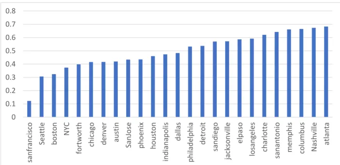
The socio-economic and geographic features of American cities are diverse and public transit plays different roles in each city. To begin to understand how public transit is used differently in different cities and what makes Nashville unique, we look at the correlation between public transit ridership and the percentage of residents with income levels below the poverty line. Figure 2 reports this correlation using data and ridership by U.S. census track for the 25 largest metro areas. These correlations show to what degree a city’s transit system is exclusively used by lower-income groups in a city.
Figure 2: Correlations between percentage using public transit and percentage under poverty line by census tract
Nashville’s position as having the second-highest poverty-transit ridership correlation highlights an important unique characteristic about Nashville’s demographics and transportation landscape. An extremely high percentage of the people served by the transit system are part of the transit-dependent population, meaning they have no other means of transportation besides transit. The cost of commuting
0 0.1 0.2 0.3 0.4 0.5 0.6 0.7 0.8
sanfrancisco Seattle boston NYC fortworth chicago denver austin SanJose phoenix houston indianapolis dallas philadelphia detroit sandiego jacksonville elpaso losangeles charlotte sanantonio memphis columbus Nashville atlanta
Chen 6 by public transit becomes a real cost to anyone in this population who works. Deciding on how to balance serving transit-dependent populations and “choice” populations is problem faced by transit authorities across the country (Lubitow, Bates, Dill, 2013). As such, studying how effective the public transit system is in serving the transit-dependent population by mitigating the spatial mismatch between these workers and jobs is an especially important and urgent issue in Nashville.
Identifying Where to Reduce Commuting Cost
For individual workers, there is a real cost to travel this distance that is part of the cost of working. The purpose of a public transit system is to help mitigate this spatial mismatch, thereby decreasing the cost of working. The cost of working has implications for each individual’s labor decision. We study the
effectiveness of the transit system by investigating the cost of commuting and access to transit and the effect that this has on labor force participation throughout Nashville.
If high commuting costs deter workers from participating in the labor force, it stands to reason that further reducing this commuting cost would compel workers to join the labor force once their wage minus the cost of working exceeds their reservation wage. This motivates the second part of this study, in which we estimate and map the total cost of commuting that is borne by the whole city in terms of lost productivity in order to identify the areas where it is most costly to commute to work. In this analysis, we are able to decompose this total cost and identify where the most expensive commutes are originating from in the city. This is motivated by the reasoning that if the cost of commuting using bus transit can be reduced for riders, then more workers can be compelled to make the decision to work. After identifying areas where bus commuting cost is highest, we can recommend which bus transit corridors should be improved with more frequent service, bus rapid transit, dedicated traffic lanes, etc.
Past Literature
The spatial mismatch hypothesis, first proposed by economist John Kain in his 1968 article, "Housing Segregation, Negro Employment, and Metropolitan Decentralization." (Kain, 1968), argues that housing segregation in urban areas leads to larger distances between residence and employment for blacks and the working poor. This in turn has an adverse effect on economic opportunity for these demographics since job choice is tied to the cost of commuting. At the time of the article’s writing, there was a nation-wide trend of suburbanizing employment centers while blacks and low-income urban residents tended to live in the inner city. While Kain did not refer to his concept by this name, he was among the first urban
economists to study and legitimatize discussion on housing segregation and employment decentralization.
Chen 7 One of Kain’s innovations in his research on urban spatial mismatch was utilizing an early numerical simulation that divided metropolitan areas into a series of zones that were order by attractiveness based on proximity to employment centers. Using this model, Kain was able to regress Black employment on proximity to employment centers and find that employment would rise with integration. Kain’s work stimulated further research on housing demand and the role of geography in housing choices, but little work on transportation accessibility specifically followed directly thereafter.
With the advent of more powerful computers, Geographical Information Systems (GIS), and open transportation data, a body research has formed around studying spatial mismatch in urban areas using these new resources. Many of Kain’s fundamental questions are still active topics of discussion and can be tackled with far more powerful analytical methods that would have been invaluable to Kain when he first posed these questions.
One researcher who has undertaken this approach is Professor Thomas Sanchez of Virginia Tech.
Sanchez’s paper, “The Connection between Public Transit and Employment” conducted an analysis of the Atlanta and Portland public transit systems’ efficacy in increasing labor force participation rates. By creating an index to measure how well individuals can access jobs using only public transit for every census block group in each city, Sanchez was able to find evidence that suggested that the areas with higher public transit accessibility led to higher labor force participation in both cities.
Thomas Sanchez’s “The Impact of Public Transport on US Metropolitan Wage Inequality” provides a macroscopic view of how the availability of urban transport affects levels of income inequality in 158 different metro areas across the United States. The analysis is primarily concerned with whether public transport has a detectable effect of income inequality in these metro areas by using a cross-sectional regression analysis in the year 1990. Using the Gini coefficient as a dependent variable in an OLS model, Sanchez finds a small but significant coefficient for the supply of transit, meaning transit is inversely correlated with income inequality. In another paper, “Income Distribution, City Size, and the Role of Public Transportation,” Sanchez writes that within urban areas, the availability of transit within a local area is even more strongly associated with decreases in the Gini coefficient.
Datasets
American Community Survey 2006-2010
This dataset is composed of 5-year averages of annual ACS demographic data down to the block group level (areas with population 600 – 3,000 people). The dataset includes the following relevant variables:
Chen 8
Employment rates
Average annual weeks worked (the dependent variable in the regression)
Race
Educational attainment by category
Median household income
Income distributions by $10,000 bins
Occupation types
Household types (i.e. single parent, two parents, etc.)
Associated census block group shape files
Census Transportation Planning Product 2006-2010
This data set is specially made by the U.S. Census in order to provide public transportation authorities transportation flow data so that transit systems can by designed around the commutes of workers in a metro area. The unit of account utilized is Traffic Analysis Zone (TAZ), which is a unit smaller than a census block group and usually has a population of 500-1000. The following data were utilized from this set:
Number of jobs from each census category
Flow data that shows how many people from each TAZ move to which TAZs for the daily commute
Associated TAZ shape files
Microsoft Bing Maps Application Program Interface
Microsoft Bings Maps is a navigational mapping platform that was used to generate the public transit travel times between TAZs and census block groups. The platform utilizes historical and live traffic congestion data, thereby creating a realistic estimate of travel times in various modes of transportation.
The simulated time and date for the data collection was kept constant at 6PM on a weekday. A python utility and ArcGIS script were written to generate a table of travel times for both driving and bus between the geographic centroids of all TAZs and census block groups.
Chen 9 Analysis I: Exploring the Relationship between Public Transit and Labor Participation
Methodology
Constructing the Accessibility Index
The accessibility index must not only be a measure of how easily residents can reach public transit, it must also measure how economically valuable that access is. As such, we want to construct an index that measures how well residents living in a particular area can access skill-appropriate jobs using only public transit.
Our data comes in two parts: first is the Census Block groups, which is the most granular data for which we have access to rich demographic data. The second is the Traffic Analysis Zone (TAZ) data from the Census Transportation Planning Product, which is even more granular than census block groups and contains data for the location of jobs throughout the county. Using ArcGIS, the geographic centroids of each census block group and TAZ were calculated to be the points of connection for the transit
accessibility calculation:
𝐴𝑖 = ∑ 𝑁𝑗𝑑𝑖𝑗−𝛽
𝑛
𝑗=1
Where:
𝐴𝑖 is the accessibility index of block group i
𝑑𝑖𝑗 is the travel time between block group i and TAZ j, (based on transit network) 𝛽 is the exponent for distance decay
𝑁𝑗 is the number of jobs in traffic analysis zone j (TAZ) that are accessible with a high school education 𝑛 is the number of TAZs in the city
𝑑𝑖𝑗 represents the travel time between the block group, 𝑖, where people live and the TAZ, 𝑗, where we have job data. This time was calculated using the Bing Maps API, using real-time traffic data set to a constant time of 8:00AM on a weekday. The decay exponent, was chosen to be 2, in accordance with economic gravity models in past literature regarding public transit (Iacono, Krizek, El-Geneidy, 2008).
The effect of this beta exponent is to increase how sharply the probability of an individual taking a job as distance increases. This is a kind of economic gravity model. The parameter controls the marginal cost of greater distance between home and work.
Chen 10 Each TAZ is weighted by its value in this context: the number of jobs in that TAZ. The more jobs in a TAZ, the greater the index becomes, but only if it travel time by transit is not too long. After summing all of the resulting weighted averages, the accessibility index calculation is complete after normalizing the indices to be between 0 and 1.
Results
Mapping the Data
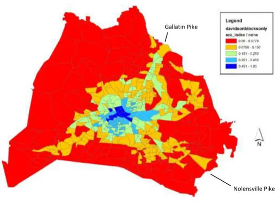
Using the accessibility index, a map of public transit accessibility was generated using ArcGIS.
Figure 3: Transit accessibility throughout Nashville, measured using the number of available skill-appropriate jobs accessible by transit.
In figure 3, the “hub-and-spoke” structure of the Nashville transit system is evident. The downtown core of the city serves as the central hub and dispatch center, as almost every bus route passes through the downtown central bus station. The four main corridors that extend from the downtown core into the outer parts of the city can also be seen. Two of these corridors, Nolensville and Gallatin, are noted on the map
Nolensville Pike Gallatin Pike
Chen 11 as potential investments to increase the quality and frequency of these service routes will be evaluated later in this investigation, on the basis of their potential to connect riders to their places of work.
Figure 4 is the visualization of supply and demand for labor in each TAZ. For each TAZ, we have calculated the difference between the jobs available and the number of workers residing.
Figure 4: Labor supply and demand. Negative values indicate more residents than jobs in a TAZ. Positive values indicate more jobs than residents in a TAZ.
Linear Regression Analysis
A linear regression was performed, regressing the average annual weeks worked in each census block group on the public transit accessibility index of the block groups as well as several controls including average household income, percentage of higher degree attainment, percentage driving personal vehicle to work, and percent nonwhite.
Chen 12
Figure 5: Descriptive statistics of the data used in the linear regression model.
The linear regression model is built as follows:
𝑦 – Average annual weeks worked (measure of labor force participation)
𝛽
0 – Regression constant𝛽
1 – Beta coefficient of accessibility index variable𝑋
1–Accessibility index of census block group𝛽
2–Beta coefficients for controls𝑋
1–A set of controls: household income, percent nonwhite, educational attainment, and percent drivingFigure 6: STATA output for the linear regression analysis of average weeks worked on the accessibility index and controls.
drive_car_~t 470 .8897812 .1161315 .1197183 1 higher_deg~t 471 .3135825 .2087201 0 .8548095 nonwhite_pct 471 .3636285 .2773425 0 1 hh_inc 467 52065.87 31921.4 4827 250001 acc_index 473 .1376425 .1152058 0 1 avg_weeks 470 46.2232 5.897582 7 51 Variable Obs Mean Std. Dev. Min Max
𝑦 = 𝛽
0+ 𝛽
1𝑋
1+ 𝛽
2𝑋
2_cons 34.57991 2.876156 12.02 0.000 28.92791 40.23191 nonwhite_pct -.8717453 1.059065 -0.82 0.411 -2.952939 1.209449 drive_car_pct 11.73908 2.785682 4.21 0.000 6.264875 17.21329 higher_deg_pct 3.030035 1.846181 1.64 0.101 -.5979371 6.658007 hh_inc .0000211 .0000118 1.79 0.074 -2.02e-06 .0000442 acc_index -3.163719 2.676097 -1.18 0.238 -8.42258 2.095142 avg_weeks Coef. Std. Err. t P>|t| [95% Conf. Interval]
Total 14111.0983 466 30.2813268 Root MSE = 5.1432 Adj R-squared = 0.1265 Residual 12194.4574 461 26.4521853 R-squared = 0.1358 Model 1916.64086 5 383.328172 Prob > F = 0.0000 F( 5, 461) = 14.49 Source SS df MS Number of obs = 467 . regress avg_weeks acc_index hh_inc higher_deg_pct drive_car_pct nonwhite_pct
Chen 13 Notable in the results of this regression is the -3.16 coefficient on the accessibility index. This can be interpreted to mean that census blocks with the lowest accessibility index having average annual weeks worked 3.16 less than census blocks with the highest accessibility index. Given that income and education have been accounted for, this result suggests a reverse causality issue since the bus routes are specifically placed by the transit authority where employment is low. With a 0.1358 R-squared, the model seems to explain a significant amount of the variance. This shows us that a simple linear regression is not sufficient to determine the effect of the public transit system.
To illustrate this endogeneity problem in the regression, we can look at the example of census block group 186.01, which is a part of the well-off Bell Meade neighborhood in Nashville. This census block group has the very low accessibility index of 0.03129 and relatively high average weeks worked of 49.68.
As a wealthy neighborhood, Bell Meade would have little need for public transit and so it has low public transit accessibility while having a higher labor participation rate. Conversely, a goal of the transit authority would be to place the transit corridors near workers who are less mobile and also more likely to be poorer and unemployed. While no conclusion about the efficacy of the transit system can be drawn, this suggests that the transit authority is at least successful in placing transit routes near the people who could benefit from them.
Household Income Quartile Analysis
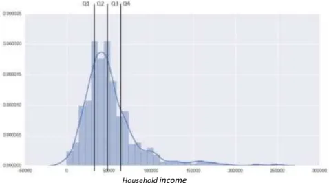
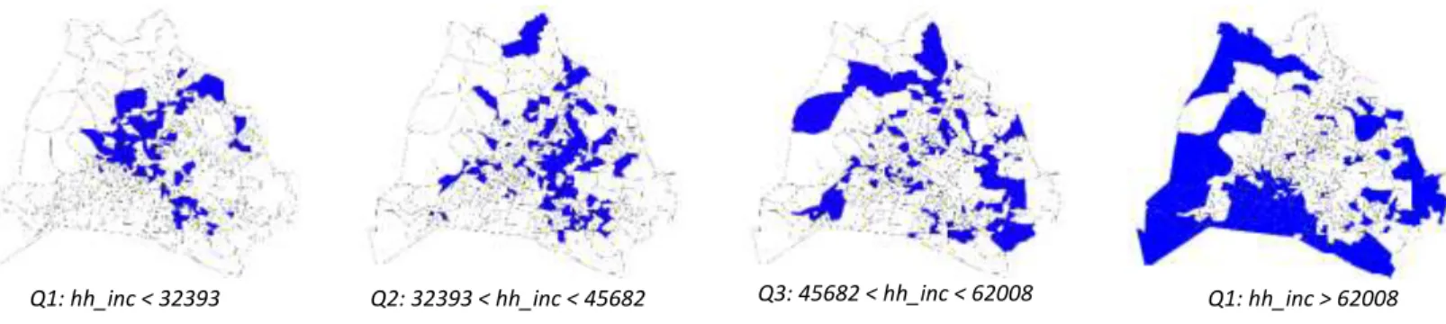
In order to explore the accessibility index’s effect on labor force participation in areas of Nashville with differing average household incomes, the census block groups were separated into quartiles accordingly.
Figure 7 shows the frequency distribution of average household income among the census block groups and the quartile divisions.
Figure 7: Frequency distribution of Nashville household income by quartile. Census block group is the unit of account.
Household income
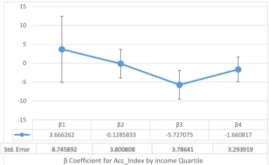
Chen 14 The same linear regression model is applied to each of the quartiles in order to separate high income areas from low income areas for the regress analysis. The result for the lowest income quartile is reproduced in figure 8. While the coefficient for the accessibility index becomes positive for this lowest income quartile, increasing to 3.67, the standard error is very large and the result is not significant. Even after restricting the analysis to this low income group, we still cannot confirm that the accessibility index has a positive effect on labor force participation rates. The coefficients for each quartiles are graphed in figure 92.
Figure 9: The beta coefficient for the accessibility index was calculated separately for each household income quartile, from lowest to highest income quartile.
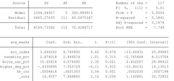
Figure 8: STATA output for the linear regression analysis of average weeks worked on the accessibility index and controls, limited to only the lowest income quartile.
_cons 16.9357 7.969865 2.12 0.036 1.142881 32.72852 hh_inc .0004616 .0001303 3.54 0.001 .0002035 .0007198 higher_deg_pct -.8330895 7.553729 -0.11 0.912 -15.80131 14.13513 drive_car_pct 15.65816 6.674495 2.35 0.021 2.432207 28.88412 nonwhite_pct 2.874018 2.846074 1.01 0.315 -2.765668 8.513704 acc_index 3.666262 8.745892 0.42 0.676 -13.66431 20.99683 avg_weeks Coef. Std. Err. t P>|t| [95% Conf. Interval]
Total 8169.72592 116 70.4286717 Root MSE = 7.749 Adj R-squared = 0.1474 Residual 6665.27635 111 60.0475347 R-squared = 0.1841 Model 1504.44957 5 300.889913 Prob > F = 0.0004 F( 5, 111) = 5.01 Source SS df MS Number of obs = 117
. regress avg_weeks acc_index nonwhite_pct drive_car_pct higher_deg_pct hh_inc if hh_incqurt ==1
β1 β2 β3 β4
3.666262 -0.1285833 -5.727075 -1.660817
-15 -10 -5 0 5 10 15
β Coefficient for Acc_Index by income Quartile
Chen 15 A mapping of the income quartiles suggests a spatial pattern in the location of census block groups with different average household incomes. Upon visual inspection, it seems that as average household income increases, a block group is more likely to fall further outside the center of the city. The block groups of the lowest income levels appear to be clustered around the city center and two prominent corridors (these have been identified to be Nolensville Pike and Gallatin Pike). The highest income quartile’s block groups are almost exclusively located in the suburbs of the city and overlap very rarely with high transit accessibility areas.
The observance of this pattern motivates a regression of household income on the accessibility index, to see what the general relationship is between the two variables across all census block groups. What we find is that there is indeed a strong negative correlation between the accessibility index of a census block group and its average household income.
Figure 11: STATA output for the linear regression analysis of census block groups’ average household income on the accessibility index.
It is possible that this strong correlation between income and the accessibility index is crowding out the effect that the accessibility index has on the average weeks worked variable. With data aggregation of the census block groups and only 117 observations in the quartile regression, the dataset is simply not
_cons 62146.78 2233.17 27.83 0.000 57758.42 66535.13 acc_index -73715.28 12561.86 -5.87 0.000 -98400.34 -49030.23 hh_inc Coef. Std. Err. t P>|t| [95% Conf. Interval]
Total 4.7484e+11 466 1.0190e+09 Root MSE = 30834 Adj R-squared = 0.0669 Residual 4.4210e+11 465 950758941 R-squared = 0.0689 Model 3.2740e+10 1 3.2740e+10 Prob > F = 0.0000 F( 1, 465) = 34.44 Source SS df MS Number of obs = 467 . regress hh_inc acc_index
Figure 10: Household income quartiles of Nashville
Q1: hh_inc < 32393 Q2: 32393 < hh_inc < 45682 Q3: 45682 < hh_inc < 62008 Q1: hh_inc > 62008
Chen 16 powerful enough to claim a positive result. To compare the relative effects of income and the accessibility index on average weeks worked, we standardized the independent variables and ran the regression again for the lowest income quartile, reproduced in figure 12.
Figure 12: Standardized variable regression for lowest income quartile
This standardized variable regression allows us to compare the relative effects of these variables, revealing that household income has a coefficient of 14.7 and is very significant while the accessibility index has a coefficient of only 0.42, with low significance. This further suggests that the effect of household income on labor force participation dominates the model.
Discussion
Our investigation into the relationship between transit accessibility of jobs and our measure of the labor force participation rate leaves us with mixed results. While there was a positive result found for the accessibility index increasing labor force participation in the lowest income quartile, the result was insignificant, with a high standard error. We are left with no evidence that the Nashville Metropolitan Transit Authority’s bus service increases labor force participation rates in any significant way in the areas that it serves. It is possible that a larger or more granular dataset with more variation of the accessibility index within income quartiles could have yielded a more significant result.
The finding that household income has a strong negative correlation with the accessibility index is consistent with our knowledge that a high percentage of Nashville’s transit riders are transit-dependent and of low household income. This could enforce the correlation between lower income areas and relative transit accessibility in two ways: 1) People who have low incomes and are transit-dependent because of it will try to live in areas with a relatively high transit accessibility and 2) the transit authority will plan to
_cons 56.19106 3.297964 17.04 0.000 49.65593 62.7262 hh_inc_std 14.7355 4.158869 3.54 0.001 6.494428 22.97658 higher_deg_pct_std -.1738824 1.576615 -0.11 0.912 -3.29805 2.950285 drive_car_pct_std 1.818407 .7751194 2.35 0.021 .2824559 3.354357 nonwhite_pct_std .7970874 .7893374 1.01 0.315 -.7670374 2.361212 acc_index_std .4223747 1.007578 0.42 0.676 -1.574208 2.418958 avg_weeks Coef. Std. Err. t P>|t| [95% Conf. Interval]
Total 8169.72592 116 70.4286717 Root MSE = 7.749 Adj R-squared = 0.1474 Residual 6665.27643 111 60.0475354 R-squared = 0.1841 Model 1504.44949 5 300.889898 Prob > F = 0.0004 F( 5, 111) = 5.01 Source SS df MS Number of obs = 117
Chen 17 place transit corridors in low-income areas where people will more likely to be transit-dependent. On the other hand, more affluent people with more mobility options will have the freedom to live anywhere, without regard to transit-accessible areas. The exclusivity of transit use among low-income workers reinforces the important of efficient transportation infrastructure as a matter of economic equity. These areas with higher transit accessibility also happen to overlap with some areas of Nashville in which housing prices are increasing most rapidly, as was found in an investigation by the Tennessean newspaper shown in figure 20. With the assumption that low income is a proxy for being more likely to be transit- dependent, we can make the reasonable projection that rising housing costs will drive low income people towards the outer parts of the city where transit accessibility is extremely low. This has critical policy implications, as people who are priced outside of the city center will surely see a drastic reduction in their mobility.
Figure 133: Heat map indicating areas in Nashville where housing costs are increasing most rapidly (Tennessean, 2009)
Another reason for concern is that people have higher incomes have no vested interest in the development of the public transit system and will rarely leverage their political capital to lobby for public transit investment.
Given that we have found little evidence that the MTA is effective in increasing labor force participation rates, even in the lowest income quartile, the second part of our analysis looks to the MTA’s long-term strategic plan, nMotion, for a preliminary analysis of what investments could be the most likely to improve the MTA’s service for the transit-dependent population.
Chen 18 Analysis II: The Future of the MTA and Transit Ridership in Nashville
Methodology
Estimating the Total Dollar Cost of Commuting
We begin by calculating an estimate of how much commuting costs the economy in terms of lost productivity. The intent behind this analysis is so that we can begin to understand what parts of the city bear the greatest costs of commuting and identify areas where investment should be prioritized, based on both economic equity and political feasibility. We include both drivers and transit riders in the analysis since transit ridership could reduce congestion for all.
First, the total commute time people living in the TAZs are spending commuting (driving) to work is calculated. This is the sum of the length of all trips, not just an average per person. This measure is meant to capture the volume of people commuting, as well as the length of time individuals are spending on commuting.
Next, by multiplying each TAZ’s total commute time by the weighted average wage of the jobs that these residents are working. The average wage in Nashville for each of the census job categories was obtained from Bureau of Labor Statistics data. For example, if the total cost of commuting for one TAZ is $500, this means that the total time that workers living in that TAZ spent the time that was equivalent to $500 in terms of their hourly wage. The data generated in this analysis is visualized in figure 4.
Analyzing Residence-Employment Connections along Proposed High-Frequency Bus Corridors
In 2016, the Nashville Metropolitan Transit Authority published nMotion, a long-term strategic
development plan for transportation in Middle Tennessee (Nashville MTA, 2016). It is both a framework for how the agency thinks about potential changes in the system, as well as a collection of concrete short- term and long-term proposals for improvements. Among the most notable short-term proposals is the proposal to significantly increase the frequency and reliability of service along several important
corridors. In this investigation, we carry out a preliminary analysis to evaluate the potential the proposed transit improvements on the Nolensville Pike and Gallatin Pike corridors have to provide more efficient connections to their places of work.
To investigate whether or not people living along the Nolensville and Gallatin corridors would actually be able to use the improved service to get to their places of work, we mapped where people living in these service areas are commuting to. Using the Census Transportation Planning Product flow data, we found
Chen 19 the total number of people commuting to each TAZ from only one of the two corridors being analyzed.
Both the service areas and their respective commuting patterns are shown in figure 23.
Results
Mapping the Total Dollar Cost of Commuting
Using the dollar cost of commuting by Traffic Analysis Zone, a map of total commuting cost borne by the transportation system was created using ArcGIS in figure 21.
Figure 14: Total dollar cost of commuting, cumulative over all commuters.
The total cost borne by the system, is estimated to be $1.27 million in lost productivity. As expected, the areas near the center of the city and on the main arterial roads in Nashville incur the lowest total
commuting costs. The traffic analysis zones that incur the highest commuting costs are on the outskirts of the city. The Texas A&M Transportation Institute publishes a similar statistic: an estimate of the annual cost of commuting by urban area. The 2010 estimate for Nashville was $980 million (TTI, 2010), while the value we calculate using our data in the same annual timeframe is about $927 million. With such similar results, we can have confidence in our estimate and perhaps as well in the finer detail that our analysis affords us: the spatial pattern that tells us where in the system this cost is being borne.
Chen 20 Analysis of Proposed Corridor Improvement
Figure 15 compares the service area of the Nolensville and Gallatin transit corridors with their commuting patterns from the CTPP dataset. From inspection, we can see that there is overlap between each service area and its corresponding pattern of commuting destinations but that there is also a significant number of commuters travelling well outside of the service area. It was also found that about 65% of workers living in the Gallatin Pike service area commute to areas within the service area, or in the downtown core.
Gallatin Pike Service Area Gallatin Pike Commuting Destinations
Nolensville Pike Service Area Nolensville Pike Commuting Destinations
Figure 15: Comparison of potential high frequency bus service areas proposed by nMotion. The figures to the right show where residents living in the areas shown in the figures to left commute to work to.
Chen 21
Figure 16: Summary of commuting patterns from Nolensville and Gallatin Pike
Number of workers in service area
Number of workers staying in service area
Percentage of workers staying in service area
Gallatin Pike 24,449 15,891 65
Nolensville Pike 24,761 11,637 47
Discussion Cost Map
While much of this commuting cost occurs simply because of the distance between people and their place of employment, the results of this system-wide cost analysis give us a preliminary way to explore how transportation in the Nashville region could be made more efficient to boost the productivity of the entire economy. It is notable that the majority of this commuting cost represents lost productivity from time spent driving, much of it in congested traffic. While the literature in urban planning has an ever-growing body of research proving that rush-hour traffic cannot be eliminated (Downs, 2004), a more efficient and attractive transit system can provide benefits for all commuters by relieving congestion and reducing this cost of commuting, or at least containing it as the city grows. The corridor analysis will provide an example of how congestion along some of Nashville’s busiest corridors could be alleviated.
Corridor Analysis
65% of workers from the Gallatin Pike service area commuting within the area represents a relatively high population of people that would stand to benefit from a new express bus service that runs with higher frequency and reliability along that corridor. The cost of commuting to work could be reduced significantly for those who are transit-dependent, benefitting those who are already in the workforce and potentially motivating more people to join the labor force since the effective reservation wage has been decreased. Furthermore, since the MTA is “hub-and-spoke,” the improvement of this one corridor enhances the connection between Gallatin Pike and the entire system. With 47% of workers in Nolensville Pike staying within the service area or downtown, it also has a large percentage of its population that would see a significant decrease in commuting costs that would benefit transit riders already in labor force and motivate more to enter.
The results of this preliminary analysis provide an optimistic outlook for the potential benefits of improved bus service on these corridors. A more thorough investigation is needed, to be sure, but these results show a path forward in improving a critical service for Nashville’s transit-dependent population.
Chen 22 Conclusion
What we have learned in this analysis
Based on the results of this analysis, we have found preliminary evidence that supports policies that increase investment in public transit in Nashville, Tennessee. In the first part of our analysis, we learned that public transit ridership has one of the highest correlations with poverty in the country, suggesting that its ridership consists of a high percentage of transit-dependent people. To begin to evaluate the MTA’s efficacy of connecting the transit-dependent population to employment, we created an accessibility index of public transit that measured how accessible jobs are to the transit-dependent population in each part of the city. Using this index to evaluate how effective the Nashville MTA is in increasing labor force participation is, we found no conclusive evidence of a significant effect.
In light of this finding, we used other spatial measures to explore how this system could be improved. By creating a map of where the transportation costs the most in the city, we observed that connections to the outer parts of the city are the most costly and potentially stand to see the greatest benefits from
improvements in public transportation. To evaluate where these improvements could be prioritized, we focused on two improvement proposals in the MTA’s long-term strategic plan, nMotion, and found that investing in bus rapid transit along two important corridors in Nashville could result in stronger
connection between residence and work for a large percentage of the population.
Policy Implications
With no conclusive evidence that the accessibility index has an effect on labor force participation rates in any income quartile, our findings suggest greater investment and careful long-term planning are needed in order to create a public transport system that effectively increases economic opportunity for the transit- dependent population of Nashville. However, the strong correlation between low income and transit accessibility is a good result from a policy point of view, indicating that the transit authority has been successful in placing transit routes to serve the transit-dependent population. Still, there is much uncertainty remaining about the efficacy of the transit system. Furthermore, even if the transit system is effective in increasing economic opportunity for the transit-dependent population of Nashville, the rising housing costs in these areas may mean that they will be driven out of these areas and see a drastic decline in their
It would be naïve to ignore the political difficulty of increasing investment in public transit. Stagnation in public transit development is a common phenomenon in cities across the United States, especially in growing southern cities like Nashville and Charlotte (Semuels, 2015). Furthermore, transit ridership is
Chen 23 declining in most American cities at alarming rates (U.S. DOT, 2017). Nashville’s attempt to create a bus rapid transit line in 2014 was defeated after a long political battle. Our analysis reinforces the importance of these sorts of investments as the city continues to grow and the transit-dependent population remains underserved.
In response to the political obstacles to investing in public transit, policymakers could look to economic arguments that show that people using any mode of transportation stand to benefit. The Urban Mobility Report by the Texas A&M Transportation Institute recommends that transit authorities focus on
improving existing lines in ways that make the most financial sense. Our cost analysis of the system map illustrates that areas across the outskirts of the city bear the greatest commuting costs—suggesting that investments could benefit many of these people even if they are not transit riders by reducing congestion.
Using economic arguments such as these could arm policymakers with better means of communicating the importance of improved transit infrastructure to the entire community.
Limitations and Areas for Future Research
There is no shortage of ways in which this research could be extended. The most obvious would be to extend the datasets used in this analysis by using data from the counties bordering Davidson County and constructing a commuter region to analyze, as opposed to the arbitrary county borders. Workers living outside of Davidson County and working inside have not been considered in this analysis. This additional data could potentially allow us to test the same hypotheses and find significant results. Furthermore, individual-level data could provide us with a powerful tool to analyze the relationship between transit accessibility on economic outcomes that the census block group aggregated data cannot. Another method that could be used to evaluate the effectiveness of the public transit system is to find historical transit routes and identify potential natural experiments in corridors that previously had no access to transit and now do. To better understand how the construction of the accessibility index affected the analysis, the same method can be applied to other urban areas, so that the index’s effect can be seen in other contexts.
Another important limitation of the data used in this analysis is that it is from the years 2006-2010 and is somewhat outdated. Nashville is one of the fastest growing and changing cities in the United States; the wealth distribution and its spatial patterns may well have changed significantly since then. The 2010 – 2016 American Community Survey and Census Transportation Planning Product will be released in late 2017 and could hold important insights about how the demographics utilizing transit have changed.
Further research to identify the most worthwhile transit investments is also critical—finding the
investments that will be most effective in improving service for the transit dependent population, and the entire city, will require deeper analysis that takes into consideration the marginal benefit to commuters of
Chen 24 an improvement transit route. A handful of cities in the United States, even some in the south such as Houston, have recently executed bold plans to revamp their systems that have increased ridership significantly. Contrary to common wisdom, Nashville’s transit system could serve as a viable alternative to driving and provide vital connections to economic opportunities and services for the transit-dependent population. Nashville cannot become a New York City or San Francisco, but what can it become?
Actionable research and follow through from policymakers is needed to answer this question.
Word Count: 5934
Chen 25 Works Cited
Semuels, Alana. "Why People Don't Ride Public Transit in Small Cities." The Atlantic. Atlantic Media Company, 28 Oct. 2015. Web. 19 Apr. 2017.
"2015 Urban Mobility Scorecard." Urban Mobility Information. Texas A&M Transportation Institute, 2016. Web.
"Car Ownership in U.S. Cities Map." Governing. E.Republic, 2015. Web. 19 Apr. 2017.
Downs, Anthony. "Traffic: Why It’s Getting Worse, What Government Can Do | Brookings Institution." Brookings. Brookings Institution , 28 July 2016. Web. 19 Apr. 2017.
Frey, William H. "U.S. growth rate hits new low as migration to the Sun Belt continues | Brookings Institution." Brookings. Brookings Institution , 23 Dec. 2016. Web. 19 Apr. 2017.
Iacono , Michael. "Access to Destinations: How Close is Close Enough? Estimating Accurate Distance Decay Functions for Multiple Modes and Different Purposes ." Www.cts.umn.edu. Minnesota Department of Transportation , 2008 . Web.
Lubitow, Amy. "Understanding the Transit-Dependent Population." Home - Transport Research International Documentation - TRID. The National Academies of Sciences, Engineering, and Medicine, n.d. Web. 19 Apr. 2017.
"Mobility Challenges for Households in Poverty." National Household Travel Survey. Federal Highway Administration, 2014. Web.
"Nashville Gentrification Maps and Data." Governing. E.Republic, n.d. Web. 19 Apr. 2017.
"Nashville MTA Strategic Plan." Http://nmotion2015.com. Nashville MTA, 2016. Web.
"Quick Facts on Middle Tennessee’s Transit Organizations." Http://www.nashvillemta.org. Nashville MTA, 2010. Web.