IBM SPSS Statistics 25 Step by Step: A Simple Guide and Reference, Fifteenth Edition, takes a simple, step-by-step approach that makes SPSS software understandable to beginners and experienced researchers alike. Title: IBM SPSS Statistics 25 Step by Step: A Simple Guide and Reference / Darren George and Paul Mallery.
MANOVA 315
Necessary Skills
STATISTICS You must have completed or are currently completing at least a basic statistics course. If you are using SPSS on a network of computers (rather than on your own PC or MAC), the steps required to access IBM SPSS Statistics may differ slightly from the single step shown on the following pages.
Scope of Coverage
Within the context of presenting a statistical procedure, we often display a window that contains several options but describes only one or two. This is done without apology, apart from the occasional “the description of these options is beyond the scope of this book” and you are cheerfully directed to the appropriate SPSS manual.
Overview
This Book’s Organization, Chapter by Chapter
As mentioned earlier, this book covers three modules produced by SPSS: IBM SPSS Statistics Base, IBM SPSS Advanced Statistics, and IBM SPSS Regression. IBM SPSS ADVANCED STATISTICS AND REGRESSION: The next set of chapters covers analyzes involving multiple dependent variables (SPSS calls these procedures General Linear Models; they are also often called MANOVAs or MANCOVAs).
An Introduction to the Example
Chapters 23–27 cover the procedures in the Advanced Statistics and Regression modules, and Chapter 28, analysis of residuals, draws from all three. IBM SPSS STATISTICS BASIC, Chapters 6 through 10 describe the most basic data analysis methods available, including frequencies, bar charts, histograms, and percentages (Chapter 6); descriptive statistics such as means, medians, modes, skewness, and range (Chapter 7); crossovers and chi-square tests of independence (Chapter 8); subpopulation means (Chapter 9); and correlations between variables (Chapter 10).
Typographical and Formatting Conventions
Because screens take up a lot of space, frequently used screens are included on the inside front and back covers of this book. Bold Font Bold font is used for words that appear on the computer screen.
The Mouse
WE HAVE mentioned in the introductory chapter that it is necessary for the user to understand how to turn on the computer and get to the Windows desktop. This chapter will give you the remaining skills needed to use SPSS for Windows: how to use the mouse, how to navigate with the taskbar, what the various buttons (on the toolbar and elsewhere) do, and how to use the primary windows that in SPSS.
The Taskbar and Start Menu
A word of caution: On some computers, the SPSS program icon may be in a different location on the Start menu. In addition to launching the SPSS program, the other important skill required when using the taskbar is to switch between programs.
Common Buttons
When multiple programs are running at the same time, each program has a button on the taskbar. To switch from one program window to another, simply move the cursor to the taskbar and click the appropriate button.
The Data and Other Commonly Used Windows
- The Initial Screen, Icon Detail, Meaning of Commands
The menu bar (commands) and toolbar are located at the top of the screen and are described on the following pages. TOOLBAR The toolbar icons are located below the menu bar at the top of the screen.
The Open Data File Dialog Window
- An Example of a Statistical-Procedure Dialog Window
- Keyboard Processing, Check Boxes, and Radio Buttons
Finally, the three buttons on the right side of the window (Statistics, Graphs, Format) present various procedural and formatting options. Ctrl-Home or Ctrl-End: Moves the focus to the upper left or lower right corner of the data set.
The Output Window
To see the notes, click the word “Notes” and then click the open book icon ( ) at the top of the page. If you want to delete the Descriptors section (perhaps because you selected an incorrect variable), simply click the word "Descriptions" (to select that menu item) and then click Delete.
Modifying or Rearranging Tables
For example, if you want to get to the Crosstab output, just click the word “Crosstab” in the Outline view and the Crosstab will appear in the output window. This table has one layer: the word “Number” (the number of topics in each category) is visible in the top left corner of the table.
Printing or Exporting Output
Click on the folder or output object you want to print on the left side of the SPSS output window;. Then click on a folder or object on the left side of the SPSS output window.
Selecting
Throughout the rest of the book we retain the computer screens, but apart from minor variations, the screens and sequences for PC and Mac are identical. The SPSS icon that appears at the bottom of the screen can include several different programs (data files and output) within it.
The Desktop, Dock, and Application Folder
In addition to launching SPSS, another important skill in using the Dock is switching between programs. To access any program that is not easily visible on the screen, hover over the SPSS icon and right-click or click with two fingers.
The Data and Other Commonly used Windows
- The Initial Screen, Icon Detail, and Meaning of Commands
The menu bar (commands) and toolbar are located at the top of the screen and are described below. Menu Bar The menu bar (just above the toolbar) displays commands that perform most of the operations that SPSS provides.
The Open Data File Dialog Window
- An Example of a Statistical-Procedure Dialog Window
For example, if you want to delete the Frequencies output (to get it out of the way and come back to it later), just click to the left of the Frequency Table heading. Clicking on the output folder or object you want to print on the left side of the.
Research Concerns and Structure of the Data File
In the first chapter, a data file was presented that will be used to illustrate the data entry process. If you provided four categories, such as White, Black, Asian, and Latino (coded as 1, 2, 3, and 4), you can create an additional category (5 = other or decline to provide) when you enter the information.
Step by Step
- Name
- Type
- Decimals
- Width
- Label
- Values
- Missing
- Columns
- Align
- Measure
- Role
You can start the process by entering all 17 names in the first 17 lines of the Variable View screen. When you click a cell under Width to the right of any variable name, the cell is highlighted and a small appears on the right edge of the cell.
Entering Data
ENTER DATA BY VARIABLE Click on the first empty cell below the first variable, type a number (or word), press the Down Arrow key or Enter key, then type the next number/word, press the Down Arrow key or Enter key, and so on. When you finish one subject, move back to the first column and enter the information for the next subject.
Editing Data
When you finish one variable, move up to the top of the file and enter the data for the next variable in the same way. For example, in the grades.sav file, you can move it just to the right of the last name variable.
Grades.sav: The Sample Data File
Perhaps the instructor of the classes in the grades.sav dataset teaches those classes at two different schools. You will rarely complete an analysis without using some of the functions in this chapter.
Step By Step: Manipulation of Data
Each section concludes with a description of how to print the results and exit the program. This chapter will be formatted slightly differently than Analysis Chapters 6 through 27 because we present seven different types of calculations or manipulations of data.
The Case Summaries Procedure
The order of selection in the Variables box will be the same order presented in the output. If there are no group variables, instances will be listed in the order of the data file.
Replacing Missing Values Procedure
Average of nearby points: Missing values are replaced by the average of surrounding values (that is, values whose SPSS case numbers are close to the case with a missing value). Median of nearby points: Missing values are replaced by the median (see glossary) of surrounding points.
The Compute Procedure
Creates a new variable named rhythm that calculates the base 10 logarithm of the variable total for each item. Creates a new variable named natural that calculates the natural logarithm of the variable total for each item.
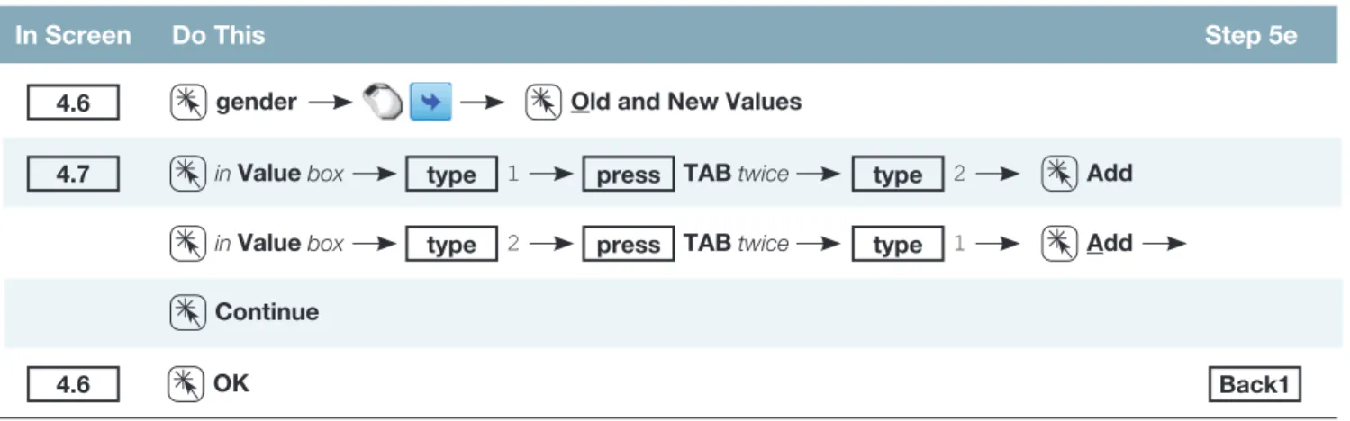
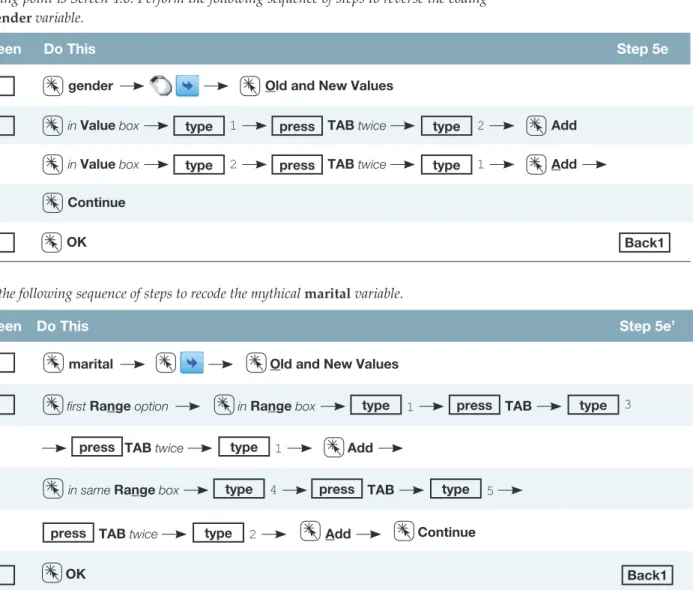
Recoding Variables
- Creating New Variables
- Changing the Coding of Variables
The dialog box presented in Screen 4.5 allows you to identify the values or range of values in the input variable (percentage) that is used to encode the level of the output variable (score). After entering all five levels of the new variable (with their associated ranges and letter grades), click Continue and screen 4.4 will reappear.
The Select Cases Option
To access the screen for creating the conditional statements (Screen 4.9), click the If condition is satisfied circle and then click the If button. The actual screen that opens is not identical to screen 4.3, but it is so similar that we won't take up space by reproducing it here.
The Sort Cases Procedure
To select a subset of variables, the process is to click the desired variable and then paste it into the active box. In the following sequences we will demonstrate how to select women for an analysis.
Merging Files Adding Blocks of Variables or Cases
- Adding Cases or Subjects
- Adding Variables
Note that the external file source (drive E), directory (SPSS data), and file name (graderow.sav) are included in the title of screen 4.11. The new variables to be added (in this case iq) are also in the New Active Dataset window and are followed by a “+” in brackets.
Printing Results
Using the grades.sav file, calculate total (the sum of all five quizzes and the final) and percentage (100 times the total divided by possible marks, 125). Using the helping3.sav file, select women (gender = 1) who spend more than average time helping (thelplnz > 0).
Comparison of the Two Graphs Options
In addition, there are two complete sets of graphing procedures available in SPSS: Legacy Dialogs graphs and Chart Builder graphs. Therefore, all graphs (except error bar charts) described in this section will be Chart Builder graphs.
Types of Graphs Described
The Chart Builder option was first introduced in SPSS 14.0 and seems to be the format that SPSS will stick with for the foreseeable future. Pie Charts: Pie charts, like bar charts, are another popular way of showing the number of themes or cases in different subsets of categorical data.
The Sample Graph
Histograms: Histograms look similar to bar graphs, but are more often used to show the number of subjects or cases in ranges of values for a continuous variable, such as the number of students who scored between 90 and 100, between 80 and 89, between 70. and 79, and so on in a final exam. Scatter graphs (simple and nested): Scatter graphs are a popular way to display the nature of correlations between variables.
Producing Graphs and Charts
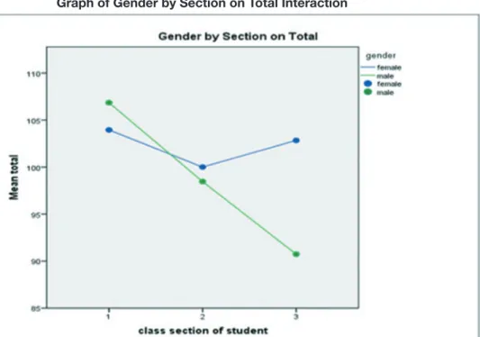
A line chart is currently selected, and the two charts on the right represent the two options – either a single line chart or a multiline chart. If you wanted to create a multi-line chart showing how the total points (gender) of men and women (total) differ in each of the three sections (sections), you would perform the following steps: Click and drag the total on the Y-axis.
Bugs
If you try to produce a graph with, say, a scalar variable when SPSS expects a nominal variable (or a nominal variable where a scalar variable is expected), SPSS will ask if you want to change the variable from one type to another . When you click and drag one of the chart icons in the Chart Preview box (screen 5.2), the window changes so you can specify the properties of your desired chart.
Specific Graphs Summarized
- Bar Charts
The following sequence will provide the average total points, accurate to one decimal, outlined at the top of each bar. Adding (or editing) a title and changing the font: The following sequence will create a title for the chart and then change the font size to 14.
- Line Graphs
Additional options (after double-clicking the graph to make it live) include: . 1) Changing the shape, font, or size of the axis labels or values along each axis (on the label or value you want to edit, and then edit using the tabbed table v. Adding gridlines: For clarity, we may want to add gridlines to chart.
- Pie Charts
- Boxplots
- Error Bar Charts
The graph produced by the series mentioned above is shown here. 1) Changing the format, font, or size of axis labels or values along each axis (on the label or value you want to edit and then editing it using the tabbed table. The sequence step below produces a pie chart showing each piece of the cake represents the number of different grades in the class.
Changing the format, font, or size of axis labels or values along each axis ( on the label or value you wish to edit and then edit using the tabbed table to the right);
- Histograms
If you want SPSS to generate error bars based on a specified number of standard deviations or standard errors of the mean, click , select the type of error bar you want, select "2.0" which will appear to the right of the multiplier, and enter the desired number of standard deviations or confidence intervals. Histograms look similar to bar graphs, but are more commonly used to indicate the number of subjects or cases in ranges of values for a continuous variable, such as the number of students who scored between 90 and 100, between 80 and 89, between 70 & 79, and so on. for the final percentage of the class.
- Scatterplots
- Printing Results
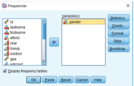
- Frequencies
- Bar Charts
- Histograms
- Percentiles
- Step by Step
- Frequencies
- Bar Charts
- Histograms
- Percentiles and Descriptives
- Printing Results
- Output
- Frequencies
- Histograms
- Descriptives and Percentiles
- Statistical Significance
- The Normal Distribution
- Measures of Central Tendency
- Measures of Variability Around the Mean
- Measures of Deviation from Normality
- Measures for Size of the Distribution
- Measures of Stability: Standard Error
- Step by Step
- Descriptives
The number associated with each level of the variable (just before each label). The mean is the average value of the distribution, or the sum of all values divided by the number of values.
Create and name a data file or edit (if necessary) an already existing file (see Chapter 3)
- Printing Results
- Output
- Descriptive Statistics
- Crosstabulation
- Chi-Square ( χ 2 ) Tests of Independence
- Step by Step
- Crosstabulation and Chi-Square Tests of Independence
- Weight Cases Procedure: Simplified Data Setup
- Printing Results
- Output
- Crosstabulation and Chi-Square (χ 2 ) Analyses
- Step by Step
- Describing Subpopulation Differences
- Printing Results
- Output
- Describing Subpopulation Differences
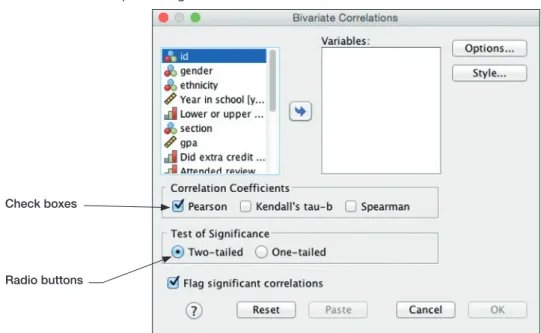
- What is a Correlation?
- Additional Considerations
- Linear versus Curvilinear
- Significance and Effect Size
- Causality
- Partial Correlation
- Step by Step
- Printing Results
- Output
- Correlations
- Independent-Samples t Tests
- Paired-Samples t Tests
- One-Sample t Tests
- Significance and Effect Size
- Step by Step
- Independent-Samples t Tests
- Paired-Samples t Tests
- One-Sample t Tests
- Printing Results
- Output
- Independent-Samples t Test
- Paired-Samples t Test
- One-Sample t Test
- Definitions of Terms
- Introduction to One-Way Analysis of Variance
- Step by Step
- One-Way Analysis of Variance
- Printing Results
- Output
- One-Way Analysis of Variance
- Statistical Power
- Two-Way Analysis of Variance
- Step by Step
- Two-Way Analysis of Variance
- Printing Results
- Output
- Two-Way Analysis of Variance
- Three-Way Analysis of Variance
- The Influence of Covariates
- Step by Step
- Three-Way Analysis of Variance
- Printing Results
- Output
- Three-Way Analysis of Variance and Analysis of Covariance
- Total Population
- Main Effect for GENDER
- Main Effect for SECTION
- Main Effect for LOWUP
- Two-Way Interaction, GENDER by SECTION
- Two-Way Interaction, GENDER by LOWUP
- Two-Way Interaction, SECTION by LOWUP
- Three-Way Interaction, GENDER by SECTION by LOWUP
By calculating the partial correlation that "partializes" the influence of year, we mathematically eliminate the influence of year of schooling on the correlation between total points and GPA. The first question is, "Can I be sure that the difference between groups (or between conditions, or between the sample mean and the population mean) is not due to random chance?" The significance value (p-value) answers this question.