However, it is not enough to focus on the effect of neighboring colors, which attribute of the color affects the appearance of the color. Furthermore, the results were compared with the estimated results of two different color rendering models, namely CIELAB and CIECAM02. Regarding the experiment findings, Hue, Colorfulness and Lightness tend to be affected by neighboring colors.
Both hue and lightness of test colors tended to be rated lower when neighboring colors were lighter. The degree of color appearance changes was compared between the experimental results and CIECAM02 values of "Reference Condition" and "Light".
Introduction
Background
However, people see many colors at the same time and color appearance can be affected by neighboring colors. There are earlier studies on color appearance that considered neighboring colors (Luo et al., 1991; Choi et al., 2010). Another earlier studies show that color appearance can be influenced according to neighboring colors (Richard and Donald, 1997; Oh and Kwak, 2014).
The results show that the color appearance was affected by the presence of adjacent colors. There is not enough research focusing on the effect of adjacent colors, where a color attribute can affect the appearance of a color.
Aim of the Research
Research Outline
Literature Review
Color Appearance Terminology
- Hue
- Brightness
- Lightness
- Brightness vs. Lightness
- Colorfulness
- Chroma
- Saturation
- Colorfulness vs. Chroma, Saturation
Brightness is an attribute of a visual perception according to which an area appears to show more or less light. Brightness and Lightness can be discriminated by the fact that Brightness is an absolute value and Lightness is a relative value. Lightness, on the other hand, can be defined as the Luminance of point 1 relative to the Luminance of point 2 used as a reference white.
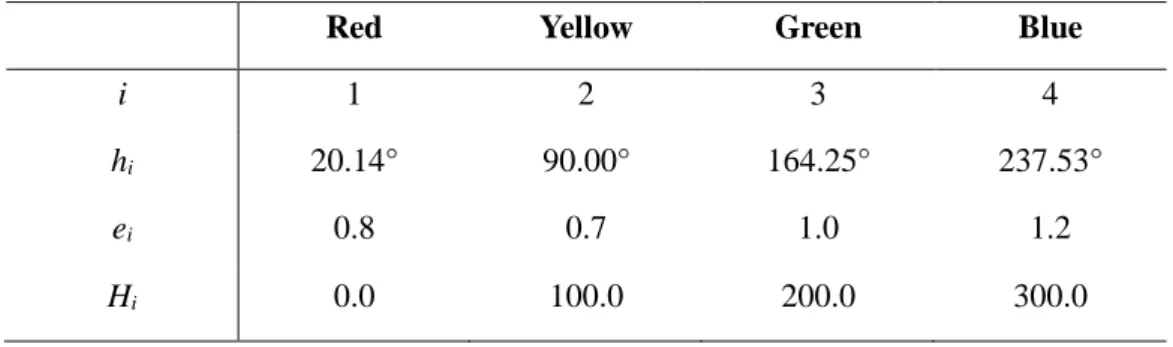
Colorfulness is an attribute of visual perception in which an area appears to exhibit more or less of its hue. Chroma is the colorfulness of an area, judged in relation to the brightness of a similarly illuminated area that appears white or highly translucent.
Color Appearance Phenomena
- Simultaneous Contrast
- Crispening Effect
- Hunt Effect
- Helmholtz-Kohlrausch Effect
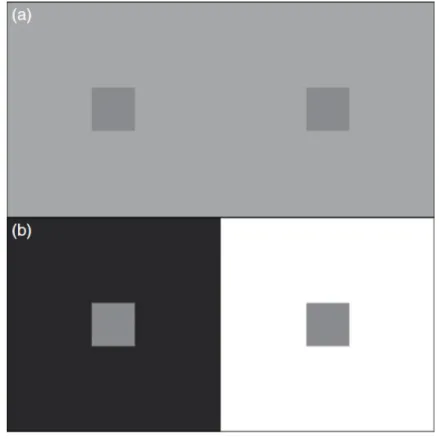
This means that a black background makes a gray spot appear lighter, and a white background makes the same gray spot appear darker. In the case of colored stimuli, the background color induces the stimuli, it looks more like a complementary background color. One of the earlier studies on simultaneous contrast (Albers, J., 2006) explored various aspects of simultaneous contrast and used them to suggest guidelines for artists and designers to avoid pitfalls and take advantage of the effect.
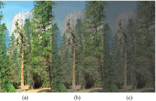
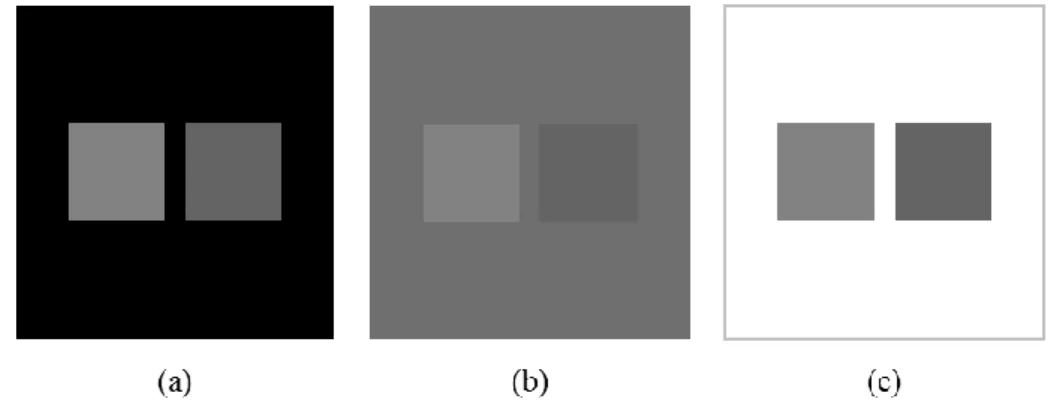
Crispining Effect is similar to Simultaneous Contrast and is one of the effects where the color appearance changes according to the surroundings. As the brightness of the image decreases, it becomes darker and at the same time less vivid (a) to (c).
CIE Colorimetry
- Light Source and CIE Standard Illuminants
- CIE Standard Measurement Geometry
- CIE Standard Observer
- CIE XYZ Tri-Stimulus Values
- Chromaticity
- Color Appearance Model
- CIELAB
- CIECAM02
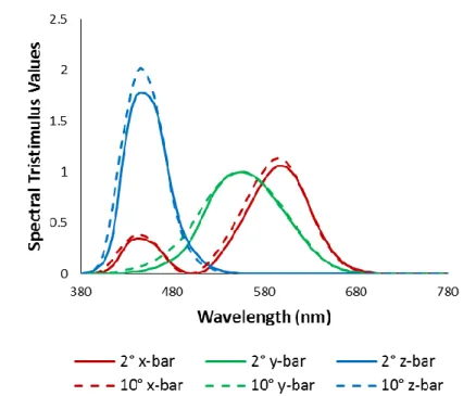
The CIE color adjustment functions for the 1931 Standard Colorimetric Observer (2°), and for the 1964 Supplementary Standard Colorimetric Observer (10°). Therefore, if the characteristics of three components, spectral power distribution of light source, spectral reflectance of an object and color matching function are known, each color can be quantified as tri-stimulus values. The CIE tri-stimulus values, X, Y and Z are not easy to represent colors intuitively, as they are represented in 3-dimensional space.
Chromaticity diagrams have been widely used, but they can only represent proportions of CIE tri-stimulus values. In the comparisons, Xn, Yn and Zn are the CIE XYZ tri-stimulus values of appropriately chosen reference white and X, Y and Z represent CIE XYZ tri-stimulus values of the test color.
Summary
Experimental Design
- Introduction
- Experimental Settings
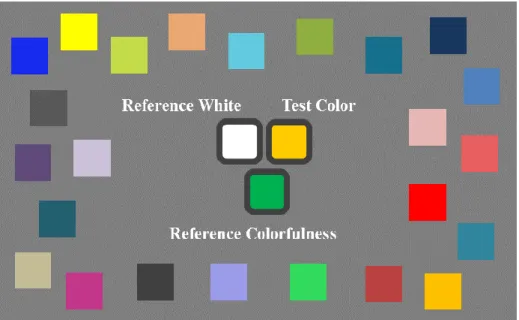
- Test Pattern
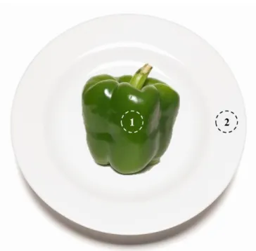
- Test Colors
- Neighboring Color Conditions
- Participants
- Psychophysical Experiment Procedure
- Data Analysis Method
- Coefficient of Variation (CV)
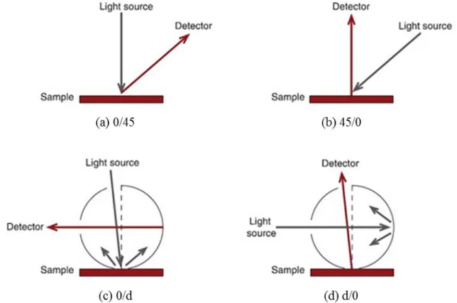
The purpose of the experiment was to investigate the effect of neighboring colors on color appearance. Each participant rated the hue, hue, and lightness of the 22 test colors using the magnitude rating method. Each neighboring color was also measured using Minolta CS-2000 tele-spectroradiometer with standard CIE 0°/45° geometry and the measurement angle was fixed at 1°.
The measured CIE XYZ tri-stimulus values of each neighboring color were transformed to CIELAB values based on the white reference as (X, Y, Z). This change in L* value was also intended to see the effect of the lightness of neighboring colors on the color appearance. Participants for the two conditions, "Saturated" and "Saturated," were composed differently than participants for the conditions, "Reference Condition," "Dark," and "Light."
In the main experiment, participants were asked to rate the color appearance of 22 test colors against 5 different adjacent color conditions. Three conditions, “Reference condition”, “Dark” and “Light”, and two conditions, “Desaturated” and “Saturated”, were shown in order. A neutral color had no chrominance, meaning zero on the scale, and each adjacent color condition was given a reference chrominance.
Reference chroma was given differently depending on adjacent color conditions, as its hue itself could influence the chroma evaluation. As shown in Table 7, reference color 1, which is red, was given under two conditions, 'Reference Condition' and 'Desaturated'. Reference Color 1 (Table 7) was given under the very first order of neighboring color conditions, respectively 'Desaturated' and 'Reference Condition'.
Results
Introduction
In this research, the color representation experiment was conducted using 5 different adjacent color conditions. A total of 20 participants were evaluated in each neighboring color condition, and each participant rated the hue, hue, and lightness of the 22 test colors using the magnitude estimation method. Furthermore, the experimental results were compared with the estimated results of two different color rendering models, namely CIELAB and CIECAM02.
Observer Performance
- Repeatability
- Reproducibility
Compared to previous research, the mean CV values of the previous color rendering experiment (Luo et al., 1991) were 9, 18, and 13 for Hue, Colorfulness, and Lightness, respectively.
Color Appearance Change by Neighboring Color Conditions
- Hue
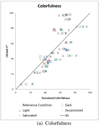
- Colorfulness
- Lightness
- Summary
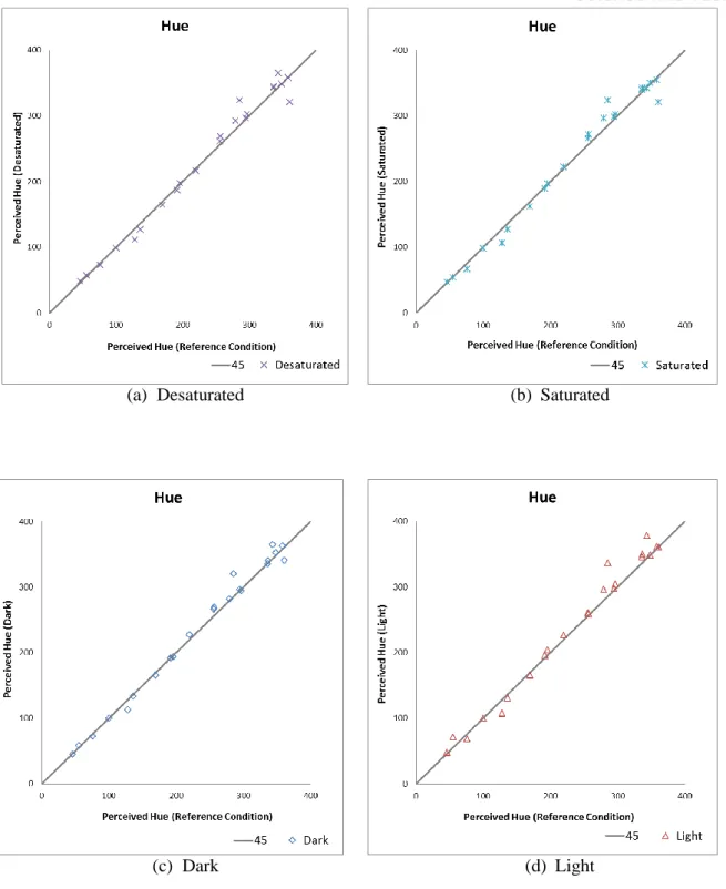
The p-value was higher than 0.05, so there was no significant difference in the Hue rating between the two conditions, "Unsaturated" and "saturated". The p-value was less than 0.05, so there was a significant difference in the Hue score between the two conditions, "Dark" and "Light". In each graph of Figure 22, the x-axis represents the mean Hue response in the 'Reference Condition' and the y-axis means the mean Hue response in the other conditions, 'Unsaturated', 'Saturated', 'Dark' and ' Light', respectively.
First, in the case of 'Dark' and 'Saturated', data points are mostly distributed along the 45 degree line. As the t-test result of Color between "Desaturated" and "Saturated" conditions, the t-value was 1.964 and the p-value was 0.063. The P-value was higher than 0.05, so there was no significant difference in Color Saturation evaluation between two conditions, 'Desaturated' and 'Saturated'.
As t-test result of Color Fullness between 'Dark' and 'Light' conditions, t-value was 4.377 and p-value was 0. In each graph of Figure 26, x-axis represents the average Light response to 'Reference Condition' and y - as means the average Lightness response to the other conditions, respectively 'Unsaturated', 'Saturated', 'Dark' and 'Light'. As shown in figure 26, in the case of 'Unsaturated', 'Saturated' and 'Dark', most data points are distributed along the 45 degree line.
Saturated, saturated and dark, the p-value was shown to be higher than 0.05, so there were no significant differences in the Lightness rating according to the conditions. As a result of the t-test of Ease between the "unsaturated" and "saturated" conditions, the t-value was -0.372 and the p-value was 0.713. As a result of the light t-test between the "Dark" and "Light" conditions, the t-value was 5.339 and the p-value was 0.
Model Performance Test
- CIELAB
- CIECAM02
- Summary
To match the scale between the experimental results and the CIECAM02 M values, each CIECAM02 M value was rescaled to have the same mean value as the "reference condition" experimental results. In each graph, the x-axis represents the average of the experimental results, and the y-axis represents the estimated CIECAM02 values. As an explanation for the symbols of each graph, the green diamond, blue square, red triangle, purple X, and blue-green X line represent "reference state," "dark," "light," "unsaturated," and "saturated." .
Reference Condition' and 'Desaturated' showed relatively low CV values as 9.9 and 9.7 respectively, which means that each result had quite strong correlation with the experimental results. Reference condition' and 'Light' condition were used because there were both colorful and lightness offsets between conditions. The degree of color appearance changes was compared with CIECAM02 value changes between 'Reference Condition' and 'Light' condition to investigate whether CIECAM02 was able to estimate color appearance shift between the conditions.
Second, the Yb value was set based on the total background of each condition, taking into account the ratio of adjacent colors that occupied approximately 13.7% of the total background in each condition. In each graph, the x-axis represents the 'reference state' result and the y-axis represents the 'light' result. In Fig. 31 (b) and (c), the data points were distributed slightly downward along the 45 degree line, but the degree of downward movement seemed much smaller than the experimental results.
That is, the CIECAM02 model underestimated the degree of chromaticity change between 'Reference condition' and 'Light' condition than the experimental result. That is, the CIECAM02 model underestimated the degree of Luminance change between 'Reference condition' and 'Light' condition than the experimental result. When CIECAM02 estimated the degree of Hue and Luminance changes according to neighboring color conditions, it could not sufficiently estimate both properties and tended to underestimate the changes compared to experimental results.
Conclusion and Discussion
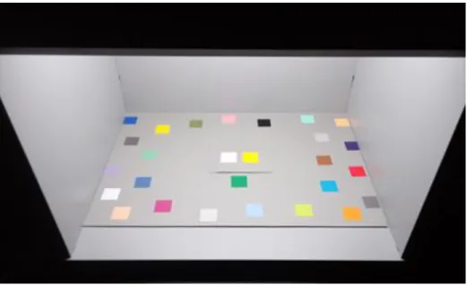
The purpose of the experiment was to investigate the effect of neighboring colors on color. The color appearance experiment was performed in the dark room using a viewing booth. Furthermore, the experimental results were compared with the estimated results of two different color appearance models, CIELAB and CIECAM02.
The result showed that the average CV values for Hue, Colorfulness and Lightness were 6.8, 16.1 and 11.2 respectively. As for the results of this experiment, Hue, Colorfulness, and Lightness tended to be affected by adjacent colors. As a comparison result of two color appearance models, CIECAM02 showed better performance than CIELAB in general.
The performances of both models tended to be poorer as adjacent color conditions became extreme for a particular color attribute, especially when evaluating Hue and Lightness. The degree of changes in color appearance was compared between the experimental results and the CIECAM02 evaluation values for "Reference Condition" and "Light". Based on the results of the analysis of color appearance phenomena, this research can be helpful in proposing design guidelines where color appearance is important relative to neighboring colors.
This research focused on the appearance of color appearance relative to adjacent colors, and the model's performance was also tested. Based on the research results, further research on color appearance should consider the surrounding environment. Effects of adjacent colors on color appearance and effect Journal of Korea Society of Color Studies, 28(3), 9.
Instructions for Participants
Color Measurement Data
Color Appearance Data