■ ■ ■
■
■
Allen B. Downey
Think
Stats
E X P LO R ATO RY
DATA A N A LY S I S
2n
d
E
di
tio
STATISTIC S PROGR AMMING
If you know how to program, you have the skills to turn data into knowledge using tools of probability and statistics. This concise introduction shows you how to perform statistical analysis computationally, rather than mathematically, with programs written in Python.
By working with a single case study throughout this thoroughly revised book, you’ll learn the entire process of exploratory data analysis—from collecting data and generating statistics to identifying patterns and testing hypotheses. You’ll explore distributions, rules of probability, visualization, and many other tools and concepts.
New chapters on regression, time series analysis, survival analysis, and analytic methods will enrich your discoveries.
■ Develop an understanding of probability and statistics by writing and testing code
■ Run experiments to test statistical behavior, such as generating samples from several distributions
■ Use simulations to understand concepts that are hard to grasp mathematically
■ Import data from most sources with Python, rather than rely on data that’s cleaned and formatted for statistics tools
■ Use statistical inference to answer questions about real-world data
Allen B. Downey
SECOND EDITION
Think Stats, Second Edition by Allen B. Downey
Copyright © 2015 Allen B. Downey. All rights reserved.
Printed in the United States of America.
Published by O’Reilly Media, Inc., 1005 Gravenstein Highway North, Sebastopol, CA 95472.
O’Reilly books may be purchased for educational, business, or sales promotional use. Online editions are also available for most titles (http://safaribooksonline.com). For more information, contact our corporate/ institutional sales department: 800-998-9938 or [email protected].
Editors: Mike Loukides and Meghan Blanchette
Production Editor: Melanie Yarbrough
Copyeditor: Marta Justak
Proofreader: Amanda Kersey
Indexer: Allen B. Downey
Cover Designer: Karen Montgomery
Interior Designer: David Futato
Illustrator: Rebecca Demarest
October 2014: Second Edition
Revision History for the Second Edition:
2014-10-09: First release
See http://oreilly.com/catalog/errata.csp?isbn=9781491907337 for release details.
The O’Reilly logo is a registered trademarks of O’Reilly Media, Inc. Think Stats, second edition, the cover image of an archerfish, and related trade dress are trademarks of O’Reilly Media, Inc.
Many of the designations used by manufacturers and sellers to distinguish their products are claimed as trademarks. Where those designations appear in this book, and O’Reilly Media, Inc. was aware of a trademark claim, the designations have been printed in caps or initial caps.
While the publisher and the author have used good faith efforts to ensure that the information and instruc‐ tions contained in this work are accurate, the publisher and the author disclaim all responsibility for errors or omissions, including without limitation responsibility for damages resulting from the use of or reliance on this work. Use of the information and instructions contained in this work is at your own risk. If any code samples or other technology this work contains or describes is subject to open source licenses or the intel‐ lectual property rights of others, it is your responsibility to ensure that your use thereof complies with such licenses and/or rights.
Think Stats is available under the Creative Commons Attribution-NonCommercial-ShareAlike 3.0 Unported License. The author maintains an online version at http://thinkstats2.com.
ISBN: 978-1-491-90733-7
Table of Contents
Preface. . . ix
1. Exploratory Data Analysis. . . 1
A Statistical Approach 2
The National Survey of Family Growth 2
Importing the Data 3
DataFrames 4
Variables 6
Transformation 7
Validation 8
Interpretation 9
Exercises 11
Glossary 12
2. Distributions. . . 15
Representing Histograms 16
Plotting Histograms 16
NSFG Variables 17
Outliers 19
First Babies 20
Summarizing Distributions 22
Variance 23
Effect Size 23
Reporting Results 24
Exercises 25
Glossary 25
3. Probability Mass Functions. . . 27
Pmfs 27
Plotting PMFs 28
Other Visualizations 30
The Class Size Paradox 30
DataFrame Indexing 34
Exercises 35
Glossary 37
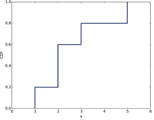
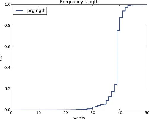
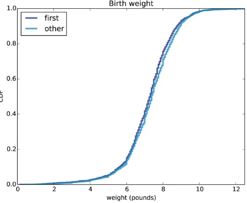
4. Cumulative Distribution Functions. . . 39
The Limits of PMFs 39
Percentiles 40
CDFs 41
Representing CDFs 42
Comparing CDFs 44
Percentile-Based Statistics 44
Random Numbers 45
Comparing Percentile Ranks 47
Exercises 47
Glossary 48
5. Modeling Distributions. . . 49
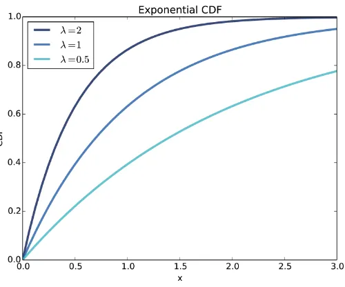
The Exponential Distribution 49
The Normal Distribution 52
Normal Probability Plot 54
The lognormal Distribution 55
The Pareto Distribution 57
Generating Random Numbers 60
Why Model? 61
Exercises 61
Glossary 63
6. Probability Density Functions. . . 65
PDFs 65
Kernel Density Estimation 67
The Distribution Framework 69
Hist Implementation 69
Pmf Implementation 70
Cdf Implementation 71
Moments 72
Skewness 73
Exercises 75
Exercises 180
Glossary 181
14. Analytic Methods. . . 183
Normal Distributions 183
Sampling Distributions 184
Representing Normal Distributions 185
Central Limit Theorem 186
Testing the CLT 187
Applying the CLT 190
Correlation Test 191
Chi-Squared Test 193
Discussion 194
Exercises 195
Index. . . 197
Preface
This book is an introduction to the practical tools of exploratory data analysis. The organization of the book follows the process I use when I start working with a dataset:
• Importing and cleaning: Whatever format the data is in, it usually takes some time and effort to read the data, clean and transform it, and check that everything made it through the translation process intact.
• Single variable explorations: I usually start by examining one variable at a time, finding out what the variables mean, looking at distributions of the values, and choosing appropriate summary statistics.
• Pair-wise explorations: To identify possible relationships between variables, I look at tables and scatter plots, and compute correlations and linear fits.
• Multivariate analysis: If there are apparent relationships between variables, I use multiple regression to add control variables and investigate more complex rela‐ tionships.
• Estimation and hypothesis testing: When reporting statistical results, it is important to answer three questions: How big is the effect? How much variability should we expect if we run the same measurement again? Is it possible that the apparent effect is due to chance?
• Visualization: During exploration, visualization is an important tool for finding possible relationships and effects. Then if an apparent effect holds up to scrutiny, visualization is an effective way to communicate results.
This book takes a computational approach, which has several advantages over mathe‐ matical approaches:
• I present most ideas using Python code, rather than mathematical notation. In general, Python code is more readable; also, because it is executable, readers can download it, run it, and modify it.
• Each chapter includes exercises readers can do to develop and solidify their learn‐ ing. When you write programs, you express your understanding in code; while you are debugging the program, you are also correcting your understanding.
• Some exercises involve experiments to test statistical behavior. For example, you can explore the Central Limit Theorem (CLT) by generating random samples and computing their sums. The resulting visualizations demonstrate why the CLT works and when it doesn’t.
• Some ideas that are hard to grasp mathematically are easy to understand by simu‐ lation. For example, we approximate p-values by running random simulations, which reinforces the meaning of the p-value.
• Because the book is based on a general-purpose programming language (Python), readers can import data from almost any source. They are not limited to datasets that have been cleaned and formatted for a particular statistics tool.
The book lends itself to a project-based approach. In my class, students work on a semester-long project that requires them to pose a statistical question, find a dataset that can address it, and apply each of the techniques they learn to their own data.
To demonstrate my approach to statistical analysis, the book presents a case study that runs through all of the chapters. It uses data from two sources:
• The National Survey of Family Growth (NSFG), conducted by the U.S. Centers for Disease Control and Prevention (CDC) to gather “information on family life, mar‐ riage and divorce, pregnancy, infertility, use of contraception, and men’s and wom‐ en’s health.” (See http://cdc.gov/nchs/nsfg.htm.)
• The Behavioral Risk Factor Surveillance System (BRFSS), conducted by the Na‐ tional Center for Chronic Disease Prevention and Health Promotion to “track health conditions and risk behaviors in the United States.” (See http://cdc.gov/ BRFSS/.)
Other examples use data from the IRS, the U.S. Census, and the Boston Marathon.
This second edition of Think Stats includes the chapters from the first edition, many of them substantially revised, and new chapters on regression, time series analysis, survival analysis, and analytic methods. The previous edition did not use pandas, SciPy, or StatsModels, so all of that material is new.
How I Wrote This Book
I did not do that. In fact, I used almost no printed material while I was writing this book, for several reasons:
• My goal was to explore a new approach to this material, so I didn’t want much exposure to existing approaches.
• Since I am making this book available under a free license, I wanted to make sure that no part of it was encumbered by copyright restrictions.
• Many readers of my books don’t have access to libraries of printed material, so I tried to make references to resources that are freely available on the Internet.
• Some proponents of old media think that the exclusive use of electronic resources is lazy and unreliable. They might be right about the first part, but I think they are wrong about the second, so I wanted to test my theory.
The resource I used more than any other is Wikipedia. In general, the articles I read on statistical topics were very good (although I made a few small changes along the way). I include references to Wikipedia pages throughout the book and I encourage you to follow those links; in many cases, the Wikipedia page picks up where my description leaves off. The vocabulary and notation in this book are generally consistent with Wi‐ kipedia, unless I had a good reason to deviate. Other resources I found useful were Wolfram MathWorld and the Reddit statistics forum.
Using the Code
The code and data used in this book are available from GitHub. Git is a version control system that allows you to keep track of the files that make up a project. A collection of files under Git’s control is called a repository. GitHub is a hosting service that provides storage for Git repositories and a convenient web interface.
The GitHub homepage for my repository provides several ways to work with the code:
• You can create a copy of my repository on GitHub by pressing the Fork button. If you don’t already have a GitHub account, you’ll need to create one. After forking, you’ll have your own repository on GitHub that you can use to keep track of code you write while working on this book. Then you can clone the repo, which means that you make a copy of the files on your computer.
• Or you could clone my repository. You don’t need a GitHub account to do this, but you won’t be able to write your changes back to GitHub.
• If you don’t want to use Git at all, you can download the files in a Zip file using the button in the lower-right corner of the GitHub page.
All of the code is written to work in both Python 2 and Python 3 with no translation.
I developed this book using Anaconda from Continuum Analytics, which is a free Python distribution that includes all the packages you’ll need to run the code (and lots more). I found Anaconda easy to install. By default it does a user-level installation, not system-level, so you don’t need administrative privileges. And it supports both Python 2 and Python 3. You can download Anaconda from Continuum.
If you don’t want to use Anaconda, you will need the following packages:
• pandas for representing and analyzing data • NumPy for basic numerical computation
• SciPy for scientific computation including statistics • StatsModels for regression and other statistical analysis • matplotlib for visualization
Although these are commonly used packages, they are not included with all Python installations, and they can be hard to install in some environments. If you have trouble installing them, I strongly recommend using Anaconda or one of the other Python distributions that include these packages.
After you clone the repository or unzip the zip file, you should have a file called
ThinkStats2/code/nsfg.py. If you run it, it should read a data file, run some tests, and print a message like, “All tests passed.” If you get import errors, it probably means there are packages you need to install.
Most exercises use Python scripts, but some also use the IPython notebook. If you have not used IPython notebook before, I suggest you start with the documentation. I wrote this book assuming that the reader is familiar with core Python, including object-oriented features, but not pandas, NumPy, and SciPy. If you are already familiar with these modules, you can skip a few sections.
I assume that the reader knows basic mathematics, including logarithms, for example, and summations. I refer to calculus concepts in a few places, but you don’t have to do any calculus.
If you have never studied statistics, I think this book is a good place to start. And if you have taken a traditional statistics class, I hope this book will help repair the damage.
—
Contributor List
If you have a suggestion or correction, please send email to downey@allendow‐ ney.com. If I make a change based on your feedback, I will add you to the contributor list (unless you ask to be omitted).
If you include at least part of the sentence the error appears in, that makes it easy for me to search. Page and section numbers are fine, too, but not quite as easy to work with. Thanks!
• Lisa Downey and June Downey read an early draft and made many corrections and suggestions.
• Steven Zhang found several errors.
• Andy Pethan and Molly Farison helped debug some of the solutions, and Molly spotted several typos.
• Andrew Heine found an error in my error function.
• Dr. Nikolas Akerblom knows how big a Hyracotherium is.
• Alex Morrow clarified one of the code examples.
• Jonathan Street caught an error in the nick of time.
• Gábor Lipták found a typo in the book and the relay race solution.
• Many thanks to Kevin Smith and Tim Arnold for their work on plasTeX, which I used to convert this book to DocBook.
• George Caplan sent several suggestions for improving clarity.
• Julian Ceipek found an error and a number of typos.
• Stijn Debrouwere, Leo Marihart III, Jonathan Hammler, and Kent Johnson found errors in the first print edition.
• Dan Kearney found a typo.
• Jeff Pickhardt found a broken link and a typo.
• Jörg Beyer found typos in the book and made many corrections in the docstrings of the accompanying code.
• Tommie Gannert sent a patch file with a number of corrections.
• Alexander Gryzlov suggested a clarification in an exercise.
• Martin Veillette reported an error in one of the formulas for Pearson’s correlation.
• Christoph Lendenmann submitted several errata.
• Haitao Ma noticed a typo and and sent me a note.
• Michael Kearney sent me many excellent suggestions.
• Alex Birch made a number of helpful suggestions.
• Lindsey Vanderlyn, Griffin Tschurwald, and Ben Small read an early version of this book and found many errors.
• John Roth, Carol Willing, and Carol Novitsky performed technical reviews of the book. They found many errors and made many helpful suggestions.
• Rohit Deshpande found a typesetting error.
• David Palmer sent many helpful suggestions and corrections.
• Erik Kulyk found many typos.
Safari® Books Online
Safari Books Online (www.safaribooksonline.com) is an on-demand digital library that delivers expert content in both book and video form from the world’s leading authors in technology and business.
Technology professionals, software developers, web designers, and business and crea‐ tive professionals use Safari Books Online as their primary resource for research, prob‐ lem solving, learning, and certification training.
Safari Books Online offers a range of plans and pricing for enterprise, government, and
education, and individuals.
How to Contact Us
Please address comments and questions concerning this book to the publisher:
O’Reilly Media, Inc.
1005 Gravenstein Highway North Sebastopol, CA 95472
800-998-9938 (in the United States or Canada) 707-829-0515 (international or local)
707-829-0104 (fax)
We have a web page for this book, where we list errata, examples, and any additional information. You can access this page at http://bit.ly/think_stats_2e.
To comment or ask technical questions about this book, send email to bookques [email protected].
For more information about our books, courses, conferences, and news, see our website at http://www.oreilly.com.
Find us on Facebook: http://facebook.com/oreilly
Follow us on Twitter: http://twitter.com/oreillymedia
Watch us on YouTube: http://www.youtube.com/oreillymedia
CHAPTER 1
Exploratory Data Analysis
The thesis of this book is that data combined with practical methods can answer ques‐ tions and guide decisions under uncertainty.
As an example, I present a case study motivated by a question I heard when my wife and I were expecting our first child: do first babies tend to arrive late?
If you Google this question, you will find plenty of discussion. Some people claim it’s true, others say it’s a myth, and some people say it’s the other way around: first babies come early.
In many of these discussions, people provide data to support their claims. I found many examples like these:
“My two friends that have given birth recently to their first babies, BOTH went almost 2 weeks overdue before going into labour or being induced.”
“My first one came 2 weeks late and now I think the second one is going to come out two weeks early!!”
“I don’t think that can be true because my sister was my mother’s first and she was early, as with many of my cousins.”
Reports like these are called anecdotal evidence because they are based on data that is unpublished and usually personal. In casual conversation, there is nothing wrong with anecdotes, so I don’t mean to pick on the people I quoted.
But we might want evidence that is more persuasive and an answer that is more reliable. By those standards, anecdotal evidence usually fails, because:
Small number of observations
If pregnancy length is longer for first babies, the difference is probably small com‐ pared to natural variation. In that case, we might have to compare a large number of pregnancies to be sure that a difference exists.
Selection bias
People who join a discussion of this question might be interested because their first babies were late. In that case the process of selecting data would bias the results.
Confirmation bias
People who believe the claim might be more likely to contribute examples that confirm it. People who doubt the claim are more likely to cite counterexamples.
Inaccuracy
Anecdotes are often personal stories, and often misremembered, misrepresented, repeated inaccurately, etc.
So how can we do better?
A Statistical Approach
To address the limitations of anecdotes, we will use the tools of statistics, which include:
Data collection
We will use data from a large national survey that was designed explicitly with the goal of generating statistically valid inferences about the U.S. population.
Descriptive statistics
We will generate statistics that summarize the data concisely, and evaluate different ways to visualize data.
Exploratory data analysis
We will look for patterns, differences, and other features that address the questions we are interested in. At the same time we will check for inconsistencies and identify limitations.
Estimation
We will use data from a sample to estimate characteristics of the general population.
Hypothesis testing
Where we see apparent effects, like a difference between two groups, we will evaluate whether the effect might have happened by chance.
By performing these steps with care to avoid pitfalls, we can reach conclusions that are more justifiable and more likely to be correct.
The National Survey of Family Growth
health education programs, and to do statistical studies of families, fertility, and health.”
We will use data collected by this survey to investigate whether first babies tend to come late, as well as answer other questions. In order to use this data effectively, we have to understand the design of the study.
The NSFG is a cross-sectional study, which means that it captures a snapshot of a group at a point in time. The most common alternative is a longitudinal study, which observes a group repeatedly over a period of time.
The NSFG has been conducted seven times; each deployment is called a cycle. We will use data from Cycle 6, which was conducted from January 2002 to March 2003.
The goal of the survey is to draw conclusions about a population; the target population of the NSFG is people in the United States aged 15-44. Ideally surveys would collect data from every member of the population, but that’s seldom possible. Instead we collect data from a subset of the population called a sample. The people who participate in a survey are called respondents.
In general, cross-sectional studies are meant to be representative, which means that every member of the target population has an equal chance of participating. That ideal is hard to achieve in practice, but people who conduct surveys come as close as they can.
The NSFG is not representative; instead it is deliberately oversampled. The designers of the study recruited three groups—Hispanics, African Americans and teenagers—at rates higher than their representation in the U.S. population, in order to make sure that the number of respondents in each of these groups is large enough to draw valid stat‐ istical inferences.
Of course, the drawback of oversampling is that it is not as easy to draw conclusions about the general population based on statistics from the survey. We will come back to this point later.
When working with this kind of data, it is important to be familiar with the code‐ book, which documents the design of the study, the survey questions, and the encoding of the responses. The codebook and user’s guide for the NSFG data are available from the CDC’s website.
Importing the Data
The code and data used in this book are available from GitHub. For information about downloading and working with this code, see “Using the Code” on page xi.
Once you download the code, you should have a folder called ThinkStats2/code with a file called nsfg.py. If you run it, it should read a data file, run some tests, and print a message like, “All tests passed.”
Let’s see what it does. Pregnancy data from Cycle 6 of the NSFG is in a file called
2002FemPreg.dat.gz; it is a gzip-compressed data file in plain text (ASCII), with fixed width columns. Each line in the file is a record that contains data about one pregnancy.
The format of the file is documented in 2002FemPreg.dct, which is a Stata dictionary file. Stata is a statistical software system; a “dictionary” in this context is a list of variable names, types, and indices that identify where in each line to find each variable.
For example, here are a few lines from 2002FemPreg.dct:
infile dictionary {
_column(1) str12 caseid %12s "RESPONDENT ID NUMBER" _column(13) byte pregordr %2f "PREGNANCY ORDER (NUMBER)" }
This dictionary describes two variables: caseid is a 12-character string that represents the respondent ID; pregorder is a one-byte integer that indicates which pregnancy this record describes for this respondent.
The code you downloaded includes thinkstats2.py which is a Python module that contains many classes and functions used in this book, including functions that read the Stata dictionary and the NSFG data file. Here’s how they are used in nsfg.py:
def ReadFemPreg(dct_file='2002FemPreg.dct', dat_file='2002FemPreg.dat.gz'): dct = thinkstats2.ReadStataDct(dct_file)
df = dct.ReadFixedWidth(dat_file, compression='gzip') CleanFemPreg(df)
return df
ReadStataDct takes the name of the dictionary file and returns dct, a
FixedWidthVariables object that contains the information from the dictionary file.
dct provides ReadFixedWidth, which reads the data file.
DataFrames
The result of ReadFixedWidth is a DataFrame, which is the fundamental data structure provided by pandas, which is a Python data and statistics package we’ll use throughout this book. A DataFrame contains a row for each record, in this case one row per preg‐ nancy, and a column for each variable.
If you print df you get a truncated view of the rows and columns, and the shape of the DataFrame, which is 13593 rows/records and 244 columns/variables.
>>> import nsfg
>>> df = nsfg.ReadFemPreg() >>> df
...
[13593 rows x 244 columns]
The attribute columns returns a sequence of column names as Unicode strings:
>>> df.columns
Index([u'caseid', u'pregordr', u'howpreg_n', u'howpreg_p', ... ])
The result is an Index, which is another pandas data structure. We’ll learn more about Index later, but for now we’ll treat it like a list:
>>> df.columns[1] 'pregordr'
To access a column from a DataFrame, you can use the column name as a key:
>>> pregordr = df['pregordr'] >>> type(pregordr)
<class 'pandas.core.series.Series'>
The result is a Series, yet another pandas data structure. A Series is like a Python list with some additional features. When you print a Series, you get the indices and the corresponding values:
>>> pregordr 0 1 1 2 2 1 3 2 ... 13590 3 13591 4 13592 5
Name: pregordr, Length: 13593, dtype: int64
In this example the indices are integers from 0 to 13592, but in general they can be any sortable type. The elements are also integers, but they can be any type.
The last line includes the variable name, Series length, and data type; int64 is one of the types provided by NumPy. If you run this example on a 32-bit machine you might see int32.
You can access the elements of a Series using integer indices and slices:
>>> pregordr[0] 1
>>> pregordr[2:5] 2 1
3 2 4 3
Name: pregordr, dtype: int64
The result of the index operator is an int64; the result of the slice is another Series.
You can also access the columns of a DataFrame using dot notation:
>>> pregordr = df.pregordr
This notation only works if the column name is a valid Python identifier, so it has to begin with a letter, can’t contain spaces, etc.
Variables
We have already seen two variables in the NSFG dataset, caseid and pregordr, and we have seen that there are 244 variables in total. For the explorations in this book, I use the following variables:
• caseid is the integer ID of the respondent.
• prglength is the integer duration of the pregnancy in weeks.
• outcome is an integer code for the outcome of the pregnancy. The code 1 indicates a live birth.
• pregordr is a pregnancy serial number; for example, the code for a respondent’s first pregnancy is 1, for the second pregnancy is 2, and so on.
• birthord is a serial number for live births; the code for a respondent’s first child is 1, and so on. For outcomes other than live births, this field is blank.
• birthwgt_lb and birthwgt_oz contain the pounds and ounces parts of the birth weight of the baby.
• agepreg is the mother’s age at the end of the pregnancy.
• finalwgt is the statistical weight associated with the respondent. It is a floating-point value that indicates the number of people in the U.S. population this re‐ spondent represents.
For example, prglngth for live births is equal to the raw variable wksgest (weeks of gestation) if it is available; otherwise it is estimated using mosgest * 4.33 (months of gestation times the average number of weeks in a month).
Recodes are often based on logic that checks the consistency and accuracy of the data. In general it is a good idea to use recodes when they are available, unless there is a compelling reason to process the raw data yourself.
Transformation
When you import data like this, you often have to check for errors, deal with special values, convert data into different formats, and perform calculations. These operations are called data cleaning.
nsfg.py includes CleanFemPreg, a function that cleans the variables I am planning to use.
def CleanFemPreg(df): df.agepreg /= 100.0 na_vals = [97, 98, 99]
df.birthwgt_lb.replace(na_vals, np.nan, inplace=True) df.birthwgt_oz.replace(na_vals, np.nan, inplace=True) df['totalwgt_lb'] = df.birthwgt_lb + df.birthwgt_oz / 16.0
agepreg contains the mother’s age at the end of the pregnancy. In the data file, agepreg
is encoded as an integer number of centiyears. So the first line divides each element of
agepreg by 100, yielding a floating-point value in years.
birthwgt_lb and birthwgt_oz contain the weight of the baby, in pounds and ounces, for pregnancies that end in live births. In addition they use several special codes:
97 NOT ASCERTAINED 98 REFUSED 99 DON'T KNOW
Special values encoded as numbers are dangerous because if they are not handled prop‐ erly, they can generate bogus results, like a 99-pound baby. The replace method replaces these values with np.nan, a special floating-point value that represents “not a number.” The inplace flag tells replace to modify the existing Series rather than create a new one.
As part of the IEEE floating-point standard, all mathematical operations return nan if either argument is nan:
>>> import numpy as np >>> np.nan / 100.0 nan
So computations with nan tend to do the right thing, and most pandas functions handle
nan appropriately. But dealing with missing data will be a recurring issue.
The last line of CleanFemPreg creates a new column totalwgt_lb that combines pounds and ounces into a single quantity, in pounds.
One important note: when you add a new column to a DataFrame, you must use dic‐ tionary syntax, like this:
# CORRECT
df['totalwgt_lb'] = df.birthwgt_lb + df.birthwgt_oz / 16.0
Not dot notation, like this:
# WRONG!
df.totalwgt_lb = df.birthwgt_lb + df.birthwgt_oz / 16.0
The version with dot notation adds an attribute to the DataFrame object, but that at‐ tribute is not treated as a new column.
Validation
When data is exported from one software environment and imported into another, errors might be introduced. And when you are getting familiar with a new dataset, you might interpret data incorrectly or introduce other misunderstandings. If you take time to validate the data, you can save time later and avoid errors.
One way to validate data is to compute basic statistics and compare them with published results. For example, the NSFG codebook includes tables that summarize each variable. Here is the table for outcome, which encodes the outcome of each pregnancy:
value label Total 1 LIVE BIRTH 9148 2 INDUCED ABORTION 1862 3 STILLBIRTH 120 4 MISCARRIAGE 1921 5 ECTOPIC PREGNANCY 190 6 CURRENT PREGNANCY 352
The Series class provides a method, value_counts, that counts the number of times each value appears. If we select the outcome Series from the DataFrame, we can use
value_counts to compare with the published data:
>>> df.outcome.value_counts().sort_index() 1 9148
The result of value_counts is a Series; sort_index sorts the Series by index, so the values appear in order.
Comparing the results with the published table, it looks like the values in outcome are correct. Similarly, here is the published table for birthwgt_lb
value label Total
The counts for 6, 7, and 8 pounds check out, and if you add up the counts for 0-5 and 9-95, they check out, too. But if you look more closely, you will notice one value that has to be an error, a 51 pound baby!
To deal with this error, I added a line to CleanFemPreg:
df.birthwgt_lb[df.birthwgt_lb > 20] = np.nan
This statement replaces invalid values with np.nan. The expression in brackets yields a Series of type bool, where True indicates that the condition is true. When a Boolean Series is used as an index, it selects only the elements that satisfy the condition.
Interpretation
To work with data effectively, you have to think on two levels at the same time: the level of statistics and the level of context.
As an example, let’s look at the sequence of outcomes for a few respondents. Because of the way the data files are organized, we have to do some processing to collect the preg‐ nancy data for each respondent. Here’s a function that does that:
def MakePregMap(df): d = defaultdict(list)
for index, caseid in df.caseid.iteritems(): d[caseid].append(index)
return d
df is the DataFrame with pregnancy data. The iteritems method enumerates the index (row number) and caseid for each pregnancy.
d is a dictionary that maps from each case ID to a list of indices. If you are not familiar with defaultdict, it is in the Python collections module. Using d, we can look up a respondent and get the indices of that respondent’s pregnancies.
This example looks up one respondent and prints a list of outcomes for her pregnancies:
>>> caseid = 10229
>>> indices = preg_map[caseid] >>> df.outcome[indices].values [4 4 4 4 4 4 1]
indices is the list of indices for pregnancies corresponding to respondent 10229.
Using this list as an index into df.outcome selects the indicated rows and yields a Series. Instead of printing the whole Series, I selected the values attribute, which is a NumPy array.
The outcome code 1 indicates a live birth. Code 4 indicates a miscarriage; that is, a pregnancy that ended spontaneously, usually with no known medical cause.
Statistically this respondent is not unusual. Miscarriages are common and there are other respondents who reported as many or more.
But remembering the context, this data tells the story of a woman who was pregnant six times, each time ending in miscarriage. Her seventh and most recent pregnancy ended in a live birth. If we consider this data with empathy, it is natural to be moved by the story it tells.
Exercises
Exercise 1-1.
In the repository you downloaded, you should find a file named chap01ex.ipynb, which is an IPython notebook. You can launch IPython notebook from the command line like this:
$ ipython notebook &
If IPython is installed, it should launch a server that runs in the background and open a browser to view the notebook. If you are not familiar with IPython, I suggest you start at the IPython website.
You can add a command-line option that makes figures appear “inline”; that is, in the notebook rather than a pop-up window:
$ ipython notebook --pylab=inline &
Open chap01ex.ipynb. Some cells are already filled in, and you should execute them. Other cells give you instructions for exercises you should try.
A solution to this exercise is in chap01soln.ipynb
Exercise 1-2.
Create a file named chap01ex.py and write code that reads the respondent file,
2002FemResp.dat.gz. You might want to start with a copy of nsfg.py and modify it.
The variable pregnum is a recode that indicates how many times each respondent has been pregnant. Print the value counts for this variable and compare them to the pub‐ lished results in the NSFG codebook.
You can also cross-validate the respondent and pregnancy files by comparing pregnum
for each respondent with the number of records in the pregnancy file.
You can use nsfg.MakePregMap to make a dictionary that maps from each caseid to a list of indices into the pregnancy DataFrame.
A solution to this exercise is in chap01soln.py
Exercise 1-3.
The best way to learn about statistics is to work on a project you are interested in. Do you want to investigate a question like “Do first babies arrive late?”
Think about questions you find personally interesting, or items of conventional wisdom, or controversial topics, or questions that have political consequences, and see if you can formulate a question that lends itself to statistical inquiry.
Look for data to help you address the question. Governments are good sources because data from public research is often freely available. Good places to start include http:// www.data.gov/, and http://www.science.gov/, and in the United Kingdom, http:// data.gov.uk/.
Two of my favorite data sets are the General Social Survey and the European Social Survey.
If it seems like someone has already answered your question, look closely to see whether the answer is justified. There might be flaws in the data or the analysis that make the conclusion unreliable. In that case you could perform a different analysis of the same data, or look for a better source of data.
If you find a published paper that addresses your question, you should be able to get the raw data. Many authors make their data available on the web, but for sensitive data you might have to write to the authors, provide information about how you plan to use the data, or agree to certain terms of use. Be persistent!
Glossary
anecdotal evidence
Evidence, often personal, that is collected casually rather than by a well-designed study.
population
A group we are interested in studying. “Population” often refers to a group of people, but the term is used for other subjects, too.
cross-sectional study
A study that collects data about a population at a particular point in time.
cycle
In a repeated cross-sectional study, each repetition of the study is called a cycle.
longitudinal study
A study that follows a population over time, collecting data from the same group repeatedly.
record
In a dataset, a collection of information about a single person or other subject.
respondent
A person who responds to a survey.
sample
representative
A sample is representative if every member of the population has the same chance of being in the sample.
oversampling
The technique of increasing the representation of a subpopulation in order to avoid errors due to small sample sizes.
raw data
Values collected and recorded with little or no checking, calculation or interpreta‐ tion.
recode
A value that is generated by calculation and other logic applied to raw data.
data cleaning
Processes that include validating data, identifying errors, translating between data types and representations, etc.
CHAPTER 2
Distributions
One of the best ways to describe a variable is to report the values that appear in the dataset and how many times each value appears. This description is called the distri‐ bution of the variable.
The most common representation of a distribution is a histogram, which is a graph that shows the frequency of each value. In this context, “frequency” means the number of times the value appears.
In Python, an efficient way to compute frequencies is with a dictionary. Given a sequence of values, t:
hist = {} for x in t:
hist[x] = hist.get(x, 0) + 1
The result is a dictionary that maps from values to frequencies. Alternatively, you could use the Counter class defined in the collections module:
from collections import Counter counter = Counter(t)
The result is a Counter object, which is a subclass of dictionary.
Another option is to use the pandas method value_counts, which we saw in the pre‐ vious chapter. But for this book I created a class, Hist, that represents histograms and provides the methods that operate on them.
Representing Histograms
The Hist constructor can take a sequence, dictionary, pandas Series, or another Hist. You can instantiate a Hist object like this:
>>> import thinkstats2
>>> hist = thinkstats2.Hist([1, 2, 2, 3, 5]) >>> hist
Hist({1: 1, 2: 2, 3: 1, 5: 1})
Hist objects provide Freq, which takes a value and returns its frequency:
>>> hist.Freq(2) 2
The bracket operator does the same thing:
>>> hist[2] 2
If you look up a value that has never appeared, the frequency is 0:
>>> hist.Freq(4) 0
Values returns an unsorted list of the values in the Hist:
>>> hist.Values() [1, 5, 3, 2]
To loop through the values in order, you can use the built-in function sorted:
for val in sorted(hist.Values()): print(val, hist.Freq(val))
Or you can use Items to iterate through value-frequency pairs:
for val, freq in hist.Items(): print(val, freq)
Plotting Histograms
For this book I wrote a module called thinkplot.py that provides functions for plotting Hists and other objects defined in thinkstats2.py. It is based on pyplot, which is part of the matplotlib package. See “Using the Code” on page xi for information about installing matplotlib.
To plot hist with thinkplot, try this:
>>> import thinkplot >>> thinkplot.Hist(hist)
You can read the documentation for thinkplot at http://bit.ly/1sgoj7V.
NSFG Variables
Now let’s get back to the data from the NSFG. The code in this chapter is in first.py. For information about downloading and working with this code, see “Using the Code” on page xi.
When you start working with a new dataset, I suggest you explore the variables you are planning to use one at a time, and a good way to start is by looking at histograms.
In “Transformation” on page 7 we transformed agepreg from centiyears to years, and combined birthwgt_lb and birthwgt_oz into a single quantity, totalwgt_lb. In this section I use these variables to demonstrate some features of histograms.
I’ll start by reading the data and selecting records for live births:
preg = nsfg.ReadFemPreg() live = preg[preg.outcome == 1]
The expression in brackets is a boolean Series that selects rows from the DataFrame and returns a new DataFrame. Next I generate and plot the histogram of birthwgt_lb for live births.
hist = thinkstats2.Hist(live.birthwgt_lb, label='birthwgt_lb') thinkplot.Hist(hist)
thinkplot.Show(xlabel='pounds', ylabel='frequency')
When the argument passed to Hist is a pandas Series, any nan values are dropped. label
is a string that appears in the legend when the Hist is plotted.
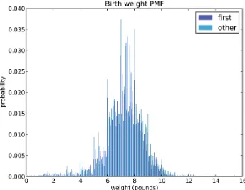
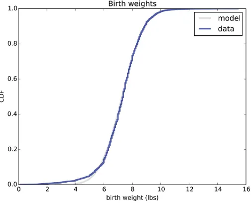
Figure 2-1 shows the result. The most common value, called the mode, is 7 pounds. The distribution is approximately bell-shaped, which is the shape of the normal distribution, also called a Gaussian distribution. But unlike a true normal distribution, this distri‐ bution is asymmetric; it has a tail that extends farther to the left than to the right.
Figure 2-2 shows the histogram of birthwgt_oz, which is the ounces part of birth weight. In theory we expect this distribution to be uniform; that is, all values should have the same frequency. In fact, 0 is more common than the other values, and 1 and 15 are less common, probably because respondents round off birth weights that are close to an integer value.
Figure 2-3 shows the histogram of agepreg, the mother’s age at the end of pregnancy. The mode is 21 years. The distribution is very roughly bell-shaped, but in this case the tail extends farther to the right than left; most mothers are in their 20s, fewer in their 30s.
Figure 2-4 shows the histogram of prglngth, the length of the pregnancy in weeks. By far the most common value is 39 weeks. The left tail is longer than the right; early babies
Figure 2-2. Histogram of the ounce part of birth weight
are common, but pregnancies seldom go past 43 weeks, and doctors often intervene if they do.
Figure 2-3. Histogram of mother’s age at end of pregnancy
Figure 2-4. Histogram of pregnancy length in weeks
Outliers
Looking at histograms, it is easy to identify the most common values and the shape of the distribution, but rare values are not always visible.
Before going on, it is a good idea to check for outliers, which are extreme values that might be errors in measurement and recording, or might be accurate reports of rare events.
Hist provides methods Largest and Smallest, which take an integer n and return the
n largest or smallest values from the histogram:
for weeks, freq in hist.Smallest(10): print(weeks, freq)
In the list of pregnancy lengths for live births, the 10 lowest values are
[0, 4, 9, 13, 17, 18, 19, 20, 21, 22]. Values below 10 weeks are certainly errors; the most likely explanation is that the outcome was not coded correctly. Values higher than 30 weeks are probably legitimate. Between 10 and 30 weeks, it is hard to be sure; some values are probably errors, but some represent premature babies.
On the other end of the range, the highest values are:
weeks count 43 148 44 46 45 10 46 1 47 1 48 7 50 2
Most doctors recommend induced labor if a pregnancy exceeds 42 weeks, so some of the longer values are surprising. In particular, 50 weeks seems medically unlikely.
The best way to handle outliers depends on “domain knowledge”; that is, information about where the data come from and what they mean. And it depends on what analysis you are planning to perform.
In this example, the motivating question is whether first babies tend to be early (or late). When people ask this question, they are usually interested in full-term pregnancies, so for this analysis I will focus on pregnancies longer than 27 weeks.
First Babies
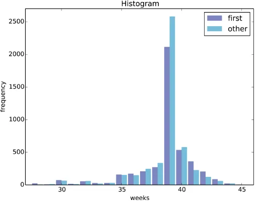
Now we can compare the distribution of pregnancy lengths for first babies and others. I divided the DataFrame of live births using birthord, and computed their histograms:
firsts = live[live.birthord == 1] others = live[live.birthord != 1]
first_hist = thinkstats2.Hist(firsts.prglngth) other_hist = thinkstats2.Hist(others.prglngth)
width = 0.45
thinkplot.PrePlot(2)
thinkplot.Hist(first_hist, align='right', width=width) thinkplot.Hist(other_hist, align='left', width=width) thinkplot.Show(xlabel='weeks', ylabel='frequency')
thinkplot.PrePlot takes the number of histograms we are planning to plot; it uses this information to choose an appropriate collection of colors.
thinkplot.Hist normally uses align=’center’ so that each bar is centered over its value. For this figure, I use align=’right’ and align=’left’ to place corresponding bars on either side of the value.
With width=0.45, the total width of the two bars is 0.9, leaving some space between each pair.
Finally, I adjust the axis to show only data between 27 and 46 weeks. Figure 2-5 shows the result.
Figure 2-5. Histogram of pregnancy lengths.
Histograms are useful because they make the most frequent values immediately appa‐ rent. But they are not the best choice for comparing two distributions. In this example, there are fewer “first babies” than “others,” so some of the apparent differences in the histograms are due to sample sizes. In the next chapter we address this problem using probability mass functions.
Summarizing Distributions
A histogram is a complete description of the distribution of a sample; that is, given a histogram, we could reconstruct the values in the sample (although not their order).
If the details of the distribution are important, it might be necessary to present a his‐ togram. But often we want to summarize the distribution with a few descriptive statis‐ tics.
Some of the characteristics we might want to report are:
central tendency
Do the values tend to cluster around a particular point?
modes
Is there more than one cluster?
spread
How much variability is there in the values?
tails
How quickly do the probabilities drop off as we move away from the modes?
outliers
Are there extreme values far from the modes?
Statistics designed to answer these questions are called summary statistics. By far the most common summary statistic is the mean, which is meant to describe the central tendency of the distribution.
If you have a sample of n values, xi, the mean, x¯, is the sum of the values divided by the
number of values:
x¯ = n1∑ i
xi
The words mean and average are sometimes used interchangeably, but I make this dis‐ tinction:
• The mean of a sample is the summary statistic computed with the previous formula. • An average is one of several summary statistics you might choose to describe a
central tendency.
But pumpkins are more diverse. Suppose I grow several varieties in my garden, and one day I harvest three decorative pumpkins that are 1 pound each, two pie pumpkins that are 3 pounds each, and one Atlantic Giant pumpkin that weighs 591 pounds. The mean of this sample is 100 pounds, but if I told you “The average pumpkin in my garden is 100 pounds,” that would be misleading. In this example, there is no meaningful average because there is no typical pumpkin.
Variance
If there is no single number that summarizes pumpkin weights, we can do a little better with two numbers: mean and variance.
Variance is a summary statistic intended to describe the variability or spread of a dis‐ tribution. The variance of a set of values is
S2= 1
n∑i (xi-x¯)2
The term xi-x¯ is called the “deviation from the mean,” so variance is the mean squared deviation. The square root of variance, S, is the standard deviation.
If you have prior experience, you might have seen a formula for variance with n- 1 in the denominator, rather than n. This statistic is used to estimate the variance in a pop‐ ulation using a sample. We will come back to this in Chapter 8.
Pandas data structures provides methods to compute mean, variance and standard de‐ viation:
mean = live.prglngth.mean() var = live.prglngth.var() std = live.prglngth.std()
For all live births, the mean pregnancy length is 38.6 weeks, the standard deviation is 2.7 weeks, which means we should expect deviations of 2-3 weeks to be common.
Variance of pregnancy length is 7.3, which is hard to interpret, especially since the units are weeks2, or “square weeks.” Variance is useful in some calculations, but it is not a good
summary statistic.
Effect Size
An effect size is a summary statistic intended to describe (wait for it) the size of an effect. For example, to describe the difference between two groups, one obvious choice is the difference in the means.
Mean pregnancy length for first babies is 38.601; for other babies it is 38.523. The dif‐ ference is 0.078 weeks, which works out to 13 hours. As a fraction of the typical preg‐ nancy length, this difference is about 0.2%.
If we assume this estimate is accurate, such a difference would have no practical con‐ sequences. In fact, without observing a large number of pregnancies, it is unlikely that anyone would notice this difference at all.
Another way to convey the size of the effect is to compare the difference between groups to the variability within groups. Cohen’s d is a statistic intended to do that; it is defined
d = x¯ -1sx¯2
where x¯1 and x¯2 are the means of the groups and s is the “pooled standard deviation”.
Here’s the Python code that computes Cohen’s d:
def CohenEffectSize(group1, group2): diff = group1.mean() - group2.mean() var1 = group1.var()
var2 = group2.var()
n1, n2 = len(group1), len(group2)
pooled_var = (n1 * var1 + n2 * var2) / (n1 + n2) d = diff / math.sqrt(pooled_var)
return d
In this example, the difference in means is 0.029 standard deviations, which is small. To put that in perspective, the difference in height between men and women is about 1.7 standard deviations (see Wikipedia).
Reporting Results
We have seen several ways to describe the difference in pregnancy length (if there is one) between first babies and others. How should we report these results?
The answer depends on who is asking the question. A scientist might be interested in any (real) effect, no matter how small. A doctor might only care about effects that are clinically significant; that is, differences that affect treatment decisions. A pregnant woman might be interested in results that are relevant to her, like the probability of delivering early or late.
How you report results also depends on your goals. If you are trying to demonstrate the importance of an effect, you might choose summary statistics that emphasize differ‐ ences. If you are trying to reassure a patient, you might choose statistics that put the differences in context.
Exercises
Exercise 2-1.
Based on the results in this chapter, suppose you were asked to summarize what you learned about whether first babies arrive late.
Which summary statistics would you use if you wanted to get a story on the evening news? Which ones would you use if you wanted to reassure an anxious patient?
Finally, imagine that you are Cecil Adams, author of The Straight Dope, and your job is to answer the question, “Do first babies arrive late?” Write a paragraph that uses the results in this chapter to answer the question clearly, precisely, and honestly.
Exercise 2-2.
In the repository you downloaded, you should find a file named chap02ex.ipynb; open it. Some cells are already filled in, and you should execute them. Other cells give you instructions for exercises. Follow the instructions and fill in the answers.
A solution to this exercise is in chap02soln.ipynb
For the following exercises, create a file named chap02ex.py. You can find a solution in chap02soln.py.
Exercise 2-3.
The mode of a distribution is the most frequent value; see Wikipedia. Write a function called Mode that takes a Hist and returns the most frequent value.
As a more challenging exercise, write a function called AllModes that returns a list of value-frequency pairs in descending order of frequency.
Exercise 2-4.
Using the variable totalwgt_lb, investigate whether first babies are lighter or heavier than others. Compute Cohen’s d to quantify the difference between the groups. How does it compare to the difference in pregnancy length?
Glossary
distribution
The values that appear in a sample and the frequency of each.
histogram
A mapping from values to frequencies, or a graph that shows this mapping.
frequency
The number of times a value appears in a sample.
mode
The most frequent value in a sample, or one of the most frequent values.
normal distribution
An idealization of a bell-shaped distribution; also known as a Gaussian distribution.
uniform distribution
A distribution in which all values have the same frequency.
tail
The part of a distribution at the high and low extremes.
central tendency
A characteristic of a sample or population; intuitively, it is an average or typical value.
outlier
A value far from the central tendency.
spread
A measure of how spread out the values in a distribution are.
summary statistic
A statistic that quantifies some aspect of a distribution, like central tendency or spread.
variance
A summary statistic often used to quantify spread.
standard deviation
The square root of variance, also used as a measure of spread.
effect size
A summary statistic intended to quantify the size of an effect like a difference be‐ tween groups.
clinically significant
CHAPTER 3
Probability Mass Functions
The code for this chapter is in probability.py. For information about downloading and working with this code, see “Using the Code” on page xi.
Pmfs
Another way to represent a distribution is a probability mass function (PMF), which maps from each value to its probability. A probability is a frequency expressed as a fraction of the sample size, n. To get from frequencies to probabilities, we divide through by n, which is called normalization.
Given a Hist, we can make a dictionary that maps from each value to its probability:
n = hist.Total() d = {}
for x, freq in hist.Items(): d[x] = freq / n
Or we can use the Pmf class provided by thinkstats2. Like Hist, the Pmf constructor can take a list, pandas Series, dictionary, Hist, or another Pmf object. Here’s an example with a simple list:
>>> import thinkstats2
>>> pmf = thinkstats2.Pmf([1, 2, 2, 3, 5]) >>> pmf
Pmf({1: 0.2, 2: 0.4, 3: 0.2, 5: 0.2})
The Pmf is normalized so total probability is 1.
Pmf and Hist objects are similar in many ways; in fact, they inherit many of their meth‐ ods from a common parent class. For example, the methods Values and Items work the same way for both. The biggest difference is that a Hist maps from values to integer counters; a Pmf maps from values to floating-point probabilities.
To look up the probability associated with a value, use Prob:
>>> pmf.Prob(2) 0.4
The bracket operator is equivalent:
>>> pmf[2] 0.4
You can modify an existing Pmf by incrementing the probability associated with a value:
>>> pmf.Incr(2, 0.2) >>> pmf.Prob(2) 0.6
Or you can multiply a probability by a factor:
>>> pmf.Mult(2, 0.5) >>> pmf.Prob(2) 0.3
If you modify a Pmf, the result may not be normalized; that is, the probabilities may no longer add up to 1. To check, you can call Total, which returns the sum of the proba‐ bilities:
>>> pmf.Total() 0.9
To renormalize, call Normalize:
>>> pmf.Normalize() >>> pmf.Total() 1.0
Pmf objects provide a Copy method so you can make and modify a copy without affecting the original.
My notation in this section might seem inconsistent, but there is a system: I use Pmf for the name of the class, pmf for an instance of the class, and PMF for the mathematical concept of a probability mass function.
Plotting PMFs
thinkplot provides two ways to plot Pmfs:
• To plot a Pmf as a bar graph, you can use thinkplot.Hist. Bar graphs are most useful if the number of values in the Pmf is small.
In addition, pyplot provides a function called hist that takes a sequence of values, computes a histogram, and plots it. Since I use Hist objects, I usually don’t use
pyplot.hist.
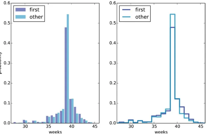
Figure 3-1 shows PMFs of pregnancy length for first babies and others using bar graphs (left) and step functions (right).
Figure 3-1. PMF of pregnancy lengths for first babies and others, using bar graphs and step functions
Here’s the code that generates Figure 3-1:
thinkplot.PrePlot(2, cols=2)
thinkplot.Hist(first_pmf, align='right', width=width) thinkplot.Hist(other_pmf, align='left', width=width) thinkplot.Config(xlabel='weeks',
ylabel='probability', axis=[27, 46, 0, 0.6]) thinkplot.PrePlot(2)
thinkplot.SubPlot(2)
thinkplot.Pmfs([first_pmf, other_pmf]) thinkplot.Show(xlabel='weeks',
axis=[27, 46, 0, 0.6])
By plotting the PMF instead of the histogram, we can compare the two distributions without being misled by the difference in sample size. Based on this figure, first babies
seem to be less likely than others to arrive on time (week 39) and more likely to be late (weeks 41 and 42).
PrePlot takes optional parameters rows and cols to make a grid of figures, in this case one row of two figures. The figure on the left displays the Pmfs using
thinkplot.Hist, as we have seen before.
The second call to PrePlot resets the color generator. Then SubPlot switches to the second figure (on the right) and displays the Pmfs using thinkplot.Pmfs. I used the
axis option to ensure that the two figures are on the same axes, which is generally a good idea if you intend to compare two figures.
Other Visualizations
Histograms and PMFs are useful while you are exploring data and trying to identify patterns and relationships. Once you have an idea what is going on, a good next step is to design a visualization that makes the patterns you have identified as clear as possible.
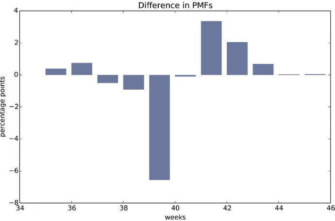
In the NSFG data, the biggest differences in the distributions are near the mode. So it makes sense to zoom in on that part of the graph, and transform the data to emphasize differences:
weeks = range(35, 46) diffs = []
for week in weeks:
p1 = first_pmf.Prob(week) p2 = other_pmf.Prob(week) diff = 100 * (p1 - p2) diffs.append(diff) thinkplot.Bar(weeks, diffs)
In this code, weeks is the range of weeks; diffs is the difference between the two PMFs in percentage points. Figure 3-2 shows the result as a bar chart. This figure makes the pattern clearer: first babies are less likely to be born in week 39, and somewhat more likely to be born in weeks 41 and 42.
For now we should hold this conclusion only tentatively. We used the same dataset to identify an apparent difference and then chose a visualization that makes the difference apparent. We can’t be sure this effect is real; it might be due to random variation. We’ll address this concern later.
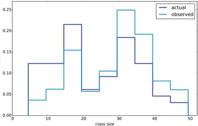
The Class Size Paradox
Figure 3-2. Difference, in percentage points, by week
At many American colleges and universities, the student-to-faculty ratio is about 10:1. But students are often surprised to discover that their average class size is bigger than 10. There are two reasons for the discrepancy:
• Students typically take 4–5 classes per semester, but professors often teach 1 or 2.
• The number of students who enjoy a small class is small, but the number of students in a large class is (ahem!) large.
The first effect is obvious, at least once it is pointed out; the second is more subtle. Let’s look at an example. Suppose that a college offers 65 classes in a given semester, with the following distribution of sizes:
size count 5- 9 8 10-14 8 15-19 14 20-24 4 25-29 6 30-34 12 35-39 8 40-44 3 45-49 2
If you ask the Dean for the average class size, he would construct a PMF, compute the mean, and report that the average class size is 23.7. Here’s the code:
d = { 7: 8, 12: 8, 17: 14, 22: 4,
27: 6, 32: 12, 37: 8, 42: 3, 47: 2 } pmf = thinkstats2.Pmf(d, label='actual') print('mean', pmf.Mean())
But if you survey a group of students, ask them how many students are in their classes, and compute the mean, you would think the average class size was bigger. Let’s see how much bigger.
First, I compute the distribution as observed by students, where the probability asso‐ ciated with each class size is “biased” by the number of students in the class.
def BiasPmf(pmf, label):
new_pmf = pmf.Copy(label=label) for x, p in pmf.Items(): new_pmf.Mult(x, x)
new_pmf.Normalize() return new_pmf
For each class size, x, we multiply the probability by x, the number of students who observe that class size. The result is a new Pmf that represents the biased distribution.
Now we can plot the actual and observed distributions:
biased_pmf = BiasPmf(pmf, label='observed') thinkplot.PrePlot(2)
thinkplot.Pmfs([pmf, biased_pmf])
thinkplot.Show(xlabel='class size', ylabel='PMF')
Figure 3-3. Distribution of class sizes, actual and as observed by students
It is also possible to invert this operation. Suppose you want to find the distribution of class sizes at a college, but you can’t get reliable data from the Dean. An alternative is to choose a random sample of students and ask how many students are in their classes.
The result would be biased for the reasons we’ve just seen, but you can use it to estimate the actual distribution. Here’s the function that unbiases a Pmf:
def UnbiasPmf(pmf, label):
new_pmf = pmf.Copy(label=label) for x, p in pmf.Items(): new_pmf.Mult(x, 1.0/x)
new_pmf.Normalize() return new_pmf
It’s similar to BiasPmf; the only difference is that it divides each probability by x instead of multiplying.
DataFrame Indexing
In “DataFrames” on page 4 we read a pandas DataFrame and used it to select and modify data columns. Now let’s look at row selection. To start, I create a NumPy array of random numbers and use it to initialize a DataFrame:
>>> import numpy as np
By default, the rows and columns are numbered starting at zero, but you can provide column names:
You can also provide row names. The set of row names is called the index; the row names themselves are called labels.
>>> index = ['a', 'b', 'c', 'd']
As we saw in the previous chapter, simple indexing selects a column, returning a Series:
>>> df['A']
>>> df.loc['a'] A -0.14351 B 0.61605
Name: a, dtype: float64
If you know the integer position of a row, rather than its label, you can use the iloc
attribute, which also returns a Series.
>>> df.iloc[0] A -0.14351 B 0.61605
Name: a, dtype: float64
loc can also take a list of labels; in that case, the result is a DataFrame.
>>> indices = ['a', 'c'] >>> df.loc[indices] A B a -0.14351 0.616050 c -0.07435 0.039621
Finally, you can use a slice to select a range of rows by label:
>>> df['a':'c'] A B a -0.143510 0.616050 b -1.489647 0.300774 c -0.074350 0.039621
Or by integer position:
>>> df[0:2]
A B a -0.143510 0.616050 b -1.489647 0.300774
The result in either case is a DataFrame, but notice that the first result includes the end of the slice; the second doesn’t.
My advice: if your rows have labels that are not simple integers, use the labels consistently and avoid using integer positions.
Exercises
Solutions to these exercises are in chap03soln.ipynb and chap03soln.py
Exercise 3-1.
Something like the class size paradox appears if you survey children and ask how many children are in their family. Families with many children are more likely to appear in your sample, and families with no children have no chance to be in the sample.