HTML and CSS
Visual QuickStart Guide
Eighth Edition
Elizabeth Castro • Bruce Hyslop
Visual QuickStart Guide
HTML and CSS, Eighth Edition Elizabeth Castro and Bruce Hyslop Peachpit Press
www.peachpit.com
To report errors, please send a note to [email protected]. Peachpit Press is a division of Pearson Education.
Copyright © 2014 by Elizabeth Castro and Bruce Hyslop Editor: Clifford Colby
Cover design: RHDG / Riezebos Holzbaur Design Group, Peachpit Press Interior design: Peachpit Press
Logo design: MINE™ www.minesf.com
Notice of Rights
All rights reserved. No part of this book may be reproduced or transmitted in any form by any means, electronic, mechanical, photocopying, recording, or otherwise, without the prior written permission of the publisher. For information on getting permission for reprints and excerpts, contact
css3generator.com screen shot courtesy of Randy Jensen.
css3please.com screen shot courtesy of Paul Irish.
dribbble.com screen shots courtesy of Dan Cederholm.
fontsquirrel.com screen shots courtesy of Ethan Dunham. foodsense.is screen shots courtesy of Julie Lamba.
google.com/fonts screen shots courtesy of Google.
namecheap.com screen shots courtesy of Namecheap.
Silk icon set courtesy of Mark James (http://www.famfamfam.com/lab/icons/silk/). Socialico font courtesy of Fontfabric (www.fontfabric.com).
Notice of Liability
The information in this book is distributed on an “As Is” basis, without warranty. While every precaution has been taken in the preparation of the book, neither the authors nor the publisher shall have any liability to any person or entity with respect to any loss or damage caused or alleged to be caused directly or indirectly by the instructions contained in this book or by the computer software and hardware products described in it.
Trademarks
trademarks. Where those designations appear in this book, and Peachpit was aware of a trademark claim, the designations appear as requested by the owner of the trademark. All other product names and services identified throughout this book are used in editorial fashion only and for the benefit of such companies with no intention of infringement of the trademark. No such use, or the use of any trade name, is intended to convey endorsement or other affiliation with this book.
ISBN-13: 978-0-321-92883-2 ISBN-10: 0-321-92883-0 9 8 7 6 5 4 3 2 1
Dedication
To family.
Acknowledgments
One of my favorite parts of working on this book has been the people I’ve been able to work with. All are dedicated, professional, good-natured, and good-humored folks who made it a real pleasure. The book wouldn’t be the same without their contributions.
A grateful, sincere thank you goes out to:
Nancy Aldrich-Ruenzel and Nancy Davis, for their continued trust in me.
Cliff Colby, for his support, for bringing the team together, and for keeping things light.
Robyn Thomas, for making the engine go, improving copy, tracking all the details, being flexible, and providing encouragement.
Scout Festa, for her skill in simplifying language, for her watchful eye, and for helping to keep things consistent and polished.
Aubrey Taylor, for all the great suggestions and technical feedback. They were very helpful, and readers are better off for them.
David Van Ness, for leading the charge in making it all look great and for all his efforts in refining the layouts.
Valerie Haynes Perry, for compiling the all-important index, which will be the first destination for many readers in search of information.
The marketing, sales, and other folks at Peachpit, for working hard to make the book available to readers. Natalia Ammon, for the wonderful design of the example webpage that adorns the pages of Chapters 11
and 12, and other spots. You can see more of her work at www.nataliaammon.com. Zach Szukala, for recommending Natalia.
Scott Boms, Ian Devlin, Seth Lemoine, Erik Vorhes, and Brian Warren, for their contributions to the previous edition.
Victor Gavenda, for providing access to necessary software.
Dan Cederholm, Ethan Dunham, Paul Irish, Mark James, Randy Jensen, Julie Lamba, Fontfabric, Google, and Namecheap, for allowing me to use screen shots or design assets (as the case may be).
C.R. Freer, for working her camera magic.
My family and friends, for providing inspiration and breaks, for being patient, and for not disowning me while I was holed up writing for months.
Robert Reinhardt, as always, for getting me started in writing books and for having a swell beard. The Boston Bruins, for providing a lot of playoffs thrills during my infrequent breaks.
The numerous folks in the web community who have shared their expertise and experiences for the betterment of others. (I’ve cited many of you throughout the book.)
To you readers, for inspiring me to recall when I began learning HTML and CSS so that I may explain them in ways I hope you find helpful. Thank you for choosing this book as part of your journey in contributing to the web. Happy reading!
And, lastly, I would like to give a special thank you to Elizabeth Castro, who created this title in the 1990s. She has taught countless readers how to build webpages over many editions and many years.
Contents at a Glance
Introduction
Chapter 1 Webpage Building Blocks
Chapter 2 Working with Webpage Files
Chapter 3 Basic HTML Structure
Chapter 4 Text
Chapter 5 Images
Chapter 6 Links
Chapter 7 CSS Building Blocks
Chapter 8 Working with Style Sheets
Chapter 9 Defining Selectors
Chapter 10 Formatting Text with Styles
Chapter 11 Layout with Styles
Chapter 12 Building Responsive Webpages
Chapter 13 Working with Web Fonts
Chapter 14 Enhancements and Effects with CSS
Chapter 15 Lists
Chapter 16 Forms
Chapter 17 Video, Audio, and Other Multimedia
Chapter 18 Tables
Chapter 19 Adding JavaScript
Chapter 20 Testing & Debugging Webpages
Chapter 21 Publishing Your Pages on the Web
Appendix HTML Reference
Table of Contents
Markup: Elements, Attributes, Values, and More A Webpage’s Text Content
Links, Images, and Other Non-Text Content File and Folder Names
URLs
HTML: Markup with Meaning
A Browser’s Default Display of Webpages Key Takeaways
Chapter 2 Working with Webpage Files
Planning Your Site
Creating a New Webpage Saving Your Webpage
Specifying a Default Page or Homepage Editing Webpages
Organizing Files
Creating a Header Marking Navigation
Inserting Images on a Page Offering Alternative Text Specifying Image Sizes
Scaling Images with the Browser Scaling Images with an Image Editor Adding Icons for Your Website
Chapter 6 Links
Creating a Link to Another Webpage (and Other Link Basics) Creating and Linking to Anchors
Chapter 8 Working with Style Sheets
Creating an External Style Sheet Linking to External Style Sheets Creating an Embedded Style Sheet Applying Inline Styles
The Cascade and the Order of Styles Using Media-Specific Style Sheets The Inspiration of Others: CSS
Chapter 9 Defining Selectors
Constructing Selectors
Selecting Elements by Name Selecting Elements by Class or ID Selecting Elements by Context
Selecting an Element That Is the First or Last Child Selecting the First Letter or First Line of an Element Selecting Links Based on Their State
Selecting Elements Based on Attributes Specifying Groups of Elements
Chapter 10 Formatting Text with Styles
Setting All Font Values at Once Setting the Color
Styling HTML5 Elements in Older Browsers Resetting or Normalizing Default Styles The Box Model
Controlling the Display Type and Visibility of Elements Setting the Height or Width for an Element
Adding Padding Around an Element Setting the Border
Changing the Cursor
Accommodating Older Versions of Internet Explorer
Chapter 13 Working with Web Fonts
What Is a Web Font? Where to Find Web Fonts
Downloading Your First Web Font Understanding the @font-face Rule Styling Text with a Web Font
Applying Italics and Bold with a Web Font Using Web Fonts from Google Fonts
Chapter 14 Enhancements and Effects with CSS
Browser Compatibility, Progressive Enhancement, and Polyfills Understanding Vendor Prefixes
Choosing Where to Start List Numbering Controlling Where Markers Hang
Creating Description Lists
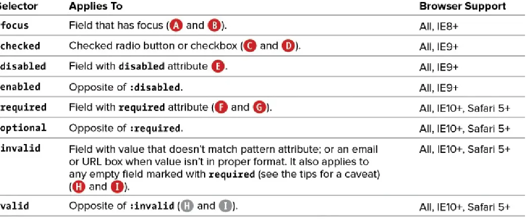
Creating Email, Search, Telephone, and URL Boxes Creating Radio Buttons
Styling Forms Based on Their State
Chapter 17 Video, Audio, and Other Multimedia
Third-Party Plugins and Going Native Video File Formats
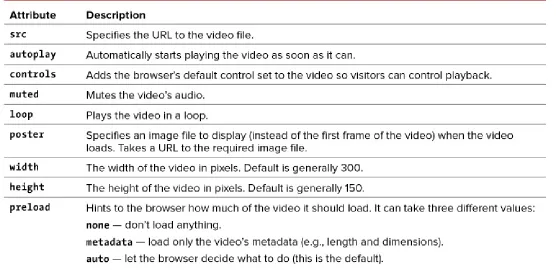
Adding a Video to Your Webpage
Adding Controls and Autoplay to Your Video Looping a Video and Specifying a Poster Image Preventing a Video from Preloading
Using Video with Multiple Sources and a Text Fallback Providing Accessibility
Audio File Formats
Adding an Audio File with Controls to Your Webpage Autoplaying, Looping, and Preloading Audio
Providing Multiple Audio Sources with a Fallback Adding Video and Audio with a Flash Fallback Advanced Multimedia
Further Resources
Structuring Tables
Spanning Columns and Rows
Chapter 19 Adding JavaScript
Loading an External Script Adding an Embedded Script JavaScript Events
Chapter 20 Testing & Debugging Webpages
Validating Your Code Testing Your Pages
Trying Some Debugging Techniques Checking the Easy Stuff: General Checking the Easy Stuff: HTML Checking the Easy Stuff: CSS When Images Don’t Display
Chapter 21 Publishing Your Pages on the Web
Getting Your Own Domain Name Finding a Host for Your Site Transferring Files to the Server
Appendix HTML Reference
Introduction
Whether you are just beginning your venture into building websites or have built some before but want to ensure that your knowledge is current, you’ve come along at a very exciting time.
How we code and style webpages, the browsers in which we view the pages, and the devices on which we visit the web have all advanced substantially the past few years. Once limited to browsing the web from our desktop computers or laptops, we can now take the web with us on any number of devices: phones, tablets, and, yes, laptops and desktops.
Which is as it should be, because the web’s promise has always been the dissolution of boundaries—the power to share and access information from any metropolis, rural community, or anywhere in between and on any web-enabled device. In short, the web’s promise lies in its universality. And its reach continues to expand as technology finds its way to communities that were once shut out.
Better still, the web belongs to everyone, and anyone is free to create and launch a site. This book shows you how. It is ideal for the beginner with no knowledge of HTML or CSS who wants to begin to create webpages. You’ll find clear, easy-to-follow instructions that take you through the process of creating pages step by step. And the book is a helpful guide to keep handy. You can look up topics in the table of contents or index and consult just those subjects about which you need more information.
HTML and CSS in Brief
At the root of the web’s success is a simple, text-based markup language that is easy to learn and that any device with a basic web browser can read: HTML. Every webpage requires at least some HTML; it wouldn’t be a webpage without it.
As you will learn in greater detail as you read this book, HTML is used to define your content, and CSS is used to control how your content and webpage will look. Both HTML pages and CSS files (style sheets) are text files, making them easy to edit. You can see snippets of HTML and CSS in “How This Book Works,” near the end of this introduction.
You’ll dive into learning a basic HTML page right off the bat in Chapter 1, and you’ll begin to learn how to style your pages with CSS in Chapter 7. See “What this book will teach you” later in this introduction for an overview of the chapters and a summary of the primary topics covered.
The word HTML is all encompassing, representing the language in general. HTML5 is used when
referring to that specific version of HTML, such as when discussing a feature that is new in HTML5 and doesn’t exist in previous versions. The same approach applies to usage of the terms CSS (general) and
CSS3 (specific to CSS3). HTML and HTML5
It helps to know some basics about the origins of HTML to understand HTML5.
HTML began in the early 1990s as a short document that detailed a handful of elements used to build webpages. Many of those elements were for content such as headings, paragraphs, lists, and links to other pages. HTML’s version number has increased as the language has evolved with the introduction of other elements and adjustments to its rules. The most current version is HTML5.
principle of HTML5 (see www.w3.org/TR/html-design-principles/).
HTML5 also adds a bevy of new features. Many are straightforward, such as additional elements
(article, main, figure, and many more) that are used to describe content. Others are complex and aid in creating powerful web applications. You’ll need a firm grasp of creating webpages before you can graduate to the more complicated features that HTML5 provides, which is why this book focuses on the former. HTML5 also introduces native audio and video playback to your webpages, which the book also covers.
CSS and CSS3
The first version of CSS didn’t exist until after HTML had been around for a few years, becoming official in 1996. Like HTML5 and its relationship to earlier versions of HTML, CSS3 is a natural extension of the versions of CSS that preceded it.
CSS3 is more powerful than earlier versions of CSS and introduces numerous visual effects, such as drop shadows, rounded corners, gradients, and much more. (See “What this book will teach you” for details of what’s covered.)
Browser Version Numbers
Like HTML and CSS, browsers have version numbers. The higher the number, the more recent it is.
For instance, Safari 7 is more recent than Safari 6, which is more recent than Safari 5. Internet Explorer 10 is more recent than Internet Explorer 9. But Internet Explorer 10 is not more recent than Safari 7.
This is true because Microsoft, Apple, and the other browser vendors do not collectively coordinate either their version numbers or when they will all release new versions. Chrome and Firefox release new versions every six weeks so naturally have much higher version numbers than the other browsers, which are updated roughly once a year at best. Regardless of who is releasing what and when, the latest version of a browser will have better support for HTML and CSS (and other) features than the previous versions do, as you would expect.
Web Browsers
The desktop version of Firefox
Windows comes preinstalled with Internet Explorer, Microsoft’s browser. OS X comes preinstalled with Safari, Apple’s browser. There are other browsers you may download for free and use instead, such as Chrome (by Google), Firefox (by Mozilla) , and Opera (by Opera Software)—and that’s just for the desktop.
On mobile devices, you’ll find the mobile version of Safari (for iPhone, iPad, and iPod touch); various default Android browsers; Chrome for Android; Firefox for Android; Opera Mini; and more.
“Testing Your Pages” in Chapter 20 provides information about how to acquire various browsers, which ones are the most important for testing your webpages, and how to test your pages.
Web Standards and Specifications
You might be wondering who created HTML and CSS in the first place, and who continues to evolve them. The World Wide Web Consortium (W3C)—directed by the inventor of the web and HTML, Tim Berners-Lee—is the organization responsible for shepherding the development of web standards.
The W3C and WHATWG
For a variety of reasons, another organization—the Web Hypertext Application Technology Working Group (WHATWG)—is developing most of the HTML5 specification. The W3C incorporates WHATWG’s work into its official version of the in-progress spec. You can find the WHATWG at www.whatwg.org.
If you want to dig into various specs (recommended!), here are the latest versions: HTML5 (W3C):
The HTML Living Standard includes newer features under development (and very much in flux) and informs the W3C’s HTML5.1 spec.
There are too many CSS specs to list, but you can see them at
http://www.w3.org/standards/techs/css#w3c_all.
Differences Between HTML4 and HTML5
If you have prior experience with HTML4 and are wondering what is different in HTML5, the W3C has created just the document for you: http://www.w3.org/TR/html5-diff/.
I call out many of the differences at various points in the book. They aren’t particularly important to know for those of you who are new to HTML, because HTML5 is what virtually everyone uses now. But you might find the W3C’s document interesting to peruse regardless.
With standards in place, we can build our pages from the agreed-upon set of rules, and browsers can be built to display our pages with those rules in mind. (On the whole, browsers implement the standards well. Older versions of Internet Explorer, especially Internet Explorer 8, have some issues.)
Specifications go through several stages of development before they are considered final, at which point they are dubbed a Recommendation (www.w3.org/2005/10/Process-20051014/tr).
Parts of the HTML5 and CSS3 specs are still being finalized, but that doesn’t mean you can’t use them. It just takes time (literally years) for the standardization process to run its course. Browsers begin to
implement a spec’s features long before it becomes a Recommendation, because that informs the spec development process itself. So browsers already include a wide variety of features in HTML5 and CSS3, even though they aren’t Recommendations yet.
Progressive Enhancement: A Best Practice
I began the introduction by speaking of the universality of the web—the notion that the web should be accessible to all. Progressive enhancement helps you build sites with universality in mind. It is not a language, but rather an approach to building sites that Steve Champeon promoted beginning in 2003 (http://en.wikipedia.org/wiki/Progressive_enhancement).
The idea is simple but powerful: Start your site with HTML content and basic behavior that is accessible to all visitors . To the same page, add your design with CSS and additional behavior with
JavaScript (a programming language). These components are kept separate but work together.
A basic HTML page with no custom CSS applied to it. Primarily, only very old browsers would display it this way. The page may not look great, but the information is accessible—and that’s what’s
The same page as viewed in a browser that supports CSS. It’s the same information, just presented differently. (The content on the right side would be visible in if you were to scroll down the page.)
More Examples
Take an early peek at Chapter 12 if you’re interested in seeing how the principle of progressive enhancement helps you build a website that adapts its layout based on a device’s screen size and browser capabilities. It can look great on mobile, desktop, and beyond.
Or see Chapter 14 for how older browsers can display simplified designs while modern browsers display ones enhanced with CSS3 effects.
Elsewhere in the book, you’ll learn other techniques that allow you to build progressively enhanced webpages.
The result is that browsers capable of accessing basic pages will get the simplified, default experience . Even browsers from the inception of the web more than 20 years ago can display this page; so too can the oldest or simplest of mobile phones with web browsers. And screen readers, software that reads webpages aloud to visually impaired visitors, will be able to navigate it easily.
Meanwhile, modern browsers capable of viewing more-robust sites will see the enhanced version . The capabilities of yet other (somewhat older) browsers might fall somewhere in between; so, too, could the way they display the page. The experience on your site doesn’t have to be the same for everyone, as long as your content is accessible.
Is This Book for You?
This book assumes no prior knowledge of building websites. So in that sense, it is for the absolute
beginner. You will learn both HTML and CSS from the ground up. In the course of doing so, you will also learn about features that are new in HTML5 and CSS3, with an emphasis on many that designers and developers are using today in their daily work.
But even if you are familiar with HTML and CSS, you still stand to learn from this book, especially if you want to get up to speed on the new elements in HTML5, several CSS3 effects, responsive web design, and various best practices.
What this book will teach you The chapters are organized like so:
Chapters 1 through 6 and 15 through 18 cover the principles of creating HTML pages and most of the HTML elements at your disposal, with clear examples demonstrating how and when to use each one.
Chapters 7 through 14 dive into CSS, all the way from creating your first style rule to applying enhanced visual effects with CSS3.
Chapter 19 shows you how to add prewritten JavaScript to your pages.
Chapter 20 tells you how to test and debug your pages before putting them on the web.
Chapter 21 explains how to secure your own domain name and then publish your site on the web for all to see.
Covered topics include the following:
Creating, saving, and editing HTML and CSS files.
What it means to write semantic HTML and why it is important.
How to separate your page’s HTML content, CSS presentation, and JavaScript behavior—a key aspect of progressive enhancement.
Structuring your content in a meaningful way by using HTML elements that have been around for years as well as ones that are new in HTML5.
Linking from one webpage to another, or from one part of a page to another part.
Adding images to your pages and optimizing them for the web. This includes creating images targeted for Apple’s Retina display and other high-pixel-density screens.
Improving your site’s accessibility with ARIA (Accessible Rich Internet Applications) landmark roles and other good coding practices.
Styling text (size, color, bold, italics, and more) and adding background colors and images. Implementing a multi-column webpage layout.
Building a responsive webpage. That is, a page that shrinks or expands to fit your visitor’s screen and with a layout that adapts in other ways as you wish. The result is a page that’s appropriate for mobile phones, tablets, laptops, desktop computers, and other web-enabled devices.
Adding custom web fonts to your pages with @font-face and using fonts from services like Font Squirrel and Google Fonts.
Using CSS3 effects such as opacity, background alpha transparency, gradients, rounded corners, drop shadows, shadows inside elements, text shadows, and multiple background images.
page needs, making it load faster for your visitors.
Building forms to solicit input from your visitors, including using some of the new form input types in HTML5.
Including media in your pages with the HTML5 audio and video elements for modern browsers, and a Flash fallback audio or video player for older browsers.
And more.
These topics are complemented by many dozens of code samples that demonstrate how to implement the features based on best practices in the industry.
What this book won’t teach you
Alas, with so many developments in the world of HTML and CSS in recent years, we had to leave out some topics. With a couple of exceptions, we stuck to omitting items that you would likely have fewer occasions to use, are still subject to change, lack widespread browser support, require JavaScript knowledge, or are advanced subjects.
Some of the topics not covered include the following:
The HTML5 details, summary, menu, command, output, and keygen elements. The W3C has included some of these on their list of features that might not make the cut when HTML5 is finalized in 2014. The others are used infrequently at best.
The HTML5 canvas element, which allows you to draw graphics, create games, and more. Also, Scalable Vector Graphics (SVG). Both are mentioned briefly in Chapter 17, with links to more information.
The HTML5 APIs and other advanced features that require JavaScript knowledge or are otherwise not directly related to the new HTML5 elements.
CSS3 transforms, animations, and transitions. See www.htmlcssvqs.com/resources/ for links to learn more.
CSS3’s new layout methods, such as FlexBox, Grid, and more. They are poised to change the way we lay out pages once the specs shake out and browser support is stronger. See Zoe Mickley Gillenwater’s presentation at www.slideshare.net/zomigi/css3-layout, or see Peter Gasston’s article at www.netmagazine.com/features/pros-guide-css-layouts.
How This Book Works
Nearly every section of the book contains practical code examples that demonstrate real-world use ( and ). Typically, they are coupled with screen shots that show the results of the code when you view the webpage in a browser .
...
You’ll find a snippet of HTML code on many pages, with the pertinent sections highlighted. An ellipsis (...) represents additional code or content that was omitted for brevity. Often, the omitted portion is
shown in a different code figure. Click here to view code image
body {
font-family: Georgia, "Times New Roman", serif; }
Screen shots of one or more browsers demonstrate how the code affects the page.
Most of the screen shots are of the latest version of Firefox that was available at the time. However, this doesn’t imply a recommendation of Firefox over any other browser. The code samples will look similar in any of the latest versions of Chrome, Internet Explorer, Opera, or Safari.
The code and screen shots are accompanied by descriptions of the HTML elements or CSS properties in question, both to increase your understanding of them and to give the samples context.
In many cases, you may find that the descriptions and code samples are enough for you to start using the HTML and CSS features. But if you need explicit guidance on how to use them, step-by-step instructions are provided as well.
Finally, most sections contain tips that relay additional usage information, best practices, references to related parts of the book, links to relevant resources, and more.
Conventions used in this book
The book uses the following conventions:
Text that is a placeholder for a value you would create yourself is italicized. Most placeholders appear in the step-by-step instructions. For example, “Type padding: x;, where x is the amount of desired space to be added.
Code that you should actually type or that represents HTML or CSS code appears in this font. An arrow ( ) in a code figure indicates a continuation of the previous line—the line has been
wrapped to fit in the book’s column . The arrow is not part of the code itself, so it’s not
something you would type. Instead, type the line continuously, as if it had not wrapped to another line.
The first occurrence of a word is italicized when it is defined.
IE is often used as a popular abbreviation of Internet Explorer. For instance, IE9 is synonymous with Internet Explorer 9.
Modern browsers collectively refers to the versions of browsers with solid support for the latest HTML5 and CSS3 features. Generally, this includes recent versions of the browsers discussed in the “Web Browsers” section of this introduction, but not IE8.
Whenever a plus sign (+) follows a browser version number, it means “the version listed plus subsequent versions.” For instance, IE8+ refers to Internet Explorer 8 and all versions after it.
Companion Website
The book’s companion website contains the table of contents, every complete code example featured in the book (plus some additional ones that wouldn’t fit), links to resources cited in the book (as well as additional ones), a list of errata, and more.
The URLs for some of the key pages on the site follow: Home page:
www.htmlcssvqs.com
Code examples:
www.htmlcssvqs.com/8ed/examples/
You can view the code examples directly from the site or download them to your computer—all the HTML and CSS files are yours for the taking.
to use it. A handful of the code samples in the book are truncated for space considerations, but the complete versions are on the website.
1. Webpage Building Blocks
In This Chapter
Thinking in HTML A Basic HTML Page
Markup: Elements, Attributes, Values, and More A Webpage’s Text Content
Links, Images, and Other Non-Text Content File and Folder Names
URLs
HTML: Markup with Meaning
A Browser’s Default Display of Webpages Key Takeaways
Although webpages have become increasingly complex, their underlying structure remains remarkably simple. As I mentioned in the Introduction, it’s impossible to create a webpage without HTML. As you will learn, HTML contains your page content and describes its meaning. In turn, web browsers display your content for users.
A webpage is primarily made up of three components:
Text content: The bare text that appears on the page to inform visitors about your business, family vacation, products, or whatever the focus of your page may be.
References to other files: These load items such as images, video, and audio files, as well as style sheets (which contain the CSS that controls how your page looks) and JavaScript files (which add special behavior to your page). They also link to other HTML pages and assets.
Markup: The HTML elements that describe your text content and make the references work. (HTML stands for Hypertext Markup Language.)
Additionally, at the beginning of each HTML page there’s a bit of information that is meant primarily for browsers and search engines (that is, Bing, Duck Duck Go, Google, Yahoo, and the like). Browsers don’t display it to your visitors.
It’s important to note that each of these components in a webpage is made up exclusively of text. This means that pages are saved in text-only format, ensuring they are accessible via practically any browser on any platform, whether desktop, mobile, tablet, or otherwise. It also contributes to HTML pages being simple to create.
In this chapter, I will walk you through a basic HTML page, explain HTML fundamentals (including the three components I mentioned at the onset), and discuss some best practices.
Thinking in HTML
Picture this scenario: You’re in a kitchen. In one hand, you have a pad of sticky notes with a word on each sheet. On some sticky notes is printed “soup,” and on others “cereal,” “plate,” “sauce,” and so on.
You open a cupboard, and as you look through it, you tag each item with the sticky note that best describes it. A yellow box of cereal gets a “cereal” sticky note. You see a red box of cereal and tag that with
“cereal,” too. And so on for the other items.
Writing HTML is a lot like this exercise, but instead of tagging food and dinnerware, you apply tags that describe your webpage’s content. You don’t make up the words on the tags—HTML has done that for you in the form of predefined elements. The p element is for paragraphs. The abbr element is for
abbreviations. The li element is for list items. You’ll learn about these and dozens more throughout the book.
Notice that the sticky notes had words like “cereal,” not “yellow box of cereal” or “red box of cereal.” Similarly, HTML elements describe what your content is, not how it looks. CSS, which you’ll learn beginning with Chapter 7, controls your content’s appearance (the fonts, colors, drop shadows, and much more). So even if you ultimately make some paragraphs green and others orange, they are all p elements as far as HTML is concerned.
Keep this approach in mind as you progress through the book and work on your own websites. The basic webpage that follows shows it in action.
A Basic HTML Page
Let’s take a look at a basic HTML page to give you context for what’s to follow in this chapter and
beyond. You’ll learn some bits about the code in this section, but don’t worry if you don’t understand it all right now. This is just to give you a taste of HTML. I’ll cover more of it later in the chapter and, of
course, in greater detail as you progress through the book. Also, because we all learn a little differently, some of you might find it helpful to first read “Markup: Elements, Attributes, Values, and More” (the next section) and then return here.
Every webpage begins with the simple structure shown in . It is the HTML equivalent of a blank sheet of paper because the content shown to your visitors goes in the body—the area between <body> and </body>—and so far that’s empty. We’ll fill it up in a minute.
Click here to view code image
<!DOCTYPE html> <html lang="en"> <head>
<meta charset="utf-8" />
<title>Your page title</title> </head>
<body>
</body> </html>
Every webpage contains the DOCTYPE, as well as the html, head, and body elements, as its foundation. The two parts you customize in this page shell are the language code assigned to lang and
Not a particularly exciting page unless you’re a minimalist!
First, a quick primer (the next section elaborates). HTML uses < and > to enclose each HTML tag. A start tag, like <head>, marks the beginning of an element; an end tag, like </head>, marks its end. A few elements, like meta , don’t have an end tag.
The Top and Head of a Webpage
I mentioned that your page content goes in the body, but what does the rest of the code do? Well,
everything above the <body> start tag is primarily instructional information for browsers and search engines. The <!DOCTYPE html> portion (known as the DOCTYPE) tells browsers that this is an HTML5 page. It should always be the first line in your pages.
Next is the html element, which encloses the rest of the page between <html lang="en"> and the </html> end tag that signals the end of the page. The lang="en" portion indicates that English is the default language of the page’s content. You can specify a different language, as explained in “Starting Your Webpage” in Chapter 3.
Following that is the document head—the area between <head> and </head>. I cover <meta
charset="utf-8" /> a little later in “A Webpage’s Text Content.” The one part above the body that
is visible to users is the text between <title> and </title>. It appears on the browser tab and as the title at the very top of the browser window (in some browsers) . Additionally, it’s typically the default name of a browser bookmark and is valuable information for search engines.
“Starting Your Webpage” and “Creating a Title” in Chapter 3 cover the DOCTYPE and head area in more detail.
So that’s it for a webpage’s foundation. Not too tough, right? The Body of a Webpage: Your Content
<!DOCTYPE html> <html lang="en"> <head>
<meta charset="utf-8" />
<title>Blue Flax (Linum lewisii)</title> </head>
<body>
<article>
<h1>The Ephemeral Blue Flax</h1>
<img src="blueflax.jpg" width="300" height="175" alt="Blue Flax" />
<p>I am continually <em>amazed</em> at the beautiful, delicate <a
href="http://en.wikipedia.org/wiki/Linum_lewisii" rel="external" title="Learn more about Blue Flax">Blue Flax</a> that somehow took hold in my garden. They are awash in color every morning, yet not a single flower remains by the afternoon. They are the very definition of ephemeral.</p>
</article>
</body> </html>
This page has the three components I mentioned at the beginning of the chapter: text content, references to other files (the image src and link href values), and markup. I’ve highlighted the HTML tags in the
body so you can distinguish them from the page’s text content. Note that some parts are separated by a blank line. This isn’t mandatory and does not affect the page’s display.
A typical default rendering of the page. Although this shows the page in Firefox, the page displays similarly in other browsers. Later in the chapter, “A Browser’s Default Display of Webpages” explains
why some text looks different than other text.
Indenting Your HTML
The code’s indentation has absolutely no bearing on how the content displays in the browser (the pre element, which you’ll learn about in Chapter 4, is the one exception). However, it’s customary to indent some elements when they are contained in another
element. It makes it easier to glean the hierarchy of elements as you read through and work with your code.
HTML provides numerous such elements. The example demonstrates six of the most common ones: a, article, em, h1, img, and p. Each has its own meaning; for instance, h1 is a heading, a is a link, and img is an image.
Before we get too deep into the example code, I’ll cover more about HTML fundamentals such as elements in general, attributes, file names, and URLs. Once you have that foundation, I’ll return to our basic page and explain further why I marked up the content the way I did. You’ll also learn more about the default way that browsers display webpages.
Markup: Elements, Attributes, Values, and More
Now that you’ve seen some HTML, we’ll take a closer look at the pieces that constitute markup:
elements, attributes, and values. We’ll also discuss what it means for an element to be a parent or child in your HTML. You’ve seen examples of all these in our basic page, perhaps without even realizing it. (Tricky of me, I know.)
Elements
As my sticky notes metaphor suggested, elements are like little labels that describe the different parts of a webpage: “This is a heading, that thing over there is a paragraph, and that group of links is navigation.” Some elements have one or more attributes, which further describe the element.
Most elements can contain both text and other elements (as the p element did in our basic page). As
mentioned, these elements consist of a start tag (the element’s name and attributes, if any, enclosed in less-than and greater-less-than signs), the content, and an end tag (a forward slash followed by the element’s name, again enclosed in less-than and greater-than signs) .
Here is a typical HTML element. The start tag and end tag surround the text the element describes. It’s customary to type your element tags in lowercase.
Empty elements, like img shown here, do not surround any text content (the alt attribute text is part of the element, not surrounded by it). They have a single tag that serves to both open and close the element. The space and forward slash at the end are optional in HTML5. However, the > that completes
the element is required.
As noted, the space and forward slash before the end of an empty element are optional in HTML5. Many of us who previously coded in XHTML (which requires the forward slash to close an empty element) tend to use it in HTML5 too, though certainly others have dropped it. If you choose to omit it, the page will behave exactly the same. Whichever style you use, I recommend using it consistently.
It’s customary to type your element names in all lowercase, although HTML5 isn’t picky here either, allowing uppercase letters instead. However, it’s now rare to find someone who codes in uppercase, so unless the rebel in you just can’t resist, I don’t recommend it. It’s looked upon as a dated practice. Attributes and Values
Attributes contain additional information about an element ( and ). In HTML5, an attribute’s value may optionally be enclosed in quotation marks—it’s customary to include them, so I recommend you always do so. (It is required when the value is more than one word.) And just as with element names, I recommend you type your attribute names in lowercase.
Here is a label element (which associates a text label with a form field) with a simple attribute-value pair. Attributes are always located inside an element’s start tag. It’s customary to enclose them in
quotation marks.
Some elements, like a (shown here) and img , can have one or more attributes, each with its own value. The order is not important. Separate each attribute-value pair from the next with a space. Although you’ll find details about allowed values for most attributes in this book, let me give you an idea of the kinds of values you’ll run into as you progress.
that accept predefined (or enumerated) values. In other words, you must select a value from a standard list of choices . Be sure to write enumerated values in all lowercase letters.
Some attributes accept only specific values. For example, the media attribute in the link element (Chapter 8) can be set to all, screen, or print, among others, but you can’t just make up a value for
it like you can with the href attribute or the title attribute .
A handful of attributes require a number for their value, particularly those describing size and length. A numeric value never includes a unit type, just the number. Where units are applicable, as in the width and height of an image or video, they are understood to be pixels.
Some attributes, like href and src , reference other files and thus must contain values in the form of a URL (uniform resource locator), a file’s unique address on the web. You’ll learn more about them in the “URLs” section of this chapter.
Lastly, there’s a special kind of attribute called a Boolean attribute. Providing a value is optional,
because if the attribute is present it evaluates to true . If you do include a value, set it to the name of the attribute itself (the result is the same regardless). Boolean attributes are also predefined; you can’t just make up your own (you really are a rebel, aren’t you?).
This code provides a form box for users to enter an email address (Chapter 16). The Boolean attribute required makes it mandatory for users to fill out. A Boolean attribute doesn’t need a value, but if you
were to include one in this case, the code would be required="required". Parents and Children
If one element contains another, it is considered to be the parent of the enclosed, or child, element. Any elements contained in the child element are considered descendants of the outer, parent element . This underlying, family tree-like structure is a key feature of HTML code. It facilitates both styling elements with CSS (which you’ll begin learning about in Chapter 7) and applying JavaScript behavior to them (which is beyond the scope of this book).
Click here to view code image
<article>
<h1>The Ephemeral Blue Flax</h1>
<img src="blueflax.jpg"... />
In this abbreviated HTML, the article element is parent to the h1, img, and p elements. Conversely, the h1, img, and p elements are children (and descendants) of the article. The p element
is parent to both the em and a elements. The em and a are children of the p and also descendants (but not children) of the article. In turn, article is their ancestor.
It’s important to note that when elements contain other elements, each element must be properly nested— that is, fully contained within its parent. Whenever you use an end tag, it should correspond to the
previous unclosed start tag. In other words, first open element 1, then open element 2, then close element 2, and then close element 1 .
Elements must be properly nested. If you open p and then em, you must close em before you close p.
A Webpage’s Text Content
The text contained within elements is perhaps a webpage’s most basic ingredient. If you’ve ever used a word processor, you’ve typed some text. Text in an HTML page, however, has some important
differences.
First, when a browser renders HTML it collapses extra spaces or tabs into a single space and either converts returns and line feeds into a single space or ignores them altogether ( and ).
Click here to view code image
... <body>
<p>I am continually <em>amazed</em> at the beautiful, delicate Blue Flax that somehow took hold in my garden.
They are awash in color every morning, yet not a single flower remains by the afternoon.
They are the very definition of ephemeral.</p> <p><small>© Blue Flax Society.</small> </p> </body>
</html>
A page’s text content (highlighted) is mostly anything besides the markup. In this example, note that each sentence in the first paragraph is separated by at least one carriage return, and some words are separated by several spaces (just to emphasize the point about collapsing returns and spaces ). The
When you view the document with a browser, the extra returns and spaces are ignored and the character reference is replaced by the corresponding symbol (©).
Next, HTML used to be restricted to ASCII characters—basically the letters of the English language, numerals, and a few of the most common symbols. Accented characters (common to many languages of Western Europe) and many everyday symbols had to be created with special character references like é (for é) or © (for ©). See a full list at
www.elizabethcastro.com/html/extras/entities.html.
Unicode mitigates a lot of issues with special characters, so it’s standard practice to encode pages in UTF-8 and to save HTML files with the same encoding (see “Saving Your Webpage” in Chapter 2). I recommend you do the same. Specifying UTF-8 or utf-8 as the charset value in yields identical results.
Click here to view code image
<!DOCTYPE html> <html lang="en"> <head>
<meta charset="utf-8" />
<title>Blue Flax (Linum lewisii)</title> </head>
<body> ... </body> </html>
Specify your document’s character encoding directly after the head start tag. The charset attribute sets the encoding type (UTF-8 is the norm).
It’s still common to use character references at times, such as for the copyright symbol since it’s easy to remember and type © .
Links, Images, and Other Non-Text Content
Of course, part of what makes the web so vibrant are the links from one page to another, and the images, videos, music, and more. Instead of actually enclosing assets such as images in the HTML file, they are saved as independent files and are simply referenced from within the page .
... <body> <article>
<h1>The Ephemeral Blue Flax</h1>
<img src="blueflax.jpg" width="300" height="175" alt="Blue Flax" />
<p>I am continually <em>amazed</em> at the beautiful, delicate <a
href="http://en.wikipedia.org/wiki/Linum_lewisii" rel="external" title="Learn more about the Blue Flax"> Blue Flax</a> that somehow took hold in my garden. They are awash in color every morning, yet not a single flower remains by the afternoon. They are the very definition of ephemeral.</p>
</article> </body> </html>
In our basic HTML document, there is a reference to an image file called blueflax.jpg in the src attribute of the img tag. The browser will request, load, and display it when it loads the page. The page
also includes a link to a page on Wikipedia about Blue Flax, as specified in the href attribute of the a tag.
Browsers can handle links and images without skipping a beat . However, they can’t necessarily handle every other kind of file. For example, some browsers require you to have Adobe Reader on your
computer to view PDFs, and you may need a program like OpenOffice to view a spreadsheet.
Images and other non-text content are referenced from a webpage, and the browser displays them together with the text. As you saw earlier, linked text displays in a different color than regular text and is
underlined by default.
The most widespread of these is Flash, which has driven vast amounts of video on the web for years. It has some issues, however, most notably that it often demands a lot of computing power.
Thankfully, HTML5 has made strides toward remedying this by providing audio and video elements. They don’t require a plugin. Instead, modern browsers have the media players built in, and you can still provide a Flash player as a fallback for older browsers. HTML5 audio and video aren’t perfect either, but they are a good start toward making websites free of plugins, and they continue to evolve.
You’ll learn more about images in Chapter 5, links in Chapter 6, and HTML5 audio and video in Chapter 17.
File and Folder Names
Like any other text document, a webpage has a file name. When you’re assigning file and folder names, there are a few tips to keep in mind that will help you organize your files, make it easier for your visitors to find and access your pages, ensure that their browsers view the pages correctly, and improve search engine optimization (SEO) ( and ). (Please note that I use the words “folder” and “directory” interchangeably.)
Remember to use all lowercase letters for your file names, separate words with a dash, and add the .html extension. Mixing upper- and lowercase letters makes it harder to type the proper address.
Use all lowercase letters and dashes for your folders as well. The key is consistency. If you don’t use uppercase letters, your visitors (and you) don’t have to waste time wondering, “Now, was that a capital B
or a small one?” Use Lowercase Names
Since the names you choose for your webpage can determine what your visitors will have to type in order to get to your page, you can save them from inadvertent typos by using only lowercase letters in your file and folder names. It’s also a big help when you create links between your pages yourself. If all your names have only lowercase letters, it’s just one less thing you’ll have to worry about.
Use the Proper Extension
Separate Words with a Dash
Never include spaces between words in your file and folder names. Instead, use a dash; for example, company-history.html and my-favorite-movies.html. You’ll come across the occasional site that uses underscores ( _ ) instead, but don’t do the same, because search engines prefer dashes.
Tip
SEO pertains to getting your webpages to appear early in search engine results.
Tip
Be aware that neither OS X nor Windows always reveals a document’s extension. Change your folder options, if necessary, so you can see extensions (see Chapter 2).
URLs
Uniform resource locator, or URL, is a fancy name for address. It contains information about where a file is and what a browser should do with it. Each file on the Internet has a unique URL.
The first part of the URL is called the scheme. It tells the browser how to deal with the file that it is about to open. The most common scheme you will see is HTTP, or Hypertext Transfer Protocol. As you are probably well aware from your own experience online, it is used to access webpages . Its cousin is HTTPS, used for secure webpages such as those on e-commerce sites. The format is the same , except https replaces http.
Your basic URL contains a scheme, a host, and a path. The path may contain one or more directory (folder) names and a single file name at the end.
The second part of the URL is the host (or host name) where the file is located. That is followed by the path, which includes both any directory names that lead to a file and the file name itself, all of which are optional. If the path in were tofu/soft/index.html, it would mean index.html is inside the soft directory and soft is inside the tofu directory, just like you might organize files and folders on your computer. (Though I doubt you have folders for different types of tofu!)
A URL with a trailing forward slash and no file name points to the default file in the last directory named (in this case, the tofu directory). The most common default file name is index.html. So, this
URL and the one in the previous example point to the same page.
Other common schemes are ftp (File Transfer Protocol), for downloading files , and mailto, for sending email (see Chapter 6).
When the user clicks this URL, the browser will begin an FTP transfer of the proposal.pdf file. (Sometimes a username and password are required first.)
A URL for an email address includes the mailto scheme followed by a colon but no forward slashes, and then the email address itself.
A scheme is generally followed by a colon and two forward slashes; mailto is an exception in that it takes only a colon. Always type schemes in lowercase letters.
Of these schemes, you will use http (and perhaps https) the most, with mailto a distant second and ftp behind that. There are other schemes for specialized cases that you’ll probably never face.
Absolute URLs
URLs can be either absolute or relative. An absolute URL contains all the information that points to a directory or file, including the scheme, the host, and the path ( and ). An absolute URL is analogous to a complete street address, including name, street and number, city, state or province, zip code, and country. No matter where a letter is sent from, the post office will be able to find the recipient. In terms of URLs, this means you can reference an absolute URL from any webpage on any host by using the same URL every time.
When you’re referencing a file located on someone else’s web server, you’ll always use an absolute URL. This concept is the same as when you might have shared a URL to a news article or YouTube video via email—your friends can’t access the item if you only give them part of the URL. And it’s the same reason why the href value of the Wikipedia link in our basic webpage is the full URL instead of simply Linum_lewisii.
Click here to view code image
<p>I am continually <em>amazed</em> at the beautiful, delicate <a
Because our basic page is not located at en.wikipedia.org, we need to include the absolute URL when linking to the page about Blue Flax (Linum lewisii in Latin). Chapter 6 gives the full scoop on
links, including the rel attribute, which is recommended for links pointing outside your site. You’ll also need to use absolute URLs for FTP sites or, generally, any kind of URL that doesn’t use an HTTP protocol.
Relative URLs
To give you directions to my neighbor’s house from my house, instead of giving her complete address I might just say, “it’s three doors down on the right.” This is a relative address—where it points to depends on where the information originates; in this case, my house. With the same information in a different city, you’d never find my neighbor. (Truth is, she’s out of town a lot so you might not find her anyway.)
In the same way, a relative URL describes the location of the desired file in consideration of the location of the file that contains the URL reference itself. So, you might have the URL say something like “link to the xyz page that’s in the same directory as this page.”
Referencing a File in the Same Directory
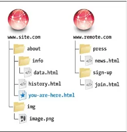
The relative URL for a file that is in the same directory as the current page (that is, the one containing the URL in question) is simply the file name and extension . For example, the HTML for the link would be <a href="history.html">Take me to history.html!</a>.
The relative URL to link to a file in the same folder (see ). Only the file’s name and extension are required in the URL, rather than preceding those with http://www.site.com/about/ (the host
and folder in which both files live). Referencing a File in a Subdirectory
You create the URL for a file in a subdirectory of the current directory by typing the name of the subdirectory followed by a forward slash and then the name and extension of the desired file . For example, <a href="info/data.html">Data supports my hypothesis</a>.
To reference a file (data.html, in this example) that is within a folder inside the current folder (see ), add the sub-folder’s name and a forward slash in front of the file name.
Referencing a File in a Higher Directory
means “go up one directory level from the current file,” so ../../ would go up two levels and ../../../ would go up three.
This file, as you can see in , is in a folder (img) that sits alongside the current folder (about) in the site’s root directory. In that case, you use two periods and a forward slash to go up a level, and then note the subdirectory (img) to go down into, followed by a forward slash, followed by the file name. (In
normal practice, you’d choose a more descriptive image file name than image.png, which is deliberately generic for the example.)
Root Relative URLs
Alternatively, if your files are on a web server, you can avoid cumbersome file paths such as
../../img/family/vacation.jpg by first jumping straight to your site’s root and then drilling down from there to the targeted file . A single forward slash at the beginning achieves this, so the root relative URL in this case would be /img/family/vacation.jpg (assuming the img folder sits in the site’s root folder, which is common). Again, this only works on a web server, like at the hosting provider that serves your site or one you’re running locally on your machine (see the tips).
The same root relative URL can be used by all pages regardless of where each page is located in your site’s folder structure. For instance, with the URL shown, your homepage could locate vacation.jpg just as
easily as another page six folders deep. (Not that I would advise having that many folder levels.) If you aren’t developing your site on a web server on your computer, then generally you’ll want to use relative URLs (except when pointing to files on someone else’s server, of course). They’ll make it easy to move your pages from your computer to your host’s server. As long as the relative position of each file remains constant, you won’t have to change any of the paths, so the links and references to files will work correctly.
Tip
Tip
Chapter 21 discusses finding a web host.
Absolute and Relative URLs Compared
To reinforce what we’ve covered, Table 1.1 and work together to illustrate the difference between absolute and relative URLs. shows an arrangement of files and folders on two different websites. The table describes how you could access various files from you-are-here.html when some of those files are on the same site (www.site.com) as that webpage and some are on another site
(www.remote.com). Although you could use the absolute URLs to access the files shown in the first three rows, it’s better to use relative URLs when accessing files on the same server.
The document that contains the URLs (you-are-here.html in this case) is the reference point for relative URLs. In other words, relative URLs are relative to that file’s location on the server. Absolute
URLs will work no matter where they are located, because they always contain the full URL to a resource.
HTML: Markup with Meaning
I began the chapter by comparing marking up content in your webpages to tagging items in a cupboard. Subsequently, you’ve learned more about HTML’s role and fundamental pieces.
The point of emphasis throughout has been that HTML describes the meaning of a webpage’s content; that is, the semantics. In the web community, the term semantic HTML simply refers to content that is marked up with the HTML elements that best describe it and without regard for how the content should look. I’m sure you’ll agree this makes more sense than choosing elements willy-nilly.
Better yet, it’s easy to do, as the following exploration of our basic page demonstrates. After that, “Why Semantics Matter” reinforces why writing semantic HTML is a cornerstone of an effective website. The Semantics of Our Basic HTML Page
Earlier in the chapter, I said we’d return to our basic webpage, and now’s the time. I’ll give you a minute to gather up the family.
OK, let’s look a little deeper at the thought process behind marking up the content. While doing so, you’ll get a taste of some of the most frequently used HTML elements , all of which we’ll cover in greater detail in subsequent chapters. As you’ll see, there’s no magic to creating HTML that has good semantics. It’s mostly common sense once you’re familiar with the elements at your disposal.
Click here to view code image
... <body>
<article>
<h1>The Ephemeral Blue Flax</h1>
<img src="blueflax.jpg" width="300" height="175" alt="Blue Flax" /> <p>I am continually <em>amazed</em> at the beautiful, delicate <a
href="http://en.wikipedia.org/wiki/Linum_lewisii" rel="external" title="Learn more about Blue Flax">Blue Flax</a> that somehow took hold in my garden. They are awash in color every morning, yet not a single flower remains by the afternoon. They are the very definition of ephemeral.</p>
</article>
</body> </html>
The body of our basic page, which contains the article, h1, img, p, em, and a elements. All the content is nested in the article.
All the content is contained in an article element . In short, article defines a self-contained composition that can stand on its own if reused elsewhere. The article element is a good choice for our basic webpage, but not necessarily for every webpage you’ll write. You’ll learn more about
article in Chapter 3.
Next is a heading . HTML provides you six heading levels, h1–h6, with h1 being the most important. An h2 is a subheading of an h1, an h3 is a subheading of an h2, and so on, just like when you type a document with various headings in a word processor.
<h1>The Ephemeral Blue Flax</h1>
Headings are critical elements in defining a page’s structure. They make a page more accessible to users of screen readers, and search engines use them to determine the focus of a page.
Every HTML page should have an h1 (or more, depending on your content), so marking up our only heading with h1 was the obvious choice. The heading elements h1–h6 are covered more in Chapter 3. Next, you have an image . The img element is the primary means for displaying an image, so again, there was no debate about which element was appropriate. The alt attribute provides text that may display if the browser has trouble loading the image or if the page is viewed in a text-only browser (admittedly rare these days). Screen readers may also announce alt text (see “Accessibility” in the next section). You’ll learn more about images in Chapter 5.
Click here to view code image
<img src="blueflax.jpg" width="300" height="175" alt="Blue Flax" />
It’s easy to add an image to a page with img.
The paragraph is marked up with the p element . Just as in printed materials, a paragraph can contain a single sentence or several sentences. If our page needed another paragraph, you’d simply add another p element after the first one.
Click here to view code image
<p>I am continually <em>amazed</em> at the beautiful, delicate <a href="http:// en.wikipedia.org/wiki/Linum_lewisii" rel="external" title="Learn more about Blue
Flax">Blue Flax</a> that somehow took hold in my garden. They are awash in color every morning, yet not a single flower remains by the afternoon. They are the very definition of ephemeral.</p>
The p element may contain other elements that define the semantics of phrases within a paragraph. The em and a elements are two examples.
There are two elements nested within our paragraph that define the meaning of bits (phrases) of text: em and a . These are examples of the numerous phrasing content elements that HTML5 provides, the majority of which improve the semantics of paragraph text. Those, along with p, are discussed in Chapter 4.
The em element means “stress emphasis,” sort of like you might stress words in speech. In the case of our page, it emphasizes the amazement that the flowers induced . Remember that because HTML describes the meaning of content, em dictates semantic, not visual, emphasis even though it’s common for browsers to render em text in italics (you can change that with CSS).
Finally, the basic page defines a link to another page with the a element (“anchor”). This is the most
powerful element in all of HTML because it makes the web, the web: It links to other pages, specific page sections, and files. In the example, it signifies that the text “Blue Flax” is a link to a page on Wikipedia .
<a href="http://en.wikipedia.org/wiki/Linum_lewisii" rel="external" title="Learn more about Blue Flax">Blue Flax</a>
This a element defines a link to the Wikipedia page about Blue Flax. The optional rel attribute adds to the semantics by indicating that the link points to another site. The link works without it, though. The optional title attribute enhances the semantics of the a by providing information about the linked page.
It appears in the browser when a user hovers over the link.
Pretty easy, right? Once you’ve learned more about the HTML elements available to you, choosing the right ones for your content is usually a straightforward task. Occasionally, you’ll come across a piece of content that reasonably could be marked up in more than one way, and that’s OK. There isn’t always a right and wrong way, just most of the time.
Besides, browsers will display your content regardless. They aren’t smart enough to know that a piece of content would be more accurately described as a paragraph than some other element.
Lastly, HTML doesn’t try to provide an element for every type of content imaginable, because the
language would become unwieldy. Instead, it takes a practical, real-world stance, defining elements that cover the vast majority of cases.
Part of HTML’s beauty is that it’s simple for anyone to learn the basics, build some pages, and grow their knowledge from there. So although there are more than 100 HTML elements, don’t let that number scare you. There’s a core handful you’ll find yourself using time and again, while the remaining ones are reserved for less common cases. And frankly, there are many you’ll likely never have occasion to use. You’ve learned the basics of several common elements, so you’re well on your way.
Why Semantics Matter
Here are some of the most important reasons why using good semantics in your HTML matters. This isn’t an exhaustive list, and we’ve touched on some of these items already:
Improved accessibility and interoperability, meaning that content is available to assistive
technologies for visitors with disabilities, and to browsers on desktop, mobile, tablet, and other devices alike.
Improved search engine optimization (SEO). Easier code maintenance and styling with CSS. (Often) lighter code and faster pages.
Accessibility
If you aren’t familiar with accessibility, it’s the practice of making your content available to all users, regardless of their capabilities (see www.w3.org/standards/webdesign/accessibility). Tim Berners-Lee, inventor of the web, famously said, “The power of the web is in its universality. Access by everyone regardless of disability is an essential aspect.”
Any device with a browser is capable of displaying HTML, since it’s just text. The means by which a user accesses content can vary, however. For instance, sighted users view the content, whereas some visually impaired users may use a screen reader to have the content read aloud to them (this is one example of assistive technology).