Praise for
CSS Cookbook
, Third Edition
“There’s a lot to know about Cascading Style Sheets, but sometimes you just want a quick answer to a specific problem. In CSS Cookbook, Christopher Schmitt delivers clear, expert solutions to the most important CSS design tasks while also promoting web standards, demonstrating current professional techniques, and providing useful information about the latest CSS standards.”
— Dave McFarland, author ofJavaScript: The Missing Manual
“Whether you’re a seasoned web professional or creating your very first site,CSS Cookbook deserves a prominent place on your desk—it’s a fantastic reference and an indispensable time-saver.”
— Dan Rubin, author ofWeb Standards Creativity and Pro CSS Techniques
“Using straightforward and approachable language, Christopher Schmitt’s CSS Cookbook delves directly into thehowof web design, offering designers practical, accessible tips for improving their work.”
THIRD EDITION
CSS Cookbook
Christopher Schmitt
foreword by Dan Cederholm
CSS Cookbook, Third Edition by Christopher Schmitt
Copyright © 2010 O’Reilly Media, Inc. All rights reserved. Printed in the United States of America.
Published by O’Reilly Media, Inc., 1005 Gravenstein Highway North, Sebastopol, CA 95472.
O’Reilly books may be purchased for educational, business, or sales promotional use. Online editions are also available for most titles (http://my.safaribooksonline.com). For more information, contact our corporate/institutional sales department: (800) 998-9938 or [email protected].
Editor: Simon St.Laurent
Production Editor: Sumita Mukherji Copyeditor: Audrey Doyle Proofreader: Kiel Van Horn
Indexer: Seth Maislin
Cover Designer: Karen Montgomery Interior Designer: David Futato Illustrator: Robert Romano
Printing History:
August 2004: First Edition.
October 2006: Second Edition.
December 2009: Third Edition.
Nutshell Handbook, the Nutshell Handbook logo, and the O’Reilly logo are registered trademarks of O’Reilly Media, Inc. CSS Cookbook, the image of a grizzly bear, and related trade dress are trademarks of O’Reilly Media, Inc.
Many of the designations used by manufacturers and sellers to distinguish their products are claimed as trademarks. Where those designations appear in this book, and O’Reilly Media, Inc., was aware of a trademark claim, the designations have been printed in caps or initial caps.
While every precaution has been taken in the preparation of this book, the publisher and author assume no responsibility for errors or omissions, or for damages resulting from the use of the information con-tained herein.
ISBN: 978-0-596-15593-3
[SB]
Table of Contents
Foreword . . . xv
Preface . . . xvii
1. Using HTML Basics . . . 1
1.1 Picking a Text Editor 3
1.2 Coding a Basic HTML Page 4
1.3 Understanding DOCTYPEs and Effects on Browser Layout 6
1.4 Marking Up Headers 10
1.5 Making Appropriate Quotations 12
1.6 Adding an Image 14
1.7 Adding Audio with HTML5 16
1.8 Incorporating Video with HTML5 17
1.9 Using strong and em Effectively 19
1.10 Creating Lists 20
1.11 Making a Link to a Web Page 22
1.12 Coding Tables 25
1.13 Creating an HTML vCard (hCard) 27
1.14 Marking Up an Event (hCalendar) 28
1.15 Validating HTML 29
2. CSS Basics . . . 33
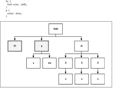
2.1 Applying CSS Rules to a Web Page 35
2.2 Using Basic Selectors to Apply Styles 38
2.3 Applying Child Selectors 47
2.4 Applying Adjacent Selectors 49
2.5 Applying Attribute Selectors 51
2.6 Using Pseudo-Classes 53
2.7 Using Pseudo-Elements 54
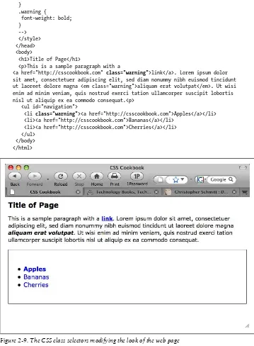
2.8 Determining When to Use Class and ID Selectors 56
2.9 Understanding CSS Properties 61
2.10 Understanding the Box Model 62
2.11 Associating Styles to a Web Page 70
2.12 Understanding the Origin 73
2.13 Understanding the Sort Order Within CSS 73
2.14 Using !important to Override Certain CSS Rules 76
2.15 Clarifying Specificity 77
2.16 Setting Up Different Types of Stylesheets 79
2.17 Adding Comments Within Stylesheets 83
2.18 Organizing the Contents of a Stylesheet 84
2.19 Working with Shorthand Properties 86
2.20 Setting Up an Alternate Stylesheet 88
2.21 Using Floats 89
2.22 Using Self-Clearing Floated Elements 92
2.23 Using Absolute Positioning 95
2.24 Using Relative Positioning 98
2.25 Using Shackling Positioning 99
2.26 Stacking Elements with z-index 101
2.27 Validating CSS Rules 102
3. Web Typography . . . 105
3.1 Specifying Fonts 106
3.2 Using Web-Safe Fonts 109
3.3 Setting an Ampersand Flourish 112
3.4 Embedding Font Files 114
3.5 Forcing a Break on Really Long Words 118
3.6 Specifying Font Measurements and Sizes 119
3.7 Gaining More Cross-Browser Consistency with Font Sizes 121
3.8 Setting Hyphens, Em Dashes, and En Dashes 125
3.9 Centering Text 126
3.10 Setting Text to Be Justified 126
3.11 Indicating an Overflow of Text with an Ellipsis 128
3.12 Removing Space Between Headings and Paragraphs 129
3.13 Setting a Simple Initial Cap 130
3.14 Setting a Larger, Centered Initial Cap 131
3.15 Setting an Initial Cap with Decoration (Imagery) 133
3.16 Creating a Heading with Stylized Text 135
3.17 Creating a Heading with Stylized Text and Borders 137
3.18 Stylizing a Heading with Text and an Image 139
3.19 Creating a Pull Quote with HTML Text 141
3.20 Placing a Pull Quote to the Side of a Column 143
3.21 Creating a Pull Quote with Borders 145
3.22 Creating a Pull Quote with Images 146
3.24 Setting the Indent of Entire Paragraphs 150
3.25 Creating a Hanging Indent 153
3.26 Styling the First Line of a Paragraph 156
3.27 Styling the First Line of a Paragraph with an Image 158
3.28 Creating a Highlighted Text Effect 159
3.29 Changing the Text Selection Color 160
3.30 Changing Line Spacing 161
3.31 Adding a Graphic Treatment to HTML Text 163
3.32 Placing a Shadow Behind Text 165
3.33 Adjusting the Space Between Letters and Words 168
3.34 Applying Baseline Rhythm on Web Typography 171
3.35 Styling Superscripts and Subscripts Without Messing the Text
Baseline 173
3.36 Setting Up Multiple Columns of Text 175
4. Images . . . 179
4.1 Transforming Color Images to Black and White in IE with CSS 179
4.2 Setting a Border Around an Image 180
4.3 Setting a Rounded Border Around an Image 182
4.4 Removing Borders Set on Images by Default in Some Browsers 184
4.5 Setting a Background Image 186
4.6 Creating a Line of Background Images 187
4.7 Positioning a Background Image 188
4.8 Using Multiple Background Images on One HTML Element 191
4.9 Setting Images on a Border 194
4.10 Creating a Stationary Background Image 197
4.11 Stretching Images As the Browser Resizes 199
4.12 Stretching an Image Across the Entire Browser Window 202
4.13 Making Images Scalable 203
4.14 Setting How a Browser Renders an Image 205
4.15 Rotating Images with CSS 206
4.16 Setting Gradients with CSS 208
4.17 Creating Transparent PNG Images for IE6 and Later 211
4.18 Using Transparent PNG Images with JavaScript 212
4.19 Overlaying HTML Text on an Image 215
4.20 Replacing HTML Text with an Image 217
4.21 Building a Panoramic Image Presentation 220
4.22 Combining Different Image Formats 222
4.23 Rounding Corners with Fixed-Width Columns 227
4.24 Rounding Corners (Sliding Doors Technique) 230
4.25 Rounding Corners (Mountaintop Technique) 235
4.26 Rounding Corners with JavaScript 239
4.27 Setting a Shadow on an Element with CSS 242
4.28 Placing a Drop Shadow Behind an Image 244
4.29 Placing a Smooth Drop Shadow Behind an Image 247
4.30 Making Word Balloons 251
4.31 Hindering People from Stealing Your Images 254
4.32 Inserting Reflections on Images Automatically 256
4.33 Using Image Sprites 258
4.34 Clipping Background Images 260
4.35 Applying Masks to Images and Borders 262
5. Page Elements . . . 265
5.1 Eliminating Page Margins 265
5.2 Resetting Browser-Style Defaults for Elements 268
5.3 Coloring the Scroll Bar in IE 272
5.4 Techniques for Centering Elements on a Web Page 275
5.5 Placing a Page Border 280
5.6 Placing a Border Around the Browser’s Viewport 283
5.7 Customizing a Horizontal Rule 285
5.8 Adding a Lightbox 287
5.9 Changing the Opacity on Elements 292
5.10 Adjusting the Opacity of Background Colors 294
6. Lists . . . 299
6.1 Changing the Format of a List 299
6.2 Changing the Color of a List Bullet 302
6.3 Writing Cross-Browser Indentation in Lists 303
6.4 Placing Dividers Between List Items 304
6.5 Creating Custom Text Markers for Lists 306
6.6 Creating Custom Image Markers for Lists 308
6.7 Inserting Larger Custom Image Markers for Lists 311
6.8 Making a List Presentation Rich with Imagery 313
6.9 Creating Inline Lists 318
6.10 Making Hanging Indents in a List 319
6.11 Moving the Marker Inside the List 321
6.12 Styling a Definition List 323
6.13 Styling a Screenplay with the HTML5 dialog Element 329
6.14 Turning a List into a Directory Tree 331
6.15 Creating a Star Ranking System 335
7. Links and Navigation . . . 341
7.1 Easily Generating Text-Based Menus and Submenus 341
7.2 Removing Underlines from Links (and Adding Other Styles) 343
7.4 Removing Dotted Lines When Clicking on a Link in Internet
Explorer 347
7.5 Changing Link Colors in Different Sections of a Page 348
7.6 Placing Icons at the End of Different Kinds of Links 349
7.7 Changing Cursors 351
7.8 Creating Rollovers Without JavaScript 353
7.9 Animating Rollovers on Links with CSS3 Transitions 354
7.10 Creating Text Navigation Menus and Rollovers 358
7.11 Adding Submenus to Vertical Menus 363
7.12 Building Horizontal Navigation Menus 365
7.13 Building Horizontal Navigation Menus with Drop-Down Menus 372
7.14 Building a Navigation Menu with Access Keys 374
7.15 Creating Breadcrumb Navigation 375
7.16 Creating Image-Based Rollovers 379
7.17 Creating Collapsible Menus 383
7.18 Creating Contextual Menus 386
7.19 Making Tool Tips with the title Attribute 389
7.20 Designing a Dynamic Tabbed Menu 389
7.21 Changing Styles on Anchored Links 392
8. Forms . . . 397
8.1 Modifying the Spacing Around a Form 398
8.2 Removing the Space Around a Form 399
8.3 Setting Styles for Input Elements 399
8.4 Changing Styles on Form Elements When a User Clicks on Them 402 8.5 Applying Different Styles to Different Input Elements in the Same
Form 403
8.6 Setting Styles for textarea Elements 404
8.7 Setting Styles for select and option Elements 406
8.8 Creating a Macintosh-Styled Search Field 408
8.9 Styling Form Buttons 411
8.10 Creating an Image Submit Button 415
8.11 Setting Up a Submit-Once-Only Button 416
8.12 Creating a Submit Button That Looks Like HTML Text 417
8.13 Making an HTML Text Link Operate Like a Submit Button 419
8.14 Designing a Web Form Without Tables 419
8.15 Designing a Two-Column Form Without Tables 422
8.16 Integrating Form Feedback with a Form 425
8.17 Styling Access Keys in Web Forms 428
8.18 Grouping Common Form Elements 429
8.19 Entering Data into a Form That Is Similar to a Spreadsheet 431
8.20 Sample Design: A Login Form 434
8.21 Sample Design: A Registration Form 441
9. Tables . . . 453
9.1 Setting the Borders and Cell Padding for Tables 453
9.2 Setting the Cell Spacing 456
9.3 Setting the Style for Captions 457
9.4 Setting the Styles Within Table Cells 458
9.5 Setting the Styles for Table Header Elements 460
9.6 Removing Gaps from Images Placed in Table Cells 462
9.7 Eliminating Gaps Between Table Cells 464
9.8 Creating Alternating Background Colors in Table Rows 465
9.9 Adding a Highlighting Effect on a Table Row 468
9.10 Sample Design: An Elegant Calendar 470
10. Designing Web Pages for Printing . . . 481
10.1 Applying a Stylesheet for Printing to a Web Page 481
10.2 Replacing a Color Logo for a Black-and-White Logo When Printing
Web Pages 484
10.3 Making a Web Form Print-Ready 486
10.4 Displaying URIs After Links 490
10.5 Inserting Special Characters Before Links 492
10.6 Setting Page Breaks for a Printed Document 493
10.7 Sample Design: A Printer-Friendly Page with CSS 495
11. Page Layouts . . . 505
11.1 Building a One-Column Layout 505
11.2 Building a Two-Column Layout 507
11.3 Building a Two-Column Layout with Fixed-Width Columns 511
11.4 Creating a Flexible Multicolumn Layout with Floats 514
11.5 Creating a Fixed-Width Multicolumn Layout with Floats 517
11.6 Creating a Flexible Multicolumn Layout with Positioning 520
11.7 Creating a Fixed-Width Multicolumn Layout with Positioning 523
11.8 Using Floats to Display Columns in Any Order 524
11.9 Designing an Asymmetric Layout 544
11.10 Designing Resolution-Independent Layouts 547
12. Hacks, Workarounds, and Troubleshooting . . . 551
12.1 Overriding Inline Styles 552
12.2 Diagnosing CSS Bugs and Browser Issues 552
12.3 Using Bookmarklets to Troubleshoot CSS 554
12.4 Using Browser Extensions to Troubleshoot CSS 555
12.5 Patching Up Internet Explorer 6 557
12.6 Patching Up Internet Explorer 6 with JavaScript 558
12.7 Using Conditional Comments to Deliver Styles to Different
12.8 Using CSS Filters to Deliver CSS Rules to Almost Any Browser 561 12.9 Setting Up an Intelligent CSS Delivery System for Modern
Browsers 562
12.10 Testing a Site Design on More Than One Platform with Only One
Computer 564
12.11 Testing a Website with a Text Browser 565
13. Designing with CSS . . . 569
13.1 Enlarging Text Excessively 570
13.2 Creating Unexpected Incongruity 571
13.3 Combining Unlike Elements to Create Contrast 574
13.4 Leading the Eye with Contrast 576
13.5 Checking for Enough Color Contrast 578
13.6 Emphasizing a Quotation with Smart Quotes 579
13.7 Setting a Moving Background Scene When a User Resizes the
Window 582
13.8 Adding Animation to Elements on a Page 584
13.9 Creating a Fireworks Display As a User Scrolls 588
13.10 Customizing the View Source Stylesheet for Firefox 590
13.11 Designing with Grids (CSS Frameworks) 591
13.12 Sample Design: A Cohesive Web Design 593
13.13 Sample Design: The U.S. Flag 609
14. Interacting with JavaScript . . . 623
14.1 Determining Whether JavaScript Is Available Within a Browser 623
14.2 Applying a Different Stylesheet Based on the Time of Day 625
14.3 Redirecting to a Mobile Site Based on the Browser’s
Screen Width 626
14.4 Adding a JavaScript Framework to a Web Page 627
14.5 Using CSS3 Selectors in IE6 and IE7 628
14.6 Zebra-Striping an HTML Table with JavaScript 630
14.7 Highlighting a Table Row with Mouseovers 632
14.8 Adding Effects to Simple Image Rollovers 634
14.9 Making a Row of Elements with a Variable Amount of Content the
Same Height 635
14.10 Setting a Link to Open a New Window 638
14.11 Making an Entire div Element Clickable 639
14.12 Supporting Transparent PNGs in IE6 with JavaScript 640
14.13 Delivering HTML5 and CSS3 to Browsers That Can Handle Them 642
A. Resources . . . 645
B. CSS 2.1 Properties and Proprietary Extensions . . . 651
C. CSS 2.1 Selectors, Pseudo-Classes, and Pseudo-Elements . . . 669
D. CSS3 Selectors and Pseudo-Classes . . . 673
E. Styling of Form Elements . . . 677
Foreword
Any great chef will tell you that the key to creating good food is using quality ingredi-ents. Author Christopher Schmitt has just gone shopping for you. By compiling hun-dreds of CSS recipes into this single book, he’s giving you a one-stop shop where you can pick up the ingredients to create stylish, flexible web pages.
When I was first learning the wonders of CSS, trial and error prevailed as my primary means for discovering its creative powers: “Hmm, I’d like to turn this list into a hori-zontal navigation bar,” or “I need to stylize the components of a form using CSS for a client.” Several hours (or days) would go by after plugging in various CSS rules, re-moving some, and experimenting with endless combinations. This hit-or-miss ap-proach worked (at times), and although a curious person like me may even consider it “fun,” it sure ate up a lot of time in the process.
I wish I’d had this book. Instead of stumbling upon the solution for styling every ele-ment of the page, I could have just thumbed through CSS Cookbook, grabbed the recipe, and started baking. The guesswork would’ve been eliminated, and I could have instead spent my time doing what I love to do best: creating.
The modular nature of this book makes it an indispensable reference for designers and developers of any caliber. Posed with problems from how best to handle typography, links, and navigation to even entire page layouts, Christopher clearly explains not only the styles necessary to complete the task, but also the caveats that may be attached for certain browsers. By additionally explaining the helpful workarounds to everyday CSS problems, he’s arming you with the critical knowledge you need to be a successful CSS designer.
For example, a recent article told of a common usability problem: when posed with a Submit button at the end of a form, some users just can’t shake their double-clicking habits. The button may get clicked twice, with the results of the form getting duplicated. What to do? A solution wasn’t offered in the aforementioned article. However, unsur-prisingly, there’s a recipe in this very book that’ll solve this little problem using CSS and a dash of JavaScript.
And that’s the heart of this book’s purpose: real problems and the goods that will deliver real results. You’ve heard about how CSS will simplify your life, making pages lighter and easier to maintain. Now it’s time to start using it, and with this book, you’ll have one less excuse not to.
So, my advice is to clear off a space on your desk because CSS Cookbook will take up
permanent residency in the corner. Hopefully for you, that spot will be easily within arm’s reach.
—Dan Cederholm
Founder, SimpleBits (http://www.simplebits.com)
Preface
Every book tells a story—even books on web design tips and techniques.
This book is about Cascading Style Sheets, or CSS as it’s commonly abbreviated. CSS is a simple standardized syntax that gives designers extensive control over the presen-tation of their web pages and is an essential component of web design today.
Compared to 1990s-era development techniques, CSS gives web designers greater con-trol over their designs so that they can spend less time editing and maintaining their websites. CSS also extends beyond traditional web design to designing and controlling the look of a web page when it is printed.
You don’t need any special hardware or software to design web pages. The basic re-quirements are a computer, a modern browser such as Firefox, Safari, or Internet Ex-plorer for Windows (to name a few), and your favorite web page editor. A web page editor can be anything from a simple text editor such as Notepad (for Windows) or TextEdit (for the Mac), to a full-fledged WYSIWYG tool such as Adobe Dreamweaver set in code view.
Now you know what the book is about. Let me tell you its story, its history.
Some would say web design officially began when Tim Berners-Lee, inventor of the World Wide Web, put together the first set of web pages. Others would say it began
when the center tag came about due to Netscape’s own extension of HTML.
Though it might seem ironic, I happen to believe that this new media really got started with books. The books that helped lead the way to the dot-com boom in the 1990s
started with Lynda Weinman’s first full-color book about web graphics, Designing Web
Graphics (Pearson), which was published in January 1996, and then David Siegel’s
Creating Killer Web Sites (Hayden), published several months later that same year. These two books helped to kick off the web revolution as much as those who invented the technologies that made the Web possible.
However, the methods written in those books, although cutting edge for their time, are out of date in today’s context. As I write these pages, it has been 13 years since those initial books were published; the same year Weinman’s and Siegel’s first books about
web design came out describing how to use font tags, nested tables, and single-pixel
GIFs was the same year CSS was first introduced.
CSS has come a long way since then. With more than 13 years of development put into it, it’s only now—with the advent of Internet Explorer 8 for Windows reaching a large audience—that web designers, developers, and everyday users of browsers can use CSS2 to its intended potential.
In addition to IE8, other browsers are making their presence known, and are often ahead of Internet Explorer in supporting new features. Browsers such as Firefox, Safari, Chrome, and Opera are implementing the latest specifications of CSS3 and HTML5 as quickly as the World Wide Web Consortium (W3C) Working Groups’ members are bandying them about.
If you are serious about building today’s usable and cutting-edge websites, use CSS and
CSS Cookbook, a collection of CSS-based solutions to common web design problems. Together they can help you create your own bit of web design history.
Audience
This book is for web designers and developers struggling with the problems of designing with CSS. With this book, web builders can solve common problems associated with CSS-enabled web page designs.
CSS Cookbook is ideal for people who have wanted to use CSS for web projects but have shied away from learning a new technology. If you are this type of reader, use the solutions in the book one or a few at a time. Use it as a guidebook and come back to it when you are ready or need to learn another technique or trick.
Even if you consider yourself an expert in CSS, but not in basic design knowledge, this book is useful to have next to your computer. It covers elements of design from web typography to page layouts, and even includes a chapter on designing with CSS to get you motivated.
Assumptions This Book Makes
This book makes several assumptions about you, dear reader.
One assumption is that you possess some web design or development experience either as a hobbyist, a student, or a professional.
Since CSS Cookbook is neither an introduction to CSS nor a book that goes into great
development education might find this book a bit more challenging than a general or complete book on the theory of CSS.
If you are looking for a book that delves into such topics about the CSS specification, you should look into CSS: The Definitive Guide, Third Edition, by Eric A. Meyer (O’Re-illy), which serves as a solid complement to this book.
If you use a program such as Adobe Dreamweaver only in its WYSIWYG or design mode and rarely, if ever, touch the markup in code view, you might have trouble getting the most out of this book right away. To get an introduction to handcoding HTML,
look into Learning Web Design by Jennifer Niederst Robbins (O’Reilly).
Although WYSIWYG tools allow for CSS-enabled designs, some of the tools have not caught up with some of the unorthodox approaches recommended in this book and might cause some trouble if you attempt to implement them by editing solely in WYSIWYG mode.
To benefit from this book, you must be able to edit HTML and CSS by hand. Some of the code in this book can be re-created using dialog-box-driven web page building applications, but you may run into some problems along the way trying to click tabs and enter CSS values into said tabs.
Another assumption is that web designers and developers practicing their craft with
HTML table-based layouts, font tags, and single-pixel GIFs will find this book both
helpful and frustrating.
Web designers who are practicing or are more familiar with these old production methods are going to find CSS challenging. The “browser hell” often associated with cross-browser development still exists, as browser vendors tended to interpret the CSS specification differently or didn’t implement the CSS specification completely. This frustration is a natural part of the learning process. You should approach the process of learning how to design with CSS with patience and a good sense of humor. The good news is that the major browser vendors seem to have solved the problem. The recent version releases of browsers appear to have implemented CSS correctly; however, attempting cross-browser support for the older or less-popular browsers may still be a challenging exercise.
Yet the benefits of CSS, including greater control over the look and feel of web pages and easier maintenance over multipage websites, outweigh the hardships associated with browser hell.
A handful of solutions within this book use JavaScript and the JavaScript framework, jQuery. This book assumes that you have a general knowledge of the scripting language as well as the ability to successfully include JavaScript code into a web document. If this is a hurdle, I recommend that you download the code from the O’Reilly website to get a firsthand look at a working example. On the other hand, if you were looking for a solution-focused book that deals with recipes where CSS plays a minor
role compared to JavaScript, that book would be JavaScript & DHTML Cookbook by Danny Goodman (O’Reilly).
The final assumption is that you desire a resource that provides fast answers to common CSS-based web design problems. The solutions in this book, covering everything from web-based typography to multicolumn layouts, are geared for modern browsers with version numbers later than or equal to 5, with the exception of Safari and Chrome. Whenever possible, I mention when a technique might cause problems in modern browsers. Although there is a chapter on hacks and workarounds to hide stylesheets from browsers with poor implementations of the complete CSS specification, this book makes no assurances that you are going to create pixel-perfect designs in every browser. Even with traditional web design methods from the 1990s, this has never been
the case (see http://dowebsitesneedtolookexactlythesameineverybrowser.com/ for more
information).
Contents of This Book
For me, the best use for a book such as this is to crack it open from time to time when trying to solve a particular problem, which I did with the first edition of the book to refresh my memory while writing this edition. To that end, this book will serve you well on or near your desk—always within reach to resolve a problem about CSS or web design. However, feel free to read the book from its first page to its last.
The following paragraphs review the contents of each chapter and the appendixes.
Chapter 1, Using HTML Basics, goes over semantic markup solutions on content.
Chapter 2, CSS Basics, discusses the general concepts of CSS as well as some techniques associated with best practices in development.
Chapter 3, Web Typography, discusses how to use CSS to specify fonts in web pages, headings, pull quotes, and indents within paragraphs as well as other solutions.
Chapter 4, Images, discusses CSS techniques directly associated with manipulating styles and properties related to web graphics.
Chapter 5, Page Elements, covers a loose collection of items that don’t necessarily fit in every chapter, but that all carry a theme of affecting the design of the overall page. Solutions in this chapter cover the topics of centering elements, setting a background image, placing a border on a page, and other techniques.
Chapter 6, Lists, describes how to style basic list items in various ways. Solutions in-clude cross-browser indentation, making hanging indents, inserting custom images for list markers, and more.
Chapter 8, Forms, discusses how to work around the basic ways browsers render forms. You’ll learn how to set styles to specific form elements, set a submit-once-only button, and style a login form, among other things.
Chapter 9, Tables, shows how to style HTML tables. Although CSS can help you elim-inate HTML table-based designs, sometimes you may need to style tabular data such as calendars and statistical data. This chapter includes solutions for setting cell padding, removing gaps in table cells with images, and styling a calendar.
Chapter 10, Designing Web Pages for Printing, talks about how you can use CSS to engineer layouts. The solutions in this chapter include methods for designing one-column layouts as well as multione-column layouts.
Chapter 11, Page Layouts, provides information on how to set styles that are used when printing web pages. Solutions discuss how to add a separate print stylesheet to a web page, set styles for web forms, and insert URLs after links.
Chapter 12, Hacks, Workarounds, and Troubleshooting, provides solutions that enable you to hide stylesheets that certain browsers cannot handle. Recipes include hiding stylesheets for browsers such as Netscape Navigator 4, Internet Explorer 5 for Win-dows, and others.
Chapter 13, Designing with CSS, is an inspirational chapter. Focusing on the notion that CSS is merely a tool that implements design, this chapter covers topics such as playing with enlarging type sizes, working with contrast, and building a panoramic presentation.
Chapter 14, Interacting with JavaScript, demonstrates how to use the JavaScript frame-work, jQuery, in conjunction with CSS for more advanced effects.
Appendix A is a collection of links and websites you can access to learn more about CSS.
Appendix B is a listing of CSS 2.1 properties that can help you define the look and feel of, or, in some cases, the sound of HTML elements on a web page.
Appendix C is a listing of selectors, pseudo-classes, and pseudo-elements available within CSS 2.1.
Appendix D is a listing of selectors and pseudo-classes available from the new CSS3 specification.
Appendix E takes a look at how various modern browsers handle the display of form elements. The print book version contains an introduction to this appendix, as well as information on how you can access the full version. The online version of this appendix contains lookup tables that allow you to quickly check out which CSS properties are supported, as well as the entire form element review that contains screenshots of every test.
Conventions Used in This Book
The following typographical conventions are used in this book:
Italic
Indicates new terms, URLs, email addresses, filenames, file extensions, pathnames, directories, and Unix utilities
Constant width
Indicates commands, options, switches, variables, attributes, keys, functions, types, classes, namespaces, methods, modules, properties, parameters, values, ob-jects, events, event handlers, XML tags, HTML tags, macros, the contents of files, or the output from commands
Constantwidthbold
Shows commands or other text that should be typed literally by the user
Constantwidthitalic
Shows text that should be replaced with user-supplied values
This icon signifies a tip, suggestion, or general note.
This icon indicates a warning or caution.
Using Code Examples
This book is here to help you get your job done. In general, you may use the code in this book in your web pages and design. You do not need to contact us for permission unless you’re reproducing a significant portion of the code. For example, writing a program that uses several chunks of code from this book does not require permission. Selling or distributing a CD-ROM of examples from O’Reilly books does require per-mission. Answering a question by citing this book and quoting example code does not require permission. Incorporating a significant amount of example code from this book into your product’s documentation does require permission.
We appreciate, but do not require, attribution. An attribution usually includes the title,
author, publisher, and ISBN. For example: “CSS Cookbook, Third Edition, by
If you feel your use of code examples falls outside fair use or the permission given here, feel free to contact us at [email protected].
We’d Like to Hear from You
Please address comments and questions concerning this book to the publisher: O’Reilly Media, Inc.
1005 Gravenstein Highway North Sebastopol, CA 95472
800-998-9938 (in the United States or Canada) 707-829-0515 (international or local)
707-829-0104 (fax)
We have a web page for this book, where we list errata, examples, and any additional information. You can access this page at:
http://www.oreilly.com/catalog/9780596155933
This book also has another website:
http://csscookbook.com
To comment or ask technical questions about this book, send email to:
For more information about our books, conferences, Resource Centers, and the O’Reilly Network, see our website at:
http://www.oreilly.com
Safari® Books Online
Safari Books Online is an on-demand digital library that lets you easily search over 7,500 technology and creative reference books and videos to find the answers you need quickly.
With a subscription, you can read any page and watch any video from our library online. Read books on your cell phone and mobile devices. Access new titles before they are available for print, and get exclusive access to manuscripts in development and post feedback for the authors. Copy and paste code samples, organize your favorites, down-load chapters, bookmark key sections, create notes, print out pages, and benefit from tons of other time-saving features.
O’Reilly Media has uploaded this book to the Safari Books Online service. To have full digital access to this book and others on similar topics from O’Reilly and other pub-lishers, sign up for free at http://my.safaribooksonline.com.
Acknowledgments
First, thanks to David Siegel and Lynda Weinman for their inspiration and support from the beginning of web design.
I wouldn’t be writing any books for an industry I love so very much without the support and friendship of Molly Holzschlag.
I’d like to acknowledge my appreciation and respect for the following fellow web builders for pushing CSS-enabled web designs forward: Douglas Bowman, Tantek Çelik, Dan Cederholm, Mike Davidson, Ethan Marcotte, Eric A. Meyer, Mark Newhouse, Dave Shea, Nicole Sullivan, Stephanie Sullivan, and Jeffrey Zeldman. Special thanks go to the technical editors, Opera Web Evangelist Bruce Lawson, Shelley Powers, and Edd Dumbill, as well as copyeditor Audrey Doyle, for their time, expertise, and patience.
Special thanks also go to Tatiana Diaz, my editor for the previous edition of this book. Simon St.Laurent took over for Tatiana in the role of editor for this edition. His calm demeanor and ability to guide this book through the production process made the metallic bladelike swooshing sounds of deadlines bearable.
Thanks to my friends who know me as the web geek I truly am, and who are OK with me not mentioning them all by name.
Thanks to Jessica, who made me a chocolate cake with homemade chocolate icing and chocolate chips to celebrate my birthday and the release of the previous edition. I en-joyed it immensely, and my dentist appreciated the extra work. I’m not expecting an-other cake, but I did put you in my acknowledgments.
Thanks to my family for their love and appreciation. Your support through good times and bad has been a rock. As always, I’m looking forward to our next reunion. Thanks to Ari Stiles for being OK with me taking time out to work on this book. I love you.
And to my dad, I dedicate this book once again. Thanks for being the best dad ever. —Christopher Schmitt
Fall 2009
CHAPTER 1
Using HTML Basics
1.0 Introduction
Using CSS effectively requires using HTML effectively. To set you on the right path with HTML, this chapter runs through the basics of using HTML well. You’ll explore basic but critical techniques for creating an HTML page, validating the markup to make sure it’s free of any typos and errors, and taking advantage of new possibilities for adding video and audio with HTML5.
If you feel you’re an old hand at this, feel free to skim the chapter. Even a review of the chapter should help you build some good habits that will ease your work.
Structuring Documents
To build a design for your web pages, first there must be content in a web document, usually a simple text file. That content within a text file needs to be tagged with what
is called HyperText Markup Language, more commonly referred to as HTML. HTML
provides structure to documents through the use of elements.
When you wrap these elements with tags, such as p for paragraphs and h2 for headings,
throughout the content, the web page starts to form an inherent HTML document structure.
The browser then applies its own stylesheet to render what is known as the default rendering of the web page onto this document structure.
This default look and feel won’t win any design awards. It’s a starting point that allows the presentation or design to be associated through Cascading Style Sheets (CSS) and JavaScript more cleanly to provide appearance and movement to the web page.
Semantic Markup
This chapter is a primer on how to code semantic HTML. Semantic markup is the “radical” notion that we use the appropriate HTML element for its respective content.
For example, to denote a paragraph, we use the simple p tag at the beginning and end
of the paragraph text:
<p>Lorem ipsum dolor sit amet, consectetuer adipiscing elit, sed diam nonummy nibh euismod tincidunt ut laoreet dolore magna aliquam erat volutpat.</p>
Avoiding Old-Tag Soup
The semantic approach to HTML isn’t common on the Web. Since various HTML elements look different when they appear in a browser, web designers occasionally brew
often-strange concoctions of HTML elements into what is commonly referred to as tag
soup to achieve the desired look and feel.
To gain control of this look and feel, designers might add presentational HTML tags to otherwise semantically marked-up content, like so:
<p><font face="Georgia, Times, serif" size="+2">Lorem ipsum dolor</font>
<font face="Arial, Helvetica, sans-serif" size="1">sit amet, consectetuer adipiscing elit, sed diam <b>nonummy</b> nibh euismod tincidunt ut laoreet dolore magna aliquam erat volutpat.</font></p>
Those additional HTML tags are there to control the look and feel of just one paragraph. When you use traditional HTML coding, every single element in a site’s HTML page would therefore need to be coded with additional elements to create the specific colors, fonts, alignment, and layout that a designer wants; such a process is extremely tedious and prone to errors.
Imagine you were designing a website that consisted of 20 pages, and you wanted to add certain design elements such as colors, fonts, sizing, and alignment to the site. Now imagine maintaining a 1,000-page website. How about a 1,000,000-page website? A site’s HTML documents quickly become bogged down with additional code that makes both the content and the code all but unmanageable.
HTML Is Document Structure
So, it’s important to get the document structure right as much as possible with HTML. Through the use of semantic, lean coding, web developers save time in terms of main-tenance while also allowing the framework on which stylesheets can be applied.
1.1 Picking a Text Editor
Problem
You want to choose a text editor for marking up content with HTML.
Solution
Numerous software applications are geared toward coding HTML. Some are free and some require payment.
Some basic text editors that come preinstalled with operating systems include: • Notepad (Windows OS)
• TextEdit (Mac OS) • gedit (Linux OS)
Here are some other free text editors that have more features:
• Notepad++ (Windows OS; http://notepad-plus.sourceforge.net/uk/site.htm)
• TextWrangler (Mac OS; http://www.barebones.com/products/TextWrangler/)
• jEdit (Windows OS, Mac OS, and Linux OS; http://www.jedit.org/)
For more professional-level, commercial integrated development environments (IDEs), try one of the following:
• Adobe Dreamweaver (Windows OS and Mac OS; http://www.adobe.com/products/
dreamweaver/)
• Panic Software’s Coda (Mac OS; http://www.panic.com/coda/)
Discussion
For editing HTML, some applications come bundled with common operating systems such as Mac OS X and Windows. They are TextEdit and Notepad, respectively.
Do not use word processing programs for working with HTML. Al-though these programs are ideal for creating common documents that you need to print, they add extraneous formatting to your text that you don’t want or need.
Before using TextEdit, go to File→Preferences and check “Plain text” as the format
option. Otherwise, the text editor might strip out the HTML elements.
If you use Notepad, select Format→WordWrap. This option allows long lines to be
wrapped within the application window, making it easier to edit.
For both TextEdit and Notepad, make sure to save the HTML file with an .html file extension. Do not append an additional .html extension onto the file. For example, example.txt.html or example.html.txt only leads to heartbreak.
Even though these code editors—which are free and already installed in the operating system—do not offer many options, many web designers rely on them for working with HTML.
More robust, still free
Another text editing option that is also free is TextWrangler from Bare Bones Software. TextWrangler is not as full-featured as the company’s flagship product, BBEdit, but it might suit your needs just the same. TextWrangler and BBEdit are Mac-only applications.
For Windows, there are options such as Notepad++ and TextPad (see http://www.text
pad.com/).
If you use Unix, there are the vi/vim and Emacs editors. Another potential text editor is jEdit, which is also available for Mac and Windows.
IDE solutions
More full-featured products often cost more, but they provide a complete solution for dealing with almost every aspect of building websites. Popular products in this realm include Adobe Dreamweaver and Panic Software’s Coda.
See Also
http://www.notepad.org/logo.htm, to get a “Made with Notepad” graphical banner to place on your web page
1.2 Coding a Basic HTML Page
Problem
You want to create your first HTML page.
Solution
Start with basic content, such as the following:
My Basic Web Page
Next, add an html element around the entire document:
<html>
My Basic Web Page
Epsum factorial non deposit quid pro quo hic escorol.
</html>
Then place the head and body elements in the document, like so: <html>
<head> </head> <body>
My Basic Web Page
Epsum factorial non deposit quid pro quo hic escorol.
</body>
</html>
Insert a title element in the head element: <html>
<head>
<title>CSS Cookbook</title>
</head> <body>
My Basic Web Page
Sed quis custodiet ipsos custodes? </body>
</html>
The heading (h1) and paragraph (p) elements go inside the body element, and the page
should render as shown in Figure 1-1:
<html> <head>
<title>CSS Cookbook</title> </head>
<body>
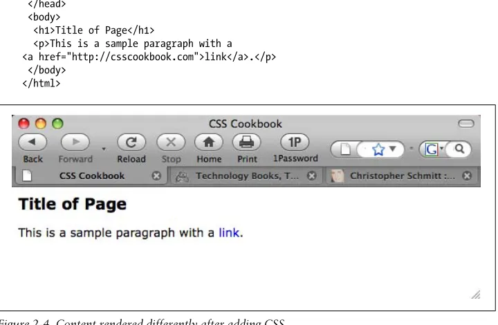
<h1>My Basic Web Page</h1>
<p>Sed quis custodiet ipsos custodes?</p>
</body> </html>
Discussion
Every web page needs to have an HTML element wrapping the entire document. Within
each HTML element are two required elements: head and body.
The head element contains the information about the document, often called meta
information. The head element needs to have the title element within it. This text is usually set in the top portion of the browser window and is used when creating book-marks. It’s important to be concise and to avoid long descriptions when using the
title tag.
If the title element contains no text, browsers will use either the filename or the first
few words of the document instead.
Only text is allowed within the title element. Other HTML elements aren’t allowed.
The content of a web document is placed within the body element. If you need to edit
or revise a web page, most of the time it is within this element.
For this example, the heading was set with an h1 element along with the standard p element for the paragraph.
See Also
Recipe 1.1 for choosing a text editor
1.3 Understanding DOCTYPEs and Effects on Browser Layout
Problem
You want to make your web page standards compliant and valid.
Solution
HTML 4.01 has three document types: Strict, Transitional, and Frameset.
Both HTML5 and XHTML 1.1 have one document type, but XHTML 1.0, like HTML 4.01, has three.
Only one document type definition (DTD) appears in the HTML document. Use any one of the following DOCTYPEs that best fits your project needs.
HTML 4.01 Strict DTD:
<!DOCTYPE HTML PUBLIC "-//W3C//DTD HTML 4.01//EN" "http://www.w3.org/TR/html4/strict.dtd">
HTML 4.01 Transitional DTD:
<!DOCTYPE HTML PUBLIC "-//W3C//DTD HTML 4.01 Transitional//EN" "http://www.w3.org/TR/1999/REC-html401-19991224/loose.dtd">
HTML 4.01 Frameset DTD:
<!DOCTYPE HTML PUBLIC "-//W3C//DTD HTML 4.01 Frameset//EN" " http://www.w3.org/TR/1999/REC-html401-19991224/frameset.dtd">
HTML5 DTD:
<!DOCTYPE html>
XHTML 1.0 Strict DTD:
<!DOCTYPE html PUBLIC "-//W3C//DTD XHTML 1.0 Strict//EN" "http://www.w3.org/TR/xhtml1/DTD/xhtml1-strict.dtd">
XHTML 1.0 Transitional DTD:
<!DOCTYPE html PUBLIC "-//W3C//DTD XHTML 1.0 Transitional//EN" "http://www.w3.org/TR/xhtml1/DTD/xhtml1-transitional.dtd">
XHTML 1.0 Frameset DTD:
<!DOCTYPE html PUBLIC "-//W3C//DTD XHTML 1.0 Frameset//EN" "http://www.w3.org/TR/xhtml1/DTD/xhtml1-frameset.dtd">
XHTML 1.1 DTD:
<!DOCTYPE html PUBLIC "-//W3C//DTD XHTML 1.1//EN" "http://www.w3.org/TR/xhtml11/DTD/xhtml11.dtd">
<title>CSS Cookbook</title> </head>
<body>
<h1>My Basic Web Page</h1>
<p>Epsum factorial non deposit quid pro quo hic escorol.</p> </body>
</html>
Discussion
A DOCTYPE, short for document type definition, defines an HTML or XHTML
docu-ment’s building blocks and tells the browsers and validators which version of HTML or XHTML your document uses.
The DOCTYPE declaration must appear at the beginning of every web page document,
before the html element, to ensure that your markup and CSS are standards compliant
and that browsers handle the pages based on the appropriate DTDs. Quirks mode
XHTML requires a valid DOCTYPE at the top of the document; otherwise, the pages won’t validate and the browsers will fall back into what is known as quirks mode. Quirks mode occurs when a browser treats a web page as “buggy.” As a result, such pages are treated as though they were written in invalid markup, and therefore will be improperly rendered in modern browsers even if the XHTML and CSS are coded perfectly.
A web page that is without a DOCTYPE, with an older DOCTYPE, or with a typo-riddled DOCTYPE triggers quirks mode. So, when coding pages, make sure to check that the DOCTYPE is both added to the page and typed correctly to ensure that brows-ers do not render pages in quirks mode.
If a web page has an HTML5 DOCTYPE, modern browsers will trigger standards mode, even though the actual markup isn’t coded with HTML5 elements. Internet Explorer for Windows 6 and 7 ignores HTML5 features.
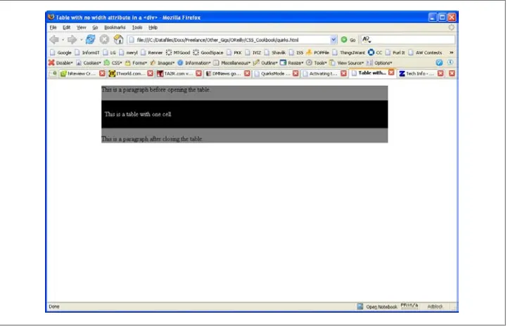
Figures 1-2 and 1-3 show how a table contained within a div with a width of 100%
goes into quirks mode in Internet Explorer 6, and how the page should look in standards mode.
Why not use the latest DOCTYPE?
Using newer DOCTYPEs such as HTML5 is an option. However, it’s not the only option. Unlike software application releases, newer DOCTYPEs don’t make older DOCTYPEs moot.
Figure 1-2. Table width in Internet Explorer 6 in quirks mode with no DOCTYPE included
Figure 1-3. Table width in Firefox 1.5 in standards mode with HTML 4.01 Strict DOCTYPE
The smallest web page ever
The Solution provides an example of a relatively short HTML5 page. However, an even
shorter and valid example can be made:
<!DOCTYPE html>
<title>Small HTML5</title> <p>Hello world</p
These three HTML elements validate for HTML5 by checking out the page at http://
validator.w3.org/check?uri=http%3A%2F%2Fjsbin.com%2Fowata&ss=1.
See Also
HTML5 specification for DTD at http://dev.w3.org/html5/spec/Overview.html#the-doc
type; HTML 4.01 specification for DTD at http://www.w3.org/TR/html401/intro/
sgmltut.html#h-3.3; W3C validators at http://www.w3.org/QA/Tools/#validators; DOCTYPEs article from A List Apart at http://www.alistapart.com/articles/doctype/;
Article from QuirksMode at http://www.quirksmode.org/index.html?/css/quirksmode
.html; Mozilla’s information on quirks mode, which explains the differences between
the rendering modes and how it handles quirks mode, at https://developer.mozilla.org/
en/Mozilla's_Quirks_Mode; Opera’s DOCTYPE page at http://www.opera.com/docs/ specs/doctype/
1.4 Marking Up Headers
Problem
You want to differentiate the importance of headings within the same document.
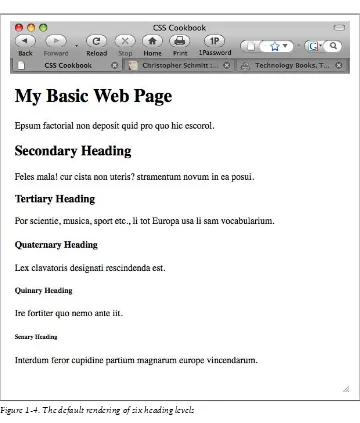
Solution
Use one of the six available headings, h1 through h6, as shown in Figure 1-4:
<!DOCTYPE html PUBLIC "-//W3C//DTD XHTML 1.0 Transitional//EN" "http://www.w3.org/TR/xhtml1/DTD/xhtml1-transitional.dtd"> <html>
<head>
<title>CSS Cookbook</title> </head>
<body>
<h1>My Basic Web Page</h1>
<p>Epsum factorial non deposit quid pro quo hic escorol.</p>
<h2>Secondary Heading</h2>
<p>Feles mala! cur cista non uteris? stramentum novum in ea posui.</p>
<h3>Tertiary Heading</h3>
<h4>Quaternary Heading</h4>
<p>Lex clavatoris designati rescindenda est.</p>
<h5>Quinary Heading</h5>
<p>Ire fortiter quo nemo ante iit.</p>
<h6>Senary Heading</h6>
<p>Interdum feror cupidine partium magnarum europe vincendarum.</p>
</body> </html>
Figure 1-4. The default rendering of six heading levels
Discussion
You can choose from among six different levels of headings when marking up titles for a document.
When marking up content, be sure to use the headings in order. For example, if you use the h2 element, the header underneath it should be wrapped in the h3 element (not
h4 or h5). The title of the page should not be wrapped in the h2 element (use the h1
element). In short, don’t skip header tags!
It’s not important to use all of the headers when creating a document. However, be
sure not to overuse the h1 element, as that might lower your search engine ranking. Use
the h1 element once for the unique title of your blog post or page; then use h2 and h3
for the other portions of the document.
If you need to use h4, h5, and h6 elements in your document, break up the content into separate pages or investigate the document structure. A document requiring six different heading levels might be so loaded down with content that it will fail to hold an average person’s attention span.
Also, if you are concerned about the look of the headings, do not worry. Through the power of CSS, the design of the headings (along with the rest of the page) can be modified.
Using headers appropriately in a document benefits people using screen readers. For a demonstration, see the video at http://www.youtube.com/ watch?v=AmUPhEVWu_E.
See Also
Chapter 3 for modifying headers and other common type treatments
1.5 Making Appropriate Quotations
Problem
You want to cite quotations with HTML, as shown in Figure 1-5.
Solution
Use the blockquote element when quoting a large amount of text:
<blockquote cite="http://www.example.com/">
vestris.</p>
</blockquote>
Figure 1-5. The default rendering of quotations
For citing phrases, use the q element:
<p>Virgil said <q>Sic itur ad astra</q>.</p>
Discussion
The blockquote element is a block-level element. This means that text tagged with a blockquote element separates itself from the rest of the text by forcing a line break above and below itself.
The q element is an inline element, which does not force a line break. Inline elements are useful for quoting small portions of text within a paragraph element.
The q element is typically rendered with quotation marks around the text it envelops. However, these quotation marks do not appear in In-ternet Explorer for Windows.
The cite attribute is optional for both the blockquote and q elements. The value of a cite attribute is a URI where the source of the quote originated.
See Also
Chapter 3 for other common type treatments
1.6 Adding an Image
Problem
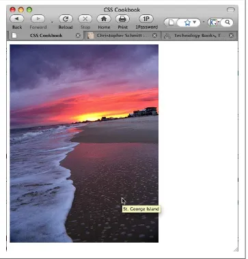
You want to add an image to a web page, as shown in Figure 1-6.
Solution
Use the img element to specify the location of the image file: <img src="saint-george-island.jpg" />
Add an alt attribute within the img element to provide alternative text in case images
are turned off or people are surfing with an assistive technology such as a screen reader:
<img src="saint-george-island.jpg" alt="St. George Island beach at sunset with an approaching storm" />
Discussion
The img element does not address content within the web document itself. It merely
defines the location of its placement within the document and specifies its location relative to the HTML document.
Additional tips
Even though a picture is worth a thousand words, the value of the alt attribute should
be a relatively short description.
As shown in Figure 1-6, some browsers display text next to a cursor, called a tool tip, within the title attribute of an image:
<img src="saint-george-island.jpg" alt="St. George Island beach at sunset with an approaching storm" title="St. George Island beach" />
File formats
Common image formats supported by browsers include GIF and JPEG. Both formats have their own pros and cons in terms of which types of images are best for each.
Based on the compression scheme, which is the method with which an image’s file size
is reduced, GIFs are better at areas of flat color and fewer gradients, and JPEGs are good for photos and subtle color changes.
All browsers support the PNG file format; however, alpha transparency is only now supported in Internet Explorer 8 for Windows. Alpha transparency allows for opacity or levels of transparency within an image, unlike the GIF format, which can assign only one color to be transparent. If an older version of IE renders a PNG image with alpha transparency, the transparent portions usually turn into blocks of solid white. Character case sensitivity
When specifying an image file within HTML, make sure the filename does not contain spaces and the lower- and uppercase characters match. Although your computer OS might be OK with a difference in cases, chances are the web server hosting your web files will not, and may keep images from appearing in the browser.
See Also
Chapter 4 for designing web pages with images
1.7 Adding Audio with HTML5
Problem
You want to add audio to a web page with HTML5.
Solution
Use the audio element to specify an audio file, as shown in Figure 1-7:
<!DOCTYPE html> <html lang="en"> <head>
<meta charset="utf-8"> <title>CSS Cookbook</title> </head>
<body>
<h1>Audio Example</h1>
<audio src="html5audio.ogg" autoplay controls>
<a href="html5test.ogg">Download audio</a> </audio>
</body> </html>
Figure 1-7. Audio added to a web page
Discussion
Audio compatibility
At the time of this writing, no one audio file type plays across all the browsers that
support the HTML5 audio element, as shown in Table 1-1.
Table 1-1. Audio file format support in HTML5
Firefox 3.5 Safari 4 Chrome 3 beta Opera 10
Ogg Vorbis Y Y
MP3 Y Y
WAV Y Y Y
To create a cross-browser solution, use the audio element along with the source element
that cites both OGG and MP3 files. Then include Flash Player embed and object code
afterward:
<audio controls autobuffer> <source src="html5audio.ogg" />
<source src="html5audio.mp3" />
<!-- include Adobe Flash player EMBED and OBJECT code here -->
</audio>
If you do insert audio, setting the file to autoplay is not recommended, as it interferes with the experience for web surfers using screen readers.
See Also
Recipe 1.8 for adding video to web pages
1.8 Incorporating Video with HTML5
Problem
You want to add video to HTML5.
Solution
Use the HTML5 video element, as shown in Figure 1-8:
<!DOCTYPE html> <html lang="en"> <head>
<meta charset="utf-8"> <title>CSS Cookbook</title> </head>
<body>
<h1>Video Example</h1>
<video src="html5video.ogg" width="320" height="240" controls poster="html5video.jpg">
<a href="html5video.ogg">Download movie</a>
</video>
</body> </html>
Figure 1-8. Video added to a web page
Discussion
You do not have to specify the width and height of the video element. If you do not set
the video element with its respective attributes, the movie will play to the default values
of the video file itself.
A video file might have its own poster, which is a static image that represents the video as a whole, similar to a thumbnail. However, you can override this poster by using the
Although the controls attribute is optional, for the sake of usability I suggest using it so as not to offend your site’s visitors.
You can place alternative text in between the video tags, including a link to download
the video file, for browsers that do not recognize the video element. This method allows website visitors a method to view the content with third-party solutions other than browsers.
At the time of this writing, Safari 3.1 and later, Firefox 3.5 and later, Opera 10 beta,
and Chrome 3 beta support the video element.
See Also
http://www.videolan.org/ for information on the export tools in the VLC software ap-plication, which you can use to convert common video files to OGG format (supported by Firefox and Opera)
1.9 Using strong and em Effectively
Problem
You want to emphasize certain words or phrases in a paragraph, as shown in Figure 1-9.
Figure 1-9. The default rendering of highlighted text
Solution
Use the strong and em elements to denote emphasis within a document:
<p>Ma quande lingues coalesce, li grammatica del <strong>resultant lingue</strong>
es plu simplic e regulari quam ti del coalescent lingues. Li nov lingua franca va esser plu simplic e regulari quam li existent Europan lingues. It va esser tam simplic quam Occidental: in fact, it va esser Occidental. A <em>un
Angleso</em> it va semblar un simplificat Angles, quam un skeptic Cambridge amico dit me que Occidental es.</p>
Discussion
The strong element’s default rendering is to make text bold, while the em element sets
text in italics.
You would use em to draw attention to or contrast one or more words from the rest of
a sentence. For example:
• Darth Vader translates loosely as Dark Father in Dutch. • There are, not 57, but 50 states in the United States of America. • If you join him, he will complete your training.
Strong is an alternative element to em to bring attention to words or phrases.
Although the use of em and strong helps to break up the monotony of text, be sure to
use these elements sparingly as well as consistently so that you do not overuse or abuse their importance.
See Also
Chapter 3 for other common type treatments
1.10 Creating Lists
Problem
You want to create a list of items within a web page, as shown in Figure 1-10.
Solution
Use the ul element to wrap around a list of phrases:
<ul>
Then use the li element to wrap around each item within the list: <ul>
<li>First Item</li> <li>Secondary Item</li> <li>Tertiary Item</li> <li>Quaternary Item</li>
</ul>
Discussion
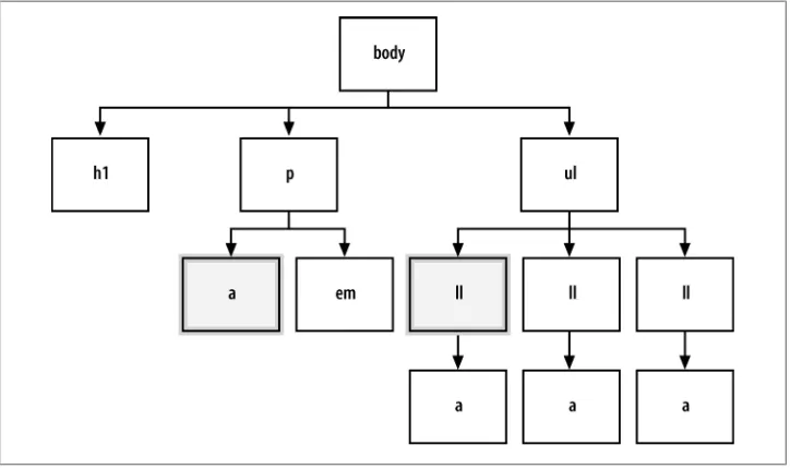
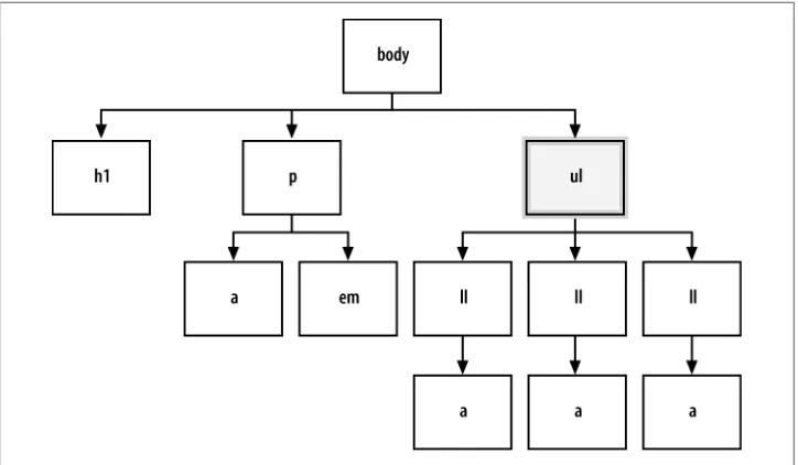
There are three types of lists in HTML: unordered, ordered, and definition lists. Marking up unordered lists and ordered lists is fairly straightforward. Use two ele-ments, ul and li, to mark up a series of items for an unordered list, which typically results in a circle appended to the left side of each list item.
An unordered list is typically used to create the base of a navigation menu.
Ordered lists, which use an ol element instead of a ul element, have a numeral in
sequential order prepended to the list.
As shown in Figure 1-11, definition lists, which are used to define terms, work a little bit differently from unordered and ordered lists. Each item is broken down into two parts: the term (dt) and the definition (dd).
<dl>
<dt>First Term</dt> <dd>Seriatim</dd> <dt>Secondary Term</dt> <dd>Sequentia</dd> <dt>Tertiary Term<dt>
<dd>Sequens mirabitur aetas</dd> </dl>
Figure 1-11. The default rendering of a definition list
See Also
Chapter 6 on lists and Chapter 7 on links and navigation
1.11 Making a Link to a Web Page
Problem
You want to link to another web page.
Solution
Using the anchor link:
<p>This book's <a href="http://www.csscookbook.com/">Web site</a> contains links to download more materials.</p>
to link to another page in the same website, link to its file:
<p>Check out the <a href="about.html">About page</a> for more information.</p>
Discussion
Along with the img element (see Recipe 1.6), some browsers display a tool tip if a title attribute and value are present within the anchor link, as shown in Figure 1-12:
Linking to another web page on the same site
When you are creating links within the same site, use relative links instead of anchor links. Relative links are addresses that are valid only if you are visiting from certain web pages.
For example, suppose you have a website composed of four pages within the same root
folder, the main directory that contains the website files, as shown in Figure 1-13: • httpdocs/
—index.html
—aboutus.html
—contactus.html
—services.html
Figure 1-13. Sample directory structure
Including everything that is needed to point a web browser to a location in a link means that you created an absolute link, which looks like this:
<a href="http://www.csscookbook.com/services.html">Services Page</a> Figure 1-12. A tool tip displayed over a link
If you want to create a link from the index page to another page on the same website, use a relative link. A relative link is a little bit leaner than an absolute link and, as in this example, can cite just the filename itself within the href attribute:
<a href="services.html">Services Page</a>
Relative links contain neither the full http:// protocol nor the domain name.
When a browser navigates to a relative link, it uses the domain name of the page it is currently viewing to assemble the link to where it should go next.
Moving up folders
Just as your personal computer probably contains numerous folders holding numerous files for a project, websites are also composed of folder sets and files. To link from one document to another document within the same website, use relative links.
For example, say you have a main technical specs page within a specs folder, which
itself is in a widget folder. The organization of the files on the server might look some-thing like this:
• products/
—widget/
—specs/
—specs.html
To provide a link to the main widget page from the technical specs page, use ../ to tell the browser to go up to the parent directory:
<a href="../widget.html">Widget Page</a>
If you want to go up two parent directories and link to the main products page from
the technical specs page, you would format the link like so:
<a href="../../products.html">Product Page</a>
Using the root relative link
The process for using relative links to move between the folders of a large website can sometimes be tricky, if not convoluted. Another type of link to use in such a case is a
root relative link.
Here is how you would use a root relative link to code the link from the technical specs page to the main product page in the preceding example:
<a href="/products/products.html">Product Page</a>