Handaru Jati, Ph.D
Universitas Negeri Yogyakarta
Chapter Overview
7.1 Introduction
7.2 Understanding Data
7.2.1 Descriptive Statistics
7.2.2 Histograms
7.3 Relationships in Data
7.3.1 Trend Curves
7.3.2 Regression
7.4 Distributions
7.5 Summary
7.6 Exercises
7.1
Introduction
This chapter illustrates the tools available in Excel for performing statistical analysis. These tools include new functions, the data analysis toolpack, and some new chart features. This chapter is not intended to teach the statistical concepts which can be used in Excel’s analysis, but rather demonstrate to the reader that several tools are available in Excel to perform these statistical functions. Statistical analysis is used often in DSS applications for analyzing input and displaying conclusive output. These tools will be especially used in applications involving simulation. We discuss the application of statistical analysis in simulation in Chapter 9 and again in Chapter 20 with VBA. We have several DSS applications which use statistical analysis tools, such as Queuing Simulation.
7.2
Understanding Data
Statistical analysis provides an understanding of a set of data. Using statistics, we can determine an average value, a variation of the data from this average, a range of data values, and perform other interesting analysis. We begin this analysis by using statistical Excel functions.
One of the basic statistical calculations to perform is finding the mean of a set of numbers; the mean is simply the average, which we learned how to calculate with the AVERAGE function in Chapter 4:
=AVERAGE(range or range_name)
Figure 7.1 displays a table of family incomes for a given year. We first name this range of data, cells B4:B31, as “FamIncome.” We can now find the average, or mean, family income for that year using the AVERAGE function as follows (see Figure 7.2):
Figure 7.1 Family incomes for a given year.
Similar to the mean, the median can also be considered the “middle” value of a set of numbers. The median is the middle number in a list of sorted data. To find the median, we use the MEDIAN function, which takes a range of data as its parameter:
=MEDIAN(range or range_name)
To determine the median of the above family incomes, we enter the MEDIAN function as follows:
=MEDIAN(FamIncome)
We can check whether or not this function has returned the correct result by sorting the data and finding the middle number. Since there are an even number of family incomes recorded in the table, we must average the two middle numbers. The result is the same (see Figure 7.3).
Another important value, standard deviation, is the square root of the variance, which measures the difference between the mean of the data set and the individual values. Finding the standard deviation is simple with the STDEV function. The parameter for this function is also just the range of data for which we are calculating the standard deviation:
=STDEV(range or range_name)
In Figure 7.4, we calculate the standard deviation of the family income data using the following function:
=STDEV(FamIncome)
Figure 7.4 Using the STDEV function.
The Analysis Toolpack provides an additional method by which to perform statistical analysis. This Excel Add-In includes statistical analysis techniques such as Descriptive Statistics, Histograms, Exponential Smoothing, Correlation, Covariance, Moving Average, and others (see Figure 7.5). These tools automate a sequence of calculations that require much data manipulation if only Excel functions are being used. We will now discuss how to use DescriptiveStatistics and Histograms in the AnalysisToolpack.
Statistical Functions
AVERAGE Finds the mean of a set of data.
MEDIAN Finds the median of a set of data.
Figure 7.5 The Data Analysis dialog box provides a list of analytical tools.
(Note: Before using the Analysis Toolpack, you must ensure that it is an active Add-in. To do so, choose Tools > Add-ins from the Excel menu and select Analysis Toolpack from the list. If you do not see it on the list, you may need to re-install Excel on your computer. After you have checked Analysis Toolpack on the Add-ins list, you should find the Data Analysis option under the Tools menu option.)
7.2.1
Descriptive StatisticsFigure 7.6 The Descriptive Statistics dialog box appears after it is chosen from the Data Analysis list.
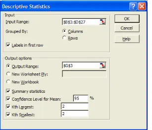
The Input Range refers to the location of the data set. We can check whether our data is Grouped By Columns or Rows. If there are labels in the first row of each column of data, then we check the Labels in First Row box. The Output Range refers to where we want the results of the analysis to be displayed in the current worksheet. We could also place the analysis output in a new worksheet or a new workbook. The Summary Statistics box calculates the most commonly used statistics from our data. We will discuss the last three options, Confidence Level for Mean, Kth Largest, and Kth Smallest, later in the chapter.
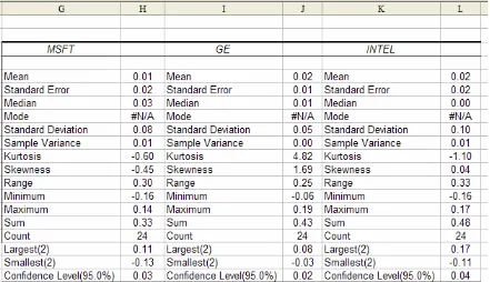
Let’s now consider an example in order to appreciate the benefit of this tool. In Figure 7.7 below, there is a table containing quarterly stock returns for three different companies. We want to determine the average stock return, the variability of stock returns, and which quarters had the highest and lowest stock returns for each company. This information could be very useful for selecting a company in which to invest.
Figure 7.7 Quarterly stock returns for three companies.
statistical analysis of these values.) Next, we check that our data is Grouped By Columns; since we do have labels in the first row of each column of data, we check the Labels in First Row box. We now specify G3 as the location of the output in the Output Range option. After checking Summary Statistics, we press OK (without checking any of the last three options) to observe the results shown below in Figure 7.9.
Figure 7.8 Filling the Descriptive Statistics dialog box for the above example data.
First, let’s become familiar with the Mean, Median, and Mode. As already mentioned, the Mean is simply the average of all values in a data set, or all observations in a sample. We have already observed that without the Analysis Toolpack, the mean value can be found with the AVERAGE function in Excel. The Median is the “middle” observation when the data is sorted in ascending order. If there is an odd number of values, then the median is truly the middle value. If there is an even number of values, then it is the average of the two middle values.
The Mode is the most frequently occurring value. If there is no repeated value in the data set, then there is no Mode value, as in this example. The Mean is usually considered the best measure of the central data value if the data is fairly symmetric; otherwise the Median is more appropriate. In this example, we can observe that the Mean and Median values for each company differ slightly; however, we use the Mean value to compare the average stock returns for this company. This analysis alone implies that GE and INTEL have higher stock returns, on average, than MSFT. But these values are still very close, so we need more information to make a better comparative analysis.
Now, let’s consider the Standard Error, Standard Deviation, and Sample Variance. All of these values measure the spread of the data from the mean. The Sample Variance is the average squared distance from the mean to each data point. The Standard Deviation is the square root of the Sample Variance and is more frequently used. Looking at these values for the example data, we can observe that INTEL has a highly varied stock return, while GE’s is more stable. Therefore, even though they have the same Mean value, this difference in the Standard Deviation makes GE a more favorable stock in which to invest.
We will discuss Standard Error, which is used in connection with trends and trendlines, in more detail later.
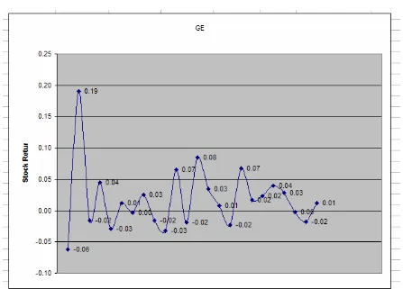
The Standard Deviation, usually referred to as s, is an important value in understanding variation in data. Most data, 68% of a Normal distribution, lies between +s and –s from the mean. Almost all of the data, 95% of a Normal distribution, lies between +2s and -2s from the mean. Any values in the data set that lie more than ±2s from the mean are called outliers. Note that outliers do not have to be defined based on ±2s, but can be measured by any other multiplier of standard deviation or any other set deviation from the mean value. Outliers can provide insightful information about a data set.
Figure 7.10 The second data point is an outlier since it is greater than 2s from the mean.
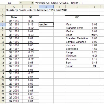
We can identify outliers by looking at a chart of data, or we can actually locate values in the data set that are greater than +2s and smaller than -2s. To do so, we can place the following formula in an adjacent column to the data:
=IF(ABS(data_value – mean_value)>2*s, “outlier”, )
Figure 7.11 Identifying the outlier by using a formula with the IF and ABS functions.
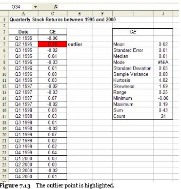
Another way to discover outliers is by using Conditional Formatting with the Formula Is option. With the formula below, we can simply select the column of values in our data set and fill in the Conditional Formatting dialog box to highlight outlier points:
=ABS(data_value – mean_value) > 2*s
Figure 7.12 Applying the Formula Is option to the example data.
In Figure 7.13, we can observe that the same outlier point has been formatted.
Figure 7.13 The outlier point is highlighted.
Let’s now return to the Descriptive Statistics results to understand the remaining analysis values. Kurtosis is a measure of peakedness in the data. It compares the data peak to that of a Normal curve (which we will discuss in more detail in a later section). The Skewness is a measure of how symmetric or asymmetric data is. A Skewness value greater than +1 is the degree to which the data is skewed in the positive direction; likewise, a value less than -1 is the degree to which the data is skewed in the negative direction. A Skewness value between -1 and +1 implies symmetry. The Skewness values for MSFT and INTEL imply that their data is fairly symmetric; however, the Skewness value for GE is 1.69, which implies that it is skewed positively. That is, there is a peak early on in the data and then the data is stable (as we saw in the GE data graph in Figure 7.10).
The last three options in the Descriptive Statistics dialog box, Confidence Level for Mean, Kth Largest, and Kth Smallest, can provide some extra information about our data. The Confidence Level for Mean calculates the mean value in the Descriptive Statistics report constrained to a specified confidence level. The mean is calculated using the specified confidence level (for example, 95% or 99%), the standard deviation, and the size of the sample data. The confidence level and the calculated mean are then added to the analysis report; we can compare the actual mean to this calculated mean based on the specified confidence level.
The Kth Largest and Kth Smallest options provide the respectively ranked data value for a specified value of k. For example, for k = 1, the Kth Largest returns the maximum data value and the Kth Smallest returns the minimum data value. The value of k can range from 1 to the number of data points in the input.
For example, let’s create the same Descriptive Statistics report, but this time check the last three options of the initial dialog box (see Figure 7.14). We have specified a confidence interval of 95%, and we want to know the 2nd largest value and 2nd smallest value.
Figure 7.14 This time, specifying the last three options in the Descriptive Statistics dialog box.
Figure 7.15 The results of the Descriptive Statistics analysis with three additional rows.
Similar to the Kth Largest and Kth Smallest options with Descriptive Statistics, the two Excel functions PERCENTILE and PERCENTRANK are valuable when working with ranking numbers. The PERCENTILE function returns a value for which a desired percentile k of the specified data_set falls below. The format of this function is:
=PERCENTILE(data_set, k)
For example, let’s apply this formula to the MSFT data. If we want to determine what value 95 percent of the data falls below, we type the function:
=PERCENTILE(B4:B27,0.95)
The result is 0.108, which means that 95 percent of the MSFT data is less than 0.108. The PERCENTRANK function performs the complementary task; it returns the percentile of the data_set that falls below a given value. The format of this function is:
=PERCENTRANK(data_set, value)
For example, if we want to know what percent of the MSFT data falls below the value 0.108, we type:
=PERCENTRANK(B4:B27, 0.108)
=PERCENTRANK(B4:B27, 0.01)
The result is that 0.388, or about 39 percent of the data, is less than the mean. These Excel functions, along with the others mentioned above, when combined with the Descriptive Statistics analysis tool, can help determine much constructive information about data.
7.2.2
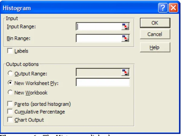
HistogramsHistograms calculate the number of occurrences, or frequency, with which values in a data set fall into various intervals. To create a histogram in Excel, we choose the Histogram option from the Analysis Toolpack list. A dialog box in which we will specify four main parameters then appears. These four parameters are: input, bins, output, and charts options(see Figure 7.16).
Figure 7.16 The Histogram dialog box.
The Input Range is the range of the data set. The Bin Range specifies the location of the bin values. Bins are the intervals into which values can fall; they can be defined by the user or can be evenly distributed among the data by Excel. If we specify our own bins, or intervals, then we must place them in a column on our worksheet. The bin values are specified by their upper bounds; for example, the intervals (0-10), (10-15), and (15-20)
Descriptive Statistics
Outliers Any values in the data set that lie more than ±2s from the
mean.
PERCENTILE A function that returns a value for which a desired
percentile k of the specified data_set falls below.
PERCENTRANK A function that returns the percentile of the data_set that
are written as 10, 15, and 20. The Output Range is the location of the output, or the frequency calculations, for each bin. This location can be in the current worksheet or in a new worksheet or a new workbook. The chart options include a simple Chart Output (the actual histogram), a Cumulative Percentage for each bin value, and a Pareto organization of the chart. (Pareto sorts the columns from largest to smallest.)
Let’s look at the MSFT stock return data from the examples above. We may want to determine how often the stock returns are at various levels. To do so, we go to Tools > DataAnalysis > Histogram and specify the parameters of the Histogram dialog box (see Figure 7.17). Our Input Range is the column of MSFT data, including the “MSFT” label in the first row. For now, we leave the Bin Range blank and let Excel create the bins, or intervals. We check Labels since we have included a label for our selected data. We pick a cell in the current worksheet as our Output Range and then select Chart Output. The resulting histogram and frequency values are shown in Figure 7.18.
Figure 7.18 The resulting histogram and frequencies for the example data.
First, let’s discuss the Bin values. Remember that each bin value is an upper bound on an interval; that is, the intervals that Excel has created for this example are (below -0.16), (-0.16, -0.08), (-0.08, -0.01), (-0.01, 0.07), and (above 0.07). We can deduce that most of our data values fall in the last three intervals. It may have been more useful to use intervals relative to the mean and standard deviation of the MSFT data. In other words, we could create the intervals (below -2s), (-2s, -s), (-s, mean), (mean, s), (s, 2s), and (above 2s). To enforce these intervals, we create our own Bin Range. In a new column, we list the upper bounds of these intervals using the mean and standard deviation values from the Descriptive Statistics results for the MSFT data. We also create a title for this column to include in the Bin Range (see Figure 7.19).
Figure 7.19 Creating the Bin Range for the example data.
Figure 7.20 The Histogram dialog box now has a specified Bin Range.
Our Bin Range now calculates the frequencies and creates the histogram (see Figure 7.21). We can analyze this data to determine that the majority of our data lies above the mean (15 points above the mean verses 9 points below the mean). This conclusion validates the result of the PERCENTRANK function, as discussed in the previous section where we learned that 39 percent of the data values are below the mean; therefore 61 percent, or the majority, of our data is above the mean. We can also observe from this histogram result that there is one outlier; in other words, there is one data point that falls below -2s. We will perform some more analysis with these histogram results later in the chapter.
A histogram can also be formatted. As with any chart, we right-click on the histogram and change the Chart Options or other parameters. For example, we have removed the Legend from the histograms shown above. If desired, we can also modify the font of the axis labels by right-clicking on the axis and choosing Format Axis.
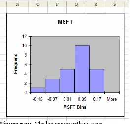
We can also remove the gaps between the bars in the histogram to better recognize possible common distributions of the data. To remove these gaps, we right-click on a bar in the graph and select Format Data Series from the list of drop-down options. Then, we select Options and set the Gap Width to 0 (see Figure 7.22).
The histogram results can now be easily outlined to identify common distributions or other analyses (see Figure 7.23). We will discuss distributions later, but for now, let’s define some common histogram shapes.
Figure 7.22 Removing the gaps by right-clicking on the bars, choosing Format Data
Figure 7.23 The histogram without gaps.
The histogram’s four basic shapes are symmetric, positively skewed, negatively skewed, and multiple peaks. A histogram is symmetric if it has only one peak; that is, if there is a central high part and almost equal lower parts to the left and right of the peak. For example, test scores are commonly symmetric; they are sometimes referred to as a bell curve because of their symmetric shape.
A skewed histogram also only has one peak; however, the peak is not central, but far to the right with many lower points on the left, or far to the left with many lower points on the right. A positively skewed histogram has a peak on the left and many lower points (stretching) to the right. A negatively skewed histogram has a peak on the right and many lower points (stretching) to the left. Most economic data sets have skewed histograms.
Multiple peaks imply that more than one source, or population, of data is being evaluated.
7.3
Relationships in Data
It is often helpful to determine if any relationship exists among data. This calculation is usually accomplished by comparing data relative to other data. Some examples include analyzing product sales in relation to particular months, production rates in relation to the number of employees working, and advertising costs in relation to sales.
Relationships in data are usually identified by comparing two variables: the dependent variable and the independent variable. The dependent variable is the variable that we are most interested in. We may be trying to predict values for this variable by understanding its current behavior in order to better predict its future behavior. The independent variable is the variable that we use as the comparison in order to make the prediction. There may be various independent variables with known values that we can use to analyze the relationship against the dependent variable. However, only one independent variable provides the most accurate understanding of the dependent variable’s behavior.
Note that since our prediction of the dependent variable relies on the independent variable, we can only predict values corresponding to known independent variable values. In other words, we cannot predict beyond the scope of available independent variable data, nor can we predict the independent variable itself.
We can graph this data (with the XY Scatter chart type) by placing the independent variable on the x-axis and the dependent variable on the y-axis and then using a tool in Excel called a trend curve to determine if any relationship exists between these variables.
Histograms
Bins The intervals of values for which frequencies are
calculated.
Symmetric A histogram with only one peak: a central high part with
almost equal lower parts to the left and right of this peak.
Positively Skewed A histogram with a peak on the left and many lower
points (stretching) to the right.
Negatively Skewed A histogram with a peak on the right and many lower
points (stretching) to the left.
Multiple Peaks A histogram with multiple peaks suggests that more than
one source, or population, of data is being evaluated. Summary
Dependent variable The variable that a user is trying to predict or
understand.
Independent variable The variable used to make predictions.
Trend Curve
7.3.1
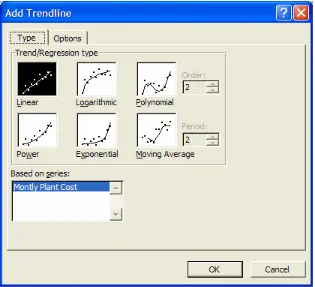
Trend CurvesTo add a trend curve to our chart, we right-click on the data points in our XY Scatter chart and choose Add Trendline from the drop-down list of options. There are five basic trend curves that Excel can model: Linear, Exponential, Power, Moving Average, and
Logarithmic. Each of these curves is illustrated in the Add Trendline dialog box, which appears in Figure 7.24.
Figure 7.24 The five trend curves that Excel can fit to data.
We will discuss how to identify linear, exponential, and power curves in a chart. If a graph looks like a straight line would run closely through the data points, then a linear curve is best. If the dependent variable (on the y-axis) appears to increase at an increasing rate, then the exponential curve is more favorable. Similar to the exponential curve is the power curve; however, the power curve has a slower rate of increase in terms of the dependent variable.
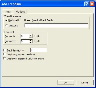
After we select the curve that we feel best fits our data, we click on the Options tab (see Figure 7.25). The first option to set is the trendline’s name; we can either use the automatic name (default) or create a custom name. The next option is to specify a period forward or backward for which we want to predict the behavior of our dependent variable. This period is in units of our independent variable. This is a very useful tool since it is one of the main motivations for using trend curves. The last set of options allows us to specify an intercept for the trendline and to display the trendline equation and the R-squared value on the chart. We will usually not check to Set Intercept; however, we always recommend checking to Display Equation and Display R-Squared Value. We will discuss the equation and the R-squared value for each trend curve in more detail later.
Figure 7.25 The Options tab of the Add Trendline dialog box.
Figure 7.26 Right-clicking on a trendline to format it or change Type or Options.
Let’s compare some examples of these three different trend curves. We will begin with Linear curves. Suppose a company has recorded the number of “Units Produced” each month and the corresponding “Monthly Plant Cost”(see Figure 7.27). The company may be able to accurately determine how much they will produce each month; however, they want to be able to estimate their plant costs based on this production amount. They will therefore need to determine, first of all, if there is a relationship between “Units Produced” and “Monthly Plant Cost.” If so, then they need to establish what type of relationship it is in order to accurately predict future monthly plant costs based on future unit production.
Figure 7.27 A record of the “Units Produced” and the “Monthly Plant Cost” for twelve months.
Figure 7.28 The XY Scatter Chart for the “Monthly Plant Cost per Units Produced.”
Figure 7.29 Selecting the Linear trend curve from the Type tab.
The trendline and the equation are then added to our chart, as illustrated in Figure 7.31.
Figure 7.31 Adding the Linear trendline to the chart.
Let’s now decipher what the trendline equation is. The x variable is the independent variable, in this example, the “Units Produced.” The y variable is the dependent variable, in this example, the “Monthly Plant Cost.” This equation suggests that for any given value of x, we can compute y. That is, for any given value of “Units Produced,” we can calculate the expected “Monthly Plant Cost.” We can therefore transfer this equation into a formula in our spreadsheet and create a column of “Predicted Cost” relative to the values from the “Units Produced” column.
In Figure 7.32 the following formula operates in the “Predicted Cost” column:
=88.165*B4 – 8198.2
Figure 7.32 Adding the “Predicted Cost” and “Error” columns to the table using the
Linear trendline equation.
Now we have enough information to address the initial problem for this example: predicting future “Monthly Plant Costs” based on planned production amounts. In Figure 7.33, we have added “Units Produced” values for three more months. Copying the formula for “Predicted Cost” to these three new rows gives us the predicted monthly costs.
Figure 7.33 Calculating the “Predicted Cost” for the next three months.
costs for this example because we assume that the production amount is known for the next three months.)
Now let’s discuss Exponential trend curves. In Figure 7.34, we have “Sales” data for ten years. If we want to be able to predict sales for the next few years, we must determine what relationship exists between these two variables. So, our independent variable is “Years” and our dependent variable is “Sales.”
Figure 7.34 Sales per year.
Figure 7.35 Choosing the Exponential trend curve.
Let’s analyze the equation provided on the chart. Again, the y variable represents the dependent variable, in this example, “Sales.” The x variable represents the independent variable, in this example, “Year.” We can therefore transform this equation into a formula in our spreadsheet and create a “Prediction” column in which we estimate sales based on the year. In Figure 7.37, we have done so using the following formula:
=58.553*EXP(0.5694*A4)
The EXP function raises e to the power in parentheses. We have copied this formula for all of the years provided in order to compare our estimated values to the actual values. Notice that there are some larger “Error” values as the years increase.
Figure 7.37 Calculating the “Prediction” values with the Exponential trendline equation.
Figure 7.38 Using the Exponential trendline equation to predict sales for year 16.
Now let’s consider an example of a Power trend curve. In Figure 7.39, we are presented with yearly “Production” and the yearly “Unit Cost” of production. We want to determine the relationship between “Unit Cost” and “Production” in order to be able to predict future “Unit Costs.”
Figure 7.39 Yearly Production and Unit Costs.
Figure 7.40 Choosing the Power curve.
Looking at the Power trendline equation, we again identify x to be the independent variable, in this case, “Production,” and y to be the dependent variable, in this case, the “Unit Cost.” We transform this equation into a formula on the spreadsheet in a “Forecast” column to compare our estimated values with the actual costs. We copy the following formula for all of the given years:
=101280*B4^-0.3057
Figure 7.42 displays these forecasted cost values and the “Error” calculated between the forecasted and actual data. The error values seem to be fairly stable, therefore implying a reliable fit.
Figure 7.42 Creating the “Forecast” and “Error” columns with the Power trendline equation.
We would now like to make a note about using data with dates (for example the “Year” in the above example). If dates are employed as an independent variable, we must convert them into a simple numerical list. For example, if we had chosen to assign the “Year” column in the above example as an independent variable for predicting the “Unit Cost,” we would have had to renumber the years from 1 to 7, 1 being the first year, 2 the second, etc., in which the data was collected. Using actual dates may yield inaccurate calculations.
Trend Curves
Linear Curve y = a*x - b
Exponential Curve y = a*e^(b*x) or y = a*EXP(b*x)
Power Curve y = a*x^b
Residual The vertical distance, or error, between the
trendline and the data points.
7.3.2
Regression
Another more accurate way to ensure that the relationships we have chosen for our data are reliable fits is by using regression analysis parameters. These parameters include the R-Squared value, standard error, slope and intercept.
The R-Squared value measures the amount of influence that the independent variable has on the dependent variable. The closer the R-Squared value is to 1, the stronger the linear relationship between the independent and dependent variables is. If the R-Squared value is closer to 0, then there may not be a relationship between them. We can then draw on multiple regression and other tools to determine a better independent variable to predict the dependent variable.
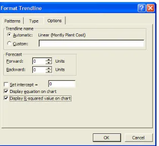
To determine the R-Squared value of a regression, or a trendline, we can use the Add Trendline dialog box on a chart of data and specify to Display R-SquaredValue on Chart in the Options tab (see Figure 7.43).
Figure 7.43 Checking the Display R-Squared Value on Chart option.
For the first example, we fit a Linear trendline to the “Monthly Plant Cost per Units Produced” chart (see Figure 7.44). The R-Squared value is 0.8137, which is fairly close to 1. We could try other trend curves and compare the R-Squared values to determine which fit is the best.
In the following example, we fit an Exponential trendline to the “Sales per Year” chart (see Figure 7.45). The R-Squared value for this data is 0.9828. This value is very close to 1 and therefore a sound fit. Again, it is wise to compare the R-Squared values for Exponential and Power curves on a set of data with an increasing slope.
In the last example, we fit a Power trendline to the “Unit Cost per Cumulative Production” chart (see Figure 7.46). The R-Squared value is 0.9485, which is also very close to 1 and therefore an indication of a good fit.
Figure 7.46 The R-Squared value with the Power trendline.
Excel’s RSQ function can calculate an R-squared value from a set of data using the Linear trendline. The format of the RSQ function is:
=RSQ(y_range, x_range)
Figure 7.47 Using the RSQ function to calculate the R-Squared value of the Linear
trendline.
The standard error measures the accuracy of any predictions made. In other words, it measures the “spread” around the least squares line, or the trendline. We have learned previously that this value can be found using Descriptive Statistics. It can also be calculated in Excel with the STEYX function. The format of this function is:
=STEYX(y_range, x_range)
Figure 7.48 Using the STEYX function to calculate the standard error.
Two other Excel functions that can be applied to a linear regression line of a collection of data are SLOPE and INTERCEPT. The SLOPE function’s format is:
=SLOPE(y_range, x_range)
Similarly, the intercept of the linear regression line of the data can be determined with the INTERCEPT function. The format of this function is:
=INTERCEPT(y_range, x_range)
Figure 7.49 Finding the slope and intercept with the SLOPE and INTERCEPT functions.
7.4
Distributions
We will now discuss some of the more common distributions that can be recognized when performing a statistical analysis of data. These are the Normal, Exponential,
Uniform, Binomial, Poisson, Beta, and Weibull distributions. The Normal, Exponential and Uniform distributions are those most often used in practice. The Binomial and Poisson are also common distributions.
Regression R-Squared Value
Measures the amount of influence that the independent variable has on the dependent variable.
Standard Error Measures the accuracy of any predictions made.
More Statistical Functions
RSQ Finds the R-squared value of a set of data.
STEYX Finds the standard error of regression for a set of data.
SLOPE Finds the slope of a set of data. INTERCEPT Finds the intercept of a set of data.
Most of these distributions have Excel functions associated with them. These functions are basically equivalent to using distribution tables. In other words, given certain parameters of a set of data for a particular distribution, we can look at a distribution table to find the corresponding area from the distribution curve. These Excel functions perform this task for us.
Let’s begin with the Normal distribution. The parameters for this distribution are simply the value that we are interested in finding the probability for, and the mean and standard deviation of the set of data. The function that we apply with the Normal distribution is NORMDIST, and with these parameters, the format for this function is:
=NORMDIST(x, mean, std_dev, cumulative)
We will use the cumulative parameter in many Excel distribution functions. This parameter takes the values True and False to determine if we want the value returned from the cumulative distribution function or the probability density function, respectively. A general difference between these two functions is that the cumulative distribution function (cdf) determines the probability that a value in the data set is less than or equal to x, while the probability density function (pdf) determines the probability that a value is exactly equal to x. We will employ this general definition to understand the cumulative parameter of other distribution functions as well.
For example, suppose annual drug sales at a local drugstore are distributed Normally with a mean of 40,000 and standard deviation of 10,000. What is the probability that the actual sales for the year are 42,000? To answer this, we use the NORMDIST function:
=NORMDIST(42000, 40000, 10000, True)
This function returns a 0.58 probability, or 58% chance, that given this mean and standard deviation for the Normal distribution, annual drug sales will be 42,000 (see Figure 7.50).
Figure 7.50 Using the NORMDIST with the cumulative distribution function.
=NORMDIST(49000, 40000, 10000, True) – NORMDIST(35000, 40000, 10000, True)
This function returns a 0.51 probability, or 51% chance, that annual sales will be between 35,000 and 49,000 (see Figure 7.51).
Figure 7.51 Using the NORMDIST function with an interval of x values.
Related to the Normal distribution is the Standard Normal distribution. If the mean of our data is 0 and the standard deviation is 1, then placing these values in the NORMDIST function with the cumulative parameter as True determines the resulting value from the Standard Normal distribution. There are also two other functions that determine the Standard Normal distribution value: STANDARDIZE and NORMSDIST.
STANDARDIZE converts the x value from a data set of a mean not equal to 0 and a standard deviation not equal to 1 into a value that does assume a mean of 0 and a standard deviation of 1. The format of this function is:
=STANDARDIZE(x, mean, std_dev)
The resulting standardized value is then used as the main parameter in the NORMSDIST function:
=NORMSDIST(standardized_x)
This function then finds the corresponding value from the Standard Normal distribution. These functions are valuable as they relieve much manual work in converting a Normal x value into a Standard Normal x value.
Let’s now consider the same example as above to determine the probability that a drugstore’s annual sales are 42,000. We standardize this using the following function:
The result of this function is 0.2. We can then use this value in the NORMSDIST function to compute the probability:
=NORMSDIST(0.2)
This function again returns a probability of 0.58 that the sales will reach 42,000 (see Figure 7.52).
Figure 7.52 Using the STANDARDIZE and NORMSDIST functions.
The Uniform distribution does not actually have a corresponding Excel function; however, there is a simple formula that models the Uniform distribution. This formula, or pdf, is:
1 / (b – a)
Given that a value x is Uniformly distributed between a and b, we can use this formula to determine the probability that x will have an integer value in this interval. To apply this formula in Excel, we recommend creating three columns: one for possible a values, one for possible b values, and one for the result of the Uniform formula (see Figure 7.50). Then, we just enter the Uniform formula by referencing the a and b value cells.
Figure 7.53 Using the Uniform distribution formula for various values of a and b.
The Poisson distribution has only the mean as its parameter. The function we use for this distribution is POISSON and the format is:
=POISSON(x, mean, cumulative)
For example, consider a bakery that serves an average of 20 customers per hour. Find the probability that, at the most, 35 customers will be served in the next two hours. To do so, we use the POISSON function with a mean value of lambda*time = 20*2.
=POISSON(35, 20*2, True)
This function returns a 0.24 probability value that 35 customers will be served in the next two hours (see Figure 7.54).
Figure 7.54 Using the POISSON function with the service time.
The Exponential distribution has only one parameter: lambda. The function we use for this distribution is EXPONDIST and its format is:
=EXPONDIST(x, lambda, cumulative)
(Note that the lambda value is equivalent to 1/mean.) The cumulative parameter is the same as described above. The x value is what we are interested in finding the distribution value for, and lambda is the distribution parameter.
A common application of the Exponential distribution is for modeling interarrival times. Let’s use the bakery example from above. If we are told that, on average, 20 customers are served per hour and we assume that each customer is served as soon as he or she arrives, then the arrival rate is said to be 20 customers per hour. This arrival rate can be converted into the interarrival mean by inverting this value; the interarrival mean, or the Exponential mean, is therefore 1/20 hours per customer arrival. Therefore, if we want to determine the probability that a customer arrives in 10 minutes, we set x = 10/60 = 0.17 hour and lambda = 1/(1/20) = 20 hours in the EXPONDIST function:
=EXPONDIST(0.17, 20, True)
Figure 7.55 Using the EXPONDIST function with the interarrival time.
The Binomial distribution has the following parameters: the number of trials and the probability of success. We are trying to determine the probability that the number of successes is less than (using cdf) or equal to (pdf) some x value. The function for this distribution is BINOMDIST and its format is:
=BINOMDIST(x, trials, prob_success, cumulative)
(Note that the values of x and trials should be integers.) For example, suppose a marketing group is conducting a survey to find out if people are more influenced by newspaper or television ads. Assuming, from historical data, that 40 percent of people pay more attention to ads in the newspaper, and 60 percent pay more attention to ads on television, what is the probability that out of 100 people surveyed, 50 of them respond more to ads on television? To determine this, we use the BINOMDIST function with the prob_success value equal to 0.60.
=BINOMDIST(50, 100, 0.06, True)
This function returns a value of 0.03 that 50 out of 100 people will report that they respond more to television ads than newspaper ads (see Figure 7.56).
Figure 7.56 Using the BINOMDIST function with the survey data.
which we want the Beta distribution value. The function for this distribution is BETADIST and its format is:
=BETADIST(x, alpha, beta, A, B)
If A and B are omitted, then a standard cumulative distribution is assumed and they are assigned the values 0 and 1, respectively.
For example, suppose a management team is trying to complete a big project by an upcoming deadline. They want to determine the probability that they can complete the project in 10 days. They estimate the total time needed to be one to two weeks based on previous projects that they have worked on together; these estimates will be the bound values, or the A and B parameters. They can also determine a mean and standard deviation from this past data to be 12 and 3 days, respectively. We can use this mean and standard deviation to compute the alpha and beta parameters; we do so using some complex transformation equations (shown in Figure 7.57), resulting in alpha = 0.08 and beta = 0.03. (Note that usually alpha and beta can be found in a resource table for the Beta distribution.) We can then use the BETADIST function as follows:
=BETADIST(10, 0.08, 0.03, 7, 14)
The result reveals that there is a 0.28 probability that they can finish the project in 10 days (see Figure 7.57).
Figure 7.57 Using BETADIST and calculating the alpha and beta values.
The Weibull distribution has the parameters alpha and beta. The function we use for this distribution is WEIBULL and its format is:
(Note that if alpha is equal to 1, then this distribution becomes equivalent to the Exponential distribution with lambda equal to 1/beta.) The Weibull distribution is most commonly employed to determine reliability functions. Consider the inspection of 50 light bulbs. Past data reveals that on average, a light bulb lasts 1200 hours, with a standard deviation of 100 hours. We can use these values to calculate alpha and beta to be 14.71 and 1243.44, respectively. (Note that usually alpha and beta can be located in a resource table for the Beta distribution.) We can now use the WEIBULL distribution to determine the probability that a light bulb will be reliable for 55 days = 1320 hours.
=WEIBULL(1320, 14.71, 1243.44, True)
The result is a 0.91 probability that a light bulb will last up to 1320 hours, or 55 days (see Figure 7.58).
Figure 7.58 Using the WEIBULL function to determine the reliability of a light bulb.
Distribution Function Parameters
NORMDIST x, mean, std_dev, cumulative
EXPONDIST x, lamda, cumulative
Uniform a, b
BINOMDIST x, trials, prob_success, cumulative
POISSON x, mean, cumulative
BETADIST x, alpha, beta, A, B
WEIBULL x, alpha, beta, cumulative
Other Distribution Functions
7.5
Summary
¾ Some of Excel’s basic statistical functions are: AVERAGE to find the mean, MEDIAN to find the median, and STDEV to find the standard deviation of a set of data.
¾ The Analysis Toolpack is an Excel Add-In that includes statistical analysis techniques such as Descriptive Statistics, Histograms, Exponential Smoothing, Correlation, Covariance, MovingAverage, and others.
¾ The Descriptive Statistics option provides a list of statistical information about a data set, including the mean, median, standard deviation, and variance.
¾ The Mean is the average of all values in a data set, or all observations in a sample. The Median is the “middle” observation when data is sorted in ascending order. The Mode is the most frequently occurring value.
¾ The Sample Variance is the average squared distance from the mean to each data point. The Standard Deviation, s, is the square root of the Sample Variance. Any values in the data set that lie more than +/-2s from the mean are called outliers. Excel functions such as IF, ABS, and OR can identify outliers. Conditional Formatting can also be used.
¾ Kurtosis is a measure of data peakedness. Skewness is a measure of how symmetric or asymmetric data is.
¾ The Confidence Level for Mean constrains the mean calculation to a specified confidence level. The Kth Largest and Kth Smallest options provide the respectively ranked data value for a specified value of k.
¾ Similar to the Kth Largest and Kth Smallest options with Descriptive Statistics are the two Excel functions PERCENTILE and PERCENTRANK.
¾ Histograms calculate the number of occurrences, or frequency, which values in a data set fall into various intervals. Bins are the intervals into which values can fall; they can be defined by a user or can be evenly distributed among the data by Excel. The bin values are specified by their upper bounds.
¾ There are four basic shapes to a histogram: symmetric, positively skewed, negatively skewed, and multiple peaks.
¾ Relationships in data are usually identified by comparing the dependent variable and the independent variable. The dependent variable is a variable that the user tries to predict values for; the independent variable is the variable that the user employs as the comparison in order to make the prediction.
¾ You can graph this data (with the XYScatter chart type) by placing the independent variable on the x-axis and the dependent variable on the y-axis and then using a trend curve to determine if any relationship exists between these variables. There are five basic trend curves that Excel can model: Linear, Exponential, Power, Moving Average, and Logarithmic.
¾ With Linear curves, there are two values that measure the accuracy of the relationship between the dependent and independent variables. The R-Squared value measures the amount of influence that the independent variable has on the dependent variable. It can be calculated from the trendline chart or with the RSQ function. The standard error also measures the accuracy of any predictions made from this relationship. This value can be determined using the STEYX function.
¾ The SLOPE and INTERCEPT functions also analyze a Linear trend curve.
7.6
Exercises
7.6.1
Review Questions1. What function calculates the mean of a data set?
2. What is the difference between the mean, median, and mode of a set of data? 3. List some of the Analysis Toolpack’s useful tools.
4. What statistical analysis values does the Descriptive Statistics tool provide? 5. From what value is the standard deviation derived?
6. How is an outlier identified?
7. Write an alternate formula for identifying an outlier using the IF and OR functions. 8. What is Skewness? What is an appropriate value of Skewness for a symmetric
data set?
9. What is the difference between the result of the PERCENTILE and PERCENTRANK functions?
10. What are the bins of a histogram? How are they created? 11. What is a Pareto organization of a chart?
12. What are the four basic shapes of a histogram?
13. What is an example of a negatively skewed histogram?
14. Give an example of a dependent and independent variable relationship. 15. Can a trendline be fitted to any type of chart created in Excel?
16. What are the three most common trend curves?
17. What two values measure the accuracy of a Linear trendline? 18. What are the parameters of the Binomial distribution function?
19. What relationship is there between the Weibull and Exponential distribution functions?
20. How do you convert a Normal x value into a Standard Normal x value?
7.6.2
Hands-On Exercises1. The table below provides a sample of the starting salaries of all geography graduates from a state university this year. What is your best estimate of a “typical” starting salary for a geography graduate?
15 $26,967.00
2. A quality assurance expert at a soft drink bottling plant has been assigned to develop a plan to reduce the number of defective bottles that the plant produces. To find the cause of the defects, she plans to analyze factors associated with the bottling lines and the types of bottles being produced. The expert has randomly sampled sets of bottles from different bottling lines and counted the number of defective bottles in the sample. She records the bottling line, the size of the sample, and the number of nonconforming bottles. She then computes the fraction of nonconforming bottles. The table below contains her results. Create this table in an Excel spreadsheet and make the following modifications:
a. Fill in the values for the “Fraction Nonconforming” column by dividing the number of nonconforming bottles in the sample by the sample size. Display the results as a percentage.
b. Compute the mean and standard deviation of the fraction of nonconforming bottles found in the samples and record the results in the bottom right-hand corner of the spreadsheet.
Sample No.Line Number Sample Size No. Nonconforming Fraction Nonconforming
Equip Num NY Chicago
A voltage regulator is considered acceptable if it can hold a voltage of between 25 and 75 volts.
a. Using Descriptive Statistics, comment on what you can observe about the voltages held by units before shipment and after shipment.
b. What percentage of units is acceptable before and after shipping?
c. Do you have any suggestions about how to improve the quality of Electro’s regulators?
d. 10% of all NY regulators have a voltage exceeding what value?
e. 5% of all NY regulators have a voltage less than or equal to what value?
4. Use the data below to create a histogram for annual returns on stocks, bills, and bonds. Which investment has the highest average return?
5. Using the above data, describe the type of histogram for each investment option: symmetric, positively skewed, negatively skewed, and multiple peaks.
1-Feb-99 -0.031 -0.19875
c. Which seems like a better investment, and why.
7. The following table lists the square footage and sales price for several houses.
2436 $ 272,652.00 3894 $ 384,248.00 4093 $ 435,207.00 1548 $ 182,280.00
a. If you build a 400 square foot addition to your house, by how much do you feel you will increase its value?
b. What percentage of the variation in home values is explained by variation in house size?
c. A 2500 square foot house is selling for $470,000. Is this price out of line with typical home values? Explain.
8. Given additional information on the number of bedrooms and bathrooms for the above house data, which factor (“Square Footage,” “Bedrooms,” or “Bathrooms”) has the strongest relationship with the sales price?
9. Given the yearly revenues (in millions) of the companies in the table below, determine the following:
a. Which company’s revenues best fit an Exponential trend curve. b. The annual percentage growth rate for revenues.
c. Predicted 2003 revenues.
(all revenues in millions)
Square Footage Bathrooms Bedrooms Price
Year Staples Wal-Mart INTEL
2001 $10,874 $191,329 $33,726 2000 $8,842 $185,013 $29,389 1999 $7,123 $157,634 $28,273 1998 $5,181 $117,958 $25,070 1997 $3,968 $104,859 $20,847
10. A marketing manager estimates total sales as a function of price, as seen below. a. Estimate the relationship between price and demand.
b. Predict the demand for the $69 price.
c. By how much will a 1 percent increase in price reduce the demand?
11. The manager of the sales department of a leading magazine publication has recorded the number of subscriptions sold for various numbers of sales calls.
a. If he were to make 75,000 sales calls next month, how many subscriptions could he estimate selling?
b. If he wanted to sell 80,000 subscriptions, how many sales calls would he have to make?
Sales Calls Number of Subscriptions Sold
30,000 35,297
12. A human resources manager wants to examine the relationship between annual salaries and the number of years that employees have worked at the company. A sample of collected data is below:
20 $70,000 30 $75,000
a. Which should be the independent variable and which should be the dependent variable?
b. Estimate the relationship between these two variables and interpret the least squares line.
c. How well does this line fit the data?
13. Consider the relationship between the size of the population and the average household income level for several small towns. A sample of this data is below:
Town Population Average Household Income
100 $25,000
a. Which should be the independent variable and which should be the dependent variable?
b. Estimate the relationship between these two variables and interpret the least squares line.
c. How well does this line fit the data?
14. A bank is trying to prove that they do not practice gender discrimination. They have a record of the education level, age, gender, and salary of each employee (provided below).
Employee ID Education Level Age Gender Salary
1 MBA 55 M $74,712
15. An electric company produces different quantities of electricity each month, depending on demand. The table below lists the number of units of electricity produced and the total cost of producing each quantity.
Month Units Cost
a. Which trend curve fits the data better, a Linear, Exponential, or Power curve?
b. What are the R-Squared values of each curve?
c. How much cost can they expect if they produce 800 units?
18 75 19 76 20 74
a. Which curve best fits this data?
b. If this data follows a learning curve, then how much time can the company expect to spend producing the next batch?
17. Suppose that car sales follow a Normal distribution with a mean of 50,000 cars and a standard deviation of 14,000 cars.
a. There is a 1 percent chance that the car sales will be how many cars next year?
b. What is the probability that they will sell less than or equal to 2.7 million cars during the next year?
18. Given that the weight of a typical American male follows a Normal distribution with a mean of 180 lb and standard deviation of 30 lbs, what fraction of American males weigh more than 225 lbs?
19. If a financial report shows an average income of $45,000 with a standard deviation of $12,000, what percentage of people on this report make more than $60,000, assuming this data follows a Normal distribution? Convert this into a Standard Normal distribution and answer the same question.
20. Assume that the monthly sales of a toys store follow an Exponential distribution with mean 560. What is the probability that sales will be over 600 in January?
21. The annual number of accidents occurring in a particular manufacturing plant follows a Poisson distribution with mean 15.
a. What is the probability of observing exactly 15 accidents at this plant? b. What is the probability of observing less than 15 accidents?
c. You can be 99 percent sure that less than how many accidents will occur?
22. Using the Binomial distribution, assume that on average 95 percent of airline passengers show up for a flight. If a plane can seat 200 passengers, how many tickets should be sold to make the change of an overbooked flight less than or equal to 5 percent?
23. A professor gives his students a 20-question True or False exam. Each correct answer is worth 5 points. Consider a student who randomly guesses on each question.
a. If no points are deducted for incorrect answers, what is the probability that the student will score at least 60 points?
b. If 5 points are deducted for each incorrect answer what is the probability that the student will score at least 60 points?
probably that you will need to wait more than a minute before observing the next arrival? What is the probability that you will need to wait at least 2 minutes?
25. The following table presents the weekly sales of floppy disk drives in a local computer dealer.
a. Find the trendline that fits the data best (linear, exponential, etc). b. Present the R-square for each trendline considered in part a. c. What are the expected sales for weeks 13 and 14?
26. The length of an injection-molded plastic case that holds magnetic tape is normally distributed with mean 80.3 millimeters and standard deviation 0.2 millimeters.
a. What is the probability that a part is longer than 80.5 millimeters or shorter than 80 millimeters?
b. Assuming that the cases will continue to be produced using the current process, up to what length will a part be 99% of the time?
27. The weight of a Coca-Cola bottle is normally distributed with a mean of 12 ounces and a standard deviation of 0.5 ounces.
a. What is the probability that the bottle weights more than 13 ounces? b. What is the probability that the bottle weights no more than 13 ounces
and no less than 11 ounces
c. What must the standard deviation of weight be in order for the company to state 99.9% of its bottles weight less than 13 ounces?
d. If the standard deviation remains 0.5 ounce, what must the mean be in order for the company to state that 99.9% of the bottles produced are less than 13 ounces?
28. The length of time (in seconds) that a user views a page on a Web site before moving to another page is lognormal random variable with parameters θ = 0.5 and ω2 = 1.
a. What is the probability that a page is viewed for more than 10 seconds? b. What is the length of time that 50% of users view the page?
c. Plot the density function of this distribution. Change the value of θ to 1 and plot the density function again.
29. The lifetime of a semiconductor laser follows a Weibull distribution with parameters α =2 and β = 700 hours.
b. Determine the probability that a semiconductor laser fails before 400 hours.