Designing Interfaces
Table of Contents | Index
Designing a good interface isn't easy. Users demand software that is well-behaved, good-looking, and easy to use. Your clients or managers demand originality and a short time to market. Your UI technology Web applications, desktop software, even mobile devices --may give you the tools you need, but little guidance on how to use them well.
UI designers over the years have refined the art of interface design, evolving many best practices and reusable ideas. If you learn these, and understand why the best user interfaces work so well, you too can design engaging and usable interfaces with less guesswork and more confidence.
Designing Interfaces captures those best practices as design patterns -- solutions to
common design problems, tailored to the situation at hand. Each pattern contains practical advice that you can put to use immediately, plus a variety of examples illustrated in full color. You'll get recommendations, design alternatives, and warnings
on when not to use them.
Each chapter's introduction describes key design concepts that are often misunderstood, such as affordances, visual hierarchy, navigational distance, and the use of color. These give you a deeper understanding of why the patterns work, and how to apply them with more insight.
A book can't design an interface for you -- no foolproof design process is given here -- but
Designing Interfaces
Table of Contents | Index
Copyright
Preface
SMALL INTERFACE PIECES, LOOSELY JOINED
ABOUT PATTERNS IN GENERAL
Structure Chapter 2. Organizing the Content:Information Architecture and Application
Section 2.1. THE BASICS OF INFORMATION ARCHITECTURE: DIVIDINGSTUFF UP Section 2.2. PHYSICAL STRUCTURE
Section 2.3. THE PATTERNS
Chapter 3. Getting Around:Navigation, Signposts, and Wayfinding
Section 3.1. STAYING FOUND
Section 3.3. THE PATTERNS
Chapter 6. Showing Complex Data:Trees, Tables, and Other Information Graphics
Copyright © 2006 O'Reilly Media, Inc. All rights reserved. Printed in the United States of America.
Published by O'Reilly Media, Inc., 1005 Gravenstein Highway North, Sebastopol, CA 95472.
O'Reilly books may be purchased for educational, business, or sales promotional use. Online editions are also available for
most titles (safari.oreilly.com). For more information, contact
our corporate/institutional sales department: (800) 998-9938 or
Editors: Andrew Odewahn and Mary O'Brien
Production Editor: Genevieve d'Entremont
Cover Designer: Mike Kohnke
Interior Designer: NOON
Printing History:
November 2005: First Edition.
Nutshell Handbook, the Nutshell Handbook logo, and the
O'Reilly logo are registered trademarks of O'Reilly Media, Inc.
Designing Interfaces and related trade dress are trademarks of O'Reilly Media, Inc.
was aware of a trademark claim, the designations have been printed in caps or initial caps.
While every precaution has been taken in the preparation of this book, the publisher and author assume no responsibility for
errors or omissions, or for damages resulting from the use of the information contained herein.
This book uses RepKover, a durable and flexible lay-flat binding.
ISBN: 0-596-00803-1
Preface
Once upon a time, interface designers worked with a woefully small toolbox.
We had a handful of simple controls: text fields, buttons, menus, tiny icons, and modal dialogs. We carefully put them together according to the Windows Style Guide or the Macintosh Human Interface Guidelines, and we hoped that users would understand the resulting interfaceand too often, they didn't. We designed for small screens, few colors, slow CPUs, and slow networks (if the user was connected at all). We made them gray.
Things have changed. If you design interfaces today, you work with a much bigger palette of components and ideas. You have a choice of many more user interface toolkits than before, such as Java™ Swing, Qt, HTML and Javascript, Flash, and numerous open-source options. Apple's and Microsoft's native UI toolkits are richer and nicer-looking than they used to be. Display technology is better. Web applications often look as
professionally designed as the web sites they're embedded in, and while desktop-UI ideas like drag-and-drop are integrated into web applications slowly, some of those web sensibilities are migrating back into desktop applications in the form of blue underlined links, Back/Next buttons, daring fonts and
background images, and nice, non-gray color schemes.
But it's still not easy to design good interfaces. Let's say you're
not a trained or self-taught interface designer. If you just use the UI toolkits the way they should be used, and if you follow the various style guides or imitate existing applications, you can probably create a mediocre but passable interface.
"out of the box," users will not think well of it. Even if the
interface obeys all the standards, you may have misunderstood users' preferred workflow, used the wrong vocabulary, or made it too hard to figure out what the software even does. Impatient users often won't give you the benefit of the doubt. Worse, if you've built an unusable web site or web application, frustrated users can give up and switch to your competitor with just the click of a button. So the cost of building a mediocre interface is higher than it used to be, too.
It's even tougher if you design products outside of the desktop and web worlds, because there's very little good design advice out there. Palmtops, cell phones, car navigation systems, digital TV recordersdesigners are still figuring out what works and
what doesn't, often from basic principles. (And their users often tolerate difficult interfacesbut that won't last long.)
SMALL INTERFACE PIECES, LOOSELY JOINED
As an interface designer trying to make sense of all the
technology changes in the last few years, I see two big effects on the craft of interface design. One is the proliferation of
interface idioms: recognizable types or styles of interfaces, each with its own vocabulary of objects, actions, and visuals. You probably recognize all the ones shown in the figure on the next page, and more are being invented all the time.
The second effect is a loosening of the rules for putting together interfaces from these idioms. It no longer surprises anyone to see several of these idioms mixed up in one interface, for
instance, or to see parts of some controls mixed up with parts of other controls. Online help pages, which have long been formatted in hypertext anyway, might now have interactive applets in them, animations, or links to a web-based bulletin board. Interfaces themselves might have help texts on them, interleaved with forms or editors; this used to be rare. Combo boxes' dropdown menus might have funky layouts, like color grids or sliders, instead of the standard column of text items. You might see web applications that look like
document-centered paint programs, but have no menu bars, and save the finished work only to a database somewhere.
The freeform-ness of web pages seems to have taught users to relax their expectations with respect to graphics and
interactivity. It's okay now to break the old Windows styleguide strictures, as long as users can figure out what you're doing.
And that's the hard part. Some applications, devices, and web applications are easy to use. Many aren't. Following style guides never guaranteed usability anyhow, but now designers have even more choices than before (which, paradoxically, can make
design a lot harder). What characterizes interfaces that are
easy to use?
One could say, "The applications that are easy to use are
designed to be intuitive." Well, yes. That's almost a tautology.
instinctive in the human brain to account for it. But once you've taken 10 seconds to learn to use a mouse, it's familiar, and
you'll never forget it. Same for blue underlined text, play/pause buttons, and so on.
Rephrased: "The applications that are easy to use are designed to be familiar."
Now we're getting somewhere. "Familiar" doesn't necessarily mean that everything about a given application is identical to some genre-defining product (e.g., Word, Photoshop, Mac OS, or a Walkman). People are smarter than that. As long as the parts are recognizable enough, and the relationships among the parts are clear, then people can apply their previous knowledge to a novel interface and figure it out.
That's where patterns come in. This book catalogs many of those familiar parts, in ways you can reuse in many different contexts. Patterns capture a common structureusually a very "local" one, like funky layouts on a combo boxwithout being too concrete on the details, which gives you flexibility to be
creative.
If you know what users expect of your application, and if you choose carefully from your toolbox of idioms (large-scale), controls (small-scale), and patterns (covering the range), then you can put together something which "feels familiar" while remaining original.
ABOUT PATTERNS IN GENERAL
In essence, patterns are structural and behavioral features that improve the "habitability" of somethinga user interface, a web site, an object-oriented program, or even a building. They make things easier to understand or more beautiful; they make tools more useful and usable.
As such, patterns can be a description of best practices within a given design domain. They capture common solutions to design tensions (usually called "forces" in pattern literature) and thus, by definition, are not novel. They aren't off-the-shelf
components; each implementation of a pattern differs a little from every other. They aren't simple rules or heuristics either. And they won't walk you through an entire set of design
decisionsif you're looking for a complete step-by-step
description of how to design an interface, a pattern catalog isn't the place!
This book describes patterns literally as solutions to design problems because part of their value lies in the way they resolve tensions in various design contexts. For instance, an interface designer who needs to pack a lot of stuff into a too-small space can use a Card Stack. What remains for the
designer is information architecturehow to split up the content into pieces, what to name them, etc.and what exactly the Card Stack will look like when it's done. Tabs? A lefthand-side list or tree? That's up to the designer's judgment.
OTHER PATTERN COLLECTIONS
The text that started it all dealt with physical buildings, not
software. Christopher Alexander's A Pattern Language, and its
companion book, The Timeless Way of Building (both Oxford
University Press), established the concept of patterns and described a 250-pattern multilayered pattern language. It is often considered the gold standard for a pattern language
because of its completeness, its rich interconnectedness, and its grounding in the human response to our built world.
In the mid-1990s, the publication of Design Patterns,
(Addison-Wesley) by Erich Gamma, Richard Helm, Ralph Johnson, and John Vlissides profoundly changed the practice of commercial software architecture. This book is a collection of patterns describing object-oriented "micro-architectures." If you have a background in software engineering, this is the book that
probably introduced you to the idea of patterns. Many other authors have written books about software patterns since
Design Patterns. Software patterns such as these do make software more habitablefor those who write the software, not those who use it!
The first substantial set of user-interface patterns was the
predecessor of this patterns collection, "Common Ground."[1]
Many other collections and languages followed, notably Martijn
van Welie's "Interaction Design Patterns,"[2] and Jan Borchers's
book A Pattern Approach to Interaction Design (Wiley More
recently, a full-fledged web site pattern language was
published, called The Design of Sites (Addison-Wesley). I highly
recommend it, especially if you're designing traditional web sites. If you're building web or desktop applications, or if you're pushing the boundaries in either domain, look at all of these publications; you might find inspiration in any of them.
ABOUT THE PATTERNS IN THIS BOOK
So there's nothing really new in here. If you've done any web or UI design, or even thought much about it, you should say, "Oh, right, I know what that is" to most of these patterns. But a few of them might be new to you, and some of the familiar ones may not be part of your usual design repertoire.
These patterns work for both desktop and web-based
applications. Many patterns also apply to such digital devices as palmtops, cell phones, and TV-based devices like digital
recorders. Ordinary web sites might also benefit, but I'll talk more about that topic in the next section.
Though this book won't exhaustively describe all the interface idioms mentioned earlier, they organize part of the book. Three chapters focus on the more common idioms: forms, information graphics, and WYSIWYG editors (like those used for text and graphics). Other chapters address subjects that are useful across many idioms, such as organization, navigation, actions, and visual style.
This book is intended to be read by people who have some knowledge of such interface design concepts and terminology such as dialog boxes, selection, combo boxes, navigation bars, and white space. It does not identify many widely accepted techniques, such as copy-and-paste, since you already know what they are. But, at the risk of belaboring the obvious, this book describes some common techniques to encourage their use in other contextsfor instance, many desktop applications could better use Global Navigationor to discuss them alongside alternative solutions.
This book does not present a complete process for constructing
Field research, to find out what the intended users are like and what they already do
Goal and task analysis, to describe and clarify what users will do with what you're building
Design models, such as personas (models of users), scenarios (models of common tasks and situations), and prototypes (models of the interface itself)
Empirical testing of the design at various points during
development, like usability testing and in situ observations
of the design used by real users
Enough time to iterate over several versions of the design, because you won't get it right the first time
The topic of design process transcends the scope of this book, and plenty of other books and workshops out there cover it well. Read them; they're good.
But there's a deeper reason why this book won't give you a recipe for designing an interface. Good design can't be reduced to a recipe. It's a creative process, and one that changes under you as you workin any given project, for instance, you won't understand some design issues until you've designed your way into a dead end. I've personally done that many times.
point"; you may have to work backward from there to figure out the right navigational structure. (No, it's not ideal, but things like this do happen in real life.)
That said, here are some ways you can use these patterns:
Learning
If you don't have years of design experience already, a set of patterns may serve as a learning tool. You may want to read over it to get ideas, or refer back to specific patterns as the need arises. Just as expanding your vocabulary helps you express ideas in language, expanding your interface design "vocabulary" helps you create more expressive designs.
Examples
Each pattern in this book has at least one example. Some have many; they might be useful to you as a sourcebook. You may find wisdom in the examples that is missing in the text of the pattern.
Terminology
If you talk to users, engineers, or managers about interface design, or if you write specifications, then you could use the pattern names as a way of communicating and discussing ideas. This is another well-known benefit of pattern
languages. (The terms "singleton" and "factory," for
Inspiration
Each pattern description tries to capture the reasons why the pattern works to make an interface easier or more fun. If you get it, but want to do something a little different from the examples, you can be creative with your "eyes open."
One more word of caution: a catalog of patterns is not a
checklist. You cannot measure the quality of a thing by counting the patterns in it. Each design project has a unique context, and even if you need to solve a common design problem (such as how to fit too much content onto a page), a given pattern might be a poor solution within that context. No reference can
substitute for good design judgment. Nor can it substitute for a good design process, which helps you find and recover from design mistakes.
AUDIENCE
If you design user interfaces in any capacity, you might find this book useful. It's intended for people who work on:
Desktop applications
Web applications or "rich internet applications" (RIAs)
Highly interactive web sites
Software for handhelds, cell phones, or other consumer electronics
Turnkey systems, such as kiosks
Operating systems
The list might also include traditional web sites such as
corporate home pages, but I deliberately did not focus on web sites. They are amply covered by the existing literature, and talking more about them here seems redundant. Also, most of them don't have the degree of interactivity taken for granted in many patterns; there's a qualitative difference between a "read-only" site and one that actually interacts with its users.
Of course, profound differences exist among all these design platforms. However, I believe they have more in common than we generally think. You'll see examples from many different platforms in these patterns, and that's deliberatethey often use the same patterns to achieve the same ends.
basics of UI design, such as available toolkits and control sets, concepts like drag-and-drop and focus, and the importance of usability testing and user feedback. If you don't, some excellent books listed in the references can get you started with the
essentials.
Specifically, this book targets the following audiences:
Software developers who need to design the UIs that they build.
Web page designers who are now asked to design web apps or sites with more interactivity.
New interface designers and usability specialists.
More experienced designers who want to see how other designs solve certain problems; the examples can serve as a sourcebook for ideas.
Professionals in adjacent fields, such as technical writing, product design, and information architecture.
Managers who want to understand what's involved in good interface design.
HOW THIS BOOK IS ORGANIZED
These patterns are grouped into thematic chapters, and each chapter has an introduction that briefly covers the concepts
those patterns are built upon. I want to emphasize briefly.
Some of these concepts could have entire books written about them. But the introductions will give you some context; if you already know this stuff, they'll be review material, and if not, they'll tell you what topics you might want to learn more about.
The first set of chapters are applicable to almost any interface you might design, whether it's a desktop application, web application, web site, hardware device, or whatever you can think of:
Chapter 1, What Users Do, talks about common behavior and usage patterns supported well by good interfaces.
Chapter 2, Organizing the Content, discusses information architecture as it applies to highly interactive interfaces. It deals with different organizational models, the amount of content a user sees at one time, and the best way to use windows, panels, and pages.
Chapter 3, Getting Around, discusses navigation. It
describes patterns for moving around an interfacebetween pages, among windows, and within large virtual spaces.
Chapter 4, Organizing the Page, describes patterns for the layout and placement of page elements. It talks about how to communicate meaning simply by putting things in the right places.
and commands; use these patterns to handle the "verbs" of an interface.
Next comes a set of chapters that deal with specific idioms. It's fine to read them all, but real-life projects probably won't use
all of them. Chapters 6 and 7 are the most broadly applicable,
since most modern interfaces use trees, tables, or forms in some fashion.
Chapter 6, Showing Complex Data, contains patterns for trees, tables, charts, and information graphics in general. It discusses the cognitive aspects of data presentation, and how to use them to communicate knowledge and meaning.
Chapter 7, Getting Input from Users, deals with forms and controls. Along with the patterns, this chapter has a table that maps data types to various controls that can represent them.
Chapter 8, Builders and Editors, discusses techniques and patterns often used in WYSIWYG graphic editors and text editors.
Finally, the last chapter comes at the end of the design
progression, but it too applies to almost anything you design.
Chapter 9, Making It Look Good, deals with aesthetics and fit-and-finish. It uses graphic-design principles and patterns to show how (and why) to polish the look-and-feel of an interface, once its behavior is established.
applications, web sites, devices, etc.and how well-known and accessible these applications might be to readers. As such, the examples are weighted heavily toward Microsoft and Apple
software, certain web sites, and easily-found consumer software and devices. This is not to say that they are always paragons of good design. They're not, and I do not mean to slight the
COMMENTS AND QUESTIONS
Please address comments and questions concerning this book to the publisher:
O'Reilly Media, Inc.
1005 Gravenstein Highway North Sebastopol, CA 95472
(800) 998-9938 (in the United States or Canada) (707) 829-0515 (international or local)
(707) 829-0104 (fax)
We have a web page for this book, where we list errata,
examples, and any additional information. You can access this page at:
http://www.oreilly.com/catalog/designinterfaces
Visit http://designinginterfaces.com for more information.
To comment or ask technical questions about this book, send email to:
For more information about our books, conferences, Resource Centers, and the O'Reilly Network, see our web site at:
ACKNOWLEDGMENTS
First, my deepest thanks to the technical reviewers of this book: Eric Freeman, Peter Morville, William Wake, Robert
Reimann, Jeff Johnson, Martijn van Welie, and Ron Jeffries. Your suggestions unquestionably made this book better.
Other readers, reviewers, and suggestion-makers include Andrea Midtmoen Fease, Jan Stetson, Helen Rennie, Rhon
Porter, Geoff Dutton, Steve Eddins, Lynn Cherny, Tom Lane, Joe Conti, Will Schroeder, Janice Kutz, Tim Wright, Ben Bederson, Robert Nero, and Michael Del Gaudio. You all offered your time and energy to help with this projectthank you. And extra thanks to my other colleagues at The MathWorks, especially Chris
Wood, for all your patience while I was so busy writing this.
Thanks to the really early reviewers, Ralph Johnson and the Software Architecture Group at the University of Illinois at Urbana-Champaign: Tankut Baris Aktemur, John Bordan, John Brant, Nicholas Bray, Danny Dig, Christos Evaggelou, Alejandra Garrido, Brian Foote, Munawar Hafiz, Thuc Si Mau Ho, Pablo Montesinos, Jeff Overbey, Weerasak Witthawaskul, Spiros Xanthos, and Joseph Yoder. (I'm sure I missed some of you because your names on the recordings were so faint!)
Doug Hull, Tom Lane, Gerard Torenvliet, Alex Conn, Amy Groden-Morrison, Susan Fowler, and Robert Nero all supplied material and links that I've included as key examplesthank you all for those screenshots and suggestions, and I hope the text does them credit.
draft.
The thousands of anonymous visitors to my UI patterns web site are the reason why this book exists. Without your log records, I'd never have known how heavily used the site actually is. And thanks to those of you who took the time to write and tell me you liked it. I hope this book meets your expectations!
Many, many thanks to my family and friends, especially Rich. You all encouraged me to turn the web site into a book, and supported me wholeheartedly throughout the writing process.
Finally, I want to thank our local champions: the 2003 and 2004 New England Patriots and the 2004 Boston Red Sox. You all
helped us believe that anythinganything!can be possible if we try hard enough.
Chapter 1. What Users Do
This book is almost entirely about the look and behavior of applications, web applications, and interactive devices. But this first chapter will be the exception to the rule. No screenshots here; no layouts, no navigation, no diagrams, and no visuals at all.
Why not? After all, that's why you may have picked up this book in the first place.
It's because good interface design doesn't start with pictures. It starts with an understanding of people: what they're like, why they use a given piece of software, and how they might interact with it. The more you know about them, and the more you
empathize with them, the more effectively you can design for them. Software, after all, is merely a means to an end for the people who use it. The better you satisfy those ends, the
happier those users will be.
Each time someone uses an application, or any digital product, they carry on a conversation with the machine. It may be
literal, as with a command line or phone menu, or tacit, like the "conversation" an artist has with her paints and canvasthe give and take between the craftsperson and the thing being built. With social software, it may even be a conversation by proxy. Whatever the case, the user interface mediates that
conversation, helping the user achieve whatever ends he or she had in mind.
As the user interface designer, then, you get to script that
appropriately for the user? How do the user and the machine finally end up communicating meaning to each other?
There's a maxim in the field of interface design: "Know thy users, for they are not you!"
So this chapter will talk about people. It covers a few fundamental ideas briefly in this introduction, and then
1.1. A MEANS TO AN END
Everyone who uses a tool, software or otherwise, has a reason to use it. For instance:
Finding some fact or object
Learning something
Well-known idioms, user behaviors, and design patterns can support each of these abstract goals. Interaction designers have learned, for example, how to help people search through vast amounts of online information for specific facts. They've learned how to present tasks so that it's easy to walk through them. They are learning ways to support the building of documents, illustrations, and code.
The first step in designing an interface is figuring out what its users are really trying to accomplish. Filling out a form, for example, almost never is a goal in and of itselfpeople only do it because they're trying to buy something online, get their
driver's license renewed, or install a networked printer.[1]
[1] See Eric Raymond's essay, "The Luxury of Ignorance: An Open-Source Horror Story," about his travails with a Linux print utility at http://www.catb.org/~esr/writings/cups-horror.html.
Asking the right questions can help you connect user goals to the design process. Users and clients typically speak to you in terms of desired features and solutions, not of needs and
problems. When a user or client tells you he wants a certain feature, ask why he wants itdetermine his immediate goal. Then, to the answer of this question, ask "why" again. And again. Keep asking until you move well beyond the boundaries
of the immediate design problem.[2]
[2] This is the same principle that underlies a well-known technique called "root cause analysis." However, root cause analysis is a tool for fixing organizational failures; here, you use its "five whys" (more or less) to
understand everyday user behaviors and feature requests.
Why should you ask these questions if you have clear
requirements? Because if you love designing things, it's easy to get caught up in an interesting interface-design problem. Maybe you're good at building forms that ask for just the right
information, with the right controls, all laid out nicely. But the
real art of interface design lies in solving the right problem.
So don't get too fond of designing that form. If there's any way to finish the transaction without making the user go through that form at all, get rid of it altogether. That gets the user closer to his goal, with less time and effort spent on his part. (And maybe yours, too.)
Let's use the "why" approach to dig a little deeper into some typical design scenarios.
are they, and why are they important to her? Privacy? The ability to archive a conversation? Social convention? What else?
A father goes to an online travel agent, types in the city where his family will take a summer vacation, and tries to find plane ticket prices on various dates. He's learning from what he finds, but his goal isn't just browsing and exploring different options. Ask why. His goal is actually a transaction: buying plane tickets. Again, he could have done that at
many different web sites, or over the phone with a live travel agent. How is this site better than those other
options? Is it faster? Friendlier? More likely to find a better deal?
A cell phone user wants a way to search through his phone list more quickly. You, as the designer, can come up with some clever ideas to save keystrokes while searching. But why did he want it? It turns out that he makes a lot of calls while driving, and he doesn't want to take his eyes off the road more than he has tohe wants to make calls while staying safe (to the extent that that's possible). The ideal case is that he doesn't have to look at the phone at all! A better solution is voice dialing: all he has to do is speak the name, and the phone makes the call for him.
thirty-five-year-old go elsewhere to buy his new board if he doesn't feel at home there, or does he not care?
It's deceptively easy to model users as a single faceless
entity"The User"walking through a set of simple use cases, with one task-oriented goal in mind. But that won't necessarily
reflect your users' reality.
To do design well, you need to take many "softer" factors into account: gut reactions, preferences, social context, beliefs, and values. All of these factors could affect the design of an
application or site. Among these "softer" factors, you may find the critical feature or design factor that makes your application more appealing and successful.
1.2. THE BASICS OF USER RESEARCH
Empirical discovery is the only really good way to obtain this information. To get a design started, you'll need to characterize the kinds of people who will use whatever you design (including the "softer" categories just mentioned), and the best way to do that is to go out and meet them.
Each user group is unique, of course. The target audience for, say, a new cell phone will differ dramatically from that for a piece of scientific software. Even if the same person uses both, his expectations for each are differenta researcher using
scientific software might tolerate a less-polished interface in exchange for high functionality, whereas that same person may trade in his new phone if he finds its UI to be too hard to use after a few days.
Every user is unique, too. What one person finds difficult, the
next one won't. The trick is to figure out what's generally true
about your users, which means learning about enough individual users to separate the quirks from the common behavior patterns.
Specifically, you'll want to learn:
Their goals in using the software you design
The specific tasks they undertake in pursuit of those goals
The language and words they use to describe what they're doing
Their attitudes toward the kind of thing you're designing, and how different designs might affect those attitudes
I can't tell you what your particular target audience is like. You need to find out what they might do with the software you design, and how it fits into the broader context of their lives. Difficult though it may be, try to describe your potential
audience in terms of how and why they might use your
software. You might get several distinct answers, representing distinct user groups; that's okay. You might be tempted to
throw up your hands and say, "I don't know who the users are," or, "Everyone is a potential user." That doesn't help you focus your design at allwithout a concrete and honest description of those people, your design will proceed with no grounding in reality.
Unfortunately, this user-discovery phase will consume serious time early in the design cycle. It's expensive, but always worth it, because you stand a better chance at solving the right
problemyou'll build the right thing in the first place.
Fortunately, lots of books, courses, and methodologies now exist to help you. Although this book does not address user research, here are some methods and topics to consider.
Direct observation
Interviews and on-site user visits put you directly into the user's world. You can ask users about what their goals are and what tasks they typically do. Usually done "on
location," where users would actually use the software (e.g., in a workplace or at home), interviews can be
structuredwith a predefined set of questionsor unstructured, in which you might probe whatever subject comes up.
few, long or short, formal or informal, on the phone or in person. These are great opportunities to learn what you don't know. Ask why. Ask it again.
Case studies
Case studies give you deep, detailed views into a few
representative users or groups of users. You can sometimes use them to explore "extreme" users that push the
boundaries of what the software can do, especially when the goal is a redesign of existing software. You also can use them as longitudinal studiesexploring the context of use over weeks, months, or even years. Finally, if you design custom software for a single user or site, you'll want to learn as much as possible about the actual context of use.
Surveys
Written surveys can collect information from many users. You can actually get statistically significant numbers of respondents with these. Since there's no direct human contact, you will miss a lot of extra informationwhatever you don't ask about, you won't learn aboutbut you can get a very clear picture of certain aspects of your target
audience. Careful survey design is essential. If you want reliable numbers instead of a qualitative "feel" for the target audience, you absolutely must write the questions correctly, pick the survey recipients correctly, and analyze the
answers correctlyand that's a science.
Personas
you figure out what to do with that data once you've got it. This is a design technique that "models" the target
audiences. For each major user group, you create a fictional person that captures the most important aspects of the
users in that group: what tasks they're trying to
accomplish, their ultimate goals, and their experience levels in the subject domain and with computers in general. They help you stay focused. As your design proceeds, you can ask yourself questions like, "Would this fictional person really do X? What would she do instead?"
And there's more. You might notice that some of these methods and topics, like interviews and surveys, sound suspiciously like marketing activities. That's exactly what they are. Focus groups can be useful too (though not so much as the others), and the concept of market segmentation resembles the definition of target audiences we've used here. In both cases, the whole point is to understand the audience as best you can.
The difference is that as a designer, you're trying to understand the people who use the software. A marketing professional tries to understand those who buy it.
It's not easy to understand the real issues that underlie users' interaction with a system. Users don't always have the language or introspective skill to explain what they really need to
accomplish their goals, and it takes a lot of work on your part to
ferret out useful design concepts from what they can tell
youself-reported observations usually are biased in subtle ways.
But if you don't have time for formal methods, it's better to just meet a few users informally than to not do any discovery at all. Talking with users is good for the soul. If you're able to
1.3. USERS' MOTIVATION TO LEARN
Before you start the design process, consider your overall approach. Think about how you might design its overall interaction styleits personality, if you will.
When you carry on a conversation with someone about a given subject, you adjust what you say according to your
understanding of the other person. You might consider how much he cares about the subject, how much he already knows about it, how receptive he is to learning from you, and whether he's even interested in the conversation in the first place. If you get any of that wrong, then bad things happenhe might feel patronized, uninterested, impatient, or utterly baffled.
This analogy leads to some obvious design advice. The subject-specific vocabulary you use in your interface, for instance,
should match your users' level of knowledge; if some users won't know that vocabulary, give them a way to learn the
unfamiliar terms. If they don't know computers very well, don't make them use sophisticated widgetry or uncommon interface-design conventions. If their level of interest might be low,
respect that, and don't ask for too much effort for too little reward.
Some of these concerns permeate the whole interface design in subtle ways. For example, do your users expect a short, tightly focused exchange about something very specific, or do they look for a conversation that's more of a free-ranging
exploration? In other words, how much openness is there in the interface? Too little, and your users feel trapped and
unsatisfied; too much, and they stand there paralyzed, not knowing what to do next, unprepared for that level of
interaction.
have to act arbitrarily. At one end of the scale might be a
software installation wizard: the user is carried through it with no opportunity to use anything other than Next, Previous, or Cancel. It's tightly focused and specific, but quite efficientand satisfying, to the extent that it works and is quick. At the other end might be an application like Excel, an "open floor plan" interface that exposes a huge number of features in one place. At any given time, the user has about 872 things that she can do next, but that's considered good because self-directed, skilled users can do a lot with that interface. Again, it's satisfying, but for entirely different reasons.
Here's an even more fundamental question: how much effort are your users willing to spend to learn your interface?
It's easy to overestimate. Maybe they use it every day on the jobclearly they'd be motivated to learn it well in that case, but that's rare. Maybe they use it sometimes, and learn it only well enough to get by. Maybe they'll only see it once, for 30
seconds. Be honest: can you expect most users to become intermediate-to-expert users, or will most users remain perpetual beginners?
Software designed for intermediate-to-expert users include:
Photoshop
Dreamweaver
Emacs
Code development environments
System-administration tools for web servers
Kiosks in tourist centers or museums
Windows or Mac OS controls for setting desktop backgrounds
Purchase pages for online stores
Installation wizards
Automated teller machines
The differences between the two groups are dramatic. Assumptions about users' tool knowledge permeate these interfaces, showing up in their screen-space usage, labeling, widget sophistication, and the places where help is (or isn't) offered.
The applications in the first group have lots of complex
functionality, but they don't generally walk the user through tasks step-by-step. They assume users already know what to do, and they optimize for efficient operation, not learnability; they tend to be document-centered or list-driven (with a few being command-line applications). They often have entire books and courses written about them. Their learning curves are
steep.
The applications in the second group are the opposite:
restrained in functionality but helpful about explaining it along the way. They present simplified interfaces, assuming no prior knowledge of document- or list-centered application styles (e.g., menu bars, multiple selection, etc.). Wizards frequently show up, removing attention-focusing responsibility from the user. The key is that users aren't motivated to work hard at learning these interfacesit's usually just not worth it!
the middle of the continuum:
The truth is, most applications fall into this middle ground. They need to serve people on both ends adequatelyto help new users learn the tool (and satisfy their need for instant gratification), while enabling frequent-user intermediates to get their work done smoothly. Their designers probably knew that people wouldn't take a three-day course to learn an email client. Yet the interfaces hold up under repeated usage. People quickly learn the basics, reach a proficiency level that satisfies them, and don't bother learning more until they are motivated to do so for specific purposes.
Alan Cooper coined the terms "sovereign posture" and
"transient posture" to discuss these approaches. Sovereign-posture applications work with users as partners; users spend time in them, give them their full attention, learn them well, and expand them to full-screen size. Transient-posture
programs are brought up briefly, used, and dismissed. These roughly correspond to the two extremes I posited, but not
entirely. See the book About Face 2.0: The Essentials of
Interaction Design for a more nuanced explanation of postures.
support frequent or expert users as much as possible. Find a balance that works for your situation. Organizational patterns in
Chapter 2 such as Multi-Level Help, Intriguing Branches, and Extras on Demand can help you serve both
1.4. THE PATTERNS
Even though individuals are unique, people behave predictably. Designers have been doing site visits and user observations for years; cognitive scientists and other researchers have spent many hundreds of hours watching how people do things and how they think about what they do.
So when you observe people using your software, or performing whatever activity you want to support with new software, you can expect them to do certain things. The behavioral patterns listed below often are seen in user observations. Odds are good that you'll see them too, especially if you look for them.
A note for patterns enthusiasts: These patterns aren't like the others in this book. They describe human behaviors, not
interface elements, and they're not prescriptive like the
patterns in other chapters. Instead of being structured like the other patterns, these are presented as small essays.
Again, an interface that supports these patterns well will help users achieve their goals far more effectively than interfaces that don't support them. And the patterns are not just about the interface, either. Sometimes the entire packageinterface, underlying architecture, feature choice, and
documentationneeds to be considered in light of these
behaviors. But as the interface designer or interaction designer, you should think about these as much as anyone on your team. You may be in the best position to advocate for the users.
Safe Exploration
Instant Gratification
Changes in Midstream
Deferred Choices
Incremental Construction
Habituation
Spatial Memory
Prospective Memory
Streamlined Repetition
Keyboard Only
Other People's Advice
1. safe exploration
"Let me explore without getting lost or getting into trouble."
When someone feels like she can explore an interface and not suffer dire consequences, she's likely to learn moreand feel more positive about itthan someone who doesn't explore. Good software allows people to try something unfamiliar, back out, and try something else, all without stress.
Those "dire consequences" don't even have to be very bad. Mere annoyance can be enough to deter someone from trying things out voluntarily. Clicking away popup windows,
re-entering data mistakenly erased, suddenly muting the volume on one's laptop when a web site unexpectedly plays loud
of software interface, make many avenues of exploration
available for users to experiment with, without costing the user anything.
Here are some examples:
A photographer tries out a few image filters in an image-processing application. He then decides he doesn't like the results and hits "Undo" a few times to get back to where he was. Then he tries another filter, and anothereach time
being able to back out of what he did. (The pattern named
Multi-Level Undo, in Chapter 5, describes how this works.)
A new visitor to a company's home page clicks various links just to see what's there, trusting that the Back button will always get her back to the main page. No extra windows or popups open, and the Back button keeps working
predictably. You can imagine that if a web application does something different in response to the Back buttonor if an application offers a button that seems like a Back button, but doesn't behave quite like itthen confusion might ensue. The user can get disoriented while navigating, and may abandon the application altogether.
A cell phone user wants to try out some intriguing new online functionality, like getting sports scores for the World Series in real time. But he's hesitant to try it because the last time he used an online service, he was charged an exorbitant amount of money just for experimenting with it for a few minutes.
2. instant gratification
People like to see immediate results from the actions they takeit's human nature. If someone starts using an application and gets a "success experience" within the first few seconds, that's gratifying! He'll be more likely to keep using it, even if it gets harder later. He will feel more confident in the application, and more confident in himself, than if it had taken a while to figure things out.
The need to support instant gratification has many design ramifications. For instance, if you can predict the first thing a new user is likely to do, then you should design the UI to make that first thing stunningly easy. If the user's goal is to create something, for instance, then show a new canvas and put a palette next to it. If the user's goal is to accomplish some task, point the way toward a typical starting point.
It also means that you shouldn't hide introductory functionality behind anything that needs to be read or waited for, such as registrations, long sets of instructions, slow-to-load screens, or advertisements. These are discouraging because they block users from finishing that first task quickly.
3. satisficing
"This is good enough. I don't want to spend more time learning to do it better."
When people look at a new interface, they don't read every piece of it methodically and then decide, "Hmmm, I think this button has the best chance of getting me what I want." Instead, a user will rapidly scan the interface, pick whatever he sees first that might get him what he wants, and try iteven if it might be wrong.
Herbert Simon, who used it to describe the behavior of people in all kinds of economic and social situations. People are willing to accept "good enough" instead of "best" if learning all the alternatives might cost time or effort.
Satisficing is actually a very rational behavior, once you
appreciate the mental work necessary to "parse" a complicated
interface. As Steve Krug points out in his book Don't Make Me
Think, (New Riders) people don't like to think any more than they have toit's work! But if the interface presents an obvious option or two that the user sees immediately, he'll try it.
Chances are good that it will be the right choice, and if not, there's little cost in backing out and trying something else
(assuming that the interface supports Safe Exploration).
This means several things for designers:
Make labels short, plainly worded, and quick to read. (This includes menu items, buttons, links, and anything else identified by text.) They'll be scanned and guessed about; write them so that a user's first guess about meaning is correct. If he guesses wrong several times, he'll be
frustrated and you're both off to a bad start.
Use the layout of the interface to communicate meaning.
Chapter 4, Layout, explains how to do so in detail. Users "parse" color and form on sight, and they follow these cues more efficiently than labels that must be read.
Make it easy to move around the interface, especially for going back to where a wrong choice might have been made
hastily. Provide "escape hatches" (see Chapter 3). On
typical web sites, using the Back button is easy, so
Keep in mind that a complicated interface imposes a large cognitive cost on new users. Visual complexity will often tempt nonexperts to satisfice: they look for the first thing that may work.
Satisficing is why many users end up with odd habits after they've been using a system for a while. Long ago, a user may have learned Path A to do something, and even though a later version of the system offers Path B as a better alternative (or was there all along), he sees no benefit in learning itthat takes effort, after alland he keeps using the less-efficient Path A. It's not necessarily an irrational choice. Breaking old habits and learning something new takes energy, and a small improvement may not be worth the cost to the user.
4. changes in midstream
"I changed my mind about what I was doing."
Occasionally, people change what they're doing in the middle of doing it. Someone may walk into a room with the intent of
finding a key she had left there, but while she's there, she finds a newspaper and starts reading it. Or she may visit Amazon to read product reviews, but ends up buying a book instead.
Maybe she's just sidetracked; maybe the change is deliberate. Either way, the user's goal changes while she's using the
interface you designed.
What this means for designers is that you should provide opportunities for people to do that. Make choices available. Don't lock users into a choice-poor environment with no global navigation, or no connections to other pages or functionality, unless there's a good reason to do so. Those reasons do exist.
See the patterns called Wizard (Chapter 2), Hub and Spoke
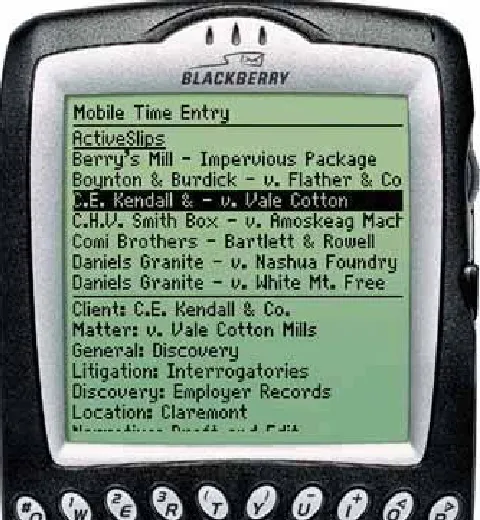
You also can make it easy for someone to start a process, stop in the middle, and come back to it later to pick up where he left offa property often called "reentrance." For instance, a lawyer may start entering information into a form on a PDA. Then when a client comes into the room, the lawyer has to turn off the PDA with the intent of coming back to finish the form later. The entered information shouldn't be lost.
To support reentrance, you can make dialog boxes remember
values typed previously (see Good Defaults in Chapter 7), and
they don't usually need to be modal; if they're not modal, a user can drag them aside on the screen for later use. Builder-style applicationstext editors, code development environments, and paint programscan let a user work on multiple projects at one time, thus letting the user put any number of projects aside while she works on another one.
Online surveys hosted by surveymonkey.com sometimes offer a button on each page of a survey that says, "I'll finish it later." This button closes the browser page, records the choices made up to that point, and lets the user come back to finish the
survey later.
5. deferred choices
"I don't want to answer that now; just let me finish!"
This follows from people's desire for instant gratification. If you ask a user several seemingly unnecessary questions while he's trying to get something done, he'd often rather skip the
questions and come back to them later.
For example, some web-based bulletin boards have long and complicated procedures for registering users. Screen names, email addresses, privacy preferences, avatars,
one little thing," says the user plaintively. Why not skip most of the questions, answer the bare minimum, and come back later (if ever) to fill in the rest? Otherwise he might be there for half an hour answering essay questions and finding the perfect avatar image.
Another example is creating a new project in Dreamweaver or other web site editors. There are some things you do have to decide up front, like the name of the project, but you can defer other choices easilywhere on the server are you going to put this when you're done? I don't know yet!
Sometimes it's just a matter of not wanting to answer the questions. At other times, the user may not have enough information to answer yet. What if a music-writing software package asked you up front for the title, key, and tempo of a new song, before you've even started writing it? (See Apple's GarageBand for this lovely bit of design.)
The implications for interface design are simple to understand, though not always easy to implement:
Don't accost the user with too many upfront choices in the first place.
On the forms that he does have to use, clearly mark the required fields, and don't make too many of them required. Let him move on without answering the optional ones.
Sometimes you can separate the few important questions or options from others that are less important. Present the
short list; hide the long list. See the Extras on Demand
pattern in Chapter 2.
keep in mind that prefilled answers still require the user to look at them, just in case they need to be changed. They have a small cost, too.
Make it possible for users to return to the deferred fields later, and make them accessible in obvious places. Some dialog boxes show the user a short statement such as "You can always change this later by clicking the Edit Project button." Some web sites store a user's half-finished form entries or other persistent data, like shopping carts with unpurchased items.
If registration is required at a web site that provides useful services, users may be far more likely to register if they're first allowed to experience the web sitedrawn in and
engagedand then asked later about who they are. In fact, TurboTax 2005 allows a user to work through an entire tax form before creating a username.
6. incremental construction
"Let me change this. That doesn't look right; let me change it again. That's better."
When people create things, they don't usually do it all at once. Even an expert doesn't start at the beginning, work through the creation process methodically, and come out with something perfect and finished at the end.
often incremental, done in a series of small changes instead of a few big ones. Sometimes it's top-down; sometimes it's
bottom-up.
Builder-style interfaces need to support that style of work. Make it easy to build small pieces one at a time. Keep the interface responsive to quick changes and saves. Feedback is critical: constantly show the user what the whole thing looks and behaves like while the user works. If you deal with code, simulations, or other executable things, make the "compile" part of the cycle as short as possible so the operational
feedback feels immediateleave little or no delay between the user making changes and seeing the results.
When good tools support creative activities, the activities can induce a state of "flow" in the user. This is a state of full
absorption in the activity, during which time distorts, other distractions fall away, and the person can remain engaged for hoursthe enjoyment of the activity is its own reward. Artists, athletes, and programmers all know this state.
Bad tools will keep someone distracted, guaranteed. If the user has to wait even half a minute to see the results of the
incremental change she just made, then her concentration is broken; flow is disrupted.
If you want to read more about flow, look at the books by Mihaly Csikszentmihalyi, who studied it for years.
7. habituation
"That gesture works everywhere else; why doesn't it work here, too?"
document, clicking the Back button to leave a web page,
pressing Return to close a modal dialog box, using gestures to show and hide windows, or even pressing a car's brake pedal. The user no longer needs to think consciously about these actions. They've become habitual.
This tendency certainly helps people become expert users of a tool (and it helps create a sense of flow, too). Habituation
measurably improves efficiency, as you can imagine. But it can also lay traps for the user. If a gesture becomes a habit and the user tries to use it in a situation when it doesn't workor, worse, does something destructivethen the user is caught short. He suddenly must think about the tool again (What did I just do? How do I do what I intended?), and he might have to undo any damage done by the gesture.
For instance, Control-X, Control-S is the "save this file" key sequence used by the emacs text editor. Control-A moves the text-entry cursor to the beginning of a line. These acts become habitual for emacs users. When a user types A, Control-X, Control-S at emacs, it performs a fairly innocuous pair of operations.
Now what happens when he types that same habituated sequence in Microsoft Word?
1. Control-A: select all
2. Control-X: cut the selection (the whole document, in this
case)
3. Control-S: save the document (whoops)
This is why consistency across applications is important!
Just as important, though, is consistency within an application. Some applications are evil because they establish an
special mode, where it suddenly does Action Y. Don't do that. It's a sure bet that users will make mistakes, and the more
experienced they arei.e., the more habituated they arethe more likely they are to make that mistake.
This is also why confirmation dialog boxes often don't work to protect a user against accidental changes. When modal dialog boxes pop up, the user can easily get rid of them just by
clicking "OK" or hitting Return (if the OK button is the default button). If dialogs pop up all the time when the user is making intended changes, such as deleting files, it becomes a
habituated response. Then when it actually matters, the dialog box doesn't have any effect, because it slips right under the user's consciousness.
I've seen at least one application that sets up the confirmation dialog box's buttons randomly from one invocation to another.
One actually has to read the buttons to figure out what to click!
This isn't necessarily the best way to do a confirmation dialog boxin fact, it's better to not have them at all under most
circumstancesbut at least this design sidesteps habituation creatively.
8. spatial memory
"I swear that button was here a minute ago. Where did it go?"
When people manipulate objects and documents, they often find them again later by remembering where they are, not what they're named.
groupings, for instance, or recall that "the document was at the top right over by such-and-such." (Naturally, there are real-world equivalents too. Many people's desks are "organized chaos," an apparent mess in which the office owner can find anything instantly. But heaven forbid that someone should clean it up for them.)
Many applications put their dialog buttonsOK, Cancel, etc.in predictable places, partly because spatial memory for them is so strong. In complex applications, people also may find things by remembering where they are relative to other things: tools on toolbars, objects in hierarchies, and so on. Therefore, you
should use patterns like Responsive Disclosure (Chapter 4)
carefully. Adding something to an interface doesn't usually cause problems, but rearranging existing controls can disrupt spatial memory and make things harder to find. It depends. Try it out on your users if you're not sure.
Along with habituation, which is closely related, spatial memory is another reason why consistency across and within
applications is good. People may expect to find similar functionality in similar places.
Spatial memory explains why it's good to provide user-arranged areas for storing documents and objects, like the
aforementioned desktops. Such things aren't always practical, especially with large numbers of objects, but it works quite well with small numbers. When people arrange things themselves, they're likely to remember where they put them. (Just don't
rearrange things for them unless they ask!) The Movable
Panels pattern in Chapter 4 describes one way to do this.
Also, this is why changing menus dynamically sometimes backfires. People get used to seeing certain items on the tops and bottoms of menus. Rearranging or compacting menu items "helpfully" can work against habituation and lead to user errors.
special locations, cognitively speaking. People notice and
remember them more than stuff in the middle of menus. They are the worst items to change out from under the user.
9. prospective memory
"I'm putting this here to remind myself to deal with it later."
Prospective memory is a well-known phenomenon in psychology that doesn't seem to have gained much traction yet in interface design. But I think it should.
We engage in prospective memory when we plan to do something in the future, and we arrange some way of
reminding ourselves to do it. For example, if you need to bring a book to work the next day, you might put it on a table beside the front door the night before. If you need to respond to
someone's email later (just not right now!), you might leave that email on your screen as a physical reminder. Or, if you tend to miss meetings, you might arrange for Outlook or your Palm to ring an alarm tone five minutes before each meeting.
Basically, this is something almost everyone does. It's part of how we cope with our complicated, highly scheduled,
multitasked lives: we use knowledge "in the world" to aid our own imperfect memories. We need to be able to do it well.
Some software does support prospective remembering. Outlook and PalmOS, as mentioned above, implement it directly and actively; they have calendars (as do many other software
systems), and they sound alarms. But what else can you use for prospective memory?
Windows left onscreen
Annotations put directly into documents (like "Finish me!")
Browser bookmarks, for web sites to be viewed later
Documents stored on the desktop, rather than in the usual places in the filesystem
Email kept in an inbox (and maybe flagged) instead of filed away
People use all kinds of artifacts to support passive prospective remembering. But notice that almost none of the techniques in
the list above were designed with that in mind! What they were
designed for is flexibilityand a laissez-faire attitude toward how users organize their information. A good email client lets you create folders with any names you want, and it doesn't care what you do with messages in your inbox. Text editors don't care what you type, or what giant bold magenta text means to you; code editors don't care that you have a "Finish this"
comment in a method header. Browsers don't know why you keep certain bookmarks around.
In many cases, that kind of hands-off flexibility is all you really need. Give people the tools to create their own reminder
systems. Just don't try to design a system that's too smart for its own good. For instance, don't assume that just because a window's been idle for a while, no one's using it and it should be closed. In general, don't "helpfully" clean up files or objects that the system may think are useless; someone may be
leaving them around for a reason. Also, don't organize or sort things automatically unless the user asks the system to do so.
As a designer, is there anything positive you can do for
and closes it temporarily, you could retain the data in it for the next timeit will help remind the user where she left off.
Similarly, many applications recall the last few objects or
documents they edited. You could offer bookmarks-like lists of "objects of interest"both past and futureand make that list easily available for reading and editing.
Here's a bigger challenge: if the user starts tasks and leaves them without finishing them, think about how to leave some artifacts around, other than open windows, that identify the unfinished tasks. Another one: how might a user gather
reminders from different sources (email, documents, calendars, etc.) into one place? Be creative!
10. streamlined repetition
"I have to repeat this how many times?"
In many kinds of applications, users sometimes find themselves having to perform the same operation over and over again. The easier it is for them, the better. If you can help reduce that
operation down to one keystroke or click per repetitionor, better, just a few keystrokes or clicks for all repetitionsthen you will spare users much tedium.
Find and Replace dialog boxes, often found in text editors
(Word, email composers, etc.), are one good adaptation to this behavior. In these dialog boxes, the user types the old phrase and the new phrase. Then it takes only one "Replace" button click per occurrence in the whole document. And that's only if the user wanted to see or veto each replacementif they're confident that they really should replace all occurrences, then they can click the "Replace All" button. One gesture does the whole job.
"actions" when you want to perform some arbitrary sequence of operations with a single click. If you want to resize, crop,
brighten, and save 20 images, you can record those four steps as they're done to the first image, and then click that action's "Play" button for each of the remaining 19.
See the Macros pattern in Chapter 5 for more information.
Scripting environments are even more general. Unix and its variants allow you to script anything you can type into a shell. You can recall and execute single commands, even long ones, with a Control-P and return. You can take any set of commands you issue to the command line, put them in a for-loop, and execute them by hitting the Return key once. Or you can put them in a shellscript (or in a for-loop in a shellscript!) and
execute them as a single command. Scripting is very powerful, and as it gets more complex, it becomes full-fledged
programming.
Other variants include copy-and-paste capability (preventing the need to retype the same thing in a million places), user-defined "shortcuts" to applications on operating-system
desktops (preventing the need to find those applications' directories in the filesystem), browser bookmarks (so users don't have to type URLs), and even keyboard shortcuts.
Direct observation of users can help you find out just what kinds of repetitive tasks you need to support. Users won't always tell you outright. They may not even be aware that they're doing repetitive things that they could streamline with the right toolsthey may have been doing it so long that they don't even notice anymore. By watching them work, you may see what they don't see.