v v v v v v v
v v
After reading this chapter, you should be able to:
Discuss the differences between enumerative and analytic studies.
Identify types of variables.
Distinguish types of data.
Construct graphical displays.
Calculate numerical summaries of data distributions.
Discuss the concept of a linear transformation.
Describe a normal distribution, including the standard normal
distribution, and find areas under any normal curve.
2.1
INTRODUCTION
DescribingPatternsinData
In Chapter 1, we stated that numerical information ( data ) is often required for gaining new knowledge, effectively im-proving business processes, and, in general, making better decisions. We also suggested that some amount of variability in the data is unavoidable even though measurements are made under identical or very nearly identical conditions. This chapter is concerned with methods for describing and summarizing data to highlight any important features or patterns they may contain. The goal is to make the information in data obvious. Because there are several types of data, a particular procedure for displaying and summarizing one kind of data may not be
H A P T E R
W O
H A P T E R
W O
C
T
2.2
ENUMERATIVE VERSUS ANALYTIC STUDIES
p
exploratory data analysis.
enumerative study,
Frame:
beyond
p
A distinction emphasized by Dr. Deming and others.
appropriate for another. However, there are general categories of methods that work, to a greater or lesser extent, for everything. These categories include tables, plots, and numerical summaries. The practice of examining data with a collection of relatively simple tables, plots, and numbers is called
We said in Chapter 1 that the population often represents the target of the numerical inquiry, although the population may be difficult to define or simply unavailable for study. In general, however, we learn about the population by sampling from it.
To illustrate situations where defining the appropriate population is difficult and generalizations the sample observations must be carefully interpreted, we must distinguish between enumerative and analytic studies.
In an interest centers on the identifiable, unchanging, gen-erally finite collection of units from which the sample was selected. For example, we may be interested in the 1996 per capita cost of health care for all U.S. companies with at least 100 employees. To get some idea of what the average 1996 per capita cost might be, a sample of these firms is selected and health care costs determined. The per capita costs for the units ( firms ) in the sample are the sample observations. The per capita costs for the entire collection of units ( firms ) are the population observations. The population numbers include the sample numbers and, if time and resources allow, a complete enumeration of the population is possible.
A list, or similar mechanism, for identifying the entire set of relevant sampling units is called a frame.
A list of the entire set of relevant sampling units
In the example on health care cost, a frame is a list of all U.S. firms with at least 100 employees as of December 31, 1996. Enumerative investigations are typically concerned with making generalizations ( inferences ) from the sample data to the complete collection of units in the frame. Along these lines, enumerative studies have two distinguishing characteristics. First, the frame ( entire collection of units ) does not change. This ordinarily means that enumerative studies pertain to an environment existing at a particular point in time. Second, a 100% sample of the frame provides the complete answer to the question posed.
analytic study
predict
before
exit poll
Product acceptance sampling is another good example of an enumerative study. A shipment of parts from a supplier is accepted or rejected depending on the number of defective parts in a sample of parts from the shipment. The frame is the aggregate collection of parts in the shipment, say, a truckload, and interest centers on the number of defective parts in the truckload.
An is a study that is not enumerative. Analytic studies generally take place over time and are concerned with processes or cause-and-effect systems. The most effective analytic studies involve a plan for collecting the data. The objective is to improve future practices or products. Analytic studies often involve comparisons. Will this material or that material lead to more durable products? Will this method of training or that method of training lead to more productive employees? Will this type of service or that type of service lead to a higher retention of customers?
In analytic studies, we are interested in drawing conclusions about a process or product that often does not exist at the beginning of the study. We are no longer dealing with a collection of identifiable units and, consequently, there is no relevant frame ( population ) from which to sample. Instead, we are typically dealing with observations derived from a current process or product, and we must what will happen at some future time if, for example, certain actions are taken.
Consider a public opinion poll of registered voters held an election. If interest centers on the proportion of people voting for, say, the Republican candidate on election day, the pre-election-day poll is an analytic study. Even a 100% sample of the registered vot-ers will not allow us to predict the outcome of the election with certainty. Between the time of the poll and election day, some voters will change their minds, additional eligible people may register, some voters will not vote for one reason or another, and these “stay-at-homes” may well differ in their voting preferences from those who do vote. We want to draw con-clusions about a future process ( election-day voting ) from information on a current process ( pre-election voting indications ) that might be quite different. However, an to de-terminetheproportionofvoterswhohavevotedforaparticularcandidateisanenumerative study, since a 100% sample provides perfect information ( provided all voters tell the truth ). New products are frequently test-marketed before full-scale production occurs. Consumer responses to a prototype product are used to fine-tune the product before full production or, perhaps, to abandon it altogether. Full evaluation of all test-marketed products still may not tell us about the process of interest—the process associated with producing the final product. Studies involving prototypes or trial products are analytic. The vast majority of numerical studies in business are analytic and we have to be careful about making statements or taking actions based on observations from current processes. If a process is stable and unchanging ( in a state of “statistical control” ) and remains so, current data may be used to reach conclusions about future performance of the process. However, the validity of extrapolating from current conditions should always be thoroughly examined. Enumerative studies, too, must be conducted with care. The validity of inferences from enumerative studies depends, in part, on how well the frame represents the target population.
2.3
VARIABLES AND DATA
. . .
data
variables.
Quantitative variable: Qualitative variable:
Nominal data:
Ordinal data:
data
, , ,
We have used the term to mean numbers or measurements obtained from sampling units. In the previous chapter, sampling units included Wednesdays in January, engines, and time intervals. More formally, are numbers that represent particular characteristics of sampling units. The characteristics themselves are called Income is a variable and, if you are a sampling unit, your particular income is a measurement or data. Gender is a variable and, if you are a sampling unit, your gender is data.
The previous examples indicate that variables are of two types:
A variable that is naturally numerical, such as income A variable whose values are categories, such as gender
The values of a quantitative variable fall on some scale of measurement. Qualitative variables are somewhat different. The variables “gender,” “employment status,” and “Moody’s bond rating” are not naturally numerical. The “values” for these variables are categories such as male female, employed unemployed, and Aaa Aa C, re-spectively. We can make variables like these numerical by assigning numbers to the categories, and sometimes it is convenient to do so.
The numbers assigned to distinguish the separate categories of a qualitative variable
The number 1 assigned to “male” and the number 2 assigned to “female” are nominal data. Sometimes, however, it is useful to retain the original verbal descriptions of the categories.
If the outcomes for qualitative variables are ordered, that is, if there is an implied hierarchy of categories, an increasing ( or decreasing ) set of numbers can be assigned to represent the ordered categories.
An increasing ( or decreasing ) set of numbers assigned to the ordered categories of a qualitative variable
For example, Moody’s has nine categories of bond ratings ranging from C ( ex-tremely poor in investment quality ) to Aaa ( a “gilt-edge” security ). We might code these categories using the integers 1 through 9 with category C assigned the number 1 and category Aaa assigned the number 9. The increasing order of the integers matches the increasing order—from worst ( extremely risky ) to best ( virtually no risk ) — of the
. . .
Binary coding:
Discrete variable:
4
4
4
` ` ` ` 4
4
proportion .
, , ,
bond categories. A group of 10 bonds might yield the data 4, 9, 9, 5, 6, 8, 2, 7, 7, 6, where the numbers correspond to the Moody’s ratings.
The magnitudes of the numbers we have assigned have meaning: 7 is a better ( less risky ) bond than 6 because 7 is larger than 6. But arithmetic operations performed on these numbers have no meaning, since there is no well-defined origin and no natural unit of measurement. For example, we can compute the difference 9 8 1, but we cannot say that this is the difference between Aaa bonds and Aa bonds. We could just as well have assigned the number 20 to Aaa bonds, 15 to Aa bonds, and so forth. In this case, the implied difference between the two highest-rated bond groups is 5. The differences ( or sums or products or ratios ) could be anything we want them to be, because there is no natural ( unique ) choice for an increasing set of numbers to represent the bond categories.
For a qualitative variable with two unordered categories, it is often helpful to assign the number 0 to one category and the number 1 to the other. With employment status, we might make the assignment
employed 1 unemployed 0
and, if several people were involved, the data would consist of a sequence of 0’s and 1’s, where a single digit corresponds to a specific person.
Assigning 0 and 1 to the only two unordered categories of a qualitative variable
Using binary coding, a group of five people, three of them employed, could yield the data 0, 1, 1, 0, 1. For binary coding, summing the data gives the count in the category designated by 1. There are 0 1 1 0 1 3 people employed in our group of five. Dividing the sum by the total number of items gives the
of items in the 1 category. For our five people, a proportion 60 are employed. Because of the interpretation of these specific arithmetic operations, binary, or 0 – 1, coding is useful.
Closer scrutiny of quantitative variables reveals two distinct types. American shoe sizes, such as 7 7 8 , proceed in steps of . Stock prices are expressed in steps of ’s of a dollar. Counts such as number of directors or vote tallies are, of course, integers.
A quantitative variable whose values are distinct numbers with gaps between them
Shoe size, stock price, number of directors, and vote tally are examples of discrete variables.
3 5
1 1
2 2
1 8
Continuous variable:
2.1
2.2
On the other hand, there are quantitative variables whose values can, in principle, take any value in an interval.
A quantitative variable whose value can be any value in an interval
To a reasonable approximation, net income, time to equipment failure, total sales, and weight are examples of continuous variables. In these cases, the measurement scale does not have any gaps. Ideally, any value along a continuum is possible.
A truly continuous scale of measurement is an idealization. In practice, continuous measurements are always rounded either for the sake of simplicity or because the measuring device has a limited accuracy. However, even though weight may be recorded to the nearest pound or time to failure to the nearest minute, their actual values occur on a continuous scale so the data are referred to as continuous. Variables that are inherently discrete are treated as such, provided they take relatively few distinct values. When the values for a discrete variable span a wide range, however, they may be treated as continuous. The number of shares ( volume ) of stock traded per day is a discrete variable, but daily volume data may, for practical purposes, be viewed as continuous.
The point to keep in mind is that, regardless of whether the variables ( char-acteristics of interest ) are naturally numerical, ultimately we will be dealing with numbers.
Classify the following as enumerative or analytic studies. Justify your choice. a. A telephone company wishes to estimate the proportion of all telephones in
a city that are working at a given time.
b. An airport executive wants to know the number of on-time arrivals at a municipal airport yesterday.
c. A construction company executive wants to estimate the amount of supervi-sory time for each worker-day of time allocated to its jobs.
d. During the summer, a university administration wants to estimate the number of admitted freshmen who will attend school in the fall.
Classify the following as enumerative or analytic studies. Justify your choice. a. A rating service wishes to estimate the number of households in the United
States watching a particular Monday night television program.
b. A company wants to determine the number of defective golf balls in a recently produced batch.
c. A consumer products company wants to know whether increasing advertising expenditures will lead to increased sales of an item.
d. A mail order firm wants to estimate the time it takes to ship the goods once an order is received.
4 4
4 4
2.4
GRAPHICAL DISPLAYS OF DATA DISTRIBUTIONS
2.32.4
2.5
2.6
2.7
frequency distribution.
4
n
x
x
Refer to Exercise 2.1. For each of the studies, define the variable ( characteristic ) of interest. Indicate whether the variable is quantitative or qualitative. If the variable is quantitative, indicate whether it is discrete or continuous.
Refer to Exercise 2.2. For each of the studies, define the variable ( characteristic ) of interest. Indicate whether the variable is quantitative or qualitative. If the variable is quantitative, indicate whether it is discrete or continuous.
Consider the collection of students in the class.
a. Describe two enumerative studies for which the students in the class may be regarded as a sample from a larger population.
b. Describe two enumerative studies for which the students in the class may be regarded as the population. Suggest a frame for this population.
A sample of 15 people were asked whether they favored or opposed a new system of high-speed rail transportation. The responses were coded as follows: favored 1, opposed 0. The data are
1 0 0 0 1 1 1 1 0 0 1 0 0 0 0 a. Sum these numbers and interpret the result.
b. Calculate the sample mean, , and interpret this quantity for 0 – 1, or binary coded, data.
A sample of ten recent graduates in accounting were asked about job satisfaction. The responses were coded as follows: satisfied 1, not satisfied 0. The data are
1 0 1 1 0 0 1 1 1 1 a. Sum these numbers and interpret the result.
b. Calculate the sample mean, , and interpret this quantity for 0 – 1, or binary coded, data.
Recall the sendouts of gas on Wednesdays in January discussed in Example 1.6 or the monthly inventory levels of diesel engines introduced in Example 1.8. These examples illustrate that repeated measurements of a given variable are different. The measurements vary. When the data set is very small, the differences are readily apparent. We can immediately see, for example, whether all the numbers are close together or whether one number is considerably smaller than all the rest. With moderate to large data sets, however, the pattern of variability is generally not evident. Until the data are organized in some meaningful fashion, it is often not clear what the data are telling us. Organizing the data graphically is a necessary first step to understanding the information contained in them. Graphical displays can provide an immediate interpretation not visible in the raw numbers.
500 1000 1500 2000 Inventory
Figure 2.1 dot diagram
stem-and-leaf diagram. Solution and Discussion.
Dot Diagram for Inventory Levels
DOT DIAGRAM
EXAMPLE 2.1
Constructing a Dot Diagram
STEM-AND-LEAF DIAGRAM
We have already seen an example of a in Figure 1.10. This figure showed the frequencies of the mail arrival times for a department in a computer manufacturing company. For relatively small data sets that contain either discrete or ( rounded ) continuous measurements, a dot diagram provides a useful display of the variability. To create a dot diagram, draw a line with a scale covering the range of values of the measurements, and then plot the individual measurements above the line as prominent dots.
The monthly inventory levels for diesel engines ( in thousands of dollars ) were given in Table 1.4 ( see Example 1.8 ). Construct a dot diagram for these data.
The dot diagram, constructed with the help of a computer program, is given in Figure 2.1. The dot diagram indicates that most of the monthly inventories cluster around the 1000 ( $1,000,000 ) level, with a few levels above 1500 and none below 500. The dot diagram shows the pattern of the variation in these data — a pattern that is not obvious from examining the rows of numbers in Table 1.4.
The dot diagram is the simplest way to display data. However, for moderate to large data sets, it is sometimes difficult to determine the actual numerical values from the scale beneath the dots. The dots blend together, or nearly identical data get rounded and plotted as the same numbers. Other graphical displays can be constructed that picture the frequency distribution and convey information about the magnitudes of the numbers themselves.
A view of a frequency distribution that features the actual numerical values in the display is provided by a Stem-and-leaf diagrams work best for small- to moderate-size data sets where the measurements are all positive two- or three-digit numbers.
2 2
3 0566799 4 445 5 6 7 8
9 6 Figure 2.2
Solution and Discussion.
Stem-and-Leaf Diagram for R&D Expenditures
. . . . . . . . . . . .
EXAMPLE 2.2
Constructing a Stem-and-Leaf Diagram
for a Small Data Set
u
u
u u
digits are the leaves, and the arrangement of the leaves on the stems provides a pictorial representation of the distribution.
Consider the R&D expenditures for the twelve largest automakers given in Exercise 1.37. Create a stem-and-leaf diagram for these data.
The R&D expenditures as a percentage of sales are reproduced here:
4 4 3 6 4 4 3 7 9 6 3 9 3 6 3 5 3 0 4 5 3 9 2 2
We represent 2.2, for example, as 2 2, where the first digit is the stem and the second digit is the leaf. The numbers 3.0 and 3.5 become 3 05, where 0 and 5 are the leaves attached to the same stem, 3. Continuing in this way we obtain the stem-and-leaf diagram in Figure 2.2.
In summary, the integers 2, 3, . . . , 9 in the first column are the stems. ( The column of stem digits is often called the stem for convenience. ) The integers in the horizontal lines coming from the stems are the leaves. Each leaf digit corresponds to a number. Since the leaf digits, for this data set, are in tenths, we say the leaf unit is .10. The first line in the stem-and-leaf diagram, 2 2, indicates a value of 2.2 for the smallest number in the data set.
The second line, 3 0566799, indicates that there are seven numbers with the stem, or first digit, 3, and with the leaf unit .10; the seven numbers are 3.0, 3.5, 3.6, 3.6, 3.7, 3.9, and 3.9. There are no numbers in the data set with the stems ( first digits ) 5 through 8, because there are no leaves attached to these stems. The final and largest R&D expenditure is 9.6.
p
Solution and Discussion.
National 800-Meter-Dash Records for Women
p
OURCE
EXAMPLE 2.3
A Computer-Generated Stem-and-Leaf Diagram
for a Large Data Set
2.15 2.01 2.05 2.24 2.02 2.00 2.00 1.89
2.30 2.19 2.00 2.05 2.10 1.93 2.19 2.11
2.28 2.12 2.03 1.99 2.18 2.09 1.96 2.07
2.07 1.99 2.22 2.02 2.00 2.24 2.08 1.97
1.92 1.89 2.04 2.10 1.96 2.15 1.98 2.09
1.98 2.10 2.02 2.03 2.03 2.05 2.15 2.33
2.21 2.27 2.16 2.10 2.20 1.95 1.95
S : IAAF-ATFS Track and Field Statistics Handbook for the 1984 Los Angeles Olympics. u
When the stem-and-leaf diagram in Figure 2.2 is turned on its side with the stem as a horizontal axis, we get a view of the pattern of variation.
In this case, the distribution is characterized by a mound of values ( leaves ) on the left that tail off to the one relatively large value at the right. The display is informative because, in addition to giving us a picture of the variation, every R&D number can be reconstructed exactly from the stem and corresponding leaf integers.
Stem-and-leaf diagrams are extremely versatile displays. A stem-and-leaf display involving a larger data set of three-digit numbers is given in Example 2.3. Other examples and variants of the stem-and-leaf diagram are considered in the exercises. Of particular interest is the use of back-to-back stem-and-leaf diagrams to compare two distributions. The distributions of the ratio ( current assets ) ( current liabilities ) for bankrupt and nonbankrupt firms are examined in Exercise 2.12 using back-to-back stem-and-leaf diagrams with a common stem.
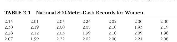
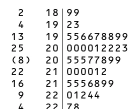
In Table 2.1, the national 800-meter-dash records for women are listed for 55 countries. The times are recorded in minutes. Construct a stem-and-leaf diagram for these data.
The stem-and-leaf diagram is shown in Figure 2.3. This diagram was produced by Minitab. There are several things to notice about the display in Figure 2.3. Since we are dealing with three-digit numbers, the stem consists of two-digit numbers with, as usual, single-digit leaves. Second, some of the stem num-bers, for example, 20, are repeated. Third, the leaf unit is .01, so when an individual value is reconstructed from the diagram, the decimal point falls between the two stem digits; that is, the first line in the figure, 18 99, corresponds to the values 1.89, 1.89.
[image:11.612.124.496.433.522.2]/
TABLE 2.1
22 30566799
4
445
2 18 99
4 19 23
13 19 556678899
25 20 000012223334
(8) 20 55577899
22 21 000012
16 21 5556899
9 22 01244
4 22 78
2 23 03 Figure 2.3 Stem-and-Leaf Diagram for 800-Meter Data
Finally, the first column of cumulative frequencies, which the software adds to the traditional stem-and-leaf picture, counts the cumulative number of values in the stem categories. The frequencies are added from each end of the distribution until the “middle” category, indicated here with a parenthetical frequency of 8, is reached. So, for example, there are 25 values less than or equal to 2.04, and 9 values greater than or equal to 2.20.
With a fairly large data set, the number of leaves attached to a stem may be large, and, because the stem categories are always defined by one- or two-digit integers, the stem-and-leaf diagram may not be particularly informative. When this occurs, a given stem category may be repeated, with the leaf digits 0 through 4 associated with the first occurrence of the category, and the leaf digits 5 through 9 associated with the second occurrence. This was the case with stem categories 19, 20, 21, and 22 above. Ordinarily, a stem category is not repeated more than once.
Turning the stem-and-leaf diagram on its side, we see that the pattern of variation in the 800-meter times tends to fan out to the right.
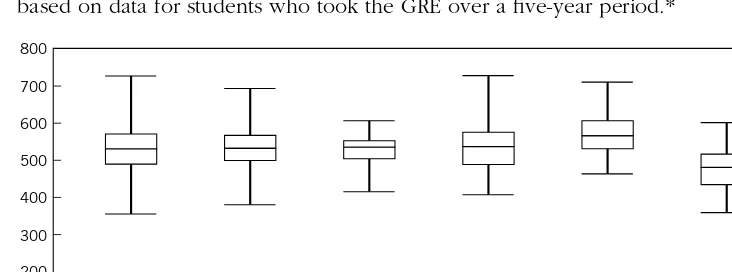
The smallest value is 1.89 and the largest value is 2.33, a range of .44 minute. However, most of the times cluster around 1.95 to 2.12, a fairly narrow range of .17 minute; that is, the bulk of the distribution is closer to the minimum, 1.89, than it is to the maximum, 2.33. Distributions that have this property are said to have a long right-hand tail or to be skewed to the right. As you might expect, nations with highly developed track and field programs, like the United States, the former Soviet Union, and the former German Democratic Republic, have the fastest times, and these times are nearly the same. Countries with less developed programs have times that are slower and more varied.
18
99
19
23
19
556678899
20
000012223334
20
55577899
21
000012
21
5556899
22
01244
22
78
23
[image:12.612.157.286.70.179.2]class
intervals class boundaries class limits.
histogram.
4
We shall adopt the convention of putting observations that fall exactly on the right-hand boundary (larger class limit) into the next interval.
HISTOGRAMS
EXAMPLE 2.4
Constructing a Histogram for the 800-Meter Data
Since stem-and-leaf diagrams use, at most, only the first few digits of the numbers they represent, some information may be lost when constructing these diagrams from numbers with more than three digits. In these cases, the remaining digits are simply ignored or truncated. For moderate to large data sets, a better graphical representation of variability is provided by histograms.
As we have mentioned, constructing a dot diagram for a large data set can be tedious, and overcrowding of the dots can destroy the clarity of the diagram. Stem-and-leaf diagrams display actual numerical values, but they too can be awkward and difficult to interpret for large data sets. In such cases, it is often convenient to group the observations according to intervals and, for each interval, to record the frequency or
Frequency Relative frequency
Total number of values of values falling in the interval.
Ordinarily, the intervals are equal, consecutive, and cover the range of the data. However, the intervals may be unequal and even open-ended. In this sense, the data categories are more flexible than those of a stem-and-leaf plot. The frequency distribution is given by listing the intervals and their associated frequencies or relative frequencies. In this format, the intervals of the frequency distribution are called
and their endpoints are called or
In this way, the numbers represented by a class interval include the left-hand endpoint but not the right-hand endpoint. If the data are discrete, the class intervals may be centered on the individual values with widths extending halfway to the observations on each side.
A display of a frequency distribution using a series of vertical bars with heights proportional to the frequencies or relative frequencies is called a
The number and positions of the class intervals of a frequency distribution are somewhat arbitrary. The number of classes usually ranges from 5 to 15, depending on the size of the data set. With too few intervals, much of the information con-cerning the distribution of the observations within individual intervals is lost, since only frequencies are recorded. With too many intervals and particularly with small data sets, the frequencies from one cell to the next can jump up and down in a chaotic manner, and no clear pattern is evident. It is best to begin with a relatively large number of intervals, combining intervals until a smooth pattern emerges. In other words, constructing a frequency distribution ( and the histogram ) requires some judgment.
1.90
3 6 12 9 9 4 6 3 2 1 2.00 2.10 2.20 2.30
Count
Relative frequency
Frequency
0 .10
0 5 10 .20
[image:14.612.155.373.98.272.2]Time (sec.)
Figure 2.4
3 55
6 55 12 55 9 55
9 55
4 55
6 55
3 55
2 55
1 55
a
Solution and Discussion.
Histogram for 800-Meter Data
.
. . . . .
. . . .
.
4
4 4 4 4 4 4 4 4 4
Frequency Distributions for
800-Meter Data
a
Class Interval Frequency Relative Frequency
[ 1.875 – 1.925 ) 3 055
[ 1.925 – 1.975 ) 6 109
[ 1.975 – 2.025 ) 12 218
[ 2.025 – 2.075 ) 9 164
[ 2.075 – 2.125 ) 9 164
[ 2.125 – 2.175 ) 4 073
[ 2.175 – 2.225 ) 6 109
[ 2.225 – 2.275 ) 3 055
[ 2.275 – 2.325 ) 2 036
[ 2.325 – 2.375 ) 1 018
Total 55 1 001
This entry is 1.000 within rounding error.
Making use of two vertical axes, we can display both the frequency distribution and the relative frequency distribution in the same figure as a single histogram. The histogram for the 800-meter data is pictured in Figure 2.4. The heights of the bars in the figure are the frequencies or relative frequencies ( see the axes at the left and right of the figure ), and the widths of the bars are the class interval widths.
[image:14.612.156.333.478.656.2]The bulk of the distribution, represented by the highest bars, is to the left. Since the distribution falls off to the right from its left-hand peak, it is skewed to the right—a description of the variation that is consistent with the stem-and-leaf diagram in Figure 2.3. The histogram, in this case, gives a clearer picture of the distribution of women’s 800-meter records than the stem-and-leaf diagram. This usually happens for large data sets. On the other hand, the individual values cannot be determined from the frequency distribution ( or the histogram ).
. . .
p
symmetric skewed
, , , ,
Journal of Finance,
p
EXAMPLE 2.5
Using a Histogram to Convey Important Stock Market
Information
Christie, W. B., and Schultz, P. H., “Why do NASDAQ market makers avoid odd-eighth quotes?” XLIX, No. 5, 1994, pp. 1813 – 1840.
Again we see that most of the national 800-meter times are within about .2 minute ( 12 seconds ) of one another, and these are the countries with the fastest times. There is more separation among the relatively few countries with 800-meter times that are slower.
Histograms are versatile data displays. With a little experimentation, they can provide clear representations of variability. A quick glance at a histogram will give the location and general shape of the data pattern. The pattern can be described as or ( single long tail ). A pattern is symmetric if the pattern of variability on one side of a vertical line through the center is a mirror image of the pattern on the other side. A pattern is skewed if much of the distribution is concentrated near one end of the range of possible values—that is, if one tail extends farther from the center than the other. Patterns of data that were skewed to the right were exhibited in Examples 2.2 and 2.3. In these examples, the bulk of the data was on the left and, consequently, the right-hand tails ( higher values ) were much longer than the left-hand tails ( lower values ). Distributions with ( relatively ) long left-hand tails are said to be skewed to the left.
The number of peaks in a histogram is also of interest because two distinct peaks, even if one is lower than the other, may indicate two groups of numbers that are different from one another in some fundamental way. For example, the histogram in Figure 2.4 has two peaks, although one is considerably smaller than the other. The second peak occurs at an 800-meter time of about 2.2 minutes. The first peak at about 2 minutes is associated with national record 800-meter times for large developed countries. Countries with national record times near the second peak are small and less developed.
A relatively simple display like a histogram can provide a considerable amount of useful information, as the next example illustrates.
Dealers who are market makers on the NASDAQ exchange give bid and asked prices on securities. The quotes are given in dollars and eighths of dollars. With competition among several hundred dealers, we expect each of the fractions of dollars,
, to occur about equally often.
Two investigators collected all bid and asked prices for 100 of the most actively traded stocks on the NASDAQ for 1991. The distribution of inside bid and asked quotes is summarized by the histogram shown in Figure 2.5. The percentage along the vertical axis is an average of the frequencies at the bid and asked prices, computed using all inside quotes for all 100 stocks throughout 1991. Interpret this histogram.
0 1 2 7
0 .125 .25 .375 .5 .625 .75 .875
Percent of inside quotes
0 5 10 15 20 25
Price fraction of inside quotes
p
Figure 2.5
Solution and Discussion.
The Distribution of Price Fractions for Inside Quotes of 100 NASDAQ Securities, 1991
p
OURCE
EXAMPLE 2.6
Using Histograms to Compare Two Data Distributions
S : Data courtesy of SONOCO Products, Inc. The complete data set is contained in Table 6, Appendix C.
We expected a flat or uniform pattern, suggesting that all eighths are “equally likely.” Instead, the histogram is a comb pattern. There are very few odd price quotes — many fewer than would be expected if prices were set in a competitive manner. If dealers agreed to avoid odd-eighth quotes, then the bid – asked spread would always be at least dollar or 25 cents. Maintaining a bid – asked spread of this nature imposes a real cost on investors.
A histogram showing price fractions for 100 similar securities traded on the NYSE AMEX exchanges is essentially flat, with all eighths represented equally. The presentation in the national press of the data shown in Figure 2.5, which suggests but does not prove collusion among NASDAQ dealers, led to almost immediate changes in the nature of bid – asked quotes for heavily traded issues. Here the message from the data is clearly and forcefully given by the histogram.
Like stem-and-leaf diagrams, histograms with a common set of equal class intervals can be used to compare two distributions. The best way to do this is to plot the his-tograms back-to-back along a common scale. We explore this possibility in Example 2.6.
Paper is manufactured in continuous sheets several feet wide. Because of the orien-tation of fibers within the paper, it has a different strength when measured in the direction produced by the machine ( machine direction ) than when measured across, or at right angles to, the machine direction. The latter direction is called the cross direc-tion. Several plies of paper are used to produce cardboard and, as part of the cardboard manufacturing process, the strengths of samples of the various plies of paper are mea-sured. The histograms in Figure 2.6 show the patterns of the measurements for strength in the machine direction and strength in the cross direction for 41 pieces of paper.
/
0 2 4 6 8 110
100 120 130 140
New paper Old paper
4 3 2 1 0
0 2 4 6 8
100 110 120 130 140
Machine direction
0 5 10 15
50 60 70 80
[image:17.612.121.497.74.189.2]Cross direction
[image:17.612.128.483.346.466.2]Figure 2.6
Figure 2.7
density histogram. Solution and Discussion.
Histograms of Strengths in the Machine Direction and Cross Direction
Back-to-back Histograms of Machine Direction Strengths
There are two clear peaks in the histogram of cross direction strengths—one at about 52 and the other at about 72. Eleven of the pieces of paper were relatively old. The remaining 30 pieces of paper were new at the time the measurements were made. Construct back-to-back histograms of strength in the machine direction for the old and new paper.
Figure 2.7 displays the histograms of the machine di-rection strengths for the old paper and new paper in a back-to-back format with a common set of class intervals. It is clear from this figure that, in general, the new paper is stronger in the machine direction than the old paper.
The differences in strengths in the machine direction for the old and new paper are “hidden” in the histogram in Figure 2.6. However, two peaks in machine direction strengths are evident if the histogram is constructed with narrower class intervals ( see Exercise 2.14 ).
Once the reason for the distinct peaks in the histogram of cross direction strengths ( age of paper ) was identified, the strengths in the machine direction were examined for the same characteristic. In this example, the two groups of machine direction strengths were then compared using back-to-back histograms.
p
4
4 4
density measures the concentration of observations per unit of interval width.
Wall Street Journal
Wall Street Journal.
p
EXAMPLE 2.7
Constructing a Density Histogram
The relative frequency distributions in Table 2.3 differ slightly from the ones in the However, the minor changes that we made do not change the results appreciably.
( height width ) equal to the relative frequency. The adjusted height is called the density. Densities are determined from the relative frequency distribution using the definition
Relative frequency Density
Interval width and, consequently,
Relative frequency Class interval width Density Area
In fact, this is how we scaled the two histograms in Figure 2.7 because the sample sizes, 11 and 30, were unequal.
We see that
Consequently, for two class intervals of equal widths and the same relative frequencies, the densities will necessarily be the same. For two class intervals of different widths, the same relative frequencies lead to different densities because the two intervals will have different proportions of observations per amount of interval width.
Comparing relative frequency distributions spread out over a set of unequal class intervals is difficult, because relative frequency calculations are influenced by class interval widths. How do we compare two identical relative frequencies when they are associated with two class intervals of considerably different widths? The scaling caused by using areas to represent relative frequencies allows an unambiguous comparison because the sum of the areas of the bars of any density histogram is always 1.00 by construction. The next example illustrates this point.
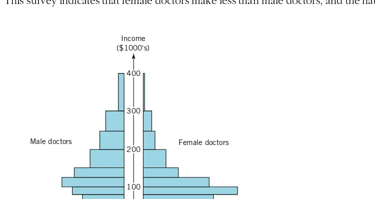
An article in the November 25, 1992, discussed the differences in earnings for male and female doctors. The article pointed out that, although one-third of the residents and 40% of the medical students in America were female, female doctors in private practice earned considerably less than their male counterparts. This income disparity occurred even in specialties in which women were heavily concentrated.
To indicate the magnitude of the differences, two relative frequency histograms ( one for males, one for females ) of income were displayed. The relative frequency distributions, based on a survey of 17,000 group-practice doctors, are shown in Table 2.3 ( page 52 ) along with the density distributions created by dividing the relative frequencies by the corresponding class interval widths.
Looking at the relative frequency distributions, we see, for example, that the largest relative frequency for male doctors occurs for the 1991 income category $150,000 to $200,000, whereas the largest relative frequency for female doctors is associated with the categories $0 to $60,000 and $80,000 to $100,000. Generally speaking, female
3
100 80 60 40 20 20 40 60 80 100 Density × 10,000
Male doctors Female doctors
Income ($1000's)
100 200 300 400
Figure 2.8 Solution and Discussion.
Density His-tograms of 1991 Incomes for Male and Female Doctors
Distributions of 1991 Income for Male and Female Doctors
Male Female
Relative Relative
Income ( $1,000’s ) frequency Density frequency Density
[ 0, 60 ) .0737 .0012 .1919 .0032
[ 60, 80 ) .0842 .0042 .1414 .0071
[ 80, 100 ) .1053 .0053 .1919 .0096
[ 100, 125 ) .1579 .0063 .1616 .0065
[ 125, 150 ) .1263 .0051 .0909 .0036
[ 150, 200 ) .1684 .0034 .1111 .0022
[ 200, 250 ) .1263 .0025 .0606 .0012
[ 250, 300 ) .0947 .0019 .0404 .0008
[ 300, 400 ) .0632 .0006 .0101 .0001
Total 1.0000 1.0000
doctors appear to make less than male doctors, since the largest relative frequencies for women are associated with the lower income categories, and the largest relative frequencies for men are associated with the middle income categories. But direct comparisons using relative frequencies are difficult in this case because the interval widths are different. Instead, compare the distributions of income with back-to-back density histograms.
[image:19.612.129.504.463.662.2]2.8
2.9
2.10
Gasoline Diesel
. . . . . . . . . . . .
Minitab or similar program recommended
16.44 7.19 8.50 7.42
9.92 4.24 10.28 10.16
11.20 14.25 12.79 9.60
13.50 13.32 6.47 11.35
29.11 12.68 9.15 9.70
7.51 9.90 9.77 11.61
10.25 11.11 9.09 8.53
12.17 10.24 8.29 15.90
10.18 8.88 11.94 9.54
12.34 8.51 10.43 10.87
26.16 12.95 7.13 11.88
16.93 14.70 12.03
10.32 8.98
9.70 12.72
9.49 8.22
13.70 8.21
15.86 9.18
12.49 17.32
FuelCost.dat
the discrepancy is evident. Incomes of females are more tightly concentrated ( less variable ) than those of males, and this concentration occurs at the lower end ( relative to male incomes ) of the income scale.
The graphical displays described in this section are extremely useful ways of looking at data. Modern computer software makes them easy to implement. Carefully constructed pictures provide an immediate impression of the general features of a data set and often suggest avenues for further study. Plots, charts, and graphs are key elements of exploratory data analysis.
The R&D expenditure numbers discussed in Example 2.2 are given here: 4 4 3 6 4 4 3 7 9 6 3 9 3 6 3 5 3 0 4 5 3 9 2 2 a. Construct a dot diagram.
b. Is the dot diagram consistent with the stem-and-leaf diagram in Figure 2.2? Discuss.
What, if anything, is wrong with the following choices of intervals for construct-ing a frequency distribution for data that run from 0 to 99?
a. [ 0, 25 ), [ 25, 50 ), and [ 55, 100 )
b. [ 0, 20 ), [ 20, 40 ), [ 40, 80 ), and [ 75, 100 )
( ) In the first phase of a study of the
cost of transporting milk from farms to dairy plants, a survey was taken of firms engaged in milk transportation. One of the variables measured was fuel cost. The fuel costs on a per-mile basis for 36 gasoline trucks and 23 diesel trucks are given here ( data courtesy of M. Keaton ).
4
b
b c,
a?
2.11
a
a b,
c
2.12
Bankrupt Nonbankrupt
Minitab or similar program recommended
1.09 1.51 2.49 2.01
1.01 1.45 3.27 2.25
1.56 .71 4.24 4.45
1.50 1.37 2.52 2.05
1.37 1.42 2.35 1.80
.33 1.31 2.17 2.50
2.15 1.19 .46 2.61
1.88 1.99 2.23 2.31
1.51 1.68 1.84 2.33
1.26 1.14 3.01 1.24
1.27 4.29 1.99
2.92 2.45
5.06
Bankrupt.dat
a. Construct a dot diagram of the fuel costs for gasoline trucks. Construct a separate dot diagram of the fuel costs for diesel trucks using the same scale as that for gasoline trucks. Comment on the differences ( if any ) between the two types of trucks.
b. Construct separate stem-and-leaf displays for the fuel costs of gasoline and diesel trucks. Use the same scale. Let the leaf unit be tenths. Truncate ( rather than round ) the hundredths digit.
c. Repeat part with a leaf unit of hundredths.
d. Using part or part construct a back-to-back stem-and-leaf diagram of fuel costs for gasoline and diesel trucks. Are the differences ( if any ) consistent with those of the dot diagrams in part
Refer to the data in Exercise 2.10.
a. Construct a frequency distribution ( see as an example Table 2.2 ) for the fuel costs of gasoline trucks. Use 10 class intervals of equal length 3. Set the midpoint of the first class interval equal to 3 and the midpoint of the last class interval equal to 30. Your table should include both frequencies and relative frequencies.
b. Repeat part using the fuel costs of diesel trucks. Use the same class intervals.
c. Using the results in parts and construct back-to-back relative frequency histograms of fuel costs for gasoline and diesel trucks. Are there any differences between gasoline and diesel trucks with respect to fuel costs? d. Would the configuration of the histograms in part change if densities
rather than relative frequencies were used to construct the back-to-back histograms? Discuss.
( ) Annual financial data were
col-lected for firms approximately 2 years before bankruptcy and for financially sound firms at about the same time. The accompanying table gives data on the variable ( Current assets ) ( Current liabilities ) CA CL for 21 bankrupt and 25 nonbankrupt firms ( Moody’s Industrial Manuals ).
a. Construct a dot diagram on the interval [ 0, 6 ] using all the observations of CA CL. Comment on its general appearance.
/
/
b?
2.13
a
a b,
c
2.14
a
a,
2.15
. , . . , .
. , . . , . . , .
. , . . , .
Size of Raise Frequency
Minitab or similar program recommended
Quality Progress Quality Progress,
2
[ 1 1 ) 602
[ 1 3 1 ) 715
[ 3 1 5 1 ) 1405
[ 5 1 7 1 ) 805
[ 7 1 10 1 ) 386
[ 10 1 15 1 ) 178
[ 15 1 20 1 ) 54
PaprStrg.dat
b. Construct separate dot diagrams of CA CL for bankrupt and nonbankrupt firms. Use the interval [ 0, 6 ] in both cases. Compare the results. Based on the evidence here, do you think this variable may be useful in distinguishing bankrupt from nonbankrupt firms?
c. Construct a back-to-back stem-and-leaf diagram of CA CL for bankrupt and nonbankrupt firms. Let the leaf unit be .10. Truncate the hundredths digit. Is the result consistent with the separate dot diagrams in part
Refer to the data in Exercise 2.12.
a. Construct a frequency distribution ( for example, see Table 2.2 ) of CA CL for bankrupt firms. Use four class intervals of equal length .5. Let the first class midpoint be .5 and the last class midpoint be 2. Your table should include both frequencies and relative frequencies.
b. Repeat part using the data for nonbankrupt firms. ( Use 10 class intervals of length .5. Let the first class midpoint be .5 and the last class midpoint be 5. )
c. Using the results in parts and construct back-to-back relative frequency histograms of CA CL for bankrupt and nonbankrupt firms. Interpret the results.
d. Would the configurations of the histograms in part change if densities rather than relative frequencies were used to construct the back-to-back histograms? Discuss.
( ) Consider the observations on
“strength in the machine direction” discussed in Example 2.6 and given in Table 6, Appendix C.
a. Using all the data on strength in the machine direction, construct a frequency histogram using class intervals all of equal length 3. Set the midpoint of the first class interval at 104 and the midpoint of the last class interval at 134. Compare the result with the histogram of strengths in the machine direction given in Figure 2.6.
b. Repeat part using class intervals all of equal length 2. Using the results in Figure 2.6 and part comment on the effect of changing the class interval length on the appearance of the histogram. Are the observations for the old and new paper distinguishable?
The following frequency distribution shows the magnitudes of raises by per-centage for 4145 quality professionals surveyed by magazine ( Bemowski, K., “1992 Quality Progress Salary Survey.” Sept. 1992, p. 28 ).
/
/
/
a,
2.16
2.17
, , , , , ,
Class Midpoint Weight Frequency
White Households Nonwhite Households
Income Frequency Relative Frequency Relative
($1000’s) (1000’s) Frequency (1000’s) Frequency
The American Statistician,
Statistical Abstract of the United States 1990,
OURCE
OURCE
2.99 1
3.01 4
3.03 4
3.05 4
3.07 7
3.09 17
3.11 24
3.13 17
3.15 13
3.17 6
3.19 2
3.21 1
[ 0 5 ) 3926 .0639 2235 .1561
[ 5 10 ) 7930 .1290 2679 .1871
[ 10 15 ) 7852 .1277 2119 .1480
[ 15 25 ) 14683 .2388 3351 .2341
[ 25 35 ) 12956 .2107 2066 .1443
[ 35 50 ) 14133 .2299 1867 .1304
S : Adapted from Table 1 in Vardeman, S., “What About Other Intervals?”
Vol. 46, No. 3, Aug. 1992, p. 195.
S : U.S. Dept. of Commerce, Bureau of the Census, Washington, D.C., pp. 444 – 445.
a. Complete the table by adding a relative frequency column and a density column.
b. Using the results in part plot the density histogram for sizes of raise. Comment on the general appearance of the density histogram.
The following table gives the class midpoint weights ( in grams ) and class frequencies for 100 newly minted U.S. pennies.
a. Create a frequency distribution for these data by specifying the class limits ( assume all intervals are of the same length ) and adding a relative frequency column.
b. Plot the relative frequency histogram of penny weights, and comment on its appearance. Would the configuration of the histogram change if densities rather than relative frequencies were used in its construction? Discuss. The accompanying table gives the frequency distributions of household incomes for white and nonwhite families in the United States as of 1987. We report only household incomes up to $50,000.
a. Plot the relative frequency histograms for white household incomes and nonwhite household incomes. Compare the two histograms. Can you make any statements about the distribution of white household incomes relative to the nonwhite household incomes? Discuss.
v v v
2.5
NUMERICAL SUMMARIES OF DATA DISTRIBUTIONS
. . .
a?
a b.
summary
every
x , x , , x n
x
x
MEASURES OF LOCATION
incomes. Compare the two density histograms. ( You may want to plot back-to-back density histograms. ) Do your conclusions about the distribution of white household incomes relative to the distribution of nonwhite household incomes change from part Explain.
c. Refer to your results in parts and When comparing distributions over class intervals of unequal lengths, is it better to use relative frequency histograms or density histograms? Discuss.
As we have seen, data sets can be visually compared using density histograms. More succinct summaries are provided by single numbers that represent particular features of data sets. For example, we may be interested in the center of a data set, or the smallest value, or the typical distance from the center, and so forth. These single-number summaries may be of interest in their own right, or they may be used in conjunction with density histograms to allow more objective comparisons.
Why are single-number summaries important? They provide immediate impres-sions of order of magnitude, and they allow simple comparisons. A current U.S. unemployment rate of 6.4% provides us with an immediate indication of the overall jobless situation — particularly when this number is compared with last month’s figure of 6.7%. We know that some areas of the country will have unemployment rates higher than 6.4% and some areas will have lower rates, but it is difficult to convey to the general public the nature of unemployment by publishing the entire collection of unemployment rates for, say, all the U.S. standard metropolitan areas. We need a
measure of unemployment.
At one of the Ford Motor Company plants, it takes a total of 20.4 hours to build a new car. Do you believe that vehicle takes exactly 20.4 hours to build? Of course not. Sometimes it takes more than 20.4 hours, sometimes it takes less. The number 20.4 is a “typical” figure. It is a useful way to summarize one aspect of productivity. It can be compared with the 19.5 hours it takes to build a vehicle at one of the Toyota plants in the United States.
Initially, we will concentrate on the following numerical measures of magnitude or location:
Mean Median Percentiles
Later, we will consider numerical summaries of other features of data sets.
To clarify the ideas and to present effectively the associated calculations, it is convenient to use the symbols to represent the measurements in the data set. We introduced this notation in Chapter 1. Now the ’s may be measurements of quantitative variables or numbers assigned to observed categories of qualitative variables. The subscripted notation allows a general discussion since we are not then anchored to a specific set of numbers.
1 2 n
17 18 19 20 21 22 Tothours
Figure 2.9 Sample mean: 4
Solution and Discussion.
Total Number of Hours to Build a Vehicle and the Location of the Sample Mean
4
Productivity in Auto Manufacturing
x
n
x x
n
San Diego Union-Tribune,
OURCE
EXAMPLE 2.8
Interpreting the Sample Mean
Number of Workers Total Number of Hours
Plant per Vehicle to Build a Vehicle
Nissan truck ( Smyrna, Tenn. ) 2.20 17.6
Nissan car ( Smyrna, Tenn. ) 2.32 18.6
Toyota car ( Georgetown, Ky. ) 2.44 19.5
Ford car ( Kansas City, Mo. ) 2.48 19.8
Ford car ( Atlanta, Ga. ) 2.49 19.9
Nummi truck ( Fremont, Calif. ) 2.52 20.2
Ford car ( Chicago, Ill. ) 2.55 20.4
Ford truck ( Norfolk, Va. ) 2.70 21.6
Ford truck ( Louisville, Ky. ) 2.71 21.7
Chrysler car ( Belvidere, Ill. ) 2.72 21.8
S : June 24, 1994.
^
The two most commonly used measures of center are the mean and the median. The sample mean was introduced in Chapter 1. Recall that the sample mean is the sum of the sample measurements divided by the sample size and is denoted by .
For measurements
1
To understand how the sample mean indicates the center or middle, we present the following example.
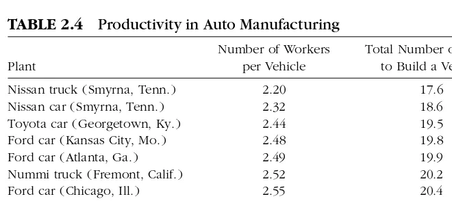
Two measures of productivity for the 10 most productive vehicle assembly operations in North America, according to a 1994 Harbour Report, are listed in Table 2.4.
Construct a dot diagram for the total hours needed to build a vehicle, and indicate the sample mean on the diagram.
The dot diagram, with the value of the sample mean, 20.11, indicated by a fulcrum, is shown in Figure 2.9.
If we imagine the horizontal axis of the dot diagram as a weightless bar and the dots representing the data as balls of equal size and weight, the mean is the point at which the bar balances. The sample mean is affected by extreme observations.
[image:25.612.128.458.348.495.2]1
TABLE 2.4
resistant robust.
trimmed mean.
Sample median:
`
n
M n
M
Imagine, for example, that the smallest total hours figure, 17.6, is decreased ( moved to the left in the figure ) while the other numbers remain the same. To maintain balance, the mean ( fulcrum ) must decrease ( move to the left ). If we change 17.6 to 13.3, for example, the sample mean becomes 19.68. Is the sample mean a good measure of center? It is, provided you interpret the center as the balancing point.
For large samples, the sample mean is ordinarily not appreciably affected by a few extreme measurements. Summary measures that are not affected by extreme values are said to be or One way to make the sample mean robust is not to include extreme values in its calculation. Suppose we order the observations from smallest to largest and then ignore, say, 5% of the measurements at each end. If we calculate the sample mean from the remaining observations, the result is called the 5% Ignoring 10% of the observations at each end gives the 10% trimmed mean and so forth.
A trimmed mean is the balancing point or center of gravity of the measurements from which it is calculated. In this sense, its interpretation is the same as that of the sample mean. Computer programs will usually compute a trimmed mean along with the sample mean. Five percent is a typical amount of trimming.
To obtain an even more robust summary statistic, arrange the data from smallest to largest. The sample median is the value that divides the data set in half; that is, 50% of the measurements are less than the median, and 50% are larger than the median.
The value that divides the ordered data in half
If the number of measurements is odd, the median is the middle measurement. If the number of measurements is even, the median is defined to be the average of the two middle measurements, or the value halfway between them.
To calculate the sample median:
1. Arrange the observations in numerical order, from smallest to largest. 2. If the number of observations is odd, the sample median, , is the middle
observation, determined by counting ( 1 ) 2 observations up from the smallest value in the ordered set.
3. If the number of observations is even, the sample median, , is the average of the two middle observations in the ordered set.
Notice that the calculation of the median is not influenced by the values of the measurements at the ends of the ordered data set. Consequently, the sample median is a robust measure of location. Moreover, the median corresponds to our intuitive notion of middle: the value that divides the ordered observations exactly in half.
4
4
4
4
` 4 4
4 4 4
4
Solution and Discussion.
Solution and Discussion. `
Death Claim Amounts for Group Life Insurance Plan
, , , , ,
M ,
x ,
n
M .
n .
n
M ,
total
x M
EXAMPLE 2.9
Calculating the Sample Median for an Even Number
of Observations
EXAMPLE 2.10
Calculating the Sample Median for an Odd Number
of Observations
1750 2800 3500 4025 4025 4375 4375 4375
5775 5775 6125 6125 6125 6475 6825 6825
6825 7350 7350 7350 7350 8050 9450 13125
13125 26250 26250 54600 64750 89600 95550
The sample mean and sample median determined from the same data set will, in general, be different. This should not be surprising since they correspond to different notions of center. They measure the overall location of a data set in different ways.
The sample mean is the most popular measure of location but, in cases where the mean and median are considerably different, both should be reported. A collection of incomes, for example,
$40 000 $50 000 $58 000 $60 000 $136 000
is best summarized by the sample median, $58 000, since it will not be influenced by exceptionally large incomes. Large incomes tend to inflate the sample mean, in this case $68 800, and make it less useful as a measure of typical income.
The total number of hours needed to build a vehicle are arranged from smallest to largest in Table 2.4 of Example 2.8. Calculate the sample median.
There are 10 observations, so the sample median is the average of the two middle values, 19.9 and 20.2; that is, 20 05. The median is in position ( 1 ) 2 5 5 or halfway between the 5th and 6th largest observations.
A University Association Group Life Insurance Plan paid 31 death claims during a recent policy year. The claim amounts are given from smallest to largest in Table 2.5. Calculate the median.
Since 31 is odd, the median is the middle observation given, in this case, by counting 16 observations from the smallest number. Thus,
6 825.
The median indicates a central value. However, if the payments for claims is important, the total is ( Number of claims ) ( Mean claim ) 31 , whereas 31 is not related to total payments.
/
11 2 [image:27.612.126.471.497.549.2]1 2
TABLE 2.5
3 3 3
Sample 100 th percentile
sample quartiles.
4 4 4
4
`
4 4 4
p
p p
p . p . p .
We adopt the convention of taking an observed value for the sample percentile except when two adjacent values satisfy the definition, in which case, their average is taken as the percentile.
p
n
np. np
np
k k k
Q Q
Q Q Q Sample Quartiles
Percentiles are numbers that divide the data into percentages. The sample median is the 50th percentile, because the sample median divides an ordered data set in half.
: The value in an ordered data set such that at least 100 % of the data set is at or less than this value and at least 100( 1 )% of the data set is at or above this value
Setting 25, 5, and 75 generates the 25th, 50th, and 75th percentiles, respectively. These numbers, taken as a group, divide the data set into quarters and, not surprisingly, are known as the
This procedure is consistent with the way we calculate the sample median.
To calculate the sample 100 th percentile,
1. Arrange the observations in numerical order, from smallest to largest. 2. Determine the product ( Sample size )( Proportion )
3. If is not an integer, round it up to the next integer and find the observation in this position. This value is the percentile. If is an integer, say, , calculate the average of the th and ( 1 )st ordered values. This average is the percentile.
Some statistical software packages use slight variations of our definition of per-centiles. For large samples, they all tend to give essentially the same numbers.
The sample percentiles used most frequently are the median, and the first and third quartiles. The sample quartiles are summarized here in terms of the percentiles they represent. From these representations, you can see that the first and third quartiles are themselves medians. The first quartile, , is the median of the observations less than the sample median, and the third quartile, , is the median of the observations greater than the sample median.
First quartile 25th percentile
Second quartile ( or median ) 50th percentile
Third quartile 75th percentile
1 3
1 2 3
4
4
4 4
4
4
4 4 4
4
4 4 4 4
Solution and Discussion.
n
. . . . . . . . . .
M .
p . np
. .
Q .
p . np . .
Q .
Q . Q M . Q .
percentiles are robust measures of location.
EXAMPLE 2.11
Calculating Sample Quartiles
To illustrate the calculation of sample quartiles, we turn once more to the productivity data listed in Table 2.4 ( see Example 2.8 ).
From Table 2.4, the 10 total number of hours needed to build a vehicle are, in order,
17 6 18 6 19 5 19 8 19 9 20 2 20 4 21 6 21 7 21 8 The sample median ( or 50th percentile or second quartile ) was calculated in Example 2.9. Recall that 20 05. Calculate the first and third quartiles.
To calculate the first quartile, set 25. Then 10( 25 ) 2 5. Since 2.5 is not an integer, round it to the next integer, 3, and take the observation in the 3rd position as the required quartile. Thus, 19 5. Three of the 10 observations ( at least 25% ) are at or below 19.5, and 8 observations ( at least 75% ) are at or above 19.5, confirming that it is the first quartile.
Similarly, to get the third quartile, set 75 so that 10( 75 ) 7 5. Round 7.5 to the next integer, 8, and take the observation in the 8th position as the required quartile. Consequently, 21 6. Eight of the 10 observations ( at least 75% ) are at or below 21.6, and 3 observations ( at least 25% ) are at or above it.
The three quartiles, 19 6, 20 05, and 21 6, divide the data set into quarters.
If, in Example 2.11, the last number in the data set were 25.3 instead of 21.8, the quartiles would not change. Similarly, if the two smallest values were, for example, 16.9 and 18.8 instead of 17.6 and 18.6, respectively, the quartiles would not change. Percentiles in general, and quartiles in particular, are not heavily influenced by the particular values of the observations. Extreme values have no influence on percentiles located toward the center of the distribution. This is what we mean when we say that We have discussed measures of location in terms of the original set of observations. If the data are displayed as dot diagrams, stem-and-leaf diagrams, or density histograms, measures of location can be indicated on the diagrams. We have already seen, for example, with the 800-meter data in Figure 2.3, that the statistical software identifies the median class in its version of the stem-and-leaf diagram and prints the cumulative frequencies from each end of the data distribution. This allows easy identification of the sample quartiles.
The sample mean always retains its interpretation as the balancing point. Therefore, its location on the variable axis of a dot diagram and, to a good approximation, a density histogram, is the point at which a fulcrum would just balance the configuration of points or pattern of vertical bars.
Because the sample mean is not a robust measure of location, it will typically be larger than the median for a histogram with a long right-hand tail, and less than the median for a histogram with a long left-hand tail. The two measures of location will almost coincide for nearly symmetric histograms, because the balancing point and the value dividing the distribution in half are the same ( see Exercise 2.22 ).
1
3
Sample variance:
Sample standard deviation:
degrees of freedom
Sample range:
4
4 `
4
4 4 4 4
4 4
4 4
` ` 4 4
4
s s
s x x
n
s s
n
x x
n n
x x x x
x
n
MEASURES OF VARIATION
!
^
We talked about measuring variability in Chapter 1, where we introduced the sample variance and sample standard deviation. Here, we will not only review these measures, we will also introduce the sample range and sample interquartile range as additional measures of variability.
The sample variance, , and sample standard deviation, , can be useful single-number summaries of variability. This is particularly true for relatively large, mound-shaped data sets.
1
( )
1
The sample variance is essentially an average squared distance from the mean; consequently, its value can be heavily influenced by observations far from the middle. Since the standard deviation is closely connected to the variance, its value can also be heavily influenced by observations far from the middle. The sample variance and sample standard deviation are not robust measures of variability.
The number 1 in the definition of the sample variance ( or sample standard deviation ) is called the because it represents the number of deviations from the mean that are “free to vary.” Let’s see what this means.
In Chapter 1, we showed that the sum of the deviations is always 0. Consequently, the final deviation can be determined once we know any 1 of the other deviations. For example, given the 4 numbers
2 3 4 1
you may verify that 2, and the first three deviations from the mean are 2 2 0, 3 2 1, and 4 2 2. Since the sum of all deviations must be zero, the last deviation must be ( 0 1 2 ) 3. Only 3 1 of the deviations are free to vary.
The sample range is simply the difference between the largest and smallest observations. It is the length of the interval that just contains all the data.
Largest observation Smallest observation
The range is very easy to calculate and interpret. However, by definition, the range is extremely sensitive to the existence of even a single very large or very small value in the data set. It is also not a robust measure of variability.
The sample interquartile range is a measure of variability based on the first and third quartiles.
2
2 2
1 2
1 2 3 4
2 2
2
2 2
2
2
2 2
2 2 2
2
n i i
Sample interquartile range:
empirical rule.
4 4
4
Cost per KW Capacity in Place for U.S. Public Utilities
Q Q
x s
x s
x s
x s
x s
n
x s x s
Empirical Rule
EXAMPLE 2.12
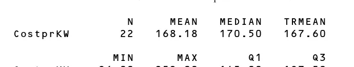
Summarizing Variation with the Empirical Rule,
the Range, and the Interquartile Range
151 104 96 168 168 174 136 178
175 202 148 164 197 192 111 150
199 245 113 204 252 173
IR Third quartile First quartile
The interquartile range is the length of the interval just containing the middle 50% of the observations. This interval is not centered on the median unless the data distribution is symmetric. Because the interquartile range depends only on the first and third quartile numbers, its value is not affected by a few extreme measurements at each end of the distribution. The sample interquartile range is a robust measure of spread. It is often used to measure spread when the median is used to measure middle.
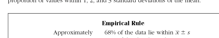
The center and the extent of spread in a data set are key pattern features. For ( nearly ) symmetric and mound-shaped data distributions, the mean and standard deviation are worthwhile measures of location and spread. Their usefulness is enhanced by the
The empirical rule provides intervals that contain certain proportions of the data when we know only the values of and . This rule works best with large data sets ( for example, more than 30 numbers ) that tend to have a mound of values around the mean and fewer values far from the mean in each direction. It gives the approximate proportion of values within 1, 2, and 3 standard deviations of the mean.
Approximately 68% of the data lie within 95% of the data lie within 2 99.7% of the data lie within 3
With only the two values and , the empirical rule allows us to create an expanding set of intervals that contain increasing proportions of the data set.
[image:31.612.120.499.322.389.2]When data distributions are skewed to the right or to the left, no single measure of spread is entirely satisfactory because the nature of the variability on one side of the center is different from that on the other side. If a single measure of sprea