•Makeyourpluginscompatibleacrossdifferentbrowsers •MasterthepluginAPIsthatAPEXprovides
and Contents at a Glance links to access them.
Contents at a Glance
Contents at a Glance ... iii
Contents ... iv
About the Author ...
..ix
About the Technical Reviewer ... x
Acknowledgments ... xi
Introduction ... xiii
Chapter 1: Introduction to Plug-Ins ... 1
Chapter 2: Plug-In Fundamentals ... 7
Chapter 3: Item Plug-Ins ... 29
Chapter 4: Dynamic Action Plug-Ins ... 75
Chapter 5: Region Plug-Ins ... 113
Chapter 6: Process Plug-ins ... 143
■ ■ ■
1
Introduction to Plug-Ins
Plug-ins allow third-party developers to add additional functionality to software applications and frameworks. Plug-ins exist for many different types of applications, such Mozilla Firefox (Add-ons and Extensions), Microsoft Word (Add-Ins), and development frameworks such as Salesforce.com.
As Oracle Application Express (APEX) has been growing, so have the requests from the APEX community for specific features. To the best of their ability, the team from Oracle that develops APEX has modified the product to meet these demands; however, it’s not fair to assume that they can add in every request that they receive. For this reason, the plug-ins framework was created. Starting in APEX 4.0, the APEX framework was extended to allow all developers to create their own plug-ins to add additional functionality in a supported and declarative way. APEX plug-ins can be shared within organizations and with the entire APEX community.
About This Book
This book provides step-by-step instructions on how to build plug-ins, along with detailed explanations about all the available options for plug-ins. It also contains some useful tools, techniques, and best practices to help ensure successful plug-in development and implementation. This book is targeted toward intermediate to advanced-level APEX developers.
It is assumed that you know the fundamentals of APEX and have developed some applications with it. If you are new to APEX, you’re encouraged to read a beginners book and then use this one to further
enhance your APEX development skill set. A recommended book for new developers is Beginning Oracle
Application Express 4, which is also published by Apress.
Besides basic knowledge about APEX, this book assumes you are comfortable with the languages and frameworks listed here. If you need to brush up on some of the web-based
technologies,www.w3schools.com has some excellent free tutorials to help you learn.
■
Note
This book contains examples on how to build all the different types of plug-ins. All the plug-ins that are
highlighted in this book are open source plug-ins that can be easily integrated into commercial applications
without concern about licensing.
Plug-Ins and Their Advantages
Plug-ins allow APEX developers to create their own supported and declarative objects in APEX. When developed correctly, plug-ins behave exactly like native APEX objects and are seamless for both developers and users alike.
There are several types of plug-ins that can currently be developed. Some of them focus on the user interface (UI), and some are for process only. Page process plug-ins can go either way, because you can use them during rendering to manipulate what the user sees, and during page processing to perform back-end work. Most often, process plug-ins are used for back-end processing.
Following are the plug-in types available:
• UI / Front-end related
o Dynamic action
o Item
o Region
• Process / Back-end related
o Authorization *
o Authentication *
o Process
■
Note
Plug-ins tagged with a “
*
” are new to 4.1. Since they are extremely new to APEX (at the time of writing),
they will not be covered in this book.
3
Getting Started
WAIT!You are probably eager to start learning to develop your first plug-in, but don’t skip over this section. The rest of the book assumes that you have all the necessary tools in place to successfully and efficiently develop plug-ins. This section will cover all the tools you’ll need throughout this book.
Oracle Database
Before using APEX, you’ll need to have an Oracle database to develop on. All the examples in this book were built on an Oracle 11gR2 instance. Some of the code may not be compatible with previous versions of Oracle but can be easily modified to work with older versions.
There are several options to choose from depending on your current situation. If you have access to a development instance of Oracle 11gR2, then you can skip this subsection. If not, there are several easy options for you:
apex.oracle.com: Oracle provides a free online instance of APEX for
development purposes. The SQL Workshop will allow you to create and modify PL/SQL code. This is the easiest solution to setup; however, it will be
cumbersome to develop and debug PL/SQL code via a web interface. You may encounter some restrictions connecting to external resources (such as web services) using apex.oracle.com for the examples in this book.
Oracle XE: Oracle provides a free (both for commercial and personal use) database called Oracle XE. It is an ideal option for installing a personal instance of Oracle. Oracle XE does have some size and functional limitations, but they should not hinder your ability to build plug-ins or follow the examples in this book. For more information about how to download and install Oracle XE, go to the following OTN page:
www.oracle.com/technetwork/database/express-edition/overview/index.html.
Virtual machine: Oracle provides a virtual machine image thatis a full version of 11gR2. You’ll first need to install Oracle Virtual Box:
www.oracle.com/technetwork/server-storage/virtualbox/index.html. The developer virtual machine image can be downloaded from the OTN Developer Days page:
www.oracle.com/technetwork/database/enterprise-edition/databaseappdev-vm-161299.html.
Install Oracle: If you want a full version of Oracle directly, you can obtain a developer’s license and download a copy from OTN:
www.oracle.com/technetwork/database/enterprise-edition/overview/index.ht ml. This is not a recommended approach for non-DBAs as it can take a while to properly configure Oracle from scratch.Of the four options just listed, Oracle XE may be the best option to implement on a personal or work PC. Each of the links provides installation instructions where applicable. Before installing or using any of the foregoingoptions, please read the licensing agreements.
APEX Instance
If you’re using a corporate database or a personal instance, you’ll need to ensure that a recent version of APEX is installed. To follow along with the examples in this book, you will need APEX 4.1 or above. The following query identifies the current version of APEX installed on your database:
SELECT *
FROM apex_release
If you don’t have APEX installed or need to upgrade it, you can download it from OTN:
www.oracle.com/technetwork/developer-tools/apex/downloads/index.html. The download page has links to detailed instructions on how to install or upgrade APEX. If you are using apex.oracle.com, you do not need to install or upgrade APEX.
Development IDE
When developing plug-ins, it’s highly recommended that you use a good PL/SQL and SQL IDE. SQL Developer is a free, Java-based, PL/SQL, and SQL IDE developed by Oracle. You can download SQL from OTN: www.oracle.com/technetwork/developer-tools/sql-developer/overview/index.html. SQL
Developer provides syntax highlighting, allows you to quickly browse all the database objects, implement unit tests, and debug code. There are other third-party tools, such as Toad from Quest software.
A good text editor will help when creating and modifying web files such as CSS, JS, and HTML. There are many free text editors available such as Notepad++ (http://notepad-plus-plus.org).
Web Browser
APEX officially supports the following major browsers: IE 7+, Firefox 3.5+, Google Chrome 4.0+, and Safari 4.0+. You can use any of these browsers to develop plug-ins, but some may be easier than others.
This book assumes that you will be developing plug-ins with either Firefox 4.0+ or Google Chrome 11.0+. When using Firefox, Firebug (http://getfirebug.com) should be installed. Chapter 8 describes how to install and configure Firebug for Firefox.
Web Server
A web server is the gateway that allows your browser to communicate to the database and serve files to the client’s browser. As part of the APEX installation process, you will have had to setup a web server.
One of the key components to developing certain types of plug-ins in APEX is the use of external files, such as JavaScript and CSS files. When working with external files, it is easiest if you can store them on an accessible web server and modify them directly.
5
Summary
This chapter gives a high-level overview of what is and isn’t covered in this book. Although not all types of APEX plug-ins will be covered, you will get a solid understanding of how they work. Once you’ve read through this book,you should be able to use what you’ve learned to create your own plug-ins, which you can share within your organization or with the APEX community.
■ ■ ■
Plug-In Fundamentals
Plug-ins are shared component objects. Like other shared components, they are local to an application and can be made accessible (via subscriptions) to other applications in the same workspace.
The main part of a plug-in consists of PL/SQL code with JavaScript and CSS as complimentary code (when applicable). A plug-in consists of one or more PL/SQL functions. These functions can either reside in the database (in a package or a set of functions) or be included within the plug-in. There are specific headers for each type of function (i.e., they must take in a certain set of parameters and return a specific type). What happens in each function is entirely up to you, the plug-in developer.
Certain types of plug-ins can also leverage third-party web files, such as JavaScript and CSS files. These files can be stored in APEX or on a web server, or bundled as part of the plug-in. The PL/SQL code in the plug-in must explicitly load these third-party files.
Plug-ins also contain attributes that, like native APEX objects, allow developers to customize the use of the object. Attributes are either global or local. The PL/SQL functions have access to these attributes.
Creating a Plug-In
Before looking at all the plug-in options, you will need to create an “empty” or “skeleton” plug-in. An empty in is just a in with no code in it yet. Later chapters will discuss how to build each plug-in type plug-in detail and will reference this section for the plug-initial steps to create a plug-plug-in. The followplug-ing steps describe how to create an empty plug-in:
8
2. Select the new application, and then go to the SharedComponents
section. Under the User Interface region, click the “Plug-ins” link, as shown in Figure 2-1.
Figure 2-1. Shared Components “Plug-ins” link
3. The Plug-ins page displays all the current plug-ins associated with your application, as shown in Figure 2-2. Click the Create button to create a new plug-in.
Figure 2-2. List of plug-ins
4. Enter Test for the Name and Internal Name fields. Select “item” as the type, and click the Create button to complete creating an empty plug-in, as shown in Figure 2-3. All of the options will be discussed in the next part of this chapter.
Figure 2-3. Creating a plug-in
Plug-In Components
It is important to have a good understanding of each of the options before building your first plug-in. This section will cover all the available options or components involved in building a plug-in. If some components seem a bit confusing, don’t worry. They will all be used throughout the demos in this book. To help follow along, edit the Test“empty”plug-in that you created in the previous section.
Name
Like most APEX objects, the Name section allows you to define the name and type for the plug-in, as shown in Figure 2-3. The following fields are required in the Name section:
Name: This is the name that other developers will see when they use a plug-in object. If developing plug-ins for the community, you may want to prefix the name with your company name.
10
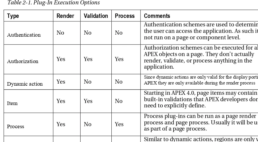
Type: The type of plug-in that you’re building; there are six different types of plug-ins: authentication, authorization, dynamic action, item, region, and process. Plug-ins can be run as part of the render, validation, or page process. Table 2-1shows how each type of plug-in can be used in an APEX page. Once a plug-in has been used in an application, the type cannot be changed. The type cannot be changed because each plug-in type has a distinct set of attributes that will become evident in the Callbacks section.
The plug-in type determines when, and how, the plug-in will be used, as shown in Table 2-1. Plug-ins that can be rendered usually (except for authorization types) require HTML code to be sent to the browser. Validation executions happen once the page is submitted. Processes can happen while the page is being rendered or when the page is submitted.
Table 2-1. Plug-In Execution Options
Type
Render
Validation Process
Comments
Authentication No No No
Authentication schemes are used to determine if the user can access the application. As such it is not run on a page or component level.
Authorization Yes Yes Yes
Authorization schemes can be executed for all APEX objects on a page. They don’t actually render, validate, or process anything in the application.
Dynamic action Yes No No
Since dynamic actions are only valid for the display portion of APEX they are only available during the render process
Item Yes Yes No
Starting in APEX 4.0, page items may contain built-in validations that APEX developers don’t need to explicitly define.
Process Yes No Yes
Process plug-ins can be run as a page render process and page process. Usually it will be used as part of a page process.
Region Yes No No
Similar to dynamic actions, regions are only valid for the display portion of an APEX page and thus are only available during the render process.
Category: Dynamic actions are broken up into various categories, shown in Figure 2-4, to help developers quickly find the appropriate dynamic action to use. The category that a dynamic action belongs to has no impact on the application. The Category option, shown in Figure 2-5, appears only when the Type field is set to Dynamic Action.
12
Subscription
You can share certain types of Shared Components objects in APEX with other applications within the same workspace. This sharing mechanism is called subscriptions. Subscriptions also allow you to subscribe to these objects. This means that you change something in your main object (referred to as a
master object) in an application and push your changes to other applications that subscribe to the object. If you are unfamiliar with subscriptions, please refer to the manual.
The Subscription section, as shown in Figure 2-6, behaves exactly like other objects in APEX that support the same functionality. APEX allows you to create a master object. When the master object changes, you can push the changes to other objects that subscribe to it.
Figure 2-6.Plug-in Subscription section
Subscriptions may be useful if you have a plug-in that is used across multiple applications. If you need to update it, you can update the master copy and have APEX push the changes to all the other applications that subscribe to it. For more information about how to use subscriptions, refer to the APEX documentation.
Settings
The Settings section contains one option that is present for all plug-ins. This option is the File Prefix option.
File Prefix: The File Prefix, as shown in Figure 2-7, defines the root directory to reference third-party files such as JavaScript and CSS. #PLUGIN_PREFIX# should be used if the files are included as part of the plug-in. You can also reference other APEX substitution strings, such as #IMAGE_PREFIX# and #APP_IMAGES#, as well as a webserver URL. If referencing a web server, you should include the trailing forward slash (/) to avoid having to include it in all references to files— for example: http://www.clarifit.com/files/instead of
http://www.clarifit.com/files.
Figure 2-7. Plug-in Settings section
Most plug-ins will also contain custom attributes. Application-level attributes will also appear in the Settings section. For example, as part of the item plug-in demo, you will create a special date picker.
3
Figure 2-8shows the custom application attribute Icon Location that is used as part of the plug-in. Icon Location is an application-level attribute that is applicable to all instances of the From To Date Picker in the application.
Figure 2-8. Plug-in setting with custom attribute
Source
The main part of a plug-in is contained in PL/SQL code. The Source section contains the following options, as shown in Figure 2-9.
PL/SQL Code: The plug-in architecture allows you to either include the PL/SQL code as part of the plug-in or reference packages and functions in the database. If bundling the PL/SQL code as part of the plug-in, you’ll need to include it in the PL/SQL Code text area. The PL/SQL code is called from the callback functions, which are covered in the next section.
Do Not Validate PL/SQL Code: Like other PL/SQL and SQL regions, APEX gives you the option to exclude code from being validated when building your application. If this checkbox is selected, and code is put in the PL/SQL Code text area, it will be validated only at runtime. Unless there is a very specific requirement, it is recommended to leave this checkbox unchecked.
14
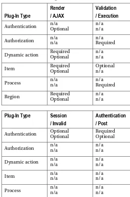
and handle AJAX calls. Each of the plug-ins has a different set of callback functions. Table 2-2showsall of the required and optional callback functions for each plug-in type.
Table 2-2. Available Plug-In Callback Functions
Plug-In Type
Dynamic action Required Optional n/a n/a
Item Required Optional Optional n/a
Process n/a n/a n/a Required
Region Required Optional n/a n/a
Plug-In Type
Session
/ Invalid
Authentication
/ Post
Authentication Optional Optional Required Optional
Authorization n/a n/a n/a n/a
Dynamic action n/a n/a n/a n/a
Item n/a n/a n/a n/a
Process n/a n/a n/a n/a
Region n/a n/a n/a n/a
Each of the callback functions passes in several parameters and returns an APEX_PLUGIN type. Click the help link to obtain the required function headers for each of the callback functions. Detailed information about each of APEX_PLUGIN types can be found in the APEX API documentation.
In the Callback section, you need to enter only the function name that APEX will call. The functions can reference either a package or function in the database, or a function that was provided in the PL/SQL Code region. The following is a list of all the callback functions and summary of what they do:
Render: The render callback function is used to render the element, load JavaScript and CSS files, and execute JavaScript code.
AJAX: If the plug-in requires an AJAX call, this function will handle it. Like standard AJAX calls, you can reference the apex_application.g_x01 ~ g_x10 variables that are passed from the client back to the server as part of the AJAX request.
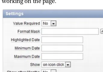
Validation: Starting in APEX 4, certain types of items have default validations. For example, on most items, you can select if a value is required, as shown in Figure 2-10, and enable these validations to be fired when submitting the page. It’s important to note that the validation function will be run only if the APEX developer decides to as part of the submit process.
Figure 2-10. Page item Settings section
Execution: The execution callback function is the only callback function available for process and authorization type plug-ins.
Session sentry: The session sentry function is used to validate that the current session is valid. If left blank, APEX will default to its session validation function.
Invalid session: Function to call if session is deemed invalid
Authentication: This function will be run during the login process to ensure that the user’s credentials are valid.
Post logout: Once APEX ends the user’s session, this function will be called. It will determine where the user should go.
16
1. In the Test plug-in that you created in the previous section, scroll down to the Standard Attributes section, as shown in Figure 2-11, and ensure that all options are unchecked.
Figure 2-11. Item plug-in Standard Attributes section
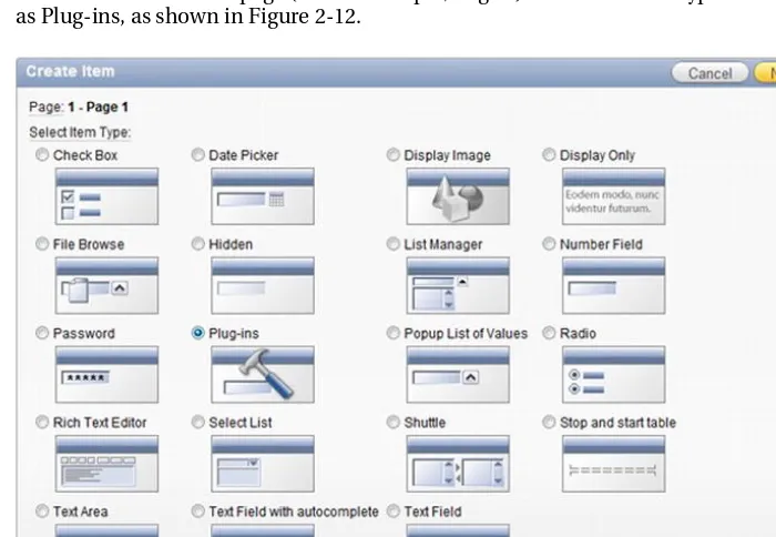
2. Create a new item on a page (in this example, Page 1). Select the item type as Plug-ins, as shown in Figure 2-12.
Figure 2-12. Create Item section
3. Select the Test plug-in, as shown in Figure 2-13, and click the Next button. You created the Test plug-in in the previous section.
Figure 2-13. Selecting plug-in
4. Enter the same values in Figure 2-14, and click the Next button.
Figure 2-14. Creating item name
18
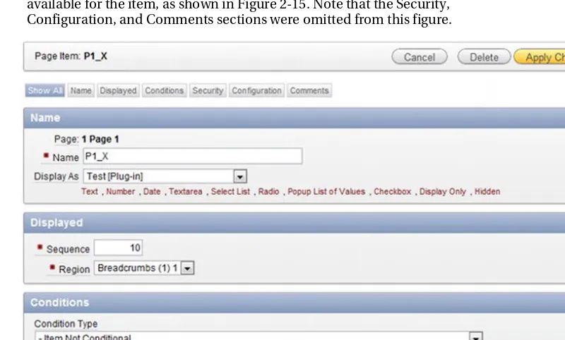
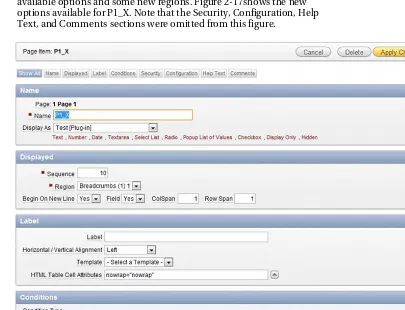
6. Edit P1_X. On the Edit Page Item page, there’s a minimal set of options available for the item, as shown in Figure 2-15. Note that the Security, Configuration, and Comments sections were omitted from this figure.
Figure 2-15. Item with no standard attributes
7. Go back and edit the Test plug-in. Check the Is Visible Widget box, as shown in Figure 2-16, and click the Apply Changes button to save it.
Figure 2-16. Standard Attributes option checked
8. Go back to Page 1 and edit P1_X. You’ll notice that it now has more available options and some new regions. Figure 2-17shows the new options available for P1_X. Note that the Security, Configuration, Help Text, and Comments sections were omitted from this figure.
Figure 2-17. Item with Is Visible standard attribute enabled
20
Custom Attributes
Custom attributes allow you to configure options that can be referenced in your plug-in callback code. Custom attributes are already present in standard APEX objects. For example, if you create a password page item (see Figure 2-18), its attributes are “Submit when Enter pressed” and “Does not save state”.
Figure 2-18. Password item custom attributes
There are two types of custom attributes. The following list describes them along with their differences.
Application: Application attributes are attributes that are global for the plug-in across the entire application. They can be configured only in the edit plug-in page. For example, if you created a plug-in that uses a color attribute that should be consistent across the application, you would create an application attribute to store the color.
Component: Component attributes are attributes that are specific for an instance of the plug-in. The password example that was previously discussed is a good example of component attributes.
You can choose to have APEX automatically replace substitution strings if they are used in the custom attribute value by setting the Substitute Attribute Values to Yes. For example, if a developer entered in &APP_ID. as a value and Substitute Attribute Values was set to Yes, then the value would be 100 (assuming the application ID was 100). If you set Substitute Attribute Values to No, then you must manually do string substitutions using apex_plugin_util.replace_substitutions.
To create either an application or component attribute, click the Add Attribute button, as shown in Figure 2-19. Attributes are stored as type VARCHAR2 in the database, so you will need to do explicit conversions if required. There’s a limit of 15 attributes for each application and component attribute. The following subsections describe the available options for attributes.
Figure 2-19. Custom Attributes section
■
Note
Some plug-in developers question why there are only 15 available custom attributes per plug-in. The
APEX team restricted the number of attributes to make it simple for other APEX developers to use plug-ins. If you
have too many attributes, other developers may get confused with all the options. Some plug-ins may warrant the
need for additional attributes; however, it is up to you, the plug-in developer, to make some assumptions and
choose default values. If users of the plug-in need to modify these default values, they can always modify them in
the plug-in Source section.
Name
The Name section allows you to define how the attributes appear on the object edit page. The following list describes the available options shown in Figure 2-20.
Scope: The scope determines the type of plug-in attribute. The two types of attributes were mentioned earlier. Once an attribute has been saved, the scope cannot be modified.
Attribute: The attribute number determines the column in the table that this attribute is stored in. There’s currently room for 15 attributes for each type. Since this is used to store the attribute value in a table, the attribute number cannot be modified once an attribute has been saved.
Display Sequence: Like other APEX objects, you can control the display order of each attribute.
Label: The label is the name displayed to the APEX developer using the plug-in.
22
Settings
The Settings section, as shown in Figure 2-21, determines the attribute type. The options vary depending on the selected type. The available options are as follows:
Type: The type of attribute will determine the rest of the available options in the Settings section. Implicit validations will occur based on the type. For example, if the type is set to Integer and a developer enters abc, an error message will be displayed. If you click the help link (i.e., the Type label), you will get a list of all the available types along with some additional information. Once a type has been saved and the plug-in has been used in the application, it cannot be modified.
Figure 2-21. Custom attribute: Settings
List of Values
The List of Values section, as shown in Figure 2-22, will appear only if the type is set to Checkboxes or Select List. It allows you to define a static list of values for a developer to select a value from.
Figure 2-22. Custom attribute: List of Values
Default Value
If entered, the default value will appear as the value for the attribute when the plug-in is first created. If the type is set to Checkboxes or Select List and it is a required attribute, then a default value is required.
Condition
The Condition section is different than standard Condition sections for APEX objects. It determines the dependency for the current attribute with respect to other attributes for the plug-in. For example, suppose you had a plug-in that drew shapes and had the following attributes:
• Shape(square, circle)
• Length
• Width
• Radius
You would not want the Radius attribute to be displayed when the shape is a square. Instead you would conditionally display the Length, Width, and Radius attributes depending on the type of shape. Figure 2-23shows the Condition section for the Radius attribute.
Figure 2-23. Custom attribute: Condition
Depending on: This is the element that the current attribute is dependent on. In the example, it was Shape.
Condition Type: The condition determines how to evaluate against the “Depending on” value.
Expression: The value to compare against. If “in list” or “not in list” is selected, the expression must be a comma-separated list. The expression value is case-sensitive.
Help Text (for the Custom Attribute)
24
Figure 2-24. Plug-in Files section
The advantage of storing the files as part of the plug-in is that you don’t need to worry about connections to other web servers, etc. If your application receives a lot of page views or you need to improve the page load time, it may help to store the file on a web server. When developing plug-ins, it helps to store the files on a web server that allows you to easily manipulate the files.
When using files, you should include a version number at the end of the file name. Including a unique version number for each file will make sure the browser uses the most recent version of the file rather than an older, cached copy. This concept is discussed in detail in Chapter 7.
Events
Events are custom JavaScript events that will be triggered by the plug-in. Some built-in JavaScript events that you may already know are onClick and onChange. Figure 2-25 shows the Events section on the plug-in page.
■
Note
www.w3schools.com/tags/ref_eventattributes.aspcontains a list of standard JavaScript events.
jQuery handles these events in a very simple manner. For more information about jQuery events, see:
http://api.jquery.com/category/events
.
Figure 2-25. Plug-in Events section
Since events are tightly coupled with JavaScript code, they are available only for plug-ins that relate to page rendering: item, region, and dynamic action. Registering an event with a plug-in requires two components on the plug-in form:
Name: Name is the display name that is shown to other APEX developers when
they are creating a dynamic action.
Internal Name: This is the name that is used in the JavaScript code to trigger the event. APEX will lowercase the internal name automatically so you cannot use camel case in your JavaScript code that manages this event.
Events can be referenced by dynamic actions or by custom JavaScript code. If used by a dynamic action, they will show up in the list of dynamic actions. The following example demonstrates the relationship with dynamic actions:
1. Edit the skeleton plug-in that you previously created at the beginning of this chapter. Scroll down to the Events region, as shown in Figure 2-25. Click the Add Event button.
2. The page will reload. Scroll back down to the Events region, which now
has a blank row for a new event, and enter Dummy Event for the Name and dummy event for the Internal Name, as shown in Figure 2-26. Click the Apply Changes button to save the modifications.
26
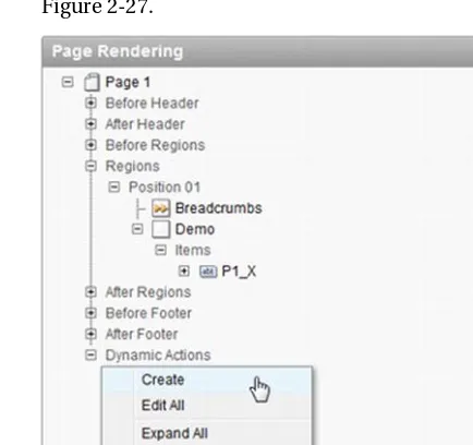
3. On Page 1, create a new dynamic action by right-clicking the Dynamic
Action tree element, and select Create from the context menu, as shown in Figure 2-27.
Figure 2-27. Creating a dynamic action
4. Select Advanced and click the Next button.
5. In the Name field, enter Test and click the Next button to continue.
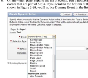
6. On the When page, expand the list of events. You’ll notice a list of built-in events that are part of APEX. If you scroll to the bottom of the list, as shown in Figure 2-28, you’ll notice Dummy Event in the list of events.
Figure 2-28. Dummy Event in dynamic action event list
7. Since you don’t need this dynamic action, hit the Cancel button to exit from the Dynamic Action wizard.
Events can be a bit confusing the first time when learning about them. Some of the demos will leverage events to help you understand how to build the additional functionality within your plug-in JavaScript code.
Information
The Information section, as shown in Figure 2-29, allows you to include some metadata about your plug-in. It contains the following fields:
28
Figure 2-29. Plug-in Information section
Help Text (for the Plug-In)
It is recommended that you include any instructions in the Help Text section for the plug-in as a whole, as shown in Figure 2-30. The Help Text section can include both plain text and HTML markup. You can also include additional information, such as license information and documentation, in the Help Text section as well.
Figure 2-30. Plug-in Help Text section
Licensing
You can create plug-ins to give away, possibly in support of marketing your services. You can also create plug-ins to sell. The plug-in Help Text section mentioned in the preceding section is an excellent place to place your license terms, or at least to reference them.
Some plug-in developers prefer to publish their work under various open source licenses. There are many different open source licenses, each written with somewhat different end goals in mind. The following URL is a good source for information on the various open source licenses available:
www.opensource.org/licenses/index.html
If you choose to use an open sources license, you can just reference the license name and choose to include only the URL to that license in the help text for your plug-in. Users can follow the link to the actual license text if they are interested in the details.
Summary
This chapter covered all the components that make up a plug-in and introduced some of the APIs required to build a plug-in. In the following chapters, you will build each different type of plug-in, and that will make use of all the components that were covered in this chapter.
■ ■ ■
Item Plug-Ins
Now that you know what plug-ins can do and their components, it’s time to build your first plug-in. Don’t worry if you’re still a bit confused about how they work. This chapter will help answer most of your questions. Since it is the first plug-in in this book, everything will be defined in detail.
This chapter is broken up into four main sections. The first section, “Business Problem,” describes what the plug-in is supposed to do. In the second section, you will build your first plug-in. This section will walk through each step and include some hints and tips. The third section, “Events,” describes an advanced feature for plug-ins. The last section summarizes this chapter.
■
Note
The plug-in that is built in this chapter was taken from a free, open source plug-in available from
http://apex-plugin.com
. This chapter will walk you through how it was built step-by-step.
Business Problem
One of the first mistakes people tend to make when creating plug-ins is to think about cool features and whiz-bang functionalities that their plug-in will have. Then they get so deep into the code that they eventually forget the problem that they’re trying to resolve. The end result is either a failed attempt at building a plug-in or a plug-in that does a lot of things but not what it was initially intended to do.
30
Example Scenario
The example in this chapter is built around the need for dynamic constraints on the values entered into a date field. The current date item allows you to select a min and max date, as shown in Figure 3-1. These constraints can be either static dates or references to a variable using the &ITEM_NAME.(substitution string) notation.
■
Note
For more information about the
&ITEM_NAMEnotation mentioned earlier, and about different methods to
reference variables, please read the following article:
http://www.talkapex.com/2011/01/variables-in-apex.html.
Regardless of how you define the min/max constraints for a date field, they are calculated once when the page is loaded. As a result, the date constraints don’t dynamically change as the user is working on the page.
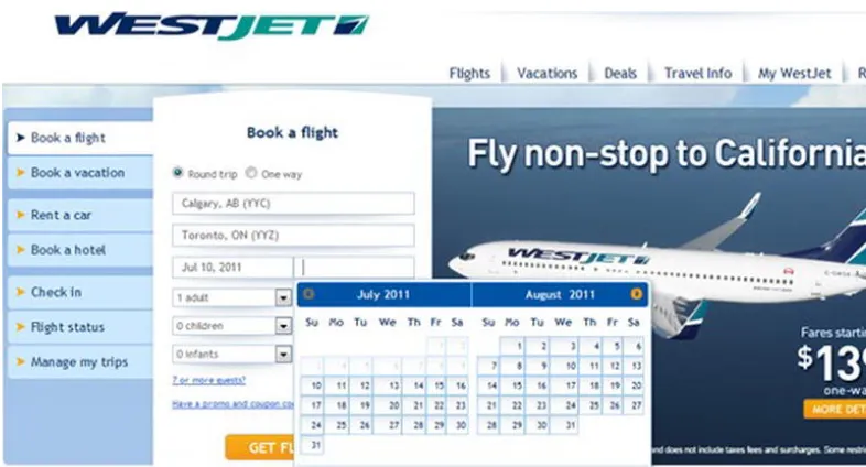
Figure 3-1. Standard date item settings
A classic example of when you would want dynamic min/max date constraints is when booking return airplane tickets. You normally select the date you’re leaving on and then select the date you’re coming back on. When you select the return date, you can’t select any dates before the date you leave on, as shown in Figure 3-2. The current min/max date options in the standard APEX date picker don’t support this functionality.
Figure 3-2. Dynamic min/max date when booking tickets
Solution Requirements
To get around the static min/max date issue, you’re going to create a dynamic from/to date picker. The new date picker will have the following functionality:
• Restrict the to date when a from date is selected; for example, suppose you
selected 20-Jan-2010 as your from date. When a user selects a date from the to date picker, he or she can’t select anything before 20-Jan-2010 (i.e., the user can’t select any dates from before 19-Jan-2010).
• Restrict the from date when a to date is selected; see the previous example in
reverse.
• Allow developers to select when the calendar is displayed
• Support multiple date formats; date formats do not need to be the same for both
the from and to dates.
32
building an item-type plug-in. If at any point you want to verify anything, an example application, covering all plug-ins in this book, is available on Apress’s web site. (See the catalog page for this book at http://apress.com/ 9781430235033.)
■
Note
This chapter’s example will use external JavaScript files as part of the plug-in. To make things easier,
the example assumes that you have read/write access to a web server that will allow you to modify the JavaScript
files. If you don’t have such access, you’ll need to either obtain access or create a local web server. An example of
how to install Apache, a free, open source web server, is covered in the Debugging & Tools chapter.
Creating the Plug-In and a Test Page
The first thing that you’ll need to do is create the plug-in. The process is exactly the same as covered in the previous chapter except for the following changes:
• Name: ClariFit From To Date Picker
• Internal Name: COM.CLARIFIT.FROMTODATEPICKER
The plug-in type should be an item plug-in type. Once you have created the blank plug-in, the Name region should look like Figure 3-3. Everything else should remain the same with the default settings.
Figure 3-3. From/to date picker initial setup
The next thing that you’ll need to do is create and compile an empty PL/SQL package in your schema. This package will be used to develop the from/to date picker item in and the other plug-ins in this book. The code for the empty package, pkg_apress_plugins, is as follows:
CREATE OR REPLACE PACKAGE pkg_apress_plugins AS
END pkg_apress_plugins; /
CREATE OR REPLACE PACKAGE BODY pkg_apress_plugins as
END pkg_apress_plugins; /
■
Note
Storing the plug-in code in a package makes it easier/faster to develop. Once the plug-in is completed,
you can store the code directly in the plug-in or move to another package.
Create a page to see how the changes you make in the plug-in affect the page item. Here are the steps to follow to do that:
1. Create a new blank page. Number it as Page 10, and name it From/To
Date Picker.
34
3. Select ClariFit From To Date Picker and click the Next button, as shown in Figure 3-5.
Figure 3-5.The Create Page Item wizard: Selecting the plug-in
4. On the Display Position and Name page, enter the values, as shown in
Figure 3-6.
Figure 3-6.The Create Page Item wizard: Selecting the display position and name
5. On the Source page, enter DD/MM/YYYY as the format mask, and click
the Create Item button to complete the wizard.
6. Create another item by repeating steps 1 through 5 with the following
changes:
a. Item name: P10_TO_DATE b. Format mask: DD-MON-YYYY
Initial Configuration
Before writing any code for the plug-in, it is useful to configure the plug-in. There are usually two things that should be setup right away: the file prefix and the standard attributes. As you develop a plug-in, you can easily change these settings.
The file prefix defines the location for third-party files such as JavaScript and CSS files. The default value is #PLUGIN_PREFIX#, which references files that are directly attached to the plug-in. When
developing plug-ins, it is usually easier to work on files that you have read/write access to. You can use a corporate development web server or a local webserver. This example, and all examples in this book, will reference a local webserver (covered in Chapter 8). It is assumed that you set the web server’s home directory to c:\www.
The following steps will point the file prefix to a local directory for development purposes (if using a different web server, change the URL accordingly):
1. Create a directory called c:\www\FromToDatePicker.
2. Edit the plug-in and scroll down to the Settings region. Set the File Prefix field to http://localhost/FromToDatePicker/,as shown in Figure 3-7.
Figure 3-7. Settings: File Prefix field
Standard attributes define what standard options are available for the application developer to use. To start, check the options as shown in Figure 3-8.
Figure 3-8.Choosing standard attributes
Including JavaScript Code
The next thing to do is add the JavaScript code to display the calendar and add constraints so the from
and to dates are within a valid range. To display the date picker, you’ll use jQuery UI date picker, which is the same tool that APEX uses for the standard date picker. The main difference is that you’ll add additional support for the date restrictions.
36
The first step is to write the JavaScript code to support the from and to date pickers. The easiest way to do this is to create a simple HTML file and build a proof of concept. This is a very important step since things can become complex when integrating into a plug-in. In order to save time, you will not need to do this step in this book; however, it is highly recommended when creating your own plug-ins from scratch.
■
Note
This section will cover all the JavaScript code required for the plug-in. When creating plug-ins, you will
probably develop and modify your JavaScript code throughout the process rather than all in one go, as it needs to
align with both the plug-in options and the PL/SQL code.
To create the external JavaScript file for this plug-in, create an empty file in
c:\www\FromToDatePicker called jquery.ui.clarifitFromToDatePicker_1.0.0.js. Edit the file in your text editor, and add the following code (this is included in the downloadable files):
/**
* ClariFit FromTo Date Picker for APEX * Plug-in Type: Item
* Summary: Handles automatically changing the min/max dates *
* Depends:
* jquery.ui.datepicker.js
* $.console.js - http://code.google.com/p/js-console-wrapper/ *
* Special thanks to Dan McGhan (www.danielmcghan.us) for his JavaScript help *
* ^^^ Contact information ^^^ * Developed by ClariFit Inc. * http://www.clarifit.com * [email protected] *
* ^^^ License ^^^
* Licensed Under: GNU General Public License, version 3 (GPL-3.0) - http://www.opensource.org/licenses/gpl-3.0.html
*
* @author Martin Giffy D'Souza - www.talkapex.com */
(function($){
$.widget('ui.clarifitFromToDatePicker', { // default options
options: {
//Information about the other date picker correspondingDatePicker: {
dateFormat: '', //Need other date format since it may not be the same as current date format id: '',
value: ''
}, //Value during page load //Options for this date picker
datePickerAttrs: { autoSize: true,
buttonImage: '', //Set by plugin attribute buttonImageOnly: true,
changeMonth: true, changeYear: true,
dateFormat: 'mm/dd/yy', //Default date format. Will be set by plugin showAnim: '', //By default disable animation
showOn: 'button'},
datePickerType: '', //from or to },
/**
* Init function. This function will be called each time the widget is referenced with no parameters
*/
_init: function(){ var uiw = this;
//For this plug-in there's no code required for this section //Left here for demonstration purposes
$.console.log(uiw._scope, '_init', uiw); }, //_init
/**
* Set private widget variables */
_setWidgetVars: function(){ var uiw = this;
uiw._scope = 'ui.clarifitFromToDatePicker'; //For debugging
uiw._values = {
shortYearCutoff: 30, //roll over year };
38
$.console.groupCollapsed(consoleGroupName); $.console.log('this:', uiw);
$.console.log('element:', uiw.element[0]);
varelementObj = $(uiw.element), otherDate,
minDate = '', maxDate = '' ;
//Get the initial min/max dates restrictions
//If other date is not well formatted, an exception will be raised try{
otherDate = uiw.options.correspondingDatePicker.value != '' ?
$.datepicker.parseDate(uiw.options.correspondingDatePicker.dateFormat,
uiw.options.correspondingDatePicker.value, {shortYearCutoff: uiw._values.shortYearCutoff}) : ''
minDate = uiw.options.datePickerType == 'to' ? otherDate : '', maxDate = uiw.options.datePickerType == 'from' ? otherDate : ''
uiw._elements.$otherDate = $('#' + uiw.options.correspondingDatePicker.id); }
var extraParams = { dateText: dateText, inst: inst }, $this = $(this)
;
$this.trigger('change'); // Need to trigger change event so that other date is updated $this.trigger('plugineventonselect', extraParams); // Trigger Plugin Event:
pluginEventOnSelect if something is listening to it }
});
elementObj.bind('change.' + uiw.widgetEventPrefix, function(){ // Sets the min/max date for related date element
// Since this function is being called as an event, "this" refers to the DOM object and not the widget "this" object
// uiw references the UI Widget "this" $.console.log(uiw._scope, 'onchange', this);
var $this = $(this),
optionToChange = uiw.options.datePickerType == 'from' ? 'minDate' : 'maxDate',
selfDate = $.datepicker.parseDate(uiw.options.datePickerAttrs.dateFormat, $this.val(), {shortYearCutoff: 30})
;
uiw._elements.$otherDate.datepicker('option', optionToChange,selfDate); //Set the min/max date information for related date option
}); //bind
$.console.groupEnd(consoleGroupName); },//_create
/**
* Removes all functionality associated with the clarifitFromToDatePicker * Will remove the change event as well
* Odds are this will not be called from APEX. */
destroy: function() { var uiw = this;
$.console.log(uiw._scope, 'destroy', uiw);
$.Widget.prototype.destroy.apply(uiw, arguments); // default destroy // unregister datepicker
$(uiw.element).datepicker('destroy'); }//destroy
}); //ui.clarifitFromToDatePicker })(apex.jQuery);
It is important to understand some of the techniques used. Here are some of the main points for the foregoing code:
• In the filename, jquery.ui.clarifitFromToDatePicker_1.0.0.js, a version
number (_1.0.0) was added to the end of the file. This was done to prevent browser caching on updates to the file. The next time a modification is made to the file, just update the version number in the filename.
• The overall structure of the JavaScript file uses the jQuery UI Widget Factory
40
• The code was instrumented using Console Wrapper, a free, opensource wrapper
for Console. Console Wrapper has tight integration with APEX and, by default, will be enabled only when APEX is run in debug mode. For more information, please
visithttp://code.google.com/p/js-console-wrapper/.
• options: Options that can be set by the calling function; some of these options will
be setup as plug-in attributes so APEX developers can explicitly configure them.
• _create: This instantiates the jQuery UI date picker for the input element and sets
the initial date restrictions based on other dates.
• plugineventonselect: In the _create function, there’s a call to
$(this).trigger('plugineventonselect', extraParams). This triggers a custom event thatcan be used when creating a dynamic action. An additional
configuration (covered later) is required.
• _onChangeHandler: When a date is changed, this function will be called. It will
change the min/max date restriction for the other date.
Since jquery.ui.clarifitFromToDatePicker_1.0.0.js references Console Wrapper, you will also
need to copy the console wrapper file to c:\www\FromToDatePicker. $console_wrapper_1.0.3.js is
included with this book, or you can download it from http://code.google.com/p/js-console-wrapper/.
For now you will not need to include the JavaScript file directly in the plug-in since you’ll be referencing the copy on the web server. If there are any bugs in the code, it is much easier to debug. At the end of this chapter, you will bundle the JavaScript directly into the plug-in.
Adding Custom Attributes
Adding custom attributes can be done at any time while developing a plug-in. You’ll tend to know some of the attributes right away and then add some additional attributes as you finalize the plug-in.
Based on the JavaScript code, there are two attributes that will be required: icon image location and when to show the calendar. To create the icon image location attribute, do the following:
1. Edit the plug-in and scroll to the Custom Attributes region.
2. Click the Add Attribute button, as shown in Figure 3-9.
Figure 3-9. Adding an attribute
3. Fill in the Name region as in Figure 3-10. Since the icon image location will probably be the same throughout the application, it should be an application-level attribute.
Figure 3-10. Custom attribute: Name
4. In the Settings region, set the Type field to Text, and Required field to Yes, as shown in Figure 3-11.
Figure 3-11. Custom attribute: Settings
5. In the Default Value region, enter &IMAGE_PREFIX.asfdcldr.gif, as shown in Figure 3-12. This will leverage the calendar icon image that APEX uses for standard date pickers.
42
Creating the Show On attribute is similar to creating the icon image location application attribute, but with some slight modifications. The following steps outline the process. (Only figures for new steps are shown.)Figures for the other steps are essentially the same as before.
1. Edit the plug-in and scroll to the Custom Attributes region.
2. Click the Add Attribute button, as shown in Figure 3-9.
3. In the Name region, set the following values:
Scope: Component
Attribute:1
Display Sequence:10
Label: Show On
Since this attribute may change for each instance of the date picker, it’ll be a component-level attribute. The attribute number is unique based on the scope. Once an attribute has been created, the attribute number cannot be changed.
4. In the Settings region, set the following values:
Type: Select List
Required: Yes
5. The next logical step is to add a value for the list of values. The catch is that if you click the Add Value button it will submit the page and save the custom attribute. Since you set this as a required attribute, you need to define a default value first. In the Default Value region, set the default value to “focus”.
6. You can now add values to the list of values. In the List of Values region, click the Add Value button, as shown in Figure 3-13.
Figure 3-13. Custom attribute: List of values
7. Enter the values, as shown in Figure 3-14, for the LOV entry form. Click the Create and Create Another button when complete.
Figure 3-14. Custom attribute: Adding LOV value
8. Repeat step 6 for:
Sequence:20
Display Value: Button
Return Value: button 9. Repeat step 6 for:
Sequence:30
Display Value: Both
Return Value: both
Instead of clicking the Create and Create Another button, just click the Create button.
When you go back to edit the plug-in, the new application custom attribute now appears in the Settings region on the plug-in page, as shown in Figure 3-15. If you edit P10_FROM_DATE, which uses this plug-in, you should notice the new Show On setting that you just created, as shown in Figure 3-16.
Figure 3-15. Application-level custom attribute
Figure 3-16. Component-level custom attribute
There are two other component-level custom attributes that need to be created for the plug-in. They are to select the type of date (from/to) and corresponding date item. To create these custom attributes, do the following:
44
3. Name:
Scope: Component
Attribute: 2
Display Sequence: 20
Label: Date Type 4. Settings:
Type: Select List
Required: Yes
5. Default Value:
Default Value: from
6. Check the Return To Page check box located in the top right corner of the page, as shown in Figure 3-17, and click the Create button.
Figure 3-17. Return to Page check box
7. You will now need to add the following values for the list of values:
Sequence: 10
Display Value: From Date
Return Value: from and
Sequence: 20
Display Value: To Date
Return Value: to
8. Add a new custom attribute. This attribute will be to select the corresponding date item.
9. Name:
Scope: Component
Attribute: 3
Display Sequence: 30
Label: Corresponding Date Item 10. Settings:
Type: Page Item
Required: Yes
11. Click the Create button to complete this step.
If you go back and edit P10_FROM_DATE, you’ll notice two additional attributes in the Settings region, as shown in Figure 3-18. If you click the Apply Changes button in the top right corner, you’ll get a “Value must be specified” error, as shown in Figure 3-19. This happens since you couldn’t define a meaningful default value when creating the Corresponding Date Item attribute. To resolve this issue, enter P10_TO_DATE in Corresponding Date Item. You should also update P10_TO_DATE and set Date Type to To Date and Corresponding Date Item to P10_FROM_DATE.
Figure 3-18. P10_FROM_DATE settings
46
■
Note
If you deploy a plug-in and need to add additional attributes, you should be aware of the consequences
of having a required attribute with no default value. If no default value is set and the APEX developer upgrades the
plug-in without modifying each instance of the plug-in, unhandled behavior may occur with negative results. As
much as possible, when updating a plug-in, try to include a meaningful default value.
Rendering Function
Similar to the test plug-in that you created in the previous chapter, if you run Page 10, you will get the error shown in Figure 3-20. This is because no render function has been defined. In this section, you will define the render function so that the items display and work properly.
Figure 3-20.“No render function” error message
The render function is a PL/SQL function that writes the HTML code onto the page. For now store the render function in the package that you previously created, PKG_APRESS_PLUGINS. First create the entry in the package specification:
1. Open pkg_apress_plugins.pks in your SQL editor.
2. Edit the plug-in and scroll to the Callbacks region. Click the Render Function Name label to bring the pop-up help, as shown in Figure 3-21.
Figure 3-21. Render function help text
3. Copy the item type plug-in render function interface header and paste it into pkg_apress_plugins.pks, as shown in Figure 3-22.
Figure 3-22. Item type interface
4. Name/rename the function to f_render_from_to_datepicker, and include
a semicolon at the end of the return line so that the package specification can compile.
5. Compile pkg_apress_plugins.pks.
The next thing to do is to create a function in the package body and enter some standard code that is useful in all plug-ins. Copy the following code into pkg_apress_plugins.pkb:
FUNCTION f_render_from_to_datepicker (
p_item IN apex_plugin.t_page_item, p_plugin IN apex_plugin.t_plugin, p_value IN VARCHAR2,
p_is_readonly IN BOOLEAN, p_is_printer_friendly IN BOOLEAN )
RETURN apex_plugin.t_page_item_render_result
AS
-- APEX information
v_app_idapex_applications.application_id%TYPE := v('APP_ID'); v_page_idapex_application_pages.page_id%TYPE := v('APP_PAGE_ID');
-- Main plug-in variables
v_result apex_plugin.t_page_item_render_result; -- Result object to be returned v_page_item_name VARCHAR2(100); -- Item name (different than ID)
48
-- Debug information (if app is being run in debug mode) IF apex_application.g_debug THEN
apex_plugin_util.debug_page_item (p_plugin => p_plugin, p_page_item =>p_item,
p_value => p_value, p_is_readonly =>p_is_readonly,
p_is_printer_friendly =>p_is_printer_friendly); END IF;
-- handle read only and printer friendly IF p_is_readonly OR p_is_printer_friendly THEN -- omit hidden field if necessary
apex_plugin_util.print_hidden_if_readonly (p_item_name => p_item.name, p_value => p_value, p_is_readonly =>p_is_readonly,
p_is_printer_friendly =>p_is_printer_friendly); -- omit display span with the value
apex_plugin_util.print_display_only (p_item_name => p_item.NAME, p_display_value =>p_value,
p_show_line_breaks => FALSE,
p_escape => TRUE, -- this is recommended to help prevent XSS p_attributes =>p_item.element_attributes);
ELSE
NULL; -- Need to fill this in END IF; -- f_render_from_to_datepicker
RETURN v_result;
END f_render_from_to_datepicker;
This code can be used for any type of item plug-in as it includes some debug code, print code, and standard variables. It does not include anything that will actually render the item in normal mode.
The render function returns a variable called v_result, which is of type
apex_plugin.t_page_item_render_result. For more information, refer to the APEX API documentation. The next step is to link the function that you just created with the plug-in. To link the render function with the plug-in, edit the plug-in and enter
pkg_apress_plugins.f_render_from_to_datepicker in the Render Function Name field, as shown in Figure 3-23.
Figure 3-23. Adding render function
If you run Page 10 again, no errors should appear, like Figure 3-24.
Figure 3-24. From/to date picker with blank rendering
As Figure 3-24’s caption states, the region is blank as nothing was displayed. The next set of steps will create the HTML input element so it displays on the screen. To do so, replace NULL; -- Need to fill this in with the following code:
-- Not read only
-- Get name. Used in the "name" form element attribute which is different than the "id" attribute
v_page_item_name := apex_plugin.get_input_name_for_page_item (p_is_multi_value => FALSE);
-- SET VALUES
-- OUTPUT
-- Print input element
v_html := '<input type="text" id="%ID%" name="%NAME%" value="%VALUE%" autocomplete="off">'; v_html := REPLACE(v_html, '%ID%', p_item.name);
v_html := REPLACE(v_html, '%NAME%', v_page_item_name); v_html := REPLACE(v_html, '%VALUE%', p_value);
sys.htp.p(v_html);
-- JAVASCRIPT
-- Tell apex that this field is navigable v_result.is_navigable := TRUE;
To summarize the foregoing code, it prints an input element and then tells APEX that it’s a navigable item. The attribute autocomplete is set to off on the input element to prevent a list of values being displayed when the user focuses on the field.
50
■
Note
It is important to include the
NAMEattribute in the input element, as it is used in the form submission, and
not the element’s
IDattribute. In general the ID is used as reference when the page is displayed and the NAME
attribute is referenced from the server.
If you refresh Page 10, it will look like Figure 3-25 (note: if the item labels do not appear, then edit each item and add the label). You could submit the form, and APEX would process the items as a regular item.
Figure 3-25. From/to date picker with input elements
If you click either date field, nothing happens. They currently behave like regular text input fields. This is because you haven’t linked the JavaScript code with the plug-in yet. Before including the JavaScript code in your plug-in, you need to create some variables to reference the custom attributes. Add the following code in the variable declaration section of the PL/SQL function:
...
-- Application Plugin Attributes
v_button_img apex_appl_plugins.attribute_01%type := p_plugin.attribute_01;
-- Item Plugin Attributes
v_show_on apex_application_page_items.attribute_01%type := lower(p_item.attribute_01); -- When to show date picker. Options: focus, button, both
v_date_picker_type apex_application_page_items.attribute_01%type := lower(p_item.attribute_02); -- from or to
v_other_item apex_application_page_items.attribute_01%type := upper(p_item.attribute_03); -- Name of other date picker item
-- Other variables
-- Oracle date formats different from JS date formats
v_orcl_date_format_maskp_item.format_mask%type; -- Oracle date format: http://www.techonthenet.com/oracle/functions/to_date.php
v_js_date_format_maskp_item.format_mask%type; -- JS date format: http://docs.jquery.com/UI/Datepicker/formatDate
v_other_js_date_format_maskapex_application_page_items.format_mask%type; -- This is the other datepicker's JS date format. Required since it may not contain the same format mask as this date picker
...
Instead of using a variable name like v_attr_01 for application- and component-level attributes, use meaningful variable names. This serves various purposes. It makes things easier for other developers to modify the plug-in. There is also a chance that the attributes may change throughout the lifespan of the plug-in.
The other variables are there to manage the date formats. The from/to date picker allows for each item to contain different date formats. Note that it is highly unlikely that each item would contain different formats, but it is a possibility since the items are independent of each other.
To set the format masks for the dates, replace the section, starting with the code here. This code uses an undocumented function that converts an Oracle date format to a JavaScript date format.
...
-- SET VALUES
-- If no format mask is defined, use the system-level date format
v_orcl_date_format_mask := nvl(p_item.format_mask, sys_context('userenv','nls_date_format'));
-- Convert the Oracle date format to JS format mask
v_js_date_format_mask := wwv_flow_utilities.get_javascript_date_format(p_format => v_orcl_date_format_mask);
-- Get the corresponding date picker's format mask
selectwwv_flow_utilities.get_javascript_date_format(p_format => nvl(max(format_mask),
■
Note
Prior to APEX 4.1, you would need to include the following line in the foregoing code to handle
substitution strings:
v_button_img := apex_application.do_substitutions(v_button_img);. This is no
longer necessary since you can declaratively tell APEX to replace substitution strings, as shown in Figure 3-9.
To integrate the JavaScript functionality, add the following code (excluding the “…”) to the section, starting with the code shown here.
...
52
%SHOW_ON_END_ELEMENT% },
%DATE_PICKER_TYPE_END_ELEMENT% });';
v_html := replace(v_html, '%NAME%', p_item.name); v_html := REPLACE(v_html, '%OTHER_DATE_FORMAT%',
apex_javascript.add_attribute('dateFormat', sys.htf.escape_sc(v_other_js_date_format_mask))); v_html := REPLACE(v_html, '%DATE_FORMAT%', apex_javascript.add_attribute('dateFormat', sys.htf.escape_sc(v_js_date_format_mask)));v_html := replace(v_html, '%ID%',
apex_javascript.add_attribute('id', v_other_item));
v_html := replace(v_html, '%VALUE_END_ELEMENT%', apex_javascript.add_attribute('value', sys.htf.escape_sc(v(v_other_item)), false, false));
v_html := replace(v_html, '%BUTTON_IMAGE%', apex_javascript.add_attribute('buttonImage', sys.htf.escape_sc(v_button_img)) );
v_html := replace(v_html, '%SHOW_ON_END_ELEMENT%', apex_javascript.add_attribute('showOn', sys.htf.escape_sc(v_show_on), false, false));
v_html := replace(v_html, '%DATE_PICKER_TYPE_END_ELEMENT%',
apex_javascript.add_attribute('datePickerType', sys.htf.escape_sc(v_date_picker_type), false, false));
apex_javascript.add_onload_code (p_code => v_html); ...
The first thing that the foregoing code does is load two different JavaScript libraries. The first is the Console Wrapper. As previously discussed in this chapter, it will allow you to include enhanced debugging in your JavaScript code. The second file is the custom JavaScript file that handles the from
and to date picking functionalities.
Both of the file load calls include the file name, a directory, and a version parameter. The file name is the file prefix, not including the version number or the file extension. APEX assumes that the file has the .js extension. If it does not use the standard .js extension, you can use the p_skip_extension parameter. Referencing p_plugin.file_prefix for the directory is the best option as it allows APEX developers to define where the files are coming from rather than having to modify the PL/SQL code. That’s it! You’ve officially built a functional plug-in.