AN OPEN SOURCE GEOVISUAL ANALYTICS TOOLBOX FOR MULTIVARIATE
SPATIO-TEMPORAL DATA IN ENVIRONMENTAL CHANGE MODELLING
M. Bernasocchi, A. Coltekin*, S. Gruber
Department of Geography, University of Zurich Winterthurerstrasse 190, Zurich, 8057, Switzerland [email protected], [email protected] (*corresponding author), [email protected]
Commission II, WG II/6
KEY WORDS: Geovisual Analytics, Geovisualisation, Open Source, Multivariate Spatio-temporal Data, Change Modelling
ABSTRACT:
In environmental change studies, often multiple variables are measured or modelled, and temporal information is essential for the task. These multivariate geographic time-series datasets are often big and difficult to analyse. While many established methods such as PCP (parallel coordinate plots), STC (space-time cubes), scatter-plots and multiple (linked) visualisations help provide more information, we observe that most of the common geovisual analytics suits do not include three-dimensional (3D) visualisations. However, in many environmental studies, we hypothesize that the addition of 3D terrain visualisations along with appropriate data plots and two-dimensional views can help improve the analysts’ ability to interpret the spatial relevance better. To test our ideas, we conceptualize, develop, implement and evaluate a geovisual analytics toolbox in a user-centred manner. The conceptualization of the tool is based on concrete user needs that have been identified and collected during informal brainstorming sessions and in a structured focus group session prior to the development. The design process, therefore, is based on a combination of user-centred design with a requirement analysis and agile development. Based on the findings from this phase, the toolbox was designed to have a modular structure and was built on open source geographic information systems (GIS) program Quantum GIS (QGIS), thus benefiting from existing GIS functionality. The modules include a globe view for 3D terrain visualisation (OSGEarth), a scattergram, a time vs. value plot, and a 3D helix visualisation as well as the possibility to view the raw data. The visualisation frame allows real-time linking of these representations. After the design and development stage, a case study was created featuring data from Zermatt valley and the toolbox was evaluated based on expert interviews. Analysts performed multiple spatial and temporal tasks with the case study using the toolbox. The expert interviews were helpful to gain initial insight into the usability of the tools and to highlight further improvements and challenges; revealing certain usability issues and indicating that analysts consider the linked views to be potentially very beneficial and they appreciate seeing the data in its spatial context.
1. INTRODUCTION AND METHODS
1.1 Motivation
The slopes on the orographic right side of the Zermatt valley in Switzerland exhibit a number of differing slope movements, many of which are hypothesized to be controlled by subsurface ice. In a large multidisciplinary project, the movements of the subsurface ice as a consequence of environmental change are currently investigated to elucidate the underlying processes. Movement is detected in spatial domain by differential SAR Interferometry and in temporal domain with a large number of continuous GPS recorders (e.g. Wirz et al 2011). For the rapid testing of initial hypothesis (i.e. “the recorded acceleration in spring is concurrent with the pulse of snow-melt water infiltration”), a physics-based cryosphere model called GEOtop (Dall’Amico et al. 2011) is developed and tested at Geographic Institute of the University of Zurich. This model can be run in a 2D mode, simulating the distributed temporal evolution of e.g. snow cover and ground freezing in a landscape. The testing and interpretation of this model can (potentially) greatly benefit from a geovisual analytics toolbox and interactive analysis of several time-dependent variables in their topographic context (Gruber, 2011, personal communication). Such geographic multivariate time series datasets are in general difficult to analyse. Different research groups have published taxonomy
studies on multivariate spatio-temporal visualisations based on the data that need to be analyzed. Good overviews of available techniques are given in Aigner et al. (2007, 2008), Andrienko et al. (2003) and Daassi et al. (2006). Among these are innovative visualisations such as Space-Time Cube, Multi-variable-Time Cube (MTC) and PCP-Time Cube (PTC) (Li and Kraak, 2005, Li et al., 2010), helix and pencil glyphs (Tominski et al., 2005), time wheel (Tominski et al., 2004), and enhanced spiral display (Tominski and Schumann, 2008). These examples are only a few among many that demonstrate how researchers have been trying to better visualise spatio-temporal multivariate data for data exploration and analysis.
Many established methods such as PCP (parallel coordinate plots), space-time cubes, scatter-plots and multiple visualisations can help gaining more information but we hyothesize and test that, especially in mountainous areas, the addition of a 3D terrain-based visualisation could improve the readability and thus the information gain from those datasets. To test this, we create a geovisual analytics toolbox based on user-centred design with a requirement analysis and agile development to help the analysts. The conceptualization of the tool is based on concrete user needs that have been identified and collected during informal brainstorming sessions and in a more structured focus group session.
1.2 Design
The decision of which platform to use for the development of the toolbox was based on multiple considerations. Besides being open source, the software had to be user friendly (QGIS 2012), mature, cross-platform, have a plug-in infrastructure and be under active development. The programming languages used in the software were only a secondary concern. The ease of implementing a globe into the toolbox was also considered. Among the considered candidates (gvSIG, OpenJump, QGIS, uDig) QGIS was chosen since it best matched the required criteria. Quantum GIS (QGIS) is an open source GIS that runs on Linux, Unix, Mac OSX and Windows. QGIS supports vector, raster, and database formats and it is licensed under the GNU Public License. After the underlying platform was selected, we proceeded to stipulating formal requirements by performing a requirement analysis and a focus group.
1.3 Requirement Analysis
The main tasks that need to be performed by a scientist working with GEOtop model and multivariate data (collected via a variety of sensors) are the following:
• Search for temporal patterns at a given location in cyclic data
• Search for spatial patterns at a given time • Search for outliers and data anomalies
• Interpret data clusters in a scattergram and find correlation to space and time
Based on literature and brainstorming sessions, following visualisations were considered appropriate for the listed tasks and were submitted to the focus group for evaluation: dataview, scatter-plot, Parallel Coordinates Plot (Inselberg, 2009), Multivariable-Time Cube (Li and Kraak, 2005), PCP-Time Cube (Li and Kraak, 2005), pencil and helix glyphs (Tominski et al., 2005) and stereo 3D terrain.
1.4 Focus Group
The focus group was modelled according to the suggestions made in Courage and Baxter (2005) and Monmonier (1994) obtaining the following process:
• Project introduction: outlining aims and requirements. • Participant introduction: What do you do in your work? How exposed are you to multivariate data and/or the GEOtop project?
• Likes and dislikes: What are your likes and dislikes in your current way of dealing with such data?
• Presentation of the eight chosen visualisations and discussion under the motto “All ideas are correct” • Presenting interface design mock-ups: the participants
received a set of mini visualisations as print-outs and were asked to create a GUI mock-up by gluing the visualisations on an A4 sheet
• Thanks and refreshments
The two hour session, combined with the requirement analysis, yielded a number of formal requirements. The modules that were recognised as indispensable were:
• A globe-like terrain model module with stereo 3D capabilities that should at least support the anaglyph
mode. Although anaglyph mode does not yield the best results possible (Volbracht et al., 1997), it has the advantage of running on a wide range of hardware and of being virtually cost free.
• A time vs. value plot should allow comparing the trends of multiple variables over time for the selected location.
• A 3D Helix visualisation should be implemented to provide the details on demand in the analysis of cyclic data (Tominski et al., 2005). Differing from the mock-up design where multiple helices were placed on a vector map to indicate the data of a region, the toolbox should have only one helix that shows the values of the selected pixel on the globe.
• A scattergram tool with a functionality to plot the values on the globe.
Overall, the application should have multiple views (independent modules) with brushing and linking (select a location in one view and highlight in all views (Rogowitz and Treinish, 1996). This architecture allows for a flexible distinction between “must-have” and “nice-to-have” features. The interface will be built based on the so-called Visual Information Seeking Mantra “Overview - zoom and filter - details on demand” (Shneiderman, 1996) implementing standard user interface (UI) controls (zoom, pan, rotate, tilt, reset), layer filters and time sliders. Furthermore, the application will take advantage of the possibility offered by linking a 2D map canvas with a 3D module (Bleisch and Nebiker, 2008).
2. IMPLEMENTATION
The proposed geovisual analytics toolbox has been developed following the Agile development process, using industry-standard open source code management and versioning systems. The whole development and testing process took place in Ubuntu Linux using exclusively open source software and tools.
2.1 System Architecture
QGIS is based on the Qt framework, a cross-platform application and UI framework, and leverages many libraries to achieve its full functionality. QGIS is built of multiple modules that deliver specific functionality to the whole system. Five main GUI components manage the whole application, while the non-GUI components perform the actual GIS functions. Finally a vast ecosystem of plug-ins contributes to QGIS flexibility by allowing users to program custom tools to suit their needs. Thanks to this approach, QGIS can be used as a library to build other applications or to add GIS capabilities to an already existing application. Thus, our toolbox was developed as set of C++ and Python plug-ins.
2.2 Globe Plug-in
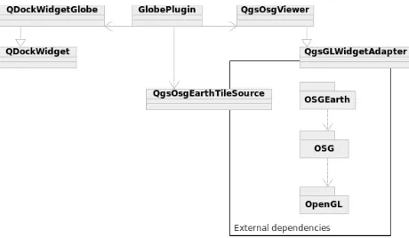
The C++ plug-in bases on the OSGEarth rendering toolkit which on its own builds on top of the OpenSceneGraph (OSG) graphics toolkit. The OSG toolkit uses C++ and OpenGL to create high performance 3D renderings. Figure 1 shows the high level architecture of the plug-in highlighting where adapter classes had to be programmed to allow the OSGEarth globe to communicate with QGIS. The architecture based on the need to ISPRS Annals of the Photogrammetry, Remote Sensing and Spatial Information Sciences, Volume I-2, 2012
have the globe running as a Qt widget directly inside QGIS and not to call it as an external program. This approach allows us leverage the QGIS rendering engine for the globe as well which results in the same layer symbology as on map canvas being used automatically. The main drawback of this approach was the relative difficulty of implementing the adapter layers, but once this was completed, the benefits have been worth the effort.
Figure 1. Globe Plug-in dependencies and high level architecture
The OSGEarth toolkit internally takes care of the generation of the terrain model, the textures and, if activated, the stereo pairs according to the user settings in QGIS settings.
2.3 MultiView Plug-in
The MultiView (Python) Plug-in consists of a main class, a main widget, a data loader, an extensible system of dockable visualisations and some support classes. The main class (MultiView) is instantiated by QGIS automatically on start-up and is used only for few functions. Its main role is to listen to the QGIS toolbar signals and start the correct widget. The other important function performed by this class is the management of the interval length for each variable loaded in the project and to save the values to the project file. This approach was used because the time intervals are created by the data loader and need to be available to the main widget as well. The data loader is an almost stand-alone data importer that takes a list of files with temporal information encoded in the file name and creates layers in QGIS with custom properties that indicate time, interval step number and length of any given layer. The data loader has a maximum resolution of one second. The main widget is where all the preparatory work is performed. This class takes care of creating the user interface on plug-in start up and then manages all user input. Once the class received the needed input, it reads the data values and prepares a multidimensional array to pass on to the currently active visualisation. This approach allows a complete separation of the visualisation widgets from the main application. The result is a fully extensible visualisation system. On each activated variable change, the main widget recalculates the lowest date of all active variables and stores this as a variable called timeMin. The data delivered to the visualisations is an array of arrays
(one for each activated variable) containing lists of seconds from timeMin and value pairs.
Each visualisation implemented in MultiView is an independent widget that needs to implement the AbstractVisualisation Widget class. This class assures that the visualisation widget implements the required methods to properly run in MultiView.
Currently, including a further visualisation requires only altering two lines in the main widget’s code. This could be reduced to no modifications needed by creating a scanning system that would include all available visualisations. However this feature has been noted as only marginally important and thus not implemented.
2.4 Rawvalue Widget
The raw value widget is the most basic visualisation possible realised for MultiView, where the result array is displayed in text form. This widget has a triple functionality, first of all it was the first widget to be implemented and thus it defined the base requirements and signal infrastructure for the further development, second it can be used to export the values for further analysis by simply copy-pasting and third it is a simple example of how the framework works for future developers that might want to implement a further visualisation widget.
2.5 TimePlot Widget
The TimePlot widget is a time vs. value plot. The X axis of the plot indicates the time of a measurement while on the Y axis the value of the current selected location is displayed. The plot can show an unlimited amount of time steps and variables using different colours per variable and allowing zooming into the data. The TimePlot plot is a QwtPlot object that implements a custom QwtScaleDraw class on its X axis. This class (TimeScaleDraw) is responsible for setting the labels and the intervals depending on the data received. The TimeScaleDraw class converts the received values into a time-date object and displays it as a label. The class instantiates as well a QwtScaleDiv object to only show labels where there is a time value, obtaining a regularly distributed labelling. The same approach is used for the TimeScalePicker, a specialized QwtScalePicker class that displays the values under the cursor when moving over the plot. Finally, various Qt classes and widgets are used to allow changing the appearance of all the lines. It is planned but not implemented yet to allow individual line styling to improve the readability of the plot.
2.6 HelixView widget
The HelixView widget is based on a port and adaptation of the LandVis code by Tominski et al. (2005) and it is implemented using Python, PyQGLViewer and the Python OpenGL module. This combination of technology layers made the programming of the helix one of the most complicated tasks of the whole project. At the heart of the helix there are the two main methods of the HelixWidget class, setData and drawWithNames. The setData method receives the raw array from MultiView and pre-processes it for the helix. The pre-processing is needed when data with different temporal resolutions are displayed at the same time. In this case, the setData method finds the greatest common denominator, calculated using the Euclidean algorithm, of the temporal resolutions and expands every array where needed so that each value for each time-step of each variable is present. SetData can either just fill the slots with null values or it can interpolate the data. Finally, the method calculates some values needed for the correct functioning of the helix. The drawWithNames method draws the helix on the screen. The method goes over the pre-processed array and subsequently creates the helix object. For each time-step a ISPRS Annals of the Photogrammetry, Remote Sensing and Spatial Information Sciences, Volume I-2, 2012
GLQuad is drawn and coloured using the hue of the variable and the saturation calculated depending on its value. If the user selected to smooth the helix, then more quads are drawn per time-step. After the quad(s) of a time-step and variable is (are) drawn, the helix is translated and the new variable’s quads are drawn. Once all variables are drawn, the helix is rotated to start drawing the next time-step and the process continues until the whole helix is drawn. Below a pseudo code implementation of the drawing algorithm can be seen:
foreach timestep
set time label if at half cycle foreach quadsPerTimestep foreach variable
calculate saturation draw GLQuad
traslatehelix //move to next variable rotatehelix //move to next time−step
2.7 Scattergram Python Plug-in Extension
The scattergram (Figure 2) is a scatter-plot tool that allows plotting the values of two layers against each other. The tool can track the mouse position over the map canvas and highlight the correspondent value on the scatter-plot.
Figure 2. High level architecture of plotToMap functionality
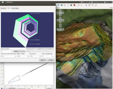
Scattergram also allows selecting a polygonal region on the map canvas and then highlights all the points included in the selection in the scatter-plot. The PlotToMap extension does exactly the contrary, allowing the user to select point(s) on the scattergram and to have them plotted on the map canvas. Figure 3 shows one combination of the possible interface elements together in a multiple-linked view environment.
Figure 3. The visualisation framework with the helix view (top-left), scatter plot (bottom-left) and the terrain view (right) 1
3. EVALUATION
3.1 Expert Interviews
After the toolbox was ready, a pilot evaluation based on expert interviews was also carried out to gain insight into the usability of the developed tool and to highlight further possible improvements and challenges. The toolbox has been tested with experts to find out if it satisfies user needs and the usability requirements expressed in the design phase of the project. Based on the requirements resulted from literature research, the various brainstorming sessions and the focus group, a test environment has been set up where five experts, chosen to cover a variety of specialists in physical geography. They had to solve a series of tasks and evaluate the ease and effectiveness of the tool they used to solve the task. The test scenario was based on real analysis tasks inspired by the original design requirements, using model data from the GEOtop model. We performed in-depth semi-structured interviews with the five experts. With this format, the user can behave freely and comment on his or her actions while still following a given structure (Courage and Baxter 2005) First, to assess their possible biases, the participants were asked questions regarding their experience with GIS, QGIS, environmental data and multi-temporal data. After an explanation about the project, what was expected from them, how the system was designed and supposed to work; the participants were presented a printed script that led them through the whole session. When needed, a quick overview of basic GIS concepts and QGIS use was given to assure a minimal bias that may come from familiarity with GIS.
Time visualisations
After about 50 minutes, all participants completed the temporal tasks and then compared the three different methods. None of the participants appreciated looking for temporal patterns using only the layers’ visibility switches. In contrast, it was a unanimous statement that TimePlot (Figure 4) was intuitive and it was easy to identify patterns in the data. Indeed, the participants performed very well when asked to identify patterns using this visualisation.
Figure 4 The time plot, showing snow depth and temperature 1
1
High resolution screenshots are available at .
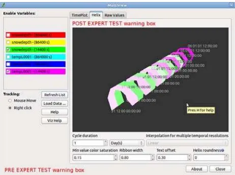
Figure 5. The helix view showing multiple cyclic phenomena1
The users could not identify complex patterns immediately, but easier patterns like the diurnal cycle were quickly discovered. All testers stated that TimePlot was their preferred tool but they would like to try using HelixView (Figure 5) with familiar datasets to assess its real potential. This result is not surprising since all the participants deal with statistics and plots. TimePlot is similar to a standard plot, the users have a very flat learning curve to start using the tool proficiently. On the other hand, the helix visualisation is mainly unknown and thus requires more effort to figure out. After this comparison, the participants were asked to close MultiView and to move on to the next test subject, the Scattergram Plug-in.
Scattergram
The users were assigned the task to look for outliers and/or clusters in the data and to see if they were connected to a specific spatial pattern using the scattergram (Figure 6) after a short training. They had little trouble getting used to the interface and could easily start using the tool to look for patterns in the data. Their success was impressive; everyone could quickly detect clusters on the scattergram, have them plotted to the map and identify the topographic characteristics of the locations.
Figure 6. The scattergram (left) and terrain (right) showing snow-depth versus temperature1
During the usage, the testers found three main issues. The first was the absence of a variable name label on each Axes. This issue is easy to fix since all needed functionalities are already in the system. Another problem was that the interaction between the zoom class and the scale range seems to create random bugs (this problem was also encountered in TimePlot). For this problem, some of the bugs have been fixed and some are under
inspection. The third problem is that a symbol icon would be better than the text icon, and can be easily solved by editing the original UI files.
Globe
The last task the users were asked to perform was a superficial evaluation of the UI of the Globe Plug-in (Figure 7), by explaining what they thought each button of the UI would do.
Figure 7. Evolution of the Globe Plug-in. Basic globe, globe with GUI, globe with GUI and stereo 3D
Most users found all the buttons to work as expected. The only button that was confusing the users was the one to reset rotation and tilting to perpendicular view with north above. As can be seen in Figure 8 this button was the same as the tilt down button and thus it was hard to discern the two. The button has been changed to reflect the testers’ suggestions.
Figure 8. Globe tilt and rotate controls pre and post expert interview
4. CONCLUSIONS
This study demonstrates the complete process of building an ad-hoc application embedded in a mature GIS software to address the user needs within an environmental monitoring project by implementing a novel combination of multivariate spatio-temporal data visualisations. A user-centred design process is followed and explained from the early planning stages, passing through the users’ task analysis, conceptual design, prototyping, expert guideline-based evaluation up to a formative usability evaluation. The developed applications are an example of how a (stereo) 3D visualisation can be used as input controller in a mixed 2D/3D environment. Furthermore, the developed Globe Plug-in simplifies the GIS work-flow for terrain based data visualisation by allowing a direct (almost real-time) visualisation of any 2D data readable by QGIS. The data export and preparation steps are no longer needed and the user can instantaneously see the results of its analysis in a terrain based (stereo) 3D visualisation. The modular implementation of the MultiView visualisation framework has opened a vast possibility for future spatio-temporal data visualisation in QGIS by creating a common development platform where independent developers can easily implement new visualisations. Lastly, the scattergram extension shows how the simple idea of backward georeferencing the scattergram data has generated a useful and intuitive tool for the localisation of data clusters, anomalies and outliers. Evaluations revealed that modules have some limitations, but most of them can be easily fixed.
Discussion and Future Work
The code developed during this project has been released to the public domain under the GPL license and is available in various repositories online2
Globe Plug-in aims at real time visualisation of the QGIS map canvas on a 3D globe. This will allow data analysis, exploration and visualisation within one software package. This approach has the advantage that all data can be studied while looking at the topography of the terrain. Therefore the topography is directly present and does not need to use a further visual variable. Furthermore this approach allows GIS users to produce high quality 3D output and visualisations without having to export or convert their data to other formats. To achieve such a goal, the following issues of the Globe Plug-in need to be addressed:
. As such, the code is available to anyone interested in fixing bugs, extending it or making it perform better. Often such work gets contributed back to the original code so that a common code-base is kept alive and growing. This is one of the advantages of open source code development.
• Increased stability
• User selectable real time synchronisation with map canvas
• Creation of signals for symbolization updates • Python bindings
• Nicer “fly to” paths
The visualisation framework and the Scattergram Plug-in are so far stable enough, to be successfully used. Of course, many features can still be added and bugs are to be fixed but no real show-stopper exists for these tools to be productively used.
Acknowledgements
This research is partially funded by Swiss National Science Foundation within project GeoF II (SNF award number 200020_132805) and supported through the nano-tera.ch project X-Sense. We would also like to acknowledge our anonymous reviewers for their valuable feedback.
References
Aigner, W., Miksch, S., Müller, W., Schumann, H., and Tominski, C., 2007. Visualizing time-oriented data – A systematic view. Computers & Graphics, 31(3): pp.401–409.
Aigner, W., Miksch, S., Müller, W., Schumann, H., and Tominski, C., 2008. Visual methods for analyzing time-oriented data. IEEE Transactions on Visualization and Computer Graphics, 14: pp. 47–60.
Andrienko, N., Andrienko, G., and Gatalsky, P., 2003.
Exploratory spatio-temporal visualization: An analytical review.
Journal of Visual Languages & Computing, 14(6): pp. 503– 541.
Bleisch, S. and Nebiker, S., 2008. Connected 2D and 3D visualizations for the interactive exploration of spatial information. In: The International Archives of the Photogrammetry, Remote Sensing and Spatial Information Sciences, Beijing, China, Vol: XXI, Part B, pp. 1037-1042.
2
http://hub.qgis.org/users/8
Courage, C. and Baxter, K., 2005. Understanding Your Users: A Practical Guide to User Requirements Methods, Tools, and Techniques. Morgan Kaufmann, 1st edition.
Daassi, C., Nigay, L., and Fauvet, M.C., 2006. A taxonomy of temporal data visualization techniques. Revue en Sciences du traitement de lInformation Cépaduès Editions, 5(2): pp. 41–63.
Dall’Amico, M., Endrizzi, S., Gruber, S. & Rigon, R., 2011. An energy-conservative model of freezing variably-saturated soil. The Cryosphere, 5: pp. 469–484.
Gruber, S., 2011. Personal communication. University of Zurich, Department of Geography, Switzerland.
Inselberg, A., 2009. Parallel coordinates: visual
multidimensional geometry and its applications. Springer-Verlag New York, Inc., Secaucus, NJ, USA.
Li, X. and Kraak, M.J., 2005. New views on multivariable spatio-temporal data: the space-time cube expanded. In:
International Symposium on Spatio-temporal Modeling, Spatial Reasoning, Analysis, Data Mining and Data Fusion, XXXVI: pp. 199–201.
Li, X., Çöltekin, A., & Kraak, M.J., 2010. Visual exploration of eye movement data using the Space-Time Cube. Lecture Notes in Computer Science (GIScience 2012), 6292: pp. 295-309.
Monmonier, M.,1994. Focus groups for design improvement in dynamic cartography. Cartography and Geographic
Information Science, 21(11): pp. 37–47.
Rogowitz, B. E. and Treinish, L. A., 1996. How not to lie with visualization. Computers in Physics, pp. 268–273.
Shneiderman, B., 1996. The eyes have it: A task by data type taxonomy for information visualizations. In IEEE Visual Languages: pp. 336–343.
Tominski, C., Abello, J., and Schumann, H., 2004. Axes-based visualizations with radial layouts. In: Proceedings of the ACM Symposium on Applied Computing (SAC): pp. 1242–1247.
Tominski, C., Schulze-Wollgast, P., and Schumann, H., 2005. 3D Information visualization for time dependent data on maps. In: Proceedings of the International Conference Information Visualisation, IEEE Computer Society, pp. 175–181.
Tominski, C. and Schumann, H., 2008. Enhanced interactive spiral display. In: Proceedings of the Annual SIGRAD Conference, Special Theme: Interactivity: pp. 53–56.
Volbracht, S., Domik, G., Shahrbabaki, K., and Fels, G., 1997. How effective are 3D display modes? In: Proceedings of the SIGCHI Conference on Human Factors in Computing Systems, CHI ’97: pp. 540–541.
QGIS Case studies, 2012 [last visited: 2012-04-23]. Available from: http://www.qgis.org/en/community/qgis-case-studies.html
Wirz, V., Limpach, P., Buchli, B., Beutel, J. and Gruber, S., 2011: Temporal characteristics of different cryosphere-related slope movements in high mountains. In: Proceedings of the Second World Landslide Forum, 3-9 October 2011. ISPRS Annals of the Photogrammetry, Remote Sensing and Spatial Information Sciences, Volume I-2, 2012