TNP2K
WORKING PAPER
POVERTY AND THE LABOUR MARKET IN INDONESIA:
EMPLOYMENT TRENDS ACROSS
THE WEALTH DISTRIBUTION
TNP2K WORKING PAPER 17 - 2014 October 2014
POVERTY AND THE LABOUR MARKET IN INDONESIA:
EMPLOYMENT TRENDS ACROSS
THE WEALTH DISTRIBUTION
TNP2K WORKING PAPER 17-2014 October 2014
JAN PRIEBE, FIONA HOWELL, AND VIRGI AGITA SARI
The TNP2K Working Paper Series disseminates the findings of work in progress to encourage discussion and exchange of ideas on poverty, social protection, and development issues.
Support for this publication has been provided by the Australian Government through the Poverty Reduction Support Facility (PRSF).
The findings, interpretations, and conclusions herein are those of the author(s) and do not necessarily reflect the views of the Government of Indonesia or the Government of Australia.
You are free to copy, distribute, and transmit this work for noncommercial purposes.
Suggested citation: Priebe, Jan, Fiona Howell, and Virgi Agita Sari. 2014. ‘Poverty and the Labour Market in Indonesia: Employment Trends across the Wealth Distribution’. TNP2K Working Paper 17-2014. Jakarta: Tim Nasional Percepatan Penanggulangan Kemiskinan (TNP2K).
Table of Contents
Abbreviations ... viii
Acknowledgements ... ix
Introduction ... 1
Labour Market Indicators 2000 to 2012: The Rise of Full-Time Employment ... 3
International Differences in Labour Force Participation Rates: The Asia Region ... 3
Labour Force Participation, Full-Time Employment, and Underemployment ... 4
Working Hours: Rise in Number of Hours Worked ... 11
Labour Market Differences among the Working Poor vs. the Working Nonpoor ... 13
Labour Force Participation across the Wealth Distribution ... 13
Working Hours across the Wealth Distribution ... 15
Who Are the Working Poor? ...21
Socioeconomic Characteristics of the Working Poor vs. the Working Nonpoor ...21
Type of Employment and Sector of Employment ...32
Summary ... 44
References ... 45
List of Figures
Figure 1: Labour Force Participation Trends in Asian Countries (1993–2012) ... 3
Figure 3: Trend in the Employment Rate (2000–12) ... 6
Figure 4: Labour Force Participation by Rural and Urban Area (2000–12) ... 8
Figure 5: Labour Force Participation by Gender (2000–12) ...10
Figure 6: Average Length of Work (2000–12) ...12
Figure 7: Labour Force Participation by Real per Capita Expenditure Decile (2012) ... 14
Figure 8: Trend in Labour Force Participation (Selected Deciles) ... 15
Figure 9: Employment Status by Real per Capita Expenditure (2012) ... 17
Figure 10: Length of Work by Real per Capita Expenditure (2012) ... 17
Figure 11: Length of Work (Selected Years) ... 18
Figure 12: Length of Work by Gender (2012) ...20
Figure 13: Length of Work by Area (2012) ...20
Figure 14: Distribution of Workers by Educational Attainment (2012) ...24
Figure 15: Distribution of Workers by Educational Attainment (2000–12) ...25
Figure 16: Educational Attainment of Workers by Gender and Area (2012) ...27
Figure 17: Share of Workers by Area (2012) ...28
Figure 18: Proportion of Workers by Areas (Selected Deciles) ...29
Figure 19: Share of Workers in the Labour Force by Area and Decile ...30
Figure 20: Proportion of Workers by Gender (2012) ... 31
Figure 21: Proportion of Workers by Gender (Selected Deciles, 2000–12) ...32
Figure 22: Distribution of Workers by Type of Employment (2012)... 33
Figure 23: Distribution of Workers by Employment Status (2000–12) ... 35
Figure 24: Distribution of Workers by Sector’s Formality (2012) ... 37
Figure 25: Proportion of Workers by Sector’s Formality (Selected Years) ... 38
Figure 26: Proportion of Workers by Sectors (2012) ...42
List of Tables
Table 1: Employment Trends (2000–12) ... 7
Table 2: Employment Rates by Area (Selected Years)... 8
Table 3: Employment Rates by Gender (2000–12) ...10
Table 4: Length of Work by Gender and Area ...12
Table 5: Labour Force Indicators by Deciles (2000–12) ... 14
Table 6: Employment Status (Selected Years) ... 16
Table 7: Length of Work (Selected Years) ... 18
Table 8: Length of Work by Gender and Area (2012) ...19
Table 9: Demographic Structure of Working Persons across Deciles (2000–12) ...22
Table 10: Distribution of Workers by Educational Attainment (2000–12) ...24
Table 10: Distribution of Workers by Educational Attainment (2000–12) [continued] ...25
Table 11: Educational Attainment of Workers by Gender and Area (2012) ...26
Table 12: Distribution of Workers by Area (2000–12) ...28
Table 13: Proportion of Workers by Gender (2000–12) ... 31
Table 14: Distribution of Workers by Employment Status (2000–12)... 34
Table 15: Employment Status by Gender and Area (2012)... 36
Table 16: Distribution of Workers by Sector’s Formality (2000–12) ... 37
Table 17: Proportion of Workers by Sector’s Formality, Gender, and Area (2012) ...39
Table 18: Proportion of Workers by Sectors (2000–12) ...40
Table 18: Proportion of Workers by Sectors (2000–12) [continued] ... 41
Table A1: Labour Market Indicators according to Statistics Indonesia (2000–12) ... 47
Table A2: Labour Market Indicators by Provinces (2000) ... 47
Table A3: Labour Market Indicators by Provinces (2012) ... 48
Abbreviations
BPS Badan Pusat Statistik (Statistics Indonesia)
HH household
ILO International Labour Organization
LFPR Labour Force Participation Rate
n/a not applicable
OECD Organisation for Economic Cooperation and Development
Sakernas Survei Angkatan Kerja Nasional (National Labour Force Survey)
Susenas Survei Sosial dan Ekonomi Nasional (National Social and Economic Survey)
TNP2K Tim Nasional Percepatan Penanggulangan Kemiskinan (National Team for
Acknowledgements
Introduction
After the financial and economic crisis of 1997/1998, Indonesia entered a period of high economic growth with gross domestic product per capita growth rates (in constant prices) averaging 5.4% between 2000 and 2012. These high economic growth rates were accompanied by strong reductions in poverty rates from 19.14% in 2000 to 11.66% in 2012.
However, despite these positive developments, poverty levels in Indonesia remain high and many millions of individuals and households live just above the widely used near-poor poverty line (1.2 times
the poverty line)1 and are vulnerable to shocks. As recent reports by the World Bank (2013) and TNP2K
(Priebe and Howell 2014) show, about 25% of households were poor at least once during 2008–10. Likewise, in 2012 about 25.5% of Indonesians were living below the near-poor poverty line, further illustrating that more than 60 million Indonesians are still considered poor or vulnerable to poverty.
Employment and jobs are instrumental to achieving economic and social development. Beyond their importance for individual well-being, they lie at the heart of many broader social objectives, such as poverty reduction, social cohesion, conflict resolution, and productivity growth. The creation of sustainable employment opportunities has been a focus for governments around the world (World Bank 2013; OECD 2013), not only on job creation but also on creating productive employment that provides decent wages and income so that workers and their families are not prone to poverty. In fact, the main problem for the poor in many developing countries, including Indonesia, is not that they do not have enough hours to work but rather that their jobs are not earning/paying sufficient income for them to make a living. Recognising and acknowledging this issue, many countries in the region, including Indonesia, have committed themselves to national and international strategies to achieve full, productive, and decent employment for all their people. For example, Indonesia has its National
Long-Term Development Plan (Rencana Pembangunan Jangka Panjang Nasional) 2005–25 and National
Medium-Term Development Plan (Rencana Pembangunan Jangka Menegah Nasional) 2010–14.
International examples include the G20 Labour and Employment Ministers’ Declaration of July 2013 and the International Labour Organization’s (ILO’s) Asian-Pacific Decent Work Decade 2006–15.
In this context, it is important to acknowledge several features of labour markets in developing countries, including Indonesia. First, due to increasing population growth, more people are entering than exiting the labour market. Economists and demographers often refer to terms such as a ‘demographic dividend’ in which the share of people that need to support the nonworking population (young children and the elderly) is supplied by a large number of people of working age; however, the existence and the extent of benefit from such a dividend strongly depends on how successful Indonesia will be in bringing the millions of new young workers into productive and gainful employment (Oberman et al. 2012).
payments, and registration of businesses); and a high share of persons working on traditional small rural farms.
To design appropriate labour market policies that contribute to economic growth and poverty reduction, it is important to better understand the composition and development of Indonesia’s labour market. This paper is intended to fill this gap by providing a comprehensive analytical overview on key labour market indicators, such as labour force participation rates, employment rates, unemployment rates, and hours and days worked. The respective statistics are calculated and further disaggregated by rural and urban status, gender, and province. Moreover, because the objective of this report is to link work with poverty, wealth distribution and labour market statistics are disaggregated by deciles (based on household per capita ependiture levels) with a particular focus on workers living in the poorest decile (decile 1). By interlinking poverty and labour market statistics, this report provides a unique data source for policy makers and researchers alike that are interested in a deeper understanding of poverty and employment issues in Indonesia.
As the main objective of this report is to analyse the interrelationship of poverty and the labour market, the principal data source used in this report is Indonesia’s large-scale national household survey, the
National Social and Economic Survey (Survei Sosial dan Ekonomi Nasional or Susenas), which is
conducted by Statistics Indonesia (Badan Pusat Statistik or BPS). Susenas is currently the only data
source available in Indonesia that collects reliable, nationally representative information on household living standards and labour market characteristics. Although Susenas is the underlying data source for official poverty statistics in Indonesia, the National Labour Force Survey (Survei Angkatan Kerja Nasional or Sakernas) is used by Statistics Indonesia to calculate the official labour market indicators. An
important disadvantage of Sakernas for our purpose is that it only provides information on individuals (individuals cannot be linked with other household members) and does not collect information that can be used to identify poor individuals (e.g., expenditure information). That said, Susenas uses exactly the same labour market questions as Sakernas, and labour market indicators included in Susenas are very similar to those of Sakernas. To analyse labour market trends over time, this report focuses on the post-financial-crisis period and uses the Susenas rounds of 2000, 2003, 2006, 2009, and 2012.
Labour Market Indicators 2000 to 2012: The Rise of Full-Time
Employment
International Differences in Labour Force Participation Rates: The Asia Region
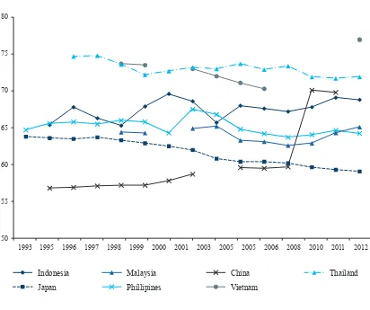
Before we analyse the labour market in 2000–12 in more detail, we would like to provide a context for the longer period 1993–2012, focusing on Indonesia’s performance and position in the Asia region. In the past 20 years, countries in Asia experienced very different developments in labour force participation rates (figure 1). Although labour force rates tend to change very slowly over time, ILO’s labour data indicate that countries such as the Philippines, Thailand, and Japan saw moderate declines in labour force participation rates, whereas China, Indonesia, and Malaysia saw slight increases. Indonesia belongs to the group of countries that saw increases in labour force participation; it also belongs to those countries, including China, Thailand, and Vietnam, that have some of the highest labour force participation rates in Asia.
Figure 1: Labour Force Participation Trends in Asian Countries (1993–2012)
80
60
55 65 70 75
50
1993 1995 1996 1997 1998 1999 2000 2001 2003 2005 2005 2006 2008 2010 2011 2012
Indonesia
Japan
Malaysia
Phillipines
China
Vietnam
Labour Force Participation, Full-Time Employment, and Underemployment
Strong Increases in Labour Force Participation Rate and Jobs with Full-Time
Employment
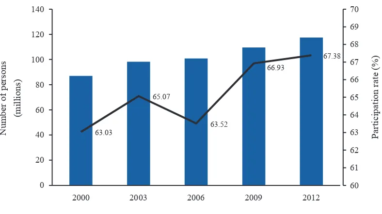
The trend of increasing labour force participation rates (LFPRs) in Indonesia, as well as the overall level of labour force participation, can be replicated with data from Susenas focusing on the period 2000–12. In line with the official Statistics Indonesia Sakernas data, Susenas shows that the growth in the LFPR has not occurred evenly throughout each year. After the turbulence of the economic and financial crisis of 1997/1998, economic growth recovered and poverty levels started falling again. However, economic growth and poverty reduction seem not to have been triggered by strong growth in jobs in the beginning of the 2000s; the World Bank called the time between 1999 and 2003 a period of jobless growth (World Bank 2010). As shown in figure 2, the LFPR increased slightly from 63.03% to 65.07% between 2000 and 2003 and, in line with Sakernas data, the LFPR decreased slightly in the wake of the fuel price cuts in 2005/6. Since 2006 the LFPR increased strongly, and from 2000 to 2012, the rate increased from 63.03% to 67.38%. In absolute terms, the increase in the size of the labour force appears even more remarkable. In 2000 about 87 million Indonesians were active in the labour force, and by 2012, this number had increased to nearly 117.5 million, that is, more than 30 million additional persons are now participating in the labour market (table 1).
Figure 2: Trend in Labour Force Participation Rate (2000–12)
Note: TNP2K calculations based on Susenas rounds. Survey weights applied.
63.03
2000 2003 2006 2009 2012
P
Box 1: Notes on Key Labour Market Indicators and Definitions*
This paper uses the concepts of key labour market indicators universally applied by Statistics Indonesia (BPS 2013a). The definition of each indicator follows:
Labour force participation. Labour force refers to the working-age population who are economically active. Working-age individuals (ages 15 years and older) considered out of the labour force include people who do not actively engage in job searching, such as those who attend schools, take care of a household, or perform other activities. The ‘labour force participation rate’ indicates the size of the working-age population that is economically active. In other words, it shows the state of labour supply of a nation. The LFPR is measured as the percentage of total labour force to the total working-age population.
Employment. Working persons include individuals who perform economic activities continuously for at least one hour during the past week to obtain earnings or profits; economic activities here refer to either (1) working at a job or (2) having a job but not working for one of several reasons: annual leave, sickness, etc. Two subcategories exist under employment:
• Full-time employment. Full-time employees include individuals who work 35 or more hours a week.
• Underemployment. The underemployed include individuals who work 1 to 35 hours a week.
The employment rate refers to the share of employed individuals within the total labour force. The time employment rate is defined as the proportion of individuals who currently engage in full-time employment to the total labour force. The underemployment rate is defined as the share of underemployed individuals to the total labour force.
Unemployment. Individuals in the labour force fall into the category of unemployed if they (1) are not working but are looking for work; (2) are not working but are preparing to start a business; (3) do not work and are unable to find a job because they gave up hope (also referred to as discouraged workers); (4) do not work but are not looking for work because they have already been accepted into employment but have not yet started working.
Formal and informal employment. In compliance with Statistics Indonesia classifications, the formal and informal sectors are defined by their main employment status. There are seven categories of employment status: (1) self-employed (own account worker); (2) self-employed assisted by temporary/ unpaid workers; (3) employer with permanent/paid workers; (4) employee; (5) casual employee in agriculture; (6) casual employee in nonagriculture; and (7) unpaid worker. Formal employment refers to an employer with permanent/paid workers and employees. Furthermore, salaried workers are those who work as employees (receiving a wage/salary) in cash or in-kind while non-salaried workers are those who are self-employed.
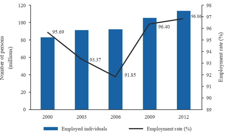
The employment rate (the share of the total labour force consisting of working individuals) has been very high throughout all the years (figure 3). Of those individuals that constitute the labour force, nearly all of them state that they are working and only a small fraction claim to be unemployed. The share
of persons actively looking for a job and not in any sort of employment (the unemployed2) has further
decreased in recent years; in 2012 to 3.14% of the labour force was unemployed (table 1). According to Susenas, employment rates ranged between 95%–97% in 2000–12, except for decreases in 2003–06 (figure 3).3
Figure 3: Trend in the Employment Rate (2000–12)
Note: TNP2K calculations based on Susenas rounds. Survey weights applied.
Not only has the number of jobs and persons employed increased since 2000, but more important, the number and share of jobs constituting full-time employment (at least 35 hours per week) has also risen continuously and sharply throughout this entire period. As shown in table 1, in 2000, about 58.68% of individuals in the labour force engaged in full-time employment; by 2012 this share had risen to 68.06%4. Accordingly, the share of those classified as underemployed by Statistics Indonesia (at least 1
hour of work a week but less than 35 hours a week) has decreased from 37.01% in 2000 to 28.80% in
2012. These data are clearly positive and indicate that the potential to obtain sufficient income from
work has increased in the past 12 years.
2 This report applies the current Statistics Indonesia definition of unemployment to all years analysed. Please see Suryadarma et al. (2007) for a more comprehensive overview on the history of unemployment measurement by Statistics Indonesia in
Indonesia.
3 Alisjahbana and Manning (2006), using the 2002 Susenas round, found that being unemployed is not associated with
being poor. Unemployment rates derived from Sakernas are slightly higher than those obtained from Susenas are but remain comparable (ILO 2013).
4 In line with its ‘decent work’ concept, the ILO further differentiates between full-time employment and employment with excessive working hours. Because this report follows the Statistics Indonesia definition, we do not provide separate estimates
for excessive working hours.
2000 2003 2006 2009 2012
N
Table 1: Employment Trends (2000–12)
Labour Market
Indicators 2000 2003 2006 2009 2012
Total working-age population 138,106,153 150,988,614 158,766,431 163,787,957 174,333,612
Total labour force 87,041,675 98,248,688 100,850,392 109,630,216 117,467,232
Employment rate (%) 95.69 93.37 91.85 96.40 96.86
Full-time employment rate (%)
58.68 62.20 61.18 63.26 68.06
Underemployment rate (%) 37.01 31.17 30.67 33.14 28.80
Unemployment rate (%) 4.31 6.63 8.15 3.60 3.14
Note: TNP2K calculations based on Susenas rounds. Survey weights applied.
The Urban Labour Market as a Driver of Job Creation
Indonesia is the world’s largest archipelago and comprises complex and diverse cultural, linguistic, and geographic settings. As a consequence, Indonesia has no one unified labour market but many local labour markets, each with its particular set of jobs (supply side) and human resources (demand side) available. Categories of local labour markets are often distinguishable along a rural/urban divide; among provinces; between Java island and off-Java areas; and even between the two regions of Western Indonesia and Eastern Indonesia. We will focus our discussion here on the rural-urban divide.
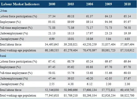
As shown in figure 4 and table 2, notable differences exist between rural and urban labour markets in Indonesia. Rural labour markets are generally characterised by higher labour force participation rates than urban labour markets are. However, urban labour markets are more likely to provide jobs with full-time employment compared with rural labour markets. Moreover, although unemployment is nearly nonexistent in rural labour markets, urban labour markets show relatively high rates of unemployment. However, the nature of and reasons behind urban unemployment rates are likely to be very different from rural unemployment rates; urban unemployment rates capture a large number of persons who are temporarily unemployed because they have recently finished their education, a substantial number of arriving new migrants looking for jobs, and many people who are in the process of changing jobs.
Figure 4: Labour Force Participation by Rural and Urban Area (2000–12)
Note: TNP2K calculations based on Susenas rounds. Survey weights applied.
Table 2: Employment Rates by Area (Selected Years)
Labour Market Indicators 2000 2003 2006 2009 2010
Urban
Labour force participation (%) 57.34 60.18 61.37 64.13 65.14
Employment (%) 93.01 89.99 89.14 94.96 95.97
Full-time employment (%) 71.88 71.86 71.17 71.73 76.58
Underemployment (%) 21.13 18.13 17.97 23.23 19.39
Unemployment (%) 6.99 10.01 10.86 5.04 4.03
Total labour force 34,495,645 39,288,021 43,250,259 51,857,404 57,007,494
Total working-age population 60,160,535 65,279,404 70,470,097 80,861,723 87,510,912
Rural
Labour force participation (%) 67.41 68.79 65.24 69.67 69.64
Employment (%) 97.45 95.62 93.88 97.70 97.70
Full-time employment (%) 50.01 55.76 53.68 55.66 60.03
Underemployment (%) 47.44 39.85 40.20 42.05 37.67
Unemployment (%) 2.55 4.38 6.12 2.30 2.30
Total labour force 52,546,030 58,960,666 57,600,134 57,772,811 60,459,745
Total working-age population 77,945,618 85,709,210 88,296,334 82,926,234 86,822,700
Note: TNP2K calculations based on Susenas rounds. Survey weights applied.
67.41
2000 2003 2006 2009 2012
L
Labour Force Labour Force Participation Rate
2000 2003 2006 2009 2012
L
Gender Differences in LFPR and Patterns of Full-Time Employment
As widely documented in labour market literature, job markets and employment opportunities are usually very different for men and women. The reasons behind these differences are diverse and often related to prevailing sociocultural norms (fertility, care giving, household management, etc.) as well as gender-specific preference and skill sets. Likewise, labour market discrimination against women may contribute to overall labour market outcomes, although the existence, extent, and type of discrimination are hard to assess using existing data in Indonesia.
Throughout the entire reference period discussed here, the LFPR among men has significantly surpassed that of women; both men and women have shown increases in the LFPR between 2000 and 2012 (figure 5 and table 3). Although in 2000, 81.19% of men in the working-age population were part of the labour force, their share increased to 84.56% in 2012. The LFPR among women saw an even stronger increase: women’s LFPR increased by about 5 percentage points from 45.26% in 2000 to 50.27% in 2012.
Two other features of the gender-specific labour market in Indonesia are noteworthy:
First and similar to OECD countries (World Bank 2013; OECD 2013), strong differences exist
between men and women in their shares of underemployment and full-time employment: a greater proportion of women are employed part-time. This high share is often related to women’s greater responsibility for domestic work and child raising and the difficulties women face in re-entering the formal labour market after raising their children.
It is important to note that, in 2000, women who were working were equally likely to be underemployed (48.54%) as employed full-time (46.89%), whereas men in about two-thirds (65.39%) of all cases were employed full-time (table 3). In 2012 the share of women in full-time positions increased significantly to 58.63% and the share of men in full-time positions increased to 73.69%.
Second, unemployment in the early 2000s was more pronounced among women; however, by 2006
Figure 5: Labour Force Participation by Gender (2000–12)
Note: TNP2K calculations based on Susenas rounds. Survey weights applied.
Table 3: Employment Rates by Gender (2000–12)
Labour Market
Indicators 2000 2003 2006 2009 2010
Female
Labour force participation (%)
45.26 45.96 43.86 50.49 50.27
Employment (%) 95.44 91.12 89.27 96.02 96.87
Full-time employment (%) 46.89 48.65 49.84 53.03 58.63
Underemployment (%) 48.54 42.47 39.43 43.00 38.23
Unemployment (%) 4.56 8.88 10.73 3.98 3.13
Total labour force 31,609,606 34,962,228 35,080,404 42,462,472 43,897,066
Total working-age population 69,834,352 76,066,439 79,979,110 84,098,878 87,329,941 Male
Labour force participation (%)
81.19 84.47 83.48 84.29 84.56
Employment (%) 95.83 94.61 93.22 96.65 96.86
Full-time employment (%) 65.39 69.69 67.23 69.73 73.69
Underemployment (%) 30.44 24.92 26.00 26.92 23.17
Unemployment (%) 4.17 5.39 6.78 3.35 3.14
Total labour force 55,432,069 63,286,459 65,769,989 67,167,743 73,570,173
Total working-age population 68,271,801 74,922,175 78,787,321 79,689,079 87,003,671
Note: TNP2K calculations based on Susenas rounds. Survey weights applied.
2000 2003 2006 2009 2012
P
Labour Force Labour Force Participation Rate
2000 2003 2006 2009 2012
P
Labour Force Labour Force Participation Rate 81.19
84.47 83.48 84.29 84.56
Working Hours: Rise in Number of Hours Worked
For a comprehensive understanding of the labour market, it is important to see, not only how labour force participation rates have changed over time (extensive margin) but also how many hours, days, and weeks a person works in a job (intensive margin). As described above, there has been a significant shift away from underemployment towards full-time employment. This shift is reflected in the number of hours a person on average reports to work in a week.
Figure 6 and table 4 depict changes over time in the number of hours worked per week and the number of days worked during a week, conditional on having a job. As shown in figure 6, Indonesians in 2012 are working on average longer hours per week (41.11 hours in 2012 compared with 37.74 hours in 2000) and slightly more days (5.89 days in 2012 compared with 5.75 days in 2000). The same holds true for urban and rural areas as well as for male and female employment (table 4). Although workers in urban areas work more hours per week on average (44.87 hours a week in 2012) than workers in rural areas (37.58 hours a week in 2012), employment trends in both areas indicate rises in hours worked per week compared with 2000.
Likewise, in 2000, men who were working spent about 39.92 hours per week on average in their jobs while women who were working spent about 33.90 hours per week on average in their job. In the past 12 years, one can observe significant increases in the number of hours worked by women (37.85 hours a week in 2012), while the gap between men and women in the numbers of hours worked narrowed despite men’s working hours also increasing to an average of 43.05 hours a week in 2012. In general, one can say that men are more likely to actively participate in the labour market and, once working, they are more likely to work longer hours than women are. However, these circumstances are changing as women’s LFPRs and number of hours worked have increased at faster rates than those of men in the same period.
Figure 6: Average Length of Work (2000–12)
Note: TNP2K calculations based on Susenas rounds. Survey weights applied. Statistics are conditional on having a job/working.
Table 4: Length of Work by Gender and Area
Length of Work 2000 2003 2006 2009 2012
Working days Overall 5.75 5.94 5.88 5.78 5.89
Urban 5.95 6.02 6.01 5.89 5.98
Rural 5.62 5.89 5.78 5.67 5.80
Male 5.82 6.03 5.94 5.84 5.93
Female 5.62 5.77 5.76 5.67 5.83
Working hours Overall 37.74 39.60 40.20 39.55 41.11
Urban 43.70 44.36 45.40 43.51 44.87
Rural 34.00 36.63 36.49 36.09 37.58
Male 39.92 41.79 41.89 41.72 43.05
Female 33.90 35.50 36.88 36.09 37.85
Note: TNP2K calculations based on Susenas rounds. Survey weights applied. Statistics are conditional on having a job/working.
2000 2003 2006 2009 2012
5.75
Labour Market Differences among the Working Poor vs. the Working
Nonpoor
Labour Force Participation across the Wealth Distribution
In recent years, a better understanding of the relationship between labour markets and poverty has emerged: persons are not necessarily poor because they do not find employment but rather because the employment they find does not provide enough working time (hours of work) or adequate income or hourly wages. Although Susenas does not allow for an investigation of the latter issue, it does allow for analysis of levels and trends in LFPRs and hours worked across the wealth distribution.
The following analysis classifies all individuals in the working-age population (age 15 years and older) into real expenditure per capita deciles by dividing overall household expenditures by the number of household members and then using a spatial price deflator to adjust for living cost differences.5 A
person that is classified within decile 1 is a member of a household that belongs to the poorest 10% of households in Indonesia, whereas an individual in decile 10 belongs to a household that is in the richest 10% of households in Indonesia. In 2000, Statistics Indonesia classified the bottom 20% of households as poor, while in 2012 about 10% of households were classified as poor. Focusing on individuals in the bottom 10% keeps track of those individuals who are the poorest in the country in the reference period and who are still classified as poor in 2012.
As shown in table 5 and figures 7 and 8, the differences in the LFPR across wealth deciles is rather small: in 2012 the LFPR in decile 1 was about 65% and in the richest decile about 67%. It becomes clear therefore that the poor are not poor because of insufficient attachment to the labour market and other factors determine whether somebody is poor. However, although the gap of 2 percentage points between workers in the poorest and richest deciles appears small, there seems to be a stronger trend towards higher LFPRs across richer deciles. In fact, as shown in table 5 and figure 7, LFPRs in 2000 were actually highest in the poorest deciles, although between 2000 and 2012, this pattern has slightly reversed. Although labour force participation has increased with time in the poorest decile, it has
increased much more strongly among the richer deciles6.
Table 5: Labour Force Indicators by Deciles (2000–12)
Labour Force Indicators 2000 2003 2006 2009 2012
Decile 1
Labour force (millions) 7.68 8.75 8.86 9.59 10.28
Labour force participation rate (%) 63.33 65.47 62.93 66.86 65.17 Decile 4
Labour force (millions) 8.47 9.61 9.86 10.80 11.45
Labour force participation rate (%) 63.92 66.12 64.18 67.80 67.40 Decile 7
Labour force (millions) 8.87 10.08 10.40 11.27 12.06
Labour force participation rate (%) 62.77 65.25 63.87 67.12 67.75 Decile 10
Labour force (millions) 9.70 10.91 11.10 12.15 12.85
Labour force participation rate (%) 60.47 62.79 62.16 65.87 67.30 Average (all deciles)
Labour force (millions) 87.04 98.25 100.85 109.63 117.47
Labour force participation rate (%) 63.03 65.07 63.52 66.93 67.38
Source: TNP2K calculations based on Susenas rounds. Survey weights applied.
Figure 7: Labour Force Participation by Real per Capita Expenditure Decile (2012)
Note: TNP2K calculations based on Susenas rounds. Survey weights applied.
63
Labour Force Labour Force Participation Rate
Figure 8: Trend in Labour Force Participation (Selected Deciles)
Note: TNP2K calculations based on Susenas rounds. Survey weights applied.
Working Hours across the Wealth Distribution
2000 2003 2006 2009 2012
P
Labour Force Labour Force Participation Rate
2000 2003 2006 2009 2012
P
Labour Force Labour Force Participation Rate
2000 2003 2006 2009 2012
P
Labour Force Labour Force Participation Rate
2000 2003 2006 2009 2012
P
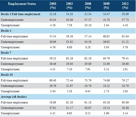
in 2000. Although insufficient hours of work seem to be an important contributing factor of being poor, it is important to note that an increasing share of the working poor comprise persons who are in full-time employment. Therefore, insufficient income and wages among the working poor play an important additional role in determining whether a person who works is poor or not.
Table 6: Employment Status (Selected Years)
Employment Status 2000
(%) 2003 (%) 2006 (%) 2009 (%) 2012 (%)
Decile 1 Full-time employment 52.16 54.33 52.34 54.47 58.09
Underemployment 43.34 38.08 37.57 41.70 37.73
Unemployment 4.50 7.59 10.10 3.84 4.18
Decile 4
Full-time employment 55.54 59.38 57.14 60.05 65.04
Underemployment 39.96 33.82 34.58 36.02 31.21
Unemployment 4.50 6.80 8.28 3.93 3.76
Decile 7
Full-time employment 59.23 63.26 62.19 64.79 70.41
Underemployment 36.46 29.63 29.89 31.90 26.68
Unemployment 4.31 7.10 7.91 3.31 2.91
Decile 10
Full-time employment 69.40 72.44 73.79 74.06 79.27
Underemployment 26.76 21.97 19.76 23.22 18.70
Unemployment 3.84 5.58 6.45 2.73 2.03
Average (all deciles)
Full-time employment 58.68 62.20 61.18 63.26 68.06
Underemployment 37.01 31.17 30.67 33.14 28.80
Unemployment 4.31 6.63 8.15 3.60 3.14
Figure 9: Employment Status by Real per Capita Expenditure (2012)
Note: TNP2K calculations based on Susenas rounds. Survey weights applied.
Figure 10: Length of Work by Real per Capita Expenditure (2012)
Note: TNP2K calculations based on Susenas rounds. Survey weights applied.
Decile
Working hours Working days
0% 10% 20% 30% 40% 50% 60% 70% 80% 90% 100%
hours across the wealth distribution point to fundamental differences in the types of employment and jobs of the working poor compared with the working nonpoor. The pattern of the working poor to work fewer hours a week than the nonpoor is robust through all selected years.
Figure 11: Length of Work (Selected Years)
Note: TNP2K calculations based on Susenas rounds. Survey weights applied.
Table 7: Length of Work (Selected Years)
Length of Work 2000 2003 2006 2009 2012
Decile 1
Average working days 5.77 5.93 5.82 5.68 5.79
Average working hours 35.39 36.79 36.78 35.73 36.86
Decile 4
Average working days 5.72 5.93 5.85 5.76 5.92
Average working hours 36.48 38.52 38.45 38.18 40.08
Decile 7
Average working days 5.72 5.95 5.9 5.82 5.92
Average working hours 37.85 40.09 40.72 40.27 42.25
Decile 10
Average working days 5.80 5.93 5.91 5.79 5.85
Average working hours 41.80 43.31 45.13 43.62 45.04
Average (all deciles)
Average working days 5.75 5.94 5.88 5.78 5.89
Average working hours 37.74 39.60 40.20 39.55 41.11
Note: TNP2K calculations based on Susenas rounds. Survey weights applied.
37.74 39.6
2000 2003 2006 2009 2012
Av
Average Working Hours (2000-2012)
Decile 1
Decile 4
Decile 7
Decile 10
Table 8 and figures 12 and 13 further disaggregate the previous decile statistics for 2012 by gender and location. In line with the previous findings, we observed that men and women who belong to the working poor work fewer hours a week on average than men and women in the richer deciles. The working hour gap between poorer and richer workers is more pronounced among women. Although men who belong to the working poor (decile 1) work on average about 6 hours fewer per week than men in decile 10 (36.6 hours compared with 45.7 hours); women in decile 1 work about 12 hours less per week than women in decile 10.
Table 8: Length of Work by Gender and Area (2012)
Length of Work Total
Gender Area
Male Female Rural Urban
Decile 1
Average working hours 36.86 39.60 32.23 34.12 42.05
Average working days 5.79 5.88 5.64 5.70 5.96
Decile 4
Average working hours 40.08 42.25 36.27 37.35 44.08
Average working days 5.92 5.96 5.86 5.86 6.01
Decile 7
Average working hours 42.25 44.24 38.77 39.12 45.74
Average working days 5.92 5.95 5.88 5.81 6.05
Decile 10
Average working hours 45.04 45.70 44.05 40.72 46.13
Average working days 5.85 5.82 5.88 5.82 5.85
Average (all deciles)
Average working hours 41.11 43.05 37.85 37.58 44.87
Average working days 5.89 5.93 5.83 5.80 5.98
Note: TNP2K calculations based on Susenas rounds. Survey weights applied.
Figure 12: Length of Work by Gender (2012)
Note: TNP2K calculations based on Susenas rounds. Survey weights applied.
Figure 13: Length of Work by Area (2012)
Note: TNP2K calculations based on Susenas rounds. Survey weights applied.
A
verage
W
orking Hours (in a week)
A
verage
W
orking Days (in a week)
Real per Capita Expenditure Decile 15
orking Hours (in a week)
A
verage
W
orking Days (in a week)
Real per Capita Expenditure Decile 15
Who Are the Working Poor?
The previous chapter analysed differences in labour market patterns of workers along the wealth distribution. From this analysis, one finds that LFPRs between the poor and nonpoor are very similar in Indonesia. However, the working poor work fewer hours on average and presumably receive lower hourly wages than better-off workers receive. In combination, these factors are assumed to be the main reasons why workers are poor or not poor. The reason for differences in working hours and hourly wages/income likely lies in differences in the underlying characteristics of poor workers, such as lower levels of education, living in regions with lower wages, and/or working in occupations/sectors that in general provide lower wages/incomes. This section investigates to what extent workers differ in basic socioeconomic and sectoral characteristics at different wealth levels and how these characteristics and
differences have evolved over time7.
Socioeconomic Characteristics of the Working Poor vs. the Working Nonpoor
Demographic Structure
Table 9 depicts mean values for a variety of important socioeconomic, spatial, and sectoral characteristics across real expenditure per capita deciles. The working poor—defined as workers in decile 1—comprise a relatively high share of youth (15 to 24 years) and elderly (55+ years) workers. Adults of prime working age (25 to 55 years) are less likely to be poor and fewer are found in the lower expenditure deciles. Because younger workers are starting their work life, their wages/income might initially be very low due to their lower levels of work experience. Likewise, the elderly are represented relatively strongly among the working poor. The high share of the elderly among the poor is of concern as this group is generally without any sort of formal pension and has very limited opportunities to save enough resources to pay for their daily living costs in old age (Priebe and Howell 2014).
Table 9: Demographic Structure of Working Persons across Deciles (2000–12)
Characteristics 2000 2003 2006 2009 2012
Decile 1
Age:
Young: 15–24 (%) 20.25 18.79 19.03 17.07 16.25
Adult: 25–54 (%) 67.55 68.27 68.41 67.40 67.97
Old: 55+ (%) 12.21 12.94 12.56 15.53 15.78
Average household size 5.03 4.81 4.99 4.76 4.62
Average HH dependency ratio 0.73 0.71 0.71 0.76 0.71
Decile 4
Age:
Young: 15–24 (%) 17.42 17.04 15.56 15.10 15.21
Adult: 25–54 (%) 68.92 69.65 70.14 68.63 70.35
Old: 55+ (%) 13.66 13.30 14.30 16.27 14.44
Average household size 4.21 4.05 3.96 3.81 3.86
Average HH dependency ratio 0.57 0.56 0.53 0.53 0.53
Decile 7
Age:
Young: 15–24 (%) 16.13 15.68 14.33 14.38 14.46
Adult: 25–54 (%) 69.54 70.46 71.22 70.29 71.77
Old: 55+ (%) 14.33 13.86 14.45 15.34 13.77
Average household size 3.59 3.52 3.48 3.43 3.51
Average HH dependency ratio 0.46 0.45 0.42 0.42 0.44
Decile 10
Age:
Young: 15–24 (%) 14.26 13.77 12.58 13.84 13.50
Adult: 25–54 (%) 71.24 72.6 74.78 74.05 75.06
Old: 55+ (%) 14.49 13.64 12.64 12.11 11.44
Average household size 2.66 2.65 2.87 2.82 2.87
Average HH dependency ratio 0.23 0.23 0.24 0.24 0.27
Average (all deciles) Age:
Young: 15–24 (%) 16.87 16.13 15.04 14.88 15.08
Adult: 25–54 (%) 69.11 70.36 71.16 69.99 71.32
Old: 55+ (%) 14.02 13.51 13.81 15.13 13.60
Average household size 3.71 3.61 3.64 3.58 3.62
Average HH dependency ratio 0.47 0.46 0.45 0.46 0.45
Furthermore, the working poor are more likely to live in households with many family members (larger household size) and with a high dependency ratio (a relatively large share of young children and elderly compared with adults in prime working age). The income of the working poor therefore needs to provide for significantly more persons than in the case of nonpoor workers. Hence, the need to share income among a larger group of poor persons further contributes to the number of workers living in poverty, despite working a substantial number of hours each week.
Education and Skill Levels of the Working Poor
In the past few decades, Indonesia has experienced significant improvements in literacy and school enrolment rates throughout the country. A large program for the construction of more than 243,000 schools began in the 1970s and strongly contributed to Indonesia achieving primary school enrolment rates of close to 100% (Suharti 2013), which in turn led to higher labour force participation rates and wage increases among the poor (Duflo 2001, 2004). In general, the period from the 1970s until today has seen a substantial and steady increase in primary, secondary, and tertiary education completion rates and the gap in years of education between the poor and the rich has narrowed over time (Fahmi and Satriatna 2013). However, substantial differences in the quality of education continue to hamper skills development in the country (Suharti 2013).
Scholars (Duflo 2004; Purnastuti et al. 2013) have observed that the rise in education levels in Indonesia has led on average to moderate declines in the rate of returns to education, implying that the value of a given education degree received in the 1980s paid relatively more than in 2014. However, although the relative benefit of higher secondary over primary schooling might have been greater in the 1980s, one must bear in mind that workers with higher secondary education qualifications on average continue to receive significantly higher incomes and wages compared with workers with only primary-level schooling.
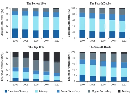
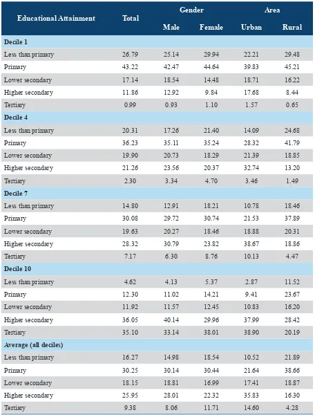
In line with the education and labour market literature on Indonesia, we found that a worker’s education level is significantly associated with belonging to the working poor (figure 14 and table 10). Although in 2012 about 70% of workers in the bottom decile (decile 1) possessed primary education or less, only 17% of workers that belong to the richest decile (decile 10) had primary school degrees or less. In fact, along the wealth distribution, the share of workers with higher secondary schooling and especially tertiary education rises continuously.
Figure 14: Distribution of Workers by Educational Attainment (2012)
Table 10: Distribution of Workers by Educational Attainment (2000–12)
Educational Attainment Rates 2000 (%) 2003 (%) 2006 (%) 2009 (%) 2012 (%)
Decile 1
Less than primary 32.01 28.72 25.46 26.86 26.79
Primary 45.08 46.76 47.29 44.17 43.22
Lower secondary 13.02 15.17 16.77 17.16 17.14
Higher secondary 9.33 8.78 9.95 10.96 11.86
Tertiary 0.56 0.57 0.52 0.85 0.99
Decile 4
Less than primary 25.98 22.22 20.73 21.23 20.31
Primary 42.58 42.82 41.56 39.06 36.23
Lower secondary 15.32 17.68 19.22 19.21 19.90
Higher secondary 14.38 15.40 16.57 18.18 21.26
Tertiary 1.74 1.87 1.92 2.32 2.30
Decile 7
Less than primary 22.47 18.53 16.7 15.84 14.80
Primary 36.01 36.86 34.18 31.36 30.08
Lower secondary 16.19 18.38 18.37 18.72 19.63
Higher secondary 21.18 21.85 25.26 27.60 28.32
Tertiary 4.15 4.38 5.50 6.47 7.17
Decile 10
Less than primary 11.55 9.84 7.45 5.84 4.62
Primary 21.75 21.61 16.33 14.85 12.30
S
Real per Capita Expenditure Decile 20
Educational Attainment Rates 2000 (%) 2003 (%) 2006 (%) 2009 (%) 2012 (%)
Lower secondary 14.52 14.67 12.87 12.7 11.92
Higher secondary 33.73 33.79 34.62 35.53 36.05
Tertiary 18.46 20.10 28.73 31.09 35.10
Average (full dataset)
Less than primary 22.83 19.54 17.65 17.20 16.27
Primary 37.00 37.82 35.01 32.61 30.25
Lower secondary 15.35 16.96 17.66 17.55 18.15
Higher secondary 19.69 20.19 22.35 23.98 25.95
Tertiary 5.13 5.48 7.33 8.66 9.38
Note: TNP2K calculations based on Susenas rounds. Survey weights applied.
Figure 15: Distribution of Workers by Educational Attainment (2000–12)
Note: TNP2K calculations based on Susenas rounds. Survey weights applied. The Bottom 10%
2000 2003 2006 2009 2012
Education Attainment
2000 2003 2006 2009 2012
Education Attainment
2000 2003 2006 2009 2012
Education Attainment
2000 2003 2006 2009 2012
Education Attainment
(
%
)
Primary Lower Secondary
Less than Primary Higher Secondary Tertiary
a weaker correlation between education levels and a person’s welfare status. This might point to other factors, such as physical assets and land possession as well as standing in the local community, playing a more important role in a household’s welfare status compared with urban areas.
Table 11: Educational Attainment of Workers by Gender and Area (2012)
Educational Attainment Total
Gender Area
Male Female Urban Rural
Decile 1
Less than primary 26.79 25.14 29.94 22.21 29.48
Primary 43.22 42.47 44.64 39.83 45.21
Lower secondary 17.14 18.54 14.48 18.71 16.22
Higher secondary 11.86 12.92 9.84 17.68 8.44
Tertiary 0.99 0.93 1.10 1.57 0.65
Decile 4
Less than primary 20.31 17.26 21.40 14.09 24.68
Primary 36.23 35.11 35.24 28.32 41.79
Lower secondary 19.90 20.73 18.29 21.39 18.85
Higher secondary 21.26 23.56 20.37 32.74 13.20
Tertiary 2.30 3.34 4.70 3.46 1.49
Decile 7
Less than primary 14.80 12.91 18.21 10.78 18.46
Primary 30.08 29.72 30.74 21.53 37.89
Lower secondary 19.63 20.27 18.46 18.88 20.31
Higher secondary 28.32 30.79 23.82 38.67 18.86
Tertiary 7.17 6.30 8.76 10.13 4.47
Decile 10
Less than primary 4.62 4.13 5.37 2.87 11.52
Primary 12.30 11.02 14.21 9.41 23.67
Lower secondary 11.92 11.57 12.45 10.83 16.20
Higher secondary 36.05 40.14 29.96 37.99 28.42
Tertiary 35.10 33.14 38.01 38.90 20.19
Average (all deciles)
Less than primary 16.27 14.98 18.54 10.52 21.89
Primary 30.25 30.14 30.44 21.64 38.66
Lower secondary 18.15 18.81 16.99 17.41 18.87
Higher secondary 25.95 28.01 22.32 35.83 16.30
Tertiary 9.38 8.06 11.71 14.60 4.28
Figure 16: Educational Attainment of Workers by Gender and Area (2012)
Note: TNP2K calculations based on Susenas rounds. Survey weights applied.
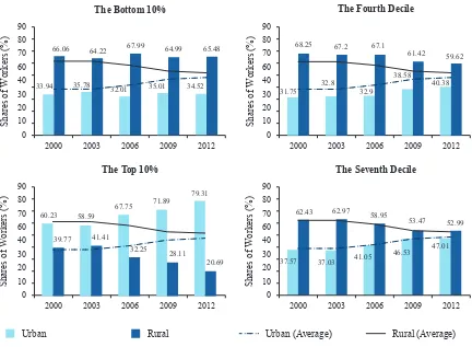
The Working Poor across Rural and Urban Areas
The majority of the working poor are concentrated in rural areas, with a widening disparity between
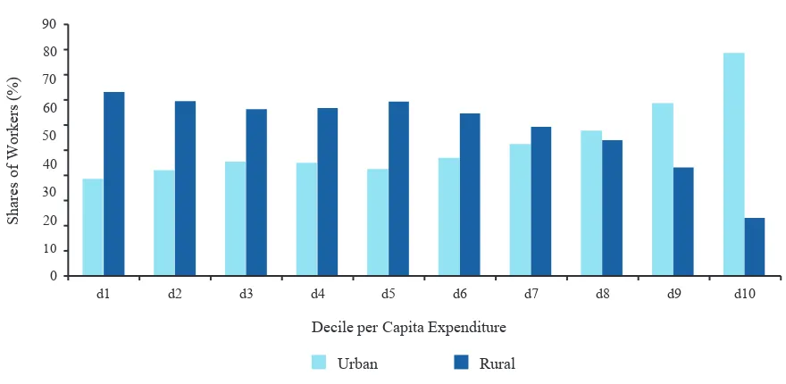
rural and urban areas from 2000 to 20128. Figure 17 and table 12 show that in 2012 about two-thirds
of workers in the poorest decile (decile 1) came from rural areas, whereas the share of rural workers in the richest decile (decile 10) was only about 20%. Furthermore, table 12 and figure 18 show the trend over time for workers in selected deciles: overall, the share of rural workers in poorest decile (decile 1) has remained approximately constant over time, while declining substantially among richer deciles (deciles 7 to 10). This result highlights findings from previous sections that showed that, in 2000–12, the urban labour market created more jobs overall and more full-time employment. Moreover, the findings suggest that recent income and wage growth has been on average weaker in rural compared with urban areas, which increasingly assigns the majority of the working poor to rural areas of Indonesia.
Male
Rural Female
0 20 40 60 80 100
Shares of Male Workers by Educational Attainment (%) d1
Shares of Female Workers by Educational Attainment (%) d1
d4 d10
d7
0 20 40 60 80 100
Shares of Urban Workers by Educational Attainment (%) d1
d4 d10
d7
0 20 40 60 80 100
Shares of Rural Workers by Educational Attainment (%) d1
d4 d10
d7
Primary Lower Secondary
Figure 17: Share of Workers by Area (2012)
Note: TNP2K calculations based on Susenas rounds. Survey weights applied.
Table 12: Distribution of Workers by Area (2000–12)
Location 2000 (%) 2003 (%) 2006 (%) 2009 (%) 2012 (%)
Decile 1
Urban 33.94 35.78 32.01 35.01 34.52
Rural 66.06 64.22 67.99 64.99 65.48
Decile 4
Urban 31.75 32.80 32.90 38.58 40.38
Rural 68.25 67.20 67.10 61.42 59.62
Decile 7
Urban 37.57 37.03 41.05 46.53 47.01
Rural 62.43 62.97 58.95 53.47 52.99
Decile 10
Urban 60.23 58.59 67.75 71.89 79.31
Rural 39.77 41.41 32.25 28.11 20.69
Average (all deciles)
Urban 38.52 38.54 41.62 46.59 48.08
Rural 61.48 61.46 58.38 53.41 51.92
Note: TNP2K calculations based on Susenas rounds. Survey weights applied.
S
Figure 18: Proportion of Workers by Areas (Selected Deciles)
Note: TNP2K calculations based on Susenas rounds. Survey weights applied.
In addition to studying characteristics of the employed (both underemployed and full-time employed), it is worth looking at unemployment rates across wealth deciles over time for both rural and urban areas. In the previous section, we showed that unemployment rates tend to be higher in urban compared with rural areas, even though unemployment rates in urban areas have fallen significantly in recent years. Figure 19 shows the share of workers in the labour force across wealth deciles. In both rural and urban areas, the unemployment rates (the difference between 100% and the depicted LFPR) are significantly higher among the poor and have been widening in urban areas in recent years. Although unemployment rates among the urban poor decreased with time, the unemployment rates decreased even more strongly for better-off workers. The trends in unemployment rates with time across wealth deciles further underline recent developments in the job market that have been more favourable in urban compared with rural areas during the period 2000–12.
2000 2003 2006 2009 2012
S
2000 2003 2006 2009 2012
2000 2003 2006 2009 2012
0
2000 2003 2006 2009 2012
66.06 64.22 67.99 64.99 65.48
33.94 35.78
Figure 19: Share of Workers in the Labour Force by Area and Decile
Note: TNP2K calculations based on Susenas rounds. Survey weights applied.
Gender Differences among the Working Poor and the Working Nonpoor
Men seem slightly overrepresented among the working poor, although the share of men and women remains relatively stable across all wealth deciles. For instance, although the share of women among workers in the poorest decile (decile 1) amounts to 37.26%, the share of women in the richest decile (decile 10) is only slightly higher at 40.44% (figure 20 and table 13). Furthermore, as table 13 and figure 21 show, this pattern has been remarkably stable over time within deciles, apart from the richest decile, for which the share of women has increased from 37.54% in 2000 to 40.44% in 2012.
90
Proportion of Working Persons by Area (2012)
S
Proportion of Working Persons by Area (2000)
Figure 20: Proportion of Workers by Gender (2012)
Note: TNP2K calculations based on Susenas rounds. Survey weights applied.
Table 13: Proportion of Workers by Gender (2000–12)
Gender 2000 (%) 2003 (%) 2006 (%) 2009 (%) 2012 (%)
Decile 1
Male 63.35 64.73 67.11 61.27 62.74
Female 36.65 35.27 32.89 38.73 37.26
Decile 4
Male 63.94 64.93 66.97 62.07 63.67
Female 36.06 35.07 33.03 37.93 36.33
Decile 7
Male 64.52 65.73 66.65 61.89 63.49
Female 35.48 34.27 33.35 38.11 36.51
Decile 10
Male 62.46 64.16 62.51 58.31 59.56
Female 37.54 35.84 37.49 41.69 40.44
Average (all deciles)
Male 63.78 65.27 66.19 61.42 62.63
Female 36.22 34.73 33.81 38.58 37.37
S
Figure 21: Proportion of Workers by Gender (Selected Deciles, 2000–12)
Note: TNP2K calculations based on Susenas rounds. Survey weights applied.
Type of Employment and Sector of Employment
This subsection looks at differences in the type of employment (self-employed, salaried worker, casual worker, and unpaid worker) and the sector of employment disaggregated for the working poor and the working nonpoor.
Differences in the Type of Employment
As show in figure 22, the working poor are characterised by a relatively high share of workers who have jobs that are unpaid (22.06%) and unstable (casual jobs: 19.37%). The type of employment that is most strongly and increasingly associated with being better off is salaried employment. However, not all salaried employment provides sufficient wages to avoid entering/escaping poverty. Likewise, a very high share of workers across all expenditure deciles (an average of about 36%) are self-employed workers. However, these self-employed activities generate a great variation in amounts of income; many of those who are self-employed fail to earn sufficient income.
0
2000 2003 2006 2009 2012
S
2000 2003 2006 2009 2012
S
2000 2003 2006 2009 2012
S
2000 2003 2006 2009 2012
S
Figure 22: Distribution of Workers by Type of Employment (2012)
Note: TNP2K calculations based on Susenas rounds. Survey weights applied.
The previous statements are also reflected in the time trend (table 14 and figure 23). Compared with 2003, the share of working poor who are salaried workers remained constant (or even decreased when benchmarked against 2000), whereas overall the share of salaried workers increased, particularly among the richer deciles (decile 7 and decile 10) underscoring that salaried employment is less likely
to be associated with poverty in 2012 compared with 20039. This finding—that salaried employment
is increasingly helping workers to avoid and escape poverty—is consistent with results from academic research, which points to substantial increases in minimum wages in the 1990s and 2000s, which brought many salaried workers and their families out of poverty (Magruder 2013; ILO 2013).
Real per Capita Expenditure Decile
Share of Workers (%)
d2 d4 d8
d3 d6 d10
d7 d9
d5
d1
1
0 2 3 4 5 6 7 8 9 10
Casual workers Unpaid workers
Table 14: Distribution of Workers by Employment Status (2000–12)
Employment Status 2000 (%) 2003 (%) 2006 (%) 2009 (%) 2012 (%)
Decile 1
Self-employed 45.46 42.70 42.76 38.31 36.88
Salaried workers 30.45 21.82 21.50 20.56 21.69
Casual workers n/a 13.67 16.22 18.54 19.37
Unpaid workers 24.09 21.81 19.53 22.59 22.06
Decile 4
Self-employed 47.47 46.29 46.03 41.46 38.13
Salaried workers 31.62 23.52 24.28 26.57 30.17
Casual workers n/a 9.39 13.33 13.46 16.62
Unpaid workers 20.91 20.80 16.36 18.51 15.08
Decile 7
Self-employed 47.73 46.05 46.42 41.94 38.25
Salaried workers 34.81 29.96 31.56 34.45 39.07
Casual workers n/a 7.16 8.98 8.82 9.94
Unpaid workers 17.46 16.83 13.04 14.79 12.74
Decile 10
Self-employed 40.89 40.23 37.41 33.17 29.47
Salaried workers 48.45 47.67 53.65 55.90 60.95
Casual workers n/a 2.89 2.69 2.84 3.01
Unpaid workers 10.66 9.22 6.24 8.10 6.56
Average (all deciles)
Self-employed 45.97 44.84 44.36 39.69 36.29
Salaried workers 35.57 29.32 31.68 33.52 37.75
Casual workers n/a 8.16 10.38 10.82 12.20
Unpaid workers 18.46 17.68 13.58 15.97 13.76
Figure 23: Distribution of Workers by Employment Status (2000–12)
Note: TNP2K calculations based on Susenas rounds. Survey weights applied.
Table 15 shows the previous labour market information further disaggregated by gender and area. The data show that, although men across all wealth deciles are largely engaged in paid work (self-employment, salaried worker, or casual worker), the share of unpaid female workers is significant throughout the entire expenditure distribution. However, unpaid work among women follows a strong wealth gradient: better-off women are significantly less likely to be engaged in unpaid work than poorer women are. For both men and women, we observed that salaried employment is significantly associated with higher living standards, although one must bear in mind that many male and female salaried workers still belong to the working poor.
With respect to the rural-urban divide, we found that, in both areas, salaried employment is associated with higher living standards as proxied by household expenditures per capita. There seem to be important differences in the type of employment activities between rural and urban areas. Although self-employment in urban areas seems to be slightly associated with lower welfare levels, the opposite can be found for rural areas. Given that the agricultural sector still dominates the rural economy, it appears
0
2000 2003 2006 2009 2012
S
2000 2003 2006 2009 2012
2000 2003 2006 2009 2012 2000 2003 2006 2009 2012
S
Table 15: Employment Status by Gender and Area (2012)
Employment Status Total (%)
Gender Area
Male
(%) Female (%) Urban (%) Rural (%)
Decile 1
Self-employed 36.88 43.45 25.81 32.91 38.97
Salaried workers 21.69 23.56 18.54 35.00 14.67
Casual workers 19.37 22.72 13.72 23.75 17.06
Unpaid workers 22.06 10.27 41.93 8.34 29.30
Decile 4
Self-employed 38.13 42.18 31.01 34.25 40.75
Salaried workers 30.17 33.00 25.23 45.80 19.59
Casual workers 16.62 18.47 13.39 13.34 18.85
Unpaid workers 15.08 6.35 30.37 6.61 20.82
Decile 7
Self-employed 38.25 40.81 33.79 33.17 42.75
Salaried workers 39.07 42.34 33.38 53.00 26.71
Casual workers 9.94 11.69 6.90 7.95 11.71
Unpaid workers 12.74 5.16 25.92 5.89 18.82
Decile 10
Self-employed 29.47 31.75 26.11 26.18 42.07
Salaried workers 60.95 61.37 60.34 66.70 38.91
Casual workers 3.01 3.60 2.14 2.48 5.06
Unpaid workers 6.56 3.27 11.41 4.63 13.96
Average (all deciles)
Self-employed 36.29 39.94 30.19 30.82 41.37
Salaried workers 37.75 39.99 33.99 53.51 23.15
Casual workers 12.20 14.23 8.80 9.55 14.66
Unpaid workers 13.76 5.84 27.02 6.13 20.82
Note: TNP2K calculations based on Susenas rounds. Survey weights applied.
Figure 24: Distribution of Workers by Sector’s Formality (2012)
Note: TNP2K calculations based on Susenas rounds. Survey weights applied.
In line with the previous results, we found (table 16 and figure 25) that being part of the informal sector labour force is increasingly associated with lower income levels and poverty. Between 2000 and 2012, the share of the working poor engaged in the informal sector increased, despite the overall share of the informal sector (out of all employment) slightly decreasing from 62.63% in 2000 to 59.07% in 2012.
Table 16: Distribution of Workers by Sector’s Formality (2000–12)
Sector’s Formality 2000 (%) 2003 (%) 2006 (%) 2009 (%) 2012 (%)
Decile 1
Formal 31.28 23.54 23.36 21.75 22.75
Informal 68.72 76.46 76.64 78.25 77.25
Decile 4
Formal 32.68 25.91 26.71 28.41 32.16
Informal 67.32 74.09 73.29 71.59 67.84
Decile 7
Formal 36.5 33.35 35.12 37.28 41.97
Informal 63.5 66.65 64.88 62.72 58.03
Decile 10
54.8 61.77 63.88 68.77
S
Figure 25: Proportion of Workers by Sector’s Formality (Selected Years)
Note: TNP2K calculations based on Susenas rounds. Survey weights applied.
Table 17 shows sector statistics along the wealth distribution for 2012 by gender and area. The findings suggest that very similar patterns exist along the wealth distribution between men and women as well as between rural and urban areas. In all cases, higher welfare levels are clearly associated with higher levels of formal employment, although as discussed above, the relative role of the formal sector differs.
0
2000 2003 2006 2009 2012
S
2000 2003 2006 2009 2012
S
2000 2003 2006 2009 2012
S
2000 2003 2006 2009 2012
S
23.54 23.36 21.75 22.75
32.68
Table 17: Proportion of Workers by Sector’s Formality, Gender, and Area (2012)
Sector Formality Total (%)
Gender Area
Male
(%) Female (%) Urban (%) Rural (%)
Decile 1
Formal 22.75 24.86 19.20 36.43 15.55
Informal 77.25 75.14 80.80 63.57 84.45
Decile 4
Formal 32.16 35.60 26.12 47.95 21.46
Informal 67.84 64.40 73.88 52.05 78.54
Decile 7
Formal 41.97 46.39 34.29 55.87 29.64
Informal 58.03 53.61 65.71 44.13 70.36
Decile 10
Formal 68.77 70.90 65.63 74.45 47.01
Informal 31.23 29.10 34.37 25.55 52.99
Average (all deciles)
Formal 40.93 44.08 35.66 57.25 25.82
Informal 59.07 55.92 64.34 42.75 74.18
Note: TNP2K calculations based on Susenas rounds. Survey weights applied.
Employment Differences between Working Poor and Working Nonpoor
Notable differences exist in the sector of employment (1-digit industry level10) between the working
Table 18: Proportion of Workers by Sectors (2000–12)
Proportion of Workers by Sectors 2000
(%) 2003 (%) 2006 (%) 2009 (%) 2012 (%)
Decile 1
Agriculture, forestry, hunting, and fishery 58.57 62.56 58.96 59.11 55.76
Mining and quarrying 0.74 0.79 0.98 1.19 1.24
Manufacturing industry 11.64 9.89 10.56 9.93 11.43
Electricity, gas, and water 0.06 0.10 0.13 0.16 0.14
Construction 4.75 4.28 6.58 5.04 8.20
Wholesale trade, retail trade, restaurants, and hotels 13.07 11.41 10.78 10.86 10.60
Transportation, storage, and communications 4.59 4.25 4.55 3.20 3.17
Financing, insurance, real estate, and business services
0.43 0.31 0.42 0.36 0.18
Public servants, civil, social, and personal services 6.16 6.24 6.92 8.44 8.28
Other n/a 0.17 0.13 1.71 1.00
Decile 4
Agriculture, forestry, hunting, and fishery 51.96 54.94 48.78 46.14 41.16
Mining and quarrying 0.64 0.75 1.12 1.18 1.65
Manufacturing industry 12.54 10.95 13.16 11.73 13.21
Electricity, gas, and water 0.13 0.15 0.21 0.26 0.25
Construction 4.00 4.33 5.87 5.40 7.15
Wholesale trade, retail trade, restaurants, and hotels 17.59 15.69 16.23 17.51 19.43
Transportation, storage, and communications 5.03 5.10 5.55 4.44 5.07
Financing, insurance, real estate, and business services
0.68 0.57 0.73 0.91 0.46
Public servants, civil, social, and personal services 7.43 7.44 8.20 11.08 10.57
Other n/a 0.09 0.15 1.36 1.06
Decile 7
Agriculture, forestry, hunting, and fishery 42.36 45.64 37.30 33.56 31.31
Mining and quarrying 0.68 0.63 1.04 1.25 1.55
Manufacturing industry 12.54 12.31 13.68 12.61 13.36
Electricity, gas, and water 0.21 0.30 0.28 0.33 0.28
Construction 3.98 3.99 5.16 4.69 6.01
Wholesale trade, retail trade, restaurants, and hotels 21.67 19.43 22.17 23.85 23.52
Transportation, storage, and communications 5.97 6.04 6.04 5.01 5.11
Financing, insurance, real estate, and business services
1.08 1.08 1.18 1.63 0.96
Public servants, civil, social, and personal services 11.51 10.48 12.98 15.72 16.98
Proportion of Workers by Sectors 2000
(%) 2003 (%) 2006 (%) 2009 (%) 2012 (%)
Decile 10
Agriculture, forestry, hunting, and fishery 20.09 22.29 13.24 10.72 9.73
Mining and quarrying 1.20 1.33 1.29 1.34 1.65
Manufacturing industry 12.52 14.26 12.92 10.64 12.62
Electricity, gas, and water 0.50 0.49 0.58 0.83 0.71
Construction 3.11 3.10 3.18 3.19 3.86
Wholesale trade, retail trade, restaurants, and hotels 28.64 25.24 27.79 27.42 26.40
Transportation, storage, and communications 5.60 6.00 5.50 4.23 5.22
Financing, insurance, real estate, and business services
4.02 3.77 5.38 6.14 4.04
Public servants, civil, social, and personal services 24.32 23.44 29.95 33.41 34.32
Other n/a 0.08 0.18 2.08 1.44
Average (all deciles)
Agriculture, forestry, hunting, and fishery 44.10 47.46 39.80 37.44 34.13
Mining and quarrying 0.77 0.83 1.08 1.24 1.46
Manufacturing industry 12.30 11.83 13.16 11.58 12.71
Electricity, gas, and water 0.20 0.25 0.31 0.38 0.32
Construction 4.00 4.00 5.22 4.71 6.51
Wholesale trade, retail trade, restaurants, and hotels 20.25 17.97 19.75 20.69 20.90
Transportation, storage, and communications 5.39 5.38 5.69 4.50 4.70
Financing, insurance, real estate, and business services
1.34 1.16 1.58 1.91 1.14
Public servants, civil, social, and personal services 11.64 11.01 13.27 16.03 17.07
Other n/a 0.10 0.14 1.51 1.06
Note: TNP2K calculations based on Susenas rounds. Survey weights applied.