Problem - Design - Solution
Wiley Publishing, Inc. 10475 Crosspoint Boulevard Indianapolis, IN 46256
www.wiley.com
Copyright © 2005 by Wiley Publishing, Inc., Indianapolis, Indiana
Published simultaneously in Canada
ISBN: 0-7645-8306-9
ISBN-13: 978-0-7645-8306-3
Manufactured in the United States of America
10 9 8 7 6 5 4 3 2 1
1MA/TQ/QT/QV/IN
No part of this publication may be reproduced, stored in a retrieval system or transmitted in any form or by any means, electronic, mechanical, photocopying, recording, scanning or otherwise, except as permitted under Sections 107 or 108 of the 1976 United States Copyright Act, without either the prior written permission of the Publisher, or authorization through payment of the appropriate percopy fee to the Copyright Clearance Center, 222 Rosewood Drive, Danvers, MA 01923, (978) 750-8400, fax (978) 646-8600. Requests to the Publisher for permission should be addressed to the Legal Department, Wiley Publishing, Inc., 10475 Crosspoint Blvd., Indianapolis, IN 46256, (317) 572-3447, fax (317) 572-4355, e-mail: [email protected].
LIMIT OF LIABILITY/DISCLAIMER OF WARRANTY:THE PUBLISHER AND THE AUTHOR MAKE NO REP-RESENTATIONS OR WARRANTIES WITH RESPECT TO THE ACCURACY OR COMPLETENESS OF THE CON-TENTS OF THIS WORK AND SPECIFICALLY DISCLAIM ALL WARRANTIES, INCLUDING WITHOUT LIMITATION WARRANTIES OF FITNESS FOR A PARTICULAR PURPOSE. NO WARRANTY MAY BE CRE-ATED OR EXTENDED BY SALES OR PROMOTIONAL MATERIALS. THE ADVICE AND STRATEGIES CON-TAINED HEREIN MAY NOT BE SUITABLE FOR EVERY SITUATION. THIS WORK IS SOLD WITH THE UNDERSTANDING THAT THE PUBLISHER IS NOT ENGAGED IN RENDERING LEGAL, ACCOUNTING, OR OTHER PROFESSIONAL SERVICES. IF PROFESSIONAL ASSISTANCE IS REQUIRED, THE SERVICES OF A COMPETENT PROFESSIONAL PERSON SHOULD BE SOUGHT. NEITHER THE PUBLISHER NOR THE AUTHOR SHALL BE LIABLE FOR DAMAGES ARISING HEREFROM. THE FACT THAT AN ORGANIZATION OR WEBSITE IS REFERRED TO IN THIS WORK AS A CITATION AND/OR A POTENTIAL SOURCE OF FUR-THER INFORMATION DOES NOT MEAN THAT THE AUTHOR OR THE PUBLISHER ENDORSES THE INFOR-MATION THE ORGANIZATION OR WEBSITE MAY PROVIDE OR RECOMMENDATIONS IT MAY MAKE. FURTHER, READERS SHOULD BE AWARE THAT INTERNET WEBSITES LISTED IN THIS WORK MAY HAVE CHANGED OR DISAPPEARED BETWEEN WHEN THIS WORK WAS WRITTEN AND WHEN IT IS READ.
For general information on our other products and services or to obtain technical support, please contact our Customer Care Department within the U.S. at (800) 762-2974, outside the U.S. at (317) 572-3993 or fax (317) 572-4002.
Wiley also publishes its books in a variety of electronic formats. Some content that appears in print may not be available in electronic books.
Library of Congress CataloginginPublication Data
Duckett, Jon.
Accessible XHTML and CSS Web sites problem design solution / Jon Duckett. p. cm.
Includes index.
ISBN 0-7645-8306-9 (paper/Web site)
1. XHTML (Document markup language) 2. Cascading style sheets. 3. Web sitesDesign. I. Title. QA76.76.H94D836 2005
006.7’4dc22
2005000593
Jon Duckettpublished his first Web site in 1996 while studying for a BSc (Hons) in psychology at Brunel University, London. Since then he has helped create a wide variety of Web sites and has coauthored more than ten programmingrelated books on topics from ASP to XML (via many other letters of the alphabet) that have covered diverse aspects of Web programming, including design, architecture, and coding.
After graduating, Jon worked for Wrox Press, first in their Birmingham (U.K.) offices for three years and then in Sydney (Australia) for another year. He is now a freelance developer and consultant based in a leafy suburb of London, working for a range of clients spread across three continents.
Acquisitions Editor
Jim Minatel
Senior Development Editor
Kevin Kent
Production Editor
William A. Barton
Technical Editor
WileyDreamtech India Pvt Ltd
Copy Editor
Luann Rouff
Editorial Manager
Mary Beth Wakefield
Vice President & Executive Group Publisher
Richard Swadley
Vice President and Publisher
Joseph B. Wikert
Project Coordinator
Erin Smith
Graphics and Production Specialists
April Farling Lauren Goddard Denny Hager Lynsey Osborn Julie Trippetti
Quality Control Technician
John Greenough Joe Niesen
Carl William Pierce
Media Development Specialist
Kit Malone
Proofreading and Indexing
This book is designed to help existing Web page authors update their skills. We all know that technology can move at a blistering pace, and sometimes it can seem very hard to keep up with the changes. This book will help keep you up to speed by teaching you about three of the hottest issues for Web page authors to learn about: XHTML, CSS, and accessibility.
You’ll be glad to know that, because this book is for those of you who already know how to write Web pages in HTML, I won’t be boring you with the basics of how to write a Web page from scratch. Rather, it will enable you to extend the knowledge you already have by presenting examples and information that reflect the way the Web has changed in the past decade.
Since the birth of the Web, many new technologies have been released, and almost as many have van-ished without a trace. XHTML and CSS, however, have emerged as mature technologies that are likely to be around for many years to come. They were specifically designed to replace HTML, and as you would expect, you will find many advantages in writing Web pages using XHTML and CSS as opposed to writ-ing them in HTML, although they share a lot of similarities, as you will see.
Preface
vii
Introduction
xix
Chapter 1: Introducing the Site
1
Problems with HTML
2
Design
3
Clarifying terminology
4
A Little Background to HTML
5
Browser issues
8
Lessons from the mobile world
9
Accessibility
10
Separating style from content
11
Putting the “X” in XHTML
12
The Story Behind CSS
13
Using Style Sheets
14
Introducing the Sample Site
16
Home page
19
Product list pages
27
Product details page
30
Site structure
34
Updating the site
35
Summary
37
Chapter 2: Moving from HTML to XHTML
39
Problem
40
Design
40
Strict XHTML
41
Transitional XHTML
42
Frameset XHTML
42
An example XHTML document
43
Writing documents using XML syntax
44
Why XML?
53
Differences between Transitional and Strict XHTML 1.0
56
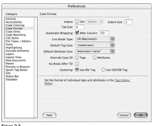
XHTML compliance in authoring tools
62
Solution
67
Home page
68
Product list page
77
Product details page
81
Validation
84
Summary
84
Chapter 3: Using CSS to Style Documents
87
Problem
88
Design
88
How CSS works
88
A closer look at adding CSS rules
94
Selectors
99
Fonts
103
Text properties
110
Text pseudo-elements
116
Understanding the box model
118
The <div> and <span> elements
121
Box properties
123
Dimensions
130
Color and background
134
Solution
143
The home page
143
The product list pages
153
The product details pages
155
Summary 158
Chapter 4: Adding More Style with CSS
159
Problem
160
Design
160
Pseudo-classes and pseudo-elements
160
Lists
175
Table properties
178
Visibility of elements
182
Multiple style sheets and @import
185
Precedence of rules
187
Validating CSS
188
Solution
189
Improving the look of links
189
Chapter 5: Using CSS for Layout
195
Problem
195
Design
196
CSS positioning schemes
196
Overlapping layers
212
Common layouts
215
Choices for layout
231
Solution
232
Summary 241
Chapter 6: Understanding Accessibility
243
Problem
244
Design
244
Assistive technology
245
Additional accessibility benefits
246
Introducing the guidelines
247
Creating accessible Web pages
249
Solution
279
Providing nontext items with text equivalents
280
Checking for dynamic content, color, and contrast issues
281
Adding links to skip repetitive navigation
281
Summary 283
Chapter 7: Creating Accessible Tables and Forms and Testing Your Site
285
Problem
286
Design
286
Tables
287
Forms
299
Accessibility issues for deaf people
313
Accessible frames
314
Text only — the last resort
317
Testing your site for accessibility
317
Solution
320
Product details pages
320
Testing with Bobby
322
Testing with LIFT
323
Chapter 8: Looking to the Future
325
Problem
326
Design
326
The situation today
326
The new devices
327
Lessons from the mobile world
328
The abstract modules of XHTML
329
XHTML 1.1
330
XHTML Basic
336
Hybrid documents
338
XHTML on different devices
344
Solution
350
Summary 354
Appendix A: Final Example Code
357
Home Page
358
Product List Page
360
Product Details Page
363
CSS Style Sheet
365
Appendix B: XHTML Element Reference
371
Core Attributes
372
<a> (all)
373
<abbr> (IE 4+, N 6+)
373
<acronym> (IE 4+ N 6+)
373
<address> (all)
373
<applet> Deprecated (all)
374
<area> (all)
374
<b> (all)
375
<base>
375
<basefont> Deprecated (all)
375
<bdo> (IE 5+, N 6+)
376
<bgsound> (IE only — IE 3+)
376
<big> (IE 4+, N 4+)
376
<blink> (Netscape only — N 3+)
376
<blockquote> (all)
377
<body> (all)
377
<br /> (all)
377
<button> (IE 4+, N 3+)
378
<center> Deprecated (all)
378
<dir> Deprecated (all)
380
<div> (all)
380
<dl> (all)
380
<dt> (all)
380
<em> (all)
380
<embed> (all) *
381
<fieldset> (IE 4+, N 6+)
381
<font> Deprecated (all)
382
<form> (all)
382
<input type="button"> (all)
386
<input type="checkbox"> (all)
387
<input type="file"> (all)
387
<input type="hidden"> (all)
388
<input type="image"> (all)
388
<input type="password"> (all)
389
<input type="radio"> (all)
389
<input type="reset"> (all)
390
<input type="submit"> (all)
390
<input type="text"> (all)
391
<ins> (IE 4+, N 6+)
391
<isindex> Deprecated (all)
391
<kbd> (all)
392
<label> (IE 4+, N 6+)
392
<layer> (Netscape only, N 4+)
392
<li> (all)
393
<link> (all)
394
<map> (all)
394
<menu> Deprecated (all)
394
<meta> (all)
394
<noembed> (N 2+)
395
<noframes> (all)
395
<nolayer> (N 4+ only)
395
<noscript> (all)
395
<object> (IE 3+, N 6+)
395
<ol>
396
<optgroup> (IE 6+, N 6+)
396
<option> (all)
397
<p> (all)
397
<param> (IE 3+, N 6+)
397
<pre> (all)
398
<q> (IE 4+, N 6+)
398
<s> Deprecated (all)
398
<samp> (all)
398
<script> (all)
398
<select> (all)
399
<small> (all)
399
<span> (all)
399
<strike> Deprecated (all)
399
<strong> (all)
399
<style> (IE 3+, N 4+)
400
<sub> (all)
400
<sup> (all)
400
<table> (all)
400
<tbody> (IE 3+, N 6+)
401
<td> (all)
401
<textarea> (all)
402
<tfoot> (IE 3+, N 6+)
403
<th> (all)
403
<thead> (IE 3+, N 6+)
404
<title> (all)
404
<tr> (all)
404
<tt> (all)
405
<u> (all)
405
<ul> (all)
405
Appendix C: CSS Properties
407
Font Properties
407
font
407
font-family
408
font-size
408
font-size-adjust
409
font-stretch
409
font-style
410
font-variant
410
font-weight
410
Text Properties
411
letter-spacing
411
text-align
411
text-decoration
411
text-indent
412
text-shadow
412
text-transform
412
white-space
413
word-spacing
413
Color and Background Properties
414
background
414
background-attachment 414
background-color 414
background-image 415
background-position 415
background-positionX 416
background-positionY 416
background-repeat 416
Border Properties
416
border (border-bottom, border-left, border-top, border-right)
416
border-style (border-bottom-style, border-left-style, border-top-style,
border-right-style) 417
border-width (border-bottom-width, border-left-width, border-top-width,
border-right-width) 417
border-color (border-bottom-color, border-left-color, border-top-color, border-right-color)
418
Dimensions 418
height
418
width
418
line-height
419
max-height
419
min-height
420
min-width
420
Margin Properties
421
margin (margin-bottom, margin-left, margin-top, margin-right)
421
Padding Properties
421
padding (padding-bottom, padding-left, padding-right, padding-top)
421
List Properties
422
Outline (outline-color, outline-style, outline-width)
427
Appendix D: Escape Characters
433
Built-In XML Character Entities
434
XHTML Character Entities
434
Currency
434
Trade Symbols
434
Math and Measurement
435
Punctuation
435
Miscellaneous
436
Appendix E: MIME Types
437
text
438
image
438
multipart 438
audio
438
video
439
application 439
In this book, I will show you how XHTML and CSS actually make it easier and quicker to write and maintain pages. I will also show you how the correct use of XHTML and CSS enable you to create Web pages that work in many different types of browsers (not only in different versions of Netscape and Internet Explorer, but also on the various devices that can access the Web these days, such as mobile phones and TV set top boxes).
While XHTMListhe successor to HTML, it is not a completely new language. In fact, much of the markup you already know remains exactly the same, so you should be creating XHTML pages in no time at all. However, some new rules control the way you write your elements (or tags) and attributes, and where they can appear in the document. In addition, you are encouraged not to use any of the elements or attributes that controlled the appearance or presentation of pages, such as the <font>element and attributes such as
bgcolor, color, and face. While you may think that this would result in some very boring pages, this is the point when CSS steps in.
CSS, or Cascading Style Sheets, is the new way to control the presentation (and sometimes even the layout) of your pages. CSS uses rules, which are applied to certain elements, to indicate how the content of that element should appear. An example of a CSS rule might be one that says the content of all <h1>elements should be displayed in an Arial typeface.
Although CSS is a new language for you to learn, having already learned HTML, you have a big advantage because many of the socalled propertiesin CSS are very similar to attributes, such as the faceattribute on a
<font>element or the bgcolorand colorattributes.
The third topic covered in this book is accessibility, and you may already be well aware of how very important it is to ensure that your pages are accessible to everyone (especially if you don’t want a court order to rebuild your site). Accessibility focuses on making Web sites site accessible to as many people as possible, and this particularly affects those with disabilities, such as those who might not be able to read small fonts or who might have motor control difficulties. In the same way that architects have had to design public buildings so that they are accessible by a wheelchair, Web designers must learn to create pages that are accessible to those who may not be able to read as easily as you or I, or who might not have such good control over a mouse.
In the last section of this book, you will learn about guidelines developed by both the U.S. government and the W3C (the World Wide Web Consortium, an organization dedicated to creating specifications for the Web) to help ensure that Web sites are accessible to as many people as possible. Adhering to these guidelines not only ensures that you will stay on the right side of the law, it also ensures a larger potential audience for your sites.
This book introduces each of these new technologies by taking a Web site written in HTML 3.2 (a fictional site that was built in the late 1990s) and updating it to use XHTML and CSS and to ensure that it meets the accessibility guidelines. You will meet this fictional site in Chapter 1, and each subsequent chapter addresses the different skills you need to learn to update the site. At the end of each chapter, you will see how the site has been adapted following the principles you learned in that chapter.
Who This Book Is For
This book is written for anyone who has learned to use HTML to create Web pages and wants to remain current with changes that have occurred over the past few years regarding how to write them, but who does not want to read a separate book on each of the key topics.
It is possible to cover XHTML, CSS, and accessibility in this one book because it is assumed that the reader has already written Web pages in HTML, and therefore knows what elements and attributes HTML con-tains and how a Web page is constructed. By not repeating these basics, it is possible to get on with the topic in hand: learning how these technologies have evolved.
The book has been designed so that you can dip into each topic separately, without having to read the rest of the book, so if you want to learn about accessibility right now, you can go straight to Chapter 7. Similarly, if you only want to learn the differences between HTML and XHTML at the moment, you need only read Chapter 2 for now.
The book is also ideal for Web developers who use serverside languages such as ASP/ASP.NET, PHP, JSP, or ColdFusion, because developing in these languages usually requires that you write code that creates HTML to send to the browser. Therefore, if you use one of these languages, you can benefit from this book by learning how to send accessible XHTML and CSS to the browser instead of plain old HTML.
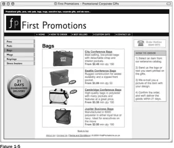
Indeed, the example site that runs throughout this book has been designed with serverside developers in mind. While the original site is written in plain HTML, it could easily have been HTML that is generated from database content; for example, the product list pages demonstrate how any tabular data could be represented, and the individual product pages could easily have been generated by any kind of content management system.
In other words, whatever level you are at, if your job involves creating Web pages to send to a browser, this book will help you keep your skills up to date.
What This Book Covers
By the end of this book, you will have evolved from being an HTML author to being an author able to write Web pages that are attractive, accessible, and that conform to the new Web standards of XHTML and CSS.
To begin, you will learn the differences between HTML and XHTML. You will learn to write both Strict
You will then be shown how to use CSS1 and CSS2 to control the presentation of your documents—for exam-ple, how to control typefaces and fonts used in your documents, colors of backgrounds, text, and lines, and so on. You will also learn how CSS2 positioning can be used to control the layout of Web pages and the position-ing of items upon them (rather than rely on tables).
Finally, you will learn how to ensure that the pages you write meet the accessibility guidelines set forth by the U.S. government in Section 508 of the Rehabilitation act (generally shortened to just Section 508 in the Web design community) and by the W3C in the Web Accessibility Initiative (WAI) guidelines.
What You Need to Use This Book
All you need to work through this book is a PC with a Web browser such as Netscape 6 or later and Internet Explorer 6, and a simple text editor such as Notepad (Windows) or SimpleText (Mac). Ideally, you should try to download more than one Web browser because, as you will see in this book, different browsers have differing levels of support for some of the latest technologies.
If you have a Web page editor program, such as Macromedia Dreamweaver or Microsoft FrontPage, you are welcome to use it, but this book does not cover how to use those programs. Rather, it focuses on the code that they would generate.
The sample code for this book is available on the Web (www.wrox.com), so you need an Internet connection if you wish to download that code. Once you have downloaded it, however, you will be able to run and test it on any PC with a recent Web browser.
How This Book Is Organized
This book is part of the Problem Design Solutionseries. As such, it teaches the subjects it addresses in three steps: looking at specific problems, looking at possible ways these problems could be solved, and finally showing the solution to the problem that was posed in the beginning.
Throughout the book, your challenge is to update a fictional Web site that was supposedly created in the late 1990s using HTML 3.2. Now, in 2005, you need to be able to update the site to take advantage of XHTML and CSS and to ensure that it adheres to accessibility requirements. Each chapter addresses sep-arate problems, such as converting the site from HTML to XHTML, and ensuring that the site meets the Section 508 guidelines for accessibility.
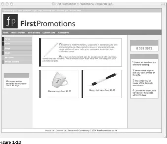
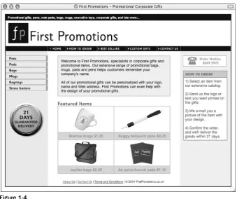
❑ The first chapter of the book introduces the First Promotions Web site. It will show you how the site was originally written, which will probably look very familiar to you. You will then learn why we are going to update the site. The question answered here is, Why is it important to learn these new skills?
❑ The next three chapters are devoted to making the site look more attractive again using CSS. Along the way, you will learn how CSS makes it a lot easier to control the presentation of the pages you design; and how it makes your XHTML pages more useful and gives them a longer life span. Chapter 3 introduces how CSS works and starts to control the presentation of pages. Chapter 4 looks at many more of the CSS properties that control how your pages appear. Chapter 5 then describes how you can use CSS to control layout and to position elements on the page, rather than rely on tables.
❑ Chapters 6 and 7 focus on accessibility and ensure that you are writing pages that adhere to the guidelines created by the U.S. government in Section 508 and by the W3C’s Web Accessibility Initiative.
❑ Chapter 8 reviews what you have learned throughout the book, and describes how you can apply your new skills with XHTML and CSS to develop for many different types of devices, from mobile phones to TV set top boxes. It also addresses the directions the Web is likely to take in the future and how these technologies are likely to continue to develop. After all, if you keep one eye on the future, it will be easier to write code that will last longer.
Finally, at the end of the book are some very helpful appendixes: The first covers the new finished ver-sion of the site, the second covers all of the elements in XHTML and the attributes they can carry, while the third covers the properties of CSS and their possible values. These are followed by appendixes on escape characters and MIME types. The appendixes should act as a helpful reference as you continue to practice writing accessible pages in XHTML and CSS.
Conventions
To help you get the most from the text and keep track of what’s happening, I’ve used a number of con-ventions throughout the book:
Tips, hints, tricks, and asides to the current discussion are offset and placed in italics like this.
As for styles in the text:
❑ I italicizeimportant words when they are first introduced. ❑ I show keyboard strokes like this: Ctrl+A.
❑ I show filenames, URLs, and code within the text like so: version=”10”. ❑ I present code in two different ways:
In code examples, I highlight new and important code with a gray background.
The gray highlighting is not used for code that’s less important in the present context or has been shown before.
Source Code
As you work through the examples in this book, you may choose either to type in all the code manually or to use the source code files that accompany the book. All of the source code used in this book is avail-able for download at www.wrox.com. Once at the site, simply locate the book’s title (either by using the Search box or by using one of the title lists) and click the Download Code link on the book’s details page to obtain all the source code for the book.
Because many books have similar titles, you may find it easiest to search by ISBN: 0-7645-8306-9.
Once you download the code, just decompress it with your favorite compression tool. Alternatively, you can go to the main Wrox code download page at www.wrox.com/dynamic/books/download.aspxto see the code available for this book and all other Wrox books.
Errata
I’ve made every effort to ensure that there are no errors in the text or in the code. However, no one is perfect, and mistakes do occur. If you find an error in this book, such as a spelling mistake or a faulty piece of code, I would be very grateful for your feedback. By sending in errata, you may save another reader hours of frustration; and at the same time, you will be helping to provide even higher quality information.
To find the errata page for this book, go to www.wrox.comand locate the title using the Search box or one of the title lists. Then, on the book’s details page, click the Book Errata link. On this page, you can view all errata that have been submitted for this book and posted by Wrox editors. A complete book list, including links to each book’s errata, is also available at www.wrox.com/miscpages/booklist.shtml.
If you don’t spot “your” error on the Book Errata page, go to www.wrox.com/contact/techsupport. shtmland complete the form there to send us the error you have found. We’ll check the information and, if appropriate, post a message to the book’s errata page and fix the problem in subsequent editions of the book.
p2p.wrox.com
For author and peer discussion, join the P2P forums at http://p2p.wrox.com. The forums are a Webbased system for you to post messages relating to Wrox books and related technologies and interact with other readers and technology users. The forums offer a subscription feature to e-mail you topics of interest of your choosing when new posts are made to the forums. Wrox authors, editors, other industry experts, and your fellow readers are present on these forums.
At http://p2p.wrox.com, you will find several different forums that will help you not only as you read this book, but also as you develop your own applications. To join the forums, just follow these steps:
3.
Complete the required information to join as well as any optional information you wish to pro-vide and click Submit.4.
You will receive an e-mail with information describing how to verify your account and com-plete the joining process.You can read messages in the forums without joining P2P, but in order to post your own messages, you must join.
Once you join, you can post new messages and respond to messages other users post. You can read mes-sages at any time on the Web. If you would like to have new mesmes-sages from a particular forum e-mailed to you, click the Subscribe to this Forum icon by the forum name in the forum listing.
the Site
In what has been a relatively short life to date, the Web has grown at a tremendous pace. When I first started learning HTML, I would not have imagined that so many people would be using the Web today. Nor, while sitting at my desktop PC, would I have imagined that by now I would need to write pages that could be accessed through such a variety of devices — such as mobile phones and TV set top boxes. These new devices are quite different from the desktop PC — they have dif-ferently sized screens and different amounts of power and memory available to them, and they enable users to access information in very different ways. Given the growth of the Web and the way in which it has changed, it is hardly surprising that those of us who build Web sites might need to update our skills, and that the tools we use to get the job done also need modernizing.
This chapter describes why it is important to learn to write sites using XHTML and CSS, and why it is so important to make your sites accessible. You will also be introduced to the example site that you will be working on throughout this book.
In this chapter, you will:
❑ Examine some of the problems caused by traditional HTML ❑ Find out why it is important to separate styling from content
❑ Meet the example First Promotions site. This is the site that you will be updating through-out the book.
❑ Learn about the aims of redesigning the site
❑ Find out more about the benefits that you will accrue by creating accessible sites in XHTML and CSS.
Problems with HTML
As the Web evolved, so did HTML. Several versions of HTML have been released by the W3C (the World Wide Web Consortium — the body responsible for maintaining many Web standards). The first versions of HTML enabled you to use markup to describe the structure of a document, but did not offer much control over how that document looked. By the time HTML 4 was released, it had become a much more complex language than its original version. The features that were first added to HTML over the years afforded Web designers a lot of control over the appearance of a page. For example, they enabled Web page authors to control the exact width of tables (to the pixel); the size and weight of fonts; the col-ors and images used as backgrounds; and so on.
The addition of these new rules that offered designers control over the appearance of pages meant that it was possible to create attractive pages that worked great on your average desktop computer. However, problems soon started to manifest:
❑ Various browsers developed different ways of doing the same thing, which meant sites would not look or work the same in all browsers.
❑ Different users had different sized screens and different screen resolutions, so pages would not look the same on all computers.
❑ New devices started to access the Web; it was no longer just desktop PCs, but also TV set top boxes, mobile phones, and so on, and each new device had different capabilities. For example, a page containing a table that was 700 pixels wide would not fit on a phone that had a display only 128 pixels wide.
❑ If you (or your boss) wanted to change some aspect of the site design, such as the colors or fonts used, every page had to be changed because this information was in the HTML for every page.
❑ As designers used more HTML code to control the layout of a page, the source code of the page became longer and more complicated to write. This in turn introduced greater scope for errors when authoring or editing a site.
❑ If you did not have 20/20 vision, it could be hard to read some of the text on the sites, and if you had severe vision impairments, you would not be able to navigate some sites at all.
As a result, some companies started to create several versions of their Web sites, with versions for differ-ent browsers and devices; they even created text-only versions of sites intended to meet disability requirements. Obviously, this means a lot of extra work, and often results in versions of the site that are not as up-to-date as others. Clearly, this solution is far from ideal.
To summarize, traditional HTML posed the following problems:
❑ As HTML developed, a lot of stylistic rules were introduced to the language that enabled Web page authors to control the appearance of their pages; however, these same enhancements to the language meant that the rules governing how the page should appear were mixed in with the actual content of the page, and that many pages would work as intended only on desktop PCs.
Therefore, you can see that the changes you have to make to the way you build sites merely reflect changes in the Web’s popularity and how people use it. In this chapter, you will see how and why the languages for writing Web pages have changed.
Design
After HTML 4.0, the W3C (which is responsible for developing the HTML specification) decided that it was time for a large-scale overhaul in the way people write Web sites. The problems described in the preceding section indicated to the W3C that these changes needed to reflect the following simple fact:
Three common reasons why you would need to present the information on your Web site in different ways are as follows:
❑ Different pieces of technology used to view the Web have different capabilities, and they are not all capable of displaying a single design adequately for all users.
❑ The information made available online can often be very useful in other formats, such as in print or on a projector as part of a conference.
❑ Some people have difficulty accessing information in a way that others might find easy; for example, those with visual impairments might not be able to read text on a computer screen.
This last point is especially important because the Web is fundamentally changing the way in which people go about their everyday lives — from being able to shop, bank, and pay bills online to the intro-duction of electronic voting — so you cannot exclude sections of the community who have disabilities.
Indeed, the Web can have a more profound effect upon the lives of people with disabilities, some of whom may find leaving their home harder than those without any disabilities. Therefore, it is essential that advances in technology include everyone.
The W3C’s solution to this problem was to strip out all the presentationalmarkup that had been added to HTML over the years to control how pages looked; this is the markup such as the <font>and <center>
elements, and the bgcolorand colorattributes. The HTML markup that was left described the struc-ture and semantics of a document, such as the title of a document, where paragraphs start and end, what text represents a heading, and so on. This did not mean that Web designers would lose control over how their documents appeared; rather, they would use something called a style sheet, which is a separate doc-ument, to indicate how the page should be displayed. Indeed, style sheets have several other advantages described throughout the chapter.
The result of this separation of style and content led to the W3C’s development of two standards, which the browser manufacturers are expected to support and the Web page authors are expected to learn:
XHTMLand CSS. Don’t let this put you off, however. In reality, both languages are very similar to the HTML you already know, which makes learning these technologies rather quick and simple.
Before looking at how the languages of the Web have changed, the following section clarifies a few key terms to ensure that your understanding of them matches mine. I then want to elaborate a little on how and why we ended up where we are today, learning these new languages, and the differences between presentational and structural markup.
Clarifying terminology
The following terms might seem obvious to you, but people often refer to the same things by slightly different names. A quick review of these definitions will ensure that you understand any concepts presented in the following discussion before you start updating your skills:
Atagis a set of characters surrounded by angled brackets; for example, here is a familiar opening tag:
<td>
Meanwhile, here is its corresponding closing tag. Anything in between these tags is used as a table cell (or table data— hence, the letters td):
</td>
An elementrefers to both an opening tag and a closing tag, plus anything between them. For example, here is a table cell element:
<td>234.5</td>
The bit between the opening tag and the closing tag is referred to as element content.
Elements can “carry” attributes, which provide further information about the element that carries them. Attributes always sit inside the opening tag of an element. For example, here is the alignattribute:
<td align=”right”>
This attribute indicates that the content of this table cell should be aligned to the right.
Some elements do not have a closing tag; for example, the <img>element can carry several attributes, but does not have any element content — there is nothing between an opening and closing tag:
<img src=”/images/120x80_logo.gif” alt=”Acme Logo” width=”120” height=’80”>
Elements that have no content are called empty elements. You will see in Chapter 2 that empty elements are written differently in XHTML, so you will have to start writing all of your <img>, <br>, and <hr>
tags in a new way.
Figure 1-1
A Little Background to HTML
Removing all of the styling rules from HTML might seem like a backward step, rather than an exciting new progression of the language — you may well be wondering why we didn’t have separate style sheets from the start if they are such a great idea. To understand why HTML evolved the way it did — that is, why HTML introduced all this stylistic markup such as the <font>elements and bgcolor
attributes if they were only going to be removed, you need to look at how HTML developed into the language you know and use today. As is often the case, the answer appears obvious with hindsight — if only we could have foreseen that the problem would occur in the first place.
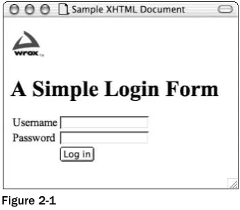
HTML was originally designed as a markup language to describe the structureand semanticsof a ment. The elements and attributes of HTML were supposed to indicate things such as the title of a docu-ment, what part of the text was a heading, what of the text was a paragraph, what data belonged in a table, and so on. In its earliest form, the Web was intended to transmit scientific documents so that the research community had quick and easy access to published work. Here is an example of a document that might have been generated for the scientific community (see the file ch01_eg01.htmlfor the download):
<html> <head>
<title>The Effect of the Internet on Psychological Theories of Self</title> </head>
<body>
<h1>The Effect of the Internet on Psychological Theories of Self</h1> <h2>Abstract</h2>
<p>This paper looks that the role in which Internet users can adopt different online personae, and the effects this has on psychoanalytic theories of self and personal identity.</p>
<p>While psychologists have long suggested that our concept of self should reflect a single, unitary, rational self, many people will adopt online personae that are very different than that which they display in person.</p> ...
</body> </html>
While this kind of document was highly practical, and enabled academics to share information with far greater ease than relying on printed journals, the presentation of these documents was rather gray and uninteresting, as you can see in Figure 1-2, which shows you what this document would look like in a browser.
<p align-"right">The cat sat on the mat</p> element content
element
attribute
opening tag
Figure 1-2
At the time, many people were quick to see the potential of the Web. These users started creating Web pages for all different kinds of purposes, from personal home pages to huge corporate sites advertising a company’s products and services. It wasn’t long before Web page authors wanted to control how their sites looked, and they expected the same level of control over their pages’ appearance as print designers had over their creations. For example, Web designers wanted to be able to control the fonts and colors used in documents, and where their text would appear on a page. As a result, the major browser manu-facturers started adding new elements and attributes to control the appearance of Web pages; both Netscape and Microsoft were desperately trying to win a greater share of the browser market by giving Web designers more control over pages shown in their browsers. The W3C also introduced many of these elements and attributes into successive versions of HTML.
This new markup is known as presentationalor stylisticmarkup, because it affects the way that pages look. (It does not describe the structure and semantics of the document, which was the initial intention of HTML.) Prime examples of this new type of markup are the <center>and <font>elements and the
bgcolorand colorattributes.
Designers were quick to learn tricks that enabled them to control the layout of pages (the positioning of content on the screen) in a similar way to print designers. Two common techniques included the use of tables as layout grids for pages and the use of transparent single-pixel GIF images (commonly known as the single pixel or transparent GIF trick) to position elements.
The following example shows the same page you just met in ch01_eg01.html, but this time it has had stylistic markup added to control its presentation. The new file, called ch01_eg02.html, is much longer with the stylistic markup added to the page:
<html> <head>
<title>The Effect of the Internet on Psychological Theories of Self</title> </head>
<body bgcolor=”#000000”> <center>
<tr>
<td bgcolor=”#999999”>
<font face=”Arial, Helvetica, sans-serif” size=”5” color=”#FFFFFF”> <h1>The Effect of the Internet on Psychological Theories of Self</h1> </font>
</td> </tr> <tr>
<td bgcolor=”#EFEFEF”>
<font face=”Arial, Helvetica, sans-serif” size=”4” color=”#000066”> <h2>Abstract</h2>
</font>
<font face=”Arial, Helvetica, sans-serif” size=”2” color=”#333333”> <p>This paper looks that the role in which Internet users can adopt different online personae, and the effects this has on psychoanalytic theories of self and personal identity.</p>
<p>While psychologists have long suggested that our concept of self should reflect a single, unitary, rational self, many people will adopt online personae that are very different than that which they display in person.</p>
... </font> </td> </tr> </table> </center> </body> </html>
Even though the layout of the document is still quite basic, the size of the page has ballooned; the num-ber of characters (not including spaces) has almost doubled, with ch01_eg01.htmlcontaining 529 char-acters and ch01_eg02.htmlcontaining 928 characters. This extra complexity increases the chances of making an error, both when authoring the page in the first place and when making any alterations to the pages. Figure 1-3 shows you what ch01_eg02.htmllooks like in the browser.
When the rules that govern the presentation of the Web page are intermingled with the actual content of the pages, changing any aspect of the presentation of your site (such as the typeface used for headings or the background color of the page) means changing everypage of the site. When you consider that many pages are littered with <font>tags and a whole host of presentational attributes, it becomes even harder to find the markup you want to change. Therefore, you can see why the stylistic markup introduces more scope for error.
At the same time that the browser manufacturers were writing their browsers to understand new markup, they were also trying to make it easy for authors to write pages, so they would incorporate code that helped users display pages even if the HTML contained errors. This meant that a lot of HTML authors got into bad habits; even some of the leading authoring tools generated sloppy code.
Furthermore, because the browser manufacturers were making the browsers capable of rendering pages even if they contained errors, the amount of disk space and memory required to run a browser had to increase.
None of these developments were inherently bad. Indeed, if it had not been possible to create attractive pages, and if it had not been as easy as to write Web pages as it is today, then it is unlikely that the Web would have ever become as popular as it is now. As you have already seen, however, with all of the extra stylistic markup and the tricks that designers were employing to control the layout of their sites, Web pages were becoming much larger. The markup no longer just described the structure of the page or provided information about its content; it also contained a lot of markup that was there only to control the presentation of the page for one kind of device: the desktop PC.
Browser issues
The problems associated with writing pages that contain rules governing how a page should look were exacerbated by the fact that the way in which people viewed Web sites was changing just as rapidly as the audiences were growing. As I have already hinted, advances in technologies meant the following:
❑ Computer processors and graphics cards improved. ❑ Higher-resolution screens became available.
❑ Larger screens fell in price and became more widespread.
❑ Devices other than desktop computers were accessing the Web, such as mobile phones and TV set top boxes; even refrigerators were being developed with built-in browsers.
Each of these advancements brought a new set of challenges:
❑ As processors and graphics cards improved, more users were encouraged to use higher screen resolutions.
❑ Because larger screens were becoming more widespread, more people were using these higher resolutions.
❑ Sites that were designed to fit on a screen at 640 ×480 resolution look smaller on a 1024 ×768 res-olution screen and can therefore be harder to read at high resres-olutions.
Most challenging were the new types of devices that were now accessing the Web, such as mobile phones, PDAs (personal digital assistants, such as the Blackberry and Palm Pilot), and set top boxes, because the screens could be very different from desktop PCs (not just slightly larger or with a bit better resolution). You certainly don’t want to have to consider rewriting a Web site for each new kind of device that can access the Web.
The problems highlighted here are, once again, tied into the way HTML developed. If the content of the page were separated from the rules that govern how the page appears on a desktop PC, you could make the same content available to numerous devices by creating only one new set of presentational rules for each device that each page of the Web site could use (rather than rewriting every page again to be styled for a particular kind of device).
Of course, creating a new version of a site from scratch for each type of device that can access the Web is not a practical solution, and as you are about to see, you can learn a number of lessons by looking at how early mobile devices accessed the Web. It is fair to say that these events spurred the W3C’s efforts to push forward the development of new versions of XHTML.
Lessons from the mobile world
When mobile phone manufacturers wanted to create Internet-enabled handsets, they knew that the HTML pages commonly available on the Web were not suitable for their devices. Not only were Web pages designed for screens much larger and more complex than theirs, but these phones had far less memory and power available to run them.
Memory was a key point because, as mentioned earlier, browsers designed to run on desktop computers had become bloated with code that enabled them to display pages even if they were not written cor-rectly. When you consider that Netscape 7.2’s system requirements are 26MB of hard disk space and 64MB of RAM, it is not hard to imagine that this is too much for your average mobile phone.
Because mobile phones presented such a different way of accessing the Web, the mobile phone manufac-turers developed their own languages designed to make Web content available to their phones. This resulted in several competing languages that were designed to offer Web content on different mobile devices — examples include Wireless Markup Language (WML), which was part of the Wireless Application Protocol (WAP) group of specifications, Compact HTML, and Handheld Device Markup Language (HDML). When you look closely at all of these languages, however, you can see that they have something in common — they all act like a subset of HTML, and enable users to do the following:
❑ Create titles, headings, and text ❑ Link between pages
❑ Embed simple images ❑ Create basic tables
❑ Collect information from users via simple forms
These languages also require that the author write the page using a strict syntax — the browsers on these mobile devices were not as forgiving of sloppy coding as the major browsers on desktop computers.
By creating their own smaller languages, the mobile phone companies were able to create smaller browsers that would require less memory, eat up less power, and would therefore be able to run on their phones. With hindsight, you can see that they were all reinventing the wheel, when they could have just used a select few of the HTML elements and attributes, but this is not what happened.
At various points in the history of the Web, you might well have thought that each new device to access the Web was going to require its own new language that reflected the capabilities of that device. This would have meant creating several different versions of each and every page for each device. If you have ever struggled to get a site to work in both Internet Explorer andNetscape, then this idea would proba-bly have filled you with dread. Furthermore, if each new device required its own language, then it would have been harder for these devices to gain acceptance, because content would have to be devel-oped especially for them if they were going to be a success.
As you will see in the last chapter of this book, the W3C’s solution has made it possible for all devices, both today and in the future, to use languages based upon XHTML; but you have a way to go before you can look at working with multiple devices.
In reality, when it comes to developing sites for different platforms, rather than creating static sites for each device, the pages are more likely to be dynamically generated from content in a database. Therefore, as you will see in this book, it is very important to ensure that the database holds XHTML, which can be repurposed for different devices.
Accessibility
Many Web designers got into the habit of designing sites with pixel-precision accuracy. They used tables for layout whose width was measured in pixels; they used fixed-sized fonts; they commonly relied on a lot of images to make attractive layouts. This helped to ensure that the site looked the same on different computers (or at least on different browsers on desktop computers). However, it introduced a lot of problems for anyone who had less than 20/20 vision or perfect control over their mouse.
Many computer users with visual impairments use devices known as screen readersto read the content of the screen to them. These devices have complicated sets of keyboard shortcuts that enable the user to operate the software without necessarily seeing what is on the screen. Screen readers are just one of the many types of devices available to users with disabilities, and in many countries it is now a legal requirement that all Web pages are accessible to those with disabilities.
Some of the problems facing users with visual impairments when visiting Web sites include the following:
❑ Tables are used for layout, and often screen readers process tables in a way that makes pages hard to understand, reading things to users in the wrong order.
❑ Poor choices of color combinations can make it very hard to read text.
These problems, yet again, could be solved if the rules that indicate how a document should be pre-sented were separated from the actual content of the document (and followed accessibility guidelines). For example, users with screen readers might want to remove all visual formatting (after all, they will not seethe page) and let their software concentrate on the actual content of the page.
When it comes to accessibility, a number of other issues affect the way you go about designing and building Web pages, and these go beyond the issue of separating style from content. That is why two chapters are dedicated to the topic after you have learned all about XHTML and CSS. Here are some of the problems that users face, which are dealt with in those chapters:
❑ When dealing with forms, it is not always clear what information should be entered into a form control such as a text box, or which radio button should be selected. It is therefore important to label all form controls.
❑ If a page contains a large header (possibly with a lot of navigation items), a user with a screen reader will have to listen to all of this information before getting to the content of a page, which could be very tedious if the information is repeated on each page. It would be better if this infor-mation could be skipped.
❑ If images are used to represent text that is necessary for understanding the site and these images do not make use of the altattribute (to provide a text alternative for those who cannot read what the image says), then users with screen readers will not know what the text on the image said.
Learning how to build sites in XHTML and CSS is the first step in creating accessible Web sites, so you should understand these basics before you continue on and learn about the range of other design consid-erations specifically related to accessibility issues, which are addressed in Chapters 6 and 7.
If you create an accessible site, you also reap other benefits (beyond those of meeting accessibility laws and helping those with disabilities):
❑ Increase the number of potential visitors to your site (and therefore potentially increase income), because the site is accessible to people it might not have been before.
❑ Make the content of your site accessible to those using your site in different situations. For example, if your site can be accessed by a screen reader, it is likely that it could also be used by an emerging market of voice browsers that can be used in different situations, such as while driving or jogging, when hands cannot be used to navigate using a mouse.
❑ Create code that will be available to a whole host of devices other than desktop PCs.
Separating style from content
At the very core of the problems you have been introduced to up to now is that most traditional HTML pages contained rules that controlled how they were presented. There was, therefore, a simple solution: Stop authors from mixing presentational (or stylistic) markup in with the markup that dictated the struc-ture of the document.
documents might seem like a step backward to the days when the Web was a rather gray and drab place; but in reality, the documents can be just as visually attractive.
Rather than put the rules that govern how a document should appear in the same document that holds the real content that people read, you put those rules in a separate document known as a style sheet. For example, a rule in the style sheet might indicate that all level 1 headings should be written in a dark blue, size 5, Arial font.
This approach has many other advantages. For example, several documents can share the same style sheet, making it possible to create a single set of rules to be used to style every page of a site. Conversely, each document could be attached to different style sheets to make the same content appear in a different manner.
If you still need convincing, here is a summary of the key advantages of separating style rules from content:
❑ The content has been freed up. It can be presented in a lot of different ways for different users. ❑ You have simpler source documents, which will be easier to write.
❑ When you have simpler source documents, you are less likely to create errors when editing the documents.
❑ You can create the style rules once and use them for each page of your site, rather than repeat them in each page.
❑ It becomes much easier to maintain the style of a site, not only because it acts as a template for all pages, but because it also enables you to change a font or color across the whole site by just altering the one style sheet.
❑ If you want your content to be made available on different devices, you only need to write a new style sheet for each different device, rather than rewrite the whole site for each device.
❑ Once the browser has automatically downloaded the style sheet when it accesses the first page that uses it, it will be quicker to download subsequent pages that use the same style sheet because the browser stores a copy of the style sheet, and subsequent pages will be smaller because they do not contain style rules.
As you can see, in addition to solving the problems discussed so far, the separation of style from content brings a lot of other advantages, too.
Putting the “X” in XHTML
At the same time that the W3C decided to remove stylistic markup from HTML, they also decided that they would go one step further and rewrite HTML in a language you may well have heard of: XML. XML is a language that is used to write markup languages (and is therefore sometimes referred to as a
meta-markup language). When the W3C was making these changes, XML was gaining wide acceptance in all areas of programming; it can be used on any platform because (like HTML) it uses plain text to hold the data, and it has been one of the most widely used new technologies in the past decade.
documents by calling it XHTML (rather like Microsoft released Windows XP instead of Windows 2003, or Macromedia released Dreamweaver MX instead of Dreamweaver 6).
Several languages that you may have heard of are written in XML, including Scalable Vector Graphics (SVG), MathML (a language dedicated to writing mathematical equations), Extensible Stylesheet Language Transformations (XSLT), and XML Schemas. You can also find hundreds of business-orientated markup languages written in XML.
Making HTML compliant with the rules of XML has many advantages. You will learn more about these advantages in Chapters 2 and 8, but they include the following:
❑ XML requires a stricter syntax than HTML did — as you will see in Chapter 2. This in turn has other advantages:
❑ Browser manufacturers can write smaller browsers that can handle the XHTML pages. These smaller browsers are ideal for small devices that do not have as much memory or power available to them as desktop computers.
❑ You can perform complex operations, processing, and transformation upon the data held within the XHTML page. This means that the data is no longer solely used for visual presentation.
❑ Many tools and languages have been written to work with XML, all of which are then available to XHTML documents, including tools such as XSLT and Simple API for XML (SAX) processors.
In October 1999, the W3C released XHTML 1.0 — this was the reformulation of HTML in XML syntax. As you will see in Chapter 2, there are actually three versions of XHTML 1.0:
❑ Strict XHTML 1.0— which also removed all the old stylistic markup
❑ Transitional XHTML 1.0— which enabled Web page authors to continue to use the stylistic markup of HTML 4.1 while adopting XML syntax. This was largely designed to support older browsers known as legacybrowsers.
❑ Frameset XHTML 1.0— which is used to create frameset documents.
Don’t worry if this sounds complicated; it will all become clear in Chapter 2. Strict XHTML 1.0 is just a subset of Transitional XHTML 1.0, while Frameset XHTML 1.0 introduces only a handful of different markup to create frames. Best of all, each of the elements and attributes should be familiar to you already from HTML — after all, XHTML is just the latest incarnation of HTML.
The Stor y Behind CSS
Because Strict XHTML 1.0 documents contain no presentational markup, if you want them to look visu-ally attractive, you have to link them to a style sheet that controls how the document is to be presented.
CSS1 was actually released in December 1996, while CSS2, which expanded upon CSS1, was released in May 1998. Because Web designers were already using CSS to control the appearance of Web pages, and because of its benefits, it was the obvious choice for use with XHTML.
One thing that makes CSS relatively easy to learn is that its so-called properties,which control how the content of an element is displayed, are very similar to the attribute names you have used in HTML. However, CSS is also a very powerful language that enables you to do much more than is possible with the basic stylistic markup of HTML. For example, CSS offers the following:
❑ Very fine-grained control over the presentation of a page
❑ Control over the layout of a document without relying on tables (as you will see in Chapter 5) ❑ Properties for presenting a document in paged media (what most people would call print) ❑ Properties for aural versions of documents — which may be used by users with visual
impair-ments or anyone on the move who cannot look at a screen
Chapters 3, 4, and 5 ensure that you can create attractive layouts using CSS.
Using Style Sheets
To solve the problems associated with viewing a Web site in different browsers and on different devices and to make sites more accessible, you have seen that the best approach is to separate the markup that describes the structure of a document’s content from the rules that indicate how it should be displayed.
Separating design from content suggests the following:
❑ You are going to have to take your HTML skills back to basics and forget about the stylistic markup that was added to later versions of HTML. The main content of a page can now be writ-ten in Strict XHTML, which contains only markup to describe the structure and semantics of a document.
❑ The rules governing how a page should be displayed are written in a separate document to which the XHTML page links. This document is a style sheet written in CSS.
It is hard to look at examples in depth without learning more about each of the relevant languages. However, the following example is a version of the document you met in ch01_eg01.htmlwritten in XHTML. It is followed by a CSS style sheet used to control presentation of the page.
As you can see in this example, even the table (which was used for layout purposes) has been removed and replaced with <div>elements, which act as grouping elements to which styles can be attached (ch01_eg03.html):
<?xml version=”1.0” encoding=”iso-8859-1”?>
<!DOCTYPE html PUBLIC “-//W3C//DTD XHTML 1.0 Strict//EN” “http://www.w3.org/TR/xhtml1/DTD/xhtml1-strict.dtd”> <html xmlns=”http://www.w3.org/1999/xhtml”>
<head>
<link rel=”stylesheet” type=”text/css” href=”ch01_eg03.css” />
<meta http-equiv=”Content-Type” content=”text/html; charset=iso-8859-1” /> </head>
<body>
<div class=”page”> <div class=”heading”>
<h1>The Effect of the Internet on Psychological Theories of Self</h1> </div>
<div class=”body”> <h2>Abstract</h2>
<p>This paper looks that the role in which Internet users can adopt different online personae, and the effects this has on psychoanalytic theories of self and personal identity.</p>
<p>While psychologists have long suggested that our concept of self should reflect a single, unitary, rational self, many people will adopt online personae that are very different than that which they display in person.</p>
The following code represents the accompanying style sheet (ch01_eg03.css). Do not worry if this looks complicated at first; when you start to look at the language in Chapter 3, you will notice that a lot of it reflects features you learned with HTML attributes:
