Eric A. Meyer
CSS Fonts by Eric A. Meyer
Copyright © 2013 O’Reilly Media. All rights reserved.
Printed in the United States of America.
Published by O’Reilly Media, Inc., 1005 Gravenstein Highway North, Sebastopol, CA 95472.
O’Reilly books may be purchased for educational, business, or sales promotional use. Online editions are also available for most titles (http://my.safaribooksonline.com). For more information, contact our corporate/ institutional sales department: 800-998-9938 or [email protected].
Editors: Simon St. Laurent and Meghan Blanchette Production Editor: Kristen Borg
Proofreader: O’Reilly Production Services
Cover Designer: Randy Comer Interior Designer: David Futato Illustrator: Rebecca Demarest
July 2013: First Edition
Revision History for the First Edition:
2013-07-16: First release
See http://oreilly.com/catalog/errata.csp?isbn=9781449371494 for release details.
Nutshell Handbook, the Nutshell Handbook logo, and the O’Reilly logo are registered trademarks of O’Reilly Media, Inc. CSS Fonts, the image of a salmon, and related trade dress are trademarks of O’Reilly Media, Inc. Many of the designations used by manufacturers and sellers to distinguish their products are claimed as trademarks. Where those designations appear in this book, and O’Reilly Media, Inc., was aware of a trade‐ mark claim, the designations have been printed in caps or initial caps.
While every precaution has been taken in the preparation of this book, the publisher and author assume no responsibility for errors or omissions, or for damages resulting from the use of the information contained herein.
ISBN: 978-1-449-37149-4
Table of Contents
Preface. . . v
Fonts. . . 1
Font Families 1
Using Generic Font Families 3
Specifying a Font Family 4
Using @font-face 7
Required Descriptors 7
Other Font Descriptors 12
Combining Descriptors 16
Font Weights 18
How Weights Work 20
Getting Bolder 22
Lightening Weights 24
Font Size 27
Absolute Sizes 28
Relative Sizes 29
Percentages and Sizes 30
Font Size and Inheritance 31
Using Length Units 34
Automatically Adjusting Size 36
Font Style 38
The font-style Descriptor 40
Font Stretching 41
The font-stretch Descriptor 43
Font Kerning 44
Font Variants 45
Level 3 Values 47
The font-feature-settings Descriptor 50
Font Synthesis 51
The font Property 52
Adding the Line Height 54
Using Shorthands Properly 55
Using System Fonts 55
Font Matching 56
Preface
Conventions Used in This Book
The following typographical conventions are used in this book: Italic
Indicates new terms, URLs, email addresses, filenames, and file extensions.
Constant width
Used for program listings, as well as within paragraphs to refer to program elements such as variable or function names, databases, data types, environment variables, statements, and keywords.
Constant width bold
Shows commands or other text that should be typed literally by the user.
Constant width italic
Shows text that should be replaced with user-supplied values or by values deter‐ mined by context.
This icon signifies a tip, suggestion, or general note.
Safari® Books Online
Safari Books Online (www.safaribooksonline.com) is an on-demand digital library that delivers expert content in both book and video form from the world’s leading authors in technology and busi‐ ness.
Technology professionals, software developers, web designers, and business and crea‐ tive professionals use Safari Books Online as their primary resource for research, prob‐ lem solving, learning, and certification training.
Safari Books Online offers a range of product mixes and pricing programs for organi‐ zations, government agencies, and individuals. Subscribers have access to thousands of books, training videos, and prepublication manuscripts in one fully searchable database from publishers like O’Reilly Media, Prentice Hall Professional, Addison-Wesley Pro‐ fessional, Microsoft Press, Sams, Que, Peachpit Press, Focal Press, Cisco Press, John Wiley & Sons, Syngress, Morgan Kaufmann, IBM Redbooks, Packt, Adobe Press, FT Press, Apress, Manning, New Riders, McGraw-Hill, Jones & Bartlett, Course Technol‐ ogy, and dozens more. For more information about Safari Books Online, please visit us online.
How to Contact Us
Please address comments and questions concerning this book to the publisher:
O’Reilly Media, Inc.
1005 Gravenstein Highway North Sebastopol, CA 95472
800-998-9938 (in the United States or Canada) 707-829-0515 (international or local)
707-829-0104 (fax)
We have a web page for this book, where we list errata, examples, and any additional information. You can access this page at http://oreil.ly/css-fonts_1e.
To comment or ask technical questions about this book, send email to bookques [email protected].
For more information about our books, courses, conferences, and news, see our website at http://www.oreilly.com.
Find us on Facebook: http://facebook.com/oreilly
Follow us on Twitter: http://twitter.com/oreillymedia
Fonts
As the authors of CSS clearly recognized from the outset, font selection is a popular, indeed crucial, feature of web design. In fact, the beginning of the “Font Properties” section of the CSS1 specification begins with the sentence, “Setting font properties will be among the most common uses of style sheets.” The intervening years have done nothing to disprove this assertion.
CSS2 added the ability to specify custom fonts for download with @font-face, but it wasn’t until about 2009 that this capability really began to be widely and consistently supported. Now, websites can call on any font they have the right to use, aided by online services such as Fontdeck and Typekit. Generally speaking, if you can get access to a font, you can use it in your design.
It’s important to remember, however, that this does not grant absolute control over fonts. If the font you’re using fails to download or is in a file format the user’s browser doesn’t understand, then the text will be displayed with a fallback font. That’s a good thing, since it means the user still gets your content, but it’s worth bearing in mind that you cannot absolutely depend on the presence of a given font, and should never design as if you can.
Font Families
In order to cover all the bases, CSS defines five generic font families: Serif fonts
These fonts are proportional and have serifs. A font is proportional if all characters in the font have different widths due to their various sizes. For example, a lowercase i and a lowercase m are different widths. (This book’s paragraph font is proportional, for example.) Serifs are the decorations on the ends of strokes within each character, such as little lines at the top and bottom of a lowercase l, or at the bottom of each leg of an uppercase A. Examples of serif fonts are Times, Georgia, and New Century Schoolbook.
Sans-serif fonts
These fonts are proportional and do not have serifs. Examples of sans-serif fonts are Helvetica, Geneva, Verdana, Arial, and Univers.
Monospace fonts
Monospace fonts are not proportional. These generally are used for displaying programmatic code or tabular data. In these fonts, each character uses up the same amount of horizontal space as all the others; thus, a lowercase i takes up the same horizontal space as a lowercase m, even though their actual letterforms may have different widths. These fonts may or may not have serifs. If a font has uniform character widths, it is classified as monospace, regardless of the presence of serifs. Examples of monospace fonts are Courier, Courier New, Consolas, and Andale Mono.
Cursive fonts
These fonts attempt to emulate human handwriting or lettering. Usually, they are composed largely of flowing curves and have stroke decorations that exceed those found in serif fonts. For example, an uppercase A might have a small curl at the bottom of its left leg or be composed entirely of swashes and curls. Examples of cursive fonts are Zapf Chancery, Author, and Comic Sans.
Fantasy fonts
Such fonts are not really defined by any single characteristic other than our inability to easily classify them in one of the other families (these are sometimes called “dec‐ orative” or “display” fonts). A few such fonts are Western, Woodblock, and Klingon.
Using Generic Font Families
You can employ any font family available by using the property font-family.
font-family
Values:[ <family-name> | <generic-family> ]# | inherit
Initial value:
User agent-specific
Applies to: All elements
Inherited: Yes
Computed value: As specified
If you want a document to use a sans-serif font, but you do not particularly care which one, then the appropriate declaration would be:
body {font-family: sans-serif;}
This will cause the user agent to pick a sans-serif font family (such as Helvetica) and apply it to the body element. Thanks to inheritance, the same font family choice will be applied to all the elements that descend from the body—unless a more specific selector overrides it, of course.
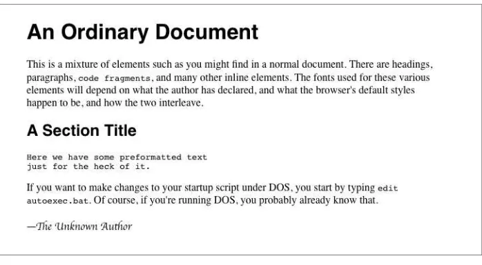
Using nothing more than these generic families, an author can create a fairly sophisti‐ cated style sheet. The following rule set is illustrated in Figure 1:
body {font-family: serif;}
Figure 1. Various font families
Thus, most of the document will use a serif font such as Times, including all paragraphs except those that have a class of signature, which will instead be rendered in a cursive font such as Author. Heading levels 1 through 4 will use a sans-serif font like Helvetica, while the elements code, pre, tt, and kbd will use a monospace font like Courier.
Specifying a Font Family
An author may, on the other hand, have more specific preferences for which font to use in the display of a document or element. In a similar vein, a user may want to create a user style sheet that defines the exact fonts to be used in the display of all documents. In either case, font-family is still the property to use.
Assume for the moment that all h1s should use Georgia as their font. The simplest rule for this would be the following:
h1 {font-family: Georgia;}
This will cause the user agent displaying the document to use Georgia for all h1s, as shown in Figure 2.
Of course, this rule assumes that the user agent has Georgia available for use. If it doesn’t, the user agent will be unable to use the rule at all. It won’t ignore the rule, but if it can’t find a font called “Georgia,” it can’t do anything but display h1 elements using the user agent’s default font (whatever that is).
All is not lost, however. By combining specific font names with generic font families, you can create documents that come out, if not exact, at least close to your intentions. To continue the previous example, the following markup tells a user agent to use Georgia if it’s available, and to use another serif font if it’s not.
h1 {font-family: Georgia, serif;}
If a reader doesn’t have Georgia installed but does have Times, the user agent might use Times for h1 elements. Even though Times isn’t an exact match to Georgia, it’s probably close enough.
For this reason, I strongly encourage you to always provide a generic family as part of any font-family rule. By doing so, you provide a fallback mechanism that lets user agents pick an alternative when they can’t provide an exact font match. Here are a few more examples:
h1 {font-family: Arial, sans-serif;} h2 {font-family: Charcoal, sans-serif;} p {font-family: 'Times New Roman', serif;} address {font-family: Chicago, sans-serif;}
If you’re familiar with fonts, you might have a number of similar fonts in mind for displaying a given element. Let’s say that you want all paragraphs in a document to be displayed using Times, but you would also accept Times New Roman, Georgia, New Century Schoolbook, and New York (all of which are serif fonts) as alternate choices. First, decide the order of preference for these fonts, and then string them together with commas:
p {font-family: Times, 'Times New Roman', 'New Century Schoolbook', Georgia, 'New York', serif;}
Based on this list, a user agent will look for the fonts in the order they’re listed. If none of the listed fonts are available, then it will simply pick an available serif font.
Using quotation marks
You may have noticed the presence of single quotes in the previous example, which we haven’t seen before. Quotation marks are advisable in a font-family declaration only if a font name has one or more spaces in it, such as “New York,” or if the font name includes symbols such as # or $. Thus, a font called Karrank% should probably be quoted:
h2 {font-family: Wedgie, 'Karrank%', Klingon, fantasy;}
Note that the quoting of a font name containing a symbol is not actually required any more. Instead, it’s recommended, which is as close to describing “best practices” as the CSS specification ever really gets. Similarly, it is recommended that you quote a font name containing spaces, though again, this is generally unnecessary in modern user agents. As it turns out, the only required quotation is for font names that match accepted font-family keywords. Thus, if you call for a font whose actual name is “cursive,” you’ll definitely need to quote it in order to distinguish it from the value keyword cursive:
h2 {font-family: Author, "cursive", cursive;}
Obviously, font names that use a single word (that doesn’t conflict with any of the key‐ words for font-family) need not be quoted, and generic family names (serif, mono space, etc.) should never be quoted when they refer to the actual generic families. If you quote a generic name, then the user agent will assume that you are asking for a specific font with that name (for example, “serif ”), not a generic family.
As for which quotation marks to use, both single and double quotes are acceptable. Remember that if you place a font-family rule in a style attribute, which you generally shouldn’t, you’ll need to use whichever quotes you didn’t use for the attribute itself. Therefore, if you use double quotes to enclose the font-family rule, then you’ll have to use single quotes within the rule, as in the following markup:
p {font-family: sans-serif;} /* sets paragraphs to sans-serif by default */
<!-- the next example is correct (uses single-quotes) -->
<p style="font-family: 'New Century Schoolbook', Times, serif;">...</p>
<!-- the next example is NOT correct (uses double-quotes) -->
<p style="font-family: "New Century Schoolbook", Times, serif;">...</p>
If you use double quotes in such a circumstance, they interfere with the attribute syntax, as you can see in Figure 3.
Using @font-face
A feature that originally debuted in CSS2 but wasn’t implemented until late in the first decade of the 2000s, @font-face lets you use custom fonts in your designs. While there’s no guarantee that every last user will see the font you want, this feature is very widely supported and (as of early 2013) gaining a lot of currency in web design.
Suppose you want to use a very specific font in your style sheets, one that is not widely installed. Through the magic of @font-face, you can define a specific family name to correspond to a font file on your server. The user agent will download that file and use it to render the text in your page, the same as if it were installed on the user’s machine. For example:
@font-face {
font-family: "SwitzeraADF";
src: url("SwitzeraADF-Regular.otf"); }
This allows the author to have conforming user agents load the defined .otf file and use that font to render text when called upon via font-family: SwitzeraADF.
The examples in this section refer to SwitzeraADF, a font face collec‐ tion available from the Arkandis Digital Foundry.
The intent of @font-face is to allow “lazy loading” of font faces. This means that only those faces needed to render a document will actually be loaded, with the rest being left alone. In fact, a browser that downloads all declared font faces without considering whether they’re actually needed is considered to be buggy.
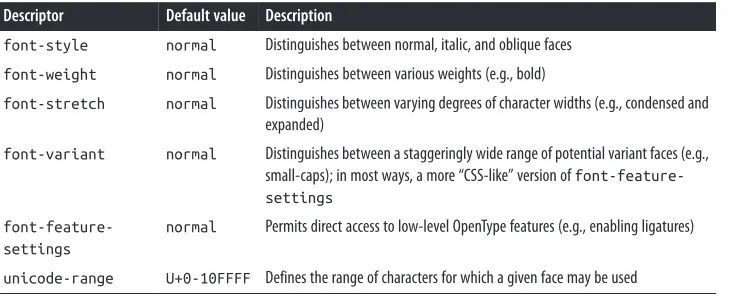
Required Descriptors
All the parameters that define the font you’re referencing are contained within the @font-face { } construct. These are called descriptors, and very much like properties, they take the format descriptor: value;. In fact, most of the descriptor names refer directly to property names, as will be explained in just a moment.
font-family
Value:<family-name>
Initial value: Not defined
src
Values:[ [ <uri> [format(<string>#)]? ] | <font-face-name> ]#
Initial value: Not defined
The point of src is pretty straightforward: it lets you define one or more sources for the font face you’re defining, using a comma-separated list if there are in fact multiple sources. You can point to a font face at any URI, but there is a restriction: font faces can only be loaded from the same origin as the style sheet. Thus, you can’t point your src at someone else’s site and download their font; you’ll need to host a local copy on your own server, or use a font-hosting service that provides both the style sheet(s) and the font file(s).
There is an exception to the same-origin restriction, which is that servers can permit cross-site loading using the HTTP header Access-Control-Allow-Origin.
You may well be wondering how it is that we’re defining font-family here when it was already defined in a previous section. The difference is that this font-family is the font-family descriptor, and the previously-defined font-family was the font-family proper‐ ty. If that seems confusing, stick with me a moment and all should become clear.
@font-face {
font-family: "SwitzeraADF"; /* descriptor */ src: url("SwitzeraADF-Regular.otf");
}
h1 {font-family: SwitzeraADF, Helvetica, sans-serif;} /* property */
Note how the font-family descriptor value and the entry in the font-family property match. If they didn’t match, then the h1 rule would ignore the first font family name listed in the font-family value and move on to the next. As long as the font has cleanly downloaded and is in a format the user agent can handle, then it will be used in the manner you direct, as illustrated in Figure 4.
Figure 4. Using a downloaded font
In a similar manner, the comma-separated src descriptor value provides fallbacks. That way, if (for whatever reason) the user agent is unable to download the first source, it can fall back to the second source and try to load the file there.
@font-face {
font-family: "SwitzeraADF";
src: url("SwitzeraADF-Regular.otf"), url("/fonts/SwitzeraADF-Regular.otf"); }
Remember that the same-origin policy generally applies in this case, so pointing to a copy of the font some other server will usually fail, unless of course said server is set up to permit cross-origin access.
If you want to be sure the user agent understands what kind of font you’re telling it to use, that can be done with the optional format().
@font-face {
font-family: "SwitzeraADF";
src: url("SwitzeraADF-Regular.otf") format("opentype"); }
@font-face {
font-family: "SwitzeraADF";
src: url("SwitzeraADF-Regular.otf") format("opentype"), url("SwitzeraADF-Regular.true") format("truetype"); }
The Flash
If you’re a designer or developer of a certain vintage, you may remember the days of FOUC: the Flash of Unstyled Content. This happened in earlier browsers that would load the HTML and display it to the screen before the CSS was finished loading, or at least before the layout of the page via CSS was finished. Thus, what would appear was a split-second of “plain ol’ text” (using the browser’s default styles) before it was replaced with the CSS-decorated layout.
As of early 2013, there is a cousin to this problem, which is the Flash of Un-Fonted Text, or FOUFT. This happens when a browser has loaded the page and the CSS and displays the laid-out page before it’s done loading custom fonts. This causes text to appear in the default font, or a fallback font, before being replaced by text using the custom-loaded font.
Since the replacement of text with the custom-loaded font face can change its layout size, authors should take care in selecting fallback fonts. If there is a significant height difference between the font used to initially display the text and the custom font even‐ tually loaded and used, significant page reflows are likely to occur. There’s no automated way to enforce this, though font-size-adjust (covered later) can help. You simply have to look at your intended font and find other faces that have a similar height.
The core reason for the “flash” behavior is pretty much the same now as it was then: the browser is ready to show something before it has all the resources on hand, so it goes ahead and does so, replacing it with the prettier version once it can. The FOUC was eventually solved, and it’s likely that some day we’ll look back at the FOUFT the same way we do at the FOUC now. Until then, we’ll have to take comfort in the fact that the FOUFT isn’t usually as jarring as was the FOUC.
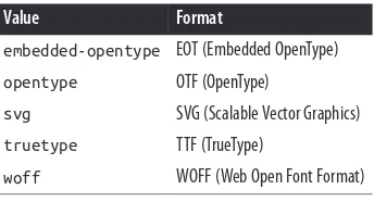
Table 1 lists all of the allowed format values (as of early 2013).
In addition to the combination of url() and format(), you can also supply a font family name (or several names) in case the font is already locally available on the user’s machine, using the aptly-named local().
@font-face {
font-family: "SwitzeraADF"; src: local("Switzera-Regular"), local("SwitzeraADF-Regular "),
url("SwitzeraADF-Regular.otf") format("opentype"), url("SwitzeraADF-Regular.true") format("truetype"); }
In this example, the user agent looks to see if it already has a font family named “Switzera-Regular” or “SwitzeraADF-“Switzera-Regular” available. If so, it will use the name SwitzeraADF to refer to that locally installed font. If not, it will use the url() value to try downloading the remote font.
Note that this capability allows an author to create custom names for locally installed fonts. For example, you could set up a shorter name for Helvetica (or, failing that, Hel‐ vetica Neue) like so:
As long as the user has Helvetica installed on their machine, then those rules will cause the first three heading levels to be rendered using Helvetica. It seems a little gimmicky, but it could have a real impact on reducing style sheet file size in certain situations.
On Being Bulletproof
The tricky part with @font-face is that different browsers of different eras supported different font formats. (To the insider, Table 1 reads as a capsule history of downloadable font support.) In order to cover the widest possible landscape, you should turn to what is known as the “Bulletproof @font-face Syntax.” Initially developed by Paul Irish and refined by the chaps at FontSpring, it looks like this:
@font-face {
font-family: "SwitzeraADF";
src: url("SwitzeraADF-Regular.eot");
src: url("SwitzeraADF-Regular.eot?#iefix") format("embedded-opentype"), url("SwitzeraADF-Regular.woff") format("woff"),
url("SwitzeraADF-Regular.ttf") format("truetype"),
Let’s break it down piece by piece. The first bit, assigning the font-family name, is straightforward enough. After that, we see:
src: url("SwitzeraADF-Regular.eot");
src: url("SwitzeraADF-Regular.eot?#iefix") format("embedded-opentype"),
This supplies an EOT (Embedded OpenType) to browsers that understand only EOTs— IE6 through IE9. The first line is for IE9 when it’s in “Compatibility Mode,” and the second line hands the same file to IE6-IE8. The ?#iefix bit in that line exploits a parsing bug in those browsers to step around another parsing bug that causes them to 404 any @font-face with multiple formats listed. IE9 fixed its bugs without expanding its font formats, so the first line is what lets it join the party.
url("SwitzeraADF-Regular.woff") format("woff"),
This line supplies a Web Open Font Format file to browsers that understand it, which includes most modern browsers. At this point, in fact, you’ll have covered the vast majority of your desktop users.
url("SwitzeraADF-Regular.ttf") format("truetype"),
This line hands over the file format understood by most iOS and Android devices, thus covering most of your handheld users.
url("SwitzeraADF-Regular.svg#switzera_adf_regular") format("svg");
Here, at the end, we supply the only font format understood by old iOS devices. This covers almost all of your remaining handheld users.
Obviously, this gets a bit unwieldy if you’re specifying more than a couple of faces, and typing it in even once is kind of a pain in the wrists. Fortunately, there are services available that will accept your font faces and generate all the @font-face rules you need, convert those faces to all the formats required, and hand it all back to you as a single package. One of the best is Font Squirrel’s “@Font-Face Kit Generator”. Just make sure you’re legally able to convert and use the font faces you’re running through the generator (see the next sidebar, “Custom Font Considerations”, for more information).
Other Font Descriptors
Custom Font Considerations
There are two things you need to keep in mind when using customized fonts. The first is that you have the rights to use the font in a web page, and the second is whether it’s a good idea to do so.
Much like stock photography, font families come with licenses that govern their use, and not every font license permits its use on the web. You can completely avoid this question by only using FOSS (Free and Open-Source Software) fonts only, or by using a commercial service like Fontdeck or Typekit that will deal with the licensing and format conversion issues so you don’t have to. Otherwise, you need to make sure that you have the right to use a font face in the way you want to use it, just the same as you would make sure you had the proper license for any images you bought.
In addition, the more font faces you call upon, the more resources the web server has to hand over and the higher the overall page weight will become. Most faces are not overly large—usually 50K to 100K—but they add up quickly if you decide to get fancy with your type, and truly complicated faces can be larger. Of course, the same problems exist for images. As always, you will have to balance appearance against performance, leaning one way or the other depending on the circumstances. Furthermore, just as there are image optimization tools available, there are also font optimization tools. Typically these are “subsetting” tools, which construct fonts using only the symbols actually needed for display. If you’re using a service like Typekit or Fonts.com, they probably have subsetting tools available, or do it dynamically when the font is requested.
Table 2. Font descriptors
Descriptor Default value Description
font-style normal Distinguishes between normal, italic, and oblique faces
font-weight normal Distinguishes between various weights (e.g., bold)
font-stretch normal Distinguishes between varying degrees of character widths (e.g., condensed and expanded)
font-variant normal Distinguishes between a staggeringly wide range of potential variant faces (e.g., small-caps); in most ways, a more “CSS-like” version of font-feature-settings
font-feature-settings
normal Permits direct access to low-level OpenType features (e.g., enabling ligatures)
Because these font descriptors are optional, they may not be listed in a @font-face rule, but CSS does not allow descriptors to go without default values any more than it does for properties. If an optional descriptor is omitted, then it is set to the default value. Thus, if font-weight is not listed, the default value of normal is assumed.
Restricting Character Range
There is one font descriptor, unicode-range, which (unlike the others in Table 2) has no corresponding CSS property. This descriptor allows authors to define the range of characters to which a custom font can be applied. This can be useful when using a symbol font, or to ensure that a font face is only applied to characters that are in a specific language.
By default, the value of this property covers the entirety of Unicode, meaning that if a font can supply the glyph for a character, it will. Most of the time, this is exactly what you want. For all the other times, you’ll want to use a specific font face for a specific kind of content. To pick two examples from the CSS Fonts Module Level 3:
unicode-range: U+590-5FF; /* Hebrew characters */
unicode-range: U+4E00-9FFF, U+FF00-FF9F, U+30??; /* Japanese kanji, hiragana, katakana */
In the first case, a single range is specified, spanning Unicode character code point 590 through code point 5FF. This covers the characters used in Hebrew. Thus, an author might specify a Hebrew font and restrict it to only be used for Hebrew characters, even if the face contains glyphs for other code points:
@font-face {
font-family: "CMM-Ahuvah";
src: url("cmm-ahuvah.otf" format("opentype"); unicode-range: U+590-5FF;
}
Ranges must always ascend. Any descending range (e.g., U+400-300) is treated as a parsing error and ignored. Besides ranges, you can also declare a single code point, which looks like U+221E. This is most often useful in conjunction with other code points and ranges, like so:
unicode-range: U+4E00-9FFF, U+FF00-FF9F, U+30??, U+A5;
/* Japanese kanji, hiragana, and katakana, plus yen/yuan currency symbol*/
Of course, you could use a single code point to declare that a specific face only be used to render one, and only one, character. Whether or not that’s a good idea is left to you, your design, the size of the font file, and your users’ connection speeds.
Because @font-face is designed for “lazy loading” optimization, it’s possible to use unicode-range to download only the font faces a page actually needs. Suppose that you have a website that uses a mixture of English, Russian, and basic mathematical operators, but you don’t know which will appear on any given page. There could be all English, a mixture of Russian and math, and so on. Furthermore, suppose you have special font faces for all three types of content. You can make sure a user agent only downloads the faces it actually needs with a properly-constructed series of @font-face rules.
@font-face {
unicode-range: U+04??, U+0500-052F, U+2DE0-2DFF, U+A640-A69F, U+1D2B-1D78; }
Because the first rule doesn’t specify a Unicode range, it is always downloaded—unless, of course, a page happens to contain no characters at all (and maybe even then). The second rule causes myfont-cyrillic.otf to be downloaded only if the page contains characters in its declared Unicode range; the third rule does the same for basic mathe‐ matical operators.
As of mid-2013, the only user agent line to support unicode-range
Combining Descriptors
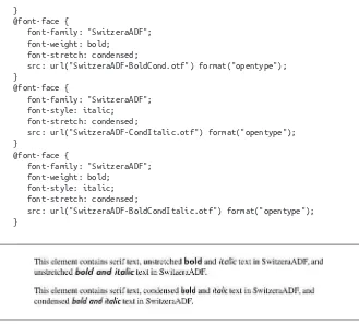
Something that might not be immediately obvious is that you can supply multiple de‐ scriptors in order to assign specific faces for specific property combinations. For ex‐ ample, you can assign one face to bold text, another to italic text, and a third to text that is both bold and italic.
This is actually implicit in the fact that any undeclared descriptor is assigned its default value. Let’s consider a basic set of three face assignments:
@font-face {
Here, we’ve made the implicit explicit: any time a descriptor isn’t being altered, its default value is listed. This is exactly the same as a set of three rules in which we remove every descriptor that shows a value of normal:
In all three rules, there is no font-stretching beyond the normal amount, and the values of font-weight and font-style vary by which face is being assigned. So what if we want to assign a specific face to unstretched text that’s both bold and italic?
@font-face {
And then what about bold, italic, condensed text?
@font-face {
We could keep this up for quite a while, but let’s stop there. If we take all those rules and strip out anything with a normal value, we end up with this result, illustrated in Figure 5:
}
@font-face {
font-family: "SwitzeraADF"; font-weight: bold;
font-stretch: condensed;
src: url("SwitzeraADF-BoldCond.otf") format("opentype"); }
@font-face {
font-family: "SwitzeraADF"; font-style: italic;
font-stretch: condensed;
src: url("SwitzeraADF-CondItalic.otf") format("opentype"); }
@font-face {
font-family: "SwitzeraADF"; font-weight: bold;
font-style: italic; font-stretch: condensed;
src: url("SwitzeraADF-BoldCondItalic.otf") format("opentype"); }
Figure 5. Employing a variety of faces
As you can see, there are a lot of possible combinations just for those three descriptors —consider that there are eleven possible values for font-weight, and ten for font-stretch—but you’ll likely never have to run through them all. In fact, most font families don’t have as many faces as SwitzeraADF offers (24 at last count) so there wouldn’t be much point in writing out all the possibilities. Nevertheless, the options are there, and in some cases you may find that you need to assign, say, a specific face for bold condensed text so that the user agent doesn’t try to compute them for you.
Font Weights
font-weight
Values:normal | bold | bolder | lighter | 100 | 200 | 300 | 400 | 500 | 600 | 700 | 800 | 900 | inherit
Initial value:
normal
Applies to: All elements
Inherited: Yes
Computed value:
One of the numeric values (100, etc.), or one of the numeric values plus one of the relative values (bolder or lighter)
Note:
Has a corresponding @font-face descriptor (see below)
Generally speaking, the heavier a font weight becomes, the darker and “more bold” a font appears. There are a great many ways to label a heavy font face. For example, the font family known as SwitzeraADF has a number of variants, such as SwitzeraADF Bold, SwitzeraADF Extra Bold, SwitzeraADF Light, and SwitzeraADF Regular. All of these use the same basic font shapes, but each has a different weight.
So let’s say that you want to use SwitzeraADF for a document, but you’d like to make use of all those different heaviness levels. You could refer to them directly through the font-family property, but you really shouldn’t have to do that. Besides, it’s no fun having to write a style sheet like this:
h1 {font-family: 'SwitzeraADF Extra Bold, sans-serif;} h2 {font-family: 'SwitzeraADF Bold, sans-serif;} h3 {font-family: 'SwitzeraADF Bold', sans-serif;} h4, p {font-family: SwitzeraADF Regular, sans-serif;} small {font-family: 'SwitzeraADF Light', sans-serif;}
That’s pretty tedious. It would make far more sense to specify a single font family for the whole document and then assign different weights to various elements. You can do this via @font-face and use the various values for the property font-weight. This is a fairly obvious font-weight declaration:
This declaration says, simply, that the b element should be displayed using a bold font face; or, to put it another way, a font face that is heavier than the normal font face. This is what we’re used to, of course, since b does cause text to be bold.
What’s really happening behind the scenes is that a heavier face of the font is used for displaying a b element. Thus, if you have a paragraph displayed using Times, and part of it is bold, then there are really two faces of the same font in use: Times and TimesBold. The regular text is displayed using Times, and the bold text is displayed using TimesBold.
How Weights Work
To understand how a user agent determines the heaviness, or weight, of a given font variant (not to mention how weight is inherited), it’s easiest to start by talking about the keywords 100 through 900. These number keywords were defined to map to a relatively common feature of font design in which a font is given nine levels of weight. If a font family has faces for all nine weight levels available, then the numbers are mapped directly to the predefined levels, with 100 as the lightest variant of the font and 900 as the heaviest.
In fact, there is no intrinsic weight in these numbers. The CSS specification says only that each number corresponds to a weight at least as heavy as the number that precedes it. Thus, 100, 200, 300, and 400 might all map to the same relatively lightweight variant; 500 and 600 could correspond to the same heavier font variant; and 700, 800, and 900 could all produce the same very heavy font variant. As long as no keyword corresponds to a variant that is lighter than the variant assigned to the previous keyword, everything will be all right.
As it happens, these numbers are defined to be equivalent to certain common variant names, not to mention other values for font-weight. 400 is defined to be equivalent to normal, and 700 corresponds to bold. The other numbers do not match up with any other values for font-weight, but they can correspond to common variant names. If there is a font variant labeled something such as “Normal,” “Regular,” “Roman,” or “Book,” then it is assigned to the number 400 and any variant with the label “Medium” is assigned to 500. However, if a variant labeled “Medium” is the only variant available, it is assigned to 400 instead of 500.
A user agent has to do even more work if there are fewer than nine weights in a given font family. In this case, it must fill in the gaps in a predetermined way:
• If 600 is unassigned, it is given the next variant darker than that assigned for 500. If no darker variant is available, 600 is assigned the same variant as 500. This method is also used for 700, 800, and 900.
To illustrate this weighting scheme more clearly, let’s look at three examples of font weight assignment. In the first example, assume that the font family Karrank% is an OpenType font, so it has nine weights already defined. In this case, the numbers are assigned to each level, and the keywords normal and bold are assigned to the numbers 400 and 700, respectively. This is the most straightforward example, and therefore the one that almost never occurs in the real world. (It is quite rare for a font family to have nine weight levels, and those that do are usually very expensive.)
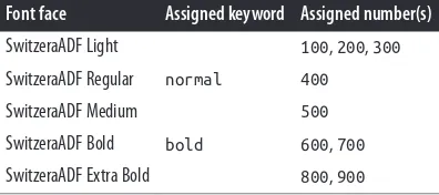
In our second example, consider the font family SwitzeraADF, which was discussed near the beginning of this section. Hypothetically, its variants might be assigned numeric values for font-weight, as shown in Table 3.
Table 3. Hypothetical weight assignments for a specific font family
Font face Assigned keyword Assigned number(s)
SwitzeraADF Light 100, 200, 300
SwitzeraADF Regular normal 400
SwitzeraADF Medium 500
SwitzeraADF Bold bold 600, 700
SwitzeraADF Extra Bold 800, 900
The first three number values are assigned to the lightest weight. The “Regular” face gets the keyword normal, as expected, and the number weight 400. Since there is a “Medium” font, it’s assigned to the number 500. There is nothing to assign to 600, so it’s mapped to the “Bold” font face, which is also the variant to which 700 and bold are assigned. Finally, 800 and 900 are assigned to the “Black” and “UltraBlack” variants, respectively. Note that this last assignment would happen only if those faces had the top two weight levels already assigned. Otherwise, the user agent might ignore them and assign 800 and 900 to the “Bold” face instead, or it might assign them both to one or the other of the “Black” variants.
For our third and final example, let’s consider a stripped-down version of Times. In Table 4, there are only two weight variants: “TimesRegular” and “TimesBold.”
Table 4. Hypothetical weight assignments for “Times”
Font face Assigned keyword Assigned numbers
TimesRegular normal 100, 200, 300, 400, 500
The assignment of the keywords normal and bold is straightforward enough, of course. As for the numbers, 100 through 300 are assigned to the “Regular” face because there isn’t a lighter face available. 400 is assigned to “Regular” as expected, but what about 500? It is assigned to the “Regular” (or normal) face because there isn’t a “Medium” face available; thus, it is assigned the same font face as 400. As for the rest, 700 goes with bold as always, while 800 and 900, lacking a heavier face, are assigned to the next-lighter face, which is the “Bold” font face. Finally, 600 is assigned to the next-heavier face, which is, of course, the “Bold” face.
font-weight is inherited, so if you set a paragraph to be bold:
p.one {font-weight: bold;}
...then all of its children will inherit that boldness, as we see in Figure 6.
Figure 6. Inherited font-weight
This isn’t unusual, but the situation gets interesting when you use the last two values we have to discuss: bolder and lighter. In general terms, these keywords have the effect you’d anticipate: they make text more or less bold compared to its parent’s font weight. First, let’s consider bolder.
Getting Bolder
If you set an element to have a weight of bolder, then the user agent first must determine what font-weight value was inherited from the parent element. It then selects the lowest number which corresponds to a font weight darker than what was inherited. If none is available, then the user agent sets the element’s font weight to the next numerical value, unless the value is already 900, in which case the weight remains at 900. Thus, you might encounter the following situations, illustrated in Figure 7:
p {font-weight: normal;}
p em {font-weight: bolder;} /* results in bold text, evaluates to '700' */
h1 {font-weight: bold;}
h1 b {font-weight: bolder;} /* if no bolder face exists, evaluates to '800' */
Figure 7. Text trying to be bolder
In the first example, the user agent moves up the weight ladder from normal to bold; in numeric terms, it jumps from 400 to 700. In the second example, h1 text is already set to bold. If there is no bolder face available, then the user agent sets the weight of b text within an h1 to 800, since that is the next step up from 700 (the numeric equivalent of bold). Since 800 is assigned to the same font face as 700, there is no visible difference between normal h1 text and bold h1 text, but the weights are different nonetheless.
In the last example, paragraphs are set to be the lightest possible font weight, which we assume exists as a “Light” variant. Furthermore, the other faces in this font family are “Regular” and “Bold.” Any em text within a paragraph will evaluate to normal since that is the next-heaviest face within the font family. However, what if the only faces in the font are “Regular” and “Bold”? In that case, the declarations would evaluate like this:
/* assume only two faces for this example: 'Regular' and 'Bold' */ p {font-weight: 100;} /* looks the same as 'normal' text */
p span {font-weight: bolder;} /* maps to '700' */
As you can see, the weight 100 is assigned to the normal font face, but the value of font-weight is still 100. Thus, any span text that is descended from a p element will inherit the value of 100 and then evaluate to the next-heaviest face, which is the “Bold” face with a numerical weight of 700.
Let’s take this one step further and add two more rules, plus some markup, to illustrate how all of this works (see Figure 8 for the results):
/* assume only two faces for this example: 'Regular' and 'Bold' */ p {font-weight: 100;} /* looks the same as 'normal' text */
p span {font-weight: 400;} /* so does this */
strong {font-weight: bolder;} /* even bolder than its parent */ strong b {font-weight: bolder;} /*bolder still */
<p>
This paragraph contains elements of increasing weight: there is a <span>span element that contains a <strong>strongly emphasized element and a <b>bold element</b></strong></span>.
Figure 8. Moving up the weight scale
In the last two nested elements, the computed value of font-weight is increased because of the liberal use of the keyword bolder. If you were to replace the text in the paragraph with numbers representing the font-weight of each element, you would get the results shown here:
<p>
100 <span> 400 <strong> 700 <b> 800 </b> </strong> </span>. </p>
The first two weight increases are large because they represent jumps from 100 to 400 and from 400 to bold (700). From 700, there is no heavier face, so the user agent simply moves the value of font-weight one notch up the numeric scale (800). Furthermore, if you were to insert a strong element into the b element, it would come out like this:
<p>
100 <span> 400 <strong> 700 <b> 800 <strong> 900 </strong> </b> </strong> </span>.
</p>
If there were yet another b element inserted into the innermost strong element, its weight would also be 900, since font-weight can never be higher than 900. Assuming that there are only two font faces available, then the text would appear to be either Regular or Bold, as you can see in Figure 9:
<p>
regular <span> regular <strong> bold <b> bold <strong> bold </strong> </b> </strong> </span>.
</p>
Figure 9. Visual weight, with descriptors
Lightening Weights
As you might expect, lighter works in just the same way, except it causes the user agent to move down the weight scale instead of up. With a quick modification of the previous example, you can see this very clearly:
/* assume only two faces for this example: 'Regular' and 'Bold' */ p {font-weight: 900;} /* as bold as possible, which will look 'bold' */ p span {font-weight: 700;} /* this will also be bold */
<p>
900 <span> 700 <strong> 400 <b> 300 <strong> 200 </strong> </b> </strong> </span>.
</p>
<!-- ...or, to put it another way... --> <p>
bold <span> bold <strong> regular <b> regular <strong> regular </strong></b> </strong></span>.
</p>
Ignoring the fact that this would be entirely counterintuitive, what you see in Fig‐ ure 10 is that the main paragraph text has a weight of 900. When the strong text is set to be lighter, it evaluates to the next-lighter face, which is the regular face, or 400 (the same as normal) on the numeric scale. The next step down is to 300, which is the same as normal since no lighter faces exist. From there, the user agent can reduce the weight only one numeric step at a time until it reaches 100 (which it doesn’t do in the example). The second paragraph shows which text will be bold and which will be regular.
Figure 10. Making text lighter
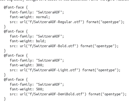
The font-weight Descriptor
With the font-weight descriptor, authors can assign faces of varying weights to the weighting levels permitted by the font-weight property. For example, the following rules explicitly assign five faces to six different font-weight values:
@font-face {
font-family: "SwitzeraADF"; font-weight: 700;
src: url("f/SwitzeraADF-Bold.otf") format("opentype"); }
@font-face {
font-family: "SwitzeraADF"; font-weight: 900;
src: url("f/SwitzeraADF-ExtraBold.otf") format("opentype"); }
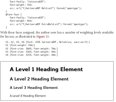
With these faces assigned, the author now has a number of weighting levels available for his use, as illustrated in Figure 11:
h1, h2, h3, h4 {font: 225% SwitzeraADF, Helvetica, sans-serif;} h1 {font-weight: 900;}
h2 {font-size: 180%; font-weight: 700;} h3 {font-size: 150%; font-weight: 500;} h4 {font-size: 125%; font-weight: 300;}
Figure 11. Using declared font-weight faces
Font Size
The methods for determining font size are both very familiar and very different.
font-size
Values:xx-small | x-small | small | medium | large | x-large | xx-large | smaller | larger | <length> | <percentage> | inherit
Initial value:
medium
Applies to: All elements
Inherited: Yes
Percentages:
Calculated with respect to the parent element’s font size
Computed value: An absolute length
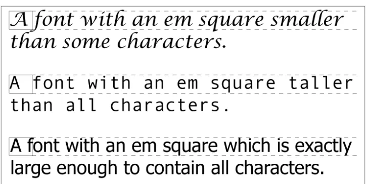
In a fashion very similar to the font-weight keywords bolder and lighter, the prop‐ erty font-size has relative-size keywords called larger and smaller. Much like what we saw with relative font weights, these keywords cause the computed value of font-size to move up and down a scale of size values, which you’ll need to understand before you can explore larger and smaller. First, though, we need to examine how fonts are sized in the first place.
Figure 12. Font characters and em squares
Thus, the effect of font-size is to provide a size for the em box of a given font. This does not guarantee that any of the actual displayed characters will be this size.
Absolute Sizes
Having established all of that, we turn now to the absolute-size keywords. There are seven absolute-size values for font-size: xx-small, x-small, small, medium, large, x-large, and xx-large. These are not defined precisely, but are relative to each other, as Figure 13 demonstrates:
p.one {font-size: xx-small;} p.two {font-size: x-small;} p.three {font-size: small;} p.four {font-size: medium;} p.five {font-size: large;} p.six {font-size: x-large;} p.seven {font-size: xx-large;}
Figure 13. Absolute font sizes
Working from the assumption that medium equals 16px, for different scaling factors, we get the absolute size equivalents shown in Table 5. (The values shown are rounded-off integers.)
Table 5. Scaling factors translated to pixels
Keyword CSS1 CSS2 CSS3 (draft)
xx-small 5px 9px 10px
x-small 7px 11px 12px
small 11px 13px 14px
medium 16px 16px 16px
large 24px 19px 19px
x-large 36px 23px 24px
xx-large 54px 28px 32px
Relative Sizes
Comparatively speaking, the keywords larger and smaller are simple: they cause the size of an element to be shifted up or down the absolute-size scale, relative to their parent element, using the same scaling factor employed to calculate absolute sizes. In other words, if the browser used a scaling factor of 1.2 for absolute sizes, then it should use the same factor when applying relative-size keywords:
p {font-size: medium;}
strong, em {font-size: larger;}
<p> medium <strong>large <em> x-large <strong>xx-large</strong> </em> </strong> </p>
Unlike the relative values for weight, the relative-size values are not necessarily con‐ strained to the limits of the absolute-size range. Thus, a font’s size can be pushed beyond the sizes for xx-small and xx-large. For example:
h1 {font-size: xx-large;} em {font-size: larger;}
<h1>A Heading with <em>Emphasis</em> added</h1>
<p>This paragraph has some <em>emphasis</em> as well.</p>
As you can see in Figure 14, the emphasized text in the h1 element is slightly larger than xx-large. The amount of scaling is left up to the user agent, with the scaling factor of 1.2 being preferred but not required. The em text in the paragraph, of course, is shifted one slot up the absolute-size scale (large).
Figure 14. Relative font sizing at the edges of the absolute sizes
User agents are not required to increase or decrease font size beyond the limits of the absolute-size keywords.
Percentages and Sizes
In a way, percentage values are very similar to the relative-size keywords. A percentage value is always computed in terms of whatever size is inherited from an element’s parent. Percentages, unlike the size keywords previously discussed, permit much finer control over the computed font size. Consider the following example, illustrated in Figure 15:
<body>
<p>This paragraph contains both <em>emphasis</em> and <strong>strong emphasis</strong>, both of which are larger than their parent element.
The <small>small text</small>, on the other hand, is smaller by a quarter.</p> <p class="fnote">This is a 'footnote' and is smaller than regular text.</p>
<p> 12px <em> 14.4px </em> 12px <strong> 16.2px </strong> 12px <small> 9px </small> 12px </p>
<p class="fnote"> 10.5px </p> </body>
Figure 15. Throwing percentages into the mix
In this example, the exact pixel size values are shown. These are the values calculated by the browser, regardless of the actual displayed size of the characters on-screen.
Incidentally, CSS defines the length value em to be equivalent to percentage values, in the sense that 1em is the same as 100% when sizing fonts. Thus, the following would yield identical results, assuming that both paragraphs have the same parent element:
p.one {font-size: 166%;} p.two {font-size: 1.6em;}
When using em measurements, the same principles apply as with percentages, such as the inheritance of computed sizes and so forth.
Font Size and Inheritance
Figure 12 also demonstrates that, although font-size is inherited in CSS, it is the com‐ puted values that are inherited, not percentages. Thus, the value inherited by the strong element is 12px, and this value is modified by the declared value 135% to arrive at 16.2px. For the “footnote” paragraph, the percentage is calculated in relation to the font-size value that’s inherited from the body element, which is 15px. Multiplying that value by 75% yields 11.25px.
As with the relative-size keywords, percentages are effectively cumulative. Thus, the following markup is displayed as shown in Figure 16:
<p>This paragraph contains both<em>emphasis and <strong>strong
emphasis</strong></em>, both of which are larger than the paragraph text. </p>
<p> 12px <em>14.4px <strong> 19.44px </strong></em> 12px </p>
Figure 16. The issues of inheritance
The size value for the strong element shown in Figure 16 is computed as follows:
12 px × 120% = 14.4px
14.4px × 135% = 19.44px (possibly rounded to 19px for display; see below)
The problem of runaway scaling can go the other direction, too. Consider for a moment a document that is nothing but a series of unordered lists, many of them nested inside other lists. Some of these lists are four nested levels deep. Imagine the effect of the following rule on such a document:
ul {font-size: 80%;}
Assuming a four-level deep nesting, the most deeply nested unordered list would have a computed font-size value 40.96 percent the size of the parent of the top-level list. Every nested list would have a font size 80 percent as big as its parent list, causing each level to become harder and harder to read.
Rounding for Display
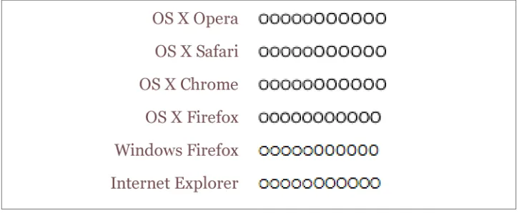
In most modern browsers, while fractional font-size values are maintained internally, they are not always used by rendering engines. For example, study the letterforms in Figure 17.
In all cases, the “O” characters increase by 0.1 pixels in size as you go from left to right. Thus, the leftmost “O” has a font-size of 10px, the one at the midpoint has a size of 10.5px, and the one on the right is 11px.
Figure 17. Fractional font sizes
Nevertheless, every browser will yield up the same subpixel font-size values if you use an inspector or query the value directly via DOM scripting. The third “O” from the right will show a computed value of 10.8px, regardless of the size of the character displayed on-screen.
Keywords and Monospace Text
There’s an interesting wrinkle to font size keywords and inheritance that becomes ap‐ parent when you look at what some browsers do with monospace text (e.g., Courier). Consider the following, illustrated in Figure 18:
p {font-size: medium;} /* the default value */ span {font-family: monospace; font-size: 1em;}
<p>This is a 'p' with a <span>'span'</span> inside.</p>
Figure 18. Monospace size oddities
The default value of medium is generally resolved to 16px, assuming the user hasn’t changed the browser preferences (where the default text sizes are set). Indeed, if you query the paragraph text outside the span, inspectors will tell you that the computed font-size of the text is 16px (again, assuming the user hasn’t changed the preferences).
So you might expect the monospaced span to also have 16 pixel text. That’s exactly the case in some browsers, but in others, it will be 13px instead.
determine the proper size, and most browsers are set to a 13px default size for all mono‐ space text. This causes them to display 13-pixel monospace text in a 16-pixel parent, even though the monospace text was explicitly set to font-size: 1em.
The effect carries through even with font sizes other than 1em (or 100%); in the following case, the monospace text will have a computed size of 26px instead of 32px (once more assuming the browser defaults have not changed):
p {font-size: medium;} /* the default value */ span {font-family: monospace; font-size: 2em;}
<p>This is a 'p' with a <span>'span'</span> inside.</p>
Note that not all browsers actually do this: some override the medium sizing assumptions in favor of scaling off the computed font-size of the parent. This leads to inconsistent text display across browsers.
As it happens, there is a way to work around this problem that works for all known browsers, at least as of early 2013. It goes like this:
p {font-size: medium;} /* the default value */ span {font-family: monospace, serif; font-size: 1em;}
<p>This is a 'p' with a <span>'span'</span> inside.</p>
See the extra serif in the font-family there? That somehow triggers a switch that makes all browsers treat font-size: 1em as being 100% of the paragraph’s computed font-size, not a medium-derived value. This is cross-browser-consistent and illustrated in Figure 19.
Figure 19. Monospace size harmony
Using Length Units
The font-size can be set using any length value. All of the following font-size dec‐ larations should be equivalent:
p.one {font-size: 36pt;} p.two {font-size: 3pc;} p.three {font-size: 0.5in;} p.four {font-size: 1.27cm;} p.five {font-size: 12.7mm;}
lines should always have the same font size. Thus, while the result may not exactly match reality (for example, the actual size of p.three may not be half an inch), the measure‐ ments should all be consistent with one another.
Figure 20. Various font sizes
There is one more value that is potentially the same as those shown in Figure 20, and that’s 36px, which would be the same physical distance if the display medium is 72 pixels-per-inch (ppi). However, there are very few monitors with that setting anymore. Most desktop displays are much higher, in the range of 96ppi to 120ppi; and mobile devices go much higher, currently in the 300ppi – 500ppi range.
Despite these variations between operating systems and devices, many authors choose to use pixel values for font sizes. This approach seems especially attractive when mixing text and raster images (GIF, JPG, PNG, etc.) on a web page, since text can (in theory) be set to the same height as graphic elements on the page by declaring font-size: 11px; or something similar, as illustrated by Figure 21.
Figure 21. Keeping text and graphics in scale with pixel sizes
full-screen devices (such as most versions of the iPhone). For these reasons alone, pixel-sizing text is generally not recommended.
Automatically Adjusting Size
Two of the main factors that influence a font’s legibility are its size and its x-height. The number that results from dividing the x-height by the font-size is referred to as the aspect value. Fonts with higher aspect values tend to be legible as the font’s size is reduced; conversely, fonts with low aspect values become illegible more quickly. CSS provides a way to deal with shifts in aspect values between font families with the property font-size-adjust.
font-size-adjust
Values:<number> | none | auto | inherit
Initial value:
none
Applies to: All elements
Inherited: Yes
The goal of this property is to preserve legibility when the font used is not the author’s first choice. Because of the differences in font appearance, while one font may be legible at a certain size, another font at the same size is difficult or impossible to read.
A good example is to compare the common fonts Verdana and Times. Consider Fig‐ ure 22 and the following markup, which shows both fonts at a font-size of 10px:
p {font-size: 10px;}
p.cl1 {font-family: Verdana, sans-serif;} p.cl2 {font-family: Times, serif; }
The text in Times is much harder to read than the Verdana text. This is partly due to the limitations of pixel-based display, but it is also because Times simply becomes harder to read at smaller font sizes.
As it turns out, the ratio of x-height to character size in Verdana is 0.58, whereas in Times it is 0.46. What you can do in this case is declare the aspect value of Verdana, and the user agent will adjust the size of the text that’s actually used. This is accomplished using the formula:
Declared font-size × (font-size-adjust value ÷ aspect value of available font) = Adjusted font-size
So, in a situation where Times is used instead of Verdana, the adjustment is as follows:
10px × (0.58 ÷ 0.46) = 12.6px
which leads to the result shown in Figure 23:
p {font: 10px Verdana, sans-serif; font-size-adjust: 0.58;} p.cl2 {font-family: Times, serif; }
Figure 23. Adjusting Times
Of course, to allow a user agent to intelligently make size adjustments, it first has to know the aspect value of the fonts you specify. User agents that support @font-face will be able to pull that information directly from the font file, assuming the files contain the information—any professionally-produced font should, but there’s no guarantee. If a font file doesn’t contain the aspect value, a user agent may try to compute it, but again, there’s no guarantee that they will or even can.
Assuming that the user agent can find or figure out aspect values, the auto value for font-size-adjust is a way of getting the desired effect even if you don’t know the actual aspect value of your first-choice font. For example, given that the user agent can deter‐ mine that the aspect value of Verdana is 0.58, then the following will have the same result as that shown in Figure 23:
p {font: 10px Verdana, sans-serif; font-size-adjust: auto;} p.cl2 {font-family: Times, serif; }
As of early 2013, the only user agent line to support font-size-adjust was the Gecko family.
Font Style
font-style is very simple: it’s used to select between normal text, italic text, and oblique text. That’s it! The only complication is in recognizing the difference between italic and oblique text and in understanding why browsers don’t always give you a choice.
font-style
Values:italic | oblique | normal | inherit
Initial value:
normal
Applies to: All elements
Inherited: Yes
Computed value: As specified
Note:
Has a corresponding @font-face descriptor (see below)
The default value of font-style is, as you can see, normal. This refers to “upright” text, which is probably best described as “text that is not italic or otherwise slanted.” The vast majority of text in this book is upright, for instance. That leaves only an explanation of the difference between italic and oblique text. For that, it’s easiest to refer to Fig‐ ure 24, which illustrates the differences very clearly.
Figure 24. Italic and oblique text in detail
If you want to make sure that a document uses italic text in familiar ways, you could write a style sheet like this:
p {font-style: normal;} em, i {font-style: italic;}
These styles would make paragraphs use an upright font, as usual, and cause the em and i elements to use an italic font—again, as usual. On the other hand, you might decide that there should be a subtle difference between em and i:
p {font-style: normal;} em {font-style: oblique;} i {font-style: italic;}
If you look closely at Figure 25, you’ll see there is no apparent difference between the em and i elements. In practice, not every font is so sophisticated as to have both an italic face and an oblique face, and even fewer web browsers are sophisticated enough to tell the difference when both faces do exist.
Figure 25. More font styles
If either of these is the case, then there are a few things that can happen. If there is no “Italic” face available, but there is an “Oblique” face, then the latter can be used for the former. If the situation is reversed—an “Italic” face exists, but there is no defined “Ob‐ lique” face—the user agent may not substitute the former for the latter, according to the specification. Finally, the user agent can simply generate the oblique face by computing a slanted version of the upright font. In fact, this is what most often happens in a digital world, where it’s fairly simple to slant a font using a simple computation.
Figure 26. Same font, same style, different sizes
There isn’t much that can be done about this, unfortunately, except better font handling. Fortunately, modern operating systems such as Mac OS X and Windows XP have very good font rendering technology, and @font-face allows authors to assign specific italic and oblique faces to the respective font-style properties, should they so choose.
Even though italic and oblique text often use the same face, font-style can still be quite useful. For example, it is a common typographic convention that a block quote should be italicized, but that any specially emphasized text within the quote should be upright. To employ this effect, which is illustrated in Figure 27, you would use these styles:
blockquote {font-style: italic;}
blockquote em, blockquote i {font-style: normal;}
Figure 27. Common typographical conventions through CSS
A related property tells the user agent whether it’s allowed to synthesize its own bold or italic faces when a family doesn’t contain them.
The font-style Descriptor
As a descriptor, font-style lets an author link specific faces to specific font-style values.
@font-face {
font-family: "SwitzeraADF"; font-style: normal;
src: url("SwitzeraADF-Regular.otf") format("opentype"); }
@font-face {
font-family: "SwitzeraADF"; font-style: italic;
@font-face {
font-family: "SwitzeraADF"; font-style: oblique;
src: url("SwitzeraADF-Italic.otf") format("opentype"); }
Given the above, the result of the following rules would be to render h2 and h3 elements using “SwitzeraADF-Italic” instead of “SwitzeraADF-Regular,” as illustrated in Fig‐ ure 28:
h1, h2, h3 {font: 225% SwitzeraADF, Helvetica, sans-serif;} h2 {font-size: 180%; font-style: italic;}
h3 {font-size: 150%; font-style: oblique;}
Figure 28. Using declared font-style faces
Of course, if there were a SwitzeraADF face with an oblique typeface, the author could point to it instead of the italic variant. There isn’t such a face, though, so the author mapped the italic face to both the italic and oblique values. As with font-weight, the font-style descriptor can take all of the values of the font-style property except for inherit.