•Useresponsiveprinciplestobuildappsthatdisplayandperformwellon •Leverageyourserver-sidecodetocustomizewhatyouservetotheclient, •BuildanASP.NETMVCcustomviewengine,usedisplaymodeseffectively, •Makethemostofnewcapabilitiesofferedonsomedevicesbyinteracting
withnativeAPIs Bytheendof
thatsuccessfullytargetanythingfromaniOSorAndroiddevicetoafeaturephone oranoldermobilebrowser.Alongtheway,you’lllearnaboutthemodernmobile
Contents at a Glance
About the Author ...
xv
About the Technical Reviewer ...
xvii
Acknowledgments ...
xix
Introduction ...
xxi
Chapter 1: The Basics of Responsive Web Design
■
...
1
Chapter 2: CSS Layout Bootcamp
■
...
21
Chapter 3: Flexible Layouts
■
...
43
Chapter 4: Flexible Navigation
■
...
63
Chapter 5: Flexible Content
■
...
83
Chapter 6: Display Modes, View Engines, and Html Helpers
■
...
105
Chapter 7: Device and Feature Detection
■
...
123
Chapter 8: Mobile Performance
■
...
137
Chapter 9: Native APIs, HTML5, and CSS3 on Mobile Today
■
...
157
Chapter 10: Programming for Touch
■
...
181
Introduction
Some of us have been doing web development for a number of years but only in the last few were given portable, connected computers in our pockets. Though phones with web browsers are nothing new, the popularity of
smartphones is making it much more tolerable, and in some cases very natural, to access the Internet on our phones. And because of the touch experience on the nicer devices, browsing on phones and tablets can often be better than on a desktop browser. Perhaps you have picked up this book because you are a web developer by trade and your own mobile usage piqued your interest in doing mobile web development. Maybe your employer wants a mobile site and you need a resource for that. Or maybe you are a hobbyist and developing for the mobile web sounds fun. Whatever the reason, I can help you.
Though I have had a mobile phone for years, I only bought a smartphone a few years ago (a Windows Phone 7 device). Now I am an iPhone user and can barely imagine not having instant access to the Internet while on the go. Fast forward a bit and I now manage mobile web development at Match.com. For the last two years I have been leading the effort to deliver a good mobile web experience to our customers. I have spent longer than that doing mobile web development and longer still doing web development for the desktop browser. Over the last few years I have had a lot of fun and learned a lot about this quickly changing topic of mobile web development. My goal is to share what I have learned with you in this book.
Who This Book Is For
This book is for the ASP.NET developer who knows how ASP.NET MVC works and is eager to learn how to use it for building mobile websites. Thorough knowledge of ASP.NET MVC is not at all required but a little is assumed. This book also assumes a little knowledge of HTML, CSS and JavaScript. You do not need any prior experience in mobile development.
What This Book Is Not
I am not here to tell you how to write native applications for iPhone, Android, or Windows Phone. Building native applications for these phones is often a fine idea. I have even tried it a bit myself. But this is not a book about writing these types of applications.
But this book is about writing cool stuff for all of those phones and more. If you want to write an app for iPhone in its native development environment, you will need to create it using Objective-C. If you want to do the same for Android, you will use Java. As for Windows Phone, you will use C# or VB.NET. One of the benefits of mobile web development is that you get to target all three and more without having to learn all of those different development platforms.
What Tools Do You Need?
unable to upgrade, everything other than parts of Chapter 6 (“Display Modes, View Engines and Html Helpers”) and Chapter 12 is still relevant. So whatever version of ASP.NET MVC you are using, this material will help you.
It is also very handy to have a wide range of mobile devices to test with. If you do not have all the mobile devices that you need, you can also use simulators or emulators. If those are not available, you can use services like Device Anywhere (http://www.keynotedeviceanywhere.com/) to test. Though you do have various options, I have found that it’s much easier to test things if you have a device to use.
Why Mobile Web Development Is Awesome
There are a number of good reasons to choose the mobile Web as a development platform. First, with mobile web development, you only need one development tool set as I mentioned before. You do not need to learn Java, Objective-C, and C# to build for each major phone.
Second, this also means that you can target multiple types of devices with one codebase. This a major boost for both productivity and maintenance. Because of browser incompatibilities, it is not “write once, run anywhere.” That would be fantastic. But a lot (or perhaps even most) of the code can be shared across browsers in modern smartphones.
Third, if you already have experience in web development generally, you are already on your way to working on the mobile web. Everything you learned in doing web development applies to mobile. All you need to do to be effective in mobile development is to pick up some additional skills.
Fourth, you can deploy anytime. This is actually a very big deal. Find a critical bug in a mobile website? Push a quick fix out to the server farm. Find a critical bug in a native application? Go through the relevant app store and their (sometimes) finicky process to get your change pushed out.
Fifth, no one can keep you off of their platform. For many, this may not even come up as a concern but it can be a very big deal. Anyone’s application can be removed from any app store (though Apple is most notorious for this) and there is nothing you can do about it. Having a mobile website along with native applications gives you a backup strategy if a store decides to remove your application. By targeting the mobile web, you are not held captive by those who run the app stores. The only one holding you back is you.
Where Mobile Web Development Has Its Challenges
So what is not to like about mobile web development? In reality, there are several advantages to doing native mobile application development. Here are a few things to keep in mind.
Third, native mobile applications also have a great story around being an acquisition tool for new customers. The native app stores can be a great channel for exposing your services to customers.
Fourth, native mobile applications already have a built-in monetization strategy through their respective app stores. If a company wants to make money on the mobile web, they have to implement payment in their web application and don’t get the convenient buy for “$0.99” button that makes purchasing native applications so painless.
Ideally, the best strategy for most companies would be to target both web and native because both have their advantages. This is our strategy at Match.com. But you do not always have resources to do everything at once, so sometimes you have to weigh the advantages and disadvantages of each approach.
The Big Questions
If you have bought this book, you probably already plan on building a mobile web site. Good for you because now the adventure can begin. And it should begin with a short discussion of mobile strategy. There is more than one way to build mobile websites and your goals, circumstances, and company dynamics can really affect the direction you take. To think through this, I like to pose four questions.
First, do you plan for your mobile website to be separate from your desktop website? Some of the later questions will help you answer this one but in some cases this is easy to answer without further consideration. Let us say that you are on the mobile team for your company and another team altogether has the responsibility for making and maintaining the desktop website. In these cases it will often be best to plan on having different sites. Sharing the code and product direction may be very difficult from an organizational perspective, and having a separate site may make the most sense.
Also, if your mobile website will have very different functionality or structure than your desktop website, it is often smart to have separate sites. By having one site you can more easily share code; but if there are significant differences, you will already know that any potential sharing is going to be more difficult.
However, there are cases where having the same site is really the smart choice. If you are tasked with creating a mobile-friendly version of your company’s blog, duplicating the site is likely a bad approach because responsive design techniques make this kind of task relatively easy to solve without creating a separate site. And even for more complicated sites, in the long term having two sites will often cause more hassle. As mobile devices proliferate in both number and size, desktop versus mobile becomes a hard distinction to maintain.
Second, are you trying to create a mobile web site or a mobile web app? At first glance you might think these are not that much different, but in some cases this will radically change how you approach the project.
A few examples might be helpful. If you take the previously mentioned example of a company blog, in most cases the best approach will be to use responsive web design principles to make an existing design (or new, if necessary) work well on both smartphones and desktop browsers. Other similar sites would be personal portfolios, consulting company websites or sites that are more content-oriented. This works especially well if you are targeting modern smartphones only.
On the flip side, an attempt to create a web app will definitely affect how you approach creating your mobile project. For example, when we created Match.com’s mobile website for iOS and Android (those were our original target devices), we explicitly patterned our interface after our iPhone native application. This also led us to leverage a certain set of HTML5 capabilities to create a more app-like experience. From a purely code-sharing perspective, it would have been next to impossible to try and take Match.com’s desktop website and try to turn it into the app that we wanted to create.
But this is often not going to be the best choice for you. Making a mobile website act like a native web app adds a great deal of difficulty to the task. Though doing this can be a fun technical exercise, this is rarely something normal users would expect, so you may be simply creating more work for yourself.
If you are building something new and it is a content-heavy site (question #2 above), it is probably best to plan from the beginning for the single site to serve both purposes. But if you are creating an alternative to an existing site, sometimes it is best to plan on replacing the existing site with the new site at some point.
Fourth, who is your audience? If your audience is primarily in North America or Europe, modern smartphones like iPhone or Android will be the vast majority of your traffic in the near future. In Match’s case, over 80 percent of our traffic comes from either iPhone or Android, so those were the first devices for us to target with our new mobile site. Blackberry devices, Windows Phones, and feature phones made up the remaining amount. And that made sense for us, because that is where most of our users are.
Though iOS and Android dominate US mobile traffic, itnternationally, there is a wide variety of phones outside of the iPhone/Android space. If your audience is primarily international, prepare for a very diverse device market.
So About Those Questions
I asked those four questions above because they help you think through your approach to mobile and how that corresponds to what we will discuss in this book. But for now, let us take a few examples. Say you have a blog, and you want to give users a good reading experience on their mobile devices. If your audience primarily has smartphones, section one of this book will be the primary resource for you. In many cases you will be able to use responsive web design to make a single site work fine for both smartphones and desktop browsers. For content-heavy sites like blogs, this goal is easily achievable. But if you want your blog readable by smartphones in North America and Europe as well as the feature phones of India and the keitai phones of Japan, you will find all the material in the book of useful for leveraging the server-side and developing for phones with less features.
Or perhaps you are creating an e-commerce platform. If you are a US- or European-based company, it might make sense for your business to just focus on modern smartphones. But if you want the widest reach for your project and want to handle old Blackberry devices and feature phones, you will want to learn how to target both differently (discussed in Chapter 6, “Display Modes, View Engines and Html Helpers”). And you almost surely want a different experience for both. Targeting the lowest common denominator browser capabilities to support older phones will mean ignoring the beneficial features in smartphones, which could have negative ramifications for your bottom line.
Whatever you are building, these four questions should help you think through your future mobile web efforts. Even though our mobile website is a year and a half old as of the publication this book, we are still asking ourselves these same questions and trying to decide our own direction.
ASP.NET MVC 5 and Mobile
As you can see, there is no “Mobile” web project. There was one in ASP.NET MVC 4 for Visual Studio 2012 and this project type pre-installed jQuery Mobile (discussed in chapter 12, “Useful Libraries for Mobile”) and was probably what some thought was the default way to approach doing mobile web development simply because that was what you got when you created a “Mobile” project. But they removed this option with Visual Studio 2013.
I can’t comment on why Microsoft did this because I don’t know. But I do believe that this was a good choice. Though jQuery Mobile is a cool open-source project and is a good fit for some sites, it is certainly not the first place to start on mobile projects. I would strongly recommend starting with a responsive web design approach instead, which is how this book starts (as I will explain below). The good news is that the default ASP.NET MVC website templates in both MVC 4 (not the “Mobile” option) and MVC 5 are responsive by default. This is a better pattern to follow, so I am pleased with the changes in Visual Studio 2013.
To see a responsive approach in action, create a new ASP.NET MVC project, start it up and start shrinking and explanding your browser width. The site should flexibly adapt to the changing browser side.
Of course you might ask what relevance there is between building a mobile website and the server-side framework you use to server up your client-side assets. You can build responsive websites on any server platform, as well as basic mobile websites for older phones. Though this is true, there is quite a bit on the server you can leverage. Much of this book is about what you should use and when.
How This Book Is Structured
I’ve split this book into three parts, each focusing on a particular subject or area of programming. The first section is on responsive web design and comprises five chapters.
Chapter 1 “The Basics of Responsive Web Design”
• introduces you to responsive web design
by building a responsive version of the APress homepage. This chapter should give you a good overview of the basic ideas in responsive web design.
Chapter 2 “CSS Layout Bootcamp”
• is a primer on layout with CSS with a focus on creating layouts with CSS floats. Many developers find laying out pages in CSS instead of tables to be very difficult, and this chapter aims to solve that problem, since tables are not a very flexible layout mechanism. Table-based layouts are difficult or impossible to make responsive, so we need to have an alternative way to layout web pages.
Chapter 3 “Flexible Layouts”
• covers a number of different ways to create layouts that are responsive and flexible enough to handle screens both large and small.
Chapter 4 “Flexible Navigation”
• is related to Chapter 3 and covers navigation as a special case. Like Chapter 3, numerous patterns are discussed.
Chapter 5 “Flexible Content”
• discusses how to make our content flexible enough to work on both desktop-size and mobile-size screens. This chapter discusses creating flexible text, tables, video, and images.
The next section switches to discuss primarily server-side topics, though there are some important client-side discussions as well.
Chapter 6 “Display Modes, View Engines and Html Helpers”
• begins our first discussion
of how we can use the server-side in mobile web development. This chapter describes three different mechanisms we can use to flexibly control what HTML, CSS, and JavaScript get returned to the client.
Chapter 7 “Device and Feature Detection”
• discusses how you can decide what your devices
are capable of doing, which is very important for progressive enhancement and can be useful for informing how we use the techniques described in Chapter 6.
The third and final section shifts the focus again to client-side mobile web development, though Chapter 8 continues with one foot planted firmly on both the client and server-sides.
Chapter 8 “Mobile Performance”
• shows you several techniques that are important for well-performing mobile web applications.
Chapter 9 “Native APIs, HTML5 and CSS3 on Mobile Today”
• gives an overview of how
advanced our mobile browsers are. You might be surprised to see what the average iOS, Android, or Windows Phone can do.
Chapter 10 “Programming for Touch”
• introduces you to the very interesting world of touch-based programming. This chapter covers how to handle the various and incompatible touch programming models and ends with a very practical use case for developing with touch.
Chapter 11 “Advanced Touch Programming”
• takes us deeper into touch development with
more practical yet complex samples.
Chapter 12 “Useful Libraries for Mobile”
3. iPhone 4S (iOS 6, Safari)
4. iPhone 5S (iOS 7, Safari)
5. iPad (3rd gen, iOS 6, Safari)
6. Samsung Galaxy S (SGH-I897, Android 2.1, Android Webkit)
7. Samsung Galaxy S (SGH-I897, Android 2.2, Android Webkit)
8. LG Nitro (P930, Android 2.3.5, Android Webkit)
9. Samsung Galaxy SIII (Android 4.1, Android Webkit, Chrome, Android, Opera Class, Opera Webkit)
10. BlackBerry Z10 (BlackBerry OS 10, BlackBerry browser)
11. Lumia 900 (Windows Phone 7.5, IE 9)
12. Lumia 820 (Windows Phone 8, IE 10)
13. Lumia 920 (Windows Phone 8, IE 10)
14. Samsung Slate Tablet (Windows 8, IE 10)
15. Geeksphone Keon (Firefox OS 1.0.1.0-prerelease)
16. Kindle Fire (first generation)
17. Kindle Fire HD
18. Galaxy Nexus 7 (*, Android Webkit, Chrome)
So why these devices? In some cases it is obvious. In the United States (my focus) iOS takes the largest share of mobile web traffic so testing your mobile web work on iOS is clearly the most important thing to do in almost all cases. In my experience iOS browsers tend to have fewer regressions and bugs as the newer versions were released, but it is still a good idea to test on multiple if you can. If you cannot, own a device running iOS 7. People do a great deal of web browsing on iPads as well, and if you want to support tablet traffic on your mobile site, you will need at least one iPad to test on.
Android takes the second place in mobile web traffic. Even though Android users upgrade slower than iOS users, Android 4 is still the best device to have if you can only have one. But it is on Android that you really see mobile browser fragmentation to its greatest extent, so testing on as many Android devices as possible is very important.
As for Windows Phone, it is probably best to own a Windows Phone 8 device even though at Match we still have more Windows Phone 7.5 users. Version 8 will probably surpass 7.5 in adoption at some point. The browsers are drastically different, so owning both would be good, though the small traffic you will likely get from these devices probably doesn’t justify owning multiple unless you have the cash to spend or a particular affinity to Windows Phone.
It is important to have some touch device running Internet Explorer 10 at the very least just so you can test the touch APIs, whether this is a Windows 8 or Windows Phone 8 device.
Downloading the code
The code for the examples shown in this book is available on the Apress website, www.apress.com. A link can be found on the book’s information page under the Source Code/Downloads tab. This tab is located underneath the Related Titles section of the page.
The author also maintains a site for the book at http://www.mobilemvcbook.com/. Most of the sample code can be viewed and tested live there on the site.
Contacting the Author
The Basics of Responsive Web Design
In April of 2000, John Allsopp wrote an article entitled “A Dao of Web Design” on the website A List Apart
[http://alistapart.com/article/dao]. The article essentially poses the following question: Do you try to control the naturally fluid medium of the web and the variety of ways people access it? Or do you treat this natural fluidity as a strength rather than as a weakness? John’s answer is simple: “Make pages which are adaptable.” In many ways this is a more difficult approach to building sites for the Web. There are advantages to starting with a fixed-layout size for a page, otherwise the approach would not be so popular. But the big problem with this fixed and non-adaptive approach is that the site ends up working really well for one type of device and not particularly well for any other. Have a website designed to work on a 1024x768 display? If that layout is fixed at that width, you have created a good experience only for the desktop user. This is not adapting. This is not designing for flexibility, but it has been the norm since few were trying to target anything other than the lowest-common-denominator desktop experience.
Fast forward a decade to May of 2010, to an article written by Ethan Marcotte entitled “Responsive Web Design.” Marcotte accepted Allsopp’s approach and outlined the main ideas behind what is now called “responsive web design.” The basic idea is that you use fluid layouts, flexible images, and media queries to design a page in such a way that it responds to its viewer and how they are viewing the site: in short, you want to “design for the ebb and flow of things” [http://alistapart.com/article/responsive-web-design]. You don’t have separate designs for mobile phones, desktops, and tablets, or yet another for large-screen displays like TVs. You design in such a way that it is flexible enough for all; and you do it with techniques that already have wide browser support.
Since May of 2010, responsive web design has taken much of the web development community by storm. This adoption has been especially high for doing mobile web development. The principles of responsive web design give you a great tool for designing sites that work across a wide range of modern phones and tablets. Here are some examples:
1. We have two sizes for iPhone now as of the release of the iPhone 5 (same width but different height).
2. There are a variety of phone sizes with Android.
3. We have one phone size with Windows Phone 7 but a couple of sizes for Windows Phone 8.
4. There are many different sizes of Android tablets.
5. The Kindle Fire is now in several different sizes and resolutions.
6. The iPad now comes in two sizes (same CSS pixel resolution but different physical sizes and pixel densities).
7. Windows 8 has no specific constraints on display, so there will be a lot of variety; and the browser in tablet mode has both a full-screen and a small-screen “snapped mode” for viewing web pages.
Go ahead and get fixed-size sites working on all those devices and try to keep your sanity. Or, instead, take an approach that embraces the fluidity of it all and uses this fluidity as a strength instead of a weakness. Even though responsive web design is not a mobile technique specifically, it works great for mobile technology anyway.
The techniques found in responsive web design are also future-friendly, since adoption of the technical bits is standardized and/or universally supported in recent browsers. For older browsers different techniques will have to be used, which is part of the focus of Chapter 6. But most people who want to create mobile websites focus on modern mobile browsers, in particular both Android and iPhone, since they are the undisputed dominant phones in the smartphone market today. So we will start there. This same approach will also work well on some other devices, like the Windows Phone 7.5 and 8, Blackberry 10, Firefox OS, and other mobile browsers like Opera and Firefox mobile.
This first chapter will give you an overview of responsive web design. In chapters 3 through 5 we will dive deep into the main ideas and look at a lot of examples. Even though the web design community is constantly coming out with new techniques and new standards are being implemented that would make being responsive easier (note the picture element draft, http://www.w3.org/TR/2013/WD-html-picture-element-20130226/), responsive web design is a very practical technique that can be used now. Working through examples will make the principles more clear as we see them used and will allow us to discuss ideas techniques can be used on a wide range of projects today.
Is This for Developers?
So who is this book for, web designers or developers? Given the start of the chapter, you would be excused in thinking that this was a chapter for designers; however, this is not the case. I am a developer, not a web designer, and I can assure you this material is for developers. The topic of web design is much greater than responsive web design. The technique is for making sites work across a wide range of displays and is not meant to encompass all that is web design. I will not be talking about many design ideas like color theory because I’m not qualified to do so, nor is it even necessary. We will be talking about typography, but only to the extent that it’s necessary to talk about flexible sizing. We will not be talking about composition, proportion, and visual hierarchies. In other words, this book is not here to turn you into a designer. You are a developer, and it is okay if you stay that way.
But if you are a web developer, the web is your medium and your canvas; so it is valuable for you to understand how it works and what it is capable of. HTML and CSS do not belong to the designer. They are there for both web developers and web designers. In many cases, developing a more thorough knowledge of your medium is not a luxury but a necessity. At my place of employment, our designers are not web developers. We get Photoshop documents to work from. If the design has to work across multiple devices, the developers have to make that happen, not the designers. Many of you will be in the same position.
So you could say that this is a discussion of the mechanics of web design. If you are a web developer, you should know how to implement a three-column design in CSS without using tables, even if you don’t have the design knowledge to navigate through all the design choices involved. Making those decisions might be someone else’s job, and that’s okay.
making it easier to share the code, even if the “code” in this case is primarily HTML and CSS. Flexible layouts make it easier to organize the page for different sizes of device. Following flexible content practices allows the content of your site to work on multiple devices. Media queries allow you to target particular sizes and apply changes.
To see how this would work, let’s jump into our sample site. As of the writing of this chapter, Apress does not have a responsive site, so we will create a responsive version of their home page. As with the other samples in this book, the source code for the sample site can be downloaded from the Apress website.
This chapter will focus on making this one page an introduction to responsive web design. The next four chapters will explain the ideas more fully and provide many more samples.
Losing that Fixed Fixation
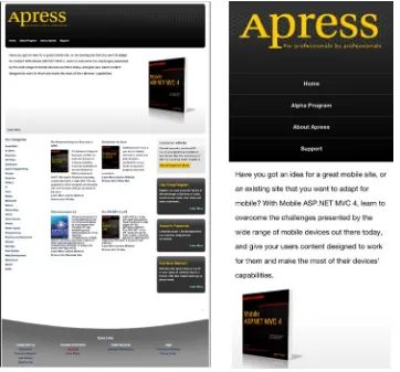
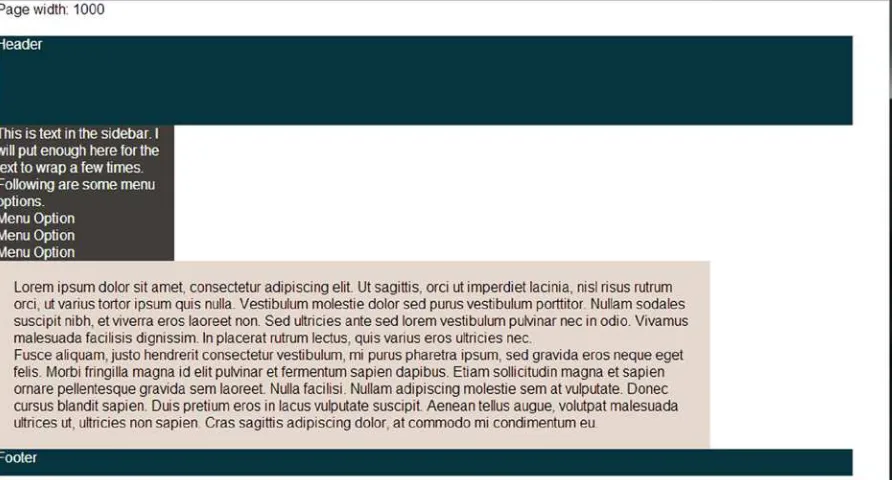
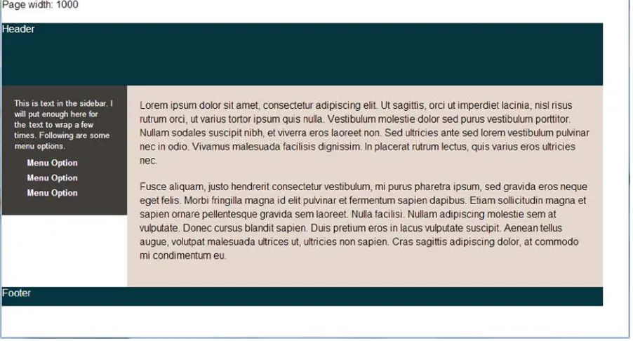
So let’s start with the home page of the site, which looks like Figure 1-1, on the left, in a desktop browser. It features a header with a horizontal menu, a large content block at the top, four columns below, and a footer. When viewed on an iPhone, the header image and text stays the same, but the menu is morphed into a centered, vertical list since it’s too wide to fit on a phone. The content in the large content block below the header shifts so that it can all fit on the screen. The four-column area adapts to the device size and collapses down to a single column. The footer itself has content broken into four columns, so we collapse the content down to a single column just as we did above.
You can contrast this by looking at the current Apress site on a smartphone. There is no adaptation. Rather, the page is shrunk down so that it all fits in the screen, and you have to pinch and zoom to find what you need. It is functional, but a better approach would be to do what we are doing in our example site: adapt to the user’s device and give them something easy to read and use.
The markup for the page is fairly simple, but there is a lot of it, so we’ll take it a section at a time.
<!DOCTYPE html> <html>
<head>
<title>A Responsive Apress</title>
<!—this tag is very important and will be explained at the end of the chapter --> <meta name="viewport" content="width=device-width" />
</head> <body>
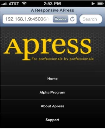
<div class="page"> <div class="header"> <h1>apress</h1>
<h2>For professionals by professionals</h2>
<ul class="nav">
<li class="nav-item"><a href="/">Home</a></li>
<li class="nav-item"><a href="/">Alpha Program</a></li> <li class="nav-item"><a href="/">About Apress</a></li> <li class="nav-item"><a href="/">Support</a></li> </ul>
First of all, like the live Apress site, we want to set a maximum width on the main section of the site. We will start by thinking inflexibly (we’ll change this below) and set the width of our content wrapper to 960 pixels and center it all horizontally. Here is our CSS for that:
.page {
Now on to the header. The only part of this section that most people would find tricky is the menu. The old-school way to lay this out would be to use an HTML table. Though this would “work” for a desktop browser, this approach is very inflexible. If you want to change the layout according to the screen size, you’ve now trapped yourself. By using a table, you make the layout a bit easier but only for one screen size. The savvier web developer would use a list and CSS floats to make the list lay out horizontally (with all non-layout-related styling removed).
/*
I also use a CSS reset (not listed here). If you aren’t familiar with those, I recommend checking out
http://meyerweb.com/eric/tools/css/reset/ or check out chapter 2. */
The overflow value on the “nav” section keeps the size of the element from collapsing to zero, and the float applied to the list items causes them to stack to the right of the one above, with a little margin to keep them from bunching up together. For those who aren’t familiar with either of these techniques, both will be discussed at length in Chapter 2.
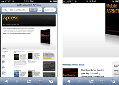
Following the header is the main content area, which is made up of four sections. The first is the featured book, which has only a paragraph description, an image, and a link. The image is floated to the right (something we will change later), but this section poses nothing complex.
<div class="featured-book">
<p class="description">Have you got an idea for a great mobile site, or an existing site...</p> <img src="/content/responsivebasics/my-book-cover.png" />
<p class="learn-more"><a href="http://www.apress.com/9781430250562">Learn More</a></p> </div>
The next section is the list of links that constitutes “Our Categories” on the left side of the page. The layout of the list is not changed, but the whole section plays a part in the four-column layout that organizes this part of the page.
<div class="our-categories"> <h2>Our Categories</h2> <ol>
<li><a href="http://www.apress.com/apple-mac">Apple/Mac</a></li> <li><a href="http://www.apress.com/at-work">At Work</a></li> <li><a href="http://www.apress.com/business">Business</a></li> <!-- more links -->
The next section, which has two of the four columns, has markup like the following:
<div class="products"> <ul>
<li class="product-item">
<p class="product-name"><a href="http://www.apress.com/9781430243984">Pro Windows 8 Apps ...</a></p> <!-- other info -->
<p>Browse other <a href="http://www.apress.com/microsoft/c">C#</a> titles</p> </div>
</li>
<li class="product-item">
<p class="product-name"><a href="http://www.apress.com/9781430249443" title="Dashboards...</a></p> <!-- other info -->
<p>Browse other <a href="http://www.apress.com/office/office">Office</a> titles</p> </div>
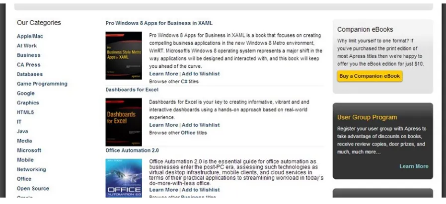
These items will be arranged into two of our four columns, the two columns in the middle. Finally we have our rightmost column of content, which contains secondary, somewhat miscellaneous bits of information.
<div class="secondary"> <div class="secondary-item"> <h2>Companion eBooks</h2>
<p>Why limit yourself to one format? If you’ve purchased the print edition of most Apress titles....</p>
<p class="more"><a href="http://www.apress.com/companion/customer/view/">Buy a Companion eBook</a></p>
</div>
<!-- more items --> </div>
.products { float: left; padding: 0 20px; width: 480px;
/* total width with padding, 520px */ }
.secondary { float: left; width: 240px;
/* total width, 240px */ }
Each section is floated left and the total width of the sections is 960 pixels, so the three sections line up side by side. For those not comfortable with CSS layouts using floats, Chapter 2 will explain how all of this works in detail. With the CSS above, we would see Figure 1-2.
Figure 1-2. Three-column layout
Next we need to arrange the product items in the middle section so that they form two columns. To implement this, we follow a similar procedure and set the width of the items and float them. The CSS below does this nicely.
.product-item { float: left; margin: 10px 10px; width: 220px; }
Our last section is the footer, which is a four-column nested list of links. We will use the same techniques as above and float these lists.
<div class="footer"> <h2>Quick Links</h2> <ul>
<li>Interact with Us <ul>
<li><a href="#">Contact Us</a></li> <li><a href="#">Customer Support</a></li> <li><a href="#">User Groups</a></li> <li><a href="#">Write For Us</a></li> </ul>
</li>
<li>Company Information <ul>
<li><a href="#">About Us</a></li> <li><a href="#">Press Room</a></li> </ul>
<li>Legal <ul>
<li><a href="#">Terms & Conditions</a></li> <li><a href="#">Privacy Policy</a></li>
</ul> </li> </ul> </div>
As you can see from the markup, each “column” is a list item, a direct descendent of the uppermost unordered list element, so we will target these elements. The footer’s width is not the expected 960 pixels in width but 956 pixels in width so that the background image can be sized to be just inside the total width of the content. But not to worry, since 956 is divisible by four.
.footer > ul > li { float: left; line-height: 20px; width: 239px; }
This gives us what we see in Figure 1-4, our footer.
Figure 1-4. The footer, laid out as four columns
A Flexible Layout
So let’s apply responsive principles to make this page more flexible. Instead of a fixed width for the container and the various content sections, we will set a maximum width for the container and percentages for the columns.
.page {
With our new more flexible layout, we can see some problems with these if we change the browser window size. Clearly, this will not do. The word “apress” is too close to the border of the background, and the yellow
subheading juts out in a rather unfortunate manner. We also need to do something about the menu and the following text but that will come below. Fortunately, the fix for the image can be easily applied.
.header img { max-width: 95%; }
And after reloading the browser, we are greeted with a much more pleasant sight!
So what is going on here? This image is contained within a div whose width is constrained by the size of the browser window. As the browser window size changes, the containing div changes and the image scales up or down to fit. In this case I use a maximum width of 95 percent, so it should fill all the space that it can; but if it’s too big to fit, it will scale down and leave a little buffer between it and its containing div. You could supply lower percentage values, and it would also work fine.
Flexible content is one of the most difficult things when implementing responsive web design. There will be much more to say about flexible images and other types of content in Chapter 5.
Figure 1-5. Inflexible image. Ouch!
Flexible Content
CSS Media Queries
We have discussed two of the three elements of responsive web design, a flexible layout and flexible content. The last element, media queries, takes our flexibility to a whole new level. Our page is more flexible than it used to be, but we still have some issues. The most significant of these is the menu. The CSS for the menu is as follows:
.nav {
border-top: solid 1px #333; overflow: hidden;
}
.nav li { float: left; margin-left: 17px; }
@media screen and (max-width: 425px) {
The “media query” part of this is in the first line of that CSS. This query checks two things: first, it makes sure the media type is screen (as opposed to print, projection, braille, et al.), and then it checks that the screen is 425 pixels in width or lower. If either one of these is false (either you are printing something, for example, or the browser window is 426+ pixels wide), the CSS nested in the media query is ignored. But if both are true, the CSS nested in the media query is applied. The great thing about media queries is that the styling follows the normal rules of CSS and is additive when placed after the other styling rules. The previous CSS is still applied to the elements, so you only need to put in style rules that you want to add. For example, the padding for the .nav item is still the same as it was when it was set earlier in the style sheet. This can be assumed in the media query. These style rules can also override previous styles, as is the case for the float value for .nav .li. To change the list back to its normal, vertical-stacking behavior, the previous float needs to be turned off, and you do that by setting float: none.
Note
■
Media in CSS refers to how the document is to be presented. As web developers, we most commonly assume
that the media we are targeting is the screen, but other media types include braile (for tactile feedback devices),
projection (for viewing on a projector), and speech (used for speech synthesizers). To target all media types, “all” can be
used. Since responsive web design is primarily a visual technique, we will be focusing on the screen.
Another place on this page that media queries can be used effectively is with the multi-column section at the bottom of the page. Though we have made our layout and our content flexible and everything can be scaled down, at a certain point the scaling becomes too great and readability is compromised (and doesn’t look good, either). In this case, removing the columns and going for a single-column approach for the bottom pieces makes sense around the 600-pixel mark, so I added this media query to override the previous CSS and add some styling to make things better in this resolution.
CSS media query to turn the three-column layout into a single-column layout
.our-categories li {
Media queries give you a lot of power because any CSS can be put in a media query. And because any CSS can be put in a media query, you can use media queries to make slight changes to a design or radically change the entire look and feel of a site (though this is usually not a good idea). But you can. Media queries give you tremendous capabilities for tailoring a site’s design or layout to a particular screen size.
The Viewport Meta Tag
and should be considered standard practice in your mobile development work. Let’s take our sample site above and how it fares in actual mobile browsers both with and without the viewport tag, as well as with various options set.
This first screenshot is of the site if it has no viewport tag, whether we are using a fixed-width design (like an explicit width: 960px as we had before) or a responsive design. Why it works this way is an interesting question. Let’s start by defining the term “viewport.” The viewport for a page is the area visible to the user in the browser. If you take a wide, fixed-width site and view it in a mobile browser, your viewport will be just a small window into the total page when zoomed in like the second view in Figure 1-7. If zoomed out, it may look like the first view in Figure 1-7. Because the site has a fixed width, the content size cannot be changed; only your zoom level can change. So the viewport, or the viewable area, can differ from the total area the page can take up.
Figure 1-7. Our mobile site without a viewport meta tag, default view, and zoomed in
The strange thing is that a responsive design that can be resized will not be resized if there is no viewport meta tag. Why? When Apple launched the iPhone with its browser, they couldn’t assume that lots of websites would scale down. Actually, you would assume the opposite. So instead of automatically scaling the viewport down to 320 pixels in width, they instead defaulted to showing things at a width of 980 pixels. As mentioned above, that’s right around the popular desktop resolution that web designers generally target. This is why a responsive website without a viewport meta tag is treated as if the width is 980 pixels, even though the site can support the smaller size.
So if the mobile browsers assume a width slightly under 1,000 pixels (it varies somewhat), how do you tell the browser to not behave that way? You use the viewport meta tag. Take the following meta tag for example:
The setting tells the viewport that the width of the browser should be the width of the device, not the default width of the browser. If you are using an iPhone, the device width is 320 pixels, so any of the media queries that get applied at sizes down to 320 pixels will be applied. In the examples above there are three max-width media queries for 425, 600, and 800 pixels respectively in our sample site above. All three would be applied because the iPhone’s size in portrait orientation is smaller than both. In Figure 1-8 we see our site with the media query applied. As you can see, it is what we want. This is why I said above that the viewport meta tag is something you almost always want to set when developing for mobile. Without it our responsive CSS above would have been for naught.
Figure 1-8. Our responsive site with our viewport meta tag Let’s try another one of our sample viewport tags.
<meta name="viewport" content="width=device-width, initial-scale=2" />
In this case the site is set to be of the proper width (the device width) but the initial view is zoomed by a factor of two. Though this is not something most will want to do, it’s an option for those who need it.
The last options I want to talk about are these two variations of the viewport meta tag.
<meta name="viewport" content="width=device-width, initial-scale=1, minimum-scale=1, maximum-scale=1" />
<meta name="viewport" content="width=device-width, initial-scale=1, user-scalable=no" />
These two viewport tags are functionally equivalent. From a visual standpoint, either one will give you the same view of the site in Figure 1-8. The difference is that these settings disallow zooming. As a general rule this should be discouraged because it creates potential usability problems (those with poor eyesight cannot zoom in to view the text if it’s too small), but there may be cases where it makes sense. One positive side effect is that some browsers will remove the 300ms delay on the browser click event with this viewport setting. For more information on why mobile browsers act that way, see Chapter 10 on programming for touch. But just in case you need to disable zoom, this is an option you can set in the viewport meta tag.
Incompatibilities
Though viewport meta tags and media queries have great support on iPhone and Android devices, this does not mean they always work the same. Question: what should happen when you switch a phone to landscape mode? The answer is different between iOS and Android. Let’s assume we have the following media queries:
@media screen and (max-width: 400px) { /* css for our first media query */ }
@media screen and (max-width: 500px) { /* css for our second media query*/ }
Assuming your Android device is the same screen size as the iPhone 4S (320 pixels wide, 480 pixels tall), only one of our media queries above gets triggered in landscape mode, the second media query. It has a max-width check of 500 pixels, and since the screen is less than 500 pixels in width, this media query kicks in. But the media query set at 400 pixels max-width does not kick in because the width is now 480 pixels. This is also the behavior on Windows Phone and Firefox OS.
For iOS, if the page has either of the first two viewport meta tags and you view the page in landscape, both media queries will be applied. If an iPhone 4S is used, the width should be 480 pixels, and one of the media queries should be applied. If an iPhone 5 is used, the width should be 568 pixels, and neither of the media queries should be applied because the viewport is wider than our largest max-width media query. But in both cases, both media queries are applied and the page is zoomed to show exactly the same width of page as when in portrait orientation. It’s almost as if the device is acting like it is 320 pixels wide. And that is exactly what is going on. If you put the following script in the page with a media query tag that only specifies width (like the first one we discussed above), you see that the inner width of the browser is actually 320 pixels wide.
How to get the inner width of the window with JavaScript
<script type="text/javascript">
window.addEventListener('resize', function () { console.log('inner width', window.innerWidth); });
</script>
So that’s why both media queries are applied. But if you set the minimum and maximum scaling to one in a viewport meta tag, iOS begins to behave like Android. In other words, add this:
<meta name="viewport" content="width=device-width, initial-scale=1, minimum-scale=1, maximum-scale=1" />
So if it is important for your site to make iOS behave like Android, you will need to turn off scaling. Note that setting “user-scalable=no” does not have the same effect as setting the scale values.
Retina Screens
There are ways of querying the pixel ratio of the device though there are inconsistencies in the browsers. This will be discussed in Chapter 5 in more detail. That is the first scenario.
The second scenario relates to text size. Let’s compare the third generation iPad (9.7 inch display, 2048x1536 resolution, 264 ppi) and the iPad mini (7.9 inch display, 1024x768 resolution, 163 ppi). In the case of the larger iPad, even though it has a resolution of 2048x1536, it is 1024x768 in CSS pixels, so the two devices will respond to all the exact same width-based media queries. This also means that text for both will be sized the same as far as CSS is concerned but will actually be smaller on the iPad mini because the screen is smaller. Unfortunately, this means small text will be even smaller, so you might have readability problems on the iPad mini.
Both of these scenarios can be handled. In Chapter 5 you will learn more about making your content work across different screen resolutions and pixel densities.
Summary
Responsive web design is a great technique for giving you flexibility in the browser. This approach is built on three key ideas: flexible layouts, flexible content, and CSS media queries. The great thing about it is that it gives you a relatively easy way to handle different display sizes: from the browser on an iPhone up to the browser in a widescreen HD TV.
But the approach is not without its weaknesses. For example, responsive non-textual content can be problematic, and there are differing ideas on the best way to solve this. Displaying tabular data on smaller devices can also be difficult. These problems and others will be discussed in chapters 3, 4, and 5. Responsive design also does not help you with older phones, so you will need some sort of adaptive rendering approach, which will be discussed in Chapter 6. But for modern browsers, desktop and mobile, it’s a fantastic tool for creating sites.
CSS Layout Bootcamp
“I tried to use CSS for my layouts but gave up and used tables instead.” This is a common sentiment. If you have been in web development long, you’ve probably heard this. You might have even said this yourself, I know I have many times. But it doesn’t need to be this way. Once you understand a few things about how browsers lay out elements, CSS layouts become doable. Eventually they actually become easy.
On the one hand, doing CSS-based layouts is about web development, both mobile and desktop. It has nothing to do in particular with mobile web development. But if you are going to do responsive layouts, it is important because table elements you might use for a full-size website layout are going to make mobile development much harder.
First Steps
The first thing to keep in mind is that browsers come with default styling. In some ways this is very helpful, but I’ve found that default styling can get in the way when trying to do precise CSS layouts. Some developers use what are called “CSS resets” to reset all of the browsers’ styling to a baseline so as to remove cross-browser inconsistencies. The basic idea of a CSS reset is something like the first part of the following CSS selection:
html, body, div, span, applet, object, iframe, h1, h2, h3, h4, h5, h6, p, blockquote, pre, a, abbr, acronym, address, big, cite, code, del, dfn, em, img, ins, kbd, q, s, samp, small, strike, strong, sub, sup, tt, var, b, u, i, center,
dl, dt, dd, ol, ul, li, fieldset, form, label, legend,
table, caption, tbody, tfoot, thead, tr, th, td, article, aside, canvas, details, embed,
As you can see, it goes through all the HTML elements and “resets” any default margins and paddings. Using a CSS reset is highly recommended. Some prefer to use CSS normalizers, which attempt to normalize the CSS instead of resetting everything to nothing. This is a fine approach as well, though CSS resets make things a bit easier for me. To use a CSS reset properly, put the reset as the first CSS imported into the page. Later styles that you supply will override the reset.
This is an example of a simple page without the reset and the same page with the margin and padding reset above. This screenshot was taken in Chrome on Windows 7, though what you see in this screenshot in Figure 2-1 is similar to what you would see in Internet Explorer or Firefox. The gray bar at the top is a part of Chrome, not a part of the page; this was included so you could see exactly how much spacing is put in the top of the document by default.
Figure 2-1. Default browser styling versus using a CSS reset
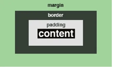
By default, browsers include margin and padding on many elements like those above, including the body of the document. Without the default margin and padding the spacing between each element is determined by its actual width and height. Removing default margin and padding makes calculating sizes for things easier and makes the task of this chapter much simpler: this is because margin and padding contribute to height and width calculations, as you will see below.
The above is the base styling for all the rest of the styling in this chapter. The first part is a selection from Eric Meyer’s CSS reset (http://meyerweb.com/eric/tools/css/reset/). His reset is normally more elaborate, but the entire thing is not needed here.
As a short note on terminology, I am going to use the word “container” a lot. This always refers to the DOM element that contains another element. Let’s say we have a span inside a div. The div is the “container” of the span. If any element is in the root of the body element, body is its container.
Finally, you will notice that the width is included in each screenshot in the chapter. The exact width of the window will be important in many of our examples. This is calculated with the following script:
window.onload = function () {
var pageWidth = document.getElementById('pageWidth'); pageWidth.innerHTML = window.innerWidth;
window.addEventListener('resize', function () { pageWidth.innerHTML = window.innerWidth; });
The Basic Rules
Let’s start with a few fundamentals before we work with layouts. Now that we have our setup, we can begin. I will explain how layout with CSS works by enumerating the most important points as rules. This will help us succinctly state how the browsers work, as well as give us points of reference we can use later.
Display: Block, Inline, and Inline Block
The first fundamentals to discuss are how display: block, display: inline and display: inline-block work. Here we see all three in Figure 2-2.
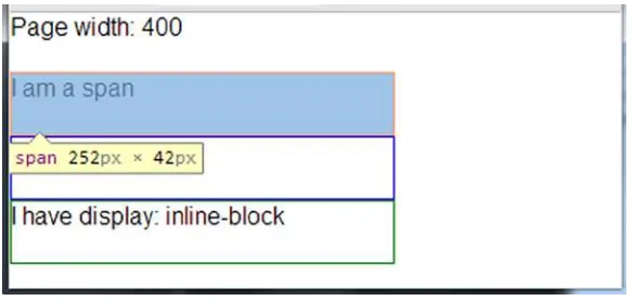
<span style="border: solid 1px red;">I am a span</span> <div style="border: solid 1px blue">I am a div</div>
<span style="border: solid 1px green; display: inline-block;">I have display: inline-block</span>
Figure 2-2. Three values of display exemplified, inline, block, and inline-block
First of all, spans are by default “inline” for their display value and divs are block, so these values do not need to be specified. And an element’s behavior can be changed. As you can see, the last element has a style value to override its default display value.
Note how they behave. Inline elements take up only the width of the content in them. The text of “I am a span” is only so wide, so the first span takes up exactly that much space. Other examples of elements that are inline include b, i, strong and em. Block elements take up the entire horizontal space of their container, like the div above. Other examples of elements that are block by default are p and li. Inline-block elements are most like inline elements but you get more capabilities. Note the following in Figure 2-3.
<span style="border: solid 1px red; width: 250px; height: 40px;">I am a span</span> <div style="border: solid 1px blue; width: 250px; height: 40px;">I am a div</div> <span style="border: solid 1px green;
Inline elements will not respond to width and height styling, but block elements will. Inline block elements will act like inline elements by default in that their initial size will be determined by the size of their content but are like block elements in that their width and height values can be set by CSS. Though padding seems to work fine with inline elements, it appears that only left and right margin works for them, so if you want to be able to set top and bottom margins, you will have to use inline-block or block elements.
An interesting thing happens if you float any of these elements. Essentially, they become block-level. If you take the same markup as before and add float: left, you get Figure 2-4.
<span style="border: solid 1px red; width: 250px; height: 40px; float: left;">I am a span</span> <div style="border: solid 1px blue; width: 250px; height: 40px; float: left;">I am a div</div> <span style="border: solid 1px green;
display: inline-block; width: 250px;
height: 40px;
float: left;">I have display: inline-block</span>
Figure 2-3. Width and height applied to inline, block and inline-block elements
Figure 2-4. Inline, block, and inline-block elements when they are floated
Let’s boil down these ideas into our first three rules:
CSS Rule #1
■
Inline elements are as wide as their content, and their dimensions cannot be set with CSS.
CSS Rule #2
■
Block elements span the width of their container by default but can have their dimensions set with CSS.
CSS Rule #3
■
Inline-block elements by default are as wide as their content, but their dimensions can be set with CSS.
Floats
If there’s anything that people find conceptually difficult in CSS, it’s the concept of floats. I was confused about them for the longest time. But hopefully the following will help you if you are not clear on how they work. Float exists to change how an element behaves in the normal flow of a page. By default, elements flow one after another in a page and top down in the order of the markup in the source file.
The basic purpose of floating is to take an element and cause it to float within the content after it. In other words, CSS floats change the flow of the document. Imagine, if you will, an image floating in a group of words. The floating image displaces the words around it, causing them to flow around the image. Here in Figure 2-5 is an example of an image floated left in a paragraph.
As you can see from the above images, the picture that is floated left will have the surrounding content flow around it to the right, and the picture floated right will have the surrounding content flow to its left. If the image is not floated, it acts like an img tag normally would, as an inline element. In terms of the DOM and how floated elements work, the floated element stays in its position (in a sense) but is also removed from the normal flow of the document. In the float examples above, the image stays in its position in the DOM but floats to the left or right depending on the float value used. So if something is floated, the content that follows it will flow around it.
The flowing behavior only applies if there is enough horizontal width for the elements to flow. In the above example, the larger the image, the less words would be able to float horizontally beside it. If the image was too large, no words would flow around it. So for a float behavior to be useful, it must allow enough horizontal space for the elements that would follow and float around it.
We should also note at this point that a floated element becomes a block element, even if it is normally an inline element like img. But note that a floated element only takes up the space needed for its content (though its width can be set with CSS). In this sense they seem to behave somewhat like inline-block elements, though this is not technically accurate. If you take a series of mixed-display elements and float them, you see in Figure 2-7 that they all seem to be acting like content-sized block elements.
<div style="float: left; border: solid 1px red;">Div one</div> <div style="float: left; border: solid 1px blue;">Div two</div> <span style="float: left; border: solid 1px yellow;">Span one</span> <span style="float: left; border: solid 1px green;">Span two</span>
Figure 2-6. On the left, the image has float: right applied. On the right, no float is applied
This leads us to our next rule.
CSS Rule #4
■
If an element is floated, it takes on the characteristics of a block element regardless of its CSS display
setting and the content that follows it flows around it.
So to reiterate, this means that floated elements can have their width set, which is something very important for layouts using floats. So if you explicitly set the width of the elements, you get Figure 2-8.
<div style="float: left; border: solid 1px red; width: 90px;">Div one</div> <div style="float: left; border: solid 1px blue; width: 90px;">Div two</div> <span style="float: left; border: solid 1px yellow; width: 90px;">Span one</span> <span style="float: left; border: solid 1px green; width: 90px;">Span two</span>
Figure 2-8. Two divs and two spans, all floated, with width values
So why do you need to care about width? Let’s say you have two divs with more content than the above example and float them. You may see something you do not expect, as in Figure 2-9.
This means that if you are trying to float two things side by side and one wraps when you don’t think it should, something is probably wider than you expect. This is exactly why many people recommend always setting an explicit width on floated items, whether that width is set in pixels, ems, or percentages. If this content happened to by dynamic (perhaps out of a CMS), any float logic may fail to apply because the dynamically changed content is too wide. So if we set the width of each piece of content to 198 pixels, things will line up as we expect. Though you might expect 200 pixels to be the correct width (since our page is 400 pixels wide), it needs to be a bit narrower. We’ll discuss calculating width shortly in the section entitled “Calculating Width.” Figure 2-10 has our floated elements with their width set.
<div style="float: left; border: solid 1px red; width: 198px;">This is some text. It is too wide.</div> <div style="float: left; border: solid 1px blue; width: 198px;">This is some text. It is too wide.</div>
Figure 2-10. Two divs arranged side-by-side with floats
Figure 2-11. Floated elements affecting a non-floated element So then we have our next rule.
■
CSS Rule #6
Always set an explicit width for floated elements so they will behave consistently.
Another thing that frequently frustrates would-be masters of floats is the concept of clearing floats. Floats not only affect themselves but content around them, so you can clear floats to tell the browser to start ignoring the floats and return back to “normal” layout mode. Take the following example. Let us say you have three divs, the first two are floated and have widths set but the last one has neither.
Given a 400-pixel container, you might assume that the first two appear side by side but the last would appear below them. Unfortunately, if you thought that, you would be wrong, as you can see in Figure 2-11.
Remember the very first discussion of floats? Floated elements make other elements float around them. In this case we have two floated elements. Since they do not take up the entire horizontal space available to them, the next piece of content will try to flow around them. This “not floated” text is not floated (obviously) but rather it is wrapping around the elements that are above it, since it is wide enough to fit next to them. If the element was larger (if the width was set or the content was wider), this would not be the case. So if we want that third element to appear below the two floated elements (no matter its actual width) we need to clear the floats. If we do that, we get what we expect in Figure 2-12.
<div style="float: left; border: solid 1px red; width: 100px;">Float 1</div>
Figure 2-12. Example of clearing a float
<div style="float: left; border: solid 1px blue; width: 100px;">Float 2</div> <div style="border: solid 1px green; clear: left;">Not floated</div>
Since the floats we want to clear are left floats, we use clear: left. If the floats are right, we could use clear: right. You could also clear floats of either type with clear: both. So the CSS clear property tells the browser to stop applying the logic of floats to elements around them. This is very important to remember, so we should make it one of our rules.
CSS Rule #7
■
Clear your floats when you are done with them so that the float behavior gets turned off.
Collapsing Containers
If you said “50 pixels,” then you are correct. The first two div elements are floated and so are taken out of the document flow and do not directly affect the height of their container. The third element is not floated, so the container calculates its height based on its own “normal” child element, so the container is 50 pixels tall. Here is another very similar example:
<div id="theContainer" style="background-color: #808080;">
<div style="height: 100px; float: left; width: 100px;">Div #1</div> <div style="height: 200px; float: left; width: 100px;">Div #2</div> <div style="height: 50px; float: left; width: 100px;">Div #3</div> </div>
In this case the height of the container is 0 pixels. No one will see background color, because an element with a background color but with 0 height will not appear on the screen. The element is still there, however. Fortunately, there is a trick for cases like this. You can set overflow: auto on the container, and it will calculate the size of the floats in it and determine its height accordingly. So in the case of both of the previous two samples, if you apply overflow: auto to the container, its height would be 200 pixels, the height of the tallest child element. This behavior gives us our last float-related rule.
CSS Rule #8
■
If all the child elements of a container are floated, that container will collapse its size unless an overflow
value is set.
Coming to grips with floats was the biggest conceptual challenge for me in CSS, but these rules cover the most important behavior of floats, especially in regard to layout.
Calculating Width
Calculating width is the last of our CSS layout fundamentals. Soon we will be creating CSS-based layouts easily; but to do so, we need to be able to determine how big an element will be. Many would assume that the width of an element is equivalent to the value assigned in the CSS width property. The truth is far more complicated: width value only applies to the width of the content. It is important that you make a distinction between the width of a bit of content versus the total width of an element. The width of content will either be the width of the content calculated by its actual size or set with the CSS width property. The total width of an element equals left margin + left border + left padding +