Related titles Unicode Explained SVG Essentials Adobe InDesign CS2
One-on-One XSL-FO
XSLT Cookbook™
CJKV Information Processing InDesign Production
Cookbook
Dynamic Learning: Illustrator CS3
oreilly.com oreilly.comis more than a complete catalog of O’Reilly books. You’ll also find links to news, events, articles, weblogs, sample chapters, and code examples.
oreillynet.comis the essential portal for developers interested in open and emerging technologies, including new platforms, pro-gramming languages, and operating systems.
Conferences O’Reilly brings diverse innovators together to nurture the ideas that sparkrevolutionary industries. We specialize in document-ing the latest tools and systems, translatdocument-ing the innovator’s knowledge into useful skills for those in the trenches. Visit con-ferences.oreilly.com for our upcoming events.
Yannis Haralambous
Translated by P. Scott Horne
Copyright © 2007 O’Reilly Media, Inc. All rights reserved. Printed in the United States of America.
Published by O’Reilly Media, Inc., 1005 Gravenstein Highway North, Sebastopol, CA 95472.
O’Reilly books may be purchased for educational, business, or sales promotional use. Online editions are also available for most titles (safari.oreilly.com). For more information, contact our
corporate/institutional sales department: (800) 998-9938 or[email protected].
Printing History:
September 2007: First Edition.
Nutshell Handbook, the Nutshell Handbook logo, and the O’Reilly logo are registered trademarks of O’Reilly Media, Inc.Fonts & Encodings, the image of an axis deer, and related trade dress are trademarks of O’Reilly Media, Inc.
Many of the designations used by manufacturers and sellers to distinguish their products are claimed as trademarks. Where those designations appear in this book, and O’Reilly Media, Inc. was aware of a trademark claim, the designations have been printed in caps or initial caps.
While every precaution has been taken in the preparation of this book, the publisher and author assume no responsibility for errors or omissions, or for damages resulting from the use of the information contained herein.
in mundo fuere ?
• His wife, Tereza, and his elder daughter, Ernestine (“Daddy, when are you going to finish your book?”), who lived through hell for a whole year.
• The management of ENST Bretagne, Annie Gravey (chair of his department), and his col-leagues, for encouraging him in this undertaking and tolerating the inconveniences caused by his prolonged absence.
• His editor, Xavier Cazin, for his professionalism, his enthusiasm, and his friendship.
• Jacques André, for supplying tons of books, articles, leads, addresses, ideas, advice, suggestions, memories, crazy thoughts, etc.
• His proofreaders: Jacques André once again, but also Patrick Andries, Oscarine Bosquet, Michel Cacouros, Luc Devroye, Pierre Dumesnil, Tereza Haralambous, John Plaice, Pascal Ru-bini, and François Yergeau, for reviewing and correcting all or part of the book in record time.
• The indefatigable George Williams, for never failing to add new features to hisFontForge soft-ware at the author’s request.
• All those who supported him by providing information or resources: Ben Bauermeister, Gá-bor Bella, Tom Bishop, Thierry Bouche, John Collins, Richard Cook, Simon Daniels, Mark Davis, Lisa Devlin, Bon Hallissy, Ken’ichi Handa, Alan Hoenig, Bogusław Jackowski, Michael Jansson, Ronan Keryell, Alain LaBonté, David Lemon, Ken Lunde, Jim Lyles, Sergey Malkin, Sabine Millecamps (Harrie Potter), Lisa Moore, Tomohiko Morioka, Éric Muller, Paul Nel-son, David Opstad, Christian Paput, Thomas Phinney, Just van Rossum, Emmanuël Souchier, Naoto Takahashi, Bob Thomas, Adam Twardoch, Jürgen Willrodt, and Candy Lee Yiu.
• The foundries that supplied fonts or specimens for use in his examples: Justin Howes, P22, Thierry Gouttenègre, Klemens Burkhardt, Hoefler Type Foundry, Typofonderie Porchez, and Fountain Type.
• Emma Colby and Hanna Dyer of O’Reilly, for selecting that magnificent buck as the animal on the cover, doubtless because its coat is reminiscent of encoding tables and its antlers suggest the Bézier curves of fonts.
Introduction
1
Explorations . . . 3
The Letter and Its Parts . . . 3
Letterpress Typesetting . . . 7
Digital Typesetting . . . 11
Font Formats . . . 14
Between Characters and Glyphs: the Problems of the Electronic Document . . . 15
The Structure of the Book and Ways to Use It . . . 17
How to Read This Book . . . 23
How to Contact Us . . . 25
1
Before Unicode
27
FIELDATA . . . 29ASCII . . . 29
EBCDIC . . . 31
ISO 2022 . . . 33
ISO 8859 . . . 35
ISO 8859-1 (Latin-1) and ISO 8859-15 (Latin-9) . . . 36
ISO 8859-2 (Latin-2) and ISO 8859-16 (Latin-10) . . . 38
ISO 8859-3 (Latin-3) and ISO 8859-9 (Latin-5) . . . 39
ISO 8859-4 (Latin-4), ISO 8859-10 (Latin-6), and ISO 8859-13 (Latin-7) . . . 40
ISO 8859-5, 6, 7, 8, 11 . . . 41
ISO 8859-14 (Latin-8) . . . 42
The Far East . . . 42
Microsoft’s code pages . . . 45
Apple’s encodings . . . 47
Electronic mail . . . 48
The Web . . . 51
2
Characters, glyphs, bytes: An introduction to Unicode
53
Philosophical issues: characters and glyphs . . . 54First principles . . . 58
Technical issues: characters and bytes . . . 62
Character encoding forms . . . 64
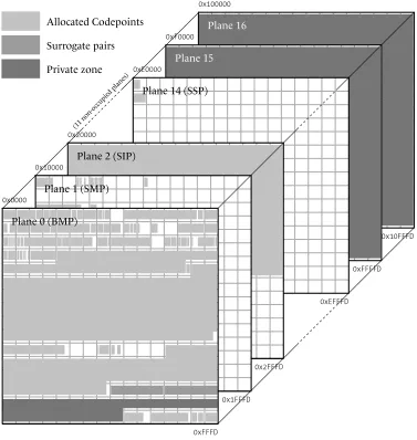
General organization of Unicode: planes and blocks . . . 70
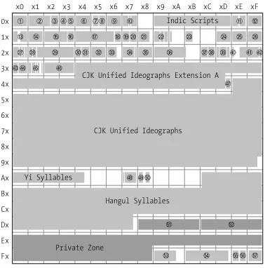
The BMP (Basic Multilingual Plane) . . . 70
Higher planes . . . 83
Scripts proposed for addition . . . 89
3
Properties of Unicode characters
95
Basic properties . . . 96Name . . . 96
Block and script . . . 96
Age . . . 97
General category . . . 98
Other general properties . . . 105
Spaces . . . 106
Alphabetic characters . . . 106
Noncharacters . . . 106
Ignorable characters . . . 107
Deprecated characters . . . 107
Logical-order exceptions . . . 107
Soft-dotted letters . . . 108
Mathematical characters . . . 108
Quotation marks . . . 109
Dashes . . . 109
Terminal punctuation . . . 109
Diacritics . . . 109
Extenders . . . 110
Join control . . . 110
The Unicode 1 name and ISO’s comments . . . 110
Properties that pertain to case . . . 111
Uppercase letters . . . 111
Lowercase letters . . . 112
Simple lowercase/uppercase/titlecase mappings . . . 112
Special lowercase/uppercase/titlecase mappings . . . 112
Case folding . . . 113
Rendering properties . . . 114
The Arabic and Syriac scripts . . . 114
Managing grapheme clusters . . . 116
Numeric properties . . . 118
Identifiers . . . 119
Reading a Unicode block . . . 120
4
Normalization, bidirectionality, and East Asian characters
127
Decompositions and Normalizations . . . 127Combining Characters . . . 127
Composition and Decomposition . . . 130
Normalization Forms . . . 131
The Bidirectional Algorithm . . . 133
Typography in both directions . . . 134
Unicode and Bidirectionality . . . 138
The Algorithm, Step by Step . . . 142
East Asian Scripts . . . 146
Ideographs of Chinese Origin . . . 147
5
Using Unicode
159
Interactive Tools for Entering Unicode Characters . . . 160
Under Mac OS X . . . 160
Under Windows XP . . . 161
Under X Window . . . 163
Virtual Keyboards . . . 164
Useful Concepts Related to Virtual Keyboards . . . 167
Under Mac OS X . . . 168
Under Windows . . . 175
Under X Window . . . 181
Conversion of Text from One Encoding to Another . . . 183
TherecodeUtility . . . 184
6
Font Management on the Macintosh
187
The Situation under Mac OS 9 . . . 188The situation under Mac OS X . . . 191
Font-Management Tools . . . 194
Tools for Verification and Maintenance . . . 194
ATM: the “Smoother” of Fonts . . . 196
ATR: classification of fonts by family . . . 199
Font Managers . . . 200
Font Servers . . . 204
Tools for Font Conversion . . . 205
TransType Pro . . . 205
dfontifier . . . 206
FontFlasher, the “Kobayashi Maru” of Fonts . . . 207
7
Font Management under Windows
209
Tools for Managing Fonts . . . 212The Extension of Font Properties . . . 212
Tools for Verification and Maintenance . . . 213
ATM: the “Smoother” of Fonts . . . 215
Font Managers . . . 216
Font Servers . . . 218
8
Font Management under X Window
221
Special Characteristics of X Window . . . 221
Logical Description of a Font under X . . . 222
Installing fonts under X . . . 226
Installing Bitmap Fonts . . . 228
Installing PostScript Type 1 or TrueType Fonts . . . 229
Tools for Managing Fonts under X . . . 231
Tools for Converting Fonts under X . . . 232
The GNU Font Tools . . . 232
George Williams’s Tools . . . 233
Various other tools . . . 233
Converting Bitmap Fonts under Unix . . . 233
9
Fonts in TEX and
Ω
, their installation and use
235
Using Fonts in TEX . . . 235Introduction to TEX . . . 236
The High Level: Basic LATEX Commands and NFSS . . . . 240
The Low Level: TEX and DVI . . . 259
“Après-TEX”: Confronting the Real World . . . 263
Installing Fonts for TEX . . . 274
The Toolafm2tfm . . . 275
Basic Use of the Toolfontinst . . . 277
Multiple Master fonts . . . 283
Customizing TEX Fonts for the User’s Needs . . . 285
How to Configure a Virtual Font . . . 285
Conclusions and Glimpses at the Future . . . 312
10 Fonts and Web Pages
315
(X)HTML, CSS, and Fonts . . . 318The Standard HTML Tags . . . 318
CSS (version 3) . . . 319
Tools for Downloading Fonts from the Web . . . 332
TrueDoc, by Bitstream . . . 333
GlyphGate, by em2 Solutions . . . 340
The SVG Format . . . 345
Fundamental Concepts of XML . . . 345
And what about SVG? . . . 350
Font Selection under SVG . . . 351
Alternate Glyphs . . . 353
SVG Fonts . . . 355
Conclusion . . . 365
11 The History and Classifications of Latin Typefaces
367
The Typographical Big Bang of the Fifteenth Century, and the Fabulous Destiny of the Carolingian Script . . . 367From Venice to Paris, by Way of Rome . . . 371
New Scripts Emerge in Germany . . . 381
The Wild Adventure of Textura in England . . . 382
The Sun King Makes Waves . . . 384
England Takes the Lead in Typographic Innovation . . . 386
Didot and Bodoni Revolutionize Typefaces . . . 390
The German “Sturm und Drang” . . . 393
The Nineteenth Century, Era of Industrialization . . . 394
The Pre-war Period: Experimentation and a Return to Roots . . . 397
The Post-war Period . . . 403
Suggested Reading . . . 407
The Vox/ATypI Classification of Typefaces . . . 408
La classification Alessandrini des caractères: le Codex 80 . . . 411
IBM’s Classification of Fonts . . . 416
Class 0: No Classification . . . 416
Class 1: Old-Style Serifs . . . 416
Class 2: Transitional Serifs . . . 418
Class 3: Modern Serifs . . . 418
Class 4: Clarendon Serifs . . . 419
Class 5: Slab Serifs . . . 420
Class 7: Free-Form Serifs . . . 420
Class 9: Ornamentals . . . 422
Class 10: Scripts . . . 422
Class 12: Symbolic . . . 423
The Panose-1 Classification . . . 424
Parameter 1: Family Kind . . . 425
Parameter 2: Serif Style . . . 425
Parameter 3: Weight . . . 427
Parameter 4: Proportion . . . 428
Parameter 5: Contrast . . . 430
Parameter 6: Stroke Variation . . . 431
Parameter 7: Arm Style and Termination of Open Curves . . . 433
Parameter 8: Slant and Shape of the Letter . . . 435
Parameter 9: Midlines and Apexes . . . 436
Parameter 10: X-height and Behavior of Uppercase Letters Relative to Accents . . . 438
12 Editing and Creating Fonts
441
Software for Editing/Creating Fonts . . . 442General Principles . . . 444
FontLab . . . 446
The Font Window . . . 446
Opening and Saving a Font . . . 452
The General-Information Window . . . 454
The Glyph Window . . . 459
The Metrics Window . . . 465
Multiple Master Fonts . . . 468
Driving FontLab with Python Scripts . . . 472
FontForge . . . 488
The Font-Table Window . . . 489
Opening/Saving a Font . . . 490
The General-Information Window . . . 491
The Glyph Window . . . 492
What About Vertical Typesetting? . . . 497
CID Fonts . . . 498
Autotracing . . . 499
potrace. . . 500
ScanFont . . . 501
13 Optimizing a rasterization
505
PostScript Hints . . . 507Global PostScript Hints . . . 507
Individual PostScript Hints . . . 512
TrueType Instructions . . . 518
Managing Instructions in FontLab . . . 520
Managing Instructions underVTT . . . 529
Managing Instructions under FontForge . . . 546
14 Enriching Fonts: Advanced Typography
549
Introduction . . . 549Managing OpenType Tables in FontLab . . . 555
Feature Definition Language . . . 556
FontLab’s User Interface . . . 565
Managing OpenType Tables in VOLT . . . 569
Managing OpenType Tables in FontForge . . . 576
Anchors . . . 577
Noncontextual Substitutions . . . 579
Noncontextual Positionings . . . 580
Contextual Substitutions and Positionings . . . 582
Managing AAT Tables in FontForge . . . 586
Features and selectors . . . 588
A Bitmap Font Formats
599
A.1 The Macintosh World . . . 599
A.1.1 TheFONTFormat . . . 599
A.1.2 The NFNT Format . . . 601
A.1.3 Color . . . 601
A.2 The DOS World . . . 601
A.2.1 The CPI Format . . . 601
A.3 The Windows World . . . 602
A.3.1 The FNT Format . . . 602
A.3.2 The FON Format . . . 604
A.4 The Unix World . . . 604
A.4.1 The PSF Format of Linux . . . 604
A.4.2 The BDF Format . . . 606
A.4.3 The HBF Format . . . 609
A.4.4 The SNF, PCF, and ABF Formats . . . 610
A.4.5 The RAW and CP Formats . . . 611
A.5 The TEX World . . . 611
A.5.1 The PXL and CHR Formats . . . 612
A.5.2 The GF Format . . . 613
A.5.3 The PK Format . . . 617
A.5.4 Fonts or Images? Both! . . . 620
A.6 Other Less Common Bitmap Formats . . . 621
A.7 Whoever Can Do More Can Also Do Less . . . 621
B TEX and
Ω
Font Formats
623
B.1 TFM . . . 623B.1.1 Global Declarations . . . 625
B.1.2 Font Parameters . . . 625
B.1.3 Kerning Pairs and Ligatures . . . 626
B.1.4 The Metric Properties of Glyphs . . . 631
B.2 OFM . . . 632
B.3 VF . . . 633
C PostScript Font Formats
635
C.1 Introduction to the PostScript Language . . . 635
C.1.1 Syntax . . . 636
C.1.2 The System of Coordinates . . . 637
C.1.3 The current transformation matrix . . . 637
C.1.4 Paths . . . 639
C.1.5 Shapes . . . 641
C.1.6 Bitmap Images . . . 642
C.1.7 Managing the Stack, Tables, and Dictionaries . . . 643
C.1.8 Font Management and Typesetting . . . 645
C.1.9 The Image Model and the Graphics State . . . 646
C.1.10 Structured Comments (DSCs) . . . 647
C.2 Type 3 Fonts . . . 650
C.3 Type 1 Fonts . . . 655
C.3.1 Before We Begin: the Format of the File that Contains the Font 656 C.3.2 The Public Dictionary . . . 657
C.3.3 Encodings for Type 1 Fonts . . . 659
C.3.4 The Private Dictionary . . . 661
C.3.5 Glyph Descriptions . . . 665
C.3.6 Individual Hints . . . 666
C.3.7 AFM Files . . . 672
C.4 Multiple Master Fonts . . . 677
C.4.1 Using Multiple Master Fonts in the PostScript Language . . . . 681
C.4.2 The AMFM file . . . 681
C.5 Type 42 Fonts . . . 682
C.6 Type 0, or OCF, Fonts . . . 684
C.6.1 Character Mapping . . . 684
C.6.2 The ACFM File . . . 686
C.7 CID Fonts (Types 9–11, 32) . . . 687
C.7.1 CIDFont. . . 688
C.7.2 CMap . . . 692
C.7.3 Rearrangement of a CID font . . . 694
C.7.5 Using a CID Font . . . 696
C.8 Type 2/CFF Fonts . . . 697
C.8.1 The Compact Font Format . . . 697
C.8.2 Thecharstringsof Type 2 . . . 700
D The TrueType, OpenType, and AAT Font Formats
705
D.1 TTX: TrueType Fonts Represented in XML . . . 706D.2 TrueType Collections . . . 709
D.3 General Overview of TrueType Tables . . . 709
D.4 The Kernel of the TrueType Tables . . . 713
D.4.1 TheGlyphOrderTable . . . 713
D.4.2 ThecmapTable . . . 714
D.4.3 TheheadTable . . . 716
D.4.4 The Tableshheaandhmtx. . . 717
D.4.5 ThemaxpTable . . . 719
D.4.6 ThenameTable . . . 720
D.4.7 TheOS/2Table . . . 722
D.4.8 ThepostTable . . . 726
D.5 The Tables That Pertain to TrueType-Style Glyph Descriptions . . . 728
D.5.1 ThelocaTable . . . 728
D.5.2 TheglyfTable . . . 728
D.5.3 The Tablesfpgm,prep, andcvt. . . 730
D.6 The TrueType Tables That Affect PostScript-Style Glyph Descriptions . 731 D.6.1 The TableCFF . . . 731
D.6.2 The TableVORG. . . 731
D.7 Bitmap Management . . . 732
D.7.1 The TablesEBLCandEBDT(Aliasblocandbdat) . . . 732
D.7.2 TheEBSCTable . . . 739
D.7.3 ThebhedTable . . . 740
D.8 Some Other Optional Tables . . . 740
D.8.1 TheDSIGTable . . . 740
D.8.2 ThegaspTable . . . 741
D.8.4 ThekernTable . . . 743
D.8.5 TheVDMXTable . . . 748
D.8.6 The Tablesvheaandvmtx. . . 749
D.8.7 ThePCLTTable . . . 750
D.9 The OpenType Advanced Typographic Tables . . . 751
D.9.1 Important concepts . . . 751
D.9.2 TheBASETable . . . 754
D.9.3 TheGPOSTable . . . 758
D.9.4 TheGSUBTable . . . 781
D.9.5 TheJSTFTable . . . 796
D.9.6 TheGDEFTable . . . 803
D.10 Predefined Features, Languages, and Scripts . . . 806
D.10.1 Predefined Languages and Scripts . . . 806
D.10.2 Predefined Features . . . 815
D.11 General AAT Tables . . . 822
D.11.1 TheacntTable . . . 823
D.11.2 ThebslnTable . . . 823
D.11.3 ThefdscTable . . . 826
D.11.4 ThefmtxTable . . . 826
D.11.5 ThefeatTable . . . 827
D.11.6 ThelcarTable . . . 838
D.11.7 TheopbdTable . . . 840
D.11.8 ThepropTable . . . 841
D.11.9 ThetrakTable . . . 842
D.11.10TheZapfTable . . . 844
D.12 The AAT Tables for Font Variation . . . 848
D.12.1 ThefvarTable . . . 848
D.12.2 TheavarTable . . . 850
D.12.3 ThegvarTable . . . 851
D.12.4 ThecvarTable . . . 855
D.13 AAT Tables with Finite Automata . . . 856
D.13.1 Finite Automata . . . 856
D.13.2 ThemorxTable (Formerlymort) . . . 862
E TrueType Instructions
879
E.1 Basic Concepts . . . 881
E.1.1 Interpreter’s Stack, Instruction Stream . . . 881
E.1.2 Reference Points . . . 881
E.1.3 Freedom and Projection Vectors . . . 881
E.1.4 Table of Control Vectors and Storage Area . . . 882
E.1.5 Touched and Untouched Points . . . 882
E.1.6 Minimum Distance and Cut-In . . . 882
E.1.7 Twilight Zone and Zone Pointers . . . 882
E.2 Instructions . . . 883
E.2.1 Instructions for Managing the Stack and Storage Area . . . 883
E.2.2 Managing Vectors, Zones, and Reference Points . . . 884
E.2.3 Moving Points . . . 885
E.2.4 δInstructions . . . 889
E.2.5 Tests and Logical and Arithmetic Functions . . . 890
E.2.6 Definitions of Subroutines and New Instructions . . . 891
E.3 Some Examples . . . 892
E.3.1 The ‘T’ in the FontCourier . . . 892
E.3.2 The ‘O’ from the FontVerdana . . . 899
F
METAFONT
and Its Derivatives
905
F.1 TheMETAFONTProgramming Language . . . 906F.1.1 Basic Concepts . . . 906
F.1.2 The Basics: Drawing and Filling . . . 908
F.1.3 More Advanced Concepts: Pen Strokes and Parameterization . 917 F.1.4 Optimizing the Rasterization . . . 930
F.2 TheComputer ModernFamily of Fonts . . . 935
F.2.1 General Structure . . . 935
F.2.2 Extensions . . . 944
F.3 MetaFog . . . 945
F.4 METATYPE1andAntykwa Półtawskiego . . . 947
F.4.1 Installing and UsingMETATYPE1 . . . 947
F.4.2 Syntactic Differences fromMETAFONT . . . 948
G Bézier Curves
961
G.1 History . . . 961
G.2 Bézier Curves . . . 961
G.2.1 Definition and Interesting Properties . . . 963
G.2.2 de Casteljau’s Algorithm . . . 964
G.2.3 Subdivision of Bézier Curves . . . 965
General Index
991
Homo sapiensis a species that writes. And among the large number of tools used for writing, the most recent and the most complex is the computer—a tool for reading and writing, a medium for storage, and a means of exchanging data, all rolled into one. It has become a veritablespacein which the text resides, a space that, as MacLuhan and others correctly predicted, has come to transcend geographic barriers and encompass the entire planet.
Within this digital space for writing, fonts and encodings serve fundamentally different
needs. Rather, they form an inseparable duo, like yin and yang, Heaven and Earth, theory and practice. An encoding emerges from the tendency to conceptualize information; it is the result of an abstraction, a construction of the mind. A font is a means of visually representing writing, the result of concrete expression, a graphical construct.
An encoding is a table ofcharacters—a character being an abstract, intangible entity. A font is a container forglyphs, which are images, drawings, physical marks of black ink on a white background. When the reader enters the digital space for writing, he participates in the unending ballet between characters and glyphs: the keys on the keyboard are marked withglyphs; when a key is pressed, acharacteris transmitted to the system, which, unless the user is entering a password, in turn displaysglyphson the screen. To send an email message is to sendcharacters, but these are displayed to the recipient in the form ofglyphs. When we run a search on a text file, we search for a string ofcharacters, but the results are shown to us as a sequence ofglyphs. And so on.
For the Western reader, this perpetual metamorphosis between characters and glyphs re-mains on the philosophical level. That is hardly surprising, as European writing systems have divided their fundamental constituents (graphemes) so that there is a one-to-one correspondence between character and glyph. Typophiles have given us some exceptions that prove the rule: in the word “film” there are four letters (and therefore four char-acters) but only three glyphs (because the letters ‘f’ and ‘i’ combine to form only one glyph). This phenomenon, which is called aligature, can be orthographically significant (as is the case for the ligature ‘œ’, in French) or purely aesthetic (as with thef-ligatures ‘fi’, ‘ff’, ‘ffi’, etc.).
In any case, these phenomena are marginal in our very cut-and-dried Western world. In the writing systems of the East, however, the conflict between characters and glyphs becomes an integral part of daily life. In Arabic, the letters are connected and assume
different forms according to their position in the word. In the languages of India and
Southeast Asia, they combine to form more and more complex graphical amalgama-tions. In the Far East, the ideographs live in a sort of parallel universe, where they are born and die, change language and country, clone themselves, mutate genetically, and carry a multitude of meanings.
Despite the trend towards globalization, the charm of the East has in no way died out; its writing systems still fire our dreams. But every dream is a potential nightmare. Eastern writing systems present a challenge to computer science—a challenge that goes beyond mere technical problems. Since writing—just like images, speech, and music—is one of the fundamental concerns of humanity, computer science cannot approach it haphaz-ardly: Eastern writing systems must be handled just as efficiently as the script that is part
of our Latin cultural heritage. Otherwise, some of those writing systems may not survive computerization.
But more is at stake than the imperatives of cultural ecology. The French say that “travel educates the young”. The same goes for writing: through thinking about the writing sys-tems of other cultures and getting to know their problems and concerns, we come to know more about our own.
Then there is also the historical perspective: in the digital space for writing that we are exploring in this book, the concepts and techniques of many centuries dwell together. Terminology, or rather the confusion that reigns in this field, clearly shows that com-puter science, despite its newness, lies on a historical continuum of techniques and prac-tices. For example, when we set type inTimes Tenat 8 points, we say that we are using a “body size of 8 points” and an “optical size of 10 points”. Can the same characters have two different sizes? To understand the meaning of these terms, it is necessary to trace the development of the concept of “type size” from the fifteenth century to the PostScript and TrueType fonts of our modern machines.
So far we have briefly surveyed the three axes on which this book is based: thesystemic approach(abstraction/concrete expression, encoding/font, character/glyph),geographicity (East/West), historicity (ancient/modern, mechanical/computerized processes). These three aspects make up the complexity and the scope of our subject, namely theexploration of the digital space for writing.
Finally, there is a fourth axis, less important than the previous three but still well grounded in our day-to-day reality, which isindustrial competition. A phenomenon that leads to an explosion in technologies, to gratuitous technicality, to a deliberate lack of clarity in documentation, and to all sorts of other foolish things that give the world of business its supposed charm. If we didn’t have PostScript fontsandTrueType fontsand OpenType fonts andApple Advanced Typography (AAT) fonts, the world might be a slightly better place and this book would be several hundred pages shorter.
out of a conscious desire to prevent the full use of the technologies. Some of the appen-dices of this book were written for the very purpose of describing certain technologies with a reputation for inaccessibility, such as AAT tables and TrueType instructions, as clearly and exhaustively as possible.
In the remainder of this introduction, we shall outline, first of all, the jargon used in the rest of the book, so as to clarify the historical development of certain terms. This will also enable us to give an overview of the transition from mechanical to computerized processes.
Next, we will give the reader a synthetic view of the book by outlining several possible ways to approach it. Each profile of a typical reader that we present is focused on a specific area of interest, a particular way to use this book. We hope that this part of the introduc-tion will allow the reader to find her own path through the forest of 2.5 million letters that she is holding in her hands.
Explorations
When one walks around a new city for the first time, one discovers places, acquires a better understanding of the reasons behind certain historical events, and puts together the pieces of the puzzle that make up the city’s environment. Here we shall do the same. Our first stroll through the digital space for writing that we plan to explore will allow us to take inventory of concepts and techniques, establish our terminology, and briefly outline the conflict between the mechanical and the electronic.
Let us set aside for the moment the geographical axis and begin with a very specific case of a glyph that comprises the molecular level of our space: the (Latin)letter.
The Letter and Its Parts
The terminology for describing the letter as a design varies greatly from one writer to the next—a phenomenon, incidentally, that affects all terminology in the entire field of
typography. In Figure 0-1, we have listed in roman type the terms that are used in this book and in italics some other terms that exist for the same parts of letters. Thus astem is also called astrokeor adownstroke.
These terms come from a variety of sources: the calligrapher’s technique (stroke, termi-nal), the engraver’s art (counter), geometry (apex, vertex), analogy or anatomy (arm, eye, ear, tail, shoulder), mechanics or architecture (finial), etc.
The most important among them are:
• Thestem, orstroke: a thick vertical or diagonal line found in such letters as ‘H’, ‘l’, ‘N’, and ‘v’. If the letter islower-case, or small, two possibilities may occur:
– the stem extends upward to the same height as the capitals or even higher, as in
Apex
Figure 0-1: The parts of a letter. The terms used in this book are in roman; alternative terms are shown in italics.
– the stem passes beneath the baseline, as in the letters ‘p’ and ‘q’. This lower part
of the stem is called adescender.
• Thebowl, which is a full circle, as in ‘O’, or the greater part of a circle, as in ‘q’.
• Thecounter, which is the inner part of a letter; for example, the space inside an ‘o’, an ‘O’, a ‘D’, etc. The counter of an ‘e’ is commonly called aneye. When the letter is open at one end, as is the case with ‘n’, we speak instead of anaperture.
• Thecrossbar(orbar), which is a thin horizontal connecting stroke, as in ‘A’ and ‘H’. A horizontal stroke that crosses a vertical one, as in ‘f’ and ‘t’, is also called across stroke.
• Theserif, which is the “pedestal” at the bottom and top of the vertical strokes and at the ends of some horizontal strokes. Thus the letter ‘I’ has two serifs, while the letter ‘H’ has four. The left part of an upper serif that appears on some letters, a remnant of the short lead-in made by the pen where it touches the paper before a downstroke, is called ahead serif. It is the head serif that distinguishes ‘l’ from ‘I’, for example. In humanist and garalde typefaces (see Chapter 11), the head serif is slanted, whereas it is perfectly horizontal in didones.
• Theterminal, which is the opposite of the head serif: it is the movement of the pen that finishes the letter. Again, it is a half-serif, this time the right side of the serif, and it occurs primarily at the baseline.
If these terms apply just as well to traditional as to digital typography, that is because they refer to abstract graphical characteristics.
Now that we have named the components of letters, we can explore ways to de-scribe them precisely. How do we dede-scribe the proportions of letters, their graphical characteristics—in short, everything that distinguishes one typographic character from another?
There are two answers to that question: that of theprofessional, which is to say that of the craftsman(engraver of characters, typographer) or othertypographic specialist(historian), and that of themathematician.
In the first case, we study the letterforms according to their history, the cultural context behind their creation and their use, and their development over time relative to the development of Western culture. To this approach we have devoted Chapter 11, which presents the history of typographic characters and one classification of them from a point of view that is more historical and cultural than formal and geometric.
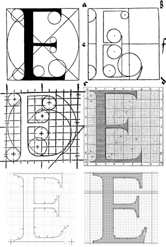
The second case, that of the mathematician, involves the study of letters as geometric shapes. This approach is hardly new.1In Figure 0-2 we see four studies of the Latin
al-phabet, corresponding to two eras and three countries: the first was made by an Italian humanist, Friar Luca de Pacioli, from his work Divine Proportion [273], published in Venice in 1509. The second comes to us from the hands of the great German engraver Al-brecht Dürer and is dated 1535. It presents different models of alphabets in a work whose title is less ambitious than that of Pacioli:Instructions on Measurement[124]. The third dates from 1524 and is from France: it is the manual of Geofroy Tory, a great Parisian humanist to whom we also owe the use of the accents and the cedilla in the French lan-guage. His descriptions appear in his finest work, theChamp fleury, au quel eNt contenu Lart & Science de la deue & vraye Proportiõ des Lettres Attiques(“The Floured Feelde, wherein be
1 Readers who wish to know more about the history of the mathematical description of letterforms are
contayned the Arte & Scyence of the iufte and true Proporcion of Atticke Letters”) [332]. Finally, in 1716, as a result of an undertaking by Louis XIV, the Jaugeon Commission drafted the design for a royal script, entirely geometrical in nature, called theRomain du Roi[276] (“the King’s roman”).
Many things strike us from an examination of these four examples. First of all, we notice that, in all four instances, the artists wished to place their letters within perfect squares, in the same way as the characters of the Far East. We also notice that they use finer and finer Cartesian grids in order to obtain more precise mathematical descriptions. While Tory uses a grid of10×10squares, the Jaugeon Commission resorts to6×6small squares within8×8large ones, for a total of48×48—2,304 squares in all, which was an enor-mous degree of precision for the time.
While the challenge was originally of a humanist nature (in the fifteenth century, when perspective was invented, Europeans began to wonder about the relationship between beauty and mathematics), it became one of power (Louis XIV took control of everything in his kingdom, right down to the microscopic level) and, finally, in the twentieth cen-tury, one of technology.
Why? Because these mathematical descriptions of letters are the precursors of the digital fonts of today, defined on a grid of1,024×1,024(PostScript) or4,096×4,096(TrueType) squares, or even more. There is only a difference of mathematical scale: whereas the let-ters in the first four examples are described by circles and lines in the manner of Euclid (“with straightedge and compass”), today’s fonts use curves defined by third-degree poly-nomials that were introduced by the French engineer Pierre Bézier (see Appendix G). In the last two examples in Figure 0-2, we see two contemporary approaches to the design of glyphs: they are screenshots from the software system FontLab.
What is the situation today? Have Bézier curves extinguished the little flame that is the genius of the master engraver? Quite the opposite. We use Bézier curves today because we have interactive tools that allow modern designers to create fonts worthy of their predecessors. We have devoted Chapters 12 to 14 and Appendix F to the description of the best available tools for creating fonts.
Letterpress Typesetting
In the previous section, we discussed the individuals that populate the digital space for writing: letters. But this space would be quite sad if each letter lived all by itself in its own little bubble. Far from being so isolated, letters, and more generally glyphs of all kinds, are highly social creatures. They love to form little groups (words), which in turn form larger and larger groups (lines, paragraphs, pages, books). We call this process type-setting. And the human who weaves the fates of the letters together to form structures on a higher level is atypesetter.
beauty of letters and to come down to earth to describe themechanicalprocess of type-setting. For computerized typesetting is based on mechanical typesetting, and the terms that we use today were invented by those people whose hands were indelibly blackened, not with oil (the liquid that pollutes our ecosystem), but with printer’s ink (the liquid that bears wisdom).
Let us therefore quickly review the manual setting of type for the letterpress, which was used from the fifteenth century until the end of the nineteenth, when the Linotype and Monotype typesetting machines made their appearance.
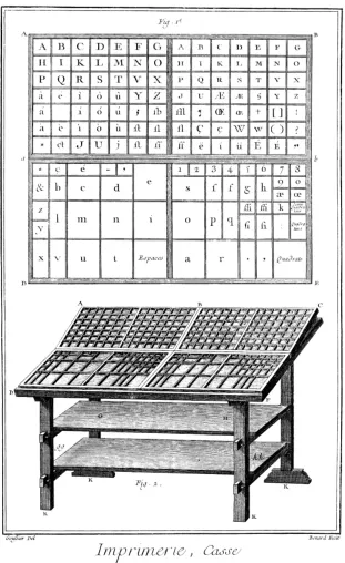
Letterpress printing is based on movabletype, little metal blocks (sorts) made from an amalgam of lead, zinc, and antimony that have on one side a mirror image of a letter, carved in relief. In Figure 0-3, taken from theEncyclopédieof Diderot and d’Alembert, we see at the top atype casecontaining type and, below it, the table that supports the different cases from which type is taken for composition. The top half of the case, the “up-per case”, contains the capital letters, the small capitals, and certain punctuation marks; the bottom half, the “lower case”, contains the small letters (called “lowercase” for this very reason), the numerals, and various “spaces” (blocks of lead with no letter carved into them that serve to separate words). We can see how type is arranged in the case. Of course, the arrangement varies from country to country according to the frequency of letters in the dominant language.
Figure 0-4: A composing stick ( from theEncyclopédieof Diderot and d’Alembert).
The typesetter takes type sorts out of the case and places them on acomposing stick, which is illustrated in Figure 0-4. A whole line at a time is prepared on a composing stick. The width of the composing stick is that of themeasureof the page; thus the typesetter knows when he has reached the end of the line and can take appropriate action. He can decide to divide the word or to fill out the line with thin strips of extra spacing between the words to extend it to the full measure.
When the line is ready, the typesetter adds it to the other lines of the page, eventually inserting horizontal strips of lead, calledleading, between the lines. At the bottom of Figure 0-5, there are three lines that are set in this fashion:
G
loireà DIEU. Honneur au ROI. Salut auxArmes.Figure 0-5: Three typeset lines ( from theEncyclopédieof Diderot and d’Alembert).
and reaches over the ‘o’ that follows. This overlapping, calledkerning, is indispensable, since italic letters are not slanted but occupy upright parallelepipeds. The italic ‘I’ also kerns with the following letter.
Another trick: the lower parts of the faces of the letters are cut on an angle. The benefit of this device is that it permits the vertical kerning of certain letters in the following line that are slightly taller than the others. For example, the apex of the ‘A’ extends above the rectangular body of the type sort and fits underneath the italic ‘R’ in the line above. This projection is calledovershootat the tops of the letters andoverhangat the baseline; in both cases, it can beroundorpointed. Overshoot exists to correct the optical illusion by which a triangle (or a circle) seems smaller than a square of the same height.
What, then, are the units by which metal type is measured? There are
body size
set-width
two basic ones: the height of the type, called thebody size, and the width of the metal type sort for each character, called itsset-width.
The ‘G’ of the word “Gloire” in Figure 0-5 is set in a larger font, which
is why the typesetter has added a row of spaces above the remainder of the first line of text. It is important to understand that the concept of “body size” is distinct from that of the size of the letters themselves. Thus, in the same figure, the letters ‘L’, ‘O’, . . . ‘E’ of “Gloire” are smaller than those
of “DIEU”, but their body size is the same, as the metal type sorts that bear them are of equal height. In this particular case, we havecapital letters(in the word “DIEU”) and small capitals(for “loire”) of the same body size.
Likewise, the set-width is theoretically independent of the width of the face of the letter, since the latter may be smaller than the former. In that case, we say that the there are right and/or leftbearingsbetween the face and the edge of the type sort. Conversely, the face may extend beyond the type sort, if it has a kern.
Digital Typesetting
Since the 1950s, phototypesetting has gradually conquered the world of printing. It is based on removing the typesetting process from its material roots. This departure from the physical grew more acute with the move towards computerization in the 1970s and 1980s. Now that we have no metal type sorts to measure, what should we make of the terms “body size”, “set-width”, and “x-height”?
Have they lost their relevance? Far from it. They aremore useful than everbecause they ensure continuity between the results of traditional typesetting and those of phototype-setting or digital typephototype-setting. This continuity is essential, since the quality of the final product, the book, must not be adversely affected because of a change in technology. In
order to produce books of quality equal to, or better than, that of traditional printing, we must preserve its points of reference, its conventions, and its visual approaches. Therefore, we have to redefine these terms to adapt them to the reality of digital typeset-ting, which is divorced from physical references. To understand how that has been done, let us investigate the model of digital typesetting:
Glyphs(i.e., the visual forms of typographic symbols) are placed in abstract rectangles whose heights are initially undetermined and whose width is equal to the set-width. We need to introduce another new concept, that of thebaseline, which is the imaginary line on which all the glyphs with a flat base, such as ‘f’, rest. Those with a round base, such as ‘c’, dip slightly below the baseline as a result ofoverhang. The intersection of the baseline and the leftmost edge of the glyph’s box is called theoriginof the glyph. We describe a glyph mathematically on a system of coordinates with this point as its origin. The set-width can be thought of as a vector connecting the origin of one glyph to that of the following glyph. This vector is called theadvance vector(orescapement vector). Digital typesetting consists of nothing more than drawing a glyph, moving as indicated by the advance vector, and preparing to draw the glyph that follows.
While it was relatively easy to adapt the concept of set-width to the digital realm, the same is not true of the body size. Indeed, we mentioned above that the box containing the glyph is of “undetermined” height. Of all the various typesetting systems, only TEX concerns itself with the height and depth of these boxes, and that is why we have shown the boxes’ upper and lower boundaries, albeit with dotted lines, in the figure.
The other systems employ set-width almost exclusively, and PostScript and TrueType fonts contain no information about the height or depth of the box other than the di-mensions of the glyph itself.
There are also scripts that are written vertically (such as ideographic scripts and Mongo-lian), in which the advance vector points downward. We say in such cases that there is avertical set-width. The heights of the spaces that will appear between the glyph and the horizontal edges of the box are thus calledupperandlower bearings, as the case may be. But let us return to the concept of “body size”. We continue to speak of setting type “with a body size of 10 points” (or, more professionally, at “10/12”, where the first figure is the type size and the second is the body, which includes leading). But what is apoint, and how is this information managed in software?
Thepointis a typographic unit invented by Father Sébastien Truchet in 1699 to describe the arithmetic progression of type sizes [276]. This unit, related to the Paris foot (pied du roi, the actual length of the king’s foot), was redefined by Pierre-Simon Fournier in 1664 and later by François-Ambroise Didot in 1783. Since the end of the nineteenth century, the Anglo-Saxons have used the pica point [87]. The PostScript language sought to simplify calculations by defining the point to be exactly 1
72of an inch. Today we have points of three different sizes: thepica point(approximately 0.351 mm), theDidot point2
(approximately 0.376 mm), and thePostScript point(approx. 0.353 mm).
As forbody size, its precise definition depends on the system being used (PostScript, True-Type, TEX), but in general the idea is as follows: glyphs are described with a system of Cartesian coordinates based on an abstract unit of length. There is a relationship be-tween these units and the “body size” of the font. Thus a PostScript font uses a grid of 1,024 units, which means, for example, that an ‘a’ designed with a height of exactly 512 units, when typeset at a font size of 10 points, will appear on paper with a real height of half of the body size, namely 5 points.
The user is still free to magnify or reduce the letter as much as he likes. In this book, we use the termactual sizefor the size of the letter as it appears on paper, after any magni-fication or reduction performed according to the principle explained below.
In the days of the letterpress, there was no way to magnify or reduce a shape arbitrarily. The different body sizes of a given typographic character were engraved separately. And typesetters took advantage of this necessity to improve the legibility of each size: the small sizes had letters that were relatively wider and more spacious than those of the large ones, which were drawn with more details, more contrast between thick and thin strokes, and so on.
2 The Didot point is still used in Greece, where letterpress typesetters complain that text set with the pica
By way of illustration, here are a 72-point font and a 6-point font, scaled to the same actual size:
Laurel &
Hardy
The actual size of this sequence of glyphs is 24 points. The 72-point letters (“Laurel &”) seem too narrow, with horizontal strokes that are too thin, whereas the 6-point letters (“Hardy”) seem too wide, bordering on awkwardness.
We use the termoptical sizefor the size at which the glyph in question was designed. Digital fonts usually have only one optical size for all actual sizes—a fact that Ladislas Mandel calls the “original sin” of phototypesetting. Usually we do not even know the optical size of a digital font. In a few exceptional cases, the name of the font reveals its optical size, as is the case withTimes Ten(10 points),Times Seven(7 points), etc. There are also a few rare families of digital fonts designed in several optical sizes:Computer Modern, by Donald Knuth (see pages 937 and 938); the splendidHW Caslon, by the late Justin Howes (page 388);HTF Didot, by Jonathan Hoefler (page 392); andITC Bodoni(page 393), by Holly Goldsmith, Jim Parkinson, and Sumner Stone. We can only hope that there will be more such font families in the years to come.
Disregard for optical size can lead to very poor results. Anne Cuneo’s bookLe maître de Garamond(“Garamond’s Master”) [105] was composed in1530 Garamond, a very beauti-fulGaramondreplica designed by Ross Mills—but at an actual size of 11, while the optical size of the font is around 48. The print is hard to read, and all the beauty of this wonderful Garamondis lost.
What about the x-height? According to Peter Karow [206] and Jacques André [34, pp. 24–26], one good approximation to the concept of x-height (in the absence of a phys-ical leaden type sort to serve as a reference) is the relationship between the height of the lowercase letters and the height of the uppercase letters (for example, the heights of ‘x’ and ‘X’). The closer the lowercase letters come to the height of the uppercase letters, the greater the x-height is. Fonts such asCourierandClarendonhave a large x-height; fonts such asCentaurandNicolas Cochinhave a small one:
The termkerningalso takes on a different meaning. In digital typesetting, kerning is a
the system first draws the ‘A’, then moves ahead by an amount equal to the set-width of an ‘A’, then moves back slightly before drawing the ‘V’, and so on.
Because kerning refers topairs of letters, this information is stored in the fonts askerning pairs. These values are negative when letters are drawn closer together (for example, ‘A’ and ‘V’) and positive when they are pushed farther apart (for example, a ‘D’ and an ‘O’). Kerning may be good or bad, according to the skills of the font designer, but one thing is certain: fonts that have no kerning pairs should not be trusted, and unfor-tunately there are more of these than there should be.
Font Formats
We have mentionedPostScriptandTrueTypefonts several times. What are they, exactly? Afontis a container forglyphs. To set a sequence of glyphs, the software calls up a font through the operating system and asks for the glyphs that it needs. The way in which the glyphs are described depends on thefont format: PostScript, TrueType, or any of a number of others, all of them quite different.
The earliest fonts werebitmaps: the glyphs were described by white and black pixels (see Appendix A). Although we can easily describe a bitmap font for use on a screen, in which each glyph contains at most a few dozen pixels, it would be cumbersome to do the same for high-resolution printers, for which a single glyph may require thousands of pixels. Two solutions emerged: compress the bitmapped glyphs or switch to a different type of
font. Donald Knuth adopted the first solution to the TEX system in 1978: he designed a program with the pretty name of METAFONT that generated compressed bitmap
fonts from a description in a very powerful programming language (Appendix A). The method of compression (§A.5.3) was designed so that the size of the glyphs would only slightly affect the size of the files produced.
The second solution was notably adopted by John Warnock, founder of Adobe, in 1985. He developed a programming language namedPostScript(§C.1) that describes the entire printed page with mathematical constructs. In particular, the PostScript language pos-sesses a font format that even today is one of the most common in the world:Type 1 fonts (§C.3). These fonts, which describe glyphs with mathematical constructs, are calledvector fonts.
The companies Bitstream and Hewlett-Packard also proposed their own vector font for-mats,Speedo[188] andIntellifont[101], which did not last long, despite the originality of their ideas.
Adobe began to grow thanks to PostScript and the Type 1 fonts, and certain other com-panies (Apple and Microsoft, without mentioning any names) decided that it was time to break Adobe’s monopoly. Therefore they jointly and hastily developed a competitor to Type 1 fonts, calledTrueType(Appendix D). TrueType fonts are not necessarily better or worse than Type 1 fonts, but they present considerable technical differences, which
The first outgrowth from Type 1 were theMultiple Masterfonts, the shapes of whose glyphs could vary under the user’s control.Multiple Masterfonts were never a screaming success, no doubt because of the difficulty of developing them.
At the same time, the countries of the Far East were struggling to find a way to typeset their ideographic and syllabic writing systems. Adobe offered them another offshoot of
Type 1, theCIDfonts (§C.1). The fact that the TrueType format was already compatible with ideographic writing systems gave it a head start in this area.
Apple and Microsoft separately began to work on improving the TrueType fonts. Apple invested in an extension of TrueType calledTrueType GXand later rechristenedAAT (“Ap-ple Advanced Typography”, §D.11). Microsoft sought help from its former adversary, Adobe, and together they brought out a competitor to TrueType GX:OpenType(§D.9). OpenType is both an extension to TrueType and an outgrowth of Type 1. In addition, there are two varieties of OpenType fonts:OpenType-TTF(which are TrueType with a few extra features) andOpenType-CFF(which are Type 1 fonts extended and integrated into TrueType structures).
Both AAT and OpenType attempt to solve two kinds of problems: those of high-quality Latin typography (with ligatures, old-style [not ranging] figures, correctly spaced punctu-ation, etc.) and those of the Asian languages (Arabic, Hebrew, Indian languages, South-east Asian languages, etc.). A large part of Appendix D is devoted to the exploration of these two font formats, which still have surprises in store for us.
Between Characters and Glyphs: the Problems
of the Electronic Document
We have outlined the digital model of typesetting and also the font formats that exist. To continue our exploration of digital writing, we must address another important concept, that of theelectronic document.
That is the name that we give to a digital entity containing text (and often images, sound, animation, and fonts as well). We find electronic documents everywhere: on hard disks, on CD-ROMs, on the Web. They can be freely accessible or protected. At the heart of our digital space for writing, electronic documents have problems of their own.
At the beginning of this introduction, we spoke of the “unending ballet between charac-ters and glyphs”. But the previous two sections did not even speak of characcharac-ters. On the contrary, the reader may have been left with the impression that the computer trans-forms characters into glyphs and typesets documents with the use of fonts, leaving the user with nothing to do but display the output on a screen or print it out.
That was true some 15 years ago, before the advent of the Web, CD-ROMs, and other means for distributing information in the form of electronic documents. An electronic document takes the appearance of a paper document when it is displayed or printed out, but it has a number of features that hardcopy lacks.
An electronic document isreadorconsulted. When reading, we need features that facili-tate our task: a table of contents with hypertext links to structural units, the display of a two-page spread, enlargement or reduction of characters according to the quality of the screen and the visual acuity of the reader, etc. When consulting a document, we need the ability to perform rapid searches with multiple criteria and to have rapid access to the information found.
A search may be performed not only on a single document but on a whole virtual li-brary or even on the entire Web. The electronic document must therefore be indexable. And if we want the indexing to be “intelligent”, which is to say enriched by structural or semantic metadata, it is in our interest to prepare the document in a structured form, in the style of XML.
When we perform searches within a document, they are searches for strings of characters. Few software systems support searching for strings with specific typographic attributes, such as specifications of font, point size, or font style. Indeed, to return to the example of the word “film” given on page 1, we could hardly tell the reader of an electronic doc-ument that he would have to enter his search with the glyph for the ‘fi’ ligature or else the word would not be found.
And since strings are what we search for in a document, strings are also what must be indexed if our searches are to be rapid. Conclusion:an electronic document must contain characters if it is to be indexed and become a full-fledged part of the World Wide Web.
But we also expect an electronic document to have the appearance of a paper document or to yield an equivalent appearance when printed out. It must therefore be typeset; that is, it must contain glyphs arranged very precisely on lines, with due regard for kerning. These lines must form paragraphs and pages according to the typographic conventions developed through the ages. Conclusion:an electronic document must contain glyphs ar-ranged with a great deal of precision in order to be a worthy successor of the paper document. Corollary: an electronic document must containbothcharactersandglyphs. The char-acters must be readily accessible to the outside world and, if possible, structured and annotated with metadata. The glyphs must be arranged precisely, according to the rules of the typographic art.
Fulfilling these two often contradictory objectives is in itself a challenge for computer science. But the problems of the electronic document do not end there. Characters and glyphs are related like the two sides of a coin, like yin and yang, like signifier and signi-fied. When we interact with an electronic document, we select glyphs with the mouse and expect that the corresponding characters will be copied onto the system’s clipboard. Therefore, the document must contain a link between each glyph and the character cor-responding to it, even in cases in which one glyph is associated with multiple characters or multiple glyphs with one character, or, to cite the most complex possibility, when multiple glyphs are associated with multiple characters in a different order.
actually buys is a license to use it. According to the foundry, this license may or may not specify the number of machines and/or printers on which the font may be installed and used. But no foundry will allow someone who has bought a license for one of its fonts to distribute that fontpublicly. How, then, can one display the glyphs of a document in a particular font if one does not have the right to distribute it?
Electronic documents are caught between the past (typography, glyphs and their ar-rangement, fonts) and the future (the Web, characters, information that can be indexed at will and made available to everyone). In saying that, we have taken only two axes of our digital space for writing into account: the system approach (characters/glyphs) and historicity. There remain the geographic axis (East/West, with all the surprises that the writing systems of other cultures have in store for us) and the industrial axis (problems of file format, platform, etc.).
In this book, we aim to offer the reader a certain number of tools to confront these prob-lems. We do not concern ourselves with all aspects of the electronic document, just those pertaining to characters and glyphs, aspects that directly and inevitably affect encodings and fonts.
The Structure of the Book and Ways to Use It
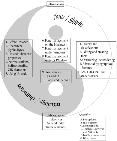
This book contains 14 chapters grouped into 4 units and 7 appendices. We have repeat-edly said that fonts and encodings interact like yin and yang. Here we use this metaphor to give a graphical illustration of the book’s structure with the yin–yang symbol (Fig-ure 0-6) in the background. On the left, in the gray-shaded area: encodings. On the right, in the white part: fonts.
At the top of the circle is the introduction that the reader is currently reading.
The first box, the one on the left, contains the five chapters on encodings, in particular Unicode.
In the first chapter, entitled “Before Unicode”, we present a history of codes and encod-ings, starting in antiquity. After a few words on systems of encoding used in telecom-munication before the advent of the computer, we proceed immediately to the most well-known encoding of all, ASCII, and its staunch competitor, EBCDIC. Then follows the ISO 8859 series of encodings, the most recent of which was released in 2001. At the same time, we discuss the problems of the countries of the Far East and the different solutions offered by ISO, Microsoft, and the UNIX world. Finally, we end with a few words on electronic mail and the Web.
The second chapter, “Characters, Glyphs, Bytes”, is an introduction to Unicode. In it, we develop the underlying concepts of Unicode, the principles on which it is based, its philosophy, and the technical choices that it has made. We finish the chapter with a quick look at the different tables of Unicode, including a preview of the tables that are still at
the stage of consideration that precedes inclusion in the encoding.
A. Bitmap fonts
in question plays a certain role. We explain this role by showing the reader some of the internal workings of the encoding.
On the subject of internal workings, we have assembled three of the most complex in Chapter 4. This chapter’s title is merely a list of these three mechanisms: normalization, the bidirectional algorithm, and the handling of East Asian characters. Normalization is a set of ways to make a text encoded in Unicode more efficient by removing certain
ambiguities; in particular, one of the normalization forms that we describe is required for the use of Unicode on the Web. Bidirectionality concerns the mixture of left-to-right and right-to-left scripts. Unicode gives us an algorithm to define the typesetting of a text containing a mixture of this sort. Finally, by “East Asian scripts” we mean both Chinese ideographs and hangul syllables. For the former, we present a handful of techniques to obtain characters not supplied in Unicode; for the latter, we describe the method for forming syllables from hangul letters.
Finally, the last chapter in this unit is less theoretical than the others. We address a specific problem: how to produce a text encoded in Unicode? We offer three possible
answers: by entering characters with a mouse, by creating virtual keyboards, and by converting texts written in other encodings. In each of these three cases, we describe appropriate tools for use under Mac OS, Windows, or UNIX.
This unit lies entirely within the gray section (“encodings”), as we discuss only encodings, not fonts, in its chapters.
The second unit (Chapters 6 to 8) lies within the white section (“fonts”), but we have placed it in the center of the circle because it discusses not fonts themselves but their management. Thus it takes up the installation of fonts, tools for activation/deactivation, font choices—in short, the management of a large number of fonts, which is of con-cern to graphic designers and other large consumers of fonts. The unit is divided into three chapters so that we can discuss the two most popular operating systems—Mac OS (9 or X) and Windows, as well as the X Window windowing system from the UNIX world. We discover that the Macintosh is privileged (it has the greatest number of tools for font management), that the same tools exist for Windows but that their quality is often poorer, and that X Window is a world unto itself, with its own advantages and drawbacks. These three chapters will thrill neither the computer scientist nor the typophile, but they may be of great practical value to those whose lives are plagued by system crashes, unexplainable slow-downs, poor quality of output (who has never been surprised to see his beautifulBemboreplaced by a hideousCourier?), corrupted documents, and all sorts of other such mishaps, often caused by fonts. They will also delight those who love order and who dream of being able to find and use almost instantaneously any font among the thousands of similar ones that they have collected on multiple CD-ROMs. On the other hand, if the reader uses only the fonts that come standard on his operating system, he has no need to read these chapters.
co-developer) and Web pages. TEX is a software system and a programming language de-voted to typesetting. It is also used today to produce electronic documents. Its approach to managing fonts is unique and totally independent of the operating system being used. In this chapter, we have tried to cover as thoroughly as possible all the many aspects of the use of fonts under TEX. Technical descriptions of the font formats used in Chapter 9 appear in Appendix B (“The Font Formats of TEX andΩ”).
The situation is different in the case of the Web, which presents both technical problems
(How to supply a font to the browser? How to make the browser use it automatically?) and legal ones (What about the font’s copyright?). We describe the different solutions
that Microsoft and Bitstream have offered for this problem and also another spectacular
solution: the GlyphGate font server. This approach can be called conventional: we use the HTML markup system and supply the fonts in addition. The Web Consortium has proposed another, cleaner, solution: describe the font in XML, just like the rest of the document. This solution is part of the SVG standard for the description of vector graph-ics, which we describe in detail.
These two chapters are also placed in the middle of the circle because they deal with subjects that lie in between encodings and fonts: TEX and HTML can both be considered as vehicles for passing from characters to glyphs; they are bridges between the two worlds.
The fourth unit (Chapters 11 to 14 and Appendix F) is devoted completely to fonts. The first chapter, “History and Classifications”, is a unique chapter in this book, as it discusses computers very little but deals mainly with the history of printing, especially the history of Latin typographic characters. We have seen that for designing high-quality fonts it is not enough to have good tools: a certain knowledge of the history of the fonts that surround us is also essential. Even in the history presented here, however, the point of view is that of the user of digital fonts. Thus most of the examples provided were pro-duced with digital fonts rather than from reproductions of specimens of printing from an earlier era. We also frequently compare the original specimens with digital fonts created by a variety of designers.
Chapter 11 goes beyond history. It continues with a description of three methods for classifying fonts. The first two (Vox and Alessandrini) finish off the history, in a way,
and recapitulate it. The Vox classification gives us a jargon for describing fonts (garalde, didone, etc.) that every professional in the fields of graphic design and publishing must know. The scheme of Alessandrini should be considered a critique (with a heaping help-ing of humor) of Vox’s; we couldn’t resist the pleasure of presenthelp-ing it here.
The third classification scheme is quite different and serves as a link between this chapter and the rest of the book. It is Panose-1, a mathematical description of the properties of glyphs. Each font is characterized by a sequence of 10 numbers, which correspond to 10 practically independent properties. Both Windows and the Cascading Style Sheets standard make use of this classification system to select substitute fonts by choosing the available font whose Panose-1 distance from the missing font is the smallest. Despite the fame of the Panose-1 system, a precise description of it is very difficult to find. This book