Additional praise for The Visual Organization: Data Visualization, Big Data, and the Quest for Better Decisions
“In Too Big to Ignore, Phil Simon introduced us to the rapidly emerging world of Big Data. In this book, he tackles how we need to see, handle, and present this mountain of information, one unlike the old, familiar, transaction data that business people know quite well. The Visual Organization shines a much-needed light on how businesses are using contemporary data visualization tools.”
Brian Sommer Enterprise Software Industry Analyst; ZDNet Contributor;
CEO of TechVentive, Inc.
“The fourth wave of computing is upon us, and the visualization of informa-tion has never been more important. The Visual Organization arrives just in time. Simon’s book helps enterprises learn from–and adapt to– this new adapt world. A must read.”
Larry Weber Chairman and CEO of Racepoint Global and best-selling author
“Once again, Phil Simon has raised the bar. Like his other books, The Visual Organization takes a very current topic and instructs the reader on what not only what is being done, but what can be done. Simon provides a wealth of advice and examples, demonstrating how organizations can move from data production to data consumption and, ultimately, to action.”
Tony Fisher Vice President Data Collaboration and Integration,
Progress Software; Author of The Data Asset
“Today data is the new oil. Organizations need ways to quickly make sense of the mountains of data they are collecting. Bottom line: today visualization is more important than ever. The Visual Organization is a checkpoint on current dataviz methods. Simon’s book represents insightful thought leadership that is sure to help any organization compete in an era of Big Data.”
William McKnight
President, McKnight Consulting Group; Author of Information
Management: Strategies for Gaining a Competitive Advantage with Data
“Through fascinating case studies and stunning visuals, The Visual Organization
demystifies data visualization. Simon charts the transformative effects of data-viz. Only through new tools and a new mind-set can organizations attempt to compete in a rapidly changing global environment.”
“A rollicking and incisive tour of the organizations pioneering the next big thing: putting visual data at the center of the enterprise. Simon’s highly read-able account points the way towards incorporating visualization into your own endeavors.”
Todd Silverstein Entrepreneur and founder, Vizify
“Sure, Big Data is cool, but how can it move the needle? Today, it’s essential to uncover insights far too often unseen, but how do you actually do that? The Visual Organization answers those questions—and more–in spades. Simon dem-onstrates how, when done correctly, dataviz promotes not only understanding, but action.”
Bill Schmarzo
CTO, EMC Global Services; Author of Big Data:
Understanding How Data Powers Big Business
“Data visualization is a secret sauce for visionary executives in today’s time-starved economy. Simon’s book provides the Rosetta Stone on how to get there.”
Adrian C. Ott CEO, Exponential Edge, and award-winning author
of The 24-Hour Customer
“Phil Simon’s latest book, The Visual Organization, superbly shows the potential of data visualization and how it can spark an organization’s imagination. As Simon makes clear, visualization is how organizations can ask the right ques-tions needed to create real value from their big data efforts; instead of fumbling about with them as too many do today.”
Wiley & SAS Business Series
The Wiley & SAS Business Series presents books that help senior-level managers with their critical management decisions.
Titles in the Wiley & SAS Business Series include:
Activity-Based Management for Financial Institutions: Driving Bottom-Line Results
by Brent Bahnub
Bank Fraud: Using Technology to Combat Losses by Revathi Subramanian
Big Data Analytics: Turning Big Data into Big Money by Frank Ohlhorst
Branded! How Retailers Engage Consumers with Social Media and Mobility by Bernie Brennan and Lori Schafer
Business Analytics for Customer Intelligence by Gert Laursen
Business Analytics for Managers: Taking Business Intelligence Beyond Reporting by Gert Laursen and Jesper Thorlund
The Business Forecasting Deal: Exposing Bad Practices and Providing Practical Solutions by Michael Gilliland
Business Intelligence Applied: Implementing an Effective Information and Communications Technology Infrastructure by Michael Gendron
Business Intelligence in the Cloud: Strategic Implementation Guide by Michael S. Gendron
Business Intelligence Success Factors: Tools for Aligning Your Business in the Global Economy by Olivia Parr Rud
CIO Best Practices: Enabling Strategic Value with Information Technology, Second Editionby Joe Stenzel
Connecting Organizational Silos: Taking Knowledge Flow Management to the Next Level with Social Media by Frank Leistner
Credit Risk Assessment: The New Lending System for Borrowers, Lenders, and Investors by Clark Abrahams and Mingyuan Zhang
Credit Risk Scorecards: Developing and Implementing Intelligent Credit Scoring by Naeem Siddiqi
The Data Asset: How Smart Companies Govern Their Data for Business Success by Tony Fisher
Delivering Business Analytics: Practical Guidelines for Best Practice by Evan Stubbs
Demand-Driven Forecasting: A Structured Approach to Forecasting, Second Edition
Demand-Driven Inventory Optimization and Replenishment: Creating a More Efficient Supply Chain by Robert A. Davis
The Executive’s Guide to Enterprise Social Media Strategy: How Social Networks Are Radically Transforming Your Business by David Thomas and Mike Barlow
Economic and Business Forecasting: Analyzing and Interpreting Econometric Results
by John Silvia, Azhar Iqbal, Kaylyn Swankoski, Sarah Watt, and Sam Bullard
Executive’s Guide to Solvency II by David Buckham, Jason Wahl, and Stuart Rose
Fair Lending Compliance: Intelligence and Implications for Credit Risk Management
by Clark R. Abrahams and Mingyuan Zhang
Foreign Currency Financial Reporting from Euros to Yen to Yuan: A Guide to Fundamental Concepts and Practical Applications by Robert Rowan
Health Analytics: Gaining the Insights to Transform Health Care by Jason Burke
Heuristics in Analytics: A Practical Perspective of What Influences Our Analytical World by Carlos Andre Reis Pinheiro and Fiona McNeill
Human Capital Analytics: How to Harness the Potential of Your Organization’s Greatest Asset by Gene Pease, Boyce Byerly, and Jac Fitz-enz
Implement, Improve, and Expand Your Statewide Longitudinal Data System: Creating a Culture of Data in Education by Jamie McQuiggan and Armistead Sapp
Information Revolution: Using the Information Evolution Model to Grow Your Business by Jim Davis, Gloria J. Miller, and Allan Russell
Killer Analytics: Top 20 Metrics Missing from Your Balance Sheet by Mark Brown
Manufacturing Best Practices: Optimizing Productivity and Product Quality by Bobby Hull
Marketing Automation: Practical Steps to More Effective Direct Marketing by Jeff LeSueur
Mastering Organizational Knowledge Flow: How to Make Knowledge Sharing Work by Frank Leistner
The New Know: Innovation Powered by Analytics by Thornton May
Performance Management: Integrating Strategy Execution, Methodologies, Risk, and Analytics by Gary Cokins
Predictive Business Analytics: Forward-Looking Capabilities to Improve Business Performance by Lawrence Maisel and Gary Cokins
Retail Analytics: The Secret Weapon by Emmett Cox
Social Network Analysis in Telecommunications by Carlos Andre Reis Pinheiro
Taming the Big Data Tidal Wave: Finding Opportunities in Huge Data Streams with Advanced Analytics by Bill Franks
Too Big to Ignore: The Business Case for Big Data by Phil Simon
The Value of Business Analytics: Identifying the Path to Profitability by Evan Stubbs
Visual Six Sigma: Making Data Analysis Lean by Ian Cox, Marie A. Gaudard, Philip J. Ramsey, Mia L. Stephens, and Leo Wright
Win with Advanced Business Analytics: Creating Business Value from Your Data by Jean Paul Isson and Jesse Harriott
The Visual
Organization
Data Visualization, Big Data, and
the Quest for Better Decisions
Cover Design: Wiley
Cover Image: © iStockphoto/sebastian-julian
Copyright © 2014 by John Wiley & Sons, Inc. All rights reserved.
Published by John Wiley & Sons, Inc., Hoboken, New Jersey. Published simultaneously in Canada.
No part of this publication may be reproduced, stored in a retrieval system, or transmitted in any form or by any means, electronic, mechanical, photocopying, recording,
scanning, or otherwise, except as permitted under Section 107 or 108 of the 1976 United States Copyright Act, without either the prior written permission of the Publisher, or authorization through payment of the appropriate per-copy fee to the Copyright Clearance Center, Inc., 222 Rosewood Drive, Danvers, MA 01923, (978) 750-8400, fax (978) 646-8600, or on the Web at www.copyright.com. Requests to the Publisher for permission should be addressed to the Permissions Department, John Wiley & Sons, Inc., 111 River Street, Hoboken, NJ 07030, (201) 748-6011, fax (201) 748-6008, or online at http://www.wiley.com/go/permissions.
Limit of Liability/Disclaimer of Warranty: While the publisher and author have used their best efforts in preparing this book, they make no representations or warranties with respect to the accuracy or completeness of the contents of this book and specifically disclaim any implied warranties of merchantability or fitness for a particular purpose. No warranty may be created or extended by sales representatives or written sales materials. The advice and strategies contained herein may not be suitable for your situation. You should consult with a professional where appropriate. Neither the publisher nor author shall be liable for any loss of profit or any other commercial damages, including but not limited to special, incidental, consequential, or other damages.
For general information on our other products and services or for technical support, please contact our Customer Care Department within the United States at (800) 762-2974, outside the United States at (317) 572-3993 or fax (317) 572-4002.
Wiley publishes in a variety of print and electronic formats and by print-on-demand. Some material included with standard print versions of this book may not be included in e-books or in print-on-demand. If this book refers to media such as a CD or DVD that is not included in the version you purchased, you may download this material at http://booksupport.wiley. com. For more information about Wiley products, visit www.wiley.com.
Library of Congress Cataloging-in-Publication Data
Simon, Phil.
The visual organization : data visualization, big data, and the quest for better decisions/ Phil Simon.
pages cm. — (Wiley and SAS business series) Includes bibliographical references and index.
ISBN 978-1-118-79438-8 (hardback); ISBN 978-1-118-85841-7 (ebk); ISBN 978-1-118-85834-9 (ebk) 1. Information technology—Management. 2. Information visualization. 3. Big data. 4. Business—Data processing. I. Title. HD30.2.S578 2014
658.4'038—dc23
2013046785
Printed in the United States of America
Other Books by Phil Simon
Too Big to Ignore: The Business Case for Big Data
The Age of the Platform: How Amazon, Apple, Facebook, and Google Have Redefined Business
The New Small: How a New Breed of Small Businesses Is Harnessing the Power of Emerging Technologies
The Next Wave of Technologies: Opportunities in Chaos
T
O MY OTHERFAVORITEW.W.
I
T’S AN HONOURWORKINGWITH YOU.
F
ONDLY,xiii
Contents
List of Figures and Tables xvii
Preface xix
Acknowledgments xxv
How to Help This Book xxvii
Part I Book Overview and Background 1
Introduction 3
Adventures in Twitter Data Discovery 4 Contemporary Dataviz 101 9
Primary Objective 9 Benefits 11
More Important Than Ever 13
Revenge of the Laggards: The Current State of Dataviz 15 Book Overview 18
Defining the Visual Organization 19 Central Thesis of Book 19
Cui Bono? 20
Methodology: Story Matters Here 21
The Quest for Knowledge and Case Studies 24 Differentiation: A Note on Other Dataviz Texts 25 Plan of Attack 26
Next 27 Notes 27
Chapter 1 The Ascent of the Visual Organization 29 The Rise of Big Data 30
Open Data 30
The Burgeoning Data Ecosystem 33
The New Web: Visual, Semantic, and API-Driven 34 The Arrival of the Visual Web 34
Linked Data and a More Semantic Web 35 The Relative Ease of Accessing Data 36
Greater Efficiency via Clouds and Data Centers 37 Better Data Tools 38
Greater Organizational Transparency 40
The Copycat Economy: Monkey See, Monkey Do 41 Data Journalism and the Nate Silver Effect 41 Digital Man 44
xiv ▸ C O N T E N T S
The Visual Employee: A More Tech- and Data-Savvy Workforce 47 Navigating Our Data-Driven World 48
Next 49 Notes 49
Chapter 2 Transforming Data into Insights: The Tools 51 Dataviz: Part of an Intelligent and Holistic Strategy 52
The Tyranny of Terminology: Dataviz, BI, Reporting, Analytics, and KPIs 53
Do Visual Organizations Eschew All Tried-and-True Reporting Tools? 55
Drawing Some Distinctions 56 The Dataviz Fab Five 57
Applications from Large Enterprise Software Vendors 57 LESVs: The Case For 58
LESVs: The Case Against 59 Best-of-Breed Applications 61
Cost 62
Ease of Use and Employee Training 62 Integration and the Big Data World 63 Popular Open-Source Tools 64
D3.js 64 R 65 Others 66 Design Firms 66
Startups, Web Services, and Additional Resources 70 The Final Word: One Size Doesn’t Fit All 72
Next 73 Notes 73
Part II Introducing the Visual Organization 75
Chapter 3 The Quintessential Visual Organization 77 Netflix 1.0: Upsetting the Applecart 77
Netflix 2.0: Self-Cannibalization 78
Dataviz: Part of a Holistic Big Data Strategy 80 Dataviz: Imbued in the Netflix Culture 81
Customer Insights 82
Better Technical and Network Diagnostics 84 Embracing the Community 88
Embracing Free and Open-Source Tools 98 Extensive Use of APIs 101
Lessons 101 Next 102 Note 102
Chapter 5 Transparency in Texas 103 Background 104
Early Dataviz Efforts 105 Embracing Traditional BI 106 Data Discovery 107
Better Visibility into Student Life 108
C O N T E N T S ◂ xv
Results 111 Lessons 113 Next 113 Notes 114
Part III Getting Started: Becoming a Visual Organization 115
Chapter 6 The Four-Level Visual Organization Framework 117 Big Disclaimers 118
A Simple Model 119
Limits and Clarifications 120 Progression 122
Is Progression Always Linear? 123
Can a Small Organization Best Position Itself to Reach Levels 3 and 4? If So, How? 123
Can an Organization Start at Level 3 or 4 and Build from the Top Down? 123
Is Intralevel Progression Possible? 123
Are Intralevel and Interlevel Progression Inevitable? 123 Can Different Parts of the Organization Exist on Different
Levels? 124
Should an Organization Struggling with Levels 1 and 2 Attempt to Move to Level 3 or 4? 124
Regression: Reversion to Lower Levels 124 Complements, Not Substitutes 125
Accumulated Advantage 125 The Limits of Lower Levels 125 Relativity and Sublevels 125
Should Every Organization Aspire to Level 4? 126 Next 126
Chapter 7 WWVOD? 127
Visualizing the Impact of a Reorg 128 Visualizing Employee Movement 129 Starting Down the Dataviz Path 129 Results and Lessons 133
Future 135
A Marketing Example 136 Next 137
Notes 137
Chapter 8 Building the Visual Organization 139 Data Tips and Best Practices 139
Data: The Primordial Soup 139
Walk Before You Run . . . At Least for Now 140 A Dataviz Is Often Just the Starting Point 140 Visualize Both Small and Big Data 141 Don’t Forget the Metadata 141 Look Outside of the Enterprise 143
The Beginnings: All Data Is Not Required 143 Visualize Good and Bad Data 144
Enable Drill-Down 144
Design Tips and Best Practices 148
Begin with the End in Mind (Sort of) 148 Subtract When Possible 150
UX: Participation and Experimentation Are Paramount 150 Encourage Interactivity 151
Use Motion and Animation Carefully 151 Use Relative—Not Absolute—Figures 151 Technology Tips and Best Practices 152
xvi ▸ C O N T E N T S
Embrace New Tools 152
Know the Limitations of Dataviz Tools 153 Be Open 153
Management Tips and Best Practices 154
Encourage Self-Service, Exploration, and Data Democracy 154 Exhibit a Healthy Skepticism 154
Trust the Process, Not the Result 155
Avoid the Perils of Silos and Specialization 156 If Possible, Visualize 156
Seek Hybrids When Hiring 157
Think Direction First, Precision Later 157 Next 158
Notes 158
Chapter 9 The Inhibitors: Mistakes, Myths, and Challenges 159 Mistakes 160
Falling into the Traditional ROI Trap 160 Always—and Blindly—Trusting a Dataviz 161 Ignoring the Audience 162
Developing in a Cathedral 162 Set It and Forget It 162 Bad Dataviz 163
TMI 163
Using Tiny Graphics 163 Myths 165
Data-visualizations Guarantee Certainty and Success 165 Data Visualization Is Easy 165
Data Visualizations Are Projects 166 There Is One “Right” Visualization 166 Excel Is Sufficient 167
Challenges 167
The Quarterly Visualization Mentality 167 Data Defiance 168
Unlearning History: Overcoming the Disappointments of Prior Tools 168
Next 169 Notes 169
Part IV Conclusion and the Future of Dataviz 171
Coda: We’re Just Getting Started 173 Four Critical Data-Centric Trends 175
Wearable Technology and the Quantified Self 175 Machine Learning and the Internet of Things 176 Multidimensional Data 177
The Forthcoming Battle Over Data Portability and Ownership 179 Final Thoughts: Nothing Stops This Train 181
Notes 182
Afterword: My Life in Data 183
Appendix: Supplemental Dataviz Resources 187
Selected Bibliography 191
About the Author 193
xvii
List of Figures and Tables
Item Description
Table I.1 Google Search Results on Three Different Types of Case Studies
Figure I.1 Vizify Phil Simon Profile
Figure I.2 Vizify Representation of @philsimon Tweets
Figure I.3 @philsimon Tweets by Hour of Day
Figure I.4 @philsimon Twitter Analytics
Figure I.5 Organizational Charts (2011)
Figure I.6 Visual Cues Ranking
Figure I.7 Preattentive Processing Test 1
Figure I.8 Preattentive Processing Test 2
Figure I.9 Graph of Google Search Results on Three Different Types of Case Studies
Figure 1.1 What Is Big Data?
Figure 1.2 The Internet in One Minute
Figure 1.3 Examples of Mainstream Open Datasets as of 2008
Figure 1.4 Nate Silver Speaking at SXSWi in 2009
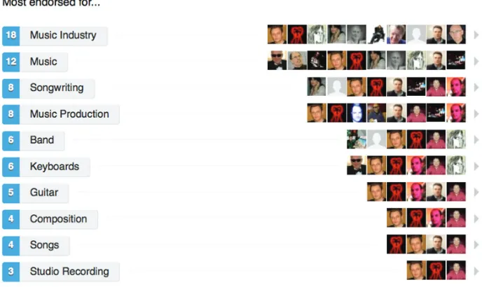
Figure 1.5 LinkedIn Endorsements of Marillion Keyboardist Mark Kelly
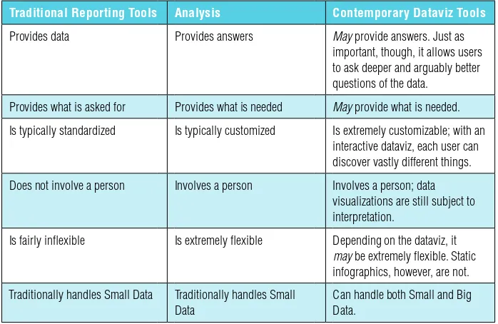
Table 2.1 Reporting vs. Analysis vs. Dataviz
Table 2.2 Dataviz and BI Offerings of Established Enterprise Software Vendors
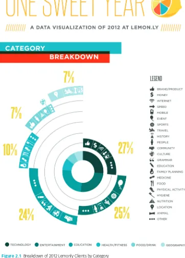
Figure 2.1 Breakdown of 2012 Lemonly Clients by Category
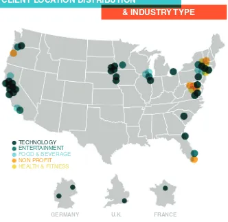
Figure 2.2 Breakdown of 2012 Lemonly Clients by Location and Category
Figure 2.3 The Startup Universe: A Visual Guide to Startups, Founders & Venture Capitalists; Investment History of Marc Andreessen
Figure 2.4 The Startup Universe: Investments in Tableau Software by Amount, Time, and Investor
Figure 2.5 The Startup Universe: Different Investments by New Enterprise over an 18-Month Period
Figure 3.1 Detailed Color Comparison of House of Cards and Macbeth
Figure 3.2 Detailed Color Comparison of Hemlock Grove, House of Cards, and Arrested Development Figure 3.3 Screenshot of Lipstick
Figure 3.4 Netflix Content Consumed by Date, Hour, and Category
Figure 3.5 Netflix Breakdown of Streaming by Device (2011)
xviii ▸ L I S T O F F I G U R E S A N D T A B L E S
Item Description
Figure 3.6 Netflix ISP Performance, Country Comparison—July 2013
Figure 3.7 Netflix ISP Performance, United States—July 2013
Figure 4.1 Frenemies Poll Data Breakdown
Figure 4.2 Poll: Who’s the More Despicable Politician?
Figure 4.3 Jeff Gluck NASCAR Poll
Figure 4.4 Wedgies’s Google Analytics, September 9, 2013
Table 5.1 UT Academic and Health Institutions
Figure 5.1 Data from UT 2009–10 Accountability Report
Figure 5.2 Student Success Dashboard
Figure 5.3 UT Time-to-Ph.D. (Subset of Programs)
Figure 5.4 UT Time-to-Ph.D. (Engineering Programs)
Figure 5.5 Total Dollars Spent under Contract, FY 2012
Figure 5.6 Total HUB Dollars Spent under Contract, FY 2012
Table 6.1 The Four-Level Visual Organization Framework (in Order of Descending Sophistication)
Figure 6.1 The Four-Level Visual Organization Framework
Figure 6.2 Potential Value and Insights from the Four-Level Visual Organization Framework
Figure 6.3 Heat Map of the Four-Level Visual Organization Framework
Figure 7.1 Series of Sequential Images from OrgOrgChart
Figure 7.2 OrgOrgChart Overview of March 17, 2009
Figure 7.3 OrgOrgChart Zoom-In of March 17, 2009
Figure 7.4 OrgOrgChart Overview of January 20, 2011
Figure 7.5 OrgOrgChart Zoom-In of January 20, 2011
Figure 8.1 Tale of 100 Entrepreneurs
Figure 8.2 Potential Fraud Network
Figure 8.3 Chart Suggestions—A Thought-Starter
Figure 9.1 Percentage Change in Enrollment by Disadvantaged Students in Russell Group Schools, 2005 to 2011
xix
Preface: A Tale of Two IPOs
Every word or concept, clear as it may seem to be,
has only a limited range of applicability.
—Werner Heisenberg
C
hristian Chabot had to be at least a little nervous when he woke up in Manhattan on the morning of May 17, 2013. More than a decade’s worth of work would be coming to fruition in only a few hours. In 2003, Chabot—along with Chris Stolte and Pat Hanrahan—founded a little data-visualization company by the name of Tableau Software. (Tableau had started in 1996 as a research project at Stanford University funded by the U.S. Depart-ment of Defense.) Chabot served as the company’s CEO, a position that he still holds today. At 9:30 a.m. EST on that May morning, Tableau would go public on the New York Stock Exchange with the apropos stock symbol of $DATA. Adding to the day’s tension, Chabot and his team would be ringing the open-ing bell to commence the day’s tradopen-ing.Now, under any circumstances, any company founder/CEO would be anxious about such a historic occasion. Chabot, however, was probably more restless than most in his position. Tableau’s public launch was taking place in an environment best described as ominous. This initial public offering (IPO) was by no means a slam-dunk. To Chabot, the halcyon days of the dot-com era must have seemed like a million years ago. And, more recently, May 17, 2013, was almost exactly a year to the day after Facebook went public in arguably the most botched IPO in U.S. history. It was a day that would live in infamy.
xx ▸ P R E F A C E
their transactions were actually executed. Aside from investor consternation, as Samantha Murphy wrote on Mashable, “The IPO caused a series of issues for finance sites, including Nasdaq.com and etrade.com.”1
That was a bit of an understatement.
Once trading finally began, things continued to spiral downward for Mark Zuckerberg’s company. Originally priced at $42 per share, $FB quickly lost one-third of its value during that fateful day. The Securities and Exchange Commission investigated the glitches, ultimately fining Nasdaq $10 million. Lawsuits were soon filed. Many early Facebook investors like Peter Thiel sold virtually all their shares as soon as they legally could—and looked shrewd for doing so. At one point in 2012, the stock slid under $20 per share, and only in August 2013 did Facebook rise above its IPO price. As of this writing, investor sentiment finally seems to have shifted.
The Facebook IPO debacle—and resulting media frenzy—reverberated throughout the financial markets in mid-2012 and well into 2013. Its effects were felt far beyond the offices of Mark Zuckerberg, COO Sheryl Sandberg, rank-and-file employees, and investors. The Facebook IPO allegedly deterred many a company from listing on the NYSE and Nasdaq. Generally speaking, Wall Street analysts believed that the fiasco poisoned the short-term IPO well for everyone, especially technology companies. In the aftermath of the Facebook IPO, many high-profile companies, including Twitter,* reportedly adjusted their own plans for going public. Of course, there were a few exceptions. Enterprise software companies Workday and Jive Software bravely went public in October and December of 2012, respectively. Their stock prices have held up relatively well after their IPOs, as did Big Data play Splunk.
APPLeS AnD COCOnuTS
On many levels, Tableau Software is the anti-Facebook. Yes, both companies rely upon cutting-edge technology to a large extent, but that’s just about where the similarities end. In many ways, the two are apples and coconuts, and no intelligent investor would ever confuse the two.
Facebook is a consumer company based in Silicon Valley with a world-famous CEO. Tableau is an enterprise technology company based in Seattle, Washington. Compared to Zuckerberg, relatively few people would recognize Tableau’s CEO on the street. Tableau doesn’t sport anywhere near 1.2 billion users. Nor do its eponymous products seem terribly sexy to John Q. Public. In fact, most peo-ple would probably consider them a bit drab. At a high level, Tableau’s offerings help people and organizations visualize data. This data need not be transactional, structured, and internal to an enterprise. Rather, Tableau can handle data from a
P R E F A C E ◂ xxi
wide range of sources, including proprietary relational databases, enterprise data warehouses and cubes, open datasets, spreadsheets, and more. Tableau’s products “look” at data and allow users to easily create dashboards and highly interactive data visualizations. With a few clicks, users can publish and share them.*
DAy One
The dubious IPO environment did not deter Chabot, Tableau’s senior team, and its investors. They decided that the company would buck the IPO trend and ignore the pall that Facebook cast over the market. Tableau would roll the dice and go public.
So, how would Tableau pan out?
That was the big question for Chabot and company on May 17, 2013. For-tunately for Tableau’s top brass, its first day of trading was spectacular and even redolent of the dot-com era. The company saw its stock skyrocket an astonishing 63 percent.2 When trading closed for the day, Tableau’s market capitalization exceeded a whopping $2 billion.
Facebook notwithstanding, first-day bumps in a stock’s first day of trad-ing are relatively common, although 63 percent is a pretty big one. Company founders, early investors, and employees with equity or stock options celebrate early jumps like these—and rightfully so. At the same time, though, these gains are often fleeting, as investors are tempted to cash out and take profits. (Groupon and Zynga are but two recent examples of stocks that rose early only to quickly come crashing down to earth.) It was reasonable to ask, “Would Tableau’s stock price maintain its lofty valuation?” In short, yes. After its initial jump, $DATA stabilized, largely holding on to its first-day gains.
I was watching the market the day of Tableau’s successful IPO with consider-able interest. Its opening and subsequent performance didn’t surprise me. By way of background, I’m far from an expert on investing. I certainly don’t purport to understand all the vicissitudes of the stock market, much less predict it with any accuracy. I don’t read these tea leaves well, and my own investment record is bor-derline deplorable. (It pains me to think about how much I paid for $AAPL. Just think of me as the antithesis of Warren Buffett.) In a year, $DATA may trade at a fraction of its current price. We may be laughing at Wall Street’s $2-billion-dollar valuation of a data-visualization company. After all, there’s plenty of precedent here. The Street is far from perfect. Exhibit A: during the dot-com boom, Pets.com sported a market capitalization north of $300 million. Whoops.
Sometimes, however, Wall Street gets it right. While it’s still early, Tableau appears to be one of those cases.
xxii ▸ P R E F A C E
THe DAWn OF A neW eRA?
The importance of Tableau Software’s wildly successful IPO is difficult to over-state. It underscores the burgeoning importance of dataviz. Now, make no mistake. Many large, publicly traded software vendors like IBM, Oracle, SAP, and Microsoft sell applications that allow their clients to visualize data—and have for a long time. However, each of these vendors hawks a wide array of other business and technology solutions. IBM, Oracle, SAP, and Microsoft make their money by selling many different products and services. These include databases, back-office ERP and CRM applications, consulting, and cus-tom software development. To each of these corporations, sales of proper data-visualization applications represent relatively negligible lines of business.
By contrast, Tableau is a different breed of cat. As of this writing, it is exclu-sively a dataviz company. Its products don’t generate and store data, per se. Rather, at a high level, Tableau’s solutions help organizations and their employ-ees represent and interpret existing data, possibly making key discoveries in the process. Equipped with data presented in such a compelling format, employees are more likely to make better business decisions.
Whether more pure dataviz companies ultimately go public is immaterial. I for one don’t expect a wave of similar IPOs in the next few years. For many reasons, many companies choose to remain private these days. (Not want-ing to deal with onerous government regulations and needlwant-ing activist inves-tors are usually near the top of the list.*) Many more start-ups and private companies actively seek exit strategies, perhaps “acqui-hires” by cash-flush behemoths like Facebook, Google, Twitter, and Yahoo.
One need not be an equities expert to understand that many factors explain the rise and fall of any individual stock. (As for me, I know enough to be dangerous.) At a high level, there are two types of variables. There are macro factors like the general economy, the unemployment rate, and the GDP growth. Then there are company-specific ones, including an organization’s competition, cash flow, and strength of its management team. At the risk of simplifying, though, the immediate and blistering success of the Tableau IPO manifests a much larger business trend. Thousands of companies use Tableau, with more coming on board every day.
Now, Tableau may be the only pure data-visualization firm to go public (again, as of this writing), but it is hardly unique in its objectives:
■ To make data more understandable
■ Along with other tools, to allow organizations to get their arms around
increasing data streams
P R E F A C E ◂ xxiii
■ To promote data discovery
■ Ultimately, to help people make better business decisions
As we’ll see in the following pages, Tableau is just one of many companies that offers new and exciting ways to represent and interpret data, especially the big kind. Increasingly, dataviz is becoming a critical and even sexy topic. Awash in a sea of data, many organizations want—nay, need—tools that help them make sense of it all.
Powerful tech companies like Amazon, Apple, Facebook, Google, and Twitter understand data visualization, but they are hardly alone. Powerful dataviz is not the sole purview of Google-sized companies. As you’ll see in this book, a wide array of organizations is representing data in amazing ways, deploying powerful data-visualization tools and building new ones. For instance, progressive and tech-savvy institutions like the Massachusetts Insti-tute of Technology and the New York Times are hiring proper dataviz specialists and engineers.* The Wall Street Journal is hiring visual journalists.3
And this trend shows no signs of abating. In fact, it’s just getting started. Today, data and dataviz are downright cool. In a few years, we may look back at May 17, 2013, as the dawn of a new type of company: the Visual Organization.
And that is the subject of this book.
Phil Simon Henderson, Nevada January 2014
nOTeS
1. Murphy, Samantha “Nasdaq Delayed Facebook IPO for 30 Minutes,” Mashable, May 18, 2012, http://mashable.com/2012/05/18/facebook-ipo-delay, Retrieved June 19, 2013.
2. Cook, John, “Strong Debut: Tableau Closes First Day of Trading Up 63%,” GeekWire, May 17, 2013, http://www.geekwire.com/2013/strong-debut-tableau-closes-day-trading-63, Retrieved June 10, 2013.
3. http://www.philsimon.com/blog.
xxv
Acknowledgments
K
udos to Tim Burgard, Sheck Cho, Stacey Rivera, Helen Cho, Evelyn Martinez, Andy Wheeler, Shelley Sessoms, Chris Gage, and the rest of Team Wiley for making this book possible. Additional kudos to Karen Gill, Johnna VanHoose Dinse, and Luke Fletcher.Paula Bales, Stephanie Huie, Justin Matejka, Drew Skau, John T. Meyer, Jimmy Jacobson, Porter Haney, Joris Evers, Scott Kahler, Ernesto Olivares, and Scott Murray were generous with their time and expertise.
I am particularly grateful to Melinda Thielbar for helping me crystallize the Four-Level Visual Organization Framework in Chapter 6. Knowing a true data scientist has its advantages.
A tip of the hat to Adrian Ott, Terri Griffith, Bruce Webster, Scott “Caddy” Erichsen, Dalton Cervo, Jill Dyché, Todd Hamilton, Ellen French, Dick and Bonnie Denby, Kristen Eckstein, Bob Charette, Andrew Botwin, Mark Frank, Thor and Keri Sandell, Michael DeAngelo, Jennifer Zito, Chad Roberts, Mark Cenicola, Colin Hickey, Brian and Heather Morgan, Michael West, Kevin J. Anderson, John Spatola, Marc Paolella, and Angela Bowman.
Next up are the usual suspects: my longtime Carnegie Mellon friends Scott Berkun, David Sandberg, Michael Viola, Joe Mirza, and Chris McGee.
My heroes from Rush (Geddy, Alex, and Neil), Dream Theater (Jordan, John, John, Mike, and James), Marillion (h, Steve, Ian, Mark, and Pete), and Porcupine Tree (Steven, Colin, Gavin, John, and Richard) have given me many years of creative inspiration through their music. Keep on keepin' on!
A very special thank-you to Vince Gilligan, Bryan Cranston, Aaron Paul, Dean Norris, Anna Gunn, Betsy Brandt, Jonathan Banks, Giancarlo Esposito, RJ Mitte, Bob Odenkirk, and the rest of the cast and team of Breaking Bad. You took us on an amazing journey over the past six years. Each of you has made me want to do great work.
xxvii
How to Help This Book
T
hank you for buying The Visual Organization. I truly hope that you enjoy reading it and have learned a great deal in the process. Beyond some level of enjoyment and education (always admirable goals in reading a nonfic-tion book), I also hope that you can apply your newfound knowledge through-out your career.And perhaps you are willing to help me. I am a self-employed author, writer, speaker, and consultant. I’m not independently wealthy and I don’t have a large marketing machine getting my name out there. My professional livelihood depends in large part on my reputation, coupled with referrals and recommendations from people like you. Collectively, these enable me to make a living.
You can help this book by doing one or more of the following:
■ Review the book on amazon.com, bn.com, goodreads.com, or other related
sites. The more honest, the better.
■ Mention the book on your blog, Facebook, Reddit, Google+, Twitter,
LinkedIn, Pinterest, and other sites you frequent.
■ Recommend the book to family members, colleagues, your boss, friends,
subway riders, and people who might find it interesting.
■ Give it as a gift.
■ If you know people who still work in newspapers, magazines, television,
or industry groups, I’d love a referral or reference. Social media hasn’t entirely replaced the importance of traditional media.
■ Visit www.philsimon.com and read, watch, and listen to your heart’s
content. I frequently blog, post videos, record podcasts, and create other interesting forms of content on a wide variety of subjects.
■ Check out my other books: Why New Systems Fail, The Next Wave of
xxviii ▸ H O W T O H E L P T H I S B O O K
I don’t expect to get rich by writing books. Michael Lewis, John Grisham, Stephen King, and Phil Simon. Hmmm . . . which one doesn’t belong in that group?
I write books for four reasons. First, I believe that have something meaningful to say. I like writing, editing, crafting a cover, and everything else that goes into writing books. To paraphrase the title of an album by Geddy Lee, it’s my favorite headache. Second, although Kindles, Nooks, and iPads are downright cool, I really enjoy holding a physical copy of one of my books in my hands. Creating something physical from scratch just feels good to me. Next, I get a sense of satisfaction from creating a physical product. Finally, I believe that my books will make other good things happen for me.
At the same time, though, producing a quality text takes an enormous amount of time, effort, and money. Every additional copy sold helps make the next one possible.
Thanks again.
1
P a r t
One
Book Overview and
Background
P
art I lays the foundation for the entire book. It covers why dataviz matters more than ever and includes the following chapters:■ Introduction
■ Chapter 1: The Ascent of the Visual Organization
3
Introduction
It’s not what you look at that matters, it’s what
you see.
—Henry David Thoreau
P
rofessional writers and speakers like me live interesting lives. I’d hazard to guess that most of us work from home, although some maintain proper offices. And when you work from home, strange things can happen. For one, it can become difficult to separate work from leisure. There’s no boss looking over your shoulder to see if you’ve completed that TPS report. Did you get that memo? If you want to take a nap in the early afternoon as I routinely do, no one’s stopping you. In a way, people like me are always at work, even though we’re not always working. It’s fair to say that the notion of work-life balance can be challenging. Lines usually blur. Maybe they’re even obliterated.In many ways, working from home could not be more different from working for “the man.” Even today, many rigid corporate environments block employees from visiting certain websites via services like Websense. And forget the obvious sites (read: porn). At many companies, there’s no guarantee that employees can access websites that serve legitimate business purposes, at least without a call to the IT help desk to unblock them. Examples include Twitter, Facebook, Tumblr, and Pinterest. Of course, many employees in indus-trialized countries sport smartphones these days, minimizing the effectiveness of the Websenses of the world. As a result, many companies have reluctantly embraced the Bring Your Own Device movement. That genie is out of the bottle.
4 ▸ B O O K O V E R V I E W A N D B A C K G R O U N D
blurry world, though, what does it really mean to waste time? That’s a bit existential. Let me rephrase: Are my tweets generally work related? Have they changed over time? If so, how?
ADVenTuReS In TWITTeR DATA DISCOVeRy
Twitter tells me that, since 2010, I have tweeted more than 17,000 times as of this writing, or about ten times per day. I’d wager that more than 70 percent of my tweets were work related. (Yes, I have been paid to tweet. Lamentably, I don’t command Kim Kardashian-type rates for my 140 characters.* Maybe some day.) Twitter has let me connect with interesting people and organizations, many of whom you’ll meet in this book. In the course of researching this book, I searched Twitter for a random sample of thoughts, typically with the hashtag #dataviz. At least to me, Twitter is an exceptionally valuable business service that I would gladly pay to use. While we’re at it, let’s put Twitter client Hoot-Suite in that same boat.
At the same time, though, I unabashedly use Twitter for reasons that have absolutely no connection to work. If you go to @philsimon and follow me (please do), there’s a good chance that you’ll see a few tweets with #Rush and #BreakingBad, my favorite band and TV show, respectively. What’s more, I’ve tweeted many of these things during times and days when I probably should have been working. I could delude myself, but I won’t. A few of my favorite celebrities and athletes have engaged with me on Twitter, bringing a smile to my face. I’ll say it: Twitter is fun.
But let’s stick with work here. Based on what I’m doing, I suspect that my tweets have evolved over time, but how? It’s presumptuous to assume that the content of my tweets is static. (I like to think that I have a dynamic personality.)
To answer this question, I could have accessed my archived tweets via Twitter.com. The company made user data available for download in December 2012. I could have thrown that data into Microsoft Excel or Access and started manually looking for patterns. Knowing me, I would have created a pivot table in Excel along with a pie chart or a basic bar graph. (Yes, I am a geek and I always have been.) The entire process would have been pretty time consuming even though I’ve been working with these productivity staples for a long time. Let’s say that Twitter existed in 1998. If I wanted to visualize and understand my tweets back then, I would have had to go the Microsoft route.
Of course, it’s not 1998 anymore. Answering these simple questions now requires less thought and data analysis than you might expect. Technology today is far more powerful, open, user-friendly, ubiquitous, and inexpensive compared to the mid-1990s.
I N T R O D U C T I O N ◂ 5
Like many companies today, Twitter relies upon a relatively open applica-tion programming interface (API).* At a high level, APIs allow devices, apps, and Web services to easily interact with one another. They also facilitate the near-instant flow of data. Lately, APIs have become all the rage. Myriad people use them every day, whether they know it or not. Facebook, LinkedIn, Four-Square, Google, and scores of other companies effectively use APIs for all sorts of reasons. And forget massive tech companies with billion-dollar valuations. Many start-ups are based on “the Twitter fire hose,” including the aforemen-tioned HootSuite. Open APIs encourage development of third-party products and services, a topic I discussed in great detail in The Age of the Platform.
One such service is Vizify, a start-up founded in 2011 and based in Port-land, Oregon. The company is a proud graduate of both Seattle TechStars and the Portland Seed Fund. I fittingly “met” company cofounder and CEO Todd Silverstein over Twitter in June 2013 while researching this book. Vizify quickly and easily lets users connect to different social networks like Facebook, Twitter, FourSquare, and LinkedIn.
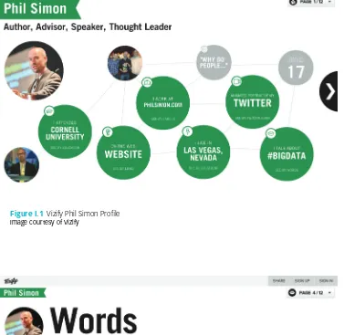
It took about three minutes for Vizify to pull my photos, education history, current occupation, work history, home page, tweets, and other key profile data that I’ve chosen to make publicly available. Of course, users aren’t obligated to connect to any individual network. (I passed on FourSquare.) After the initial load, users can easily remove pictures or other information they would prefer not to share. By accessing open APIs, Vizify allows users to create free and interactive visual profiles. Mine is shown in Figure I.1.
If you want to see my full multipage profile, go to https://www.vizify.com/ phil-simon. In case you’re wondering, users can change the colors on their profiles. I went with that particular shade of green as a homage to Breaking Bad.
A snazzy visual profile is all fine and dandy, but it still didn’t answer my Twitter question. Fortunately, Vizify also allowed me to effortlessly see the evolution of my tweets over time. A screenshot from that part of my profile is shown in Figure I.2.
Figure I.2 proved what I had suspected. First, I use Twitter for both business and personal reasons. Second, my tweets for #BigData began to increase in October 2012. At that time, I was knee-deep into the research for my previous book, Too Big to Ignore: The Business Case for Big Data. Before then, I didn’t tweet about #BigData very often, much less the title of the book (#TooBigToIgnore).
But not everything changes—at least with me. For instance, my tweets about #BreakingBad and #Rush have remained fairly constant over time, with a few notable exceptions. (Did I really go a whole month in early 2013 without mentioning Canada’s finest export on Twitter?)
6 ▸ B O O K O V E R V I E W A N D B A C K G R O U N D
Figure I.1 Vizify Phil Simon Profile
Imagecourtesy of Vizify
Figure I.2 Vizify representation of @philsimon tweets
I N T R O D U C T I O N ◂ 7
Even though this was a one-time experiment, I could see using Vizify on a regular basis. My tweets will continue to evolve, probably mirroring my pro-fessional endeavors and newfound personal interests. Case in point: my pub-lisher has scheduled this book to be released in early 2014. If I run Vizify again around that time, I would assume that many of my tweets will contain the hashtag #dataviz. Fortunately, that won’t be difficult to discern.
So, my tweets have changed over time, but (as you can probably tell) this process just whet my appetite. I was still curious about my Twitter habits, and other questions remained, like this one: what were my peak tweeting hours? It took only a few clicks to answer that question. Vizify created a personal 30-second video analyzing my tweets.† A screenshot from that video is pre-sented in Figure I.3.
NOTE
Vizify allows users to customize their public profiles, as well as see their other frequently used Twitter hashtags. Figure I.2 shows a snapshot of my top-five hashtags as of June 2013.*
▲
* Vizify even lets users create 30-second Twitter videos based on pictures tweeted. To see mine, go to https://www.vizify.com/phil-simon/twitter-video.
† To see my video, go to https://www.vizify.com/phil-simon/twitter-video.
Figure I.3 @philsimon tweets by Hour of Day
8 ▸ B O O K O V E R V I E W A N D B A C K G R O U N D
Since I have always been a morning person, it’s no shocker that my first tweets start as early as 6 a.m. On most days, I wake up by 5 a.m. and promptly make myself a cup of coffee. I check my e-mail and tweet new posts or articles I’ve written for my clients or my own sites. I intentionally break up my normal day to give my weary eyes a rest by hitting the gym around 10 a.m. By 6 p.m., I’ve already put in more than a full day. I’m rarely in front of my computer after that time, although, like many people, I have recently embraced the two-screen experience of tweeting when I watch television. (It’s a sign of the times. For many TV viewers today, “It is a common practice to tweet while watch-ing. Nielsen has new research that confirms for the first time that tweets can increase a TV program’s ratings.”1)
Vizify confirmed what I expected: I am not much of a late-night tweeter, although I occasionally schedule tweets and let HootSuite auto-tweet for me. (I generally try to space out my tweets, and I don’t follow anyone who tweets 34 times per hour. It’s fair to say that I have developed my own Twitter phi-losophy. I’d even call myself a bit of a Twitter snob.)
Aside from my most frequently used hashtags, Vizify also identified my most frequent targets—that is, the people about whom I tweeted most often. I have par-ticular affection for author and professor Terri Griffith (@terrigriffith) and blogger Jim Harris (@ocdqblog). In Jim’s case, the feeling is mutual.*
Vizify let me indulge in what was mostly an intellectual exercise. (I can’t say that my boss forced me to geek out.) I was curious about my tweeting his-tory and decided to play around with a new toy, hardly an uncommon occur-rence for me. And there is a slew of other toys. For instance, Ionz lets users easily “self-visualize” their Twitter data, and Visually lets users do something similar with their Facebook data. But data visualization is anything but the sole purview of geeks like me with admittedly too much time on their hands. Social networks are becoming more interactive, data driven, and visual.
Twitter senior management pays close attention to what its ecosystem and competition are doing, as it should. Not that Twitter is alone here. For instance, in June 2013, Facebook added verified accounts, support for hashtags, and Vine-like video capabilities to its Instagram app. Seem familiar? Facebook clearly “borrowed” these features from Twitter. Such is life in the Age of the Platform; frenemies and coopetition are the norm. During that same month, Twitter added enhanced native analytics of its own.† I have presented my own in Figure I.4.
I’ll spare you any more analysis of my tweets. You get it. This little yarn only serves to illustrate one of the key points in this book: it’s never been easier or more essential to visualize data.
I N T R O D U C T I O N ◂ 9
COnTeMPORARy DATAVIz 101
Incessant social media, memes, and nonstop content permeate our lives. With seemingly every new hot topic or trend, there’s no shortage of definitions, many of which come from people and organizations with vested interests in
their definition winning (read: consulting firms, software vendors, and thought leaders).
In both The Age of the Platform and Too Big to Ignore, I devote a fair amount of space to defining in plain English my key terms platforms and Big Data, respec-tively. There’s so much noise and confusion out there on each topic. I feel the need to do the same here with data visualization.
Figure I.4 @philsimon twitter analytics Source: Twitter
NOTE
In this book, contemporary data visualization, or dataviz, signifies the practice of representing data through visual and often interactive means. An individual dataviz represents information after it been abstracted in some schematic form. Finally, contemporary data visualization technologies are capable of incorporating what we now call Big Data.
▲
Primary Objective
10 ▸ B O O K O V E R V I E W A N D B A C K G R O U N D
not just a synonym or a fancy term for data mining, business intelligence, the many forms of analytics,* or enterprise reporting.
Delineating among all these terms isn’t terribly important here. Chapter 2 returns to this subject. For now, suffice it to say that these concepts aren’t com-pletely unrelated to one another. In fact, there’s a great deal of overlap among them. The most obvious: each is predicated on data in one form or another.
Views on the “proper” goal of dataviz vary considerably. For instance, con-sider the words of Vitaly Friedman, the editor-in-chief of Smashing Magazine, an online periodical for professional Web designers and developers:
The main goal of data visualization is its ability to visualize data, communicating information clearly and effectively. It doesn’t mean that data visualization needs to look boring to be functional or extremely sophisticated to look beautiful. To convey ideas effectively, both aesthetic form and functionality need to go hand in hand, providing insights into a rather sparse and complex dataset by communicating its key aspects in a more intuitive way. Yet designers often tend to discard the balance between design and function, creating gorgeous data visualizations which fail to serve its main purpose—communicate information.2
Communicating information is unquestionably important, but not every-one believes in its primacy (read: that it should be the goal of dataviz). Data-viz pioneers Fernanda Viégas and Martin M. Wattenberg have suggested that the ideal dataviz goes beyond promoting understanding and communication. Those are short-term goals that should buttress the long-term aims of making better business decisions and even prediction. We’ll see in Part II how Visual Organizations use dataviz to do much more than understand what’s currently happening.
Dataviz applications are certainly important, but it’s best to think of data visualization as more than the output of some software program. So argues Nathan Yau in his 2013 book Data Points: Visualization That Means Something. Yau stresses the importance of thinking of dataviz more as a medium than a specific tool. “Visualization is a way to represent data, an abstraction of the real world, in the same way that the written word can be used to tell differ-ent kinds of stories,” he writes. “Newspaper articles aren’t judged on the same criteria as novels, and data art should be critiqued differently than a business dashboard.”3
I could quote other dataviz experts ad infinitum, but I won’t belabor the point: opinions on the topic are far from unanimous. For the purposes of this book, dataviz shares the same ultimate goal with data mining, business intelligence (BI), analytics, and enterprise reporting: to make more informed
I N T R O D U C T I O N ◂ 11
business decisions. Contemporary dataviz is primarily a means of exploring data and discovering valuable insights. It is not about reporting per se nor is it about creating pretty graphs or charts for the sake of doing so. In other words, the most valuable data visualizations today are often based on the premise that employees don’t knowing exactly what they’re looking for, much less what they’ll find. By exploring the data, employees are more likely to discover interesting tidbits or revelations that should drive better decision-making and outcomes. (You won’t find too many absolutes and guarantees in this book. I’m a big fan of probabilistic thinking.)
Benefits
To be sure, data doesn’t always need to be visualized, and many data visuali-zations just plain suck. Look around you. It’s not hard to find truly awful representations of information. Some work in concept but fail because they are too busy; they confuse people more than they convey information, to para-phrase the late George Carlin.* Visualization for the sake of visualization is unlikely to produce desired results—and this goes double in an era of Big Data. Bad is still bad, even and especially at a larger scale.
John Sviokla serves as the vice chairman of Diamond Management & Technology Consultants. As he writes on the Harvard Business Review blog,4 dataviz confers three general benefits:
1. Great visualizations are efficient. They let people look at vast quantities of data quickly.
2. Visualizations can help analysts or groups achieve more insight into the nature of a problem and discover new understanding.
3. A great visualization can help create a shared view of a situation and align folks on needed actions.
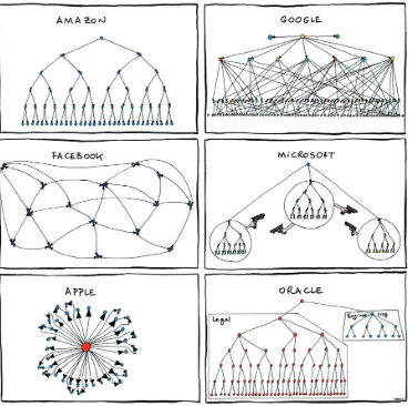
At a high level, Sviokla is spot-on. Consider the following example, as it demonstrates how quickly even a simple dataviz can communicate information. Figure I.5 shows a comical visual of six prominent companies’ 2011 org charts.
Would it be hard to write a few sentences on each organization’s structure? Of course not. In early 2011, Apple revolved around one iconic man. Even after Steve Jobs’s death, his presence is deeply felt throughout the company. For its part, Oracle is still a litigious company. Microsoft is composed of war-ring factions. Looking at the six images in Figure I.5 represents a quicker and certainly more humorous way of summarizing each company than even my witty text probably could.
12 ▸ B O O K O V E R V I E W A N D B A C K G R O U N D
I would add that, for the purposes of understanding large, unpredictable datasets, interactive data visualizations are generally superior to static infographics, dashboards, and standard reports. (I should know. I’ve designed thousands of the latter in my consulting career for my clients.) By definition, presenting even Small Data in predetermined, static, noninteractive formats limits what users can do with—and ultimately get from—data. This has always been the case. In other words, these types of formats generally preclude people from interacting with the data.* They can’t drill down and around. They can’t explore, nor can they ask iterative and better questions, and ultimately find answers.
Figure I.5 Organizational Charts (2011) Source: Manu Cornet
I N T R O D U C T I O N ◂ 13 excellent studies and books have informed our cur-rent understanding of the workings of the human brain, and I certainly won’t attempt to summarize them all here. The Visual Organization is in no way a
book about the behavioral sciences, neurology, or cognitive psychology. I will, however, concisely mention a few of the more important works in those fields.
“The human visual system is a pattern seeker of enormous power and subtlety,” writes Colin Ware in his classic text Information Visualization: Perception for Design. “The eye and the visual cortex of the brain form a massive parallel processor that provides the highest bandwidth channel into human cognitive centers. At higher levels of processing, perception and cognition are closely interrelated, which is why the words understanding and seeing are synonymous.”5 Our brains are wired to process information better in a visual manner.
That humans tend to comprehend visual information quicker than raw data doesn’t mean that all visualizations are created equal. On the contrary, we understand certain types of graphical representations better than oth-ers. Researchers William S. Cleveland and Robert McGill proved as much in September 1984. Cleveland and McGill published a paper in the Journal of the American Statistical Association titled “Graphical Perception: Theory, Exper-imentation, and Application to the Development of Graphical Methods.” Cleveland and McGill studied the visual clues that people are able to decode most accurately. The two ranked these clues in the following list:
1. Position along a common scale, e.g., scatter plot
2. Position on identical but nonaligned scales, e.g., multiple scatter plots 3. Length, e.g., bar chart
4. Angle and slope (tie), e.g., pie chart 5. Area, e.g., bubbles
6. Volume, density, and color saturation (tie), e.g., heat map 7. Color hue, e.g., news map
A slightly modified visual of this list is presented in Figure I.6. In English, it means that not all people comprehend and decode all visual cues equally. For instance, we tend to understand data positioned along a
14 ▸ B O O K O V E R V I E W A N D B A C K G R O U N D
common scale better than data shown on heat maps. Note, however, that the findings of Cleveland and McGill should not be seen in absolute terms. The study suggests that absolutes are a myth and that the ability to understand visual clues is situational. For example, some people will understand a bar chart better than a bubble chart. The Cleveland and McGill recommenda-tions are just general guidelines.
In their 2012 book Infographics: The Power of Visual Storytelling, Jason Lankow, Josh Ritchie, and Ross Crooks demonstrate how even very simple for-matting can make certain data stand out at the expense of other data. Consider Figure I.7, a series of random numbers. Go ahead and find each instance of the number 7.
Now, with simple formatting, repeat the same exercise with Figure I.8. In professional settings, data has always mattered, although some depart-ments and industries have been more likely to embrace it than others. In this
Figure I.6 Visual Cues ranking
Source: Reprinted with permission from The Journal of the American Statistical Association. Copyright 1984 by the American Statistical Association. All rights reserved.
I N T R O D U C T I O N ◂ 15
Figure I.8 Preattentive Processing test 2 Source: Lankow, Ritchie, and Crooks
book, I contend that data visualization has never been more important. Chapter 1 will have a great deal more to say about the rise of the Visual Organization. For now, suffice it to say that representing informa-tion in schematic forms has always been essential to human understanding.
Revenge of the Laggards: The Current State of Dataviz
Fifteen years ago, the presentation of data wasn’t terribly democratic, sophis-ticated, and interactive, especially compared to today. Tech-savvy analysts and IT professionals generated static diagrams, graphs, and charts for quarterly or annual meetings or “special events.” Back then, cutting-edge dataviz wasn’t part and parcel to many jobs. There just wasn’t that much data, especially compared to today.
In a way, this was entirely understandable. Yes, the late-1990s saw the advent of modern enterprise reporting and BI applications adroit at represent-ing mostly structured data. In most organizations, however, relatively few peo-ple regularly visualized data, at least not on a regular basis.
My, how times have changed. Now data is everywhere. As I wrote in Too Big to Ignore, we are living in the era of Big Data, and many things are changing. In the workplace, let’s focus on two major shifts. First, today it is becoming incum-bent upon just about every member of a team, group, department, and organiza-tion to be, at a minimum, comfortable with data. Fewer and fewer knowledge workers can hide from quantitative analysis. Second, pie charts, bar charts,
16 ▸ B O O K O V E R V I E W A N D B A C K G R O U N D
and other simple data visualizations of 15 years ago now seem quaint. They don’t remotely resemble anything that qualifies as contemporary dataviz. More important, today they often fail to tell the stories that need to be told.
Next, data no longer needs be presented on an occasional or periodic basis. We are constantly looking at data of all types—a trend that will only intensify in the coming years. Before our eyes, we are seeing the ability to effectively present quantitative information in a compelling manner become a professional
sine qua non. Hidden in the petabytes of structured and unstructured data are key consumer, employee, and organizational insight. If found and unleashed, those insights would invariably move the needle.
The PwC survey confirmed what I have long assumed. Although notable exceptions exist, only a minority of organizations and professionals currently do very much with dataviz. Most enterprises fail to present data in visually compelling ways. Far too many rely upon old standbys: bar charts, simple graphs, and the ubiquitous Excel spreadsheet. And their business decisions suffer as a result.
Why the widespread lack of adoption? I’d posit that several factors are at play here. First, while dataviz is hardly new, the landscape is. Many of the applications and services detailed in Chapter 2 are recent advents. Second, I have little doubt that the explosions of dataviz and Big Data left many CXOs overwhelmed. In this way, dataviz is much like cloud computing. With myriad options, it’s natural for those in control of the purse strings to ask, “Where do we even start?”
Next, many organizations suffer from downright ignorance. Many lack the knowledge that better tools exist, not to mention that enterprises are suc-cessfully using them. (Hopefully, this book will change that, at least to some extent.) Then there are organizations whose cultures systematically ignore data and analysis. I have seen my share of those As such, their employees generally lack the willingness to try, buy, deploy, and use contemporary data-viz tools. When corporate fiat, culture, and politics dominate decision-making, what’s the point of even looking at data?
For these reasons, it should be no surprise that Big Data is still in its infancy. Brian McKenna tackles this subject in an April 2013 ComputerWeekly article. About the state of Big Data, he writes that “Analytics firm SAS and SourceMedia surveyed 339 data-management professionals about their organizations’ use of
NOTE
The hype around Big Data and, to a lesser extent, dataviz still far exceeds their business realities. To quote former Notre Dame coach Lou Holtz, “When all is said and done, more is said than done.” Rather than hem and haw, organizations should recognize the vast opportunity that the status quo represents. Those that act now can realize significant benefits that won’t be available to them once their competition wakes up.
I N T R O D U C T I O N ◂ 17
* Access the entire report at http://tinyurl.com/pwc-dv-2.
THE CURRENT DATA ON DATAVIZ
Sadly, most employees—and, by extension, departments and organizations—don’t capitalize on the massive opportunities presented by Big Data and data visualization. So says consulting firm PricewaterhouseCoopers (PwC) in its fifth annual Digital IQ Survey (titled “Digital Conversations and the C-suite”).
In 2013, PwC surveyed 1,108 respondents from 12 countries across a variety of industries. Respondents were equally split between IT and business leaders. More than 75 percent worked in organizations with revenues of more than $1 billion.*
FINDINGS
A majority of respondents (62 percent) think that Big Data can provide a competitive advantage. That’s not exactly surprising, but believing in the power of Big Data is hardly the same as turning it into actual business insights—and then acting upon them. Nearly the same number of respondents (58 percent) agreed that moving from data to insight is much easier said than done.
Only 26 percent of global survey respondents are currently using dataviz. (I suspect that many of these “forward-thinking” organizations aren’t exactly Google-like in their execution.) Interestingly, though, adoption—or lack thereof—is not evenly distributed among all respondents. Specifically, those that reported revenue growth in excess of 5 percent led the pack—and weren’t letting up. They planned to invest more in data visualization in 2013. The same can be said of organizations in the top quartile for revenue, profitability, and innovation. The gap between the dataviz haves and have-nots seems to be growing.
OBSTACLES
Organizations face four major obstacles with respect to Big Data:
1. They are blind to the importance of visualization.
2. They are investing more in gathering data than analyzing it. 3. They are facing a talent gap.
4. They are struggling with insufficient systems to rapidly process information.
“The amount of information and data that we’re collecting now is truly enormous, [especially] the volume that is outside the four walls of the organization,” says Anand Rao, principal at PwC. “Organizations don’t have the right people, they don’t have the right structure in place, and they’re still struggling with some of the tools and techniques.”6