Data Science in the Cloud with
Microsoft Azure Machine
Learning and R: 2015 Update
Data Science in the Cloud with Microsoft Azure Machine Learning and R: 2015 Update
by Stephen F. Elston
Copyright © 2015 O’Reilly Media Inc. All rights reserved. Printed in the United States of America.
Published by O’Reilly Media, Inc., 1005 Gravenstein Highway North, Sebastopol, CA 95472.
Revision History for the First Edition 2015-09-01: First Release
2015-11-21: Second Release
The O’Reilly logo is a registered trademark of O’Reilly Media, Inc. Data Science in the Cloud with Microsoft Azure Machine Learning and R: 2015 Update, the cover image, and related trade dress are trademarks of O’Reilly Media, Inc.
While the publisher and the author(s) have used good faith efforts to ensure that the information and instructions contained in this work are accurate, the publisher and the author(s) disclaim all responsibility for errors or omissions, including without limitation responsibility for damages resulting from the use of or reliance on this work. Use of the information and instructions contained in this work is at your own risk. If any code samples or other technology this work contains or describes is subject to open source licenses or the
intellectual property rights of others, it is your responsibility to ensure that your use thereof complies with such licenses and/or rights.
Chapter 1. Data Science in the
Cloud with Microsoft Azure
Introduction
This report covers the basics of manipulating data, constructing models, and evaluating models in the Microsoft Azure Machine Learning platform (Azure ML). The Azure ML platform has greatly simplified the development and deployment of machine learning models, with easy-to-use and powerful cloud-based data transformation and machine learning tools.
In this report, we’ll explore extending Azure ML with the R language. (A companion report explores extending Azure ML using the Python language.) All of the concepts we will cover are illustrated with a data science example, using a bicycle rental demand dataset. We’ll perform the required data
manipulation, or data munging. Then, we will construct and evaluate regression models for the dataset.
You can follow along by downloading the code and data provided in the next section. Later in the report, we’ll discuss publishing your trained models as web services in the Azure cloud.
Before we get started, let’s review a few of the benefits Azure ML provides for machine learning solutions:
Solutions can be quickly and easily deployed as web services.
Models run in a highly scalable and secure cloud environment.
Azure ML is integrated with the powerful Microsoft Cortana Analytics Suite, which includes massive storage and processing capabilities. It can read data from and write data to Cortana storage at significant volume. Azure ML can even be employed as the analytics engine for other components of the Cortana Analytics Suite.
Machine learning algorithms and data transformations are extendable using the R language, for solution-specific functionality.
Downloads
For our example, we will be using the Bike Rental UCI dataset available in Azure ML. This data is also preloaded in the Azure ML Studio environment, or you can download this data as a .csv file from the UCI website. The
reference for this data is Fanaee-T, Hadi, and Gama, Joao, “Event labeling combining ensemble detectors and background knowledge,” Progress in Artificial Intelligence (2013): pp. 1-15, Springer Berlin Heidelberg.
Working Between Azure ML and RStudio
Azure ML is a production environment. It is ideally suited to publishing machine learning models. In contrast, Azure ML is not a particularly good
development environment.
In general, you will find it easier to perform preliminary editing, testing, and debugging in RStudio. In this way, you take advantage of the powerful
development resources and perform your final testing in Azure ML.
Downloads for R and RStudio are available for Windows, Mac, and Linux. This report assumes the reader is familiar with the basics of R. If you are not familiar with using R in Azure ML, check out the Quick Start Guide to R in AzureML.
Overview of Azure ML
This section provides a short overview of Azure Machine Learning. You can find more details and specifics, including tutorials, at the Microsoft Azure web page. Additional learning resources can be found on the Azure Machine Learning documentation site.
Deeper and broader introductions can be found in the following video classes:
Data Science with Microsoft Azure and R, Working with Cloud-based Predictive Analytics and Modeling by Stephen Elston from O’Reilly Media, provides an in-depth exploration of doing data science with Azure ML and R.
Data Science and Machine Learning Essentials, an edX course by Stephen Elston and Cynthia Rudin, provides a broad introduction to data science using Azure ML, R, and Python.
Azure ML Studio
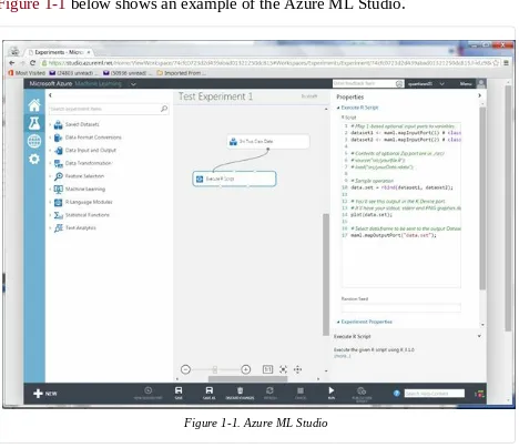
Azure ML models are built and tested in the web-based Azure ML Studio. Figure 1-1 below shows an example of the Azure ML Studio.
Figure 1-1. Azure ML Studio
A workflow of the model appears in the center of the studio window. A dataset and an Execute R Script module are on the canvas. On the left side of the Studio display, you see datasets, and a series of tabs containing various types of modules. Properties of whichever dataset or module that has been clicked on can be seen in the right panel. In this case, you can see the R code contained in the Execute R Script module.
Building your own experiment in Azure ML is quite simple. Click the +
Figure 1-2. Creating a New Azure ML Experiment
Getting Data In and Out of Azure ML
Let’s discuss how we get data into and out of Azure ML. Azure ML supports several data I/O options, including:
Web services
These data I/O capabilities enable interaction with external applications and other components of the Cortana Analytics Suite.
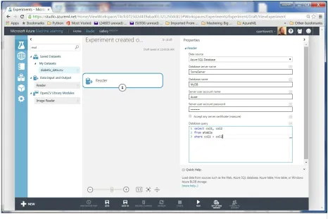
We will investigate web service publishing in another section of this report. Data I/O at scale is supported by the AzureML Reader and Writer modules. The Reader and Writer modules provide an interface with Cortana data
storage components. Figure 1-3 shows an example of configuring the Reader module to read data from a hypothetical Azure SQL table. Similar
Modules and Datasets
Mixing native modules and R in Azure ML
Azure ML provides a wide range of modules for data transformation,
machine learning, and model evaluation. Most native Azure ML modules are computationally efficient and scalable. As a general rule, these native
modules should be your first choice.
The deep and powerful R language extends Azure ML to meet the requirements of specific data science problems. For example, solution-specific data transformation and cleaning can be coded in R. R language scripts contained in Execute R Script modules can be run in-line with native Azure ML modules. Additionally, the R language gives Azure ML powerful data visualization capabilities. With the Create R Model module, you can train and score models from numerous R packages within an experiment with relatively little work.
As we work through the examples, you will see how to mix native Azure ML modules and Execute R Script modules to create a complete solution.
Execute R Script Module I/O
In the Azure ML Studio, input ports are located above module icons, and
output ports are located below module icons.
TIP
If you move your mouse over the ports of a module, you will see a “tool tip” showing the type of data for that port.
The Execute R Script module has five ports:
The Dataset1 and Dataset2 ports are inputs for rectangular Azure data tables.
file.
The Result Dataset output port produces an Azure rectangular data table from a data frame.
The R Device port produces output of text or graphics from R.
Azure ML Workflows
Model training workflow
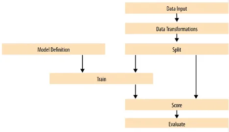
Figure 1-4 shows a generalized workflow for training, scoring, and
evaluating a machine learning model in Azure ML. This general workflow is the same for most regression and classification algorithms. The model
definition can be a native Azure ML module or R code in a Create R Model module
Figure 1-4. A generalized model training workflow for Azure ML models.
Key points on the model training workflow:
Data input can come from a variety of interfaces, including web services, HTTP connections, Azure SQL, and Hive Query. These data sources can be within the Cortana suite or external to it. In most cases, for training and testing models, you use a saved dataset.
A Model Definition module defines the model type and properties. On the left hand pane of the Studio you will see numerous choices for models. The parameters of the model are set in the properties pane. R model training and scoring scripts can be provided in a Create R Model module.
The Training module trains the model. Training of the model is scored in the Score module and performance summary statistics are computed in the Evaluate module.
The following sections include specific examples of each of the steps illustrated in Figure 1-4.
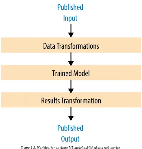
Publishing a model as a web service
Once you have developed and evaluated a satisfactory model, you can
Figure 1-5. Workflow for an Azure ML model published as a web service
Here are some key points of the workflow for publishing a web service: Typically, you will use transformations you created and saved when you were training the model. These include saved transformations from the various Azure ML data transformation modules and modified R
transformation code.
model.
Problem and Data Overview
Demand and inventory forecasting are fundamental business processes.
Forecasting is used for supply chain management, staff level management, production management, and many other applications.
In this example, we will construct and test models to forecast hourly demand for a bicycle rental system. The ability to forecast demand is important for the effective operation of this system. If insufficient bikes are available, regular users will be inconvenienced. The users become reluctant to use the system, lacking confidence that bikes will be available when needed. If too many bikes are available, operating costs increase unnecessarily.
In data science problems, it is always important to gain an understanding of the objectives of the end-users. In this case, having a reasonable number of extra bikes on-hand is far less of an issue than having an insufficient
inventory. Keep this fact in mind as we are evaluating models.
For this example, we’ll use a dataset containing a time series of demand information for the bicycle rental system. These data contain hourly demand figures over a two-year period, for both registered and casual users. There are nine features, also know as predictor, or independent, variables. The data set contains a total of 17,379 rows or cases.
The first and possibly most important, task in creating effective predictive analytics models is determining the feature set. Feature selection is usually more important than the specific choice of machine learning model. Feature candidates include variables in the dataset, transformed or filtered values of these variables, or new variables computed from the variables in the dataset. The process of creating the feature set is sometimes known as feature
selection or feature engineering.
In addition to feature engineering, data cleaning and editing are critical in most situations. Filters can be applied to both the predictor and response variables.
California Machine Learning Repository.
A first set of transformations
For our first step, we’ll perform some transformations on the raw input data using the code shown below in an Azure ML Execute R Script module:
## This file contains the code for the transformation ## of the raw bike rental data. It is intended to run in an ## Azure ML Execute R Script module. By changing
## the following variable to false the code will run ## in R or RStudio.
Azure <- FALSE
## If we are in Azure, source the utilities from the zip ## file. The next lines of code read in the dataset, either ## in Azure ML or from a csv file for testing purposes. if(Azure){
source("src/utilities.R")
BikeShare <- maml.mapInputPort(1)
BikeShare$dteday <- set.asPOSIXct(BikeShare) }else{
BikeShare <- read.csv("BikeSharing.csv", sep = ",", header = T, stringsAsFactors = F )
## Select the columns we need
cols <- c("dteday", "mnth", "hr", "holiday", "workingday", "weathersit", "temp", "hum", "windspeed", "cnt")
BikeShare <- BikeShare[, cols]
## Transform the date-time object
BikeShare$dteday <- char.toPOSIXct(BikeShare)
## Normalize the numeric predictors cols <- c("temp", "hum", "windspeed")
BikeShare[, cols] <- scale(BikeShare[, cols]) }
## Create a new variable to indicate workday
BikeShare$isWorking <- ifelse(BikeShare$workingday &
!BikeShare$holiday, 1, 0)
## Add a column of the count of months which could ## help model trend.
## Create an ordered factor for the day of the week ## starting with Monday. Note this factor is then ## converted to an "ordered" numerical value to be ## compatible with Azure ML table data types.
BikeShare$dayWeek <- as.factor(weekdays(BikeShare$dteday))
## Output the transformed data frame if in Azure ML. if(Azure) maml.mapOutputPort('BikeShare')
Notice the conditional statement at the beginning of this code listing. When the logical variable Azure is set to TRUE, the maml.mapInputPort(1)
function reads the data frame from the input port of the execute R Script Module. The argument 1 indicates the first input port. R functions from a .zip
file are brought into the R environment by the source() function. The .R file
is read from a directory /src. The date-time character string is converted to a POSIXct time series object by the to.POSIXct function.
If, on the other hand, Azure is set to FALSE, the other code path is executed.
This code path allows us to test the code in RStudio. The data are read from a .csv file. The argument stringsAsFactors = FALSE ensures that string
columns are retained as such, and as they will be in Azure ML. Column selection and normalization of certain numeric columns are executed. These transformations are accomplished with the Azure module in that
environment. The date-time column is converted to a time series object with the char.toPOSIXct function.
This code creates five new columns, or features. As we explore the data we will determine if any of these features improve our models.
Creating a column indicating whether it’s a workday or not.
months from the beginning of the time series.
A column indicating the day of the week as an ordered factor.
TIP
In most cases, Azure ML will treat R POSIXct formatted character columns as having a date-time type. R may not interpret the Azure ML date-time type as POSIXct. To be consistent, a type conversion is required. If you encounter errors with date-time fields when working with R in Azure ML, check that the type conversions are working as expected.
The utilities.R file contains the functions used for the transformations. The listing of these functions is shown below:
set.asPOSIXct <- function(inFrame) { dteday <- as.POSIXct(
as.integer(inFrame$dteday), origin = "1970-01-01")
as.POSIXct(strptime(
paste(as.character(dteday), " ",
char.toPOSIXct <- function(inFrame) { as.POSIXct(strptime( Dteday <- strftime(inFrame$dteday,
format = "%Y-%m-%dT%H:%M:%S") yearCount <- as.numeric(unlist(lapply(strsplit( Dteday, "-"),
inFrame$monthCount <- 12 * yearCount + inFrame$mnth inFrame
}
These functions are in a file called utilities.R. This file is packaged into a .zip
file, and uploaded into Azure ML Studio. The R code in the .zip file is then available in any Execute R Script module in the experiment.
Exploring the data
Let’s have a first look at the data by walking through a series of exploratory plots.
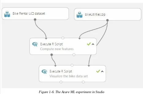
An additional Execute R Script module with the visualization code is added to the experiment. At this point, our Azure ML experiment looks like
Figure 1-6. The first Execute R Script module, titled “Transform Data,” contains the code shown in the previous code listing.
Figure 1-6. The Azure ML experiment in Studio
code for exploring the data, using output from the Execute R Script module that transforms the data.
Our first step is to read the transformed data and create a correlation matrix using the following code:
## This code will create a series of data visualizations ## to explore the bike rental dataset. This code is ## intended to run in an Azure ML Execute R
## Script module. By changing the following variable ## you can run the code in R or RStudio for testing.
Azure <- FALSE if(Azure){
## Source the zipped utility file source("src/utilities.R")
## Read in the dataset.
BikeShare <- maml.mapInputPort(1)
BikeShare$dteday <- set.asPOSIXct2(BikeShare) }
## Look at the correlation between the predictors and ## between predictors and quality. Use a linear
## time series regression to detrend the demand. Time <- BikeShare$dteday
In this code, we use lm() to compute a linear model used for detrending the
response variable column in the data frame. Detrending removes a source of bias in the correlation estimates. We are particularly interested in the
correlation of the predictor variables with this detrended response.
NOTE
The levelplot() function from the lattice package is wrapped by a call to plot(). This
is required since, in some cases, Azure ML suppresses automatic printing, and hence plotting. Suppressing printing is desirable in a production environment as automatically produced output will not clutter the result. As a result, you may need to wrap expressions you intend to produce as printed or plotted output, with the print() or plot() functions.
This code requires one function, which is defined in the utilities.R file.
set.asPOSIXct2 <- function(inFrame) { dteday <- as.POSIXct(
as.integer(inFrame$dteday), origin = "1970-01-01")
}
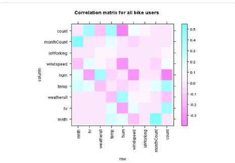
Using the cor() function, we’ll compute the correlation matrix. This
correlation matrix is displayed using the levelplot() function in the lattice
package.
Figure 1-7. Plot of correlation matrix
This plot is dominated by the strong correlation between dayWeek and isWorking—which is hardly surprising. It’s clear that we don’t need to
include both of these variables in any model, as they are proxies for each other.
Figure 1-8. Plot of correlation matrix without dayWeek variable
In this plot we can see that a few of the features exhibit fairly strong correlation with the response. The hour (hr), temp, and month (mnth) are
positively correlated, whereas humidity (hum) and the overall weather
(weathersit) are negatively correlated. The variable windspeed is nearly
uncorrelated. For this plot, the correlation of a variable with itself has been set to 0.0. Note that the scale is asymmetric.
We can also see that several of the predictor variables are highly correlated— for example, hum and weathersit or hr and hum. These correlated variables
could cause problems for some types of predictive models.
WARNING
You should always keep in mind the pitfalls in the interpretation of correlation. First, and most importantly, correlation should never be confused with causation. A highly
uncorrelated variable may, or may not, be a good predictor. The variable may be nearly collinear with some other predictor, or the relationship with the response may be nonlinear.
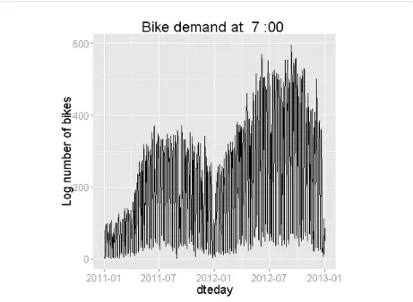
Next, time series plots for selected hours of the day are created, using the following code:
## Make time series plots for certain hours of the day require(ggplot2)
times <- c(7, 9, 12, 15, 18, 20, 22) # BikeShare$Time <- Time
lapply(times, function(times){
ggplot(BikeShare[BikeShare$hr == times, ], aes(x = dteday, y = cnt)) +
geom_line() +
ylab("Log number of bikes") +
labs(title = paste("Bike demand at ",
as.character(times), ":00", spe ="")) + theme(text = element_text(size=20))
} )
This code uses the ggplot2 package to create the time series plots. An
anonymous R function wrapped in lapply, generates the plots at the selected
hours.
Figure 1-10. Time series plot of bike demand for the 1800 hour
Notice the differences in the shape of these curves at the two different hours. Also, note the outliers at the low side of demand.
Next, we’ll create a number of box plots for some of the factor variables, using the following code:
## Convert dayWeek back to an ordered factor so the plot is in ## time order.
BikeShare$dayWeek <- fact.conv(BikeShare$dayWeek)
## This code gives a first look at the predictor values vs the demand for bikes. labels <- list("Box plots of hourly bike demand",
"Box plots of monthly bike demand",
"Box plots of bike demand by weather factor", "Box plots of bike demand by workday vs. holiday", "Box plots of bike demand by day of the week") xAxis <- list("hr", "mnth", "weathersit",
Map(function(X, label){
If you are not familiar with using Map() this code may look a bit
intimidating. When faced with functional code like this, always read from the inside out. On the inside, you can see the ggplot2 package functions. This code is contained in an anonymous function with two arguments. Map()
iterates over the two argument lists to produce the series of plots.
The utility function that creates the day of week factor with meaningful names is shown in the listing below:
fact.conv <- function(inVec){
## Function gives the day variable meaningful ## level names.
outVec <- as.factor(inVec)
levels(outVec) <- c("Monday", "Tuesday", "Wednesday", "Thursday", "Friday", "Saturday", "Sunday")
outVec
Figure 1-13. Box plots showing the relationship between bike demand and day of the week
From these plots, you can see a significant difference in the likely predictive power of these three variables. Significant and complex variation in hourly bike demand can be seen in Figure 1-11. In contrast, it looks doubtful that
weathersit is going to be very helpful in predicting bike demand, despite
the relatively high (negative) correlation value observed. The result shown in Figure 1-13 is surprising—we expected bike demand to depend on the day of the week.
Once again, the outliers at the low end of bike demand can be seen in the box plots.
TIP
Finally, we’ll create some plots to explore the continuous variables, using the following code:
## Look at the relationship between predictors and bike demand labels <- c("Bike demand vs temperature",
"Bike demand vs humidity", "Bike demand vs windspeed", "Bike demand vs hr")
xAxis <- c("temp", "hum", "windspeed", "hr") Map(function(X, label){
ggplot(BikeShare, aes_string(x = X, y = "cnt")) + geom_point(aes_string(colour = "cnt"), alpha = 0.1) + scale_colour_gradient(low = "green", high = "blue") + geom_smooth(method = "loess") +
ggtitle(label) +
theme(text = element_text(size=20)) }, xAxis, labels)
This code is quite similar to the code used for the box plots. We have
included a loess smoothed line on each of these plots. Also, note that we have added a color scale and increased the point transparency. Therefore, we get a feel for the number of overlapping data points.
TIP
When plotting a large number of points, overplotting is a significant problem.
Overplotting makes it difficult to tell the actual point density as points lie on top of each other. Methods like color scales, point transparency and hexbinning can all be applied to situations with significant overplotting.
WARNING
Examples of the resulting scatter plots are shown in Figures 14 and 15.
Figure 1-14. Scatter plot of bike demand versus humidity
Figure 1-15. Scatter plot of bike demand versus hour of the day
Figure 1-15 shows the scatter plot of bike demand vs. hour of the day. Note that the loess smoother does not fit parts of these data very well. This is a warning that we may have trouble modeling this complex behavior.
Once again, in both scatter plots we see the prevalence of outliers at the low end of bike demand.
Exploring a potential interaction
Perhaps there is an interaction between time of day and day of the week. A day of week effect is not apparent from Figure 1-13, but we may need to look in more detail. This idea is easy to explore. Adding the following code to the visualization Execute R Script module creates box plots for working and non-working days for peak demand hours:
labels <- list("Box plots of bike demand at 0900 for \n working and non-working days",
"Box plots of bike demand at 1800 for \n working and non-working days")
Times <- list(8, 17)
Map(function(time, label){
ggplot(BikeShare[BikeShare$hr == time, ],
aes(x = isWorking, y = cnt, group = isWorking)) + geom_boxplot( ) + ggtitle(label) +
theme(text = element_text(size=18)) }, Times, labels)
The result of running this code can be seen in Figures 16 and 17.
Figure 1-17. Box plots of bike demand at 1800 for working and non-working days
Now we can clearly see what we were missing in the initial set of features. There is different demand between working and non-working days at peak demand hours.
Creating new features
We need a new feature that differentiates the time of the day by working and non-working days; to do this, we will add the following code to the transform Execute R Script module:
## Add a variable with unique values for time of day for ## working and non-working days.
BikeShare$workTime <- ifelse(BikeShare$isWorking, BikeShare$hr,
NOTE
We have created the new variable using working versus non-working days. This leads to 48 levels (2 × 24) in this variable. We could have used the day of the week, but this approach would have created 168 levels (7 × 24). Reducing the number of levels reduces complexity and the chance of overfitting—generally leading to a better model.
Transformed time: Other new features
As noted earlier, the complex hour-to-hour variation bike demand shown in Figures 10 and 14 may be difficult for some models to deal with. Perhaps, if we shift the time axis, we will create new features where demand is closer to a simple hump shape. The following code shifts the time axis by five hours to create one new feature and shifts the workTime feature by five hours to
create another new feature:
## Shift the order of the hour variable so that it is smoothly ## "humped over 24 hours.
BikeShare$xformHr <- ifelse(BikeShare$hr > 4, BikeShare$hr - 5, BikeShare$hr + 19)
## Add a variable with unique values for time of day for ## working and non-working days.
BikeShare$xformWorkHr <- ifelse(BikeShare$isWorking, BikeShare$xformHr, BikeShare$xformHr + 24)
We add two more plots to the series we created in the visualization model, with the following code:
## Look at the relationship between predictors and bike demand labels <- c("Bike demand vs temperature",
"Bike demand vs humidity", "Bike demand vs windspeed", "Bike demand vs hr",
"Bike demand vs xformHr", "Bike demand vs xformWorkHr") xAxis <- c("temp", "hum", "windspeed", "hr", "xformHr", "xformWorkHr")
Map(function(X, label){
geom_point(aes_string(colour = "cnt"), alpha = 0.1) + scale_colour_gradient(low = "green", high = "blue") + geom_smooth(method = "loess") +
ggtitle(label) +
theme(text = element_text(size=20)) }, xAxis, labels)
This element is added to each of these vectors to allow creating of the plot for the transformed features. The resulting plot is shown in Figures 18 and 19.
Figure 1-19. Bike demand by transformed workTime
The bike demand by transformed hour curve definitely shows more of a hump shape. The loess curve for bike demand by transformed workTime exhibits a double hump. However, there seem to be three humps in demand. Regardless, this plot exposes quite a bit of structure in the data.
A First Model
Now that we have some basic data transformations, and have had a first look at the data, it’s time to create our first model. Given the complex
relationships we see in the data, we will use a nonlinear regression model. In particular, we will try the Decision Forest Regression module.
Figure 1-20. Azure ML Studio with first bike demand model
There are quite a few new modules on the canvas at this point.
We added a Split module after the Transform Data Execute R Script module.
The sub-selected data are then sampled into training and test (evaluation) sets with a 70%/30% split. Later, we will introduce a second split to separate testing the model from evaluation. The test dataset is used for performing model parameter tuning and feature selection.
Note that we placed the Project Columns module after the Split module, so we can prune the features we’re using without affecting the model evaluation. We use the Project Columns module to select the following columns of
transformed data for the model:
The selection of a minimal feature set is of critical importance. The danger of over-parameterizing or overfitting a model is always present. While Decision Forest algorithms are known to be fairly insensitive to this problem, we ignore it at our peril. Dropping features that do little to improve a model is always a good idea. Features that are highly correlated with other features are especially good candidates for removal.
For the Decision Forest Regression module, we have set the following parameters:
Resampling method: Bagging
Number of decision trees: 100
Number of random splits: 128
Minimum number of samples per leaf: 10
The model is scored with the Score Model module, which provides predicted values for the module from the evaluation data. Figure 1-21 shows the
performance summary statistics from the Evaluate Model module.
Figure 1-21. Performance statistics for the model
These results are interesting, but a bit abstract. We include another Execute R Script module in our experiment, which provides some performance
evaluations specific to our use case.
The second Project Columns module selects one column from the Scoring module: Scored Labels. These data are then used in an Execute R Script module.
For the first step of this evaluation, we will compare the actual and predicted values. The following code creates a set of time series plots of actual bike demand to the demand predicted by the model:
## This code will produce various measures of model ## performance using the actual and predicted values ## from the Bike rental data.
## This code is intended to run in an Azure ML ## Execute R Script module. By changing the Azure ## variable to false you can run in R or
## RStudio. Azure <- FALSE
if(Azure){
source("src/utilities.R")
## Another data frame is created from the data produced ## by the Azure Split module. The columns we need are ## added to inFrame
inFrame[, c("cnt", "dteday", "monthCount", "hr", "xformWorkHr")] <- refFrame[, c("cnt", "dteday", "monthCount", "hr", "xformWorkHr")]
## Assign names to the data frame for reference names(inFrame) <- c("predicted", "cnt", "dteday", "monthCount", "hr", "xformWorkHr")
## Since the sampling process randomized the order of ## the rows sort the data by the Time object.
inFrame <- inFrame[order(inFrame$dteday),]
## Time series plots showing actual and predicted values; ## columns 3 and 4.
library(ggplot2)
times <- c(7, 9, 12, 15, 18, 20, 22)
lapply(times, function(times){ ggplot() +
geom_line(data = inFrame[inFrame$hr == times, ], aes(x = dteday, y = cnt)) +
geom_line(data = inFrame[inFrame$hr == times, ],
aes(x = dteday, y = predicted), color = "red") + ylab("Log number of bikes") +
labs(title = paste("Bike demand at ",
as.character(times), ":00", spe ="")) + theme(text = element_text(size=20))
})
This code includes the following key steps:
A second data frame is read using a second Azure ML mapInputPort()
evaluation summaries. Reading these columns independently allows you to prune any columns used by the model, without breaking the evaluation code.
A POSIXct time series object with date and hours is created.
Required columns from the two data frames are joined into one.
The rows of the data frame are sorted in time series order. The Split module randomly samples the rows in the data table. To plot these data properly, they must be in time order.
Time series plots are created for the actual and predicted values at selected hours using lapply(). As before, we use the ggplot2 package.
Figure 1-22. Time series plot of actual and predicted bike demand at 0900
Figure 1-23. Time series plot of actual and predicted bike demand at 1800
By examining these time series plots, you can see that the model produces a reasonably good fit to the evaluation data. However, there are quite a few cases where the actual demand exceeds the predicted demand.
Let’s have a closer look at the residuals. The following code creates box plots of the residuals by hour and by the 48 hour workTime scale:
## Compute the residuals library(dplyr)
inFrame <- mutate(inFrame, resids = predicted - cnt)
## Plot the residuals. First a histogram and ## a qq plot of the residuals.
ggplot(inFrame, aes(x = resids)) +
qqnorm(inFrame$resids) qqline(inFrame$resids)
## Plot the residuals by hour and transformed work hour. inFrame <- mutate(inFrame, fact.hr = as.factor(hr),
fact.xformWorkHr = as.factor(xformWorkHr)) facts <- c("fact.hr", "fact.xformWorkHr")
lapply(facts, function(x){
ggplot(inFrame, aes_string(x = x, y = "resids")) + geom_boxplot( ) +
ggtitle("Residual of actual versus predicted bike demand by hour")})
This code employs the mutate operator from the dplyr package to compute
the additional columns required for the plots. Again, the ggplot2 package is used to create the plots.
The results of running this code can be seen in Figures 24 and 25.
Figure 1-25. Box plots of residuals between actual and predicted values by transformed hour
Studying these plots, we see that there are significant residuals at peak
demand hours. The model consistently underestimates demand at 0800, 1700, and 1800—peak commuting hours on work days. Clearly, to be useful, a bike sharing system should meet demand at these peak hours. However, there are significant negative residuals at midday on non-work days.
Note that previously shown code also generates a histogram and a quantile-quantile plot of the residuals. While not shown here, these plots confirm the hypothesis of large positive residuals.
TIP
Improving the Model and Transformations
The question is now, how can we improve these model results? It is possible that improvements in the choice of model parameters, or an alternative model might give better results. However, it is typically the case that improved
feature engineering and data cleaning leads to greater improvements in results rather than small model improvements.
In this section we will try several ideas for improvement: better data cleaning, alternative models, and better selection of model parameters.
Filtering with SQLite
We can create a filter using the SQLite dialect of SQL in the Apply SQL transformation module. The experiment with the apply SQL transformation module is shown in Figure 1-26.
Figure 1-26. Experiment with Apply SQL Transformation module
In this case we use a simple SQL script to trim small values from the training data.
select * from t1 where cnt > 100;
12,000 to about 7,000.
Another Data Transformation
Let’s try another data transformation—filtering out the low end outliers. To wit, we’ve added the highlighted Execute R Script module, as shown in Figure 1-27. The code in this module will filter out down-side outliers in the training data.
We only want to apply this filter to the training data, and not to the evaluation data. When using the predictive model in production, we are computing an estimate of the response, and will not have the actual response values to trim. Consequently, the new Execute R Script module is placed
Figure 1-27. Updated experiment with new Execute R Script to trim outliers
The code for this new Execute R Script module is shown here:
## This code removes downside outliers from the ## training sample of the bike rental data. ## The value of Quantile variable can be changed ## to change the trim level.
## Execute R Script module. By changing the Azure ## variable to FALSE you can run the code in R ## and RStudio.
Azure <- FALSE
if(Azure){
## Read in the dataset.
BikeShare <- maml.mapInputPort(1)
BikeShare$dteday <- as.POSIXct(as.integer(BikeShare$dteday), origin = "1970-01-01")
}
## Build a dataframe with the quantile by month and ## hour. Parameter Quantile determines the trim point. Quantile <- 0.20
require(dplyr) quantByPer <- ( BikeShare %>%
group_by(workTime, monthCount) %>% summarise(Quant = quantile(cnt,
probs = Quantile, na.rm = TRUE)) )
## Join the quantile information with the ## matching rows of the data frame. This ## join uses the names with common columns ## as the keys.
BikeShare2 <- inner_join(BikeShare, quantByPer)
## Filter for the rows we want and remove the ## no longer needed column.
BikeShare2 <- BikeShare2 %>% filter(cnt > Quant)
BikeShare2[, "Quant"] <- NULL
## Output the transformed data frame. if(Azure) maml.mapOutputPort('BikeShare2')
This code makes heavy use of the dplyr package to create the required filter: 1. We compute the 20% quantiles of the data grouped by both workTime
(working and non-working time) and by month count from the start of the series.
Evaluating the Improved Model
Let’s look at the results of using this filter. As a first step, the summary statistics produced by the Evaluate module are shown in Figure 1-28.
Figure 1-28. Performance statistics for the model with outliers trimmed in the training data
When compared with the performance statistics shown in Figure 1-21, these statistics are a bit worse. However, keep in mind that our goal is to limit the number of times we underestimate bike demand. This process will cause some degradation in the aggregate statistics as bias is introduced.
Figure 1-30. Residuals by workTime with outliers trimmed in the training data
If you compare these residual plots with Figures 24 and 25 you will notice that the residuals are now biased to the positive—this is exactly what we hoped. It is better for users if the bike share system has a slight excess of inventory rather than a shortage.
TIP
Improving Model Parameter Selection in Azure
ML
We can try improving the model’s performance by searching the parameter space with the Sweep module. Up until now, all of our results have been based on educated guesses of the model parameters.
The Sweep module searches the parameter space for the best combination. The Sweep module has three input ports: one for the model, one for a training data set, and one for a test data set. Another Split module is required to
resample the original training data set. As before, we only want to prune the outliers in the training data.
Figure 1-31. Experiment with new Split and Sweep modules added
The parameters for the Sweep module are as follows: Specify parameter sweeping mode: Entire grid
Selected column: cnt
Metric for measuring performance: Root mean square error
The Split module provides a 60/40% split of the data.
After running the experiment we see the results displayed in Figure 1-32.
Figure 1-32. Performance statistics produced by sweeping the model parameters
Figure 1-33. Box plots of residuals by hour after sweeping parameters
Figure 1-34. Box plots of residuals by workTime after sweeping parameters
Using an R Model in Azure ML
Let’s try a model in the R language. Azure ML provides the Create R Model module. Within this module, R code is provided for computing the model and scoring the model. The experiment with the Create R Model module is
shown in Figure 1-35.
Figure 1-35. Experiment with Create R Model module added
## This code is intended to run in an
## Azure ML Execute R Script module. By changing ## the following variable to false the code will run ## in R or RStudio.
Azure <- FALSE
## Set the dteday column to a POSIXct type if in Azure ML ## or bind the data to the dataset name.
if(Azure){
dataset$dteday <- set.asPOSIXct(dataset) }else{
dataset <- read.csv("BikeSharing.csv", sep = ",", header = T, stringsAsFactors = F ) dataset$dteday <- char.toPOSIXct(dataset)
}
require(randomForest)
model <- randomForest(cnt ~ xformWorkHr + dteday + temp + hum,
data = dataset, ntree = 40, nodesize = 5)
Within the Train Model module, the training data frame will appear under the name dataset. The last few lines of this code do the real work. A model is computed and saved with the required name model. The model is exported to the code in the scoring module.
The code listing for scoring the model is shown in the listing below:
## This code is intended to run in an
## Azure ML Execute R Script module. By changing ## the following variable to false the code will run ## in R or RStudio.
Azure <- FALSE
## Set the dteday column to a POSIXct type if in Azure ML ## or bind the data to the dataset name.
if(Azure){
BikeShare <- dataset
BikeShare$dteday <- set.asPOSIXct(BikeShare) }
require(randomForest)
As in the Training code, the test data set appears in the Score module with the name dataset. This data structure is immutable. The first thing we do is copy it into a new data frame. The vector of predicted values is placed into a data frame named scores, which will be output.
Note that the functions as.POSIXct and char.toPOSIXct must be in the full
code listing since the Create R Module module cannot import from a .zip file. The code for these functions is simply copied for the utilities.R file into the code for the Create R Model module.
The box plots of the residuals are shown in Figures 36 and 37.
Figure 1-37. Box plot of residuals by workTime for the R model
Cross Validation
Figure 1-38. Experiment with Cross Validation module added
Figure 1-39. The results by fold of the model cross validation
Figure 1-41. Residuals from the model cross validation by workTime
Some Possible Next Steps
It is always possible to do more when refining a predictive model. The
question must always be: is it worth the effort for the possible improvement? The median performance of the Decision Forest Regression model is fairly good. However, there are some significant outliers in the residuals. Thus, some additional effort is probably justified before either model is put into production.
There is a lot to think about when trying to improve the results. We could consider several possible next steps, including the following:
Understand the source of the residual outliers. We have not
investigated if there are systematic sources of these outliers. Are there certain ranges of predictor variable values that give these erroneous results? Do the outliers correspond to exogenous events, such as parades and festivals, failures of other public transit, holidays that are not
indicated as non-working days, etc.? Such an investigation will require additional data. Or, are these outliers a sign of overfitting?
Perform additional feature engineering. We have tried a few obvious new features with some success, but there is no reason to think this process has run its course. Perhaps another time axis transformation, which orders the hour-to-hour variation in demand would perform better. Some moving averages might reduce the effects of the outliers.
Prune features to prevent overfitting. Overfitting is a major source of poor model performance. As noted earlier, we have pruned some features. Perhaps, a different pruning of the features would give a better result.
Publishing a Model as a Web Service
Now that we have a reasonably good model, we can publish it as a web service. Publishing an Azure ML experiment as a web service is remarkably easy. As illustrated in Figure 1-42, simply push the Set Up Web Service button on the right hand side of the tool bar at the bottom of the studio window. Then select Predictive Web Service.
Figure 1-42. The Set Up Web Service button in Azure ML studio
and the web services input and output models are added automatically.
Figure 1-43. The scoring experiment with web services input and output modules
By clicking on the Web Services icon on the left side of the studio canvas, a page showing a list of published web services appears. Click on the line for the web bicycle demand forecasting service and the display shown in
Figure 1-44. Web service page for bike demand forecasting
On this page you can see a number of properties and tools:
An API key, used by external applications to access this predictive model. To ensure security, manage the distribution of this key carefully!
A link to a page that describes the request-response REST API. This document includes sample code in C#, Python, and R.
A link to a page that describes the batch API. This document includes sample code in C#, Python, and R.
A test button for manually testing the web service.
An Excel download.
Figure 1-45. Excel workbook connected to web service API
Users can enter values on the left side of the spreadsheet, labeled Parameters. The results computed in the Azure cloud appear on the as Predicted Values shown in Figure 1-46.
Figure 1-46. The results produced by the web service
We can see that the newly computed predicted values are reasonably close to the actual values.
Summary
I hope this article has motivated you to try your own data science projects in Azure ML.
To summarize our discussion:
Azure ML is an easy-to-use and powerful environment for the creation and cloud deployment of powerful machine learning solutions.
Analytics written in R can be rapidly operationalized as web services using Azure ML.
R code is readily integrated into the Azure ML workflow.
Careful development, selection, and filtering of features is the key to creating successful data science solutions.
Understanding business goals and requirements is essential to the creation of a valuable analytic solution.
About the Author
Stephen F. Elston, Managing Director of Quantia Analytics, LLC is a big data geek, data scientist, instructor, and O’Reilly author. He has over two decades of experience in predictive analytics and machine learning with R, S/SPLUS, and Python. Elston has developed, sold, and supported multiple analytics solutions. He holds a PhD degree in Geophysics from Princeton University. Formally he led R&D for the S-PLUS companies and is a