Data Science in the Cloud with
Microsoft Azure Machine
Learning
and Python
Data Science in the Cloud with Microsoft Azure Machine Learning and Python
by Stephen F. Elston
Copyright © 2016 O’Reilly Media, Inc. All rights reserved. Printed in the United States of America.
Published by O’Reilly Media, Inc., 1005 Gravenstein Highway North, Sebastopol, CA 95472.
Revision History for the First Edition 2016-01-04: First Release
The O’Reilly logo is a registered trademark of O’Reilly Media, Inc. Data Science in the Cloud with Microsoft Azure Machine Learning and Python, the cover image, and related trade dress are trademarks of O’Reilly Media, Inc. While the publisher and the author have used good faith efforts to ensure that the information and instructions contained in this work are accurate, the publisher and the author disclaim all responsibility for errors or omissions, including without limitation responsibility for damages resulting from the use of or reliance on this work. Use of the information and instructions contained in this work is at your own risk. If any code samples or other technology this work contains or describes is subject to open source licenses or the
intellectual property rights of others, it is your responsibility to ensure that your use thereof complies with such licenses and/or rights.
Chapter 1. Data Science in the
Cloud with Microsoft Azure
Introduction
This report covers the basics of manipulating data, constructing models, and evaluating models on the Microsoft Azure Machine Learning platform
(Azure ML). The Azure ML platform has greatly simplified the development and deployment of machine learning models, with easy-to-use and powerful cloud-based data transformation and machine learning tools.
We’ll explore extending Azure ML with the Python language. A companion report explores extending Azure ML using the R language.
All of the concepts we will cover are illustrated with a data science example, using a bicycle rental demand dataset. We’ll perform the required data
manipulation, or data munging. Then we will construct and evaluate regression models for the dataset.
You can follow along by downloading the code and data provided in the next section. Later in the report, we’ll discuss publishing your trained models as web services in the Azure cloud.
Before we get started, let’s review a few of the benefits Azure ML provides for machine learning solutions:
Solutions can be quickly and easily deployed as web services.
Models run in a highly scalable, secure cloud environment.
Azure ML is integrated with the Microsoft Cortana Analytics Suite, which includes massive storage and processing capabilities. It can read data from, and write data to, Cortana storage at significant volume. Azure ML can be employed as the analytics engine for other components of the Cortana Analytics Suite.
Machine learning algorithms and data transformations are extendable using the Python or R languages for solution-specific functionality.
Downloads
For our example, we will be using the Bike Rental UCI dataset available in Azure ML. This data is preloaded into Azure ML; you can also download this data as a .csv file from the UCI website. The reference for this data is
Fanaee-T, Hadi, and Gama, Joao, “Event labeling combining ensemble detectors and background knowledge,” Progress in Artificial Intelligence (2013): pp. 1-15, Springer Berlin Heidelberg.
Working Between Azure ML and Spyder
Azure ML uses the Anaconda Python 2.7 distribution. You should perform your development and testing of Python code in the same environment to simplify the process.
Azure ML is a production environment. It is ideally suited to publishing machine learning models. However, it’s not a particularly good code development environment.
In general, you will find it easier to perform preliminary editing, testing, and debugging in an integrated development environment (IDE). The Anaconda Python distribution includes the Spyder IDE. In this way, you take advantage of the powerful development resources and perform your final testing in Azure ML. Downloads for the Anaconda Python 2.7 distribution are
available for Windows, Mac, and Linux. Do not use the Python 3.X versions, as the code created is not compatible with Azure ML.
If you prefer using Jupyter notebooks, you can certainly do your code
development in this environment. We will discuss this later in “Using Jupyter Notebooks with Azure ML”.
This report assumes the reader is familiar with the basics of Python. If you are not familiar with Python in Azure ML, the following short tutorial will be useful: Execute Python machine learning scripts in Azure Machine Learning Studio.
The Python source code for the data science example in this report can be run in either Azure ML, in Spyder, or in IPython. Read the comments in the
Overview of Azure ML
This section provides a short overview of Azure Machine Learning. You can find more detail and specifics, including tutorials, at the Microsoft Azure web page. Additional learning resources can be found on the Azure Machine
Learning documentation site.
For deeper and broader introductions, I have created two video courses: Data Science with Microsoft Azure and R: Working with Cloud-based Predictive Analytics and Modeling (O’Reilly) provides an in-depth exploration of doing data science with Azure ML and R.
Data Science and Machine Learning Essentials, an edX course by myself and Cynthia Rudin, provides a broad introduction to data science using Azure ML, R, and Python.
Azure ML Studio
Figure 1. Azure ML Studio
A workflow of the model appears in the center of the studio window. A dataset and an Execute Python Script module are on the canvas. On the left side of the Studio display, you see datasets and a series of tabs containing various types of modules. Properties of whichever dataset or module has been selected can be seen in the right panel. In this case, you see the Python code contained in the Execute Python Script module.
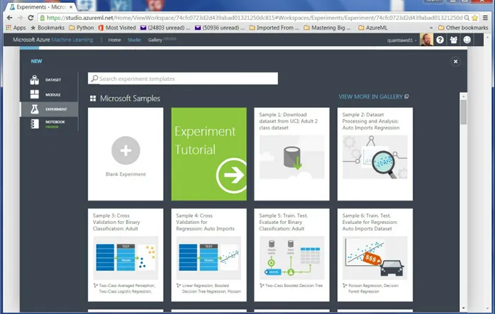
Build your own experiment
Building your own experiment in Azure ML is quite simple. Click the +
symbol in the lower lefthand corner of the studio window. You will see a display resembling Figure 2. Select either a blank experiment or one of the sample experiments.
Getting Data In and Out of Azure ML
Azure ML supports several data I/O options, including: Web services
These data I/O capabilities enable interaction with either external applications and other components of the Cortana Analytics Suite.
NOTE
We will investigate web service publishing in “Publishing a Model as a Web Service”.
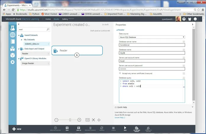
Data I/O at scale is supported by the Azure ML Reader and Writer modules. The Reader and Writer modules provide interface with Cortana data storage components. Figure 3 shows an example of configuring the Reader module to read data from a hypothetical Azure SQL table. Similar capabilities are
Modules and Datasets
Mixing native modules and Python in Azure ML
Azure ML provides a wide range of modules for data transformation, machine learning, and model evaluation. Most native (built-in) Azure ML modules are computationally-efficient and scalable. As a general rule, these native modules should be your first choice.
The deep and powerful Python language extends Azure ML to meet the requirements of specific data science problems. For example, solution-specific data transformation and cleaning can be coded in Python. Python language scripts contained in Execute Python Script modules can be run inline with native Azure ML modules. Additionally, the Python language gives Azure ML powerful data visualization capabilities. You can also use the many available analytics algorithms packages such as scikit-learn and StatsModels.
As we work through the examples, you will see how to mix native Azure ML modules and Execute Python Script modules to create a complete solution.
Execute Python Script Module I/O
In the Azure ML Studio, input ports are located at the top of module icons, and output ports are located below module icons.
TIP
If you move your mouse over the ports of a module, you will see a “tool tip” that shows the type of data for that port.
The Execute Python Script module has five ports:
The Dataset1 and Dataset2 ports are inputs for rectangular Azure data tables, and they produce a Pandas data frame in Python.
dataset files.
The Result dataset output port produces an Azure rectangular data table from a Pandas data frame.
The Python device port produces output of text or graphics from R.
Within experiments, workflows are created by connecting the appropriate ports between modules — output port to input port. Connections are made by dragging your mouse from the output port of one module to the input port of another module.
Azure ML Workflows
Model training workflow
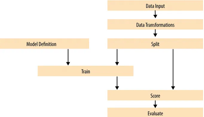
Figure 4 shows a generalized workflow for training, scoring, and evaluating a machine learning model in Azure ML. This general workflow is the same for most regression and classification algorithms. The model definition can be a native Azure ML module or, in some cases, Python code.
Figure 4. A generalized model training workflow for Azure ML models
Key points on the model training workflow:
Data input can come from a variety of interfaces, including web services, HTTP connections, Azure SQL, and Hive Query. These data sources can be within the Cortana suite or external to it. In most cases, for training and testing models, you will use a saved dataset.
A Model Definition module defines the model type and properties. On the lefthand pane of the Studio, you will see numerous choices for models. The parameters of the model are set in the properties pane.
The Training module trains the model. Training of the model is scored in the Score module, and performance summary statistics are computed in the Evaluate module.
The following sections include specific examples of each of the steps illustrated in Figure 4.
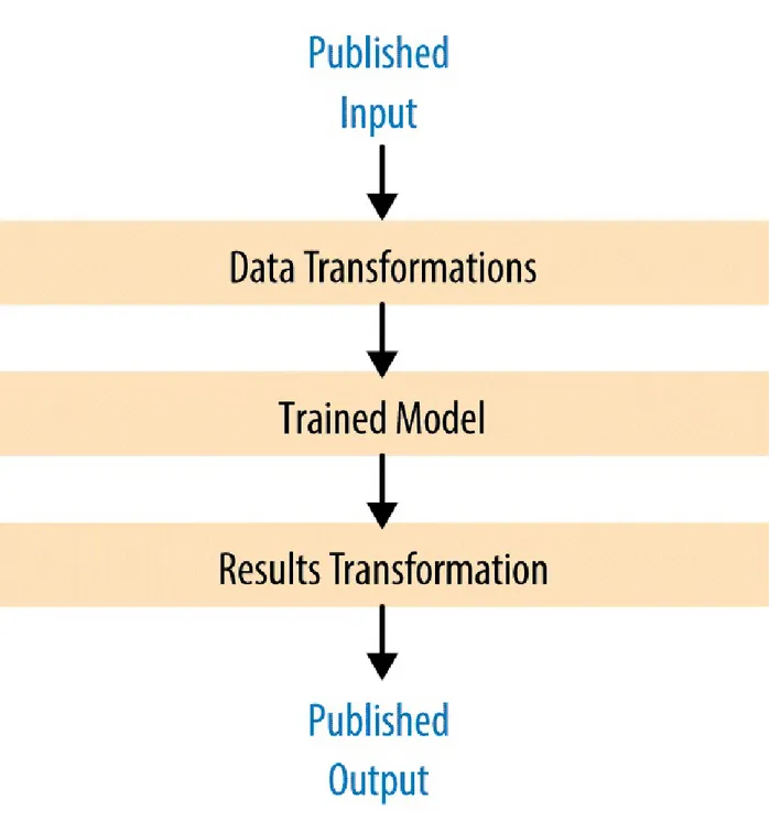
Publishing a model as a web service
Once you have developed and evaluated a satisfactory model, you can
Figure 5. Workflow for an Azure ML model published as a web service
Some key points of the workflow for publishing a web service are:
The product of the training processes (discussed previously) is the trained model.
Problem and Data Overview
Demand and inventory forecasting are fundamental business processes. Forecasting is used for supply chain management, staff level management, production management, power production management, and many other applications.
In this example, we will construct and test models to forecast hourly demand for a bicycle rental system. The ability to forecast demand is important for the effective operation of this system. If insufficient bikes are available, regular users will be inconvenienced. The users become reluctant to use the system, lacking confidence that bikes will be available when needed. If too many bikes are available, operating costs increase unnecessarily.
In data science problems, it is always important to gain an understanding of the objectives of the end-users. In this case, having a reasonable number of extra bikes on-hand is far less of an issue than having an insufficient
inventory. Keep this fact in mind as we are evaluating models.
For this example, we’ll use a dataset containing a time series of demand information for the bicycle rental system. These data contain hourly demand figures over a two-year period, for both registered and casual users. There are nine features, also know as predictor, or independent, variables. The dataset contains a total of 17,379 rows or cases.
The first and possibly most important task in creating effective predictive analytics models is determining the feature set. Feature selection is usually more important than the specific choice of machine learning model. Feature candidates include variables in the dataset, transformed or filtered values of these variables, or new variables computed from the variables in the dataset. The process of creating the feature set is sometimes known as feature
selection and feature engineering.
In addition to feature engineering, data cleaning and editing are critical in most situations. Filters can be applied to both the predictor and response variables.
A First Set of Transformations
For our first step, we’ll perform some transformations on the raw input data using the code from the transform.py file, shown next, in an Azure ML Execute Python Script module:
## The main function with a single argument, a Pandas dataframe ## from the first input port of the Execute Python Script module.
def azureml_main(BikeShare): import pandas as pd
from sklearn import preprocessing
import utilities as ut
import numpy as np
import os
## If not in the Azure environment, read the data from a csv ## file for testing purposes.
Azure = False
if(Azure == False):
## the start of the series which can be used to model
The main function in an Execute Python Script module is called
azureml_main. The arguments to this function are one or two Python Pandas
dataframes input from the Dataset1 and Dataset2 input ports. In this case, the single argument is named frame1.
Notice the conditional statement near the beginning of this code listing. When the logical variable Azure is set to False, the data frame is read from the .csv file.
The rest of this code performs some filtering and feature engineering. The filtering includes removing unnecessary columns and scaling the numeric features.
The term feature engineering refers to transformations applied to the dataset to create new predictive features. In this case, we create four new columns, or features. As we explore the data and construct the model, we will determine if any of these features actually improves our model performance. These new columns include the following information:
Indicate if it is a workday or not
Transformed time of day for working and nonworking days by shifting by 5 hours
A count of days from the start of the time series
The utilities.py file contains a utility function used in the transformations. The listing of this function is shown here:
def mnth_cnt(df):
This file is a Python module. The module is packaged into a .zip file, and uploaded into Azure ML Studio. The Python code in the zip file is then available, in any Execute Python Script module in the experiment connected to the zip.
Exploring the data
Let’s have a first look at the data by walking through a series of exploratory plots. An additional Execute Python Script module with the visualization code is added to the experiment. At this point, our Azure ML experiment looks like Figure 6. The first Execute Python Script module, titled
Figure 6. The Azure ML experiment in Studio
The Execute Python Script module, shown at the bottom of this experiment, runs code for exploring the data, using output from the Execute Python Script module that transforms the data. The new Execute Python Script module contains the visualization code contained in the visualize.py file.
In this section, we will explore the dataset step by step, discussing each section of code and the resulting charts. Normally, the entire set of code would be run at one time, including a return statement at the end. You can add to this code a step at a time as long as you have a return statement at the end.
The first section of the code is shown here. This code creates two plots of the correlation matrix between each of the features and the features and the label (count of bikes rented).
def azureml_main(BikeShare): import matplotlib
matplotlib.use('agg') # Set backend
matplotlib.rcParams.update({'font.size': 20})
from sklearn import preprocessing
from sklearn import linear_model
import numpy as np
import matplotlib.pyplot as plt
import statsmodels.graphics.correlation as pltcor
Azure = False
## Compute the correlation matrix and set the diagonal
## elements to 0.
The first two lines import matplotlib and configure a backend for Azure ML to use. This configuration must be done before any other graphics libraries are imported or used.
The dataframe is sorted into time order. Sorting ensures that time series plots appear in the correct order.
Bike demand (cnt) is de-trended using a linear model from the scikit-learn package. De-trending removes a source of bias in the correlation
estimates. We are particularly interested in the correlation of the features (predictor variables) with this de-trended label (response).
NOTE
The selected columns of the Pandas dataframe have been coerced to NumPy arrays, with the as_matrix method.
The correlation matrix is computed using the NumPy package. The values along the diagonal are set to zero.
NOTE
The data in the Pandas dataframe have been coerced to a NumPy array with the as_matrix method.
The correlation matrix is plotted using
statsmodels.graphics.correlation.plot_corr.
If Azure = True, the plot object is saved to a file with a unique name.
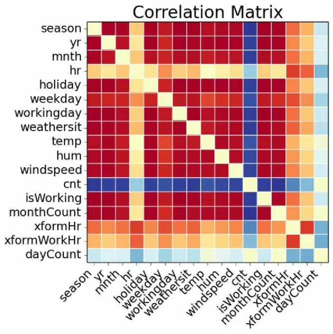
The contents of this file will be displayed at the Python device port of the Execute Python Script module. If the plot is not saved to a file with a unique name, it will not be displayed. The resulting plot is shown in Figure 7.
features, shown in Figure 8.
NOTE
To run this code in Azure ML, make sure you set Azure = True.
Figure 7. Plot of correlation matrix
the strong correlations between many of the features. For example, date-time features are correlated, as are weather features. There is also some significant correlation between date-time and weather features. This correlation results from seasonal variation (annual, daily, etc.) in weather conditions. There is also strong positive correlation between the feature (cnt) and several other features. It is clear that many of these features are redundant with each other, and some significant pruning of this dataset is in order.
Figure 8. Plot of correlation matrix without dayWeek variable
The patterns revealed in this plot are much the same as those seen in
Figure 6. The patterns in correlation support the hypothesis that many of the features are redundant.
WARNING
You should always keep in mind the pitfalls in the interpretation of correlation. First, and most importantly, correlation should never be confused with causation. A highly
correlated variable may or may not imply causation. Second, any particular feature highly correlated, or uncorrelated, with the label may, or may not, be a good predictor. The variable may be nearly collinear with some other predictor, or the relationship with the response may be nonlinear.
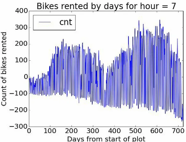
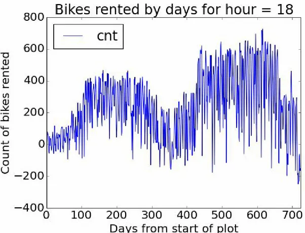
Next, time series plots for selected hours of the day are created, using the following code:
## Make time series plots of bike demand by times of the day.
times = [7, 9, 12, 15, 18, 20, 22]
This code loops over a list of hours of the day. For each hour, a time series plot object is created and saved to a file with a unique name. The contents of these files will be displayed at the Python device port of the Execute Python Script module.
shown in Figures 9 and 10. Recall that these time series have had the linear trend removed.
Figure 10. Time series plot of bike demand for the 1800 hour
Notice the differences in the shape of these curves at the two different hours. Also, note the outliers at the low side of demand. These outliers can be a source of bias when training machine learning models.
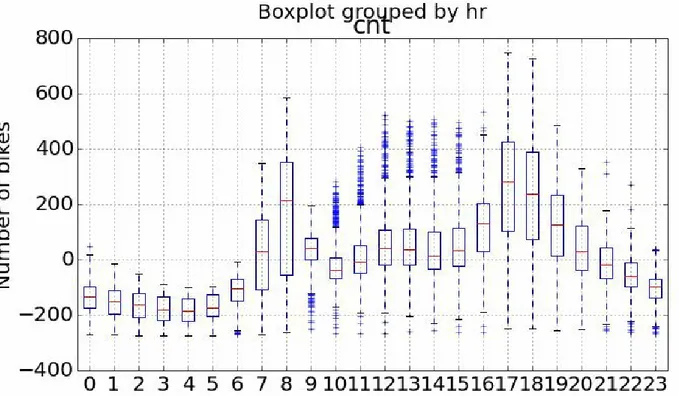
Next, we will create some box plots to explore the relationship between the categorical features and the label (cnt). The following code shows the box plots.
## Boxplots for the predictor values vs the demand for bikes.
for lab, xaxs in zip(labels, xAxes):
This code executes the following steps:
1. The set_day function is called (see the following code).
2. A list of figure captions is created.
3. A list of column names for the features is defined.
4. A for loop iterates over the list of captions and columns, creating a box
plot of each specified feature.
5. For each hour, a time series object plot is created and saved to a file with a unique name. The contents of these files will be displayed at the Python device port of the Execute Python Script module.
This code requires one function, defined in the visualise.py file.
def set_day(df): '''
cur_day = day
if(i == 6): i = 0
else: i += 1
temp[indx] = days[i] indx += 1
df['dayWeek'] = temp
return df
This function creates a new feature showing the day of the week, using day names that make the plots easier to understand.
Three of the resulting box plots are shown in Figures 11, 12, and 13.
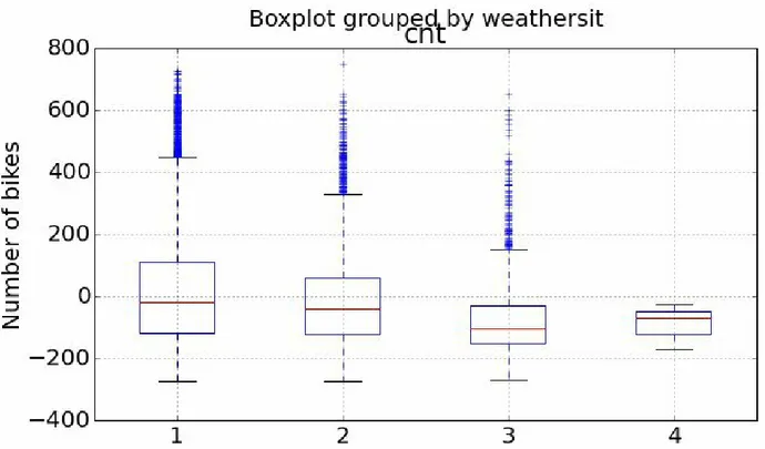
Figure 12. Box plots showing the relationship between bike demand and weather situation
From these plots, you can see differences in the likely predictive power of these three features.
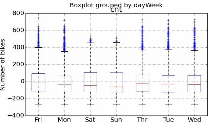
Figure 13. Box plots showing the relationship between bike demand and day of the week
The result shown in Figure 13 is surprising — we expected bike demand to depend on the day of the week.
Once again, the outliers at the low end of bike demand can be seen in the box plots.
Finally, we’ll create some scatter plots to explore the continuous variables, using the following code:
## Make scatter plot of bike demand vs. various features.
## Now make the plots
This code is quite similar to the code used for the box plots. We have included a lowess smoothed line on each of these plots using
statsmodels.nonparametric.smoothers_lowess.lowess. Also, note that we increased the point transparency (small value of alpha), so we get a feel for the number of overlapping data points.
TIP
When plotting a large number of points, “over-plotting” is a significant problem. Overplotting makes it difficult to tell the actual point density as points lie on top of each other. Methods like color scales, point transparency, and hexbinning can all be applied to situations with significant overplotting.
WARNING
The lowess method is quite memory intensive. Depending on how much memory you have on your local machine, you may or may not be able to run this code. Fortunately, Azure ML runs on servers with 60 GB of RAM, which is more than up to the job.
Figure 14. Scatter plot of bike demand versus humidity
Figure 15. Scatter plot of bike demand versus temperature
Figure 15 shows the scatter plot of bike demand versus temperature. Note the complex behavior exhibited by the “lowess” smoother; this is a warning that we may have trouble modeling this feature.
Exploring a Potential Interaction
Perhaps there is an interaction between the time of day of working and nonworking days. A day of week effect is not apparent from Figure 13, but we may need to look in more detail. This idea is easy to explore. Adding the following code creates box plots for peak demand hours of working and nonworking days:
## Explore bike demand for certain times on working and nonworking days
labels = ["Boxplots of bike demand at 0900 \n\n",
This code is nearly identical to the code we already discussed for creating box plots. The only difference is the use of the by argument to create a separate box plot for working and nonworking days.
Note the return statement at the end — Python functions require a return statement.
Figure 17. Box plots of bike demand at 1800 for working and nonworking days
Investigating a New Feature
We need a new feature that differentiates the time of the day by working and nonworking days. The feature we created, xformWorkHr, does just this.
NOTE
We created a new variable using working versus nonworking days. This leads to 48 levels (2 × 24) in this variable. We could have used the day of the week, but this approach would have created 168 levels (7 × 24). Reducing the number of levels reduces complexity and the chance of overfitting — generally leading to a better model.
The complex hour-to-hour variation bike demand, shown in Figure 11, may be difficult for some models to deal with. A shift in the time axis creates a new feature where demand is closer to a simple hump shape.
The resulting new feature is both time-shifted and grouped by working and nonworking hours, as shown in Figure 18.
This plot shows a clear pattern of bike demand by the working (0–23) and nonworking (24–47) hour of the day. The pattern of demand is fairly
Figure 18. Bike demand by transformed workTime
A First Model
Now that we have some basic data transformations and a first look at the data, it’s time to create our first model. Given the complex relationships seen in the data, we will use a nonlinear regression model. In particular, we will try the Decision Forest Regression model.
Figure 19 shows our Azure ML Studio canvas with all of the modules in place.
There are quite a few new modules on the canvas at this point.
We added a Split module after the Transform Data Execute Python Script module. The sub-selected data are then sampled into training and test (evaluation) sets with a 70%/30% split. Later, we will introduce a second split to separate testing the model from evaluation. The test dataset is used for performing model parameter tuning and feature selection.
Pruning features
There are a large number of apparently redundant features in this dataset. As we have seen, many of these features are highly correlated with each other. In all likelihood, models created with the full dataset will be overparameterized.
WARNING
The selection of a minimal feature set is of critical importance. The danger of overparameterizing or overfitting a model is always present. While decision forest algorithms are known to be fairly insensitive to this problem, we ignore it at our peril. Dropping features that do little to improve model performance is always a good idea. Features that are highly correlated with other features are especially good candidates for removal.
Figure 20. Importance of final feature selection
We placed the Project Columns module after the Split module, in order to prune the features we’re using without affecting the model evaluation. Use the Project Columns module to select the following columns of transformed data for the model:
cnt
xformHr
temp
dteday
We have gone from 17 features to just 3 with very little change in the model performance metrics. The pruned feature set shows a significant reduction in complexity.
The Decision Forest Model
Now that we have the feature set selected, let’s investigate the Decision Forest Model and its performance.
For the Decision Forest Regression module, we have set the following parameters:
Number of decision trees: 40
Maximum depth: 32
Number of random splits: 128
Minimum number of samples per leaf: 10
The model is scored by the Score Model module, which provides predicted values for the module from the evaluation data. Figure 21 shows the
performance summary statistics from the Evaluate Model module.
Figure 21. Performance statistics for the model
These results are interesting, but a bit abstract.
Now, we include another Execute Python Script module in our experiment. The Python code in the visualizeresids.py file creates charts for evaluating the performance of this model in more detail. As we did before, we will discuss this code and the charts it produces one step at a time. (As before, there must be a return statement at the end of any Python function.)
For the first step of this evaluation, we will compare the actual and predicted values. The following code creates a scatter plot of the residuals (errors) versus bike demand:
def azureml_main(BikeShare): import matplotlib
matplotlib.use('agg') # Set backend
matplotlib.rcParams.update({'font.size': 20})
import matplotlib.pyplot as plt
Azure = False
## Compute the residuals.
BikeShare['Resids'] = BikeShare['Scored Label Mean'] - BikeShare['cnt']
## Plot the residuals vs the label, the count of rented bikes.
fig = plt.figure(figsize=(8, 6))
Sorts the data frame into time order.
Computes a new column in the Pandas dataframe, containing the residuals.
Creates a scatter plot of the residuals versus bike demand (cnt), which is shown in Figure 22.
Figure 22. Model residuals versus bike demand
NOTE
To run this code in Azure ML, make sure you set Azure = True.
Next, we will create some time series plots of both actual bike demand and the forecasted demand using the following code:
## Make time series plots of actual bike demand and ## predicted demand by times of the day.
times = [7, 9, 12, 15, 18, 20, 22] for tm in times:
fig = plt.figure(figsize=(8, 6)) fig.clf()
ax = fig.gca()
BikeShare[BikeShare.hr == tm].plot(kind = 'line',
BikeShare[BikeShare.hr == tm].plot(kind = 'line',
This code executes the following steps: 1. Creates a list of times.
2. A for loop iterates over these times.
3. Line plots are created for the actual and predicted bike demand (Scored Label Mean).
4. Saves the plot objects to files with unique names.
Figure 24. Time series plot of actual and predicted bike demand at 1800
Let’s have a closer look at the residuals. The following code creates box plots of the residuals, by hour and by the 48-hour workTime scale:
## Boxplots for the residuals by hour and transformed hour.
labels = ["Box plots of residuals by hour of the day \n\n",
2. Creates a list of column names.
3. The for loop iterates over the captions and column names.
4. A box plot of the residuals is grouped by the column values.
5. Saves the plot object to a unique filename.
The results of running this code can be seen in Figures 25 and 26.
Figure 26. Box plots of residuals between actual and predicted values by transformed hour
Studying these plots, we see there are significant residuals at peak demand hours. The model consistently underestimates demand at both 0900 and 1800 — peak commuting hours on working days. Clearly, to be useful, a bike sharing system should meet demand at these peak hours. And there are significant negative residuals at midday on nonwork days.
Finally, we create a Q-Q Normal plot and a histogram using the following code:
## QQ Normal plot of residuals
ax.hist(BikeShare['Resids'].as_matrix(), bins = 40)
This code performs the following steps:
1. Creates a Q-Q (quantile-quantile) Normal plot of the residuals.
2. Saves the plot object to a unique filename.
3. Creates a histogram of the residuals.
4. Saves the plot object to a unique filename.
The plots created are shown in Figures 27 and 28.
Ideally, the residuals should have a small range and compact distribution. Both of these plots show significant outliers in the residuals.
Improving the Model and Transformations
The question is now: How can we improve these model results? It is possible that improvements in the choice of model parameters, or an alternative
model, might give better results. However, it is often the case that improved feature engineering and data cleaning leads to greater improvements in results, rather than small model improvements.
In this section, we will try several ideas for improvement: better data cleaning, alternative models, and better selection of model parameters. Looking at the residuals in Figures 22, 25, 26, 27, and 28, as well as
differences in the time series plots in Figures 23 and 24, you can see outliers in demand on the low side. These outliers may well be a source of bias
Filtering with SQLite
We can create a filter using the SQLite dialect of SQL in the Apply SQL transformation module. The experiment with the apply SQL transformation module is shown in Figure 29.
Figure 29. Experiment with Apply SQL Transformation module
In this case, we use a simple SQL script to trim small values from the training data.
select * from t1 where cnt > 100;
Another Data Transformation
Let’s try another data transformation — filtering out the low-end outliers. To wit, we’ve added the highlighted Execute Python Script module, as shown in Figure 30. The code in this module will filter-out downside outliers in the training data.
Figure 30. Updated experiment with new Execute Python Script to trim outliers
evaluation data. When using the predictive model in production, we are computing an estimate of the response, and will not have the actual response values to trim. Consequently, the new Execute Python Script module is placed after the Split module.
The code for this new Execute Python Script module is in the filterdata.py file and is shown here:
## Remove the unneeded column and restore the original column names.
BikeShare.drop('cnt_y', axis = 1, inplace = True) BikeShare.columns = in_names
## Sort the data frame based on the dayCount
BikeShare.sort('dayCount', axis = 0, inplace = True)
return BikeShare
This code uses the following steps to find and remove downside outliers: 1. Saves the original column names in a list.
3. Filters any rows where the total number of bikes (cnt) is less than the 20% quantile.
4. Removes the extraneous column and restores the column names.
Evaluating the Improved Model
Let’s look at the results of using this filter. As a first step, the summary statistics produced by the Evaluate module are shown in Figure 31.
Figure 31. Performance statistics for the model with outliers trimmed in the training data
When compared with the performance statistics shown in Figure 18, these figures are a bit worse. However, keep in mind that our goal is to limit the number of times we underestimate bike demand. This process will cause some degradation in the aggregate performance statistics, as bias is introduced.
Let’s look in depth and see if we can make sense of these results. Figures 32 and 33 show box plots of the residuals by hour of the day and by
Figure 32. Residuals by hour with outliers trimmed in the training data
Figure 33. Residuals by workTime with outliers trimmed in the training data
If you compare these residual plots with Figures 25 and 26, you will notice that the residuals are now biased to the positive — this is exactly what we hoped. It is better for users if the bike share system has a slight excess of inventory rather than a shortage.
TIP
Improving Model Parameter Selection in Azure
ML
We can try improving the model’s performance by searching the parameter space with the Sweep module. Up until now, all of our results have been based on initial guesses of the model parameters.
The Sweep module searches the parameter space for the best combination. The Sweep module has three input ports: one for the model, one for a training dataset, and one for a test dataset. Another Split module is required to
resample the original training dataset. As before, we only want to prune the outliers in the training data.
Figure 34. Experiment with new Split and Sweep modules added
The parameters for the Sweep module are as follows: Specify parameter sweeping mode: Random Sweep
Maximum number of runs: 50
Metric for measuring performance: Coefficient of determination
The Split module provides a 60%/40% split of the data.
NOTE
Before using the Sweep Parameters module, you must configure the machine learning module to enable multiple choices of values for the parameters. If the machine learning module is not configured with multiple parameter value choices, sweeping will have no effect.
The Create trainer mode on the properties pane of the Decision Forest Regression module is set to Parameter Range. In this case, we accept the default parameter value choices. The Range Builder tools allow you to configure different parameter value choices.
After running the experiment, we see the results displayed in Figure 35.
Figure 35. Performance statistics produced by sweeping the model parameters
Figure 36. Box plots of residuals by hour after sweeping parameters
Figure 37. Box plots of residuals by workTime after sweeping parameters
Cross Validation
Let’s test the performance of our better model in depth. We’ll use the Azure ML Cross Validation module. In summary, cross validation resamples the dataset multiple times into nonoverlapping folds. The model is recomputed and rescored for each fold. This procedure provides multiple estimates of model performance. These estimates are averaged to produce a more reliable performance estimate. Dispersion measures of the performance metrics provide some insight into how well the model will generalize in production. The updated experiment is shown in Figure 38. Note the addition of the Cross Validate Model module. The dataset used by the model comes from the
output of the Project Columns model, to ensure the same features are used for model training and cross validation.
After running the experiment, the output of the Evaluation Results by Fold is shown in Figure 39.
These results are encouraging.
The two leftmost columns in the box are Relative Squared Error and
Figure 38. Experiment with Cross Validation module added
Examine the bottom two rows, showing the Mean and Standard Deviation of the performance metrics. The mean values of these metrics are better than those achieved previously, which is a bit surprising. However, keep in mind that we are only using a subset of the data for the cross validation.
Some Possible Next Steps
It is always possible to do more when refining a predictive model. The
question must always be: Is it worth the effort for the possible improvement? The median performance of the decision forest regression model is fairly good. However, there are some significant outliers in the residuals. Thus, some additional effort is probably justified before either model is put into production.
There is a lot to think about when trying to improve the results. We could consider several possible next steps, including the following:
Understand the source of the residual outliers
We have not investigated if there are systematic sources of these outliers. Are there certain ranges of predictor variable values that give these erroneous results? Do the outliers correspond to exogenous events, such as parades and festivals, failures of other public transit, holidays that are not indicated as nonworking days, etc.? Such an investigation will require additional data.
Perform additional feature engineering
We have tried a few obvious new features with some success, but there is no reason to think this process has run its course. Perhaps another time axis transformation, which orders the hour-to-hour variation in demand would perform better. Some moving averages might reduce the effects of the outliers.
Prune features to prevent overfitting
Overfitting is a major source of poor model performance. As noted earlier, we have pruned some features. Perhaps, a different pruning of the features would give a better result.
Change the quantile of the outlier filter
some other type of filter might help. Try some other models
Publishing a Model as a Web Service
Now that we have a reasonably good model, we can publish it as a web service. A schematic view has been presented in Figure 5.
Publishing an Azure ML experiment as a web service is remarkably easy. As illustrated in Figure 40, simply push the Setup Web Service button on the righthand side of the tool bar at the bottom of the studio window. Then select Predictive Web Service.
A Predictive Experiment is automatically created, as illustrated in Figure 41. Unnecessary modules have been pruned and the web services input and output models are added automatically.
Figure 40. The Setup web services button in Azure ML studio
Figure 42. Web service page for bike demand forecasting
On this page, you can see a number of properties and tools:
An API key, used by external applications to access this predictive model. To ensure security, manage the distribution of this key carefully!
A link to a page which describes the request-response REST API. This document includes sample code in C#, Python, and R.
A link to a page which describes the batch API. This document includes sample code in C#, Python, and R.
A test button for manually testing the web service.
An Excel download.
Let’s start an Excel workbook and test the Azure ML web service API. In this case, we will use Excel Online.
Once a blank workbook is opened, download the Azure ML plug-in following these steps:
2. In the dialog, select Store and search for Azure Machine Learning.
3. Download the plug-in, select Trust it.
4. Select + Web service.
5. Copy and paste the Request/Response Link Address URL (not the URL of the web services properties page) and the API key.
6. Click Add.
7. Click on Use Sample Data on the plug-in.
After clicking on Use Sample Data on the plug-in, the workbook appears as shown in Figure 43. Note: the column names of the input schema appear. We can now compute predicted label and label standard deviation values using the Azure ML web service, by following these steps:
1. Copy a few rows of data from the original dataset and paste them into the appropriate cells of the workbook containing the plug-in.
2. Select the range of input data cells, making sure to include the header row and that it is selected as the Input for the plug-in.
3. Select the first output cell (for the header row) as the Output.
4. Click the Predict button.
Figure 43. Excel workbook with Azure ML plug-in configured
Figure 44. Workbook with input data and predicted values
The label values (cnt) and the predicted values (Scored Label Mean) are shown in the highlight. You can see that the newly computed predicted values are reasonably close to the actual values.
scalable and secure Azure cloud. The API key is encrypted in the plug-in, allowing wide distribution of the workbook.
Using Jupyter Notebooks with Azure ML
Python users can interact with data in the Azure Machine Learningenvironment using Jupyter notebooks. Notebooks provide a highly interactive environment for the exploration and modeling of data. Jupyter notebooks can be shared with colleagues as a reproducible document showing your analyses. You can find more information on the Jupyter project, including tutorials, at the jupyter.org website.
As of the release date for this report, the Azure ML Jupyter notebook
capability is in preview release. Here is a tutorial for Jupyter with Azure ML. In Azure ML, any dataset in the form of a .csv file can be exported to a
Figure 45. Opening a Jupyter notebook from an experiment
Figure 46. Open Jupyter notebook
Figure 47. Creating a plot interactively in a Jupyter notebook
Summary
To summarize our discussion:
Azure ML is an easy-to-use environment for the creation and cloud deployment of powerful machine learning solutions.
Analytics written in Python can be rapidly operationalized as web services using Azure ML.
Python code is readily integrated into the Azure ML workflow.
Understanding business goals and requirements is essential to the creation of a valuable analytic solution.
Careful development, selection, and filtering of features is the key to creating successful data science solutions.
A clear understanding of residuals is essential to the evaluation and improvement of machine learning model performance.
You can create and test an Azure ML web service with just a few point-and-click operations; the resulting notebook can be widely distributed to end users.
Jupyter notebook allows you to interactively analyze data in a
About the Author
Stephen F. Elston, Managing Director of Quantia Analytics, LLC, is a big data geek and data scientist, with over two decades of experience with predictive analytics, machine learning, and R and S/SPLUS. He leads architecture, development, sales, and support for predictive analytics and machine learning solutions. Steve started using S, the predecessor of R, in the mid-1980s. Steve led R&D for the SPLUS companies, who were pioneers in introducing the S language into the market. He is a cofounder of
1. Data Science in the Cloud with Microsoft Azure Machine Learning and Python
Introduction Downloads
Working Between Azure ML and Spyder
Overview of Azure ML Azure ML Studio
Getting Data In and Out of Azure ML
Modules and Datasets
Improving Model Parameter Selection in Azure ML
Some Possible Next Steps
Publishing a Model as a Web Service
Using Jupyter Notebooks with Azure ML