by Ted Padova and Don Mason
Digital Photographers
FOR
by Ted Padova and Don Mason
Digital Photographers
FOR
111 River Street Hoboken, NJ 07030-5774
www.wiley.com
Copyright © 2007 by Wiley Publishing, Inc., Indianapolis, Indiana Published by Wiley Publishing, Inc., Indianapolis, Indiana Published simultaneously in Canada
No part of this publication may be reproduced, stored in a retrieval system or transmitted in any form or by any means, electronic, mechanical, photocopying, recording, scanning or otherwise, except as permit-ted under Sections 107 or 108 of the 1976 Unipermit-ted States Copyright Act, without either the prior written permission of the Publisher, or authorization through payment of the appropriate per-copy fee to the Copyright Clearance Center, 222 Rosewood Drive, Danvers, MA 01923, (978) 750-8400, fax (978) 646-8600. Requests to the Publisher for permission should be addressed to the Legal Department, Wiley Publishing, Inc., 10475 Crosspoint Blvd., Indianapolis, IN 46256, (317) 572-3447, fax (317) 572-4355, or online at http:// www.wiley.com/go/permissions.
Trademarks:Wiley, the Wiley Publishing logo, For Dummies, the Dummies Man logo, A Reference for the Rest of Us!, The Dummies Way, Dummies Daily, The Fun and Easy Way, Dummies.com, and related trade dress are trademarks or registered trademarks of John Wiley & Sons, Inc. and/or its affiliates in the United States and other countries, and may not be used without written permission. All other trademarks are the property of their respective owners. Wiley Publishing, Inc., is not associated with any product or vendor mentioned in this book.
LIMIT OF LIABILITY/DISCLAIMER OF WARRANTY: THE PUBLISHER AND THE AUTHOR MAKE NO REP-RESENTATIONS OR WARRANTIES WITH RESPECT TO THE ACCURACY OR COMPLETENESS OF THE CON-TENTS OF THIS WORK AND SPECIFICALLY DISCLAIM ALL WARRANTIES, INCLUDING WITHOUT LIMITATION WARRANTIES OF FITNESS FOR A PARTICULAR PURPOSE. NO WARRANTY MAY BE CREATED OR EXTENDED BY SALES OR PROMOTIONAL MATERIALS. THE ADVICE AND STRATEGIES CONTAINED HEREIN MAY NOT BE SUITABLE FOR EVERY SITUATION. THIS WORK IS SOLD WITH THE UNDER-STANDING THAT THE PUBLISHER IS NOT ENGAGED IN RENDERING LEGAL, ACCOUNTING, OR OTHER PROFESSIONAL SERVICES. IF PROFESSIONAL ASSISTANCE IS REQUIRED, THE SERVICES OF A COMPE-TENT PROFESSIONAL PERSON SHOULD BE SOUGHT. NEITHER THE PUBLISHER NOR THE AUTHOR SHALL BE LIABLE FOR DAMAGES ARISING HEREFROM. THE FACT THAT AN ORGANIZATION OR WEBSITE IS REFERRED TO IN THIS WORK AS A CITATION AND/OR A POTENTIAL SOURCE OF FURTHER INFORMATION DOES NOT MEAN THAT THE AUTHOR OR THE PUBLISHER ENDORSES THE INFORMA-TION THE ORGANIZAINFORMA-TION OR WEBSITE MAY PROVIDE OR RECOMMENDAINFORMA-TIONS IT MAY MAKE. FURTHER, READERS SHOULD BE AWARE THAT INTERNET WEBSITES LISTED IN THIS WORK MAY HAVE CHANGED OR DISAPPEARED BETWEEN WHEN THIS WORK WAS WRITTEN AND WHEN IT IS READ.
For general information on our other products and services, please contact our Customer Care Department within the U.S. at 800-762-2974, outside the U.S. at 317-572-3993, or fax 317-572-4002. For technical support, please visit www.wiley.com/techsupport.
Wiley also publishes its books in a variety of electronic formats. Some content that appears in print may not be available in electronic books.
Library of Congress Control Number: 2006939459 ISBN: 978-0-470-04892-4
Manufactured in the United States of America 10 9 8 7 6 5 4 3 2 1
Ted Padovafirst began his interest in amateur photography as a Peace Corps volunteer in Venezuela. He toured five Latin American countries, collecting shoeboxes of slides he hopefully will one day sort out. Upon completion of his two-year Peace Corps tour, he attended the New York Institute of Photography in Manhattan when it was a resident school, earning a diploma in Commercial Photography.
In 2004, he retired from his Digital Imaging Service Bureau and Custom Photo Finishing Lab after 15 years of owning and operating three facilities. He has authored over 25 computer books on Adobe Acrobat, Adobe Photoshop, Adobe Photoshop Elements, and Adobe Illustrator. Today, he spends his time writing and speaking nationally and internationally on Acrobat PDF and digi-tal imaging.
Ted Padova:For Arnie
Don Mason: For Jim, Joe, and Wes
Authors’ Acknowledgments
Our sincere thanks to the following people who graciously allowed us to use photos of their delightful children: Claire Lahorgue and her children, Michael and Sarah; and Jennifer Randle and her children, Cody, Calico, and Becky.
We’d also like to thank Courtney Creasy, Joel Berkovitz, Karen Krulikowsky, Lisle Gates, Carole Murray, Dan Mancini, Mark Young, Cheri Zadarski, Nicole Saint-John, and Kortney Penrose.
Some of the people who helped bring this book to market include the following:
Acquisitions, Editorial, and Media Development
Project Editor:Rebecca Huehls
Sr. Acquisitions Editor:Bob Woerner
Copy Editors:Laura Miller, Heidi Unger
Technical Editor:Michael Sullivan
Editorial Manager:Leah P. Cameron
Media Development Specialists:Angela Denny, Kate Jenkins, Steven Kudirka, Kit Malone
Media Development Coordinator:
Laura Atkinson
Media Project Supervisor:Laura Moss
Media Development Manager:Laura VanWinkle
Editorial Assistant:Amanda Foxworth
Sr. Editorial Assistant:Cherie Case
Cartoons:Rich Tennant (www.the5thwave.com)
Composition Services
Project Coordinator: Patrick Redmond
Layout and Graphics: Denny Hager, Heather Ryan
Proofreaders:Laura Albert, Betty Kish
Indexer: Palmer Publishing Services
Anniversary Logo Design:Richard Pacifico
Publishing and Editorial for Technology Dummies
Richard Swadley,Vice President and Executive Group Publisher
Andy Cummings,Vice President and Publisher
Mary Bednarek,Executive Acquisitions Director
Mary C. Corder,Editorial Director
Publishing for Consumer Dummies
Diane Graves Steele,Vice President and Publisher
Joyce Pepple,Acquisitions Director
Composition Services
Gerry Fahey,Vice President of Production Services
Introduction ...1
Part I: The Basics of Color Editing...5
Chapter 1: Understanding Color...7
Chapter 2: Controlling Lighting ...21
Chapter 3: Calibrating Your Monitor...29
Chapter 4: Color Profiles and File Formats ...55
Part II: Image Brightness and Contrast Corrections ...77
Chapter 5: Making Tonal and Brightness Corrections...79
Chapter 6: Correcting Contrast ...111
Chapter 7: Using Adjustment Layers ...133
Part III: Color Corrections...149
Chapter 8: Identifying Color Problems ...151
Chapter 9: Color Correcting Skin Tones ...157
Chapter 10: Using Levels and Color Variations to Make Color Corrections ...179
Chapter 11: Advanced Color-Correction Methods...195
Chapter 12: Camera Raw Color Correction ...227
Part IV: Finishing Work...241
Chapter 13: Printing ...243
Chapter 14: Soft Proofing Color ...273
Part V: The Part of Tens ...283
Chapter 15: Ten Tips for Better Tone and Color ...285
Chapter 16: Ten Reasons to Upgrade to Photoshop...293
Introduction...1
About This Book...1
Who This Book Is For ...1
Conventions Used in This Book ...2
How This Book Is Organized...2
Part I: The Basics of Color Editing ...2
Part II: Image Brightness and Contrast Corrections ...2
Part III: Color Corrections ...3
Part IV: Finishing Work ...3
Part V: The Part of Tens...3
Icons Used in This Book...3
Where to Go from Here...4
Part I: The Basics of Color Editing ...5
Chapter 1: Understanding Color . . . .7
Understanding Calibration Basics ...7
Getting to Know the Language of Color ...9
Hue ...9
Why are there 256 levels?...17
Chapter 2: Controlling Lighting . . . .21
Understanding Color Temperature...22
Using Balanced Lighting...23
Going for Neutral Gray ...24
Building a viewing booth...25
Employing viewing booth alternatives ...27
Chapter 3: Calibrating Your Monitor . . . .29
What Is Monitor Calibration?...29
Working with CRT versus LCD Monitors...30
Calibrating with Hardware Devices ...32
Adjusting Hardware Controls on an LCD Display ...33
Using Calibration Software ...36
Using Adobe Gamma...37
Calibrating with just RGB controls on a Mac...42
Calibrating LCD monitors that have brightness and contrast controls...47
Calibrating monitors that have white-balance, brightness, and contrast controls in Windows...52
Calibrating monitors with just white-balance controls in Windows...53
Calibrating Mac monitors that have white-point adjustments...54
Chapter 4: Color Profiles and File Formats . . . .55
What’s a Color Profile? ...55
Understanding the Different Types of Profiles ...57
Monitor profiles ...57
Workspace profiles...57
Output profiles...58
Working with Workspace Profiles in Elements ...58
Defining your color workspace...58
Embedding the workspace profile ...60
Managing Print Colors with Output Profiles...61
Acquiring device profiles...62
Installing profiles on your computer ...65
Using output profiles when printing ...67
Choosing and Changing File Formats ...69
Which formats support profiles?...69
When can you change a file format? ...71
Understanding Bit Depth...73
Understanding dynamic range ...74
Part II: Image Brightness and Contrast Corrections ...77
Chapter 5: Making Tonal and Brightness Corrections . . . .79
Checking Out Your Images ...80
Fixing Tone Problems ...81
Using the Levels Dialog Box...84
Getting to Black and White ...88
Adjusting Gamma levels ...89
Correcting a low-contrast file...92
Correcting an underexposed file ...93
Correcting an overexposed file...94
Correcting a high contrast file ...95
Finding the first real black and white pixels ...95
The Levels black-and-white preview option ...97
Breaking the Rules of Editing...100
Knowing when to break the rules...101
Breaking the rules for white-point adjustments...102
Breaking the rules for black-point adjustments ...105
Chapter 6: Correcting Contrast . . . .111
Correcting Image Contrast...111
Fixing Contrast Problems with the Auto Contrast Command ...114
Working with the Brightness/Contrast Command ...117
Modifying Contrast with Adjust Color Curves ...121
Using the Shadows/Highlights Tool to Adjust Contrast...124
Traveling Back in Time with the Undo Command ...131
Chapter 7: Using Adjustment Layers . . . .133
Adding Adjustment Layers to Your Editing Arsenal ...134
Creating Adjustment Layers ...134
Working with Adjustment Layers...136
Changing the opacity of layers ...137
Moving adjustment layers between files ...137
Choosing a layer blending mode ...139
Correcting Image Contrast with a Curves Adjustment Layer...139
Increasing image contrast ...140
Reducing image contrast...144
Part III: Color Corrections ...149
Chapter 8: Identifying Color Problems . . . .151
Identifying a Colorcast...151
Discovering Memory Colors ...153
Chapter 9: Color Correcting Skin Tones . . . .157
Correcting Skin Tones...157
Using the Hue/Saturation Tool ...164
Understanding the Hue/Saturation dialog box ...164
Editing Hue/Saturation ...165
Removing a Colorcast...173
Chapter 10: Using Levels and Color Variations
to Make Color Corrections . . . .179
Using Levels for Color Correction...179
Correcting color by using Levels...181
Analyzing the Levels adjustments...184
Working with Color Variations...185
Correcting color with Color Variations...188
Darkening and lightening images ...191
Saturating images with Color Variations ...191
Chapter 11: Advanced Color-Correction Methods . . . .195
Cleaning Up the Whites ...195
Examining color channels in Levels...198
Using Auto Levels...199
Setting White and Black Points with the Levels Eyedroppers ...204
Fine-Tuning with the Hue/Saturation Command...212
Correcting Overexposed Saturated Files ...216
Correcting Color by Using Levels ...221
Understanding the effects of adjusting color in Levels ...222
Color correcting a file with Levels ...223
Chapter 12: Camera Raw Color Correction . . . .227
Understanding Camera Raw ...228
Using the Raw Converter ...228
Making Adjustments in Camera Raw ...233
Working with Camera Raw Defaults...239
Part IV: Finishing Work ...241
Chapter 13: Printing . . . .243
Preparing Files for Printing ...243
Printing and image resolution ...244
Changing image resolution...246
Cropping images...248
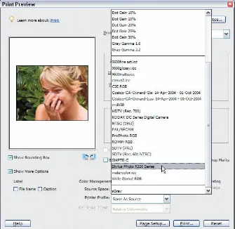
Printing to Epson Inkjet Printers...251
Using automatic profile selection...252
Selecting a printer profile manually...259
Printing with a printer profile in Windows...259
Printing with a custom profile ...261
Printing to HP Inkjet Printers...262
Printing to HP printers in Windows ...263
Printing to HP printers on a Macintosh...264
Printing to Canon Printers ...265
Printing to Canon printers in Windows ...265
Printing to Canon Printers on a Mac...266
Renaming Color Profiles...268
Printing Contact Prints...268
Choosing Paper and Inks...271
Chapter 14: Soft Proofing Color . . . .273
Understanding Soft Proofing...273
Converting to an Output Profile ...274
Converting color in Windows ...274
Converting profiles by using operating system tools on a Macintosh ...277
Viewing the Soft Proof ...279
Part V: The Part of Tens ...283
Chapter 15: Ten Tips for Better Tone and Color . . . .285
Calibrating Your Monitor ...285
Using a Gray Card...286
Or Using the GretagMacbeth ColorChecker ...287
Shooting Pictures in Proper Lighting...287
Shooting Photos against a Background...288
Using Curves Adjustment Layers...288
Shooting in Camera Raw ...289
Editing 16-Bit Images ...289
Editing for Content...290
Using Filters ...290
Chapter 16: Ten Reasons to Upgrade to Photoshop . . . .293
Using the Curves Dialog Box ...293
Using the Channels Dialog Box...297
Changing Bit Depth ...298
Improving Dynamic Range ...300
Converting to a Profile...303
Proofing Color...304
Embedding Profiles ...304
More Options for Using Camera Raw ...305
More Selection Tools ...306
Y
ou rarely find a photo you can take with a digital camera or scan on a desktop scanner that doesn’t need some kind of brightness, contrast, or color correction. Taking pictures with your camera is only half of your job when you want to print pictures or host them on the Web. The other half of your job is editing in your digital darkroom.In this book, you can find out how to get color just right by setting up a digi-tal darkroom in your home (or wherever you work on your digidigi-tal photos) and using the plentiful and robust tools in Photoshop Elements to correct tone and color.
About This Book
In this book, we try to provide a comprehensive view of tone and color cor-rection, using the tools available in Photoshop Elements versions 4 and 5. We stick to what Elements provides you in the application without using third-party products designed to overcome limitations in the program. What Elements offers off-the-shelf is all you need to create the pictures you want with proper brightness, contrast, and color.
Who This Book Is For
If you’ve had problems getting brightness and color correct on your pictures, this book is for you. This book is also meant for Photoshop Elements users.
If you’re a Macintosh user, you’ll find this book equally as helpful as Windows users do. We use screen shots from the newest release of Photoshop Elements, which is available only in Windows, as of this writing. However, just about all the techniques, the dialog boxes, and almost all tools are the same in a Mac’s Photoshop Elements 4 as those found in Window’s Photoshop Elements 5.
Conventions Used in This Book
We point you to menus where you’ll frequently access commands throughout the book. You need to know how to decipher the references for where to go when we detail steps in a procedure. First off, you need to know how we show accessing a menu command. You might see something like this:
Enhance➪Adjust Color➪Adjust Color for Skin Tones
When you see commands such as these, we’re asking you to click the Enhance menu to open that menu, then click the menu command labeled Adjust Color to open a submenu. In the submenu, select the Adjust Color for Skin Tones command. Many of the menu commands we talk about then open a dialog box where you perform your editing.
Another convention we use relates to using keystrokes on your keyboard. When we mention some keys that you need to press on your keyboard, the text looks like this:
Shift+Ctrl+M (Shift+Ô+M on Macs)
In this case, you need to press the Shift key, the Control key in Windows (the
Ôkey on a Mac), and the M key at the same time. This keyboard shortcut opens the Adjust Smart Fix dialog box.
How This Book Is Organized
This book is divided into logical chunks (parts). Chapters that discuss related topics are grouped together in five different parts.
Part I: The Basics of Color Editing
The first three chapters in the book are devoted to understanding color, cali-bration, and the essentials you need to do to prepare your color editing envi-ronment. We talk about terms and concepts you need to know for any kind of color correction and tonal editing. Be certain you understand the concepts in these three chapters and, in particular, make sure you get your monitor cali-brated for proper color viewing.
Part II: Image Brightness and Contrast Corrections
in Photoshop Elements to get the proper brightness and contrast in your pic-tures. As you can discover for yourself, doing these corrections first makes the job of color correction much easier.
Part III: Color Corrections
This part relates exclusively to color correction, and it’s by far the largest part in the book. We cover color correction techniques for a wide variety of image problems related to color reproduction. You can find out all that Elements has to offer for professional color-correction methods, and we avoid using menu commands and tools that just don’t measure up when you want to create quality images.
Part IV: Finishing Work
This part is limited to color printing. We talk about what you need to do to get your output to look like your monitor and how to print your pictures with color profiles. We cover several, common, consumer-grade printers and how you print your files to these printers.
Part V: The Part of Tens
We wrap up the book with the Part of Tens chapters, where you can find tips for better tone and color corrections. After you gain experience with Elements and the techniques in this book, if you become curious about upgrading to Photoshop, we provide a chapter that offers an overview of Photoshop’s additional features for correcting brightness and color.
Icons Used in This Book
In the margins throughout this book, you see icons next to key paragraphs. These icons indicate some important information in the text they accompany. Here are the icons and their meanings:
Tips tell you how to use an alternate method for a procedure, shortcut, or workaround, or they give you other helpful information related to working on tasks in the sections in which they appear.
This icon gives you a heads-up about something you may want to commit to memory. Usually, it informs you of a shortcut or a repetitive task, where remembering a procedure can save you time.
No matter how hard we try to simplify our explanations of features, we can’t entirely avoid the technical. If we think something is complex, we use this icon to alert you that we’re moving into a scary, technical subject. You won’t see many of these icons in the book because we try our best to give you the details in nontechnical terms.
When you see this icon, the text it’s next to includes a reference to a file on the companion Web site for the Color Management for Digital Photographers For Dummiesbook. Log on to www.dummies.com/colormanagement, and you
can download files that we uploaded to help you follow some important steps. If you have a little time, visit the Web site and download all the files so that you have them ready to use when you see this icon in a chapter.
Where to Go from Here
The first part of this book involves the basics of color, and it’s the foundation for all the remaining chapters. Try to spend a little time going through the first three chapters in Part I. Next, be sure to thoroughly review Part II. You need to become familiar with tone and brightness corrections before moving on to color correction. After reviewing Part II, feel free to jump around the color correction chapters.
If you have some questions, comments, suggestions, or complaints, send your comments to [email protected].
As an additional source of information, feel free to contact us, the authors, directly with any questions you have related to the book contents. You can reach Ted at [email protected], and you can contact Don at
We wish you much success and enjoyment in using Adobe Photoshop
Y
ou need to walk before you can run. In Photoshop Elements terms, you need to know some basics about color and calibration before you can start color correcting photos.1
Understanding Color
In This Chapter
䊳Getting the essentials of managing color
䊳Speaking the language of color
䊳Mixing three hues into millions of colors
䊳Choosing the right color mode for your image
䊳Switching between color modes
I
n order to manage and correct color photos, you need to understand a few things about how your digital camera, your computer, and your printer handle color. The tools you use to create your photos capture and display color in a consistent manner. Although not the most exciting aspect of cor-recting an image for proper color viewing, the basics of color and how your devices deal with color is an essential ingredient to producing better color photos. In this chapter, we cover some essentials of color that you need to know as you work through all the other chapters in this book.Understanding Calibration Basics
Throughout this book, we talk about working in a good color-management workflow. Developing such a workflow begins with the essentials — setting up your work environment, getting your monitor in shape, and using your color desktop printer properly.
In this book, we talk about some sophisticated measures to help you best view, edit, and print color images. In some cases, you may think that some recommendations and tips we
One thing to keep in mind is that the more preparation steps you cut out of your color-management workflow, the farther you move away from accurate color reproduction. Therefore, you may decide to eliminate some things that we consider critical to preparing your work environment; but realize that you can’t expect to achieve the most accurate color in your photos.
We tried to write this book in such a way that you don’t need to read it cover to cover, but even so, you do need to work through some essentials in order to dive into Elements’ Standard Edit mode and begin editing your pictures. You can’t avoid these essentials — you need to address them before you begin image editing. To prepare your work environment and set up your com-puter for good color management, you need to do some preliminary tasks:
⻬Controlled lighting:One of the most commonly overlooked areas related to good color-viewing conditions is carefully setting up your viewing environment. If you work on a super professional color monitor, have your monitor tweaked with a $5,000 color calibrator, and use the most sophisticated color profiles, you’re only halfway to managing color. If light coming through your window and from your overhead light fix-tures results in a colorcast on your monitor, you’re not working in an optimum viewing environment. The first consideration you need to make is controlling the lighting of your workplace. We cover setting up lighting in Chapter 2.
⻬Monitor calibration:You’ve heard it all before, and we repeat it here — you need to be certain your viewing device reflects the best possible brightness and gray balance that you can get. On the low end, you can purchase some inexpensive calibration equipment; on the high end, you can purchase some very sophisticated calibration tools. At some point, you need to use a device to get your monitor to display the best it can, in terms of brightness and gray balance, as we explain in Chapter 3.
⻬Color profiles:You may have heard the term color profiles before. A color profileis a small computer file that contains all the settings that give you the best color capture, view, and/or print. If you don’t use color profiles, your reproduction efforts are like taking a shot in the dark.
There you have it. Your first steps in color correction involve controlling lighting, calibrating your monitor, and having all the color profiles you need for editing images and outputting them either for Web hosting or printing. After you have these essentials in place, you can begin the task of color correction.
Getting to Know the Language of Color
Color terms and definitions can be very confusing, but for this book, we use the same terms and concepts that Adobe Photoshop Elements uses and avoid all the fancy scientific stuff you really don’t need to know to edit your images.
Color is defined by just three terms: hue, saturation, and brightness. In order to make the concept of correcting color much easier to understand later in the book, we also give you the definition of a complementary color, which means the exact opposite (on the color wheel) of the color you’re looking at.
Stay awake because the following sections are really important.
Hue
Hueis the term used to name the actual color you’re looking at. Your eyes perceive only three pure colors, but those three colors mix in your brain to give you all the colors you actually see.
The human eye has special receptors called cones. Cones come in three dif-ferent kinds, each sensitive to a narrow portion of the light spectrum humans can see. One cone type responds to short wavelength light and sees blue. One cone type responds to middle wavelength light and sees green. The last cone type responds to the longest wavelengths and sees red. Our eyes’ three-color cone design is why your monitor can show you millions of three-colors, even though it projects light in just three pure hues: red, green, and blue. These colors are known as the additive model.
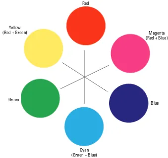
Photoshop Elements works with color by mixing (adding) red, green, and blue. You need to identify these hues in the same way that Photoshop Elements does. Take a look at the color wheel in Figure 1-1.
Figure 1-1: This simple color wheel shows red, green, and blue hues.
The first thing you might question is the yellow patch, made from green plus red. Keep in mind that you’re mixing light, not paint. Mix equal parts of red and green light, and you get yellow. No, we’re not making this up! Your eyes see yellow when something you’re looking at emits equal parts of green and red light.
Still doubt us? Well, paint a yellow patch on your monitor in an Elements file, then zoom in and look very closely at the monitor. The only colors you see are little, glowing pixels of green and red. It’s counter-intuitive, but green and red light make yellow.
Red
Yellow
(Red + Green) Magenta
(Red + Blue)
Blue
The next color that might confuse you is blue. It looks purple, you say? You also might think that the cyan patch should really be called blue. Remember, you’re mixing light, not paint.
Your kindergarten teacher is probably to blame for the confusion. Back when you mixed paints in those long-ago classes, she showed you that blue and yellow mixed together made green, and you probably had a pot of paint called purple that looked like the blue patch on our color wheel.
Mixing paints to get different colors uses subtractive primaries. The subtrac-tive primaries are cyan, magenta, and yellow. Your teacher probably called them blue, red, and yellow. It made naming the paints a lot easier, but it wasn’t really correct.
Equally mixing the red, green, and blue primaries create cyan, magenta, and yellow on your monitor, as shown on the color wheel in Figure 1-1. Just remember that you need the basic hues of red, green, and blue to make a full range of hues (or colors) on the computer.
Colors exactly opposite of each other on the wheel are called complementary colors.Mix the complementary colors together on the monitor in equal parts, and you get a shade of gray, light gray, or white. The complementary colors cancel each other out. We talk more about this concept of colors canceling each other out in Chapter 8, where we show you how to correct the color on a bad image file.
Saturation
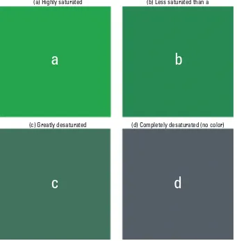
The term saturationdefines the purity of a hue. Saturation is pretty easy to understand if you look at a few examples, such as the ones shown in Figure 1-2. The green patch in Example A is a highly saturated hue. In Example B, the patch is the same hue but less saturated. In Example C, the patch is desatu-rated more than B. Finally, in Example D, you see the same hue completely desaturated and therefore devoid of color.
Saturation defines the vividness of the hue in question. Think of a desatu-rated color as one with white, gray, or black mixed in. Gray represents a fully desaturated tone — no color at all.
Brightness
Figure 1-2: A green patch shown at different levels of saturation.
Figure 1-3: These three cyan color patches vary in brightness values, from least bright on the left to brightest on the right.
(a) Highly saturated (b) Less saturated than a
(c) Greatly desaturated (d) Completely desaturated (no color)
a
b
We repeat these color concepts a great deal in this book as we work our way through color management. Editing a file to change overall color, brightness, and contrast often affects the hue, saturation, and brightness of the colors in your file. Understanding how to define those changes can make the rest of the book far easier to understand.
Color space
Throughout this book, we continually refer to the term color space. Color spaceis a way to numerically describe color on computers. Color space is also often referred to as a color model.RGB (Red, Green, and Blue) is a color space. CMYK (Cyan, Magenta, Yellow, and blacK) is a different color space. HSB (Hue, Saturation, and Brightness) is a color space that describes color as we define it in the preceding sections.
For most purposes, because Elements is limited in the number of color spaces that you can view, we pretty much stick with the RGB color space throughout this book.
Color gamut
Another term you find frequently used in this book is color gamut. Color gamut is simply the entire range of color within a given color space. We might use a phrase such as “outside the color gamut,” which simply means that a particular color isn’t contained within the range of color for a particular color space. As a result, you can’t see the color on your monitor, and you can’t print the color on your printer.
You might have a color visible on your monitor because it fits within the monitor color gamut, but the color may not print on your color desktop printer. The color isn’t within the printer’s color gamut.
Clipping
Quite often, we talk about colors or tones being clipped,which means that the value is cut off. A color that’s clipped, for example, won’t print. When Elements prints a photo that has some color clipped, the print shows you the closest color to the clipped value. Beyond that value, the clipped colors aren’t printed.
Suppose you took a picture in which the foreground subject is in the sun. In the background, your eyes see a beautiful range of shaded trees. When you print your photo, the leaves on the trees aren’t completely visible. They look dark and don’t have much detail. The dark tones were clipped (cut off) from the image.
Mixing Colors
Your computer monitor is capable of displaying a total of 16.7 million distinct and individual colors. The monitor is capable of showing you all these colors by mixing the primary hues of red, green, and blue together. Understanding how your monitor mixes the colors ultimately helps you understand how to edit your pictures for color correction.
Imagine a diaphragm similar to your camera’s diaphragm. You can turn the f-stop ring to open or close the diaphragm. As you open the diaphragm, you let more light pass through the lens. If you could close a diaphragm all the way on a lens, you would block all light from passing through the lens.
When your monitor displays a color, it allows certain amounts of light to pass through the RGB color phosphors in a similar fashion to a camera lens. The monitor can control the amount of light that passes through the phosphors in 256 individual steps. It’s like having a ring on your camera lens with 256 separate adjustments.
In computer terms, 0 (zero) is a number; therefore, the 256 value is really measured from 0 (zero) to 255. If you assign 255 to the red hue and 0 (zero) to the green and blue hues, you see a fully saturated red color on your monitor. To test this theory, follow these steps:
1. Open any file in Standard Edit mode.
2. Double-click the mouse cursor on the Foreground color swatch in the Tools palette.
The Color Picker dialog box opens.
3. Set the color to a fully saturated Red.
Figure 1-4: The Color Picker identifies a fully saturated red color.
Understanding grays
The number of distinct settings you have for color mixing are commonly called levels of gray.Because the computer monitor doesn’t have a diaphragm, you need some method for controlling the amount of light that passes through any one of the three RGB phosphors.
Try to visualize a large plate of glass. If you paint the glass solid black and place a light behind the black glass, zero light passes through it. If you then paint a glass plate 50 percent gray, some light passes through the glass. As you reduce the level of gray to smaller percentages, more light passes through the glass, resulting in more saturated color.
Hence, in Photoshop Elements terms, you have 256 levels of gray that permit you to increase or decrease the saturation on the three individual hues. Remember when we said that your computer monitor can display 16.7 million distinct colors? We got this number by multiplying the maximum number of grays for each hue together (256 ×256 ×256 = 16.7 million). This number
Understanding channels
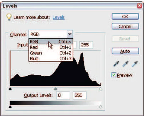
In Photoshop Elements terms, the three hues your monitor displays (red, green, and blue) are called channels. You can easily see the three channels by opening an RGB color image in Standard Edit mode and opening the Levels dialog box. Select Enhance➪Adjust Lighting➪Levels or simply press Ctrl+L (Ô+L for Macs). When the Levels dialog box opens, click the RGB menu (the down-pointing arrow), and you see the three channels, as shown in Figure 1-5.
Figure 1-5: In the Levels dialog box, you can access the three RGB channels.
We commonly refer to the RGB channel as the composite channel because it’s a mix of the different gray levels in all three channels. If you make an adjust-ment to this channel, all three RGB channels are adjusted together. However, you can also individually make adjustments to the Red, Green, and Blue channels.
When we refer to making adjustments to either the composite channel or the individual channels, we’re really talking about painting that imaginary glass darker or lighter to allow more or less light to pass through, resulting in more or less saturated color.
Why are there 256 levels?
This 256 number comes up a lot when talking about image modes. What makes it so special?
Reproducing tone on paper or a monitor requires a minimum of about 200 tone levels to give smooth results without banding(or making sharp transi-tions between) the tones in smooth gradient image areas. Some images can get along with far fewer levels of tone, such as highly textured images or those that don’t really contain any smooth tones.
Two hundred tone levels is a kind of minimum benchmark for good results. So why 256 levels and not exactly 200? It has to do with the way computers calculate. Computers use binary math, and 8-bit encoding allows exactly 256 tone levels. Seven-bit would result in just 128 tone levels. So, 8-bit mode became the minimum standard for full tonal range image files.
The 256 tone levels of 8-bit mode also allow a little headroom for file editing. Image editing always causes some amount of information loss, and as a direct result, an edited 8-bit file always has less than 256 real tone levels remaining. The extra 56 levels allow more editing before any tone banding problems become visible.
Understanding Color Modes
A color modeis a fancy term for the method Elements uses to display and print your image. Elements allows you a choice of four different color modes. And although Elements doesn’t support the CMYK mode, it can convert a CMYK-mode file to a mode it does support.
RGB
You’ll probably use RGB, Elements’ standard default mode, 99 percent of the time. This mode uses three channels (Red, Green, and Blue) to describe color and tone. This mode is the most versatile and gives you access to all the edit-ing tools and filters in your Elements application. RGB files allow embedded color profiles (which we talk about in Chapter 4).
Index color
color file sizes as small as possible. Computers couldn’t display 16.7 million colors back then, so monitors that showed images in only 8-bit mode used index color.
Web pages still use index color today, in the form of GIF-format files that are limited to 256 colors. The Save for Web option in Elements allows you to save files in the GIF format, if you want.
The main advantage to the GIF format is the ability to keep graphic elements clean and sharp on Web pages, unlike JPEG files, which can add distracting visual artifacts to graphics when the JPEG files use high compression set-tings. But index color doesn’t allow the use of color profiles.
Grayscale
You can think of grayscale as the black-and-white image mode, in terms of black-and-white photos. Just a single channel is used to describe image tone without color information. Grayscale has 256 distinct gray levels supported in 8-bit mode and more than 40,000 gray levels in 16-bit mode.
Grayscale mode has advantages if you like to work with classic black-and-white photography. Grayscale files are just one-third the size of an RGB file, so you get much faster computer performance and can store more files on your hard drive.
If you want to tone, paint, or tint a grayscale creation, you must convert to RGB mode to do so.
Grayscale supports embedding special profiles to indicate the display Gamma used and also for dot gain if the file is for traditional press use.
Bitmap
Bitmap is a 1-bit file format. One bit means that only two tone values are supported — just white and black with no grays. Bitmap can simulate gray values by using a display we call dithering, which places the black and white pixels in a pattern to visually appear as grays.
CMYK
You can’t edit in this mode, but Elements does allow you to open a CMYK color mode file that Elements converts upon opening to RGB mode so that you can work with the image.
CMYK is the color mode used for traditional printing press reproduction of color images. For example, this book was printed from CMYK-mode files.
Printing presses need to use four separate ink plates to reproduce full color images on paper. The press plate colors are cyan, magenta, yellow, and black, so it’s called CMYK mode. (Black is abbreviated K because, a long time ago, people were afraid that using B for black might be confused with blue.)
CMYK supports embedded color profiles. (We talk about color profiles in detail in Chapter 4.)
Converting Color Modes
In some situations, you need or want to convert one image mode to another. You may need to convert a grayscale or bitmap file to RGB so you can col-orize, paint, or tint the image for output to a color printer. If your file’s in bitmap mode, you must convert first to grayscale and then to RGB mode. You can make these conversions by selecting Image➪Mode and then selecting a color mode from choices in the submenu that appears.
In other situations, you may need to convert from RGB mode to index color mode for Web use. Sometimes, you need to make a mode conversion from index color to RGB so you can edit the file for color or tone, before convert-ing it back to index color mode.
Follow these tips when you make image mode conversions for editing:
⻬To allow full editing capabilities for an index color file, convert the file to RGB mode, edit it, and convert it back to index color mode.
⻬If you plan to create multiple images for use in index color mode, keep your original files in RGB mode and convert duplicates. You can’t recover the information you lose when you convert RGB mode to index color mode.
⻬Grayscale mode has far more editing options than bitmap mode. It’s best to keep master files in grayscale mode and convert to bitmap mode as a final step before viewing or printing the file.
2
Controlling Lighting
In This Chapter
䊳Understanding color temperature
䊳Balancing lighting in your room
䊳Creating a neutral gray work environment
C
orrecting color in digital images requires you to optimize your working conditions for the best possible viewing environment, as well as make sure all your equipment is calibrated properly. Getting color precise with absolutely no discernible differences isn’t completely possible when viewing color images on monitors and printing photos on a wide range of output devices. Therefore, what we strive for is to control the variables as much as possible to bring our color viewing and printing together as close as we can. If you skip one variable in the process, you move just a little farther away from an ideal color-matching system.In this chapter, you take the first step toward controlling those variables — creating the optimal lighting in your workspace. Accurate and consistent color editing requires full-spectrum lighting, with a color tempera-ture reasonably matched to the monitor color tem-perature setting so that both the viewing area and monitor view are consistent with one another.
Most quality, full-spectrum lighting used today involves fluorescent-type lighting fixtures that use special lamps with a sophisticated phosphor mix that yields a full, white-light spectrum.
color-correction work. We give you the whole nine yards here and in Chapters 3 and 4, where we cover monitor calibration and color profiles, and you can pick and choose what changes you want to make in your workplace. Hopefully, you know that if you cut a lot of corners and you expect to do quality color work, you’re not likely to achieve the best possible results.
Understanding Color Temperature
We could have titled this section “What Color Are Your Whites?”In the com-puter world, white is a relative value.
Your eyes and brain are constantly at work adjusting what you see to let you perceive a pure white when you find it. This is why you can move from a department store to the great outdoors and not notice the change in lighting color from one place to another.
Unlike a camera, we tend to see colors as normal no matter what kind of light is illuminating a scene. Set your camera to daylight balance, however, and that department store interior most likely photographs with a strong, yellow-green colorcast from the indoor fluorescent lighting. Your eyes see no cast at all. That’s because your brain figures out a real white point and adjusts your internal white balance in an instant — pretty amazing.
This property of your eyes is very important when it comes to editing images on a monitor and viewing the resulting print outputs. You see, your eyes can adjust to only one viewing environment at a time. Why is this important?
Well, if you have a monitor set to one white balance and your viewing area has a different white balance, images on them look differentto your eyes because your brain can adjust for only one situation at a time. We have to try our best to match the monitor whites to our viewing area whites. If we don’t, a perfect printer output looks like a mismatch to the monitor.
The term used to define white balance is called color temperature.In simple terms, average daylight has a color temperature of around 5,000 degrees Kelvin. The term has to do with the color of light from very hot objects like the sun. That’s why 5000K is a kind of standard for neutral white.
However, as we said, white is relative.
However, remember that the lighting of the room impacts the way you per-ceive color on your monitor, too — which is why it’s important to start set-ting up your color-management work area by making the room’s lighset-ting as close to daylight as possible before moving on to calibrating your monitor, which we explain in Chapter 3.
The best possible lighting for viewing should be daylight balanced,which requires lights in the 5000K to 6000K color temperature range.
Using Balanced Lighting
Balancing lightingis an attempt to make the quality of your indoor light as close to natural daylight as possible. With different light bulbs in studios and homes, the balance of your ambient light varies farther away from natural daylight, although the extent of this variation depends on the light sources influencing your environment.
The color quality of light is rated as the CRI(color rendering index) in per-centage values. A CRI of 100 percent is a perfect match to natural daylight, although the best lamps available are rated around CRI 98 percent — a very close match to natural daylight. A standard, cool-white, fluorescent lamp has extremely poor color quality and is rated at about CRI 60 percent. Full-spectrum lights fit in standard fluorescent fixtures and are also available in the new Spiralux form that fits in a standard light bulb fixture. By checking this rating when you shop for light bulbs, you’ll have a better idea what bulbs can help create an environment that’s as close as possible to natural daylight.
Ideally, the Kelvin rating(color of the lamp) should match closely to your moni-tor’s color temperature setting. A 5000K lamp (daylight balance) should, ideally, be used with a 5000K monitor setting. We find that the lamps seem a bit cooler (bluer) in color than the same monitor setting, at least on a CRT monitor, so we use 5000K lamps with a 5500K monitor setting. Your mileage might vary depending on your monitor and available natural light in your studio.
Prices for these lamps are usually about three times or more higher than prices for inexpensive, cool-white lamps. The good news is that they last for years, and some are very reasonably priced. Don’s studio uses standard, 96-inch fluo-rescent fixtures that are fitted with Sylvania Sun Stick lamps that are rated at 5000K and a CRI of 92. Cost is about $8 per tube. You can find Sun Stick lamps at your local home improvement store. The homemade viewing booth, shown in Figure 2-1, uses a pair of 48-inch Triten 50 full-spectrum tubes. Color temper-ature is 5000K, with an awesome CRI of 98 percent. Cost per tube is $6. To purchase the Triten 50 full-spectrum tubes, visit www.1000bulbs.com. This
vendor also stocks Spiralux full-spectrum lamps. Just look for Full Spectrum
Figure 2-1: A homemade, color-correction workplace.
Keeping the lighting consistent is important. The lighting in a room with large windows varies a great deal during the day. For viewing purposes, a win-dowed room should have good curtains or shades to keep ambient light levels consistent at all times. Visual monitor calibration is based on the view-ing environment. In a windowed room without shades, monitor calibration is like a broken clock — it’s always correct once a day!
Going for Neutral Gray
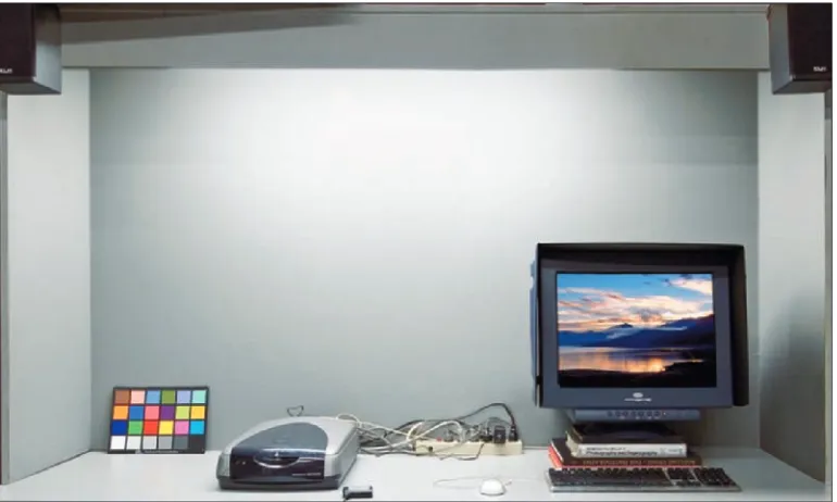
Building a viewing booth
For a makeshift viewing booth, follow these steps:
1. Purchase an 18 percent gray card.
You can find 18 percent gray cards at photo suppliers. Just ask a sales person for a gray card or shop online at photo suppliers. A good online source for all your photographic needs is www.calumetphoto.com. You can also use a QPcard like the one shown in Figure 2-2. These cards have a neutral gray as well as a black and white patch you can use when photographing scenes. You can purchase the cards at Calumet Photographic as well.
2. Purchase a paint that matches the color of the gray card.
Take your 18 percent gray card to your local paint store and ask for a flat paint that matches the color of your gray card when the paint dries. Most hardware and commercial paint stores are happy to provide exactly what you need.
3. Construct your booth.
Using particle board or unfinished plywood, construct the booth so that it surrounds the viewing space around your monitor. You might paint the unfinished wood or particle board before assembly.
4. Touch up the paint.
It’s not a piece of fine furniture, but you might spruce it up a little with some touchup paint if you paint the material before assembly.
5. Set up your monitor.
If you have a CRT monitor(which is a television-type of monitor), you can cut a hole in the back of the booth (see Figure 2-3) and push the monitor back to provide more surface area for your keyboard.
Employing viewing booth alternatives
A viewing booth is ideal for photo editing, but here are some tips for your viewing environment if you feel a viewing booth is overkill for your needs.
⻬Get a piece of gray foam core board and place it behind your monitor in your viewing area. Having a neutral value in your field of vision helps a great deal. You can store the gray board when you’re not using it.
⻬Cover your working surface with a neutral material, especially if your desk surface is a bright color. It doesn’t have to be gray, although gray is best. A white tablecloth is fine for this. You can even place a second piece of gray foam core board on the viewing surface.
⻬Add some daylight-balanced Spiralux lamps to your existing light fixtures.
Just remember that keeping your viewing area devoid of competing color makes image editing much easier.
Get rid of the swimming fishes
When you open a program like PhotoshopElements, you’ll notice the default background color in the Elements window is a neutral gray. Software engineers set this color as a default intentionally because neutral gray is the best color to minimize any colorcasting problems and visual perception anomalies when viewing your color photos.
If you use a desktop color or image, you infect your viewing environment with extraneous
color. This is most obvious when you minimize the Elements window and see the desktop pattern in the background.
3
Calibrating Your Monitor
In This Chapter
䊳Understanding monitor calibration
䊳Knowing the differences between CRT and LCD monitors
䊳Using hardware devices to calibrate your monitor
䊳Making hardware adjustments on LCD monitors
䊳Calibrating an LCD monitor with software
C
alibrating your monitor is the second phase of setting up your color-management environment, after you take steps to control lighting, which we explain in Chapter 2. By calibrating your monitor, you ensure the color temperature is as close to daylight as possible, not only so you see colors more accurately, but also to ensure that the color temperature of your moni-tor is balanced with your room.What Is Monitor Calibration?
Your monitor needs to be calibrated so that it accu-rately displays the colors contained in any given image. You calibrate your monitor by adjusting a number of different variables, which may include the following, depending on your monitor and the tools you use to calibrate:
⻬The balance of colors on your monitor:This bal-ance corrects any color tints or colorcasts.
⻬Brightness:The brightness control historically adjusts the black point, which is the darkest point on the monitor.
⻬Gamma:Gammais the brightness of mid-level tones in an image.
In technical terms, Gamma is a parameter that describes the shape of the transfer function for one or more stages in an imaging pipeline.
⻬White balance:You adjust the white balance setting to try to get the brightness as close to natural daylight as you can.
You have a few choices for what tool you can use to adjust your monitor brightness:
⻬Expensive calibration equipment that can cost $3,000 or more
⻬A low-cost hardware device priced at less than $300
⻬Software tools provided by Adobe (or your OS developer) to set up your monitor
We discuss how you use low-cost hardware devices and software tools in the sections “Calibrating with Hardware Devices” and “Adjusting Hardware Controls on an LCD Display,” later in this chapter.
Working with CRT versus LCD Monitors
Computer monitors come in two flavors — CRT (cathode ray tube) and LCD (liquid crystal display). The CRT monitors look much like old TV sets, and the LCDs offer a sleeker, thinner look. Each type has its pros and cons when it comes to monitor calibration.
LCD monitors, although now more prolific and newer in the marketplace, just don’t match the color clarity you find in CRT monitors. In addition to improved color clarity, CRT monitors also cost much less than LCDs. As of this writing, a Dell Trinitron 21-inch display sells for less than $200 at online reseller outlets — try www.tigerdirect.com. CRTs have their downside, however. In addition to their large size, overall bulkiness, increased power consump-tion, and the excess heat they produce, they’re becoming increasingly scarce. Many CRT manufacturers have discontinued entire lines of CRTs in favor of the newer LCD technology.
formula, however, because monitors vary greatly in fidelity and life expectancy. You can easily check the date a monitor was manufactured by looking at the label affixed to the back of the monitor.
Because of the popularity of LCD monitors and the anomalies associated with calibrating LCD displays, we thought we’d point out some real problems you may encounter when trying to calibrate an LCD display with the visual (soft-ware) calibration utilities for both Windows and the Mac.
The visual calibrators were designed with CRT displays in mind. LCDs differ from CRTs in two fundamental ways:
⻬LCDs are much brighter than CRTs and have a much higher overall contrast.Setting picture contrast to the highest setting on an LCD, as instructed by the calibration utility, usually makes the picture far too bright for the calibration utility to work properly.
⻬The LCD monitor controls work differently than CRT controls.CRT brightness and contrast controls are part of the monitor hardware, just like a CRT television set. The brightness control adjusts the black point, and the contrast control adjusts the white point by varying the output of the electron guns. The same is true of the color adjustments.
An LCD (unless it’s a very expensive professional model) varies the brightness and contrast by changing the internal monitor color Look Up Tables (LUT) to change the monitor image. The backlight is always bright — very different from a CRT.
We worked long and hard to create a foolproof way to visually calibrate an LCD monitor. If you decide to use a visual calibration tool, check out the sec-tion “Adjusting Hardware Controls on an LCD Display,” later in this chapter, and you should get a result that matches your print outputs much more closely than the monitor default settings. Just keep in mind that you need to use a hardware calibration device for the very best results.
An LCD monitor that’s calibrated for print work always looks darker and warmer in tone than with the factory default settings.
Calibrating with Hardware Devices
We skip the high-end costly devices and suggest that, at the very least, you should make one valuable purchase for creating a monitor profile — a hard-ware profiling system. (See Chapter 4 for more on monitor profiling.)
On the low end, you have some very affordable devices that go a long way in helping you adjust your monitor brightness and color balance:
⻬ColorVision Spyder2express:This calibration system is one of the newer devices on the market. For as low as $69, you can purchase an easy-to-use, three-step device that balances the color on your monitor and adjusts it for optimum brightness (for both Macs and PCs). This device is receiving five-star ratings at online resellers, including www.amazon.com.
⻬Pantone Huey Monitor Color Correction system: This new, low-cost calibration system can calibrate both CRTs and LCDs (and supports both Macs and Windows). This unit retails for $88 and sells for $74.95 at Amazon.com, as of this writing.
⻬GretagMacbeth Eye-One Display 2:For a little more money, you can order this low-end calibration device with superb capabilities from GretagMacbeth (www.gretagmacbeth.com) — a company that has long been a leader in sophisticated hardware equipment for creating calibra-tions and color profiles. This device costs $249, as of this writing.
Eye-One Display 2 is an easy-to-use profiling tool that works with CRT displays, LCDs, and laptop computers. You attach the suction cup that comes with your Eye-One Display 2 to your monitor (see Figure 3-1), click a few buttons in the software application accompanying the hard-ware, and Eye-One Display 2 eventually prompts you to save a monitor profile. Your operating system automatically uses the profile you create when you start up your computer. When the profile kicks in, your moni-tor is balanced, using the settings determined when the device per-formed the calibration.
Figure 3-1: The Eye-One Display 2 calibration device helps you create a monitor profile.
Adjusting Hardware Controls on an LCD Display
What do we mean by visual calibration? If you don’t purchase at least a low-cost hardware calibration device, such as those discussed in the preceding section, or you need to quickly color correct some photos of the family reunion before your device arrives, you can use a software utility already available on your computer.
Before you can use the visual calibration tools on a Windows machine or a Mac, you need to do a little work making some hardware adjustments. Without making some hardware corrections, your software calibration tools won’t get your monitor to closely match your printed output for color and brightness.
LCD monitor controls vary a great deal. Some LCDs have full control of brightness, contrast, white point, and color balance (using individual red, green, and blue controls). Others have some combination of these controls, and some offer only color-balance presets for the red, green, and blue con-trols. In the following sections, we try to explain the best methods to use when making hardware adjustments, in spite of the lack of consistency among LCD-monitor makers.
We ran across a couple of Dell LCDs with just preset and RGB-slider controls (that is, sliders that adjust the levels of red, green, and blue). Because a Dell monitor of this type is a popular brand, we’ll start here. Many other LCD monitors are limited to just these controls, too, so try to apply our example of adjusting a Dell monitor to your brand. Here are the steps to follow:
1. Open the hardware adjustment controls on your monitor, and you’re presented with some-thing like you see in Figure 3-2.
The monitor has no brightness or contrast controls! Developers continually rely on
auto-brightness and -contrast adjust-ments, and many are eliminating these manual controls on LCD displays.
2. On the Dell monitor, navigate to the Color Settings option and open the adjustment settings.
You find options like those you see in Figure 3-3.
On an LCD, you may have to navigate through the controls on your remote control device or on the monitor.
Figure 3-3: You can make adjustments to the Color Settings on a Dell monitor.
The Color adjustment contains a limited series of presets and a user preset with RGB controls. You don’t have a Color Temperature option on this monitor. (For an introduction to color temperature, see Chapter 2.)
The Normal Preset monitor setting is a generic setting that seems to adjust for the normal blue color bias of an LCD monitor.
3. Make note of the settings and close the Color Settings panel.
To get close to a proper gray balance, we need to mix less blue than green and less green than red. Our monitor has a slight blue cast and is much too bright at the default settings.
4. In Photoshop Elements, open the MonitorCalibrationFile.tiffile (shown in Figure 3-4) in Standard Edit mode.
We provide this monitor calibration file, MonitorCalibrationFile.tif, in the Chapter 3 folder on the Wiley companion Web site for you to down-load. (See the Introduction for details about the Web site.)
5. Size the image to about one-fourth of your monitor size by pressing Ctrl+– (minus) to zoom out.
Figure 3-4: You can use our Monitor Calibration File to get your monitor looking just right.
6. Open the monitor Color Settings control (one of the LCD monitor con-trol buttons).
7. Select User Preset and reduce the Red output to 75 percent.
We start with this setting because we need to cut overall brightness to make sure the monitor’s appearance matches images you print from your computer.
8. Using only the Green and Blue sliders, adjust the color settings to obtain the best neutral gray that you can on the test file and Photoshop Elements’ neutral gray background.
Placing a standard photographic gray card next to the monitor can really help you determine a true neutral gray.
After you have the best gray, you’re now ready to use the visual soft-ware calibration tool. If you have a PC, see the following section, “Using Adobe Gamma.” If you’re using a Mac, jump to the section “Calibrating with just RGB controls on a Mac,” later in this chapter, instead.
Using Calibration Software
calibrating your monitor is the best solution. However, if you don’t have a hard-ware calibration device, using a softhard-ware tool to calibrate your monitor is the next best thing to getting the monitor brightness correct.
Using Adobe Gamma
The Adobe Gamma application has been around for some time. It was dis-continued on the Mac version of Elements when the Mac OS X operating system was introduced. However, on the Windows version of Elements, it remains the software utility to use. Like the Macintosh Display Calibrator Assistant (which we describe in the section “Calibrating with just RGB con-trols on a Mac,” later in this chapter), Adobe Gamma enables you to figure out proper monitor adjustments that you can eventually save as a monitor profile.
To use the Adobe Gamma control panel device, follow these steps:
1. Open your Control Panel by clicking the Start menu and choosing Settings➪Control Panel.
2. Double-click Adobe Gamma in the Control Panel folder.
The Adobe Gamma dialog box appears.
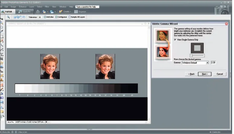
3. Select the Step-by-Step (Wizard) radio button and click Next. (See Figure 3-5.)
4. Type a name for your profile and click Next.
5. Adjust the brightness and contrast controls on your monitor (see Figure 3-6) and click Next.
Follow the description in the wizard to make your monitor adjustments.
Figure 3-6: The Adobe Gamma Wizard helps you adjust brightness and contrast controls on your monitor.
6. On the pane that asks you to select the Phosphors for your monitor from a menu, Custom appears as the default choice. Leave this setting alone and click the Next button.
By default, Adobe Gamma supplies the Custom choice taken from the default monitor profile.
7. On the Gamma settings pane, deselect the View Single Gamma Only check box.
The pane displays individual Gamma adjustments that you can make for Red, Green, and Blue. (See Figure 3-7.)
8. Place each slider in the exact center under each box, as shown in Figure 3-7.
9. Return to the single Gamma view by selecting the View Single Gamma Only check box.
Figure 3-7: Place each slider in the exact center below each of the RGB boxes.
10. Place the Adobe Gamma dialog box next to the open monitor calibra-tion file, so you can easily view both at once.
11. Select a Gamma choice from the Gamma menu. Select Windows Default 2.20 for the Gamma, then click Next.
You arrive at a pane in which the Hardware White Point check box is selected. This setting defines the general colorcast on your monitor. You can choose a setting anywhere between 5,000 degrees Kelvin (which gives your image a slight red cast) and 9,300 degrees Kelvin (which pro-duces a cooler blue colorcast).
12. Set the Adjusted White Point to 5500K for now.
The monitor view becomes slightly warmer than the 6500K setting that we normally use to match natural daylight. This setting relates to color temperature, which we introduce in Chapter 2.
13. Click the Back button in the wizard to return to the Gamma adjust-ment pane.
Figure 3-8: Place the Adobe Gamma Wizard window next to the test file while you’re making the Gamma adjustment.
14. Now, adjust the single Gamma slider in Adobe Gamma until the little square above the slider seems to match the surrounding gray (be cer-tain the box for View Single Gamma Only is selected).
Slightly squint your eyes as you move the slider back and forth if that helps you distinguish shades of gray. If the monitor controls are near the correct setting, the Gamma slider will wind up fairly close to center, but place it where it needs to be to match the little gray square to the grid.
Look at the step tablet below the portrait images in the test file (the grayscale gradient). Can you see all the steps from white to black? The dark step to the left of the black step should separate from that blackest step and look slightly lighter than black. All steps toward white should be visible, with no steps merged together toward white. The portrait images should have a normal brightness. The big gray patch in the middle should look gray. In Figure 3-9, a monitor adjustment appears too light on the left, too dark in the middle, and properly corrected on the right side of the figure.