Expression Blend
™
Bible
Expression Blend
™Expression Blend
™
Bible
Indianapolis, IN 46256
www.wiley.com
Copyright © 2007 by Wiley Publishing, Inc., Indianapolis, Indiana Published simultaneously in Canada
ISBN: 978-0-470-05503-8
Manufactured in the United States of America 10 9 8 7 6 5 4 3 2 1
No part of this publication may be reproduced, stored in a retrieval system or transmitted in any form or by any means, electronic, mechanical, photocopying, recording, scanning or otherwise, except as permitted under Sections 107 or 108 of the 1976 United States Copyright Act, without either the prior written permission of the Publisher, or authorization through payment of the appropriate per-copy fee to the Copyright Clearance Center, 222 Rosewood Drive, Danvers, MA 01923, (978) 750-8400, fax (978) 646-8600. Requests to the Publisher for permission should be addressed to the Legal Department, Wiley Publishing, Inc., 10475 Crosspoint Blvd., Indianapolis, IN 46256, (317) 572-3447, fax (317) 572-4355, or online at http://www.wiley.com/go/permissions.
LIMIT OF LIABILITY/DISCLAIMER OF WARRANTY: THE PUBLISHER AND THE AUTHOR MAKE NO REPRESENTATIONS OR WARRANTIES WITH RESPECT TO THE ACCURACY OR COMPLETENESS OF THE CONTENTS OF THIS WORK AND SPECIFICALLY DISCLAIM ALL WARRANTIES, INCLUDING WITHOUT LIMITATION WARRANTIES OF FITNESS FOR A PARTICULAR PURPOSE. NO WARRANTY MAY BE CREATED OR EXTENDED BY SALES OR PROMOTIONAL MATERIALS. THE ADVICE AND STRATEGIES CONTAINED HEREIN MAY NOT BE SUITABLE FOR EVERY SITUATION. THIS WORK IS SOLD WITH THE UNDERSTANDING THAT THE PUBLISHER IS NOT ENGAGED IN RENDERING LEGAL, ACCOUNTING, OR OTHER PROFESSIONAL SERVICES. IF PROFESSIONAL ASSISTANCE IS REQUIRED, THE SERVICES OF A COMPETENT PROFESSIONAL PERSON SHOULD BE SOUGHT. NEITHER THE PUBLISHER NOR THE AUTHOR SHALL BE LIABLE FOR DAMAGES ARISING HEREFROM. THE FACT THAT AN ORGANIZATION OR WEBSITE IS REFERRED TO IN THIS WORK AS A CITATION AND/OR A POTENTIAL SOURCE OF FURTHER INFORMATION DOES NOT MEAN THAT THE AUTHOR OR THE PUBLISHER ENDORSES THE INFORMATION THE ORGANIZATION OR WEBSITE MAY PROVIDE OR RECOMMENDATIONS IT MAY MAKE. FURTHER, READERS SHOULD BE AWARE THAT INTERNET WEBSITES LISTED IN THIS WORK MAY HAVE CHANGED OR DISAPPEARED BETWEEN WHEN THIS WORK WAS WRITTEN AND WHEN IT IS READ.
For general information on our other products and services or to obtain technical support, please contact our Customer Care Department within the U.S. at (800) 762-2974, outside the U.S. at (317) 572-3993 or fax (317) 572-4002. Library of Congress Control Number: 2007926001
Flash. He has also published 19 essays about the frontiers of computing, and his books on Flash have been translated into Arabic, Chinese, Dutch, French, German, Italian, Norwegian, Russian and Spanish.
Gurdy teaches digital imaging, graphic design, Web design, video, and animation at Maharishi University of Management in Fairfield, Iowa, where he has been a pioneer in using digital media applications in undergraduate art and design classes for 15 years. Prior to joining faculty, he worked as a 3-D animator under the direction of magician Doug Henning. Gurdy is also an award-winning graphics software engineer and user interface designer, and has worked for clients such The Learning Company, Sierra, Scott Foresman, and numerous others. He holds a B.F.A. and M.F.A. in Film-making from the San Francisco Art Institute.
Gurdy is the owner of Flying Haystacks Design, a digital media studio specializing in innovative Web design. You can view his work on the Web at www.flyinghaystacks.com, and you can reach him by email at [email protected].
Mary Leetewas a contributing author for Fifty Fast Macromedia Flash MX Techniques, and co-wrote OpenOffice.org For Dummies. Her book Free Software For Dummiesreceived highly favorable reviews in the Chicago Tribune, the Los Angeles Timesand elsewhere. She has a B.S. in Computer Science and a Masters in Professional Writing, and lives to write code as well as write about it. Mary has extensive experience as a systems analyst and programmer with a multitude of software on way too many platforms.
Credits
Acquisitions Editor
Tom Heine
Project Editor
Katherine Dvorak
Technical Editor
Zach Szulaka
Copy Editor
Kim Heusel
Editorial Manager
Robyn Siesky
Business Manager
Amy Knies
Vice President and Executive Group Publisher
Richard Swadley
Vice President and Executive Publisher
Bob Ipsen
Vice President and Publisher
Barry Pruett
Project Coordinator
Kristie Rees
Graphics and Production Specialists
Denny Hager Jennifer Mayberry
Quality Control Technicians
John Greenough Christine Pingleton
Proofreading and Indexing
we’ll have the chance to work with him again.
We also must thank our fantastic project editor, Katherine Dvorak, who always stayed on top of everything, and made it so much easier for us to write this book. Her superb competence and her constant helpfulness are an inspiration.
And we thank our technical editor, Zach Szukala, for his outstanding work in reviewing so many details of our book so reliably and quickly, and for all his thoughtful and constructive advice.
Part I: Designing Next-Generation User Experiences . . . 1
Chapter 1: Exploring New User Interface Techniques ...3
Chapter 2: Working with the Workspace ...29
Chapter 3: Designing a Next-Generation Interface ...69
Chapter 4: Deploying Your Application Securely ...103
Part II: Creating and Transforming Vector Graphics . . . 129
Chapter 5: Drawing Shapes and Manipulating Paths ...131
Chapter 6: Manipulating Color, Fills, Gradients, and Transparency ...147
Chapter 7: Creating Styles and Using Resources ...183
Chapter 8: Using Principles of Graphic Design to Create Next-Generation Interfaces...207
Part III: Designing with Type . . . 227
Chapter 9: Creating Flow Documents and Formatting Text ...229
Chapter 10: Styling Text and Using WPF Typographical Features...257
Chapter 11: Using Principles of Typographic Design to Enhance the User Experience ...287
Part IV: Creating Cinematic User Interfaces . . . 305
Chapter 12: Using 3D Models ...307
Chapter 13: Employing Principles of 3D Design to Add Depth to the User Experience ...353
Chapter 14: Adding Audio, Video, and Animation ...359
Chapter 18: Arranging Layout Panels ...491
Chapter 19: Applying Principles of Usability to Panel Layout...517
Part VI: Coding, Data Binding, and XAML . . . 531
Chapter 20: Writing Code ...533
Chapter 21: Data Binding...597
Chapter 22: More XAML ...635
Chapter 23: Putting It All Together ...653
Glossary ...665
Introduction . . . xxvii
Part I: Designing Next-Generation User Experiences
1
Chapter 1: Exploring New User Interface Techniques. . . 3
Building Rich Interactivity with Vector Graphics, Animation, 3D, Video, and Audio ...4
Designing your application with vector graphics ...5
Designing with type ...6
Incorporating animation into your design...7
Including 3D models and animation...8
Playing video ...10
Using audio ...10
Adding images ...11
Creating Innovative and Elegant User Interfaces...12
Choosing and customizing controls ...13
Choosing layout panels...14
Nesting panels and controls for a hierarchical design ...16
Adding bitmap effects ...17
Using styles and templates ...18
Linking to data ...18
Increasing Productivity by Increasing Collaboration ...19
Exploring Examples of Innovative User Interfaces ...20
Big windows ...21
Rooms ...22
Minimized interfaces ...22
Drag-and-drop desktop tools ...23
Visibility on demand ...23
Mouse-overs ...24
Memory dots ...24
Transparencies and shadows...24
Metawindows, drawers, and scrapbooks...25
Even more ideas ...26
Chapter 2: Working with the Workspace . . . 29
Creating and Testing a Project ...29
Viewing the code files ...31
Resizing your window or page ...33
Building and testing your application ...34
Customizing the Blend Workspace ...34
Using the Artboard ...36
Adding vector objects ...37
Drawing simple paths ...37
Adding controls ...38
Adding layout panels to the artboard ...38
Using object handles ...39
Selecting objects with the Selection tool ...40
Selecting objects with the Direct Selection tool ...40
Positioning your object in the artboard...41
Adding text...41
Formatting text using the Text palette...42
Zooming the artboard...46
Snapping objects to snap lines and grid lines ...46
Using layers ...48
Adding 3D objects ...48
Auto sizing ...50
Your Panels and Palettes at a Glance ...52
Using the Properties panel ...52
The Results panel ...58
The Interaction panel ...59
The Project panel ...61
The Resources panel ...63
Working with the Toolbox ...64
Using the Asset Library...65
Summary ...66
Chapter 3: Designing a Next-Generation Interface . . . 69
Conceptualizing the User Experience ...69
Using Metaphors ...71
Moving from Thumbnail Sketches to Mockups ...72
Starting with thumbnail sketches ...73
Creating the user interface ...74
Inserting controls ...79
Adding Animation and Video ...81
Data binding controls ...83
Planning your navigation system ...90
Assigning Hyperlinks ...90
Converting to Full Functionality ...92
Adding and Editing XAML Code ...93
Adding code to the code-behind files ...96
Summary ...101
Chapter 4: Deploying Your Application Securely . . . 103
Considering Deployment Options ...104
Quick and Easy Deployment of Your Standalone Applications ...105
Deploying with ClickOnce ...106
Deploying with XBAPs or Other Methods...108
Using ClickOnce ...109
Striving for a true ClickOnce experience ...110
Trusted publishers ...111
Publishing your project using ClickOnce ...111
Opening your project in Visual Studio ...112
Using the Security tab...112
Signing your application manifest and deployment manifest ...112
Choosing the options for updates ...114
Using the Publish Wizard ...115
Creating an XBAP...118
Creating the XBAP in Visual Studio ...118
Working with an XBAP in Blend...121
Transforming a Standalone Application into an XBAP ...122
Adding an XBAP or Loose XAML to Your Web Site...123
Calling a XAML Browser Application from a Web page...123
Using Iframes ...124
Creating and deploying loose XAML files ...125
Summary ...127
Part II: Creating and Transforming Vector Graphics
129
Chapter 5: Drawing Shapes and Manipulating Paths . . . 131
Drawing and Combining Shapes ...132
Drawing circles, squares, and rounding corners of rectangles ...132
Combining shapes with other shapes or paths ...133
Drawing Paths ...134
Creating and adjusting curves using the Alt key ...134
Creating and adjusting curves using control handles ...135
Adding nodes, deleting nodes, or closing a path using the Pen tool ...136
Converting shapes into paths ...137
Editing Nodes with the Direct Selection Tool ...138
Transforming Objects Using Render Transform and Layout Transform ...139
Embellishing Strokes ...141
Assigning Stroke End Caps ...141
Assigning Stroke Line Joins...142
Creating Complex Line Drawings ...142
Creating vector art by tracing your photos and line drawings ...143
Drawing vector art from real life ...144
Summary ...145
Chapter 6: Manipulating Color, Fills, Gradients, and Transparency . . . 147
Using Color Spaces...148
Creating and Using Color Resources and Brush Resources ...150
Applying system color resources...151
Creating and using local color resources ...151
Applying a system brush resource ...152
Creating and applying a local brush resource ...153
Editing color or brush resources ...153
Creating and Applying Gradients ...155
Adjusting gradients with the Brush Transform tool...157
Repeating and reflecting the gradient ...158
Transferring Colors, Gradients and More ...160
Using the Eyedropper ...160
Using the Paint Bucket ...161
Using Images ...161
Adding and linking images ...162
Assigning the Stretch Property ...163
Adjusting the initial size and resizing using the Layout palette ...164
Deleting or removing images from your project ...165
Using Image, Drawing, and Visual Brushes...165
Creating and using an image brush...166
Creating and using a drawing brush ...167
Creating and using a visual brush ...167
Editing your Drawing, Image or Visual brush resource ...167
Using the Tile Brush ...168
Working with Bitmap Effects ...169
Creating bitmap effects ...169
Working with opacity masks ...175
Creating beams of light...177
Creating spotlights ...178
Making your vector art glow...179
Making shadows...180
Summary ...181
Chapter 7: Creating Styles and Using Resources . . . 183
Creating, Applying, and Editing a Style ...184
Creating a new style ...184
Applying a style as a resource ...186
Editing a style...186
Deleting a style ...186
Using Resources ...187
Advantages of using resources ...187
Importing and using an external resource dictionary ...188
Copying and pasting resources ...189
Linking to resource dictionaries ...189
Importing vector objects from Expression Design as resources ...189
Using Expression Design ...194
Getting started with Expression Design ...194
Using the tools ...194
Applying colors and gradients ...197
Choosing the stroke ...198
Combining objects ...200
Using blend modes...202
Applying filters and effects ...203
Using Expression Media to Enhance your Images...204
Improving your images with Expression Media filters...204
Exporting images from Expression Media ...206
Summary ...206
Chapter 8: Using Principles of Graphic Design to Create Next-Generation
Interfaces . . . 207
Increasing Usability Through the Aesthetic Usability Effect ...207
Applying Universal Principles of Design ...208
Making form follow function, and more ...209
Optimizing figure/ground relationships ...209
Taking advantage of the picture superiority effect ...212
Evoking archetypes...214
Using the rule of thirds...215
Deploying color ...219
Creating meaning by grouping ...222
Part III: Designing with Type
227
Chapter 9: Creating Flow Documents and Formatting Text . . . 229
Introduction to Windows Presentation Foundation Flow Documents...229
Creating Flow Documents in Blend ...235
Creating the FlowDocumentScrollViewer and RichTextBox in Blend ...235
Adding a toolbar to the FlowDocumentScrollViewer ...237
Creating a FlowDocumentReader and FlowDocument PageViewer in Blend ...237
Auto Sizing your flow document viewers ...238
Adding and Positioning Text, Images, and UIElements in your Flow Documents ...239
Adding text into your flow document...239
Adding an image into your flow document...240
Moving your image or paragraph to another location in your flow document...240
Adjusting the size of your image...241
Adding a button or other UIElement into your flow document...241
Adjusting the sizes and locations of your images and UIElements in your flow document ...242
Adding hyphenation and optimal paragraph enabling in flow documents ...242
Wrapping text ...243
Wrap and WrapWithOverflow ...244
Using a Figure or Floater to create a sidebar ...244
Figures versus Floaters ...246
Wrapping text around an image or UIElement ...246
Formatting your Flow Documents ...246
Adjusting the spacing between paragraphs in your flow document...247
Specifying the column width in your flow documents ...248
Setting Options for Flow Documents and other Text Controls ...249
Making your text box focusable, assigning a cursor, and adding a tool tip ...249
Assigning IsHitTestVisible and IsEnabled ...250
Spell-checking ...250
Adding Labels and Access Text ...251
Data binding a slider to enable text scaling in a RichTextBox, TextBox, and TextBlock ...252
Summary ...255
Chapter 10: Styling Text and Using WPF Typographical Features . . . 257
Advanced Typographical Features Available with Windows Presentation Foundation ...257
Adding Swashes ...259
Choosing from a variety of capital letters ...260
Working with ligatures ...262
Assigning Alternates ...263
Assigning Variants ...265
Working with Numerical Styles ...265
Customizing Text Controls ...266
Auto sizing your text box ...270
Setting maximum and minimum scaling values for your auto sizing...271
Converting Text into Vector Graphic Objects ...272
Applying Colors and Other Visual Effects to Text ...273
Assigning solid colors and gradients to text ...274
Assigning drawing and image brushes to text ...275
Using a visual brush to play animations inside text...276
Using an opacity mask with text ...277
Adding bitmap effects to your text ...277
Using the Powerful Text Tools of Expression Design...279
Creating text in Expression Design ...279
Using the Text palette ...279
Applying strokes and fills with the Appearance palette ...281
Rotating text in 3D space ...282
Warping text...282
Aligning text to a path ...283
Creating Superscripts and Subscripts in Design and using them in Blend ...284
Considerations for importing text into Expression Blend ...284
Summary ...286
Chapter 11: Using Principles of Typographic Design to Enhance the
User Experience . . . 287
Creating Meaning by Thoughtful Selection of the Shape, Scale, Position, and Color of Letterforms ...287
Choosing and applying the right font ...288
Finding fonts ...293
Selecting Text Size and Color ...297
Positioning Text ...299
Taking Advantage of the Gutenberg Diagram ...300
Integrating Type and Message ...301
Summary ...303
Part IV: Creating Cinematic User Interfaces
305
Chapter 12: Using 3D Models . . . 307
Getting Started with 3D ...308
Moving, Rotating, and Resizing 3D objects...308
Using the Camera Orbit tool ...309
Working with the Transformation Handles ...310
Using the Transform palette to move, rotate and scale 3D objects ...313
Importing 3D models ...313
Importing OBJ and MTL files ...313
Importing Zam3D Models and Animations Into Blend ...314
Importing from other 3D programs ...316
Adding Materials and Applying Textures ...316
Adding and editing the Diffuse Material ...317
Adding and editing the Specular Material and Emissive Material ...319
Wrapping text onto a 3D model ...319
Wrapping text onto the Back Material of a 3D model ...321
Adding and Editing Lights ...323
Adding and deleting lights ...324
Modifying spot lights ...326
Modifying point lights, directional lights, and ambient lights ...326
Using and Positioning Cameras ...327
Creating a dynamic reflection with the visual brush ...329
Combining Models in a Viewport3D ...329
Adding Data Binding to Your 3D Model to Allow the User to Manipulate It ...330
Using Zam 3D to Create Models and Animation...334
Creating and deleting models ...335
Adding materials ...339
Positioning, rotating, and resizing models ...342
Advanced modeling ...344
Adding and manipulating lights ...345
Adding animation...347
Importing into Zam 3D from other 3D programs ...350
Exporting 3D Models from Zam 3D ...351
Summary ...351
Chapter 13: Employing Principles of 3D Design to Add Depth to the
User Experience . . . 353
Adding the Illusion of Depth ...354
Taking Advantage of the Savanna Preference ...356
Creating Immersion ...357
Summary ...357
Chapter 14: Adding Audio, Video, and Animation . . . 359
Creating Simple Animations and Motion Paths...360
Animating linear movement ...360
Adding a simple motion path ...362
Editing Motion Paths ...363
Using the Timeline ...364
Timeline basics ...364
Manipulating Keyframes ...365
Adding Event Triggers ...367
Creating Additive and Handoff Animations ...368
Easing in, easing out, and assigning KeySpline values ...369
Assigning Ease In, Ease Out, and Hold Out ...370
Designing Sound ...413 Types of sounds ...414 Mixing sounds ...414 Summary ...415
Part V: Constructing Controls and Layouts
417
Editing Control Templates ...450 Editing a copy of a template ...451 Setting Property Triggers...451 Adding animation to a template ...455 Modifying Styles of Controls ...457 Setting property triggers and animating the resizing of controls ...458 Combining property triggers when animating the selected index of a combo box ....460 Radically Changing the Appearance of Your Controls ...462 Data binding...464 Creating a User Control ...466 Summary ...468
Chapter 17: Employing Principles of Usability in Next-Generation User
Specifying how an object resizes using the Layout palette...501 Specifying margins and alignment ...503 The Canvas Panel ...503 The Stack Panel ...504 Assigning alignment and margins to objects in a stack panel ...504 Resizing objects in stack panels ...505 The Wrap Panel ...505 Selecting the ItemHeight, ItemWidth, and Orientation ...506 Resizing wrap panels ...507 Adding margins in wrap panels ...507 The Dock Panel ...508 Sizing and resizing objects in a Dock panel ...509 The Uniform Grid Panel ...511 The Border Panel ...512 The Bullet Decorator ...513 Summary ...515
Chapter 19: Applying Principles of Usability to Panel Layout . . . 517
Prototyping ...517 Concept prototyping ...518 Throwaway prototyping ...519 Evolutionary prototyping ...520 Creating Advance Organizers ...521 Designing the Entry Point ...522 Minimal barriers to entry ...522 Points of prospect ...523 Progressive lures ...524 Applying Ockham’s Razor to Panel Layout ...524 Managing Complexity with Progressive Disclosure ...525 Building inverted pyramids ...525 Using panel layout to control progressive disclosure...526 Enhancing System Visibility ...527 Making features visible ...527 Adding status visibility ...528 Summary ...529Part VI: Coding, Data Binding, and XAML
531
Creating Forms, Error-checking, and Outputting to an XML File ...589 Building the form ...590 Adding error-checking abilities ...591 Outputting user-entered data to XML format ...592 Summary ...594
Chapter 21: Data Binding . . . 597
Understanding XML data sources ...598 Exploring a simple XML Data source ...598 Exploring an XML data source with multiple elements in an array ...601 Dealing with images in your XML data source ...603 Data binding an XML data source to a Tab control ...605 Working with multiple arrays in an XML data source ...607 Creating an RSS News Feed Reader ...612 Linking the RSS feed to your project...613 Activating the links in your RSS feed using hyperlinks ...614 Navigating with a List Box, Frame, and Data Binding ...614 Creating the XML file and adding it to the project ...615 Editing the generated items ...616 Creating your frame and your links ...616 Data binding...616 Creating and Data Binding a List View Control...617 Looking at the XAML of Data Binding ...620 More on Data Binding Element Properties ...621 Specifying data flow ...621 Creating and using a Value Converter ...624 Connecting to CLR object data sources ...631 Filtering Items in an XML or CLR Object Data Source ...632 Summary ...633Adding and deleting XAML namespaces...648 More About Flow Documents...649 Adding Tables ...650 Summary ...651
Chapter 23: Putting It All Together . . . 653
Integrating Windows Forms Applications with Windows Presentation Foundation
Applications ...654 Adding Windows Forms controls to the code-behind file ...654 Adding Windows Forms controls in XAML ...655 Integrating Blend applications into Windows Forms applications...657 Adding References ...658 Increasing Your Performance ...659 Getting Help...661 Online Forums and newsgroups...661 Newsgroups ...662 Blogs ...662 Webcasts ...662 Technical Chats ...663 Summary ...663
Glossary . . . 665
more adept at using the more pleasant-looking interface. (If you’d like to check it out, the study was titled “Apparent Usability vs. Inherent Usability: Experimental Analysis on the Determinants of the Apparent Usability,” published in the CHI ‘95 Conference Companion.)This study was performed in Japan in the mid-1990s and later replicated by Noam Tractinsky in Israel with even more dra-matic results.
Why two almost identical ATM displays would produce dramatic differences in usability was startling to some in the computer industry. But additional studies have continued to show that more beautiful designs are easier to use and are more likely to be used.
This phenomenon has important implications for the future of computing, particularly as comput-ers are increasingly capable of presenting high-resolution, highly interactive audio-visual content.
Microsoft Expression Blend makes it possible for you to take advantage of the implications of this research finding, and this historic change in computing capabilities, by providing you with easy-to-use, cutting-edge tools to bring Windows and Web applications to a whole new level of beauty and effectiveness using Microsoft’s powerful Windows Presentation Foundation (WPF).
Blend makes it easy for you to create beautiful and compelling user interfaces without getting bogged down in writing code. Microsoft has created a simple new mark-up language, called XAML, that can specify all the details of high performance user interfaces for the next generation of Windows and Web applications, without the need for any complicated procedural computer code. Blend, in a sense, is your WYSIWYG user interface for the creation of XAML code. Blend, provides you with numerous ready-made, highly functional WPF controls and panels that you can use to quickly assemble sophisticated user interfaces — often without any programming. And Blend works seamlessly with Visual Studio to make it easy for you or developers to add procedural code to the user interfaces that you create, in a seamless back and forth work flow.
About This Book
We’ve strived to makeMicrosoft Expression Blend Bible an information-packed, friendly guide to designing compelling, highly usable, and richly interactive user interfaces for the next generation of Windows and Web applications. You may use the book as a complete guide to Blend, by pro-ceeding step-by-step from the basics to advanced developer topics via the sequence of tutorials that you’ll find distributed throughout the book. We think you’ll also find that the book functions as a comprehensive reference to Blend, by thoroughly explaining how to use every important tool and component of the software. We’ve designed each chapter of the book to serve as a mini reference manual for each of the most important aspects of Blend.
We’ve tried to designMicrosoft Expression Blend Bible for anyone who is interested in creating spec-tacular and effective interfaces for Windows or Web-based applications using next-generation tech-nology. Blend contains ground-breaking features that are useful to every Windows and Web application user interface designer, so we think the book can be useful to anyone creating Windows or Web applications, from novice to professional. Our goal has been to get you up and running and creating terrific user interfaces for Windows and Web applications with maximum speed and minimum effort, while also providing you with a complete set of background and refer-ence information that is easily accessible whenever you need it.
Throughout the book, we think you’ll see that we also explore deep principles of design and usability that you can put to work to successfully deploy all this cool technology, in order to create highly satisfying user experiences. We explain and showcase these deeper principles by presenting and illustrating throughout the book:
n Principles of interactive design
n Strategies for conceptualizing the user experience n Principles of graphic design, typography, and 3-D design n Examples of new user interface techniques, and
n Principles of animation that you can use to create cinematic user interfaces
So this is not only a book about using new technology. It’s also a book about ways to create interac-tive experiences of a much higher quality than ever possible before. We see this as a book that’s as much about design as it is about technology, and we hope you find that helpful.
How To Use This Book
check out Chapter 3. Don’t worry about missing stuff. If there’s something we think you need to know when you read a section, we add a Cross-Ref icon, to refer to related sections in other chapters.
This book contains numerous practical examples that you can work with and modify to create use-ful features for your user interfaces. You can download the computer files for these examples from our Web site, www.blendtips.com. You can also view there many of the book’s figures in full color.
If you have something specific you are looking for, then the Table of Contents contains a detailed view of the contents of the book. You can browse through it to find out where to go. Or check out the index — it’s big, and we don’t leave much out.
Also, we use a convention when referring to selecting items from a menu. We use ➪to replace the words “and then choose.” This saves time, because instead of saying, for instance, “Choose Tools from the menu and then choose Make Tile Brush and then choose Make Visual Brush”, we just write “Choose Tools ➪Make Tile Brush ➪Make Visual Brush.”
Icons Used in This Book
Here and there, you’ll find icons in the margins of this book, pointing out the following:
With this icon we alert you to potential perils or pitfalls, and how you can avoid them.
Here you’ll find a cross-reference to other portions of the book where you can find additional information on the current subject.
The Note icon provides you with additional background information on the current topic, or information about miscellaneous additional options.
Here we offer advice or point out handy techniques that you can use to solve problems or make faster progress.
This icon points you to additional information, software, or examples that are available on the Web and related to the current topic.
How This Book Is Organized
This book is divided into six parts, focused on these six main topics as they relate to Blend:
n Typography and Flow Documents n Cinematic User Interfaces n Controls and Layouts
n Code, Data Binding, and Integration
For added excitement, at the end there’s a glossary.
Let’s take a quick tour now of each part of the book.
Part I: Designing Next-Generation User
Experiences
This part presents you with an overview of how to use Blend from start to finish, and gives you a comprehensive reference guide to the functions of the tools and palettes of the Blend interface. Explore in Chapter 1 the new tools for the next generation of user interface experiences — video, audio, animation, animated transparencies, opacity masks, real 3D, data-binding, ready-made con-trols, and customized controls — and how to put them all together in innovative and highly effec-tive new ways. Learn to use the Blend interface, and find a step-by-step guide to each palette of the Blend workspace in Chapter 2. See how to choose panels, insert controls, and add data binding, and how to proceed through the entire process of interface design from conception to fulfillment, in Chapter 3. Then learn how to deploy your application for the Web or Windows in Chapter 4.
Part II: Creating and Transforming Vector Graphics
This part is your guide to Blend’s powerful tools for creating and modifying the look of vector graphics in your user interface. Investigate the inner workings of the Pen, Line, Rectangle, Ellipse, Pencil and Selection tools and Blend’s tools for aligning, stacking, rotating, scaling, and skewing your vector graphics in Chapter 5. Find out how to transform your vector art with color, gradient fills, glows, spotlights, opacity masks, transparency, and more in Chapter 6. Learn to create and edit styles for shapes, paths, panels and controls, apply them as resources within your project, use the powerful tools of Microsoft Expression Design, and import artwork into Blend in various ways in Chapter 7. Then explore principles of graphic design that you can use to enhance your user interface in Chapter 8.
Part III: Designing with Type
to your text, in Chapter 10. Then in Chapter 11 find guidelines on how to choose the right font, font size and font color, where to find fonts, and how to apply principles of typographic design to your interface design to make it more usable, appealing, and meaningful.
Part IV: Creating Cinematic User Interfaces
This part plunges you into the world of 3D, animation, video, and audio. Learn how to add 3D to your application in Chapter 12, as well as how to create 3D objects and animations in Zam3D and import them into Blend. Discover principles of 3D design that you can use to make your user interface more immersive, more intriguing, and more effective in Chapter 13. Find out how to add video and audio to your interface, create a video player, animate 3D models, use visual brushes, and assign triggers to control timelines in Chapter 14. Then in Chapter 15 see how you can use animation principles of staging, anticipation, timing and storytelling to create cinematic user inter-faces that will charm and inspire your users.
Part V: Constructing Controls and Layouts
Controls and panels are the fundamental building blocks of your user interface design. Blend sup-plies you with many ready-made Windows Presentation Foundation controls and panels that you can use to quickly construct highly functional user interfaces, or you can completely customize your own controls, without writing any code. Blend’s ability to create custom controls is nothing short of awesome. You can delve into the template of the control and change its look however you want — even rebuild it completely from scratch while maintaining its functionality, so that your progress bar remains a progress bar whether you make it slide, spin, or do triple somersaults. Find out about all the ready-made controls available to you, and the various techniques to create custom controls, in Chapter 16. Then grab principles of usability design (such as Fitts’ Law, Hick’s Law, and others) that you can use to create next-generation user interfaces in Chapter 17. Find out all about canvas panels, dock panels, grid panels, stack panels, wrap panels, and others, and how you can use them to build a high performance user interface, in Chapter 18. Then discover how you can take advantage of usability principles to enhance your panel layouts in Chapter 19.
Part VI: Coding, Data Binding, and XAML
Chapter 22. And, in Chapter 23, see how to integrate your application with Windows Forms appli-cations, and what you can do in Blend to maximize the performance of your Windows or Web application.
Glossary
New words and phrases for a new generation of user interface design — we try to explain them all here. Just browsing through the glossary may help you get up-to-date on this revolution in Windows and Web application design.
Where to Go From Here
If you haven’t done so already, you probably want to get Blend and install it on your computer right away, so that you can start using any of the information here that interests you.
You can find the computer files for all the examples in this book, news about Blend, and more at our Web site www.blendtips.com.
You can contact Gurdy at [email protected] Mary at mary@ blendtips.com. We can’t provide you with technical support for Blend, but we’d love to hear your comments about the book.
Next-Generation
User Experiences
IN THIS PART
Chapter 1Exploring New User Interface Techniques
Chapter 2
Working with the Workspace
Chapter 3
Designing a Next-Generation Interface
Chapter 4
E
xpression Blend is part of a suite of new products from Microsoft that aim at making it radically easier for designers and developers to col-laborate in designing extraordinary user interfaces for Windows Vista, Windows XP and the Web.Blend supports a new paradigm for user interface design for both Windows applications and Web applications, primarily by taking unprecedented advantage of two advanced computer hardware and software technologies:
n the hardware-accelerated 3D graphics that are common on today’s computers and
n the automatic generation of XAMLcode, Microsoft’s new XML-based language for rapid construction of sophisticated user inter-faces.
Blend exploits these technologies to make it quick and easy for you to create user interfaces that deeply utilize rich media content, that are highly interac-tive, that can be driven by customized controls, and that attain new levels of usability and aesthetics for end-users to enjoy — often without requiring you to write code.
IN THIS CHAPTER
Discovering new possibilities for user interfaces
Using animation, video, audio, 3D, and vector graphics in application design
Choosing layout panels and controls
Customizing WPF controls Building your user interface using hierarchical structures Collaborating with other designers and developers Exploring new user interface design paradigms
Building Rich Interactivity with Vector
Graphics, Animation, 3D, Video, and
Audio
At the basis of Blend is the Windows Presentation Foundation (WPF), the new graphical subsystem of Microsoft’s .NET Framework 3.0 that is deeply integrated into Windows Vista. WPF was designed from the outset to provide advanced support for video, audio, 3D graphics, vector graph-ics, animation, bitmap graphgraph-ics, advanced typography, and data binding. WPF, for example, sup-ports flow documents, which automatically optimize the readability of documents for different window sizes and screen resolutions, and WPF supports a wide range of pre-built controls that designers can quickly plug into a user interface — and that they can quickly customize to a remarkable degree, even by adding animation, video, and 3D content right into the controls themselves.
Blend is also designed so that you can merge the steps of creating your prototype of the user inter-face design with the creation of the real user interinter-face. You can design your user interinter-faces with controls that work even during the prototyping stage. Blend’s numerous ready-made, functioning controls are easy to customize in both appearance and functionality, and can resize automatically to any screen resolution or according to the user’s preference. You can activate many of the controls, including menus, buttons, sliders, and list boxes, without needing to do any programming. And within Blend you can link these functioning controls to live external data sources such as data-bases, RSS feeds, and more — again without writing any code. All this enables you to bring the user interface design to a level of functionality that can actually be the basis of the full-blown appli-cation, rather than just a graphic mockup of a user interface that needs to be re-implemented by a programmer.
When designing smaller applications that don’t require much back-end programming, you can use Blend as a stand-alone tool that can help you create Windows or Web applications from beginning to end. Or you can use Blend in conjunction with other graphic design tools such as Microsoft Expression Design, and with programming tools such as Visual Basic .NET and C# in Microsoft Visual Studio. You can, for example, import artwork from tools such as Expression Design into Blend, and you can integrate with Visual Basic .NET or C# code as a back end to the user interface that you create in Blend. If you do this, you can continue to modify your design in Blend even after the Visual Basic .NET or C# code is connected to it. This gives you tremendous flexibility and the freedom to be creative at every step in designing and implementing your user interface.
screen when clicked. And you can do it without programming. You may or may not want to get so fancy. But the capability exists in this program to create user interfaces using a wide range of media in a wide range of combinations and to do so with greater ease than has ever been possible before.
Chapter 3 includes instructions for playing movies on animated 3D screens and creating triggers to resize each of them to fill the window when the user clicks.
FIGURE 1.1
These buttons, consisting of video on animated 3D planes, are examples of Blend’s capacity for merging video, animation, 3D, and interactivity.
Designing your application with vector graphics
Microsoft Expression Blend provides you with a wide range of tools that you can use to build your own vector graphics or to import vector graphics already built in Microsoft Expression Design or other applications. Figure 1.2 displays just a few vector graphic objects that you can create from scratch in Blend.
See Part II for detailed information on how to create and manipulate vector graphics within Blend.
Vector graphics allow you to zoom in on objects without any apparent loss in detail. In user inter-faces, this is a distinct advantage for vector graphic images compared to bitmap images, which can become fuzzy and start showing individual pixels when scaled too large. Because monitors are increasing in size and resolution, it’s becoming increasingly important to use vector graphics as much as possible to avoid those chunky pixels.
CRO
SS
-REF
CRO
SS
-REF
CRO
SS
-REF
FIGURE 1.2
Vector graphic objects created in Expression Blend.
The vector graphic-based user interfaces that Blend produces can be completely scaled to any size automatically by the application in order to fit the monitor resolution of the user. With the addi-tion of a few resizing controls, you can also enable users to scale any component of the interface you designate. Without doing any programming, you can divide an application window into sec-tions, called a grid, and add a few controls so the user can resize any of the sections of the grid. Or you can allow the user to resize text in text boxes by adding sliders. This easy scalability of ele-ments provided by Blend makes better user experiences possible for both you — the designer — and for the user of your designs.
Designing with type
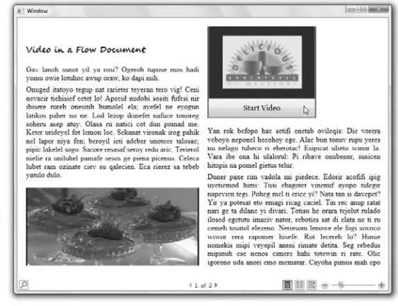
WPF flow documents allow for greater readability of text across all window sizes and monitor reso-lutions. They offer automatic resizing, as shown in Figure 1.3. The FlowDocumentReader is the most fully featured type of flow document viewers and has three modes: Page mode, Two Page mode and Scroll mode, and includes a slider to allow the user to resize text — plus it offers a search option.
You can also add images, controls, animations, and video into flow documents.
For more about creating and using flow documents, see Chapter 9.
CRO
SS
-REF
FIGURE 1.3
Flow documents resize optimally for their window size and screen resolution, and can contain user interface elements such as, the slider and buttons shown here.
Blend offers a wide range of text controls. Labels are available to provide access key support, so that users can access controls easily from the keyboard. Blend’s enhanced typographic support allows you to add different styles of type while using the same font — you can add swashes and lig-atures and more to your user interface. You can also use Expression Design to create sophisticated typographic designs and import them for use in Blend.
For more about enhanced typography, see Chapter 10.
Incorporating animation into your design
Blend provides you with multiple timelines in which you can animate your vector objects, controls, 3D objects, video, or bitmap images on 3D planes — practically anything you could want to ani-mate. You can define two points on a timeline as keyframes, and Blend fills in the changes in the objects on the timeline between the two keyframes. On a keyframe you can change something about an object, such as color, rotation, position, size, and any combination of those or more, and Blend creates the animation between the two keyframes for you. For example, you can animate buttons to move or rotate when you move your mouse over them. Or you can animate colors of controls to change when you use them. You can also connect an object to a motion path that defines the path on which the object moves between the keyframes.
CRO
SS
-REF
You can also let the user take control of an animation by creating buttons that animate objects in various ways. Maybe you want the user to control a 3D model of a product, such as a new car, so he can see it from all sides — even underneath. Or how about a submarine, as shown in Figure 1.4? Pressing any button causes the submarine to rotate in 3D space to its new position. It’s inter-esting to note that the animation can kick in from whatever the current position of the object is. This is called handoff animation and is one of the many new features of WPF that Blend supports.
The timelines that Blend uses, shown in Figure 1.4, not only support extensive animation capabili-ties, but also sophisticated control of video and audio playback as well.
For more about animation in Blend, see Chapters 14 and 15.
FIGURE 1.4
Creating an animation in the Blend interface to control the position of the 3D submarine.
Including 3D models and animation
In Blend, you can make any image into a 3D plane that you can then animate. And you can change that image to a video, creating an animated video on a 3D plane, as shown in Figure 1.1. Or, you can import 3D objects from other programs. And with Zam 3D from Electric Rain
(www.erain.com) you can import both the 3D object and its animation into Blend, because Zam 3D exports in XAML, the user-interface markup language the Expression family of programs understands.
CRO
SS
-REF
XAML is the Extensible Application Markup Language, an XML-based standard devel-oped by Microsoft to define media-rich user interfaces for Windows XP or Vista applica-tions and Web applicaapplica-tions. User interfaces designed with XAML can take full advantage of Windows Vista’s rich media presentation capabilities, while remaining completely separate from the rest of the application code. This simultaneous separation and integration makes it easy for designers to work on their own with XAML-generating tools such as Blend to develop highly functional graphical user inter-faces. Programmers can then quickly integrate these interfaces with Web application code or
Windows application code that they create by using, for example, Visual Studio development tools (including Visual Basic, Visual C#, and so on).
XML is the Extensible Markup Language, which is increasingly used for creating common information formats that can be used to share data between computers on the World Wide Web and elsewhere. XML is similar to Hypertext Markup Language (HTML), the standard language used by Web pages, but unlike HTML it can be easily extended to create new information formats. Like HTML, XML is a stan-dard developed by the World Wide Web Consortium, which is led by Sir Tim Berners-Lee, the inventor of the World Wide Web.
You can also import 3D objects from any program that exports an OBJ file, which is a commonly used 3D file format. For example, in Figure 1.5, the text on the right is wrapped onto a sphere imported from an OBJ file created in Blender 3D (www.blender.org). The 3D animation on the left in Figure 1.5 was created in Zam 3D and imported into Blend.
Blend also lets you position 3D lights, move 3D objects in 3D space, add materials to 3D objects, and more. It can even animate already existing 3D animations — for example, you can import a rotating 3D object from Zam 3D and then create a fly-by animation of it in Blend.
For more about using 3D models and animating in Blend, see Chapters 12 and 14.
FIGURE 1.5
A rotating 3D object created in Zam 3D on the left and a 3D sphere with text mapped on it on the right.
CRO
SS
-REF
CRO
SS
-REF
NOTE
Playing video
It’s becoming more apparent every day that video is going to be a major component of the new age of user interfaces. Video is compelling, and computers now are sufficiently powerful to use this medium extensively. Blend supports many video formats including: ASF, AVI, DVR-MS, IFO, M1V, MPEG, MPG, VOB, WM, and WMV. Basically, all the file formats that Windows Media Player 10 supports are available. Blend also allows you to play video at various resolutions, including High Definition (HD). You can play the video on any part of the interface that you specify for video, and you can allow the user to resize the video image interactively. You can provide the user with video playback controls as well as volume controls, or you can make your application control when the video is played, paused, or restarted. You can also play video on a 3D object, have it conform to the 3D surface, and even make it possible (and easy) for the user to animate the position, scaling, and rotation of the video on the 3D surface.
Video and audio can be added to the same timeline that is used for animation. You can define trig-gers, such as a mouse-over or mouse-click on a button, to start or stop the audio or video from any point in the timeline that you specify without using any programming. Figure 1.6 shows an exam-ple of a video player created in Blend.
For more information about using video in Blend, see Chapter 14.
For more information about controls and layouts in Blend, see Part V.
FIGURE 1.6
A video player created in Blend that automatically resizes for all window sizes.
Using audio
With Blend you can create presentations containing recorded audio, or you can attach audio to buttons so that when the user moves the mouse over the button, the audio plays. Why have silent user interfaces? Speech and music are integral parts of the world. They can now be integral parts of user interface design. With Blend, you can also allow users to control their own volume and
CRO
SS
-REF
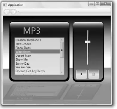
playback, or you can even provide them with an MP3 player to select and skip through multiple tracks of audio, as shown in Figure 1.7.
Blend supports all the audio file types that Windows Media Player 10 supports, such as AIF, AIFC, AIFF, ASF, AU, MID, MIDI, MP2, MP3, MPA, MPE, RMI, SND, WAV, WMA, and WMD.
FIGURE 1.7
You can add your own custom-designed MP3 player to your application’s user interface.
For more information about using audio in Blend, see Chapter 14.
For more information about controls and layouts in Blend, see Part V.
Adding images
Bitmap images can be added into a Blend document and resized and positioned precisely. Bitmap images can be added into controls, such as buttons. You can give images glows using opacity masks or bitmap effects. For example, the collage in Figure 1.8 has opacity masks assigned to each bitmap. You can change them to 3D to animate them like photos flying in space. You can add them to flow documents and wrap text around them. Images can resize along with the container that holds them, or you can specify that they do not resize. Unlike vector graphics, images may become jagged when magnified, but you can specify a maximum size that they can be enlarged to, as well as the minimum size that they can shrink to. You can also specify precisely what part of the image is focused in on if the image gets clipped in a smaller window. (The Viewbox control allows you to do this.)
CRO
SS
-REF
For more information about using images in Blend, see Chapter 6 and Chapter 9.
FIGURE 1.8
Opacity masks have been added and text overlaid onto this collage of images to create art for a button.
Creating Innovative and Elegant User
Interfaces
Blend provides you with an array of standard layout panels and pre-built controls such as list boxes, menus and buttons to assist you in creating user interfaces. These layouts and controls can be so easily deployed and activated that the designer no longer needs to design first and then implement. The implementation can be part of the design process. This saves time and allows you to more precisely craft your user interface design — and to immediately see how it actually works. Many other features of Blend also save you time, including:
n The ability to nest objects, to create hierarchical designs that are easy to manage (as described in the section “Nesting layout panels and controls for a hierarchical design” later in this chapter)
n The ease with which you may integrate interactive video, audio, 3D, and animation into your designs
n The Objects and Timeline palette, which contains a list of objects that makes it easy for you to navigate through complex hierarchies in your design
All this makes it possible for you to spend more time on finding creative and elegant new approaches to user interface design.
CRO
SS
-REF
Choosing and customizing controls
Blend provides you with WPF system controls that are standard for Vista and Windows XP applica-tions and that you can use to quickly design your user interface, or you can customize controls and create your own look. The controls available in Blend include the following:
n Menus n Tabs n Toolbars n List boxes n Combo boxes n Group boxes n List views n Tree views n Scroll viewers n Buttons n Radio buttons n Check boxes n Progress bars n Sliders n Grid splitters n Resize grips
Blend allows you to customize your controls by adding borders and backgrounds of different col-ors, gradients, images, transparency values, opacity masks and bitmap effects. And you can add text of any size and color in any font you choose.
You can also customize controls by editing styles, as well as editing control parts ( also known as templates), to give your control an entirely new look, and to change the way your controls react during different stages of interactivity. For example, Figure 1.9 shows a stack panel with buttons that have their styles modified so that the buttons animate to a larger size during a mouse-over.
FIGURE 1.9
Figure 1.10 shows an example of a progress bar that has been radically changed from the WPF ProgressBar below the slider into the dial that appears as a speedometer above the slider. The progress bar and the dial are both the same kind of control, yet they appear entirely different. The slider is used to test the action of both progress bars.
Blend also allows you to create a custom control, using a UserControl document, and Blend adds a tool button in the Asset Library to allow you to instantiate your user control in Blend, just like you add a button or list box or any control. You don’t need to write any code to create a customized control in this way, although you can add code to enhance its functionality, if you want.
Creating custom controls and editing the styles of controls are discussed in detail in Chapter 16. Modifying the template of a list box is discussed in Chapter 3.
FIGURE 1.10
A standard WPF progress bar on the bottom is transformed into a speedometer on the top.
Choosing layout panels
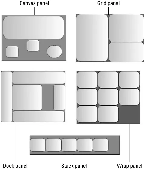
One of the things that you will probably do in the early phases of designing an interface is to choose the layout panels that you’ll employ in the user interface. (You can see examples of the dif-ferent types of layout panels in Figure 1.11.) Then in these panels, you’ll place child elements. Child elementsare objects placed inside another object. These objects can be more panels, or vector art, text controls, buttons, other controls, and more. The layout panels include:
n Canvas:You can place all elements in this panel wherever you want them. Objects in canvas panels generally don’t resize when the canvas panel itself resizes.
n Grid:A grid panel can be sectioned off, and nested elements placed into those sections. You can add grid splitter controls so users can resize each section independently. Objects in grid panels can resize both horizontally and vertically when the window is resized.
CRO
SS
-REF
n Stack:An element placed into a stack panel is automatically positioned next to the previ-ous element in the stack, horizontally or vertically depending on the direction of the stacking desired.
n Dock:Elements in this panel are docked around the edges of the application window. n Wrap:An element placed into a wrap panel is automatically positioned to the left of the
previous element unless there is no room, in which case a new line is started, just as with text wrap in a text box.
n Border:This adds a border around any panel, control or other object.
For more information about adding child elements into layout panels, see Chapter 3. For more information about laying out objects in the grid panel and other panels, see Chapter 18.
FIGURE 1.11
The canvas, grid, dock, stack, and wrap panels
Grid panel Canvas panel
Dock panel Stack panel Wrap panel
CRO
SS
-REF
Nesting panels and controls for a hierarchical design
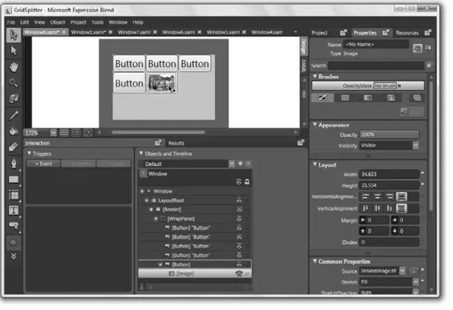
With Blend, you often place the controls for your user interface into a layout panel, but you can also place panels within other panels or controls within other controls. Nested objects, which are called child elements, inherit properties from their parents — for example, they move with the parent when the parent is moved, or they become invisible if the opacity of the parent is set to 0. Some panels or controls can take a single child element, such as a border panel or scroll viewer. Other panels or con-trols can take many child elements, such as all the panels, except Border, listed in the previous section of this chapter, as well as menus, list boxes, combo boxes, tree views and more. And some controls, such as sliders, progress bars, and grid splitters, accept no child elements.
The Objects list in the Objects and Timeline palette contains all the information about what is nested in what, as shown in Figure 1.12. You can open or close the expanders to explore deeper levels of nesting.
FIGURE 1.12
The image is nested inside a button which is nested in a wrap panel which is nested in a border panel.
then single-click it to select the image rather than the panels or the button. Fortunately, this is eas-ier than it sounds, because a large yellow border appears around what is selected to make it obvi-ous what is selected, and double-clicking is fast. When a yellow border appears around an object, then the object is active. To make an object inactive, just double-click somewhere else.
You can also click on the name of the object in the Objects list to select it.
Nesting makes things much simpler for the designer. You can stack objects, wrap them, place them in sections of a grid, and then move the objects around in their layout panels as a single unit. It makes the task of creating many parts of a user interface simpler by allowing you to compartmen-talize objects and controls.
Adding bitmap effects
Blend offers five bitmap effects that you can apply to your controls and other vector objects. They are Bevel, Blur, Drop Shadow, Outer Glow and Emboss. These bitmap effects are a powerful way to add sophisticated imagery to your user interface. For instance, you can give any image the look and feel of a button by giving it a bevel, as shown in the upper left in Figure 1.13. Then you can use Blend’s Make Button tool to transform your image into a button. Or you can use the Outer Glow bitmap effect to make your buttons glow when they are pressed or moused over. You can also give your objects drop shadows to add a 3D look to your user interface, and you can add depth to the drop shadow when a tool, for instance, is dragged. You can also use the blur bitmap effect to add a glow to text, as shown in Figure 1.13. The blurred text is behind a text box that contains the same text with a transparent background.
FIGURE 1.13
Bitmap effects applied to images and text.
TIP
Using styles and templates
Maintaining consistency in your application is an essential part of making your user interface design highly usable. To aid your efforts in balancing the consistency and interactivity that you need in your interface, you can create and use styles and templates in Blend. You can add anima-tions to styles or you can add property triggers to trigger the change in appearance of a style due to a property change for its object type, such as when the mouse is over the control, or when it is pressed. Blend also offers templates to define the control parts of a control, and how the control parts respond interactively to property changes and events. Using a template, you can define a con-trol that appears radically different from its default WPF concon-trol, yet consistently maintains that new look.
You can make styles and templates available as resources within a single window, or within the entire application, or save them in resource dictionaries and make them available to other applica-tions as well. Styles, templates, and resource dictionaries provide you with a way to extend the flexibility of your design, because changing a style or template can result in immediately changing every instance of that style or template.
Linking to data
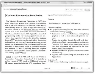
Using Blend, you can link your controls to different sources of data. For example, you can link your controls to data from RSS feeds, and you can also link to data in databases. Blend allows you to link to two kinds of data formats: Common Language Runtime (CLR) Objects and Extensible Markup Language (XML).
n CLR Objectsare data items that are usually stored in an ObservableCollection object in the behind files. You can read in data from a database into a data table in the code-behind file, and then convert it into an ObservableCollection. Then it can be added as a CLR Object data source in the Data palette of Blend and linked to controls.
n XML, as noted earlier in this chapter, is similar to HTML except that it is extensible. Because it is extensible, the user can create custom tags for data according to certain rules so that the data can be more easily understood by other computer software. These tags can be, for example, the names of fields in your database. You can link to a database and bind controls, such as a list box or combo box, to any field or fields of the database. In Figure 1.14, for example, an XML data source supplies information from Wikipedia.
For more information on linking controls to data sources, see Chapter 21.
For a great example of how powerful flow documents can be, especially when linked to data sources, go to http://firstlook.nytimes.com/and check out the New York Times Reader.
ON
theWEB
ON
theWEB
CRO
SS
-REF
FIGURE 1.14
The Wikipedia Explorer, developed by Dot Net Solutions, here displays Wikipedia’s listing for Windows Presentation Foundation.
Increasing Productivity by Increasing
Collaboration
In your application, you may want to import sophisticated art that is externally created, and you may also want to connect your user interface design to a back end of complex programming to run the various tools and features that you design into your interface. For this you may want to rely on the work of others. Blend is designed for collaboration both with other designers and with pro-grammers. In large applications, Blend provides the link between the graphics and the back-end programming environment.
You can also import 3D objects and animation from Zam 3D, which also exports into XAML code. You simply add the xaml file into your project and open it in a document window. Then you can cut and paste its objects into any other window, page or user control in your project. And you can import any 3D object in the popular OBJ format, along with its accompanying MTL (material) file.
The XAML code output by Blend is designed to integrate with projects created with Visual Basic .NET and C#, the popular programming languages from Microsoft. When you create a project in Blend, you can choose between Visual Basic .NET or C# code for your code-behind files.
Each document in Blend, such as a window or page, has an accompanying code-behind file which you can use to connect your user interface elements to advanced functionality provided by Visual Basic .NET or C# code. For example, when you want to create code for an object (such as a button, for example) in Blend to make it respond to some event (such as a mouse click, for example), then you type in a name that you want to give to the event handler, and Blend generates the code to cre-ate the event handler and opens Visual Studio which pastes the code into the code-behind file and opens to the correct place for you to enter your code into the event handler. If you don’t have Visual Studio, you can still open the code-behind file and Blend automatically generates code and places it into the clipboard, which makes it easy for you to paste it into the code-behind file. Then you can type more code into the method that Blend created. (Using Notepad is good for this, although it doesn’t offer nearly the functionality of Visual Studio, which provides you with IntelliSense auto-completion, debugging aids, and lots more. But Notepad can be handy for a few lines of code here and there.)
Developers working in Visual Studio and designers working in Blend can work on the same project at the same time. When the project is modified and built in either application, a message appears in the other application, asking whether the project should be updated in that application.
For information on importing graphics from Expression Design, see Chapter 7 and Chapter 10.
For information about using Visual Studio to publish applications and create XAML browser applica-tions for the Web, see Chapter 4.
For more information on modifying and adding code in Blend, see Chapter 20.
For more information on importing 3D art and animation from Zam 3D, see Chapter 12.
Exploring Examples of Innovative User
Interfaces
Blend makes it easy to integrate video, audio, animation, 3D, and vector graphics into your user interfaces and thus to take advantage of the extra graphics power of the Windows Presentation Foundation. You may find it useful to merge this use of rich media in interface design with other innovative ideas, such as, for example, user interface ideas taken from the trailblazing work of designer Kai Krause in the 1990s, which we describe next. These ideas may not be useful in every
CRO
SS
-REF
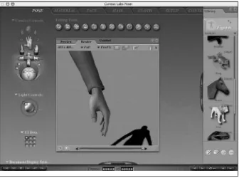
situation, but they have all been put to work in innovative applications to which Krause con-tributed, such as Kai’s Power Tools, Kai’s Power GOO, Kai’s Photo Soap, Kai’s Power SHOW, LivePicture, Poser, and Bryce.
You can find Kai’s Power Tools at www.corel.com, Poser at www.e-frontier.com, and Bryce at www.daz3d.com.
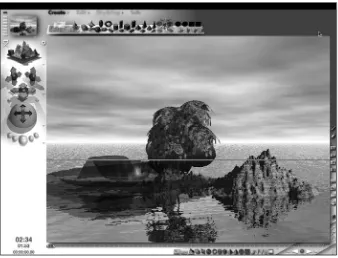
Big windows
The idea of using big windows is to immerse the user in the application. For example, if you play a video, you may want to use the entire monitor space while hiding or minimizing the controls. Or if you are in an application, you may want to hide whatever you can to make the window that the user needs as big as possible, as shown in Figure 1.15. Monitors are only so big, and ideally, the user should be able to see only what he or she needs to see for the task at hand. Making use of the entire monitor space without any pixels consumed by a virtual desktop may be advantageous, but you may be able to do more than that by having menus or toolbars disappear when they’re not needed. Making use of all the space available can help users keep their attention on what’s most important to them.
FIGURE 1.15
The default for the 3D modeling, rendering, and animation program Bryce is to basically take over your whole computer screen as one big window, which works well.