Windows 8 App Projects
XAML and C# Edition
Windows 8 App Projects: XAML and C# Edition
Copyright © 2013 by Nico Vermeir
This work is subject to copyright. All rights are reserved by the Publisher, whether the whole or part of the material is concerned, specifically the rights of translation, reprinting, reuse of illustrations, recitation, broadcasting, reproduction on microfilms or in any other physical way, and transmission or information storage and retrieval, electronic adaptation, computer software, or by similar or dissimilar methodology now known or hereafter developed. Exempted from this legal reservation are brief excerpts in connection with reviews or scholarly analysis or material supplied specifically for the purpose of being entered and executed on a computer system, for exclusive use by the purchaser of the work. Duplication of this publication or parts thereof is permitted only under the provisions of the Copyright Law of the Publisher’s location, in its current version, and permission for use must always be obtained from Springer. Permissions for use may be obtained through RightsLink at the Copyright Clearance Center. Violations are liable to prosecution under the respective Copyright Law.
ISBN 978-1-4302-5065-4
ISBN 978-1-4302-5066-1 (eBook)
Trademarked names, logos, and images may appear in this book. Rather than use a trademark symbol with every occurrence of a trademarked name, logo, or image we use the names, logos, and images only in an editorial fashion and to the benefit of the trademark owner, with no intention of infringement of the trademark.
The use in this publication of trade names, trademarks, service marks, and similar terms, even if they are not identified as such, is not to be taken as an expression of opinion as to whether or not they are subject to proprietary rights.
While the advice and information in this book are believed to be true and accurate at the date of publication, neither the authors nor the editors nor the publisher can accept any legal responsibility for any errors or omissions that may be made. The publisher makes no warranty, express or implied, with respect to the material contained herein.
President and Publisher: Paul Manning Lead Editor: Jonathan Hassell
Developmental Editor: Kate Blackham Technical Reviewer: Kevin Dockx
Editorial Board: Steve Anglin, Mark Beckner, Ewan Buckingham, Gary Cornell, Louise Corrigan, Morgan Ertel, Jonathan Gennick, Jonathan Hassell, Robert Hutchinson, Michelle Lowman, James Markham, Matthew Moodie, Jeff Olson, Jeffrey Pepper, Douglas Pundick, Ben Renow-Clarke, Dominic Shakeshaft, Gwenan Spearing, Matt Wade, Tom Welsh
Coordinating Editor: Katie Sullivan
Distributed to the book trade worldwide by Springer Science+Business Media New York, 233 Spring Street, 6th Floor, New York, NY 10013. Phone 1-800-SPRINGER, fax (201) 348-4505, e-mail [email protected], or visit www.springeronline.com. Apress Media, LLC is a California LLC and the sole member (owner) is Springer Science + Business Media Finance Inc (SSBM Finance Inc). SSBM Finance Inc is a Delaware corporation.
For information on translations, please e-mail [email protected], or visit www.apress.com.
Apress and friends of ED books may be purchased in bulk for academic, corporate, or promotional use. eBook versions and licenses are also available for most titles. For more information, reference our Special Bulk Sales–eBook Licensing web page at www.apress.com/bulk-sales.
Any source code or other supplementary materials referenced by the author in this text is available to readers at www.apress.com. For detailed information about how to locate your book’s source code, go to
iii
Contents at a Glance
About the Author ...
xi
About the Technical Reviewer ...
. xiii
Acknowledgments ...
xv
Chapter 1: Introduction
N
...
1
Chapter 2: Getting Started
N
...
5
Chapter 3: Building a First Project
N
...
21
Chapter 4: Consuming Data
N
...
43
Chapter 5: Build a Charming Application
N
...
67
Chapter 6: Using Live Tiles
N
...
97
Chapter 7: Notifications
N
...
119
Chapter 8: Building an Adaptable App
N
...
131
Chapter 9: Sensors
N
...
151
Chapter 10: Games
N
...
173
Chapter 11: The Windows Store
N
...
195
Contents
About the Author ...
xi
About the Technical Reviewer ...
xiii
Acknowledgments ...
xv
N
Chapter 1: Introduction ...
1
History ...
1
Windows Application Programming Interface ...
3
About This Book ...
4
Chapter 2: Getting Started
N
...
5
Setting Up the Environment ...
5
Starting a First Project ...
8
Class Library ...
8
Windows Runtime Component ...
8
Unit Test Library ...
9
Blank App Template ...
9
Grid App Template ...
10
Split App Template ...
15
A Closer Look at the Simulator ...
17
Summary ...
20
Chapter 3: Building a First Project
N
...
21
Adding Pages ...
21
GridView ...
22
N CONTENTS
vi
Grid ...
26
Canvas ...
27
Our Project ...
27
Adding a Page ...
28
QuizPage ...
31
MVVM and MVVM Light ...
32
Getting Started with MVVM Light ...
32
ViewModelLocator ...
34
ViewModels ...
36
Navigation in MVVM ...
38
Where Are My Behaviors? ...
41
Summary ...
42
Chapter 4: Consuming Data
N
...
43
SQLite in Windows 8 ...
44
Creating a Basic SQLite App ...
44
Adding the Child and Observation Classes ...
45
Building the Database and Its Connection ...
46
App Functionality ...
47
Observation Page...
48
AppBar ...
49
Add Child Form ...
51
Displaying Data on MainPage ...
52
Running the App ...
53
Consuming REST Services ...
53
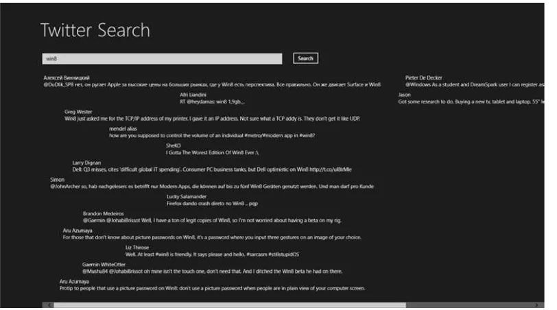
Twitter Search App ...
53
The Tweet Class ...
53
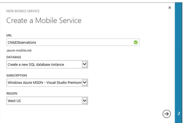
Windows Azure Mobile Services ...
56
Creating a Mobile Service...
56
Creating the Windows Store App ...
62
N CONTENTS
Chapter 5: Build a Charming Application
N
...
67
Search Charm ...
67
Filters ...
71
Search Suggestions from a List ...
75
Search Suggestions from Known Folders...
77
Search Suggestions Through Open Search ...
79
Share Charm ...
82
Sharing Text ...
82
Sharing Links ...
84
Sharing HTML ...
86
Sharing Images ...
87
Sharing Custom Data ...
88
Settings Charm ...
91
Summary ...
95
Chapter 6: Using Live Tiles
N
...
97
Application Tile ...
97
Build Your Own Live Tile ...
97
The Button Click ...
98
Live Tile with Image ...
101
Secondary Tiles ...
104
Adding a Secondary Tile ...
104
Adding Navigation to the Secondary Tile ...
106
Updating a Secondary Tile ...
107
Badges ...
109
Building the Badges...
110
Updating Tiles ...
112
Notification Queues ...
113
Background Tasks ...
113
N CONTENTS
viii
Chapter 7: Notifications
N
...
119
Toast Notifications ...
119
Building a Toast-Capable App ...
119
Toast Templates ...
122
Toasts with Images ...
123
Scheduling a Notification...
124
Adding Audio to Toasts ...
126
Lockscreen Notifications ...
127
Summary ...
130
Chapter 8: Building an Adaptable App
N
...
131
Multiple Resolutions ...
131
Grids ...
131
Testing Multiple Resolutions ...
138
Dots Per Inch ...
139
GridView ...
140
Variable-Sized WrapGrid ...
144
Changing the App Layout ...
144
Visual State Manager...
144
Snap That App ...
145
Device Orientation ...
148
Summary ...
149
Chapter 9: Sensors
N
...
151
Accelerometer Sensor ...
151
How Does It Work? ...
152
Using the Windows 8 Accelerometer API ...
152
Location Sensor ...
156
How Does It Work? ...
156
N CONTENTS
Simple Orientation Sensor...
159
How Does It Work? ...
160
Using the Windows 8 Simple Orientation API ...
160
Light Sensor ...
163
How Does It Work? ...
163
Using the Windows 8 Light Sensor API ...
163
Inclinometer Sensor ...
165
How Does It Work? ...
166
Using the Windows 8 Inclinometer API ...
166
Gyroscope Sensor ...
168
How Does It Work? ...
168
Using the Windows 8 Gyroscope API ...
168
Compass Sensor ...
170
How Does It Work? ...
170
Using the Windows 8 Compass API ...
170
Summary ...
171
Chapter 10: Games
N
...
173
Direct3D ...
173
Direct2D ...
175
SharpDX ...
178
MonoGame ...
178
Installing MonoGame ...
179
Starting a MonoGame Project ...
180
Game Class ...
182
Adding the Model ...
185
MouseManager class...
190
Game Logic ...
191
N CONTENTS
x
Chapter 11: The Windows Store
N
...
195
Creating a Developer Account ...
195
Prepare to Submit Your App ...
198
Submit Your App ...
201
Summary ...
204
About the Author
xiii
About the Technical Reviewer
Kevin Dockx lives in Belgium and works at RealDolmen, one of Belgium’s biggest ICT companies. He is a 31-year-old technical specialist/project leader on NET (web) applications, mainly XAML based, and a solution owner for Windows 8 Store applications. His main focus lies in all things XAML, but he still keeps an eye on the new developments concerning other products from the Microsoft NET (Web) Stack. As an XAML enthusiast, he’s a regular speaker at various national and international events, such as Microsoft Techdays in Belgium, Portugal, and Finland and
Acknowledgments
I would like to thank my wife, Kim, for letting me chase my dreams, no matter how crazy or how many lonely evenings it meant for her.
I would also like to thank Kevin Dockx for being my technical reviewer and always being there to help or give advice. I already learned a great deal from him and I sincerely hope we’ll be working together for many years to come.
1
CHAPTER 1
Introduction
Windows 8 is an exciting release. It tries to reimagine the way we use computers; it’s a fresh wind through an old, established environment. Before we dive into the technical stuff, we’ll have a small history lesson about the development process of Windows 8.
History
Windows 8 was first announced at the Consumer Electronics Show (CES) in 2011. Back then, it was just the next Windows iteration. A very early version found its way onto the Internet pretty fast, and inside was evidence of native Universal Serial Bus (USB) 3.0 support, United Extensible Firmware Interface (UEFI), and even some slight hints at an application (app) store. The leaked version still had the classic Start button and Start menu like in Windows 7. The biggest news, however, was not really the announcement of the new operating system but the fact that Windows was getting an Acom RISC Machine (ARM) version next to the classic x86/x64 versions. This immediately fueled rumors of Windows 8 focusing on touch and taking on capabilities of the iPad and Android tablets.
A few months later Microsoft showed off the new interface for the first time at the Taipei Computex 2011 show. This was followed closely by the Build Windows 8 blog, where the Windows 8 product team would reflect on certain decisions and features involving Windows 8.
On September 13, 2011, the keynote presentation of the Build conference went into detail about the Windows 8 app store and the development process. Microsoft Belgium asked all their technical communities to set up a live stream for their members. I remember sitting there and getting really excited about getting started developing for this brand new platform with a potential huge reach of customers.
In that same keynote there was an announcement of the Windows 8 Developer Preview, marking the start of one of the biggest beta programs of any Windows release so far. The Developer Preview came with Visual Studio 2012 beta (known as Visual Studio 11 back then) and a Blend 5 beta, giving developers the chance to dive into the platform early on before release. It also included some installed example apps that had been developed by interns at Microsoft. The Developer Preview did not yet have an app store, but its sole purpose was to get developers familiar with the new Windows Software Development Kit. The operating system and Visual Studio bits were still in a very early stage, resulting in many crashes and frustration among those trying to learn the new development environment.
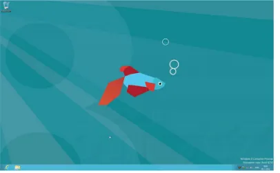
The Developer Preview, shown in Figure 1-1, still had a Start button, it was square this time but it was still there. It would take the user to the Start screen, so the classic menu was already gone. A registry hack appeared on the Web faster then you could say metro. That hack brought back the classic Windows 7 shell.
N. Vermeir, Windows 8 App Projects
CHAPTER 1 N INTRODUCTION
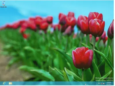
In February 2012 Microsoft announced the Windows 8 Consumer Preview, as shown in Figure 1-2. This version was aimed toward normal users to get them familiar with the new interface. In this version the Start button was gone, but other than that it still strongly resembled Windows 7 with all the glass effects. Developers were able to get a new Visual Studio 11 beta version and could actually get work done on this. There was an increase in stability in both Windows and Visual Studio. Microsoft reported that the Consumer Preview was downloaded over 1 million times in 24 hours, making it one of the most popular beta products ever released by the software company.
Figure 1-1. Developer Preview
CHAPTER 1 N INTRODUCTION
3
June 2012 marked the release of the last beta version, called the Windows 8 Release Preview. The Release Preview, as shown in Figure 1-3, included a multitude of apps and a working app store. Developers had to go through a long process with both their local Microsoft evangelists and the Microsoft test team before they could get their apps in the store.The final version of Windows 8 was released to Microsoft Developer Network (MSDN) and Technet subscribers in August 2012 with general availability in October.
After this quick history lesson, we’ll have a look at the internals of Windows 8 and the available application programming interfaces (APIs). The information in this chapter is accurate at the time of writing but, as with any software, might change over time. The best place to check if this information is still up to date is the MSDN documentation.
Windows Application Programming Interface
At Build, the chart presented in Figure 1-4 was shown to the public, laying out the differences between desktop applications and Windows Store apps.
CHAPTER 1 N INTRODUCTION
This image came with the announcement of different technologies for building Windows Store apps. We can use C, C++, C#, and Visual Basic to develop apps with Extensible Application Markup Language as the design language or use JavaScript with HyperText Markup Language (HTML) and Cascading Style Sheets (CSS). The fact that JavaScript and HTML can be used to develop apps meant that, in theory, web developers could hop on the bandwagon and start developing Windows Store apps. In reality they do have to learn some platform-specific stuff, but it should be quite easy to get started.
The image also shows that the Windows Store apps (still called Metro back then) and Desktop apps are both built on top of the Windows kernel, but they live in separate environments and have their own specific API set. A good example to prove this is the use of the webcam. Ever tried accessing a webcam from .NET? It requires interop calls to the avicap32 DLL, there are a bunch of wrappers, but it’s still quite a pain to get it working. In a Windows Store app, you need two lines of code to show a webcam stream, as shown in Listing 1-1.
Listing 1-1. Accessing a Webcam in a Windows Store App
var dialog = new CameraCaptureUI();
await dialog.CaptureFileAsync(CameraCaptureUIMode.PhotoOrVideo);
Quite the difference! In the meantime, there has been some success in using the Windows Store API set in normal .NET applications using reflection, but to get those applications to work you need all users to have Windows 8.
About This Book
This book is for people who already know their way around in C#. It’s aimed at developers who want to build and publish apps for Windows 8. Throughout this book, we’ll only use C# for the code and XAML for the user interface. I try to explain everything by giving real-life examples and situations where a certain feature might come in handy.
Throughout the book we’ll look at topics such as charms, data (both remote and local data), live tiles, notifications, and even some about game development.
Should you have any questions, comments, or remarks, feel free to share them with me on Twitter (http://www.twitter.com/NicoVermeir) or on my blog (http://www.spikie.be).
5
CHAPTER 2
Getting Started
I hope you’re just as excited as I am to dive into a wild Windows 8 adventure. Before we do, however, we need to get our development environment ready. When talking about developing in a Microsoft ecosystem, we of course are talking about Visual Studio. When developing Windows Store apps, the all new Visual Studio 2012 is the way to go, really the only way to go! Visual Studio 2010 has no support for the Windows 8 Software Development Kit (SDK) nor does Windows 7. So we need a machine running Windows 8, not Windows RT, and Visual Studio 2012.
Visual Studio 2012 comes in many flavors, some free, some rather expensive, but all very useful. The most complete Visual Studio version is of course the most expensive one, Visual Studio 2012 Ultimate. With Visual
Studio 2012 Ultimate, you get all the features, including IntelliTrace debugging, load testing tools, Architecture Explorer, and many more features.
Visual Studio 2012 Premium has a lot of features but is missing the features mentioned above. It is still a very complete and good development environment that has everything needed to develop projects ranging from large, business-size applications to small mobile applications.
Visual Studio 2012 Professional is missing a lot of testing features and tools that the more expensive versions have, but it still has unit testing. Also lab management is not available nor are sprint planning in Team Foundation Server (TFS) and support for TFS as a service. It is still powerful enough for hobby developers and those working on smaller projects, but it might be best to upgrade to a more expensive version for really big projects.
If you do not have access to a Visual Studio license or do not want to invest in a license, there is always the Visual Studio Express edition, which is a collection of free Visual Studio versions each targeting a specific technology. There is a Visual Studio Express for web development, Windows Phone development, Windows Desktop development, and Windows 8 development. Since the introduction of Visual Studio 2012, there’s also a Team Foundation Server Express edition if you want to work in a team or are in need of a self-administered source control system.
So choose your weapon (or environment) of choice and let’s get those bits installed! Throughout this book I’ll be using Visual Studio 2012 Premium, so screenshots might differ from your environment, especially if you’re using Visual Studio Express, but other than some options being in a different spot, there shouldn’t be much difference between what is shown in this book using Visual Studio 2012 Premium and the results for Visual Studio 2012 Express.
Setting Up the Environment
As of the 2012 version of Visual Studio, there are two types of installers. There’s the complete installation on DVD, or ISO file, and there is a web installer that will download the necessary setup files on the fly. If you have a fast and stable broadband connection, the web installer definitely is the way to go as the download speed will be higher than the reading speed of a DVD drive. Grab your preferred installer and launch it, and the new Visual Studio logo and splash screen should welcome you, as shown in Figure 2-1.
N. Vermeir, Windows 8 App Projects
CHAPTER 2 N GETTING STARTED
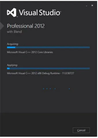
I must say the new installer looks really great and has some smooth animations. This was actually the first time that I felt the long installation time of Visual Studio was worth the wait (Figure 2-2).
Figure 2-1. Visual Studio logo and splash screen
Figure 2-2. Visual Studio 2012 installer
If you keep looking at the installer, you should see a Windows 8 reference passing by. The installer will detect whether or not you’re installing Visual Studio 2012 on a Windows 8 machine. If you are, then the Windows 8 SDK will be installed automatically with Visual Studio.
The Windows 8 SDK is available as a separate download at http://msdn.microsoft.com/en-us/windows/ hardware/hh852363.aspx. A major difference with previous Windows SDKs is that the Windows 8 SDK no longer has a built-in command line compiler. That means if you want to use another integrated development environment (IDE) other than Visual Studio (technically, you can even develop apps in Notepad as long as you have a compiler to run your code through) to develop Windows 8 apps, you will have to make sure that it contains a compiler or that you have one installed on your system.
CHAPTER 2 N GETTING STARTED
7
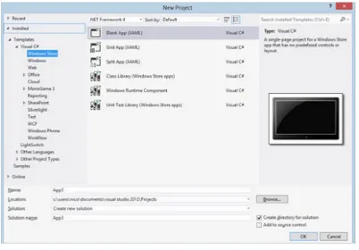
when you submit an application to the store. We’ll delve deeper into the WACK in Chapter 11 of this book, for now just remember that it’s important to run this before you submit your app to the store to save you loads of time.Once your Visual Studio setup is complete, start it up and click New Project. If all went well, you should see Windows Store under your favorite language in the Installed Templates tree, as shown in Figure 2-3.
Figure 2-3. New Project window
If you’re not seeing the Windows Store option, make sure you’re looking under a supported Windows Store language (C#, VB.NET, C++, and JavaScript, there is no F# support at the time of writing). Also make sure you are running Windows 8 and that you didn’t uncheck Windows Store apps during Visual Studio setup.
We’re now basically good to go. You can install your favorite Visual Studio plug-ins if they have a Visual Studio 2012 version. I can’t hardly live without Jetbrain’s ReSharper, which extends Visual Studio in such a way that refactoring big chunks of code is a breeze, and navigating big projects becomes really easy. I personally feel that the key scheme of ReSharper feels better than that of Visual Studio. ReSharper also includes StyleCop, which is a plug-in that checks if your code is formatted the way it should be (pascal case or camel case where needed). There are other tools that have the same functionality if you decide to use them, so find the one that you feel most comfortable with. There is no best or worst plug-in. Also, don’t go searching for the Visual Studio Productivity Power Tools that made Visual Studio 2010 so awesome. They don’t exist for Visual Studio 2012 because they are integrated into the default setup, including the Solution Explorer, with a serious performance boost.
CHAPTER 2 N GETTING STARTED
Starting a First Project
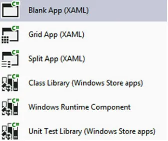
The Windows 8 SDK comes with different templates that start you off with certain layout, navigation, and test data. Should your app design follow more or less the same layout as one of the templates, it provides you with an easy set up and allows you to skip over writing some boilerplate code for the navigation logic. However, don’t just adjust the template and submit the app. Alter the app’s design to make it your own. Your app on the Windows Store is your signature. No one looks at the developer name on the Windows Store, but rather they look at the quality of other apps built by the same person. Your apps build your reputation, not your name. Figure 2-4 gives an overview of the available templates in the Windows 8 SDK.
Figure 2-4. Default templates included in the SDK
We’ll start with the last three templates and then go back to the first three.
Note
N
The code in the templates is great for reference, but they generally don’t use best practices. I would greatly
advise you to start from a blank template and add a basic page to the project. Visual Studio will add some classes and
resource dictionaries to the project. From there you will have a great starting point for your trademark application.
Class Library
The first one, Class Library, should be pretty familiar to those who’ve already worked with .NET. It’s basically a project filled with classes and functions that you can use inside your Windows Store app or even share between different apps. When a Class Library gets built, it results in an assembly. That assembly can be used in applications that target the same framework version. The big advantage here is that we can create a class with common functions, which is often needed in apps. We create the Class Library once and reference it in the apps that need its logic. Class Libraries exist for any type of .NET application, just make sure both the library and the app target the same framework version.
Windows Runtime Component
CHAPTER 2 N GETTING STARTED
9
Windows Runtime Component, and that component can then be called on in, for example, a JavaScript or a C# app. Also background tasks rely on runtime components as they can only be built as a runtime component. This will be discussed more later in the book. The example presented here is actually used in some apps because C++ is a native code and it has more performance than managed code such as C#. If you want to read more about the Windows Runtime Component, including best practices and possible traps, look at the MSDN documentation at http://msdn.microsoft.com/en-us/library/windows/apps/br230301(v=vs.110).aspx.Unit Test Library
A Unit Test Library is just that, a library that should be filled with tests that will test your business logic. If you build your tests just right, you wouldn’t need to run the app every time you change your logic, so you could just run the test and see if the result is what you had expected. Let’s say, for example, you have a class that generates a discount based on what customers have already purchased in the past. At a certain moment in time, that logic will change, and if there are tests available in the project, you would only need to adjust the logic and the expected result in the test and run it. A test that takes a second to complete is better than having to run the app, log in, select a customer, and so on.
With that you should now have some background information about these three project types. I won’t be going into detail about these because we won’t actually use them in the book. Now let’s take a look at the project templates.
Blank App Template
First up is the Blank App Template. This is literally a blank app, with barely any code inside the template. When you run it, all you’ll get is a black screen. The file MainPage.xaml is the first page of your app that will appear. If you want, you can change the startup page in App.xaml.cs. The OnLaunched event creates the page instance. In the Blank App Template, it looks like the code in Listing 2-1.
Listing 2-1. MainPage.xaml
<Page
x:Class="App3.MainPage"
xmlns="http://schemas.microsoft.com/winfx/2006/xaml/presentation" xmlns:x="http://schemas.microsoft.com/winfx/2006/xaml"
xmlns:local="using:App3"
xmlns:d="http://schemas.microsoft.com/expression/blend/2008"
xmlns:mc="http://schemas.openxmlformats.org/markup-compatibility/2006" mc:Ignorable="d">
<Grid Background="{StaticResource ApplicationPageBackgroundThemeBrush}">
</Grid> </Page>
As you can see, the only thing there is a grid. All your page controls need to go in that grid, however,
you are free to change it from a grid to a stack panel or any other container. Listing 2-2 shows the code behind the file
CHAPTER 2 N GETTING STARTED
Listing 2-2. MainPage.xaml.cs
using Windows.UI.Xaml.Controls; using Windows.UI.Xaml.Navigation;
// The Blank Page item template is documented at http://go.microsoft.com/fwlink/?LinkId=234238
namespace App3 {
/// <summary>
/// An empty page that can be used on its own or navigated to within a Frame. /// </summary>
public sealed partial class MainPage : Page {
/// <param name="e">Event data that describes how this page was reached. The Parameter /// property is typically used to configure the page.</param>
protected override void OnNavigatedTo(NavigationEventArgs e) {
} } }
All there is here is a default constructor that initializes all the controls on the page and an event handler for when the app navigates to the page. As you can see, the MainPage inherits from the Page base class. Page is a user control that defines properties for both the bottom and top app bar, a frame where all the content will be shown, and the
NavigationCacheMode. That latter allows us to cache every page in memory. When navigating back to a cached page, the app will load the cached page instead of instantiating a new instance. Next to those properties, the Page class also holds three virtual methods: OnNavigatedFrom, OnNavigatedTo, and OnNavigatingFrom. These are perfect for passing data between pages or saving settings or data when navigating away from a page.
Grid App Template
CHAPTER 2 N GETTING STARTED
11
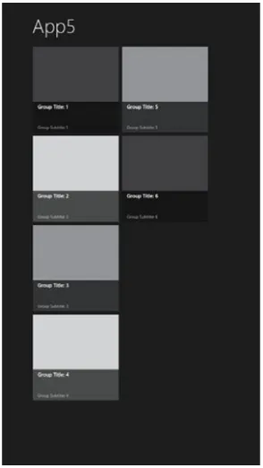
This image clearly shows the groups. Notice that the groups have an angle bracket (>) next to their name. That’s because the group titles provide the link to the group details. One of the design guidelines Microsoft proposes is to use as much content as possible for navigation, providing a much cleaner layout without excessive use of buttons or other navigational controls. The CollectionViewSource allows us to do stuff like grouping and sorting items in a collection without having to write the logic ourselves. The CollectionViewSource takes in our items, applies any sorting or grouping, and creates a view. We can then bind the CollectionViewSource to a control like a GridView to display that view, as shown in Listing 2-3.Listing 2-3. CollectionViewSource in Grid App Template
<Page.Resources>
<CollectionViewSource
x:Name="groupedItemsViewSource" Source="{Binding Groups}" IsSourceGrouped="true" ItemsPath="TopItems"
d:Source="{Binding AllGroups, Source={d:DesignInstance Type=data:SampleDataSource, IsDesignTimeCreatable=True}}"/>
</Page.Resources>
Notice the bindings there? The controls on this page get their information from the DefaultViewModel, which is set as the DataContext for this page. Feeling a bit lost there? Let me explain. An XAML page or element can have a
DataContext, a class that contains a bunch of properties, commands, and other stuff that holds the data and logic for this page or element. When we define a binding on an element’s property, we attach the value from the property on the
DataContext to the property on that element. Take the CollectionViewSource in Listing 2-3 for example. The Source
property is bound to a property called Groups. That property can be found on something called the DefaultViewModel, as you can see in Listing 2-4. When working with XAML applications, it’s really important to have a good understanding of data binding, which we’ll discuss more in depth when we’re talking about Model View ViewModel.
CHAPTER 2 N GETTING STARTED
Listing 2-4. DataContext Set on a Page
<common:LayoutAwarePage x:Name="pageRoot"
x:Class="App4.GroupedItemsPage"
DataContext="{Binding DefaultViewModel, RelativeSource={RelativeSource Self}}" xmlns="http://schemas.microsoft.com/winfx/2006/xaml/presentation"
xmlns:x="http://schemas.microsoft.com/winfx/2006/xaml" xmlns:local="using:App4"
xmlns:data="using:App4.Data" xmlns:common="using:App4.Common"
xmlns:d="http://schemas.microsoft.com/expression/blend/2008"
xmlns:mc="http://schemas.openxmlformats.org/markup-compatibility/2006" mc:Ignorable="d">
Also notice that a page in the Blank Template was of type Page, while in this template it’s of type
LayoutAwarePage.
LayoutAwarePage
The LayoutAwarePage class lives in the Common folder inside the solution. The class inherits from Page, the same class as was used in the Blank Template folder. The most important functions in this class are the GoBack and GoHome functions. The GoBack method is what takes care of the Back button found on the pages in this project template. GoHome navigates the user to the top page on the current navigation stack. The page title and Back button are also present in the template, and they are usually found closer to the bottom of the page (Listing 2-5). Next to that, the LayoutAwarePage class also handles orientation changes, full to snap mode changes, and saving and loading page state. We’ll take a closer look at those functions when we discuss orientation changes later in the book.
Listing 2-5. LayoutAwarePage Back Button and Page Title
<!-- Back button and page title --> <Grid>
<Grid.ColumnDefinitions>
<ColumnDefinition Width="Auto"/> <ColumnDefinition Width="*"/> </Grid.ColumnDefinitions>
<Button x:Name="backButton" Click="GoBack" IsEnabled="{Binding Frame.CanGoBack, ElementName=pageRoot}" Style="{StaticResource BackButtonStyle}"/>
<TextBlock x:Name="pageTitle" Text="{StaticResource AppName}" Grid.Column="1" IsHitTestVisible="false" Style="{StaticResource PageHeaderTextStyle}"/>
</Grid>
Notice that the IsEnabled property of the Back button is bound to the Frame.CanGoBack. Frame is the control that the pages are displayed in. It loads new pages and holds the navigation stack. If the CanGoBack property is false, that means the current page is the top page on the navigation stack, effectively hiding the button.
GroupDetailPage
CHAPTER 2 N GETTING STARTED
13
This page consist of a GridView, just like the GroupedItemsPage, only this time the GridView has a header (the big image with description text under it on the left of the page). Listing 2-6 presents the code associated with the GroupDetailsPage.Listing 2-6. GroupDetailsPage GridView
<GridView
x:Name="itemGridView"
AutomationProperties.AutomationId="ItemGridView" AutomationProperties.Name="Items In Group" TabIndex="1"
Grid.RowSpan="2"
Padding="120,126,120,50"
ItemsSource="{Binding Source={StaticResource itemsViewSource}}" ItemTemplate="{StaticResource Standard500x130ItemTemplate}" SelectionMode="None"
IsSwipeEnabled="false" IsItemClickEnabled="True" ItemClick="ItemView_ItemClick">
<GridView.Header>
<StackPanel Width="480" Margin="0,4,14,0">
<TextBlock Text="{Binding Subtitle}" Margin="0,0,18,20" Style="{StaticResource SubheaderTextStyle}" MaxHeight="60"/>
<Image Source="{Binding Image}" Height="400" Margin="0,0,18,20" Stretch="UniformToFill" AutomationProperties.Name="{Binding Title}"/>
<TextBlock Text="{Binding Description}" Margin="0,0,18,0" Style="{StaticResource BodyTextStyle}"/>
CHAPTER 2 N GETTING STARTED
</StackPanel> </GridView.Header>
<GridView.ItemContainerStyle>
<Style TargetType="FrameworkElement">
<Setter Property="Margin" Value="52,0,0,10"/> </Style>
</GridView.ItemContainerStyle> </GridView>
ItemDetailPage
When one of the items in the list is clicked, the app navigates to the third and final page in this template, the ItemDetailPage, as shown in Figure 2-7.
Figure 2-7. ItemDetailPage
See the arrows on both side of the page? They allow us to flip back and forth between all the items in the collection. That way we won’t have to navigate to the previous page to select another item, and we can just flip until we get the one we need. This is done by using the FlipView control, as presented in Listing 2-7, which spans the entire page.
Listing 2-7. FlipView
<FlipView
x:Name="flipView"
AutomationProperties.AutomationId="ItemsFlipView" AutomationProperties.Name="Item Details"
CHAPTER 2 N GETTING STARTED
15
Grid.RowSpan="2"
ItemsSource="{Binding Source={StaticResource itemsViewSource}}">
<FlipView.ItemContainerStyle>
<Style TargetType="FlipViewItem">
<Setter Property="Margin" Value="0,137,0,0"/> </Style>
</FlipView.ItemContainerStyle>
<FlipView.ItemTemplate> <DataTemplate> ...
</DataTemplate>
</FlipView.ItemTemplate> </FlipView>
That was a quick overview of the Grid App Template, so now let’s take a look at the last template that is included in the Windows 8 SDK.
Split App Template
The Split App Template consists of two pages. The first one is the ItemsPage, which consists of nothing more than a GridView. It’s quite similar to the GroupedItemsPage, the only difference being that the GridView on this page isn’t grouped, and it’s pretty easy to adjust the page so that it has groups if you want them. A simple example where this can be used is a feed reader, as shown in Figure 2-8. The first page shows the headlines, and clicking a headline navigates to the second page showing the complete text with a small list of all the other headlines, making it very easy for the user to read the next article.
CHAPTER 2 N GETTING STARTED
By the way, don’t worry too much about the VisualState stuff on the pages in the templates. This will be discussed in detail in Chapter 8. The ItemsPage has nothing that is new to us, so let’s just skip it and go straight to the SplitPage, as shown in Figure 2-9.
Figure 2-9. SplitPage
The SplitPage consists of a grid divided into two columns, one containing a list with all the items and the second containing the information from the items. This setup is perfect for an RSS reader or a sports app.
The list of items is contained in a ListView, as presented in Listing 2-8.
Listing 2-8. ListView
<!-- Vertical scrolling item list --> <ListView
x:Name="itemListView"
AutomationProperties.AutomationId="ItemsListView" AutomationProperties.Name="Items"
TabIndex="1" Grid.Row="1"
Margin="-10,-10,0,0" Padding="120,0,0,60"
ItemsSource="{Binding Source={StaticResource itemsViewSource}}" IsSwipeEnabled="False"
SelectionChanged="ItemListView_SelectionChanged"
ItemTemplate="{StaticResource Standard130ItemTemplate}"/>
CHAPTER 2 N GETTING STARTED
17
Listing 2-9. ScrollViewer
<!-- Details for selected item --> <ScrollViewer
x:Name="itemDetail"
AutomationProperties.AutomationId="ItemDetailScrollViewer" Grid.Column="1"
Grid.RowSpan="2" Padding="70,0,120,0"
DataContext="{Binding SelectedItem, ElementName=itemListView}"
d:DataContext="{Binding AllGroups[0].Items[0], Source={d:DesignInstance Type=data:SampleDataSource, IsDesignTimeCreatable=True}}"
Style="{StaticResource VerticalScrollViewerStyle}">
<Grid x:Name="itemDetailGrid" Margin="0,60,0,50"> <Grid.RowDefinitions> <StackPanel x:Name="itemDetailTitlePanel" Grid.Row="1" Grid.Column="1"> <TextBlock x:Name="itemTitle" Margin="0,-10,0,0" Text="{Binding Title}"
The ScrollViewer on the SplitPage has a grid as a child containing an image, title, subtitle, and the content. As soon as the grid becomes taller than the page, the ScrollViewer will do its magic and provide a scrollbar for the user. Obviously, it also provides kinetic scrolling on touch-enabled devices.
With that we conclude our quick overview of the templates that are included in the Windows 8 SDK. Let’s take a look at the simulator next.
A Closer Look at the Simulator
CHAPTER 2 N GETTING STARTED
submitting the app to the store. This advice isn’t just for developers that target the Microsoft platforms. Testing on actual devices is equally important for iOS and Android developers (actually Android developer should test on a multitude of devices because not every app works the same way on every device).
You may have noticed that I’m not talking about an emulator for Windows 8 but rather about a simulator. The big difference there is that an emulator actually contains an image of the full iOS it’s emulating; for Windows 8 that would mean running Windows 8 inside of Windows 8, and that can easily be done with a virtual machine. Microsoft decided otherwise, so in order to save resources, the simulator actually uses your Windows 8 installation. The simulator is actually a thin client that remote desktops into your familiar environment. You will be logged in to your own account and all your installed apps will be available.
Let’s fire up that simulator and see what it can do. Open up a Windows Store app solution in Visual Studio 2012, and make sure that the app isn’t installed on your device. Click the small arrow next to the debug button, as shown in Figure 2-10.
Figure 2-10. The run options in Visual Studio 2012
Figure 2-11. The simulator
CHAPTER 2 N GETTING STARTED
19
There it is, looking like a tablet. Now to prove that it really hooks into your actual Windows 8 installation, before doing anything else go to the Start menu on your device and scroll all the way back. Notice the app that’s running on the simulator? That’s right, it’s installed on your device.The simulator allows us to use touch features on a nontouch device. The third and fourth buttons from the top (the arrow and the pointing hand) switch the simulator between mouse and touch capabilities. The fifth button simulates pinch-to-zoom, clicking and holding the left mouse button while using the scroll wheel will give the effect (you can try it on the Start screen in the simulator, just click the button on the bottom side). The seventh and eight buttons rotate the simulator to test if your app rescales to the inverted resolution, as shown in Figure 2-12.
Figure 2-12. App running in portrait mode
Allowing your app to adjust according to the dimension of the device gives a great user experience, so please consider implementing it. Even if you don’t, rotate the simulator once to make sure your app doesn’t crash on it because that will fail the certification.
CHAPTER 2 N GETTING STARTED
By default, the selected resolution is the same one that is set on your physical device. The choices range from the very minimum resolution that allows Windows Store apps to run (1024 × 768, anything lower will just give an error message when trying to run a Windows Store app, including the one started from Visual Studio) to a pretty big 2560 × 1440. Note that besides resolution, the dots per inch (DPI) of a screen also determines how much screen real estate we have for our apps. Many controls in the Windows 8 SDK scale by themselves, a GridView, for example, will show less rows per column on a lower resolution (the Windows 8 Start screen is a great example of this). Make sure to test your app on different resolutions and make them use as much available space as possible. An app that looks great on 1366 × 768 but has two-thirds white space on 1920 × 1080 is not a great user experience, and it’s a waste of space.
Summary
In this chapter, we’ve discussed the different versions of Visual Studio 2012, going from the full-blown versions, such as Ultimate, Premium, and Professional, to the Express edition that has a separate install for each technology, such as Windows Store, Windows Desktop, and Web.
We’ve also discussed the different templates that are included in the Windows 8 SDK: the Blank Template (an empty screen that requires you to do all the hard work and start completely from scratch); the Grid Template (a three-page template containing a grouped GridView, a group detail page, and an item detail page); and a Split App Template (a two-page template containing a split page that has a list of items and a detail view). The detail view is updated automatically if another item is selected in the list.
In the last part of this chapter, we discussed the simulator, a software device that can emulate touch, multitouch, orientation changes, and resolution changes. I can’t stress enough the importance of these features. If you don’t own a device that has an accelerometer to detect orientation changes, make sure to test how your app behaves by using this simulator.
21
CHAPTER 3
Building a First Project
So far we’ve taken a look at installing the newest version of Visual Studio, a very exciting new release of what I believe is one of the best integrated development environments out there. We’ve also gotten a first taste at how it feels to develop and run a Windows Store app, so now it’s time to take that feeling to the next level. This chapter will show how to build a complete, good-looking application. We’ll add pages to the project and learn how to navigate to those pages and how to pass data between them. We’ll also have a look at Model View ViewModel (MVVM), think Model View Controller but for XAML, including a great toolkit that provides an implementation of the MVVM design pattern. And to finish off we’ll learn that an important piece of XAML that is very commonly used in Windows Presentation Foundation (WPF), Silverlight, and Windows Phone is missing in Windows RT. But no worries, we’ll figure something out.
We’re going to build a complete application in this chapter. The application will be a quiz, where the first screen will show some subjects and the player will select a subject and get a multiple choice question with four possible answers. Clicking the correct answer will take the player to a congratulations page, but clicking the wrong answer will show the game over page. Pretty basic, but it contains pages, navigation, and it can be hooked up to an MVVM scenario.
Adding Pages
This chapter will focus on adding pages to a project and building the layout. We’ll be discussing GridViews, StackPanels, WrapPanels, and many more.
Let’s get started! For this chapter we’re going to use the Grid App Template that was discussed in Chapter 2. Select that template, choose a location to store the project, and click OK, as shown in Figure 3-1.
N. Vermeir, Windows 8 App Projects
CHAPTER 3 N BUILDING A FIRST PROJECT
GridView
As mentioned, this template was discussed in the previous chapter. Now let’s take a closer look at the controls that are on the page, starting with the GridView, as shown in Listing 3-1.
Listing 3-1. GridView
<GridView
x:Name="itemGridView"
AutomationProperties.AutomationId="ItemGridView" AutomationProperties.Name="Grouped Items" Grid.RowSpan="2"
Padding="116,137,40,46"
ItemsSource="{Binding Source={StaticResource groupedItemsViewSource}}" ItemTemplate="{StaticResource Standard250x250ItemTemplate}"
SelectionMode="None" IsSwipeEnabled="false" IsItemClickEnabled="True" ItemClick="ItemView_ItemClick">
As you can see, the ItemTemplate property of the GridView is bound to a static resource. That resource is included in this template and can be found under the common folder called StandardStyles.xaml, as shown in Listing 3-2.
CHAPTER 3 N BUILDING A FIRST PROJECT
23
Listing 3-2. DataTemplate
<DataTemplate x:Key="Standard250x250ItemTemplate">
<Grid HorizontalAlignment="Left" Width="250" Height="250">
<Border Background="{StaticResource ListViewItemPlaceholderBackgroundThemeBrush}"> <Image Source="{Binding Image}" Stretch="UniformToFill"
AutomationProperties.Name="{Binding Title}"/> </Border>
<StackPanel VerticalAlignment="Bottom" Background="{StaticResource ListViewItemOverlayBackgroundThemeBrush}">
<TextBlock Text="{Binding Title}" Foreground="{StaticResource
ListViewItemOverlayForegroundThemeBrush}" Style="{StaticResource TitleTextStyle}" Height="60" Margin="15,0,15,0"/>
<TextBlock Text="{Binding Subtitle}" Foreground="{StaticResource
ListViewItemOverlaySecondaryForegroundThemeBrush}" Style="{StaticResource CaptionTextStyle}" TextWrapping="NoWrap" Margin="15,0,15,10"/>
</StackPanel> </Grid>
</DataTemplate>
This is the template used for the items in the GridView. It’s basically a grid that contains an image and some text blocks, which is surrounded by a border. The StackPanel containing the text blocks overlaps the image and is a bit transparent, giving it a nice modern look.
Back to the GridView, there’s an event handler attached to the ItemClick event to respond to the user clicking an item.
Note
N
When using the
ItemClickevent, don’t forget to set the
IsItemClickEnabledproperty to true or the event
won’t fire.
The other properties of the GridView will determine how the GridView is drawn on the screen, how or if it wraps the items, and so on, as shown in the code in Listing 3-3 for GroupStyle.
Listing 3-3. GroupStyle
<GridView.GroupStyle> <GroupStyle>
CHAPTER 3 N BUILDING A FIRST PROJECT
</Grid> </DataTemplate>
</GroupStyle.HeaderTemplate> <GroupStyle.Panel>
<ItemsPanelTemplate>
<VariableSizedWrapGrid Orientation="Vertical" Margin="0,0,80,0"/> </ItemsPanelTemplate>
</GroupStyle.Panel> </GroupStyle>
</GridView.GroupStyle>
We’ll go over these properties from top to bottom. The first one is the HeaderTemplate, which is mainly used when you’re using grouping in the GridView, such as the template does. It’s not necessary to do that, and you can build a great GridView that doesn’t have any groups at all. Every item, header, or other template consists of a DataTemplate, which then contains all the controls, in this case a button with a style that makes it look just like a text block. In Windows Store app development, your content is your navigation, so the group titles are a perfect way of navigating to other pages of your application.
Note
N
Try to avoid any buttons on the pages for navigation. Buttons can be placed in the app bars, but they shouldn’t
be the main way of navigating.
The second template, after the GroupStyle, we encounter in this GridView is the ItemsPanelTemplate. A GridView provides a very basic way of ordering items. If we want we can gain more control over the way items are displayed, and that’s where the ItemsPanelTemplate comes in. The DataTemplate we define here is the one that will be used for ordering and displaying the items. It can go from a grid to a stack panel or a VariableSizedWrapGrid in this case. The VariableSizedWrapGrid provides a grid layout where every item can differ in size by making them span multiple rows and columns. This is commonly used to make the first item in the grid stand out from the rest, for example, an important headline in a news reader app. The WrapGrid part of the VariableSizedWrapGrid means that it will automatically wrap items to the next row or column instead of showing scrollbars.
Note
N
Do not try to set the items in a grid layout, because on a machine with a different resolution, your layout will be
messed up. When using a
WrapGrid, the control will take care of scaling the items correctly on any resolution.
That’s it for the GridView, a pretty easy yet very powerful control that can effectively scale over different resolutions and orientations. The way that the HeaderTemplate and the ItemsPanelTemplate are defined here can also be used to define the ItemTemplate, such as the example in Listing 3-4 shows.
Listing 3-4. ItemTemplate
<GridView.ItemTemplate> <DataTemplate>
<Border BorderBrush="Black" BorderThickness="2" Width="300" HorizontalAlignment="Left" Height="120">
<StackPanel Orientation="Horizontal" VerticalAlignment="Center" Margin="10,0,0,0"> <StackPanel>
CHAPTER 3 N BUILDING A FIRST PROJECT
Don’t worry too much about those binding and converter statements in there, we’ll take a look at those in a minute.
StackPanel
I’ve mentioned the StackPanel a few times already. Those who’ve had some experience with XAML, either from WPF, Silverlight, or Windows Phone, will know exactly what that and the other item containers are. For the rest, let’s do a quick overview. Don’t worry, they are not complex at all and they don’t need the same lengthy explanation as the GridView. I will explain those that are more complex as we encounter them.
Let’s start with the StackPanel, which orders items either under one another or next to one another. The most important property here is Orientation, which can be either horizontal or vertical, with the default being vertical, as in the example in Listing 3-5.
Listing 3-5. Vertical StackPanel
<StackPanel>
<TextBlock Text="Enter Name" Width="180" /> <TextBox Text="{Binding Name}" Width="180" /> </StackPanel>
The StackPanel in Listing 3-5 will show a text block and a text box nicely aligned on top of each other. Listing 3-6 shows the code for a horizontal StackPanel.
Listing 3-6. Horizontal StackPanel
<StackPanel Orientation="Horizontal">
<TextBlock Text="Enter Name" Width="180" /> <TextBox Text="{Binding Name}" Width="180" /> </StackPanel>
This StackPanel will show those same controls side by side. A commonly used scenario for a StackPanel is a form, such as the one presented in Listing 3-7 taken from one of my apps.
Listing 3-7. StackPanel Form
<StackPanel x:Name="LayOutPopUp" Margin="342,133,346,208" Height="300" Grid.Row="1" Grid.ColumnSpan="2" Background="#FFEAE5E5" Visibility="Collapsed">
<TextBlock TextWrapping="Wrap" Text="Name" Style="{StaticResource BasicTextStyle}" Margin="10,10,0,0"/>
<TextBox x:Name="TextBoxName" TextWrapping="Wrap" Margin="10,0"/> <TextBlock TextWrapping="Wrap" Text="Url" Margin="10,20,0,0" Style="{StaticResource BasicTextStyle}"/>
CHAPTER 3 N BUILDING A FIRST PROJECT
<TextBlock TextWrapping="Wrap" Text="Tags, seperated by semicolumns ( ; )" Margin="10,20,0,0" Style="{StaticResource BasicTextStyle}"/>
<TextBox x:Name="TextBoxTags" TextWrapping="Wrap" Margin="10,0"/>
<Grid Margin="0,20,10,20" HorizontalAlignment="Right" Width="658" Height="90">
<TextBlock x:Name="TextBlockError" TextWrapping="Wrap" Text="You need to fill in all textboxes to continue" Style="{StaticResource BasicTextStyle}" VerticalAlignment="Center"
Height="27" Foreground="#DEA00D0D" FontWeight="Bold" Margin="121,22,203,41" Visibility="Collapsed"/> <StackPanel Height="71" Orientation="Horizontal" HorizontalAlignment="Right"
Width="183" Margin="0,0,0,19">
<Button Content="Save" HorizontalAlignment="Stretch" VerticalAlignment="Stretch" Width="80" Click="Button_Click_3"/>
<Button Content="Cancel" HorizontalAlignment="Stretch"
VerticalAlignment="Stretch" Margin="20,0,0,0" Width="80" Click="Button_Click_2"/> </StackPanel>
</Grid> </StackPanel>
Notice the StackPanel inside the StackPanel in Listing 3-7? That’s because all controls are stacked vertically, and we needed two buttons next to each other.
Grid
Another very common container is the Grid. Every page you create in a Windows Store app consists of a Grid by default. This can be changed into any other container control, such as a StackPanel. A Grid can be divided into rows and columns of set or variable sizes, and controls can then be placed into one of those cells or they can be made to span multiple cells. Listing 3-8 presents an example of the Grid.
Listing 3-8. Grid
<TextBlock Grid.Row="0" Grid.Column="1" Foreground="Gray" FontFamily="Segoe UI Light" FontSize="45" Text="Developer links" />
</Grid>
CHAPTER 3 N BUILDING A FIRST PROJECT
27
Canvas
Another container that is commonly used is the Canvas, which is typically used for absolute positioning of controls operations page. This can be a big disadvantage when dealing with different resolutions and screen sizes. An example of the code for the Canvas is shown in Listing 3-9.
Listing 3-9. Canvas
<Canvas Width="640" Height="480" Background="White"> <Rectangle Canvas.Left="30" Canvas.Top="30" Fill="red" Width="200" Height="200" /> </Canvas>
No matter where on the page this canvas is drawn or what the resolution of the device is, the rectangle inside the Canvas will always be drawn at 30 pixels from the top and 30 pixels from the left of the Canvas. This kind of functionality makes the Canvas a great element for games built in XAML.
Note
N
The
Canvaselement has some similarities to the HTML5
Canvaselement. They share some of the same
features and advantages.
The Grid, the StackPanel, and the Canvas are the most common XAML controls that are used to lay out a page in an XAML project. That’s why I spent some time on that here. We’ll take a closer look at other controls throughout this book.
Our Project
All right, all very interesting stuff. Now back to our little project. The GroupDetailPage has basically the same layout as the first page. The big difference here is the HeaderTemplate, as shown in Listing 3-10.
Listing 3-10. GridView
<GridView.Header>
<StackPanel Width="480" Margin="0,4,14,0">
<TextBlock Text="{Binding Subtitle}" Margin="0,0,18,20" Style="{StaticResource SubheaderTextStyle}" MaxHeight="60"/>
<Image Source="{Binding Image}" Height="400" Margin="0,0,18,20" Stretch="UniformToFill" AutomationProperties.Name="{Binding Title}"/> <TextBlock Text="{Binding Description}" Margin="0,0,18,0" Style="{StaticResource BodyTextStyle}"/>
</StackPanel> </GridView.Header>
CHAPTER 3 N BUILDING A FIRST PROJECT
Adding a Page
That second page is pretty useless to us for the moment. Let’s add a new page that we’ll use to ask the quiz question. Right-click the project in the Solution Explorer and select Add New Item, as shown in Figure 3-2.
Figure 3-2. Adding a page
All the page templates here are the same pages that exist in the project templates for Windows Store apps. We’re going to go with the Basic Page for now. The Basic Page inherits from the LayoutAwarePage class and provides all the logic for navigating back, showing a page title with all margins set like the Windows Store guidelines describe, so that’s a really good starting point.
Note
N
When adding a basic page to a blank project, you might see a dialog box pop up asking you if it’s okay to
add some stuff to the project. The stuff that it wants to add is everything found in the
Commonfolder, such as the
LayoutAwarePage
class and
StandarStyles.xaml. We’ll get back to those in more detail later in the book.
So we’ve taken a look at the most commonly used item containers and we’ve added a page to our project. What we’re going to do next is clean up the project a bit and start adding some navigation and a basic layout to it.
Let’s start by adding another new page to the project called MainPage. Next we’ll remove all pages except for the two pages we’ve added ourselves. So remove GroupDetailPage, GroupedItemsPage, and ItemDetailPage.
CHAPTER 3 N BUILDING A FIRST PROJECT
29
That’s because that page is set to launch when the application starts, so let’s change that. Open App.xaml.cs, navigate to the OnLaunched method, and find this part of the code:if (!rootFrame.Navigate(typeof(GroupedItemsPage), "AllGroups")) {
throw new Exception("Failed to create initial page"); }
This is the piece of code that initializes and shows the first page of the application. Replace the
typeof(GroupedItemsPage) with typeof(MainPage) and our app should run fine again, although it will no longer show any items. We could’ve just started off with a blank project and started adding items, but then I wouldn’t have been able to explain the GridView properly.
Let’s get our MainPage to show some items that navigate to another page when clicked. First, we’re going to need to set the DataContext of that page. The DataContext is an instance of a class where the controls that are bound will look for their source. To start, we’re going to bind to properties that are in the code behind the page. To do that, we set the DataContext at the top of the MainPage.xaml, as shown here:
DataContext="{Binding RelativeSource={RelativeSource Self}}"
Next, we’ll create a data source to retrieve some data. We’ll take a look at contacting services later in the book, so for this example I have some hard-coded data. In MainPage.xaml, we’ll retrieve all subjects and show them in a GridView. I prefer to retrieve the data from the OnNavigatedTo event instead of from the constructor as the constructor isn’t always called when navigating to this page because when we navigate back to a page we go back to the existing instance. First, declare a property to contain all the subjects, then call the data source to load the subjects, as shown in Listing 3-11.
Listing 3-11. OnNavigatedTo Method
public List<string> Subjects { get; set; }
protected override void OnNavigatedTo(NavigationEventArgs e) {
Subjects = QuizDataSource.GetSubjects();
base.OnNavigatedTo(e); }
When overriding the OnNavigatedTo event handler, don’t forget to call the base OnNavigatedTo method. If you forget this, the app will crash whenever a user clicks the Back button to navigate back to this page. That’s because this page inherits from the LayoutAwarePage base class. The OnNavigatedTo method in that base class configures the
SuspensionManager, so we can easily navigate back to this page.
Now add a GridView to the page and bind its ItemsSource to the Subjects property, as demonstrated in Listing 3-12.
Listing 3-12. GridView with ItemsSource
<GridView Grid.Row="1" Margin="120,0,0,0" ItemsSource="{Binding Subjects}">
</GridView>
CHAPTER 3 N BUILDING A FIRST PROJECT
Our binding seems to be working, good work! Time to add some navigation. First, we need the GridView to respond to an item click, as demonstrated in Listing 3-13.
Listing 3-13. GridView with Properties
<GridView Grid.Row="1" Margin="120,0,0,0" ItemsSource="{Binding Subjects}" IsItemClickEnabled="True"
ItemClick="GridView_ItemClick_1">
</GridView>
Don’t forget to set the IsItemClickEnabled property to true or your grid won’t respond to the ItemClick event. Listing 3-14 shows how we navigate to the next page.
Listing 3-14. Navigation
private void GridView_ItemClick_1(object sender, ItemClickEventArgs e) {
Frame.Navigate(typeof (QuizPage)); }
CHAPTER 3 N BUILDING A FIRST PROJECT
31
Every XAML-based app consists of a frame that shows the necessary page. The Navigate method takes the page that’s passed as a parameter and displays it in the frame. In Windows Phone apps, the page was passed as a string, and in Windows Store apps, it’s passed as a type. The biggest advantage we have in this is IntelliSense support and less chance of runtime errors for our users. With that in place, our app should navigate to our second page when an item in the GridView is clicked.Navigating is one thing but it could also come in handy to pass some data from one page to the next. The
Navigate method has an overload that allows data to pass through to the next page. The parameter is of type object so basically we can pass anything. For our quiz application we’ll pass the subject, so here just a string. Modify the
Frame.Navigate call to look like this:
Frame.Navigate(typeof (QuizPage), e.ClickedItem);
QuizPage
On to our QuizPage we go. On this page we need to overwrite the OnNavigatedTo method just like we did on the
MainPage. The NavigationEventArgs that gets passed into the OnNavigatedTo method has the parameter that we passed in the navigation call. We’re going to take that parameter and set it to a property that we can then bind to the page title, as shown in Listing 3-15.
Listing 3-15. Title Property
public string Title { get; set; }
protected override void OnNavigatedTo(NavigationEventArgs e) {
if(e.Parameter != null) {
Title = e.Parameter.ToString(); }
base.OnNavigatedTo(e); }
We first check to see if there actually is a parameter, and if there is, we pass it to the Title property. Second, we need to adjust the title TextBlock in the XAML to be bound to the Title property, as shown in Listing 3-16.
Listing 3-16. Bound TextBlock
<TextBlock x:Name="pageTitle" Grid.Column="1" Text="{Binding Title}" Style="{StaticResource PageHeaderTextStyle}"/>