John D
i
Marco
An introduction to theory, principles,
and techniques
John DiMarco, Ph.D.
Published simultaneously in Canada
No part of this publication may be reproduced, stored in a retrieval system, or transmitted in any form or by any means, electronic, mechanical, photocopying, recording, scanning, or otherwise, except as permitted under Section 107 or 108 of the 1976 United States Copyright Act, without either the prior written permis-sion of the Publisher, or authorization through payment of the appropriate per-copy fee to the Copyright Clearance Center, 222 Rosewood Drive, Danvers, MA 01923, (978) 750-8400, fax (978) 646-8600, or on the web at www.copyright.com. Requests to the Publisher for permission should be addressed to the Permissions Department, John Wiley & Sons, Inc., 111 River Street, Hoboken, NJ 07030, (201) 748-6011, fax (201) 748-6008, or online at www.wiley.com/go/permissions.
Limit of Liability/Disclaimer of Warranty: While the publisher and the author have used their best efforts in preparing this book, they make no representations or warranties with respect to the accuracy or com-pleteness of the contents of this book and specifically disclaim any implied warranties of merchantability or fitness for a particular purpose. No warranty may be created or extended by sales representatives or writ-ten sales materials. The advice and strategies contained herein may not be suitable for your situation. You should consult with a professional where appropriate. Neither the publisher nor the author shall be liable for any loss of profit or any other commercial damages, including but not limited to special, incidental, con-sequential, or other damages.
For general information about our other products and services, please contact our Customer Care Depart-ment within the United States at (800) 762-2974, outside the United States at (317) 572-3993 or fax (317) 572-4002.
Wiley also publishes its books in a variety of electronic formats. Some content that appears in print may not be available in electronic books. For more information about Wiley products, visit our web site at www.wiley.com.
Library of Congress Cataloging-in-Publication Data:
DiMarco, John, 1969–
Digital design for print and web : an introduction to theory and techniques / by John DiMarco. p. cm.
Includes bibliographical references and index.
ISBN 978-0-470-39836-4 (pbk. : alk. paper) 1. Commercial art—Data processing. 2. Graphic arts—Data processing. 3. Web sites—Design. I. Title.
NK1520.D56 2009 741.6--dc22
2009033990
Printed in the United States of America
Behaviors . . . 312
Uploading Files to the Internet . . . . 319
Design Assignment . . . . 322
Online Movie Lessons . . . . 322
Bibliography . . . . 322
Figure Credits . . . 323
index . . . 327
Digital Design for Print and Web: An Introduction to Theory, Principles, and Techniques was written to help people succeed with digital design. It is a learning product that incorporates both video lessons and an in-depth textbook written from two perspectives—that of a student, and that of a teacher.
First I put myself in the shoes of a new designer or design student caught up in a frenzy of information. The melding of new technology, techniques, and prin-ciples causes many inexperienced designers to default to honing their computer skills, rather than establishing their design sense. This is dangerous: it creates a backlash against the creative process, which requires us to think creatively and then produce—not the other way around. As tools and technology become increasingly accessible—and powerful—I see this problem among more and more students.
To learn design, you need to recognize it and extract its principles for use in your own work. To be a digital designer, you must marry the principles of design to software techniques. You are thus engaged in using theory in practice. That is what this book is about. It will help you discover the principles of design and understand the most vital digital design techniques used today. Along the way, you will learn by seeing real-world design examples from highly prominent designers and artists. Then you will learn by doing, using step-by-step examples and tutorial movies.
Although the text presents several different industry-standard software applications, the book is technique driven rather than software driven. The techniques are applied to digital design problem solving across software titles and versions. The book aims to provide value to small lab settings that demand hands-on instructors as well as to larger courses planned around instructor-driven lectures and demonstrations that encourage experienced students to explore software techniques on their own. Inspiration is provided through images from classic and contemporary designers.
Part One presents introductory design and graphic communication con-cepts and principles. Theoretical coverage includes a concise design overview surveying communication goals and fundamental design principles, using historical, professional, and student images of digital print design, Web design, Web graphics, digital imaging, and digital illustration.
Part Two introduces technical coverage, providing a primer of basic to intermediate digital design techniques for students of communication design, graphic design, computer graphics, and media graphics.
Unique Features
Over two hundred historical and professional illustrations of design
con-•
cepts, print design, Web design, Web graphics, digital imaging, and digital illustration from world-renowned designers and design firms as well as students.
Coverage of theory and practice in one text.
•
Online tutorial movies for each chapter to support classroom lectures,
stu-•
dent assignments, and lab sessions.
Design assignments for in-class or homework assignments.
•
Illustrated, step-by-step techniques.
•
A comprehensive connection between theory and practice.
•
Critical terms and techniques combined with short treatments to provide a
•
thorough primer for new learners.
Advanced production projects online for accelerated students.
•
Progression toward print and Web project development.
•
Pedagogical tools including chapter objectives, key design concepts, design
This book was a team effort. Following are the people who helped make it come together.
The Team at Wiley
I am thankful to the team at John Wiley & Sons who made my vision a reality. Senior editor Margaret Cummins and her assistants Leslie Saxman and Lauren Poplawski worked hard to mold my ideas into a publication that would impact the lives of students and professionals across the world. Margaret walked me through this project, sharing her wealth of experience and expertise freely. She challenged me to develop a book that would refresh the digital design publica-tion market and enable people who read it to learn critical principles and tech-niques in a way that is clear, comprehensive, and innovative. I also need to thank senior production editor David Sassian and copyeditor Andrew Miller for polish-ing the manuscript into a finished work.
Contributors to This Book
I was so fortunate to connect with a wealth of great creative professionals when I was writing this book. These designers, photographers, and design history icons, as busy as they are, were kind enough to respond to the requests I sent them for images of their work. Those images helped make this book beautiful and practi-cal, and I am grateful to each one of them for their contribution to my small piece of history.
James Biber of Pentagram Design Michael Bierut of Pentagram Design Michael Calandra
Kristen Crawford
Greg D’Onofrio of Kind Company John Fekner
Brian Fendt Kevin Fornito
Michael Gericke of Pentagram Design Milton Glaser of Milton Glaser Studio Luke Hayman of Pentagram Design Kitt Hendricks of Pentagram Design
Julia Hoffmann, Creative Director, Museum of Modern Art (MOMA) Angus Hyland of Pentagram Design
Don Leicht
Domenic Lippa of Pentagram Design Alvin Lustig
Elaine Lustig Cohen Richard Kirk Mills
Justus Oehler of Pentagram Design
Susannah McDonald, Archivist at Pentagram Design Abbot Miller of Pentagram Design
Micha Riss of Flying Machine Stefan Sagmeister of Sagmeister Inc. Paula Scher of Pentagram Design Jee Won Sin
Tommy Spero of Soul Associates DJ Stout of Pentagram Design Lisa Strausfeld of Pentagram Design Richard Rex Thomas
Special Thanks
My former student, and now my friend and colleague, Kristen Crawford pro-vided many of the illustrations and figures in this book, working through my sometimes cryptic requests. Her tireless dedication to this project was instru-mental to its success. I am thankful to have met Kristen and value her friendship.
My former students Brian Fendt, Kevin Fornito, and Michael Calandra gra-ciously provided their photography and artwork for the in-text examples and learning movies.
Richard Rex Thomas wrote a special appendix on digital photography for the book. I am thankful to Rex for taking time out of his busy life to give my readers a chunk of his expertise.
My Mentors
Dr. Frank Brady has given me the opportunity to succeed at the institution that I love, St. John’s University, and the guidance I constantly need to navigate aca-demia and achieve my goals. I cherish my relationship with him and am honored to receive kind mentoring from such an accomplished scholar. I also need to thank Dean Kathleen Voute MacDonald of St. John’s University, who has sup-ported my professional projects and research efforts from the beginning of my journey at St. John’s. Dr. Richard Smiraglia has been a foundation for learning and taught me how to perform research and write effectively. Finally, my former professors (whom I now call friends), John Fekner and Rick Mills have guided me to embrace a life of creativity—something I will cherish forever.
My Students
My Family and Friends
Nothing happens in my life without my most important support system, my family and friends. My wife Kimberly is my partner, my love, and my life. My boys, David and Jack, bring me joy and pride, and I only hope that I can help them grow into people who find true happiness and make a difference in society.
chapter objectives
define graphic communication.
identify and define communi-cation goals: information, persuasion, education, and entertainment.
What Is Graphic Communication?
Graphic communication is the result of a long evolution of tools and tech-niques. That evolution was greatly accelerated by the establishment of modern, industrial societies—and graphic communication itself greatly contributed to modern social and economic development, to the extent that today visual communication is a readily identifiable force in the growth of both Western and Eastern “postindustrial” information economies.
According to historical literature, graphic communication has taken as long as 30,000 years to evolve (Meggs 1998). The role of the visual communica-tor—and the function of communication—developed slowly: cave paintings done between 15,000 and 10,000 B.C., the invention of writing with picto-graphs in Mesopotamia (3100 B.C.), the invention of paper and Chinese relief printing (second century A.D.), the rise of late medieval illuminated manuscripts (eighth century A.D.), and the breakthrough of movable type in Europe (1450 A.D.) all contributed to that development. Investigation of communication design over the last century reveals patterns of technological, economic, occu-pational, spatial, and cultural development that can be attributed to the creation of an information-driven economy and society that relies on communication design and technology for stability and growth.
Although enhanced and changed by modern technology, including software and computers, the basics of communication have essentially remained the same through the millennia. Communication is a process that requires a sender (the designer), a message (information or an effort to persuade), a medium (the delivery platform), and a receiver of that message (the audience). Communication comes in various forms and is delivered in various media, or platforms for com-munication delivery. These media include all forms of printed paper or material (books, magazines, newspapers, brochures, flyers, signage, and billboards), the Internet, mobile phones and handheld devices, television, radio, CDs and DVDs, videos, video games, and films. Media transmitted to mass audiences is called mass media; it includes television, film, recordings, mobile technology, magazines, books, the Internet, and radio. Conversely, a brochure, part of a collection of col-lateral material, may only be seen by a few people.
the mass media. Then, we step back and decipher the message to determine if it can be trusted, and to what level it can be absorbed and used by us; this process is part of media literacy. In all forms of communication, judicious design and pro-fessional production values therefore become vital to the success of a message. The final product—how it looks and performs visually—becomes a factor in the value of the communication and how it meets its goal. The content, design, and medium (output) make up the complete message, and each has an effect on the communication’s perceived credibility and persuasiveness.
Communication can be written, as with copywriting and poetry. It can be visual, as with graphic design and fine art. It can be verbal, as with speech or song, or nonverbal, as with body language, dance, or instrumental music. This book focuses on visual communication and production in print (i.e., on paper) and on the Web.
The goals of such messages are to inform, to persuade, to educate, or to entertain. These goals overlap in many instances, but ultimately we plan communication vehicles such as brochures, Web sites, advertisements, com-mercials, animations, posters, flyers, books, magazines, video games, films, newspapers, and presentations with one specific goal in mind. For example, a children’s site could have the specific communication goal of educating children in math techniques. That central goal
may be enhanced by using entertain-ment in the content of the site—for example, interactive games and ani-mation that explain math techniques in a fun, engaging way. A newspaper attempts to deliver news that informs the reader quickly and efficiently by using headline text, charts, and graphs. When newspapers print sensual or shocking images, although the main goal may be to inform, the effect may be also to elicit an emotional response from readers.
Paul Martin Lester (2006, 50–51) outlined two ways that we process communication: sensually and percep-tually. These differing pathways have been studied by scientists and other researchers. The sensual process, that which leads from sensation to visual communication, occurs when our eyes see visual forms and our brain takes the sensations (visual input) and makes a coherent image (also known as a gestalt). Perceptual processing occurs
when our brains make immediate meaning from an image we see, such as that of a traffic light. The gestalt principle states that we see the whole before we identify the parts. Our brains separate wholes into parts to establish a figure (foreground) and a ground (background). When we can visually stabilize the parts into a whole image and identify figure and ground, we can make visual sense of an image. Combining images creates new meanings from the identifi-cation of associated symbols.
Perception to visual communication occurs when we see images beyond the sensations and assign them complex meanings. An approach to understand-ing perception is semiotics, the study of signs. Signs have complex cultural meanings and can be seen in three ways: iconic, indexical, and symbolic (Lester 2006, 52–57). We are guided by iconic signs in everyday life: iconic signs are intended to be true representations of what they present—such as a photo-graph. Indexical signs have a logical connection to what they represent, such as dark clouds as a sign of stormy weather or falling snow as a sign of winter. Symbolic signs forge a cultural or social connection between an image or object and what it represents. Therefore, symbolic signs take on different meanings for different audiences—as in the case of a flag, monument, or style of dress.
As designers, we create a series of signs each time we create imagery. Our focus on the goals of a communication helps ensure that we create meaningful, simple, and understandable signs. Creating thoughtful communication requires researching the audience, recognizing its cultural and societal viewpoints, and delivering simple, clear messages that connect with its need or ability to be informed, persuaded, educated, and entertained. Indeed, using communication
with the intended goal of informing, persuading, educat-ing, or entertaining is the applied focus of digital design. The pervasive, all-encompassing power of digital
information and communication technologies have given us a potent platform for gathering
data, sculpting it into meaningful infor-mation, and producing designs that can
be delivered via print, Web, broadcast, mobile technology, or industrial material.
Information
What Is Information?
Information is a raw material of—and core ingredient in—all designs and is part of all communication goals. Information is gathered in myriad ways and then adapted to fit the goal of the communication—whether to inform, persuade, educate, or entertain. We must have information in order to create a design.
Information is structured data. Data consists of random bits and pieces that can be seen all around us and can be gathered. We process data to create infor-mation that has meaning and contextualizes our reality. Numbers are a great example of data. Random numbers have little meaning to us, but when they are placed in a context, such as a birthday, on a player’s uniform, or in a name (such as Louis XIV), they become information with meaning.
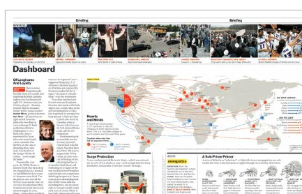
Information design arranges chunks of data and information to inform the viewer. Information-focused designs communicate to us each day as we stop at a stop sign, read a train schedule, or watch the weather report on the evening news. Information designs are seen in newspapers, news-casts, calendars, timelines, charts, corporate reports, news Web sites, and instructional materials.
The meaning attached to informa-tion design can be purposeful, as in a campus map, or it may be lifesaving, as in an emergency exit sign. Informa-tion design must have high fidelity in meaning and visual strength in exe-cution-because it guides the viewer during action. People must navigate through a Web site in order find information (text, photos, video, and audio content). Similarly, when read-ing a newspaper, people must navigate through various articles and sections in order to find information (stories, box scores, and ads) meaningful to them. Although there is an element of curiosity (looking for things) and discoverabil-ity (finding things) in print and Web interactions, information design—both for print and the Web—works to guide a viewer toward meaning as quickly as pos-sible. In print design, the message must be read, understood, and processed by the viewer so it can be acted upon. This is known as legibility. In Web design, it is known as usability. The concepts of legibility and usability are discussed further in part 2 of this book.
Principles and Goals: Design for Information
When creating designs for information, decisions related to what viewers want—and what they need to be informed—become critical to success, and smart choices must be made based on the product definition, the audience, the
environment, the development tools, and available raw materials. Decisions about text, images, and technology, which are needed to develop and deliver the message, should always be planned out.
Structure is the key component in information graphics (also known as infographics); achieving the proper gestalt (unification of the parts) leads to understanding on the part of the viewer or user. Therefore, information design-ers frequently use fact boxes, tables, diagrams, and illustrations. In his classic text Envisioning Information, Edward Tufte describes the flat, two-dimensional paper or video/computer screen media used in information design as “flatland.” “Escaping flatland,” states Tufte, is a key goal in designing the presentation of information (Tufte 1990, 12). He promotes information density (quantity) and resolving power (clarity) in information design. He suggests the following prin-ciples to help escape flatland and build meaningful designs for information:
Micro/macro readings represent information that is rich in detail and in
•
overall structure. Micro refers to critical information that is read carefully to extract meaning. Macro refers to the larger whole that contains the micro components. We frequently see micro/macro readings in maps, flowcharts, blueprints, timetables, and monuments.
Layering and separation represent an informational structure through
•
overlapping elements, grids, margins, and white space. We frequently see layering and separation in Web pages, charts and graphs, catalogs, ads, magazines, newspapers, books, and brochures.
Small multiples represent information using repetition, consistency, mimicry,
•
and iconic representation. We frequently see small multiples in instruction manuals, road maps, posters, computer interfaces, data tables, and charts.
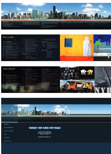
Figure 1-8 This wrapping paper for AIGA presents a fun overall visual structure using patterning. Smaller, detailed images create micro structures that can be viewed independently, which is also fun. Design by Julia Hoffmann.
Color provides hierarchical value, sensation, contrast, and visual texture.
• 1
Color is a fundamental component of all design.
Figure 1-9 The Alvin Lustig history site by Kind Company uses black and white and warm colors to separate sets of visuals and information and to establish a stylized retro mood. Design by Kind Company.
Persuasion
What Is Persuasion?
The notion of persuasion is essential to many scholars’ definitions of commu-nication. David Berlo’s definition of communication states, “All communication behavior has as its purpose the eliciting of a specific response from a specific person (or group of persons)” (Berlo 1960, 16).
Persuasion is central to all communication, especially digital design, and par-ticularly as it is applied to advertising. Information is converted into persuasive arguments during the advertising creative process (White 2007, 11). Persuasive arguments provide controlled messages that highlight features, advantages, benefits, and a unique selling proposition to a target audience. Persuasion is attempted by delivering rational appeal (using factual argument) or emotional appeal (using values, opinions, and attitudes) to bring someone to action. Action comes in the form of buying a product or service, subscribing to an idea, donating to a public service organization, or voting for a political candidate.
Brands, an essential tool in persuasion, are “cre-ated in the mind,” according to Walter Landor
(Wheeler, 2003). Brands become the icons that customers look for when purchasing
products. Built around symbolic logos, brands evolve into identities recogniz-able to consumers. The designer works to establish a visual icon—a logo—that represents the brand and creates a channel of persuasion built on trust and recognition. We recognize and connect to certain brands as they become iconic, indexical, or symbolic to us. The look of the corporate identity is critical in representing the company and its products and services.
Figure 1-14 Paula Scher quickly made visual sense of the Travelers merger with Citibank. She effortlessly mocked up the concept on a napkin during the pitch meeting. Design by Paula Scher.
Figure 1-15 The Citi logo. Photo by John DiMarco
Principles and Goals: Design for Persuasion
Our goal as designers who create persuasive documents is simple in theory, but quite challenging in practice. We must use type, image, and multimedia to bring the viewer to an understanding of the message and a desire to act upon it. We want the viewer to understand the feature, advantage, or benefit we are pre-senting. We want the viewer to agree to the unique selling proposition we are pitching through the visuals we present in our persuasive designs.
Certain elements of persuasive designs have resonance in the human mind. A design cannot be persuasive if it cannot be understood. Concentrate on one idea for each persuasive communication. Follow these suggestions in your print and Web designs to increase their persuasive value:
Do research on the audience and the
•
competition to put you in the viewer’s situation.
Use arresting or thought-provoking
•
images (photos or illustrations) that act as a magnet for the viewer’s eyes. Use display type (which is larger and
•
more dominant than the body text) that draws the reader in. Create visually dominant attention-seeking headlines. Explain and clarify features,
advan-•
tages, and benefits in highly legible body copy.
Use grids to arrange elements in order
•
of importance.
Use size to clarify meaning and create
•
visual hierarchy.
Use color to attract attention, group
ele-•
ments, indicate meaning, and enhance aesthetics (Lidwell et al. 2003, 38). Keep messages and visual elements
•
simple so recognition is quick. Use themes to connect with the
•
audience.
Education
What Is Education?
Simply stated, education is the process of transferring knowledge and skills. Instructional design is also known as designing for education and is also used in designing for training. The goal of education design is to translate learning objectives (lessons) into measurable outcomes for the learner. Connecting a lesson-based communication into a learning experience requires instructional design; the designer must create engaging, understandable chunks of commu-nication that guide the viewer toward comprehension, application, criticism, and synthesis of something that is new. We see design for education in textbooks (such as this one) and children’s books, online learning objects (such as interac-tive games and activities), educational brochures (like the one at your dentist on how to properly brush your teeth), educational television and videos (Sesame Street and Blue’s Clues, for example), posters, classroom teaching materials, and e-learning courses for academic credit or corporate training.
Principles and Goals: Design for Education
In their book Universal Principles of Design, Lidwell, Holden, and Butler answer the question, How can I help people learn from a design? The authors provide some fundamental sections on how a designer can enhance the learning experience for the viewer.
Use chunks (small units) of information in designs. Chunking involves
com-•
bining many units of information into smaller units, or chunks, so it is easier to remember the information (Lidwell et al. 2003, 30). Using bulleted lists, tables, and short paragraphs of text helps the learner grasp topics and avoid overload when absorbing new information.
Use hierarchy in designs for education. Using trees, nests, and stairs in
•
educational graphics helps the viewer make relationships to the mate-rial presented and emphasizes
the importance of each element (Lidwell et al. 2003, 104).
Pursue legibility at all costs in design
•
for education, because it is critical to understanding. Legibility ensures that items are as clear and simple as possible so that the viewer can digest the information without ques-tions. Using contrast, space, type, and images consistently helps build legibility in your education designs. Use mental models to illustrate
con-•
cepts that involve user experience and how something works (Lidwell et al. 2003, 130). Use real-life mod-els if available and appropriate, but do not use models that are not spe-cific to the task. The design should incorporate the real event and the expected outcome in order to cre-ate scenario-based learning. Mental models are used in simulations. For
com-example, flight simulators teach pilots how to use aviation instrumenta-tion without being in planes. For the designer to understand the model and to grasp key interactions, he or she should use the model in real life first, before—as well as during—the design process, if possible.
Use progressive disclosure in education and instructional designs to
man-•
age complex information so that it is displayed only at the necessary time (Lidwell et al. 2003, 154). Give viewers only what they need to learn at that particular moment. New, more complex information should be discov-ered upon request or after simpler information is digested. In print design, progressive disclosure is seen in footnotes, appendices, and instructions. Instruction manuals guide the reader toward learning about a product by revealing more complex features as the reader gets deeper into the manual’s contents. In Web design, progressive disclosure is seen by clicking a button labeled More or Next. Web-based training, also known as e-learning, uses progressive disclosure to pace the learner through the materials and to give relevance to each chunk of information being presented.
Entertainment
What Is Entertainment?
Dictionary.com defines entertainment as “something affording pleasure, diver-sion, or amusement, esp. a performance of some kind.”2 Design for entertain-ment is seen in fine art, television programs, plays, animation (for TV, Web, and gaming), video games, films, books, magazines, movies (on television or the Web), e-books, and digital video on the Web.
Principles and Goals: Design for Entertainment
Entertainment design requires focus oncreating an art form that has the ability to engage the viewer or listener to appreciate a product emotionally and intellectually (Pramaggiore and Wallis 2008, 3). The basic framework of items that you would need to focus on when designing for entertainment are:
Narrative or documentary (the story
•
and the writing: fiction or nonfiction) Cinematography (the camera work:
•
shot setups, framing, lighting) Staging (the set design: stage or
•
screen)
Audio (dialogue and sound effects)
•
Characters (the talent: actors or
•
animations)
Visuals (titling, images, special
•
effects)
Style (the look and feel of the details)
•
Delivery medium (television, print
•
vehicle, Web site, DVD, video, CD-ROM, movie theater, stage, concert hall).
Entertainment design as a visual product (not a manuscript of text only) relies upon images and narrative to create connection with the viewer. The digital design of visual entertainment content is seen extensively in works with moving images, such as movies and animations. Entertainment design is also seen in the packaging of entertainment content and news, such as posters, CD and DVD covers, books, digital videos, Web sites, and magazines.
References
Benedetti, Paul, and Nancy deHart. 1997. On McLuhan: Forward through the rearview mirror. Cambridge: MIT Press.
Berlo, David K. 1960. The process of communication: An introduction to theory and practice. San Francisco: Rinehart.
Holtzschue, Linda. 2006. Understanding color: An introduction for designers. Hoboken, NJ: John Wiley & Sons.
Lidwell, Paul, Kritina Holden, and Jill Butler. 2003. Universal principles of design. Gloucester, MA: Rockport.
Lester, Paul. 2006. Visual communication: Images with messages. Belmont, CA: Thomson Wadsworth.
Meggs, Phillip. 1998. A history of graphic design. New York: John Wiley & Sons. Pramaggiore, Maria, and Tom Wallis. 2008. Film: A critical introduction. London:
Laurence King.
Tufte, Edward. 1990. Envisioning information. Cheshire, CT: Graphics Press. Wheeler, Alina. 2003. Designing brand identity: A complete guide to creating, building, and maintaining strong brands. Hoboken, NJ: John Wiley & Sons. White, Alex W. 2007. Advertising design and typography. New York: Allworth
Notes
1. Holtzschue (2006, 30) writes that sensation is the body’s response to stimulus.
chapter objectives
define design as a problem-solving tool for communication. introduce basic design types. identify modern, functional
influences.
identify and integrate mod-ern, functional design devices.
explore exemplary and inspirational images from a variety of artists and designers.
Design as a Problem-Solving Tool
What Is Design?
A noun and a verb, design has a variety of meanings. As a verb, design desig-nates an activity. To design something is to conceive, invent, or create to solve a problem. As a noun, design designates a visual or industrial composition. Con-necting the two, we can define design as a visual or industrial composition that solves a problem.
Design is a process and a tool. We see the residual effects of design in new and improved products and technological innovation. On the industrial side of design, let’s use automobiles as an example. A major automobile safety prob-lem is the head-on car crash. A head-on crash may cause a driver or passenger to be catapulted out of the vehicle upon impact, causing serious or lethal injury. To solve this problem, industrial designers first invented lap-only seatbelts. Lives were saved as time went on. However, research showed that injuries still occurred, because passengers were getting injured from the whip of their upper bodies into the dashboard. So the seatbelt was redesigned to add a shoulder harness. The shoulder harness was better, but it still did not offer protection if the vehicle crumpled into the occupants during a crash. Recognition of that problem spawned the design of the airbag for drivers and front passengers. Still not good enough. Passengers in the front and back seats can be injured or killed when there is a side impact crash. Problems move design, and design moves innovation forward. The latest innovation in automobile safety is the side curtain airbag.
Figure 2-1A This cover for Creativity magazine shows how form is translated through clear, functional type and image. Design by Michael Bierut.
Design is not simply a final result; design is a spiraling process that is used to solve a problem and achieve a goal. So, what are the problems we work to solve as digital designers? The problems we solve, through visual communication and multimedia communication, are rooted in the communication goals of our clients. The problem could be that more products need to be sold; we therefore focus on design for persuasion. The problem could be that we need to tell the story of a great event or person; we therefore focus on design for entertain-ment. The problem could be that we need to guide people to a destination; we therefore focus on design for information. The problem could be that we need to transfer knowledge about how to do something; we therefore focus on design for education. Remember, the problem exists in the communication goal we are trying to achieve. We have to figure out who our audience is and how to inform, persuade, educate, or entertain them using print or Web media. In many cases, we must pursue multiple goals. We want the viewer to see the communication, read the message, and act upon it.
Figure 2-3 Seattle design firm Turnstyle shows modern design influence with clear commu-nication and legibility in BrandScents, a series of self-promotion air fresheners that focus on client brand awareness. Design by Turnstyle.
In Edward Tufte’s 2003 manifesto on the evils of bad presentation design, The Cognitive Style of PowerPoint, he warns that “the tools are not the content…the content is the content and those who create content must care how it is presented in the form of quantity, style, pace, and most importantly, message” (Tufte 2003). The tools of design are whatever you have. We use pencils, markers, and paper to create two-dimensional designs on paper. We use cameras, scanners, comput-ers, and digital design software to create computer graphics, printed page layouts, animations, and Web pages that move into the realm of 3-D virtual design and 4-D time-based design. But the tools do not make the designs. The designer must find the solution through knowledge of the client, source materials, and calculated methods. The next section provides broad information on modern styles.
Modern influence
and most of Europe began this shift toward mass production, technologies such as photography and lithographic printing provided the production tools needed to deliver information to mass audiences. The modernism in commerce was fueled by modernism in the art and design disciplines. Modernism movements in design gave birth to functional design and challenged designers to create meaningful communications based on predetermined standards and formats, including posters, brochures, book covers, magazine designs, and advertise-ments (Meggs 2006).
Tools and techniques used by designers today were influenced by modern-ism; these techniques include montage, collage, symmetrical and asymmetrical typography, geometrics, and most importantly, function before form. Many modern movements, including futurism, Dada, and de Stijl, have influenced art-ists and designers. You can explore art history texts and archival Web sites to get exposure to all the movements in modern and postmodern art.
To help you grasp the styles and their characteristics, I have briefly sum-marized (and provided some treatment examples for) several modern styles— including cubism, constructivism, Bauhaus and New Typography, American late modern, and Swiss International—that stand out as highly influential in digital design today. I suggest that you explore each style to build your composition options. You can transfer and combine these characteristics into your design projects to help find your own approaches.
Cubism
Cubism has aesthetic connections to modern-day digital design as it is
char-•
acterized by flattened forms, overlapping and intersecting planes, and the collage of abstract forms to create a visual whole.
The movement was pioneered by the artists Pablo Picasso (1881–1973) and
•
Georges Braque (1882–1963) and occurred in two stages that included ana-lytic and synthetic cubism (Golding 1994, 66–67).
Analytic cubism moved away from traditional figure modeling and
perspec-•
tive-based techniques, focusing on using natural forms and then abstracting the painting to flattened shapes.
Synthetic cubism evolved as a visual language and was defined by the
tech-•
the French verb “to glue”) techniques combined various components such as colored cut paper, cloth, wallpaper, type clippings, newspapers clippings, and textures (Arnston 2006, 6).
Figure 2-4 This design treatment’s abstracted form and flattened shapes shows the influence of the analytic cubism style (Meggs 2006). Design by John DiMarco.
Constructivism
Constructivism arose in the wake of the Russian revolution of 1917, and was
•
given further impetus by the Soviet Union’s New Economic Policy of 1921, as a vehicle for commercial and political communication.
Born in the Soviet Union, it spread across Europe, leading to constructivist
•
movements in Poland, Belgium, and Czechoslovakia.
Constructivism presented an approach that focused on designs rich in
•
more photographs, an idea birthed by Dada), and utilizing type as a pictorial element (Heller and Chwast 2000, 262).
The constructivist movement used pure line and shape and was critical to
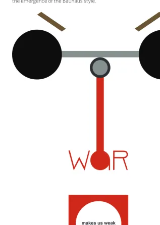
•
the emergence of the Bauhaus style.
Bauhaus and the New Typography
Architect Walter Gropius founded the Bauhaus school when he combined
•
the Weimar Art Academy and the Weimar Arts and Crafts School in Ger-many in 1919. The school was rooted in working in the real world, a rejection of the divergent approaches that were seen in art schools of the time. Heller and Chwast describe the Bauhaus as a place where “craftsmen and
•
fine artists would introduce students to the mysteries of creativity and help them to achieve a formal language on their own” (2000, 113). The school combined art and craft and was the birthplace of modern architecture and design.
The Bauhaus became a landmark for modernism in graphic and industrial
•
design in the early twentieth century. The Bauhaus reacted to the upturn in the pace of technological and commercial development with a changed program, defining its future image under the motto, “Art and technology: a new unity.” The school evolved into a workshop that focused on both the functional and aesthetic aspects of design and architecture, “producing prototypes for mass production: from a single lamp to a complete dwelling” (Bauhaus-Archiv Museum of Design, 1919).
The concept that “form follows function” was paramount at the Bauhaus,
•
where problem solving aesthetics. Thus, preceded concern for the Bauhaus style became the standard of functional graphic design in the late 1920s (Heller and Chwast 2000, 114). The school was shut down by the Nazis in 1933.
The focus on functionality over aesthetics is a main standard for successful
•
design today. Adherence to structure and fluid geometry made Bauhaus graphic work discernible and stylistic.
The Bauhaus was an incubator for the New Typography, a style that merged
•
the sheltered, simple ways of the Bauhaus approach with new and emerging design problems.
The New Typography was pioneered by Jan Tschichold, a designer
influ-•
Figure 2-6 This design treatment borrows composition from Herbert Bayer’s Kandinsky poster and uses functional information flow and type coupled with alignment and balance, which are essential influences from the Bauhaus and New Typography styles. Design by John DiMarco.
American Late Modern
Late modern style in America emerged from the 1940s through the 1950s and
•
was seen in the creation of wartime propaganda, as well as in posters, manu-als, and news magazines during World War II (Heller and Chwast 2000, 195). Focus on information and education design was paramount during the war
•
years (1941–1945) due to the government’s need to publish documents used to instruct men and women in the mechanics and materials of war. When the war ended, graphic design work returned to focusing on using
•
persuasive and informational communication design for selling products and ideas through advertising and publishing.
The modern American design style incorporated illustration and
photo-•
Figure 2-7 This design treatment borrows from Lester Beall’s American late modern approach and shows an elemental sign with vivid, patriotic colors combined with a simple message. Design by John DiMarco.
Swiss International
After the war, the corporation became the main engine in society, and a new
•
corporate style evolved in international typographic style, also known as Swiss International style.
Stemming from Bauhaus and constructivist styles, international typographic
•
1960s and was characterized by “objective photography, sans serif typog-raphy, lack of ornamentation, and strict composition on the basis of the grid system” (Heller and Chwast 2000, 196).
Images were cropped, scaled, and manipulated to create engaging,
interest-•
ing designs. Grids were used to create order and clarity in delivering graphic communication. The grid has since become the standard tool for composi-tion in digital design.
Focusing on sans serif typefaces such as Helvetica, the Swiss International
•
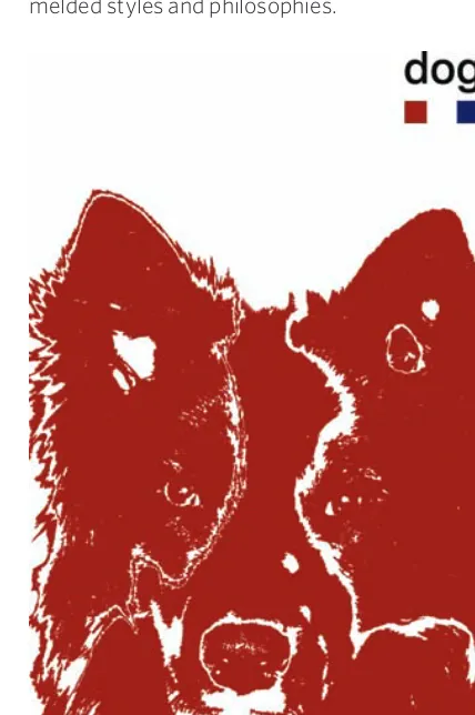
style was seen as formal and simplistic by many artists and designers of the time. The rejection of this style evolved into postmodernist approaches that melded styles and philosophies.
design or Art?
Both design and art use design principles and elements to create content— the story or subject matter and form—the way the story or subject matter is presented. Artists solve their own problems with message, materials, and aesthetic when they create paintings, sculptures, prints, or graphics. A purely aesthetic object is an artwork that is made for adornment and visual pleasure. Artists can define the scope and objectives for their work and pursue unbridled visions. Designers are given a problem and must typically work within certain specifications that present limitations to achieving that goal. Both artists and designers create visual solutions across media and industrial solutions across materials.
Convergent versus divergent
There are two main approaches to solving design problems: convergent and divergent.
Convergent thinking is linear and lends itself to solving a design problem in a commercial application. The convergent approach is systematic and rigorous, attempting to identify and define each part of the design process to meet specific goals. For example, a client requests a poster to promote its products inside a retail store. The convergent approach begins with defining the problem, then moves to research for clarification. Next, goals are established, a strategy is planned and executed, and finally the entire project is evaluated to determine its success.
The divergent approach uses a creative, nonlinear process through which the outcome is not clearly identified and the methods are exploratory. Divergent problem solving is open-ended and pays less attention to what the client wants. It works well when the problem is evolving as the process occurs, deadlines are flexible, and a sequential methodology is unnecessary.We see divergent think-ing in art, where the final product is about the journey in makthink-ing the artwork. Divergent thinking is a great way to generate ideas at a highly creative level due to its inherent freedom of expression and lack of specifications.
In many cases, we begin with convergent thinking but then explore diver-gent thinking when executing our designs. Great designs are typically a product of both approaches.
two-, three-, and Four-dimensional design
Design problems can be solved using 2-D, 3-D, and 4-D designs generated from convergent and divergent problem solving. Manipulation of assets such as text, images, messages, people, sets, lighting, materials, and moving footage are involved based on the type of design.
Figure 2-11 The exhibition wall of the Philip Johnson Glass House Visitors Center for the National Trust for Historic Preservation features twenty-four monitors within a space that offers a 2-D, 3-D, and 4-D visual experience. Design by James Biber.
Virtual three-dimensional designs created using computers have height, width, and depth. Three-dimensional designs that exist in reality include sculp-ture, product design, and architecture. These are not flat—as are screens and paper—but have mass, which requires them to occupy physical space. We connect with these designs because they share the same physical space with us. We occupy buildings and live in houses that engulf us in 3-D spaces. In her book Launching the Imagination: A Comprehensive Guide to Basic Design, Mary Stewart explains that in three-dimensional design, “Artists and designers must assure that form follows function in order to organize line, plane, volume, mass, and space into coherent form.” Stewart reinforces this by stating “the structural integrity of a sculpture is just as important as the structural integrity of a wheel-chair” (2002, 7-0). Three-dimensional design solutions present real-world problems to designers that require convergent problem solving but also benefit from divergent thinking to provide aesthetic appeal.
films, television shows and commercials, performance art (like plays and bal-lets), animations and cartoons, and interactive Web sites. Four-dimensional designs utilize storytelling and focus on setting (perceived location of the work), duration (length of the work), tempo (speed and pace of the work), intensity (level of energy), scope (the depth of intellectual engagement), and, for Web designs, interactivity (level of interaction with the medium).
Figure 2-12 This poster for the Architectural League of New York is a two-dimensional design. Design by Michael Bierut.
Figure 2-14 The Sugar user interface for the XO laptop provides a four-dimensional experi-ence through virtual space. Design by Lisa Strausfeld.
Design Devices
Space, Format, and Structure
be horizontal, vertical, or circular. They can also be customized, such as in the template for a package.
Digital designers must use space to simulate depth. When we look at an image, we see a picture plane that represents the image as if we were looking at it through a window frame. We establish a foreground (bottom), middle ground (eye-level horizon line), and background (distance). By making foreground imagery (below the horizon line) larger and background imagery (above the horizon line) smaller, the illusion of depth can be established. Using sizing in space, the designer can cre-ate an illusion of distance. Using overlap to arrange design elements in space, the designer can create spatial depth and a stacking order. Using linear perspective, the technique of converging lines to the vanishing point, the designer can unify and create a dynamic quality of motion in a piece (Lauer and Pentak 2007, 190). Type, image, and space are the broad components in a visual design.
negative Space
The empty space that exists in the established format is negative space, and using space effectively involves a careful consideration of this space. When we begin a design project, we start with negative space. A blank piece of paper or a document representing that piece of paper on the computer screen is made of negative space. We fill negative space with type and images to create a
relationship between the three elements with the goal of creating a gestalt. To create the gestalt, we need to use space division efficiently and should concen-trate on big pockets of negative space—not small ones. Small pockets create a tension between elements and may cause confusion due to the elements’ proximity or their irrational grouping. Big pockets of space allow components to interweave to create a complete image and a communication that can be trans-lated effectively. Using negative space effectively is critical in composition.
Composition
The way components (text, images, and space) are arranged is the composi-tion. Compositions can be formatted for landscape (horizontal) or portrait (ver-tical) layouts and can contain elements that are positioned horizontally,
vertically, and diagonally. Arrangement and rearrangement of elements changes the meaning and the gestalt of the design piece. Using various tech-niques—such as unity and variety, balance, scale and proportion, emphasis, repetition, alignment, grouping, overlap, collage, and proximity—contributes to the visual impact of the composition. Text and image are arranged in relation-ship to space using a grid.
Grids
In his book Thinking in Type, Alex W. White defines the grid as “a skeletal guide used to ensure design consistency. A grid should show type widths, image areas, margins and spaces to be left empty and trim size” (2005, 203). The grid is critical to digital design, because it provides the framework needed to achieve a gestalt in composition. Random placement of elements during divergent prob-lem solving is OK, but when we use convergent approaches we must inevitably justify the elements’ placement. According to grid systems guru Kimberly Elam, using a grid, particularly a 3 × 3 column grid, “provides a wide range of variation for exploration within a controlled system of organization” (2004, 7). Using the 3 × 3 grid allows you to understand the rule of thirds and use the law of thirds. The use of grids is critical to both publication and Web design.
Figure 2-19 Grid usage rules. Once you understand how to use the 3 × 3 grid, you can begin to break the rules and explore new approaches. Any element that is placed on the page must occupy one, two, or three full vertical, horizontal, or diagonal sections of the grid. Elements should not land in the middle of a grid square or extend across a portion of it. The circled inter-sections are where the eye is drawn naturally.
Rule of Thirds and Law of Thirds
The rule of thirds (also known as the golden grid rule) is a composition tech-nique in which the medium is divided into a 3 × 3 grid of nine rectangles and four intersections. Position the primary design element at the intersections to produce an asymmetrical image and a good aesthetic. Use a secondary design element for visual balance. Positioning strong elements in the center will create a dominant visual (Lidwell et al., 168).
Figures 2-20, A, b This spread from Design This Day (B), the book commemorating Walter Dorwin Teague’s eightieth anniversary, exemplifies the rule of thirds and the law of thirds by using a dominant element that intersects with the grid points. The placement of text and smaller elements in close proximity to the intersections are another example of the law of thirds. Notice how each piece fits into the grid (A). Design by Turnstyle.
(A)
Consistency
Consistency is a cornerstone of good design. When similar items are expressed in similar, repetitive ways, it creates consistency. There are two main forms of consistency that digital designers need to be aware of: aesthetic consistency and functional consistency.
Aesthetic consistency refers to style and appearance. A good example of this is seen in corporate identity and branding design. Companies use the same color, fonts, and icons throughout their marketing materials (brochures, packaging, signage, etc.) to create a consistent experience for the customer through recognition and association. Aesthetic consistency also needs to be evident in the images that are used. Mixing illustrations with photos in a sequence of images may hurt the consis-tency of the visual whole, or gestalt. There-fore, you should keep sequential items the same in style (photo vs. line art illustration) and size.
Functional consistency yields coher-ence in meaning and action. That is why it is a key component in Web site design, where usability (the ability of the site user to succeed) and learnability (the ability to ensure knowledge transfer) is paramount (Lidwell et al. 2003, 46). Functional con-sistency affects the placement of naviga-tion buttons, the way media controls such as start and stop buttons work, and the ease of use of online forms. Functional consistency also creates implied meaning for users so that they can be transparently guided by hierarchy.
hierarchy
Hierarchy is top-down structure. By creating a hierarchal structure with our content, we help people understand:
What they are looking at and why it is important to them (in print)
•
Where they are and where they can go (on the Web)
•
The invisible hand of hierarchical structure guides the user of a Web site by creating access routes to main pages (e.g., the home page, the log-in page, etc.) and links to subpages (i.e., Web site content) (Kristof and Satran 1995, 42–43). The typography’s contrasting hierarchical structure—in the form of headlines, subheads, and body copy—creates a path for the reader to follow. The bigger and bolder something is, the more important it is. The smaller and lighter it is, the less important it is (White 2005, 85). The company logo is usually placed at the bottom of the page because it is the least important hierarchically. The headline— the most prominent text—typically comes first: it hooks the reader into wanting to read on (thus its ranking is above sub-heads and body copy).
Hierarchy is a critical component in digital design and depends on the design elements within a composition being clearly distinguishable. Hierarchy also plays an important role in the way infor-mational components are understood. A hierarchical arrangement of informational components, called “supported align-ment,” facilitates an understanding of the connections between them.
Alignment
Creating cohesion and a visually effective whole (or gestalt) requires a designer to seriously consider where text and graphics are placed on a page. Alignment is the technique used for creating implied visual lines that connect elements on a page. It contributes to balance and symmetry. Design author Robin Williams wrote that
“the principle of alignment states that nothing on a page should be placed on the page arbitrarily. Every item should have a visual connection with something else on a page” (1994, 27). Use left or right justified type to create clean visual lines and easy-to-follow visual connections. Avoid using centered alignment unless it is absolutely necessary or you are sure you can do it effectively.
The proper alignment of type and image creates the proper visual con-nections; creating meaningful connections is also achieved by proximity and grouping.
proximity and Grouping
The proximity of related items provides a visual guide for the viewer’s ingestion of a page’s organization and content. While proximity demonstrates impor-tance, grouping shows connections. Placing a company’s Web site address underneath its logo in an advertisement is an example of grouping. Placing the logo at the bottom of the page—far from the page’s main content—is an exam-ple of proximity. The use of proximity as a design technique is also seen in the manipulation of the page’s perimeter edge.
perimeter edge
The perimeter edge is the edge of the live space for the design. The four edges of a piece of paper are perimeter edges. The four edges of a screen or monitor also create a perimeter edge. Treatment of the perimeter edge can be varied with the margins and bleeds. Margins are the spaces between text and graphics and the edges of the paper or the screen. By leaving wide margins, you create a dramatic, isolated visual. Bleeds are created by positioning text and images partially off the edge of the page, so that they appear cut off. This technique of allowing images to bleed off the page can be found in many print designs, including magazines and book covers. Bleeds give a design a dynamic look and can also evoke the feeling of motion because the type, image, or color drops off the page.
References
Arnston, Amy E. 2006. Digital design basics. Belmont, CA: Thomson Wadsworth.
Barzun, Jacques, and Henry Graff. 2004. The modern researcher. 6th ed. Bel-mont, CA: Thomson Wadsworth.
Bauhaus-Archiv Museum of Design. 1919. Manifesto. http://www.bauhaus.de/ english/bauhaus1919/manifest1919.htm.
Brainard, Shirl. 1991. A design manual. Englewood Cliffs, NJ: Prentice Hall. Curtis, Hillman. 2000. Flash Web design: The art of motion graphics. Berkeley, CA:
New Riders.
———. 2002. MTIV: Process, inspiration, and practice for the new media designer. Berkeley, CA: New Riders.
Elam, Kimberly. 2001. Geometry of design. New York: Princeton Architectural Press.
———. 2004. Grid systems: Principles of organizing type. New York: Princeton Architectural Press.
Golding, John. 1994. Concepts of modern art. Ed. Nikos Stangos. New York: Thames & Hudson.
Grayson, Steve. 1995. Adobe Systems print publishing guide. Mountain View, CA: Adobe Systems.
Heller, Steven, and Seymour Chwast. 2000. Graphic style: From Victorian to digi-tal. New York: Harry Abrams.
Herman Miller. 2008. Discovering design (educational Web site). http://www.hermanmiller.com/discoveringdesign.
Hollis, Richard. 2001. Graphic design: A concise history. New York: Thames & Hudson.
Holtzschue, Linda. 2006. Understanding color: An introduction for designers. Hoboken, NJ: John Wiley & Sons.
Lauer, David, and Stephen Pentak. 2007. Design basics. Belmont, CA: Thomson Wadsworth.
Lidwell, Paul, Kritina Holden, and Jill Butler. 2003. Universal principles of design. Gloucester, MA: Rockport.
Meggs, Phillip. 1989. Type and image: The language of graphic design. New York: Van Nostrand Reinhold,
Meggs, Phillip, and Alston Purvis. 2006. Meggs’ History of Graphic Design, 4th ed. Hoboken, NJ: John Wiley & Sons.
Stewart, Mary. 2002. Launching the imagination: A comprehensive guide to basic design. New York: McGraw Hill.
Swann, Alan. 1997. The new graphic design school. Hoboken, NJ: John Wiley & Sons.
Tufte, Edward. 2003. The cognitive style of PowerPoint. Cheshire, CT: Graphics Press.
Wheeler, Alina. 2003. Designing brand identity: A complete guide to creating, build-ing, and maintaining strong brands. Hoboken, NJ: John Wiley & Sons.
White, Alex W. 2005. Thinking in type: The practical philosophy of typography. New York: Allworth.
chapter objectives
identify and define visual design elements. introduce basic design
principles.
explore exemplary and inspirational images from a variety of artists and designers.
The Visual Pieces
Line
A line is a connected series of points that contrasts with its background. Lines can be rectilinear (straight with corners) or curvilinear (rounded), to project dif-ferent visual themes. Curvilinear lines are seen in nature (plants and animals do not have absolutely straight lines) and are therefore considered organic. Recti-linear lines are associated with industry—buildings and machinery, for example. Considered mechanical, they are typically harder edged and more constraining.
Lines can be used to create the contour of an object, resulting in a shape. Lines can be overlapped, or hatched, to create textures. Lines can also be used to create boundaries or to suggest motion. We create lines in digital design applications by drawing or painting and by using line tools and rules. We also create them transparently through alignment, proximity, and grouping.
Shape
A shape is an area in space created by closure. Shapes can be organic (from nature), geometric (formed according to mathematical formulas), or freely imaginary. Shapes occupy space and create a relationship between figure and ground. Shapes (figures) are image elements that contrast with the background (ground). (The ground is the “negative space.”) In graphic design, by composing shape elements (type and images) using a grid, we create a gestalt. When we use the same shapes and use space as a buffer, we create an illusionary shape from the negative space. We create shape in digital design by using digital tools to draw and paint marks that connect and by using various digital design soft-ware shape tools to draw geometric and abstract shapes.
Texture
The surface quality of a shape or line is its texture. Texture can be seen and felt (tactile) in sculpture or other three-dimensional objects; it can be seen (visual) in two-dimensional artwork and design pieces. Texture is created in digital design by using overlapping images, lines, and shapes. We can also invent textures by creating different patterns (repeating elements) that simulate a textured surface (Stewart 2002, 1-15–1-17). Digital design software provides layers, so that dif-ferent elements can be separated and we can then experiment with overlapping and changing their stacking order to create textures.
Value
Value is the relative lightness or darkness of a hue. A hue’s value is measured by comparing it to hues of other values. These values establish an image’s contrast: an image composed mainly of hues of similar values is said to have low contrast, while a high-contrast image contains hues of widely disparate values. Values can be graduated into a gradient scale (grayscale, for example) to show the dif-ference between light and dark, as well as all the midrange values in between.
Figure 3-4 Value and contrast are used here to create depth and distance. Design by Richard Kirk Mills.
In illustrations, dark values are used to create depth and lighter values to create distance. Value and contrast can change the mood and visual strength of a composition. Digital design software provides color tools for manipulating values by allowing tints (lighter values) or shades (darker values) to be created from any color and used in a composition or a piece of artwork.
Color
Brief Overview of terms
Figure 3-5 Vibrant, warm colors (red, green, and blue) make this screen-printed illustration come alive. Design by Richard Kirk Mills.
The basic terminology for describing color includes the terms hue, value, shade, tint, saturation, and contrast.
enhances or minimizes the intensity of the color. contrast is the result of com-paring values. Black and brown have low contrast. Black and yellow have high contrast. We choose and manipulate hue, value, shade, tint, saturation, and contrast when we create digital design compositions for print and the Web. You need to understand the basics of color to use it effectively in your design work. There are four main things you need to know about color:
1. The color wheel (yorVBg) is the basis for design using color. The color wheel is employed to explore color usage in order to establish color schemes (color combinations) for use in our designs.
2. The artist's colors are derived from the color wheel: red, yellow, and blue. These colors represent the primary colors of the color wheel,which can be combined to create secondary, and intermediate colors.
3. The additive color model (rgB) is based on light and is used for output to a screen or monitor (as with Web sites, film, and television). When we output Web pages, we end up with RGB and index color modes.
4. The subtractive (cmy) and process (cmyK) color models are the basis for process printing on all types of printers and printing presses. CMYK is based on pigments (inks). When we output printed pages, we end up with digital files in CMYK mode.
Your computer monitor’s screen is a canvas that allows you to mix the color domains—the artist’s colors of red, yellow, and blue with the additive colors of RGB. Software translates the printed output to a combination of CMYK colors.
the Artist’s Color Wheel
The color wheel is a spectrum (range) of visible hues (colors) in order. The color wheel consists of six (YORVBG) or twelve colors (YORVBG + the in-between colors). The six-color wheel contains the primary colors of red (R), yellow (Y), and blue (B). Using these three primary colors, secondary colors can be made by an equal mix of two of the three primary colors. The secondary colors are green (G) (blue + yellow), orange (O) (red + yellow), and violet (V) (red + blue).
Figure 3-6 Color wheel with primary, secondary, intermediate, warm, and cool colors. Design by Kristen Crawford.