Selected by Naomi Ceder
Manning Author Picks
Copyright 2018 Manning Publications
www.manning.com. The publisher offers discounts on these books when ordered in quantity.
For more information, please contact
Special Sales Department Manning Publications Co. 20 Baldwin Road
PO Box 761
Shelter Island, NY 11964 Email: [email protected]
©2018 by Manning Publications Co. All rights reserved.
No part of this publication may be reproduced, stored in a retrieval system, or transmitted, in any form or by means electronic, mechanical, photocopying, or otherwise, without prior written permission of the publisher.
Many of the designations used by manufacturers and sellers to distinguish their products are claimed as trademarks. Where those designations appear in the book, and Manning
Publications was aware of a trademark claim, the designations have been printed in initial caps or all caps.
Recognizing the importance of preserving what has been written, it is Manning’s policy to have the books we publish printed on acid-free paper, and we exert our best efforts to that end. Recognizing also our responsibility to conserve the resources of our planet, Manning books are printed on paper that is at least 15 percent recycled and processed without the use of elemental chlorine.
Manning Publications Co. 20 Baldwin Road Technical PO Box 761
Shelter Island, NY 11964
Cover designer: Leslie Haimes
ISBN: 9781617296048
iii
contents
about the authors ivintroduction v
T
HE
DATA
SCIENCE
PROCESS
1
The data science process
Chapter 2
from Introducing Data Science
by Davy Cielen, Arno D. B. Meysman, and Mohamed Ali. 2
P
ROCESSING
DATA
FILES
37
Processing data files
Chapter 21
from The Quick Python Book, 3rd edition by Naomi Ceder. 38
E
XPLORING
DATA
55
Exploring data
Chapter 24
from The Quick Python Book, 3rd edition by Naomi Ceder. 56
M
ODELING
AND
PREDICTION
73
Modeling and prediction
Chapter 3
from Real-world Machine Learning
by Henrik Brink, Joseph W. Richards, and Mark Fetherolf. 74
iv
about the authors
Davy Cielen, Arno D. B. Meysman, and Mohamed Ali are the founders and managing partners of Optimately and Maiton, where they focus on developing data science proj-ects and solutions in various sectors. Together, they wrote Introduce Data Science.Naomi Ceder is chair of the Python Software Foundation and author of The Quick Python Book, Third Edition. She has been learning, using, and teaching Python since 2001. Naomi Ceder is the originator of the PyCon and PyCon UK poster sessions and the education summit.
v
introduction
We may have always had data, but these days it seems we have never had quite so much data, nor so much demand for processes (and people) to put it to work. Yet in spite of the exploding interest in data engineering, data science, and machine learning it’s not always easy to know where to start and how to choose among all of the languages, tools, and technologies currently available. And even once those decisions are made, finding real-world explanations and examples to use as guides in doing useful work with data are all too often lacking.Fortunately, as the field evolves some popular (with good reason) choices and stan-dards are appearing. Python, along with pandas, numpy, scikit-learn, and a whole eco-system of data science tools, is increasingly being adopted as the language of choice for data engineering, data science, and machine learning. While it seems new approaches and processes for extracting meaning from data emerge every day, it’s also true that general outlines of how one gets, cleans, and deals with data are clearer than they were a few years ago.
This sampler brings to together chapters from three Manning books to address these issues. First, we have a thorough discussion of the data science process from Introducing Data Science, by Davy Cielen, Arno D. B. Meysman, and Mohamed Ali, which lays out some of the considerations in starting a data science process and the elements that make up a successful project. Moving on from that base, I’ve selected two chapters from my book, The Quick Python Book, 3rd Edition, which focus on the using the Python language to handle data. While my book covers the range of Python from the basics through advanced features, the chapters included here cover ways to use Python for processing data files and cleaning data, as well as how to use Python for exploring data. Finally, I’ve chosen a chapter from Real-world Machine Learning by Hen-rik Brink, Joseph W. Richards, and Mark Fetherolf for some practical demonstrations of modelling and prediction with classification and regression.
T
here are a lot of factors to consider in extracting meaningful insights from data. Among other things, you need to know what sorts of questions you hope to answer, how you are going to go about it, what resources and how much time you’ll need, and how you will measure the success of your project. Once you have answered those questions, you can consider what data you need, as well as where and how you’ll get that data and what sort of preparation and cleaning it will need. Then after exploring the data comes the actual data modelling, argu-ably the “science” part of “data science.” Finally, you’re likely to present your results and possibly productionize your process.Being able to think about data science with a framework like the above increases your chances of getting worthwhile results from the time and effort you spend on the project. This chapter, “The data science process” from Intro-ducing Data Science, by Davy Cielen, Arno D. B. Meysman, and Mohamed Ali, lays out the steps in a mature data science process. While you don’t need to be strictly bound by these steps, and may spend less time or even ignore some of them, depending on you project, this framework will help keep your project on track.
2
by Davy Cielen, Arno D. B. Meysman,
and Mohamed Ali.
The data science process
The goal of this chapter is to give an overview of the data science process without diving into big data yet. You’ll learn how to work with big data sets, streaming data, and text data in subsequent chapters.
2.1
Overview of the data science process
Following a structured approach to data science helps you to maximize your chances of success in a data science project at the lowest cost. It also makes it possi-ble to take up a project as a team, with each team member focusing on what they do best. Take care, however: this approach may not be suitable for every type of project or be the only way to do good data science.
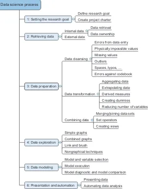
The typical data science process consists of six steps through which you’ll iter-ate, as shown in figure 2.1.
This chapter covers
Understanding the flow of a data science process
Figure 2.1 summarizes the data science process and shows the main steps and actions you’ll take during a project. The following list is a short introduction; each of the steps will be discussed in greater depth throughout this chapter.
1 The first step of this process is setting a research goal. The main purpose here is making sure all the stakeholders understand the what, how, and why of the proj-ect. In every serious project this will result in a project charter.
2 The second phase is data retrieval. You want to have data available for analysis, so this step includes finding suitable data and getting access to the data from the Data science process
1: Setting the research goal
2: Retrieving data
Model diagnostic and model comparison
Reducing number of variables
data owner. The result is data in its raw form, which probably needs polishing and transformation before it becomes usable.
3 Now that you have the raw data, it’s time to prepare it. This includes transform-ing the data from a raw form into data that’s directly usable in your models. To achieve this, you’ll detect and correct different kinds of errors in the data, com-bine data from different data sources, and transform it. If you have successfully completed this step, you can progress to data visualization and modeling.
4 The fourth step is data exploration. The goal of this step is to gain a deep under-standing of the data. You’ll look for patterns, correlations, and deviations based on visual and descriptive techniques. The insights you gain from this phase will enable you to start modeling.
5 Finally, we get to the sexiest part: model building (often referred to as “data modeling” throughout this book). It is now that you attempt to gain the insights or make the predictions stated in your project charter. Now is the time to bring out the heavy guns, but remember research has taught us that often (but not always) a combination of simple models tends to outperform one complicated model. If you’ve done this phase right, you’re almost done.
6 The last step of the data science model is presenting your results and automating the analysis, if needed. One goal of a project is to change a process and/or make better decisions. You may still need to convince the business that your findings will indeed change the business process as expected. This is where you can shine in your influencer role. The importance of this step is more apparent in projects on a strategic and tactical level. Certain projects require you to per-form the business process over and over again, so automating the project will save time.
In reality you won’t progress in a linear way from step 1 to step 6. Often you’ll regress and iterate between the different phases.
Following these six steps pays off in terms of a higher project success ratio and increased impact of research results. This process ensures you have a well-defined research plan, a good understanding of the business question, and clear deliverables before you even start looking at data. The first steps of your process focus on getting high-quality data as input for your models. This way your models will perform better later on. In data science there’s a well-known saying: Garbage in equals garbage out.
Another benefit of following a structured approach is that you work more in pro-totype mode while you search for the best model. When building a propro-totype, you’ll probably try multiple models and won’t focus heavily on issues such as program speed or writing code against standards. This allows you to focus on bringing busi-ness value instead.
Dividing a project into smaller stages also allows employees to work together as a team. It’s impossible to be a specialist in everything. You’d need to know how to upload all the data to all the different databases, find an optimal data scheme that works not only for your application but also for other projects inside your company, and then keep track of all the statistical and data-mining techniques, while also being an expert in presentation tools and business politics. That’s a hard task, and it’s why more and more companies rely on a team of specialists rather than trying to find one person who can do it all.
The process we described in this section is best suited for a data science project that contains only a few models. It’s not suited for every type of project. For instance, a project that contains millions of real-time models would need a different approach than the flow we describe here. A beginning data scientist should get a long way fol-lowing this manner of working, though.
2.1.1 Don’t be a slave to the process
Not every project will follow this blueprint, because your process is subject to the prefer-ences of the data scientist, the company, and the nature of the project you work on. Some companies may require you to follow a strict protocol, whereas others have a more informal manner of working. In general, you’ll need a structured approach when you work on a complex project or when many people or resources are involved.
The agile project model is an alternative to a sequential process with iterations. As this methodology wins more ground in the IT department and throughout the com-pany, it’s also being adopted by the data science community. Although the agile meth-odology is suitable for a data science project, many company policies will favor a more rigid approach toward data science.
Planning every detail of the data science process upfront isn’t always possible, and more often than not you’ll iterate between the different steps of the process. For instance, after the briefing you start your normal flow until you’re in the explor-atory data analysis phase. Your graphs show a distinction in the behavior between two groups—men and women maybe? You aren’t sure because you don’t have a vari-able that indicates whether the customer is male or female. You need to retrieve an extra data set to confirm this. For this you need to go through the approval process, which indicates that you (or the business) need to provide a kind of project char-ter. In big companies, getting all the data you need to finish your project can be an ordeal.
Step 1: Defining research goals and creating
2.2
a project charter
questions (what, why, how) is the goal of the first phase, so that everybody knows what to do and can agree on the best course of action.
–
Define research goal
Create project charter
Data science process
1: Setting the research goal
2: Retrieving data +
3: Data preparation +
4: Data exploration +
5: Data modeling +
6: Presentation and automation + Figure 2.2 Step 1: Setting
the research goal
The outcome should be a clear research goal, a good understanding of the con-text, well-defined deliverables, and a plan of action with a timetable. This information is then best placed in a project charter. The length and formality can, of course, differ between projects and companies. In this early phase of the project, people skills and business acumen are more important than great technical prowess, which is why this part will often be guided by more senior personnel.
2.2.1 Spend time understanding the goals and context of your research
An essential outcome is the research goal that states the purpose of your assignment in a clear and focused manner. Understanding the business goals and context is criti-cal for project success. Continue asking questions and devising examples until you grasp the exact business expectations, identify how your project fits in the bigger pic-ture, appreciate how your research is going to change the business, and understand how they’ll use your results. Nothing is more frustrating than spending months researching something until you have that one moment of brilliance and solve the problem, but when you report your findings back to the organization, everyone imme-diately realizes that you misunderstood their question. Don’t skim over this phase lightly. Many data scientists fail here: despite their mathematical wit and scientific bril-liance, they never seem to grasp the business goals and context.
2.2.2 Create a project charter
A project charter requires teamwork, and your input covers at least the following:
A clear research goal
The project mission and context
How you’re going to perform your analysis
What resources you expect to use
Proof that it’s an achievable project, or proof of concepts
Deliverables and a measure of success
A timeline
Your client can use this information to make an estimation of the project costs and the data and people required for your project to become a success.
2.3
Step 2: Retrieving data
The next step in data science is to retrieve the required data (figure 2.3). Sometimes you need to go into the field and design a data collection process yourself, but most of the time you won’t be involved in this step. Many companies will have already col-lected and stored the data for you, and what they don’t have can often be bought from third parties. Don’t be afraid to look outside your organization for data, because more and more organizations are making even high-quality data freely available for public and commercial use.
Data science process
1: Setting the research goal
2: Retrieving data
3: Data preparation + +
+
4: Data exploration +
5: Data modeling +
6: Presentation and automation + –
Internal data
External data
– Data retrieval
Data ownership
Figure 2.3 Step 2: Retrieving data
Start with data st
2.3.1 ored within the company
Your first act should be to assess the relevance and quality of the data that’s readily available within your company. Most companies have a program for maintaining key data, so much of the cleaning work may already be done. This data can be stored in official data repositories such as databases, data marts, data warehouses, and data lakes maintained by a team of IT professionals. The primary goal of a database is data stor-age, while a data warehouse is designed for reading and analyzing that data. A data mart is a subset of the data warehouse and geared toward serving a specific business unit. While data warehouses and data marts are home to preprocessed data, data lakes con-tains data in its natural or raw format. But the possibility exists that your data still resides in Excel files on the desktop of a domain expert.
Finding data even within your own company can sometimes be a challenge. As companies grow, their data becomes scattered around many places. Knowledge of the data may be dispersed as people change positions and leave the company. Doc-umentation and metadata aren’t always the top priority of a delivery manager, so it’s possible you’ll need to develop some Sherlock Holmes–like skills to find all the lost bits.
Getting access to data is another difficult task. Organizations understand the value and sensitivity of data and often have policies in place so everyone has access to what they need and nothing more. These policies translate into physical and digital barriers called Chinese walls. These “walls” are mandatory and well-regulated for customer data in most countries. This is for good reasons, too; imagine everybody in a credit card company having access to your spending habits. Getting access to the data may take time and involve company politics.
Don’t be afraid to shop around 2.3.2
If data isn’t available inside your organization, look outside your organization’s walls. Many companies specialize in collecting valuable information. For instance, Nielsen and GFK are well known for this in the retail industry. Other companies provide data so that you, in turn, can enrich their services and ecosystem. Such is the case with Twitter, LinkedIn, and Facebook.
Do data quality checks no
2.3.3 w to prevent problems later
Expect to spend a good portion of your project time doing data correction and cleans-ing, sometimes up to 80%. The retrieval of data is the first time you’ll inspect the data in the data science process. Most of the errors you’ll encounter during the data-gathering phase are easy to spot, but being too careless will make you spend many hours solving data issues that could have been prevented during data import.
You’ll investigate the data during the import, data preparation, and exploratory phases. The difference is in the goal and the depth of the investigation. During data retrieval, you check to see if the data is equal to the data in the source document and look to see if you have the right data types. This shouldn’t take too long; when you have enough evidence that the data is similar to the data you find in the source docu-ment, you stop. With data preparation, you do a more elaborate check. If you did a good job during the previous phase, the errors you find now are also present in the source document. The focus is on the content of the variables: you want to get rid of typos and other data entry errors and bring the data to a common standard among the data sets. For example, you might correct USQ to USA and United Kingdom to UK. During the exploratory phase your focus shifts to what you can learn from the data. Now you assume the data to be clean and look at the statistical properties such as distribu-tions, correladistribu-tions, and outliers. You’ll often iterate over these phases. For instance, when you discover outliers in the exploratory phase, they can point to a data entry error. Now that you understand how the quality of the data is improved during the process, we’ll look deeper into the data preparation step.
Step 3: Cleansing, integr
2.4
ating, and transforming data
The data received from the data retrieval phase is likely to be “a diamond in the rough.” Your task now is to sanitize and prepare it for use in the modeling and report-ing phase. Doreport-ing so is tremendously important because your models will perform bet-ter and you’ll lose less time trying to fix strange output. It can’t be mentioned nearly enough times: garbage in equals garbage out. Your model needs the data in a specific
Table 2.1 A list of open-data providers that should get you started
Open data site Description
The home of the US Government’s open data Data.gov
https://open-data.europa.eu/ The home of the European Commission’s open data
An open database that retrieves its information from sites like
Freebase.org
Wikipedia, MusicBrains, and the SEC archive
Open data initiative from the World Bank Data.worldbank.org
Open data for international development Aiddata.org
format, so data transformation will always come into play. It’s a good habit to correct data errors as early on in the process as possible. However, this isn’t always possible in a realistic setting, so you’ll need to take corrective actions in your program.
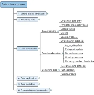
Figure 2.4 shows the most common actions to take during the data cleansing, inte-gration, and transformation phase.
This mind map may look a bit abstract for now, but we’ll handle all of these points in more detail in the next sections. You’ll see a great commonality among all of these actions.
2.4.1 Cleansing data
Data cleansing is a subprocess of the data science process that focuses on removing errors in your data so your data becomes a true and consistent representation of the processes it originates from.
By “true and consistent representation” we imply that at least two types of errors exist. The first type is the interpretation error, such as when you take the value in your
Data science process
3: Data preparation –
Data cleansing –
Physically impossible values
Errors against codebook Missing values Errors from data entry
Outliers
Spaces, typos, …
Data transformation
Combining data
–
Extrapolating data
Derived measures Aggregating data
Creating dummies
– Set operators
Merging/joining data sets
Creating views
Reducing number of variables 1: Setting the research goal +
2: Retrieving data +
4: Data exploration +
5: Data modeling +
6: Presentation and automation +
data for granted, like saying that a person’s age is greater than 300 years. The second type of error points to inconsistencies between data sources or against your company’s standardized values. An example of this class of errors is putting “Female” in one table and “F” in another when they represent the same thing: that the person is female. Another example is that you use Pounds in one table and Dollars in another. Too many possible errors exist for this list to be exhaustive, but table 2.2 shows an overview of the types of errors that can be detected with easy checks—the “low hanging fruit,” as it were.
Sometimes you’ll use more advanced methods, such as simple modeling, to find and identify data errors; diagnostic plots can be especially insightful. For example, in fig-ure 2.5 we use a measfig-ure to identify data points that seem out of place. We do a regression to get acquainted with the data and detect the influence of individual observations on the regression line. When a single observation has too much influ-ence, this can point to an error in the data, but it can also be a valid point. At the data cleansing stage, these advanced methods are, however, rarely applied and often regarded by certain data scientists as overkill.
Now that we’ve given the overview, it’s time to explain these errors in more detail.
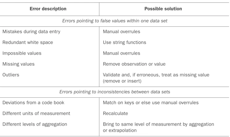
Table 2.2 An overview of common errors
General solution
Try to fix the problem early in the data acquisition chain or else fix it in the program.
Possible solution Error description
Errors pointing to false values within one data set
Manual overrules Mistakes during data entry
Use string functions Redundant white space
Manual overrules Impossible values
Remove observation or value Missing values
Validate and, if erroneous, treat as missing value
Outliers
(remove or insert)
Errors pointing to inconsistencies between data sets
Match on keys or else use manual overrules Deviations from a code book
Recalculate Different units of measurement
Bring to same level of measurement by aggregation
Different levels of aggregation
Distance
Row number
A single outlier can throw off a regression estimate.
Figure 2.5 The encircled point influences the model heavily and is worth investigating because it can point to a region where you don’t have enough data or might indicate an error in the data, but it also can be a valid data point.
DATAENTRYERRORS
Data collection and data entry are error-prone processes. They often require human intervention, and because humans are only human, they make typos or lose their con-centration for a second and introduce an error into the chain. But data collected by machines or computers isn’t free from errors either. Errors can arise from human sloppiness, whereas others are due to machine or hardware failure. Examples of errors originating from machines are transmission errors or bugs in the extract, trans-form, and load phase (ETL).
For small data sets you can check every value by hand. Detecting data errors when the variables you study don’t have many classes can be done by tabulating the data with counts. When you have a variable that can take only two values: “Good” and “Bad”, you can create a frequency table and see if those are truly the only two values present. In table 2.3, the values “Godo” and “Bade” point out something went wrong in at least 16 cases.
Most errors of this type are easy to fix with simple assignment statements and if-then-else rules:
if x == “Godo”: x = “Good” if x == “Bade”: x = “Bad”
REDUNDANTWHITESPACE
Whitespaces tend to be hard to detect but cause errors like other redundant charac-ters would. Who hasn’t lost a few days in a project because of a bug that was caused by whitespaces at the end of a string? You ask the program to join two keys and notice that observations are missing from the output file. After looking for days through the code, you finally find the bug. Then comes the hardest part: explaining the delay to the project stakeholders. The cleaning during the ETL phase wasn’t well executed, and keys in one table contained a whitespace at the end of a string. This caused a mismatch of keys such as “FR ” – “FR”, dropping the observations that couldn’t be matched.
If you know to watch out for them, fixing redundant whitespaces is luckily easy enough in most programming languages. They all provide string functions that will remove the leading and trailing whitespaces. For instance, in Python you can use the
strip() function to remove leading and trailing spaces.
FIXING CAPITAL LETTER MISMATCHES Capital letter mismatches are common. Most programming languages make a distinction between “Brazil” and “bra-zil”. In this case you can solve the problem by applying a function that returns both strings in lowercase, such as .lower() in Python. “Brazil”.lower()== “brazil”.lower() should result in true.
IMPOSSIBLEVALUESANDSANITYCHECKS
Sanity checks are another valuable type of data check. Here you check the value against physically or theoretically impossible values such as people taller than 3 meters or someone with an age of 299 years. Sanity checks can be directly expressed with rules:
check = 0 <= age <= 120
OUTLIERS
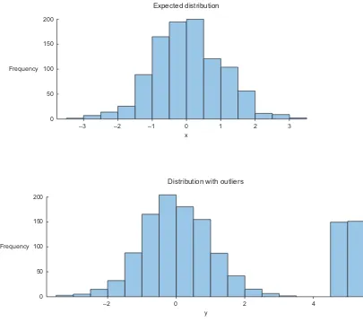
An outlier is an observation that seems to be distant from other observations or, more specifically, one observation that follows a different logic or generative process than the other observations. The easiest way to find outliers is to use a plot or a table with the minimum and maximum values. An example is shown in figure 2.6.
Expected distribution
Frequency
x
3 2
1 0
–1 –2
–3 200
150
100
50
0
Distribution with outliers
Frequency
y
–2 0 2 4
200
150
100
50
0
Figure 2.6 Distribution plots are helpful in detecting outliers and helping you understand the variable.
It shows most cases occurring around the average of the distribution and the occur-rences decrease when further away from it. The high values in the bottom graph can point to outliers when assuming a normal distribution. As we saw earlier with the regression example, outliers can gravely influence your data modeling, so investigate them first.
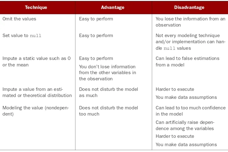
DEALINGWITHMISSINGVALUES
Which technique to use at what time is dependent on your particular case. If, for instance, you don’t have observations to spare, omitting an observation is probably not an option. If the variable can be described by a stable distribution, you could impute based on this. However, maybe a missing value actually means “zero”? This can be the case in sales for instance: if no promotion is applied on a customer basket, that customer’s promo is missing, but most likely it’s also 0, no price cut.
DEVIATIONSFROMACODEBOOK
Detecting errors in larger data sets against a code book or against standardized values can be done with the help of set operations. A code book is a description of your data, a form of metadata. It contains things such as the number of variables per observation, the number of observations, and what each encoding within a variable means. (For instance “0” equals “negative”, “5” stands for “very positive”.) A code book also tells the type of data you’re looking at: is it hierarchical, graph, something else?
You look at those values that are present in set A but not in set B. These are values that should be corrected. It’s no coincidence that sets are the data structure that we’ll use when we’re working in code. It’s a good habit to give your data structures addi-tional thought; it can save work and improve the performance of your program.
If you have multiple values to check, it’s better to put them from the code book into a table and use a difference operator to check the discrepancy between both tables. This way, you can profit from the power of a database directly. More on this in chapter 5.
Table 2.4 An overview of techniques to handle missing data
Technique Advantage Disadvantage
You lose the information from an Easy to perform
Omit the values
observation
Set value to null Easy to perform Not every modeling technique and/or implementation can han-dle null values
Impute a static value such as 0 or the mean
Easy to perform
You don’t lose information from the other variables in the observation
Can lead to false estimations from a model
Impute a value from an esti-mated or theoretical distribution
Does not disturb the model as much
Harder to execute
You make data assumptions
Modeling the value (nondepen-dent)
Does not disturb the model too much
Can lead to too much confidence in the model
Can artificially raise depen-dence among the variables Harder to execute
DIFFERENTUNITSOFMEASUREMENT
When integrating two data sets, you have to pay attention to their respective units of measurement. An example of this would be when you study the prices of gasoline in the world. To do this you gather data from different data providers. Data sets can con-tain prices per gallon and others can concon-tain prices per liter. A simple conversion will do the trick in this case.
DIFFERENTLEVELSOFAGGREGATION
Having different levels of aggregation is similar to having different types of measure-ment. An example of this would be a data set containing data per week versus one containing data per work week. This type of error is generally easy to detect, and sum-marizing (or the inverse, expanding) the data sets will fix it.
After cleaning the data errors, you combine information from different data sources. But before we tackle this topic we’ll take a little detour and stress the impor-tance of cleaning data as early as possible.
Correct errors as early as possible 2.4.2
A good practice is to mediate data errors as early as possible in the data collection chain and to fix as little as possible inside your program while fixing the origin of the problem. Retrieving data is a difficult task, and organizations spend millions of dollars on it in the hope of making better decisions. The data collection process is error-prone, and in a big organization it involves many steps and teams.
Data should be cleansed when acquired for many reasons:
Not everyone spots the data anomalies. Decision-makers may make costly mis-takes on information based on incorrect data from applications that fail to cor-rect for the faulty data.
If errors are not corrected early on in the process, the cleansing will have to be done for every project that uses that data.
Data errors may point to a business process that isn’t working as designed. For instance, both authors worked at a retailer in the past, and they designed a cou-poning system to attract more people and make a higher profit. During a data science project, we discovered clients who abused the couponing system and earned money while purchasing groceries. The goal of the couponing system was to stimulate cross-selling, not to give products away for free. This flaw cost the company money and nobody in the company was aware of it. In this case the data wasn’t technically wrong but came with unexpected results.
Data errors may point to defective equipment, such as broken transmission lines and defective sensors.
Fixing the data as soon as it’s captured is nice in a perfect world. Sadly, a data scientist doesn’t always have a say in the data collection and simply telling the IT department to fix certain things may not make it so. If you can’t correct the data at the source, you’ll need to handle it inside your code. Data manipulation doesn’t end with correcting mistakes; you still need to combine your incoming data.
As a final remark: always keep a copy of your original data (if possible). Sometimes you start cleaning data but you’ll make mistakes: impute variables in the wrong way, delete outliers that had interesting additional information, or alter data as the result of an initial misinterpretation. If you keep a copy you get to try again. For “flowing data” that’s manipulated at the time of arrival, this isn’t always possible and you’ll have accepted a period of tweaking before you get to use the data you are capturing. One of the more difficult things isn’t the data cleansing of individual data sets however, it’s combining different sources into a whole that makes more sense.
2.4.3 Combining data from different data sources
Your data comes from several different places, and in this substep we focus on inte-grating these different sources. Data varies in size, type, and structure, ranging from databases and Excel files to text documents.
We focus on data in table structures in this chapter for the sake of brevity. It’s easy to fill entire books on this topic alone, and we choose to focus on the data science pro-cess instead of presenting scenarios for every type of data. But keep in mind that other types of data sources exist, such as key-value stores, document stores, and so on, which we’ll handle in more appropriate places in the book.
THEDIFFERENTWAYSOFCOMBININGDATA
You can perform two operations to combine information from different data sets. The first operation is joining: enriching an observation from one table with information from another table. The second operation is appendingorstacking: adding the observa-tions of one table to those of another table.
When you combine data, you have the option to create a new physical table or a virtual table by creating a view. The advantage of a view is that it doesn’t consume more disk space. Let’s elaborate a bit on these methods.
JOININGTABLES
Joining tables allows you to combine the information of one observation found in one table with the information that you find in another table. The focus is on enriching a single observation. Let’s say that the first table contains information about the pur-chases of a customer and the other table contains information about the region where your customer lives. Joining the tables allows you to combine the information so that you can use it for your model, as shown in figure 2.7.
Region
Figure 2.7 Joining two tables on the Item and Region keys
are called primary keys. One table may have buying behavior and the other table may have demographic information on a person. In figure 2.7 both tables contain the cli-ent name, and this makes it easy to enrich the clicli-ent expenditures with the region of the client. People who are acquainted with Excel will notice the similarity with using a lookup function.
The number of resulting rows in the output table depends on the exact join type that you use. We introduce the different types of joins later in the book.
APPENDINGTABLES
Appending or stacking tables is effectively adding observations from one table to another table. Figure 2.8 shows an example of appending tables. One table contains the observations from the month January and the second table contains observations from the month February. The result of appending these tables is a larger one with the observations from January as well as February. The equivalent operation in set the-ory would be the union, and this is also the command in SQL, the common language of relational databases. Other set operators are also used in data science, such as set difference and intersection.
USINGVIEWSTOSIMULATEDATAJOINSANDAPPENDS
To avoid duplication of data, you virtually combine data with views. In the previous example we took the monthly data and combined it in a new physical table. The prob-lem is that we duplicated the data and therefore needed more storage space. In the example we’re working with, that may not cause problems, but imagine that every table consists of terabytes of data; then it becomes problematic to duplicate the data. For this reason, the concept of a view was invented. A view behaves as if you’re working on a table, but this table is nothing but a virtual layer that combines the tables for you. Figure 2.9 shows how the sales data from the different months is combined virtually into a yearly sales table instead of duplicating the data. Views do come with a draw-back, however. While a table join is only performed once, the join that creates the view is recreated every time it’s queried, using more processing power than a pre-calculated table would have.
Figure 2.9 A view helps you combine data without replication.
ENRICHINGAGGREGATEDMEASURES
Data enrichment can also be done by adding calculated information to the table, such as the total number of sales or what percentage of total stock has been sold in a cer-tain region (figure 2.10).
Product class
Figure 2.10 Growth, sales by product class, and rank sales are examples of derived and aggregate measures.
product sold/total quantity sold) tend to outperform models that use the raw num-bers (quantity sold) as input.
2.4.4 Transforming data
Certain models require their data to be in a certain shape. Now that you’ve cleansed and integrated the data, this is the next task you’ll perform: transforming your data so it takes a suitable form for data modeling.
TRANSFORMINGDATA
Relationships between an input variable and an output variable aren’t always linear. Take, for instance, a relationship of the form y = ae bx. Taking the log of the indepen-dent variables simplifies the estimation problem dramatically. Figure 2.11
0 5 10 15
Figure 2.11 Transforming x to log x makes the relationship between x and y linear (right), compared with the non-log x (left).
transforming the input variables greatly simplifies the estimation problem. Other times you might want to combine two variables into a new variable.
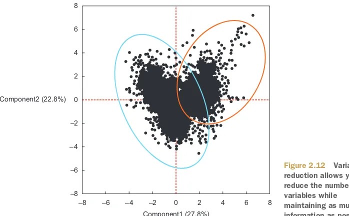
REDUCINGTHENUMBEROFVARIABLES
Sometimes you have too many variables and need to reduce the number because they don’t add new information to the model. Having too many variables in your model makes the model difficult to handle, and certain techniques don’t perform well when you overload them with too many input variables. For instance, all the techniques based on a Euclidean distance perform well only up to 10 variables.
Data scientists use special methods to reduce the number of variables but retain the maximum amount of data. We’ll discuss several of these methods in chapter 3. Fig-ure 2.12
–8 0 8
Component1 (27.8%) Component2 (22.8%)
– 4 –2 2 4 6
–6 8
6
4
2
0
–2
– 4
–6
–8
Figure 2.12 Variable reduction allows you to reduce the number of variables while maintaining as much information as possible.
shows how reducing the number of variables makes it easier to understand the
Euclidean distance
Euclidean distance or “ordinary” distance is an extension to one of the first things anyone learns in mathematics about triangles (trigonometry): Pythagoras’s leg theo-rem. If you know the length of the two sides next to the 90° angle of a right-angled triangle you can easily derive the length of the remaining side (hypotenuse). The for-mula for this is hypotenuse = . The Euclidean distance between two points in a two-dimensional plane is calculated using a similar formula: distance = . If you want to expand this distance calculation to more dimensions, add the coordinates of the point within those higher dimensions to the
for-mula. For three dimensions we get distance = .
side1 + side2
2
x1–x2
2+y1–y22
x1–x2
key values. It also shows how two variables account for 50.6% of the variation within the data set (component1 = 27.8% + component2 = 22.8%). These variables, called “component1” and “component2,” are both combinations of the original variables. They’re the principal components of the underlying data structure. If it isn’t all that clear at this point, don’t worry, principal components analysis (PCA) will be explained more thoroughly in chapter 3. What you can also see is the presence of a third (unknown) variable that splits the group of observations into two.
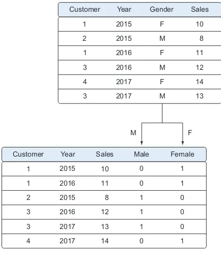
TURNINGVARIABLESINTODUMMIES
Variables can be turned into dummy variables (figure 2.13). Dummy variables can only take two values: true(1) or false(0). They’re used to indicate the absence of a categorical effect that may explain the observation. In this case you’ll make separate columns for the classes stored in one variable and indicate it with 1 if the class is present and 0 otherwise. An example is turning one column named Weekdays into the columns Monday through Sunday. You use an indicator to show if the observa-tion was on a Monday; you put 1 on Monday and 0 elsewhere. Turning variables into dummies is a technique that’s used in modeling and is popular with, but not exclu-sive to, economists.
Figure 2.13 Turning variables into dummies is a data transformation that breaks a variable that has multiple classes into multiple variables, each having only two possible values: 0 or 1.
understanding of the content of the data and the relationships between the variables and observations; we explore this in the next section.
2.5
Step 4: Exploratory data analysis
During exploratory data analysis you take a deep dive into the data (see figure 2.14). Information becomes much easier to grasp when shown in a picture, therefore you mainly use graphical techniques to gain an understanding of your data and the inter-actions between variables. This phase is about exploring data, so keeping your mind open and your eyes peeled is essential during the exploratory data analysis phase. The goal isn’t to cleanse the data, but it’s common that you’ll still discover anomalies you missed before, forcing you to take a step back and fix them.
Data science process
1: Setting the research goal +
2: Retrieving data +
3: Data preparation +
5: Data modeling +
6: Presentation and automation +
4: Data exploration –
Simple graphs
Nongraphical techniques Link and brush Combined graphs
Figure 2.14 Step 4: Data exploration
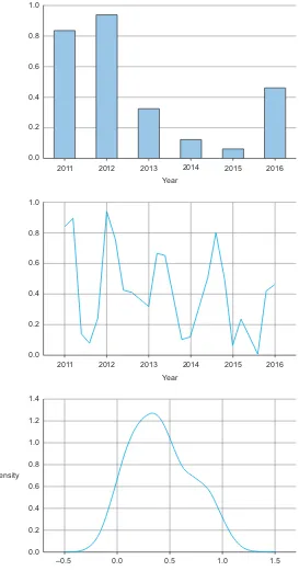
The visualization techniques you use in this phase range from simple line graphs or histograms, as shown in figure 2.15, to more complex diagrams such as Sankey and network graphs. Sometimes it’s useful to compose a composite graph from simple graphs to get even more insight into the data. Other times the graphs can be ani-mated or made interactive to make it easier and, let’s admit it, way more fun. An example of an interactive Sankey diagram can be found at http://bost.ocks.org/ mike/sankey/.
1.0
0.8
0.6
0.4
0.2
0.0
Year
Density 1.0
0.8
0.6
0.4
0.2
0.0
–0.5 0.0 0.5 1.0 1.5
1.4
1.2
1.0
0.8
0.6
0.4
0.2
0.0
2016 2015
2014 2013
2012 2011
2016 2015
2014 2013
2012 2011
Year
These plots can be combined to provide even more insight, as shown in figure 2.16.
Figure 2.16 Drawing multiple plots together can help you understand the structure of your data over multiple variables.
Overlaying several plots is common practice. In figure 2.17 we combine simple graphs into a Pareto diagram, or 80-20 diagram.
Figure 2.18 shows another technique: brushing and linking. With brushing and link-ing you combine and link different graphs and tables (or views) so changes in one graph are automatically transferred to the other graphs. An elaborate example of this can be found in chapter 9. This interactive exploration of data facilitates the discovery of new insights.
Two other important graphs are the histogram shown in figure 2.19 and the boxplot shown in figure 2.20.
In a histogram a variable is cut into discrete categories and the number of occur-rences in each category are summed up and shown in the graph. The boxplot, on the other hand, doesn’t show how many observations are present but does offer an impression of the distribution within categories. It can show the maximum, minimum, median, and other characterizing measures at the same time.
Country
Figure 2.17 A Pareto diagram is a combination of the values and a cumulative distribution. It’s easy to see from this diagram that the first 50% of the countries contain slightly less than 80% of the total amount. If this graph represented customer buying power and we sell expensive products, we probably don’t need to spend our marketing budget in every country; we could start with the first 50%.
0.2
Frequency
Age 60
10
8
6
4
2
0
65 70 75 80 85 90
Figure 2.19 Example histogram: the number of people in the age-groups of 5-year intervals
Appreciation score
User category 1
5
4
3
2
1
0
–1
–2
–3
2 3
Figure 2.20 Example boxplot: each user category has a distribution of the appreciation each has for a certain picture on a photography website.
The techniques we described in this phase are mainly visual, but in practice they’re certainly not limited to visualization techniques. Tabulation, clustering, and other modeling techniques can also be a part of exploratory analysis. Even building simple models can be a part of this step.
Step 5: Build the models
2.6
With clean data in place and a good understanding of the content, you’re ready to build models with the goal of making better predictions, classifying objects, or gain-ing an understandgain-ing of the system that you’re modelgain-ing. This phase is much more focused than the exploratory analysis step, because you know what you’re looking for and what you want the outcome to be. Figure 2.21 shows the components of model building.
Data science process
1: Setting the research goal +
2: Retrieving data +
3: Data preparation +
4: Data exploration +
6: Presentation and automation +
5: Data modeling – Model execution
Model and variable selection
Model diagnostic and model comparison
Figure 2.21 Step 5: Data modeling
The techniques you’ll use now are borrowed from the field of machine learning, data mining, and/or statistics. In this chapter we only explore the tip of the iceberg of existing techniques, while chapter 3 introduces them properly. It’s beyond the scope of this book to give you more than a conceptual introduction, but it’s enough to get you started; 20% of the techniques will help you in 80% of the cases because tech-niques overlap in what they try to accomplish. They often achieve their goals in similar but slightly different ways.
Building a model is an iterative process. The way you build your model depends on whether you go with classic statistics or the somewhat more recent machine learning school, and the type of technique you want to use. Either way, most models consist of the following main steps:
1 Selection of a modeling technique and variables to enter in the model
2 Execution of the model
3 Diagnosis and model comparison
2.6.1 Model and variable selection
of what variables will help you construct a good model. Many modeling techniques are available, and choosing the right model for a problem requires judgment on your part. You’ll need to consider model performance and whether your project meets all the requirements to use your model, as well as other factors:
Must the model be moved to a production environment and, if so, would it be easy to implement?
How difficult is the maintenance on the model: how long will it remain relevant if left untouched?
Does the model need to be easy to explain?
When the thinking is done, it’s time for action.
Model execution 2.6.2
Once you’ve chosen a model you’ll need to implement it in code.
REMARK This is the first time we’ll go into actual Python code execution so make sure you have a virtual env up and running. Knowing how to set this up is required knowledge, but if it’s your first time, check out appendix D.
All code from this chapter can be downloaded from https://www.manning .com/books/introducing-data-science. This chapter comes with an ipython (.ipynb) notebook and Python (.py) file.
Luckily, most programming languages, such as Python, already have libraries such as StatsModels or Scikit-learn. These packages use several of the most popular tech-niques. Coding a model is a nontrivial task in most cases, so having these libraries available can speed up the process. As you can see in the following code, it’s fairly easy to use linear regression (figure 2.22) with StatsModels or Scikit-learn. Doing this your-self would require much more effort even for the simple techniques. The following listing shows the execution of a linear prediction model.
import statsmodels.api as sm import numpy as np
predictors = np.random.random(1000).reshape(500,2) target = predictors.dot(np.array([0.4, 0.6])) + np.random.random(500) lmRegModel = sm.OLS(target,predictors)
result = lmRegModel.fit() result.summary()
Shows model fit statistics.
Listing 2.1 Executing a linear prediction model on semi-random data
Imports required Python modules.
Creates random data for predictors (x-values) and semi-random data for the target (y-values) of the model. We use predictors as input to create the target so we infer a correlation here. Fits linear
Okay, we cheated here, quite heavily so. We created predictor values that are meant to pre-dict how the target variables behave. For a linear regression, a “linear relation” between each x (predictor) and the y (target) variable is assumed, as shown in figure 2.22.
Y(target variable)
X(predictor variable)
Figure 2.22 Linear regression tries to fit a line while minimizing the distance to each point
We, however, created the target variable, based on the predictor by adding a bit of randomness. It shouldn’t come as a surprise that this gives us a well-fitting model. The
results.summary() outputs the table in figure 2.23. Mind you, the exact outcome depends on the random variables you got.
Model fit: higher is better but too high is suspicious.
p-value to show whether a predictor variable has a significant influence on the target. Lower is better and <0.05 is often considered “significant.”
Linear equation coefficients. y = 0.7658xl + 1.1252x2.
Let’s ignore most of the output we got here and focus on the most important parts:
Model fit —For this the R-squared or adjusted R-squared is used. This measure is an indication of the amount of variation in the data that gets captured by the model. The difference between the adjusted R-squared and the R-squared is minimal here because the adjusted one is the normal one + a penalty for model complexity. A model gets complex when many variables (or features) are introduced. You don’t need a complex model if a simple model is available, so the adjusted R-squared punishes you for overcomplicating. At any rate, 0.893 is high, and it should be because we cheated. Rules of thumb exist, but for models in businesses, models above 0.85 are often considered good. If you want to win a competition you need in the high 90s. For research however, often very low model fits (<0.2 even) are found. What’s more important there is the influence of the introduced predictor variables.
Predictor variables have a coefficient —For a linear model this is easy to interpret. In our example if you add “1” to x1, it will change y by “0.7658”. It’s easy to see how finding a good predictor can be your route to a Nobel Prize even though your model as a whole is rubbish. If, for instance, you determine that a certain gene is significant as a cause for cancer, this is important knowledge, even if that gene in itself doesn’t determine whether a person will get cancer. The example here is classification, not regression, but the point remains the same: detecting influences is more important in scientific studies than perfectly fitting models (not to mention more realistic). But when do we know a gene has that impact? This is called significance.
Predictor significance —Coefficients are great, but sometimes not enough evi-dence exists to show that the influence is there. This is what the p-value is about. A long explanation about type 1 and type 2 mistakes is possible here but the short explanations would be: if the p-value is lower than 0.05, the vari-able is considered significant for most people. In truth, this is an arbitrary number. It means there’s a 5% chance the predictor doesn’t have any influ-ence. Do you accept this 5% chance to be wrong? That’s up to you. Several people introduced the extremely significant (p<0.01) and marginally signifi-cant thresholds (p<0.1).
Linear regression works if you want to predict a value, but what if you want to classify something? Then you go to classification models, the best known among them being k-nearest neighbors.
Let’s try it in Python code using the Scikit learn library, as in this next listing.
from sklearn import neighbors
predictors = np.random.random(1000).reshape(500,2) target = np.around(predictors.dot(np.array([0.4, 0.6])) + np.random.random(500)) clf = neighbors.KNeighborsClassifier(n_neighbors=10) knn = clf.fit(predictors,target) knn.score(predictors, target)
Gets model fit score: what percent of the classification was correct?
As before, we construct random correlated data and surprise, surprise we get 85% of cases correctly classified. If we want to look in depth, we need to score the model. Don’t let knn.score() fool you; it returns the model accuracy, but by “scoring a model” we often mean applying it on data to make a prediction.
prediction = knn.predict(predictors)
Now we can use the prediction and compare it to the real thing using a confusion matrix.
metrics.confusion_matrix(target,prediction)
We get a 3-by-3 matrix as shown in figure 2.25.
Listing 2.2 Executing k-nearest neighbor classification on semi-random data (a) 1-nearest neighbor
(b) 2-nearest neighbor (c) 3-nearest neighbor
x
Figure 2.24 K-nearest neighbor techniques look at the k-nearest point to make a prediction.
Imports modules.
Creates random predictor data and semi-random target data based on predictor data.
Actual value Predicted value
Number of correctly predicted cases
Figure 2.25 Confusion matrix: it shows how many cases were correctly classified and incorrectly classified by comparing the prediction with the real values. Remark: the classes (0,1,2) were added in the figure for clarification.
The confusion matrix shows we have correctly predicted 17+405+5 cases, so that’s good. But is it really a surprise? No, for the following reasons:
For one, the classifier had but three options; marking the difference with last time np.around() will round the data to its nearest integer. In this case that’s either 0, 1, or 2. With only 3 options, you can’t do much worse than 33% cor-rect on 500 guesses, even for a real random distribution like flipping a coin.
Second, we cheated again, correlating the response variable with the predic-tors. Because of the way we did this, we get most observations being a “1”. By guessing “1” for every case we’d already have a similar result.
We compared the prediction with the real values, true, but we never predicted based on fresh data. The prediction was done using the same data as the data used to build the model. This is all fine and dandy to make yourself feel good, but it gives you no indication of whether your model will work when it encoun-ters truly new data. For this we need a holdout sample, as will be discussed in the next section.
Don’t be fooled. Typing this code won’t work miracles by itself. It might take a while to get the modeling part and all its parameters right.
(if not the most popular) programming languages for data science. For more infor-mation, see http://www.kdnuggets.com/polls/2014/languages-analytics-data-mining-data-science.html.
2.6.3 Model diagnostics and model comparison
You’ll be building multiple models from which you then choose the best one based on multiple criteria. Working with a holdout sample helps you pick the best-performing model. A holdout sample is a part of the data you leave out of the model building so it can be used to evaluate the model afterward. The principle here is simple: the model should work on unseen data. You use only a fraction of your data to estimate the model and the other part, the holdout sample, is kept out of the equation. The model is then unleashed on the unseen data and error measures are calculated to evaluate it. Multiple error measures are available, and in figure 2.26 we show the general idea on comparing models. The error measure used in the example is the mean square error.
MSE 1
Mean square error is a simple measure: check for every prediction how far it was from the truth, square this error, and add up the error of every prediction.
n Size Price
Figure 2.27 A holdout sample helps you compare models and ensures that you can generalize results to data that the model has not yet seen.
estimate the models, we use 800 randomly chosen observations out of 1,000 (or 80%), without showing the other 20% of data to the model. Once the model is trained, we predict the values for the other 20% of the variables based on those for which we already know the true value, and calculate the model error with an error measure. Then we choose the model with the lowest error. In this example we chose model 1 because it has the lowest total error.
Many models make strong assumptions, such as independence of the inputs, and you have to verify that these assumptions are indeed met. This is called model diagnostics.
This section gave a short introduction to the steps required to build a valid model. Once you have a working model you’re ready to go to the last step.
2.7
Step 6: Presenting findings and building applications
on top of them
After you’ve successfully analyzed the data and built a well-performing model, you’re ready to present your findings to the world (figure 2.28). This is an exciting part; all your hours of hard work have paid off and you can explain what you found to the stakeholders.
Data science process
1: Setting the research goal +
2: Retrieving data +
3: Data preparation +
4: Data exploration +
5: Data modeling +
6: Presentation and automation –
Presenting data
Automating data analysis
Figure 2.28 Step 6: Presentation and automation
If you’ve done this right, you now have a working model and satisfied stakeholders, so we can conclude this chapter here.
Summary
2.8
In this chapter you learned the data science process consists of six steps:
Setting the research goal —Defining the what, the why, and the how of your project in a project charter.
Retrieving data —Finding and getting access to data needed in your project. This data is either found within the company or retrieved from a third party.
Data preparation —Checking and remediating data errors, enriching the data with data from other data sources, and transforming it into a suitable format for your models.
Data exploration —Diving deeper into your data using descriptive statistics and visual techniques.
Data modeling —Using machine learning and statistical techniques to achieve your project goal.
O
ne of the key ingredients in data science projects is, obviously, data. Much of the time that data will be stored in files. Those files might be found in different places, and they probably will have different formats and different structures. It will be your job to get those files and decide how to extract their data and combine in way that is meaningful for your project. You will also almost certainly need to massage and clean that data in various ways.The following chapter, “Processing data files,” is from my book, The Quick Python Book, 3rd edition. While it’s intended to be a book introducing all of the Python language, for the 3rd edition I chose to use the last 5 chapters to focus a
bit more on how to use Python to handle data.
This chapter introduces several aspects of reading and writing data files, from plain text files and delimited files to more structured formats like JSON and XML, even to spreadsheet files. It also discusses several common scenarios for massaging and cleaning the data extracted from those files, including han-dling incorrectly encoded files, null bytes, and other common hassles.
38
3rd edition
by Naomi Ceder.
Processing data files
Much of the data available is contained in text files. This data can range from unstructured text, such as a corpus of tweets or literary texts, to more structured data in which each row is a record and the fields are delimited by a special charac-ter, such as a comma, a tab, or a pipe (|). Text files can be huge; a data set can be spread over tens or even hundreds of files, and the data in it can be incomplete or horribly dirty. With all the variations, it’s almost inevitable that you’ll need to read and use data from text files. This chapter gives you strategies for using Python to do exactly that.
This chapter covers
Using ETL (extract-transform-load)
Reading text data files (plain text and CSV)
Reading spreadsheet files
Normalizing, cleaning, and sorting data
21.1
Welcome to ETL
The need to get data out of files, parse it, turn it into a useful format, and then do something with it has been around for as long as there have been data files. In fact, there is a standard term for the process: extract-transform-load (ETL). The extraction refers to the process of reading a data source and parsing it, if necessary. The transfor-mation can be cleaning and normalizing the data, as well as combining, breaking up, or reorganizing the records it contains. The loading refers to storing the transformed data in a new place, either a different file or a database. This chapter deals with the basics of ETL in Python, starting with text-based data files and storing the transformed data in other files. I look at more structured data files in chapter 22 and storage in databases in chapter 23.
21.2
Reading text files
The first part of ETL—the “extract” portion—involves opening a file and reading its contents. This process seems like a simple one, but even at this point there can be issues, such as the file’s size. If a file is too large to fit into memory and be manipu-lated, you need to structure your code to handle smaller segments of the file, possibly operating one line at a time.
21.2.1 Text encoding: ASCII, Unicode, and others
Another possible pitfall is in the encoding. This chapter deals with text files, and in fact, much of the data exchanged in the real world is in text files. But the exact nature of text can vary from application to application, from person to person, and of course from country to country.
Sometimes, text means something in the ASCII encoding, which has 128 charac-ters, only 95 of which are printable. The good news about ASCII encoding is that it’s the lowest common denominator of most data exchange. The bad news is that it doesn’t begin to handle the complexities of the many alphabets and writing systems of the world. Reading files using ASCII encoding is almost certain to cause trouble and throw errors on character values that it doesn’t understand, whether it’s a German ü, a Portuguese ç, or something from almost any language other than English.
UNICODEAND UTF-8
One way to mitigate this confusion is Unicode. The Unicode encoding called UTF-8 accepts the basic ASCII characters without any change but also allows an almost unlimited set of other characters and symbols according to the Unicode standard. Because of its flexibility, UTF-8 was used in more 85% of web pages served at the time I wrote this chapter, which means that your best bet for reading text files is to assume UTF-8 encoding. If the files contain only ASCII characters, they’ll still be read cor-rectly, but you’ll also be covered if other characters are encoded in UTF-8. The good news is that the Python 3 string data type was designed to handle Unicode by default.
Even with Unicode, there’ll be occasions when your text contains values that can’t be successfully encoded. Fortunately, the open function in Python accepts an optional errors parameter that tells it how to deal with encoding errors when reading or writ-ing files. The default option is 'strict', which causes an error to be raised whenever an encoding error is encountered. Other useful options are 'ignore', which causes the character causing the error to be skipped; 'replace', which causes the character to be replaced by a marker character (often, ?); 'backslashreplace', which replaces the character with a backslash escape sequence; and 'surrogateescape', which trans-lates the offending character to a private Unicode code point on reading and back to the original sequence of bytes on writing. Your particular use case will determine how strict you need to be in handling or resolving encoding issues.
Look at a short example of a file containing an invalid UTF-8 character, and see how the different options handle that character. First, write the file, using bytes and binary mode:
>>> open('test.txt', 'wb').write(bytes([65, 66, 67, 255, 192,193]))
This code results in a file that contains “ABC” followed by three non-ASCII characters, which may be rendered differently depending on the encoding used. If you use vim to look at the file, you see
ABCÿÀÁ ~
Now that you have the file, try reading it with the default 'strict' errors option:
>>> x = open('test.txt').read() Traceback (most recent call last): File "<stdin>", line 1, in <module>
File "/usr/local/lib/python3.6/codecs.py", line 321, in decode (result, consumed) = self._buffer_decode(data, self.errors, final) UnicodeDecodeError: 'utf-8' codec can't decode byte 0xff in position 3:
invalid start byte