EXPERIMENTAL EVALUATION OF LIDAR DATA VISUALIZATION SCHEMES
Suddhasheel Ghosh and Bharat Lohani∗
Geoinformatics Laboratory, Department of Civil Engineering, Indian Institute of Technology Kanpur, Kanpur, 208 016 India [email protected], [email protected]
Commission II, WG II/6
KEY WORDS:LiDAR, feature extraction, visualization, statistics, non-parametric
ABSTRACT:
LiDAR (Light Detection and Ranging) has attained the status of an industry standard method of data collection for gathering three dimensional topographic information. Datasets captured through LiDAR are dense, redundant and are perceivable from multiple directions, which is unlike other geospatial datasets collected through conventional methods. This three dimensional information has triggered an interest in the scientific community to develop methods for visualizing LiDAR datasets and value added products. Elementary schemes of visualization use point clouds with intensity or colour, triangulation and tetrahedralization based terrain models draped with texture. Newer methods use feature extraction either through the process of classification or segmentation. In this paper, the authors have conducted a visualization experience survey where 60 participants respond to a questionnaire. The questionnaire poses six different questions on the qualities of feature perception and depth for 12 visualization schemes. The answers to these questions are obtained on a scale of 1 to 10. Results are thus presented using the non-parametric Friedman’s test, using post-hoc analysis for hypothetically ranking the visualization schemes based on the rating received and finally confirming the rankings through the Page’s trend test. Results show that a heuristic based visualization scheme, which has been developed by Ghosh and Lohani (2011) performs the best in terms of feature and depth perception.
1 INTRODUCTION
Light Detection and Ranging (LiDAR) has become a standard technology for procuring dense, accurate and precise three di-mensional topographic information in terms of data points in short time. Digital Elevation Models (DEM) and Digital Ter-rain Models (DTMs) generated through such information can be used for applications which need precise geographic information. In scenarios like disaster management and mitigation, situations might arise when data are procured in short time and required to be visualized for further assessment. It is to be noted here that even for very small areas, the size of a LiDAR data set is consid-erably large.
MacEachren and Kraak (2001) pointed out four different research challenges in the field of geovisualization in the ICA research agenda. Out of these, the second agenda item concerns the devel-opment of new methods and tools as well as a fundamental effort in theory building for representation and management of geo-graphic knowledge gathered from large data sets (Dykes et al., 2005). Three dimensional models for visualization of geospatial data have been brought forward by Zlatanova (2000), Zlatanova and Verbree (2000), Lattuada (2006), Lin and Zhu (2006) and van Oosterom et al. (2006). Several approaches for processing and visualizing LiDAR data have been found in the literature, which indicate the following approaches for preparing 3D maps: (a) direct visualization of LiDAR point cloud (b) through manual process of classification which is time consuming, or (c) through the process of segmentation. In the cases of segmentation and classification, the extracted features are first generalized and then visualized. Out-of-core computation algorithms have also been reported which handle and visualize large point cloud datasets.
The authors have observed from the literature that the process of classification of LiDAR datasets require many thresholds, sub-stantial a priori knowledge, and is also time consuming. There-fore, the authors have worked in the direction of development of methods and schemes for visualization which bypass this pro-cess of classification. Visualization of LiDAR data using
sim-plices has been reported in (Ghosh and Lohani, 2007a,b). They have also developed a heuristic to process LiDAR data to extract and generalize features (Ghosh and Lohani, 2011). This paper develops a methodology to statistically rank the various visual-ization schemes for LiDAR data in terms of the visualvisual-ization ex-perience through specifically designed experiments, and select the best scheme. The various schemes of visualization that have been studied by the authors are presented in section 2. Section 5 presents the design and methodology for conducting the experi-ment and also the statistical background for analyzing the results. The results are presented and discussed in section 6.
2 SCHEMES OF VISUALIZATION
Kreylos et al. (2008) visualized large point data sets using a head tracked and stereoscopic visualization mode through the devel-opment of a multiresolution rendering scheme that supports ren-dering billions of 3D points at 48–60 stereoscopic frames per second. This method has been reported to give better results over other analysis methods, especially when used in a CAVE based immersive visualization environment. Richter and D¨ollner (2010) developed an out-of-core real time visualization method for visualizing massive point clouds using a spatial data structure for a GPU based system with 4 GB main memory and a 5400rpm hard disk.
Ghosh and Lohani (2007a) attempted to develop a methodol-ogy for stereoscopic visualization of the terrain using Delaunay Triangulation and the OpenInventor visualization engine. The Triangulated Irregular Network (TIN) obtained from the LiDAR data is draped with the geocoded texture data and the two are di-rected into the visualization engine via an Inventor file. The TIN generated through the Delaunay Triangulation was found to have triangles with small area but very large edges. Such triangles are removed using a certain thresholdτ. The remaining triangles along with the point data and geocoded texture are sent to the visualization engine (Ghosh and Lohani, 2007b).
for processing LiDAR data for visualization. The tetrahedrals generated by the process were broken down to their respective facets. The triangular facets containing long edges were removed using a thresholdτ. The remaining triangles, the geocoded tex-ture, and the points are sent to the visualization engine.
In case of the Delaunay triangulation and subsequent trimming, it is noted that certain dome shaped terrain features e.g very sparse trees get deleted, whereas planar features were well represented. In the case of Delaunay tetrahedralization, the sparse trees were better represented. Owing to the complexity of the tetrahedral-ization process, the planar features are over represented and the rendering is comparatively slow. Thus, Ghosh and Lohani (2011) expressed the need of a hybrid mode of processing and developed a heuristic after clustering the data using data mining algorithms. The results from all the processing methods described in this sec-tion may be visualized either in 2.5D or 3D. The notasec-tions and the schemes are shown in Table [1].
ID Notation Description Mode
1 PL-PTS Point Display 2.5D
2 PL-DTRI Triangulation display 2.5D 3 PL-TDTRI Trimmed triangulation
dis-play
2.5D
4 PL-TDTET Trimmed delaunay tetrahe-dralization
2.5D
5 PL-PMDL Heuristical model with dome shaped clusters displayed in point mode
2.5D
6 PL-MDL Heuristical model with completely generalized clusters
2.5D
7 AN-PTS Point Display 3D
8 AN-DTRI Triangulation display 3D 9 AN-TDTRI Trimmed triangulation
dis-play
3D
10 AN-TDTET Trimmed delaunay tetrahe-dralization
3D
11 AN-PMDL Heuristical model with dome shaped clusters displayed in point mode
3D
12 AN-MDL Heuristical model with completely generalized clusters
3D
Table 1: Processing methods and their notations
3 OBJECTIVE
The aim of this paper is to rank the various processes listed in Table [1] in the order of their effectiveness in terms of feature recognition and depth perception. In this light, the paper ad-dresses the following research objectives: (a) design an experi-ment to evaluate the various schemes listed in Table [1], and (b) find the statistically best method for processing and visualizing LiDAR data.
4 DATA AND TOOLS USED
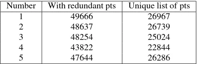
In 2004, Optech Inc, Canada conducted a LiDAR flight over the environs of Niagara Falls. The flight was conducted at an aver-age height of 1200m above ground level. Five different subsets of 100m×100m each were cut out from the datasets. The number of data points in each of these datasets is given in Table [2]. Each of these subsets contains buildings, trees, roads and vehicles. For algorithms using Delaunay triangulation and tetrahedralization
Number With redundant pts Unique list of pts
1 49666 26967
2 48637 26739
3 48254 25024
4 43822 22844
5 47644 26286
Table 2: Description of subsets. Points are called redundant if they have same coordinates
we use the Quickhull tool (Barber et al., 1996). The OpenScene-Graph Engine with its C++based API is used for the visual-ization of the LiDAR data sets and derived products (see Table [1]). The OpenSceneGraph engine is able to render in 2.5D and 3D, where 3D perception was made possible through anaglyph glasses. The programming is done on an Ubuntu Linux 11.04, 64 bit platform.
5 METHODOLOGY
This section presents the experiment designed in order to obtain the ratings from the participants for the 12 visualization schemes presented in Table [1].
5.1 Design of Experiment
The experiment was designed to examine the user perception of various features like buildings, trees, roads and vehicles in addi-tion to the capability of 3D percepaddi-tion. It was necessary that the participants were brought to the same level before participating in the experiment. Therefore, the conduction of the experiment was divided into three phases: (a) orientation, (b) acquaintance with perception of the third dimension, and; (c) perception of features from the various schemes presented to the participants for rating the schemes.
5.1.1 The rating scale Researchers have opined differently on selecting the scales of ratings to be adopted for surveys and ex-periments. While Worcester and Burns (1975) argued that scales without mid points pushed the respondents to the positive end of the scale, Garland (1991) found the opposite. Dawes (2008) found that scores based on 5 point or 7 point scales might pro-duce slightly higher mean scores relative to the highest possible attainable score, compared to a 10 point scale. Dawes (2008) also showed that this difference was statistically significant. In this study, therefore, a 10 point scale was selected.
5.1.2 Phases of the experiment The orientation phase intro-duced the participant to the experiment through a presentation designed on LibreOffice Impress. The scheme of rating and the meaning of 3D perception was explained to the user in this phase. It was emphasised that the rating of the scenes presented were to be done absolutely on a scale of 1 to 10, where 1 means “very bad” and 10 means “very good”.
The second phase of the experiment was designed to acquaint the participant with 3D perception through anaglyph glasses. Three different anaglyph photos were presented before the participant in an increasing order of complexity in terms of the depth cue. The participants were asked objective questions which involved either counting the number of objects in a scene, ordering the objects in terms of distance from the participant or identifying the type of the objects. The orientation phase and the acquaintance phase were designed to bring the participants of the experiment to the same level.
the experiment. Since the focus is on the perception of the var-ious features on the terrain (buildings, trees, roads and vehicles) and depth cue, the following questions were formulated for ob-taining the ratings:
1. How well do you perceive depth in the presented scene?
2. How well is your overall perception of features in the pre-sented scene? Features mean buildings, trees, roads and ve-hicles.
3. How well do you perceive buildings in the presented scene?
4. How well do you perceive trees in the presented scene?
5. How well do you perceive roads in the presented scene?
6. How well do you perceive vehicles in the presented scene?
Figure 1: Layout of nodes and edges for creating Hamiltonian Paths
Since there are 12 visualization schemes which are to be eval-uated by the users, there could be 12! ways of presenting the outputs from the schemes to the participants. The process of con-founding is used to limit the number of possible ways in which visualization schemes are presented to the participant (Finney, 1980). Vajta et al. (2007) have proposed a method of determin-ing the order of presentation of the visualization schemes usdetermin-ing Hamiltonian paths. A Hamiltonian path will ensure that all the visualization schemes are presented before a participant. It is ob-served from Table [1] that the presentation methods are either in 2.5D on 3D (stereoscopic) and the pre-processing schemes are namely point based, triangulation based, tetrahedralization based, and heuristic based. The pre-processing schemes are laid out in the x-axis and the presentation schemes are laid out in the y-axis. The confounding is done by ensuring that any movement is made one step either in thex-direction or they-direction. Thus, the valid paths from one point to the other are shown in Figure [1]. The Hamiltonian paths are then computed through the Math-ematica package.
5.2 Design of the user interface
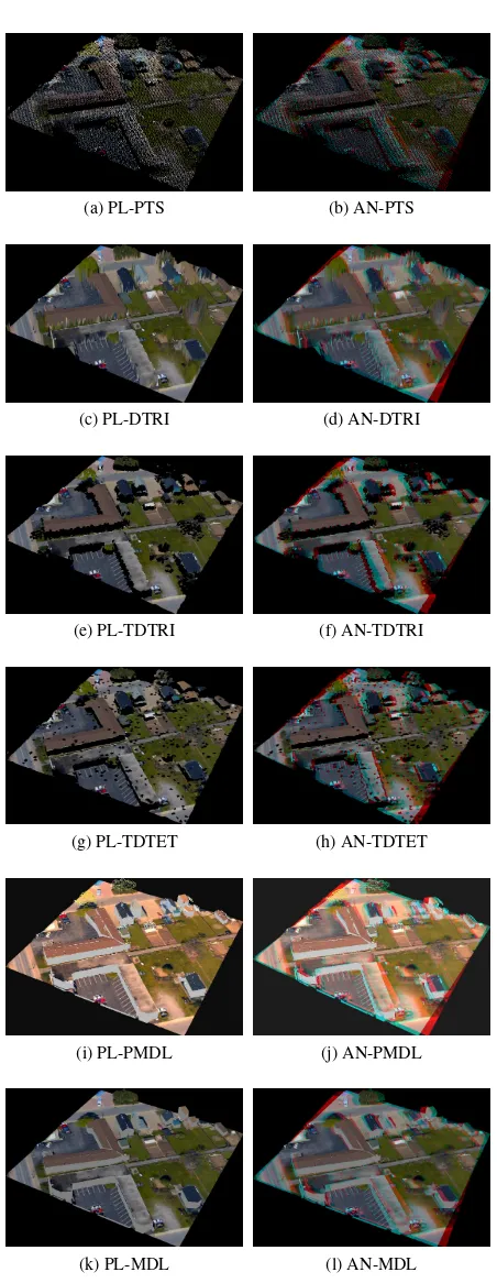
A user interface using Qt/C++and OpenSceneGraph was de-signed which would read a file corresponding to the processed or unprocessed dataset and the texture and also present the par-ticipant with visualization schemes and the rating questionnaires alternatively. Each participant was to be presented with results from a different dataset and a different order of schemes. Rota-tion, zooming in and zooming out were possible for each of the visualization schemes. The ratings obtained from a participant were to be stored in a binary format in the hard disk. Screen-shots of the various schemes presented to a participant are shown in Figure [2] for one of the data sets. The user interface was de-signed such that the interaction with the keyboard and mouse was minimum.
(a) PL-PTS (b) AN-PTS
(c) PL-DTRI (d) AN-DTRI
(e) PL-TDTRI (f) AN-TDTRI
(g) PL-TDTET (h) AN-TDTET
(i) PL-PMDL (j) AN-PMDL
(k) PL-MDL (l) AN-MDL
5.3 Conducting the experiment
Sixty third year undergraduate students of the Department of Civil Engineering, Indian Institute of Technology Kanpur agreed to participate in the experiment through appointment slots of 45 minutes each. During each of the experiments, it was ensured that the lighting and cooling were kept constant, and the noise level was kept to the minimum possible.
5.4 Statistical analysis of the scores
Based on the previous discussion, there are 12 schemes to be compared (see Table [1]) and there are 60 participants in the ex-periment. This subsection describes the statistical methodology to compare the 12 methods using the scores obtained from the 60 participants.
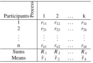
To simplify the explanation of the analytical process, the number of processes are denoted bykand the number of participants are denoted byn. Each of thenparticipants gives a score on each of the processes. The score given by theith participant for the jth process is denoted bysi j(see Table [3]).
Participants Process 1 2 . . . k
Table 3: Scores given bynparticipants
5.4.1 Pre-analysis For each of the participants, the scores in a row are ranked in an increasing or decreasing order. Tied ranks are replaced by averaged ranks. In Table [4],ri jdenotes the rank
ofsi jamongstsi1,si2, . . . ,sik.
Table 4: Ranks for each of thenparticipants
5.4.2 Null hypothesis and the Friedman’s test As a first step, the null hypothesis is framed asH0:−the processes are all
similar. The alternate hypothesis is to prove otherwise. In order to check for the validity of the null hypothesis, the Friedman Test (Friedman, 1937, 1939) is conducted. The following notations are therefore introduced: R·j :=Pni=1ri j,r:= nk1 Pni=1
The formula for Q-statistic for the Friedman’s test is given by (Gibbons and Chakraborti, 2010)
Q:=(k−1)S
St
. (1)
Q denotes the test statistic for the Friedman’s test. For large val-ues ofnandk, the probability distribution ofQis approximated
by theχ2 distribution. If thep-value, given byP(χ2
k−1 ≥Q), is
smaller than the level of significanceαthen the null hypothesis is rejected.
5.4.3 Post-hoc analysis and hypothetical ranking In case the Friedman’s test indicates that the null hypothesis cannot be accepted i.e. results from thekprocesses are not similar, a post-hoc analysis has to be conducted. The processesi and jare termed as different for a significance levelαif (Kvam and Vi-dakovic, 2007)
be given hypothetical ranks from 1 tok. In case two processes are found similar (see equation [2]), they are allotted the same rank as per the standard competition ranking scheme.
5.4.4 Page’s test for ordered alternatives Page (1963) de-veloped an L-statistic to help rank the processes. Since the col-umn sums are real numbers, theR·j’s can be arranged in a
de-creasing/increasing order. IfYj denotes the hypothetical rank
of the jth column, obtained through some process, then the L -statistic is given by
reject the null hypothesis and accept the hypothetical ranking of the processes.
6 RESULTS AND DISCUSSION
The experiment intends to present all the visualization schemes from different subsets. In order to avoid biases in the experiment, all the scenes are not presented sequentially but randomly. How-ever, confounding is done in order to avoid the large number of experiments. With the nodes and edges as defined in Figure [1], 64 Hamiltonian paths are calculated using Mathematica. How-ever only 60 participants agreed to take part in the experiment.
6.1 Data preparation
The user interface designed for the experiment stored the scores received from each of the participants in the experiment in sepa-rate files. Each of these files were read into a corresponding Li-breOffice Calc sheet. A LibreOffice BASIC code was then used to collate the results for each of the questions into a single sheet. Since there were six questions, six different sheets were created through the BASIC code. Each of the sheets thus contained a 60×12 matrix.
6.2 Data analysis
It was verified through Pearson’sχ2goodness of fit tests and
through the different visualization schemes. With respect to the formulas and tables described earlier, we havek= 12 different processes andn=60 participants. The results of the Friedman Test for each of the questions are given in Table [5]. If the level of significanceαis taken as 0.05, it is clearly seen that the null hypothesis of Friedman’s test cannot be accepted for all the ques-tions.
Q. No. QStatistic P-value 1 462.3639 3.3604E-092 2 384.9278 9.6587E-076 3 355.3281 1.8068E-069 4 205.6392 5.0203E-038 5 399.5652 7.5683E-079 6 275.7351 1.1166E-052
Table 5:Q-statistic andP-value for all the questions
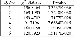
The methodology adopted for hypothetically ranking the schemes has been explained earlier in this paper. The column-wise rank sums are added up and the post-hoc analysis was conducted for each of the LibreOffice Calc Sheets corresponding to each of the questions. The column wise rank sumsR·j,j=1,· · ·,12 are laid
out in the increasing order for each of these sheets and ranks are given from 1 to 12, according to the standard competition ranking scheme. The ties in this scenario are determined using equation (2). The values of theχ2
Lstatistic and the correspondingP
val-ues are presented in Table [6]. The ranks obtained are presented in Table [7]. Here, equal ranks have been replaced by average ranks.
Q. No. χ2
LStatistic P-value
1 196.8464 3.3537E-036 2 169.1995 1.7240E-030 3 159.4702 1.7177E-028 4 91.7196 7.6684E-015 5 160.0758 1.2905E-028 6 120.3923 1.5117E-020
Table 6:χ2
L-statistic andP-value for all the questions
The Friedman test was performed again on the ranking’s ob-tained from the earlier post-hoc analysis (see Table [7]). The
Q-statistic is found out to be 116.3224 and the corresponding p-value is found out to be 9.9362E-020. Thus at a significance level of α = 0.05, the hypothesis that all the visualization schemes are equally effective cannot be accepted. A post-hoc analysis is thus conducted and a hypothetical ranking is performed. Page’s test for alternative hypothesis confirms this ranking as the val-ues ofχ2
Lis seen to be 57.0204 and the correspondingP-value is
4.3131E-014. It is therefore seen that the heuristic-based model viewed in the anaglyph mode (AN-MDL) gets the highest rank. It is therefore seen that AN-MDL (described in Ghosh and Lohani (2011)) has performed the best.
6.3 Findings from the research work
The experiment was conducted with 60 participants who were third year undergraduate students of Civil Engineering. The par-ticipants were not exposed to visualizing LiDAR data prior to the experiment.
It can be seen from Table [7] that anaglyph based visualization schemes have generally received better rankings. Almost every participant expressed appreciation for the realistic representation of the data in the anaglyph mode of visualization. Table [7] also reveals that the point based visualization in the anaglyph mode
has received lesser rankings. Since laymen are not used to see the features of the terrain in the point format, low ratings have been received by the point based visualization schemes namely PL-PTS and AN-PTS. It was also observed during the experi-ment that the participants usually zoomed out while visualizing the point based schemes. The Delaunay triangulation only con-siders one of the points which have the same values ofxandy
coordinates and differentzcoordinates. As a result, there is a loss of 3D information when a triangulation is generated from the raw datasets. The structures of the trees are therefore not well repre-sented, especially for the sparse trees. The buildings have rough and sloping walls and non-smooth edges. Further, when narrow triangles are trimmed using a threshold, sparse trees are lost in the process. Buildings turn to roofs hanging in the space when the triangles are trimmed. As a result, buildings have poor scores in AN-TDTRI and PL-TDTRI. However, the terrain and the vehi-cles are both well perceived in the triangulation and the trimmed triangulation schemes. The tetrahedralization based processing schemes (PL-DTET and AN-DTET) were developed for preserv-ing the tree structures. However, the thresholdpreserv-ing process creates “holes” in the representation of the terrain objects. Therefore good ratings are obtained for the trees but poor ratings for the buildings. The heuristic based visualization schemes (PL-MDL, PL-PMDL, AN-MDL and AN-PMDL) were designed to take the best of triangulation and tetrahedralization based schemes. Further, the buildings in these algorithms are represented with smoother walls compared to their triangulation based counter-parts. In the PL-PMDL and AN-PMDL algorithms, the trees are represented by points and therefore they have received a poorer rating in the experiments compared to the other schemes. On the contrary, both trees and buildings received high ratings in AN-MDL. PL-MDL receives high ratings amongst the 2.5 modes of visualization. Roads and vehicle features are represented well in the AN-MDL and they have received “best” ratings for Questions 5 and 6. AN-MDL received the best overall ranking in terms of depth and feature perception followed by DTET and AN-DTRI on the second and third places respectively. This ranking has also been verified statistically using the Page’s trend test.
Scheme Q1 Q2 Q3 Q4 Q5 Q6 Sum Rank
PL-PTS 12 12 12 11 12 12 71 12
PL-DTRI 7 7.5 8 8.5 7 6 44 7
PL-TDTRI 11 10 11 12 9.5 10 63.5 11
PL-DTET 9.5 9 10 8.5 9.5 9 55.5 10
PL-PMDL 9.5 6 5 10 8 7 45.5 8
PL-MDL 8 7.5 6 7 6 8 42.5 6
AN-PTS 6 11 9 5 11 11 53 9
AN-DTRI 3 4 3 3 2 3 18 3
AN-TDTRI 5 5 7 4 5 5 31 5
AN-DTET 2 1 4 1 4 2 14 2
AN-PMDL 4 3 1 6 3 4 21 4
AN-MDL 1 2 2 2 1 1 9 1
Table 7: Question-wise rankings for all the visualization schemes. Lower values of ranks are better.
6.4 Remarks on the statistical method
multivariate. Therefore, a more robust method of ranking based on permutation MANOVA or non-parametric MANOVA should be used. Further research in this direction would be presented elsewhere.
7 CONCLUSION
The aim of developing a visualization scheme for LiDAR data is to enable a user to perceive the various features on the terrain i.e. buildings, roads, trees and vehicles. Researchers have been working in this area of extracting features from LiDAR data us-ing the methods of classification. The authors of this paper have been working towards the development of methods which can enable the user to distinguish between the various features avail-able on the terrain without using the method of classification. Literature suggests that several methods of visualizing LiDAR data and derived products have been proposed by the scientific community. This paper has presented a method for designing an experiment and data analysis to select the best visualization scheme from the various available schemes. The experiment de-sign and subsequent data analysis have proven that the method-ology developed by Ghosh and Lohani (2011) performs the best in terms of depth and feature perception. Since the data obtained from the experiment is multivariate, studies using multivariate non-parametric methods for ranking and selection of visualiza-tion schemes would be presented in the future.
ACKNOWLEDGEMENT
The authors are grateful to Optech Inc., Canada for providing the data used for this research work. Valuable comments from the reviewers are gratefully acknowledged.
References
Barber, C. B., Dobkin, D. P. and Huhdanpaa, H., 1996. The quickhull algorithm for convex hulls. ACM Transactions on Mathematical Software 22(4), pp. 469–483.
Dawes, J., 2008. Do data characteristics change according to the number of scale points used? an experiment using 5-point, 7-point and 10-point scales. International Journal of Market Research 50(1), pp. 61–77.
Dykes, J., MacEachren, A. M. and Kraak, M.-J., 2005. Explor-ing geovisualization. In: ExplorExplor-ing Geovisualization, Elsevier Academic Press, chapter 1.
Finney, D. J., 1980. Statistics for Biologists. Chapman and Hall.
Friedman, M., 1937. The use of ranks to avoid the assumption of normality implicit in the analysis of variance. Journal of the American Statistical Association 32(200), pp. 675–701.
Friedman, M., 1939. A correction: The use of ranks to avoid the assumption of normality implicit in the analysis of vari-ance. Journal of the American Statistical Association 34(205), pp. 109.
Garland, R., 1991. The mid-point on a rating scale: Is it desir-able? Marketing Bulletin 2, pp. 66–70. Research Note 3.
Ghosh, S. and Lohani, B., 2007a. Development of a system for 3D visualization of lidar data. In: Map World Forum, Hyder-abad, India.
Ghosh, S. and Lohani, B., 2007b. Near-realistic and 3D visuali-sation of lidar data,. In: International Archives of Photogram-metry, Remote Sensing and Spatial Information Sciences, Vol. XXXVI 4/W45, Joint Workshop “Visualization and Explo-ration of Geospatial Data”.
Ghosh, S. and Lohani, B., 2011. Heuristical feature extraction from LiDAR data and their visualization. In: D. D. Lichti and A. F. Habib (eds), Proceedings of the ISPRS Workshop on Laser Scanning 2011, Vol. XXXVIII5/W12, International Society of Photogrammetry and Remote Sensing, University of Calgary, Canada.
Gibbons, J. D. and Chakraborti, S., 2010. Nonparametric Statis-tical Inference. 5 edn, CRC Press, Taylor and Francis Group.
Kreylos, O., Bawden, G. and Kellogg, L., 2008. Immersive visu-alization and analysis of lidar data. In: G. Bebis, R. Boyle, B. Parvin, D. Koracin, P. Remagnino, F. Porikli, J. Peters, J. Klosowski, L. Arns, Y. Chun, T.-M. Rhyne and L. Mon-roe (eds), Advances in Visual Computing, Lecture Notes in Computer Science, Vol. 5358, Springer Berlin/Heidelberg, pp. 846–855. 10.1007/978-3-540-89639-5 81.
Kvam, P. H. and Vidakovic, B., 2007. Non parametric statistics with applications to science and engineering. John Wiley & Sons.
Lattuada, R., 2006. Three-dimensional representations and data structures in GIS and AEC. In: S. Zlatanova and D. Prosperi (eds), Large-scale 3D data integration: challenges and oppor-tunities, Taylor & Francis, Inc., chapter 3.
Lin, H. and Zhu, Q., 2006. Virtual geographic environments. In: S. Zlatanova and D. Prosperi (eds), Large-scale 3D data integration: challenges and opportunities, Taylor & Francis, Inc., chapter 9.
MacEachren, A. M. and Kraak, M.-J., 2001. Research challenges in geovisualization. Cartography and Geographic Information Science 28(1), pp. 3–12.
Page, E. B., 1963. Ordered hypotheses for multiple treatments: a significance test for linear ranks. Journal of the American Statistical Association 58(301), pp. 216–230.
Richter, R. and D¨ollner, J., 2010. Out-of-core real-time visual-ization of massive 3d point clouds. In: Proceedings of the 7th International Conference on Computer Graphics, Virtual Real-ity, Visualisation and Interaction in Africa, AFRIGRAPH ’10, ACM, New York, NY, USA, pp. 121–128.
Vajta, L., Urbancsek, T., Vajda, F. and Juh´asz, T., 2007. Compari-son of different 3d (stereo) visualization methods – experimen-tal study. In: Proceedings of the 6th EUROSIM Congress on Modelling and Simulation, Ljubljana, Slovenia, 9-13 Septem-ber 2007.
van Oosterom, P., Stoter, J. and Jansen, E., 2006. Bridging the worlds of CAD and GIS. In: S. Zlatanova and D. Prosperi (eds), Large-scale 3D data integration: challenges and oppor-tunities, Taylor & Francis, Inc., chapter 1.
Worcester, R. M. and Burns, T. R., 1975. A statistical exam-ination of the relative precision of verbal scales. Journal of Market Research Society 17(3), pp. 181–197.
Zlatanova, S., 2000. 3D GIS for urban development. ISBN 90-6164-178-0, ITC Netherlands, ITC Netherlands.