Pro CSS Techniques
Pro CSS Techniques
Copyright © 2006 by Jeff Croft, Ian Lloyd, and Dan Rubin
All rights reserved. No part of this work may be reproduced or transmitted in any form or by any means, electronic or mechanical, including photocopying, recording, or by any information storage or retrieval system, without the prior written permission of the copyright owner and the publisher.
ISBN-13 (pbk): 978-1-59059-732-3 ISBN-10 (pbk): 1-59059-732-X
Printed and bound in the United States of America 9 8 7 6 5 4 3 2 1
Trademarked names may appear in this book. Rather than use a trademark symbol with every occurrence of a trademarked name, we use the names only in an editorial fashion and to the benefit of the trademark owner, with no intention of infringement of the trademark.
Lead Editor: Chris Mills
Technical Reviewer: Wilson Miner
Editorial Board: Steve Anglin, Ewan Buckingham, Gary Cornell, Jason Gilmore, Jonathan Gennick, Jonathan Hassell, James Huddleston, Chris Mills, Matthew Moodie, Dominic Shakeshaft, Jim Sumser, Keir Thomas, Matt Wade
Project Manager: Beth Christmas Copy Edit Manager: Nicole Flores Copy Editor: Liz Welch
Assistant Production Director: Kari Brooks-Copony Production Editor: Katie Stence
Compositor and Artist: Kinetic Publishing Services, LLC Proofreader: Lori Bring
Indexer: Broccoli Information Management Cover Designer: Kurt Krames
Manufacturing Director: Tom Debolski
Distributed to the book trade worldwide by Springer-Verlag New York, Inc., 233 Spring Street, 6th Floor, New York, NY 10013. Phone 1-800-SPRINGER, fax 201-348-4505, e-mail [email protected], or visit http://www.springeronline.com.
For information on translations, please contact Apress directly at 2560 Ninth Street, Suite 219, Berkeley, CA 94710. Phone 510-549-5930, fax 510-549-5939, e-mail [email protected], or visit http://www.apress.com. The information in this book is distributed on an “as is” basis, without warranty. Although every precaution has been taken in the preparation of this work, neither the author(s) nor Apress shall have any liability to any person or entity with respect to any loss or damage caused or alleged to be caused directly or indirectly by the information contained in this work.
For Haley, because everything I do is dedicated to you. —Jeff Croft
For Manda. Thanks for the continued support—lloydi loves ya! —Ian Lloyd
Contents at a Glance
About the Authors . . . xvii
About the Tech Reviewer . . . xix
Acknowledgments . . . xxi
Introduction . . . xxv
■
CHAPTER 1
The Promise of CSS
. . . 1■
CHAPTER 2
The Language of Style Sheets
. . . 11■
CHAPTER 3
Specificity and the Cascade
. . . 27■
CHAPTER 4
The Browsers
. . . 59■
CHAPTER 5
Managing CSS Files
. . . 73■
CHAPTER 6
Hacks and Workarounds
. . . 85■
CHAPTER 7
CSS Layouts
. . . 111■
CHAPTER 8
Creating Common Page Elements
. . . 163■
CHAPTER 9
Typography
. . . 191■
CHAPTER 10
Styling Tables
. . . 219■
CHAPTER 11
Styling Forms
. . . 235■
CHAPTER 12
Styling Lists
. . . 255■
CHAPTER 13
Styling for Print and Other Media
. . . 277■
CHAPTER 14
Everything Falls Apart
. . . 293■
APPENDIX A
CSS Reference
. . . 323■
APPENDIX B
CSS Specificity Chart
. . . 351■
APPENDIX C
Browser Grading Chart
. . . 355■
INDEX
. . . 361Contents
About the Authors . . . xvii
About the Tech Reviewer . . . xix
Acknowledgments . . . xxi
Introduction . . . xxv
■
CHAPTER 1
The Promise of CSS
. . . 1The Advantages of Using CSS for Style
. . . 1Semantic (X)HTML: Markup with Meaning
. . . 2What Is Semantic Markup?
. . . 2How Does Writing Semantic Markup Help You
in the Real World?
. . . 3Creating Semantically Rich (X)HTML Markup
. . . 4Avoiding Nonstructural Tags
. . . 5Avoiding “Divitis” and “Classitis”
. . . 5Choosing Your Markup Language and DOCTYPE
. . . 7HTML vs. XHTML: Why the Decision
Does—and Doesn’t—Matter
. . . 7DOCTYPE: The Most Underappreciated Tag of All
. . . 8The Three Layers of a Modern Web Document
. . . 9Summary
. . . 10■
CHAPTER 2
The Language of Style Sheets
. . . 11Adding Style to Your (X)HTML Document
. . . 11The <link> Tag
. . . 11Using Multiple Style Sheets
. . . 12The style Element
. . . 13Creating a Style Sheet
. . . 14Declarations
. . . 14Selectors
. . . 14Element Selectors
. . . 15Class Selectors
. . . 15ID Selectors
. . . 17(X)HTML’s Family Tree
. . . 17Descendant Selectors
. . . 18Child Selectors
. . . 19Adjacent Sibling Selectors
. . . 20Attribute Selectors
. . . 20Presence of an Attribute
. . . 21Exact Attribute Value
. . . 21Partial Attribute Values
. . . 22Particular Attribute Selector
. . . 22Pseudo-Classes and Pseudo-Elements
. . . 22Pseudo-Classes
. . . 23Pseudo-Elements
. . . 24Daisy-Chaining Selectors
. . . 24Grouping Selectors
. . . 25Summary
. . . 25■
CHAPTER 3
Specificity and the Cascade
. . . 27Selectors
. . . 27Selectors: Simple and Combined
. . . 27Universal “Star” Selector
. . . 29Element Selectors
. . . 30Descendant, Child, and Adjacent Sibling Selectors
. . . 30Pseudo-Class Selectors
. . . 31Link and Dynamic Pseudo-Classes:
A LoVe/HAte Relationship
. . . 31Pseudo-Elements
. . . 32The Cascade: Calculating Specificity
. . . 37How the CSS 2.1 Specification Describes the Cascade
. . . 37Translating the Spec
. . . 38Keeping Score
. . . 39A Series of Basic Examples
. . . 39Understanding the Scoring
. . . 47How the Cascade, Inline Styles, and
!important Affect Our Scoring
. . . 48Real-World Examples
. . . 49Summary
. . . 57■C O N T E N T S
■
CHAPTER 4
The Browsers
. . . 59A Little History
. . . 59The Standards Movement
. . . 60The Current (Desktop) Browser Landscape
. . . 60Firefox
. . . 60Safari
. . . 61Opera
. . . 62Internet Explorer
. . . 62Other Browsers
. . . 65Dealing with Older Desktop Browsers
. . . 65Graded Browser Support
. . . 66On Choosing a Development Browser
. . . 69Browsers for the Mobile Web
. . . 69Summary
. . . 71■
CHAPTER 5
Managing CSS Files
. . . 73Style Storage
. . . 74The Path to Your CSS
. . . 74Using Multiple Files As One Style Sheet
. . . 74Conventions for class and id Names
. . . 75Formatting CSS Declarations
. . . 76One Line vs. One Property Per Line
. . . 76Beyond Organized: Ordering Your Properties
. . . 76Saving Time with Shorthand
. . . 77Grouping and Notating CSS Rules with Comments
. . . 78CSS Comment Syntax
. . . 78Code Notations
. . . 78Comments for Metadata
. . . 79Comments for “Code Glossaries”
. . . 80Comments for Grouping
. . . 80Ordering CSS Rules
. . . 81General to Specific
. . . 81By Order in Which They Appear
. . . 81By Page or Section of the Site
. . . 82Creating a Reusable Framework
. . . 82The Mass Reset
. . . 82Summary
. . . 84■
CHAPTER 6
Hacks and Workarounds
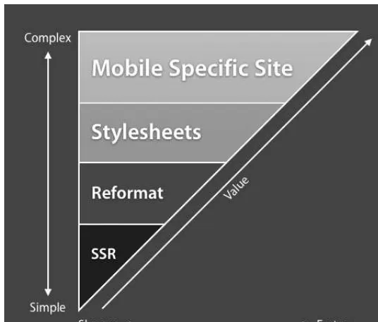
. . . 85Faux Columns: Using Background Images to Suggest Columns
. . . 145Faux Columns to the Rescue
. . . 145Scalable Text + Fixed Background Widths = Trouble
. . . 147Fixed-Width Layout: Column Resizes with Font Resize
. . . 147■C O N T E N T S
Managing Floats
. . . 149Floating Nearly Everything
. . . 150Using Easy Clearing
. . . 151Using overflow to Control Floats
. . . 154Negativity Is Good for You
. . . 155Flexibility of CSS Layouts
. . . 158Practical Layout Examples
. . . 159Style Switchers: Giving the User Control
. . . 160Summary
. . . 161■
CHAPTER 8
Creating Common Page Elements
. . . 163Styling a Page Header
. . . 164Using a Small Logo
. . . 164Mixing and Matching Foreground and Background Images
. . . 164Positioning the Logo and Tagline
. . . 165Adding the Background Image
. . . 166Adding in the Reflection Image
. . . 167Disabling the Style Sheets
. . . 168Adding Site Search and Sitewide Header Links
. . . 168Floating the Links into Place
. . . 169Positioning the Search Box
. . . 170Creating CSS-Based Tabbed Navigation
. . . 172Creating the Markup
. . . 172Positioning the Links
. . . 172Styling the Links
. . . 173Breadcrumb Trails
. . . 175Showing the Hierarchy of the Breadcrumb Trail
. . . 175Styling the Hierarchical Order
. . . 176Images and Hover Effects
. . . 177The Simple Image Swap
. . . 177Avoiding “Divitis”
. . . 178Sprites: Using One Image for All States
. . . 179Remote Image Swaps
. . . 180Remote Image Swapping and Sprites Combined
. . . 181Rounded-Corner Boxes
. . . 183Creating a Fixed-Width Rounded Box
. . . 183Creating a Rounded Box That Scales
. . . 185Making the Background Images
. . . 185Conclusion
. . . 189■
CHAPTER 10
Styling Tables
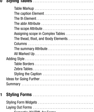
. . . 219Table Markup
. . . 219The caption Element
. . . 220The th Element
. . . 221The abbr Attribute
. . . 221The scope Attribute
. . . 221Assigning scope in Complex Tables
. . . 222The thead, tfoot, and tbody Elements
. . . 223Columns
. . . 224The summary Attribute
. . . 225All Marked Up
. . . 225Adding Style
. . . 227Table Borders
. . . 229Zebra Tables
. . . 232Styling the Caption
. . . 233Ideas for Going Further
. . . 234Summary
. . . 234■
CHAPTER 11
Styling Forms
. . . 235Styling Form Widgets
. . . 235Laying Out Forms
. . . 236Semantic (X)HTML for Forms
. . . 238Applying Basic Styling to the Form
. . . 241Intermediate Form Styling
. . . 245Aligning Labels and Their Fields in the Middle
. . . 249Summary
. . . 253■
CHAPTER 12
Styling Lists
. . . 255The Basic List
. . . 255Removing Browser Default Styling
. . . 256Flattening the List
. . . 257Custom Bullets
. . . 259Styled Ordered Lists
. . . 260Custom Bullets with Background Images
. . . 261Right-Aligned Bullets
. . . 262Vertical Navigation Links
. . . 262Adding the Media to Specific Selectors within
a Style Sheet
. . . 279Creating a Print Style Sheet
. . . 280What Do You Put in a Print CSS File?
. . . 281Resetting Layout
. . . 282Hiding Navigation and Other Interactive Elements
. . . 283■
CHAPTER 14
Everything Falls Apart
. . . 293What to Do When You Don’t Know What Went Wrong
. . . 293Useful Browser Add-ons and Utilities
. . . 294Validate Markup and Styles
. . . 297Disable Styles in Chunks
. . . 298Disable Hacks
. . . 299Create Minimal Test Cases to Simplify Problems
. . . 299Common CSS Mistakes
. . . 299Specificity Problems
. . . 300Image Paths
. . . 301Link Order (LoVe/HAte)
. . . 302Clear All Floats
. . . 302Common CSS Bugs (in IE)
. . . 302Doubled Float-Margin Bug
. . . 303Three-Pixel Jog
. . . 304Absolute Positioning in a Relative Container
. . . 306Whitespace Bug
. . . 307Solving Problems in the Real World: A Walkthrough
. . . 308Creating the Layout
. . . 309Getting It Right in Firefox
. . . 313Woe Is IE
. . . 315Adding the Subnav
. . . 318Why You Shouldn’t Group Your Hacks
. . . 321Summary
. . . 322■
APPENDIX A
CSS Reference
. . . 323CSS Units, Keywords, and Other Property Values
. . . 323Factors and Integers
. . . 323Colors
. . . 323Fonts
. . . 324Length
. . . 324Percentages
. . . 325Position Keywords
. . . 325URLs
. . . 325Properties That Accept Multiple Instances
. . . 325Inherit
. . . 325CSS Properties
. . . 326Typefaces, Text Color, Text Size, and Similar Properties
. . . 326Type Spacing and Alignment
. . . 328Box Model
. . . 331Positioning
. . . 338Background Colors, Images, and Similar Properties
. . . 340Lists
. . . 342Tables
. . . 344Generated Content
. . . 345cursor
. . . 347Printing
. . . 347■
APPENDIX B
CSS Specificity Chart
. . . 351Element Selectors
. . . 351Descendant, Child, and Adjacent Sibling Selectors
. . . 352Attribute Selectors
. . . 352Pseudo-Class Selectors
. . . 353Pseudo-Elements
. . . 353■
APPENDIX C
Browser Grading Chart
. . . 355Background
. . . 356Border
. . . 356Margin
. . . 357Padding
. . . 357Dimension
. . . 357Text
. . . 358Font
. . . 358List and Marker
. . . 358Positioning
. . . 359Classification
. . . 359Table
. . . 359Pseudo-Classes
. . . 360Pseudo-Elements
. . . 360Outline
. . . 360■
INDEX
. . . 361■C O N T E N T S
About the Authors
■JEFF CROFTis a web and graphic designer focused on web standards–based development who lives and works in Lawrence, Kansas. As the senior designer at World Online, Jeff works on such award-winning standards-based sites as http://lawrence.comand http://LJWorld.com. Jeff also runs a popular blog and personal site at http://jeffcroft.com, where he writes about many topics, including modern web and graphic design.
In addition to his work with World Online, Jeff has worked at two major universities in an effort to bring web standards to the education sector, and he has completed many freelance and contract jobs for various clients.
When he’s not hunched over a computer, Jeff enjoys photography, music, film, television, and a good night out on the town.
■IAN LLOYDruns Accessify.com, a site dedicated to promoting web accessi-bility and providing tools for web developers. His personal site, Blog Standard Stuff, ironically, has nothing to do with standards for blogs (it’s a play on words), although there is an occasional standards-related gem to be found there.
Ian works full-time for Nationwide Building Society, where he tries his hardest to influence standards-based design (“to varying degrees!”). He is a member of the Web Standards Project, contributing to the Accessibility Task Force. Web standards and accessibility aside, he enjoys writing about his trips abroad and recently took a year off from work and all things web but then ended up writing more in his year off than he ever had before. He finds most of his time being taken up by a demanding old lady (relax, it’s only his old Volkswagen camper van).
Ian is married to Manda and lives in the oft-mocked town of Swindon (where the “boring lot” in the UK version of The Officeare from) next to a canal that the locals like to throw shop-ping carts into for fun.
Ian is the author of Build Your Own Web Site the Right Way with HTML & CSS (SitePoint, 2006), which teaches web standards–based design to the complete beginner. He has also been technical editor on a number of other books published by Apress, friends of ED, and SitePoint.
■DAN RUBINspends his days blending music, design, typography, and web standards with the sunny beaches of South Florida. From vocal coaching and performing to graphic design and (almost literally) everything in between, Dan does his best to spread his talent as thin and as far as he possi-bly can while still leaving time for a good cup of tea and the occasional nap.
His passion for all things creative and artistic isn’t a solely selfish endeavor either—you don’t have to hang around too long before you’ll find him waxing educational about a cappella jazz and barbershop har-mony (his design of roundersquartet.comis just one example of these two worlds colliding),
interface design, usability, web standards, graphic design in general, and which typeface was on the bus that just drove by.
In addition to his contributions to sites including Blogger, the CSS Zen Garden, and Microsoft’s ASP.NET portal, Dan is a contributing author to Cascading Style Sheets: Separating Content from Presentation(2nd Edition, friends of ED, 2004), a technical reviewer for Beginning CSS Web Development: From Novice to Professional(Apress, 2006), and coauthor of Web Standards Creativity(friends of ED, 2007). He writes about web standards, design, and life in general on his blog, http://superfluousbanter.organd publishes podcasts on http://livefromthe101.com, and his professional work can be found at his agency’s site, http://webgraph.com.
■A B O U T T H E A U T H O R S
About the Technical Reviewer
■WILSON MINERis a designer and web developer based in San Francisco. He works at Apple and he’s also the designer for Django, an open source Python web framework. He publishes occasionally at www.wilsonminer.com.
Acknowledgments
T
hanks to everyone who helped make this book possible—and there are a lot of you. To Chris Mills, for giving me this wonderful opportunity and for guiding me through it every step of the way. To Beth Christmas, for managing the project and keeping on me when I slipped behind (and God knows I did). To Liz Welch, for keeping our grammar, tone, and spelling in check. To Katie Stence, for her wonderful production work. And to everyone else at Apress who worked long and hard to get this book published. You guys have been tremendous.To my long-distance friends and coauthors, Ian Lloyd and Dan Rubin. It’s been a joy working with you both. I can’t wait until we can celebrate in person. To my good friend and colleague Wilson Miner, who, in addition to doing the book’s technical editing, put a great deal of effort into the early planning stages of this project. And to design rockstar Bryan Veloso for his early contributions. It wouldn’t have been possible without all of you.
To my friends and colleagues at World Online, especially Dan Cox, Nathan Borror, Jacob Kaplan-Moss, Matt Croydon, David Ryan, James Bennett, and Tom Tobin for their encourage-ment and feedback throughout this process. Working with you guys is at once a challenge, an education, and a great source of entertainment. Also to my friends at Kansas State University, especially Janelle Corkill and Neil Erdwien, for not being afraid of my big ideas and believing in me as much as you did. I miss you guys.
To Jeffrey Zeldman, for being the inspiration to me and many others to get on board with web standards, and to Dave Shea, for creating the resource that ultimately proved CSS could really work—and also for giving me some personal opportunities that helped me through a trying time.
To the many great minds in the web standards community who share their ideas, discov-eries, and wonderful personalities with us through blogs and other online resources. All of you are constant sources of inspiration and motivation. Among you: Cameron Adams, Faruk Ates, Ryan Brill, Mark Boulton, Douglas Bowman, Andy Budd, Dan Cederholm, Tantek Çelik, Jared Christensen, Joe Clark, Andy Clarke, Simon Collison, Mike Davidson, Dustin Diaz, Garret Dimon, Todd Dominey, Derek Featherstone, Andrei Herasimchuk, Jon Hicks, Molly Holzschlag, Shaun Inman, Roger Johansson, Jeremy Keith, Dirk Knemeyer, Ethan Marcotte, Drew McLellan, Eric Meyer, Cameron Moll, Paul Nixon, Dunstan Orchard, John Oxton, Mike Papageorge, Veerle Pieters, D. Keith Robinson, Mike Rundle, Richard Rutter, Jason Santa Maria, Ryan Sims, Nathan Smith, Steve Smith, Jonathan Snook, Greg Storey, Jeffrey Veen, Khoi Vinh, Russ Weakley, Rob Weychert, and Simon Willison. There are more of you—you know who you are.
To Sue Jarchow at Washburn University, for (quite literally) showing me the door to free-dom, respect, and opportunity. Thanks for the enormous kick-start you gave to my career.
To everyone who visits jeffcroft.com and posts an occasional comment. I owe this oppor-tunity to you as much as anyone.
To all my friends, who’ve seen a lot less of me in the past seven or eight months. I’m looking forward to hanging out with you all regularly again.
xxi
To Michelle, who spent many nights on the couch alone while I hacked away at this book. Thanks for all your support and understanding. I love you, Meesh.
To my whole family, especially my Mom, who was as excited about this opportunity as I was, and my Dad, whom I look to as a role model and an inspiration far more than he knows. You guys have supported me through everything, good and bad, and in more ways than any child should even dream of. Words cannot express how much I love you and need you, and nothing I will ever be able to do will be a suitable way to thank you.
To my beautiful daughter Haley, who is the reason I do everything I do. I love you, sweetheart, and the moments I spend with you are truly the ones I value more than any other.
And of course to you, for reading.
Jeff Croft ■A C K N O W L E D G M E N T S
B
eginning with the obligatory group hug, thanks to my fellow authors Jeff and Dan. Without you guys . . . erm . . . well, I’d have had a lot more to write. Lifesavers. Seriously, though, you were all quick to respond to queries about your respective chapters so we all knew what was going on despite a sometimes tight time frame. We got through it—will have to down a beer or two with you in Austin next March!Thanks to Wilson for the tech editing and for not being too brutal. He never threw any major curve balls in my direction for which I was truly thankful!
Thanks to all the people at Apress who were flexible enough to accommodate me when I couldn’t quite meet the deadlines (on account of doing other work for the publisher at the same time). It was a juggling act at times, so flexibility was a good thing!
And finally, thanks to the other half, the missus, ’er indoors—whom I never refer to in those terms but it seemed like fun to do so in print!—for giving me the OK to take on these chapters, knowing full well that it would mean times when I would lock myself away for hours and communication would involve little more than the odd grunt or head nod. Wait, that’s just a normal day. My bad.
Ian Lloyd
Writing a book is an adventure. To begin with, it is a toy and an amusement; then it becomes a mistress, and then it becomes a master, and then a tyrant. The last phase is that just as you are about to be reconciled to your servitude, you kill the monster, and fling him out to the public.
—Winston Churchill
C
hurchill’s words accurately describe the process, and I would not have been able to make it through without the help, love, and encouragement of some truly amazing people.First and foremost, I owe a massive debt of gratitude to the entire team at Apress, specifically Chris Mills, Beth Christmas, Liz Welch, Kylie Johnston, and Katie Stence. You are all wonderful, caring, and patient people, and it has been a pleasure working with you over these last few months. I would not have been able to “kill the monster” without you.
To my coauthors, Jeff and Ian: you guys are talented, knowledgeable writers, even if your headshots aren’t as nice as mine. It is an honor to have my name share the cover with you both. This book could not have been written without years of experience, but not simply in the design or web standards fields. Everyone who has had an impact on my thought process, writ-ing style, and the long and constant learnwrit-ing process that is the Web has contributed in some way. During the course of writing this book, however, I would be remiss in not thanking certain individuals for their support: to Brad Tuckman, KSC Studio, Pixel Logo and MusicAlly, my clients over the last few months, for being so understanding; to Bryan Veloso, Jeremy Hubert, Mark Hornsby, Jina Bolton, Kris Rector, Lauren Grant, Brean Thibodeau, and Stephanie Ditchfield for their tireless encouragement, moral support, and late-night insanity phone calls and IMs; to Anton Peck for his support and the wonderful logo design used for one of the examples in this book; to Garrett Dimon for some CSS brainstorming and being cool in general (Vince Vaughn and Ben Stiller have nothingon us!); to Ryan Brill for helping out with some Windows-related development tidbits; to my brothers in harmony, Alex, Sean, Myron, and the rest of the Rounders family for putting up with my lack of focus on singing for a while; to the members of my chorus for the same—I know it’s difficult when the director misses rehearsals; to Kristina Horst, for taking such a wonderful photo of me for use in this book; to Dinah, Kit, and Tana, the three most awesome, wonderful, and inspirational people I know; to the entire crew at Starbucks on US1 and Broward Blvd. for the steady stream of caffeine, the smiling faces, and for always remembering my name and drinks when I walk in the door; to Tetley for the many boxes of British Blend tea I consumed during the course of this project; to cows and dairy farms, for the milk in my tea; and to Big Sugar (with the amount of tea I drank, I should either invest in sugar futures or a better dental plan).
And finally, I owe more than I can possibly express to my family. Mum and Dad, you are inspiration personified. Now we can put this book on the shelf next to yours. Bro (aka “Alex”), thanks for everything, and then some, and for taking care of me and the business while I was distracted by all this darned writing . . . as busy as we both are, you’re always on top of things, constantly amazing and impressing me with more moral fiber and strength of character than anyone I’ve ever met.
Dan Rubin ■A C K N O W L E D G M E N T S
Introduction
T
his book is a collection of proven, professional, modern techniques that you can use every day to get the most out of the time you put into your projects, from start to finish.As it has finally come to pass that CSS (Cascading Style Sheets) and other web standards are useful, real-world tools as opposed to idealistic goals, more and more professional web developers are moving to CSS from older approaches. Web browsers that support CSS well are now the default for the vast majority of web surfers. Additionally, a whole new generation of web developers are appearing on the scene, many of whom have never had the grave displeas-ure of dealing with nested table layouts and spacer GIFs.
So how are these web developers learning CSS? Most often, they are self-taught. They’ve picked up bits and pieces from online articles and blog posts, they’ve scoured other people’s code to dissect how someone achieved a particular style or layout technique, and they’ve read other CSS books on the market.
Like blog posts and online tutorials, most of the CSS books currently available are focused on specific principles and techniques out of context. Pro CSS Techniquesfocuses on context, and how each of the techniques presented fits into the lifecycle of a real-world project.
What This Book Is Not
This book is not an introduction to CSS. Although we’ll provide an overview of the basics, we’ll assume you have a simple understanding of what CSS is and how it works.
This book is not a comprehensive reference guide, either. Reference guides can be very useful (and CSS references already exist on the market), but they don’t usually deal with con-text, best practices, and issues of practicality.
This book is also not a preachy bible for web standards. We’ll assume you’ve already had at least one zealot preach at you about the importance of standards, and that if you’re reading this book, that zealot has already won you over. Or maybe you’ve already discovered the bene-fits of web standards on your own. Either way, you’re a convert. We believe strongly in web standards, but we also believe in doing what’s practical and effective above all else. We try to be 100 percent standards compliant where possible, but aren’t afraid to deviate from that goal slightly if it’s more practical to do so.
This book is not a gallery of clever, experimental CSS techniques. We’re focusing on tech-niques you can use today in the real world, on real projects, for real clients.
The Goals of This Book
This book is focused on four key goals:• Maintainability: We’ll provide suggestions on how you can easily write, organize, and store your code in ways that makes it simple to maintain—by you or by someone else.
• Compatibility: We’ll show you how you can avoid browser compatibility issues before they crop up, and how you can work around them when they do.
• Reusability: We want you to get the most out of your styles by taking advantage of the inheritance and specificity built into CSS.
• Practicality: We’ll remind you not to get too hung up on any of these ideals. It’s always smart to try to do something the “right” way, but if the “right” way proves to be impractical, use what works in the real world and move on. The ink is never dry on a web site—you can always optimize later.
Who This Book Is For
Pro CSS Techniqueswill be useful to anyone with a basic understanding of (X)HTML and CSS, who wants to take their knowledge and technique to the next level. We’ll focus our attention on web designers and developers who are building professional sites for general audiences. We know that not everyone who works in web development spends their time off reading web design magazines, blogs, and other people’s code. If you want to get up to speed on modern CSS development without reading hundreds of blogs posts all over the Internet, this book is your ticket home.
The Structure of This Book
Although this book is about CSS, it’s essential that you understand and provide clean, semantic (X)HTML to hang your CSS styles upon. Therefore, the first chapter of this book, “The Promise of CSS,” includes a review of modern (X)HTML markup. Next comes “The Language of Style Sheets,” a chapter that, along with its follow-up, “Specificity and the Cascade,” provides all the dirty details on how CSS actually works. We then discuss “The Browsers,” including their inconsistencies, which you likely already know is the bane of CSS development.
We move on to cover the practical management of your CSS development workflow. In “Managing CSS Files,” you’ll learn best practices for writing CSS selectors and declarations, how to best organize your selectors in multiple CSS files, and how to optimize your style sheets for bandwidth and speed. In “Hacks and Workarounds,” we explain how you can avoid over-complicating your CSS by building to the most reliable browsers first, when you’ll need to use CSS “hacks” or “filters,” and how to use them in the cleanest way possible. We also outline the most useful CSS filters.
Following these early chapters, the meat of the book shows you specific CSS styling techniques that you can use in your projects. We start with “CSS Layouts,” explaining effective ways for creating many common layouts, and then move on to “Creating Common Page Elements,” which covers such goodies as navigation tabs, drop-down menus, and rounded-corner boxes. We have a chapter dedicated to CSS “Typography,” the subtle art of fine-tuning ■I N T R O D U C T I O N
text for readability and aesthetics. We then move on to specific chapters on the visual formatting of (X)HTML tables, forms, and lists, and close with a chapter on “Styling for Print and Other Media.”
We finish the book with a troubleshooting guide we call “Everything Falls Apart.” It will help you get through the inevitable cases when things don’t go as planned. We discuss how you can figure out which components of your CSS are causing problems, some common CSS mistakes, and fixes to common CSS browser bugs.
Finally, we include useful references in appendices at the end of the book.
A Note About Internet Explorer 7
At the time of this writing, IE 7 was in beta, so we referred to it as such throughout this book; however, by publication it will be available as a full release.
Conventions Used in This Book
Throughout the book, we’ll use the following terms:• (X)HTML refers to both HTML and XHTML.
• CSS refers to the CSS 2.1 specification, unless otherwise stated.
All (X)HTML examples in this book are assumed to be nested in the <body>tag of a com-plete (X)HTML document. For the sake of brevity, we will often not show the entire (X)HTML document but only the relevant code snippet. Similarly, all CSS examples are assumed to be in the <head>of an (X)HTML document (usually by way of a link to an external style sheet).
Now, let’s get started.
The Promise of CSS
T
he ideal that Cascading Style Sheets (CSS) strives to attain is the complete separation of content from presentation. In other words, you build, maintain, and store the core contentof your web page, web site, or application (the text, related images, forms, and so forth) sepa-rately from the visualpresentation (such as the layout, typography, and decorative images).Those of you moving to CSS from the world of old-school web development may find this approach quite different from what you’re used to. You may be accustomed to using (X)HTML tables as layout grids, creating margins between items by including imgelements in your (X)HTML that serve up one-pixel transparent GIF images, and specifying typefaces using the (X)HTML fontelement. “Freeing your mind” from relying on those approaches isn’t easy, but most people who do are glad they did. For those of you who have used CSS since the day you started building web sites, consider yourselves blessed—learning CSS from scratch is easier than changing the way you think about web design.
■
Note
Most discussion points and examples in this book apply to both HTML and XHTML. We will use the notation (X)HTML to indicate these cases. When things do apply specifically to HTML or XHTML and not both, we will use the appropriate name alone, without the parenthetical (X).The Advantages of Using CSS for Style
There are numerous real-world advantages to separating content and style, and most of you are probably already aware of them. We’ll recap, just in case.
By separating the two layers of your document, you make it simple to add, remove, or update content without having to worry about botching up your layout. You also make it easy to change the font used for the entire site without having to dig through your content in search of every single <font>tag. Separating the two layers allows a web team to work efficiently; your visual designers can focus on design while your content producers focus on content—and neither has to worry about the other getting in their way. If you’re a solo developer, you’ll find that the separation of content and presentation allows you to keep your “frames of mind” sep-arate as well. When you need to make a change to content, you won’t have to dig through a bunch of style code to find what you’re looking for.
1
C H A P T E R 1
In addition, separating the two layers makes it possible to do an entire site redesign without touching the content at all—you only need to create a new CSS style sheet. By using external style sheets, separate from your HTML structure, you can make all modifications to the visual presentation of the site by editing just onefile rather than the numerous files (possi-bly numbering in the hundreds!) that make up your content.
As we move along, you’ll find that the complete separation of content and presentation doesn’t always pan out in the real world, but it’s still an important goal. Trying to attain it— even if you don’t make it 100 percent of the way—will pay off for you in efficiency and simplicity. If you shoot for the moon and don’t make it, you’ll still end up in the stars.
Semantic (X)HTML: Markup with Meaning
Before we can start working with CSS, we need to be sure we are able to adequately structure our (X)HTML documents in a modern fashion. Contrary to what you may have learned in the earlier years of web development, (X)HTML should not define the look and presentation of a web page (that’s the job of CSS). Instead, the purpose of (X)HTML is to provide context and meaning to the content of the document—this is referred to as semantic markup.
What Is Semantic Markup?
CSS relies completely on the (X)HTML that references it. If you want to use CSS to its fullest potential, it’s imperative that you provide it with clean, structured content marked up with (X)HTML. Before you can do that, you need to understand (X)HTML’s purpose in life. Accord-ing to the World Wide Web Consortium (W3C), an organization that develops specifications for many of the interoperable technologies used on the Web, “HTML is the lingua francafor publishing hypertext on the World Wide Web . . . HTML uses tags such as <h1>and </h1>to structure text into headings, paragraphs, lists, hypertext links etc.” (www.w3.org/MarkUp/).
In simpler terms, (X)HTML is a way of adding structure and meaning (or “semantics”) to textual content. It’s a way of saying, “This line is a header, and these lines make up a paragraph. This text is a list of items, and this text is a link to another document on the Web.” Note that it is not the job of HTML to say, “This text is blue, and this text is red. This section is a column that is to the right of everything else, and this line is in italics.” That presentational informa-tion is CSS’s job. When developing for the modern Web—especially if you come from the old school—always remember this: (X)HTML tells us what a piece of content is (or what it means), and not what it looks like.
When we refer to “semantic markup,” we are talking about (X)HTML that is free of presenta-tional information and chock-full of meaningful tags that define the structure of the document. C H A P T E R 1■ T H E P R O M I S E O F C S S
(X)HTML VALIDATION
(X)HTML validation, the process of checking your markup for errors against the specifications the W3C has created, is an invaluable tool for modern web developers. Oftentimes, when it seems something isn’t working properly, it’s because you have an error in your code that a validator script (such as the one at http:// validator.w3.org/) can easily find and point out to you.
However, it’s also important to note that validation and clean, semantic markup are not one and the same. It’s possible to write very poorly structured markup that will pass the validation test with flying colors. Likewise, it’s possible to write very good, semantic (X)HTML and still find that you have a validation error or two.
Remember: both validation and solid semantics are important goals, but neither one necessarily leads to the other. A proper (X)HTML document will be semantic in nature and validate. It’s important to ensure you are striving to meet both of these goals and not just one or the other.
How Does Writing Semantic Markup Help You in the Real World?
Good semantic (X)HTML markup helps to promote the accessibility of your site to visitors. Not all visitors to your site will be able to “see” your CSS and JavaScript, but they’ll all get your (X)HTML. Therefore, it’s essential that your markup provide the semantic context necessary for comprehension of your content.
Screen readers (for visitors who are visually impaired) “read” your page based on the markup. For example, if you use the semantic <acronym>tag, a screen reader may “spell out” your word rather than trying to pronounce it. You’ll learn how to create semantically rich markup in the next section.
Personal digital assistants (PDAs), cell phones, and other devices may not render your page in the same way a desktop web browser does (usually because these devices have reduced support for CSS). Using semantic markup ensures that these devices render your page in a way that makes sense. Ideally, it is the job of the viewing device to render the content as appropriate to the context of that device. Starting with semantic markup gives the device the information it needs to make contextual decisions, and saves you from having to think about all the possi-ble contexts where your content will be consumed (now or in the future). For example, a cell phone may choose to render text marked up with a header tag in bold. A PDA may display the same text in a larger font. Either way, by marking up your text as a header, you’ve made sure the reading device will act accordingly, based on what it feels is appropriate for the context in which the page is being viewed.
Search engine crawlers also rely on your markup to determine context and weight of vari-ous keywords. You may not have considered search engine crawlers and bots as “visitors” to your site in the past, but they are actually extremely valuable users. Without them, search engines wouldn’t be able to index your sites, and human users would be less likely to find them. It’s in your best interest to make your pages as easy to understand as possible for crawlers, which largely ignore presentational markup and pay attention only to semantic markup. Therefore, if the name of your web document is marked up in a<font size="7">tag instead of an <h1>, your site’s position in search engine results could suffer.
Besides promoting accessibility, semantic markup facilitates the proper use of CSS and JavaScript by providing many “hooks” on which to apply styles and behaviors.
Creating Semantically Rich (X)HTML Markup
Now that you understand the benefits of semantic markup, how can you go about creating (X)HTML that is as structured and meaningful as possible?
Start by using the right (X)HTML elements for your content. If it’s a paragraph, put it in a<p>
tag. If it’s a header, put it in an <hx>tag. If it’s a list of links, use <a>tags inside of list elements. This may sound simple, but it’s astonishing how many sites you’ll find on the Internet that don’t bother with these details at all. They choose to put two <br>tags after some text rather than using the paragraph element, or they use <font size="5">instead of a header element.
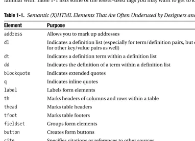
To help you decide on the right elements for your content, become familiar with some of the lesser-used (X)HTML tags. There are a whole host of useful elements out there that many web developers seem to completely forget about. By simply adopting some of these tags as your own, you can quickly add structure, context, and styling hooks to your documents. We’ll be using many of these tags later in the book as we get into styling various page elements. In the meantime, you may wish to brush up on your (X)HTML if these are not elements you are familiar with. Table 1-1 lists some of the lesser-used tags you may want to get to know.
Table 1-1. Semantic (X)HTML Elements That Are Often Underused by Designers and Developers
Element Purpose
address Allows you to mark up addresses
dl Indicates a definition list (especially for term/definition pairs, but can be used for other key/value pairs as well)
dt Indicates a definition term within a definition list
dd Indicates the definition of a term within a definition list
blockquote Indicates extended quotes
q Indicates inline quotes
label Labels form elements
th Marks headers of columns and rows within a table
thead Marks table headers
tfoot Marks table footers
fieldset Groups form elements
button Creates form buttons
cite Specifies citations or references to other sources
samp Indicates sample output of scripts, programs, etc.
kbd Indicates text to be entered by the user
abbr Specifies abbreviated forms or words or phrases
acronym Indicates acronyms
It should be obvious by now, but when creating semantic markup, you want to avoid presen-tational tags such as <font>, <i>, <b>, and <u>. The sole purpose of each of these tags is to create a visual effect, which in the modern world of web development is the job of CSS, not (X)HTML. You should use elements like emand strongto define the meaning of the content, and then use CSS to specify your desired presentation for those elements (such as underlined, bold, or italic). C H A P T E R 1■ T H E P R O M I S E O F C S S
Also, do not repurpose structural tags for presentational effect. Before browsers supported CSS, many a web developer (including the authors of this book!) found creative ways to use tags for purposes other than their intended ones. For example, developers used the tableelement— designed for displaying tabular data such as spreadsheets and invoices—as a layout grid for their pages. They used the <blockquote>tag to create indentions. This sort of repurposing, while clever, is simply not necessary on the modern Web. Using CSS, you can style any element to look any way you’d like. There’s no need to use an <li>tag just to get a bullet to appear next to some content. Use the list item element (li) if it really is a list item, but if it’s not, simply use CSS to restyle the appropriate element with a bullet. Remember, the (X)HTML should tell us
what it is, not what it looks like.
Avoiding Nonstructural Tags
To provide as much structure as possible, limit your use of (X)HTML’s nonstructural tags as much as possible. <div>and <span>are incredibly useful—and absolutely necessary for CSS development—but they have no semantic meaning. Always check for an appropriate semantic tag you could use instead before resorting to <div>and <span>.
The divelement serves as a unit for grouping structural areas of your web document—for example, lumping together all of the primary content and then all of the secondary content. The purpose of the spanelement is to set apart inline content within a parent element. For example, consider the header text “Chapter One: Modern Markup.” If you consider the phrase “Modern Markup” emphasized, then you should mark it up like so:
<h1>Chapter One: <em>Modern Markup</em></h1>
If, on the other hand, you wish to set “Modern Markup” apart for some nonsemantic reason (perhaps because you want to style it differently), use <span>:
<h1>Chapter One: <span>Modern Markup</span></h1>
divand spanshould not be used to replace more appropriate elements. For example, there is no reason to do this:
<div>This is a paragraph of text.</div>
when you could simply do this:
<p>This a paragraph of text.</p>
The first example is meaningless, whereas the second provides the paragraph structure to the browsers and other devices reading it.
Avoiding “Divitis” and “Classitis”
Often, developers who are accustomed to using the tableelement for layout will be inclined to create markup with lots of nested <div>tags, effectively replicating their tablelayouts with the divelement. This practice, which has been dubbed divitis, should be avoided.
Similarly, be careful about “wrapping” single elements in <div>tags. This is often done for styling purposes—and it is sometimes necessary to create a particular effect—but usually it is wasted markup. For example, why do this:
<div id="menu">
when this provides as much structure and uses less code:
<ul id="menu"> <li>First item</li> <li>Second item</li> <li>Third item</li> </ul>
Less code is always a good thing.
Like divitis, it’s also possible (and very common) for developers to overuse (X)HTML’s
classattribute. This has been deemed classitis. The classattribute exists so that you can add some semblance of semantics if no appropriate (X)HTML element is available and so that you can create “hooks” for CSS styles and JavaScript behaviors to act on. But developers often use classes instead of more appropriate tags, like this:
<p class="address"> John Smith<br />
1234 Rolling Rock Rd. <br /> Albany, NY, 12345<br /> </p>
Instead of using (X)HTML’s addresselement, like this:
<address>
John Smith<br />
1234 Rolling Rock Rd. <br /> Albany, NY, 12345<br /> </address>
developers also tend to use aclassover and over again on repeated elements when they could simply apply it once to a parent element. Consider this:
<ul>
Here’s a much cleaner approach:
<ul class="cheese-types"> <li>Cheddar</li> <li>Mozzarella</li>
C H A P T E R 1■ T H E P R O M I S E O F C S S
<li>Parmesan</li> <li>Swiss</li> </ul>
So, when dealing with div, span, and the classattribute, be sure you aren’t using them instead of more appropriate (X)HTML elements, and be sure you are using as few of them as possible. They’re useful when used properly, but they can clutter up your document and cause a great deal of confusion if you’re not careful.
Choosing Your Markup Language and DOCTYPE
HTML isn't the only game in town when it comes to web markup. XHTML has hit the ground running and is now very popular among many web designers and developers. Even after you choose one of the two, you’ll still have to decide exactly which version you intend to write against. There are several factors to consider, and it’s important to think them through and choose the right markup language for your project—changing down the road may prove tedious and time consuming.HTML vs. XHTML: Why the Decision Does—and Doesn’t—Matter
HTML was the original language of the Web, and it continues to be the most widely used. HTML 4.01 is both the most recent and last version of HTML—it is the final W3C specification for HTML. XHTML 1.0 was created after HTML 4.01 to encourage a transition to a new genre of markup languages. XHTML is a reformulation of HTML in XML. Because of this, XHTML documents are both hypertext documents and XML documents.
As far as the users of your web site are concerned, there is almost no real-world benefit to using XHTML over HTML. However, there are still a few compelling reasons why you, as a developer, may prefer XHTML.
XHTML, because of its XML roots, has far more rigorous syntax rules than HTML. Although this may seem like a bad thing at first glance, it actually forces authors to be more precise, which in turn makes XHTML documents easier to maintain than their HTML counterparts. The most relevant examples of XHTML’s more particular syntax requirements include insisting that all ele-ment and attribute names be lowercase, requiring that all attribute values be quoted, and demanding that all elements—even empty ones—be properly closed.
As valid XML, your XHTML documents can theoretically be parsed by XML utilities that would choke on HTML pages. Also, as valid XML your XHTML documents are ready to be manipulated by Extensible Stylesheet Language Transformations (XSLT). While we don’t dis-cuss XSLT in this book, you may find it to be relevant in your organization, and preferring XHTML to HTML will give you this extra layer of compatibility.
■
Note
If you want to find out more about using XML and XSLT in your work, check out Beginning XML with DOM and Ajax: From Novice to Professional, by Sas Jacobs (Apress, 2006, ISBN 1590596765) and Beginning XSLT 2.0: From Novice to Professional, by Jeni Tennison (Apress, 2005, ISBN 1590593243).You will run across people who will argue very strongly for both XHTML and HTML. The authors of this book tend to prefer XHTML, but we also recognize that HTML is every bit as valuable to your users. In the end, writing clean, semantic markup is the most important thing, whether you choose to do it in HTML or XHTML.
DOCTYPE: The Most Underappreciated Tag of All
All modern, valid (X)HTML documents must open with aDOCTYPEdeclaration. DOCTYPEis an (X)HTML string created primarily as a validation mechanism. It indicates to the browser, valida-tor, or other reading device what sort of document you are writing, as well as which specification, or set of rules, you are writing it against. Most modern browsers actually display the page differ-ently based on what DOCTYPEis declared (we’ll cover the specifics of how different DOCTYPEs affect browser display in Chapter 4). When you declare aDOCTYPE, you are effectively saying to the browser, “I, the developer of this site, have chosen to write my code against the following specification, and I’d really appreciate it if you’d use the same specification to render it.”
So what are these specifications? There are many possible DOCTYPEs, but for the purposes of this book, only four are significant:
• HTML 4.01 Strict
• HTML 4.01 Transitional
• XHTML 1.0 Strict
• XHTML 1.0 Transitional
Let’s take a look at each in turn.
HTML 4.01 Strict
HTML 4.01 Strict allows for a trimmed-down version of HTML 4.01. HTML 4.01 Strict empha-sizes structure over presentation. It does not contain deprecated and presentational elements (such as font, center, or u), nor does it allow for frames or link targets. Use a strict DOCTYPE
when you intend to write only 100 percent clean markup, free of presentational clutter. To declare HTML 4.01 Strict, the first line of your markup document should be
<!DOCTYPE HTML PUBLIC "-//W3C//DTD HTML 4.01//EN" ➥
"http://www.w3.org/TR/html4/strict.dtd">
HTML 4.01 Transitional
HTML 4.01 Transitional includes all elements and attributes of HTML 4.01 Strict but also sup-ports older presentational attributes, deprecated elements, and link targets. Use a transitional
DOCTYPEwhen dealing with legacy files that may still contain some presentational markup (you can always change the DOCTYPEto Strict once you completely clean up your legacy code). To declare HTML 4.01 Transitional, make the following the first line of your document:
<!DOCTYPE HTML PUBLIC "-//W3C//DTD HTML 4.01 Transitional//EN" ➥
"http://www.w3.org/TR/html4/loose.dtd">
C H A P T E R 1■ T H E P R O M I S E O F C S S
XHTML 1.0 Strict
Similar to HTML 4.01 Strict, the Strict version of XHTML 1.0 emphasizes structure by remov-ing all presentational tags and attributes, and beremov-ing XHTML, it also enforces the strict rules of XML on your markup, as detailed in the section “HTML vs. XHTML: Why the Decision Does— and Doesn’t—Matter.” Use a Strict DOCTYPEwhen you intend to write only 100 percent clean markup, free of presentational clutter. To declare XHTML 1.0 Strict, use the following as the first line of your document:
<!DOCTYPE html PUBLIC "-//W3C//DTD XHTML 1.0 Strict//EN" ➥
"http://www.w3.org/TR/xhtml1/DTD/xhtml1-strict.dtd">
XHTML 1.0 Transitional
Similar to HTML 4.01 Transitional, the XHTML 1.0 Transitional specification allows for some presentational markup, although again, the XML rules are enforced. Use a Transitional
DOCTYPEwhen dealing with legacy files that may still contain some presentational markup (you can always change the DOCTYPEto Strict once you completely clean up your legacy code). To declare XHTML 1.0 Transitional, use the following as the first line of your document:
<!DOCTYPE html PUBLIC "-//W3C//DTD XHTML 1.0 Transitional//EN" ➥
"http://www.w3.org/TR/xhtml1/DTD/xhtml1-transitional.dtd">
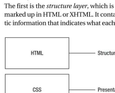
The Three Layers of a Modern Web Document
Modern, well-constructed web documents have three distinct layers of data (see Figure 1-1). The first is the structure layer, which is (at least for the purposes of this book) a text document marked up in HTML or XHTML. It contains the content of your document, along with the seman-tic information that indicates what each bit of text is (headers, paragraphs, lists, and so forth).Figure 1-1. The three-layer model of modern web development
The second layer is the presentation layer, which is the core focus of this book. It describes how your document will be presented to the visitor, including such details as layout, typography, colors, decorative images, and even nonvisual presentations like the voice family a screen reader may use. Generally, the presentation layer of a web document is written using CSS.
Besides these two layers, you’ll also find references to the behavior layerof a web docu-ment. We don’t discuss this layer in depth, but you should understand that it refers to using scripting (usually JavaScript for manipulating the Document Object Model, or DOM) to update, add, or remove items from the document based on the user’s behavior.
■
Note
For more information about JavaScript and the DOM, check out Beginning JavaScript with DOM Scripting and Ajax: From Novice to Professional, by Christian Heilmann (Apress, 2006, ISBN 1590596803).For a simple example of how the three layers work in conjunction with one another, consider a basic “contact us” form on a company’s web site. The form itself is marked-up text, produced in (X)HTML. That text is then styled into the aesthetic presentation you see on screen using CSS. After you fill out the form and click the Submit button, JavaScript steps in to vali-date your input and lets you know that you skipped a required field. After you fix that oversight, you hit Submit again. JavaScript then disables the button and displays a simple animation to let you know something is happening before returning a message such as “Thank you! We’ll get back to you as soon as possible.”
Summary
In this chapter, we’ve covered the basics of modern (X)HTML markup. Because CSS expects you to have written clean, valid, and semantic markup for your documents, it’s essential to have this piece of the equation in great shape before moving on to the presentation layer of your page or site. Many CSS headaches can be solved simply by getting your (X)HTML right. Speaking of CSS, let’s move on to Chapter 2, where we’ll cover the basics of what CSS is and how it works.
C H A P T E R 1■ T H E P R O M I S E O F C S S
The Language of Style Sheets
O
K, now we’ve had a look at modern web design, and how CSS fits into that, let’s turn our attention to recapping the basics of CSS to make sure we are all on the same page before we start immersing ourselves in all the exciting techniques and productivity-improving tips that make up the rest of the book. Even if you think you have a good handle on the basics of CSS, at least skim through the chapter anyway. Specifically we cover the following:• Adding style to your document
• Creating a style sheet and declarations
• Choosing selectors to apply styles to your markup
• Understanding XHTML and how it can be represented as an element node tree
• Daisy-chaining and grouping selectors
Adding Style to Your (X)HTML Document
In this section we’ll explore the various ways in which you can add CSS styles to your (X)HTML document. We’ll cover several approaches, and offer some best practices for making your markup and presentation information work well together.
The <link> Tag
There are a few ways to add CSS style information to an (X)HTML document, but it’s almost always a best practice to use the <link>tag. The tag’s purpose is simple: to associate one docu-ment with another. For our purposes, let’s use it to associate a CSS docudocu-ment with an XHTML document, like so:
<link rel="stylesheet" type="text/css" href="styles.css" media="all" />
This simply tells the XHTML document to use the file styles.cssas a source of CSS information. We call CSS documents referenced in this way external style sheets. Link tags that reference external style sheets must be placed inside the headelement of your (X)HTML document (but not inside any other element).
The attributes of the <link>tag are fairly straightforward. The rel, or relation, attribute, describes the sort of relationship the linked file has to the (X)HTML file calling it. For CSS style sheets, its value will always be stylesheet. The typeattribute defines the file type of the linked
11
C H A P T E R 2
file, and its value should always be text/cssfor CSS style sheets. As you might expect, the href
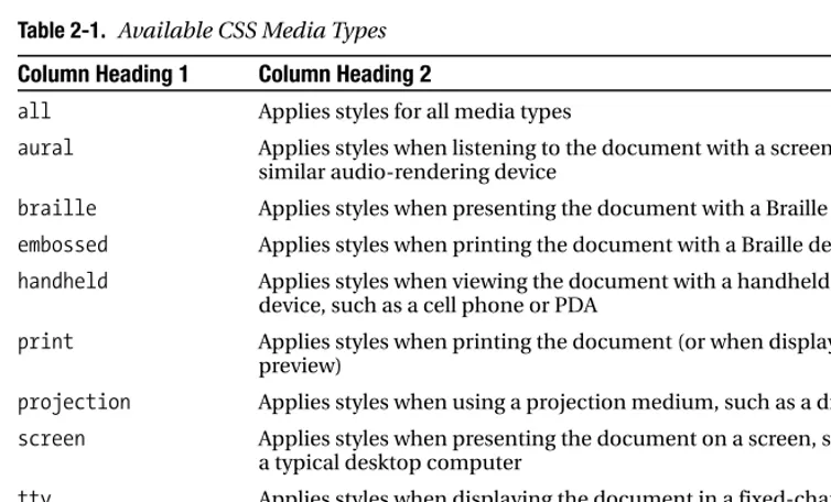
attribute declares the URL of the style sheet file you’d like to attach to your document. This URL may be absolute or relative. The final attribute, media, states for which presentation media the styles contained in the external style sheet should be applied. As Table 2-1 shows, several possible media types are defined in CSS—and they have varying degrees of browser support (more on this in Chapter 13).
Table 2-1. Available CSS Media Types
Column Heading 1 Column Heading 2
all Applies styles for all media types
aural Applies styles when listening to the document with a screen reader or similar audio-rendering device
braille Applies styles when presenting the document with a Braille device
embossed Applies styles when printing the document with a Braille device
handheld Applies styles when viewing the document with a handheld personal device, such as a cell phone or PDA
print Applies styles when printing the document (or when displaying a print preview)
projection Applies styles when using a projection medium, such as a digital projector
screen Applies styles when presenting the document on a screen, such as that on a typical desktop computer
tty Applies styles when displaying the document in a fixed-character width setting, such as Teletype printers
tv Applies styles when the document is being presented on a television-style screen
It’s up to each viewing device that supports CSS—be it a desktop computer’s web browser, a cell phone, a PDA, or a web TV device—to render the styles appropriate for the context in which it’s being used. Desktop browsers, for example, know to use styles destined for the “screen” media type when they display web sites normally but to use those defined for the “print” type when you are printing; cell phones and PDAs know they should use styles for the “handheld” type; and so on.
You can use a single style sheet in multiple media by setting the value of the mediaattribute to a list, separated by commas. For example, to use the style sheet named styles.cssin both screen and projection media, you’d use the following:
<link rel="stylesheet" type="text/css" href="styles.css" ➥
media="screen, projection" />
We’ll cover using CSS media types in much greater detail in Chapter 13.
Using Multiple Style Sheets
You can also attach multiple style sheets to a single (X)HTML document with the <link>tag. The browser will use all linked style sheets and render the page accordingly.
C H A P T E R 2■ T H E L A N G U A G E O F S T Y L E S H E E T S
Also, there exists the concept of an alternate style sheet. In some browsers (notably those powered by the Gecko rendering engine, such as Mozilla, Firefox, and recent versions of Netscape), these alternate visual presentations of your document will appear in a menu for the visitor to select between. For example:
<link rel="stylesheet" type="text/css" href="styles.css" ➥
media="all" title="Default" />
<link rel="alternate stylesheet" type="text/css" ➥
href="low_vision_styles.css" media="all" title="Low vision" />
Here, we’ve defined references to two different style sheets. Because the second one has the value alternate stylesheetfor the relattribute, it will not be used when the page is first pre-sented but will be offered to the user as a choice (only in those browsers that support it, though). Note the use of the titleattribute to give each style sheet a name (which will appear in the visitor’s menu of choices). Alternate style sheets are not widely used, probably because of their limited browser support.
It’s important to note that any <link>tag with both atitleattribute and arelvalue of
stylesheetwill be considered a preferred style sheet. Only one preferred style sheet will be used when the page is initially loaded. Therefore, it’s important that you don’t assign multiple
<link>tags both atitleattribute and arelattribute value of stylesheet. <link>tags without
atitleattribute are designated as persistent style sheets— which means they’ll alwaysbe used in the display of the document. More often than not, this is the behavior you’ll want. Because of this, you should only apply atitleattribute to your <link>tags if you are referring to an alternate style sheet.
The style Element
The styleelement is an (X)HTML element that allows you to embed CSS style information directly in the page you’re working on, rather than abstracting it out to an external style sheet. Although this may sound like a convenience at first, it’s almost always a hindrance in the real world. One of the major benefits of CSS is the ability to have all of your style information in a single external style sheet that many pages refer to. That way, when you want to change something, you only have to change it one time. In the case of embedded style sheets created with the styleelement, the style information applies only to the (X)HTML document you’re working with. It’s possible this behavior is what you want, but more often than not it’s benefi-cial to have the style information abstracted.
If you do want to embed a style sheet, use code like this in the headelement of your (X)HTML document:
<style type="text/css" media="screen, print "> ...
</style>
The practical applications of embedded style sheets are few. If you are making a simple, one-page site, it may be more convenient to keep your style information embedded in your (X)HTML document. You may also have one page within a larger site that needs additional or overriding styles along with the styles applied to the rest of the site. In this case, you can get by with an embedded style sheet, but it still may be a best practice to abstract the styles into their own file. You never know when you may need to add another page utilizing those styles, or