For example, writing a program that uses several pieces of code from this book does not require permission. Permission is required to include a significant amount of sample code from this book in your product documentation.
How to Contact Us
Acknowledgments
Exploratory Data Analysis
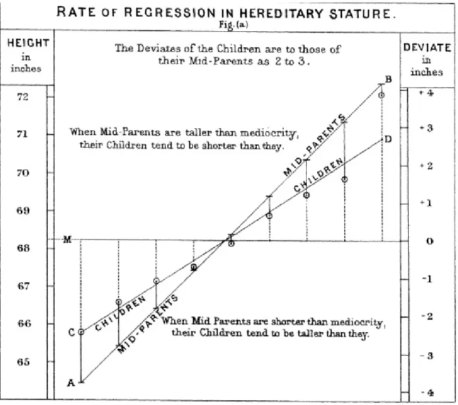
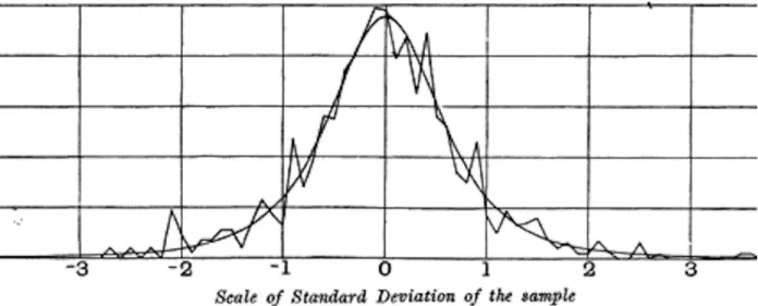
Tukey (Figure 1-1) called for a reformation of statistics in his seminal paper "The Future of Data Analysis." Donoho traces the genesis of data science to Tukey's pioneering work in data analysis.

Elements of Structured Data
Binary data is an important special case of categorical data that takes only one of two values, such as 0/1, yes/no, or true/false. In fact, data science software such as R and Python use these data types to improve computational performance.
Further Reading
Rectangular Data
Data Frames and Indexes
Nonrectangular Data Structures
In computing and information technology, the term graph usually refers to the representation of the connections between entities and the underlying data structure. In statistics, graph is used to refer to various graphs and visualizations, not just connections between entities, and the term refers only to the visualization, not to the structure of the data.
Estimates of Location
At first glance, summarizing data may seem quite trivial: just average the data (see "Average"). In fact, although the mean is easy to calculate and convenient to use, it may not always be the best measure of a central value.
Mean
Another type of average is a weighted average, which you calculate by multiplying each data value by a weight and dividing its sum by the sum of the weights. For example, if we average multiple sensors and one of the sensors is less accurate, we may be able to downgrade the data from that sensor.
Median and Robust Estimates
The trimmed mean can be thought of as a compromise between the median and the mean: it is robust to extreme values in the data, but uses more data to calculate the location estimate. The basic measure of location is the average, but can be sensitive to extreme values (outlier).
Estimates of Variability
The value such that P percent of the values take this value or less and (100–P) percent take this value or more. Just as there are different ways to measure location (mean, median, etc.), there are also different ways to measure variability.
Standard Deviation and Related Estimates
Variance, standard deviation, mean absolute deviation, and median absolute deviation from the median are not equivalent estimates, even when the data come from a normal distribution. In fact, the standard deviation is always greater than the mean absolute deviation, which is itself greater than the median absolute deviation.
Estimates Based on Percentiles
The standard deviation is almost twice as large as the MAD (in R, by default, the scale of the MAD is adjusted to be on the same scale as the mean). The variance and standard deviation are the most widely used and routinely reported statistics of variability.

Exploring the Data Distribution
Percentiles and Boxplots
Dashed lines, called whiskers, extend from the top and bottom and indicate the range for most data. There are many variations of the boxplot; see for example the documentation for the R function boxplot [R-base-2015].
Frequency Table and Histograms
The frequency table, on the other hand, will have different counts in the containers (containers of the same size). Skewness refers to whether data is skewed toward larger or smaller values, and kurtosis indicates the tendency of the data to have extreme values.

Density Estimates
A frequency histogram shows frequency counts on the y-axis and variable values on the x-axis; it gives an understanding of the data distribution at a glance. Density estimation in R is covered in the paper of the same name by Henry Deng and Hadley Wickham.

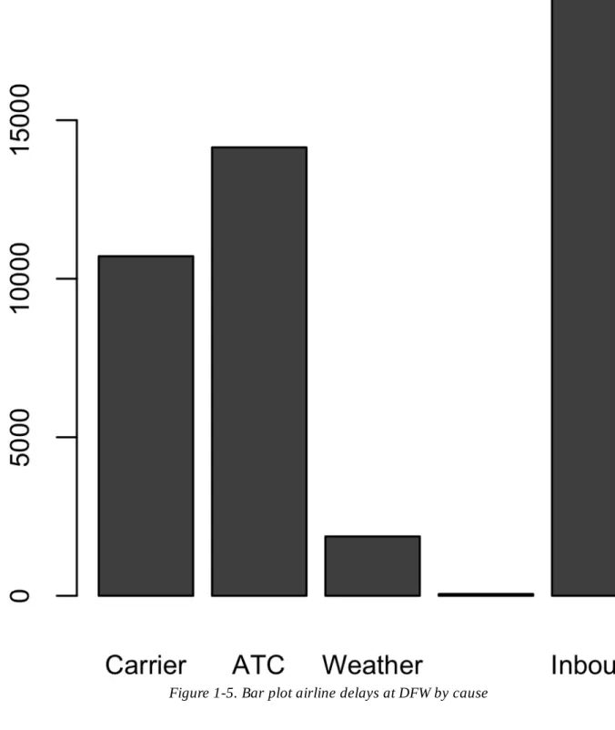
Exploring Binary and Categorical Data
Note that a bar chart is similar to a histogram; in a bar chart, the x-axis represents the different categories of the factor variable, while in a histogram, the x-axis represents the values of the individual variable on a numerical scale. In this sense, histograms and bar charts are similar, except that the categories on the x-axis in the bar chart are not ordered.
Mode
Expected Value
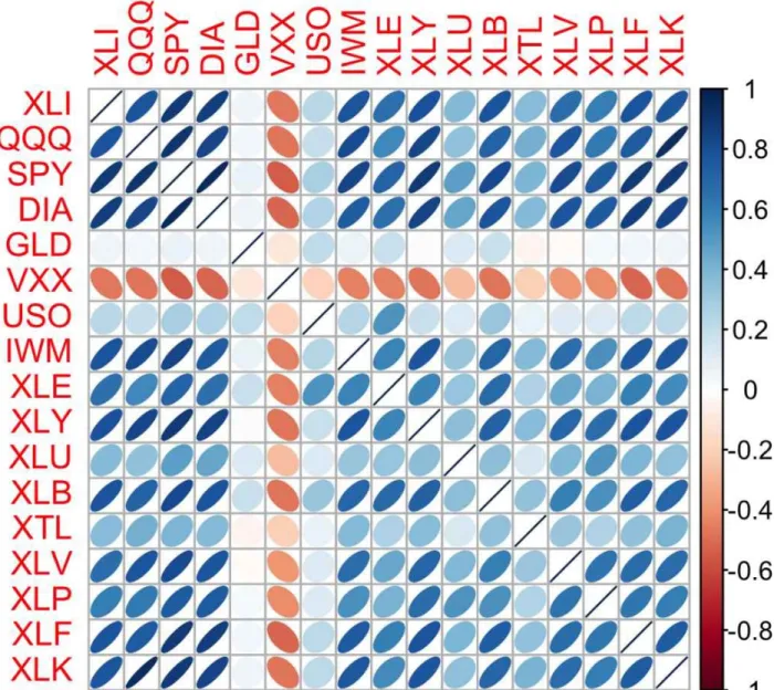
Correlation
Note the diagonal of 1s (a stock's correlation with itself is 1), and the redundancy of the information above and below the diagonal. The orientation of the ellipse indicates whether two variables are positively correlated (the ellipse is oriented to the right) or negatively correlated (the ellipse is oriented to the left).
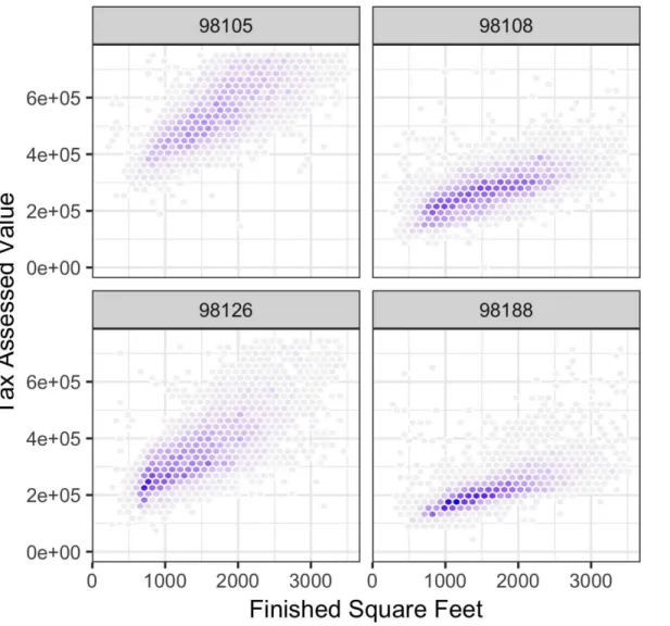
Scatterplots
The correlation coefficient measures the degree to which two variables are related to each other. The correlation coefficient is a standardized metric so that it always ranges from –1 (perfect negative correlation) to +1 (perfect positive correlation).
Exploring Two or More Variables
Hexagonal Binning and Contours (Plotting Numeric versus Numeric Data)
Other types of charts are used to show the relationship between two numerical variables, including heat maps.

Two Categorical Variables
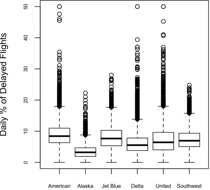
Categorical and Numeric Data
The advantage of a violin plot is that it can show nuances in the distribution that are not visible in a box plot. You can combine a violin plot with a box plot by adding geom_boxplot to the plot (although this is best if colors are used).
Visualizing Multiple Variables
Contingency tables are the standard tool for looking at the number of two categorical variables. Modern Data Science with R, by Benjamin Baumer, Daniel Kaplan, and Nicholas Horton (CRC Press, 2017), has an excellent presentation of "a grammar for graphics" ("gg" in ggplot).
Summary
Data and Sampling Distributions
All that is available is the sample data and its empirical distribution shown on the right. Traditional statistics focused heavily on the left side, using theory based on strong assumptions about the population.
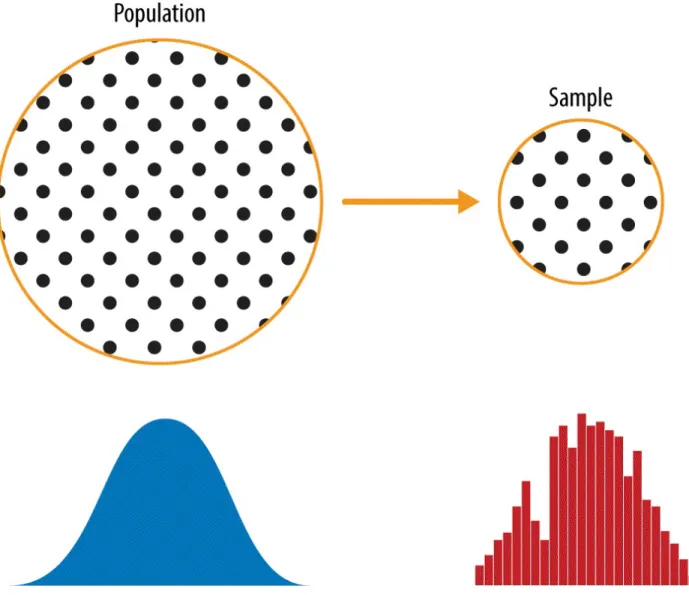
Random Sampling and Sample Bias
This leads to self-selection: the people who are motivated to write reviews may be those who have had bad experiences, have ties to the establishment, or are simply a different type of person than those who don't write reviews. Note that although self-selection samples may be unreliable indicators of the true state of affairs, they may be more reliable if they simply compare one establishment with a similar one; the same self-selection bias may apply to any of them.
Bias
Random Selection
Size versus Quality: When Does Size Matter?
Sample Mean versus Population Mean
This chapter provides an overview of the changes to random sampling that are commonly used in practice. The story of Literary Digest's failed poll can be found on Capital Century's website.
Selection Bias
The chance that someone in the stadium will get 10 heads is extremely high (more than 99% - it is 1 minus the chance that no one will get 10 heads). Obviously, retrospectively selecting the person (or persons) who gets 10 heads in the stadium does not indicate that they have a special talent – it is most likely luck.
Regression to the Mean
All other forms of data analysis risk bias as a result of the data collection/analysis. Wilkins' article "Identifying and Avoiding Bias in Research" in (surprisingly) Plastic and Reconstructive Surgery (August 2010) has an excellent review of different types of bias that can be involved in research, including selection bias.
Sampling Distribution of a Statistic
The distribution of a sample statistic such as the mean is likely to be more regular and bell-shaped than the distribution of the data itself. The histogram of the individual data values is widely distributed and skewed towards higher values as might be expected with income data.
Central Limit Theorem
Standard Error
Do not confuse standard deviation (which measures the variability of individual data points) with standard error (which measures the variability of a sample metric). The frequency distribution of a sample statistic tells us how that measure would turn out differently from sample to sample.
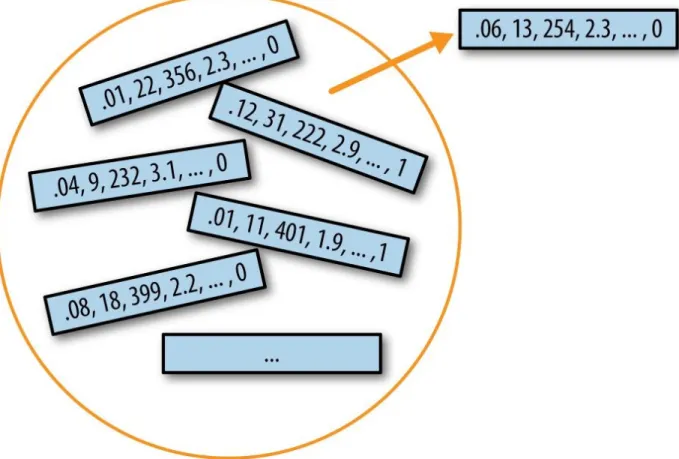
The Bootstrap
The bootstrap can be used with multivariate data, where the rows are sampled as units (see Figure 2-8). The sampling distribution of the mean has been well established since 1908; the sampling distribution of many other measures does not.
Resampling versus Bootstrapping
An Introduction to Bootstrap by Bradley Efron and Robert Tibshirani (Chapman Hall, 1993) was the first book-length treatment of bootstrap.
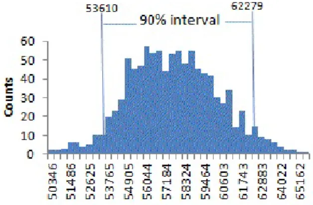
Confidence Intervals
For a data scientist, a confidence interval is a tool to get an idea of how variable a sample result may be. The lower the level of confidence you can tolerate, the narrower the confidence interval will be.
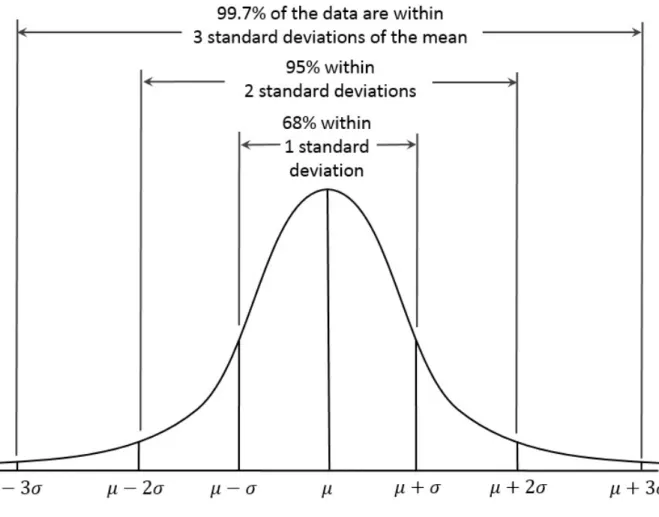
Normal Distribution
The normal distribution is also referred to as a Gaussian distribution after Carl Friedrich Gauss, a prodigious German mathematician of the late 18th and early 19th centuries. Gauss's development of the normal distribution came from his study of the errors in astronomical measurements, which were found to be normally distributed.
Standard Normal and QQ-Plots
Converting the data to z-scores (ie, standardizing or normalizing the data) does not result in a normal distribution of the data. To convert data to z-scores, you subtract the mean of the data and divide by the standard deviation;.
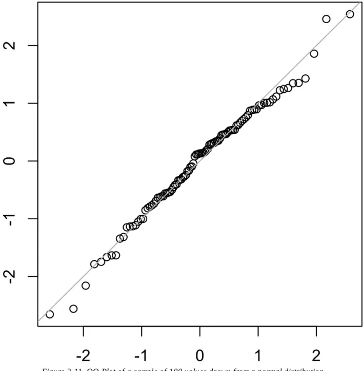
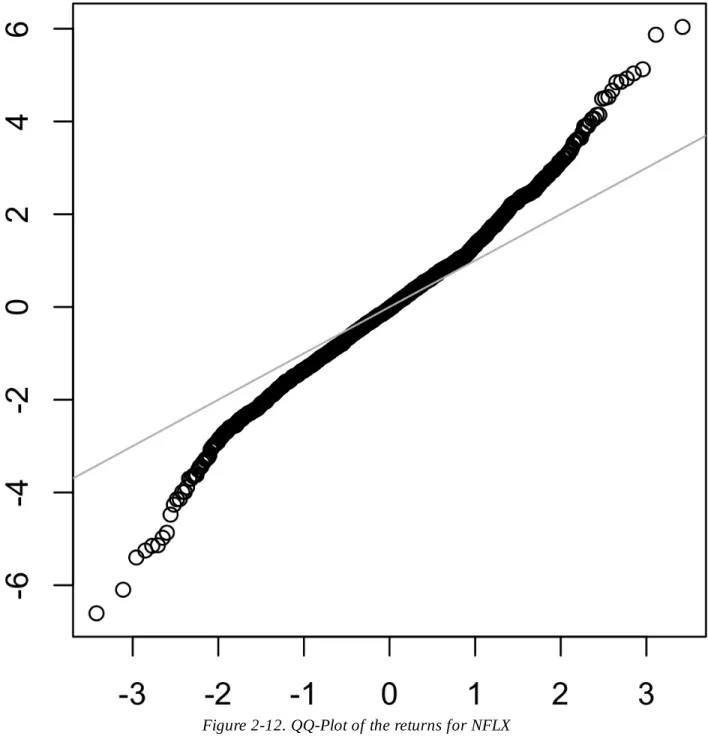
Long-Tailed Distributions
Unlike Figure 2-11, the points are well below the line for low values and well above the line for high values. Data is variable, and often stable, in face, with more than one form and type.
Student’s t-Distribution
What data scientists need to know about the t-distribution and the central limit theorem. It is widely used as a reference for the distribution of sample means, differences between two sample means, regression parameters, and more.
Binomial Distribution
The binomial distribution is the frequency distribution of the number of successes (x) in a given number of trials (n) with a certain probability (p) of success in each trial. This would return 0.9914, which is the probability of observing two or fewer successes in five trials, where the probability of success for each trial is 0.1.

Poisson and Related Distributions
Poisson Distributions
Exponential Distribution
Estimating the Failure Rate
Weibull Distribution
Statistical Experiments and Significance Testing
When you see references to statistical significance, t-tests, or p-values, it is typically in the context of the classic statistical inference "pipeline" (see Figure 3-1). This process starts with a hypothesis ("drug A is better than the existing standard drug," "price A is more profitable than the existing price B").
A/B Testing
The subject can be a person, a plant seed, a web visitor; the key is that the subject is exposed to the treatment. The luck of the draw assigning subjects to which treatments (i.e., the random assignment may have resulted in the naturally better performing subjects being concentrated in A or B).
Why Have a Control Group?
A blinded study is one in which the subjects do not know whether they are receiving treatment A or treatment B. Typically, the subject in the experiment is a web visitor, and the outcomes we want to measure are clicks, purchases, duration of visit, number of pages visited, whether a specified page visited and similar.
Why Just A/B? Why Not C, D…?
However, Facebook ran against this general acceptance in 2014 when it experimented with the emotional tone in users' news feeds. Facebook found that the users who experienced a more positive news feed were more likely to post positively themselves, and vice versa.
Hypothesis Tests
A statistical hypothesis test is the further analysis of an A/B test, or any randomized experiment, to assess whether random chance is a reasonable explanation for the observed difference between groups A and B.
The Null Hypothesis
Alternative Hypothesis
One-Way, Two-Way Hypothesis Test
David Freedman, Robert Pisani and Roger Purves' classic statistics text Statistics, 4th edition. W. W. Norton, 2007) has excellent non-mathematical treatments of most statistics topics, including hypothesis testing. Introductory Statistics and Analysis: A Resampling Perspective by Peter Bruce (Wiley, 2014) develops hypothesis testing concepts using resampling.
Resampling
Permutation Test
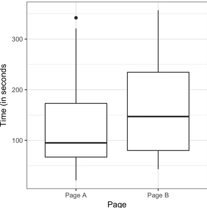
One way to answer this is to use a permutation test - then combine all the session times together. Calling this function R = 1000 times and specifying n2 = 15 and n1 = 21 produces a distribution of differences in session times that can be plotted as a histogram.
Exhaustive and Bootstrap Permutation Test
Permutation Tests: The Bottom Line for Data Science
Statistical Significance and P-Values
Value
This is the frequency with which the random model produces a more extreme result than the observed result. The normal approximation gives a p-value of 0.3498, which is close to the p-value obtained from the permutation test.
Alpha
In fact, a type 2 error is not so much an error as a judgment that the sample size is too small to detect an effect.
Data Science and P-Values
The alternative hypothesis is that the mean of the session time for page A is smaller than for page B. Any introductory statistics text will include illustrations of the t-statistic and its use; two good ones are Statistics, 4th Edition, by David Freedman, Robert Pisani and Roger Purves (W.W. Norton, 2007) and The Basic Practice of Statistics by David S.
Multiple Testing
These adjustment procedures typically involve "dividing alpha" according to the number of tests. In these cases, the term applies to the test protocol, and a single false "discovery" refers to the result of a hypothesis test (eg, between two samples).
Degrees of Freedom
Although there are seven days in the week, there are only six degrees of freedom to specify the day of the week. The concept of degrees of freedom is behind the factorization of categorical variables into n–1 indicator or dummy variables when doing a regression (to avoid multicollinearity).