STATISTICS
David Freeman, Robert Pisani, and Roger Purves
Fourth Edition
Statistics
Fourth Edition
DAVID FREEDMAN ROBERT PISANI ROGER PURVES
Statistics
Fourth Edition
W
•
W•
NORTON & COMPANYNEW YORK•LONDON
All rights reserved.
Printed in the United States of America.
Cartoons by Dana Fradon and Leo Cullum
The text of this book is composed in Times Roman.
Composition by Integre Technical Publishing Company, Inc.
Manufacturing by R. R. Donnelley.
Library of Congress Cataloging-in-Publication Data Freedman, David, 1938–
Statistics. — 4th ed. / David Freedman, Robert Pisani, Roger Purves.
p. cm.
Rev. ed. of: Statistics / David Freedman. . .[et al.], 3rd ed.
⃝c1998.
Includes bibliographical references and index.
ISBN 0-393-92972-8 ISBN 13-978-0-393-92972-0
1. Mathematical statistics. I. Pisani, Robert. II. Purves, Roger. III. Statistics. IV. Title.
QA276.F683 519.5—dc21
W.W. Norton & Company, Inc., 500 Fifth Avenue, New York, N.Y. 10110 http://www.wwnorton.com
W.W. Norton & Company Ltd., Castle House, 75/76 Wells Street, London W1T 3QT 1 2 3 4 5 6 7 8 9 0
To Jerzy Neyman (1894–1981)
Born in Russia, Neyman worked in Poland and England before coming to the United States in 1938. He was one of the great statisticians of our time.
Contents
Preface xv
PART I. DESIGN OF EXPERIMENTS
Chapter 1. Controlled Experiments 3
1. The Salk Vaccine Field Trial 3 2. The Portacaval Shunt 7 3. Historical Controls 8 4. Summary 10
Chapter 2. Observational Studies 12
1. Introduction 12 2. The Clofibrate Trial 13 3. More Examples 15
4. Sex Bias in Graduate Admissions 17 5. Confounding 20
6. Review Exercises 24 7. Summary and Overview 27
PART II. DESCRIPTIVE STATISTICS
Chapter 3. The Histogram 31
1. Introduction 31 2. Drawing a Histogram 35 3. The Density Scale 38 4. Variables 42
5. Controlling for a Variable 45 6. Cross-Tabulation 47 7. Selective Breeding 48 8. Review Exercises 50 9. Summary 56
Chapter 4. The Average and the Standard Deviation 57 1. Introduction 57
2. The Average 58
3. The Average and the Histogram 61 4. The Root-Mean-Square 66 5. The Standard Deviation 67
6. Computing the Standard Deviation 71 7. Using a Statistical Calculator 74 8. Review Exercises 74
9. Summary 76
Chapter 5. The Normal Approximation for Data 78 1. The Normal Curve 78
2. Finding Areas under the Normal Curve 82 3. The Normal Approximation for Data 85 4. Percentiles 88
5. Percentiles and the Normal Curve 90 6. Change of Scale 92
7. Review Exercises 93 8. Summary 96
Chapter 6. Measurement Error 97
1. Introduction 97 2. Chance Error 97 3. Outliers 102 4. Bias 103
5. Review Exercises 104 6. Special Review Exercises 105 7. Summary and Overview 108
Chapter 7. Plotting Points and Lines 110
1. Reading Points off a Graph 110 2. Plotting Points 112
3. Slope and Intercept 113 4. Plotting Lines 114
5. The Algebraic Equation for a Line 115
PART III. CORRELATION AND REGRESSION
Chapter 8. Correlation 119
1. The Scatter Diagram 119 2. The Correlation Coefficient 125 3. The SD Line 130
4. Computing the Correlation Coefficient 132 5. Review Exercises 134
6. Summary 139
Chapter 9. More about Correlation 141
1. Features of the Correlation Coefficient 141 2. Changing SDs 144
3. Some Exceptional Cases 147 4. Ecological Correlations 148 5. Association is Not Causation 150 6. Review Exercises 153
7. Summary 157
Chapter 10. Regression 158
1. Introduction 158
2. The Graph of Averages 162
CONTENTS ix 3. The Regression Method for Individuals 165
4. The Regression Fallacy 169
5. There Are Two Regression Lines 174 6. Review Exercises 176
7. Summary 178
Chapter 11. The R.M.S. Error for Regression 180
1. Introduction 180
2. Computing the R.M.S. Error 185 3. Plotting the Residuals 187 4. Looking at Vertical Strips 190
5. Using the Normal Curve Inside a Vertical Strip 195 6. Review Exercises 198
7. Summary 201
Chapter 12. The Regression Line 202
1. Slope and Intercept 202
2. The Method of Least Squares 208 3. Does the Regression Make Sense? 211 4. Review Exercises 213
5. Summary and Overview 216
PART IV. PROBABILITY
Chapter 13. What Are the Chances? 221
1. Introduction 221
2. Conditional Probabilities 226 3. The Multiplication Rule 228 4. Independence 230
5. The Collins Case 233 6. Review Exercises 234 7. Summary 236
Chapter 14. More about Chance 237
1. Listing the Ways 237 2. The Addition Rule 241
3. Two FAQs (Frequently Asked Questions) 243 4. The Paradox of the Chevalier De M´er´e 248 5. Are Real Dice Fair? 252
6. Review Exercises 252 7. Summary 254
Chapter 15. The Binomial Formula 255
1. Introduction 255
2. The Binomial Formula 259 3. Review Exercises 261 4. Special Review Exercises 263 5. Summary and Overview 268
PART V. CHANCE VARIABILITY
Chapter 16. The Law of Averages 273
1. What Does the Law of Averages Say? 273 2. Chance Processes 278
3. The Sum of Draws 279 4. Making a Box Model 281 5. Review Exercises 285 6. Summary 287
Chapter 17. The Expected Value and Standard Error 288 1. The Expected Value 288
2. The Standard Error 290 3. Using the Normal Curve 294 4. A Short-Cut 298
5. Classifying and Counting 299 6. Review Exercises 304 7. Postscript 307 8. Summary 307
Chapter 18. The Normal Approximation for Probability Histograms 308 1. Introduction 308
2. Probability Histograms 310
3. Probability Histograms and the Normal Curve 315 4. The Normal Approximation 317
5. The Scope of the Normal Approximation 319 6. Conclusion 325
7. Review Exercises 327 8. Summary 329
PART VI. SAMPLING
Chapter 19. Sample Surveys 333
1. Introduction 333
2. TheLiterary DigestPoll 334
3. The Year the Polls Elected Dewey 337 4. Using Chance in Survey Work 339
5. How Well Do Probability Methods Work? 342 6. A Closer Look at the Gallup Poll 343 7. Telephone Surveys 346
8. Chance Error and Bias 348 9. Review Exercises 351 10. Summary 353
Chapter 20. Chance Errors in Sampling 355
1. Introduction 355
2. The Expected Value and Standard Error 359 3. Using the Normal Curve 362
CONTENTS xi 4. The Correction Factor 367
5. The Gallup Poll 370 6. Review Exercises 371 7. Summary 373
Chapter 21. The Accuracy of Percentages 375
1. Introduction 375 2. Confidence Intervals 381
3. Interpreting a Confidence Interval 383 4. Caveat Emptor 387
5. The Gallup Poll 389 6. Review Exercises 391 7. Summary 394
Chapter 22. Measuring Employment and Unemployment 395 1. Introduction 395
2. The Design of the Current Population Survey 396 3. Carrying out the Survey 398
4. Weighting the Sample 401 5. Standard Errors 402 6. The Quality of the Data 404 7. Bias 404
8. Review Exercises 405 9. Summary 407
Chapter 23. The Accuracy of Averages 409
1. Introduction 409 2. The Sample Average 415 3. Which SE? 422
4. A Reminder 424 5. Review Exercises 425 6. Special Review Exercises 428 7. Summary and Overview 436
PART VII. CHANCE MODELS
Chapter 24. A Model for Measurement Error 441
1. Estimating the Accuracy of an Average 441 2. Chance Models 445
3. The Gauss Model 450 4. Conclusion 454 5. Review Exercises 455 6. Summary 457
Chapter 25. Chance Models in Genetics 458
1. How Mendel Discovered Genes 458 2. Did Mendel’s Facts Fit His Model? 463 3. The Law of Regression 465
4. An Appreciation of the Model 468 5. Review Exercises 470
6. Summary and Overview 471
PART VIII. TESTS OF SIGNIFICANCE
Chapter 26. Tests of Significance 475
1. Introduction 475
2. The Null and the Alternative 477
3. Test Statistics and Significance Levels 478 4. Making a Test of Significance 482 5. Zero-One Boxes 483
6. Thet-Test 488 7. Review Exercises 495 8. Summary 500
Chapter 27. More Tests for Averages 501
1. The Standard Error for a Difference 501 2. Comparing Two Sample Averages 503 3. Experiments 508
4. More on Experiments 512 5. When Does thez-Test Apply? 517 6. Review Exercises 518
7. Summary 521
Chapter 28. The Chi-Square Test 523
1. Introduction 523
2. The Structure of theχ2-Test 530 3. How Fisher Used theχ2-Test 533 4. Testing Independence 535 5. Review Exercises 540 6. Summary 544
Chapter 29. A Closer Look at Tests of Significance 545 1. Was the Result Significant? 545
2. Data Snooping 547
3. Was the Result Important? 552 4. The Role of the Model 555
5. Does the Difference Prove the Point? 560 6. Conclusion 562
7. Review Exercises 563 8. Special Review Exercises 565 9. Summary and Overview 576
Notes A3
Answers to Exercises A43
Tables A104
Index A107
Preface
What song the Sirens sang, or what name Achilles assumed when he hid among women, though puzzling questions, are not beyond all conjecture.
—SIR THOMAS BROWNE(ENGLAND, 1605–1682)
TO THE READER
We are going to tell you about some interesting problems which have been studied with the help of statistical methods, and show you how to use these meth- ods yourself. We will try to explain why the methods work, and what to watch out for when others use them. Mathematical notation only seems to confuse things for many people, so this book relies on words, charts, and tables; there are hardly anyx’s ory’s. As a matter of fact, even when professional mathematicians read technical books, their eyes tend to skip over the equations. What they really want is a sympathetic friend who will explain the ideas and draw the pictures behind the equations. We will try to be that friend, for those who read our book.
WHAT IS STATISTICS?
Statistics is the art of making numerical conjectures about puzzling questions.
• What are the effects of new medical treatments?
• What causes the resemblance between parents and children, and how strong is that force?
• Why does the casino make a profit at roulette?
• Who is going to win the next election? by how much?
• How many people are employed? unemployed?
These are difficult issues, and statistical methods help a lot if you want to think about them. The methods were developed over several hundred years by people who were looking for answers to their questions. Some of these people will be introduced later.
AN OUTLINE
Part I is about designing experiments. With a good design, reliable conclu- sions can be drawn from the data. Some badly-designed studies are discussed too—so you can see the pitfalls, and learn what questions to ask when reading about a study. Study design is perhaps our most important topic; that is why we start there. The ideas look simple, but appearances may be deceptive: part I has a lot of depth.
Studies typically produce so many numbers that summaries are needed. De- scriptive statistics—the art of summarizing data—is introduced in part II. His- tograms, the average, the standard deviation, and the normal curve are all consid- ered. The discussion continues in part III, where the focus is on analyzing rela- tionships, for instance, the dependence of income on education. Here, correlation and regression are the main topics.
Much statistical reasoning depends on the theory of probability, discussed in part IV; the connection is through chance models, which are developed in part V.
Coins, dice, and roulette wheels are the main examples in parts IV and V. The expected value and standard error are introduced; probability histograms are de- veloped, and convergence to the normal curve is discussed.
Statistical inference—making valid generalizations from samples—is the topic of parts VI–VIII. Part VI is about estimation. For instance, how does the Gallup Poll predict the vote? Why are some methods for drawing samples better than others? Part VII uses chance models to analyze measurement error, and to develop genetic theory. Part VIII introduces tests of significance, to judge whether samples are consistent with hypotheses about the population. As parts VI–VIII show, statistical inferences depend on chance models. If the model is wrong, the resulting inference may be quite shaky.
Nowadays, inference is the branch of statistics most interesting to profes- sionals. However, non-statisticians often find descriptive statistics a more useful branch, and the one that is easier to understand. That is why we take up descriptive statistics before inference. The bare bones of our subject are presented in chapters 1 to 6, 13, 16 to 21, 23, and 26. After that, the reader can browse anywhere. The next chapters to read might be 8, 10, 27, and 29.
EXERCISES
The sections in each chapter usually have a set of exercises, with answers at the back of the book. If you work these exercises as they come along and check the answers, you will get practice in your new skills—and find out the extent to which you have mastered them. Every chapter (except 1 and 7) ends with a set of review exercises. The book does not give answers for those exercises. Chapters 6, 15, 23, and 29 also have “special review exercises,” covering all previous material.
Such exercises must be answered without the clues provided by context.
When working exercises, you might be tempted to flip backward through the pages until the relevant formula materializes. However, reading the book back- ward will prove very frustrating. Review exercises demand much more than for- mulas. They call for rough guesses and qualitative judgments. In other words, they require a good intuitive understanding of what is going on. The way to develop that understanding is to read the book forward.
Why does the book include so many exercises that cannot be solved by plug- ging into a formula? The reason is that few real-life statistical problems can be solved that way. Blindly plugging into statistical formulas has caused a lot of confusion. So this book teaches a different approach: thinking.
PREFACE xv GRAPHICS
As in previous editions, extensive use is made of computer graphics to dis- play the data. Working drawings, however, are done freehand; the reader is en- couraged to make similar sketches, rather than being intimidated by too much precision. The book still features cartoons by Dana Fradon ofThe New Yorker.
What’s New in the Fourth Edition?
Of the making of books, there is no end.
—Ecclesiastes The principal change is to the data. Statistics, like people, show wear and tear from aging. Fortunately or unfortunately, data are easier to rejuvenate. We started the first edition in 1971, and completed the fourth in 2006. These past 35 years were years of rapid change, as commentators have doubtless observed since prehistoric times.
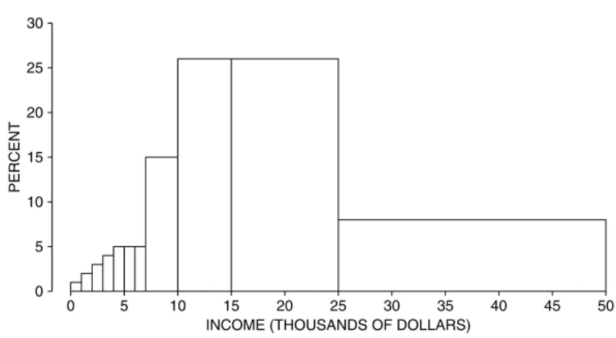
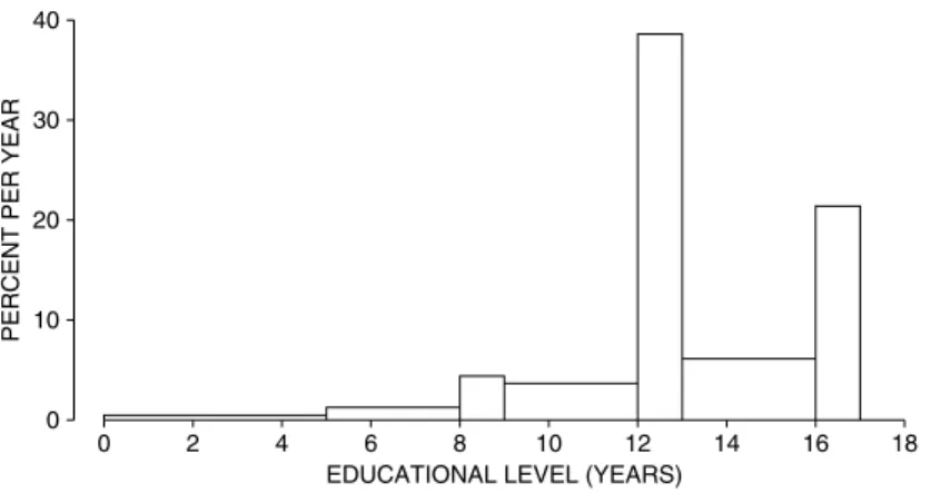
There was explosive growth in computer use. Other technical developments include email(+), the world wide web(+), Windows(±), cell phones(±), and call centers with voice-activated menus(−). SAT scores bottomed out around 1990, and have since been slowly going up (chapter 5). Educational levels have been steadily increasing (chapter 4), but reading skills may—or may not—be in decline (chapter 27).
The population of the United States increased from 200 million to 300 mil- lion (chapter 24). There was corresponding growth in higher education. Over the period 1976 to 1999, the number of colleges and universities increased from about 3,000 to 4,000 (chapter 23). Student enrollments increased by about 40%, while the professoriate grew by 60%. The number of male faculty increased from 450,000 to 600,000; for women, the increase was 175,000 to 425,000. Student enrollments shifted from 53% male to 43% male.
There were remarkable changes in student attitudes (chapters 27, 29). In 1970, 60% of first-year students thought that capital punishment should be abol- ished; by 2000, only 30% favored abolition. In 1970, 36% of them thought that
“being very well off financially” was “very important or essential”; by 2000, the figure was 73%.
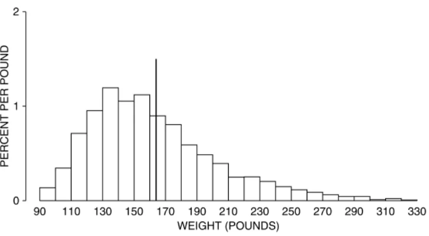
The American public gained a fraction of an inch in height, and 20 pounds in weight (chapter 4). Despite the huge increase in obesity, there were steady gains in life expectancy—about 7 years over the 35-year period. Gain in life expectancy is a process (“the demographic transition”) that started in Europe around 1800. The trend toward longer lives has major societal implications, as well as ripple effects on our exercises.
Family incomes went up by a factor of four, although much of the change represents a loss of purchasing power in the dollar (chapter 3). Crime rates peaked somewhere around 1990, and have fallen precipitously since (chapters 2, 29). Jury awards in civil cases once seemed out of control, but have declined since the 1990s
along with crime rates. (See chapter 29; is this correlation or causation?) Our last topic is a perennial favorite: the weather. We have no significant changes to report (chapters 9, 24).∗
ACKNOWLEDGMENTS FOR THE FOURTH EDITION
Technical drawings are by Dale Johnson and Laura Southworth. Type was set in TEX by Integre. Nick Cox (Durham), Russ Lyons (Indiana), Josh Palmer (Berkeley), and Sam Rose (Berkeley) gave us detailed and useful feedback. M´aire N´ı Bhrolch´ain (Southampton), David Card (Berkeley), Rob Hollister (Swarth- more), Diana Petitti (Kaiser Permanente), and Philip Stark (Berkeley) helped us navigate the treacherous currents of the scholarly literature, and the even more treacherous currents of the world wide web.
ACKNOWLEDGMENTS FOR PREVIOUS EDITIONS
Helpful comments came from many sources. For the third edition, we thank Mike Anderson (Berkeley), Dick Berk (Pennsylvania), Jeff Fehmi (Arizona), David Kaye (Arizona), Steve Klein (Los Angeles), Russ Lyons (Indiana), Mike Ostland (Berkeley), Erol Pekoz (Boston), Diana Petitti (Kaiser Permanente), Juliet Shaffer (Berkeley), Bill Simpson (Winnipeg), Terry Speed (Berkeley), Philip Stark (Berkeley), and Allan Stewart-Oaten (Santa Barbara). Ani Adhikari (Berkeley) participated in the second edition, and had many good comments on the third edition.
The writing of the first edition was supported by the Ford Foundation (1973–
1974) and by the Regents of the University of California (1974–75). Earl Cheit and Sanford Elberg (Berkeley) provided help and encouragement at critical times.
Special thanks go to our editor, Donald Lamm, who somehow turned a perma- nently evolving manuscript into a book. Finally, we record our gratitude to our students, and other readers of our several editions and innumerable drafts.
∗Most of the data cited here come from theStatistical Abstract of the United States, various editions.
See chapter notes for details. On trends in life expectancy, see Dudley Kirk, “Demographic transition theory,”Population Studiesvol. 50 (1996) pp. 361–87.
PART I
Design of
Experiments
1
Controlled Experiments
Always do right. This will gratify some people, and astonish the rest.
—MARK TWAIN(UNITED STATES, 1835–1910)
1. THE SALK VACCINE FIELD TRIAL
A new drug is introduced. How should an experiment be designed to test its effectiveness? The basic method iscomparison.1The drug is given to subjects in atreatment group, but other subjects are used ascontrols—they aren’t treated.
Then the responses of the two groups are compared. Subjects should be assigned to treatment or controlat random, and the experiment should be rundouble-blind:
neither the subjects nor the doctors who measure the responses should know who was in the treatment group and who was in the control group. These ideas will be developed in the context of an actual field trial.2
The first polio epidemic hit the United States in 1916, and during the next forty years polio claimed many hundreds of thousands of victims, especially chil- dren. By the 1950s, several vaccines against this disease had been discovered. The one developed by Jonas Salk seemed the most promising. In laboratory trials, it had proved safe and had caused the production of antibodies against polio. By 1954, the Public Health Service and the National Foundation for Infantile Paraly- sis (NFIP) were ready to try the vaccine in the real world—outside the laboratory.
Suppose the NFIP had just given the vaccine to large numbers of children.
If the incidence of polio in 1954 dropped sharply from 1953, that would seem to
prove the effectiveness of the vaccine. However, polio was an epidemic disease whose incidence varied from year to year. In 1952, there were about 60,000 cases;
in 1953, there were only half as many. Low incidence in 1954 could have meant that the vaccine was effective—or that 1954 was not an epidemic year.
The only way to find out whether the vaccine worked was to deliberately leave some children unvaccinated, and use them as controls. This raises a trouble- some question of medical ethics, because withholding treatment seems cruel.
However, even after extensive laboratory testing, it is often unclear whether the benefits of a new drug outweigh the risks.3Only a well-controlled experiment can settle this question.
In fact, the NFIP ran a controlled experiment to show the vaccine was effec- tive. The subjects were children in the age groups most vulnerable to polio—
grades 1, 2, and 3. The field trial was carried out in selected school districts throughout the country, where the risk of polio was high. Two million children were involved, and half a million were vaccinated. A million were deliberately left unvaccinated, as controls; half a million refused vaccination.
This illustrates the method of comparison. Only the subjects in the treatment group were vaccinated: the controls did not get the vaccine. The responses of the two groups could then be compared to see if the treatment made any difference.
In the Salk vaccine field trial, the treatment and control groups were of different sizes, but that did not matter. The investigators compared the rates at which chil- dren got polio in the two groups—cases per hundred thousand. Looking at rates instead of absolute numbers adjusts for the difference in the sizes of the groups.
Children could be vaccinated only with their parents’ permission. So one possible design—which also seems to solve the ethical problem—was this. The children whose parents consented would go into the treatment group and get the vaccine; the other children would be the controls. However, it was known that higher-income parents would more likely consent to treatment than lower-income parents. This design is biased against the vaccine, because children of higher- income parents are more vulnerable to polio.
That may seem paradoxical at first, because most diseases fall more heavily on the poor. But polio is a disease of hygiene. A child who lives in less hygienic surroundings is more likely to contract a mild case of polio early in childhood, while still protected by antibodies from its mother. After being infected, these children generate their own antibodies, which protect them against more severe infection later. Children who live in more hygienic surroundings do not develop such antibodies.
Comparing volunteers to non-volunteers biases the experiment. The statisti- cal lesson: the treatment and control groups should be as similar as possible, ex- cept for the treatment. Then, any difference in response between the two groups is due to the treatment rather than something else. If the two groups differ with respect to some factor other than the treatment, the effect of this other factor might beconfounded(mixed up) with the effect of treatment. Separating these effects can be difficult, and confounding is a major source of bias.
For the Salk vaccine field trial, several designs were proposed. The NFIP had originally wanted to vaccinate all grade 2 children whose parents would consent,
THE SALK VACCINE FIELD TRIAL 5
leaving the children in grades 1 and 3 as controls. And this design was used in many school districts. However, polio is a contagious disease, spreading through contact. So the incidence could have been higher in grade 2 than in grades 1 or 3.
This would have biased the study against the vaccine. Or the incidence could have been lower in grade 2, biasing the study in favor of the vaccine. Moreover, children in the treatment group, where parental consent was needed, were likely to have different family backgrounds from those in the control group, where parental con- sent was not required. With the NFIP design, the treatment group would include too many children from higher-income families. The treatment group would be more vulnerable to polio than the control group. Here was a definite bias against the vaccine.
Many public health experts saw these flaws in the NFIP design, and sug- gested a different design. The control group had to be chosen from the same population as the treatment group—children whose parents consented to vacci- nation. Otherwise, the effect of family background would be confounded with the effect of the vaccine. The next problem was assigning the children to treatment or control. Human judgment seems necessary, to make the control group like the treatment group on the relevant variables—family income as well as the children’s general health, personality, and social habits.
Experience shows, however, that human judgment often results in substantial bias: it is better to rely on impersonal chance. The Salk vaccine field trial used a chance procedure that was equivalent to tossing a coin for each child, with a 50–50 chance of assignment to the treatment group or the control group. Such a proce- dure is objective and impartial. The laws of chance guarantee that with enough subjects, the treatment group and the control group will resemble each other very closely with respect to all the important variables, whether or not these have been identified. When an impartial chance procedure is used to assign the subjects to treatment or control, the experiment is said to berandomized controlled.4
Another basic precaution was the use of a placebo: children in the control group were given an injection of salt dissolved in water. During the experiment the subjects did not know whether they were in treatment or in control, so their response was to the vaccine, not the idea of treatment. It may seem unlikely that subjects could be protected from polio just by the strength of an idea. However, hospital patients suffering from severe post-operative pain have been given a “pain killer” which was made of a completely neutral substance: about one-third of the patients experienced prompt relief.5
Still another precaution: diagnosticians had to decide whether the children contracted polio during the experiment. Many forms of polio are hard to diagnose, and in borderline cases the diagnosticians could have been affected by knowing whether the child was vaccinated. So the doctors were not told which group the child belonged to. This wasdouble blinding: the subjects did not know whether they got the treatment or the placebo, and neither did those who evaluated the responses. This randomized controlled double-blind experiment—which is about the best design there is—was done in many school districts.
How did it all turn out? Table 1 shows the rate of polio cases (per hundred thousand subjects) in the randomized controlled experiment, for the treatment
group and the control group. The rate is much lower for the treatment group, decisive proof of the effectiveness of the Salk vaccine.
Table 1. The results of the Salk vaccine trial of 1954. Size of groups and rate of polio cases per 100,000 in each group. The numbers are rounded.
The randomized controlled
double-blind experiment The NFIP study
Size Rate Size Rate
Treatment 200,000 28 Grade 2 (vaccine) 225,000 25 Control 200,000 71 Grades 1 and 3 (control) 725,000 54 No consent 350,000 46 Grade 2 (no consent) 125,000 44
Source: Thomas Francis, Jr., “An evaluation of the 1954 poliomyelitis vaccine trials—summary report,”American Journal of Public Healthvol. 45 (1955) pp. 1–63.
Table 1 also shows how the NFIP study was biased against the vaccine. In the randomized controlled experiment, the vaccine cut the polio rate from 71 to 28 per hundred thousand. The reduction in the NFIP study, from 54 to 25 per hundred thousand, is quite a bit less. The main source of the bias was confounding. The NFIP treatment group included only children whose parents consented to vaccina- tion. However, the control group also included children whose parents would not have consented. The control group was not comparable to the treatment group.
The randomized controlled double-blind design reduces bias to a mini- mum—the main reason for using it whenever possible. But this design also has an important technical advantage. To see why, let us play devil’s advocate and assume that the Salk vaccine had no effect. Then the difference between the polio rates for the treatment and control groups is just due to chance. How likely is that?
With the NFIP design, the results are affected by many factors that seem random: which families volunteer, which children are in grade 2, and so on. How- ever, the investigators do not have enough information to figure the chances for the outcomes. They cannot figure the odds against a big difference in polio rates being due to accidental factors. With a randomized controlled experiment, on the other hand, chance enters in a planned and simple way—when the assignment is made to treatment or control.
The devil’s-advocate hypothesis says that the vaccine has no effect. On this hypothesis, a few children are fated to contract polio. Assignment to treatment or control has nothing to do with it. Each child has a 50–50 chance to be in treatment or control, just depending on the toss of a coin. Each polio case has a 50–50 chance to turn up in the treatment group or the control group.
Therefore, the number of polio cases in the two groups must be about the same. Any difference is due to the chance variability in coin tossing. Statisticians understand this kind of variability. They can figure the odds against a difference as large as the observed one. The calculation will be done in chapter 27, and the odds are astronomical—a billion to one against.
THE PORTACAVAL SHUNT 7
2. THE PORTACAVAL SHUNT
In some cases of cirrhosis of the liver, the patient may start to hemorrhage and bleed to death. One treatment involves surgery to redirect the flow of blood through aportacaval shunt. The operation to create the shunt is long and haz- ardous. Do the benefits outweigh the risks? Over 50 studies have been done to assess the effect of this surgery.6Results are summarized in table 2 below.
Table 2. A study of 51 studies on the portacaval shunt. The well- designed studies show the surgery to have little or no value. The poorly- designed studies exaggerate the value of the surgery.
Degree of enthusiasm
Design Marked Moderate None
No controls 24 7 1
Controls, but not randomized 10 3 2
Randomized controlled 0 1 3
Source: N. D. Grace, H. Muench, and T. C. Chalmers, “The present status of shunts for portal hyper- tension in cirrhosis,”Gastroenterologyvol. 50 (1966) pp. 684–91.
There were 32 studies without controls (first line in the table): 24/32 of these studies, or 75%, were markedly enthusiastic about the shunt, concluding that the benefits definitely outweighed the risks. In 15 studies there were controls, but assignment to treatment or control was not randomized. Only 10/15, or 67%, were markedly enthusiastic about the shunt. But the 4 studies that were randomized controlled showed the surgery to be of little or no value. The badly designed studies exaggerated the value of this risky surgery.
A randomized controlled experiment begins with a well-defined patient pop- ulation. Some are eligible for the trial. Others are ineligible: they may be too sick
to undergo the treatment, or they may have the wrong kind of disease, or they may not consent to participate (see the flow chart at the bottom of the previous page). Eligibility is determined first; then the eligible patients are randomized to treatment or control. That way, the comparison is made only among patients who could have received the therapy. The bottom line: the control group is like the treatment group. By contrast, with poorly-controlled studies, ineligible patients may be used as controls. Moreover, even if controls are selected among those eli- gible for surgery, the surgeon may choose to operate only on the healthier patients while sicker patients are put in the control group.
This sort of bias seems to have been at work in the poorly-controlled studies of the portacaval shunt. In both the well-controlled and the poorly-controlled stud- ies, about 60% of the surgery patients were still alive 3 years after the operation (table 3). In the randomized controlled experiments, the percentage of controls who survived the experiment by 3 years was also about 60%. But only 45% of the controls in the nonrandomized experiments survived for 3 years.
In both types of studies, the surgeons seem to have used similar criteria to select patients eligible for surgery. Indeed, the survival rates for the surgery group are about the same in both kinds of studies. So, what was the crucial difference?
With the randomized controlled experiments, the controls were similar in general health to the surgery patients. With the poorly controlled studies, there was a ten- dency to exclude sicker patients from the surgery group and use them as controls.
That explains the bias in favor of surgery.
Table 3. Randomized controlled experiments vs. controlled experiments that are not randomized. Three-year survival rates in studies of the porta- caval shunt. (Percentages are rounded.)
Randomized Not randomized
Surgery 60% 60%
Controls 60% 45%
3. HISTORICAL CONTROLS
Randomized controlled experiments are hard to do. As a result, doctors of- ten use other designs which are not as good. For example, a new treatment can be tried out on one group of patients, who are compared to “historical controls:” pa- tients treated the old way in the past. The problem is that the treatment group and the historical control group may differ in important ways besides the treatment.
In a controlled experiment, there is a group of patients eligible for treatment at the beginning of the study. Some of these are assigned to the treatment group, the others are used as controls: assignment to treatment or control is done “contem- poraneously,” that is, in the same time period. Good studies use contemporaneous controls.
The poorly-controlled trials on the portacaval shunt (section 2) included some with historical controls. Others had contemporaneous controls, but assign-
HISTORICAL CONTROLS 9
ment to the control group was not randomized. Section 2 showed that the design of a study matters. This section continues the story. Coronary bypass surgery is a widely used—and very expensive—operation for coronary artery disease.
Chalmers and associates identified 29 trials of this surgery (first line of table 4).
There were 8 randomized controlled trials, and 7 were quite negative about the value of the operation. By comparison, there were 21 trials with historical con- trols, and 16 were positive. The badly-designed studies were more enthusiastic about the value of the surgery. (The other lines in the table can be read the same way, and lead to similar conclusions about other therapies.)
Table 4. A study of studies. Four therapies were evaluated both by ran- domized controlled trials and by trials using historical controls. Conclu- sions of trials were summarized as positive (+) about the value of the ther- apy, or negative (−).
Randomized Historically
Therapy controlled controlled
+ − + −
Coronary bypass surgery 1 7 16 5
5-FU 0 5 2 0
BCG 2 2 4 0
DES 0 3 5 0
Note: 5-FU is used in chemotherapy for colon cancer; BCG is used to treat melanoma; DES, to prevent miscarriage.
Source: H. Sacks, T. C. Chalmers, and H. Smith, “Randomized versus historical controls for clinical trials,”American Journal of Medicinevol. 72 (1982) pp. 233–40.7
Why are well-designed studies less enthusiastic than poorly-designed stud- ies? In 6 of the randomized controlled experiments on coronary bypass surgery and 9 of the studies with historical controls, 3-year survival rates for the surgery group and the control group were reported (table 5). In the randomized controlled experiments, survival was quite similar in the surgery group and the control group.
That is why the investigators were not enthusiastic about the operation—it did not save lives.
Table 5. Randomized controlled experiments vs. studies with historical controls. Three-year survival rates for surgery patients and controls in tri- als of coronary bypass surgery. Randomized controlled experiments differ from trials with historical controls.
Randomized Historical
Surgery 87.6% 90.9%
Controls 83.2% 71.1%
Note: There were 6 randomized controlled experiments enrolling 9,290 patients; and 9 studies with historical controls, enrolling 18,861 patients.
Source: See table 4.
Now look at the studies with historical controls. Survival in the surgery group is about the same as before. However, the controls have much poorer survival
rates. They were not as healthy to start with as the patients chosen for surgery.
Trials with historical controls are biased in favor of surgery. Randomized trials avoid that kind of bias. That explains why the design of the study matters. Tables 2 and 3 made the point for the portacaval shunt; tables 4 and 5 make the same point for other therapies.
The last line in table 4 is worth more discussion. DES (diethylstibestrol) is an artificial hormone, used to prevent spontaneous abortion. Chalmers and associates found 8 trials evaluating DES. Three were randomized controlled, and all were negative: the drug did not help. There were 5 studies with historical controls, and all were positive. These poorly-designed studies were biased in favor of the therapy.
Doctors paid little attention to the randomized controlled experiments. Even in the late 1960s, they were giving the drug to 50,000 women each year. This was a medical tragedy, as later studies showed. If administered to the mother during pregnancy, DES can have a disastrous side-effect 20 years later, causing her daughter to develop an otherwise extremely rare form of cancer (clear-cell adenocarcinoma of the vagina). DES was banned for use on pregnant women in 1971.8
4. SUMMARY
1. Statisticians use themethod of comparison. They want to know the effect of atreatment(like the Salk vaccine) on aresponse(like getting polio). To find
SUMMARY 11
out, they compare the responses of atreatment groupwith acontrol group. Usu- ally, it is hard to judge the effect of a treatment without comparing it to something else.
2. If the control group is comparable to the treatment group, apart from the treatment, then a difference in the responses of the two groups is likely to be due to the effect of the treatment.
3. However, if the treatment group is different from the control group with respect to other factors, the effects of these other factors are likely to becon- foundedwith the effect of the treatment.
4. To make sure that the treatment group is like the control group, investiga- tors put subjects into treatment or control at random. This is done inrandomized controlled experiments.
5. Whenever possible, the control group is given aplacebo, which is neutral but resembles the treatment. The response should be to the treatment itself rather than to the idea of treatment.
6. In a double-blind experiment, the subjects do not know whether they are in treatment or in control; neither do those who evaluate the responses. This guards against bias, either in the responses or in the evaluations.
2
Observational Studies
That’s not an experiment you have there, that’s an experience.
—SIR R.A.FISHER(ENGLAND, 1890–1962)
1. INTRODUCTION
Controlled experiments are different fromobservational studies. In a con- trolled experiment, the investigators decide who will be in the treatment group and who will be in the control group. By contrast, in an observational study it is the subjects who assign themselves to the different groups: the investigators just watch what happens.
The jargon is a little confusing, because the wordcontrolhas two senses.
• Acontrolis a subject who did not get the treatment.
• Acontrolled experimentis a study where the investigators decide who will be in the treatment group and who will not.
Studies on the effects of smoking, for instance, are necessarily observational: no- body is going to smoke for ten years just to please a statistician. However, the treatment-control idea is still used. The investigators compare smokers (the treat- ment or “exposed” group) with non-smokers (the control group) to determine the effect of smoking.
The smokers come off badly in this comparison. Heart attacks, lung cancer, and many other diseases are more common among smokers than non-smokers.
So there is a strongassociationbetween smoking and disease. If cigarettes cause
THE CLOFIBRATE TRIAL 13
disease, that explains the association: death rates are higher for smokers because cigarettes kill. Thus, association is circumstantial evidence for causation. How- ever, the proof is incomplete. There may be some hidden confounding factor which makes people smoke and also makes them get sick. If so, there is no point in quitting; that will not change the hidden factor. Association is not the same as causation.
Statisticians like Joseph Berkson and Sir R. A. Fisher did not believe the evi- dence against cigarettes, and suggested possible confounding variables. Epidemi- ologists (including Sir Richard Doll in England, and E. C. Hammond, D. Horn, H. A. Kahn in the United States) ran careful observational studies to show these alternative explanations were not plausible. Taken together, the studies make a powerful case that smoking causes heart attacks, lung cancer, and other diseases.
If you give up smoking, you will live longer.1
Observational studies are a powerful tool, as the smoking example shows.
But they can also be quite misleading. To see if confounding is a problem, it may help to find out how the controls were selected. The main issue: was the control group really similar to the treatment group—apart from the exposure of interest?
If there is confounding, something has to be done about it, although perfection cannot be expected. Statisticians talk aboutcontrolling forconfounding factors in an observational study. This is a third use of the wordcontrol.
One technique is to make comparisons separately for smaller and more ho- mogeneous groups. For example, a crude comparison of death rates among smok- ers and non-smokers could be misleading, because smokers are disproportionately male and men are more likely than women to have heart disease anyway. The dif- ference between smokers and non-smokers might be due to the sex difference. To eliminate that possibility, epidemiologists compare male smokers to male non- smokers, and females to females.
Age is another confounding variable. Older people have different smoking habits, and are more at risk for lung cancer. So the comparison between smokers and non-smokers is done separately by age as well as by sex. For example, male smokers age 55–59 are compared to male non-smokers age 55–59. This controls for age and sex. Good observational studies control for confounding variables.
In the end, however, most observational studies are less successful than the ones on smoking. The studies may be designed by experts, but experts make mistakes too. Finding the weak points is more an art than a science, and often depends on information outside the study.
2. THE CLOFIBRATE TRIAL
The Coronary Drug Project was a randomized, controlled double-blind ex- periment, whose objective was to evaluate five drugs for the prevention of heart attacks. The subjects were middle-aged men with heart trouble. Of the 8,341 sub- jects, 5,552 were assigned at random to the drug groups and 2,789 to the control group. The drugs and the placebo (lactose) were administered in identical cap- sules. The patients were followed for 5 years.
One of the drugs on test was clofibrate, which reduces the levels of choles- terol in the blood. Unfortunately, this treatment did not save any lives. About 20%
of the clofibrate group died over the period of followup, compared to 21% of the control group. A possible reason for this failure was suggested—many subjects in the clofibrate group did not take their medicine.
Subjects who took more than 80% of their prescribed medicine (or placebo) were called “adherers” to the protocol. For the clofibrate group, the 5-year mor- tality rate among the adherers was only 15%, compared to 25% among the non- adherers (table 1). This looks like strong evidence for the effectiveness of the drug. However, caution is in order. This particular comparison is observational not experimental—even though the data were collected while an experiment was going on. After all, the investigators did not decide who would adhere to protocol and who would not. The subjects decided.
Table 1. The clofibrate trial. Numbers of subjects, and percentages who died during 5 years of followup. Adherers take 80% or more of pre- scription.
Clofibrate Placebo
Number Deaths Number Deaths
Adherers 708 15% 1,813 15%
Non-adherers 357 25% 882 28%
Total group 1,103 20% 2,789 21%
Note: Data on adherence missing for 38 subjects in the clofibrate group and 94 in the placebo group.
Deaths from all causes.
Source: The Coronary Drug Project Research Group, “Influence of adherence to treatment and re- sponse of cholesterol on mortality in the Coronary Drug Project,”New England Journal of Medicine vol. 303 (1980) pp. 1038–41.
Maybe adherers were different from non-adherers in other ways, besides the amount of the drug they took. To find out, the investigators compared adherers and non-adherers in the control group. Remember, the experiment was double- blind. The controls did not know whether they were taking an active drug or the placebo; neither did the subjects in the clofibrate group. The psychological basis for adherence was the same in both groups.
In the control group too, the adherers did better. Only 15% of them died during the 5-year period, compared to 28% among the non-adherers. The conclu- sions:
(i) Clofibrate does not have an effect.
(ii) Adherers are different from non-adherers.
Probably, adherers are more concerned with their health and take better care of themselves in general. That would explain why they took their capsules and why they lived longer. Observational comparisons can be quite misleading. The inves- tigators in the clofibrate trial were unusually careful, and they found out what was wrong with comparing adherers to non-adherers.2
MORE EXAMPLES 15
3. MORE EXAMPLES
Example 1. “Pellagrawas first observed in Europe in the eighteenth cen- tury by a Spanish physician, Gaspar Casal, who found that it was an important cause of ill-health, disability, and premature death among the very poor inhab- itants of the Asturias. In the ensuing years, numerous. . .authors described the same condition in northern Italian peasants, particularly those from the plain of Lombardy. By the beginning of the nineteenth century, pellagra had spread across Europe, like a belt, causing the progressive physical and mental deterioration of thousands of people in southwestern France, in Austria, in Rumania, and in the domains of the Turkish Empire. Outside Europe, pellagra was recognized in Egypt and South Africa, and by the first decade of the twentieth century it was rampant in the United States, especially in the south. . . .”3
Pellagra seemed to hit some villages much more than others. Even within affected villages, many households were spared; but some had pellagra cases year after year. Sanitary conditions in diseased households were primitive; flies were everywhere. One blood-sucking fly (Simulium) had the same geographical range as pellagra, at least in Europe; and the fly was most active in the spring, just when most pellagra cases developed. Many epidemiologists concluded the disease was infectious, and—like malaria, yellow fever, or typhus—was transmitted from one person to another by insects. Was this conclusion justified?
Discussion. Starting around 1914, the American epidemiologist Joseph Goldberger showed by a series of observational studies and experiments that pel- lagra is caused by a bad diet, and is not infectious. The disease can be prevented or cured by foods rich in what Goldberger called the P-P (pellagra-preventive) factor. Since 1940, most of the flour sold in the United States is enriched with the P-P factor, among other vitamins; the P-P factor is called “niacin” on the label.
Niacin occurs naturally in meat, milk, eggs, some vegetables, and certain grains. Corn, however, contains relatively little niacin. In the pellagra areas, the poor ate corn—and not much else. Some villages and some households were poorer than others, and had even more restricted diets. That is why they were harder hit by the disease. The flies were a marker of poverty, not a cause of pella- gra. Association is not the same as causation.
Example 2. Cervical cancer and circumcision. For many years, cervical cancer was one of the most common cancers among women. Many epidemiol- ogists worked on identifying the causes of this disease. They found that in several different countries, cervical cancer was quite rare among Jews. They also found the disease to be very unusual among Moslems. In the 1950s, several investigators wrote papers concluding that circumcision of the males was the protective factor.
Was this conclusion justified?
Discussion. There are differences between Jews or Moslems and mem- bers of other communities, besides circumcision. It turns out that cervical can- cer is a sexually transmitted disease, spread by contact. Current research suggests that certain strains of HPV (human papilloma virus) are the causal agents. Some women are more active sexually than others, and have more partners; they are more likely to be exposed to the viruses causing the disease. That seems to be what makes the rate of cervical cancer higher for some groups of women. Early studies did not pay attention to this confounding variable, and reached the wrong conclusions.4(Cancer takes a long time to develop; sexual behavior in the 1930s or 1940s was the issue.)
Example 3. Ultrasound and low birthweight.Human babies can now be examined in the womb using ultrasound. Several experiments on lab animals have shown that ultrasound examinations can cause low birthweight. If this is true for humans, there are grounds for concern. Investigators ran an observational study to find out, at the Johns Hopkins hospital in Baltimore.
Of course, babies exposed to ultrasound differed from unexposed babies in many ways besides exposure; this was an observational study. The investigators found a number of confounding variables and adjusted for them. Even so, there was an association. Babies exposed to ultrasound in the womb had lower birth- weight, on average, than babies who were not exposed. Is this evidence that ultra- sound causes lower birthweight?
Discussion. Obstetricians suggest ultrasound examinations when something seems to be wrong. The investigators concluded that the ultrasound exams and low birthweights had a common cause—problem pregnancies. Later, a random- ized controlled experiment was done to get more definite evidence. If anything, ultrasound was protective.5
SEX BIAS IN GRADUATE ADMISSIONS 17
Example 4. The Samaritans and suicide.Over the period 1964–70, the sui- cide rate in England fell by about one-third. During this period, a volunteer wel- fare organization called “The Samaritans” was expanding rapidly. One investiga- tor thought that the Samaritans were responsible for the decline in suicides. He did an observational study to prove it. This study was based on 15 pairs of towns.
To control for confounding, the towns in a pair were matched on the variables regarded as important. One town in each pair had a branch of the Samaritans;
the other did not. On the whole, the towns with the Samaritans had lower suicide rates. So the Samaritans prevented suicides. Or did they?
Discussion. A second investigator replicated the study, with a bigger sample and more careful matching. He found no effect. Furthermore, the suicide rate was stable in the 1970s (after the first investigator had published his paper) although the Samaritans continued to expand. The decline in suicide rates in the 1960s is better explained by a shift from coal gas to natural gas for heating and cooking.
Natural gas is less toxic. In fact, about one-third of suicides in the early 1960s were by gas. At the end of the decade, there were practically no such cases, explain- ing the decline in suicides. The switch to natural gas was complete, so the suicide rate by gas couldn’t decline much further. Finally, the suicide rate by methods other than gas was nearly constant over the 1960s—despite the Samaritans. The Samaritans were a good organization, but they do not seem to have had much effect on the suicide rate. And observational studies, no matter how carefully done, are not experiments.6
4. SEX BIAS IN GRADUATE ADMISSIONS
To review briefly, one source of trouble in observational studies is that sub- jects differ among themselves in crucial ways besides the treatment. Sometimes these differences can be adjusted for, by comparing smaller and more homoge- neous subgroups. Statisticians call this techniquecontrolling forthe confounding factor—the third sense of the wordcontrol.
An observational study on sex bias in admissions was done by the Graduate Division at the University of California, Berkeley.7During the study period, there were 8,442 men who applied for admission to graduate school and 4,321 women.
About 44% of the men and 35% of the women were admitted. Taking percents adjusts for the difference in numbers of male and female applicants: 44 out of every 100 men were admitted, and 35 out of every 100 women.
Assuming that the men and women were on the whole equally well qualified (and there is no evidence to the contrary), the difference in admission rates looks like a strong piece of evidence to show that men and women are treated differently in the admissions procedure. The university seems to prefer men, 44 to 35.
Each major did its own admissions to graduate work. By looking at them separately, the university should have been able to identify the ones which dis- criminated against the women. At that point, a puzzle appeared. Major by major, there did not seem to be any bias against women. Some majors favored men, but others favored women. On the whole, if there was any bias, it ran against the men.
What was going on?
Over a hundred majors were involved. However, the six largest majors to- gether accounted for over one-third of the total number of applicants to the cam- pus. And the pattern for these majors was typical of the whole campus. Table 2 shows the number of male and female applicants, and the percentage admitted, for each of these majors.
Table 2. Admissions data for the graduate programs in the six largest ma- jors at University of California, Berkeley.
Men Women
Number of Percent Number of Percent
Major applicants admitted applicants admitted
A 825 62 108 82
B 560 63 25 68
C 325 37 593 34
D 417 33 375 35
E 191 28 393 24
F 373 6 341 7
Note: University policy does not allow these majors to be identified by name.
Source: The Graduate Division, University of California, Berkeley.
SEX BIAS IN GRADUATE ADMISSIONS 19
In each major, the percentage of female applicants who were admitted is roughly equal to the percentage for male applicants. The only exception is ma- jor A, which appears to discriminate against men. It admitted 82% of the women but only 62% of the men. The department that looks most biased against women is E. It admitted 28% of the men and 24% of the women. This difference only amounts to 4 percentage points. However, when all six majors are taken together, they admitted 44% of the male applicants, and only 30% of the females. The difference is 14 percentage points.
This seems paradoxical, but here is the explanation.
• The first two majors were easy to get into. Over 50% of the men applied to these two majors.
• The other four majors were much harder to get into. Over 90% of the women applied to these four majors.
The men were applying to the easy majors, the women to the harder ones. There was an effect due to the choice of major, confounded with the effect due to sex.
When the choice of major is controlled for, as in table 2, there is little difference in the admissions rates for men or women. The statistical lesson: relationships between percentages in subgroups (for instance, admissions rates for men and women in each department separately) can be reversed when the subgroups are combined. This is calledSimpson’s paradox.8
Technical note. Table 2 is hard to read because it compares twelve admis- sions rates. A statistician might summarize table 2 by computing one overall ad- missions rate for men and another for women, but adjusting for the sex difference in application rates. The procedure would be to take some kind of average ad- mission rate separately for the men and women. An ordinary average ignores the differences in size among the departments. Instead, a weighted averageof the admission rates could be used, the weights being the total number of applicants (male and female) to each department; see table 3.
Table 3. Total number of applicants, from table 2.
Total number Major of applicants
A 933
B 585
C 918
D 792
E 584
F 714
4,526 The weighted average admission rate for men is
.62×933 +.63×585+.37×918+.33×792+.28×584+.06×714 4,526
This works out to 39%. Similarly, the weighted average admission rate for the women is
.82×933+.68×585 +.34×918+.35×792+.24×584+.07×714 4,526
This works out to 43%. In these formulas, the weights are the same for the men and women; they are the totals from table 3. The admission rates are different for men and women; they are the rates from table 2. The final comparison: the weighted average admission rate for men is 39%, while the weighted average admission rate for women is 43%. The weighted averages control for the con- founding factor—choice of major. These averages suggest that if anything, the admissions process is biased against the men.
5. CONFOUNDING
Hidden confounders are a major problem in observational studies. As dis- cussed in section 1, epidemiologists found an association between exposure (smoking) and disease (lung cancer): heavy smokers get lung cancer at higher rates than light smokers; light smokers get the disease at higher rates than non- smokers. According to the epidemiologists, the association comes about because smoking causes lung cancer. However, some statisticians—including Sir R. A.
Fisher—thought the association could be explained by confounding.
Confounders have to be associated with (i) the disease and (ii) the exposure.
For example, suppose there is a gene which increases the risk of lung cancer.
Now, if the gene also gets people to smoke, it meets both the tests for a con- founder. This gene would create an association between smoking and lung cancer.
The idea is a bit subtle: a gene that causes cancer but is unrelated to smoking is not a confounder and is sideways to the argument, because it does not account for the facts—the association between smoking and cancer.9 Fisher’s “constitu- tional hypothesis” explained the association on the basis of genetic confounding;
nowadays, there is evidence from twin studies to refute this hypothesis (review exercise 11, chapter 15).
Confounding means a difference between the treatment and control groups—other than the treatment—which affects the re- sponses being studied. A confounder is a third variable, associated with exposure and with disease.
Exercise Set A
1. In the U.S. in 2000, there were 2.4 million deaths from all causes, compared to 1.9 million in 1970—a 25% increase.10True or false, and explain: the data show that the public’s health got worse over the period 1970–2000.
CONFOUNDING 21
2. Data from the Salk vaccine field trial suggest that in 1954, the school districts in the NFIP trial and in the randomized controlled experiment had similar exposures to the polio virus.
(a) The data also show that children in the two vaccine groups (for the ran- domized controlled experiment and the NFIP design) came from families with similar incomes and educational backgrounds. Which two numbers in table 1 (p. 6) confirm this finding?
(b) The data show that children in the two no-consent groups had similar fam- ily backgrounds. Which pair of numbers in the table confirm this finding?
(c) The data show that children in the two control groups had different family backgrounds. Which pair of numbers in the table confirm this finding?
(d) In the NFIP study, neither the control group nor the no-consent group got the vaccine. Yet the no-consent group had a lower rate of polio. Why?
(e) To show that the vaccine works, someone wants to compare the 44/100,000 in the NFIP study with the 25/100,000 in the vaccine group. What’s wrong with this idea?
3. Polio is an infectious disease; for example, it seemed to spread when children went swimming together. The NFIP study was not done blind: could that bias the results? Discuss briefly.
4. The Salk vaccine field trials were conducted only in certain experimental areas (school districts), selected by the Public Health Service in consultation with local officials.11 In these areas, there were about 3 million children in grades 1, 2, or 3; and there were about 11 million children in those grades in the United States.
In the experimental areas, the incidence of polio was about 25% higher than in the rest of the country. Did the Salk vaccine field trials cause children to get polio instead of preventing it? Answer yes or no, and explain briefly.
5. Linus Pauling thought that vitamin C prevents colds, and cures them too. Thomas Chalmers and associates did a randomized controlled double-blind experiment to find out.12The subjects were 311 volunteers at the National Institutes of Health.
These subjects were assigned at random to 1 of 4 groups:
Group Prevention Therapy 1 placebo placebo 2 vitamin C placebo 3 placebo vitamin C 4 vitamin C vitamin C
All subjects were given six capsules a day for prevention, and an additional six capsules a day for therapy if they came down with a cold. However, in group 1 both sets of capsules just contained the placebo (lactose). In group 2, the pre- vention capsules had vitamin C while the therapy capsules were filled with the placebo. Group 3 was the reverse. In group 4, all the capsules were filled with vitamin C.
There was quite a high dropout rate during the trial. And this rate was significantly higher in the first 3 groups than in the 4th. The investigators noticed this, and found the reason. As it turned out, many of the subjects broke the blind. (That
is quite easy to do; you just open a capsule and taste the contents; vitamin C—
ascorbic acid—is sour, lactose is not.) Subjects who were getting the placebo were more likely to drop out.
The investigators analyzed the data for the subjects who remained blinded, and vitamin C had no effect. Among those who broke the blind, groups 2 and 4 had the fewest colds; groups 3 and 4 had the shortest colds. How do you interpret these results?
6. (Hypothetical.) One of the other drugs in the Coronary Drug Project (section 2) was nicotinic acid.13Suppose the results on nicotinic acid were as reported below.
Something looks wrong. What, and why?
Nicotinic acid Placebo
Number Deaths Number Deaths
Adherers 558 13% 1,813 15%
Non-adherers 487 26% 882 28%
Total group 1,045 19% 2,695 19%
7. (Hypothetical.) In a clinical trial, data collection usually starts at “baseline,” when the subjects are recruited into the trial but before they are assigned to treatment or control. Data collection continues until the end of followup. Two clinical trials on prevention of heart attacks report baseline data on smoking, shown below. In one of these trials, the randomization did not work. Which one, and why?
Number of Percent persons who smoked
Treatment 1,012 49.3%
(i)
!
Control 997 69.0%
Treatment 995 59.3%
(ii)
!
Control 1,017 59.0%
8. Some studies find an association between liver cancer and smoking. However, alcohol consumption is a confounding variable. This means—
(i) Alcohol causes liver cancer.
(ii) Drinking is associated with smoking, and alcohol causes liver cancer.
Choose one option, and explain briefly.
9. Breast cancer is one of the most common malignancies among women in the U.S.
If it is detected early enough—before the cancer spreads—chances of successful treatment are much better. Do screening programs speed up detection by enough to matter?
The first large-scale trial was run by the Health Insurance Plan of Greater New York, starting in 1963. The subjects (all members of the plan) were 62,000 women age 40 to 64. These women were divided at random into two equal groups. In the treatment group, women were encouraged to come in for annual screening, including examination by a doctor and X-rays. About 20,200 women in the treat- ment group did come in for the screening; but 10,800 refused. The control group was offered usual health care. All the women were followed for many years.
CONFOUNDING 23
Results for the first 5 years are shown in the table below.14(“HIP” is the usual abbreviation for the Health Insurance Plan.)
Deaths in the first five years of the HIP screening trial, by cause. Rates per 1,000 women.
Cause of Death Breast cancer All other
Number Rate Number Rate
Treatment group
Examined 20,200 23 1.1 428 21
Refused 10,800 16 1.5 409 38
Total 31,000 39 1.3 837 27
Control group 31,000 63 2.0 879 28
Epidemiologists who worked on the study found that (i) screening had little im- pact on diseases other than breast cancer; (ii) poorer women were less likely to accept screening than richer ones; and (iii) most diseases fall more heavily on the poor than the rich.
(a) Does screening save lives? Which numbers in the table prove your point?
(b) Why is the death rate from all other causes in the whole treatment group (“examined” and “refused” combined) about the same as the rate in the control group?
(c) Breast cancer (like polio, but unlike most other diseases) affects the rich more than the poor. Which numbers in the table confirm this association between breast cancer and income?
(d) The death rate (from all causes) among women who accepted screening is about half the death rate among women who refused. Did screening cut the death rate in half? If not, what explains the difference in death rates?
10. (This continues exercise 9.)
(a) To show that screening reduces the risk from breast cancer, someone wants to compare 1.1 and 1.5. Is this a good comparison? Is it biased against screening? For screening?
(b) Someone claims that encouraging women to come in for breast cancer screening increases their health consciousness, so these women take better care of themselves and live longer for that reason. Is the table consistent or inconsistent with the claim?
(c) In the first year of the HIP trial, 67 breast cancers were detected in the
“examined” group, 12 in the “refused” group, and 58 in the control group.
True or false, and explain briefly: screening causes breast cancer.
11. Cervical cancer is more common among women who have been exposed to the herpes virus, according to many observational studies.15Is it fair to conclude that the virus causes cervical cancer?
12. Physical exercise is considered to increase the risk of spontaneous abortion. Fur- thermore, women who have had a spontaneous abortion are more likely to have another. One observational study finds that women who exercise regularly have fewer spontaneous abortions than other women.16Can you explain the findings of this study?