Chapter - Introduction 1.1 Presentation of the problems 1.2 Objectives of the study / 1.3 Background of the study lDissertation structure 2. It should also easily fit into their lifestyle by offering options for preparation (either conventional oven or microwave) and consumption (either straight from the refrigerator or at room temperature .The above is just an illustration of the power that packaging has over Fast Moving Consumer Goods manufacturers and their need to keep up with the wants, needs and trends of consumers around the world.
So, one of the most important sources of differentiation, product recognition and shelf visibility is packaging.
Consumer Perception and Marketing Strategy
It communicates these images to her through advertising campaigns and, most importantly, product packaging. As with most aspects of the marketing process, it depends on the target market, the product and the situation. If the target market is interested in a product category or a company or brand, attention will not be a big problem.
The government, consumer groups and ethical marketers want the warnings to fulfill their primary task, viz. they must effectively alert the potential user to the risk associated with using the product in a manner that enables the consumer to make an informed decision about the product.
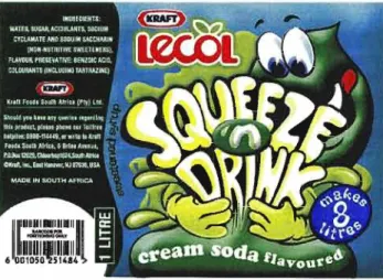
Lecol Juices: Re-packaging launch .1 Background
- Research undertaken
- Methodology of Research
- Sample design and respondent selection
- Research Results
Research was commissioned to determine the impact of the packaging changes on consumer perception of Lecol Squashes and Squeeze 'n Drink. The marketing business objectives of the research were to design an attractive Lecollabel that will. The purpose of the research was to identify differences in product ratings due to pack changes.
Their perceptions of Lecol offerings were significantly improved by the proposed label - perceived as more modern, attractive and refreshing.
Manhattan Sweets: Re-packaging launch 1 Background
Research Undertaken
Research Methodology
Research Results
The packaging is much brighter compared to the old packaging - now it stands out much more compared to the competitors on the shelves. The illustration above shows the four counties into which the entire Manhattan area is divided.
Packaging in the tea industry
Lipton, the most widely used branded tea in the world, is a relatively small part of Unilever, the leader in the entire household products category and one of the most powerful corporations in existence. Blue is one of the least intimidating colors, rarely creates a negative impression and often conveys positive emotions such as safety and relaxation in specific shades such as baby blue, sky blue and powder blue. The word "Lipton" is skillfully cemented in the public eye with the brand name 21. The "successes" with the brand are achieved without ostentatiousness and represent the modern use of packaging to consolidate brand equity.
The color of currency and the color of human skin may vary between regions of the world, but a truly global corporation can create a uniformity of appearance that is impossible for any other entity, even a government. One of the bonuses of Evian or Perrier is that the brand also represents a part of French culture. Culture is what connects the brand to the firm, especially when the two share the same name.
Nike bears a Greek name that relates to its specific cultural values, to the Olympic Games and to the glorification of the human body. Because of its communication and its most distinctive product that is built up over time, a brand will always tend to build a reflection or image of the buyer or user that it appears to be addressing. Thus, the brand also succeeds in getting 30- or 40-year-old consumers to identify with its lifestyle.
These are the six aspects that define a brand's identity and the boundaries within which it can freely change or evolve. The brand identity prism proves that all these aspects are interconnected and form a well-structured whole.
The Brand's Identity
The Power of Branding
The red grouse, symbol of Scotland and a rare bird, has been chosen as the emblem of Famous Grouse whiskey to reflect the aesthetic ideal of its consumers. Emblems embody more than one facet of brand identity; That is why they play such a crucial role in building identity capital. It can also be a direct symbol of the brand's qualities (the Nestlé rabbit, Mr Clean, the Michelin bibendum).
Some characters serve to build a certain relationship and emotional prescriptive connection between the brand and its public. They were chosen as brand portraits, i.e. as the brand's features in the etymological sense. They don't make the brand, but they define the way the brand brings its features and functions to life.
They are actually chosen as such: the corporate specifications submitted to graphic identity and design agencies are mainly about the personality traits and values of the brands. What is important about these symbols and logos is not so much that they help identify the brand, but that the brand is identified with them. When companies change logos it either means that they or their brands are ready to transform: as soon as possible.
Some companies are taking a different approach to revitalizing the brand and restoring their identity; they milk their lost brand emblems for the energy and aggressiveness they need to change. Just as human personality can be reflected in a signature, brand essence and self-image can be reflected in symbols.
Summary of the Literature Review
Certain consumers prefer tried-and-tested old brands that have been around for hundreds of years and with them change the minimum packaging. At the other end of the spectrum are consumers who want change, aren't afraid to try new things and expect packaging to constantly evolve with the times. Sometimes different packaging preferences have nothing to do with the product, but are nevertheless the preferred option.
It is the essence of everything the brand stands for and everything it wants to represent. Bringing these six elements together on the shelf and communicating this to the consumer as they pass by is a key task. Consumers are spoiled for choice these days and when these six aspects come together to make the consumer feel that the brand was created for him/her, the branding exercise has been well executed.
It can consist of anything and everything connected to the brand and includes elements such as symbolism, type of advertising campaigns, target market reach and brand image. All great brands have a core product or attribute that is responsible for conveying the brand meaning. The power of brands reiterates the importance of really focusing on the product message that comes through individual elements such as the brand name, brand characters, visual symbols and logotypes.
Countless marketing success stories have come from a simple name change simply because consumers could not associate the brand name with the product. Ad appeal should always be linked to the physical product, i.e. once a consumer sees a product on the shelf, they should spontaneously recall all brand communication in at least the last 3 months - ideally.
Research Methodology
Descriptions and experiences of the researchers' observation were transcribed shortly after the focus groups took place.
Sampling
Focus Group Design
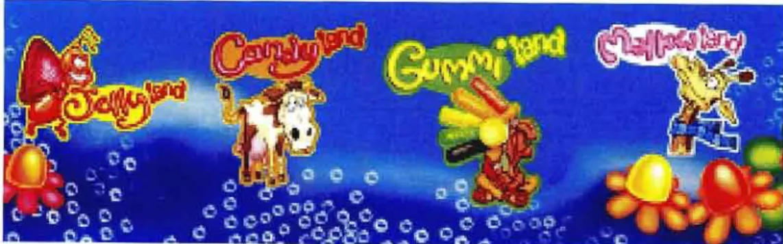
The above products were chosen because of the diversity they represent in relation to the consumer's shopping bag. These products were sampled to test respondents' spontaneous mentions of internal product features, eg, format, color, size, wording, brand image, etc.
Research Validity and Reliability
Representativeness
Limitations of the Study
Any study using the use of focus groups may have some weakness in that certain respondents tend to dominate the discussion and/or influence the rest of the groups opinion on a certain issue.
RESULTS OF THE STUDY
- Description of the sample
- Description of the sample
- Themes that have arisen from the study
- Respondents' acknowledgement of different types of packaging
- Respondents' link between packaging and purchasing decisions
- Respondents' definition of attractive packaging
- Respondents' definition of unattractive packaging
- Have respondents noticed when a brand has undergone a packaging revamp? What does it say of the brand?
- Would good packaging entice you to buy a product that you would not normally purchase?
- Do upper income consumers' opinions differ from lower income? Do opinions differ amongst different races?
- Key purchase drivers of product choice
- Examination of additional questions generated by the study
- RESEARCH CONCLUSIONS
- RECOMMENDATIONS
Packaging in general, across all respondents initially caught their attention and would entice them to pick up the product and at least look at it. Respondents really liked the feel of traditional products like Royal baking powder and felt that a packaging change would do the product a disservice. Respondents also felt that unattractive packaging made them feel that the product was of low quality and "not good for you".
They also felt that the product had better taste or performance and that the company had improved the quality of the product. All respondents said that good packaging would attract them, but only 20% said that they would be attracted to buy a product based solely on the packaging. The general consensus (+95%) of black consumers was that the packaging was a very important ingredient and would entice them to pick up the product, but it was not the packaging alone that swayed them, it was the product's effectiveness and the product's ingredients that mattered more. contained.
Indian and black consumers except seven were highly conscious of packaging, all income groups said that good packaging indicates that the product was of good quality and worth buying. Money back guarantees on the back of the pack - reassured the consumer that the product was good value. Overall all respondents said that good packaging would attract them to the product and even entice them to pick it up and check it out, however most respondents said that this packaging would not be enough to convince them .
Once they picked up the product, it was up to the manufacturer to ensure that the quality of the product was just as good. There was a small percentage who said that good packaging for a product would convince them to purchase the product and that after purchasing the product it would then be the performance of the product that would determine whether they would purchase it again. Bright colors, good visuals and useful information on the packaging are some of the features they were looking for.
Any kind of charitable donation made on behalf of the buyer of the product, ego Dettol trust for AIDS victims.