Categorical
Data Analysis
Using SAS
®
Third Edition
The correct bibliographic citation for this manual is as follows: Stokes, Maura E., Charles S. Davis, and Gary G. Koch. 2012. Categorical Data Analysis Using SAS®, Third Edition. Cary, NC: SAS Institute Inc. Categorical Data Analysis Using SAS®, Third Edition
Copyright © 2012, SAS Institute Inc., Cary, NC, USA ISBN 978-1-61290-090-2 (electronic book)
ISBN 978-1-60764-664-8
All rights reserved. Produced in the United States of America.
For a hard-copy book: No part of this publication may be reproduced, stored in a retrieval system, or transmitted, in any form or by any means, electronic, mechanical, photocopying, or otherwise, without the prior written permission of the publisher, SAS Institute Inc.
For a Web download or e-book: Your use of this publication shall be governed by the terms established by the vendor at the time you acquire this publication.
The scanning, uploading, and distribution of this book via the Internet or any other means without the permission of the publisher is illegal and punishable by law. Please purchase only authorized electronic editions and do not participate in or encourage electronic piracy of copyrighted materials. Your support of others’ rights is appreciated. U.S. Government Restricted Rights Notice: Use, duplication, or disclosure of this software and related
documentation by the U.S. government is subject to the Agreement with SAS Institute and the restrictions set forth in FAR 52.227-19, Commercial Computer Software-Restricted Rights (June 1987).
SAS Institute Inc., SAS Campus Drive, Cary, North Carolina 27513-2414 1st printing, July 2012
SASInstitute Inc. provides a complete selection of books and electronic products to help customers use SAS software to its fullest potential. For more information about our e-books, e-learning products, CDs, and hard-copy books, visit the SAS Books Web site at support.sas.com/bookstore or call 1-800-727-3228.
SAS® and all other SAS Institute Inc. product or service names are registered trademarks or trademarks of SAS Institute Inc. in the USA and other countries. ® indicates USA registration.
Contents
Chapter 1. Introduction . . . 1
Chapter 2. The22Table . . . 15
Chapter 3. Sets of22Tables . . . 47
Chapter 4. 2rands2Tables . . . 73
Chapter 5. ThesrTable . . . 107
Chapter 6. Sets ofsr Tables . . . 141
Chapter 7. Nonparametric Methods . . . 175
Chapter 8. Logistic Regression I: Dichotomous Response . . . 189
Chapter 9. Logistic Regression II: Polytomous Response . . . 259
Chapter 10. Conditional Logistic Regression . . . 297
Chapter 11. Quantal Response Data Analysis . . . 345
Chapter 12. Poisson Regression and Related Loglinear Models . . . 373
Chapter 13. Categorized Time-to-Event Data . . . 409
Chapter 14. Weighted Least Squares . . . 427
Chapter 15. Generalized Estimating Equations . . . 487
References . . . 557
Preface to the Third Edition
The third edition accomplishes several purposes. First, it updates the use of SAS®software to current practices. Since the last edition was published more than 10 years ago, numerous sets of example statements have been modified to reflect best applications of SAS/STAT®software.
Second, the material has been expanded to take advantage of the many graphs now provided by SAS/STAT software through ODS Graphics. Beginning with SAS/STAT 9.3, these graphs are available with SAS/STAT—no other product license is required (a SAS/GRAPH® license was required for previous releases). Graphs displayed in this edition include:
mosaic plots
effect plots
odds ratio plots
predicted cumulative proportions plot
regression diagnostic plots
agreement plots
Third, the book has been updated and reorganized to reflect the evolution of categorical data analysis strategies. The previous Chapter 14, “Repeated Measurements Using Weighted Least Squares,” has been combined with the previous Chapter 13, “Weighted Least Squares,” to create the current Chapter 14, “Weighted Least Squares.” The material previously in Chapter 16, “Loglinear Models,” is found in the current Chapter 12, “Poisson Regression and Related Loglinear Models.” The material in Chapter 10, “Conditional Logistic Regression,” has been rewritten, and Chapter 8, “Logistic Regression I: Dichotomous Response,” and Chapter 9, “Logistic Regression II: Polytomous Response,” have been expanded. In addition, the previous Chapter 16, “Categorized Time-to-Event Data” is the current Chapter 13.
Numerous additional techniques are covered in this edition, including:
incidence density ratios and their confidence intervals
additional confidence intervals for difference of proportions
exact Poisson regression
difference measures to reflect direction of association in sets of tables
partial proportional odds model
odds ratios in the presence of interactions
Firth penalized likelihood approach for logistic regression
In addition, miscellaneous revisions and additions have been incorporated throughout the book. However, the scope of the book remains the same as described in Chapter 1, “Introduction.”
Computing Details
The examples in this third edition were executed with SAS/STAT 12.1, although the revision was largely based on SAS/STAT 9.3. The features specific to SAS/STAT 12.1 are:
mosaic plots in the FREQ procedure
partial proportional odds model in the LOGISTIC procedure
Miettinen-Nurminen confidence limits for proportion differences in PROC FREQ
headings for the estimates from the FIRTH option in PROC LOGISTIC
Because of limited space, not all of the output that is produced with the example SAS code is shown. Generally, only the output pertinent to the discussion is displayed. An ODS SELECT statement is sometimes used in the example code to limit the tables produced. The ODS GRAPHICS ON and ODS GRAPHICS OFF statements are used when graphs are produced. However, these statements are not needed when graphs are produced as part of the SAS windowing environment beginning with SAS 9.3. Also, the graphs produced for this book were generated with the STYLE=JOURNAL option of ODS because the book does not feature color.
For More Information
The websitehttp://www.sas.com/catbook contains further information that pertains to topics in the book, including data (where possible) and errata.
Acknowledgments
And, of course, we remain thankful to those persons who contributed to the earlier editions. They include Diane Catellier, Sonia Davis, Bob Derr, William Duckworth II, Suzanne Edwards, Stuart Gansky, Greg Goodwin, Wendy Greene, Duane Hayes, Allison Kinkead, Gordon Johnston, Lisa LaVange, Antonio Pedroso-de-Lima, Annette Sanders, John Preisser, David Schlotzhauer, Todd Schwartz, Dan Spitzner, Catherine Tangen, Lisa Tomasko, Donna Watts, Greg Weier, and Ozkan Zengin.
Anne Baxter and Ed Huddleston edited this book.
Chapter 1
Introduction
Contents
1.1 Overview . . . 1
1.2 Scale of Measurement . . . 2
1.3 Sampling Frameworks . . . 4
1.4 Overview of Analysis Strategies . . . 5
1.4.1 Randomization Methods . . . 6
1.4.2 Modeling Strategies. . . 6
1.5 Working with Tables in SAS Software. . . 8
1.6 Using This Book . . . 13
1.1
Overview
Data analysts often encounter response measures that are categorical in nature; their outcomes reflect categories of information rather than the usual interval scale. Frequently, categorical data are presented in tabular form, known as contingency tables. Categorical data analysis is concerned with the analysis of categorical response measures, regardless of whether any accompanying explanatory variables are also categorical or are continuous. This book discusses hypothesis testing strategies for the assessment of association in contingency tables and sets of contingency tables. It also discusses various modeling strategies available for describing the nature of the association between a categorical response measure and a set of explanatory variables.
2 Chapter 1: Introduction
1.2
Scale of Measurement
The scale of measurement of a categorical response variable is a key element in choosing an appropriate analysis strategy. By taking advantage of the methodologies available for the particular scale of measurement, you can choose a well-targeted strategy. If you do not take the scale of measurement into account, you may choose an inappropriate strategy that could lead to erroneous conclusions. Recognizing the scale of measurement and using it properly are very important in categorical data analysis.
Categorical response variables can be
dichotomous ordinal nominal discrete counts
grouped survival times
Dichotomousresponses are those that have two possible outcomes—most often they are yes and no. Did the subject develop the disease? Did the voter cast a ballot for the Democratic or Republican candidate? Did the student pass the exam? For example, the objective of a clinical trial for a new medication for colds is whether patients obtained relief from their pain-producing ailment. ConsiderTable 1.1, which is analyzed in Chapter 2, “The 22 Table.”
Table 1.1 Respiratory Outcomes Treatment Favorable Unfavorable Total
Placebo 16 48 64
Test 40 20 60
The placebo group contains 64 patients, and the test medication group contains 60 patients. The columns contain the information concerning the categorical response measure: 40 patients in the Test group had a favorable response to the medication, and 20 subjects did not. The outcome in this example is thus dichotomous, and the analysis investigates the relationship between the response and the treatment.
Frequently, categorical data responses represent more than two possible outcomes, and often these possible outcomes take on some inherent ordering. Such response variables have anordinalscale of measurement. Did the new school curriculum produce little, some, or high enthusiasm among the students? Does the water exhibit low, medium, or high hardness? In the former case, the order of the response levels is clear, but there is no clue as to the relative distances between the levels. In the latter case, there is a possible distance between the levels: medium might have twice the hardness of low, and high might have three times the hardness of low. Sometimes the distance is even clearer: a 50% potency dose versus a 100% potency dose versus a 200% potency dose. All three cases are examples of ordinal data.
1.2. Scale of Measurement 3
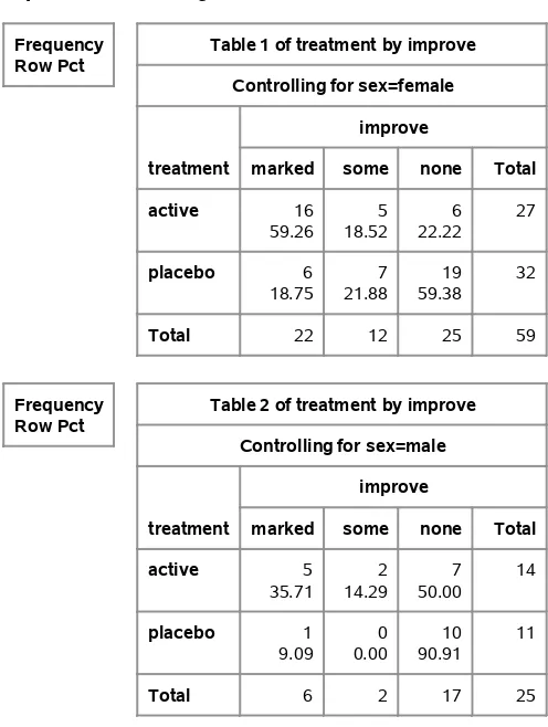
for rheumatoid arthritis. Male and female patients were given either the active treatment or a placebo; the outcome measured was whether they showed marked, some, or no improvement at the end of the clinical trial. The analysis uses the proportional odds model to assess the relationship between the response variable and gender and treatment.
Table 1.2 Arthritis Data Improvement
Sex Treatment Marked Some None Total
Female Active 16 5 6 27
Female Placebo 6 7 19 32
Male Active 5 2 7 14
Male Placebo 1 0 10 11
Note that categorical response variables can often be managed in different ways. You could combine the Marked and Some columns inTable 1.2 to produce a dichotomous outcome: No Improvement versus Improvement. Grouping categories is often done during an analysis if the resulting dichotomous response is also of interest.
If you have more than two outcome categories, and there is no inherent ordering to the categories, you have anominalmeasurement scale. Which of four candidates did you vote for in the town council election? Do you prefer the beach, mountains, or lake for a vacation? There is no underlying scale for such outcomes and no apparent way in which to order them.
ConsiderTable 1.3, which is analyzed in Chapter 5, “Thesr Table.” Residents in one town were asked their political party affiliation and their neighborhood. Researchers were interested in the association between political affiliation and neighborhood. Unlike ordinal response levels, the classifications Bayside, Highland, Longview, and Sheffeld lie on no conceivable underlying scale. However, you can still assess whether there is association in the table, which is done in Chapter 5.
Table 1.3 Distribution of Parties in Neighborhoods Neighborhood
Party Bayside Highland Longview Sheffeld
Democrat 221 160 360 140
Independent 200 291 160 311
Republican 208 106 316 97
Categorical response variables sometimes containdiscrete counts. Instead of falling into categories that are labeled (yes, no) or (low, medium, high), the outcomes are numbers themselves. Was the litter size 1, 2, 3, 4, or 5 members? Did the house contain 1, 2, 3, or 4 air conditioners? While the usual strategy would be to analyze the mean count, the assumptions required for the standard linear model for continuous data are often not met with discrete counts that have small range; the counts are not distributed normally and may not have homogeneous variance.
4 Chapter 1: Introduction
Table 1.4 Colds in Children Periods with Colds
Sex Residence 0 1 2 Total
Female Rural 45 64 71 180
Female Urban 80 104 116 300
Male Rural 84 124 82 290
Male Urban 106 117 87 310
The table represents a cross-classification of gender, residence, and number of periods with colds. The analysis is concerned with modeling mean colds as a function of gender and residence.
Finally, another type of response variable in categorical data analysis is one that representssurvival times. With survival data, you are tracking the number of patients with certain outcomes (possibly death) over time. Often, the times of the condition are grouped together so that the response variable represents the number of patients who fail during a specific time interval. Such data are calledgrouped survival times. For example, the data displayed inTable 1.5are from Chapter 13, “Categorized Time-to-Event Data.” A clinical condition is treated with an active drug for some patients and with a placebo for others. The response categories are whether there are recurrences, no recurrences, or whether the patients withdrew from the study. The entries correspond to the time intervals 0–1 years, 1–2 years, and 2–3 years, which make up the rows of the table.
Table 1.5 Life Table Format for Clinical Condition Data Controls
Interval No Recurrences Recurrences Withdrawals At Risk
0–1 Years 50 15 9 74
1–2 Years 30 13 7 50
2–3 Years 17 7 6 30
Active
Interval No Recurrences Recurrences Withdrawals At Risk
0–1 Years 69 12 9 90
1–2 Years 59 7 3 69
2–3 Years 45 10 4 59
1.3
Sampling Frameworks
Categorical data arise from different sampling frameworks. The nature of the sampling framework determines the assumptions that can be made for the statistical analyses and in turn influences the type of analysis that can be applied. The sampling framework also determines the type of inference that is possible. Study populations are limited to target populations, those populations to which inferences can be made, by assumptions justified by the sampling framework.
1.4. Overview of Analysis Strategies 5
an infectious disease in a multicounty area, the children attending a particular elementary school, or those persons appearing in court during a specified time period. Highway safety data concerning injuries in motor vehicles is another example of historical data.
Experimental dataare drawn from studies that involve the random allocation of subjects to different treatments of one sort or another. Examples include studies where types of fertilizer are applied to agricultural plots and studies where subjects are administered different dosages of drug therapies. In the health sciences, experimental data may include patients randomly administered a placebo or treatment for their medical condition.
Insample survey studies, subjects are randomly chosen from a larger study population. Investigators may randomly choose students from their school IDs and survey them about social behavior; national health care studies may randomly sample Medicare users and investigate physician utilization patterns. In addition, some sampling designs may be a combination of sample survey and experimental data processes. Researchers may randomly select a study population and then randomly assign treatments to the resulting study subjects.
The major difference in the three sampling frameworks described in this section is the use of randomization to obtain them. Historical data involve no randomization, and so it is often difficult to assume that they are representative of a convenient population. Experimental data have good coverage of the possibilities of alternative treatments for the restricted protocol population, and sample survey data have very good coverage of the larger population from which they were selected.
Note that the unit of randomization can be a single subject or a cluster of subjects. In addition, randomization may be applied within subsets, called strata or blocks, with equal or unequal probabilities. In sample surveys, all of this can lead to more complicated designs, such as stratified random samples, or even multistage cluster random samples. In experimental design studies, such considerations lead to repeated measurements (or split-plot) studies.
1.4
Overview of Analysis Strategies
Categorical data analysis strategies can be classified into those that are concerned with hypothesis testing and those that are concerned with modeling. Many questions about a categorical data set can be answered by addressing a specific hypothesis concerning association. Such hypotheses are often investigated with randomization methods. In addition to making statements about association, you may also want to describe the nature of the association in the data set. Statistical modeling techniques using maximum likelihood estimation or weighted least squares estimation are employed to describe patterns of association or variation in terms of a parsimonious statistical model. Imrey (2011) includes a historical perspective on numerous methods described in this book.
6 Chapter 1: Introduction
1.4.1 Randomization Methods
Table 1.1, the respiratory outcomes data, contains information obtained as part of a randomized allocation process. The hypothesis of interest is whether there is an association between treatment and outcome. For these data, the randomization is accomplished by the study design.
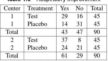
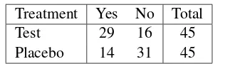
Table 1.6contains data from a similar study. The main difference is that the study was conducted in two medical centers. The hypothesis of association is whether there is an association between treatment and outcome, controlling for any effect of center.
Table 1.6 Respiratory Improvement Center Treatment Yes No Total
1 Test 29 16 45
1 Placebo 14 31 45
Total 43 47 90
2 Test 37 8 45
2 Placebo 24 21 45
Total 61 29 90
Chapter 2, “The 2 2 Table,” is primarily concerned with the association in 2 2 tables; in addition, it discusses measures of association, that is, statistics designed to evaluate the strength of the association. Chapter 3, “Sets of 22 Tables,” discusses the investigation of association in sets of 22 tables. When the table of interest has more than two rows and two columns, the analysis is further complicated by the consideration of scale of measurement. Chapter 4, “Sets of2rand s2Tables,” considers the assessment of association in sets of tables where the rows (columns) have more than two levels.
Chapter 5 describes the assessment of association in the generalsrtable, and Chapter 6, “Sets of sr Tables,” describes the assessment of association in sets ofsr tables. The investigation of association in tables and sets of tables is further discussed in Chapter 7, “Nonparametric Methods,” which discusses traditional nonparametric tests that have counterparts among the strategies for analyzing contingency tables.
Another consideration in data analysis is whether you have enough data to support the asymptotic theory required for many tests. Often, you may have an overall table sample size that is too small or a number of zero or small cell counts that make the asymptotic assumptions questionable. Recently, exact methods have been developed for a number of association statistics that permit you to address the same hypotheses for these types of data. The above-mentioned chapters illustrate the use of exact methods for many situations.
1.4.2 Modeling Strategies
Modeling Strategies 7
Perhaps the most common response function modeled for categorical data is the logit. If you have a dichotomous response and represent the proportion of those subjects with an event (versus no event) outcome asp, then the logit can be written
log
p
1 p
Logistic regression is a modeling strategy that relates the logit to a set of explanatory variables with a linear model. One of its benefits is that estimates of odds ratios, important measures of association, can be obtained from the parameter estimates. Maximum likelihood estimation is used to provide those estimates.
Chapter 8, “Logistic Regression I: Dichotomous Response,” discusses logistic regression for a dichotomous outcome variable. Chapter 9, “Logistic Regression II: Polytomous Response,” discusses logistic regression for the situation where there are more than two outcomes for the response variable. Logits calledgeneralized logitscan be analyzed when the outcomes are nominal. And logits called cumulative logitscan be analyzed when the outcomes are ordinal. Chapter 10, “Conditional Logistic Regression,” describes a specialized form of logistic regression that is appropriate when the data are highly stratified or arise from matched case-control studies. These chapters describe the use of exact conditional logistic regression for those situations where you have limited or sparse data, and the asymptotic requirements for the usual maximum likelihood approach are not met.
Poisson regression is a modeling strategy that is suitable for discrete counts, and it is discussed in Chapter 12, “Poisson Regression and Related Loglinear Models.” Most often the log of the count is used as the response function.
Some application areas have features that led to the development of special statistical techniques. One of these areas for categorical data is bioassay analysis. Bioassay is the process of determining the potency or strength of a reagent or stimuli based on the response it elicits in biological organisms. Logistic regression is a technique often applied in bioassay analysis, where its parameters take on specific meaning. Chapter 11, “Quantal Bioassay Analysis,” discusses the use of categorical data methods for quantal bioassay. Another special application area for categorical data analysis is the analysis of grouped survival data. Chapter 13, “Categorized Time-to-Event Data,” discusses some features of survival analysis that are pertinent to grouped survival data, including how to model them with the piecewise exponential model.
In logistic regression, the objective is to predict a response outcome from a set of explanatory variables. However, sometimes you simply want to describe the structure of association in a set of variables for which there are no obvious outcome or predictor variables. This occurs frequently for sociological studies. The loglinear model is a traditional modeling strategy for categorical data and is appropriate for describing the association in such a set of variables. It is closely related to logistic regression, and the parameters in a loglinear model are also estimated with maximum likelihood estimation. Chapter 12, “Poisson Regression and Related Loglinear Models,” includes a discussion of the loglinear model, including a typical application.
8 Chapter 1: Introduction
directly through study design or indirectly via assumptions concerning the representativeness of the data. Not only can you model a variety of useful functions, but weighted least squares estimation also provides a useful framework for the analysis of repeated categorical measurements, particularly those limited to a small number of repeated values. Chapter 14, “Weighted Least Squares,” addresses modeling categorical data with weighted least squares methods, including the analysis of repeated measurements data.
Generalized estimating equations (GEE) is a widely used method for the analysis of correlated responses, particularly for the analysis of categorical repeated measurements. The GEE method applies to a broad range of repeated measurements situations, such as those including time-dependent covariates and continuous explanatory variables, that weighted least squares doesn’t handle. Chapter 15, “Generalized Estimating Equations,” discusses the GEE approach and illustrates its application with a number of examples.
1.5
Working with Tables in SAS Software
This section discusses some considerations of managing tables with SAS. If you are already familiar with the FREQ procedure, you may want to skip this section.
Many times, categorical data are presented to the researcher in the form of tables, and other times, they are presented in the form of case record data. SAS procedures can handle either type of data. In addition, many categorical data have ordered categories, so that the order of the levels of the rows and columns takes on special meaning. There are numerous ways that you can specify a particular order to SAS procedures.
Consider the following SAS DATA step that inputs the data displayed inTable 1.1.
data respire;
input treat $ outcome $ count; datalines;
placebo f 16 placebo u 48
test f 40
test u 20
;
proc freq;
weight count;
tables treat*outcome; run;
1.5. Working with Tables in SAS Software 9
the procedure that the data are count data, or frequency data; the variable listed in the WEIGHT statement contains the values of the count variable.
Output 1.1contains the resulting frequency table.
Output 1.1 Frequency Table
Frequency Percent Row Pct Col Pct
Table of treat by outcome
treat
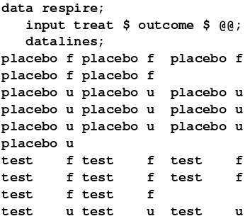
Suppose that a different sample produced the numbers displayed inTable 1.7.
Table 1.7 Respiratory Outcomes Treatment Favorable Unfavorable Total
Placebo 5 10 15
Test 8 20 28
These data may be stored in case record form, which means that each individual is represented by a single observation. You can also use this type of input with the FREQ procedure. The only difference is that the WEIGHT statement is not required.
The following statements create a SAS data set for these data and invoke PROC FREQ for case record data. The @@ symbol in the INPUT statement means that the data lines contain multiple observations.
data respire;
input treat $ outcome $ @@; datalines;
placebo f placebo f placebo f placebo f placebo f
placebo u placebo u placebo u placebo u placebo u placebo u placebo u placebo u placebo u placebo u
test f test f test f
test f test f test f
test f test f
10 Chapter 1: Introduction
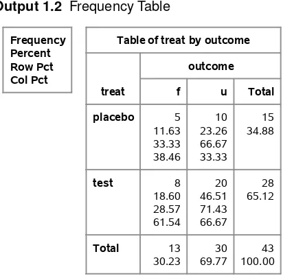
Output 1.2displays the resulting frequency table.
Output 1.2 Frequency Table
Frequency Percent Row Pct Col Pct
Table of treat by outcome
treat
In this book, the data are generally presented in count form.
When ordinal data are considered, it becomes quite important to ensure that the levels of the rows and columns are sorted correctly. By default, the data are going to be sorted alphanumerically. If this isn’t suitable, then you need to alter the default behavior.
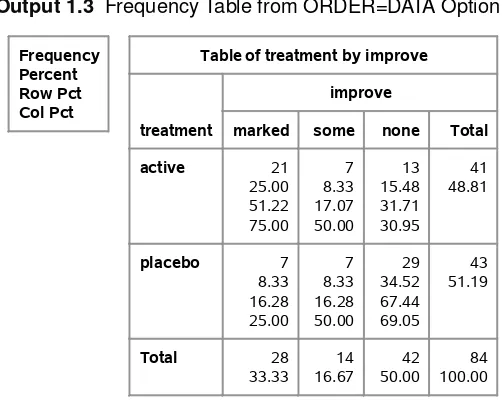
Consider the data displayed inTable 1.2. Variable IMPROVE is the outcome, and the values marked, some, and none are listed in decreasing order. Suppose that the data set ARTHRITIS is created with the following statements.
data arthritis;
length treatment $7. sex $6. ;
input sex $ treatment $ improve $ count @@; datalines;
female active marked 16 female active some 5 female active none 6
female placebo marked 6 female placebo some 7 female placebo none 19
male active marked 5 male active some 2 male active none 7
male placebo marked 1 male placebo some 0 male placebo none 10
;
1.5. Working with Tables in SAS Software 11
columns would be ordered marked, none, and some, which would be incorrect. One way to change this default sort order is to use the ORDER=DATA option in the PROC FREQ statement. This specifies that the sort order is the same order in which the values are encountered in the data set. Thus, since ‘marked’ comes first, it is first in the sort order. Since ‘some’ is the second value for IMPROVE encountered in the data set, then it is second in the sort order. And ‘none’ would be third in the sort order. This is the desired sort order. The following PROC FREQ statements produce a table displaying the sort order resulting from the ORDER=DATA option.
proc freq order=data; weight count;
tables treatment*improve; run;
Output 1.3displays the frequency table for the cross-classification of treatment and improvement for these data; the values for IMPROVE are in the correct order.
Output 1.3 Frequency Table from ORDER=DATA Option
Frequency Percent Row Pct Col Pct
Table of treatment by improve
treatment
Other possible values for the ORDER= option include FORMATTED, which means sort by the formatted values. The ORDER= option is also available with the CATMOD, LOGISTIC, and GENMOD procedures. For information on the ORDER= option for the FREQ procedure, refer to theSAS/STAT User’s Guide. This option is used frequently in this book.
Often, you want to analyze sets of tables. For example, you may want to analyze the cross-classification of treatment and improvement for both males and females. You do this in PROC FREQ by using a three-way crossing of the variables SEX, TREAT, and IMPROVE.
proc freq order=data; weight count;
tables sex*treatment*improve / nocol nopct; run;
12 Chapter 1: Introduction
left having two levels each, then four tables would be produced, one for each unique combination of the two leftmost variables in the TABLES statement.
Note also that the options NOCOL and NOPCT are included. These options suppress the printing of column percentages and cell percentages, respectively. Since generally you are interested in row percentages, these options are often specified in the code displayed in this book.
Output 1.4contains the two tables produced with the preceding statements.
Output 1.4 Producing Sets of Tables
Frequency Row Pct
Table 1 of treatment by improve Controlling for sex=female
Table 2 of treatment by improve Controlling for sex=male
1.6. Using This Book 13
1.6
Using This Book
This book is intended for a variety of audiences, including novice readers with some statistical background (solid understanding of regression analysis), those readers with substantial statistical background, and those readers with a background in categorical data analysis. Therefore, not all of this material will have the same importance to all readers. Some chapters include a good deal of tutorial material, while others have a good deal of advanced material. This book is not intended to be a comprehensive treatment of categorical data analysis, so some topics are mentioned briefly for completeness and some other topics are emphasized because they are not well documented.
The data used in this book come from a variety of sources and represent a wide breadth of application. However, due to the biostatistical background of all three authors, there is a certain inevitable weighting of biostatistical examples. Most of the data come from practice, and the original sources are cited when this is true; however, due to confidentiality concerns and pedagogical requirements, some of the data are altered or created. However, they still represent realistic situations.
Chapters 2–4 are intended to be accessible to all readers, as is most of Chapter 5. Chapter 6 is an integration of Mantel-Haenszel methods at a more advanced level, but scanning it is probably a good idea for any reader interested in the topic. In particular, the discussion about the analysis of repeated measurements data with extended Mantel-Haenszel methods is useful material for all readers comfortable with the Mantel-Haenszel technique.
Chapter 7 is a special interest chapter relating Mantel-Haenszel procedures to traditional nonpara-metric methods used for continuous data outcomes.
Chapters 8 and 9 on logistic regression are intended to be accessible to all readers, particularly Chapter 8. The last section of Chapter 8 describes the statistical methodology more completely for the advanced reader. Most of the material in Chapter 9 should be accessible to most readers. Chapter 10 is a specialized chapter that discusses conditional logistic regression and requires somewhat more statistical expertise. Chapter 11 discusses the use of logistic regression in analyzing bioassay data.
Parts of the subsequent chapters discuss more advanced topics and are necessarily written at a higher statistical level. Chapter 12 describes Poisson regression and loglinear models; much of the Poisson regression should be fairly accessible but the loglinear discussion is somewhat advanced. Chapter 13 discusses the analysis of categorized time-to-event data and most of it should be fairly accessible.
Chapter 14 discusses weighted least squares and is written at a somewhat higher statistical level than Chapters 8 and 9, but most readers should find this material useful, particularly the examples. Chapter 15 describes the use of generalized estimating equations. The opening section includes a basic example that is intended to be accessible to a wide range of readers.
Chapter 2
The
2
2
Table
Contents
2.1 Introduction . . . 15
2.2 Chi-Square Statistics . . . 17
2.3 Exact Tests . . . 20
2.3.1 Exactp-values for Chi-Square Statistics . . . 23
2.4 Difference in Proportions . . . 25
2.5 Odds Ratio and Relative Risk . . . 31
2.5.1 Exact Confidence Limits for the Odds Ratio . . . 38
2.6 Sensitivity and Specificity . . . 39
2.7 McNemar’s Test . . . 41
2.8 Incidence Densities . . . 43
2.9 Sample Size and Power Computations. . . 46
2.1
Introduction
The 22contingency table is one of the most common ways to summarize categorical data. Categorizing patients by their favorable or unfavorable response to two different drugs, asking health survey participants whether they have regular physicians and regular dentists, and asking residents of two cities whether they desire more environmental regulations all result in data that can be summarized in a22table.
Generally, interest lies in whether there is an association between the row variable and the column variable that produce the table; sometimes there is further interest in describing the strength of that association. The data can arise from several different sampling frameworks, and the interpretation of the hypothesis of no association depends on the framework. Data in a22table can represent the following:
simple random samples from two groups that yield two independent binomial distributions for a binary response
16 Chapter 2: The22Table
a simple random sample from one group that yields a single multinomial distribution for the cross-classification of two binary responses
Taking a random sample of subjects and asking whether they see both a regular physician and a regular dentist is an example of this framework. The hypothesis of interest is one of independence. Are having a regular dentist and having a regular physician independent of each other?
randomized assignment of patients to two equivalent treatments, resulting in the hypergeo-metric distribution
This framework occurs when patients are randomly allocated to one of two drug treatments, regardless of how they are selected, and their response to that treatment is the binary outcome. Under the null hypothesis that the effects of the two treatments are the same for each patient, a hypergeometric distribution applies to the response distributions for the two treatments.
incidence densities for counts of subjects who responded with some event versus the extent of exposure for the event
These counts represent independent Poisson processes. This framework occurs less fre-quently than the others but is still important.
Table 2.1summarizes the information from a randomized clinical trial that compared two treatments (test and placebo) for a respiratory disorder.
Table 2.1 Respiratory Outcomes Treatment Favorable Unfavorable Total
Placebo 16 48 64
Test 40 20 60
The question of interest is whether the rates of favorable response for test (67%) and placebo (25%) are the same. You can address this question by investigating whether there is a statistical association between treatment and outcome. The null hypothesis is stated
H0WThere is no association between treatment and outcome.
There are several ways of testing this hypothesis; many of the tests are based on the chi-square statistic. Section2.2discusses these methods. However, sometimes the counts in the table cells are too small to meet the sample size requirements necessary for the chi-square distribution to apply, and exact methods based on the hypergeometric distribution are used to test the hypothesis of no association. Exact methods are discussed in Section2.3.
2.2. Chi-Square Statistics 17
2.2
Chi-Square Statistics
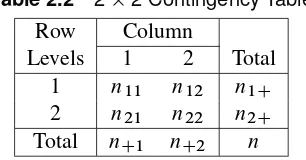
Table 2.2displays the generic22table, including row and column marginal totals.
Table 2.2 22 Contingency Table
Row Column
Levels 1 2 Total
1 n11 n12 n1C
2 n21 n22 n2C
Total nC1 nC2 n
Under the randomization framework that producedTable 2.1, the row marginal totals n1C and n2Care fixed since 60 patients were randomly allocated to one of the treatment groups and 64 to the other. The column marginal totals can be regarded as fixed under the null hypothesis of no treatment difference for each patient (since each patient would have the same response regardless of the assigned treatment, under this null hypothesis). Then, given that all of the marginal totals n1C,n2C,nC1, andnC2 are fixed under the null hypothesis, the probability distribution from the randomized allocation of patients to treatment can be written
Prfnijg D n1CŠn2CŠnC1ŠnC2Š nŠn11Šn12Šn21Šn22Š
which is the hypergeometric distribution. The expected value ofnij is
EfnijjH0g D niCnCj
n Dmij
and the variance is
VfnijjH0g D n1Cn2CnC1nC2 n2.n 1/ Dvij
For a sufficiently large sample,n11approximately has a normal distribution, which implies that
QD .n11 m11/ 2 v11
approximately has a chi-square distribution with one degree of freedom. It is the ratio of a squared difference from the expected value versus its variance, and such quantities follow the chi-square distribution when the variable is distributed normally. Q is often called the randomization (or Mantel-Haenszel) chi-square. It doesn’t matter how the rows and columns are arranged;Qtakes the same value since
jn11 m11j D jnij mijj D jn11n22 n12n21j
n D
n1Cn2C
n jp1 p2j
18 Chapter 2: The22Table
A related statistic is the Pearson chi-square statistic. This statistic is written
QP D
wherepCD.nC1=n/is the proportion in column 1 for the pooled rows.
If the cell counts are sufficiently large,QP is distributed as chi-square with one degree of freedom. Asngrows large,QP andQconverge. A useful rule for determining adequate sample size for bothQandQP is that the expected valuemij should exceed 5 (and preferable 10) for all of the cells. WhileQis discussed here in the framework of a randomized allocation of patients to two groups,QandQP are also appropriate for investigating the hypothesis of no association for all of the sampling frameworks described previously.
The following PROC FREQ statements produce a frequency table and the chi-square statistics for the data in Table 2.1. The data are supplied in frequency (count) form. An observation is supplied for each configuration of the values of the variables TREAT and OUTCOME. The variable COUNT holds the total number of observations that have that particular configuration. The WEIGHT statement tells the FREQ procedure that the data are in frequency form and names the variable that contains the frequencies. Alternatively, the data could be provided as case records for the individual patients; with this data structure, there would be 124 data lines corresponding to the 124 patients, and neither the variable COUNT nor the WEIGHT statement would be required.
The CHISQ option in the TABLES statement produces chi-square statistics.
data respire;
input treat $ outcome $ count; datalines;
2.2. Chi-Square Statistics 19
Table of treat by outcome
treat
Output 2.2contains the table with the chi-square statistics.
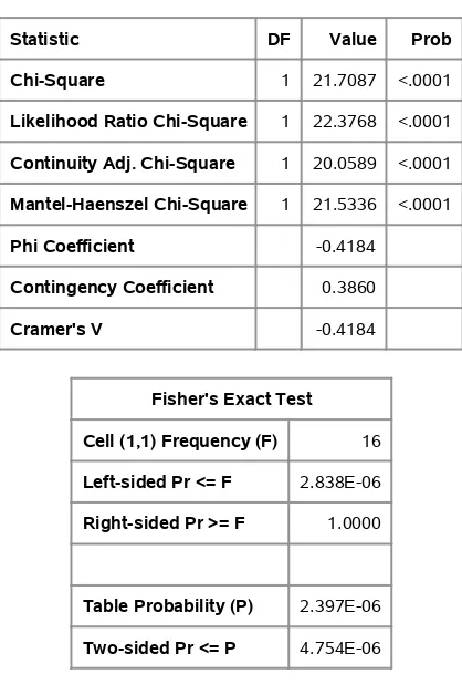
Output 2.2 Chi-Square Statistics
Statistic DF Value Prob
Chi-Square 1 21.7087 <.0001
Likelihood Ratio Chi-Square 1 22.3768 <.0001 Continuity Adj. Chi-Square 1 20.0589 <.0001 Mantel-Haenszel Chi-Square 1 21.5336 <.0001
Phi Coefficient -0.4184
Contingency Coefficient 0.3860
Cramer's V -0.4184
Fisher's Exact Test
Cell (1,1) Frequency (F) 16
Left-sided Pr <= F 2.838E-06
Right-sided Pr >= F 1.0000
Table Probability (P) 2.397E-06
Two-sided Pr <= P 4.754E-06
Sample Size = 124
20 Chapter 2: The22Table
association between treatment and outcome such that the test treatment results in a more favorable response outcome than the placebo. The row percentages inOutput 2.1show that the test treatment resulted in 67% favorable response and the placebo treatment resulted in 25% favorable response.
The output also includes a statistic labeled “Likelihood Ratio Chi-Square.” This statistic, often writtenQL, is asymptotically equivalent toQandQP. The statisticQLis described in Chapter 8 in the context of hypotheses for the odds ratio, for which there is some consideration in Section 2.5.QLis not often used in the analysis of22tables. Some of the other statistics are discussed in the next section.
2.3
Exact Tests
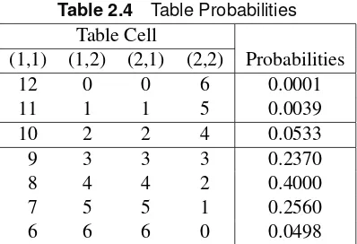
Sometimes your data include small and zero cell counts. For example, consider the data inTable 2.3 from a study on treatments for healing severe infections. Randomly assigned test treatment and control are compared to determine whether the rates of favorable response are the same.
Table 2.3 Severe Infection Treatment Outcomes Treatment Favorable Unfavorable Total
Test 10 2 12
Control 2 4 6
Total 12 6 18
Obviously, the sample size requirements for the chi-square tests described in Section2.2are not met by these data. However, if you can consider the margins (12, 6, 12, 6) to be fixed, then the random assignment and the null hypothesis of no association imply the hypergeometric distribution
Prfnijg D n1CŠn2CŠnC1ŠnC2Š nŠn11Šn12Šn21Šn22Š
The row margins may be fixed by the treatment allocation process; that is, subjects are randomly assigned to Test and Control. The column totals can be regarded as fixed by the null hypothesis; there are 12 patients with favorable response and 6 patients with unfavorable response, regardless of treatment. If the data are the result of a sample of convenience, you can still condition on marginal totals being fixed by addressing the null hypothesis that the patients are interchangeable; that is, the observed distributions of outcome for the two treatments are compatible with what would be expected from random assignment. That is, all possible assignments of the outcomes for 12 of the patients to Test and for 6 to Control are equally likely.
2.3. Exact Tests 21
Table 2.4 Table Probabilities Table Cell
(1,1) (1,2) (2,1) (2,2) Probabilities
12 0 0 6 0.0001
11 1 1 5 0.0039
10 2 2 4 0.0533
9 3 3 3 0.2370
8 4 4 2 0.4000
7 5 5 1 0.2560
6 6 6 0 0.0498
To find the one-sided p-value, you sum the probabilities that are as small or smaller than those computed for the table observed, in the direction specified by the one-sided alternative. In this case, it would be those tables in which the Test treatment had the more favorable response:
pD0:0533C0:0039C0:0001D0:0573
To find the two-sidedp-value, you sum all of the probabilities that are as small or smaller than that observed, or
pD0:0533C0:0039C0:0001C0:0498D0:1071
Generally, you are interested in the two-sidedp-value. Note that when the row (or column) totals are nearly equal, thep-value for the two-sided Fisher’s exact test is approximately twice thep-value for the one-sided Fisher’s exact test for the better treatment. When the row (or column) totals are equal, thep-value for the two-sided Fisher’s exact test is exactly twice the value of thep-value for the one-sided Fisher’s exact test.
The following SAS statements produce the22 frequency table forTable 2.3. Specifying the CHISQ option also produces Fisher’s exact test for a22table. In addition, the ORDER=DATA option specifies that PROC FREQ order the levels of the rows (columns) in the same order in which the values are encountered in the data set.
data severe;
input treat $ outcome $ count; datalines;
Test f 10
Test u 2
Control f 2 Control u 4 ;
proc freq order=data; weight count;
tables treat*outcome / chisq nocol; run;
22 Chapter 2: The22Table
Output 2.3 Frequency Table
Frequency Percent Row Pct
Table of treat by outcome
treat
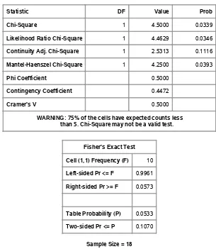
Output 2.4contains the chi-square statistics, including the exact test. Note that the sample size assumptions are not met for the chi-square tests: the warning beneath the table asserts that this is the case.
Output 2.4 Table Statistics
Statistic DF Value Prob
Chi-Square 1 4.5000 0.0339
Likelihood Ratio Chi-Square 1 4.4629 0.0346
Continuity Adj. Chi-Square 1 2.5313 0.1116
Mantel-Haenszel Chi-Square 1 4.2500 0.0393
Phi Coefficient 0.5000
Contingency Coefficient 0.4472
Cramer's V 0.5000
WARNING: 75% of the cells have expected counts less than 5. Chi-Square may not be a valid test.
Fisher's Exact Test
Cell (1,1) Frequency (F) 10
Left-sided Pr <= F 0.9961
Right-sided Pr >= F 0.0573
Table Probability (P) 0.0533
Two-sided Pr <= P 0.1070
Exactp-values for Chi-Square Statistics 23
SAS produces both a left-tail and right-tailp-value for Fisher’s exact test. The left-tail probability is the probability of all tables such that the (1,1) cell value is less than or equal to the one observed. The right-tail probability is the probability of all tables such that the (1,1) cell value is greater than or equal to the one observed. Thus, the one-sidedp-value is the same as the right-tailedp-value in this case, since large values for the (1,1) cell correspond to better outcomes for Test treatment.
Both the two-sided p-value of 0.1070 and the one-sided p-value of 0.0573 are larger than the
p-values associated withQP (p D0:0339) andQ(p D0:0393). Depending on your significance criterion, you might reach very different conclusions with these three test statistics. The sample size requirements for the chi-square distribution are not met with these data; hence thep-values from these test statistics with this approximation are questionable. This example illustrates the usefulness of Fisher’s exact test when the sample size requirements for the usual chi-square tests are not met.
The output also includes a statistic labeled the “Continuity Adj. Chi-Square”; this is the continuity-adjusted chi-square statistic suggested by Yates (1934), which is intended to correct the Pearson chi-square statistic so that it more closely approximates Fisher’s exact test. In this case, the correction produces a chi-square value of 2.5313 withp D 0:1116, which is certainly close to the two-sided Fisher’s exact test value. And using half of the continuity-corrected chi-square approximates the one-sided Fisher’s exact test well. However, many statisticians recommend that you should simply apply Fisher’s exact test when the sample size requires it rather than try to approximate it. In particular, the continuity-corrected chi-square may be overly conservative for two-sided tests when the corresponding hypergeometric distribution is asymmetric; that is, the two row totals and the two column totals are very different, and the sample sizes are small.
Fisher’s exact test is always appropriate, even when the sample size is large.
2.3.1 Exactp-values for Chi-Square Statistics
For many years, the only practical way to assess association in22tables that had small or zero counts was with Fisher’s exact test. This test is computationally quite easy for the22case. However, you can also obtain exactp-values for the statistics discussed in Section2.2. This is possible due to the development of fast and efficient network algorithms that provide a distinct advantage over direct enumeration. Although such enumeration is reasonable for Fisher’s exact test, it can prove prohibitive in other instances. See Mehta, Patel, and Tsiatis (1984) for a description of these algorithms; Agresti (1992) provides a useful overview of the various algorithms for the computation of exactp-values.
In the case ofQ,QP, and a closely related statistic,QL(likelihood ratio statistic), large values of the statistic imply a departure from the null hypothesis. The exactp-values for these statistics are the sum of the probabilities for the tables that have a test statistic greater than or equal to the value of the observed test statistic.
24 Chapter 2: The22Table
For theTable 2.3data, the following SAS statements produce the exactp-values for the chi-square tests of association. You include the keyword(s) for the statistics for which to compute exact p-values, CHISQ in this case.
proc freq order=data; weight count;
tables treat*outcome / chisq nocol; exact chisq;
run;
First, the usual table for the CHISQ statistics is displayed (not re-displayed here), and then individual tables forQP,QL, andQare presented, including test values and both asymptotic and exactp-values, as shown inOutput 2.5.Output 2.6, andOutput 2.7.
Output 2.5 Pearson Chi-Square Test
Pearson Chi-Square Test
Chi-Square 4.5000
DF 1
Asymptotic Pr > ChiSq 0.0339
Exact Pr >= ChiSq 0.1070
Output 2.6 Likelihood Ratio Chi-Square Test
Likelihood Ratio Chi-Square Test
Chi-Square 4.4629
DF 1
Asymptotic Pr > ChiSq 0.0346
Exact Pr >= ChiSq 0.1070
Output 2.7 Mantel-Haenszel Chi-Square Test
Mantel-Haenszel Chi-Square Test
Chi-Square 4.2500
DF 1
Asymptotic Pr > ChiSq 0.0393
Exact Pr >= ChiSq 0.1070
2.4. Difference in Proportions 25
this case may have found an inappropriate significance that is not there when exactp-values are considered. Note that Fisher’s exact test provides an identicalp-value of 0.1070, but this is not always the case.
Using the exactp-values for the association chi-square versus applying the Fisher’s exact test is a matter of preference. However, there might be some interpretation advantage in using the Fisher’s exact test since the comparison is to your actual table rather than to a test statistic based on the table.
2.4
Difference in Proportions
The previous sections have addressed the question of whether there is an association between the rows and columns of a22table. In addition, you may be interested in describing the association in the table. For example, once you have established that the proportions computed from a table are different, you may want to estimate their difference.
ConsiderTable 2.5, which displays data from two independent groups.
Table 2.5 22Contingency Table Yes No Total Proportion Yes
Group 1 n11 n12 n1C p1 Dn11=n1C
Group 2 n21 n22 n2C p2 Dn21=n2C
Total nC1 nC2 n
If the two groups are arguably comparable to simple random samples from populations with corresponding population fractions for Yes as1and2, respectively, you might be interested in estimating the difference between the proportionsp1andp2withd Dp1 p2. You can show that the expected value with respect to the samples from the two groups having independent binomial distributions is
Efp1 p2g D1 2
and the variance is
Vfp1 p2g D 1.1 1/
n1C C
2.1 2/
n2C
for which a consistent estimator is
vd D
p1.1 p1/
n1C C
p2.1 p2/ n2C
26 Chapter 2: The22Table
wherez˛=2 is the100.1 .˛=2//percentile of the standard normal distribution; this confidence interval is based on Fleiss, Levin, and Paik (2003). These confidence limits include a continuity adjustment to the Wald asymptotic confidence limits that adjust for the difference between the normal approximation and the discrete binomial distribution. They are appropriate for moderate sample sizes—say cell counts of at least 8.
For example, considerTable 2.6, which reproduces the data analyzed in Section2.2. In addition to determining that there is a statistical association between treatment and response, you may be interested in estimating the difference between the proportions of favorable response for the test and placebo treatments, including a 95% confidence interval.
Table 2.6 Respiratory Outcomes
Favorable Treatment Favorable Unfavorable Total Proportion
Placebo 16 48 64 0.250
Test 40 20 60 0.667
Total 56 68 124 0.452
The difference isd D0:667 0:25D0:417, and the confidence interval is written
0:417˙
A related measure of association is the Pearson correlation coefficient. This statistic is proportional to the difference of proportions. SinceQP is also proportional to the squared difference in proportions, the Pearson correlation coefficient is also proportional topQP.
The Pearson correlation coefficient can be written
rD
Dn.n11n22 n12n21/=Œ.n1Cn2CnC1nC2/1=2o
DŒn1Cn2C=nC1nC21=2d D.QP=n/1=2
For the data inTable 2.6,ris computed as
2.4. Difference in Proportions 27
The FREQ procedure produces the difference in proportions and the continuity-corrected Wald interval. PROC FREQ also provides the uncorrected Wald confidence limits, but the Wald-based interval is known to have poor coverage, among other issues, especially when the proportions grow close to 0 or 1. See Newcombe (1998) and Agresti and Caffo (2000) for further discussion.
You can request the difference of proportions and the continuity-corrected Wald confidence limits with the RISKDIFF (CORRECT) option in the TABLES statement. The following statements produce the difference along with the Pearson correlation coefficient, which is requested with the MEASURES option.
The ODS SELECT statement restricts the output produced to the RiskDiffCol1 table and the Measures table. The RiskDiffCol1 table produces the difference for column 1 of the frequency table. There is also a table for the column 2 difference called RiskDiffCol2, which is not produced in this example.
data respire2;
input treat $ outcome $ count @@; datalines;
test f 40 test u 20
placebo f 16 placebo u 48 ;
ods select RiskDiffCol1 Measures; proc freq order=data;
weight count;
tables treat*outcome / riskdiff (correct) measures; run;
28 Chapter 2: The22Table
Output 2.8 Pearson Correlation Coefficient Statistics for Table of treat by outcome Statistics for Table of treat by outcome
Statistic Value ASE
Gamma 0.7143 0.0974
Kendall's Tau-b 0.4184 0.0816
Stuart's Tau-c 0.4162 0.0814
Somers' D C|R 0.4167 0.0814
Somers' D R|C 0.4202 0.0818
Pearson Correlation 0.4184 0.0816 Spearman Correlation 0.4184 0.0816
Lambda Asymmetric C|R 0.3571 0.1109
Lambda Asymmetric R|C 0.4000 0.0966
Lambda Symmetric 0.3793 0.0983
Uncertainty Coefficient C|R 0.1311 0.0528 Uncertainty Coefficient R|C 0.1303 0.0525 Uncertainty Coefficient Symmetric 0.1307 0.0526
Output 2.9 contains the value for the difference of proportions for Test versus Placebo for the Favorable response, which is 0.4167 with confidence limits (0.2409, 0.5924). Note that this table also includes the proportions of column 1 response in both rows, along with the continuity-corrected asymptotic confidence limits and exact (Clopper-Pearson) confidence limits for the row proportions, which are based on inverting two equal-tailed binomial tests to identify thei that would not be contradicted by the observedpi at the.˛=2/significance level. See Clopper and Pearson (1934) for more information.
Output 2.9 Difference in Proportions
Column 1 Risk Estimates
Risk ASE
(Asymptotic) 95% Confidence Limits
(Exact) 95% Confidence Limits
Row 1 0.6667 0.0609 0.5391 0.7943 0.5331 0.7831
Row 2 0.2500 0.0541 0.1361 0.3639 0.1502 0.3740
Total 0.4516 0.0447 0.3600 0.5432 0.3621 0.5435
Difference 0.4167 0.0814 0.2409 0.5924
Difference is (Row 1 - Row 2)
2.4. Difference in Proportions 29
Another way to generate a confidence interval for the difference of proportions is to invert a score test. For testing goodness of fit for a specified difference,QP is the score test. Consider that Efp1g D and Efp2g D C. Then you can write
QP D .n11 n1C/O 2
n1CO C
.n1C n11 n1C.1 //O 2
n1C.1 /O C
.n21 n2C.O C//2 n2C.O C/ C
.n2C n21 n2C.1 O //2 n2C.1 O /
DZ˛2 D3:84
for˛ D0:05. You then identify theso thatQP 3:84for a 0.95 confidence interval, which requires iterative methods. This Miettinen-Nurminen interval (1985) has mean coverage somewhat above the nominal value (Newcombe 1998) and is also appealing theoretically (Newcombe and Nurminen 2011). The score interval is available with the FREQ procedure, which produces a bias-corrected interval by default (as specified in Miettinen and Nurminen 1985).
The following statements request the Miettinen-Nurminen interval, along with a corrected Wald interval. You specify these additional confidence intervals with the CL=(WALD MN) suboption of the RISKDIFF option. Adding the CORRECT option means that the Wald interval will be the corrected one.
proc freq order=data; weight count;
tables treat*outcome / riskdiff(cl=(wald mn) correct) measures; run;
Output 2.10contains both the Miettinen-Nurminen and corrected Wald confidence intervals. Output 2.10 Miettinen and Nurminen Confidence Interval
Confidence Limits for the Proportion (Risk) Difference
Column 1 (outcome = f)
Proportion Difference = 0.4167
Type 95% Confidence Limits
Miettinen-Nurminen 0.2460 0.5627
Wald (Corrected) 0.2409 0.5924
The Miettinen-Nurminen confidence interval is a bit narrower than the corrected Wald interval. In general, it might be preferred when the cell count size is marginal.
30 Chapter 2: The22Table
You can produce Wilson score confidence limits for the binomial proportion in PROC FREQ by specifying the BINOMIAL (WILSON) option for a one-way table.
You then compute the Newcombe confidence interval for the difference of proportions by plugging in the Wilson score confidence limitsPU 1; PL1andPU 2; PL2, which correspond to the row 1 and row 2 proportions, respectively, to obtain the lower (L) and upper.U) bounds for the confidence interval for the proportion difference:
LD.p1 p2/
The Newcombe confidence interval for the difference of proportions has been shown to have good coverage properties and avoids overshoot (Newcombe 1998); it’s the choice of many practitioners regardless of sample size. In general, it attains near nominal coverage when the proportions are away from 0 and 1, and it can have higher than nominal coverage when the proportions are both close to 0 or 1 (Agresti and Caffo 2000). A continuity-corrected Newcombe’s method also exists, and it should be considered if a row count is less than 10. You obtain a continuity-corrected confidence interval for the difference of proportions by plugging in the continuity-corrected Wilson score confidence limits.
There are also exact methods for computing the confidence intervals for the difference of pro-portions; they are unconditional exact methods which contend with a nuisance parameter by maximizing thep-value over all possible values of the parameter (versus, say, Fisher’s exact test, which is a conditional exact test that conditions on the margins). The unconditional exact intervals do have the property that the nominal coverage is the lower bound of the actual coverage. One type of these intervals is computed by inverting two separate one-sided tests where the size of each test is˛=2at most; the actual coverage is bounded by the nominal coverage. This is called the tail method. However, these intervals have excessively higher than nominal coverage, especially when the proportions are near 0 or 1, in which case the lower bound of the coverage is1 ˛=2instead of 1 ˛(Agresti 2002).
2.5. Odds Ratio and Relative Risk 31
proc freq order=data data=severe; weight count;
tables treat*outcome / riskdiff(cl=(wald newcombe exact) correct ); exact riskdiff;
run;
Output 2.11displays the confidence intervals.
Output 2.11 Confidence Intervals for Difference of Proportions Statistics for Table of treat by outcome
Statistics for Table of treat by outcome Confidence Limits for the Proportion (Risk) Difference
Column 1 (outcome = f)
Proportion Difference = 0.5000
Type 95% Confidence Limits
Exact -0.0296 0.8813
Newcombe Score (Corrected) -0.0352 0.8059
Wald (Corrected) -0.0571 1.0000
The continuity-corrected Wald-based confidence interval is the widest interval at. 0:0571; 1:000/, and it might have boundary issues with the upper limit of 1. The exact unconditional confidence interval at ( 0.0296, 0.8813) also includes zero. The corrected Newcombe interval is the narrowest at ( 0.0352, 0.8059). All of these confidence intervals are in harmony with the Fisher’s exact test result (two-sidedp D0:1071), but the corrected Newcombe interval might be the most suitable for these data.
2.5
Odds Ratio and Relative Risk
Measures of association are used to assess the strength of an association. Numerous measures of association are available for the contingency table, some of which are described in Chapter 5, “The srTable.” For the22table, one measure of association is theodds ratio, and a related measure of association is therelative risk.
ConsiderTable 2.5. Theodds ratio(OR) compares the odds of the Yes proportion for Group 1 to the odds of the Yes proportion for Group 2. It is computed as
ORD p1=.1 p1/
p2=.1 p2/ D
n11n22 n12n21
32 Chapter 2: The22Table
Define thelogitfor generalpas
logit.p/Dlog
p
1 p
with log as the natural logarithm. If you take the log of the odds ratio,
f DlogfORg Dlog
p1.1 p2/
p2.1 p1/
Dlogfp1=.1 p1/g logfp2=.1 p2/g
you see that the odds ratio can be written in terms of the difference between two logits. The logit is the function that is modeled in logistic regression. As you will see inChapter 8, “Logistic Regression I: Dichotomous Response,” the odds ratio and logistic regression are closely connected.
Since
f Dlogfn11g logfn12g logfn21g Clogfn22g
a consistent estimate of its variance with usefulness when allnij 5(preferably10) is
vf D
1
n11 C 1 n12 C
1 n21 C
1 n22
so a100.1 ˛/% confidence interval for OR can be written as
exp.f ˙z˛=2pvf/
The odds ratio is a useful measure of association regardless of how the data are collected. However, it has special meaning for retrospective studies because it can be used to estimate a quantity called
relative risk, which is commonly used in epidemiological work. The relative risk (RR) is the risk of developing a particular condition (often a disease) for one group compared to another group. For data collected prospectively, the relative risk is written
RRD p1 p2
You can show that
RRDORf1C.n21=n22/g f1C.n11=n12/g
2.5. Odds Ratio and Relative Risk 33
a relatively common occurrence, you are more interested in looking at the difference in proportions rather than at the odds ratio or the relative risk.
For a retrospective study, estimates forp1,p2, and RR are not available because they involve the unknown risk of the disease, but the OR estimator forp1.1 p2/=p2.1 p1/is still valid.
For cross-sectional data, the quantityp1=p2is called theprevalence ratio; it does not indicate risk because the disease and risk factor are assessed at the same time, but it does give you an idea of the prevalence of a condition in one group compared to another.
It is important to realize that the odds ratio can always be used as a measure of association, and that relative risk and the odds ratio as an estimator of relative risk have meaning for certain types of studies and require certain assumptions.
Table 2.7contains data from a study about how general daily stress affects one’s opinion on a proposed new health policy. Since information about stress level and opinion were collected at the same time, the data are cross-sectional.
Table 2.7 Opinions on New Health Policy Stress Favorable Unfavorable Total
Low 48 12 60
High 96 94 190
To produce the odds ratio and other measures of association from PROC FREQ, you specify the MEASURES option in the TABLES statement. The ORDER=DATA option is used in the PROC FREQ statement to produce a table that looks the same as that displayed inTable 2.7. Without this option, the row that corresponds to high stress would come first, and the row that corresponds to low stress would come last.
data stress;
input stress $ outcome $ count; datalines;
low f 48
low u 12
high f 96 high u 94 ;
proc freq order=data; weight count;
tables stress*outcome / chisq measures nocol nopct; run;
34 Chapter 2: The22Table
Output 2.12 Frequency Table
Frequency Row Pct
Table of stress by outcome
stress
outcome
f u Total
low 48 80.00
12 20.00
60
high 96 50.53
94 49.47
190
Total 144 106 250
Output 2.13displays the chi-square statistics. The statisticsQandQP indicate a strong association, with values of 16.1549 and 16.2198, respectively. Note how close the values for these statistics are for a sample size of 250.
Output 2.13 Chi-Square Statistics
Statistic DF Value Prob
Chi-Square 1 16.2198 <.0001 Likelihood Ratio Chi-Square 1 17.3520 <.0001 Continuity Adj. Chi-Square 1 15.0354 0.0001 Mantel-Haenszel Chi-Square 1 16.1549 <.0001
Phi Coefficient 0.2547
Contingency Coefficient 0.2468
Cramer's V 0.2547